Components / feedback
Spinner
Shows that something is loading with a spinning arc, in three sizes and four colors, still when motion is reduced.
Import
In a Flutter app where fliin init has run:
Examples
Sizes
The spinner in each size; label is what the screen reader announces.

import 'package:your_app/ui/fliin/components/spinner/fl_spinner.dart';
import 'package:your_app/ui/fliin/core/fliin.dart';
import 'package:flutter/widgets.dart';

class SpinnerSizesExample extends StatelessWidget {
  const SpinnerSizesExample({super.key});

  @override
  Widget build(BuildContext context) {
    final space = FlScope.of(context).space;
    return Wrap(
      alignment: WrapAlignment.center,
      crossAxisAlignment: WrapCrossAlignment.center,
      spacing: space.sm,
      runSpacing: space.sm,
      children: [
        for (final size in FlSpinnerSize.values) FlSpinner(label: 'Loading', size: size),
      ],
    );
  }
}Colors
Each tone: the accent by default, or a status color that says what is going on.

import 'package:your_app/ui/fliin/components/spinner/fl_spinner.dart';
import 'package:your_app/ui/fliin/core/fliin.dart';
import 'package:flutter/widgets.dart';

class SpinnerColorsExample extends StatelessWidget {
  const SpinnerColorsExample({super.key});

  @override
  Widget build(BuildContext context) {
    final space = FlScope.of(context).space;
    return Wrap(
      alignment: WrapAlignment.center,
      crossAxisAlignment: WrapCrossAlignment.center,
      spacing: space.sm,
      runSpacing: space.sm,
      children: [
        for (final tone in FlSpinnerTone.values) FlSpinner(label: 'Loading', tone: tone),
      ],
    );
  }
}Loading
A large spinner with a line of text under it, while a longer task runs.

import 'package:your_app/ui/fliin/components/spinner/fl_spinner.dart';
import 'package:your_app/ui/fliin/components/text/fl_text.dart';
import 'package:your_app/ui/fliin/core/fliin.dart';
import 'package:flutter/widgets.dart';

class SpinnerLoadingExample extends StatelessWidget {
  const SpinnerLoadingExample({super.key});

  @override
  Widget build(BuildContext context) {
    return Column(
      mainAxisSize: MainAxisSize.min,
      crossAxisAlignment: CrossAxisAlignment.center,
      spacing: FlScope.of(context).space.md,
      children: const [
        FlSpinner(label: 'Processing', size: FlSpinnerSize.lg, tone: FlSpinnerTone.success),
        FlText('Processing...', type: FlTextType.bodySm, tone: FlTextTone.muted),
      ],
    );
  }
}Speed
speed turns the spinner slower or faster than the default: slow for a wait in the background, fast for one that is about to end.

import 'package:your_app/ui/fliin/components/spinner/fl_spinner.dart';
import 'package:your_app/ui/fliin/components/text/fl_text.dart';
import 'package:your_app/ui/fliin/core/fliin.dart';
import 'package:flutter/widgets.dart';

class SpinnerSpeedExample extends StatelessWidget {
  const SpinnerSpeedExample({super.key});

  @override
  Widget build(BuildContext context) {
    final space = FlScope.of(context).space;
    return Wrap(
      alignment: WrapAlignment.center,
      spacing: space.xl,
      runSpacing: space.md,
      children: [
        for (final (speed, name) in const [(0.5, 'Slow'), (1.0, 'Default'), (2.0, 'Fast')])
          Column(
            mainAxisSize: MainAxisSize.min,
            spacing: space.sm,
            children: [
              FlSpinner(label: 'Loading', speed: speed),
              FlText(name, type: FlTextType.bodyXs, tone: FlTextTone.muted),
            ],
          ),
      ],
    );
  }
}Custom
extent and color take over from the size and the tone: an extra large spinner of 40, and one in the color of the text it sits beside.

import 'package:your_app/ui/fliin/components/spinner/fl_spinner.dart';
import 'package:your_app/ui/fliin/components/text/fl_text.dart';
import 'package:your_app/ui/fliin/core/fliin.dart';
import 'package:flutter/widgets.dart';

class SpinnerCustomExample extends StatelessWidget {
  const SpinnerCustomExample({super.key});

  @override
  Widget build(BuildContext context) {
    final theme = FlScope.of(context);
    return Column(
      mainAxisSize: MainAxisSize.min,
      spacing: theme.space.lg,
      children: [
        const FlSpinner(label: 'Loading', extent: 40),
        Row(
          mainAxisSize: MainAxisSize.min,
          spacing: theme.space.sm,
          children: [
            FlSpinner(label: 'Saving', size: FlSpinnerSize.sm, color: theme.colors.onSurfaceMuted),
            const FlText('Saving draft…', type: FlTextType.bodySm, tone: FlTextTone.muted),
          ],
        ),
      ],
    );
  }
}Usage
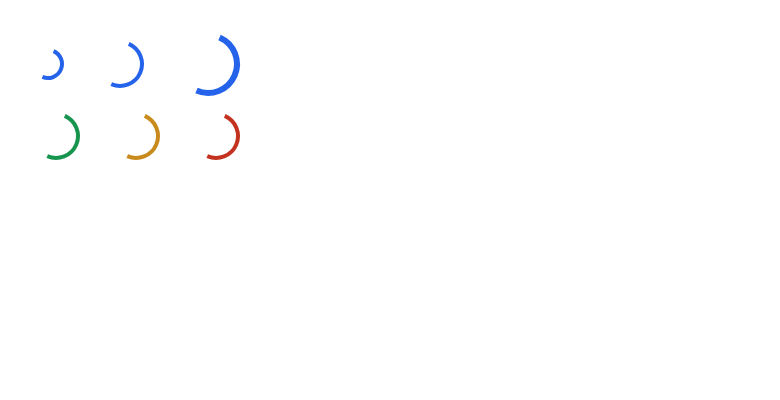
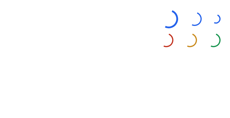
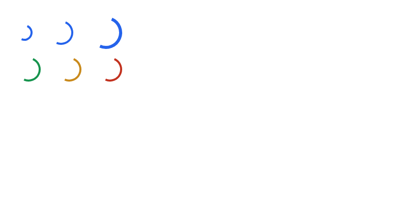
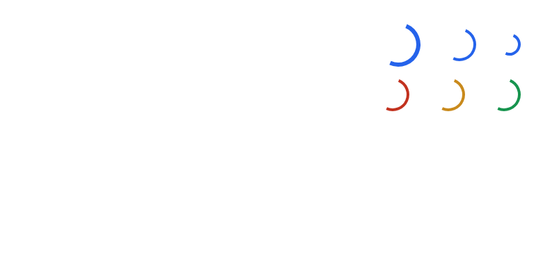
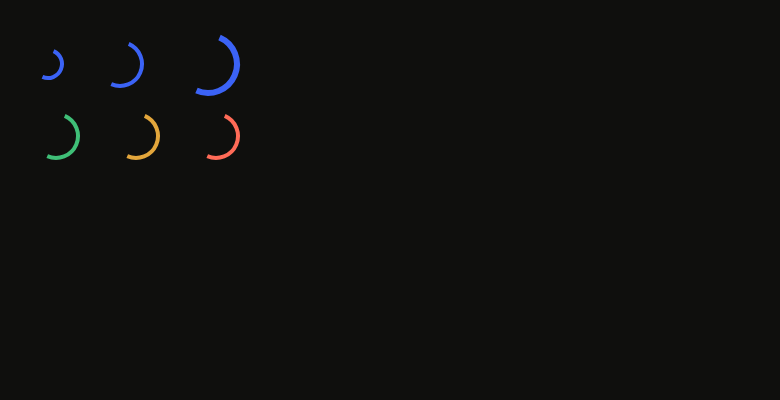
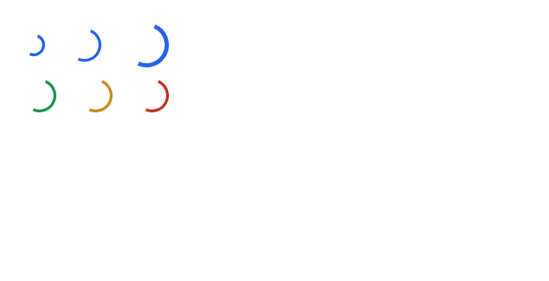
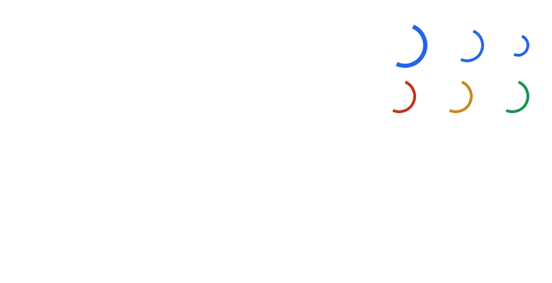
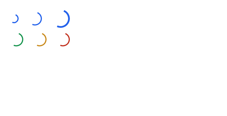
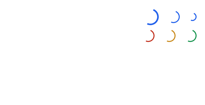
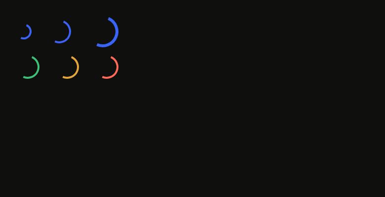
The code the reference images render:
final example = ColoredBox(
  color: FlScope.of(context).colors.surface,
  child: Padding(
    padding: EdgeInsetsDirectional.all(FlScope.of(context).space.lg),
    child: Column(
      crossAxisAlignment: CrossAxisAlignment.stretch,
      spacing: FlScope.of(context).space.sm,
      children: [
        Row(
          spacing: FlScope.of(context).space.lg,
          children: [
            FlSpinner(label: 'Loading', size: FlSpinnerSize.sm),
            FlSpinner(label: 'Loading'),
            FlSpinner(label: 'Loading', size: FlSpinnerSize.lg),
          ],
        ),
        Row(
          spacing: FlScope.of(context).space.lg,
          children: [
            FlSpinner(label: 'Sending', tone: FlSpinnerTone.success),
            FlSpinner(label: 'Sending', tone: FlSpinnerTone.warning),
            FlSpinner(label: 'Sending', tone: FlSpinnerTone.danger),
          ],
        ),
      ],
    ),
  ),
);API
FlSpinnerSize: enum {sm, md, lg}
FlSpinnerSize.sm: static final FlSpinnerSize
FlSpinnerSize.md: static final FlSpinnerSize
FlSpinnerSize.lg: static final FlSpinnerSize
FlSpinnerTone: enum {accent, success, warning, danger}
FlSpinnerTone.accent: static final FlSpinnerTone
FlSpinnerTone.success: static final FlSpinnerTone
FlSpinnerTone.warning: static final FlSpinnerTone
FlSpinnerTone.danger: static final FlSpinnerTone
FlSpinner: class extends StatefulWidget
FlSpinner.new: const new({super.key, required String label, FlSpinnerSize size, FlSpinnerTone tone, Color? color, double? extent, double speed})
FlSpinner.label: get String
FlSpinner.size: get FlSpinnerSize
FlSpinner.tone: get FlSpinnerTone
FlSpinner.color: get Color?
FlSpinner.extent: get double?
FlSpinner.speed: get double
FlSpinner.createState: State<FlSpinner>()Reference renders
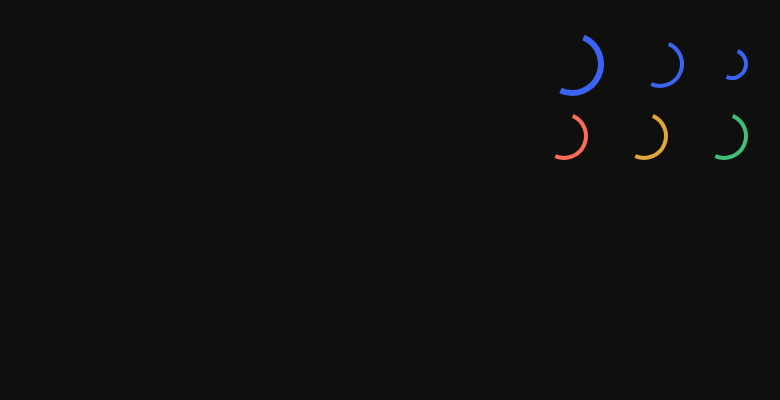
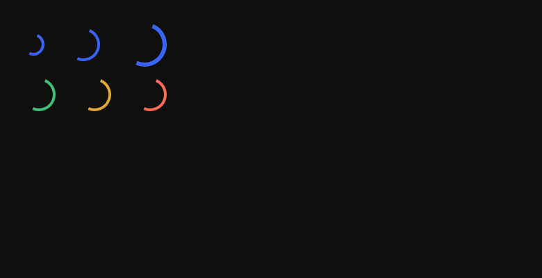
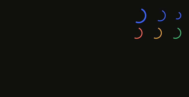
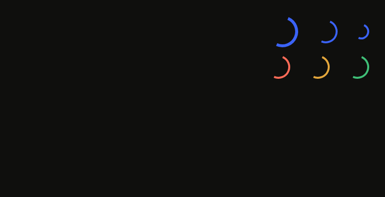
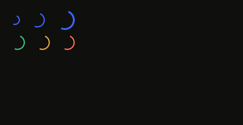
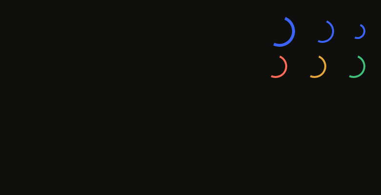
The 16 images published with version 0.2.2, rendered by the shared harness on macOS with Flutter 3.47.7. fliin verify spinner compares your copy to them.
Use it to
- show that something is loading
- keep users waiting during a request
- show a loading wheel
- show a sync of unknown duration
- show a wait inside a button
- Not for
- measurable progress: use a progress bar (progress)
Source
The files fliin add spinner copies into your app, before your prefix and imports are applied.
spinner/fl_spinner.dart
// Modified from the Spinner of HeroUI Native 1.0.10, Copyright 2025 NextUI
// Inc., licensed under Apache 2.0: https://www.apache.org/licenses/LICENSE-2.0
import 'dart:math' as math;

import 'package:flutter/semantics.dart' show SemanticsRole;
import 'package:flutter/widgets.dart';
import 'package:fliin_ui/core/fliin.dart';

/// The size of an [FlSpinner].
enum FlSpinnerSize {
  /// `size.spinnerSm`, 16 points.
  sm,

  /// `size.spinnerMd`, 24 points.
  md,

  /// `size.spinnerLg`, 32 points.
  lg,
}

/// The color of an [FlSpinner].
enum FlSpinnerTone {
  /// `selected`: a wait is not the primary action,
  /// which alone carries the accent.
  accent,

  /// `success`.
  success,

  /// `warning`.
  warning,

  /// `danger`.
  danger,
}

/// An activity indicator, drawn as Izydesk's: half a ring that spins
/// endlessly and fades in. Still under reduced motion. Announces itself as a loading
/// indicator named [label].
class FlSpinner extends StatefulWidget {
  /// An `md` indicator, `accent` tone (painted in `selected`) by default.
  const FlSpinner({
    super.key,
    required this.label,
    this.size = FlSpinnerSize.md,
    this.tone = FlSpinnerTone.accent,
    this.color,
    this.extent,
    this.speed = 1,
  }) : assert(speed > 0, 'speed must be positive');

  /// What is loading, read by the screen reader.
  final String label;

  /// The size.
  final FlSpinnerSize size;

  /// The theme color, unless [color] is given.
  final FlSpinnerTone tone;

  /// A color in place of [tone] (the text of a loading button).
  final Color? color;

  /// A side length in place of the one from [size], in logical points (40
  /// for an extra large one).
  final double? extent;

  /// How many times faster than the default it turns: 0.5 for a slow wait
  /// in the background, 2 for a quick one. 1 by default.
  final double speed;

  @override
  State<FlSpinner> createState() => _FlSpinnerState();
}

class _FlSpinnerState extends State<FlSpinner> with TickerProviderStateMixin {
  late final AnimationController _turns = AnimationController(vsync: this);
  late final AnimationController _fade = AnimationController(vsync: this);
  var _shown = false;

  @override
  void didChangeDependencies() {
    super.didChangeDependencies();
    _start();
  }

  @override
  void didUpdateWidget(FlSpinner oldWidget) {
    super.didUpdateWidget(oldWidget);
    if (widget.speed != oldWidget.speed) _start();
  }

  void _start() {
    final motion = FlMotion.of(context);
    if (motion.reduced) {
      _turns.value = 0;
      _fade.value = 1;
    } else {
      // A 1.1 speed: one turn in indicatorTurn / 1.1.
      _turns
        ..duration = motion.tokens.indicatorTurn * (1 / (1.1 * widget.speed))
        ..repeat();
      if (!_shown) {
        _fade.animateTo(1, duration: motion.tokens.short4, curve: motion.tokens.easeOut);
      }
    }
    _shown = true;
  }

  @override
  void dispose() {
    _turns.dispose();
    _fade.dispose();
    super.dispose();
  }

  @override
  Widget build(BuildContext context) {
    final theme = FlScope.of(context);
    final colors = theme.colors;
    final color =
        widget.color ??
        switch (widget.tone) {
          FlSpinnerTone.accent => colors.selected,
          FlSpinnerTone.success => colors.success,
          FlSpinnerTone.warning => colors.warning,
          FlSpinnerTone.danger => colors.danger,
        };
    final side =
        widget.extent ??
        switch (widget.size) {
          FlSpinnerSize.sm => theme.size.spinnerSm,
          FlSpinnerSize.md => theme.size.spinnerMd,
          FlSpinnerSize.lg => theme.size.spinnerLg,
        };
    return Semantics(
      container: true,
      role: SemanticsRole.loadingSpinner,
      label: widget.label,
      child: FadeTransition(
        opacity: _fade,
        child: SizedBox.square(
          dimension: side,
          child: RotationTransition(
            turns: _turns,
            // A 2 border, 3 from 32 up.
            child: CustomPaint(painter: _Arc(color, side >= theme.size.spinnerLg ? 3 : 2)),
          ),
        ),
      ),
    );
  }
}

/// Izydesk's `.spinner`: half a ring, from the bottom-left diagonal round
/// through the start and the top to the top-right diagonal, as a circle
/// bordered at its top and left only.
class _Arc extends CustomPainter {
  _Arc(this.color, this.stroke);

  final Color color;
  final double stroke;

  @override
  void paint(Canvas canvas, Size size) {
    final rect = (Offset.zero & size).deflate(stroke / 2);
    canvas.drawArc(
      rect,
      3 * math.pi / 4,
      math.pi,
      false,
      Paint()
        ..style = PaintingStyle.stroke
        ..strokeWidth = stroke
        ..color = color,
    );
  }

  @override
  bool shouldRepaint(_Arc oldDelegate) => color != oldDelegate.color || stroke != oldDelegate.stroke;
}