Components / forms
Select
Offers one or several choices from a closed list, from a trigger that shows the current choice. A list as wide as the trigger, or a bottom sheet or a dialog.
Import
In a Flutter app where fliin init has run:
Examples
Placeholder
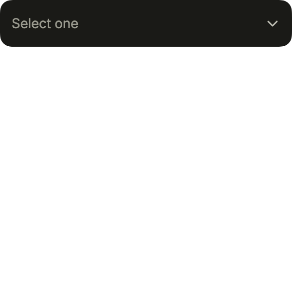
Before a choice, the select shows its placeholder; touching it opens the list of options, and choosing one closes it.
import 'package:your_app/ui/fliin/components/select/fl_select.dart';
import 'package:flutter/widgets.dart';

class SelectPlaceholderExample extends StatefulWidget {
  const SelectPlaceholderExample({super.key});

  @override
  State<SelectPlaceholderExample> createState() => _SelectPlaceholderExampleState();
}

class _SelectPlaceholderExampleState extends State<SelectPlaceholderExample> {
  String? _state;

  @override
  Widget build(BuildContext context) {
    return FlSelect<String>(
      label: 'State',
      placeholder: 'Select one',
      listLabel: 'Choose a state',
      options: const [
        FlSelectOption(value: 'ca', label: 'California'),
        FlSelectOption(value: 'ny', label: 'New York'),
        FlSelectOption(value: 'tx', label: 'Texas'),
        FlSelectOption(value: 'fl', label: 'Florida'),
      ],
      selection: FlSingleSelection(value: _state, onChanged: (state) => setState(() => _state = state)),
    );
  }
}Open
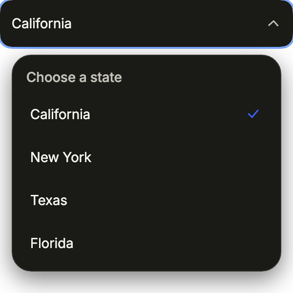
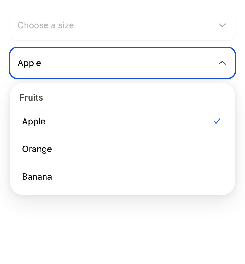
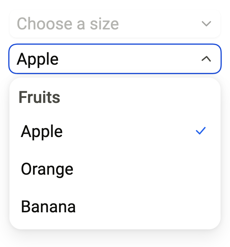
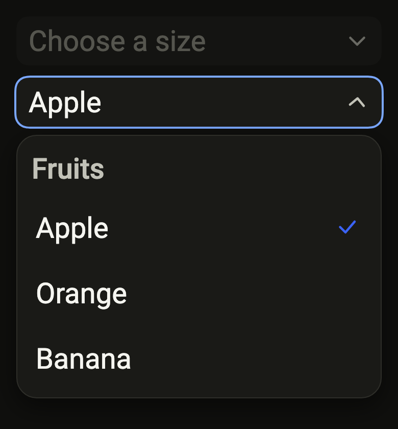
The list open, the current choice marked. A FlSelectController opens or closes it from code, for instance to ask again after a failed save.
import 'package:your_app/ui/fliin/components/select/fl_select.dart';
import 'package:flutter/widgets.dart';

class SelectOpenExample extends StatefulWidget {
  const SelectOpenExample({super.key, this.controller});

  final FlSelectController? controller;

  @override
  State<SelectOpenExample> createState() => _SelectOpenExampleState();
}

class _SelectOpenExampleState extends State<SelectOpenExample> {
  String? _state = 'ca';

  @override
  Widget build(BuildContext context) {
    return FlSelect<String>(
      controller: widget.controller,
      label: 'State',
      placeholder: 'Select one',
      listLabel: 'Choose a state',
      options: const [
        FlSelectOption(value: 'ca', label: 'California'),
        FlSelectOption(value: 'ny', label: 'New York'),
        FlSelectOption(value: 'tx', label: 'Texas'),
        FlSelectOption(value: 'fl', label: 'Florida'),
      ],
      selection: FlSingleSelection(value: _state, onChanged: (state) => setState(() => _state = state)),
    );
  }
}Disabled
onChanged: null disables the select: it keeps showing its value but no longer opens.

import 'package:your_app/ui/fliin/components/select/fl_select.dart';
import 'package:flutter/widgets.dart';

class SelectDisabledExample extends StatelessWidget {
  const SelectDisabledExample({super.key});

  @override
  Widget build(BuildContext context) {
    return const FlSelect<String>(
      label: 'State',
      placeholder: 'Select one',
      listLabel: 'Choose a state',
      options: [
        FlSelectOption(value: 'ca', label: 'California'),
        FlSelectOption(value: 'ny', label: 'New York'),
        FlSelectOption(value: 'tx', label: 'Texas'),
        FlSelectOption(value: 'fl', label: 'Florida'),
      ],
      selection: FlSingleSelection(value: 'ny', onChanged: null),
    );
  }
}Description
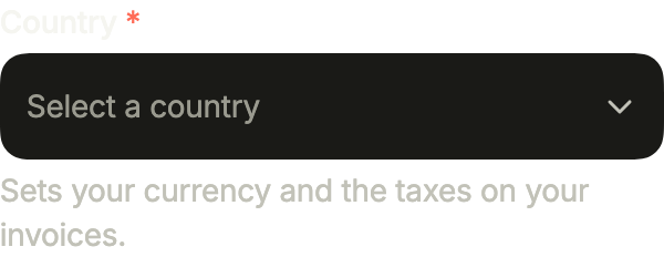
showLabel writes the label above the trigger, required adds its asterisk, and helper explains the choice below it, as on a text field.
import 'package:your_app/ui/fliin/components/select/fl_select.dart';
import 'package:flutter/widgets.dart';

class SelectDescriptionExample extends StatefulWidget {
  const SelectDescriptionExample({super.key});

  @override
  State<SelectDescriptionExample> createState() => _SelectDescriptionExampleState();
}

class _SelectDescriptionExampleState extends State<SelectDescriptionExample> {
  String? _country;

  @override
  Widget build(BuildContext context) {
    return FlSelect<String>(
      label: 'Country',
      showLabel: true,
      required: true,
      placeholder: 'Select a country',
      helper: 'Sets your currency and the taxes on your invoices.',
      options: const [
        FlSelectOption(value: 'fr', label: 'France'),
        FlSelectOption(value: 'de', label: 'Germany'),
        FlSelectOption(value: 'es', label: 'Spain'),
        FlSelectOption(value: 'it', label: 'Italy'),
      ],
      selection: FlSingleSelection(value: _country, onChanged: (country) => setState(() => _country = country)),
    );
  }
}Leading
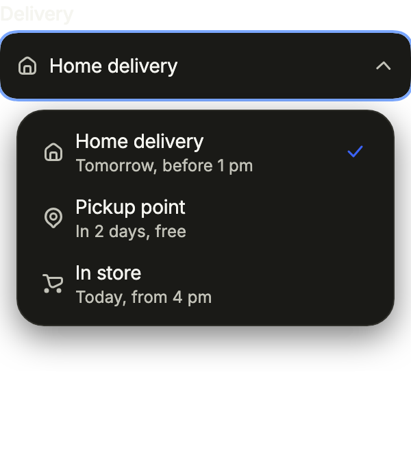
Each option's leading, an icon here, shows before its label in the list and, once chosen, in the trigger; description adds a line under the label.
import 'package:your_app/ui/fliin/components/select/fl_select.dart';
import 'package:your_app/ui/fliin/core/fliin.dart';
import 'package:your_app/ui/fliin/icons/fl_icons.dart';
import 'package:flutter/widgets.dart';

class SelectLeadingExample extends StatefulWidget {
  const SelectLeadingExample({super.key, this.controller});

  final FlSelectController? controller;

  @override
  State<SelectLeadingExample> createState() => _SelectLeadingExampleState();
}

class _SelectLeadingExampleState extends State<SelectLeadingExample> {
  String? _delivery = 'home';

  @override
  Widget build(BuildContext context) {
    return FlSelect<String>(
      controller: widget.controller,
      label: 'Delivery',
      showLabel: true,
      placeholder: 'Choose a delivery',
      options: [
        FlSelectOption(
          value: 'home',
          label: 'Home delivery',
          description: 'Tomorrow, before 1 pm',
          leading: FlIcon(FlIcons.house),
        ),
        FlSelectOption(
          value: 'pickup',
          label: 'Pickup point',
          description: 'In 2 days, free',
          leading: FlIcon(FlIcons.mapPin),
        ),
        FlSelectOption(
          value: 'store',
          label: 'In store',
          description: 'Today, from 4 pm',
          leading: FlIcon(FlIcons.shoppingCart),
        ),
      ],
      selection: FlSingleSelection(value: _delivery, onChanged: (delivery) => setState(() => _delivery = delivery)),
    );
  }
}Multiple
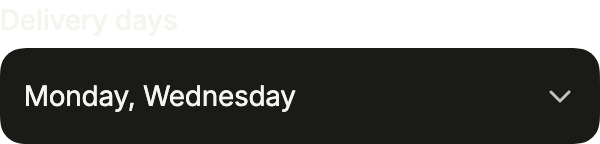
FlMultipleSelection keeps the list open while each option checks and unchecks; the trigger lists the chosen labels.
import 'package:your_app/ui/fliin/components/select/fl_select.dart';
import 'package:flutter/widgets.dart';

class SelectMultipleExample extends StatefulWidget {
  const SelectMultipleExample({super.key});

  @override
  State<SelectMultipleExample> createState() => _SelectMultipleExampleState();
}

class _SelectMultipleExampleState extends State<SelectMultipleExample> {
  var _days = const {'mon', 'wed'};

  @override
  Widget build(BuildContext context) {
    return FlSelect<String>(
      label: 'Delivery days',
      showLabel: true,
      placeholder: 'Select days',
      options: const [
        FlSelectOption(value: 'mon', label: 'Monday'),
        FlSelectOption(value: 'tue', label: 'Tuesday'),
        FlSelectOption(value: 'wed', label: 'Wednesday'),
        FlSelectOption(value: 'thu', label: 'Thursday'),
        FlSelectOption(value: 'fri', label: 'Friday'),
      ],
      selection: FlMultipleSelection(values: _days, onChanged: (days) => setState(() => _days = days)),
    );
  }
}Invalid
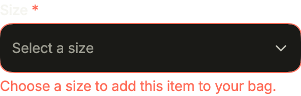
error rings the trigger in danger and replaces the helper, until the choice is made.
import 'package:your_app/ui/fliin/components/select/fl_select.dart';
import 'package:flutter/widgets.dart';

class SelectInvalidExample extends StatefulWidget {
  const SelectInvalidExample({super.key});

  @override
  State<SelectInvalidExample> createState() => _SelectInvalidExampleState();
}

class _SelectInvalidExampleState extends State<SelectInvalidExample> {
  String? _size;

  @override
  Widget build(BuildContext context) {
    return FlSelect<String>(
      label: 'Size',
      showLabel: true,
      required: true,
      placeholder: 'Select a size',
      helper: 'See the size guide for your measurements.',
      error: _size == null ? 'Choose a size to add this item to your bag.' : null,
      options: const [
        FlSelectOption(value: 's', label: 'Small'),
        FlSelectOption(value: 'm', label: 'Medium'),
        FlSelectOption(value: 'l', label: 'Large'),
      ],
      selection: FlSingleSelection(value: _size, onChanged: (size) => setState(() => _size = size)),
    );
  }
}Usage
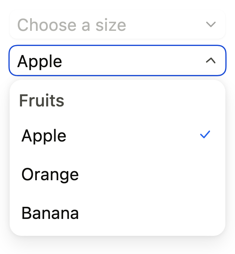
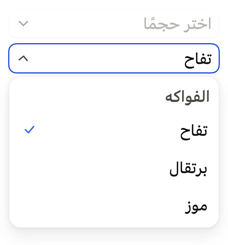
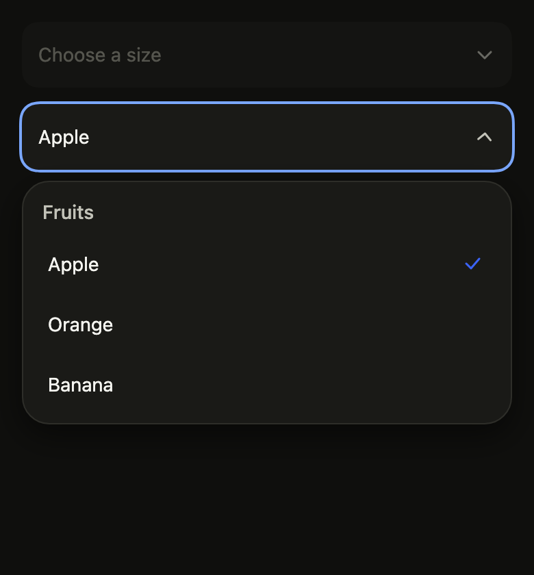
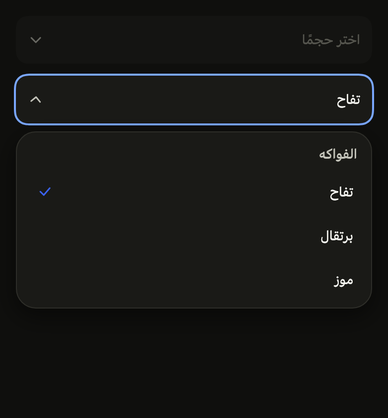
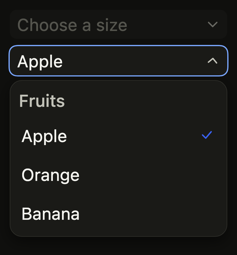
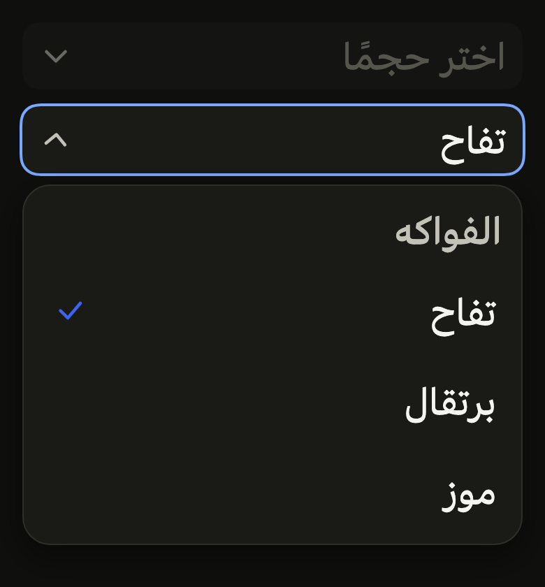
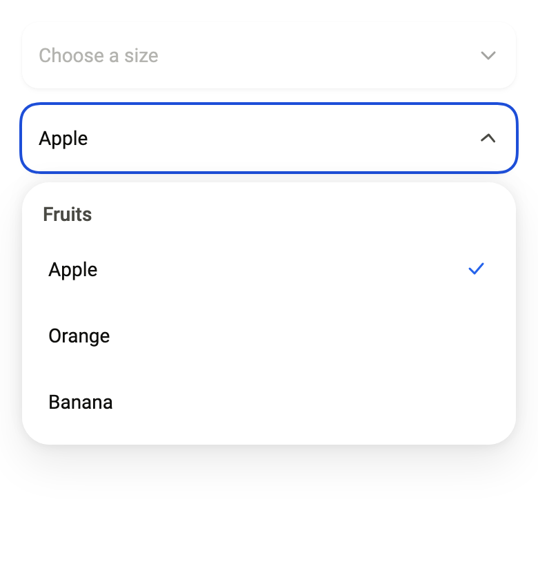
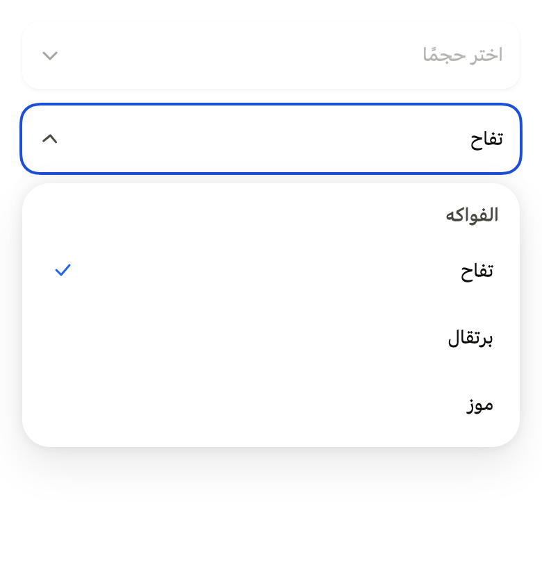
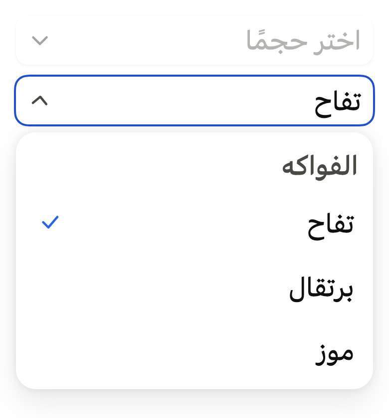
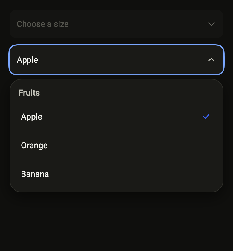
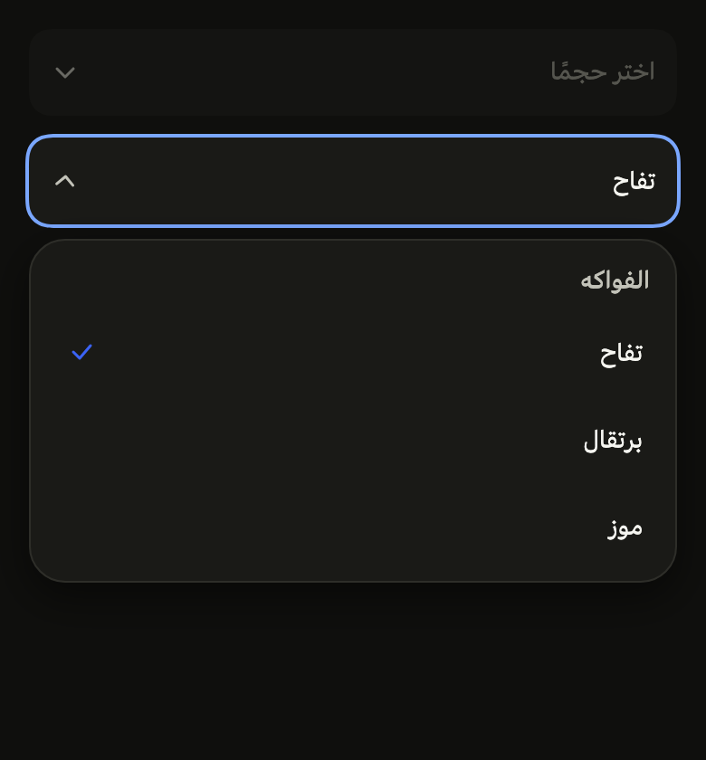
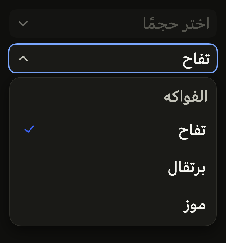
The code the reference images render:
final example = Overlay(
  initialEntries: [
    OverlayEntry(
      builder: (context) => ColoredBox(
        color: FlScope.of(context).colors.surface,
        child: Padding(
          padding: EdgeInsetsDirectional.all(FlScope.of(context).space.lg),
          child: Column(
            crossAxisAlignment: CrossAxisAlignment.stretch,
            spacing: FlScope.of(context).space.md,
            children: [
              FlSelect<int>(
                label: 'Size',
                placeholder: 'Choose a size',
                options: const [],
                selection: FlSingleSelection(value: null, onChanged: null),
              ),
              Builder(
                builder: (context) {
                  final controller = FlSelectController();
                  WidgetsBinding.instance.addPostFrameCallback(
                    (_) => controller.open(),
                  );
                  return FlSelect<int>(
                    controller: controller,
                    label: 'Fruit',
                    placeholder: 'Choose a fruit',
                    listLabel: 'Fruits',
                    options: [
                      for (final (i, name)
                          in (variant.dir == TextDirection.rtl
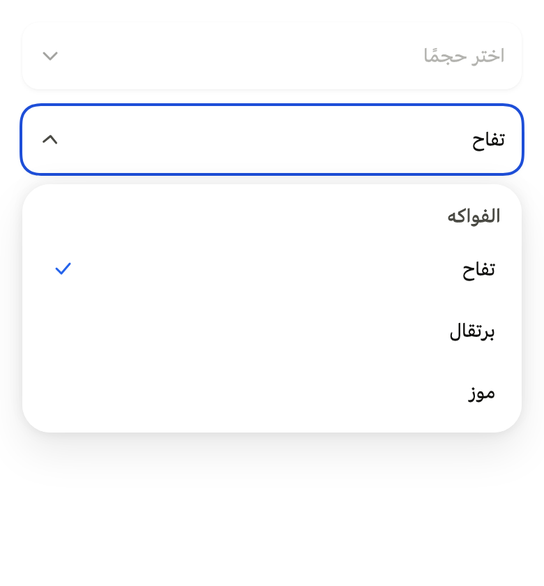
                                  ? const ['تفاح', 'برتقال', 'موز']
                                  : const ['Apple', 'Orange', 'Banana'])
                              .indexed)
                        FlSelectOption(value: i, label: name),
                    ],
                    selection: FlSingleSelection(value: 0, onChanged: (_) {}),
                  );
                },
              ),
            ],
          ),
        ),
      ),
    ),
  ],
);API
FlSelectOption: final class<T>
FlSelectOption.new: const new({required T value, required String label, String? description, Widget? leading, bool enabled})
FlSelectOption.value: get T
FlSelectOption.label: get String
FlSelectOption.description: get String?
FlSelectOption.leading: get Widget?
FlSelectOption.enabled: get bool
FlSelection: sealed class<T> permits {FlMultipleSelection, FlSingleSelection}
FlSelection.new: const new()
FlSingleSelection: final class<T> extends FlSelection<T>
FlSingleSelection.new: const new({required T? value, required ValueChanged<T>? onChanged})
FlSingleSelection.value: get T?
FlSingleSelection.onChanged: get ValueChanged<T>?
FlMultipleSelection: final class<T> extends FlSelection<T>
FlMultipleSelection.new: const new({required Set<T> values, required ValueChanged<Set<T>>? onChanged})
FlMultipleSelection.values: get Set<T>
FlMultipleSelection.onChanged: get ValueChanged<Set<T>>?
FlSelectController: class
FlSelectController.new: new()
FlSelectController.isOpen: get bool
FlSelectController.open: void()
FlSelectController.close: void()
FlSelectPresentation: enum {popover, sheet, dialog}
FlSelectPresentation.popover: static final FlSelectPresentation
FlSelectPresentation.sheet: static final FlSelectPresentation
FlSelectPresentation.dialog: static final FlSelectPresentation
FlSelect: class<T> extends StatefulWidget
FlSelect.new: const new({super.key, required List<FlSelectOption<T>> options, required FlSelection<T> selection, required String label, required String placeholder, String? listLabel, FlSelectPresentation presentation, String? barrierLabel, String? closeLabel, FlSelectController? controller, bool showLabel, String? helper, String? error, bool required, FlInputVariant variant})
FlSelect.options: get List<FlSelectOption<T>>
FlSelect.selection: get FlSelection<T>
FlSelect.label: get String
FlSelect.placeholder: get String
FlSelect.listLabel: get String?
FlSelect.presentation: get FlSelectPresentation
FlSelect.barrierLabel: get String?
FlSelect.closeLabel: get String?
FlSelect.controller: get FlSelectController?
FlSelect.showLabel: get bool
FlSelect.helper: get String?
FlSelect.error: get String?
FlSelect.required: get bool
FlSelect.variant: get FlInputVariant
FlSelect.createState: State<FlSelect<T>>()
FlSelectOptionRow: class<T> extends StatelessWidget
FlSelectOptionRow.new: const new({super.key, required FlSelectOption<T> option, required bool selected, required VoidCallback? onPressed, bool active})
FlSelectOptionRow.option: get FlSelectOption<T>
FlSelectOptionRow.selected: get bool
FlSelectOptionRow.onPressed: get VoidCallback?
FlSelectOptionRow.active: get bool
FlSelectOptionRow.build: Widget(BuildContext context)Reference renders
The 16 images published with version 0.2.5, rendered by the shared harness on macOS with Flutter 3.47.7. fliin verify select compares your copy to them.
Use it to
- pick a size or a quantity from a dropdown
- add a dropdown field to a form
- offer a fixed set of choices instead of free text
- let people pick several tags in one field
- choose a delivery method from a closed list
- Not for
- triggering an action: use a menu (menu)
- two or three choices always visible: use radio buttons (radio)
- entering free text: use a text field (text-field)
- a city or an address to find by typing: use a combo box (combo-box)
- States
Source
The files fliin add select copies into your app, before your prefix and imports are applied.
select/fl_select.dart
// Modified from the Select of HeroUI Native 1.0.10, Copyright 2025 NextUI Inc.,
// licensed under Apache 2.0: https://www.apache.org/licenses/LICENSE-2.0
import 'package:flutter/semantics.dart';
import 'package:flutter/services.dart';
import 'package:flutter/widgets.dart';
import 'package:fliin_ui/components/close_button/fl_close_button.dart';
import 'package:fliin_ui/components/dialog/fl_dialog.dart';
import 'package:fliin_ui/components/field/fl_field.dart';
import 'package:fliin_ui/components/popover/fl_popover.dart';
import 'package:fliin_ui/components/sheet/fl_sheet.dart';
import 'package:fliin_ui/components/text_field/fl_input.dart';
import 'package:fliin_ui/core/fliin.dart';
import 'package:fliin_ui/icons/fl_icons.dart';
/// An option of an [FlSelect].
final class FlSelectOption<T> {
/// An option with value [value].
const FlSelectOption({required this.value, required this.label, this.description, this.leading, this.enabled = true});
/// The value returned on choice.
final T value;
/// The option text (`Select.ItemLabel`), also shown in the trigger when
/// it is selected.
final String label;
/// The text under the label (`Select.ItemDescription`); null, no text.
final String? description;
/// What precedes the label, in the row and, once chosen, in the trigger
/// of a single selection: an `FlAvatar` of `sm` size for a person, a flag,
/// an icon (muted, 16 by default). Decorative: the label names the
/// option. When null, nothing.
final Widget? leading;
/// False: the option can't be picked.
final bool enabled;
}
/// What the select picks: one value, or several.
sealed class FlSelection<T> {
const FlSelection();
bool get _enabled;
bool _contains(T value);
/// True when picking closes the select.
bool get _closesOnChoice;
void _choose(T value);
}
/// At most one value; picking it closes the select.
final class FlSingleSelection<T> extends FlSelection<T> {
/// [value] selected, null without a choice; a null [onChanged] disables
/// the select.
const FlSingleSelection({required this.value, required this.onChanged});
/// The selected value, null without a choice.
final T? value;
/// Called with the selected value.
final ValueChanged<T>? onChanged;
@override
bool get _enabled => onChanged != null;
@override
bool _contains(T value) => this.value == value;
@override
bool get _closesOnChoice => true;
@override
void _choose(T value) => onChanged?.call(value);
}
/// Several values; each is checked and unchecked, and the select stays
/// open.
final class FlMultipleSelection<T> extends FlSelection<T> {
/// [values] selected; a null [onChanged] disables the select.
const FlMultipleSelection({required this.values, required this.onChanged});
/// The selected values.
final Set<T> values;
/// Called with the selected values.
final ValueChanged<Set<T>>? onChanged;
@override
bool get _enabled => onChanged != null;
@override
bool _contains(T value) => values.contains(value);
@override
bool get _closesOnChoice => false;
@override
void _choose(T value) => onChanged?.call(values.contains(value) ? ({...values}..remove(value)) : {...values, value});
}
/// Opens and closes the [FlSelect] it is given to, once that select is
/// mounted.
class FlSelectController {
_FlSelectState<Object?>? _state;
/// True when the list is open.
bool get isOpen => _state?._open ?? false;
/// Opens the list. No effect if it already is, or if the select is
/// disabled or not mounted.
void open() {
final state = _state;
if (state != null && !state._open && state.widget.selection._enabled) {
state._show();
}
}
/// Closes the list. No effect if it already is closed.
void close() {
if (isOpen) _state?._close();
}
}
/// How the select presents its options.
enum FlSelectPresentation {
/// A floating list under the trigger, at its width.
popover,
/// A bottom sheet ([showFlSheet]).
sheet,
/// A centered dialog ([showFlDialog]).
dialog,
}
/// A choice among options: a trigger like a field
/// (an `FlInputFrame`: `field` fill and shadow, no outline at rest, a
/// hairline under the pointer, continuous corners of `shape.radiusControl`) that shows the value or
/// [placeholder] and a chevron that turns around on opening, then the list
/// of options on an [FlPopover] as wide as the trigger, 8 points from it,
/// in a sheet or in a dialog. The chosen option carries a `selected` check:
/// a chosen state, never the accent.
///
/// The trigger is announced by [label] and the value, expanded or
/// collapsed; the list takes focus on opening, Escape and a tap outside
/// close it, and focus returns to the trigger. When disabled (null
/// `onChanged`), it fades to `disabledOpacity`.
class FlSelect<T> extends StatefulWidget {
/// A closed select.
const FlSelect({
super.key,
required this.options,
required this.selection,
required this.label,
required this.placeholder,
this.listLabel,
this.presentation = FlSelectPresentation.popover,
this.barrierLabel,
this.closeLabel,
this.controller,
this.showLabel = false,
this.helper,
this.error,
this.required = false,
this.variant = FlInputVariant.primary,
}) : assert(
presentation == FlSelectPresentation.popover || barrierLabel != null,
'a sheet or a dialog closes through its barrier, which must be named',
);
/// The options, in display order.
final List<FlSelectOption<T>> options;
/// The selected value, or values.
final FlSelection<T> selection;
/// The select's name, read with the value by the screen reader.
final String label;
/// The trigger text without a choice, in `fieldPlaceholder`.
final String placeholder;
/// The list title (`Select.ListLabel`); null, no title.
final String? listLabel;
/// Anchored list by default, sheet or dialog.
final FlSelectPresentation presentation;
/// The name of the sheet's or dialog's barrier, which closes it.
final String? barrierLabel;
/// The name of the dialog's close button (`Select.Close`); null, no
/// button.
final String? closeLabel;
/// To open and close the list without touching the trigger.
final FlSelectController? controller;
/// True: [label] shows above the trigger as an `FlLabel`, `flFieldGap`
/// apart, and fades with it when disabled, like an `FlTextField`'s. False
/// by default: the screen supplies its own label, or none.
final bool showLabel;
/// The help under the trigger (`Description`), in muted `textSm`,
/// replaced by [error] when there is one; read with the trigger. When
/// null, none.
final String? helper;
/// The error under the trigger (`FieldError`): when set, the trigger takes
/// a `danger` ring and the message replaces [helper], announced when it
/// appears. When null, the select is valid.
final String? error;
/// True: a `danger` asterisk follows the visible label ([showLabel]), and
/// the trigger is announced as required.
final bool required;
/// The trigger's background: `primary` by default (white and shadowed),
/// `secondary` on a surface, like an `FlTextField`'s.
final FlInputVariant variant;
@override
State<FlSelect<T>> createState() => _FlSelectState<T>();
}
class _FlSelectState<T> extends State<FlSelect<T>> with SingleTickerProviderStateMixin {
final FlPopoverController _popover = FlPopoverController();
late final AnimationController _turn = AnimationController.unbounded(vsync: this);
bool _open = false;
/// The open sheet or dialog, to close it.
BuildContext? _route;
@override
void initState() {
super.initState();
widget.controller?._state = this;
}
@override
void didUpdateWidget(FlSelect<T> oldWidget) {
super.didUpdateWidget(oldWidget);
if (oldWidget.controller != widget.controller) {
oldWidget.controller?._state = null;
widget.controller?._state = this;
}
if (widget.error case final error? when oldWidget.error == null && MediaQuery.supportsAnnounceOf(context)) {
SemanticsService.sendAnnouncement(View.of(context), error, Directionality.of(context));
}
}
@override
void dispose() {
if (widget.controller?._state == this) widget.controller?._state = null;
_turn.dispose();
super.dispose();
}
void _openChanged(bool open) {
if (!mounted || open == _open) return;
setState(() => _open = open);
final motion = FlMotion.of(context);
final target = open ? 1.0 : 0.0;
if (motion.reduced) {
_turn.value = target;
} else {
_turn.driveTo(target, FlSpringMotion(motion.tokens.indicator));
}
}
Future<void> _show() async {
switch (widget.presentation) {
case FlSelectPresentation.popover:
_popover.open();
case FlSelectPresentation.sheet:
_openChanged(true);
await showFlSheet<void>(
context,
label: widget.label,
barrierLabel: widget.barrierLabel!,
title: widget.listLabel,
builder: (context) {
_route = context;
return _List(select: widget, close: _close, listLabel: false);
},
);
_route = null;
_openChanged(false);
case FlSelectPresentation.dialog:
_openChanged(true);
await showFlDialog<void>(
context: context,
barrierLabel: widget.barrierLabel,
builder: (context) {
_route = context;
return _DialogPanel(select: widget, close: _close);
},
);
_route = null;
_openChanged(false);
}
}
void _close() {
switch (widget.presentation) {
case FlSelectPresentation.popover:
_popover.close();
case FlSelectPresentation.sheet || FlSelectPresentation.dialog:
if (_route case final route? when route.mounted) {
Navigator.of(route).pop();
}
}
}
@override
Widget build(BuildContext context) {
final trigger = _Trigger(
select: widget,
open: _open,
turn: _turn,
onPressed: widget.selection._enabled ? (_open ? _close : _show) : null,
);
final theme = FlScope.of(context);
if (widget.presentation != FlSelectPresentation.popover) {
return _labelled(theme, trigger);
}
return _labelled(
theme,
FlPopover(
controller: _popover,
label: widget.label,
offset: theme.size.selectOffset,
matchAnchorWidth: true,
fitBesideAnchor: true,
// Izydesk's listbox: 6 around the options.
padding: EdgeInsetsDirectional.all(theme.space.xs * 1.5),
onOpenChanged: _openChanged,
content: _List(select: widget, close: _close, listLabel: true),
child: trigger,
),
);
}
/// [field] under its visible label when [FlSelect.showLabel], the trigger
/// reading the label itself.
Widget _labelled(FlTheme theme, Widget field) {
final helper = widget.helper;
final error = widget.error;
if (!widget.showLabel && helper == null && error == null) return field;
final disabled = !widget.selection._enabled;
return Column(
mainAxisSize: MainAxisSize.min,
crossAxisAlignment: CrossAxisAlignment.stretch,
spacing: flFieldGap(theme),
children: [
if (widget.showLabel)
Align(
alignment: AlignmentDirectional.centerStart,
child: ExcludeSemantics(
child: FlLabel(widget.label, disabled: disabled, required: widget.required),
),
),
field,
// Tight around their text, like a text field's: at full width, the
// contrast check took the trigger's shadow as their background.
if (error != null)
Align(
alignment: AlignmentDirectional.centerStart,
child: ExcludeSemantics(
// Read in the trigger's hint and announced where the platform
// can; a live region elsewhere (Android).
excluding: MediaQuery.supportsAnnounceOf(context),
child: FlFieldError(error, invalid: true),
),
)
else if (helper != null)
Align(
alignment: AlignmentDirectional.centerStart,
child: ExcludeSemantics(child: FlDescription(helper, invalid: false, disabled: disabled)),
),
],
);
}
}
/// The trigger (`Select.Trigger` in its `default` variant).
class _Trigger<T> extends StatelessWidget {
const _Trigger({required this.select, required this.open, required this.turn, required this.onPressed});
final FlSelect<T> select;
final bool open;
final Animation<double> turn;
final VoidCallback? onPressed;
@override
Widget build(BuildContext context) {
final theme = FlScope.of(context);
final colors = theme.colors;
final radius = theme.shape.radiusControl;
final chosen = [
for (final option in select.options)
if (select.selection._contains(option.value)) option.label,
];
final display = chosen.isEmpty ? null : chosen.join(', ');
// The chosen option's leading, in a single selection only: several
// would not fit beside their labels.
final leading = switch (select.selection) {
FlSingleSelection(:final value?) => select.options.where((option) => option.value == value).firstOrNull?.leading,
_ => null,
};
final announces = MediaQuery.supportsAnnounceOf(context);
final described = select.error == null ? select.helper : (announces ? select.error : null);
final hint = [?(display == null ? select.placeholder : null), ?described].join('\n');
return FlPressable(
onPressed: onPressed,
borderRadius: BorderRadius.circular(radius),
scaleOnPress: false,
overlay: FlPressOverlay.none,
expanded: open,
builder: (context, states) => Semantics(
label: select.label,
value: display,
hint: hint.isEmpty ? null : hint,
isRequired: select.required ? true : null,
excludeSemantics: true,
child: Opacity(
opacity: states.contains(WidgetState.disabled) ? theme.size.disabledOpacity : 1,
// Open, the trigger carries the focus ring, like a field being typed in.
child: FlInputFrame(
variant: select.variant,
outline: select.error == null ? null : colors.danger,
focused: open,
hovered: states.contains(WidgetState.hovered),
// Izydesk's `.input.select-trigger`: the control height, `textSm`.
child: ConstrainedBox(
constraints: BoxConstraints(minHeight: theme.controlHeight),
child: Padding(
padding: EdgeInsetsDirectional.symmetric(horizontal: theme.space.md, vertical: theme.space.xs),
child: Row(
spacing: theme.space.sm,
children: [
if (leading != null) _leading(context, leading),
Expanded(
child: flPopoverText(
context,
FlTextRole.textSm,
color: display == null ? colors.fieldPlaceholder : colors.onSurface,
child: Text(display ?? select.placeholder, maxLines: 1, overflow: TextOverflow.ellipsis),
),
),
RotationTransition(
turns: turn.drive(Tween(begin: 0, end: -0.5)),
child: FlIcon(
FlIcons.chevronDown,
size: _iconScale(context, theme.size.indicatorIcon),
color: colors.onSurfaceMuted,
),
),
],
),
),
),
),
),
),
);
}
}
/// The option list, with its title (`Select.ListLabel`) when [listLabel] is
/// true. It scrolls within the space its panel leaves it; the up and down
/// arrows move from one option to the next, Home and End go to the first
/// and the last.
class _List<T> extends StatefulWidget {
const _List({required this.select, required this.close, required this.listLabel});
final FlSelect<T> select;
final VoidCallback close;
final bool listLabel;
@override
State<_List<T>> createState() => _ListState<T>();
}
class _ListState<T> extends State<_List<T>> {
final FocusNode _options = FocusNode(debugLabel: 'FlSelect', skipTraversal: true, canRequestFocus: false);
@override
void dispose() {
_options.dispose();
super.dispose();
}
/// [step] options past the focused one, clamped at the ends; the first or
/// the last when [step] is infinite.
void _move(int step) {
final nodes = _options.traversalDescendants.where((node) => node.canRequestFocus).toList();
if (nodes.isEmpty) return;
final at = nodes.indexWhere((node) => node.hasPrimaryFocus);
final next = switch (step) {
< -1 => 0,
> 1 => nodes.length - 1,
_ => at < 0 ? 0 : (at + step).clamp(0, nodes.length - 1),
};
nodes[next].requestFocus();
}
@override
Widget build(BuildContext context) {
final theme = FlScope.of(context);
final select = widget.select;
final title = select.listLabel;
return CallbackShortcuts(
bindings: {
const SingleActivator(LogicalKeyboardKey.arrowDown): () => _move(1),
const SingleActivator(LogicalKeyboardKey.arrowUp): () => _move(-1),
const SingleActivator(LogicalKeyboardKey.home): () => _move(-2),
const SingleActivator(LogicalKeyboardKey.end): () => _move(2),
},
child: Focus(
focusNode: _options,
child: SingleChildScrollView(
child: Column(
mainAxisSize: MainAxisSize.min,
crossAxisAlignment: CrossAxisAlignment.stretch,
children: [
if (widget.listLabel && title != null)
Padding(
// `px-2 py-1.5`.
padding: EdgeInsetsDirectional.symmetric(horizontal: theme.space.sm, vertical: theme.space.xs * 1.5),
child: Semantics(
header: true,
child: flPopoverText(
context,
FlTextRole.textSm,
color: theme.colors.onSurfaceMuted,
weight: theme.tokens.typography.weight.medium,
child: Text(title),
),
),
),
for (final option in select.options)
FlSelectOptionRow(
option: option,
selected: select.selection._contains(option.value),
onPressed: select.selection._enabled && option.enabled
? () {
select.selection._choose(option.value);
if (select.selection._closesOnChoice) widget.close();
}
: null,
),
],
),
),
),
);
}
}
/// An option of a list (Izydesk's `.option`), the rows of [FlSelect] and of
/// `FlComboBox`: `space.md` around a `textSm` label, 44 high on one line, its
/// muted `textSm` description under it, a 16 `selected` check when it is
/// chosen, on `control` with `radiusControl` corners when pressed, hovered,
/// focused or [active]. The screen reader reads the label and the
/// description, and the chosen option as selected.
class FlSelectOptionRow<T> extends StatelessWidget {
/// The row of [option].
const FlSelectOptionRow({
super.key,
required this.option,
required this.selected,
required this.onPressed,
this.active = false,
});
/// The option shown.
final FlSelectOption<T> option;
/// Chosen: the check, and `selected` for the screen reader.
final bool selected;
/// Called on tap; null with a disabled option or selection.
final VoidCallback? onPressed;
/// Designated from the keyboard while the focus stays elsewhere (the
/// suggestion of a combo box): the hovered look.
final bool active;
@override
Widget build(BuildContext context) {
final theme = FlScope.of(context);
final colors = theme.colors;
final description = option.description;
return FlPressable(
onPressed: onPressed,
borderRadius: BorderRadius.circular(theme.shape.radiusControl),
scaleOnPress: false,
overlay: FlPressOverlay.none,
focusRing: FlFocusRingPlacement.inside,
builder: (context, states) => Semantics(
label: description == null ? option.label : '${option.label}\n$description',
selected: selected,
excludeSemantics: true,
child: Opacity(
opacity: option.enabled ? 1 : theme.size.disabledOpacity,
child: DecoratedBox(
decoration: ShapeDecoration(
color: active || states.any({WidgetState.pressed, WidgetState.hovered, WidgetState.focused}.contains)
? colors.control
: null,
shape: FlContinuousBorder(radius: theme.shape.radiusControl),
),
// Izydesk's two-line `.option`: 6 above and below, the
// description in `textXs`, still 44 high at least.
child: ConstrainedBox(
constraints: BoxConstraints(minHeight: theme.hitTarget),
child: Padding(
padding: EdgeInsetsDirectional.symmetric(
horizontal: theme.space.md,
vertical: description == null ? theme.space.md : theme.space.xs * 1.5,
),
child: Row(
spacing: theme.space.sm,
children: [
if (option.leading case final leading?) _leading(context, leading),
Expanded(
child: Column(
mainAxisSize: MainAxisSize.min,
crossAxisAlignment: CrossAxisAlignment.start,
children: [
flPopoverText(context, FlTextRole.textSm, color: colors.onSurface, child: Text(option.label)),
if (description != null)
flPopoverText(
context,
FlTextRole.textXs,
color: colors.onSurfaceMuted,
child: Text(description),
),
],
),
),
if (selected)
// Centered in a 43.5-point line, Yoga snaps it to the
// pixel.
FlPixelSnap(
child: SizedBox.square(
dimension: _iconScale(context, theme.size.indicatorBox),
child: Center(
child: FlIcon(
FlIcons.check,
size: _iconScale(context, theme.size.indicatorIcon),
color: colors.selected,
),
),
),
),
],
),
),
),
),
),
),
);
}
}
/// The select's dialog (`select__dialog-content`): centered 20 from the
/// edges, `p-5`, `surfaceOverlay`, continuous `radiusCard` corners,
/// `overlay` shadow; the close button, the list title, then the options.
class _DialogPanel<T> extends StatelessWidget {
const _DialogPanel({required this.select, required this.close});
final FlSelect<T> select;
final VoidCallback close;
@override
Widget build(BuildContext context) {
final theme = FlScope.of(context);
final radius = theme.shape.radiusCard;
final padding = theme.space.xs * 5;
final closeLabel = select.closeLabel;
return LayoutBuilder(
builder: (context, constraints) => Stack(
children: [
Positioned.fromRect(
rect: flAnchorBounds(
overlay: constraints.biggest,
padding: MediaQuery.paddingOf(context),
viewInsets: MediaQuery.viewInsetsOf(context),
margin: padding,
),
child: Center(
child: ConstrainedBox(
constraints: BoxConstraints(maxWidth: theme.size.dialogMaxWidth),
child: Semantics(
container: true,
explicitChildNodes: true,
scopesRoute: true,
namesRoute: true,
label: select.label,
child: FlPixelSnap(
child: FlShadow(
layers: theme.shadows.overlay,
shape: RoundedRectangleBorder(borderRadius: BorderRadius.circular(radius)),
child: DecoratedBox(
decoration: ShapeDecoration(
color: theme.colors.surfaceOverlay,
shape: FlContinuousBorder(radius: radius),
),
child: Padding(
padding: EdgeInsetsDirectional.all(padding),
child: Column(
mainAxisSize: MainAxisSize.min,
crossAxisAlignment: CrossAxisAlignment.stretch,
children: [
if (closeLabel != null)
Align(
alignment: AlignmentDirectional.centerEnd,
child: FlCloseButton(label: closeLabel, onPressed: close),
),
Flexible(
child: _List(select: select, close: close, listLabel: true),
),
],
),
),
),
),
),
),
),
),
),
],
),
);
}
}
/// [extent] following the text scale, up to `size.iconMaxScale`.
double _iconScale(BuildContext context, double extent) =>
MediaQuery.textScalerOf(context).clamp(maxScaleFactor: FlScope.of(context).size.iconMaxScale).scale(extent);
/// An option's [FlSelectOption.leading]: muted icons at the indicator size,
/// following the text scale; never read.
Widget _leading(BuildContext context, Widget leading) {
final theme = FlScope.of(context);
return ExcludeSemantics(
child: IconTheme.merge(
data: IconThemeData(color: theme.colors.onSurfaceMuted, size: _iconScale(context, theme.size.indicatorIcon)),
child: leading,
),
);
}