Components / forms
Number field
Sets a quantity or a number of guests between two limits, typed or nudged with minus and plus buttons that repeat while held, read out as an adjustable value.
Import
In a Flutter app where fliin init has run:
Examples
Example
Number fields with a minus and a plus button around the value, bounded by min and max. helper sets the limit out; FlInputVariant.secondary suits a raised surface.
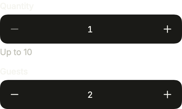
import 'package:your_app/ui/fliin/components/number_field/fl_number_field.dart';
import 'package:your_app/ui/fliin/components/text_field/fl_text_field.dart';
import 'package:your_app/ui/fliin/core/fliin.dart';
import 'package:flutter/widgets.dart';

class NumberFieldExample extends StatefulWidget {
  const NumberFieldExample({super.key});

  @override
  State<NumberFieldExample> createState() => _NumberFieldExampleState();
}

class _NumberFieldExampleState extends State<NumberFieldExample> {
  var _quantity = 1.0;
  var _guests = 2.0;

  @override
  Widget build(BuildContext context) {
    return Column(
      mainAxisSize: MainAxisSize.min,
      crossAxisAlignment: CrossAxisAlignment.stretch,
      spacing: FlScope.of(context).space.md,
      children: [
        FlNumberField(
          key: const ValueKey('quantity'),
          label: 'Quantity',
          value: _quantity,
          min: 1,
          max: 10,
          format: const FlIntegerFormat(),
          decrementLabel: 'Decrease',
          incrementLabel: 'Increase',
          helper: 'Up to 10',
          onChanged: (value) => setState(() => _quantity = value),
        ),
        FlNumberField(
          key: const ValueKey('guests'),
          label: 'Guests',
          value: _guests,
          min: 1,
          max: 10,
          format: const FlIntegerFormat(),
          decrementLabel: 'Decrease',
          incrementLabel: 'Increase',
          variant: FlInputVariant.secondary,
          onChanged: (value) => setState(() => _guests = value),
        ),
      ],
    );
  }
}Value
A number field holding a value: typing or the buttons change it, within min and max.

import 'package:your_app/ui/fliin/components/number_field/fl_number_field.dart';
import 'package:flutter/widgets.dart';

class NumberFieldValueExample extends StatefulWidget {
  const NumberFieldValueExample({super.key});

  @override
  State<NumberFieldValueExample> createState() => _NumberFieldValueExampleState();
}

class _NumberFieldValueExampleState extends State<NumberFieldValueExample> {
  var _value = 2.0;

  @override
  Widget build(BuildContext context) {
    return FlNumberField(
      label: 'Quantity',
      value: _value,
      min: 1,
      max: 10,
      format: const FlIntegerFormat(),
      decrementLabel: 'Decrease',
      incrementLabel: 'Increase',
      onChanged: (value) => setState(() => _value = value),
    );
  }
}Bound
At min, the minus button turns off: the value cannot go lower.

import 'package:your_app/ui/fliin/components/number_field/fl_number_field.dart';
import 'package:flutter/widgets.dart';

class NumberFieldBoundExample extends StatefulWidget {
  const NumberFieldBoundExample({super.key});

  @override
  State<NumberFieldBoundExample> createState() => _NumberFieldBoundExampleState();
}

class _NumberFieldBoundExampleState extends State<NumberFieldBoundExample> {
  var _value = 1.0;

  @override
  Widget build(BuildContext context) {
    return FlNumberField(
      label: 'Guests',
      value: _value,
      min: 1,
      max: 10,
      format: const FlIntegerFormat(),
      decrementLabel: 'Decrease',
      incrementLabel: 'Increase',
      onChanged: (value) => setState(() => _value = value),
    );
  }
}Secondary
FlInputVariant.secondary, for a field on a raised surface.

import 'package:your_app/ui/fliin/components/number_field/fl_number_field.dart';
import 'package:your_app/ui/fliin/components/text_field/fl_text_field.dart';
import 'package:flutter/widgets.dart';

class NumberFieldSecondaryExample extends StatefulWidget {
  const NumberFieldSecondaryExample({super.key});

  @override
  State<NumberFieldSecondaryExample> createState() => _NumberFieldSecondaryExampleState();
}

class _NumberFieldSecondaryExampleState extends State<NumberFieldSecondaryExample> {
  var _value = 3.0;

  @override
  Widget build(BuildContext context) {
    return FlNumberField(
      label: 'Nights',
      value: _value,
      min: 1,
      max: 10,
      format: const FlIntegerFormat(),
      decrementLabel: 'Decrease',
      incrementLabel: 'Increase',
      variant: FlInputVariant.secondary,
      onChanged: (value) => setState(() => _value = value),
    );
  }
}Invalid
A value above max: error says what is allowed.
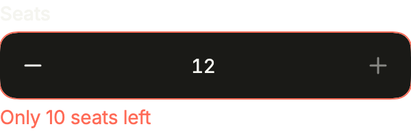
import 'package:your_app/ui/fliin/components/number_field/fl_number_field.dart';
import 'package:flutter/widgets.dart';

class NumberFieldInvalidExample extends StatefulWidget {
  const NumberFieldInvalidExample({super.key});

  @override
  State<NumberFieldInvalidExample> createState() => _NumberFieldInvalidExampleState();
}

class _NumberFieldInvalidExampleState extends State<NumberFieldInvalidExample> {
  var _value = 12.0;

  @override
  Widget build(BuildContext context) {
    return FlNumberField(
      label: 'Seats',
      value: _value,
      min: 1,
      max: 10,
      format: const FlIntegerFormat(),
      decrementLabel: 'Decrease',
      incrementLabel: 'Increase',
      error: 'Only 10 seats left',
      onChanged: (value) => setState(() => _value = value),
    );
  }
}Disabled
enabled: false locks the value and both buttons.

import 'package:your_app/ui/fliin/components/number_field/fl_number_field.dart';
import 'package:flutter/widgets.dart';

class NumberFieldDisabledExample extends StatefulWidget {
  const NumberFieldDisabledExample({super.key});

  @override
  State<NumberFieldDisabledExample> createState() => _NumberFieldDisabledExampleState();
}

class _NumberFieldDisabledExampleState extends State<NumberFieldDisabledExample> {
  var _value = 4.0;

  @override
  Widget build(BuildContext context) {
    return FlNumberField(
      label: 'Rooms',
      value: _value,
      min: 1,
      max: 10,
      format: const FlIntegerFormat(),
      decrementLabel: 'Decrease',
      incrementLabel: 'Increase',
      enabled: false,
      onChanged: (value) => setState(() => _value = value),
    );
  }
}Formats
FlDecimalFormat writes a price, a unit or a percentage, and reads it back with or without its symbol. Set its separators to the app's language.
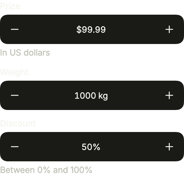
import 'package:your_app/ui/fliin/components/number_field/fl_number_field.dart';
import 'package:your_app/ui/fliin/core/fliin.dart';
import 'package:flutter/widgets.dart';

class NumberFieldFormatsExample extends StatefulWidget {
  const NumberFieldFormatsExample({super.key});

  @override
  State<NumberFieldFormatsExample> createState() => _NumberFieldFormatsExampleState();
}

class _NumberFieldFormatsExampleState extends State<NumberFieldFormatsExample> {
  var _price = 99.99;
  var _weight = 1000.0;
  var _discount = 0.5;

  @override
  Widget build(BuildContext context) {
    return Column(
      mainAxisSize: MainAxisSize.min,
      crossAxisAlignment: CrossAxisAlignment.stretch,
      spacing: FlScope.of(context).space.md,
      children: [
        FlNumberField(
          key: const ValueKey('price'),
          label: 'Price',
          value: _price,
          min: 0,
          step: 0.01,
          format: const FlDecimalFormat(prefix: r'$', groupSeparator: ','),
          decrementLabel: 'Decrease',
          incrementLabel: 'Increase',
          helper: 'In US dollars',
          onChanged: (value) => setState(() => _price = value),
        ),
        FlNumberField(
          key: const ValueKey('weight'),
          label: 'Weight',
          value: _weight,
          min: 0,
          step: 50,
          format: const FlDecimalFormat(fractionDigits: 0, suffix: ' kg'),
          decrementLabel: 'Decrease',
          incrementLabel: 'Increase',
          onChanged: (value) => setState(() => _weight = value),
        ),
        FlNumberField(
          key: const ValueKey('discount'),
          label: 'Discount',
          value: _discount,
          min: 0,
          max: 1,
          step: 0.05,
          format: const FlDecimalFormat.percent(),
          decrementLabel: 'Decrease',
          incrementLabel: 'Increase',
          helper: 'Between 0% and 100%',
          onChanged: (value) => setState(() => _discount = value),
        ),
      ],
    );
  }
}Custom icons
decrementIcon and incrementIcon replace the minus and the plus.

import 'package:your_app/ui/fliin/components/number_field/fl_number_field.dart';
import 'package:your_app/ui/fliin/icons/fl_icons.dart';
import 'package:flutter/widgets.dart';

class NumberFieldCustomIconsExample extends StatefulWidget {
  const NumberFieldCustomIconsExample({super.key});

  @override
  State<NumberFieldCustomIconsExample> createState() => _NumberFieldCustomIconsExampleState();
}

class _NumberFieldCustomIconsExampleState extends State<NumberFieldCustomIconsExample> {
  var _floor = 3.0;

  @override
  Widget build(BuildContext context) {
    return FlNumberField(
      label: 'Floor',
      value: _floor,
      min: 0,
      max: 40,
      format: const FlIntegerFormat(),
      decrementLabel: 'Floor below',
      incrementLabel: 'Floor above',
      decrementIcon: FlIcons.chevronDown,
      incrementIcon: FlIcons.chevronUp,
      onChanged: (value) => setState(() => _floor = value),
    );
  }
}Usage
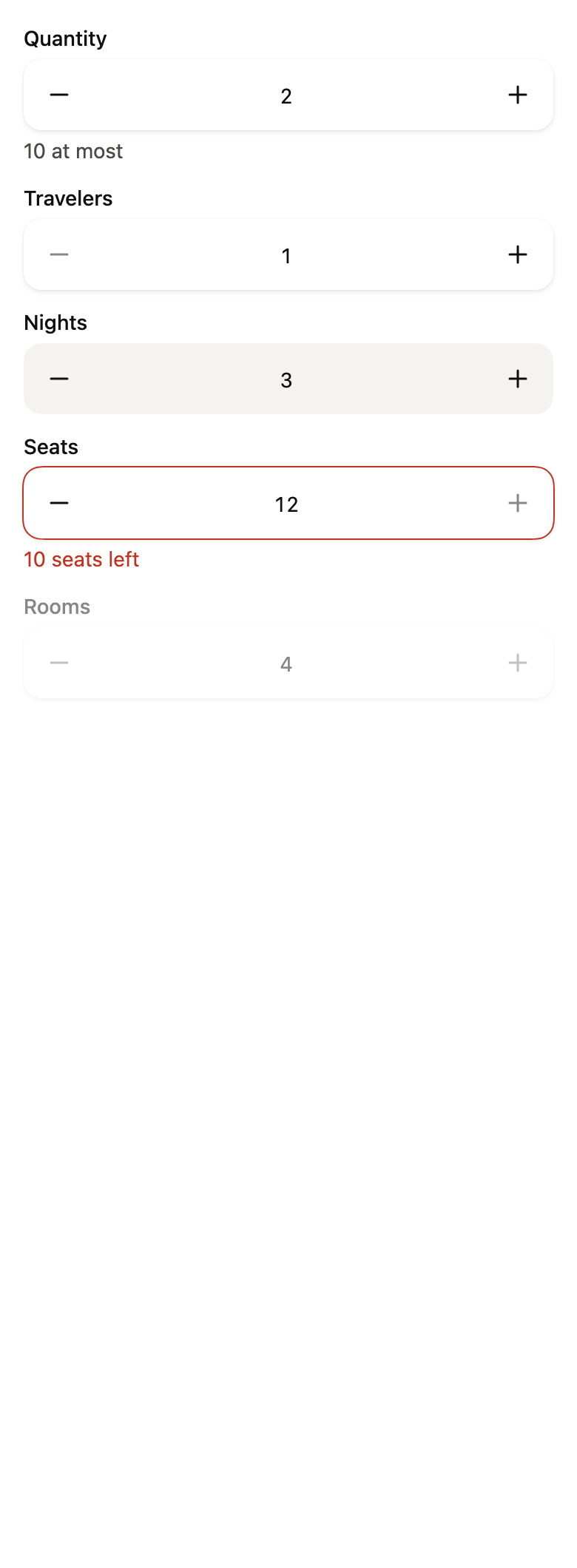
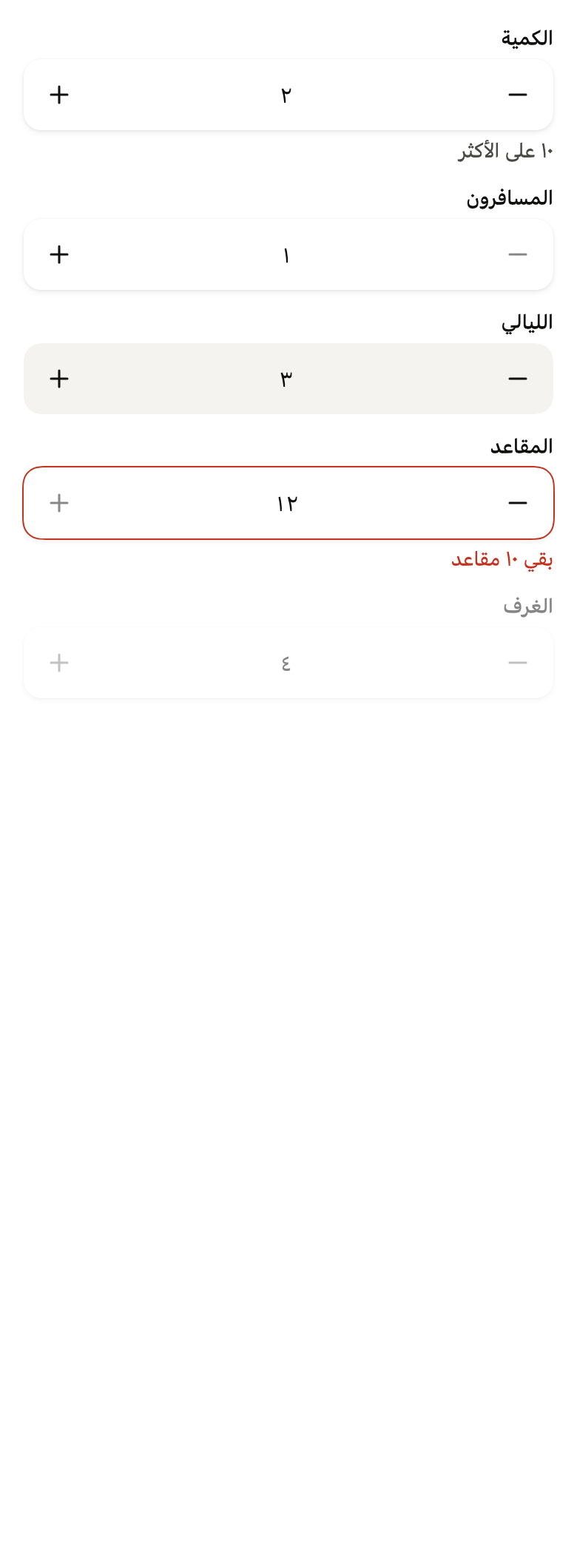
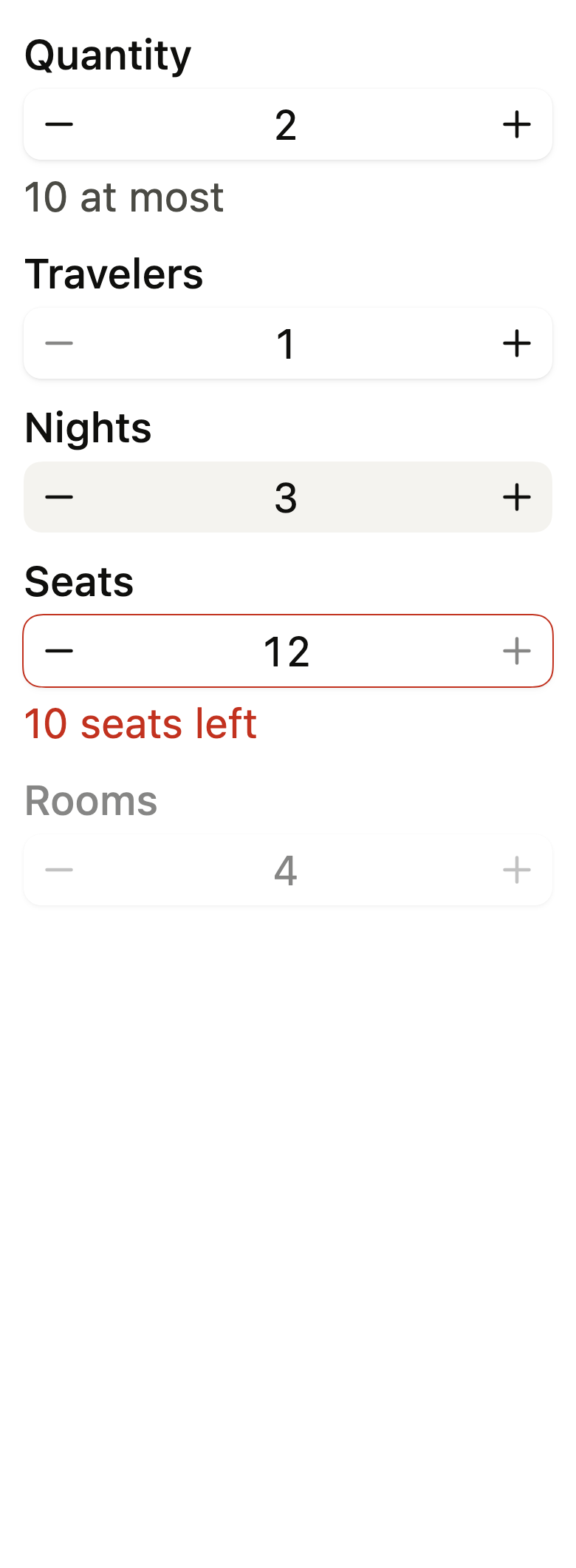
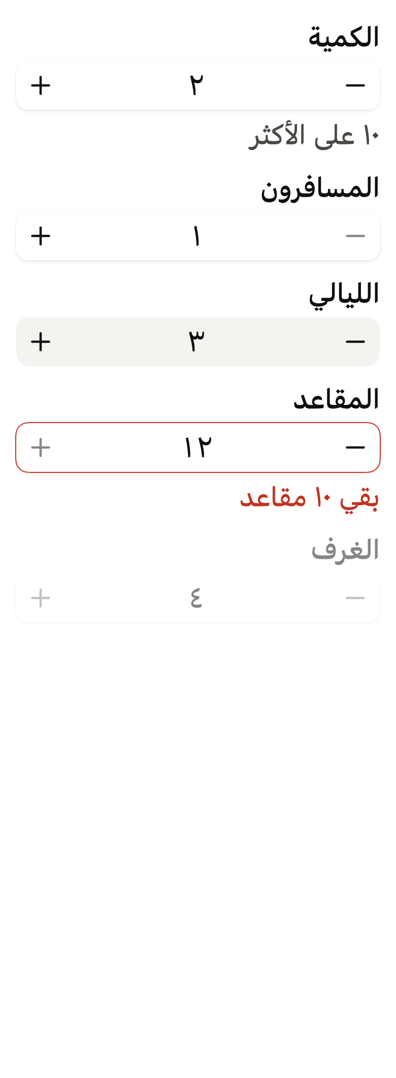
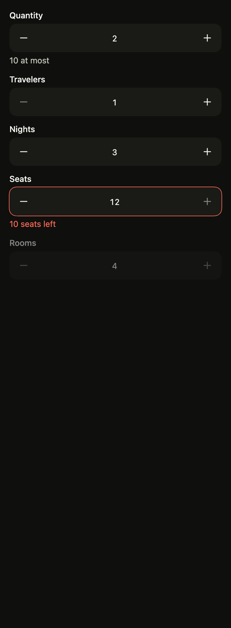
The code the reference images render:
final example = Localizations(
  locale: const Locale('en'),
  delegates: const [DefaultWidgetsLocalizations.delegate],
  child: Directionality(
    textDirection: variant.dir,
    child: Overlay(
      initialEntries: [
        OverlayEntry(
          builder: (context) => ColoredBox(
            color: FlScope.of(context).colors.surface,
            child: Padding(
              padding: EdgeInsetsDirectional.all(FlScope.of(context).space.lg),
              child: Column(
                crossAxisAlignment: CrossAxisAlignment.stretch,
                spacing: FlScope.of(context).space.md,
                children: [
                  FlNumberField(
                    label: 'Quantity',
                    value: 2,
                    min: 1,
                    max: 10,
                    format: FlIntegerFormat(
                      digits: variant.dir == TextDirection.rtl
                          ? FlDigits.arabicIndic
                          : FlDigits.latin,
                    ),
                    decrementLabel: 'Decrease',
                    incrementLabel: 'Increase',
                    helper: '10 at most',
                    onChanged: (_) {},
                  ),
                  FlNumberField(
                    label: 'Travelers',
                    value: 1,
                    min: 1,
                    max: 10,
                    format: FlIntegerFormat(
                      digits: variant.dir == TextDirection.rtl
                          ? FlDigits.arabicIndic
                          : FlDigits.latin,
                    ),
                    decrementLabel: 'Decrease',
                    incrementLabel: 'Increase',
                    onChanged: (_) {},
                  ),
                  FlNumberField(
                    label: 'Nights',
                    value: 3,
                    min: 1,
                    max: 10,
                    format: FlIntegerFormat(
                      digits: variant.dir == TextDirection.rtl
                          ? FlDigits.arabicIndic
                          : FlDigits.latin,
                    ),
                    decrementLabel: 'Decrease',
                    incrementLabel: 'Increase',
                    variant: FlInputVariant.secondary,
                    onChanged: (_) {},
                  ),
                  FlNumberField(
                    label: 'Seats',
                    value: 12,
                    min: 1,
                    max: 10,
                    format: FlIntegerFormat(
                      digits: variant.dir == TextDirection.rtl
                          ? FlDigits.arabicIndic
                          : FlDigits.latin,
                    ),
                    decrementLabel: 'Decrease',
                    incrementLabel: 'Increase',
                    error: '10 seats left',
                    onChanged: (_) {},
                  ),
                  FlNumberField(
                    label: 'Rooms',
                    value: 4,
                    min: 1,
                    max: 10,
                    format: FlIntegerFormat(
                      digits: variant.dir == TextDirection.rtl
                          ? FlDigits.arabicIndic
                          : FlDigits.latin,
                    ),
                    decrementLabel: 'Decrease',
                    incrementLabel: 'Increase',
                    enabled: false,
                    onChanged: (_) {},
                  ),
                ],
              ),
            ),
          ),
        ),
      ],
    ),
  ),
);API
FlDigits: enum {latin, arabicIndic, extendedArabicIndic}
FlDigits.latin: static final FlDigits
FlDigits.arabicIndic: static final FlDigits
FlDigits.extendedArabicIndic: static final FlDigits
flDigitsOf: FlDigits(Locale? locale)
FlNumberFormat: abstract interface class
FlNumberFormat.new: new()
FlNumberFormat.format: abstract String(double value)
FlNumberFormat.parse: abstract double?(String text)
FlNumberFormat.decimal: abstract get bool
FlIntegerFormat: final class implements FlNumberFormat
FlIntegerFormat.new: const new({FlDigits digits})
FlIntegerFormat.digits: get FlDigits
FlIntegerFormat.decimal: get bool
FlIntegerFormat.operator ==: bool(Object other)
FlIntegerFormat.hashCode: get int
FlIntegerFormat.format: String(double value)
FlIntegerFormat.parse: double?(String text)
FlDecimalFormat: final class implements FlNumberFormat
FlDecimalFormat.new: const new({int fractionDigits, String prefix, String suffix, double factor, String decimalSeparator, String? groupSeparator, FlDigits digits})
FlDecimalFormat.percent: const new({int fractionDigits, String suffix, String decimalSeparator, FlDigits digits})
FlDecimalFormat.fractionDigits: get int
FlDecimalFormat.prefix: get String
FlDecimalFormat.suffix: get String
FlDecimalFormat.factor: get double
FlDecimalFormat.decimalSeparator: get String
FlDecimalFormat.groupSeparator: get String?
FlDecimalFormat.digits: get FlDigits
FlDecimalFormat.decimal: get bool
FlDecimalFormat.operator ==: bool(Object other)
FlDecimalFormat.hashCode: get int
FlDecimalFormat.format: String(double value)
FlDecimalFormat.parse: double?(String text)
FlNumberField: class extends StatefulWidget
FlNumberField.new: const new({super.key, required String label, required double value, required ValueChanged<double> onChanged, required String decrementLabel, required String incrementLabel, double? min, double? max, double step, FlNumberFormat? format, String? helper, String? error, FlInputVariant variant, bool enabled, bool required, FocusNode? focusNode, bool autofocus, String? semanticLabel, FlIconData? decrementIcon, FlIconData? incrementIcon})
FlNumberField.label: get String
FlNumberField.semanticLabel: get String?
FlNumberField.value: get double
FlNumberField.onChanged: get ValueChanged<double>
FlNumberField.decrementLabel: get String
FlNumberField.incrementLabel: get String
FlNumberField.min: get double?
FlNumberField.max: get double?
FlNumberField.step: get double
FlNumberField.format: get FlNumberFormat?
FlNumberField.helper: get String?
FlNumberField.error: get String?
FlNumberField.variant: get FlInputVariant
FlNumberField.enabled: get bool
FlNumberField.required: get bool
FlNumberField.focusNode: get FocusNode?
FlNumberField.autofocus: get bool
FlNumberField.decrementIcon: get FlIconData?
FlNumberField.incrementIcon: get FlIconData?
FlNumberField.createState: State<FlNumberField>()Reference renders
The 16 images published with version 0.2.4, rendered by the shared harness on macOS with Flutter 3.47.7. fliin verify number-field compares your copy to them.
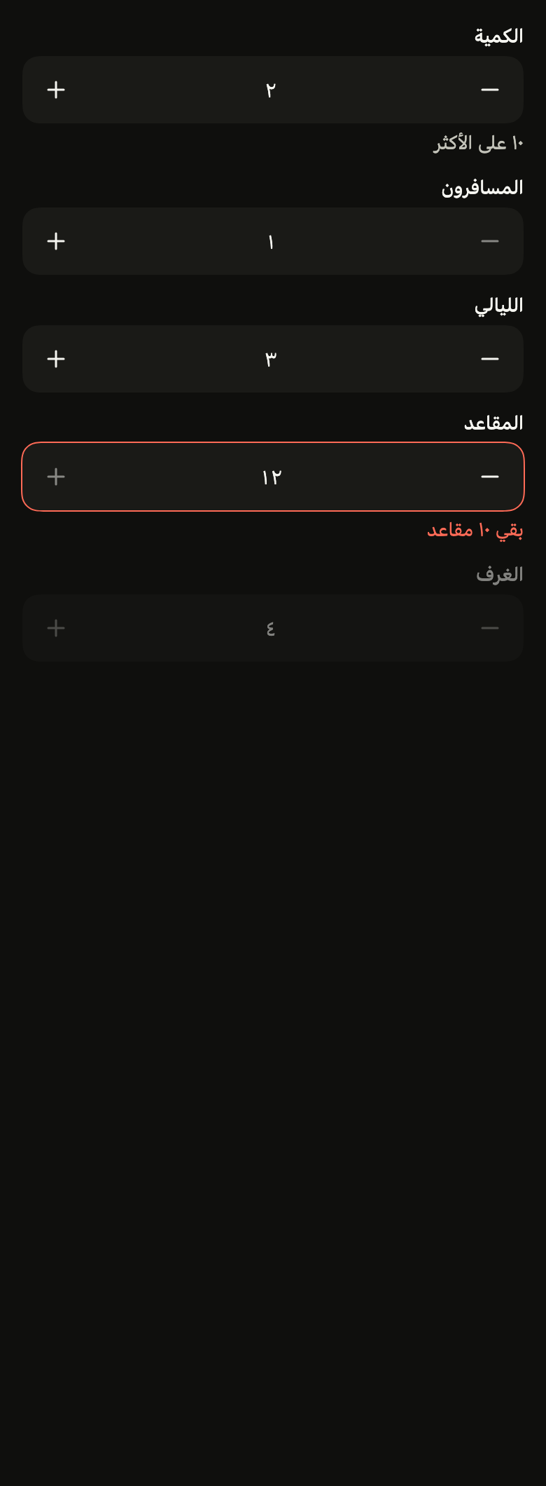
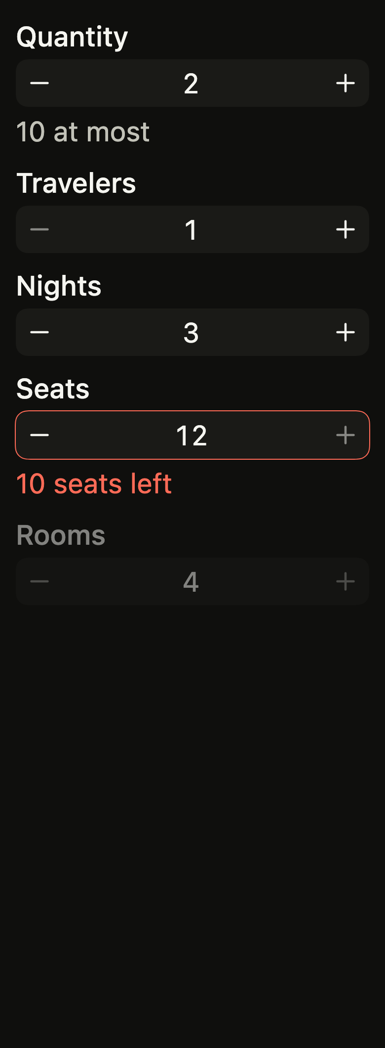
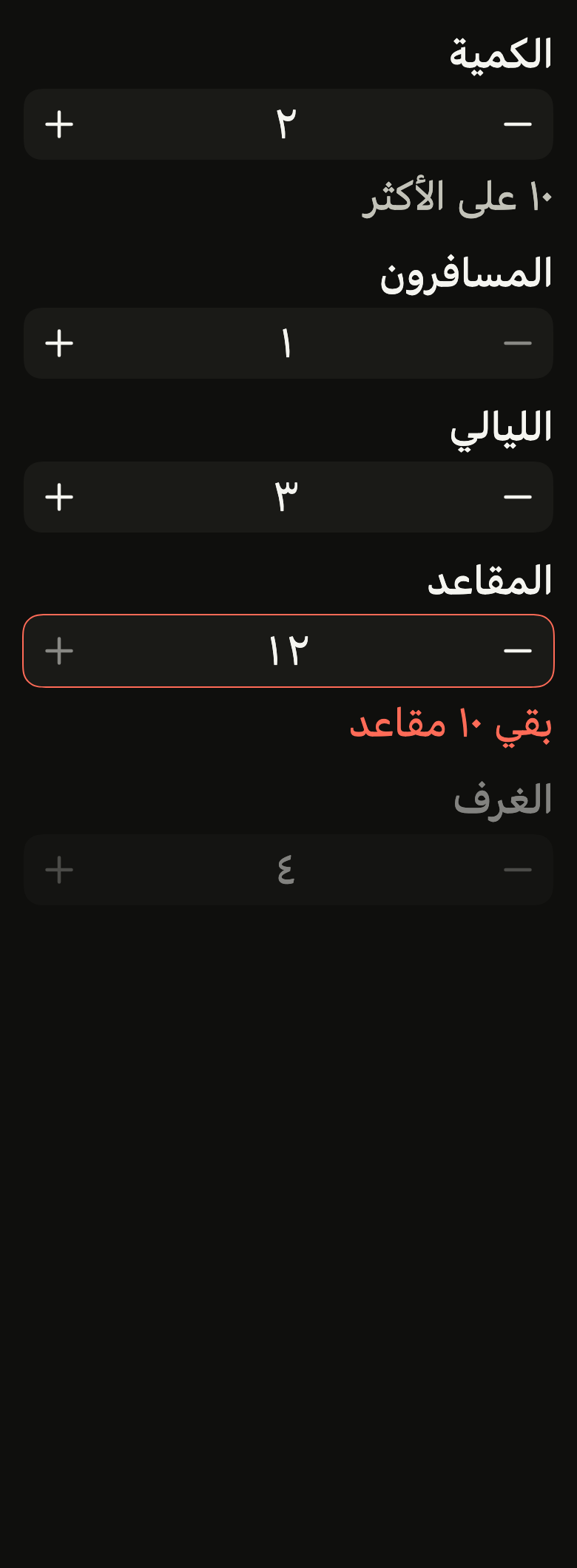
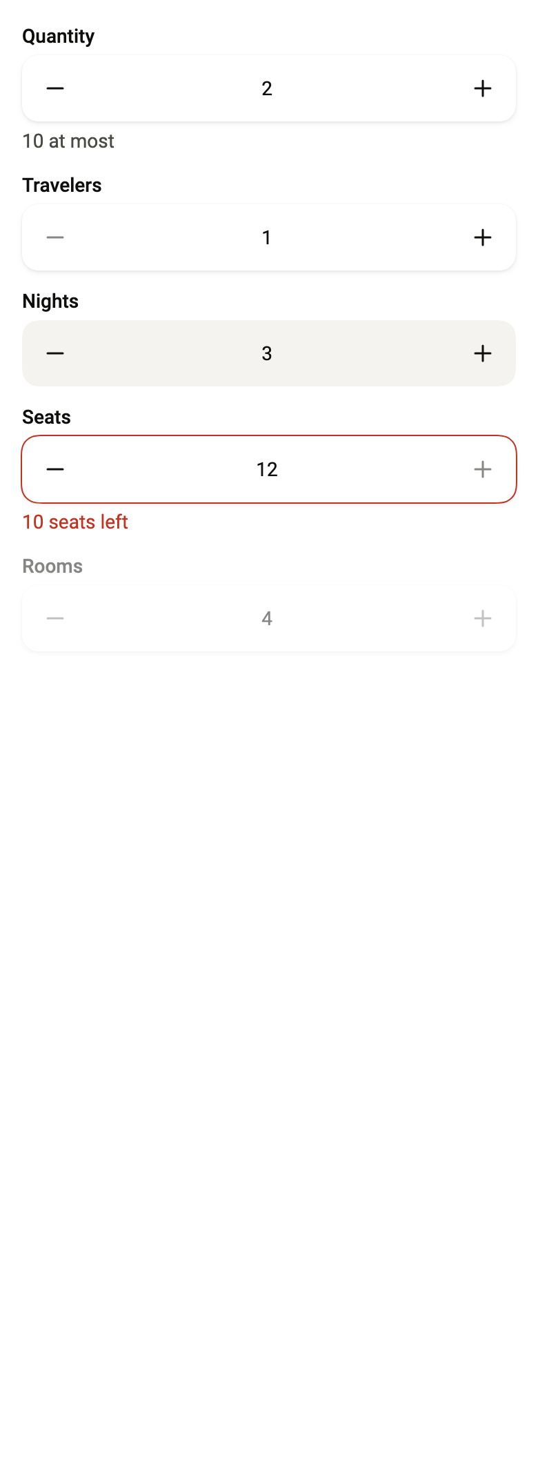
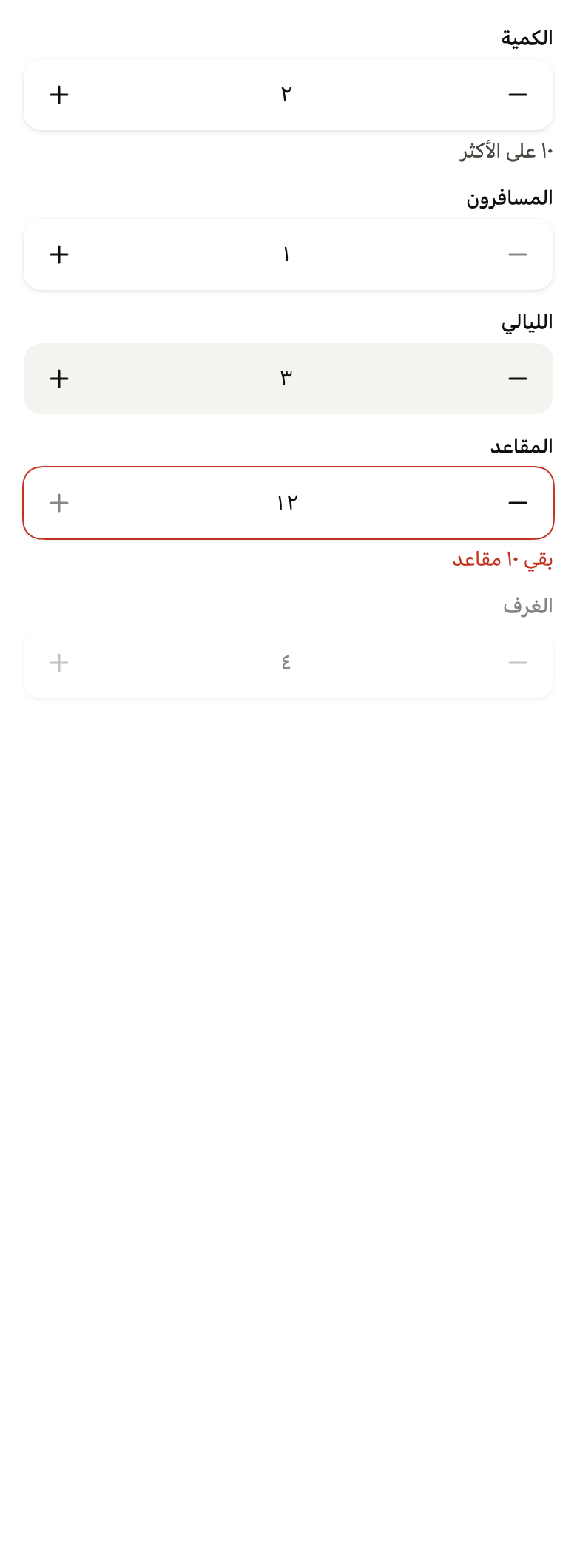
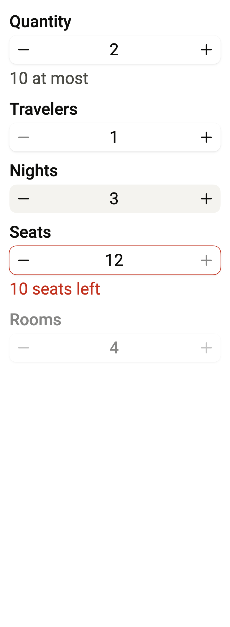
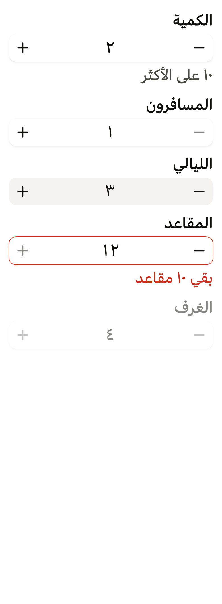
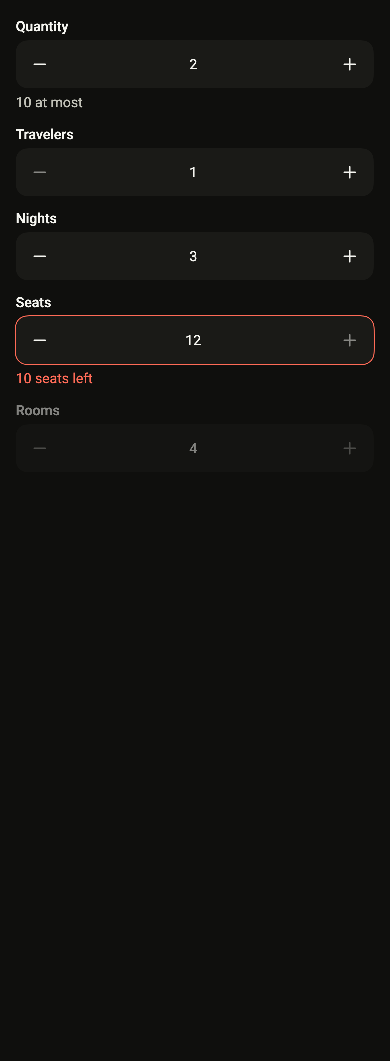
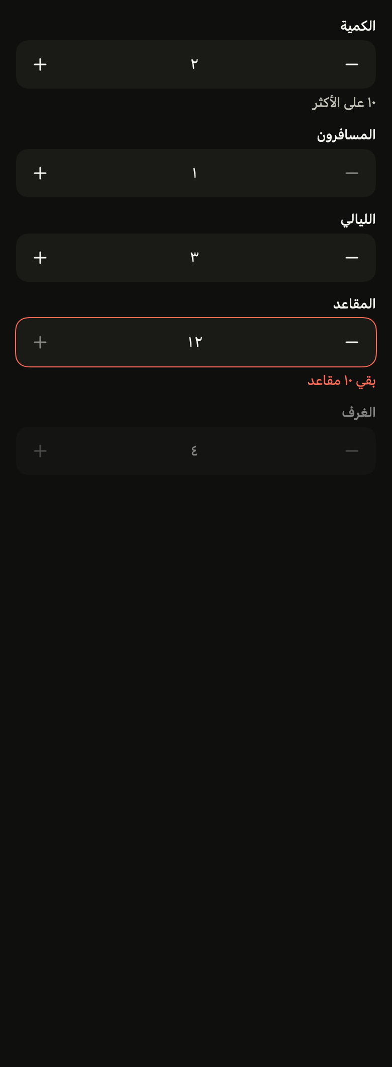
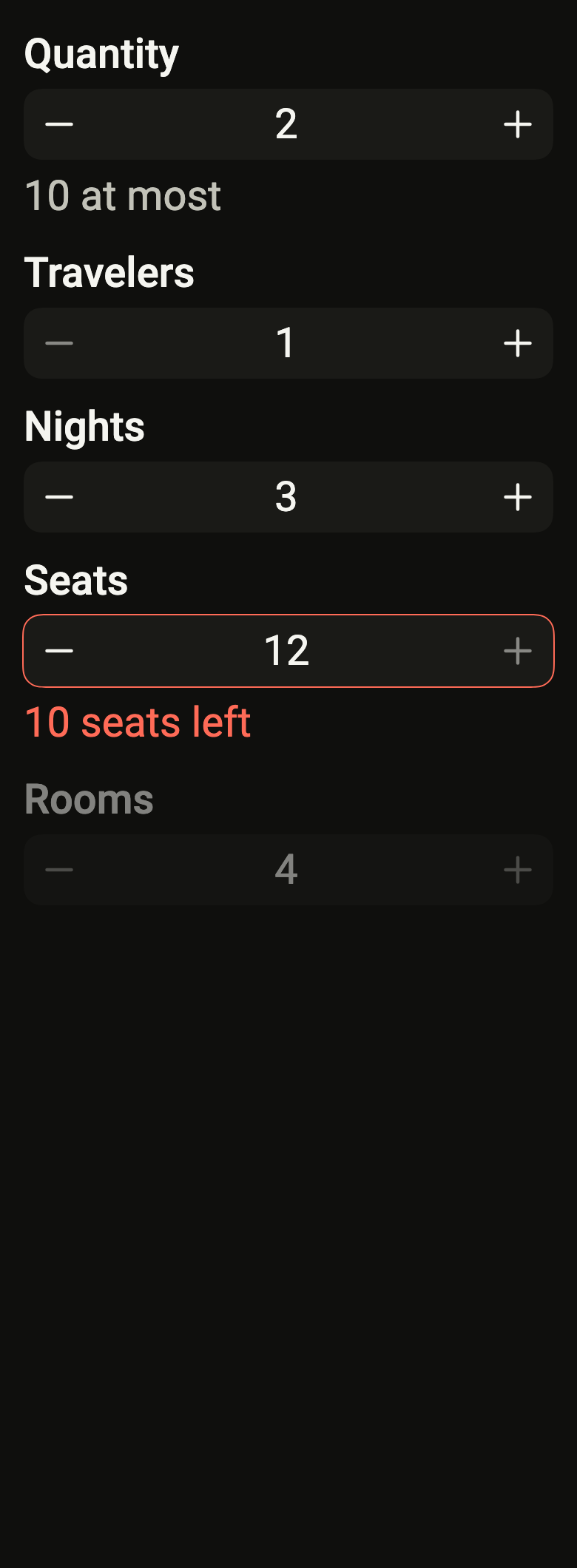
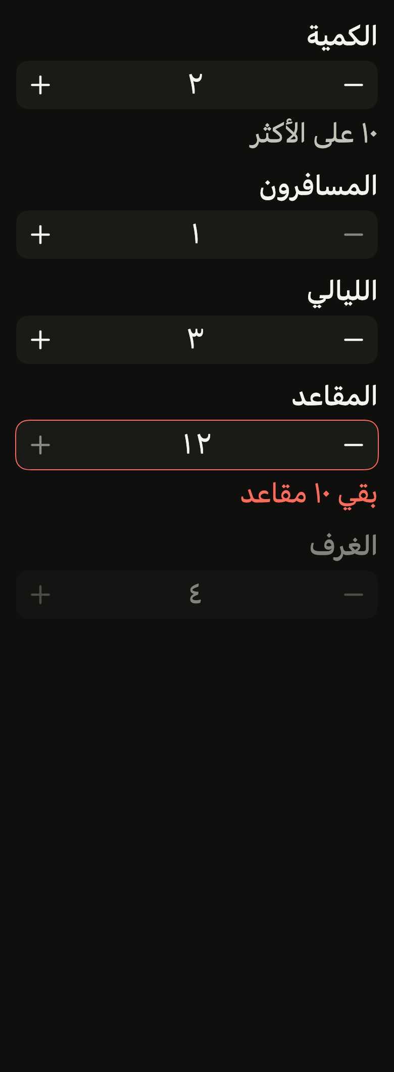
Use it to
- pick how many items go in the cart
- choose the number of guests for a booking
- add or remove one unit with a tap
- adjust a number of nights between two limits
- use the numeric keypad for a whole number
- offer a stepper with minus and plus buttons
- Not for
- an approximate value on a continuous range: use a slider (slider)
- free text, email or password: use a text field (text-field)
- a choice among a list of named values: use a select (select)
- States
Source
The files fliin add number-field copies into your app, before your prefix and imports are applied.
number_field/fl_number_field.dart
// Modified from the NumberField and its minus and plus icons of HeroUI React
// v3, Copyright 2020 Next UI Inc., licensed under the MIT license below and
// under Apache 2.0: https://www.apache.org/licenses/LICENSE-2.0
//
// Permission is hereby granted, free of charge, to any person obtaining a copy
// of this software and associated documentation files (the "Software"), to
// deal in the Software without restriction, including without limitation the
// rights to use, copy, modify, merge, publish, distribute, sublicense, and/or
// sell copies of the Software, and to permit persons to whom the Software is
// furnished to do so, subject to the following conditions:
//
// The above copyright notice and this permission notice shall be included in
// all copies or substantial portions of the Software.
//
// THE SOFTWARE IS PROVIDED "AS IS", WITHOUT WARRANTY OF ANY KIND, EXPRESS OR
// IMPLIED, INCLUDING BUT NOT LIMITED TO THE WARRANTIES OF MERCHANTABILITY,
// FITNESS FOR A PARTICULAR PURPOSE AND NONINFRINGEMENT. IN NO EVENT SHALL THE
// AUTHORS OR COPYRIGHT HOLDERS BE LIABLE FOR ANY CLAIM, DAMAGES OR OTHER
// LIABILITY, WHETHER IN AN ACTION OF CONTRACT, TORT OR OTHERWISE, ARISING
// FROM, OUT OF OR IN CONNECTION WITH THE SOFTWARE OR THE USE OR OTHER DEALINGS
// IN THE SOFTWARE.
//
// Also modified from the Input frame of HeroUI Native 1.0.10, Copyright 2025
// NextUI Inc., licensed under Apache 2.0.
import 'dart:async';
import 'dart:math' as math;

import 'package:flutter/gestures.dart';
import 'package:flutter/semantics.dart';
import 'package:flutter/services.dart';
import 'package:flutter/widgets.dart';
import 'package:fliin_ui/components/field/fl_field.dart';
import 'package:fliin_ui/components/text_field/fl_text_field.dart';
import 'package:fliin_ui/core/fliin.dart';
import 'package:fliin_ui/icons/fl_icons.dart';

/// A long press on a button repeats the step after 400 ms, then every 60 ms,
/// like React Aria's `useSpinButton`.
const Duration _repeatDelay = Duration(milliseconds: 400);
const Duration _repeatInterval = Duration(milliseconds: 60);

/// The pressed button (`active`): at 0.97, on `controlPressed`.
const double _pressedScale = 0.97;

/// The digits of a written number.
enum FlDigits {
  /// 0123456789.
  latin,

  /// Eastern Arabic digits, ٠١٢٣٤٥٦٧٨٩.
  arabicIndic,

  /// The extended Eastern Arabic digits of Persian and Urdu,
  /// ۰۱۲۳۴۵۶۷۸۹.
  extendedArabicIndic,
}

/// The digits of [locale]'s language, CLDR's default numbering system:
/// Eastern Arabic in Arabic, except in the Maghreb and Libya; extended in
/// Persian, Pashto and Indian Urdu; Latin elsewhere, Pakistani Urdu
/// included.
FlDigits flDigitsOf(Locale? locale) => switch (locale) {
  Locale(languageCode: 'ar', countryCode: 'DZ' || 'EH' || 'LY' || 'MA' || 'TN') => FlDigits.latin,
  Locale(languageCode: 'ar') => FlDigits.arabicIndic,
  Locale(languageCode: 'fa' || 'ps') || Locale(languageCode: 'ur', countryCode: 'IN') => FlDigits.extendedArabicIndic,
  _ => FlDigits.latin,
};

/// Writes and reads back the value of an [FlNumberField]. `core/` has no
/// `intl`: an app that formats its numbers with `NumberFormat` wraps it
/// here, in four lines.
abstract interface class FlNumberFormat {
  /// The text of [value].
  String format(double value);

  /// The value of [text], null when the text is not a number. A non-finite
  /// value (NaN, infinity) counts as null.
  double? parse(String text);

  /// True when the value has decimals: the virtual keyboard offers them.
  bool get decimal;
}

/// An integer, without thousands separators, in the digits [digits]. It
/// reads back Latin, Eastern Arabic and extended digits, and the minus sign
/// `-` or `−`; nothing else, neither `0x10` nor `1e3`.
final class FlIntegerFormat implements FlNumberFormat {
  /// An integer written in [digits].
  const FlIntegerFormat({this.digits = FlDigits.latin});

  /// The digits used for writing.
  final FlDigits digits;

  static const _arabicIndicZero = 0x0660;
  static const _extendedZero = 0x06F0;
  static final _integer = RegExp(r'^[+-]?[0-9]+$');

  @override
  bool get decimal => false;

  @override
  bool operator ==(Object other) => other is FlIntegerFormat && other.digits == digits;

  @override
  int get hashCode => digits.hashCode;

  @override
  String format(double value) => _written(value.round().toString(), digits);

  @override
  double? parse(String text) {
    final latin = _latin(text.trim());
    return _integer.hasMatch(latin) ? int.tryParse(latin)?.toDouble() : null;
  }
}

/// [text] with its Latin digits written in [digits].
String _written(String text, FlDigits digits) {
  final zero = switch (digits) {
    FlDigits.latin => 0x30,
    FlDigits.arabicIndic => FlIntegerFormat._arabicIndicZero,
    FlDigits.extendedArabicIndic => FlIntegerFormat._extendedZero,
  };
  return String.fromCharCodes(text.codeUnits.map((c) => c >= 0x30 && c <= 0x39 ? c - 0x30 + zero : c));
}

/// [text] with its Eastern Arabic and extended digits in Latin, and `−` as
/// `-`.
String _latin(String text) => String.fromCharCodes(
  text.runes.map(
    (c) => switch (c) {
      >= FlIntegerFormat._arabicIndicZero && <= FlIntegerFormat._arabicIndicZero + 9 =>
        c - FlIntegerFormat._arabicIndicZero + 0x30,
      >= FlIntegerFormat._extendedZero && <= FlIntegerFormat._extendedZero + 9 =>
        c - FlIntegerFormat._extendedZero + 0x30,
      0x2212 => 0x2D,
      _ => c,
    },
  ),
);

/// A decimal number with a fixed count of [fractionDigits], between a
/// [prefix] and a [suffix]: a price (`prefix: '$'`), a weight
/// (`suffix: ' kg'`), a percentage ([FlDecimalFormat.percent]). The value
/// is multiplied by [factor] for display: 100 for a percentage of a 0..1
/// value. [groupSeparator] splits the thousands and [decimalSeparator] the
/// decimals, to set to the app's language ("1 234,50 €" in French). It
/// reads back the text with or without the affixes and the separators, in
/// Latin, Eastern Arabic or extended digits, with `-` or `−`.
final class FlDecimalFormat implements FlNumberFormat {
  /// A number with [fractionDigits] decimals, between [prefix] and [suffix].
  const FlDecimalFormat({
    this.fractionDigits = 2,
    this.prefix = '',
    this.suffix = '',
    this.factor = 1,
    this.decimalSeparator = '.',
    this.groupSeparator,
    this.digits = FlDigits.latin,
  }) : assert(fractionDigits >= 0 && fractionDigits <= 10, 'between 0 and 10 decimals'),
       assert(factor > 0, 'a positive factor');

  /// A percentage of a value between 0 and 1: 0.5 is written "50%".
  const FlDecimalFormat.percent({
    this.fractionDigits = 0,
    this.suffix = '%',
    this.decimalSeparator = '.',
    this.digits = FlDigits.latin,
  }) : prefix = '',
       factor = 100,
       groupSeparator = null,
       assert(fractionDigits >= 0 && fractionDigits <= 10, 'between 0 and 10 decimals');

  /// The decimals always written: 2 by default, 0 for whole units.
  final int fractionDigits;

  /// The text before the number ("$"), after the minus sign.
  final String prefix;

  /// The text after the number (" kg", "%").
  final String suffix;

  /// The display is the value times [factor]; 1 by default.
  final double factor;

  /// The decimal point; "." by default.
  final String decimalSeparator;

  /// The thousands separator; null, none.
  final String? groupSeparator;

  /// The digits used for writing.
  final FlDigits digits;

  static final _number = RegExp(r'^([0-9]+\.?[0-9]*|\.[0-9]+)$');
  static final _space = RegExp(r'\s');

  @override
  bool get decimal => fractionDigits > 0 || factor != 1;

  @override
  bool operator ==(Object other) =>
      other is FlDecimalFormat &&
      other.fractionDigits == fractionDigits &&
      other.prefix == prefix &&
      other.suffix == suffix &&
      other.factor == factor &&
      other.decimalSeparator == decimalSeparator &&
      other.groupSeparator == groupSeparator &&
      other.digits == digits;

  @override
  int get hashCode => Object.hash(fractionDigits, prefix, suffix, factor, decimalSeparator, groupSeparator, digits);

  @override
  String format(double value) {
    final scaled = value * factor;
    final fixed = scaled.abs().toStringAsFixed(fractionDigits);
    // "-0.00" is written without its sign.
    final negative = scaled < 0 && fixed.codeUnits.any((c) => c > 0x30 && c <= 0x39);
    final dot = fixed.indexOf('.');
    var whole = dot < 0 ? fixed : fixed.substring(0, dot);
    if (groupSeparator case final separator?) {
      final buffer = StringBuffer();
      for (var i = 0; i < whole.length; i++) {
        if (i > 0 && (whole.length - i) % 3 == 0) buffer.write(separator);
        buffer.write(whole[i]);
      }
      whole = buffer.toString();
    }
    final number = dot < 0 ? whole : '$whole$decimalSeparator${fixed.substring(dot + 1)}';
    return '${negative ? '-' : ''}$prefix${_written(number, digits)}$suffix';
  }

  @override
  double? parse(String text) {
    var latin = _latin(text).trim();
    final negative = latin.startsWith('-');
    if (negative || latin.startsWith('+')) {
      latin = latin.substring(1).trimLeft();
    }
    final prefix = this.prefix.trim();
    final suffix = this.suffix.trim();
    if (prefix.isNotEmpty && latin.startsWith(prefix)) {
      latin = latin.substring(prefix.length);
    }
    if (suffix.isNotEmpty && latin.endsWith(suffix)) {
      latin = latin.substring(0, latin.length - suffix.length);
    }
    if (groupSeparator case final separator? when separator.trim().isNotEmpty) {
      latin = latin.replaceAll(separator.trim(), '');
    }
    latin = latin.replaceAll(_space, '');
    if (decimalSeparator != '.') {
      latin = latin.replaceAll(decimalSeparator, '.');
    }
    if (!_number.hasMatch(latin)) return null;
    final value = double.tryParse(latin);
    return value == null ? null : (negative ? -value : value) / factor;
  }
}

/// A number field: the label, the input
/// between a minus button and a plus button, then the help or the error. The
/// buttons fade at the bounds, and a long press repeats the step. Keyboard
/// input that is a number within the bounds and on the step counts as soon
/// as it is typed: iOS's number pad has no Return key. A touch outside the
/// field leaves it. On leaving or on the action key, a value outside the
/// bounds is clamped and snapped to the step, and text that is not a number
/// restores the previous value.
///
/// The screen reader reads an adjustable value ("Quantity, 2") that it
/// increases or decreases, with the two named buttons; a double tap on the
/// value opens input. From the keyboard, the field is a single Tab stop: the
/// up and down arrows add or remove a step, Home and End go to the bounds
/// when they exist.
class FlNumberField extends StatefulWidget {
  /// A field named [label], which shows [value] and offers the next ones to
  /// [onChanged].
  const FlNumberField({
    super.key,
    required this.label,
    required this.value,
    required this.onChanged,
    required this.decrementLabel,
    required this.incrementLabel,
    this.min,
    this.max,
    this.step = 1,
    this.format,
    this.helper,
    this.error,
    this.variant = FlInputVariant.primary,
    this.enabled = true,
    this.required = false,
    this.focusNode,
    this.autofocus = false,
    this.semanticLabel,
    this.decrementIcon,
    this.incrementIcon,
  }) : assert(step > 0, 'a positive step'),
       assert(min == null || max == null || min <= max, 'min at most max');

  /// The field's name, shown above and read by the screen reader unless
  /// [semanticLabel].
  final String label;

  /// The read name of the value node instead of [label], when the word shown
  /// is not enough out of context ("Quantity, Linen tote bag" for several
  /// "Quantity" fields in a cart). It must contain the word shown, preferably
  /// first (WCAG 2.5.3); null, [label].
  final String? semanticLabel;

  /// The value shown. A value different from the ongoing input replaces it,
  /// like React Aria's `useNumberFieldState`: the parent has the last word (a
  /// stock that drops during input).
  final double value;

  /// Receives the new value, clamped and snapped to the step; up to the parent
  /// to give it back in [value].
  final ValueChanged<double> onChanged;

  /// The read name of the minus button ("Decrease").
  final String decrementLabel;

  /// The read name of the plus button ("Increase").
  final String incrementLabel;

  /// The lower bound, inclusive; null, unbounded.
  final double? min;

  /// The upper bound, inclusive; null, unbounded.
  final double? max;

  /// The gap between two values, counted from [min] (or zero); 1 by default. A
  /// decimal step or [min] requires a decimal [format]: the integer format
  /// would round the display.
  final double step;

  /// Writes and reads back the value; null, an integer in the language's
  /// digits (`flDigitsOf`); [FlDecimalFormat] writes decimals, a price, a
  /// unit or a percentage.
  final FlNumberFormat? format;

  /// The help text under the field, read as a hint. Hidden while [error] is
  /// non-null.
  final String? helper;

  /// Non-null: the field is invalid, and this text replaces [helper].
  final String? error;

  /// The background: `primary` by default, `secondary` on a surface.
  final FlInputVariant variant;

  /// False: the whole field is half opaque, without touch or focus.
  final bool enabled;

  /// True: an asterisk follows the label, and the field announces itself as
  /// required.
  final bool required;

  /// The input's focus node. Null, the field creates its own.
  final FocusNode? focusNode;

  /// Takes focus on the first frame if nothing else has it within its scope.
  final bool autofocus;

  /// The minus button's icon; null, `FlIcons.minus`.
  final FlIconData? decrementIcon;

  /// The plus button's icon; null, `FlIcons.plus`.
  final FlIconData? incrementIcon;

  @override
  State<FlNumberField> createState() => _FlNumberFieldState();
}

class _StepIntent extends Intent {
  const _StepIntent(this.direction);

  /// +1 upward, -1 downward.
  final int direction;
}

class _EdgeIntent extends Intent {
  const _EdgeIntent({required this.end});

  /// True: the upper bound; false: the lower one.
  final bool end;
}

class _FlNumberFieldState extends State<FlNumberField> {
  final TextEditingController _text = TextEditingController();
  FocusNode? _ownFocus;
  FocusNode get _focus => widget.focusNode ?? (_ownFocus ??= FocusNode());
  late FlNumberFormat _format;
  bool _formatted = false;

  /// The last value the input gave the parent: giving it back in
  /// [FlNumberField.value] does not rewrite the ongoing text.
  double? _typed;

  /// The last value given to the parent by a step, until it has rebuilt: two
  /// steps in the same frame add up.
  double? _sent;

  /// The format of [widget], or the integer in the language's digits.
  FlNumberFormat get _formatOf =>
      widget.format ?? FlIntegerFormat(digits: flDigitsOf(Localizations.maybeLocaleOf(context)));

  @override
  void initState() {
    super.initState();
    _focus.addListener(_onFocusChange);
  }

  /// A new format rewrites the value, except during input.
  void _adoptFormat() {
    final format = _formatOf;
    if (_formatted && format == _format) return;
    final first = !_formatted;
    _format = format;
    _formatted = true;
    if (first || !_focus.hasFocus) _show(widget.value);
  }

  @override
  void didChangeDependencies() {
    super.didChangeDependencies();
    _adoptFormat();
  }

  @override
  void didUpdateWidget(FlNumberField oldWidget) {
    super.didUpdateWidget(oldWidget);
    _sent = null;
    if (oldWidget.focusNode != widget.focusNode) {
      (oldWidget.focusNode ?? _ownFocus)?.removeListener(_onFocusChange);
      _focus.addListener(_onFocusChange);
    }
    _adoptFormat();
    if (oldWidget.value != widget.value && !(_focus.hasFocus && widget.value == _typed)) {
      _show(widget.value);
    }
    if (widget.error case final error? when oldWidget.error == null && MediaQuery.supportsAnnounceOf(context)) {
      SemanticsService.sendAnnouncement(View.of(context), error, Directionality.of(context));
    }
  }

  @override
  void dispose() {
    _focus.removeListener(_onFocusChange);
    _ownFocus?.dispose();
    _text.dispose();
    super.dispose();
  }

  void _show(double value) {
    final text = _format.format(value);
    if (_text.text != text) {
      _text.value = TextEditingValue(
        text: text,
        selection: TextSelection.collapsed(offset: text.length),
      );
    }
  }

  void _onFocusChange() {
    if (!_focus.hasFocus) {
      _typed = null;
      _commit();
    }
    setState(() {});
  }

  double get _origin => widget.min ?? 0;

  /// The decimals of the step and the origin: `0.1 + 0.2` is written 0.3.
  int get _decimals => [widget.step, _origin].map(_decimalsOf).reduce(math.max);

  static int _decimalsOf(double x) {
    if (x == x.roundToDouble()) return 0;
    final text = x.toString();
    final dot = text.indexOf('.');
    return dot < 0 || text.contains('e') ? 10 : math.min(10, text.length - dot - 1);
  }

  double _clean(double value) => double.parse(value.toStringAsFixed(_decimals));

  double _clamp(double value) => value.clamp(widget.min ?? double.negativeInfinity, widget.max ?? double.infinity);

  /// [value] snapped to the nearest step, then clamped.
  double _snap(double value) =>
      _clamp(_clean(_origin + ((value - _origin) / widget.step).roundToDouble() * widget.step));

  double? _parse(String text) => switch (_format.parse(text)) {
    final value? when value.isFinite => value,
    _ => null,
  };

  /// The value a step starts from: the ongoing input when it is a number,
  /// otherwise the value given to the parent, never the text of a field that
  /// does not have focus (the format may round it).
  double get _current => _focus.hasFocus ? (_parse(_text.text) ?? widget.value) : (_sent ?? widget.value);

  void _set(double value) {
    _show(value);
    if (value != widget.value) {
      _sent = value;
      widget.onChanged(value);
    }
  }

  void _commit() => _set(_snap(_parse(_text.text) ?? widget.value));

  void _onTyped(String text) {
    final value = _parse(text);
    if (value == null || _snap(value) != value) return;
    _typed = value;
    if (value != widget.value) widget.onChanged(value);
  }

  bool get _canIncrease => widget.enabled && (widget.max == null || widget.value < widget.max!);
  bool get _canDecrease => widget.enabled && (widget.min == null || widget.value > widget.min!);

  /// The next step in [direction] from the input: a value off the step goes to
  /// the neighbouring step, and a value outside the bounds to the bound.
  double _stepped(double from, int direction) {
    final steps = (from - _origin) / widget.step;
    final onGrid = (steps - steps.roundToDouble()).abs() < 1e-9;
    final index = onGrid
        ? steps.roundToDouble() + direction
        : (direction > 0 ? steps.floorToDouble() + 1 : steps.ceilToDouble() - 1);
    return _clamp(_clean(_origin + index * widget.step));
  }

  /// Adds or removes a step; false when the bound is reached.
  bool _step(int direction) {
    if (!(direction > 0 ? _canIncrease : _canDecrease)) return false;
    _set(_stepped(_current, direction));
    return true;
  }

  @override
  Widget build(BuildContext context) {
    assert(
      _format.decimal || [widget.step, _origin].every((x) => x == x.roundToDouble()),
      'a decimal step or lower bound requires a decimal format',
    );
    final theme = FlScope.of(context);
    final announces = MediaQuery.supportsAnnounceOf(context);
    final error = widget.error;
    final helper = widget.helper;
    final described = error == null ? helper : (announces ? error : null);
    final value = widget.value;
    final increased = _canIncrease ? _format.format(_stepped(value, 1)) : null;
    final decreased = _canDecrease ? _format.format(_stepped(value, -1)) : null;
    // Izydesk's `.input-btn`: 32 square, `space.sm` from the frame's edges.
    final button = theme.space.xxl;
    final input = DefaultTextStyle.merge(
      style: const TextStyle(fontFeatures: [FontFeature.tabularFigures()]),
      child: FlInputAffixes(
        // The buttons laid over the input, with their padding on each side.
        prefix: SizedBox(width: button + theme.space.sm * 2),
        suffix: SizedBox(width: button + theme.space.sm * 2),
        disabled: false,
        child: FlInput(
          label: widget.label,
          controller: _text,
          focusNode: _focus,
          variant: widget.variant,
          textAlign: TextAlign.center,
          disabled: false,
          readOnly: !widget.enabled,
          autofocus: widget.autofocus,
          keyboardType: TextInputType.numberWithOptions(
            signed: widget.min == null || widget.min! < 0,
            decimal: _format.decimal,
          ),
          textInputAction: TextInputAction.done,
          onChanged: _onTyped,
          onSubmitted: (_) => _commit(),
        ),
      ),
    );
    Widget stepper(int direction) => _StepButton(
      label: direction > 0 ? widget.incrementLabel : widget.decrementLabel,
      icon: direction > 0 ? (widget.incrementIcon ?? FlIcons.plus) : (widget.decrementIcon ?? FlIcons.minus),
      fill: widget.variant == FlInputVariant.primary ? theme.colors.control : theme.colors.field,
      pressedFill: widget.variant == FlInputVariant.primary ? theme.colors.controlPressed : theme.colors.control,
      width: button,
      enabled: direction > 0 ? _canIncrease : _canDecrease,
      onStep: () => _step(direction),
    );
    final group = Stack(
      children: [
        ExcludeSemantics(excluding: !_focus.hasFocus, child: input),
        // In the input's region: touching them does not make it lose focus.
        PositionedDirectional(
          start: theme.space.sm,
          top: 0,
          bottom: 0,
          child: TextFieldTapRegion(child: stepper(-1)),
        ),
        PositionedDirectional(
          end: theme.space.sm,
          top: 0,
          bottom: 0,
          child: TextFieldTapRegion(child: stepper(1)),
        ),
      ],
    );
    final edges = {
      if (widget.min != null) const SingleActivator(LogicalKeyboardKey.home): const _EdgeIntent(end: false),
      if (widget.max != null) const SingleActivator(LogicalKeyboardKey.end): const _EdgeIntent(end: true),
    };
    final field = Shortcuts(
      shortcuts: {
        const SingleActivator(LogicalKeyboardKey.arrowUp): const _StepIntent(1),
        const SingleActivator(LogicalKeyboardKey.arrowDown): const _StepIntent(-1),
        ...edges,
      },
      child: Actions(
        actions: {
          _StepIntent: CallbackAction<_StepIntent>(onInvoke: (intent) => _step(intent.direction)),
          _EdgeIntent: CallbackAction<_EdgeIntent>(onInvoke: (intent) => _set((intent.end ? widget.max : widget.min)!)),
          // On a phone, EditableText keeps focus on an outside touch.
          EditableTextTapOutsideIntent: CallbackAction<EditableTextTapOutsideIntent>(
            onInvoke: (intent) => intent.focusNode.unfocus(),
          ),
        },
        // The node is the touch target's, as for an input.
        child: FlHitTarget(
          child: Semantics(
            slider: true,
            label: widget.semanticLabel ?? widget.label,
            value: _format.format(value),
            increasedValue: increased,
            decreasedValue: decreased,
            onIncrease: increased == null ? null : () => _step(1),
            onDecrease: decreased == null ? null : () => _step(-1),
            onTap: widget.enabled ? _focus.requestFocus : null,
            hint: described,
            enabled: widget.enabled,
            validationResult: error != null ? SemanticsValidationResult.invalid : SemanticsValidationResult.none,
            isRequired: widget.required ? true : null,
            child: IgnorePointer(
              ignoring: !widget.enabled,
              child: ExcludeFocus(
                excluding: !widget.enabled,
                child: Opacity(opacity: widget.enabled ? 1 : theme.size.disabledOpacity, child: group),
              ),
            ),
          ),
        ),
      ),
    );
    return FlFieldScope(
      invalid: error != null,
      disabled: !widget.enabled,
      required: widget.required,
      child: Column(
        mainAxisSize: MainAxisSize.min,
        crossAxisAlignment: CrossAxisAlignment.stretch,
        // Izydesk's `.field` gap, like FlTextField.
        spacing: flFieldGap(theme),
        children: [
          Align(
            alignment: AlignmentDirectional.centerStart,
            child: ExcludeSemantics(child: FlLabel(widget.label)),
          ),
          field,
          if (helper != null && error == null) ExcludeSemantics(child: FlDescription(helper)),
          if (error != null)
            announces
                ? ExcludeSemantics(child: FlFieldError(error))
                : Align(
                    alignment: AlignmentDirectional.centerStart,
                    child: Semantics(container: true, child: FlFieldError(error)),
                  ),
        ],
      ),
    );
  }
}

/// A minus or plus button (Izydesk's `.input-btn`): a [width] square with
/// `radiusXl` corners, centred in the input's height, transparent at rest,
/// on [fill] under the
/// pointer, pressed at 0.97 on [pressedFill], faded when disabled. A long press repeats
/// [onStep] as long as it returns true.
class _StepButton extends StatefulWidget {
  const _StepButton({
    required this.label,
    required this.icon,
    required this.fill,
    required this.pressedFill,
    required this.width,
    required this.enabled,
    required this.onStep,
  });

  final String label;
  final FlIconData icon;
  final Color fill;
  final Color pressedFill;
  final double width;
  final bool enabled;
  final bool Function() onStep;

  @override
  State<_StepButton> createState() => _StepButtonState();
}

class _StepButtonState extends State<_StepButton> {
  bool _pressed = false;
  bool _hovered = false;
  Timer? _repeat;

  @override
  void didUpdateWidget(_StepButton oldWidget) {
    super.didUpdateWidget(oldWidget);
    if (!widget.enabled) _release();
  }

  @override
  void dispose() {
    // The press is already released when the button is removed (the gesture is
    // rejected): a guard for any other path that would leave the timer armed.
    _repeat?.cancel();
    super.dispose();
  }

  void _press() {
    setState(() => _pressed = true);
    if (!widget.onStep()) return;
    _repeat = Timer(_repeatDelay, () {
      _repeat = Timer.periodic(_repeatInterval, (timer) {
        if (!widget.onStep()) _release();
      });
    });
  }

  void _release() {
    _repeat?.cancel();
    _repeat = null;
    if (_pressed && mounted) setState(() => _pressed = false);
  }

  @override
  Widget build(BuildContext context) {
    final theme = FlScope.of(context);
    final colors = theme.colors;
    final enabled = widget.enabled;
    final icon = MediaQuery.textScalerOf(context)
        .clamp(maxScaleFactor: theme.size.iconMaxScale)
        .scale(theme.size.indicatorIcon);
    return FlHitTarget(
      child: Semantics(
        button: true,
        label: widget.label,
        enabled: enabled,
        onTap: enabled ? () => widget.onStep() : null,
        child: RawGestureDetector(
          behavior: HitTestBehavior.opaque,
          excludeFromSemantics: true,
          gestures: {
            if (enabled)
              _HoldGestureRecognizer: GestureRecognizerFactoryWithHandlers<_HoldGestureRecognizer>(
                () => _HoldGestureRecognizer(debugOwner: this),
                (recognizer) => recognizer
                  ..onPress = _press
                  ..onRelease = _release,
              ),
          },
          child: MouseRegion(
            onEnter: (_) => setState(() => _hovered = true),
            onExit: (_) => setState(() => _hovered = false),
            child: Opacity(
              opacity: enabled ? 1 : theme.size.disabledOpacity,
              child: Transform.scale(
                scale: _pressed ? _pressedScale : 1,
                child: SizedBox(
                  width: widget.width,
                  child: Center(
                    child: SizedBox.square(
                      dimension: widget.width,
                      child: DecoratedBox(
                        decoration: ShapeDecoration(
                          color: _pressed
                              ? widget.pressedFill
                              : _hovered && enabled
                              ? widget.fill
                              : widget.fill.withValues(alpha: 0),
                          shape: FlContinuousBorder(radius: theme.shape.radiusXl),
                        ),
                        child: Center(
                          child: FlIcon(widget.icon, size: icon, color: colors.onField),
                        ),
                      ),
                    ),
                  ),
                ),
              ),
            ),
          ),
        ),
      ),
    );
  }
}

/// The press of a minus or plus button. It starts like a tap
/// (`kPressTimeout`, or immediately without a competitor), and claims the
/// gesture when repetition starts: a long-press ancestor (a cart row deleted
/// that way) does not stop it, and a drag started earlier still wins.
class _HoldGestureRecognizer extends PrimaryPointerGestureRecognizer {
  _HoldGestureRecognizer({super.debugOwner})
    : super(deadline: kPressTimeout, preAcceptSlopTolerance: kTouchSlop, postAcceptSlopTolerance: kTouchSlop);

  VoidCallback? onPress;
  VoidCallback? onRelease;

  Timer? _claim;
  bool _pressed = false;

  @override
  void addAllowedPointer(PointerDownEvent event) {
    super.addAllowedPointer(event);
    _claim ??= Timer(_repeatDelay, () => resolve(GestureDisposition.accepted));
  }

  @override
  void didExceedDeadline() => _press();

  @override
  void handlePrimaryPointer(PointerEvent event) {
    if (event is PointerUpEvent) {
      _press();
      resolve(GestureDisposition.accepted);
      stopTrackingPointer(event.pointer);
    } else if (event is PointerCancelEvent) {
      resolve(GestureDisposition.rejected);
      stopTrackingPointer(event.pointer);
    }
  }

  @override
  void acceptGesture(int pointer) {
    super.acceptGesture(pointer);
    if (pointer == primaryPointer) _press();
  }

  @override
  void rejectGesture(int pointer) {
    super.rejectGesture(pointer);
    if (pointer == primaryPointer) _end();
  }

  @override
  void didStopTrackingLastPointer(int pointer) {
    super.didStopTrackingLastPointer(pointer);
    _end();
  }

  @override
  void dispose() {
    _end();
    super.dispose();
  }

  void _press() {
    if (_pressed) return;
    _pressed = true;
    onPress?.call();
  }

  void _end() {
    _claim?.cancel();
    _claim = null;
    if (!_pressed) return;
    _pressed = false;
    onRelease?.call();
  }

  @override
  String get debugDescription => 'hold';
}