Components / navigation
App bar
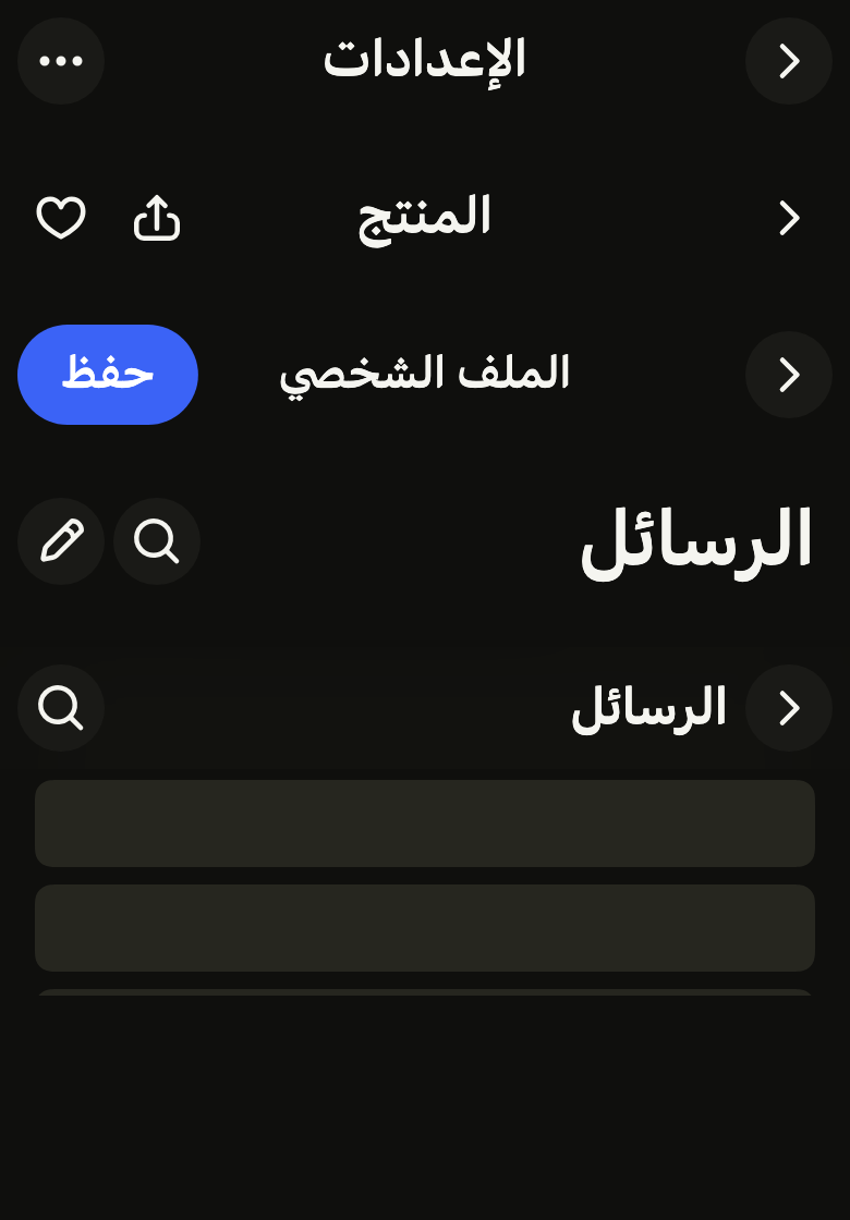
Shows where the user is and leads back: the screen title, a back chevron and up to three actions, with a large title that collapses into the bar on scroll.
Import
In a Flutter app where fliin init has run:
Examples
Inline
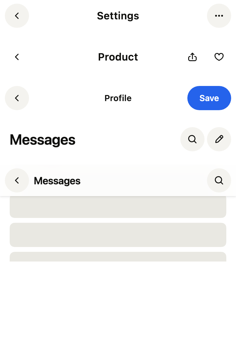
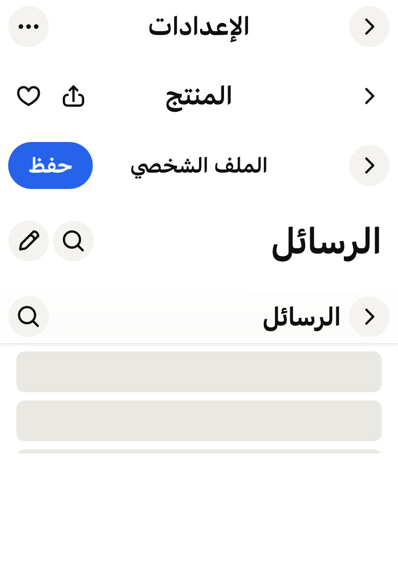
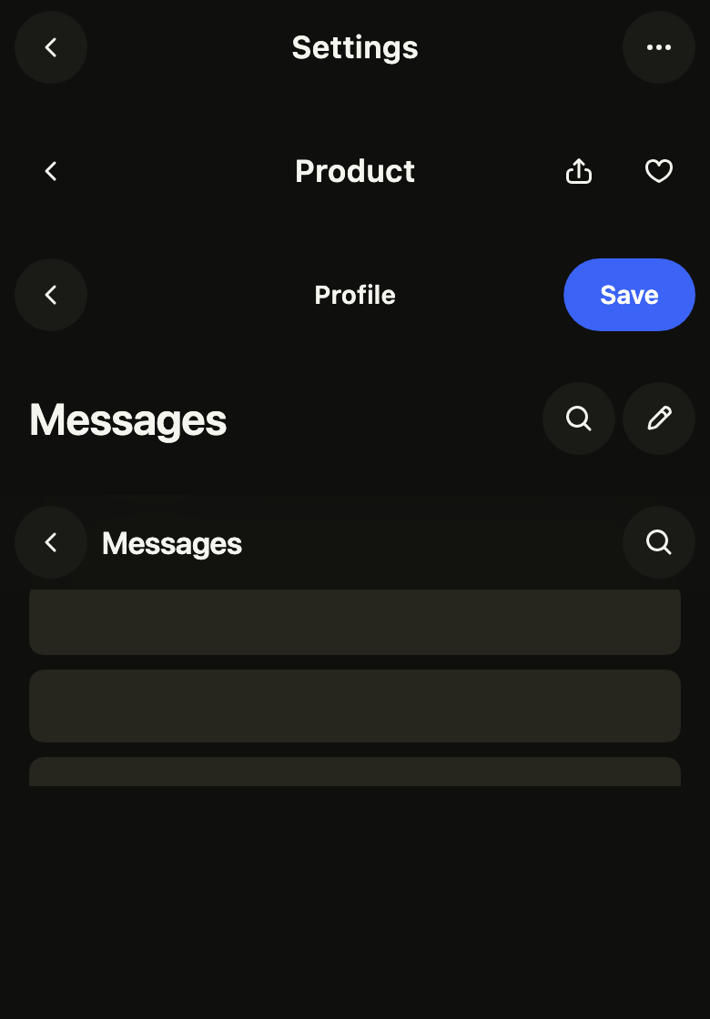
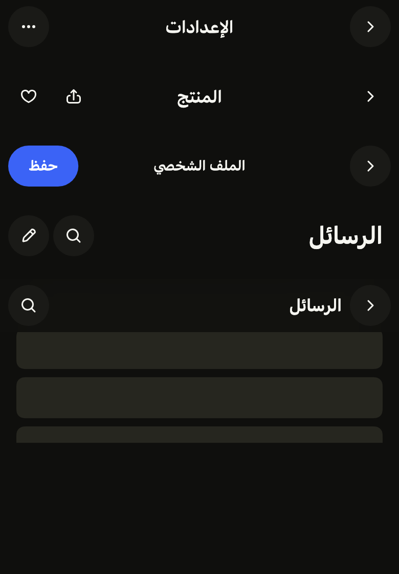
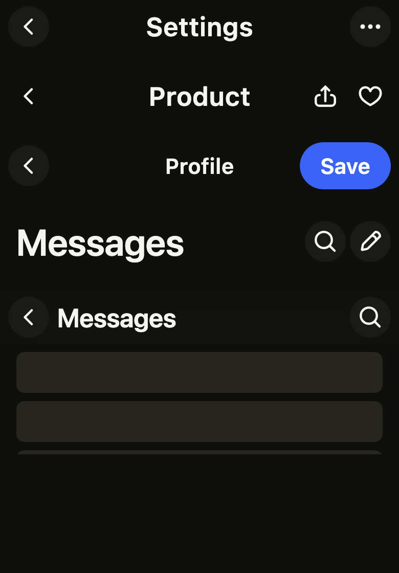
The default bar: the back chevron in a disc, the title centered, an icon action at the end. Each icon action has a label for the screen reader.

import 'package:your_app/ui/fliin/components/app_bar/fl_app_bar.dart';
import 'package:your_app/ui/fliin/core/fliin.dart';
import 'package:your_app/ui/fliin/icons/fl_icons.dart';
import 'package:flutter/widgets.dart';

class AppBarInlineExample extends StatelessWidget {
  const AppBarInlineExample({super.key});

  @override
  Widget build(BuildContext context) {
    return FlAppBar(
      title: 'Settings',
      back: FlAppBarBack(label: 'Back', onPressed: () {}),
      actions: [FlAppBarAction(icon: FlIcon(FlIcons.ellipsis), label: 'More', onPressed: () {})],
    );
  }
}Bare
filled: false draws the chevron and the actions without their disc, for a bar over an image or a light page.

import 'package:your_app/ui/fliin/components/app_bar/fl_app_bar.dart';
import 'package:your_app/ui/fliin/core/fliin.dart';
import 'package:your_app/ui/fliin/icons/fl_icons.dart';
import 'package:flutter/widgets.dart';

class AppBarBareExample extends StatelessWidget {
  const AppBarBareExample({super.key});

  @override
  Widget build(BuildContext context) {
    return FlAppBar(
      title: 'Product',
      filled: false,
      back: FlAppBarBack(label: 'Back', onPressed: () {}),
      actions: [
        FlAppBarAction(icon: FlIcon(FlIcons.arrowUpFromSquare), label: 'Share', onPressed: () {}),
        FlAppBarAction(icon: FlIcon(FlIcons.heart), label: 'Favorite', onPressed: () {}),
      ],
    );
  }
}Large
A large title at the start of the row, next to the actions: the top of a main screen. In an FlPage, it shrinks as the content scrolls.

import 'package:your_app/ui/fliin/components/app_bar/fl_app_bar.dart';
import 'package:your_app/ui/fliin/core/fliin.dart';
import 'package:your_app/ui/fliin/icons/fl_icons.dart';
import 'package:flutter/widgets.dart';

class AppBarLargeExample extends StatelessWidget {
  const AppBarLargeExample({super.key});

  @override
  Widget build(BuildContext context) {
    return FlAppBar(
      title: 'Messages',
      titleSize: FlAppBarTitleSize.large,
      actions: [
        FlAppBarAction(icon: FlIcon(FlIcons.magnifier), label: 'Search', onPressed: () {}),
        FlAppBarAction(icon: FlIcon(FlIcons.pencil), label: 'New', onPressed: () {}),
      ],
    );
  }
}Text action
FlAppBarAction.text writes the action as a pill: “Save” on an edit screen, in the accent when it confirms.

import 'package:your_app/ui/fliin/components/app_bar/fl_app_bar.dart';
import 'package:flutter/widgets.dart';

class AppBarTextActionExample extends StatelessWidget {
  const AppBarTextActionExample({super.key});

  @override
  Widget build(BuildContext context) {
    return FlAppBar(
      title: 'Profile',
      titleSize: FlAppBarTitleSize.small,
      back: FlAppBarBack(label: 'Back', onPressed: () {}),
      actions: [FlAppBarAction.text(label: 'Save', onPressed: () {})],
    );
  }
}Scrolled
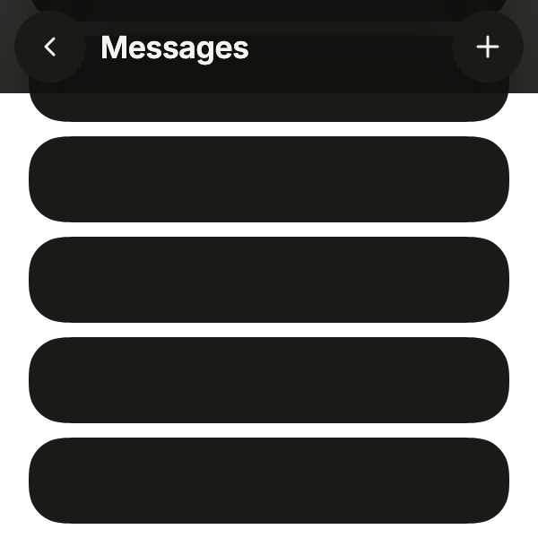
In a CustomScrollView, FlSliverAppBar collapses the large title as the content scrolls under it, and the raised bar takes a blurred veil and its shadow. Scroll back up to see the title return.
import 'package:your_app/ui/fliin/components/app_bar/fl_app_bar.dart';
import 'package:your_app/ui/fliin/core/fliin.dart';
import 'package:your_app/ui/fliin/icons/fl_icons.dart';
import 'package:flutter/widgets.dart';

class AppBarScrolledExample extends StatefulWidget {
  const AppBarScrolledExample({super.key});

  @override
  State<AppBarScrolledExample> createState() => _AppBarScrolledExampleState();
}

class _AppBarScrolledExampleState extends State<AppBarScrolledExample> {
  final _controller = ScrollController(initialScrollOffset: 160);

  @override
  void dispose() {
    _controller.dispose();
    super.dispose();
  }

  @override
  Widget build(BuildContext context) {
    return CustomScrollView(
      controller: _controller,
      slivers: [
        FlSliverAppBar(
          appBar: FlAppBar(
            title: 'Messages',
            titleSize: FlAppBarTitleSize.large,
            back: FlAppBarBack(label: 'Back', onPressed: () {}),
            actions: [FlAppBarAction(icon: FlIcon(FlIcons.plus), label: 'New', onPressed: () {})],
          ),
        ),
        const _Placeholder(10),
      ],
    );
  }
}

/// Blank blocks standing in for the page's content.
class _Placeholder extends StatelessWidget {
  const _Placeholder(this.count);

  final int count;

  @override
  Widget build(BuildContext context) {
    final theme = FlScope.of(context);
    return SliverPadding(
      padding: EdgeInsetsDirectional.all(theme.space.lg),
      sliver: SliverList.list(
        children: [
          for (var i = 0; i < count; i++)
            Padding(
              padding: EdgeInsetsDirectional.only(bottom: theme.space.sm),
              child: SizedBox(
                height: 48,
                child: DecoratedBox(
                  decoration: ShapeDecoration(
                    color: theme.colors.surfaceRaised,
                    shape: FlContinuousBorder(radius: theme.shape.radiusCard),
                  ),
                ),
              ),
            ),
        ],
      ),
    );
  }
}Avatar
leading puts the user's avatar at the start of a root screen, where a detail screen has its back button; it opens the profile.

import 'package:your_app/ui/fliin/components/app_bar/fl_app_bar.dart';
import 'package:your_app/ui/fliin/components/avatar/fl_avatar.dart';
import 'package:your_app/ui/fliin/core/fliin.dart';
import 'package:your_app/ui/fliin/icons/fl_icons.dart';
import 'package:flutter/widgets.dart';

class AppBarAvatarExample extends StatelessWidget {
  const AppBarAvatarExample({super.key});

  @override
  Widget build(BuildContext context) {
    return FlAppBar(
      title: 'Home',
      titleSize: FlAppBarTitleSize.large,
      leading: FlPressable(
        label: 'Profile',
        borderRadius: BorderRadius.circular(FlScope.of(context).shape.radiusButtonLarge),
        onPressed: () {},
        builder: (context, states) => const FlAvatar(initials: 'JD'),
      ),
      actions: [
        FlAppBarAction(icon: FlIcon(FlIcons.bell), label: 'Notifications', onPressed: () {}),
      ],
    );
  }
}Close
A screen opened over the app closes rather than goes back: the icon of FlAppBarBack draws a cross in the disc, the pill confirms.

import 'package:your_app/ui/fliin/components/app_bar/fl_app_bar.dart';
import 'package:your_app/ui/fliin/core/fliin.dart';
import 'package:your_app/ui/fliin/icons/fl_icons.dart';
import 'package:flutter/widgets.dart';

class AppBarCloseExample extends StatelessWidget {
  const AppBarCloseExample({super.key});

  @override
  Widget build(BuildContext context) {
    return FlAppBar(
      title: 'New event',
      titleSize: FlAppBarTitleSize.small,
      back: FlAppBarBack(label: 'Close', icon: FlIcon(FlIcons.xmark), onPressed: () {}),
      actions: [FlAppBarAction.text(label: 'Add', onPressed: () {})],
    );
  }
}Usage
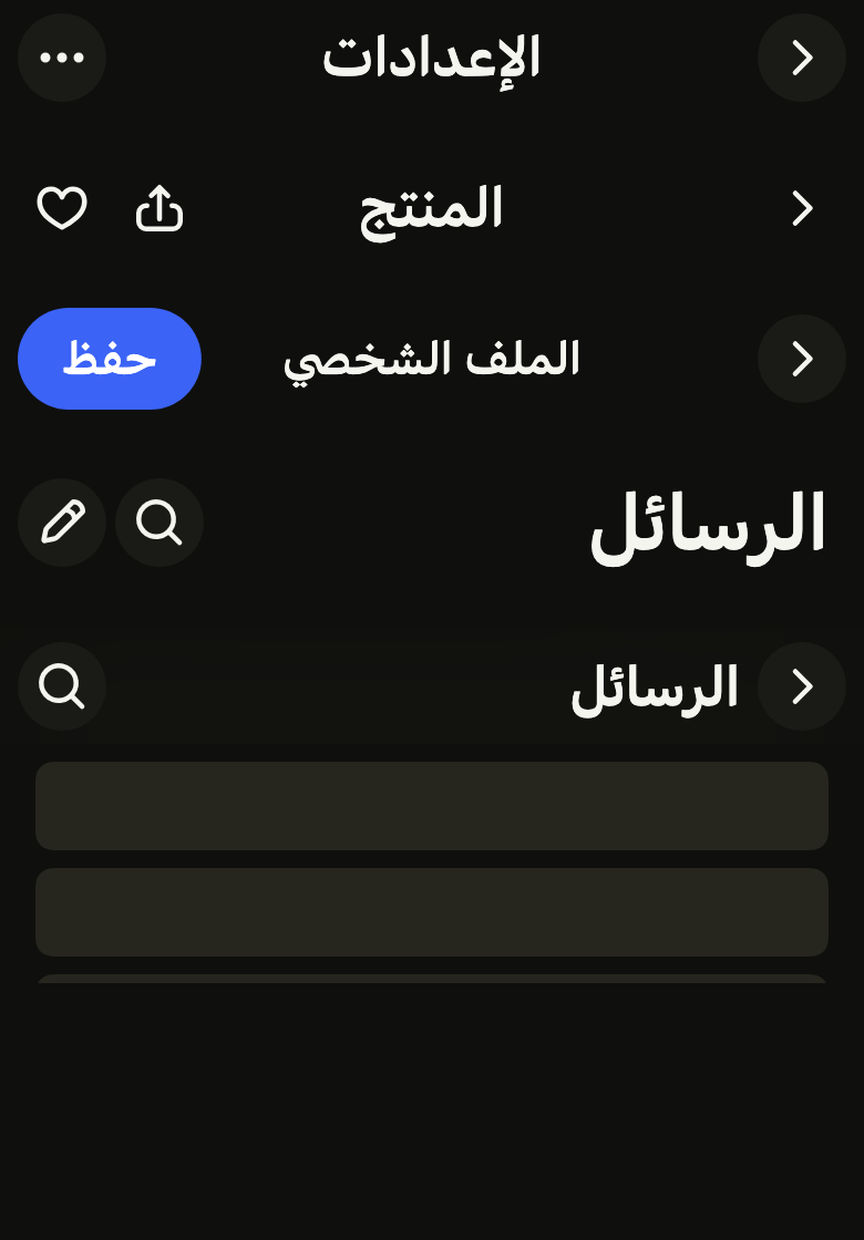
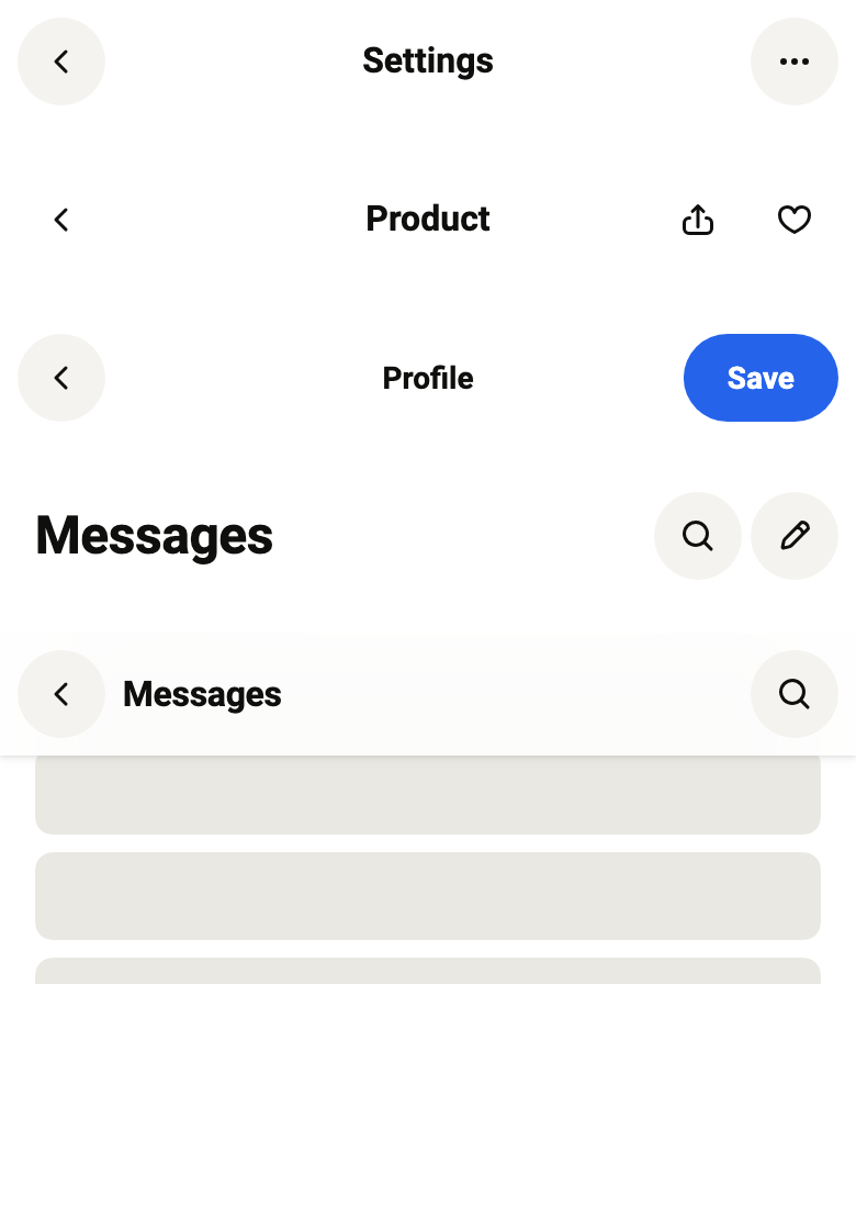
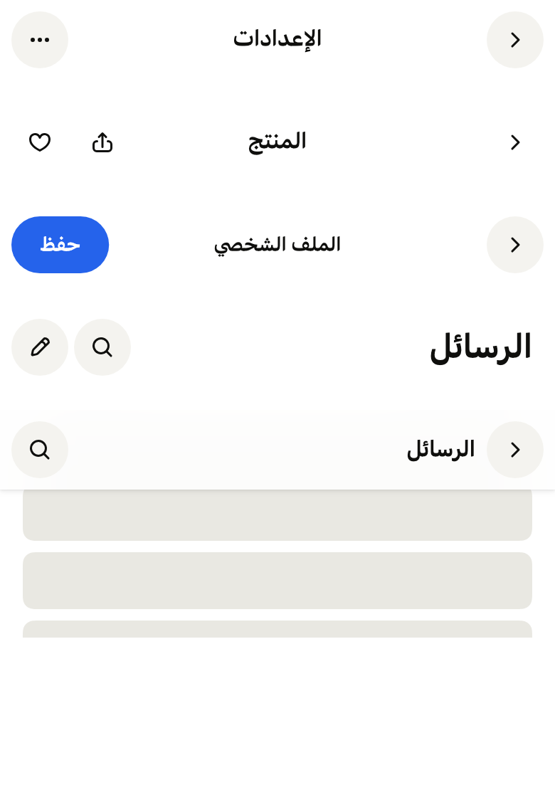
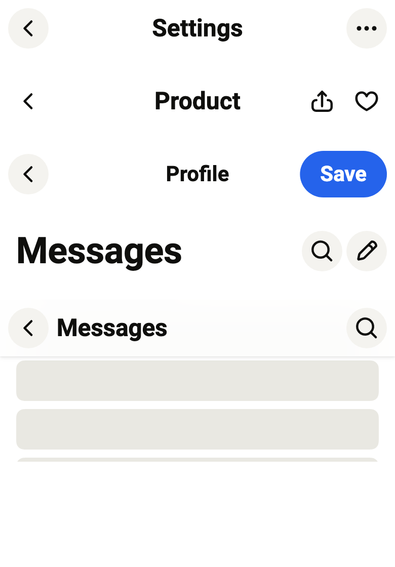
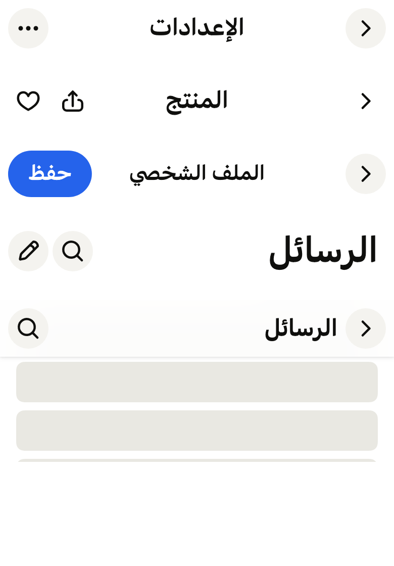
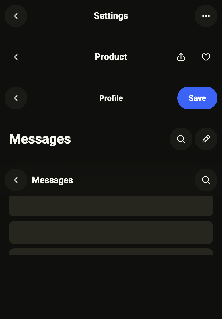
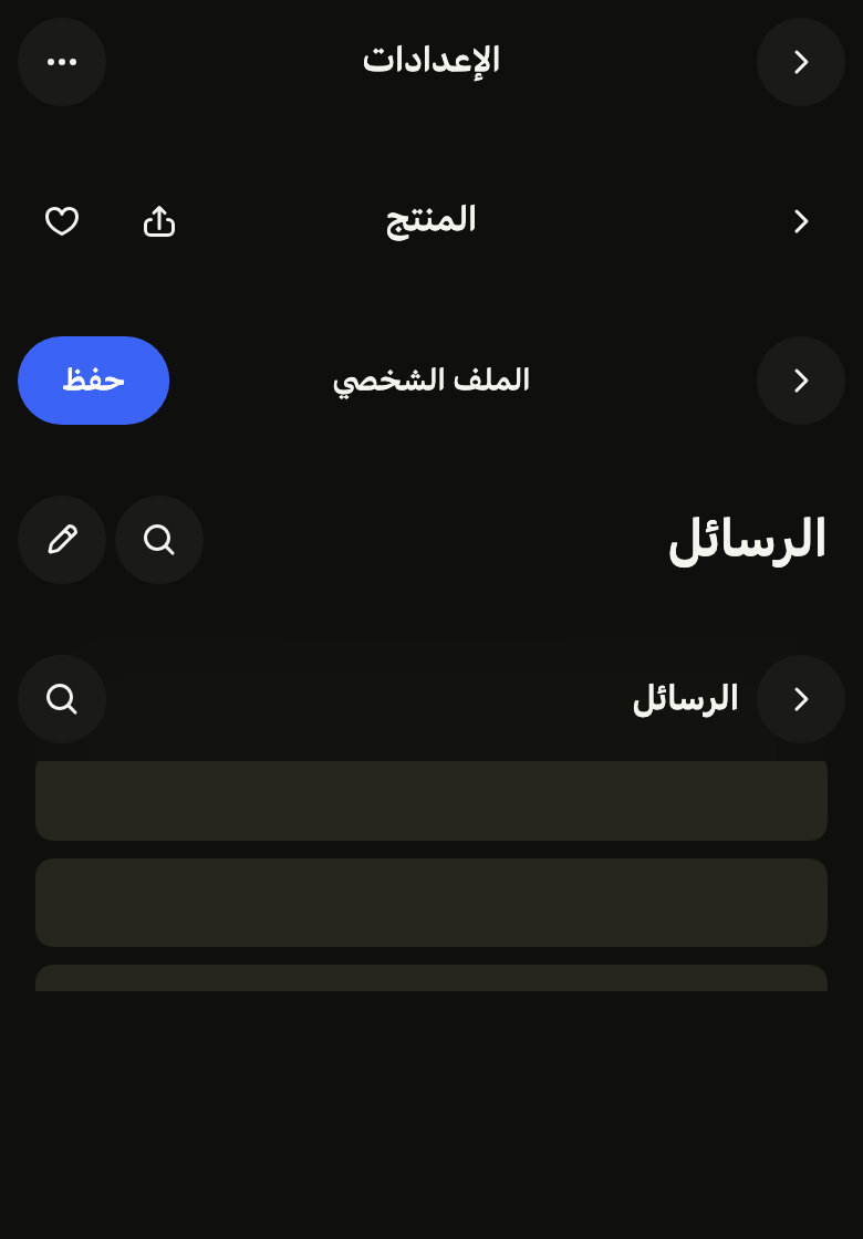
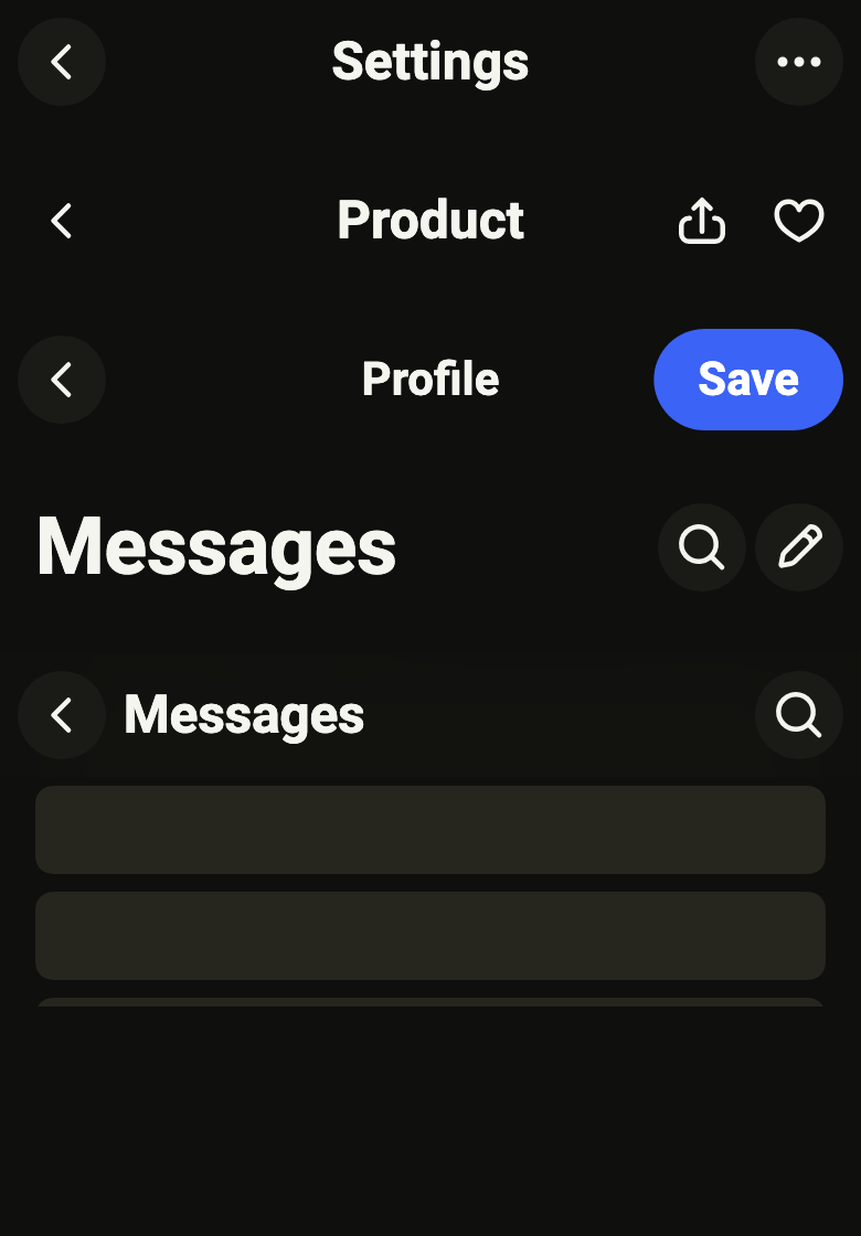
The code the reference images render:
final example = ColoredBox(
  color: FlScope.of(context).colors.surface,
  child: Column(
    crossAxisAlignment: CrossAxisAlignment.stretch,
    spacing: FlScope.of(context).space.lg,
    children: [
      FlAppBar(
        title: 'Settings',
        back: FlAppBarBack(label: 'Back', onPressed: () {}),
        actions: [
          FlAppBarAction(
            icon: FlIcon(FlIcons.ellipsis),
            label: 'More',
            onPressed: () {},
          ),
        ],
      ),
      FlAppBar(
        title: 'Product',
        filled: false,
        back: FlAppBarBack(label: 'Back', onPressed: () {}),
        actions: [
          FlAppBarAction(
            icon: FlIcon(FlIcons.arrowUpFromSquare),
            label: 'Share',
            onPressed: () {},
          ),
          FlAppBarAction(
            icon: FlIcon(FlIcons.heart),
            label: 'Favorite',
            onPressed: () {},
          ),
        ],
      ),
      FlAppBar(
        title: 'Profile',
        titleSize: FlAppBarTitleSize.small,
        back: FlAppBarBack(label: 'Back', onPressed: () {}),
        actions: [FlAppBarAction.text(label: 'Save', onPressed: () {})],
      ),
      FlAppBar(
        title: 'Messages',
        titleSize: FlAppBarTitleSize.large,
        actions: [
          FlAppBarAction(
            icon: FlIcon(FlIcons.magnifier),
            label: 'Search',
            onPressed: () {},
          ),
          FlAppBarAction(
            icon: FlIcon(FlIcons.pencil),
            label: 'New',
            onPressed: () {},
          ),
        ],
      ),
      SizedBox(
        height: 160,
        child: CustomScrollView(
          controller: ScrollController(initialScrollOffset: 200),
          slivers: [
            FlSliverAppBar(
              appBar: FlAppBar(
                title: 'Messages',
                titleSize: FlAppBarTitleSize.large,
                back: FlAppBarBack(label: 'Back', onPressed: () {}),
                actions: [
                  FlAppBarAction(
                    icon: FlIcon(FlIcons.magnifier),
                    label: 'Search',
                    onPressed: () {},
                  ),
                ],
              ),
            ),
            SliverList.list(
              children: [
                for (var i = 0; i < 12; i++)
                  Padding(
                    padding: EdgeInsetsDirectional.symmetric(
                      horizontal: FlScope.of(context).space.lg,
                      vertical: FlScope.of(context).space.xs,
                    ),
                    child: SizedBox(
                      height: 40,
                      child: DecoratedBox(
                        decoration: ShapeDecoration(
                          color: FlScope.of(context).colors.surfaceSecondary,
                          shape: FlContinuousBorder(
                            radius: FlScope.of(context).shape.radiusMd,
                          ),
                        ),
                      ),
                    ),
                  ),
              ],
            ),
          ],
        ),
      ),
    ],
  ),
);API
FlAppBarTitleSize: enum {small, medium, large, xlarge}
FlAppBarTitleSize.small: static final FlAppBarTitleSize
FlAppBarTitleSize.medium: static final FlAppBarTitleSize
FlAppBarTitleSize.large: static final FlAppBarTitleSize
FlAppBarTitleSize.xlarge: static final FlAppBarTitleSize
FlAppBarTitleSize.new: const new(FlTextRole role)
FlAppBarTitleSize.role: get FlTextRole
FlAppBarTitleSize.atStart: get bool
FlAppBarBack: final class
FlAppBarBack.new: const new({required String label, required VoidCallback onPressed, bool down, Widget? icon})
FlAppBarBack.label: get String
FlAppBarBack.onPressed: get VoidCallback
FlAppBarBack.down: get bool
FlAppBarBack.icon: get Widget?
FlAppBarAction: final class
FlAppBarAction.new: const new({required Widget icon, required String label, required VoidCallback? onPressed})
FlAppBarAction.text: const new({required String label, required VoidCallback? onPressed, bool loading, bool strong})
FlAppBarAction.icon: get Widget?
FlAppBarAction.label: get String
FlAppBarAction.onPressed: get VoidCallback?
FlAppBarAction.loading: get bool
FlAppBarAction.strong: get bool
FlAppBar: class extends StatelessWidget
FlAppBar.new: const new({super.key, required String title, FlAppBarTitleSize titleSize, FlAppBarBack? back, List<FlAppBarAction> actions, String? subtitle, bool filled, Widget? leading})
FlAppBar.title: get String
FlAppBar.titleSize: get FlAppBarTitleSize
FlAppBar.subtitle: get String?
FlAppBar.back: get FlAppBarBack?
FlAppBar.actions: get List<FlAppBarAction>
FlAppBar.filled: get bool
FlAppBar.leading: get Widget?
FlAppBar.barHeight: static double(BuildContext context)
FlAppBar.restHeight: double(BuildContext context)
FlAppBar.build: Widget(BuildContext context)
FlSliverAppBar: class extends StatelessWidget
FlSliverAppBar.new: const new({super.key, required FlAppBar appBar})
FlSliverAppBar.appBar: get FlAppBar
FlSliverAppBar.build: Widget(BuildContext context)Reference renders
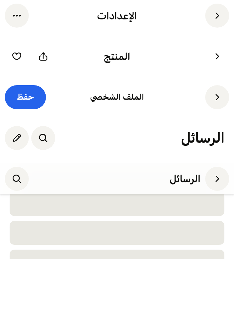
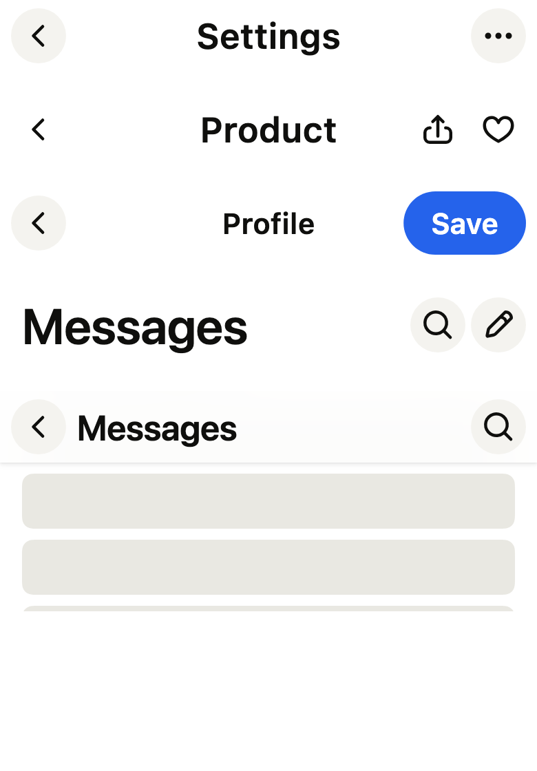
The 16 images published with version 0.3.1, rendered by the shared harness on macOS with Flutter 3.47.7. fliin verify app-bar compares your copy to them.
Use it to
- navigate back to the previous page with a chevron
- add a large title that collapses on scroll
- add actions next to the page name
- keep the page name visible while the list scrolls
- offer a way back to the parent page
- Not for
- the title of a section in the page: use a section header (section-header)
- navigation between the app's sections: use the tab bar (tab-bar)
- States
Source
The files fliin add app-bar copies into your app, before your prefix and imports are applied.
app_bar/fl_app_bar.dart
import 'dart:math' as math;
import 'dart:ui' show ImageFilter, lerpDouble;

import 'package:flutter/services.dart' show SystemUiOverlayStyle;
import 'package:flutter/widgets.dart';
import 'package:fliin_ui/components/button/fl_button.dart';
import 'package:fliin_ui/components/spinner/fl_spinner.dart';
import 'package:fliin_ui/core/fliin.dart';
import 'package:fliin_ui/icons/fl_icons.dart';

/// The size of an [FlAppBar]'s title.
enum FlAppBarTitleSize {
  /// `label`, semibold, centered in the bar: a secondary screen with a long
  /// action (an edit screen).
  small(FlTextRole.label),

  /// `headline`, centered in the bar: the usual detail screen.
  medium(FlTextRole.headline),

  /// `title1`, at the start of the bar, beside the actions: a root screen.
  /// It shrinks to [medium] as the content scrolls under it.
  large(FlTextRole.title1),

  /// `display`, at the start of the bar: a root screen that names a whole
  /// section of the app. It shrinks to [medium] like [large].
  xlarge(FlTextRole.display);

  const FlAppBarTitleSize(this.role);

  /// The type role of the title at rest.
  final FlTextRole role;

  /// True: the title sits at the start of the line, and shrinks on scroll.
  bool get atStart => this == large || this == xlarge;
}

/// The back button of a [FlAppBar]: a chevron alone, at the start of the bar.
final class FlAppBarBack {
  /// A back button that the screen reader names [label] ("Back"), and that
  /// calls [onPressed].
  const FlAppBarBack({required this.label, required this.onPressed, this.down = false, this.icon});

  /// What the screen reader reads; never written.
  final String label;

  /// Called on tap, usually `Navigator.maybePop`.
  final VoidCallback onPressed;

  /// True: the chevron points down, for a screen that closes downwards over
  /// the one below (a player opened from its mini player).
  final bool down;

  /// What the disc shows instead of the chevron, usually
  /// `FlIcon(FlIcons.xmark)` for a screen opened over the app that closes
  /// rather than goes back (a composer, a filter). When null, the chevron.
  final Widget? icon;
}

/// An action at the end of a [FlAppBar]: an icon in the same disc as the
/// back button, or a pill ("Save") through [FlAppBarAction.text].
final class FlAppBarAction {
  /// The action [label], drawn by [icon], that calls [onPressed].
  const FlAppBarAction({required Widget this.icon, required this.label, required this.onPressed})
    : loading = false,
      strong = false;

  /// The written action [label], which calls [onPressed]: a pill, the
  /// button that confirms an edit screen, always visible, even with the
  /// keyboard open. `primary` when [strong], the one accent of the screen;
  /// `tertiary` otherwise, an aside ("Help", "Today"). [loading]: a spinner
  /// replaces the word while waiting, and the action does not respond.
  const FlAppBarAction.text({required this.label, required this.onPressed, this.loading = false, this.strong = true})
    : icon = null;

  /// The icon, which reads its color and size from the `IconTheme`; when
  /// null, the action is written.
  final Widget? icon;

  /// What the screen reader reads, and the word of a written action.
  final String label;

  /// Called on tap; when null, the action is disabled.
  final VoidCallback? onPressed;

  /// True while waiting for what the action triggers (written action).
  final bool loading;

  /// True: the written action is the screen's accent pill; false, a
  /// `tertiary` pill.
  final bool strong;
}

/// The bar's height with a centered title: Izydesk's `.appbar` on iOS, that
/// of Material's top app bar elsewhere. Only the bar reads it.
const _barHeightIos = 52.0;
const _barHeightOther = 56.0;

/// The scroll offset at which the bar's background and shadow appear, once
/// the content has passed under it.
const _raiseTravel = 12.0;

/// The blur behind the raised bar, and how opaque its `surface` gets: the
/// content stays readable through it, as through iOS's bars.
const _glassBlur = 20.0;
const _glassOpacity = 0.85;

typedef _Scroll = ({double collapse, double raise, double? height});

/// The top bar of a screen: a back chevron at the start, the [title], up to
/// three [actions] at the end, below the top safe area.
///
/// The back button and the icon actions are the same discs, filled with
/// `tertiary` when [filled], bare otherwise, so the bar stays symmetric. A
/// written action is a pill.
///
/// On its own, it draws at rest, transparent over the page. In a `FlPage`,
/// or through [FlSliverAppBar] in a `CustomScrollView`, it follows the
/// scroll: a large title shrinks to the size of a centered one, then a
/// translucent `surface`, blurred, with the `surface` shadow, appears when
/// the content passes under it.
///
/// Back navigation (iOS edge swipe, Android button and predictive back)
/// belongs to the app's router; the bar only shows the chevron and calls
/// [back].
class FlAppBar extends StatelessWidget {
  /// A bar titled [title].
  const FlAppBar({
    super.key,
    required this.title,
    this.titleSize = FlAppBarTitleSize.medium,
    this.back,
    this.actions = const [],
    this.subtitle,
    this.filled = true,
    this.leading,
  });

  /// The screen's title, announced as a header.
  final String title;

  /// The size of the title, and whether it is centered or at the start.
  final FlAppBarTitleSize titleSize;

  /// A line under a centered title, in `textXs` and `onSurfaceMuted`: a
  /// conversation's "online". Ignored with a title at the start.
  final String? subtitle;

  /// The back chevron; when null, the bar has none.
  final FlAppBarBack? back;

  /// The actions at the end of the bar, in reading order; three at most.
  final List<FlAppBarAction> actions;

  /// True: the back chevron and the icon actions sit on a `tertiary` disc;
  /// false, bare, a ghost button's press only.
  final bool filled;

  /// What sits at the start of a bar without [back]: the user's `FlAvatar`
  /// of `sm` size on a root screen, which opens the profile, or the app's
  /// mark. It brings its own semantics and touch target. Ignored with
  /// [back]; when null, nothing.
  final Widget? leading;

  /// The height of a bar with a centered title, without the safe area.
  static double barHeight(BuildContext context) =>
      FlScope.of(context).platform == TargetPlatform.iOS ? _barHeightIos : _barHeightOther;

  /// The line of [titleSize]'s role as the font lays it out (a font with
  /// large metrics enlarges the tokens' line).
  double _line(BuildContext context, FlTextRole role) {
    final theme = FlScope.of(context);
    final inherited = DefaultTextStyle.of(context).style;
    final painter = TextPainter(
      text: TextSpan(text: title, style: inherited.merge(theme.typography.resolve(role, heading: true))),
      strutStyle: theme.typography.strut(role, inheritedFamily: inherited.fontFamily, heading: true),
      textScaler: MediaQuery.textScalerOf(context).clamp(maxScaleFactor: theme.size.iconMaxScale),
      textDirection: Directionality.of(context),
      maxLines: 1,
    )..layout();
    final line = painter.height;
    painter.dispose();
    return line;
  }

  /// How far the content scrolls while a title at the start shrinks: its
  /// line, whether or not the bar loses height meanwhile.
  double _titleTravel(BuildContext context) => titleSize.atStart ? _line(context, titleSize.role) : 0;

  /// The height of the bar at rest, without the safe area: [barHeight], or
  /// more for a large title, which keeps `space.sm` above and below it. In a
  /// [FlSliverAppBar], the bar shrinks from it to [barHeight] as the content
  /// scrolls.
  double restHeight(BuildContext context) {
    final bar = barHeight(context);
    if (!titleSize.atStart) return bar;
    return math.max(bar, _line(context, titleSize.role) + 2 * FlScope.of(context).space.sm);
  }

  @override
  Widget build(BuildContext context) {
    // Checked here and not in the constructor, which must stay const.
    assert(actions.length <= 3, 'three actions at most');
    final theme = FlScope.of(context);
    final colors = theme.colors;
    final scroll =
        context.dependOnInheritedWidgetOfExactType<_AppBarScroll>()?.scroll ?? (collapse: 0, raise: 0, height: null);
    final height = scroll.height ?? restHeight(context);
    final disc = theme.size.controlCompact - theme.space.xs;
    final scaler = MediaQuery.textScalerOf(context).clamp(maxScaleFactor: theme.size.iconMaxScale);

    Widget circle(String label, Widget icon, VoidCallback? onPressed) => FlButton.icon(
      label: label,
      icon: icon,
      onPressed: onPressed,
      variant: filled ? FlButtonVariant.tertiary : FlButtonVariant.ghost,
      size: FlButtonSize.sm,
      extent: disc,
    );

    final back = this.back;
    final start = this.leading;
    final leading = switch ((back, start)) {
      (final back?, _) => Center(
        widthFactor: 1,
        child: circle(
          back.label,
          back.icon ?? FlIcon(back.down ? FlIcons.chevronDown : FlIcons.chevronLeft),
          back.onPressed,
        ),
      ),
      (null, final start?) => Center(widthFactor: 1, child: start),
      (null, null) => null,
    };

    // NavigationToolbar keeps `middleSpacing` after the leading widget, but
    // pushes a centered title that is too wide right against the trailing
    // one: the same gap is carried here.
    final trailing = actions.isEmpty
        ? null
        : Padding(
            padding: EdgeInsetsDirectional.only(start: titleSize.atStart ? 0 : theme.space.sm),
            child: Row(
              mainAxisSize: MainAxisSize.min,
              crossAxisAlignment: CrossAxisAlignment.center,
              spacing: theme.space.xs,
              children: [
                for (final action in actions)
                  switch (action.icon) {
                    final icon? => circle(action.label, icon, action.onPressed),
                    null => _Pill(action: action, height: disc),
                  },
              ],
            ),
          );

    final Widget middle;
    if (titleSize.atStart) {
      // The title is laid out at its rest size and scaled down: it keeps its
      // line breaks and its ellipsis while it shrinks.
      final rest = theme.typography.resolve(titleSize.role, heading: true).fontSize!;
      final collapsed = theme.typography.resolve(FlTextRole.headline, heading: true).fontSize!;
      middle = Align(
        alignment: AlignmentDirectional.centerStart,
        child: Transform.scale(
          scale: lerpDouble(1, collapsed / rest, scroll.collapse)!,
          alignment: AlignmentDirectional.centerStart.resolve(Directionality.of(context)),
          child: _Title(title: title, role: titleSize.role, scaler: scaler),
        ),
      );
    } else {
      final titleText = _Title(title: title, role: titleSize.role, scaler: scaler);
      middle = switch (subtitle) {
        final subtitle? => Column(
          mainAxisSize: MainAxisSize.min,
          children: [
            titleText,
            Text(
              subtitle,
              maxLines: 1,
              overflow: TextOverflow.ellipsis,
              softWrap: false,
              textScaler: scaler,
              style: theme.typography.resolve(FlTextRole.textXs).copyWith(color: colors.onSurfaceMuted),
              strutStyle: theme.typography.strut(
                FlTextRole.textXs,
                inheritedFamily: DefaultTextStyle.of(context).style.fontFamily,
              ),
            ),
          ],
        ),
        _ => titleText,
      };
    }

    // The buttons' touch target, centered on them, stays on screen, even in
    // compact density; a title at the start without a back button lines up
    // with the page's content, at `space.lg`.
    final inset = math.max(theme.space.sm, (theme.hitTarget - disc) / 2);
    final bar = Padding(
      padding: EdgeInsetsDirectional.only(
        start: leading == null && titleSize.atStart ? theme.space.lg : inset,
        end: actions.isEmpty && titleSize.atStart ? theme.space.lg : inset,
      ),
      child: NavigationToolbar(
        leading: leading,
        middle: middle,
        trailing: trailing,
        centerMiddle: !titleSize.atStart,
        middleSpacing: leading == null && titleSize.atStart ? 0 : theme.space.sm,
      ),
    );

    final content = SafeArea(
      top: false,
      bottom: false,
      child: Column(
        mainAxisSize: MainAxisSize.min,
        crossAxisAlignment: CrossAxisAlignment.stretch,
        children: [
          SizedBox(height: MediaQuery.paddingOf(context).top),
          SizedBox(height: height, child: bar),
        ],
      ),
    );

    final surface = colors.surface;
    final raised = scroll.raise == 0
        ? content
        : FlShadow(
            layers: [
              for (final layer in theme.shadows.surface)
                FlShadowLayer(
                  color: layer.color.withValues(alpha: layer.color.a * scroll.raise),
                  offset: layer.offset,
                  blur: layer.blur,
                  spread: layer.spread,
                  inset: layer.inset,
                ),
            ],
            shape: const RoundedRectangleBorder(),
            child: ClipRect(
              child: BackdropFilter(
                filter: ImageFilter.blur(sigmaX: _glassBlur * scroll.raise, sigmaY: _glassBlur * scroll.raise),
                child: ColoredBox(
                  color: surface.withValues(alpha: surface.a * _glassOpacity * scroll.raise),
                  child: content,
                ),
              ),
            ),
          );

    return AnnotatedRegion<SystemUiOverlayStyle>(
      value: SystemUiOverlayStyle(
        statusBarBrightness: theme.brightness,
        statusBarIconBrightness: theme.brightness == Brightness.light ? Brightness.dark : Brightness.light,
      ),
      child: raised,
    );
  }
}

/// A [FlAppBar] pinned at the top of a `CustomScrollView`, which follows its
/// scroll: a large title shrinks, then the background appears. `FlPage`
/// places it alone; a screen that holds its own scrollable puts it first.
class FlSliverAppBar extends StatelessWidget {
  /// The bar [appBar] at the top of the scroll.
  const FlSliverAppBar({super.key, required this.appBar});

  /// The bar to pin.
  final FlAppBar appBar;

  @override
  Widget build(BuildContext context) {
    final top = MediaQuery.paddingOf(context).top;
    return SliverPersistentHeader(
      pinned: true,
      delegate: _Delegate(
        appBar: appBar,
        top: top,
        collapsed: top + FlAppBar.barHeight(context),
        rest: top + appBar.restHeight(context),
        titleTravel: appBar._titleTravel(context),
      ),
    );
  }
}

class _Delegate extends SliverPersistentHeaderDelegate {
  const _Delegate({
    required this.appBar,
    required this.top,
    required this.collapsed,
    required this.rest,
    required this.titleTravel,
  });

  final FlAppBar appBar;
  final double top;
  final double collapsed;
  final double rest;
  final double titleTravel;

  @override
  double get minExtent => collapsed;

  @override
  double get maxExtent => rest;

  @override
  Widget build(BuildContext context, double shrinkOffset, bool overlapsContent) {
    // The title shrinks over its own line even when the bar keeps its
    // height; the background waits for both.
    final travel = math.max(rest - collapsed, titleTravel);
    return _AppBarScroll(
      scroll: (
        collapse: titleTravel == 0 ? 0 : (shrinkOffset / titleTravel).clamp(0.0, 1.0),
        raise: ((shrinkOffset - travel) / _raiseTravel).clamp(0.0, 1.0),
        height: math.max(rest - shrinkOffset, collapsed) - top,
      ),
      child: appBar,
    );
  }

  @override
  bool shouldRebuild(_Delegate oldDelegate) =>
      appBar != oldDelegate.appBar ||
      top != oldDelegate.top ||
      collapsed != oldDelegate.collapsed ||
      rest != oldDelegate.rest ||
      titleTravel != oldDelegate.titleTravel;
}

class _AppBarScroll extends InheritedWidget {
  const _AppBarScroll({required this.scroll, required super.child});

  final _Scroll scroll;

  @override
  bool updateShouldNotify(_AppBarScroll oldWidget) => scroll != oldWidget.scroll;
}

/// A single-line title, cut with an ellipsis and announced as a header; its
/// enlargement is capped by [scaler], like the title of an iOS navigation
/// bar.
class _Title extends StatelessWidget {
  const _Title({required this.title, required this.role, required this.scaler});

  final String title;
  final FlTextRole role;
  final TextScaler scaler;

  @override
  Widget build(BuildContext context) {
    final theme = FlScope.of(context);
    var style = theme.typography.resolve(role, heading: true).copyWith(color: theme.colors.onSurface);
    if (role == FlTextRole.label) {
      style = style.copyWith(fontWeight: theme.tokens.typography.weight.semibold);
    }
    return Semantics(
      header: true,
      child: Text(
        title,
        maxLines: 1,
        overflow: TextOverflow.ellipsis,
        softWrap: false,
        textScaler: scaler,
        style: style,
        strutStyle: theme.typography.strut(
          role,
          inheritedFamily: DefaultTextStyle.of(context).style.fontFamily,
          heading: true,
        ),
      ),
    );
  }
}

/// A written action of the bar: [action]'s label in a pill [height] high,
/// the same height as the discs. `accent` when strong, `control` otherwise,
/// the fills of a `primary` and a `tertiary` button; a spinner replaces the
/// label while loading, keeping its width.
class _Pill extends StatelessWidget {
  const _Pill({required this.action, required this.height});

  final FlAppBarAction action;
  final double height;

  @override
  Widget build(BuildContext context) {
    final theme = FlScope.of(context);
    final colors = theme.colors;
    final strong = action.strong;
    final fill = strong ? colors.accent : colors.control;
    final foreground = strong ? colors.onAccent : colors.onControl;
    final highlight = strong ? colors.accentPressed : colors.controlPressed;
    const role = FlTextRole.controlSm;
    final scaler = MediaQuery.textScalerOf(context).clamp(maxScaleFactor: theme.size.iconMaxScale);
    final label = Text(
      action.label,
      maxLines: 1,
      textScaler: scaler,
      style: theme.typography
          .resolve(role)
          .copyWith(color: foreground, fontWeight: theme.tokens.typography.weight.semibold),
      strutStyle: theme.typography.strut(role, inheritedFamily: DefaultTextStyle.of(context).style.fontFamily),
    );
    final radius = theme.shape.buttonRadius;
    return FlPressable(
      onPressed: action.loading ? null : action.onPressed,
      label: action.label,
      borderRadius: radius,
      builder: (context, states) => Opacity(
        opacity: states.contains(WidgetState.disabled) && !action.loading ? theme.size.disabledOpacity : 1,
        child: ConstrainedBox(
          constraints: BoxConstraints(minHeight: height),
          child: DecoratedBox(
            decoration: BoxDecoration(color: fill, borderRadius: radius),
            child: Stack(
              alignment: Alignment.center,
              children: [
                Positioned.fill(
                  child: ClipRRect(
                    borderRadius: radius,
                    child: FlPressHighlight(color: highlight),
                  ),
                ),
                // `space.sm` above and below the label: a font with a tall line
                // grows the pill rather than reaching its edge.
                Padding(
                  padding: EdgeInsetsDirectional.symmetric(
                    horizontal: theme.size.buttonPaddingSm,
                    vertical: theme.space.sm,
                  ),
                  child: action.loading
                      ? Stack(
                          alignment: Alignment.center,
                          children: [
                            Visibility.maintain(visible: false, child: label),
                            FlSpinner(
                              label: action.label,
                              color: foreground,
                              extent: scaler.scale(theme.size.spinnerSm),
                            ),
                          ],
                        )
                      : label,
                ),
              ],
            ),
          ),
        ),
      ),
    );
  }
}