Components / forms
Combo box
Suggests matches under a text field as you type, from a local list or a remote lookup, with loading, no-result and error states; arrow keys pick a suggestion while focus stays in the field.
Import
In a Flutter app where fliin init has run:
Examples
Example
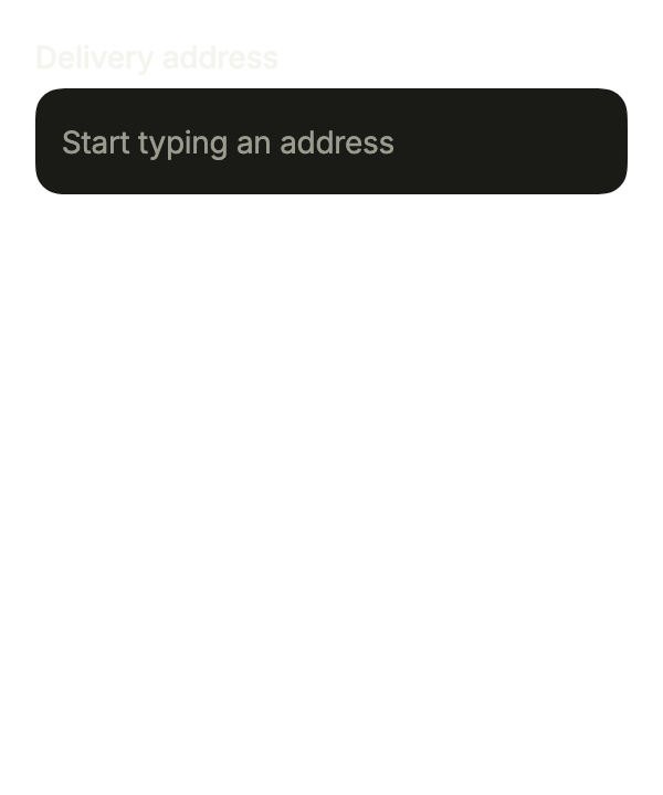
Suggestions from an asynchronous search, like an address lookup on a server, with allowsCustomValue so that free text remains a valid answer.
import 'package:your_app/ui/fliin/components/combo_box/fl_combo_box.dart';
import 'package:your_app/ui/fliin/components/select/fl_select.dart';
import 'package:flutter/widgets.dart';

class ComboBoxExample extends StatefulWidget {
  const ComboBoxExample({super.key});

  @override
  State<ComboBoxExample> createState() => _ComboBoxExampleState();
}

class _ComboBoxExampleState extends State<ComboBoxExample> {
  FlSelectOption<String>? _address;

  Future<List<FlSelectOption<String>>> _search(String query) async {
    await Future<void>.delayed(const Duration(milliseconds: 500));
    if (query.trim().length < 2) return const [];
    return [
      for (final street in const ['12 Main Street', '48 Main Square', '5 Maple Avenue'])
        if (street.toLowerCase().contains(query.trim().toLowerCase()))
          FlSelectOption(value: street, label: street, description: 'Springfield'),
    ];
  }

  @override
  Widget build(BuildContext context) {
    return FlComboBox<String>(
      key: const ValueKey('address'),
      label: 'Delivery address',
      placeholder: 'Start typing an address',
      allowsCustomValue: true,
      value: _address,
      onChanged: (address) => setState(() => _address = address),
      suggestions: _search,
      countText: (count) => '$count addresses',
      emptyText: 'No address found',
      loadingText: 'Looking up addresses…',
      errorText: 'Address lookup failed',
    );
  }
}Capitals
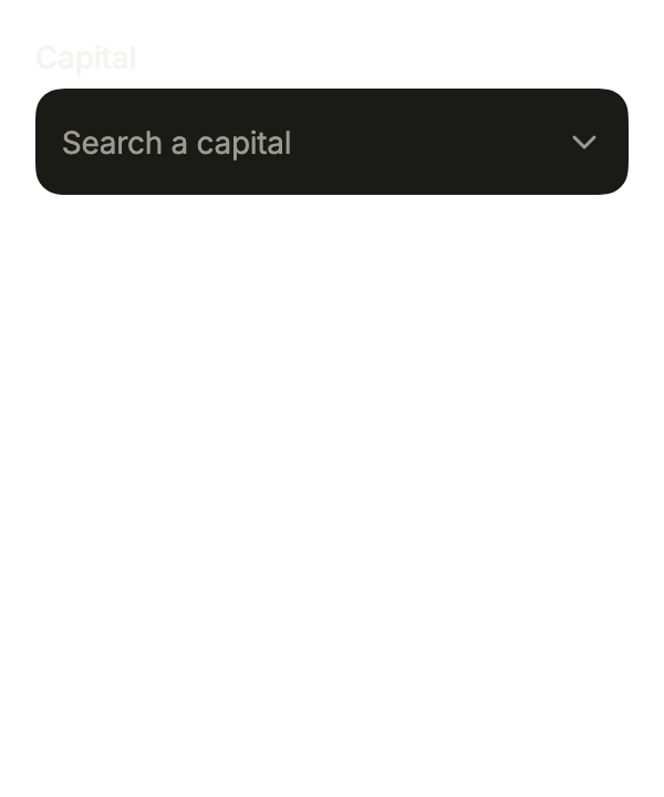
FlComboBox.filtering filters a list the app already holds on each letter typed; the button at the end shows them all.
import 'package:your_app/ui/fliin/components/combo_box/fl_combo_box.dart';
import 'package:your_app/ui/fliin/components/select/fl_select.dart';
import 'package:flutter/widgets.dart';

class ComboBoxCapitalsExample extends StatefulWidget {
  const ComboBoxCapitalsExample({super.key});

  @override
  State<ComboBoxCapitalsExample> createState() => _ComboBoxCapitalsExampleState();
}

class _ComboBoxCapitalsExampleState extends State<ComboBoxCapitalsExample> {
  static const _capitals = [
    FlSelectOption(value: 'ams', label: 'Amsterdam'),
    FlSelectOption(value: 'ber', label: 'Berlin'),
    FlSelectOption(value: 'lis', label: 'Lisbon'),
    FlSelectOption(value: 'mad', label: 'Madrid'),
    FlSelectOption(value: 'par', label: 'Paris'),
    FlSelectOption(value: 'rom', label: 'Rome'),
    FlSelectOption(value: 'vie', label: 'Vienna'),
  ];

  FlSelectOption<String>? _city;

  @override
  Widget build(BuildContext context) {
    return FlComboBox<String>.filtering(
      label: 'Capital',
      placeholder: 'Search a capital',
      triggerLabel: 'Show all capitals',
      options: _capitals,
      value: _city,
      onChanged: (city) => setState(() => _city = city),
      countText: (count) => '$count suggestions',
      emptyText: 'No capital found',
    );
  }
}Open
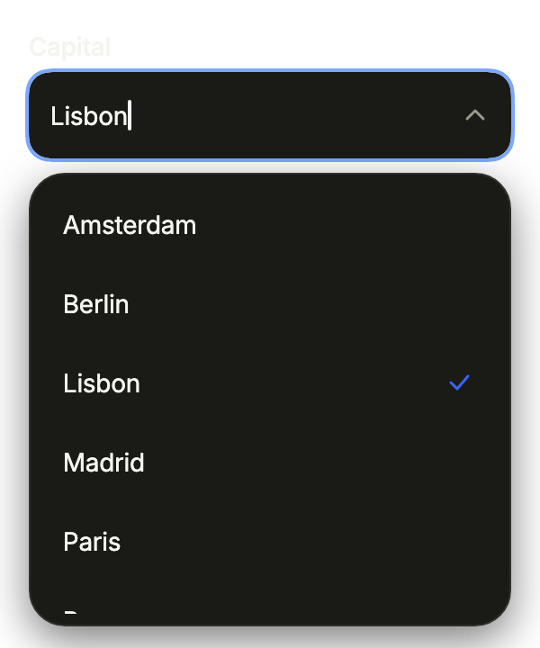
With autofocus, the field takes the focus as the page opens and lists the suggestions under it.
import 'package:your_app/ui/fliin/components/combo_box/fl_combo_box.dart';
import 'package:your_app/ui/fliin/components/select/fl_select.dart';
import 'package:flutter/widgets.dart';

class ComboBoxOpenExample extends StatefulWidget {
  const ComboBoxOpenExample({super.key});

  @override
  State<ComboBoxOpenExample> createState() => _ComboBoxOpenExampleState();
}

class _ComboBoxOpenExampleState extends State<ComboBoxOpenExample> {
  static const _capitals = [
    FlSelectOption(value: 'ams', label: 'Amsterdam'),
    FlSelectOption(value: 'ber', label: 'Berlin'),
    FlSelectOption(value: 'lis', label: 'Lisbon'),
    FlSelectOption(value: 'mad', label: 'Madrid'),
    FlSelectOption(value: 'par', label: 'Paris'),
    FlSelectOption(value: 'rom', label: 'Rome'),
    FlSelectOption(value: 'vie', label: 'Vienna'),
  ];

  FlSelectOption<String>? _city = _capitals.firstWhere((city) => city.value == 'lis');

  @override
  Widget build(BuildContext context) {
    return FlComboBox<String>(
      autofocus: true,
      label: 'Capital',
      placeholder: 'Search a capital',
      triggerLabel: 'Show all capitals',
      value: _city,
      onChanged: (city) => setState(() => _city = city),
      suggestions: (query) => [
        for (final city in _capitals)
          if (city.label.toLowerCase().contains(query.toLowerCase())) city,
      ],
      countText: (count) => '$count suggestions',
      emptyText: 'No capital found',
      loadingText: 'Searching…',
      errorText: 'Search failed',
    );
  }
}Disabled
onChanged: null disables the field: the chosen value stays readable but cannot be changed.

import 'package:your_app/ui/fliin/components/combo_box/fl_combo_box.dart';
import 'package:your_app/ui/fliin/components/select/fl_select.dart';
import 'package:flutter/widgets.dart';

class ComboBoxDisabledExample extends StatefulWidget {
  const ComboBoxDisabledExample({super.key});

  @override
  State<ComboBoxDisabledExample> createState() => _ComboBoxDisabledExampleState();
}

class _ComboBoxDisabledExampleState extends State<ComboBoxDisabledExample> {
  static const _capitals = [
    FlSelectOption(value: 'ams', label: 'Amsterdam'),
    FlSelectOption(value: 'ber', label: 'Berlin'),
    FlSelectOption(value: 'lis', label: 'Lisbon'),
    FlSelectOption(value: 'mad', label: 'Madrid'),
    FlSelectOption(value: 'par', label: 'Paris'),
    FlSelectOption(value: 'rom', label: 'Rome'),
    FlSelectOption(value: 'vie', label: 'Vienna'),
  ];

  final FlSelectOption<String> _city = _capitals.firstWhere((city) => city.value == 'ber');

  @override
  Widget build(BuildContext context) {
    return FlComboBox<String>(
      label: 'Capital',
      placeholder: 'Search a capital',
      triggerLabel: 'Show all capitals',
      value: _city,
      onChanged: null,
      suggestions: (query) => [
        for (final city in _capitals)
          if (city.label.toLowerCase().contains(query.toLowerCase())) city,
      ],
      countText: (count) => '$count suggestions',
      emptyText: 'No capital found',
      loadingText: 'Searching…',
      errorText: 'Search failed',
    );
  }
}Invalid
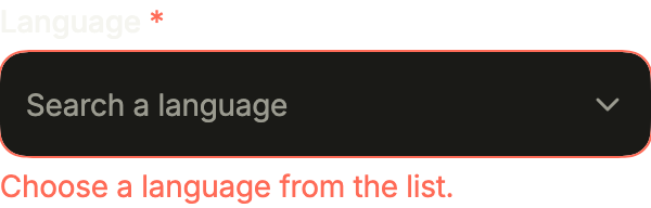
required marks the label, helper explains the field, and error replaces it with a danger ring until a suggestion is chosen.
import 'package:your_app/ui/fliin/components/combo_box/fl_combo_box.dart';
import 'package:your_app/ui/fliin/components/select/fl_select.dart';
import 'package:flutter/widgets.dart';

class ComboBoxInvalidExample extends StatefulWidget {
  const ComboBoxInvalidExample({super.key});

  @override
  State<ComboBoxInvalidExample> createState() => _ComboBoxInvalidExampleState();
}

class _ComboBoxInvalidExampleState extends State<ComboBoxInvalidExample> {
  static const _languages = [
    FlSelectOption(value: 'en', label: 'English'),
    FlSelectOption(value: 'fr', label: 'French'),
    FlSelectOption(value: 'de', label: 'German'),
    FlSelectOption(value: 'es', label: 'Spanish'),
  ];

  FlSelectOption<String>? _language;

  @override
  Widget build(BuildContext context) {
    return FlComboBox<String>.filtering(
      label: 'Language',
      required: true,
      placeholder: 'Search a language',
      helper: 'The language of your emails and invoices.',
      error: _language == null ? 'Choose a language from the list.' : null,
      triggerLabel: 'Show all languages',
      options: _languages,
      value: _language,
      onChanged: (language) => setState(() => _language = language),
      countText: (count) => '$count languages',
      emptyText: 'No language found',
    );
  }
}Usage
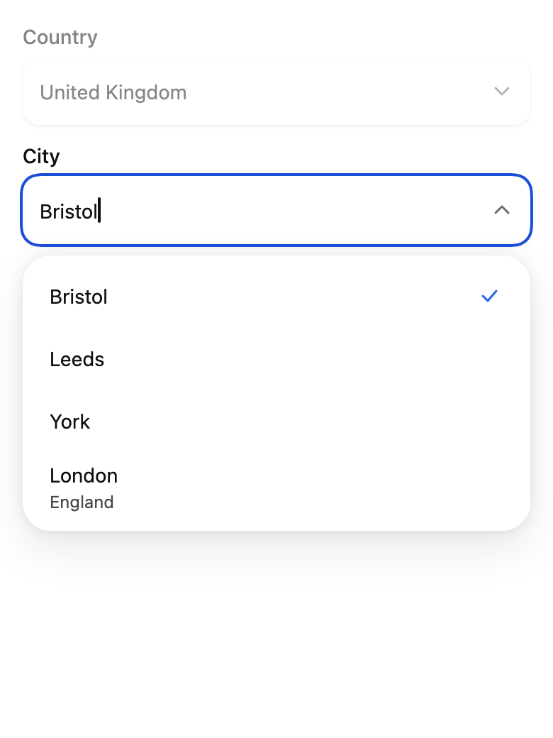
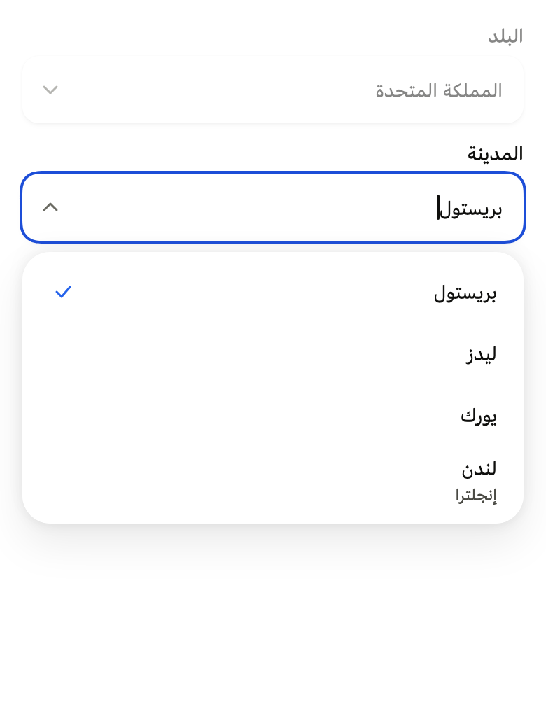
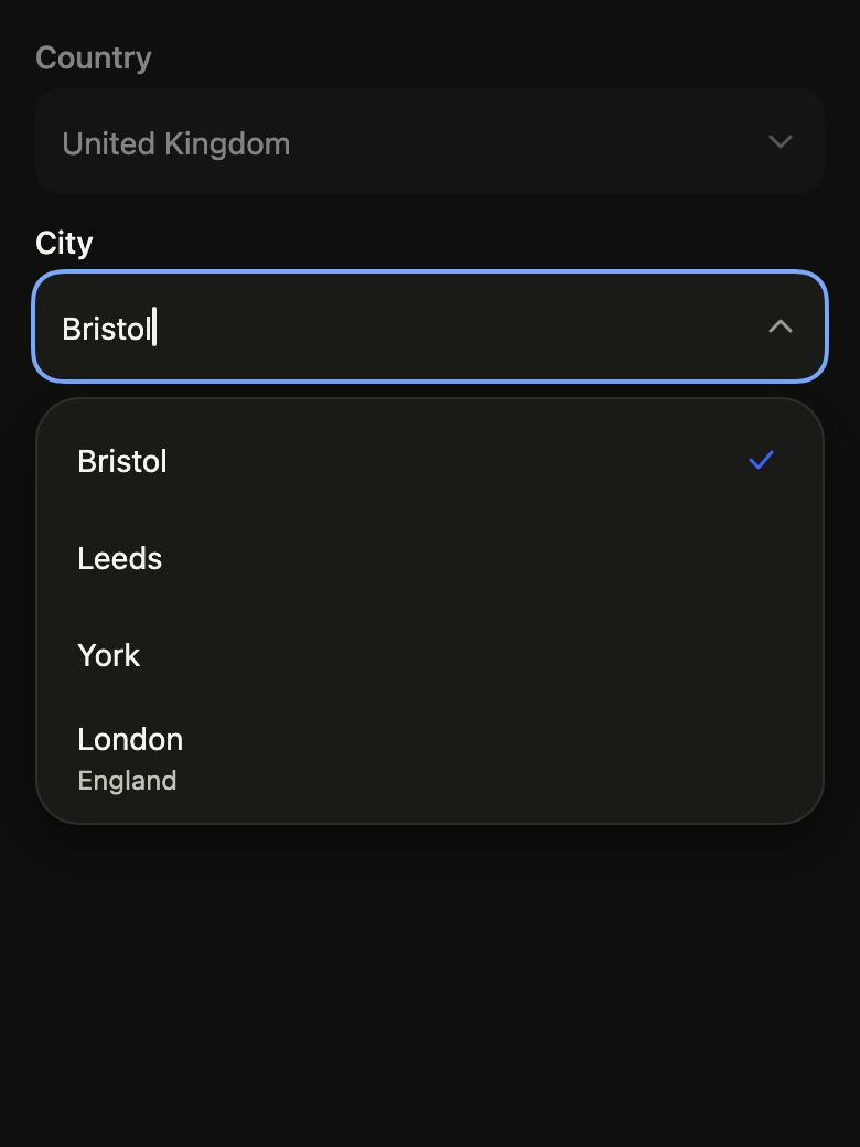
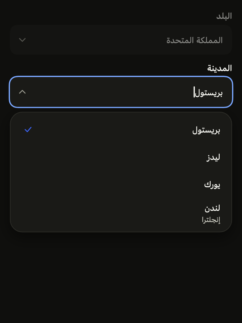
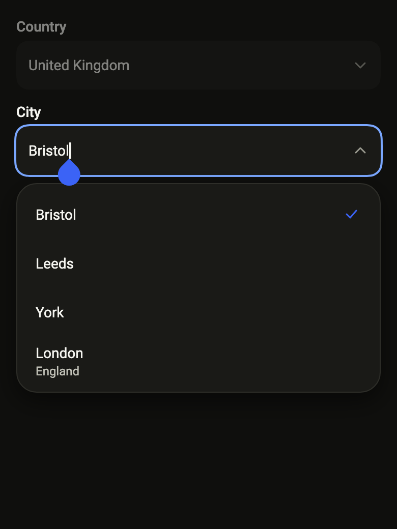
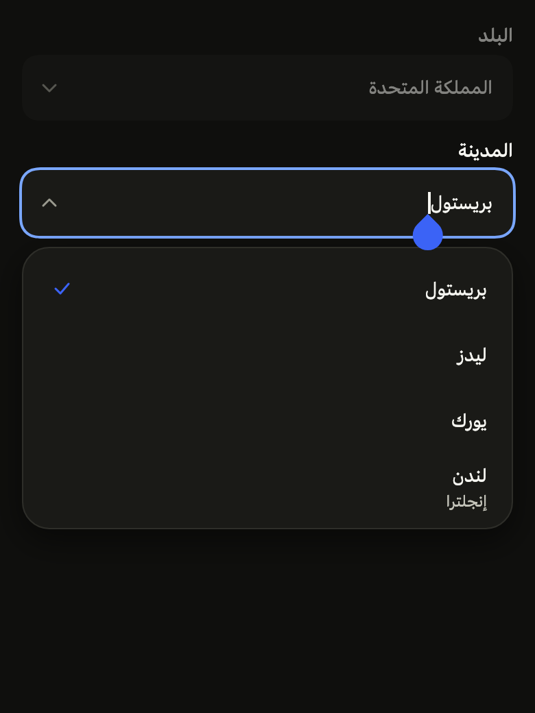
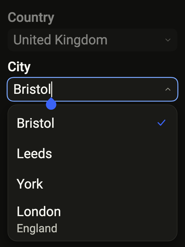
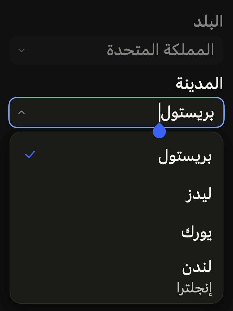
The code the reference images render:
final example = Overlay(
  initialEntries: [
    OverlayEntry(
      builder: (context) => ColoredBox(
        color: FlScope.of(context).colors.surface,
        child: Padding(
          padding: EdgeInsetsDirectional.all(FlScope.of(context).space.lg),
          child: Column(
            crossAxisAlignment: CrossAxisAlignment.stretch,
            spacing: FlScope.of(context).space.md,
            children: [
              FlComboBox<int>(
                label: 'Country',
                triggerLabel: 'All countries',
                value: FlSelectOption(value: 0, label: 'United Kingdom'),
                onChanged: null,
                suggestions: (_) => const [],
                countText: (count) => '$count suggestions',
                emptyText: 'No city',
                loadingText: 'Searching…',
                errorText: 'The search failed',
              ),
              FlComboBox<int>(
                autofocus: true,
                label: 'City',
                placeholder: 'Search for a city',
                triggerLabel: 'All cities',
                value: FlSelectOption(value: 0, label: 'Bristol'),
                onChanged: (_) {},
                suggestions: (query) => [
                  for (final (i, (name, region))
                      in (variant.dir == TextDirection.rtl
                              ? const [
                                  ('بريستول', null),
                                  ('ليدز', null),
                                  ('يورك', null),
                                  ('لندن', 'إنجلترا'),
                                ]
                              : const [
                                  ('Bristol', null),
                                  ('Leeds', null),
                                  ('York', null),
                                  ('London', 'England'),
                                ])
                          .indexed)
                    if (name.toLowerCase().contains(query.toLowerCase()))
                      FlSelectOption(
                        value: i,
                        label: name,
                        description: region,
                      ),
                ],
                countText: (count) => '$count suggestions',
                emptyText: 'No city',
                loadingText: 'Searching…',
                errorText: 'The search failed',
              ),
            ],
          ),
        ),
      ),
    ),
  ],
);API
FlComboBoxSource: typedef<T> = FutureOr<List<FlSelectOption<T>>> Function(String query)
FlComboBox: class<T> extends StatefulWidget
FlComboBox.new: const new({super.key, required String label, required FlComboBoxSource<T> suggestions, required FlSelectOption<T>? value, required ValueChanged<FlSelectOption<T>?>? onChanged, required String Function(int count) countText, required String emptyText, required String loadingText, required String errorText, bool allowsCustomValue, ValueChanged<String>? onTextChanged, String? triggerLabel, String? placeholder, String? helper, String? error, bool required, FlInputVariant variant, TextEditingController? controller, FocusNode? focusNode, bool autofocus})
FlComboBox.filtering: new({super.key, required String label, required List<FlSelectOption<T>> options, required FlSelectOption<T>? value, required ValueChanged<FlSelectOption<T>?>? onChanged, required String Function(int count) countText, required String emptyText, bool allowsCustomValue, ValueChanged<String>? onTextChanged, String? triggerLabel, String? placeholder, String? helper, String? error, bool required, FlInputVariant variant, TextEditingController? controller, FocusNode? focusNode, bool autofocus})
FlComboBox.label: get String
FlComboBox.suggestions: get FlComboBoxSource<T>
FlComboBox.value: get FlSelectOption<T>?
FlComboBox.onChanged: get ValueChanged<FlSelectOption<T>?>?
FlComboBox.countText: get String Function(int count)
FlComboBox.emptyText: get String
FlComboBox.loadingText: get String
FlComboBox.errorText: get String
FlComboBox.allowsCustomValue: get bool
FlComboBox.onTextChanged: get ValueChanged<String>?
FlComboBox.triggerLabel: get String?
FlComboBox.placeholder: get String?
FlComboBox.helper: get String?
FlComboBox.error: get String?
FlComboBox.required: get bool
FlComboBox.variant: get FlInputVariant
FlComboBox.controller: get TextEditingController?
FlComboBox.focusNode: get FocusNode?
FlComboBox.autofocus: get bool
FlComboBox.createState: State<FlComboBox<T>>()Reference renders
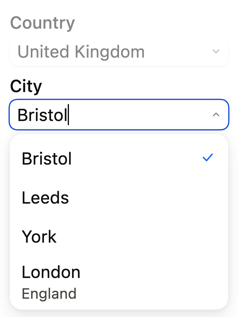
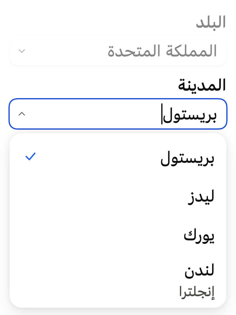
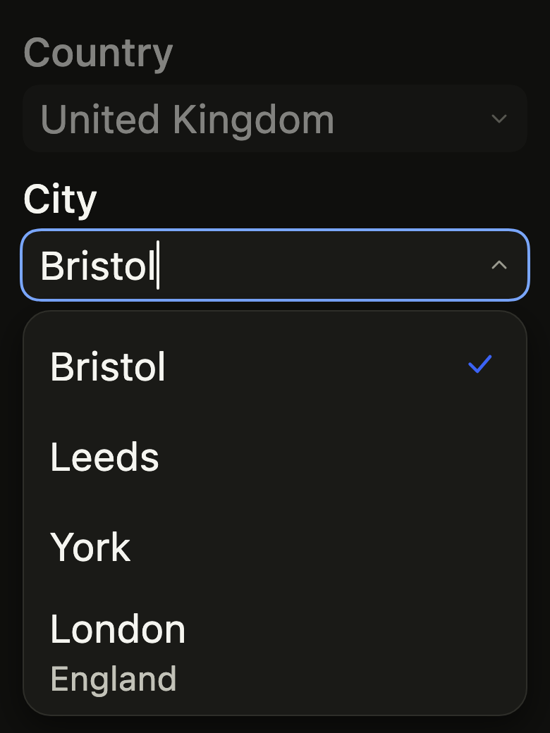
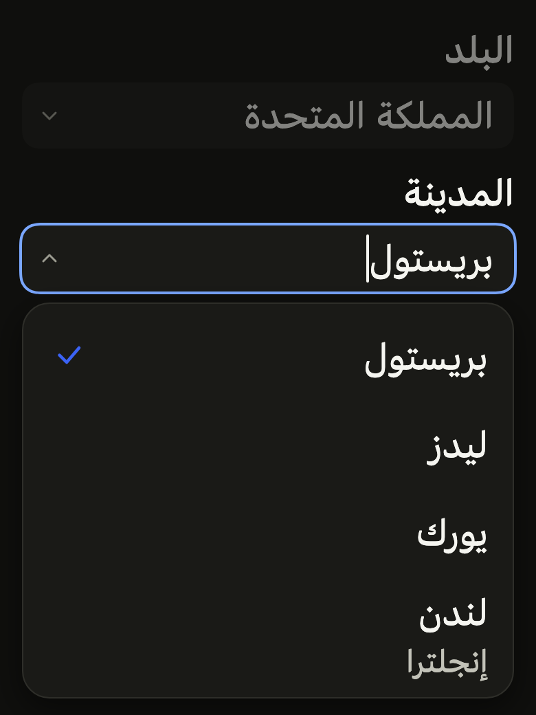
The 16 images published with version 0.2.3, rendered by the shared harness on macOS with Flutter 3.47.7. fliin verify combo-box compares your copy to them.
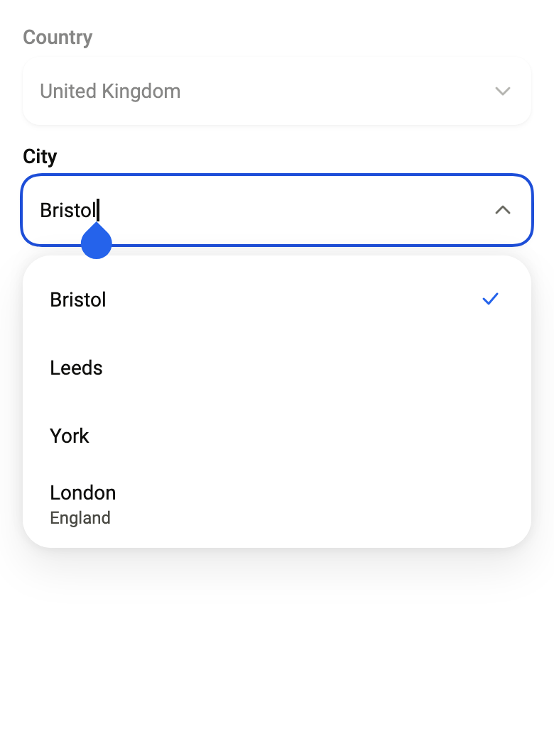
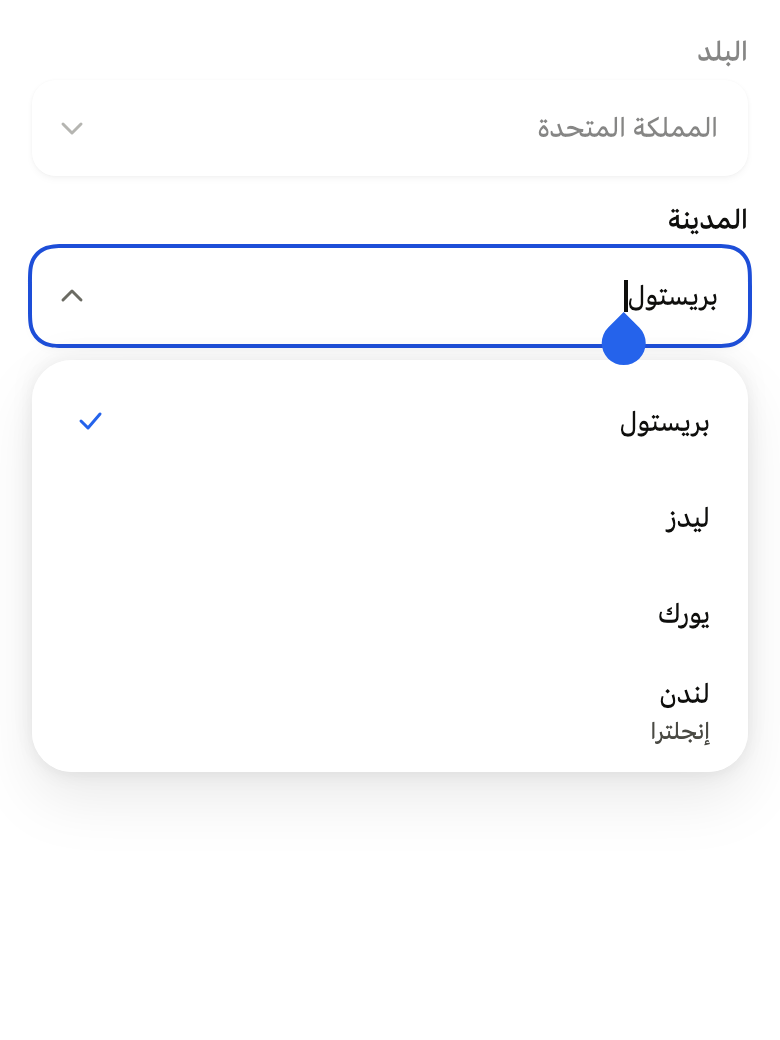
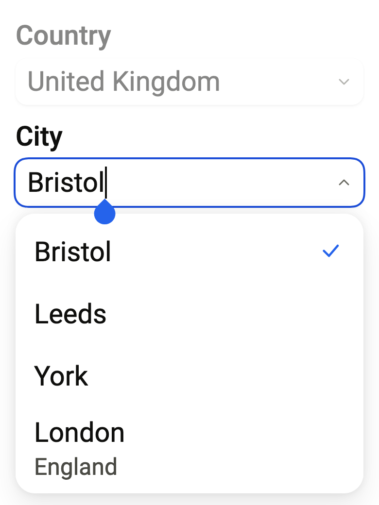
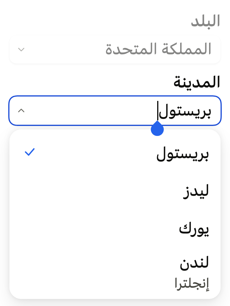
Use it to
- show suggestions under a field while typing
- pick a city by typing its first letters
- choose an address returned by a lookup service
- choose from a list box filtered by the text typed in the input
- keep free text when no suggestion fits
- use the keyboard to filter a long dropdown of options
- add an autocomplete field to a form
- Not for
- a short list, without typing: use a select (select)
- filtering the results shown on the page: use a search field (search-field)
- free text, without suggestions: use a text field (text-field)
- States
Source
The files fliin add combo-box copies into your app, before your prefix and imports are applied.
combo_box/fl_combo_box.dart
// Modified from the ComboBox of HeroUI React v3, Copyright 2020 Next UI Inc.,
// licensed under the MIT license below and under Apache 2.0:
// https://www.apache.org/licenses/LICENSE-2.0
//
// Permission is hereby granted, free of charge, to any person obtaining a copy
// of this software and associated documentation files (the "Software"), to
// deal in the Software without restriction, including without limitation the
// rights to use, copy, modify, merge, publish, distribute, sublicense, and/or
// sell copies of the Software, and to permit persons to whom the Software is
// furnished to do so, subject to the following conditions:
//
// The above copyright notice and this permission notice shall be included in
// all copies or substantial portions of the Software.
//
// THE SOFTWARE IS PROVIDED "AS IS", WITHOUT WARRANTY OF ANY KIND, EXPRESS OR
// IMPLIED, INCLUDING BUT NOT LIMITED TO THE WARRANTIES OF MERCHANTABILITY,
// FITNESS FOR A PARTICULAR PURPOSE AND NONINFRINGEMENT. IN NO EVENT SHALL THE
// AUTHORS OR COPYRIGHT HOLDERS BE LIABLE FOR ANY CLAIM, DAMAGES OR OTHER
// LIABILITY, WHETHER IN AN ACTION OF CONTRACT, TORT OR OTHERWISE, ARISING
// FROM, OUT OF OR IN CONNECTION WITH THE SOFTWARE OR THE USE OR OTHER DEALINGS
// IN THE SOFTWARE.
//
// Also modified from the field, panel, rows and colors of HeroUI Native 1.0.10,
// Copyright 2025 NextUI Inc., licensed under Apache 2.0.
import 'dart:async';

import 'package:flutter/semantics.dart';
import 'package:flutter/services.dart';
import 'package:flutter/widgets.dart';
import 'package:fliin_ui/components/list_row/fl_list_row.dart';
import 'package:fliin_ui/components/popover/fl_popover.dart';
import 'package:fliin_ui/components/select/fl_select.dart';
import 'package:fliin_ui/components/spinner/fl_spinner.dart';
import 'package:fliin_ui/components/text_field/fl_text_field.dart';
import 'package:fliin_ui/core/fliin.dart';

/// `combo-box__trigger--pressed`: `opacity-70`.
const double _pressedOpacity = 0.7;

/// The suggestions for [query], right away or later (an address search on
/// a service). An exception yields the error state; an `Error`, a bug in
/// the code, yields it too, and is reported through
/// `FlutterError.reportError`.
typedef FlComboBoxSource<T> = FutureOr<List<FlSelectOption<T>>> Function(String query);

/// The options of [options] whose label contains the query, ignoring case,
/// in their order; all of them for the empty query.
FlComboBoxSource<T> _filtering<T>(List<FlSelectOption<T>> options) => (query) {
  final needle = query.trim().toLowerCase();
  if (needle.isEmpty) return options;
  return [
    for (final option in options)
      if (option.label.toLowerCase().contains(needle)) option,
  ];
};

/// What the list shows, for the text [query] it requested.
sealed class _Results<T> {
  const _Results(this.query);

  final String query;
}

/// Nothing requested since the field got the focus.
final class _Idle<T> extends _Results<T> {
  const _Idle() : super('');
}

final class _Loading<T> extends _Results<T> {
  const _Loading(super.query);
}

final class _Failed<T> extends _Results<T> {
  const _Failed(super.query);
}

/// The [options] found, and the one the arrows point to, [active].
final class _Loaded<T> extends _Results<T> {
  const _Loaded(super.query, this.options, {this.active});

  final List<FlSelectOption<T>> options;
  final int? active;

  _Loaded<T> activate(int? index) => _Loaded(query, options, active: index);
}

/// A text field followed by a list of suggestions that filters as one
/// types: a [FlTextField], a chevron that opens the list, and the list in a
/// [FlPopover] at the field's width, one [FlSelectOptionRow] per suggestion.
///
/// The app gives the suggestions through [suggestions], called on each
/// input: a list filtered right away, or a search later. While waiting, the
/// list says [loadingText]; with no result, [emptyText]; on failure,
/// [errorText]. A response that arrives after a more recent input is
/// ignored: the list always matches the field's text.
///
/// The value is the selected suggestion, [value]. The field keeps the
/// focus: the up and down arrows point to a suggestion, Enter selects it,
/// Escape closes the list then clears the field. The screen reader
/// announces the number of results ([countText]) and the suggestion pointed
/// to. Disabled when [onChanged] is null.
///
/// The displayed text never contradicts the value: as soon as the input
/// departs from the selected label, [onChanged] receives null, without
/// waiting for the field to lose the focus, which a tap elsewhere does not
/// do on iOS.
///
/// It also replaces a select whose panel opens a search field: on a phone, the same gesture with one tap fewer. Few
/// choices, without typing: `FlSelect`. Several choices in a long list: a
/// combo-box where each choice is added to a removable `FlTagGroup` under
/// the field.
class FlComboBox<T> extends StatefulWidget {
  /// A field named [label], with no selection when [value] is null.
  const FlComboBox({
    super.key,
    required this.label,
    required this.suggestions,
    required this.value,
    required this.onChanged,
    required this.countText,
    required this.emptyText,
    required this.loadingText,
    required this.errorText,
    this.allowsCustomValue = false,
    this.onTextChanged,
    this.triggerLabel,
    this.placeholder,
    this.helper,
    this.error,
    this.required = false,
    this.variant = FlInputVariant.primary,
    this.controller,
    this.focusNode,
    this.autofocus = false,
  });

  /// A field that filters [options], a list the app already holds, as one
  /// types: those whose label contains the input, ignoring case, in their
  /// order. The answer is immediate: no
  /// waiting nor failure text to give. With [triggerLabel], the chevron
  /// shows them all.
  FlComboBox.filtering({
    super.key,
    required this.label,
    required List<FlSelectOption<T>> options,
    required this.value,
    required this.onChanged,
    required this.countText,
    required this.emptyText,
    this.allowsCustomValue = false,
    this.onTextChanged,
    this.triggerLabel,
    this.placeholder,
    this.helper,
    this.error,
    this.required = false,
    this.variant = FlInputVariant.primary,
    this.controller,
    this.focusNode,
    this.autofocus = false,
  }) : suggestions = _filtering(options),
       // Never shown: a list in memory answers before the list opens.
       loadingText = emptyText,
       errorText = emptyText;

  /// The field's name, displayed above and read by the screen reader.
  final String label;

  /// The suggestions for the field's text; the empty string when the field
  /// takes the focus on a made selection, or when the chevron opens the list.
  final FlComboBoxSource<T> suggestions;

  /// The selected suggestion, whose label fills the field; null with no
  /// selection.
  final FlSelectOption<T>? value;

  /// Receives the selected suggestion, and null when the input departs from
  /// it or the field is cleared. When null: the field is disabled.
  final ValueChanged<FlSelectOption<T>?>? onChanged;

  /// What the screen reader announces when the list shows [count]
  /// suggestions, at least one ("3 suggestions").
  final String Function(int count) countText;

  /// The list's text when nothing matches the input.
  final String emptyText;

  /// The list's text during a search.
  final String loadingText;

  /// The list's text when [suggestions] failed.
  final String errorText;

  /// False by default: only a suggestion is a value, and the field reverts
  /// to the selected label, or empties, when it loses the focus (React
  /// Aria). True: free text stays, read through [onTextChanged].
  final bool allowsCustomValue;

  /// Receives the field's text each time it changes: input, selection,
  /// clearing, and, after construction, the value set by the app.
  final ValueChanged<String>? onTextChanged;

  /// The name of the chevron that opens the whole list (`ComboBox.Trigger`);
  /// when null, no chevron, for a search that offers nothing without input:
  /// [suggestions] is then never called with the empty string.
  final String? triggerLabel;

  /// The placeholder text while the field is empty.
  final String? placeholder;

  /// The help under the field, hidden by [error].
  final String? helper;

  /// When non-null: the field is invalid, and this text replaces [helper].
  final String? error;

  /// True: an asterisk follows the label, and the field is announced required.
  final bool required;

  /// The field's background: `primary` by default, `secondary` on a surface.
  final FlInputVariant variant;

  /// The field's text. When null, the combo-box creates one; a provided
  /// controller stays with the caller. Text set by the app starts no search.
  final TextEditingController? controller;

  /// The field's focus node; when null, the field creates one.
  final FocusNode? focusNode;

  /// Takes the focus on first render.
  final bool autofocus;

  @override
  State<FlComboBox<T>> createState() => _FlComboBoxState<T>();
}

class _FlComboBoxState<T> extends State<FlComboBox<T>> {
  final FlPopoverController _popover = FlPopoverController();
  final GlobalKey _activeRow = GlobalKey();
  TextEditingController? _ownController;
  FocusNode? _ownFocusNode;

  TextEditingController get _controller =>
      widget.controller ?? (_ownController ??= TextEditingController(text: widget.value?.label));
  FocusNode get _focusNode => widget.focusNode ?? (_ownFocusNode ??= FocusNode());

  _Results<T> _results = const _Idle();

  /// The number of the last request: a response to an older request is
  /// ignored.
  int _request = 0;

  /// The value the field shows, as the combo-box last received or sent it.
  FlSelectOption<T>? _chosen;

  /// True when the user is working in the field (focus, input, chevron,
  /// down arrow); false after a selection, Escape, a tap outside or the
  /// loss of focus. The list opens only when true.
  bool _engaged = false;

  /// True when the user asked for the whole list (chevron, down arrow): it
  /// then opens as soon as it is waiting, even for an empty request.
  bool _asked = false;

  /// The last selection, kept when the input departs from it: retyping its
  /// label selects it again.
  FlSelectOption<T>? _remembered;

  /// The finger is on the chevron, which opens and closes the list itself.
  bool _onTrigger = false;

  /// The last announced state, so as not to repeat it.
  String? _announced;

  bool get _enabled => widget.onChanged != null;

  @override
  void initState() {
    super.initState();
    _chosen = _remembered = widget.value;
    if (widget.value case final value? when widget.controller != null) {
      _followApp(value.label, announce: false);
    }
    _focusNode.addListener(_onFocus);
  }

  @override
  void didUpdateWidget(FlComboBox<T> oldWidget) {
    super.didUpdateWidget(oldWidget);
    if (oldWidget.focusNode != widget.focusNode) {
      (oldWidget.focusNode ?? _ownFocusNode)?.removeListener(_onFocus);
      _focusNode.addListener(_onFocus);
    }
    if (oldWidget.controller != widget.controller) {
      final previous = oldWidget.controller ?? _ownController;
      if (widget.controller == null) {
        _ownController = TextEditingController.fromValue(previous?.value);
      } else {
        _ownController?.dispose();
        _ownController = null;
      }
    }
    // Only a value that the app changes, and that the combo-box did not
    // emit, is taken up: an app that ignores the null emitted during input
    // does not bring the text back to the previous selection.
    if (!_same(widget.value, oldWidget.value) && !_same(widget.value, _chosen)) {
      _chosen = _remembered = widget.value;
      _followApp(_chosen?.label ?? (widget.allowsCustomValue ? _controller.text : ''), announce: true);
    }
  }

  /// The text follows a value set by the app, after construction: a
  /// provided controller has app listeners, which cannot rebuild while it
  /// is building.
  void _followApp(String text, {required bool announce}) {
    WidgetsBinding.instance.addPostFrameCallback((_) {
      if (!mounted || _controller.text == text) return;
      _setText(text);
      if (announce) widget.onTextChanged?.call(text);
    });
  }

  @override
  void dispose() {
    _focusNode.removeListener(_onFocus);
    _ownFocusNode?.dispose();
    _ownController?.dispose();
    super.dispose();
  }

  static bool _same<T>(FlSelectOption<T>? a, FlSelectOption<T>? b) => a?.value == b?.value && a?.label == b?.label;

  void _setText(String text) {
    if (_controller.text == text) return;
    _controller.value = TextEditingValue(
      text: text,
      selection: TextSelection.collapsed(offset: text.length),
    );
  }

  /// The text changes, and the value with it: null when it no longer reads
  /// the selection, the previous selection when it reads its label again.
  void _textChanged(String text) {
    widget.onTextChanged?.call(text);
    if (_chosen case final chosen? when chosen.label != text) {
      _emit(null);
    } else if (_chosen == null && _remembered?.label == text) {
      _emit(_remembered);
    }
  }

  void _emit(FlSelectOption<T>? option) {
    _chosen = option;
    if (option != null) _remembered = option;
    widget.onChanged?.call(option);
  }

  /// The string to request on opening: the whole list when the field reads
  /// the made selection, like React Aria's button (`showAllItems`).
  String get _browseQuery {
    final text = _controller.text;
    return _chosen?.label == text ? '' : text;
  }

  /// Opens the list on [_browseQuery]. An empty request is not made without
  /// a chevron (a search that offers nothing without input), and the list
  /// shows its waiting state only if the user asked for it ([asked]). No
  /// effect when this request is already in progress or answered.
  void _browse({required bool asked}) {
    final query = _browseQuery;
    _engaged = true;
    _asked = asked;
    if (query.isEmpty && widget.triggerLabel == null) return;
    if (_results is! _Idle && _results.query == query) {
      _sync();
      return;
    }
    _query(query);
  }

  void _onFocus() {
    if (!mounted) return;
    if (_focusNode.hasFocus) {
      _browse(asked: _asked);
      return;
    }
    _request++;
    setState(() {
      _engaged = false;
      _asked = false;
      _results = const _Idle();
    });
    _sync();
    if (!widget.allowsCustomValue) {
      final text = _chosen?.label ?? '';
      if (_controller.text != text) {
        _setText(text);
        widget.onTextChanged?.call(text);
      }
    }
  }

  void _onEdited(String text) {
    _textChanged(text);
    _engaged = true;
    _asked = false;
    _query(text);
  }

  /// Tapping the field that already has the focus reopens the list.
  void _onTapField(PointerDownEvent event) {
    final onTrigger = _onTrigger;
    _onTrigger = false;
    if (!onTrigger && _enabled && _focusNode.hasFocus && !_popover.isOpen) {
      _browse(asked: false);
    }
  }

  void _query(String query) {
    final request = ++_request;
    void failed(Object error, StackTrace stack) {
      if (!mounted || request != _request) return;
      _show(_Failed(query));
      if (error is! Exception) {
        FlutterError.reportError(FlutterErrorDetails(exception: error, stack: stack, library: 'combo-box'));
      }
    }

    FutureOr<List<FlSelectOption<T>>> found;
    try {
      found = widget.suggestions(query);
    } catch (error, stack) {
      failed(error, stack);
      return;
    }
    if (found is! Future<List<FlSelectOption<T>>>) {
      _show(_Loaded(query, found));
      return;
    }
    _show(_Loading(query));
    found.then((options) {
      if (mounted && request == _request) _show(_Loaded(query, options));
    }, onError: failed);
  }

  void _show(_Results<T> results) {
    setState(() => _results = results);
    _sync();
  }

  bool get _wanted =>
      _enabled &&
      _engaged &&
      switch (_results) {
        _Idle() => false,
        _Loading(:final query) || _Failed(:final query) => query.isNotEmpty || _asked,
        _Loaded(:final query, :final options) => options.isNotEmpty || query.isNotEmpty,
      };

  /// Opens or closes the list according to the state, and announces what it shows.
  void _sync() {
    final wanted = _wanted;
    if (wanted != _popover.isOpen) wanted ? _popover.open() : _popover.close();
    if (!wanted) {
      _announced = null;
      return;
    }
    final status = _status;
    if (status != _announced) {
      _announced = status;
      _announce(status);
    }
  }

  String get _status => switch (_results) {
    _Idle() || _Loading() => widget.loadingText,
    _Failed() => widget.errorText,
    _Loaded(:final options) when options.isEmpty => widget.emptyText,
    _Loaded(:final options) => widget.countText(options.length),
  };

  void _announce(String text) {
    if (!MediaQuery.supportsAnnounceOf(context)) return;
    unawaited(SemanticsService.sendAnnouncement(View.of(context), text, Directionality.of(context)));
  }

  void _close() {
    if (_popover.isOpen) _popover.close();
    _announced = null;
  }

  /// The list also closes by itself (tap outside, field off screen): it
  /// stays closed until the next input.
  void _onOpenChanged(bool open) {
    setState(() {
      if (!open && _wanted) {
        _engaged = false;
        _announced = null;
      }
    });
  }

  void _choose(FlSelectOption<T> option) {
    _setText(option.label);
    widget.onTextChanged?.call(option.label);
    _emit(option);
    setState(() => _engaged = false);
    _close();
  }

  void _openAll() {
    if (_popover.isOpen) {
      setState(() => _engaged = false);
      _close();
      return;
    }
    // The incoming focus sees the request in progress and does not repeat it.
    _browse(asked: true);
    if (!_focusNode.hasFocus) _focusNode.requestFocus();
  }

  /// [step] suggestions past the one pointed to, skipping the disabled
  /// ones, clamped at the ends.
  void _move(int step) {
    final results = _results;
    if (results is! _Loaded<T>) return;
    final enabled = [
      for (final (index, option) in results.options.indexed)
        if (option.enabled) index,
    ];
    if (enabled.isEmpty) return;
    final at = enabled.indexOf(results.active ?? -1);
    final next = at < 0 ? (step > 0 ? 0 : enabled.length - 1) : (at + step).clamp(0, enabled.length - 1);
    final index = enabled[next];
    if (index == results.active) return;
    setState(() => _results = results.activate(index));
    final option = results.options[index];
    _announce(option.description == null ? option.label : '${option.label}, ${option.description}');
    WidgetsBinding.instance.addPostFrameCallback((_) {
      if (_activeRow.currentContext case final row? when row.mounted) {
        unawaited(
          Scrollable.ensureVisible(
            row,
            alignmentPolicy: step > 0
                ? ScrollPositionAlignmentPolicy.keepVisibleAtEnd
                : ScrollPositionAlignmentPolicy.keepVisibleAtStart,
          ),
        );
      }
    });
  }

  KeyEventResult _onKey(FocusNode node, KeyEvent event) {
    if (!_enabled || event is KeyUpEvent) return KeyEventResult.ignored;
    final open = _popover.isOpen;
    switch (event.logicalKey) {
      case LogicalKeyboardKey.arrowDown || LogicalKeyboardKey.arrowUp:
        final step = event.logicalKey == LogicalKeyboardKey.arrowDown ? 1 : -1;
        if (open) {
          _move(step);
        } else {
          _browse(asked: true);
        }
        return KeyEventResult.handled;
      case LogicalKeyboardKey.enter || LogicalKeyboardKey.numpadEnter:
        final results = _results;
        if (!open || results is! _Loaded<T> || results.active == null) {
          return KeyEventResult.ignored;
        }
        if (event is KeyDownEvent) _choose(results.options[results.active!]);
        return KeyEventResult.handled;
      // Tab selects the suggestion pointed to, then moves on (React Aria).
      case LogicalKeyboardKey.tab:
        final results = _results;
        if (open && event is KeyDownEvent && results is _Loaded<T> && results.active != null) {
          _choose(results.options[results.active!]);
        }
        return KeyEventResult.ignored;
      case LogicalKeyboardKey.escape:
        if (event is! KeyDownEvent) return KeyEventResult.ignored;
        if (open) {
          setState(() => _engaged = false);
          _close();
          return KeyEventResult.handled;
        }
        if (_controller.text.isEmpty) return KeyEventResult.ignored;
        _setText('');
        _textChanged('');
        return KeyEventResult.handled;
      default:
        return KeyEventResult.ignored;
    }
  }

  @override
  Widget build(BuildContext context) {
    final theme = FlScope.of(context);
    final triggerLabel = widget.triggerLabel;
    final trigger = triggerLabel == null
        ? null
        : ExcludeFocus(
            child: Listener(
              onPointerDown: (_) => _onTrigger = true,
              child: _Trigger(label: triggerLabel, open: _popover.isOpen, onPressed: _enabled ? _openAll : null),
            ),
          );
    // Izydesk's searching field: a muted spinner at its end, before the
    // chevron, while [suggestions] answers. The list says it out loud.
    final searching = _results is _Loading<T>
        ? ExcludeSemantics(
            child: FlSpinner(label: widget.loadingText, size: FlSpinnerSize.sm, color: theme.colors.onSurfaceMuted),
          )
        : null;
    final field = Focus(
      canRequestFocus: false,
      skipTraversal: true,
      onKeyEvent: _onKey,
      child: TapRegion(
        onTapInside: _onTapField,
        child: FlTextField(
          label: widget.label,
          controller: _controller,
          focusNode: _focusNode,
          placeholder: widget.placeholder,
          helper: widget.helper,
          error: widget.error,
          variant: widget.variant,
          enabled: _enabled,
          required: widget.required,
          autofocus: widget.autofocus,
          onChanged: _onEdited,
          // Out of the Tab order, like React Aria's button: on the keyboard,
          // the down arrow opens the list.
          suffix: switch ((searching, trigger)) {
            (null, null) => null,
            (final searching?, null) => searching,
            (null, final trigger?) => trigger,
            (final searching?, final trigger?) => Row(
              mainAxisSize: MainAxisSize.min,
              spacing: theme.space.sm,
              children: [searching, trigger],
            ),
          },
        ),
      ),
    );
    return FlPopover(
      controller: _popover,
      label: widget.label,
      takesFocus: false,
      matchAnchorWidth: true,
      fitBesideAnchor: true,
      offset: theme.size.selectOffset,
      // Izydesk's listbox: 6 around the options, like the select's.
      padding: EdgeInsetsDirectional.all(theme.space.xs * 1.5),
      onOpenChanged: _onOpenChanged,
      // Tapping a suggestion is "inside" the field: on desktop and on the
      // web, it does not take the focus away from it, which would clear it.
      content: TextFieldTapRegion(child: _list(context)),
      child: field,
    );
  }

  Widget _list(BuildContext context) {
    final results = _results;
    final announces = MediaQuery.supportsAnnounceOf(context);
    final Widget body = switch (results) {
      _Loaded(:final options, :final active) when options.isNotEmpty => SingleChildScrollView(
        child: Column(
          mainAxisSize: MainAxisSize.min,
          crossAxisAlignment: CrossAxisAlignment.stretch,
          children: [
            for (final (index, option) in options.indexed)
              FlFocusRing(
                key: index == active ? _activeRow : null,
                visible: index == active,
                borderRadius: BorderRadius.zero,
                placement: FlFocusRingPlacement.inside,
                child: FlSelectOptionRow(
                  option: option,
                  selected: _same(option, _chosen),
                  active: index == active,
                  onPressed: option.enabled ? () => _choose(option) : null,
                ),
              ),
          ],
        ),
      ),
      _Loading() || _Idle() => _Status(text: widget.loadingText, busy: true),
      _Failed() => _Status(text: widget.errorText),
      _Loaded() => _Status(text: widget.emptyText),
    };
    // Where the platform does not announce (Android), the list is a live
    // region named by its state.
    return Semantics(container: true, liveRegion: !announces, label: _status, child: body);
  }
}

/// A status row of the list: muted `textSm`, with a spinner during the
/// search.
class _Status extends StatelessWidget {
  const _Status({required this.text, this.busy = false});

  final String text;
  final bool busy;

  @override
  Widget build(BuildContext context) {
    final theme = FlScope.of(context);
    return ExcludeSemantics(
      child: Padding(
        padding: EdgeInsetsDirectional.symmetric(horizontal: theme.space.lg, vertical: theme.space.md),
        child: Row(
          spacing: theme.space.sm,
          children: [
            if (busy) FlSpinner(label: text, size: FlSpinnerSize.sm),
            Expanded(
              child: flPopoverText(context, FlTextRole.textSm, color: theme.colors.onSurfaceMuted, child: Text(text)),
            ),
          ],
        ),
      ),
    );
  }
}

/// The field's chevron (`ComboBox.Trigger`): 16, `fieldPlaceholder`, which
/// turns half a turn when the list is open and fades when pressed.
class _Trigger extends StatelessWidget {
  const _Trigger({required this.label, required this.open, required this.onPressed});

  final String label;
  final bool open;
  final VoidCallback? onPressed;

  @override
  Widget build(BuildContext context) {
    final theme = FlScope.of(context);
    final rtl = Directionality.of(context) == TextDirection.rtl;
    return FlPressable(
      onPressed: onPressed,
      label: label,
      expanded: open,
      borderRadius: BorderRadius.circular(theme.shape.radiusXs),
      scaleOnPress: false,
      overlay: FlPressOverlay.none,
      builder: (context, states) => Opacity(
        opacity: states.contains(WidgetState.pressed) ? _pressedOpacity : 1,
        child: IconTheme.merge(
          data: IconThemeData(color: theme.colors.fieldPlaceholder),
          // The end-of-line chevron, pointing down, then up when the list is
          // open (`rotate-180`).
          child: RotatedBox(quarterTurns: (rtl ? 3 : 1) + (open ? 2 : 0), child: const FlListRowChevron()),
        ),
      ),
    );
  }
}