Components / data-display
Avatar
Shows a person by their round photo, which fades in once loaded, or else by their initials or a silhouette.
Import
In a Flutter app where fliin init has run:
Examples
Photos
Photos from the app's assets. The initials stand in while a photo loads, or if it fails; semanticLabel names the person.

import 'package:your_app/ui/fliin/components/avatar/fl_avatar.dart';
import 'package:your_app/ui/fliin/core/fliin.dart';
import 'package:flutter/widgets.dart';

class AvatarPhotosExample extends StatelessWidget {
  const AvatarPhotosExample({super.key});

  @override
  Widget build(BuildContext context) {
    final space = FlScope.of(context).space;
    return Wrap(
      alignment: WrapAlignment.center,
      spacing: space.sm,
      runSpacing: space.sm,
      children: [
        for (final (n, initials, name) in [
          (1, 'JS', 'Jane Smith'),
          (2, 'JD', 'John Doe'),
          (3, 'EC', 'Emily Chen'),
        ])
          FlAvatar(
            image: AssetImage('images/people/$n.jpg'),
            initials: initials,
            semanticLabel: name,
            size: FlAvatarSize.lg,
          ),
      ],
    );
  }
}Content
Whatever the app has: a photo, initials, any icon, or nothing, in which case the avatar shows a person.

import 'package:your_app/ui/fliin/components/avatar/fl_avatar.dart';
import 'package:your_app/ui/fliin/core/fliin.dart';
import 'package:your_app/ui/fliin/icons/fl_icons.dart';
import 'package:flutter/widgets.dart';

class AvatarContentExample extends StatelessWidget {
  const AvatarContentExample({super.key});

  @override
  Widget build(BuildContext context) {
    final space = FlScope.of(context).space;
    return Wrap(
      alignment: WrapAlignment.center,
      spacing: space.sm,
      runSpacing: space.sm,
      children: [
        const FlAvatar(
          image: AssetImage('images/people/4.jpg'),
          initials: 'MB',
          semanticLabel: 'Michael Brown',
          size: FlAvatarSize.lg,
        ),
        const FlAvatar(initials: 'KW', semanticLabel: 'Kate Wilson', size: FlAvatarSize.lg),
        FlAvatar(
          icon: FlIcon(FlIcons.shoppingCart),
          semanticLabel: 'Shop',
          size: FlAvatarSize.lg,
          variant: FlAvatarVariant.soft,
        ),
        const FlAvatar(semanticLabel: 'Guest', size: FlAvatarSize.lg),
      ],
    );
  }
}Initials
Initials alone, in the accent color: for people without a photo.

import 'package:your_app/ui/fliin/components/avatar/fl_avatar.dart';
import 'package:your_app/ui/fliin/core/fliin.dart';
import 'package:flutter/widgets.dart';

class AvatarInitialsExample extends StatelessWidget {
  const AvatarInitialsExample({super.key});

  @override
  Widget build(BuildContext context) {
    final space = FlScope.of(context).space;
    return Wrap(
      alignment: WrapAlignment.center,
      spacing: space.sm,
      runSpacing: space.sm,
      children: [
        for (final (initials, name) in [('JD', 'John Doe'), ('JS', 'Jane Smith'), ('BJ', 'Bob Johnson')])
          FlAvatar(initials: initials, semanticLabel: name, size: FlAvatarSize.lg, color: FlAvatarColor.accent),
      ],
    );
  }
}Colors
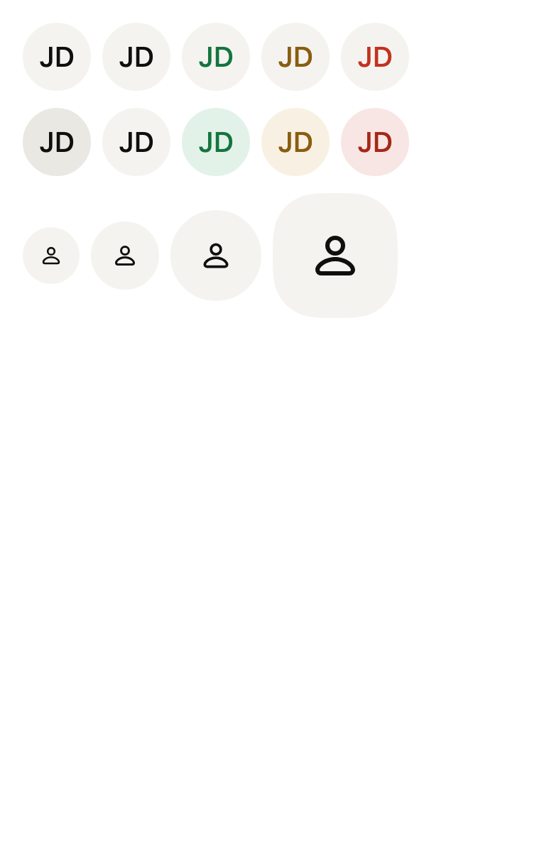
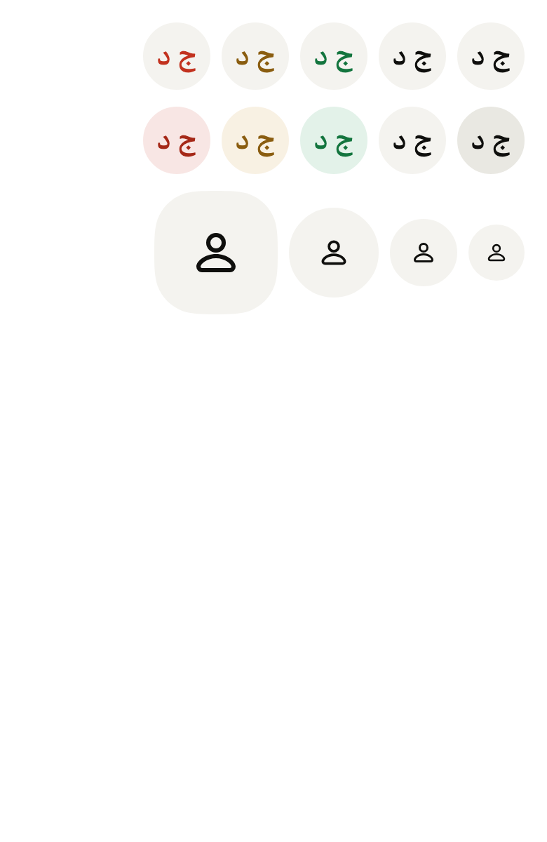
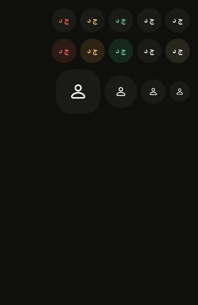
Five colors, one row per variant: the color tells a status or a team apart, the variant sets how loud it is.
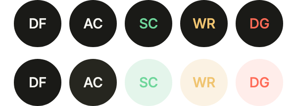
import 'package:your_app/ui/fliin/components/avatar/fl_avatar.dart';
import 'package:your_app/ui/fliin/core/fliin.dart';
import 'package:flutter/widgets.dart';

class AvatarColorsExample extends StatelessWidget {
  const AvatarColorsExample({super.key});

  @override
  Widget build(BuildContext context) {
    final space = FlScope.of(context).space;
    return Column(
      mainAxisSize: MainAxisSize.min,
      spacing: space.md,
      children: [
        for (final variant in FlAvatarVariant.values)
          Wrap(
            alignment: WrapAlignment.center,
            spacing: space.sm,
            runSpacing: space.sm,
            children: [
              for (final (color, initials) in [
                (FlAvatarColor.neutral, 'DF'),
                (FlAvatarColor.accent, 'AC'),
                (FlAvatarColor.success, 'SC'),
                (FlAvatarColor.warning, 'WR'),
                (FlAvatarColor.danger, 'DG'),
              ])
                FlAvatar(initials: initials, semanticLabel: color.name, variant: variant, color: color),
            ],
          ),
      ],
    );
  }
}Sizes
Every size, from the one beside a line of text to the one heading a profile.
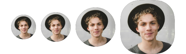
import 'package:your_app/ui/fliin/components/avatar/fl_avatar.dart';
import 'package:your_app/ui/fliin/core/fliin.dart';
import 'package:flutter/widgets.dart';

class AvatarSizesExample extends StatelessWidget {
  const AvatarSizesExample({super.key});

  @override
  Widget build(BuildContext context) {
    final space = FlScope.of(context).space;
    return Wrap(
      alignment: WrapAlignment.center,
      crossAxisAlignment: WrapCrossAlignment.center,
      spacing: space.sm,
      runSpacing: space.sm,
      children: [
        for (final size in FlAvatarSize.values)
          FlAvatar(
            image: const AssetImage('images/people/5.jpg'),
            initials: 'LM',
            semanticLabel: 'Leo Martin',
            size: size,
          ),
      ],
    );
  }
}Custom styles
Avatars adjusted one by one: a rounded square through radius, a team logo in its own colors through backgroundColor and foregroundColor, and a 24 byline through dimension.

import 'package:your_app/ui/fliin/components/avatar/fl_avatar.dart';
import 'package:your_app/ui/fliin/core/fliin.dart';
import 'package:flutter/widgets.dart';

class AvatarCustomStylesExample extends StatelessWidget {
  const AvatarCustomStylesExample({super.key});

  @override
  Widget build(BuildContext context) {
    final theme = FlScope.of(context);
    final colors = theme.colors;
    return Wrap(
      alignment: WrapAlignment.center,
      crossAxisAlignment: WrapCrossAlignment.center,
      spacing: theme.space.md,
      runSpacing: theme.space.md,
      children: [
        FlAvatar(
          image: const AssetImage('images/people/6.jpg'),
          initials: 'JD',
          semanticLabel: 'John Doe',
          size: FlAvatarSize.lg,
          radius: theme.shape.radiusXl,
        ),
        FlAvatar(
          initials: 'GB',
          semanticLabel: 'Green Bay team',
          size: FlAvatarSize.lg,
          radius: theme.shape.radiusXl,
          backgroundColor: colors.success,
          foregroundColor: colors.onSuccess,
        ),
        const FlAvatar(
          image: AssetImage('images/people/3.jpg'),
          initials: 'EC',
          semanticLabel: 'Emily Chen',
          size: FlAvatarSize.sm,
          dimension: 24,
        ),
      ],
    );
  }
}Usage
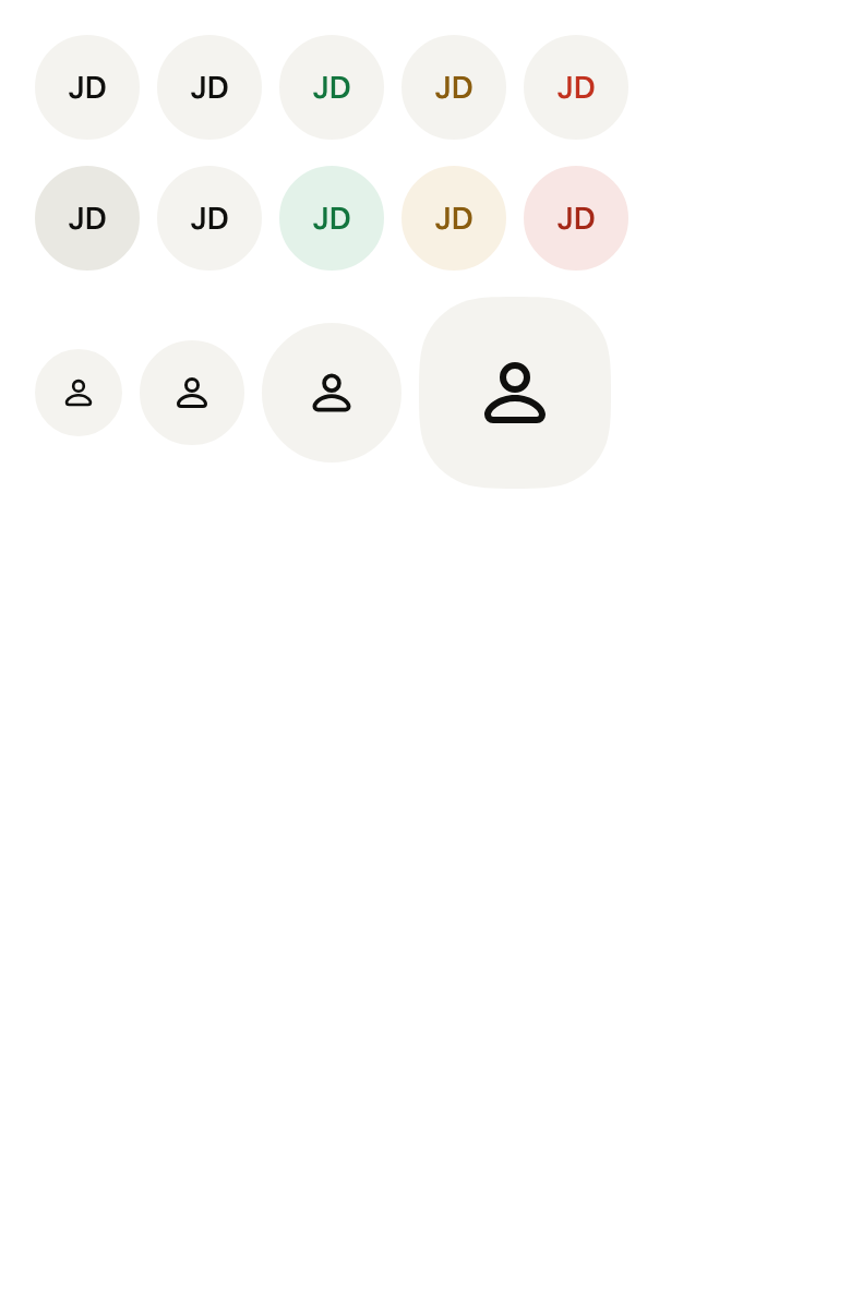
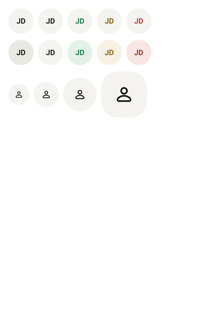
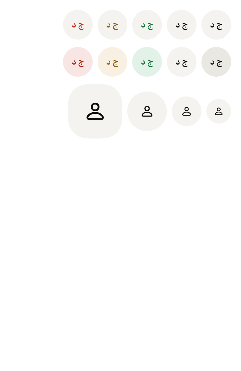
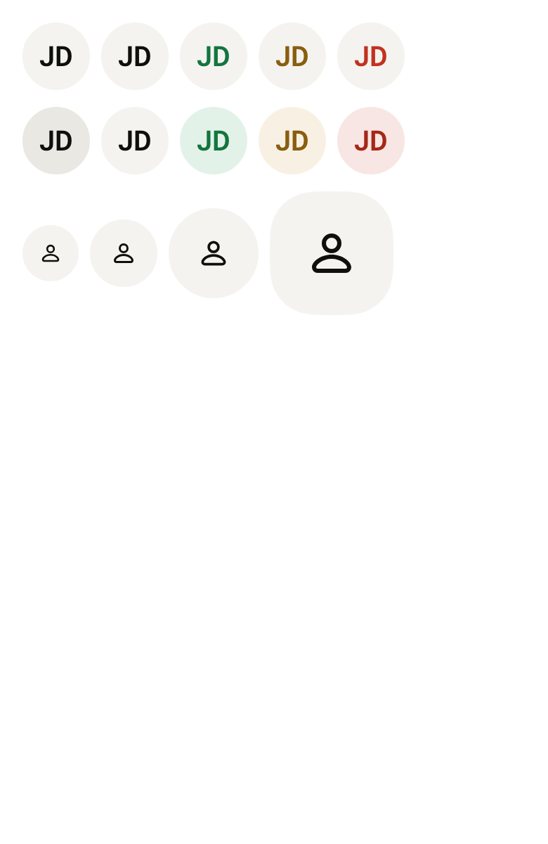
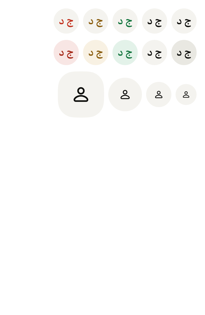
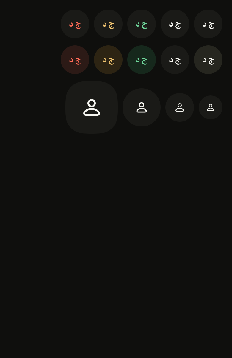
The code the reference images render:
final example = ColoredBox(
  color: FlScope.of(context).colors.surface,
  child: Padding(
    padding: EdgeInsetsDirectional.all(FlScope.of(context).space.lg),
    child: Column(
      crossAxisAlignment: CrossAxisAlignment.start,
      spacing: FlScope.of(context).space.md,
      children: [
        for (final v in FlAvatarVariant.values)
          Wrap(
            spacing: FlScope.of(context).space.sm,
            runSpacing: FlScope.of(context).space.sm,
            children: [
              for (final c in FlAvatarColor.values)
                FlAvatar(
                  initials: 'JD',
                  semanticLabel: 'Jane Doe',
                  variant: v,
                  color: c,
                ),
            ],
          ),
        Wrap(
          spacing: FlScope.of(context).space.sm,
          crossAxisAlignment: WrapCrossAlignment.center,
          children: [
            for (final s in FlAvatarSize.values)
              FlAvatar(size: s, semanticLabel: 'Guest'),
          ],
        ),
      ],
    ),
  ),
);API
FlAvatarSize: enum {sm, md, lg, xl}
FlAvatarSize.sm: static final FlAvatarSize
FlAvatarSize.md: static final FlAvatarSize
FlAvatarSize.lg: static final FlAvatarSize
FlAvatarSize.xl: static final FlAvatarSize
FlAvatarVariant: enum {primary, soft}
FlAvatarVariant.primary: static final FlAvatarVariant
FlAvatarVariant.soft: static final FlAvatarVariant
FlAvatarColor: enum {accent, neutral, success, warning, danger}
FlAvatarColor.accent: static final FlAvatarColor
FlAvatarColor.neutral: static final FlAvatarColor
FlAvatarColor.success: static final FlAvatarColor
FlAvatarColor.warning: static final FlAvatarColor
FlAvatarColor.danger: static final FlAvatarColor
FlAvatar: class extends StatelessWidget
FlAvatar.new: const new({super.key, ImageProvider? image, String? initials, Widget? icon, String? semanticLabel, FlAvatarSize size, FlAvatarVariant variant, FlAvatarColor color, Duration fallbackDelay, double? dimension, double? radius, Color? backgroundColor, Color? foregroundColor})
FlAvatar.image: get ImageProvider?
FlAvatar.initials: get String?
FlAvatar.icon: get Widget?
FlAvatar.semanticLabel: get String?
FlAvatar.size: get FlAvatarSize
FlAvatar.variant: get FlAvatarVariant
FlAvatar.color: get FlAvatarColor
FlAvatar.fallbackDelay: get Duration
FlAvatar.dimension: get double?
FlAvatar.radius: get double?
FlAvatar.backgroundColor: get Color?
FlAvatar.foregroundColor: get Color?
FlAvatar.build: Widget(BuildContext context)Reference renders
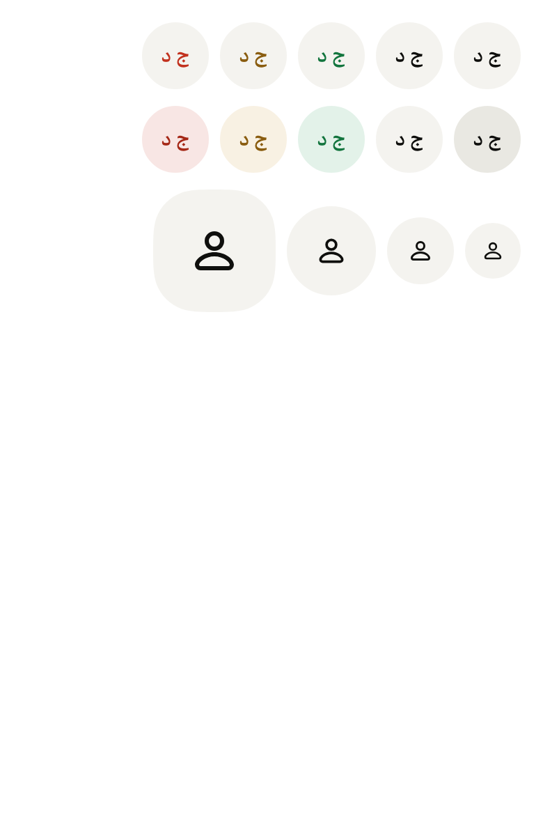
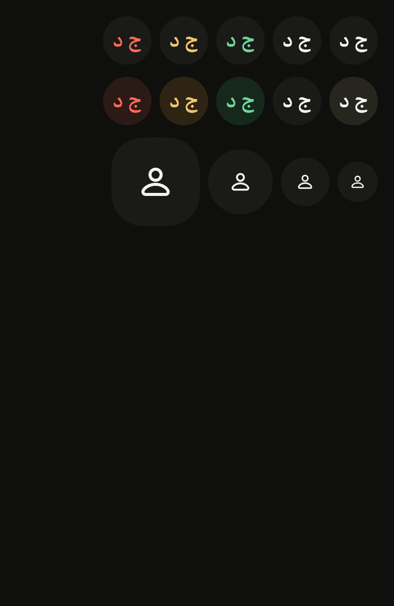
The 16 images published with version 0.2.5, rendered by the shared harness on macOS with Flutter 3.47.7. fliin verify avatar compares your copy to them.





Use it to
- show a user's profile picture
- show initials when the photo is missing
- present the author of a message
- show the signed-in account at the top of the screen
- show who takes part in a conversation
- show a user photo in a circle
- Not for
- a status or category in text: use a chip (chip)
Source
The files fliin add avatar copies into your app, before your prefix and imports are applied.
avatar/fl_avatar.dart
// Modified from the Avatar of HeroUI Native 1.0.10, Copyright 2025 NextUI Inc.,
// licensed under Apache 2.0: https://www.apache.org/licenses/LICENSE-2.0
import 'package:flutter/widgets.dart';
import 'package:fliin_ui/core/fliin.dart';
import 'package:fliin_ui/icons/fl_icons.dart';

/// The side of a [FlAvatar], and the size of its text and icon.
enum FlAvatarSize {
  /// 40, `textXs` text, 14 icon.
  sm,

  /// 48, `textSm` text, 16 icon.
  md,

  /// 64, `textBase` text, 20 icon.
  lg,

  /// 88, `heading2` text, 32 icon: the head of a profile (Izydesk's
  /// `.avatar-xl`).
  xl,
}

/// The background of a [FlAvatar].
enum FlAvatarVariant {
  /// The `control` background, whatever the color.
  primary,

  /// The color's tint at 15 %, `control` for the neutral.
  soft,
}

/// The color of a [FlAvatar]: that of the initials and of the fallback
/// icon, and of the `soft` background.
enum FlAvatarColor {
  /// The accent.
  accent,

  /// The neutral.
  neutral,

  /// Green.
  success,

  /// Orange.
  warning,

  /// Red.
  danger,
}

/// An avatar: a round image that fades in once loaded,
/// and, without an image or when it fails, a fallback (initials, a given
/// icon, or a silhouette) that fades in. While loading, only the background
/// shows.
class FlAvatar extends StatelessWidget {
  /// An `md`, `primary`, `accent` avatar.
  const FlAvatar({
    super.key,
    this.image,
    this.initials,
    this.icon,
    this.semanticLabel,
    this.size = FlAvatarSize.md,
    this.variant = FlAvatarVariant.primary,
    this.color = FlAvatarColor.accent,
    this.fallbackDelay = Duration.zero,
    this.dimension,
    this.radius,
    this.backgroundColor,
    this.foregroundColor,
  }) : assert(dimension == null || dimension > 0, 'dimension must be positive'),
       assert(radius == null || radius >= 0, 'radius must not be negative');

  /// The image; when null, the fallback.
  final ImageProvider? image;

  /// The fallback text, most often two letters, in medium weight. It does
  /// not grow beyond 1.4 times its size.
  final String? initials;

  /// The fallback without [initials], in the icon's color and size; when
  /// null, the `person` icon of the chosen set.
  final Widget? icon;

  /// What the screen reader reads: the person's name. When null: the
  /// [initials].
  final String? semanticLabel;

  /// The side.
  final FlAvatarSize size;

  /// The background.
  final FlAvatarVariant variant;

  /// The color.
  final FlAvatarColor color;

  /// The wait before the fallback enters: an image
  /// that fails quickly does not make the initials flicker.
  final Duration fallbackDelay;

  /// The side, instead of that of [size], which keeps its text and icon: a
  /// 24 byline under a card, a 56 community logo.
  final double? dimension;

  /// The radius of the continuous corners; when null,
  /// `shape.radiusButtonLarge`, a disc up to the `lg` size. `shape.radiusXl`
  /// draws a rounded square.
  final double? radius;

  /// The background, instead of that of [variant] and [color].
  final Color? backgroundColor;

  /// The color of the initials and of the fallback icon, instead of that of
  /// [color].
  final Color? foregroundColor;

  @override
  Widget build(BuildContext context) {
    final theme = FlScope.of(context);
    final colors = theme.colors;
    final motion = FlMotion.of(context);
    final soft = variant == FlAvatarVariant.soft;
    final fill =
        backgroundColor ??
        switch (color) {
          FlAvatarColor.accent when soft => colors.accentSoft,
          FlAvatarColor.success when soft => colors.successSoft,
          FlAvatarColor.warning when soft => colors.warningSoft,
          FlAvatarColor.danger when soft => colors.dangerSoft,
          _ => colors.control,
        };
    final ink =
        foregroundColor ??
        switch (color) {
          FlAvatarColor.accent => colors.onAccentSoft,
          FlAvatarColor.neutral => colors.onControl,
          FlAvatarColor.success => colors.onSuccessSoft,
          FlAvatarColor.warning => colors.onWarningSoft,
          // On `control`, `danger` holds 4.5:1; `onDangerSoft` is darker only
          // for the soft tint.
          FlAvatarColor.danger => soft ? colors.onDangerSoft : colors.danger,
        };
    final xs = theme.space.xs;
    // size-10, size-12, size-16; the icons from AVATAR_DEFAULT_ICON_SIZE.
    final (sizeSide, role, iconSize) = switch (size) {
      FlAvatarSize.sm => (xs * 10, FlTextRole.textXs, 14.0),
      FlAvatarSize.md => (xs * 12, FlTextRole.textSm, 16.0),
      FlAvatarSize.lg => (xs * 16, FlTextRole.textBase, 20.0),
      FlAvatarSize.xl => (xs * 22, FlTextRole.heading2, 32.0),
    };
    final side = dimension ?? sizeSide;
    final fade = motion.reduced ? Duration.zero : theme.motion.short4;
    final curve = theme.motion.easeIn;
    Widget fallback() {
      final initials = this.initials;
      final scale = theme.typography;
      final content = initials != null
          ? MediaQuery.withClampedTextScaling(
              maxScaleFactor: _maxTextScale,
              child: Text(
                initials,
                maxLines: 1,
                textAlign: TextAlign.center,
                style: scale.resolve(role).copyWith(color: ink, fontWeight: theme.tokens.typography.weight.medium),
                strutStyle: scale.strut(role, inheritedFamily: DefaultTextStyle.of(context).style.fontFamily),
              ),
            )
          : IconTheme.merge(
              data: IconThemeData(color: ink, size: iconSize),
              child: icon ?? const _PersonIcon(),
            );
      return _FadeIn(
        delay: motion.reduced ? Duration.zero : fallbackDelay,
        duration: fade,
        curve: curve,
        child: Center(child: content),
      );
    }

    final image = this.image;
    final shape = FlContinuousBorder(radius: radius ?? theme.shape.radiusButtonLarge);
    return Semantics(
      image: true,
      label: semanticLabel ?? initials,
      child: ExcludeSemantics(
        child: FlPixelSnap(
          child: SizedBox.square(
            dimension: side,
            // The background is painted to the shape, without clipping:
            // clipped as well, its doubly antialiased edge fades (0.63 px at
            // the outline in sm). Only the image, which overflows, is clipped.
            child: DecoratedBox(
              decoration: ShapeDecoration(color: fill, shape: shape),
              child: image == null
                  ? fallback()
                  : ClipPath(
                      clipper: ShapeBorderClipper(shape: shape, textDirection: Directionality.maybeOf(context)),
                      child: Image(
                        image: image,
                        fit: BoxFit.cover,
                        width: side,
                        height: side,
                        frameBuilder: (context, child, frame, synchronous) => frame == null
                            ? const SizedBox.expand()
                            : _FadeIn(duration: fade, curve: curve, child: child),
                        errorBuilder: (context, error, stack) => fallback(),
                      ),
                    ),
            ),
          ),
        ),
      ),
    );
  }
}

/// The largest text scale the initials follow.
const double _maxTextScale = 1.4;

/// A fade-in of [duration] along [curve], after [delay]: Reanimated's
/// `FadeIn`, replayed on every mount.
class _FadeIn extends StatefulWidget {
  const _FadeIn({this.delay = Duration.zero, required this.duration, required this.curve, required this.child});

  final Duration delay;
  final Duration duration;
  final Curve curve;
  final Widget child;

  @override
  State<_FadeIn> createState() => _FadeInState();
}

class _FadeInState extends State<_FadeIn> with SingleTickerProviderStateMixin {
  late final AnimationController _controller = AnimationController(
    vsync: this,
    duration: widget.delay + widget.duration,
    value: widget.delay + widget.duration == Duration.zero ? 1 : 0,
  )..forward();

  @override
  void dispose() {
    _controller.dispose();
    super.dispose();
  }

  @override
  Widget build(BuildContext context) {
    final total = (widget.delay + widget.duration).inMicroseconds;
    final start = total == 0 ? 0.0 : widget.delay.inMicroseconds / total;
    return FadeTransition(
      opacity: CurvedAnimation(
        parent: _controller,
        curve: Interval(start, 1, curve: widget.curve),
      ),
      child: widget.child,
    );
  }
}

/// The `person` icon of the chosen set, in the color and size of the
/// `IconTheme`.
class _PersonIcon extends StatelessWidget {
  const _PersonIcon();

  @override
  Widget build(BuildContext context) {
    final icon = IconTheme.of(context);
    return FlIcon(FlIcons.person, size: icon.size ?? 16, color: icon.color ?? FlScope.of(context).colors.onControl);
  }
}