Components / actions
Button
Triggers the main action of a screen or form. Primary, secondary or ghost, with loading, leading icon, visible keyboard focus and the platform tap target.
Import
In a Flutter app where fliin init has run:
Examples
Publish
A primary action next to a quieter one. While the work runs, loading keeps the button's width and shows a spinner; once done, the label says so and the variant steps down.
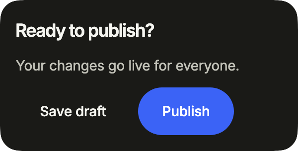
import 'dart:async';

import 'package:your_app/ui/fliin/components/button/fl_button.dart';
import 'package:your_app/ui/fliin/components/surface/fl_surface.dart';
import 'package:your_app/ui/fliin/components/text/fl_text.dart';
import 'package:your_app/ui/fliin/core/fliin.dart';
import 'package:flutter/widgets.dart';

class ButtonPublishExample extends StatefulWidget {
  const ButtonPublishExample({super.key});

  @override
  State<ButtonPublishExample> createState() => _ButtonPublishExampleState();
}

class _ButtonPublishExampleState extends State<ButtonPublishExample> {
  var _publishing = false;
  var _published = false;
  Timer? _timer;

  @override
  void dispose() {
    _timer?.cancel();
    super.dispose();
  }

  void _publish() {
    setState(() => _publishing = true);
    _timer = Timer(const Duration(milliseconds: 1400), () {
      setState(() {
        _publishing = false;
        _published = true;
      });
    });
  }

  @override
  Widget build(BuildContext context) {
    final space = FlScope.of(context).space;
    return FlSurface(
      child: Column(
        crossAxisAlignment: CrossAxisAlignment.start,
        spacing: space.md,
        children: [
          const FlText('Ready to publish?', type: FlTextType.h5),
          const FlText('Your changes go live for everyone.', type: FlTextType.bodySm, tone: FlTextTone.muted),
          Wrap(
            alignment: WrapAlignment.end,
            spacing: space.sm,
            runSpacing: space.sm,
            children: [
              FlButton(label: 'Save draft', variant: FlButtonVariant.tertiary, onPressed: () {}),
              FlButton(
                label: _published ? 'Published' : 'Publish',
                variant: _published ? FlButtonVariant.secondary : FlButtonVariant.primary,
                loading: _publishing,
                onPressed: _published || _publishing ? null : _publish,
              ),
            ],
          ),
        ],
      ),
    );
  }
}Variants
Seven variants, from the most to the least emphasis. Keep a single primary per screen; danger and dangerSoft are for actions that destroy something.
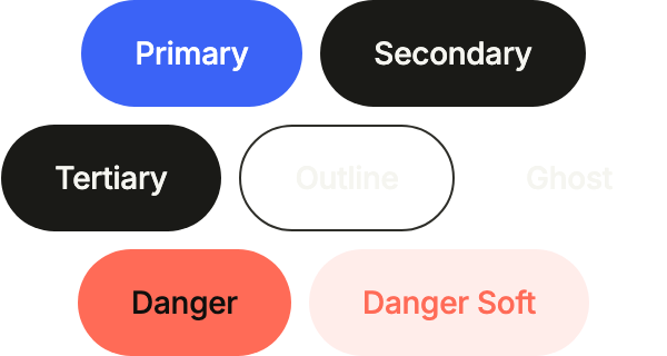
import 'package:your_app/ui/fliin/components/button/fl_button.dart';
import 'package:your_app/ui/fliin/core/fliin.dart';
import 'package:flutter/widgets.dart';

class ButtonVariantsExample extends StatelessWidget {
  const ButtonVariantsExample({super.key});

  @override
  Widget build(BuildContext context) {
    final space = FlScope.of(context).space;
    return Wrap(
      alignment: WrapAlignment.center,
      spacing: space.sm,
      runSpacing: space.sm,
      children: [
        FlButton(label: 'Primary', onPressed: () {}),
        FlButton(label: 'Secondary', variant: FlButtonVariant.secondary, onPressed: () {}),
        FlButton(label: 'Tertiary', variant: FlButtonVariant.tertiary, onPressed: () {}),
        FlButton(label: 'Outline', variant: FlButtonVariant.outline, onPressed: () {}),
        FlButton(label: 'Ghost', variant: FlButtonVariant.ghost, onPressed: () {}),
        FlButton(label: 'Danger', variant: FlButtonVariant.danger, onPressed: () {}),
        FlButton(label: 'Danger Soft', variant: FlButtonVariant.dangerSoft, onPressed: () {}),
      ],
    );
  }
}Sizes
Three sizes. md is the default; sm fits inside a row or a card, lg carries the main action at the bottom of a screen.

import 'package:your_app/ui/fliin/components/button/fl_button.dart';
import 'package:your_app/ui/fliin/core/fliin.dart';
import 'package:flutter/widgets.dart';

class ButtonSizesExample extends StatelessWidget {
  const ButtonSizesExample({super.key});

  @override
  Widget build(BuildContext context) {
    final space = FlScope.of(context).space;
    return Wrap(
      alignment: WrapAlignment.center,
      crossAxisAlignment: WrapCrossAlignment.center,
      spacing: space.sm,
      runSpacing: space.sm,
      children: [
        FlButton(label: 'Small', size: FlButtonSize.sm, onPressed: () {}),
        FlButton(label: 'Medium', size: FlButtonSize.md, onPressed: () {}),
        FlButton(label: 'Large', size: FlButtonSize.lg, onPressed: () {}),
      ],
    );
  }
}With icons
An icon before the label with leading, or after it with trailing: it takes the label's color and the button's icon size.
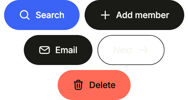
import 'package:your_app/ui/fliin/components/button/fl_button.dart';
import 'package:your_app/ui/fliin/core/fliin.dart';
import 'package:your_app/ui/fliin/icons/fl_icons.dart';
import 'package:flutter/widgets.dart';

class ButtonWithIconsExample extends StatelessWidget {
  const ButtonWithIconsExample({super.key});

  @override
  Widget build(BuildContext context) {
    final space = FlScope.of(context).space;
    return Wrap(
      alignment: WrapAlignment.center,
      spacing: space.sm,
      runSpacing: space.sm,
      children: [
        FlButton(label: 'Search', leading: FlIcon(FlIcons.magnifier), onPressed: () {}),
        FlButton(
          label: 'Add member',
          variant: FlButtonVariant.secondary,
          leading: FlIcon(FlIcons.plus),
          onPressed: () {},
        ),
        FlButton(
          label: 'Email',
          variant: FlButtonVariant.tertiary,
          leading: FlIcon(FlIcons.envelope),
          onPressed: () {},
        ),
        FlButton(
          label: 'Next',
          variant: FlButtonVariant.outline,
          trailing: FlIcon(FlIcons.arrowRight),
          onPressed: () {},
        ),
        FlButton(label: 'Delete', variant: FlButtonVariant.danger, leading: FlIcon(FlIcons.trashBin), onPressed: () {}),
      ],
    );
  }
}Icon only
FlButton.icon shows the icon alone in a square as tall as the button; label is what the screen reader says.

import 'package:your_app/ui/fliin/components/button/fl_button.dart';
import 'package:your_app/ui/fliin/core/fliin.dart';
import 'package:your_app/ui/fliin/icons/fl_icons.dart';
import 'package:flutter/widgets.dart';

class ButtonIconOnlyExample extends StatelessWidget {
  const ButtonIconOnlyExample({super.key});

  @override
  Widget build(BuildContext context) {
    final space = FlScope.of(context).space;
    return Wrap(
      alignment: WrapAlignment.center,
      spacing: space.sm,
      runSpacing: space.sm,
      children: [
        FlButton.icon(
          label: 'More options',
          icon: FlIcon(FlIcons.ellipsis),
          variant: FlButtonVariant.tertiary,
          onPressed: () {},
        ),
        FlButton.icon(
          label: 'Settings',
          icon: FlIcon(FlIcons.gear),
          variant: FlButtonVariant.secondary,
          onPressed: () {},
        ),
        FlButton.icon(
          label: 'Delete',
          icon: FlIcon(FlIcons.trashBin),
          variant: FlButtonVariant.danger,
          onPressed: () {},
        ),
        FlButton.icon(
          label: 'Add',
          icon: FlIcon(FlIcons.plus),
          size: FlButtonSize.sm,
          variant: FlButtonVariant.outline,
          onPressed: () {},
        ),
      ],
    );
  }
}Full width
fullWidth stretches the button across the width it is given, its content centered, even in a column that centers its children.
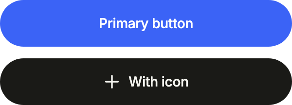
import 'package:your_app/ui/fliin/components/button/fl_button.dart';
import 'package:your_app/ui/fliin/core/fliin.dart';
import 'package:your_app/ui/fliin/icons/fl_icons.dart';
import 'package:flutter/widgets.dart';

class ButtonFullWidthExample extends StatelessWidget {
  const ButtonFullWidthExample({super.key});

  @override
  Widget build(BuildContext context) {
    return Column(
      mainAxisSize: MainAxisSize.min,
      spacing: FlScope.of(context).space.md,
      children: [
        FlButton(label: 'Primary button', fullWidth: true, onPressed: () {}),
        FlButton(
          label: 'With icon',
          variant: FlButtonVariant.tertiary,
          leading: FlIcon(FlIcons.plus),
          fullWidth: true,
          onPressed: () {},
        ),
      ],
    );
  }
}Toggle
A toggle button: selected tells assistive technologies whether it is on, and the variant shows it.

import 'package:your_app/ui/fliin/components/button/fl_button.dart';
import 'package:your_app/ui/fliin/core/fliin.dart';
import 'package:flutter/widgets.dart';

class ButtonToggleExample extends StatefulWidget {
  const ButtonToggleExample({super.key});

  @override
  State<ButtonToggleExample> createState() => _ButtonToggleExampleState();
}

class _ButtonToggleExampleState extends State<ButtonToggleExample> {
  var _bold = true;
  var _italic = false;

  @override
  Widget build(BuildContext context) {
    return Wrap(
      alignment: WrapAlignment.center,
      spacing: FlScope.of(context).space.sm,
      children: [
        FlButton(
          label: 'Bold',
          selected: _bold,
          variant: _bold ? FlButtonVariant.secondary : FlButtonVariant.ghost,
          size: FlButtonSize.sm,
          onPressed: () => setState(() => _bold = !_bold),
        ),
        FlButton(
          label: 'Italic',
          selected: _italic,
          variant: _italic ? FlButtonVariant.secondary : FlButtonVariant.ghost,
          size: FlButtonSize.sm,
          onPressed: () => setState(() => _italic = !_italic),
        ),
      ],
    );
  }
}Enabled
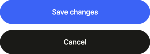
Stretched to the width of a form: the action that saves, and the one that backs out, quieter.
import 'package:your_app/ui/fliin/components/button/fl_button.dart';
import 'package:your_app/ui/fliin/core/fliin.dart';
import 'package:flutter/widgets.dart';

class ButtonEnabledExample extends StatelessWidget {
  const ButtonEnabledExample({super.key});

  @override
  Widget build(BuildContext context) {
    return Column(
      mainAxisSize: MainAxisSize.min,
      crossAxisAlignment: CrossAxisAlignment.stretch,
      spacing: FlScope.of(context).space.md,
      children: [
        FlButton(label: 'Save changes', onPressed: () {}),
        FlButton(label: 'Cancel', variant: FlButtonVariant.tertiary, onPressed: () {}),
      ],
    );
  }
}Disabled
onPressed: null disables the button: it fades, ignores touches and says so to the screen reader.

import 'package:your_app/ui/fliin/components/button/fl_button.dart';
import 'package:your_app/ui/fliin/core/fliin.dart';
import 'package:flutter/widgets.dart';

class ButtonDisabledExample extends StatelessWidget {
  const ButtonDisabledExample({super.key});

  @override
  Widget build(BuildContext context) {
    return Wrap(
      alignment: WrapAlignment.center,
      spacing: FlScope.of(context).space.sm,
      children: const [
        FlButton(label: 'Disabled', onPressed: null),
        FlButton(label: 'Disabled', variant: FlButtonVariant.secondary, onPressed: null),
      ],
    );
  }
}Loading
loading swaps the label for a spinner without changing the button's size; touch it to toggle.

import 'package:your_app/ui/fliin/components/button/fl_button.dart';
import 'package:flutter/widgets.dart';

class ButtonLoadingExample extends StatefulWidget {
  const ButtonLoadingExample({super.key});

  @override
  State<ButtonLoadingExample> createState() => _ButtonLoadingExampleState();
}

class _ButtonLoadingExampleState extends State<ButtonLoadingExample> {
  var _loading = true;

  @override
  Widget build(BuildContext context) {
    return Center(
      child: FlButton(
        label: 'Download now',
        loading: _loading,
        onPressed: () => setState(() => _loading = !_loading),
      ),
    );
  }
}Usage
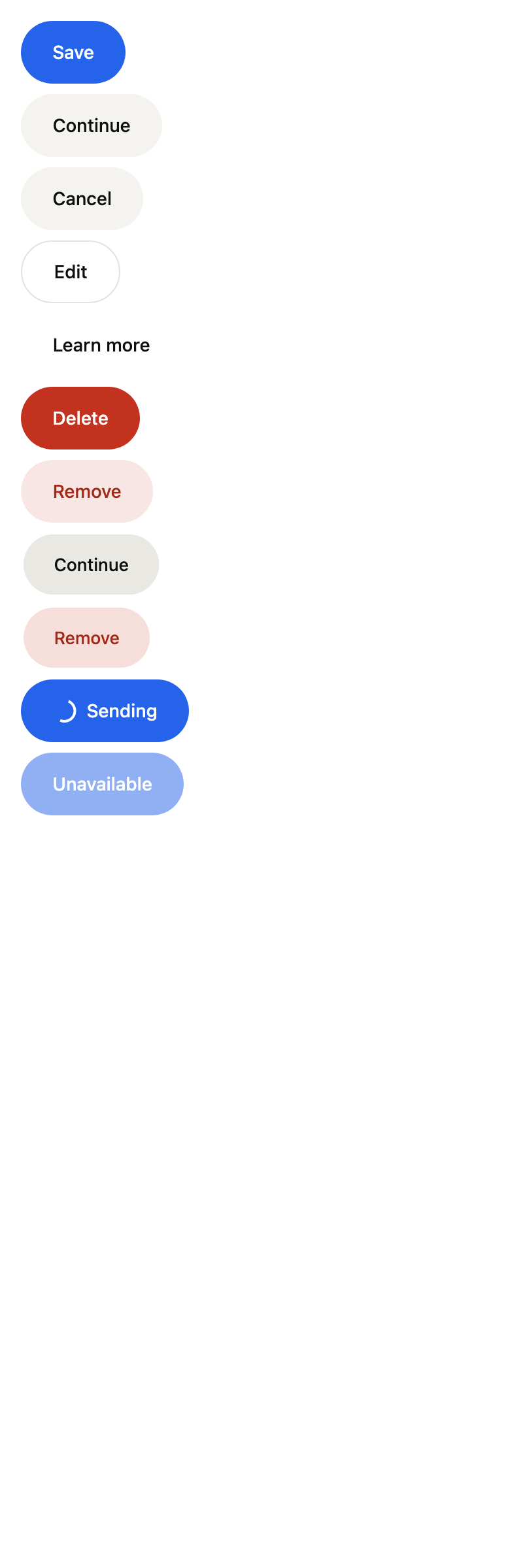
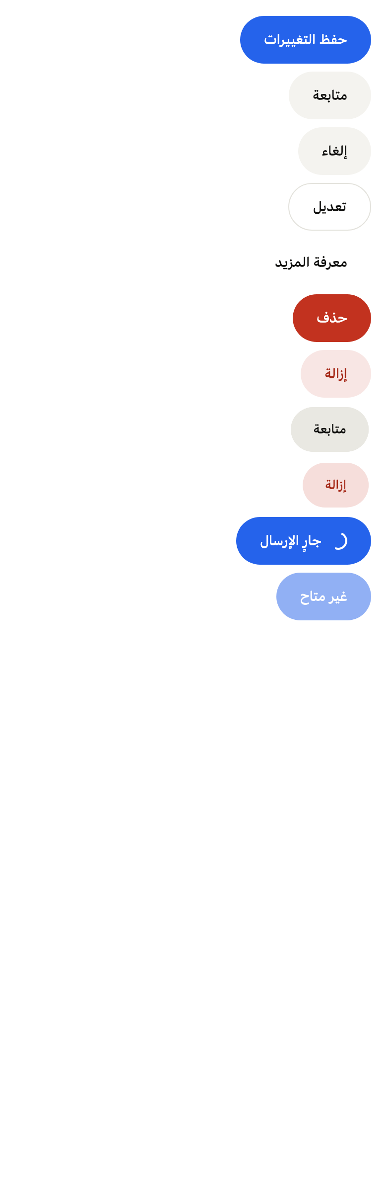
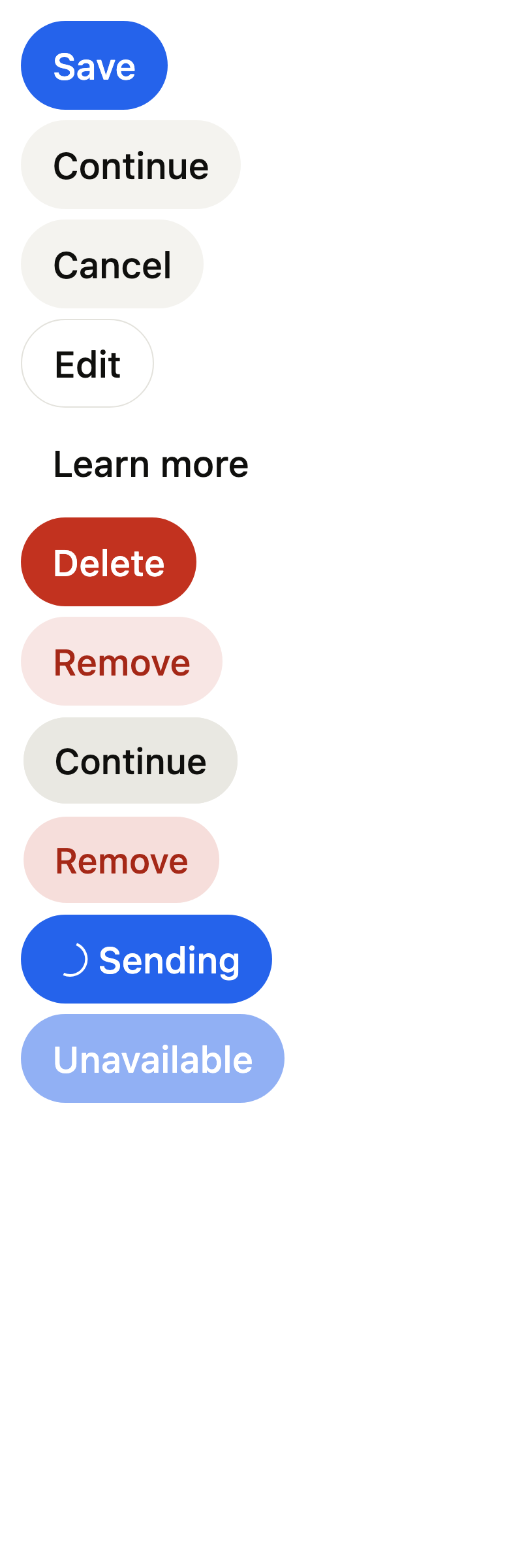
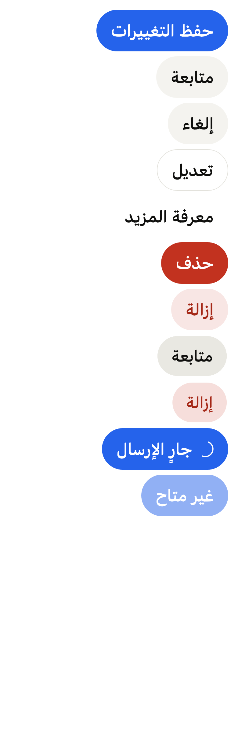
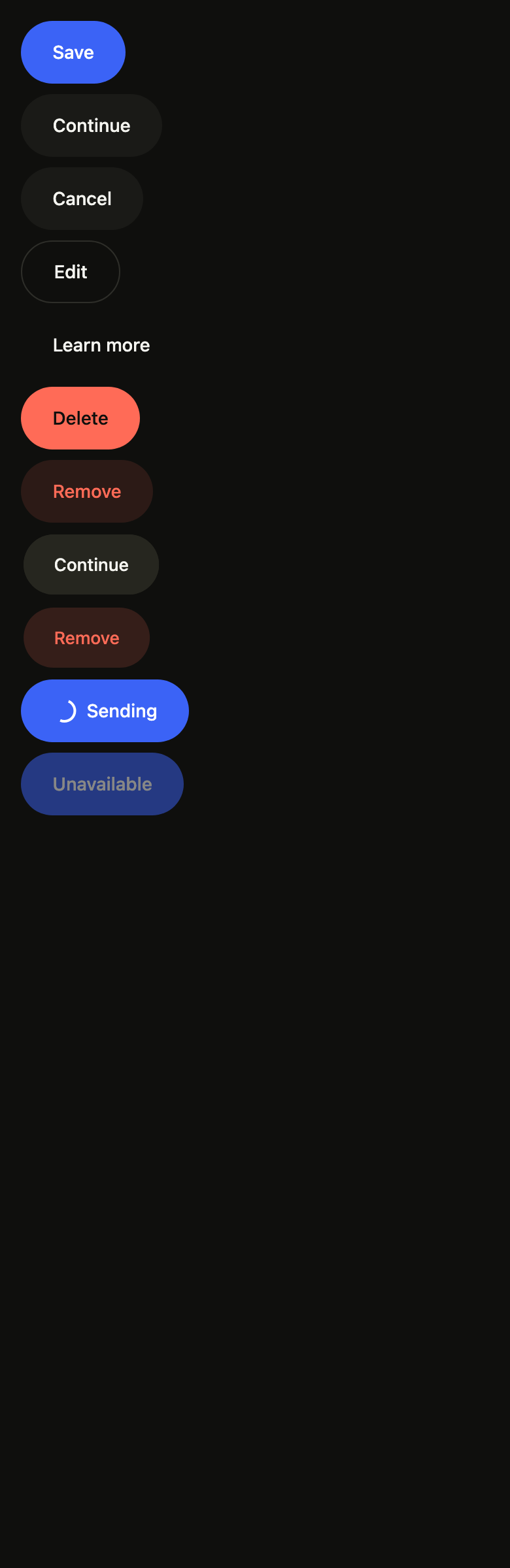
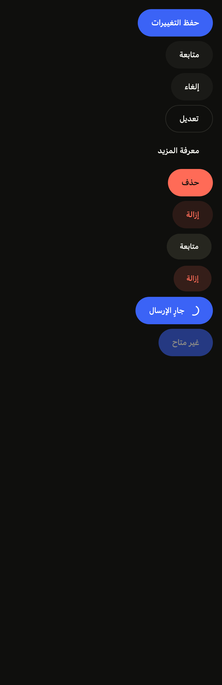
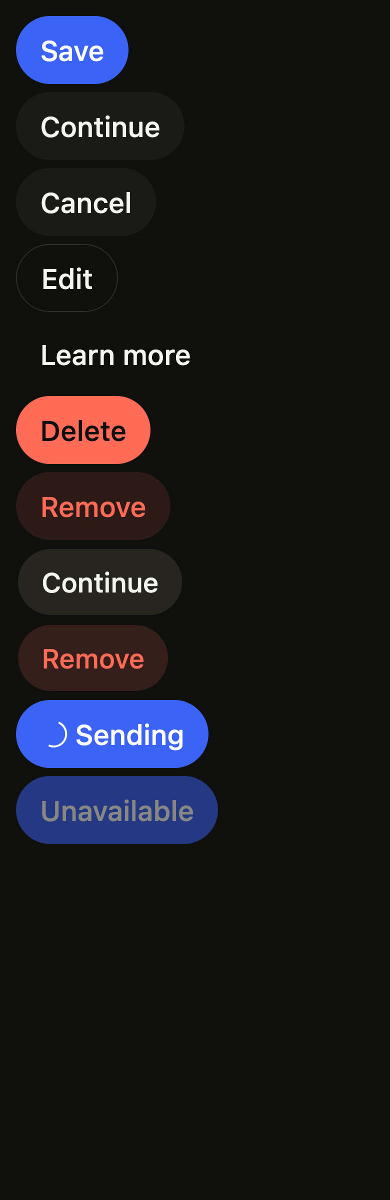
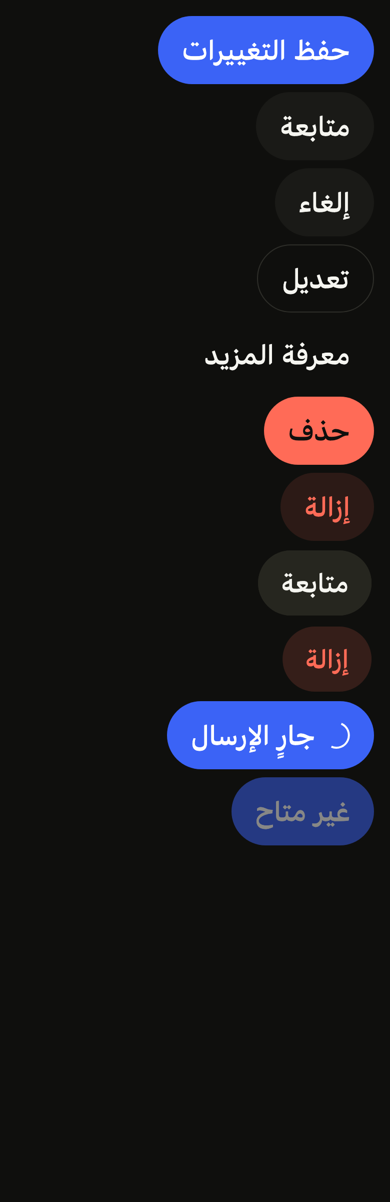
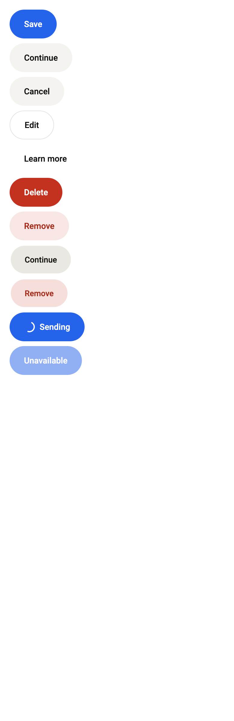
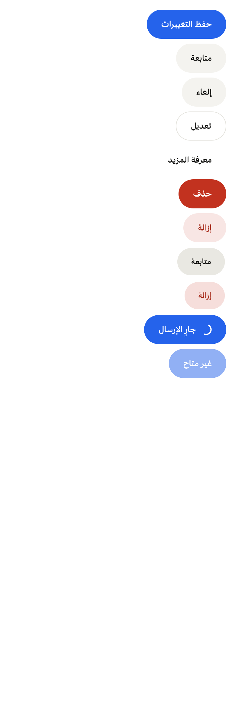
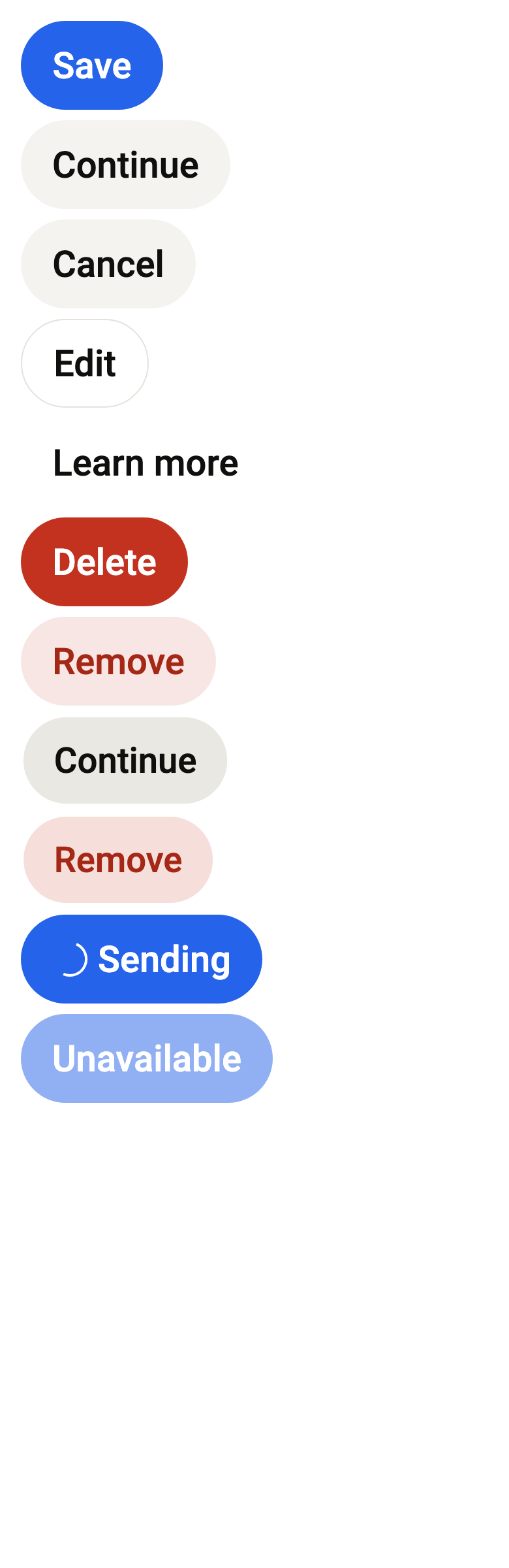
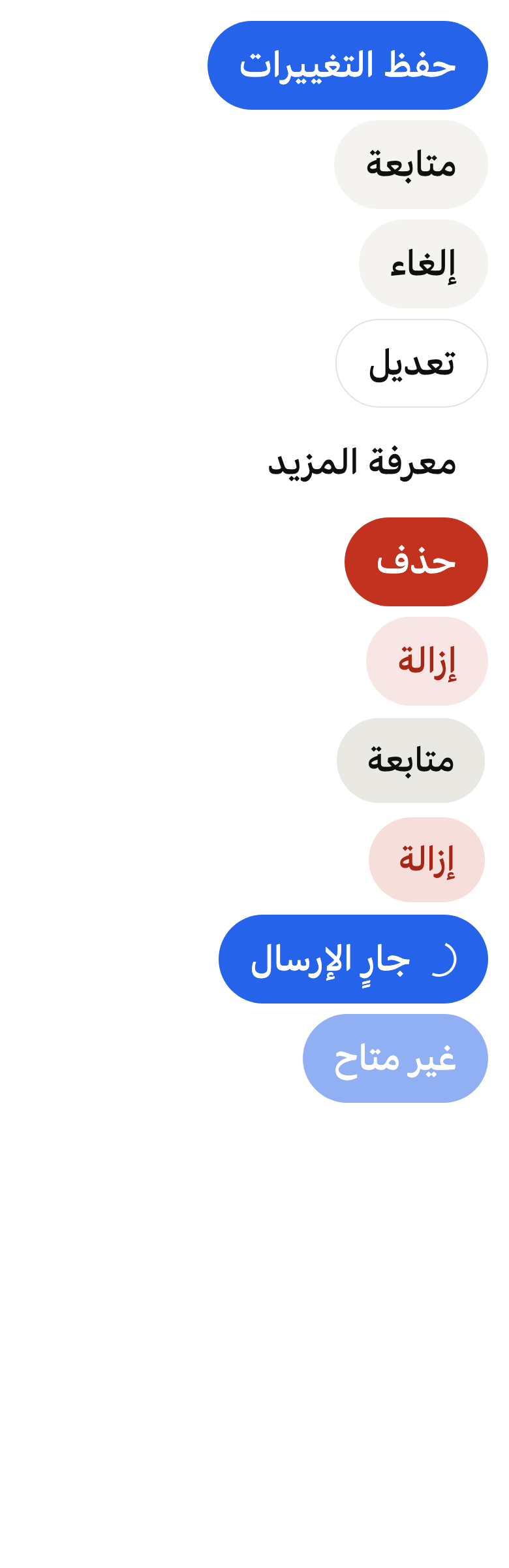
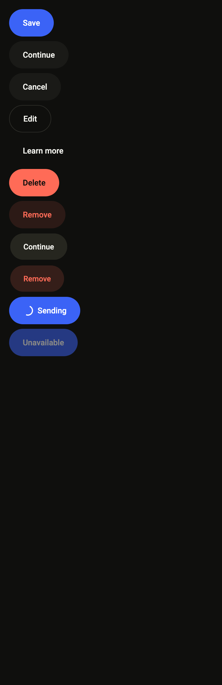
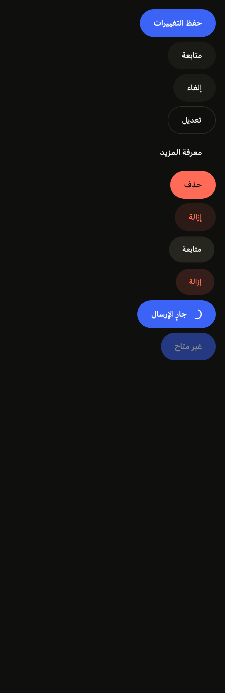
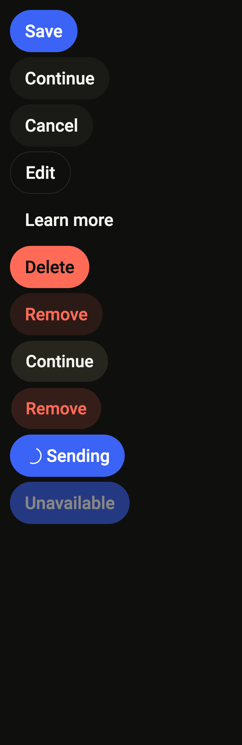
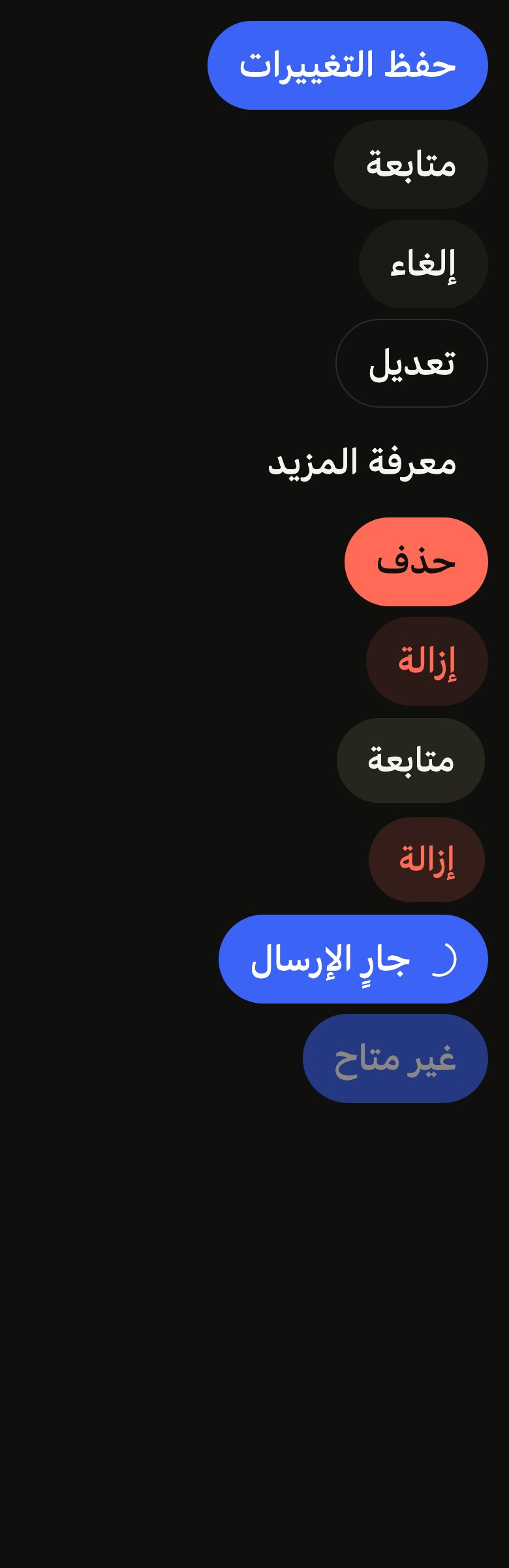
The code the reference images render:
final example = ColoredBox(
  color: FlScope.of(context).colors.surface,
  child: Padding(
    padding: EdgeInsetsDirectional.all(FlScope.of(context).space.lg),
    child: Column(
      crossAxisAlignment: CrossAxisAlignment.start,
      spacing: FlScope.of(context).space.sm,
      children: [
        FlButton(label: 'Save', onPressed: () {}),
        FlButton(
          label: 'Continue',
          variant: FlButtonVariant.secondary,
          onPressed: () {},
        ),
        FlButton(
          label: 'Cancel',
          variant: FlButtonVariant.tertiary,
          onPressed: () {},
        ),
        FlButton(
          label: 'Edit',
          variant: FlButtonVariant.outline,
          onPressed: () {},
        ),
        FlButton(
          label: 'Learn more',
          variant: FlButtonVariant.ghost,
          onPressed: () {},
        ),
        FlButton(
          label: 'Delete',
          variant: FlButtonVariant.danger,
          onPressed: () {},
        ),
        FlButton(
          label: 'Remove',
          variant: FlButtonVariant.dangerSoft,
          onPressed: () {},
        ),
        FlButton(
          label: 'Continue',
          variant: FlButtonVariant.secondary,
          statesController: WidgetStatesController({WidgetState.pressed}),
          onPressed: () {},
        ),
        FlButton(
          label: 'Remove',
          variant: FlButtonVariant.dangerSoft,
          statesController: WidgetStatesController({WidgetState.pressed}),
          onPressed: () {},
        ),
        FlButton(label: 'Sending', loading: true, onPressed: () {}),
        FlButton(label: 'Unavailable', onPressed: null),
      ],
    ),
  ),
);API
FlButtonVariant: enum {primary, secondary, tertiary, outline, ghost, danger, dangerSoft, inverse}
FlButtonVariant.primary: static final FlButtonVariant
FlButtonVariant.secondary: static final FlButtonVariant
FlButtonVariant.tertiary: static final FlButtonVariant
FlButtonVariant.outline: static final FlButtonVariant
FlButtonVariant.ghost: static final FlButtonVariant
FlButtonVariant.danger: static final FlButtonVariant
FlButtonVariant.dangerSoft: static final FlButtonVariant
FlButtonVariant.inverse: static final FlButtonVariant
FlButtonFeedback: enum {scaleHighlight, scaleRipple, scale, none}
FlButtonFeedback.scaleHighlight: static final FlButtonFeedback
FlButtonFeedback.scaleRipple: static final FlButtonFeedback
FlButtonFeedback.scale: static final FlButtonFeedback
FlButtonFeedback.none: static final FlButtonFeedback
FlButtonSize: enum {sm, md, lg}
FlButtonSize.sm: static final FlButtonSize
FlButtonSize.md: static final FlButtonSize
FlButtonSize.lg: static final FlButtonSize
FlButtonSize.of: static FlButtonSize(FlDensity density)
FlButton: class extends StatelessWidget
FlButton.new: const new({super.key, required String label, required VoidCallback? onPressed, FlButtonVariant variant, FlButtonSize? size, bool loading, Widget? leading, Widget? trailing, FlButtonFeedback feedback, WidgetStatesController? statesController, bool? selected, bool fullWidth})
FlButton.icon: get Widget?
FlButton.label: get String
FlButton.onPressed: get VoidCallback?
FlButton.variant: get FlButtonVariant
FlButton.size: get FlButtonSize?
FlButton.loading: get bool
FlButton.leading: get Widget?
FlButton.trailing: get Widget?
FlButton.extent: get double?
FlButton.feedback: get FlButtonFeedback
FlButton.statesController: get WidgetStatesController?
FlButton.selected: get bool?
FlButton.fullWidth: get bool
FlButton.build: Widget(BuildContext context)Reference renders
The 16 images published with version 0.2.5, rendered by the shared harness on macOS with Flutter 3.47.7. fliin verify button compares your copy to them.
Use it to
- submit a form
- add a primary action button
- add a call to action
- offer a secondary or cancel button
- show a spinner in the button while sending
- add a subtle ghost button to a toolbar
- add a destructive delete button
- make a toggle button for bold text
- toggle a favourite with a heart button
- Not for
- an on/off toggle: use a switch (switch)
- States
Source
The files fliin add button copies into your app, before your prefix and imports are applied.
button/fl_button.dart
// Modified from the Button of HeroUI Native 1.0.10, Copyright 2025 NextUI Inc.,
// licensed under Apache 2.0: https://www.apache.org/licenses/LICENSE-2.0
import 'package:flutter/widgets.dart';
import 'package:fliin_ui/components/spinner/fl_spinner.dart';
import 'package:fliin_ui/core/fliin.dart';

/// The visual emphasis of an [FlButton]. The accent is reserved for a single
/// primary action per view: everything else is told apart by grays.
enum FlButtonVariant {
  /// `accent` fill, `onAccent` text, flat: the primary action of the
  /// screen, one per view.
  primary,

  /// `control` background, `onAccentSoft` text: a highlighted secondary
  /// action.
  secondary,

  /// `control` background, `onControl` text: a neutral secondary action.
  tertiary,

  /// No fill, a hairline in `border`,
  /// `onControl` text.
  outline,

  /// No background or border, `onControl` text: a subtle action.
  ghost,

  /// `dangerFill` fill, `onDanger` text, flat: a destructive action, never
  /// next to the primary action.
  danger,

  /// Translucent `dangerSoft` background, `onDangerSoft` text: a subtle
  /// destructive action.
  dangerSoft,

  /// `selected` fill, `onSelected` text: the inverted action of a screen
  /// that keeps the accent off, like an onboarding's.
  inverse,
}

/// The press feedback of a [FlButton].
enum FlButtonFeedback {
  /// The button shrinks and dims.
  scaleHighlight,

  /// The button shrinks, and a ripple starts from the touched point.
  scaleRipple,

  /// The button shrinks, without dimming.
  scale,

  /// Neither scale nor dimming: only the screen reader and focus convey the press.
  none;

  bool get _scales => this != none;

  FlPressOverlay get _overlay => switch (this) {
    scaleHighlight => FlPressOverlay.highlight,
    scaleRipple => FlPressOverlay.ripple,
    scale || none => FlPressOverlay.none,
  };
}

/// The size of an [FlButton]: 44, 48 or 56 points high with the default
/// tokens, the control heights of the three densities.
enum FlButtonSize {
  /// Height `size.controlCompact`, label `controlSm`.
  sm,

  /// Height `size.controlComfortable`, label `controlMd`.
  md,

  /// Height `size.controlSpacious`, label `controlLg`.
  lg;

  /// The size that follows the theme's density: compact, comfortable or spacious.
  static FlButtonSize of(FlDensity density) => switch (density) {
    FlDensity.compact => sm,
    FlDensity.comfortable => md,
    FlDensity.spacious => lg,
  };
}

typedef _Metrics = ({double height, double padding, double gap, double icon, FlTextRole text, double radius});

typedef _Paint = ({Color? fill, Color? border, Color foreground, Color highlight});

/// An action button: [label] between optional [leading] and
/// [trailing] icons, or an icon alone through [FlButton.icon]. It shrinks
/// and dims when pressed, and turns half opaque when disabled.
class FlButton extends StatelessWidget {
  /// Creates a labeled button, with the `primary` variant by default.
  const FlButton({
    super.key,
    required this.label,
    required this.onPressed,
    this.variant = FlButtonVariant.primary,
    this.size,
    this.loading = false,
    this.leading,
    this.trailing,
    this.feedback = FlButtonFeedback.scaleHighlight,
    this.statesController,
    this.selected,
    this.fullWidth = false,
  }) : icon = null,
       extent = null;

  /// Creates a square button that shows only [icon]; [label] remains what
  /// the screen reader reads.
  const FlButton.icon({
    super.key,
    required this.label,
    required Widget this.icon,
    required this.onPressed,
    this.variant = FlButtonVariant.primary,
    this.size,
    this.loading = false,
    this.feedback = FlButtonFeedback.scaleHighlight,
    this.statesController,
    this.extent,
    this.selected,
  }) : leading = null,
       trailing = null,
       fullWidth = false;

  /// The displayed text, read as is by the screen reader in place of the
  /// whole content of the button.
  final String label;

  /// Called when the button is pressed. When null: the button goes to
  /// `size.disabledOpacity` and announces itself disabled.
  final VoidCallback? onPressed;

  /// The background, the border and the text color; `primary` by default.
  final FlButtonVariant variant;

  /// The height, the padding and the text size. When null, it follows the
  /// theme's density: `md` on mobile.
  final FlButtonSize? size;

  /// True: a `FlSpinner` in the text color replaces [leading] (at the icon's
  /// size) or [icon] (at size `md`), and the button
  /// ignores presses without changing appearance. The indicator is still
  /// under reduced motion.
  final bool loading;

  /// An icon before the text, in the text's tint and size, capped by
  /// `size.iconMaxScale`. Hidden during [loading].
  final Widget? leading;

  /// An icon after the text, in the text's tint and size.
  final Widget? trailing;

  /// The icon of a [FlButton.icon] button, alone in a square.
  final Widget? icon;

  /// The side of a [FlButton.icon]'s square, in logical points; when null,
  /// the height of [size] (the close button takes a smaller one).
  final double? extent;

  /// The press feedback: scale and dimming by default.
  final FlButtonFeedback feedback;

  /// The button's states, which the app can read or force; see
  /// `FlPressable.statesController`.
  final WidgetStatesController? statesController;

  /// Selected or not, for a toggle button (a favorite, an editor's bold);
  /// null for an action button. [label] stays the same, selected or not: a
  /// favorite is named "Favorite". The node carries `selected`: iOS sets
  /// the "selected" trait when it is true, Android `setSelected`, and the
  /// off state is announced nowhere; so the screen should announce the
  /// change (`SemanticsService.sendAnnouncement`). Selected, a `tertiary`
  /// button takes the `selected` fill and `onSelected` text, like every
  /// chosen state; a `secondary`, `outline` or `ghost` one the `accentSoft`
  /// fill. Color is not enough to convey the state: the app changes [icon]
  /// or [leading] with it.
  ///
  /// ```dart
  /// FlButton.icon(label: 'Favorite', selected: favorite, variant: FlButtonVariant.secondary,
  ///     icon: favorite ? heartFilled : heartOutline, onPressed: toggleFavorite)
  /// FlButton.icon(label: 'Bold', selected: bold,
  ///     variant: bold ? FlButtonVariant.secondary : FlButtonVariant.ghost, icon: boldIcon, onPressed: toggleBold)
  /// ```
  final bool? selected;

  /// True: the button takes the full width it is given, its content
  /// centered; under an unbounded width (in a `Row`),
  /// it keeps its natural width. False by default: as wide as its content.
  /// A [FlButton.icon] stays square.
  final bool fullWidth;

  _Metrics _metrics(FlTheme theme, FlButtonSize size) {
    final s = theme.size;
    return switch (size) {
      FlButtonSize.sm => (
        height: s.controlCompact,
        padding: s.buttonPaddingSm,
        gap: s.buttonGapSm,
        icon: s.buttonIconSm,
        text: FlTextRole.controlSm,
        radius: theme.shape.radiusButton,
      ),
      FlButtonSize.md => (
        height: s.controlComfortable,
        padding: s.buttonPaddingMd,
        gap: s.buttonGapMd,
        icon: s.buttonIconMd,
        text: FlTextRole.controlMd,
        radius: theme.shape.radiusButton,
      ),
      FlButtonSize.lg => (
        height: s.controlSpacious,
        padding: s.buttonPaddingLg,
        gap: s.buttonGapLg,
        icon: s.buttonIconLg,
        text: FlTextRole.controlLg,
        radius: theme.shape.radiusButtonLarge,
      ),
    };
  }

  /// The colors of each variant and the press veil. No variant carries a
  /// halo: the buttons are flat, and a colored glow would blur into the focus ring and linger on a disabled button.
  _Paint _paint(FlTheme theme) {
    final c = theme.colors;
    final subtle = c.controlPressed.withValues(alpha: theme.size.pressedOverlayOpacity);
    // Selected, a tertiary toggle turns `selected` like the canvas's state
    // matrix; the other neutral variants take the `accentSoft` fill (the
    // canvas's favorite); the filled and destructive variants keep theirs.
    if (variant == FlButtonVariant.tertiary && selected == true) {
      return (
        fill: c.selected,
        border: null,
        foreground: c.onSelected,
        highlight: Color.alphaBlend(c.onSelected.withValues(alpha: theme.size.pressedOverlayOpacity), c.selected),
      );
    }
    if (variant case FlButtonVariant.secondary || FlButtonVariant.outline || FlButtonVariant.ghost
        when selected == true) {
      return (
        fill: c.accentSoft,
        border: variant == FlButtonVariant.outline ? c.border : null,
        foreground: c.onAccentSoft,
        highlight: c.accentSoftPressed,
      );
    }
    return switch (variant) {
      FlButtonVariant.primary => (fill: c.accent, border: null, foreground: c.onAccent, highlight: c.accentPressed),
      FlButtonVariant.secondary => (
        fill: c.control,
        border: null,
        foreground: c.onAccentSoft,
        highlight: c.controlPressed,
      ),
      FlButtonVariant.tertiary => (fill: c.control, border: null, foreground: c.onControl, highlight: c.controlPressed),
      FlButtonVariant.outline => (fill: null, border: c.border, foreground: c.onControl, highlight: subtle),
      FlButtonVariant.ghost => (fill: null, border: null, foreground: c.onControl, highlight: subtle),
      FlButtonVariant.danger => (fill: c.dangerFill, border: null, foreground: c.onDanger, highlight: c.dangerPressed),
      FlButtonVariant.dangerSoft => (
        fill: c.dangerSoft,
        border: null,
        foreground: c.onDangerSoft,
        // Over the fill, the veil that brings it to `dangerSoftPressed`
        // rather than stacking both tints.
        highlight: _veilOver(c.dangerSoft, c.dangerSoftPressed),
      ),
      // No token darkens `selected`: pressed, an `onSelected` veil, like the
      // chosen segment's.
      FlButtonVariant.inverse => (
        fill: c.selected,
        border: null,
        foreground: c.onSelected,
        highlight: Color.alphaBlend(c.onSelected.withValues(alpha: theme.size.pressedOverlayOpacity), c.selected),
      ),
    };
  }

  /// The veil that, painted over [fill], gives [target]: both are the same
  /// color at two opacities.
  static Color _veilOver(Color fill, Color target) {
    if (fill.a >= 1 || target.a <= fill.a) return target;
    return target.withValues(alpha: (target.a - fill.a) / (1 - fill.a));
  }

  /// The fill under the pointer, Izydesk's state matrix: a filled variant
  /// darkens to `size.hoverBrightness` (`filter: brightness(.92)`); a neutral
  /// one, unselected, steps to `controlPressed`, hovered or pressed, even
  /// without fill (`outline`, `ghost`).
  Color? _hovered(FlTheme theme, Color? fill, Set<WidgetState> states) {
    if (states.contains(WidgetState.disabled) || loading) return fill;
    final hovered = states.contains(WidgetState.hovered);
    switch (variant) {
      case FlButtonVariant.primary || FlButtonVariant.danger || FlButtonVariant.inverse:
        if (!hovered || fill == null) return fill;
        final k = theme.size.hoverBrightness;
        return Color.from(alpha: fill.a, red: fill.r * k, green: fill.g * k, blue: fill.b * k);
      case FlButtonVariant.secondary || FlButtonVariant.tertiary || FlButtonVariant.outline || FlButtonVariant.ghost:
        if (selected == true) return fill;
        return hovered || states.contains(WidgetState.pressed) ? theme.colors.controlPressed : fill;
      case FlButtonVariant.dangerSoft:
        return fill;
    }
  }

  /// The button's shape: continuous corners in the `rounded` shape.
  static OutlinedBorder _shape(FlButtonShape shape, double radius, BorderSide side) => switch (shape) {
    FlButtonShape.square => RoundedRectangleBorder(side: side),
    FlButtonShape.rounded => FlContinuousBorder(side: side, radius: radius),
    FlButtonShape.pill => StadiumBorder(side: side),
  };

  @override
  Widget build(BuildContext context) {
    final theme = FlScope.of(context);
    final sized = _metrics(theme, size ?? FlButtonSize.of(theme.density));
    final metrics = switch (extent) {
      final side? => (
        height: side,
        padding: sized.padding,
        gap: sized.gap,
        icon: sized.icon,
        text: sized.text,
        radius: sized.radius,
      ),
      null => sized,
    };
    final paint = _paint(theme);
    final border = paint.border;
    final shape = _shape(
      theme.shape.button,
      metrics.radius,
      border == null ? BorderSide.none : BorderSide(color: border, width: theme.size.border),
    );
    // Yoga counts the border in an automatic width, not in a fixed height:
    // only the outline width grows.
    final inline = metrics.padding + (border == null ? 0 : theme.size.border);
    // The height is a minimum, and the padding that centers the line keeps
    // it when the text grows, changing nothing at 1×.
    final block = (metrics.height - theme.typography.style(metrics.text).lineHeight) / 2;
    final radius = switch (theme.shape.button) {
      FlButtonShape.square => BorderRadius.zero,
      FlButtonShape.rounded => BorderRadius.circular(metrics.radius),
      FlButtonShape.pill => theme.shape.buttonRadius,
    };
    final iconSize = MediaQuery.textScalerOf(context)
        .clamp(maxScaleFactor: theme.size.iconMaxScale)
        .scale(metrics.icon);
    final iconTheme = IconThemeData(color: paint.foreground, size: iconSize);
    // Yoga snaps each view to the pixel grid, the icon included.
    Widget glyph(Widget child) => FlPixelSnap(
      child: IconTheme.merge(data: iconTheme, child: child),
    );
    // The loading state: an md Spinner in the text color in an icon button,
    // at the icon's size next to a label.
    final spinner = FlSpinner(label: label, color: paint.foreground, extent: this.icon == null ? iconSize : null);
    final icon = this.icon;
    final leading = this.leading;
    final trailing = this.trailing;

    final Widget content;
    if (icon != null) {
      content = loading ? spinner : glyph(icon);
    } else {
      content = Row(
        mainAxisSize: MainAxisSize.min,
        spacing: metrics.gap,
        children: [
          if (loading) spinner else if (leading != null) glyph(leading),
          Flexible(
            child: Text(
              label,
              textAlign: TextAlign.center,
              style: theme.typography.resolve(metrics.text).copyWith(color: paint.foreground),
              strutStyle: theme.typography.strut(
                metrics.text,
                inheritedFamily: DefaultTextStyle.of(context).style.fontFamily,
              ),
            ),
          ),
          if (trailing != null) glyph(trailing),
        ],
      );
    }

    final button = FlPressable(
      onPressed: loading ? null : onPressed,
      statesController: statesController,
      selected: selected,
      label: label,
      borderRadius: radius,
      scaleOnPress: feedback._scales,
      overlay: feedback._overlay,
      builder: (context, states) {
        final disabled = states.contains(WidgetState.disabled) && !loading;
        final fill = _hovered(theme, paint.fill, states);
        final motion = FlMotion.of(context);
        return Opacity(
          opacity: disabled ? theme.size.disabledOpacity : 1,
          child: FlPixelSnap(
            child: ConstrainedBox(
              constraints: BoxConstraints(minHeight: metrics.height, minWidth: icon == null ? 0 : metrics.height),
              // The hover fill fades in over 100 ms.
              child: TweenAnimationBuilder<Color?>(
                // A tween needs an end: no fill is the hover color, transparent.
                tween: ColorTween(end: fill ?? theme.colors.controlPressed.withValues(alpha: 0)),
                duration: motion.reduced ? Duration.zero : theme.motion.short2,
                curve: Curves.easeOut,
                builder: (context, fill, child) => DecoratedBox(
                  decoration: ShapeDecoration(color: fill, shape: shape),
                  child: child,
                ),
                child: Stack(
                  alignment: Alignment.center,
                  children: [
                    Positioned.fill(
                      child: ClipPath(
                        clipper: ShapeBorderClipper(shape: shape),
                        child: FlPressHighlight(color: paint.highlight),
                      ),
                    ),
                    Padding(
                      padding: EdgeInsetsDirectional.symmetric(
                        horizontal: icon == null ? inline : 0,
                        vertical: icon == null ? block : 0,
                      ),
                      child: content,
                    ),
                  ],
                ),
              ),
            ),
          ),
        );
      },
    );
    if (!fullWidth) return button;
    return LayoutBuilder(
      builder: (context, constraints) =>
          constraints.hasBoundedWidth ? SizedBox(width: constraints.maxWidth, child: button) : button,
    );
  }
}