Components / forms
Field label, description and error
Says what a field asks for, explains it and reports its error: label with a required asterisk, description, announced error message.
Import
In a Flutter app where fliin init has run:
Examples
Enabled
FlField puts a label above any control and a help line under it, at the field's own gap; required adds the asterisk and tells the control.
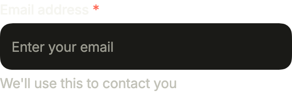
import 'package:your_app/ui/fliin/components/field/fl_field.dart';
import 'package:your_app/ui/fliin/components/text_field/fl_text_field.dart';
import 'package:flutter/widgets.dart';

class FieldEnabledExample extends StatelessWidget {
  const FieldEnabledExample({super.key});

  @override
  Widget build(BuildContext context) {
    return const FlField(
      label: 'Email address',
      helper: "We'll use this to contact you",
      required: true,
      child: FlInput(label: 'Email address', placeholder: 'Enter your email'),
    );
  }
}Invalid
With an error, the message replaces the help line and the control inside turns invalid: the input is outlined in danger.
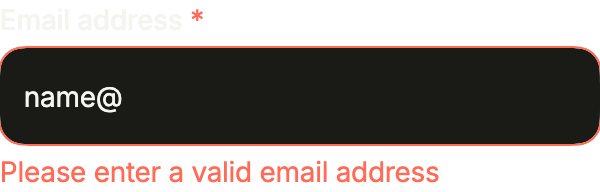
import 'package:your_app/ui/fliin/components/field/fl_field.dart';
import 'package:your_app/ui/fliin/components/text_field/fl_text_field.dart';
import 'package:flutter/widgets.dart';

class FieldInvalidExample extends StatefulWidget {
  const FieldInvalidExample({super.key});

  @override
  State<FieldInvalidExample> createState() => _FieldInvalidExampleState();
}

class _FieldInvalidExampleState extends State<FieldInvalidExample> {
  final _email = TextEditingController(text: 'name@');

  @override
  void dispose() {
    _email.dispose();
    super.dispose();
  }

  @override
  Widget build(BuildContext context) {
    return FlField(
      label: 'Email address',
      helper: "We'll use this to contact you",
      error: 'Please enter a valid email address',
      required: true,
      child: FlInput(label: 'Email address', controller: _email),
    );
  }
}Disabled
disabled: true fades the label, the control and the help line together, and locks the input inside.
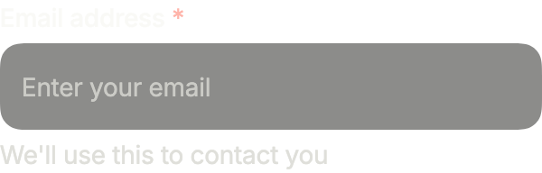
import 'package:your_app/ui/fliin/components/field/fl_field.dart';
import 'package:your_app/ui/fliin/components/text_field/fl_text_field.dart';
import 'package:flutter/widgets.dart';

class FieldDisabledExample extends StatelessWidget {
  const FieldDisabledExample({super.key});

  @override
  Widget build(BuildContext context) {
    return const FlField(
      label: 'Email address',
      helper: "We'll use this to contact you",
      disabled: true,
      required: true,
      child: FlInput(label: 'Email address', placeholder: 'Enter your email'),
    );
  }
}Parts
The parts on their own, for a layout of your own: FlFieldScope sets required and invalid once, and FlLabel, FlInput, FlDescription and FlFieldError read them. flFieldGap is the field's gap.
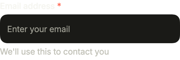
import 'package:your_app/ui/fliin/components/field/fl_field.dart';
import 'package:your_app/ui/fliin/components/text_field/fl_text_field.dart';
import 'package:your_app/ui/fliin/core/fliin.dart';
import 'package:flutter/widgets.dart';

class FieldPartsExample extends StatelessWidget {
  const FieldPartsExample({super.key});

  @override
  Widget build(BuildContext context) {
    return FlFieldScope(
      required: true,
      child: Column(
        mainAxisSize: MainAxisSize.min,
        crossAxisAlignment: CrossAxisAlignment.stretch,
        spacing: flFieldGap(FlScope.of(context)),
        children: const [
          FlLabel('Email address'),
          FlInput(label: 'Email address', placeholder: 'Enter your email'),
          FlDescription("We'll use this to contact you", hideOnInvalid: true),
          FlFieldError('Please enter a valid email address'),
        ],
      ),
    );
  }
}Label trailing
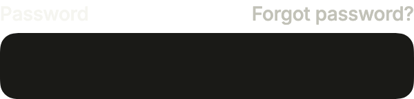
labelTrailing puts a widget across from the label: here the link to reset a forgotten password, on the sign-in form.
import 'package:your_app/ui/fliin/components/button/fl_button.dart';
import 'package:your_app/ui/fliin/components/field/fl_field.dart';
import 'package:your_app/ui/fliin/components/link_button/fl_link_button.dart';
import 'package:your_app/ui/fliin/components/text_field/fl_text_field.dart';
import 'package:flutter/widgets.dart';

class FieldLabelTrailingExample extends StatelessWidget {
  const FieldLabelTrailingExample({super.key});

  @override
  Widget build(BuildContext context) {
    return FlField(
      label: 'Password',
      labelTrailing: FlLinkButton(
        label: 'Forgot password?',
        size: FlButtonSize.sm,
        tone: FlLinkButtonTone.muted,
        onPressed: () {},
      ),
      child: const FlInput(label: 'Password', obscureText: true),
    );
  }
}Counter
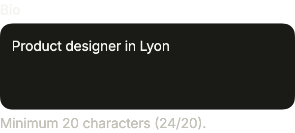
A text area that counts: the help line follows the text, and the error takes its place while the bio is too short.
import 'package:your_app/ui/fliin/components/field/fl_field.dart';
import 'package:your_app/ui/fliin/components/text_field/fl_text_field.dart';
import 'package:flutter/widgets.dart';

class FieldCounterExample extends StatefulWidget {
  const FieldCounterExample({super.key});

  @override
  State<FieldCounterExample> createState() => _FieldCounterExampleState();
}

class _FieldCounterExampleState extends State<FieldCounterExample> {
  static const _min = 20;
  final _bio = TextEditingController(text: 'Product designer in Lyon');

  @override
  void dispose() {
    _bio.dispose();
    super.dispose();
  }

  @override
  Widget build(BuildContext context) {
    final length = _bio.text.length;
    return FlField(
      label: 'Bio',
      helper: 'Minimum $_min characters ($length/$_min).',
      error: length > 0 && length < _min
          ? 'Bio must contain at least $_min characters.'
          : null,
      child: FlInput(
        label: 'Bio',
        controller: _bio,
        placeholder: 'Tell us about yourself…',
        multiline: true,
        rows: 3,
        onChanged: (_) => setState(() {}),
      ),
    );
  }
}Usage
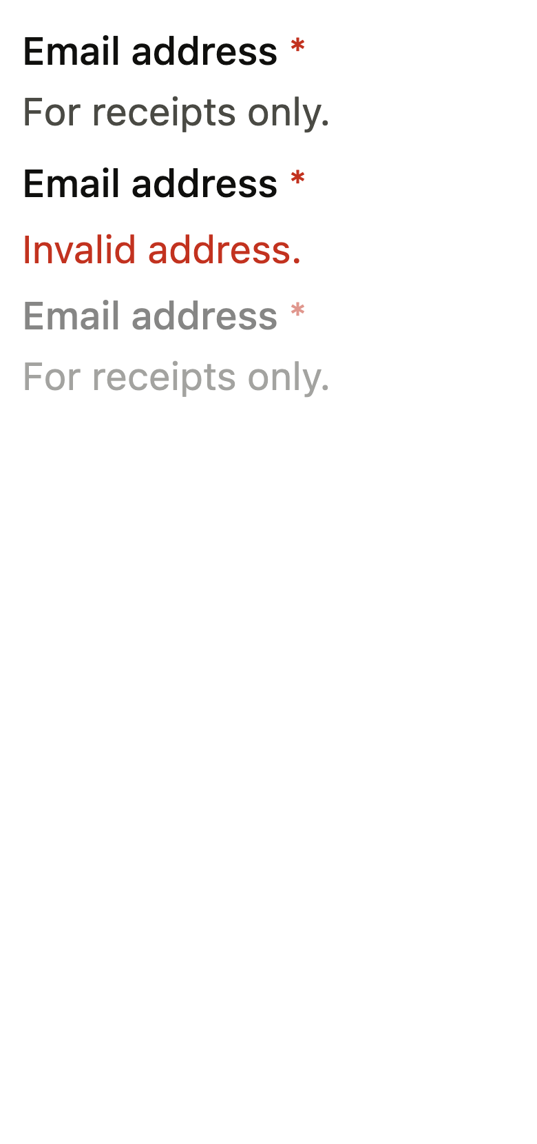
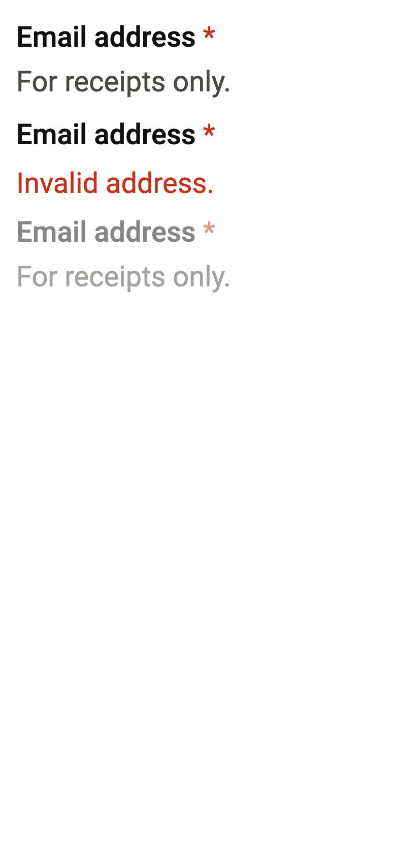
The code the reference images render:
final example = ColoredBox(
  color: FlScope.of(context).colors.surface,
  child: Padding(
    padding: EdgeInsetsDirectional.all(FlScope.of(context).space.lg),
    child: Column(
      crossAxisAlignment: CrossAxisAlignment.stretch,
      spacing: FlScope.of(context).space.sm,
      children: [
        FlFieldScope(
          invalid: false,
          disabled: false,
          required: true,
          child: Column(
            crossAxisAlignment: CrossAxisAlignment.start,
            spacing: FlScope.of(context).space.xs,
            children: [
              FlLabel('Email address'),
              FlDescription('For receipts only.', hideOnInvalid: true),
              FlFieldError('Invalid address.'),
            ],
          ),
        ),
        FlFieldScope(
          invalid: true,
          disabled: false,
          required: true,
          child: Column(
            crossAxisAlignment: CrossAxisAlignment.start,
            spacing: FlScope.of(context).space.xs,
            children: [
              FlLabel('Email address'),
              FlDescription('For receipts only.', hideOnInvalid: true),
              FlFieldError('Invalid address.'),
            ],
          ),
        ),
        FlFieldScope(
          invalid: false,
          disabled: true,
          required: true,
          child: Column(
            crossAxisAlignment: CrossAxisAlignment.start,
            spacing: FlScope.of(context).space.xs,
            children: [
              FlLabel('Email address'),
              FlDescription('For receipts only.', hideOnInvalid: true),
              FlFieldError('Invalid address.'),
            ],
          ),
        ),
      ],
    ),
  ),
);API
flFieldGap: double(FlTheme theme)
FlField: class extends StatelessWidget
FlField.new: const new({super.key, required String label, Widget? child, String? helper, String? error, bool required, bool disabled, bool? invalid, Widget? labelTrailing})
FlField.label: get String
FlField.child: get Widget?
FlField.helper: get String?
FlField.error: get String?
FlField.required: get bool
FlField.disabled: get bool
FlField.invalid: get bool?
FlField.labelTrailing: get Widget?
FlField.build: Widget(BuildContext context)
FlLabel: class extends StatelessWidget
FlLabel.new: const new(String text, {super.key, bool? invalid, bool? disabled, bool? required})
FlLabel.text: get String
FlLabel.invalid: get bool?
FlLabel.disabled: get bool?
FlLabel.required: get bool?
FlLabel.build: Widget(BuildContext context)
FlDescription: class extends StatelessWidget
FlDescription.new: const new(String text, {super.key, bool? invalid, bool? disabled, bool hideOnInvalid})
FlDescription.text: get String
FlDescription.invalid: get bool?
FlDescription.disabled: get bool?
FlDescription.hideOnInvalid: get bool
FlDescription.build: Widget(BuildContext context)
FlFieldError: class extends StatelessWidget
FlFieldError.new: const new(String text, {super.key, bool? invalid})
FlFieldError.text: get String
FlFieldError.invalid: get bool?
FlFieldError.build: Widget(BuildContext context)Reference renders
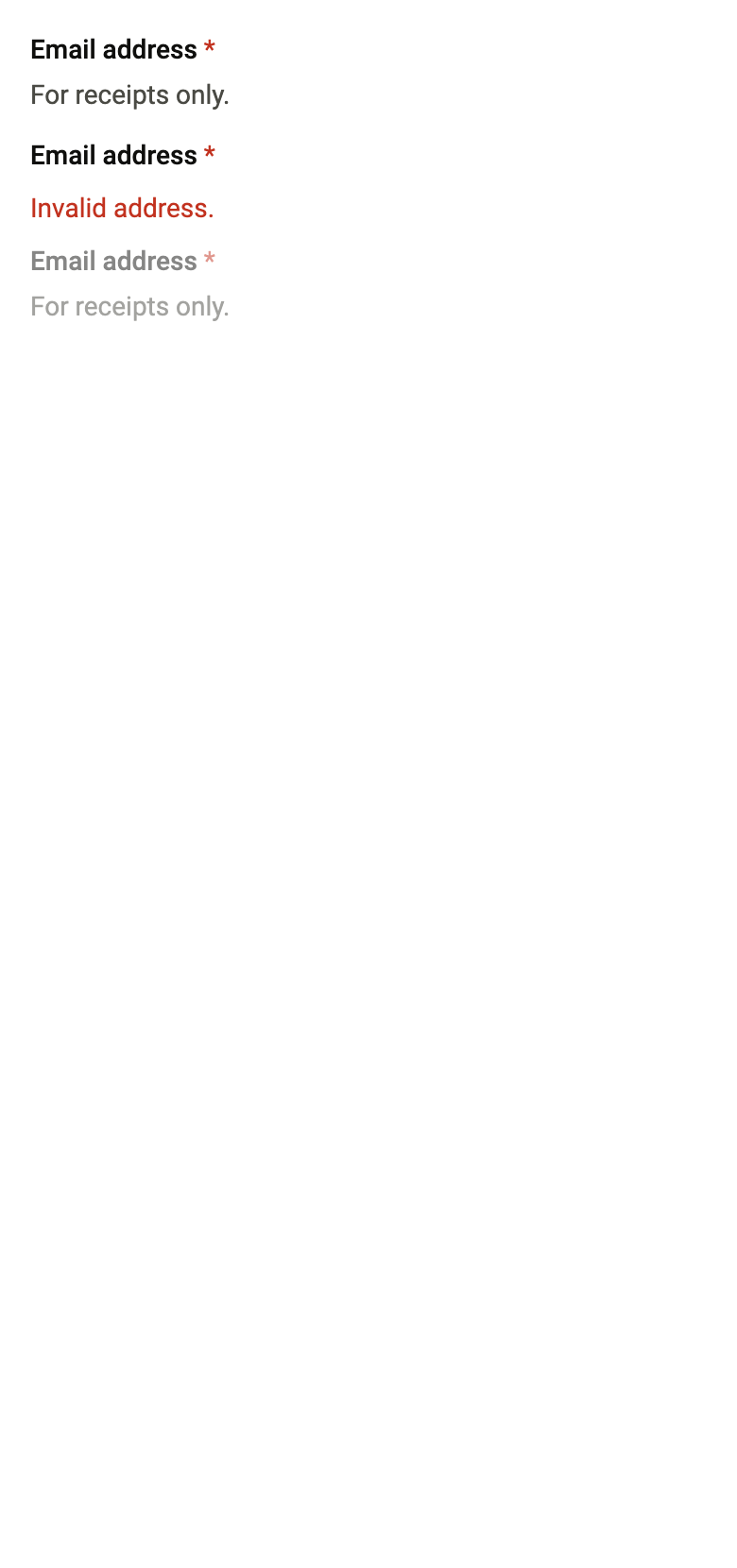
The 16 images published with version 0.2.3, rendered by the shared harness on macOS with Flutter 3.47.7. fliin verify field compares your copy to them.













Use it to
- add a label to a form field
- show an asterisk on a required field
- explain what a field expects
- show an input error
- show the message of an invalid field
- Not for
- text input: use a text field (text-field)
- States
Source
The files fliin add field copies into your app, before your prefix and imports are applied.
field/fl_field.dart
// Modified from Label, Description and FieldError of HeroUI Native 1.0.10,
// Copyright 2025 NextUI Inc., licensed under Apache 2.0:
// https://www.apache.org/licenses/LICENSE-2.0
import 'dart:math' as math;

import 'package:flutter/widgets.dart';
import 'package:fliin_ui/core/fliin.dart';

/// The gap between a field's label, its control and its message: Izydesk's
/// `.field` gap (`space.xs`), plus whatever the control's touch target
/// overflows its frame by (a compact control under the platform's target),
/// so that the target never reaches the label or the message.
double flFieldGap(FlTheme theme) => theme.space.xs + math.max(0, (theme.hitTarget - theme.controlHeight) / 2);

/// What a field part reads: its own setting, otherwise that of the enclosing
/// [FlFieldScope], otherwise false.
typedef _FieldState = ({bool invalid, bool disabled, bool required, bool inset});

_FieldState _state(BuildContext context, {bool? invalid, bool? disabled, bool? required}) {
  final scope = FlFieldScope.maybeOf(context);
  return (
    invalid: invalid ?? scope?.invalid ?? false,
    disabled: disabled ?? scope?.disabled ?? false,
    required: required ?? scope?.required ?? false,
    inset: scope?.inset ?? false,
  );
}

/// A field text in the role [role], the color [color], inset by
/// `size.fieldInset` in a field that asks for it.
Widget _text(
  BuildContext context,
  FlTextRole role,
  _FieldState state, {
  required List<InlineSpan> spans,
  required Color color,
}) {
  final theme = FlScope.of(context);
  final scale = theme.typography;
  final metrics = scale.style(role);
  final system = scale.familyOf(role) == null;
  final style = scale.resolve(role).copyWith(color: color);
  final inherited = DefaultTextStyle.of(context).style.fontFamily;
  final text = Padding(
    padding: EdgeInsetsDirectional.symmetric(horizontal: state.inset ? theme.size.fieldInset : 0),
    child: Text.rich(
      TextSpan(children: spans),
      // The role's line height, enforced for the system font (see FlText).
      // Like React Native's lineHeight, it fixes the line: without it, the line
      // spacing of text distributed proportionally, or the larger asterisk, would
      // make it overflow the strut.
      style: system ? style.copyWith(height: metrics.lineHeight / metrics.size) : style,
      strutStyle: system
          ? StrutStyle.fromTextStyle(
              style,
              fontFamily: inherited,
              height: metrics.lineHeight / metrics.size,
              leadingDistribution: TextLeadingDistribution.even,
              forceStrutHeight: true,
            )
          : scale.strut(role, inheritedFamily: inherited),
    ),
  );
  // A disabled field announces itself as such, and its half-opaque text falls
  // outside the contrast rule, like a disabled control (WCAG 1.4.3).
  return state.disabled ? Semantics(enabled: false, child: text) : text;
}

/// A whole field (Izydesk's `.field`): an [FlLabel] above [child], then an
/// [FlDescription] or, when [error] is set, an [FlFieldError] in its place,
/// `flFieldGap` apart. The label carries a `danger` asterisk when [required];
/// the whole field is half opaque when [disabled]; [labelTrailing] sits at
/// the end of the label's line. [child] (an `FlInput`, an
/// `FlInputGroup`, a one-time code…) reads the invalid, disabled and required
/// states from the [FlFieldScope] this field sets around it, and carries
/// its own name for the screen reader: the visible label is not read again.
///
/// ```dart
/// FlField(
///   label: 'Site',
///   error: invalid ? 'Invalid address' : null,
///   child: FlInputGroup(prefix: Text('https://'), decorativePrefix: true, child: FlInput(label: 'Site')),
/// )
/// ```
class FlField extends StatelessWidget {
  /// A field labeled [label], around [child].
  const FlField({
    super.key,
    required this.label,
    this.child,
    this.helper,
    this.error,
    this.required = false,
    this.disabled = false,
    this.invalid,
    this.labelTrailing,
  });

  /// The visible label, above [child].
  final String label;

  /// The control; null for a label and its message alone.
  final Widget? child;

  /// The help under the control, replaced by [error] when there is one.
  final String? helper;

  /// The error message: when set, the field is invalid.
  final String? error;

  /// Required: an asterisk after the label, announced as required.
  final bool required;

  /// Disabled: the label, the control and the message at
  /// `size.disabledOpacity`.
  final bool disabled;

  /// Invalid without a message (the message shown elsewhere); when null,
  /// invalid when [error] is set.
  final bool? invalid;

  /// A widget at the end of the label's line, across from it: a "Forgot
  /// password?" link, a character count, an "Optional" tag. It keeps its
  /// own semantics. When null, the label stands alone.
  final Widget? labelTrailing;

  @override
  Widget build(BuildContext context) {
    final theme = FlScope.of(context);
    final error = this.error;
    final trailing = labelTrailing;
    final helper = this.helper;
    final child = this.child;
    return FlFieldScope(
      invalid: invalid ?? error != null,
      disabled: disabled,
      required: required,
      child: Column(
        mainAxisSize: MainAxisSize.min,
        crossAxisAlignment: CrossAxisAlignment.stretch,
        spacing: flFieldGap(theme),
        children: [
          // Tight around its text: at full width, the contrast check took
          // the control below as the label's background.
          if (trailing == null)
            Align(
              alignment: AlignmentDirectional.centerStart,
              // The control carries its own name: the label is read once.
              child: child == null ? FlLabel(label) : ExcludeSemantics(child: FlLabel(label)),
            )
          else
            Row(
              spacing: theme.space.sm,
              children: [
                Expanded(
                  child: Align(
                    alignment: AlignmentDirectional.centerStart,
                    child: child == null ? FlLabel(label) : ExcludeSemantics(child: FlLabel(label)),
                  ),
                ),
                trailing,
              ],
            ),
          ?child,
          if (error != null)
            Align(alignment: AlignmentDirectional.centerStart, child: FlFieldError(error, invalid: true))
          else if (helper != null)
            Align(alignment: AlignmentDirectional.centerStart, child: FlDescription(helper, invalid: false)),
        ],
      ),
    );
  }
}

/// A field's label: `textSm` in medium weight,
/// `onSurface`, even when the field is invalid (Izydesk's `.label`: the
/// outline and the error say it); a `danger` asterisk when it is required,
/// and half opaque when it is disabled.
/// Each null setting comes from the enclosing [FlFieldScope].
class FlLabel extends StatelessWidget {
  /// The label [text].
  const FlLabel(this.text, {super.key, this.invalid, this.disabled, this.required});

  /// The label text.
  final String text;

  /// Invalid. Kept for the API: the label no longer changes color, the field's
  /// outline and error carry the state.
  final bool? invalid;

  /// Disabled: `size.disabledOpacity`, the asterisk included.
  final bool? disabled;

  /// Required: an asterisk follows the text. The screen reader reads the
  /// label without the asterisk, and announces it as required.
  final bool? required;

  @override
  Widget build(BuildContext context) {
    final theme = FlScope.of(context);
    final colors = theme.colors;
    final state = _state(context, invalid: invalid, disabled: disabled, required: required);
    final label = _text(
      context,
      FlTextRole.textSm,
      state,
      color: colors.onSurface,
      spans: [
        TextSpan(
          text: text,
          style: TextStyle(fontWeight: theme.tokens.typography.weight.medium),
        ),
        if (state.required)
          TextSpan(
            text: ' *',
            semanticsLabel: '',
            style: TextStyle(fontWeight: theme.tokens.typography.weight.normal, color: colors.danger),
          ),
      ],
    );
    final announced = state.required ? Semantics(isRequired: true, child: label) : label;
    return state.disabled ? Opacity(opacity: theme.size.disabledOpacity, child: announced) : announced;
  }
}

/// A field's description: `textSm`,
/// `onSurfaceMuted`, `danger` when the field is invalid, half opaque when it
/// is disabled. [hideOnInvalid] fades it out when the error replaces it.
class FlDescription extends StatelessWidget {
  /// The description [text].
  const FlDescription(this.text, {super.key, this.invalid, this.disabled, this.hideOnInvalid = false});

  /// The text.
  final String text;

  /// Invalid: `danger`, or removed with [hideOnInvalid].
  final bool? invalid;

  /// Disabled: `size.disabledOpacity`.
  final bool? disabled;

  /// True: the description fades out when the field is invalid.
  final bool hideOnInvalid;

  @override
  Widget build(BuildContext context) {
    final theme = FlScope.of(context);
    final state = _state(context, invalid: invalid, disabled: disabled);
    final description = _text(
      context,
      FlTextRole.textSm,
      state,
      color: state.invalid ? theme.colors.danger : theme.colors.onSurfaceMuted,
      spans: [TextSpan(text: text)],
    );
    final shown = state.disabled ? Opacity(opacity: theme.size.disabledOpacity, child: description) : description;
    if (!hideOnInvalid) return shown;
    return _Presence(visible: !state.invalid, child: shown);
  }
}

/// A field's error message: `textSm` `danger`,
/// present only when the field is invalid, fading in over `short3` and out
/// over `short2`. The screen reader announces it when it appears.
class FlFieldError extends StatelessWidget {
  /// The message [text].
  const FlFieldError(this.text, {super.key, this.invalid});

  /// The message.
  final String text;

  /// Invalid: the message is shown; null, the state of the [FlFieldScope].
  final bool? invalid;

  @override
  Widget build(BuildContext context) {
    final state = _state(context, invalid: invalid);
    return _Presence(
      visible: state.invalid,
      child: Semantics(
        liveRegion: true,
        child: _text(
          context,
          FlTextRole.textSm,
          state,
          color: FlScope.of(context).colors.danger,
          spans: [TextSpan(text: text)],
        ),
      ),
    );
  }
}

/// Fades [child] in over `short3` (`easeOut`) and out over `short2`, its
/// space included; instant under reduced motion.
class _Presence extends StatefulWidget {
  const _Presence({required this.visible, required this.child});

  final bool visible;
  final Widget child;

  @override
  State<_Presence> createState() => _PresenceState();
}

class _PresenceState extends State<_Presence> with SingleTickerProviderStateMixin {
  late final AnimationController _opacity = AnimationController(vsync: this, value: widget.visible ? 1 : 0);

  @override
  void didUpdateWidget(_Presence oldWidget) {
    super.didUpdateWidget(oldWidget);
    if (widget.visible == oldWidget.visible) return;
    final motion = FlMotion.of(context);
    final target = widget.visible ? 1.0 : 0.0;
    if (motion.reduced) {
      _opacity.value = target;
    } else {
      _opacity.animateTo(
        target,
        duration: widget.visible ? motion.tokens.short3 : motion.tokens.short2,
        curve: motion.tokens.easeOut,
      );
    }
  }

  @override
  void dispose() {
    _opacity.dispose();
    super.dispose();
  }

  @override
  Widget build(BuildContext context) => AnimatedBuilder(
    animation: _opacity,
    builder: (context, child) =>
        _opacity.value == 0 ? const SizedBox.shrink() : FadeTransition(opacity: _opacity, child: child),
    child: widget.child,
  );
}