Components / feedback
Progress indicator
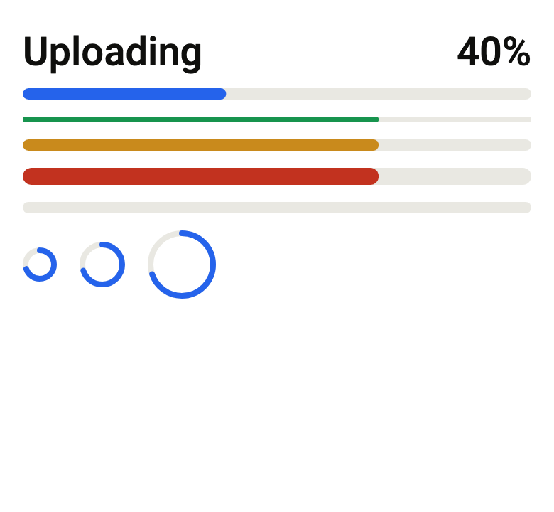
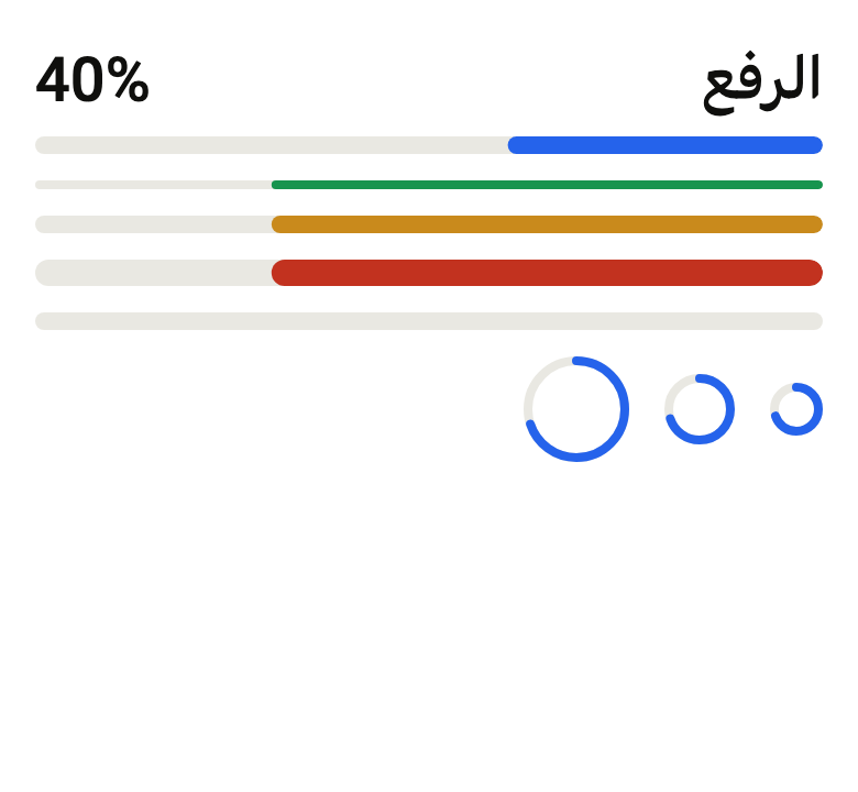
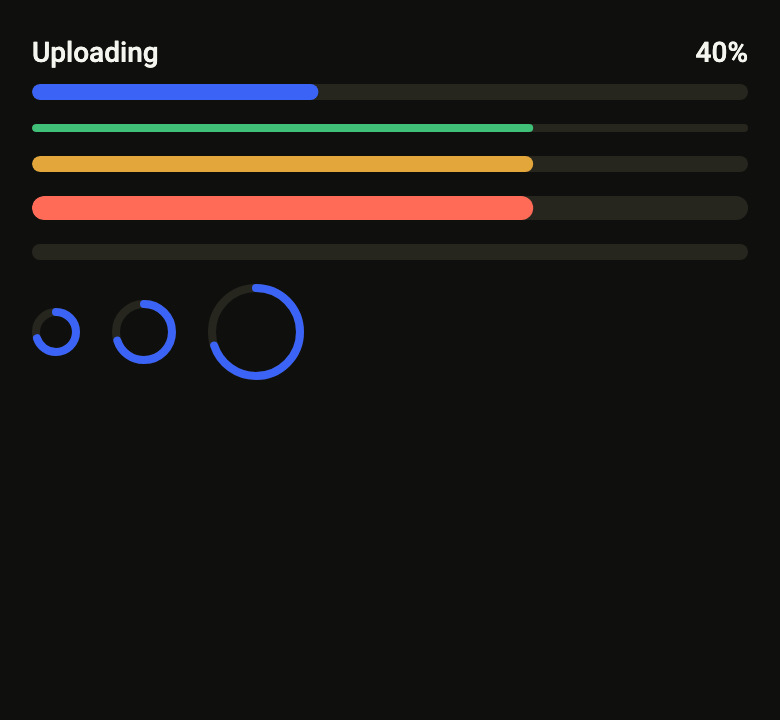
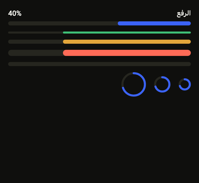
Shows how far a task has gone, or that it is running. A bar and a ring in three sizes and five colors, with label and percentage; the running bar stands still when motion is reduced.
Import
In a Flutter app where fliin init has run:
Examples
Colors
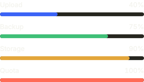
Linear bars with their label and percentage (showLabel), in the four colors: accent by default, then success, warning and danger as the bar fills up.
import 'package:your_app/ui/fliin/components/progress/fl_progress.dart';
import 'package:your_app/ui/fliin/core/fliin.dart';
import 'package:flutter/widgets.dart';

class ProgressColorsExample extends StatelessWidget {
  const ProgressColorsExample({super.key});

  @override
  Widget build(BuildContext context) {
    return Column(
      mainAxisSize: MainAxisSize.min,
      crossAxisAlignment: CrossAxisAlignment.stretch,
      spacing: FlScope.of(context).space.md,
      children: [
        for (final (color, label, value) in const [
          (FlProgressColor.accent, 'Upload', 0.4),
          (FlProgressColor.success, 'Backup', 0.75),
          (FlProgressColor.warning, 'Storage', 0.9),
          (FlProgressColor.danger, 'Quota', 1.0),
        ])
          FlProgress.linear(value: value, label: label, color: color, showLabel: true),
      ],
    );
  }
}Circular
FlProgress.circular in each size, for a progress that sits in a row or next to an icon.

import 'package:your_app/ui/fliin/components/progress/fl_progress.dart';
import 'package:your_app/ui/fliin/core/fliin.dart';
import 'package:flutter/widgets.dart';

class ProgressCircularExample extends StatelessWidget {
  const ProgressCircularExample({super.key});

  @override
  Widget build(BuildContext context) {
    final space = FlScope.of(context).space;
    return Wrap(
      alignment: WrapAlignment.center,
      crossAxisAlignment: WrapCrossAlignment.center,
      spacing: space.sm,
      runSpacing: space.sm,
      children: [
        for (final size in FlProgressSize.values) FlProgress.circular(value: 0.7, size: size, label: 'Sync'),
        const FlProgress.circular(value: 0.35, color: FlProgressColor.success, label: 'Sync'),
      ],
    );
  }
}Determinate
With a value between 0 and 1, the bar shows how far along the work is.

import 'package:your_app/ui/fliin/components/progress/fl_progress.dart';
import 'package:flutter/widgets.dart';

class ProgressDeterminateExample extends StatelessWidget {
  const ProgressDeterminateExample({super.key});

  @override
  Widget build(BuildContext context) {
    return const FlProgress.linear(value: 0.6, label: 'Downloading', showLabel: true);
  }
}Indeterminate
Without a value, the bar runs on its own: for work whose length is unknown.

import 'package:your_app/ui/fliin/components/progress/fl_progress.dart';
import 'package:flutter/widgets.dart';

class ProgressIndeterminateExample extends StatelessWidget {
  const ProgressIndeterminateExample({super.key});

  @override
  Widget build(BuildContext context) {
    return const FlProgress.linear(label: 'Preparing', showLabel: true);
  }
}Sizes
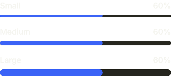
size sets the bar's height, 4, 8 or 12: sm under a line of text, md by default, lg for the one figure of a screen.
import 'package:your_app/ui/fliin/components/progress/fl_progress.dart';
import 'package:your_app/ui/fliin/core/fliin.dart';
import 'package:flutter/widgets.dart';

class ProgressSizesExample extends StatelessWidget {
  const ProgressSizesExample({super.key});

  @override
  Widget build(BuildContext context) {
    return Column(
      mainAxisSize: MainAxisSize.min,
      crossAxisAlignment: CrossAxisAlignment.stretch,
      spacing: FlScope.of(context).space.lg,
      children: [
        for (final (size, label) in const [
          (FlProgressSize.sm, 'Small'),
          (FlProgressSize.md, 'Medium'),
          (FlProgressSize.lg, 'Large'),
        ])
          FlProgress.linear(value: 0.6, size: size, label: label, showLabel: true),
      ],
    );
  }
}Custom value
valueLabel writes the value the way the app counts it, here an amount raised against its goal; the screen reader speaks the same text.

import 'package:your_app/ui/fliin/components/progress/fl_progress.dart';
import 'package:flutter/widgets.dart';

class ProgressCustomValueExample extends StatelessWidget {
  const ProgressCustomValueExample({super.key});

  static const _goal = 1000;

  @override
  Widget build(BuildContext context) {
    return FlProgress.linear(
      value: 750 / _goal,
      label: 'Raised',
      showLabel: true,
      color: FlProgressColor.success,
      valueLabel: (share) => '\$${(share * _goal).round()} of \$$_goal',
    );
  }
}Circular label
showLabel on a ring writes its name and its value after it, on one line: a compact progress for a row of a list.

import 'package:your_app/ui/fliin/components/progress/fl_progress.dart';
import 'package:your_app/ui/fliin/core/fliin.dart';
import 'package:flutter/widgets.dart';

class ProgressCircularLabelExample extends StatelessWidget {
  const ProgressCircularLabelExample({super.key});

  @override
  Widget build(BuildContext context) {
    return Column(
      mainAxisSize: MainAxisSize.min,
      crossAxisAlignment: CrossAxisAlignment.start,
      spacing: FlScope.of(context).space.md,
      children: const [
        FlProgress.circular(value: 0.75, size: FlProgressSize.sm, label: 'Complete', showLabel: true),
        FlProgress.circular(value: 0.4, label: 'Profile', showLabel: true, color: FlProgressColor.warning),
      ],
    );
  }
}Usage
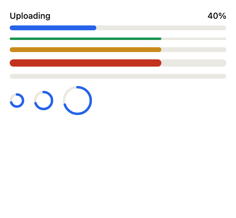
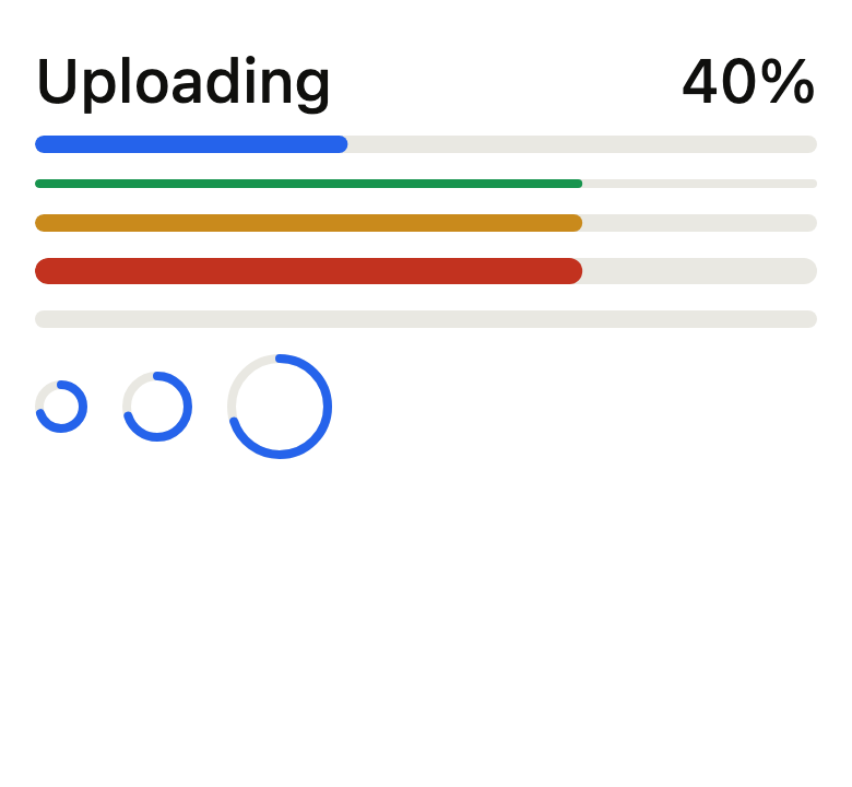
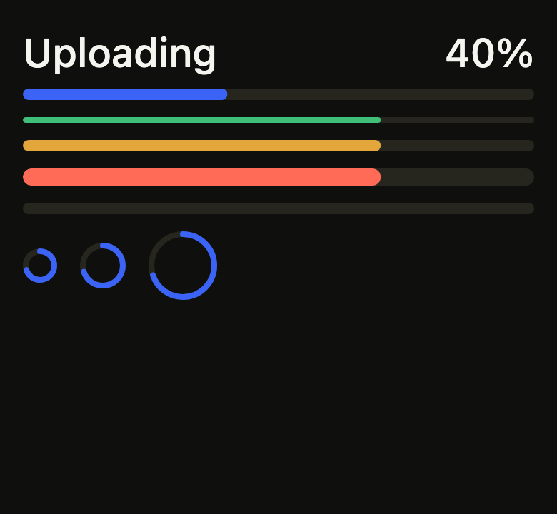
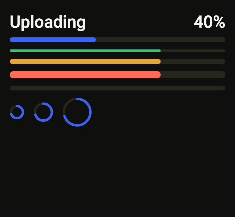
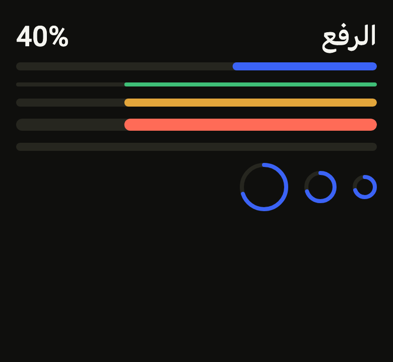
The code the reference images render:
final example = ColoredBox(
  color: FlScope.of(context).colors.surface,
  child: Padding(
    padding: EdgeInsetsDirectional.all(FlScope.of(context).space.lg),
    child: Column(
      crossAxisAlignment: CrossAxisAlignment.stretch,
      spacing: FlScope.of(context).space.md,
      children: [
        FlProgress.linear(value: 0.4, label: 'Uploading', showLabel: true),
        for (final s in FlProgressSize.values)
          FlProgress.linear(
            value: 0.7,
            size: s,
            color: FlProgressColor.values[s.index + 2],
            label: 'Storage',
          ),
        FlProgress.linear(label: 'Preparing'),
        Row(
          spacing: FlScope.of(context).space.lg,
          children: [
            for (final s in FlProgressSize.values)
              FlProgress.circular(value: 0.7, size: s, label: 'Syncing'),
          ],
        ),
      ],
    ),
  ),
);API
FlProgressShape: enum {linear, circular}
FlProgressShape.linear: static final FlProgressShape
FlProgressShape.circular: static final FlProgressShape
FlProgressSize: enum {sm, md, lg}
FlProgressSize.sm: static final FlProgressSize
FlProgressSize.md: static final FlProgressSize
FlProgressSize.lg: static final FlProgressSize
FlProgressColor: enum {neutral, accent, success, warning, danger}
FlProgressColor.neutral: static final FlProgressColor
FlProgressColor.accent: static final FlProgressColor
FlProgressColor.success: static final FlProgressColor
FlProgressColor.warning: static final FlProgressColor
FlProgressColor.danger: static final FlProgressColor
FlProgress: class extends StatefulWidget
FlProgress.linear: const new({super.key, double? value, required String label, FlProgressSize size, FlProgressColor color, bool showLabel, String Function(double value)? valueLabel})
FlProgress.circular: const new({super.key, required double value, required String label, FlProgressSize size, FlProgressColor color, String Function(double value)? valueLabel, bool showLabel})
FlProgress.shape: get FlProgressShape
FlProgress.value: get double?
FlProgress.label: get String
FlProgress.size: get FlProgressSize
FlProgress.color: get FlProgressColor
FlProgress.showLabel: get bool
FlProgress.valueLabel: get String Function(double value)?
FlProgress.createState: State<FlProgress>()Reference renders
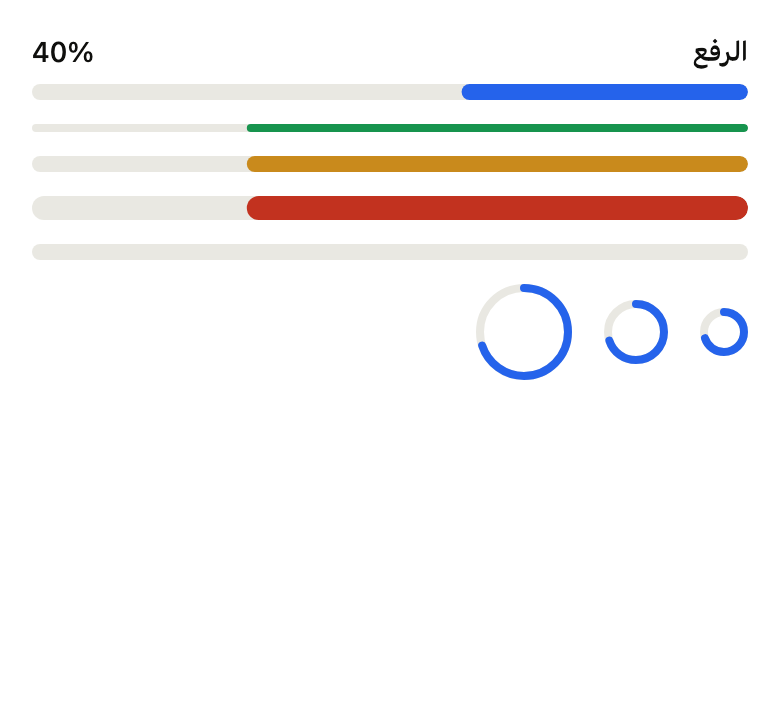
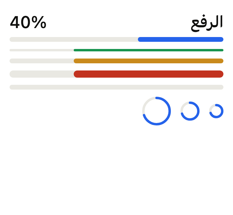
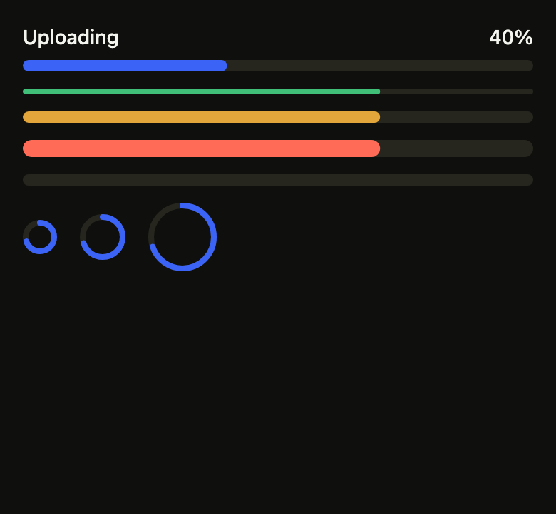
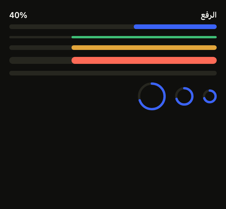
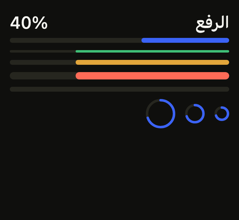
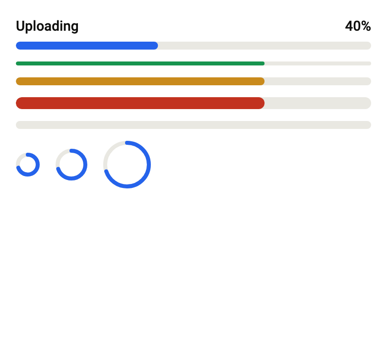
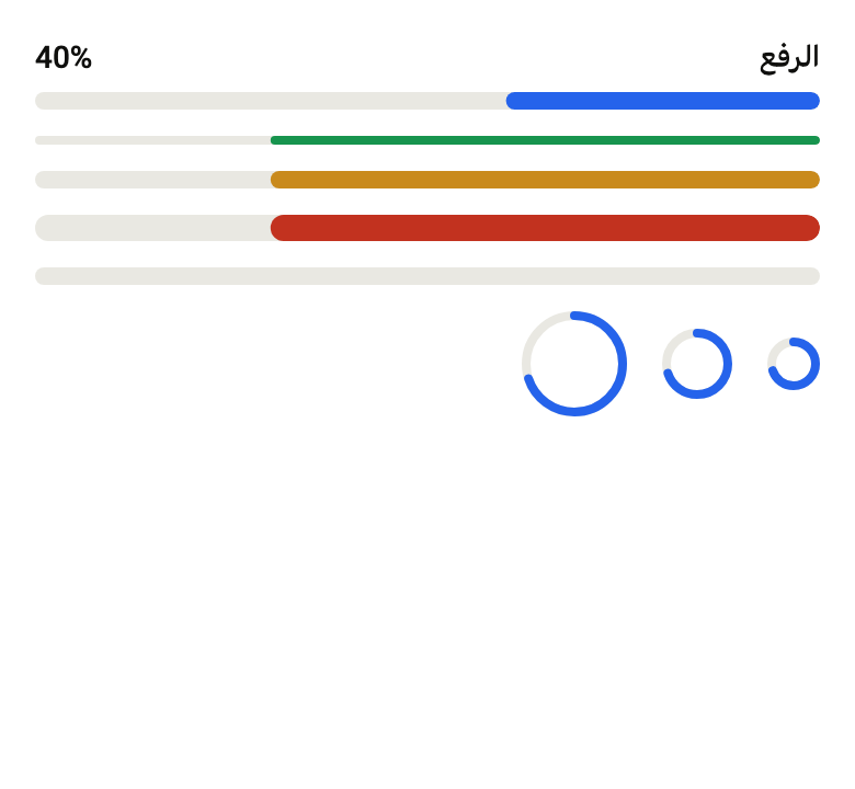
The 16 images published with version 0.2.5, rendered by the shared harness on macOS with Flutter 3.47.7. fliin verify progress compares your copy to them.
Use it to
- show upload progress
- show a loading indicator
- add a progress bar
- show sync progress as a ring
- let users know work is in progress
- show progress while data is fetched
- show how much of a download is done
- Not for
- a button that starts the action and waits: use the button's loading state (button)
- a value the user sets: use a slider (slider)
- States
Source
The files fliin add progress copies into your app, before your prefix and imports are applied.
progress/fl_progress.dart
// Modified from ProgressBar and ProgressCircle of HeroUI React v3, Copyright
// 2020 Next UI Inc., licensed under the MIT license below and under Apache 2.0:
// https://www.apache.org/licenses/LICENSE-2.0
//
// Permission is hereby granted, free of charge, to any person obtaining a copy
// of this software and associated documentation files (the "Software"), to
// deal in the Software without restriction, including without limitation the
// rights to use, copy, modify, merge, publish, distribute, sublicense, and/or
// sell copies of the Software, and to permit persons to whom the Software is
// furnished to do so, subject to the following conditions:
//
// The above copyright notice and this permission notice shall be included in
// all copies or substantial portions of the Software.
//
// THE SOFTWARE IS PROVIDED "AS IS", WITHOUT WARRANTY OF ANY KIND, EXPRESS OR
// IMPLIED, INCLUDING BUT NOT LIMITED TO THE WARRANTIES OF MERCHANTABILITY,
// FITNESS FOR A PARTICULAR PURPOSE AND NONINFRINGEMENT. IN NO EVENT SHALL THE
// AUTHORS OR COPYRIGHT HOLDERS BE LIABLE FOR ANY CLAIM, DAMAGES OR OTHER
// LIABILITY, WHETHER IN AN ACTION OF CONTRACT, TORT OR OTHERWISE, ARISING
// FROM, OUT OF OR IN CONNECTION WITH THE SOFTWARE OR THE USE OR OTHER DEALINGS
// IN THE SOFTWARE.
//
// Also modified from the theme colors and radii of HeroUI Native 1.0.10,
// Copyright 2025 NextUI Inc., licensed under Apache 2.0.
import 'dart:math' as math;

import 'package:flutter/semantics.dart' show SemanticsRole;
import 'package:flutter/widgets.dart';
import 'package:fliin_ui/core/fliin.dart';

/// Bar or ring.
enum FlProgressShape {
  /// A bar that takes the full available width and fills in the reading
  /// direction.
  linear,

  /// A fixed-size ring, filled clockwise from twelve o'clock.
  circular,
}

/// The size of an [FlProgress].
enum FlProgressSize {
  /// Bar of 4 (`h-1`, radius `xs`), ring of 24.
  sm,

  /// Bar of 8 (`h-2`, radius `sm`), ring of 32.
  md,

  /// Bar of 12 (`h-3`, radius `md`), ring of 48.
  lg,
}

/// The fill color of an [FlProgress], on a `control` track.
enum FlProgressColor {
  /// `onControl`, the neutral.
  neutral,

  /// `selected`: an ongoing state is not the primary
  /// action, which alone carries the accent.
  accent,

  /// Green.
  success,

  /// Orange.
  warning,

  /// Red.
  danger,
}

/// The indeterminate segment of `progress-bar.css`: two fifths of the
/// track, starting one width before the track and going up to three and a
/// half widths, in `motion.duration.progressSweep` along
/// `motion.curve.easeInOutCubic`.
const _segment = 2 / 5;

/// Where the indeterminate sweep starts: the segment already shows across
/// the track, from a fifth to a little past the middle, as Izydesk draws it
/// at rest, rather than entering an empty track.
const _sweepStart = 0.44;

/// Progress indicator, a bar or a ring: a
/// `control` track and a [color] fill. [value] between 0 and 1 says how far
/// the task has got; when null, the bar only says the task is in progress
/// (indeterminate). The ring is always determinate: for a wait without a
/// value, use `spinner`. The fill advances in `medium2` when [value]
/// changes, without transition under reduced motion, where the
/// indeterminate segment stops in the middle of the track.
class FlProgress extends StatefulWidget {
  /// A progress bar, which takes the full available width.
  const FlProgress.linear({
    super.key,
    this.value,
    required this.label,
    this.size = FlProgressSize.md,
    this.color = FlProgressColor.accent,
    this.showLabel = false,
    this.valueLabel,
  }) : shape = FlProgressShape.linear;

  /// A progress ring, of fixed size.
  const FlProgress.circular({
    super.key,
    required double this.value,
    required this.label,
    this.size = FlProgressSize.md,
    this.color = FlProgressColor.accent,
    this.valueLabel,
    this.showLabel = false,
  }) : shape = FlProgressShape.circular;

  /// Bar or ring, set by the chosen constructor.
  final FlProgressShape shape;

  /// The completed share, from 0 to 1, announced as a percentage; clamped
  /// to these bounds. Null (bar only): indeterminate, announced as loading.
  final double? value;

  /// What is progressing ("Uploading"), read by the screen reader, and
  /// shown above the bar when [showLabel] is true.
  final String label;

  /// The bar's height or the ring's diameter; `md` by default.
  final FlProgressSize size;

  /// The fill color; `accent` (painted in `selected`) by default.
  final FlProgressColor color;

  /// True: the bar carries [label] above it at the start and the percentage
  /// value at the end; the ring
  /// carries them after it, on one line, the value muted. False by default:
  /// only the screen reader says them.
  final bool showLabel;

  /// The value as the bar writes it and the screen reader speaks it, from
  /// the completed share; by default, the percentage ("40%"). French writes
  /// it "40 %". A text that is not a number ("\$750 of \$1,000") is read
  /// after [label], the node's value staying the percentage.
  final String Function(double value)? valueLabel;

  @override
  State<FlProgress> createState() => _FlProgressState();
}

class _FlProgressState extends State<FlProgress> with TickerProviderStateMixin {
  late final AnimationController _value = AnimationController(vsync: this, value: _clamped(widget.value) ?? 0);
  late final AnimationController _cycle = AnimationController(vsync: this);

  static double? _clamped(double? value) => value?.clamp(0.0, 1.0);

  @override
  void didChangeDependencies() {
    super.didChangeDependencies();
    _syncCycle();
  }

  @override
  void didUpdateWidget(FlProgress oldWidget) {
    super.didUpdateWidget(oldWidget);
    final value = _clamped(widget.value);
    if (value != null && value != _clamped(oldWidget.value)) {
      final motion = FlMotion.of(context);
      if (oldWidget.value == null || motion.reduced) {
        _value.value = value;
      } else {
        _value.animateTo(value, duration: motion.tokens.medium2, curve: motion.tokens.decelerate);
      }
    }
    if ((widget.value == null) != (oldWidget.value == null)) {
      _syncCycle();
    }
  }

  void _syncCycle() {
    _cycle.duration = FlMotion.of(context).tokens.progressSweep;
    if (widget.value != null || FlMotion.of(context).reduced) {
      _cycle
        ..stop()
        ..value = 0;
    } else if (!_cycle.isAnimating) {
      _cycle
        ..value = _sweepStart
        ..repeat();
    }
  }

  @override
  void dispose() {
    _cycle.dispose();
    _value.dispose();
    super.dispose();
  }

  Color _fill(FlColorTokens colors) => switch (widget.color) {
    FlProgressColor.neutral => colors.onControl,
    FlProgressColor.accent => colors.selected,
    FlProgressColor.success => colors.success,
    FlProgressColor.warning => colors.warning,
    FlProgressColor.danger => colors.dangerFill,
  };

  String _percent(double value) => widget.valueLabel?.call(value) ?? '${(value * 100).round()}%';

  /// True when [text] reads as a number or a percentage, as the engine
  /// requires of a progress bar's value ("40%", "40 %", "0.4").
  static bool _numeric(String text) {
    final trimmed = text.trim();
    return double.tryParse(trimmed) != null ||
        (trimmed.endsWith('%') && double.tryParse(trimmed.substring(0, trimmed.length - 1)) != null);
  }

  @override
  Widget build(BuildContext context) {
    final theme = FlScope.of(context);
    final xs = theme.space.xs;
    final value = _clamped(widget.value);
    final painter = _ProgressPainter(
      shape: widget.shape,
      value: value == null ? null : _value,
      cycle: _cycle,
      sweep: theme.motion.easeInOutCubic,
      still: FlMotion.of(context).reduced,
      radius: switch (widget.size) {
        FlProgressSize.sm => theme.shape.radiusXs,
        FlProgressSize.md => theme.shape.radiusSm,
        FlProgressSize.lg => theme.shape.radiusMd,
      },
      // `surfaceSecondary`, a step darker than the sand of a card: the
      // track reads on the page and on a card alike.
      track: theme.colors.surfaceSecondary,
      fill: _fill(theme.colors),
      direction: Directionality.of(context),
      ringStroke: xs,
    );
    // Bars of 4, 8 and 12 and rings of 24, 32 and 48 (Izydesk's `.bar` and
    // `.ring`): multiples of the spacing.
    final steps = switch (widget.size) {
      FlProgressSize.sm => 1,
      FlProgressSize.md => 2,
      FlProgressSize.lg => 3,
    };
    Widget indicator = switch (widget.shape) {
      FlProgressShape.linear => SizedBox(
        height: xs * steps,
        width: double.infinity,
        child: CustomPaint(painter: painter),
      ),
      FlProgressShape.circular => SizedBox.square(
        dimension: xs * const [6, 8, 12][steps - 1],
        child: CustomPaint(painter: painter),
      ),
    };
    // The node covers only the indicator: the text line, which the node
    // already says, stays out of the semantics. A progress bar's value must
    // read as a number or a percentage (the engine refuses "750 of 1,000"):
    // a written value that does not joins the label, the value staying the
    // percentage.
    final written = value == null ? null : _percent(value);
    final numeric = written != null && _numeric(written);
    indicator = value == null
        ? Semantics(container: true, role: SemanticsRole.loadingSpinner, label: widget.label, child: indicator)
        : Semantics(
            container: true,
            role: SemanticsRole.progressBar,
            label: numeric ? widget.label : '${widget.label}\n$written',
            value: numeric ? written : '${(value * 100).round()}%',
            minValue: '0',
            maxValue: '100',
            child: indicator,
          );
    if (!widget.showLabel) return indicator;
    const role = FlTextRole.textSm;
    // The label and the value: both medium, the value in tabular figures.
    final style = theme.typography
        .resolve(role)
        .copyWith(color: theme.colors.onSurface, fontWeight: theme.tokens.typography.weight.medium);
    final strut = theme.typography.strut(role, inheritedFamily: DefaultTextStyle.of(context).style.fontFamily);
    final figures = style.copyWith(fontFeatures: const [FontFeature.tabularFigures()]);
    if (widget.shape == FlProgressShape.circular) {
      // The ring beside its label: the ring, then the name and the value,
      // centred on the ring.
      return Row(
        mainAxisSize: MainAxisSize.min,
        spacing: theme.space.sm,
        children: [
          indicator,
          Flexible(
            child: ExcludeSemantics(
              child: Text.rich(
                TextSpan(
                  children: [
                    TextSpan(text: widget.label),
                    if (value != null) ...[
                      const TextSpan(text: ' '),
                      // Isolated left to right: after an Arabic label, the
                      // bidi algorithm would put the percent sign first.
                      TextSpan(
                        text: '\u2066${_percent(value)}\u2069',
                        style: figures.copyWith(
                          color: theme.colors.onSurfaceMuted,
                          fontWeight: theme.tokens.typography.weight.normal,
                        ),
                      ),
                    ],
                  ],
                ),
                style: style,
                strutStyle: strut,
              ),
            ),
          ),
        ],
      );
    }
    return Column(
      mainAxisSize: MainAxisSize.min,
      crossAxisAlignment: CrossAxisAlignment.stretch,
      spacing: xs * 1.5,
      children: [
        ExcludeSemantics(
          child: Row(
            spacing: xs,
            children: [
              Expanded(
                child: Text(widget.label, style: style, strutStyle: strut),
              ),
              if (value != null) Text(_percent(value), style: figures, strutStyle: strut),
            ],
          ),
        ),
        indicator,
      ],
    );
  }
}

class _ProgressPainter extends CustomPainter {
  _ProgressPainter({
    required this.shape,
    required this.value,
    required this.cycle,
    required this.sweep,
    required this.still,
    required this.radius,
    required this.track,
    required this.fill,
    required this.direction,
    required this.ringStroke,
  }) : super(repaint: Listenable.merge([value, cycle]));

  final FlProgressShape shape;
  final Animation<double>? value;
  final Animation<double> cycle;
  final Curve sweep;
  final bool still;
  final double radius;
  final Color track;
  final Color fill;
  final TextDirection direction;

  /// The ring's stroke, whatever its diameter.
  final double ringStroke;

  /// Start and end of the fill, as a fraction of the track from its start.
  /// When still (reduced motion), the indeterminate segment sits in the
  /// middle, so as to look like no determinate value.
  (double, double) get _span {
    final value = this.value;
    if (value != null) return (0, value.value);
    if (still) return ((1 - _segment) / 2, (1 + _segment) / 2);
    final start = -_segment + sweep.transform(cycle.value) * 4.5 * _segment;
    return (start, start + _segment);
  }

  @override
  void paint(Canvas canvas, Size size) {
    final (start, end) = _span;
    switch (shape) {
      case FlProgressShape.linear:
        final bounds = RRect.fromRectAndRadius(Offset.zero & size, Radius.circular(radius));
        canvas.drawRRect(bounds, Paint()..color = track);
        if (end <= start) return;
        double x(double at) => direction == TextDirection.ltr ? at * size.width : (1 - at) * size.width;
        final left = math.min(x(start), x(end));
        final right = math.max(x(start), x(end));
        canvas
          ..save()
          ..clipRRect(bounds)
          ..drawRRect(RRect.fromLTRBR(left, 0, right, size.height, Radius.circular(radius)), Paint()..color = fill)
          ..restore();
      case FlProgressShape.circular:
        final stroke = ringStroke;
        final rect = (Offset.zero & size).deflate(stroke / 2);
        final paint = Paint()
          ..style = PaintingStyle.stroke
          ..strokeWidth = stroke;
        canvas.drawArc(rect, 0, 2 * math.pi, false, paint..color = track);
        if (end > start) {
          // Round caps: the arc ends soft.
          canvas.drawArc(
            rect,
            -math.pi / 2,
            (end - start) * 2 * math.pi,
            false,
            paint
              ..color = fill
              ..strokeCap = StrokeCap.round,
          );
        }
    }
  }

  @override
  bool shouldRepaint(_ProgressPainter oldDelegate) =>
      shape != oldDelegate.shape ||
      value != oldDelegate.value ||
      cycle != oldDelegate.cycle ||
      sweep != oldDelegate.sweep ||
      still != oldDelegate.still ||
      radius != oldDelegate.radius ||
      track != oldDelegate.track ||
      fill != oldDelegate.fill ||
      direction != oldDelegate.direction ||
      ringStroke != oldDelegate.ringStroke;
}