Components / navigation
Drawer
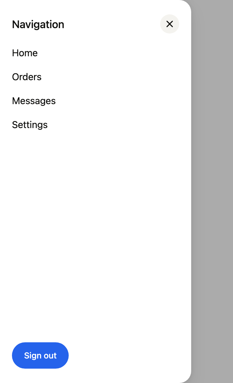
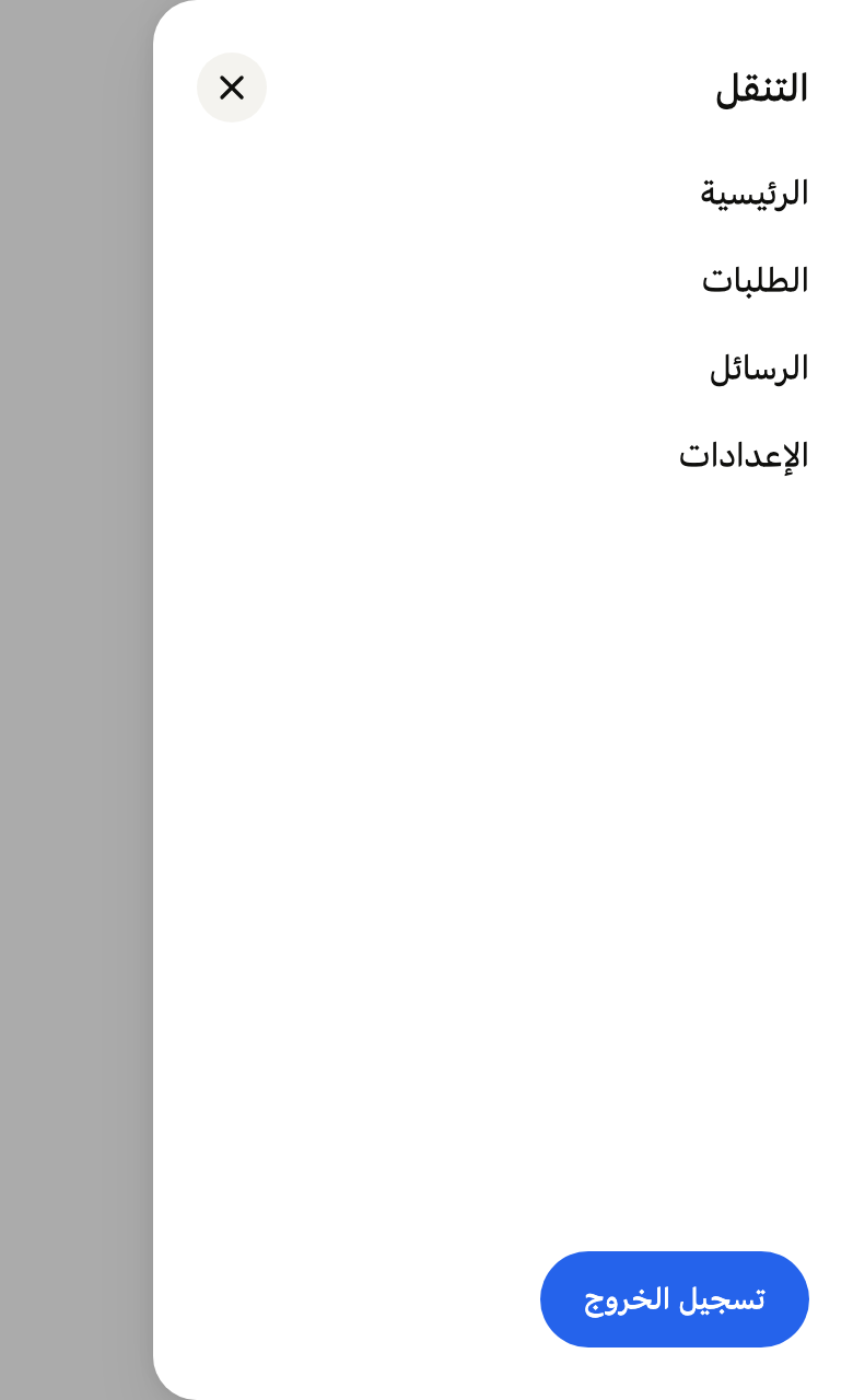
Opens a navigation panel from the side of the screen over a scrim, mirrored in right-to-left layouts, and closes by swipe, tap outside, Escape or back.
Import
In a Flutter app where fliin init has run:
Examples
Open
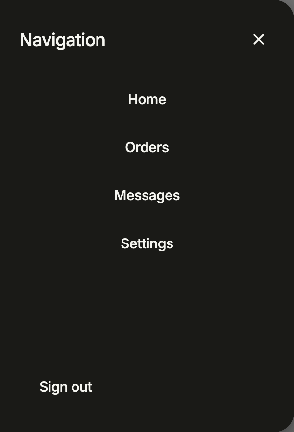
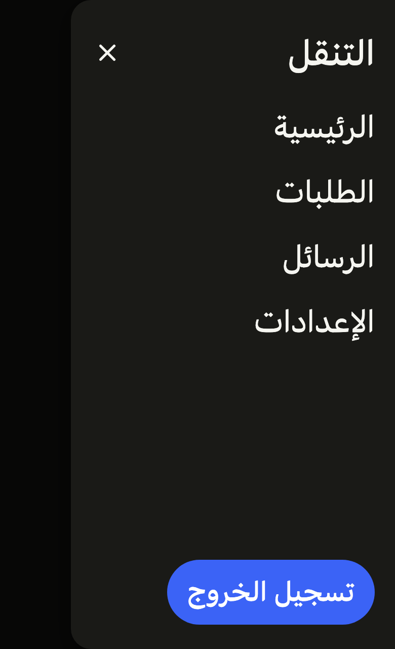
showFlDrawer slides a navigation panel in from the start edge, over a barrier that closes it; the panel takes a title, its links and actions at the bottom.
import 'package:your_app/ui/fliin/components/button/fl_button.dart';
import 'package:your_app/ui/fliin/components/drawer/fl_drawer.dart';
import 'package:flutter/widgets.dart';

class DrawerOpenExample extends StatelessWidget {
  const DrawerOpenExample({super.key});

  @override
  Widget build(BuildContext context) {
    return FlButton(
      label: 'Menu',
      variant: FlButtonVariant.secondary,
      onPressed: () => showNavigationDrawer(context),
    );
  }
}

Future<void> showNavigationDrawer(BuildContext context) {
  return showFlDrawer<void>(
    context: context,
    barrierLabel: 'Close menu',
    builder: (context) => FlDrawer(
      title: 'Navigation',
      closeLabel: 'Close',
      actions: [
        FlButton(
          label: 'Sign out',
          size: FlButtonSize.sm,
          variant: FlButtonVariant.tertiary,
          onPressed: () => Navigator.pop(context),
        ),
      ],
      child: Column(
        crossAxisAlignment: CrossAxisAlignment.stretch,
        children: [
          for (final label in const ['Home', 'Orders', 'Messages', 'Settings'])
            FlButton(label: label, variant: FlButtonVariant.ghost, onPressed: () => Navigator.pop(context)),
        ],
      ),
    ),
  );
}Usage
The code the reference images render:
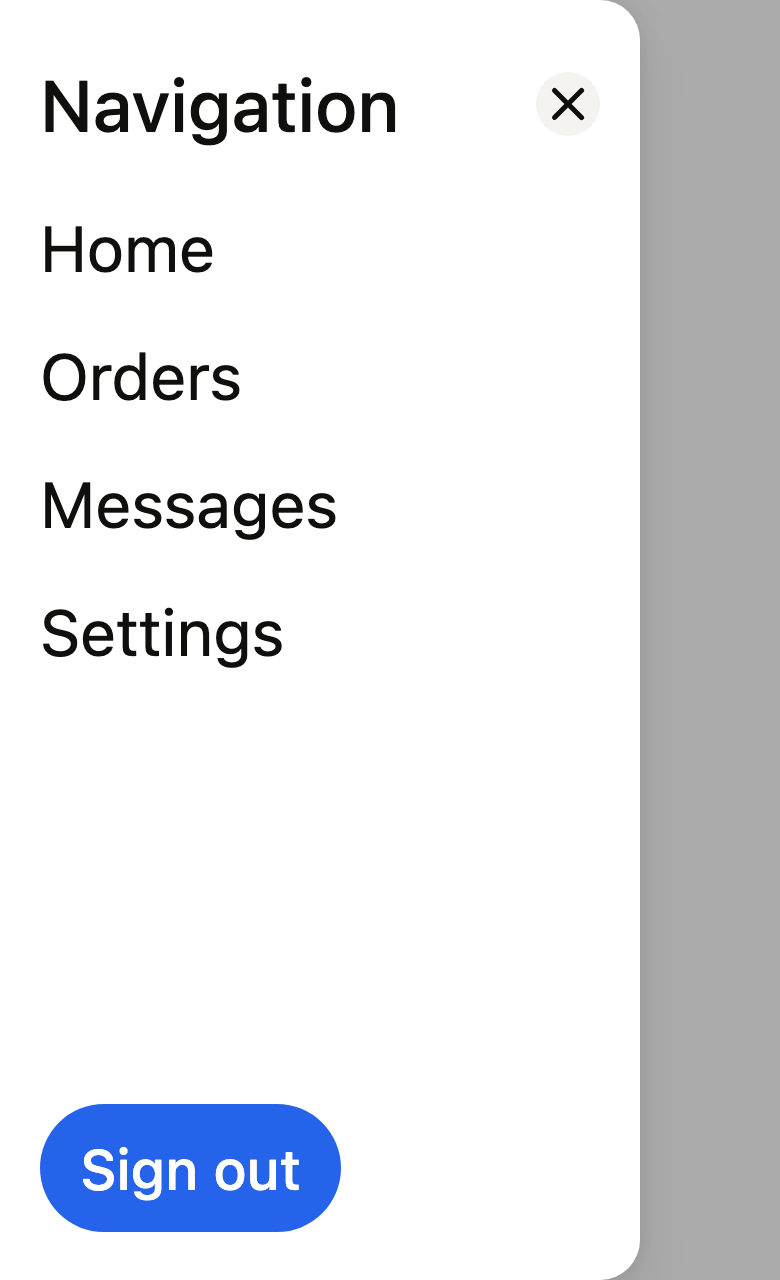
Navigator(onGenerateInitialRoutes: (navigator, _) => [PageRouteBuilder<void>(pageBuilder: (context, _, _) => ColoredBox(color: FlScope.of(context).colors.surface, child: const SizedBox.expand())), FlDrawerRoute<void>(context: context, barrierLabel: 'Close the menu', builder: (context) => FlDrawer(title: 'Navigation', closeLabel: 'Close', actions: [FlButton(label: 'Sign out', size: FlButtonSize.sm, onPressed: () => Navigator.pop(context))], child: Column(crossAxisAlignment: CrossAxisAlignment.stretch, spacing: FlScope.of(context).space.lg, children: [for (final (fr, ar) in const [('Home', 'الرئيسية'), ('Orders', 'الطلبات'), ('Messages', 'الرسائل'), ('Settings', 'الإعدادات')]) Textfr, style: TextStyle(color: FlScope.of(context).colors.onSurface))])))])API
FlDrawerSide: enum {start, end}
FlDrawerSide.start: static final FlDrawerSide
FlDrawerSide.end: static final FlDrawerSide
showFlDrawer: Future<T?><T>({required BuildContext context, required WidgetBuilder builder, required String barrierLabel, FlDrawerSide side, bool useRootNavigator})
FlDrawerRoute: class<T> extends RawDialogRoute<T>
FlDrawerRoute.new: new({required BuildContext context, required WidgetBuilder builder, required String barrierLabel, FlDrawerSide side, super.settings})
FlDrawerRoute.side: get FlDrawerSide
FlDrawerRoute.reverseTransitionDuration: get Duration
FlDrawerRoute.install: void()
FlDrawerRoute.dispose: void()
FlDrawerRoute.createAnimationController: AnimationController()
FlDrawerRoute.buildModalBarrier: Widget()
FlDrawerRoute.buildTransitions: Widget(BuildContext context, Animation<double> animation, Animation<double> secondaryAnimation, Widget child)
FlDrawer: class extends StatefulWidget
FlDrawer.new: const new({super.key, required String title, required Widget child, List<Widget> actions, String? closeLabel})
FlDrawer.title: get String
FlDrawer.child: get Widget
FlDrawer.actions: get List<Widget>
FlDrawer.closeLabel: get String?
FlDrawer.createState: State<FlDrawer>()Reference renders
The 16 images published with version 0.2.2, rendered by the shared harness on macOS with Flutter 3.47.7. fliin verify drawer compares your copy to them.
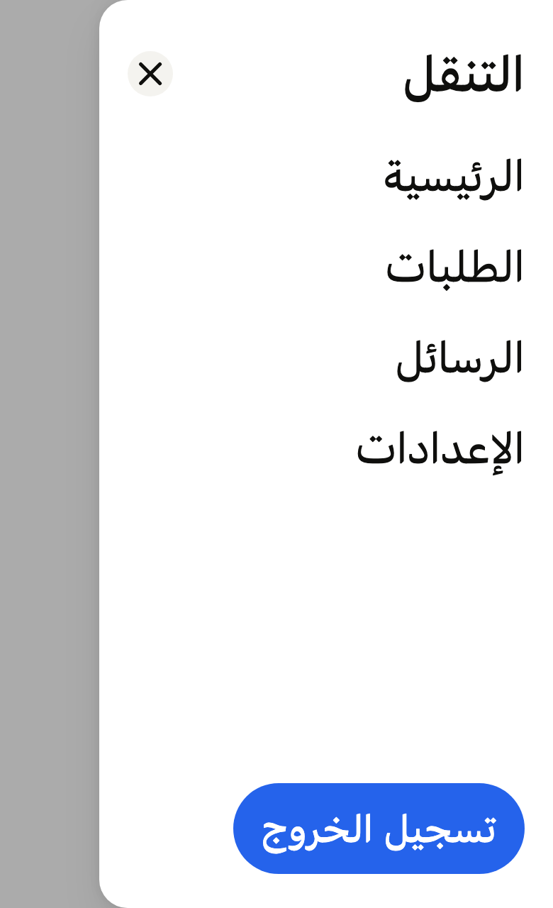
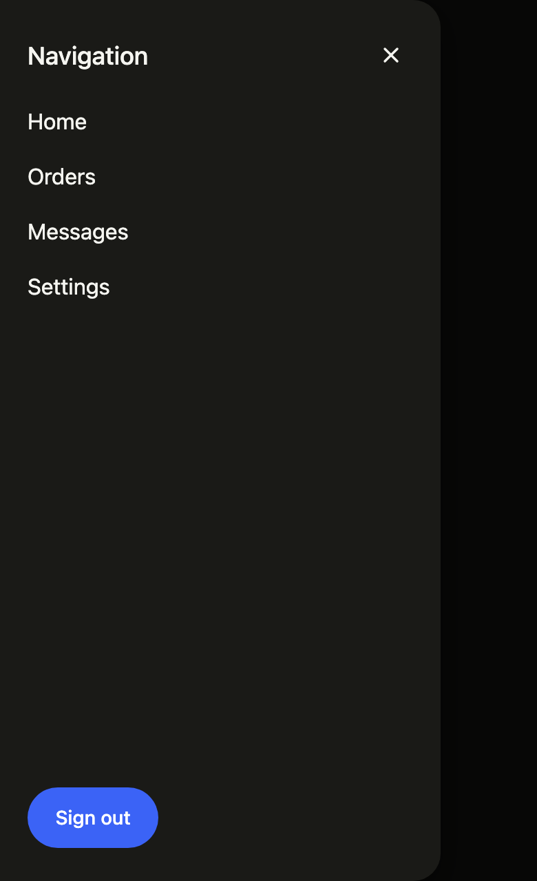
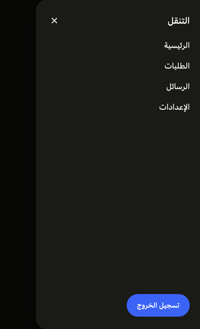
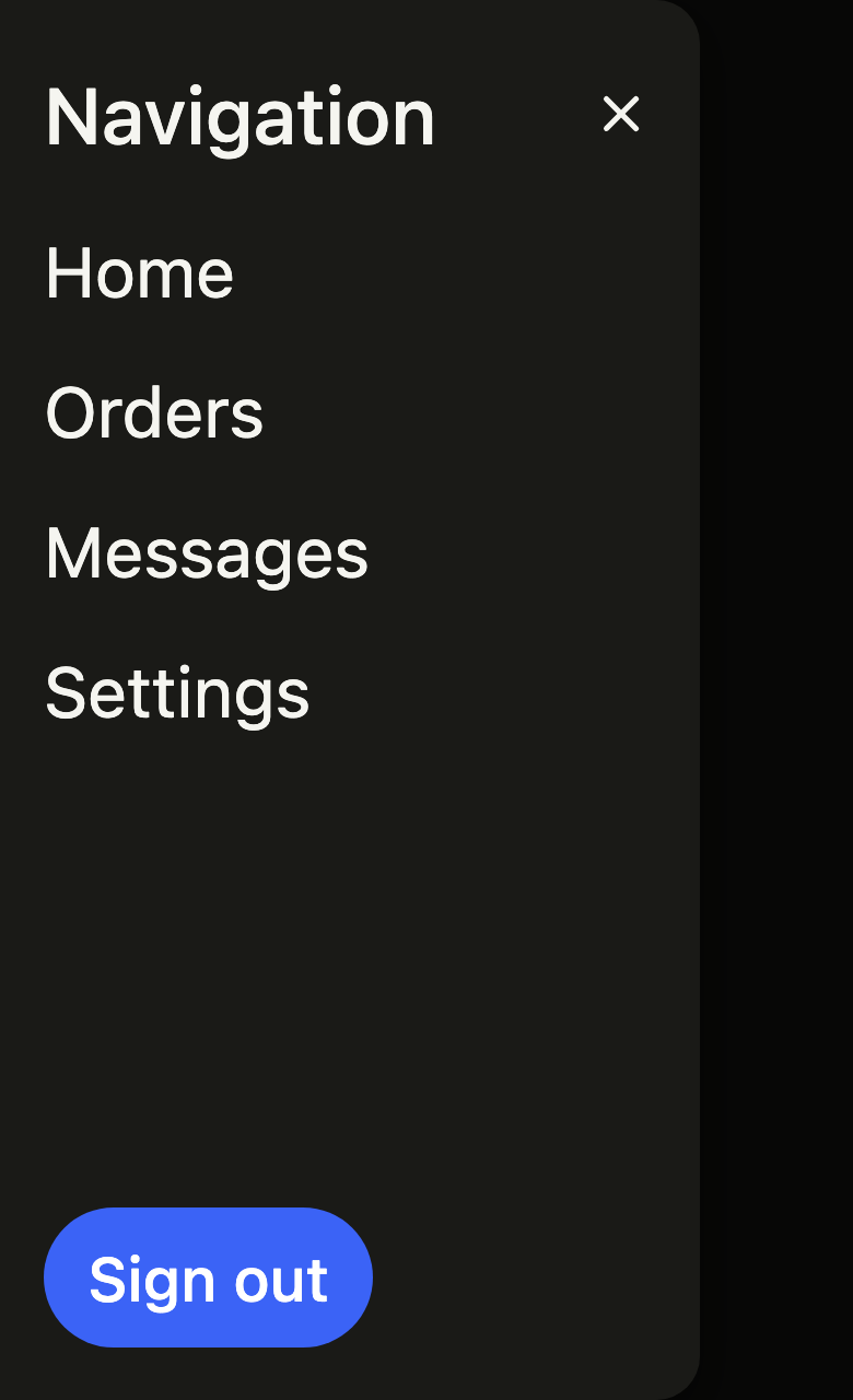
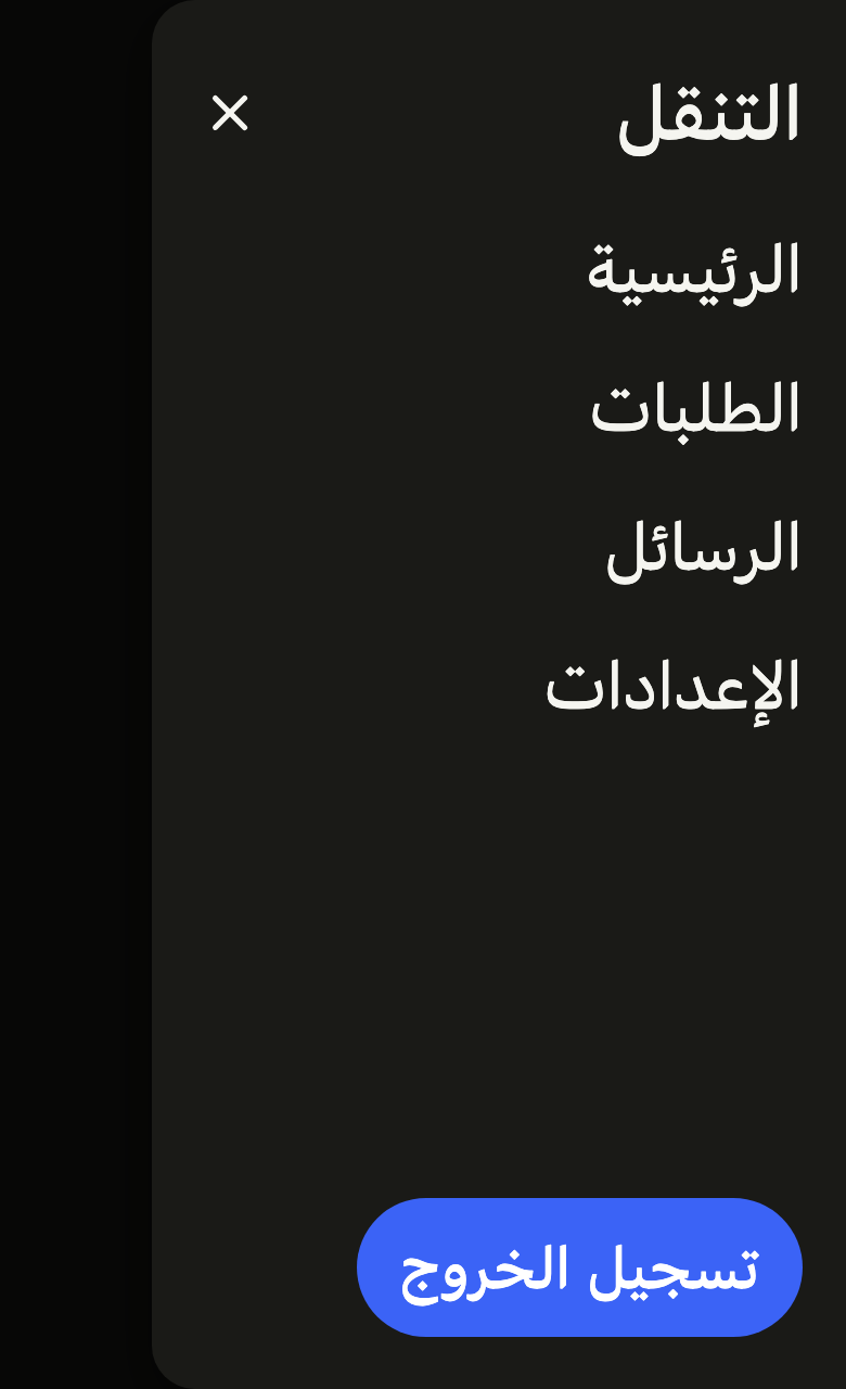
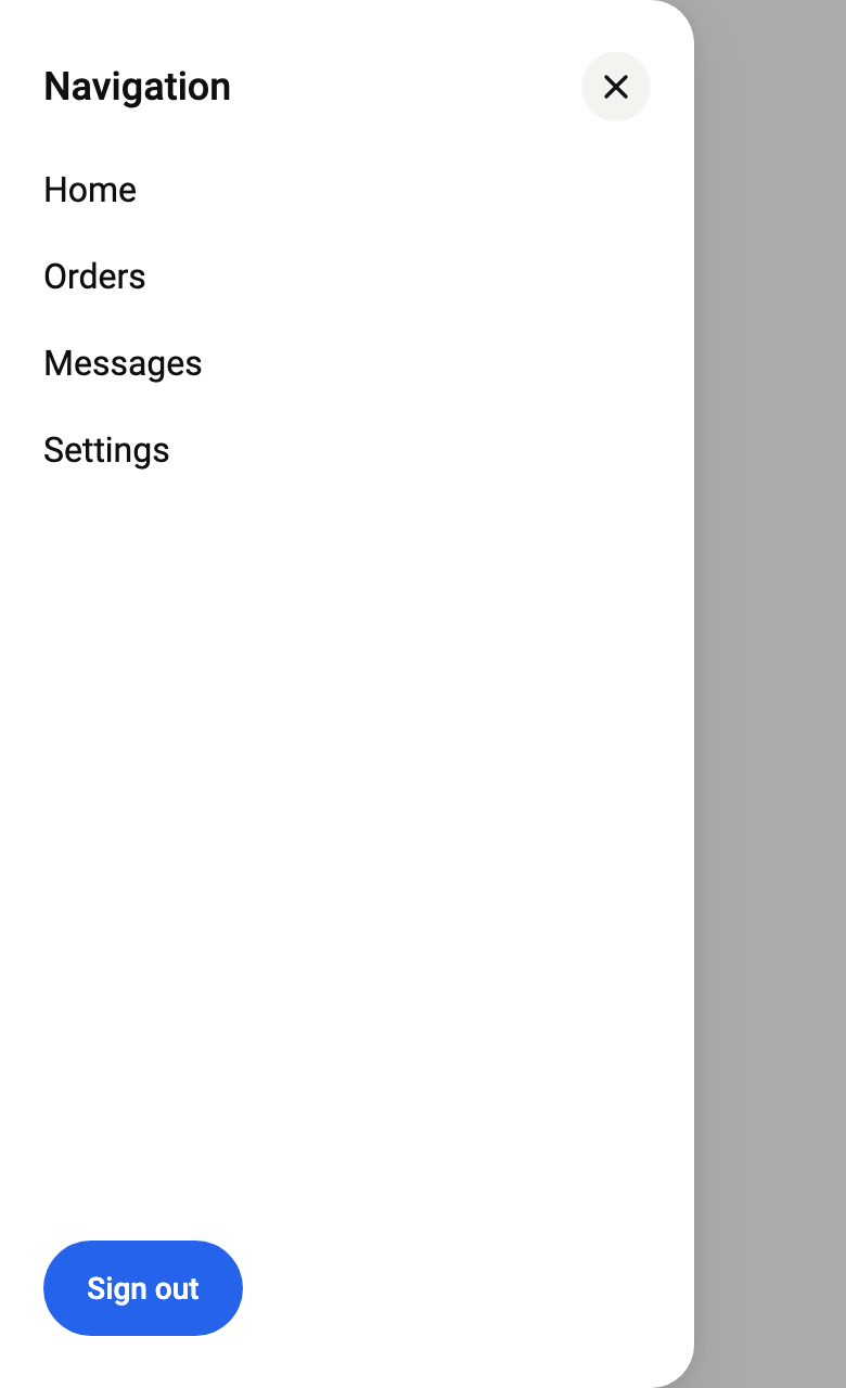
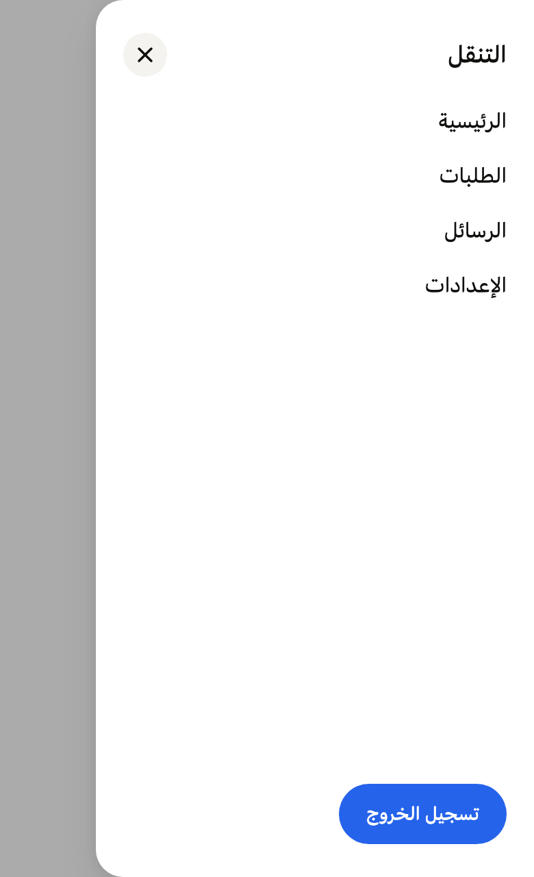
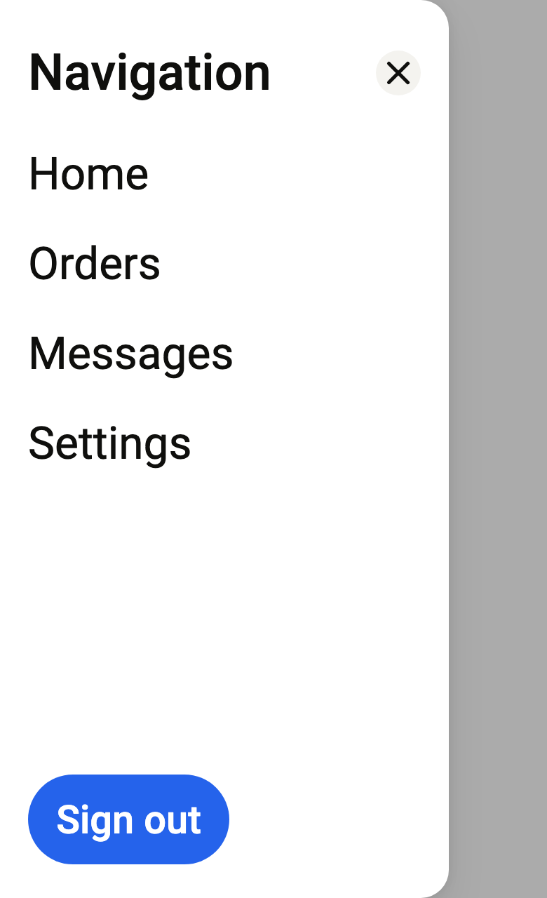
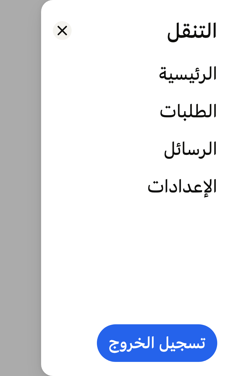
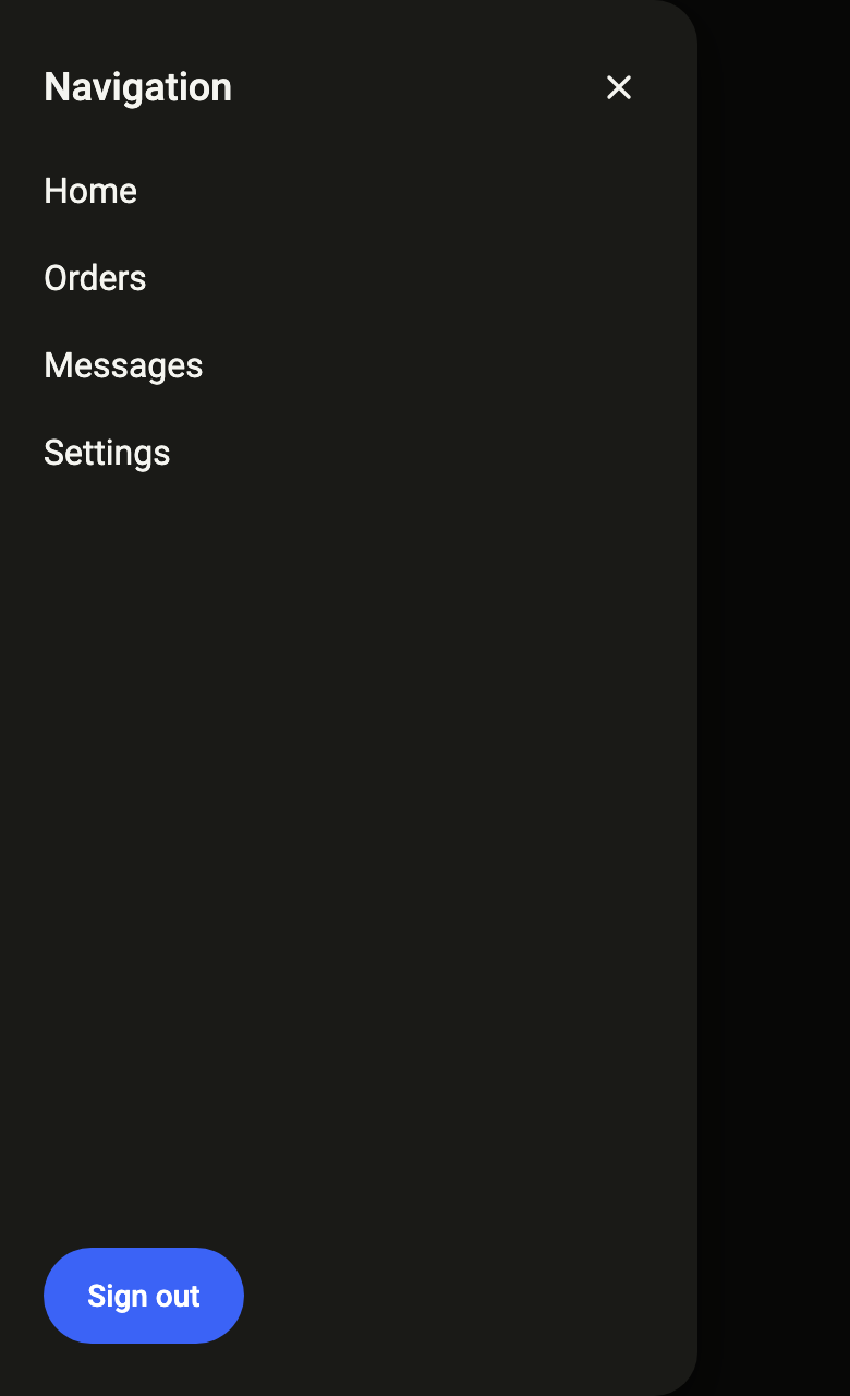
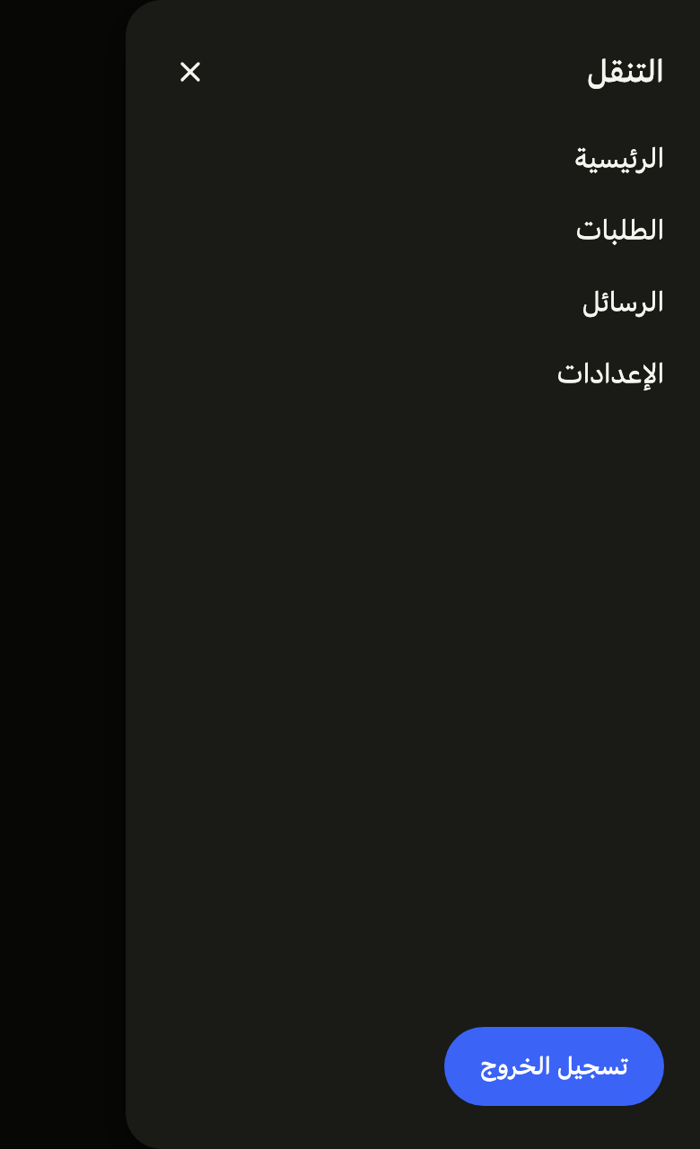
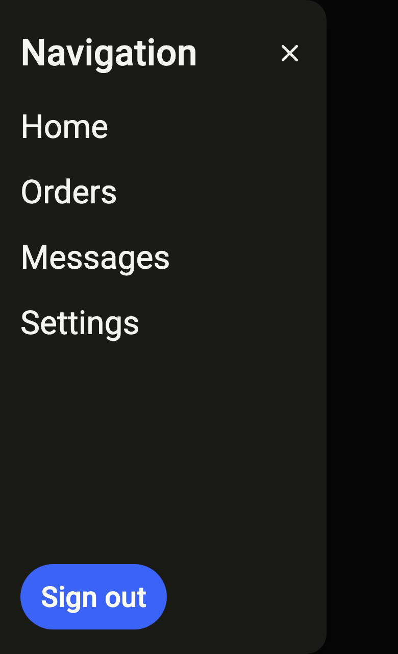
Use it to
- open the main menu from the side
- add a side navigation drawer that slides in from the left
- drag the side menu away to close it
- show the main destinations in a drawer
- add a hamburger menu
- Not for
- a sheet anchored at the bottom: use a bottom sheet (sheet)
- a question awaiting an answer: use a dialog (dialog)
- main navigation always visible: use a tab bar (tab-bar)
- States
Source
The files fliin add drawer copies into your app, before your prefix and imports are applied.
drawer/fl_drawer.dart
// Modified from the Drawer of HeroUI React v3, Copyright 2020 Next UI Inc.,
// licensed under the MIT license below and under Apache 2.0:
// https://www.apache.org/licenses/LICENSE-2.0
//
// Permission is hereby granted, free of charge, to any person obtaining a copy
// of this software and associated documentation files (the "Software"), to
// deal in the Software without restriction, including without limitation the
// rights to use, copy, modify, merge, publish, distribute, sublicense, and/or
// sell copies of the Software, and to permit persons to whom the Software is
// furnished to do so, subject to the following conditions:
//
// The above copyright notice and this permission notice shall be included in
// all copies or substantial portions of the Software.
//
// THE SOFTWARE IS PROVIDED "AS IS", WITHOUT WARRANTY OF ANY KIND, EXPRESS OR
// IMPLIED, INCLUDING BUT NOT LIMITED TO THE WARRANTIES OF MERCHANTABILITY,
// FITNESS FOR A PARTICULAR PURPOSE AND NONINFRINGEMENT. IN NO EVENT SHALL THE
// AUTHORS OR COPYRIGHT HOLDERS BE LIABLE FOR ANY CLAIM, DAMAGES OR OTHER
// LIABILITY, WHETHER IN AN ACTION OF CONTRACT, TORT OR OTHERWISE, ARISING
// FROM, OUT OF OR IN CONNECTION WITH THE SOFTWARE OR THE USE OR OTHER DEALINGS
// IN THE SOFTWARE.
//
// Also modified from the barrier, close button and colors of HeroUI Native
// 1.0.10, Copyright 2025 NextUI Inc., licensed under Apache 2.0.
import 'dart:async' show unawaited;
import 'dart:math' as math;
import 'dart:ui' show SemanticsRole;

import 'package:flutter/widgets.dart';
import 'package:fliin_ui/components/close_button/fl_close_button.dart';
import 'package:fliin_ui/core/fliin.dart';

// drawer.css: `--drawer-enter-ease` and `--drawer-exit-ease`.
const Curve _ease = Cubic(0.32, 0.72, 0, 1);

// drawer.css: `w-80 max-w-[85vw] sm:w-96`.
const double _narrowWidth = 320;
const double _wideWidth = 384;
const double _wideViewport = 640;
const double _maxWidthFraction = 0.85;

// drawer.tsx: closed beyond 30 % of the width, or flung faster than
// 0.5 px/ms.
const double _dismissFraction = 0.3;
const double _dismissVelocity = 500;

/// The side of the screen a [FlDrawer] comes from.
enum FlDrawerSide {
  /// The start of the line: left, right in RTL. Android's navigation
  /// drawer.
  start,

  /// The end of the line: right, left in RTL.
  end,
}

/// Opens [builder], a [FlDrawer], in a [FlDrawerRoute] from [side], and
/// returns the value passed to `Navigator.pop`. The root navigator by
/// default, like `showFlDialog`.
Future<T?> showFlDrawer<T>({
  required BuildContext context,
  required WidgetBuilder builder,
  required String barrierLabel,
  FlDrawerSide side = FlDrawerSide.start,
  bool useRootNavigator = true,
}) => Navigator.of(
  context,
  rootNavigator: useRootNavigator,
).push(FlDrawerRoute<T>(context: context, builder: builder, barrierLabel: barrierLabel, side: side));

/// A modal route from `widgets` that places a side panel over the `FlPopup`
/// barrier. The panel enters from [side] over `motion.duration.medium1` and
/// exits over `short4`, along a decelerating curve; under reduced motion, it
/// fades in and out in place, with the same durations.
///
/// It closes through the barrier (named [barrierLabel]), Escape, system
/// back, and by swiping it toward its edge: released beyond 30 % of its
/// width or flung, it exits; before that, it returns on the `release`
/// spring. The route's focus scope keeps Tab inside the panel and returns
/// the focus to whatever had it when it closes. The builder's [FlDrawer]
/// places the panel and makes it slide: another widget would not slide.
class FlDrawerRoute<T> extends RawDialogRoute<T> {
  /// Reads the motion from [context] at creation.
  FlDrawerRoute({
    required BuildContext context,
    required WidgetBuilder builder,
    required String super.barrierLabel,
    this.side = FlDrawerSide.start,
    super.settings,
  }) : _motion = FlScope.of(context).motion,
       super(
         pageBuilder: (context, _, _) => builder(context),
         barrierDismissible: true,
         barrierColor: null,
         transitionDuration: FlScope.of(context).motion.medium1,
       );

  /// The side the panel comes from.
  final FlDrawerSide side;
  final FlMotionTokens _motion;

  /// 0 at rest; swiping toward the edge moves it up toward 1, and the
  /// barrier lightens by as much.
  late final AnimationController _drag;

  /// The opening along the drawer's curve, minus the swipe: the panel's
  /// position and the barrier's opacity. Created once, with the route.
  late final CurvedAnimation _open;
  late final Animation<double> _presence;

  @override
  Duration get reverseTransitionDuration => _motion.short4;

  @override
  void install() {
    super.install();
    _drag = AnimationController(vsync: navigator!);
    _open = CurvedAnimation(parent: animation!, curve: _ease, reverseCurve: _ease.flipped);
    _presence = _Presence(_open, _drag);
  }

  @override
  void dispose() {
    _open.dispose();
    _drag.dispose();
    super.dispose();
  }

  @override
  AnimationController createAnimationController() => AnimationController(
    vsync: navigator!,
    duration: transitionDuration,
    reverseDuration: reverseTransitionDuration,
    animationBehavior: AnimationBehavior.preserve,
  );

  @override
  Widget buildModalBarrier() => BlockSemantics(
    child: FlPopupOverlay(animation: _presence, onDismiss: () => navigator?.maybePop(), dismissLabel: barrierLabel),
  );

  @override
  Widget buildTransitions(
    BuildContext context,
    Animation<double> animation,
    Animation<double> secondaryAnimation,
    Widget child,
  ) {
    if (FlMotion.of(context).reduced) {
      return FadeTransition(opacity: _presence, child: child);
    }
    return child;
  }
}

/// The panel's presence: the route's opening, minus the swipe.
class _Presence extends CompoundAnimation<double> {
  _Presence(Animation<double> open, Animation<double> drag) : super(first: open, next: drag);

  @override
  double get value => first.value * (1 - next.value);
}

/// Shifts the panel outward by [away] times its painted width, to the left
/// when [left].
class _Slide extends StatelessWidget {
  const _Slide({required this.away, required this.left, required this.child});

  final double away;
  final bool left;
  final Widget child;

  @override
  Widget build(BuildContext context) =>
      FractionalTranslation(translation: Offset(left ? -away : away, 0), child: child);
}

/// The panel of a drawer: `surfaceOverlay` background, `overlay` shadow, the edge that
/// faces the page rounded at `shape.radiusSheet`, full height, 320 wide (384
/// on a screen of 640 and more), never more than 85 % of the screen.
/// `space.xl` padding above and below, 20 at the sides, plus the safe area.
/// [title] at the top, in medium-weight `textLg`; [child] below, in
/// `textBase`, in a scrolling area; [actions] at the bottom, aligned to the
/// start. A close button at the end of the title's line with [closeLabel].
///
/// It announces itself as a dialog named by [title], which carries and
/// names its route. It sits in a [FlDrawerRoute], through [showFlDrawer].
class FlDrawer extends StatefulWidget {
  /// A [title] panel.
  const FlDrawer({super.key, required this.title, required this.child, this.actions = const [], this.closeLabel});

  /// The title (`Drawer.Heading`), which also names the panel for the
  /// screen reader.
  final String title;

  /// The content (`Drawer.Body`): navigation links, settings, filters. It
  /// scrolls when it overflows.
  final Widget child;

  /// The bottom buttons (`Drawer.Footer`), usually `FlButton`s. Empty by
  /// default.
  final List<Widget> actions;

  /// The name of the close button (`Drawer.CloseTrigger`); when null, no
  /// button.
  final String? closeLabel;

  @override
  State<FlDrawer> createState() => _FlDrawerState();
}

class _FlDrawerState extends State<FlDrawer> {
  final ScrollController _scroll = ScrollController();
  final ScrollController _footer = ScrollController();

  /// The painted width, safe area included: the distance the panel travels.
  double _extent = 1;

  @override
  void dispose() {
    _footer.dispose();
    _scroll.dispose();
    super.dispose();
  }

  FlDrawerRoute<Object?>? get _route => switch (ModalRoute.of(context)) {
    final FlDrawerRoute<Object?> route => route,
    _ => null,
  };

  /// The direction, in x, that moves the panel out: -1 to the left.
  double _outward(FlDrawerSide side) =>
      (side == FlDrawerSide.start) != (Directionality.of(context) == TextDirection.rtl) ? -1 : 1;

  void _dragStart(DragStartDetails details) => _route!._drag.stop();

  void _dragUpdate(DragUpdateDetails details) {
    final route = _route!;
    final drag = route._drag;
    drag.value = (drag.value + details.primaryDelta! * _outward(route.side) / _extent).clamp(0.0, 1.0);
  }

  Future<void> _dragEnd(DragEndDetails details) async {
    final route = _route!;
    final outward = (details.primaryVelocity ?? 0) * _outward(route.side);
    if (route._drag.value > _dismissFraction || outward > _dismissVelocity) {
      // A PopScope may refuse the exit, and maybePop returns true anyway:
      // only a route that exits does not come back.
      await route.navigator?.maybePop();
      if (!mounted || !route.isActive || route.animation?.status == AnimationStatus.reverse) {
        return;
      }
    }
    switch (FlMotion.of(context).spring(FlSpring.release)) {
      case final FlSpringMotion spring:
        unawaited(route._drag.driveTo(0, spring, velocity: outward / _extent));
      case FlFadeMotion():
        route._drag.value = 0;
    }
  }

  @override
  Widget build(BuildContext context) {
    final theme = FlScope.of(context);
    final colors = theme.colors;
    final media = MediaQuery.of(context);
    final route = _route;
    final placement = route?.side ?? FlDrawerSide.start;
    final rtl = Directionality.of(context) == TextDirection.rtl;
    final left = (placement == FlDrawerSide.start) != rtl;
    final viewport = media.size.width;
    final width = math.min(viewport >= _wideViewport ? _wideWidth : _narrowWidth, viewport * _maxWidthFraction);
    // Izydesk's drawer: 24 above and below, 20 at the sides, plus the safe
    // area on the side of the screen the panel touches; 20 between its parts.
    final padding = theme.space.xl;
    final side = theme.space.xs * 5;
    final gap = theme.space.xs * 5;
    final safe = media.padding;
    final closeLabel = widget.closeLabel;
    final scale = theme.typography;
    final inherited = DefaultTextStyle.of(context).style.fontFamily;
    final title = _style(
      scale,
      FlTextRole.textLg,
      heading: true,
    ).copyWith(color: colors.onSurface, fontWeight: theme.tokens.typography.weight.medium);
    final body = _style(scale, FlTextRole.textBase).copyWith(color: colors.onSurface);
    // The safe area of the screen edge the panel touches.
    final edge = left ? safe.left : safe.right;
    final start = placement == FlDrawerSide.start;
    _extent = width + edge;
    Widget scrollbar(ScrollController controller, Widget child) => RawScrollbar(
      controller: controller,
      thumbVisibility: true,
      thickness: theme.size.indicatorStroke,
      radius: Radius.circular(theme.size.indicatorStroke),
      thumbColor: colors.onSurfaceMuted,
      child: SingleChildScrollView(controller: controller, child: child),
    );
    final content = Padding(
      // Like FlDialog: clear of the safe area and the keyboard, the larger
      // of the two at the bottom.
      padding: EdgeInsetsDirectional.fromSTEB(
        side + (start ? edge : 0),
        padding + safe.top,
        side + (start ? 0 : edge),
        padding + math.max(safe.bottom, media.viewInsets.bottom),
      ),
      child: LayoutBuilder(
        // The title scrolls with the body; the actions stay at the bottom,
        // and scroll in turn beyond half the height (enlarged text in
        // landscape), like FlSheet's header.
        builder: (context, constraints) => Column(
          crossAxisAlignment: CrossAxisAlignment.stretch,
          children: [
            Expanded(
              child: scrollbar(
                _scroll,
                Column(
                  crossAxisAlignment: CrossAxisAlignment.stretch,
                  spacing: gap,
                  children: [
                    Padding(
                      // The close button's space, laid on top at the end of
                      // the title's line, `space.md` away.
                      padding: EdgeInsetsDirectional.only(
                        end: closeLabel == null ? 0 : theme.size.closeButton + theme.space.md,
                      ),
                      // The line is as tall as the close button, the title
                      // centred on it.
                      child: ConstrainedBox(
                        constraints: BoxConstraints(minHeight: closeLabel == null ? 0 : theme.size.closeButton),
                        child: Align(
                          alignment: AlignmentDirectional.centerStart,
                          widthFactor: 1,
                          child: ExcludeSemantics(
                            child: Text(
                              widget.title,
                              style: title,
                              strutStyle: scale.strut(FlTextRole.textLg, inheritedFamily: inherited, heading: true),
                            ),
                          ),
                        ),
                      ),
                    ),
                    DefaultTextStyle.merge(style: body, child: widget.child),
                  ],
                ),
              ),
            ),
            if (widget.actions.isNotEmpty)
              ConstrainedBox(
                constraints: BoxConstraints(maxHeight: constraints.maxHeight / 2),
                child: scrollbar(
                  _footer,
                  Padding(
                    padding: EdgeInsetsDirectional.only(top: gap),
                    child: OverflowBar(
                      alignment: MainAxisAlignment.start,
                      overflowAlignment: OverflowBarAlignment.start,
                      spacing: theme.space.sm,
                      overflowSpacing: theme.space.sm,
                      children: widget.actions,
                    ),
                  ),
                ),
              ),
          ],
        ),
      ),
    );
    // Izydesk rounds the edge that faces the page, at `shape.radiusSheet`.
    final shape = RoundedRectangleBorder(
      borderRadius: BorderRadiusDirectional.horizontal(
        start: start ? Radius.zero : Radius.circular(theme.shape.radiusSheet),
        end: start ? Radius.circular(theme.shape.radiusSheet) : Radius.zero,
      ),
    );
    final line = scale.style(FlTextRole.textLg).lineHeight;
    Widget panel = FlShadow(
      layers: theme.shadows.overlay,
      shape: shape,
      child: DecoratedBox(
        decoration: ShapeDecoration(color: colors.surfaceOverlay, shape: shape),
        child: Stack(
          children: [
            Positioned.fill(child: content),
            if (closeLabel != null)
              PositionedDirectional(
                // Centered on the title's first line, which is at least as
                // tall as the button.
                top:
                    padding +
                    safe.top +
                    math.max(0, (MediaQuery.textScalerOf(context).scale(line) - theme.size.closeButton) / 2),
                end: side + (start ? 0 : edge),
                child: FlCloseButton(label: closeLabel, onPressed: () => Navigator.maybePop(context)),
              ),
          ],
        ),
      ),
    );
    if (route != null && !FlMotion.of(context).reduced) {
      panel = GestureDetector(
        excludeFromSemantics: true,
        onHorizontalDragStart: _dragStart,
        onHorizontalDragUpdate: _dragUpdate,
        onHorizontalDragEnd: _dragEnd,
        child: panel,
      );
    }
    final semantics = Semantics(
      container: true,
      explicitChildNodes: true,
      scopesRoute: true,
      namesRoute: true,
      role: SemanticsRole.dialog,
      label: widget.title,
      child: panel,
    );
    final presence = route?._presence;
    return Align(
      alignment: start ? AlignmentDirectional.centerStart : AlignmentDirectional.centerEnd,
      child: SizedBox(
        width: _extent,
        height: double.infinity,
        child: presence == null || FlMotion.of(context).reduced
            ? semantics
            : AnimatedBuilder(
                animation: presence,
                builder: (context, child) => _Slide(away: 1 - presence.value, left: left, child: child!),
                child: semantics,
              ),
      ),
    );
  }
}

/// The style of the role [role]: the role's line height forced on the system
/// font (see FlText), the named font's otherwise.
TextStyle _style(FlTypeScale scale, FlTextRole role, {bool? heading}) {
  final metrics = scale.style(role);
  final style = scale.resolve(role, heading: heading);
  return scale.familyOf(role, heading: heading) == null
      ? style.copyWith(height: metrics.lineHeight / metrics.size, leadingDistribution: TextLeadingDistribution.even)
      : style;
}