Components / forms
Slider
Lets people pick a value or a range by dragging, tapping the track or with the keyboard. One or two thumbs, divisions, label and value, horizontal or vertical.
Import
In a Flutter app where fliin init has run:
Examples
Example
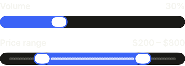
A slider for one value and a range slider for two, each with its label and current value. valueLabel writes the value the way the user reads it.
import 'package:your_app/ui/fliin/components/slider/fl_slider.dart';
import 'package:your_app/ui/fliin/core/fliin.dart';
import 'package:flutter/widgets.dart';

class SliderExample extends StatefulWidget {
  const SliderExample({super.key});

  @override
  State<SliderExample> createState() => _SliderExampleState();
}

class _SliderExampleState extends State<SliderExample> {
  var _volume = 0.3;
  FlSliderRange _price = (start: 200, end: 800);

  @override
  Widget build(BuildContext context) {
    return Column(
      mainAxisSize: MainAxisSize.min,
      crossAxisAlignment: CrossAxisAlignment.stretch,
      spacing: FlScope.of(context).space.md,
      children: [
        FlSlider(
          key: const ValueKey('volume'),
          value: _volume,
          label: 'Volume',
          showLabel: true,
          onChanged: (value) => setState(() => _volume = value),
        ),
        FlRangeSlider(
          key: const ValueKey('price'),
          values: _price,
          min: 0,
          max: 1000,
          divisions: 100,
          label: 'Price range',
          startLabel: 'Minimum price',
          endLabel: 'Maximum price',
          valueLabel: (value) => '\$${value.round()}',
          showLabel: true,
          onChanged: (values) => setState(() => _price = values),
        ),
      ],
    );
  }
}Enabled
A slider from 0 to 1, its value shown next to the label with showLabel.

import 'package:your_app/ui/fliin/components/slider/fl_slider.dart';
import 'package:flutter/widgets.dart';

class SliderEnabledExample extends StatefulWidget {
  const SliderEnabledExample({super.key});

  @override
  State<SliderEnabledExample> createState() => _SliderEnabledExampleState();
}

class _SliderEnabledExampleState extends State<SliderEnabledExample> {
  var _volume = 0.5;

  @override
  Widget build(BuildContext context) {
    return FlSlider(
      value: _volume,
      label: 'Volume',
      showLabel: true,
      onChanged: (value) => setState(() => _volume = value),
    );
  }
}Disabled
onChanged: null disables the slider: the value stays readable, the thumb no longer moves.

import 'package:your_app/ui/fliin/components/slider/fl_slider.dart';
import 'package:flutter/widgets.dart';

class SliderDisabledExample extends StatefulWidget {
  const SliderDisabledExample({super.key});

  @override
  State<SliderDisabledExample> createState() => _SliderDisabledExampleState();
}

class _SliderDisabledExampleState extends State<SliderDisabledExample> {
  final _volume = 0.4;

  @override
  Widget build(BuildContext context) {
    return FlSlider(
      value: _volume,
      label: 'Volume',
      showLabel: true,
      onChanged: null,
    );
  }
}Divisions
divisions snaps the thumb to steps: four here, so five possible values.

import 'package:your_app/ui/fliin/components/slider/fl_slider.dart';
import 'package:flutter/widgets.dart';

class SliderDivisionsExample extends StatefulWidget {
  const SliderDivisionsExample({super.key});

  @override
  State<SliderDivisionsExample> createState() => _SliderDivisionsExampleState();
}

class _SliderDivisionsExampleState extends State<SliderDivisionsExample> {
  var _volume = 0.5;

  @override
  Widget build(BuildContext context) {
    return FlSlider(
      value: _volume,
      divisions: 4,
      label: 'Volume',
      showLabel: true,
      onChanged: (value) => setState(() => _volume = value),
    );
  }
}Range
A range slider: two thumbs, each with its own label for the screen reader.

import 'package:your_app/ui/fliin/components/slider/fl_slider.dart';
import 'package:flutter/widgets.dart';

class SliderRangeExample extends StatefulWidget {
  const SliderRangeExample({super.key});

  @override
  State<SliderRangeExample> createState() => _SliderRangeExampleState();
}

class _SliderRangeExampleState extends State<SliderRangeExample> {
  FlSliderRange _price = (start: 0.2, end: 0.7);

  @override
  Widget build(BuildContext context) {
    return FlRangeSlider(
      values: _price,
      label: 'Price',
      startLabel: 'Minimum price',
      endLabel: 'Maximum price',
      showLabel: true,
      onChanged: (values) => setState(() => _price = values),
    );
  }
}Marks
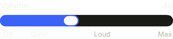
marks labels chosen values under the track; the marks inside the fill take the text color.
import 'package:your_app/ui/fliin/components/slider/fl_slider.dart';
import 'package:flutter/widgets.dart';

class SliderMarksExample extends StatefulWidget {
  const SliderMarksExample({super.key});

  @override
  State<SliderMarksExample> createState() => _SliderMarksExampleState();
}

class _SliderMarksExampleState extends State<SliderMarksExample> {
  var _volume = 40.0;

  @override
  Widget build(BuildContext context) {
    return FlSlider(
      value: _volume,
      max: 100,
      label: 'Volume',
      showLabel: true,
      valueLabel: (value) => '${value.round()}',
      marks: const [
        FlSliderMark(0, 'Off'),
        FlSliderMark(20, 'Quiet'),
        FlSliderMark(60, 'Loud'),
        FlSliderMark(100, 'Max'),
      ],
      onChanged: (value) => setState(() => _volume = value),
    );
  }
}Range marks
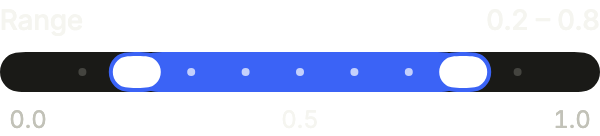
A range in tenths: divisions sets the steps, and a mark without text writes its own value, at each end and in the middle.
import 'package:your_app/ui/fliin/components/slider/fl_slider.dart';
import 'package:flutter/widgets.dart';

class SliderRangeMarksExample extends StatefulWidget {
  const SliderRangeMarksExample({super.key});

  @override
  State<SliderRangeMarksExample> createState() => _SliderRangeMarksExampleState();
}

class _SliderRangeMarksExampleState extends State<SliderRangeMarksExample> {
  FlSliderRange _range = (start: 0.2, end: 0.8);

  @override
  Widget build(BuildContext context) {
    return FlRangeSlider(
      values: _range,
      divisions: 10,
      label: 'Range',
      startLabel: 'Start',
      endLabel: 'End',
      showLabel: true,
      valueLabel: (value) => value.toStringAsFixed(1),
      marks: const [FlSliderMark(0), FlSliderMark(0.5), FlSliderMark(1)],
      onChanged: (values) => setState(() => _range = values),
    );
  }
}Vertical
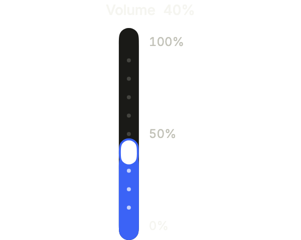
axis: Axis.vertical stands the slider up: it needs a bounded height, and its marks sit beside the track.
import 'package:your_app/ui/fliin/components/slider/fl_slider.dart';
import 'package:flutter/widgets.dart';

class SliderVerticalExample extends StatefulWidget {
  const SliderVerticalExample({super.key});

  @override
  State<SliderVerticalExample> createState() => _SliderVerticalExampleState();
}

class _SliderVerticalExampleState extends State<SliderVerticalExample> {
  var _volume = 0.4;

  @override
  Widget build(BuildContext context) {
    return SizedBox(
      height: 240,
      child: FlSlider(
        value: _volume,
        divisions: 10,
        label: 'Volume',
        showLabel: true,
        axis: Axis.vertical,
        marks: const [FlSliderMark(0), FlSliderMark(0.5), FlSliderMark(1)],
        onChanged: (value) => setState(() => _volume = value),
      ),
    );
  }
}Currency
valueLabel writes the value as the user reads it, a price here; the screen reader speaks the same text.

import 'package:your_app/ui/fliin/components/slider/fl_slider.dart';
import 'package:flutter/widgets.dart';

class SliderCurrencyExample extends StatefulWidget {
  const SliderCurrencyExample({super.key});

  @override
  State<SliderCurrencyExample> createState() => _SliderCurrencyExampleState();
}

class _SliderCurrencyExampleState extends State<SliderCurrencyExample> {
  var _price = 60.0;

  @override
  Widget build(BuildContext context) {
    return FlSlider(
      value: _price,
      max: 100,
      divisions: 100,
      label: 'Price',
      showLabel: true,
      valueLabel: (value) => '\$${value.round()}.00',
      onChanged: (value) => setState(() => _price = value),
    );
  }
}Usage
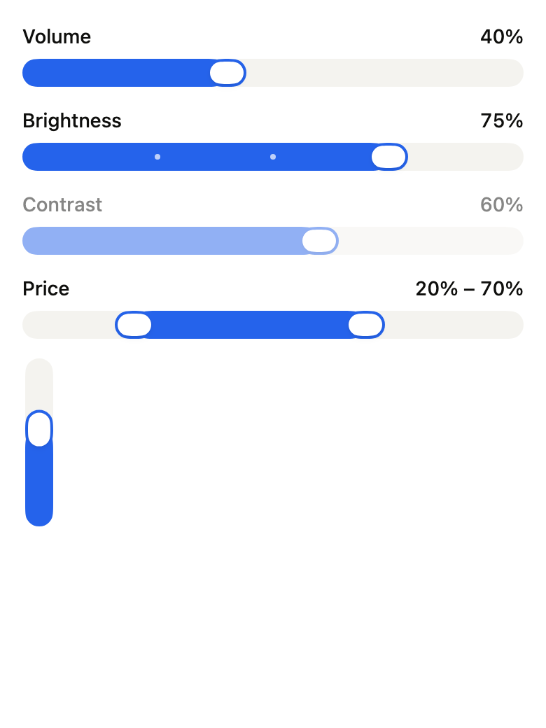
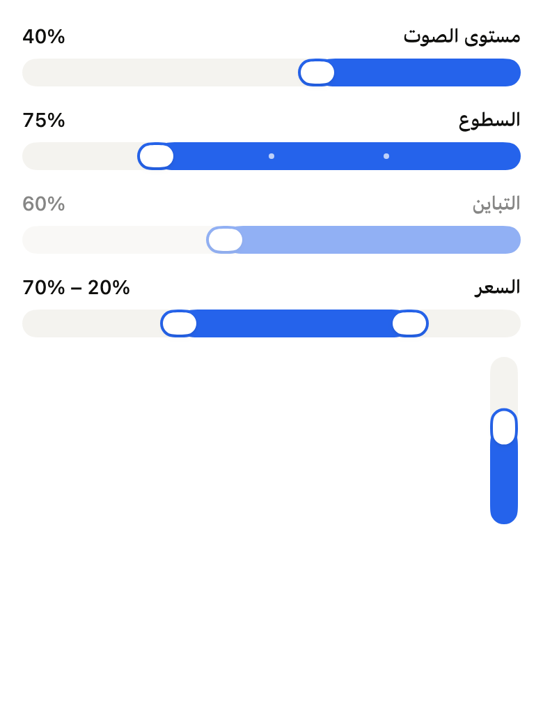
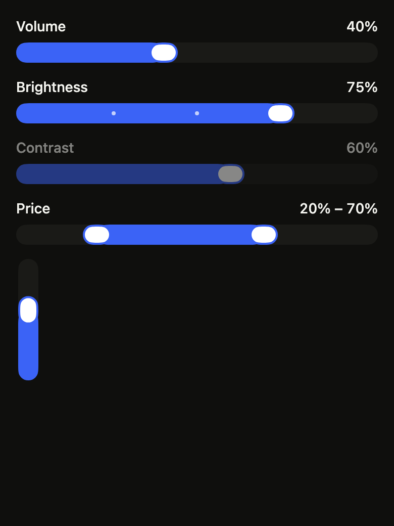
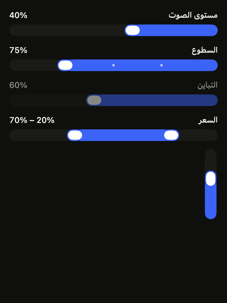
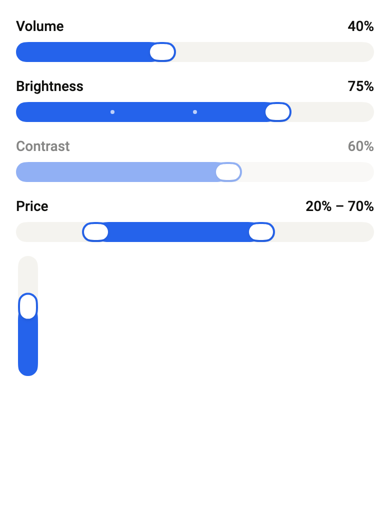
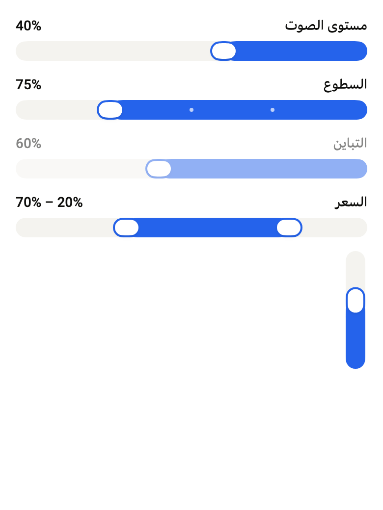
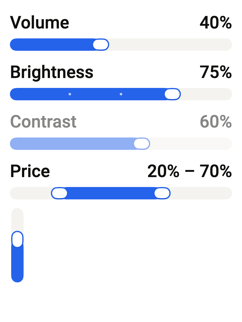
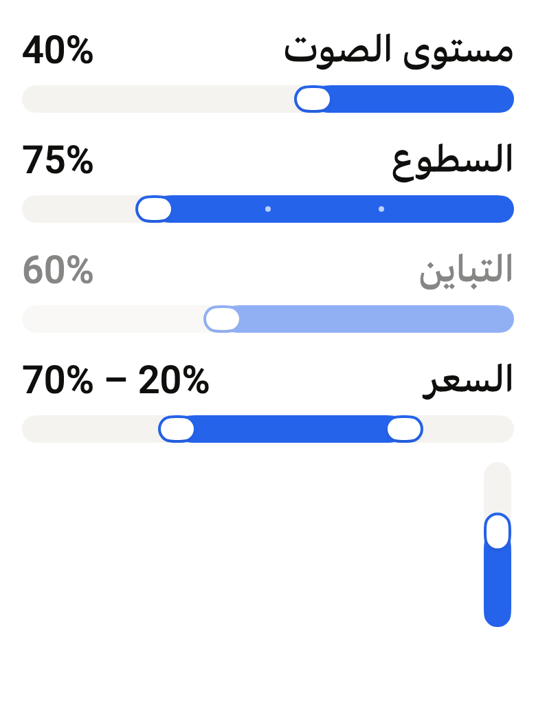
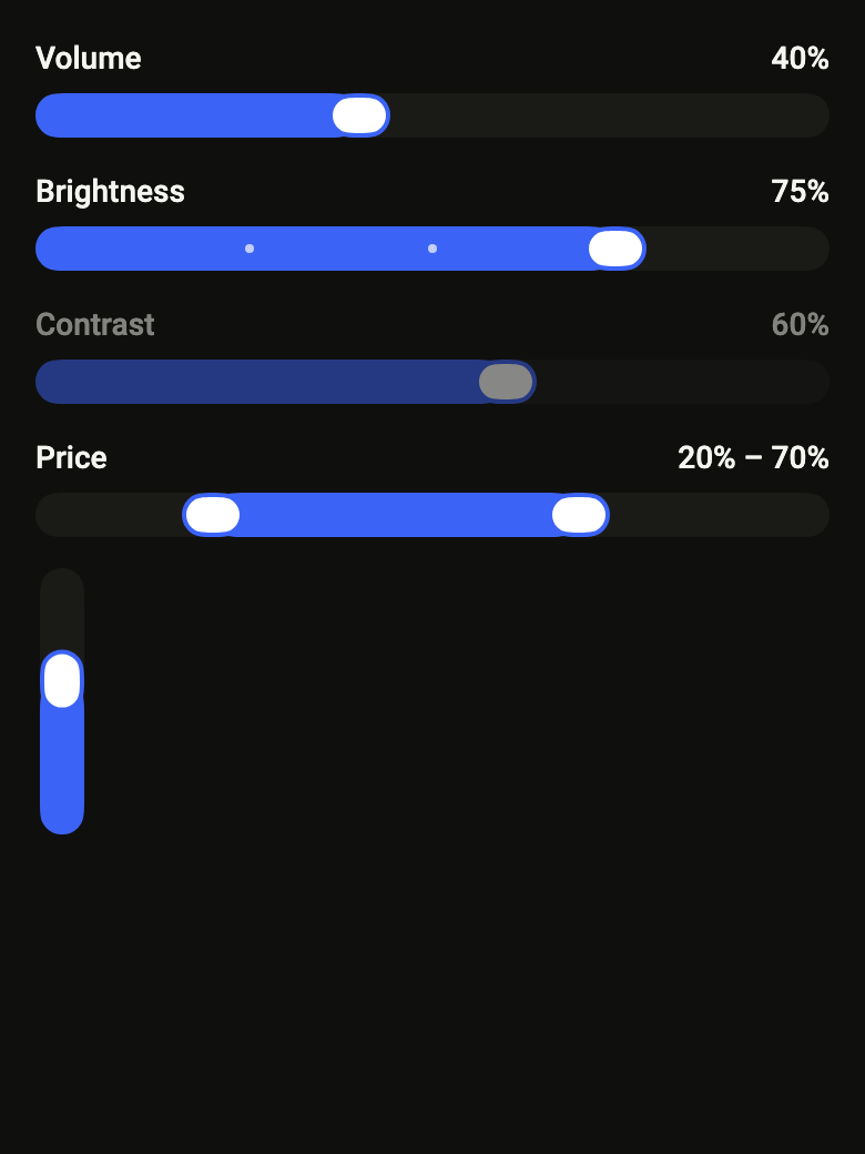
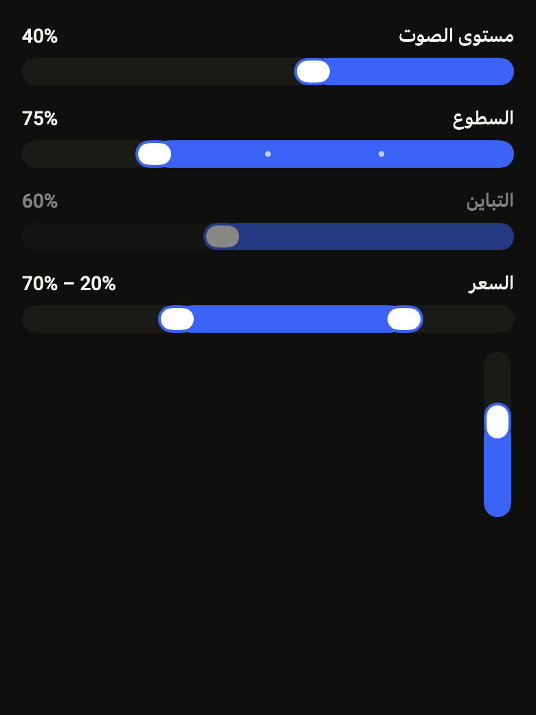
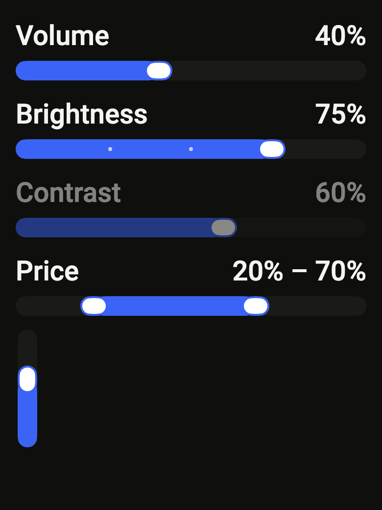
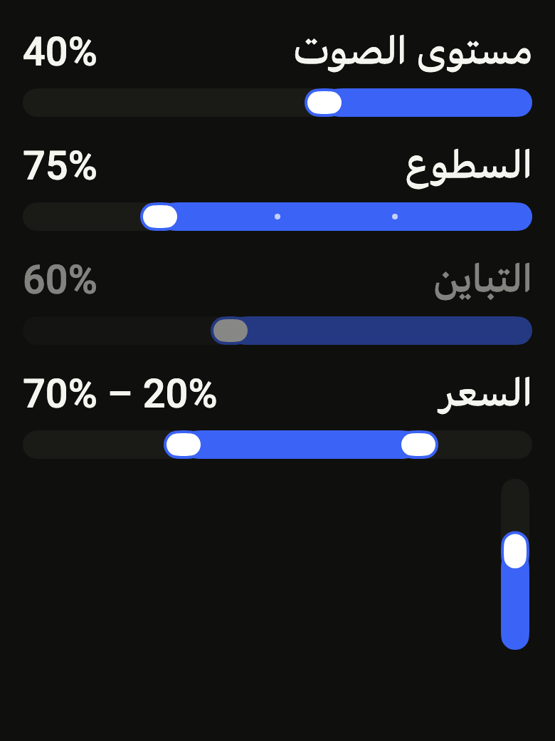
The code the reference images render:
final example = ColoredBox(
  color: FlScope.of(context).colors.surface,
  child: Padding(
    padding: EdgeInsetsDirectional.all(FlScope.of(context).space.lg),
    child: Column(
      crossAxisAlignment: CrossAxisAlignment.stretch,
      spacing: FlScope.of(context).space.md,
      children: [
        FlSlider(
          value: 0.4,
          label: 'Volume',
          showLabel: true,
          onChanged: (_) {},
        ),
        FlSlider(
          value: 0.75,
          divisions: 4,
          label: 'Brightness',
          showLabel: true,
          onChanged: (_) {},
        ),
        FlSlider(
          value: 0.6,
          label: 'Contrast',
          showLabel: true,
          onChanged: null,
        ),
        FlRangeSlider(
          values: (start: 0.2, end: 0.7),
          label: 'Price',
          startLabel: 'Minimum price',
          endLabel: 'Maximum price',
          showLabel: true,
          onChanged: (_) {},
        ),
        SizedBox(
          height: 120,
          child: Row(
            children: [
              FlSlider(
                value: 0.6,
                label: 'Bass',
                axis: Axis.vertical,
                onChanged: (_) {},
              ),
            ],
          ),
        ),
      ],
    ),
  ),
);API
FlSlider: class extends StatelessWidget
FlSlider.new: const new({super.key, required double value, required ValueChanged<double>? onChanged, required String label, ValueChanged<double>? onChangeEnd, double min, double max, int? divisions, double? step, String Function(double value)? valueLabel, Axis axis, bool showLabel, List<FlSliderMark> marks, bool autofocus})
FlSlider.value: get double
FlSlider.onChanged: get ValueChanged<double>?
FlSlider.onChangeEnd: get ValueChanged<double>?
FlSlider.label: get String
FlSlider.min: get double
FlSlider.max: get double
FlSlider.divisions: get int?
FlSlider.step: get double?
FlSlider.valueLabel: get String Function(double value)?
FlSlider.axis: get Axis
FlSlider.showLabel: get bool
FlSlider.marks: get List<FlSliderMark>
FlSlider.autofocus: get bool
FlSlider.build: Widget(BuildContext context)
FlSliderMark: final class
FlSliderMark.new: const new(double value, [String? label])
FlSliderMark.value: get double
FlSliderMark.label: get String?
FlSliderRange: typedef = ({double start, double end})
FlRangeSlider: class extends StatelessWidget
FlRangeSlider.new: const new({super.key, required FlSliderRange values, required ValueChanged<FlSliderRange>? onChanged, required String label, required String startLabel, required String endLabel, ValueChanged<FlSliderRange>? onChangeEnd, double min, double max, int? divisions, String Function(double value)? valueLabel, Axis axis, bool showLabel, List<FlSliderMark> marks, bool autofocus})
FlRangeSlider.values: get FlSliderRange
FlRangeSlider.onChanged: get ValueChanged<FlSliderRange>?
FlRangeSlider.onChangeEnd: get ValueChanged<FlSliderRange>?
FlRangeSlider.label: get String
FlRangeSlider.startLabel: get String
FlRangeSlider.endLabel: get String
FlRangeSlider.min: get double
FlRangeSlider.max: get double
FlRangeSlider.divisions: get int?
FlRangeSlider.valueLabel: get String Function(double value)?
FlRangeSlider.axis: get Axis
FlRangeSlider.showLabel: get bool
FlRangeSlider.marks: get List<FlSliderMark>
FlRangeSlider.autofocus: get bool
FlRangeSlider.build: Widget(BuildContext context)Reference renders
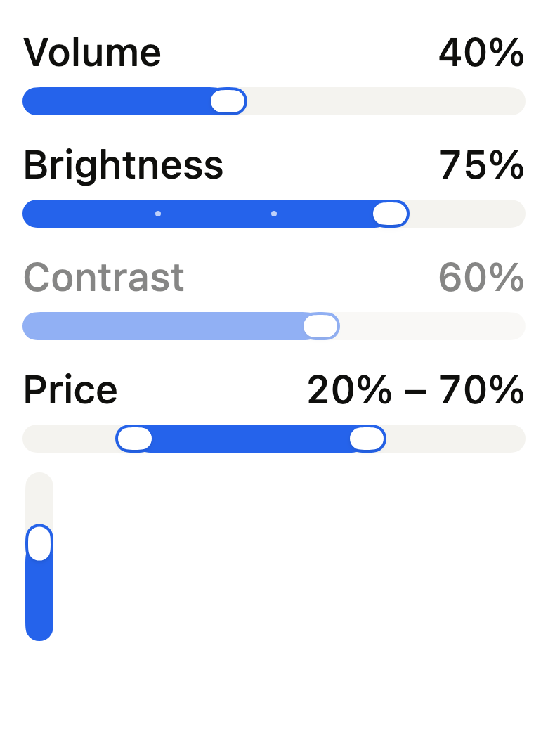
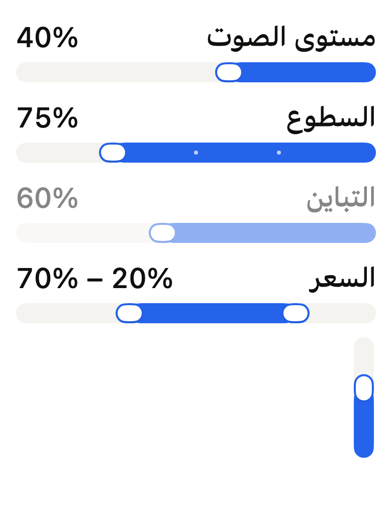
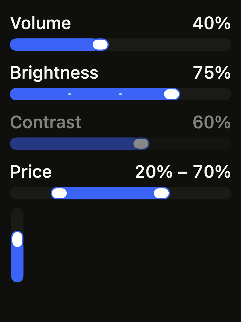
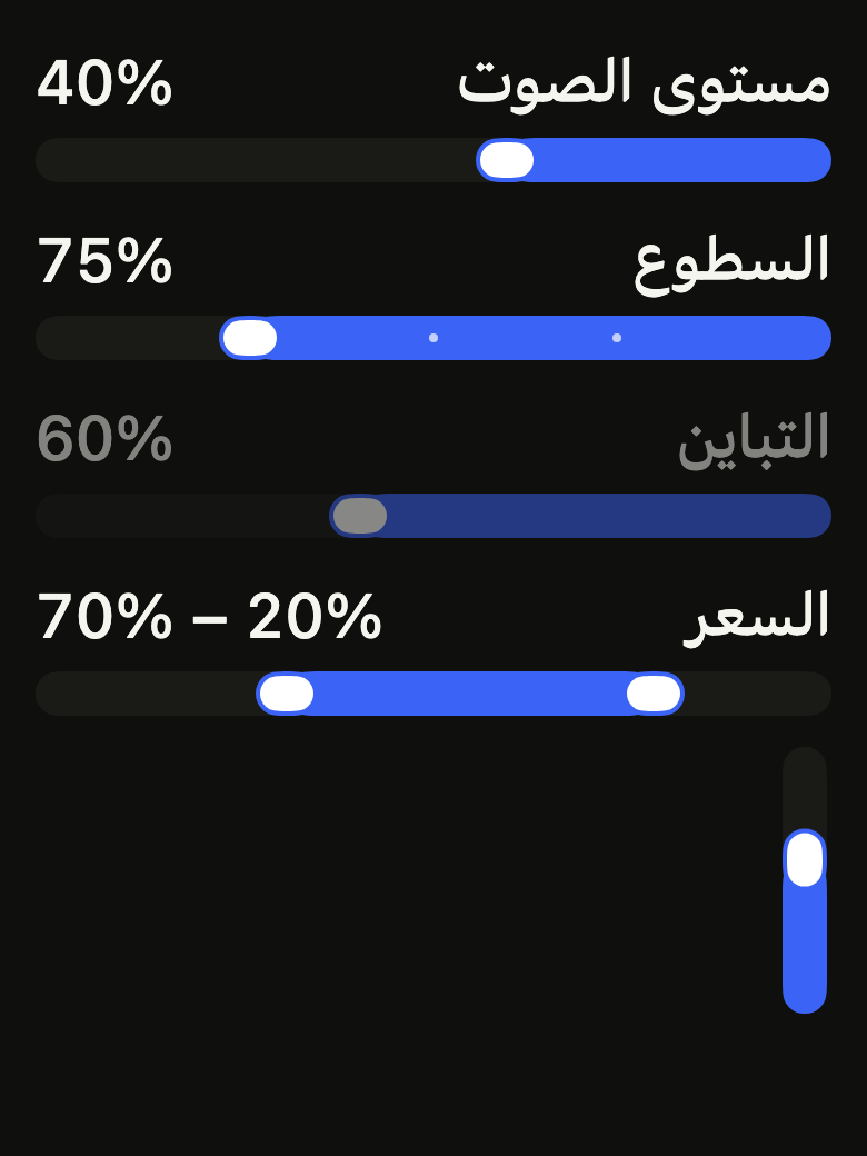
The 16 images published with version 0.2.5, rendered by the shared harness on macOS with Flutter 3.47.7. fliin verify slider compares your copy to them.
Use it to
- adjust a value by dragging
- pick volume or brightness
- add a stepped slider to settings
- select a number within a range
- let users fine-tune a level with arrow keys
- pick a price range with two handles
- Not for
- turning a setting on or off: use a switch (switch)
- entering an exact value: use a text field (text-field)
- States
Source
The files fliin add slider copies into your app, before your prefix and imports are applied.
slider/fl_slider.dart
// Modified from the Slider of HeroUI Native 1.0.10, Copyright 2025 NextUI Inc.,
// licensed under Apache 2.0: https://www.apache.org/licenses/LICENSE-2.0
import 'dart:math' as math;

import 'package:flutter/gestures.dart' show DragStartBehavior;
import 'package:flutter/services.dart';
import 'package:flutter/widgets.dart';
import 'package:fliin_ui/core/fliin.dart';

/// Single-thumb slider: picks a value between [min] and
/// [max] by tapping the track, dragging the thumb, or with the keyboard
/// (arrows, Page, Home, End). With [divisions], the value lands on one of
/// the `divisions + 1` stops. Disabled when [onChanged] is null.
///
/// `SemanticsRole.slider` does not exist in 3.47: the thumb announces itself
/// through the `slider` flag of `Semantics`.
class FlSlider extends StatelessWidget {
  /// Creates a slider over the range [min]..[max], which must contain
  /// [value].
  const FlSlider({
    super.key,
    required this.value,
    required this.onChanged,
    required this.label,
    this.onChangeEnd,
    this.min = 0,
    this.max = 1,
    this.divisions,
    this.step,
    this.valueLabel,
    this.axis = Axis.horizontal,
    this.showLabel = false,
    this.marks = const [],
    this.autofocus = false,
  }) : assert(min < max),
       assert(divisions == null || divisions > 0),
       assert(step == null || (step > 0 && divisions == null), 'a step without divisions'),
       assert(value >= min && value <= max);

  /// The displayed value, between [min] and [max]. The slider does not keep
  /// it: the caller updates it from [onChanged].
  final double value;

  /// Receives the new value while dragging, on tap and from the keyboard,
  /// only when it changes. When null, the slider is disabled and drops to
  /// `size.disabledOpacity`.
  final ValueChanged<double>? onChanged;

  /// Receives the value when a drag ends, after a tap and after a key
  /// press: the moment to save.
  final ValueChanged<double>? onChangeEnd;

  /// The slider's name, read by the screen reader before the value, and
  /// displayed above the track when [showLabel] is true.
  final String label;

  /// The lower bound, at the start of the track (on the right in RTL, at the
  /// bottom when vertical). 0 by default.
  final double min;

  /// The upper bound, strictly greater than [min]. 1 by default.
  final double max;

  /// The number of intervals between [min] and [max]. Null by default: the
  /// value is continuous.
  final int? divisions;

  /// The step of a keyboard arrow and of a screen reader adjust gesture, in
  /// the value's unit (10 seconds on a playback track); when null, a
  /// hundredth of the range. Dragging stays continuous, and Page always
  /// moves a tenth of the range. Without [divisions].
  final double? step;

  /// The value as the slider writes it and the screen reader speaks it; by
  /// default, the percentage of the range ("40%").
  final String Function(double value)? valueLabel;

  /// Horizontal by default; when vertical, the value increases upward and
  /// the slider needs a bounded height.
  final Axis axis;

  /// True: [label] at the start and the value at the end, above the track.
  final bool showLabel;

  /// Labels under the track (beside it when vertical) at chosen values
  /// ("Off", "Max", or the value itself). Empty by
  /// default.
  final List<FlSliderMark> marks;

  /// Takes focus on first build if nothing else in its scope has it.
  final bool autofocus;

  @override
  Widget build(BuildContext context) {
    final onChanged = this.onChanged;
    final onChangeEnd = this.onChangeEnd;
    return _Slider(
      values: [value],
      thumbLabels: [label],
      label: label,
      onChanged: onChanged == null ? null : (values) => onChanged(values.single),
      onChangeEnd: onChangeEnd == null ? null : (values) => onChangeEnd(values.single),
      min: min,
      max: max,
      divisions: divisions,
      step: step,
      valueLabel: valueLabel,
      axis: axis,
      showLabel: showLabel,
      marks: marks,
      autofocus: autofocus,
    );
  }
}

/// A label under the track of an [FlSlider] or an [FlRangeSlider], at
/// [value]. It is muted outside the fill and takes
/// the text color inside it.
final class FlSliderMark {
  /// A mark at [value], between the slider's `min` and `max`, reading
  /// [label]; when null, the value as `valueLabel` writes it.
  const FlSliderMark(this.value, [this.label]);

  /// Where the mark stands, in the slider's unit.
  final double value;

  /// The text of the mark ("Off", "Max"); null, the written value.
  final String? label;
}

/// A range picked on an [FlRangeSlider], `start` at most equal to `end`.
typedef FlSliderRange = ({double start, double end});

/// Two-thumb slider:
/// picks a range between [min] and [max]. A tap on the track moves the
/// nearest thumb; a thumb never passes the other. Each thumb is a Tab stop
/// and a slider for the screen reader.
class FlRangeSlider extends StatelessWidget {
  /// Creates a range slider over [min]..[max], which must contain [values].
  const FlRangeSlider({
    super.key,
    required this.values,
    required this.onChanged,
    required this.label,
    required this.startLabel,
    required this.endLabel,
    this.onChangeEnd,
    this.min = 0,
    this.max = 1,
    this.divisions,
    this.valueLabel,
    this.axis = Axis.horizontal,
    this.showLabel = false,
    this.marks = const [],
    this.autofocus = false,
  }) : assert(min < max),
       assert(divisions == null || divisions > 0);

  /// The displayed range, between [min] and [max], `start` at most equal to
  /// `end`.
  final FlSliderRange values;

  /// Receives the new range when one of the thumbs moves. When null, the
  /// slider is disabled.
  final ValueChanged<FlSliderRange>? onChanged;

  /// Receives the range when a drag ends, after a tap and after a key press.
  final ValueChanged<FlSliderRange>? onChangeEnd;

  /// The slider's name, displayed when [showLabel] is true.
  final String label;

  /// The name of the start thumb for the screen reader ("Minimum price").
  final String startLabel;

  /// The name of the end thumb for the screen reader ("Maximum price").
  final String endLabel;

  /// The lower bound. 0 by default.
  final double min;

  /// The upper bound. 1 by default.
  final double max;

  /// The number of intervals between [min] and [max]; when null, continuous.
  final int? divisions;

  /// A value as the slider writes it and the screen reader speaks it; by
  /// default, the percentage of the range. The output joins the two with
  /// "–".
  final String Function(double value)? valueLabel;

  /// Horizontal by default, or vertical.
  final Axis axis;

  /// True: [label] at the start and the range at the end, above the track.
  final bool showLabel;

  /// Labels under the track at chosen values; see [FlSlider.marks].
  final List<FlSliderMark> marks;

  /// The start thumb takes focus on first build.
  final bool autofocus;

  @override
  Widget build(BuildContext context) {
    assert(values.start <= values.end && values.start >= min && values.end <= max);
    final onChanged = this.onChanged;
    final onChangeEnd = this.onChangeEnd;
    FlSliderRange range(List<double> values) => (start: values.first, end: values.last);
    return _Slider(
      values: [values.start, values.end],
      thumbLabels: [startLabel, endLabel],
      label: label,
      onChanged: onChanged == null ? null : (values) => onChanged(range(values)),
      onChangeEnd: onChangeEnd == null ? null : (values) => onChangeEnd(range(values)),
      min: min,
      max: max,
      divisions: divisions,
      step: null,
      valueLabel: valueLabel,
      axis: axis,
      showLabel: showLabel,
      marks: marks,
      autofocus: autofocus,
    );
  }
}

/// Without divisions, an arrow moves a hundredth of the range and Page a
/// tenth; with divisions, one stop and a tenth of the stops (at least one).
const _fineSteps = 100;
const _pageFraction = 10;

/// The opacity of a stop's dot on the fill, and off it.
const double _stepOpacity = 0.7;
const double _stepOffOpacity = 0.25;

/// The thumb shrinks to 0.9 while dragged (`slider.animation.ts`).
const _draggedScale = 0.9;

class _StepIntent extends Intent {
  const _StepIntent(this.pages, this.steps);

  final int pages;
  final int steps;
}

class _EdgeIntent extends Intent {
  const _EdgeIntent({required this.end});

  final bool end;
}

class _Slider extends StatefulWidget {
  const _Slider({
    required this.values,
    required this.thumbLabels,
    required this.label,
    required this.onChanged,
    required this.onChangeEnd,
    required this.min,
    required this.max,
    required this.divisions,
    required this.step,
    required this.valueLabel,
    required this.axis,
    required this.showLabel,
    required this.marks,
    required this.autofocus,
  });

  final List<double> values;
  final List<String> thumbLabels;
  final String label;
  final ValueChanged<List<double>>? onChanged;
  final ValueChanged<List<double>>? onChangeEnd;
  final double min;
  final double max;
  final int? divisions;
  final double? step;
  final String Function(double value)? valueLabel;
  final Axis axis;
  final bool showLabel;
  final List<FlSliderMark> marks;
  final bool autofocus;

  @override
  State<_Slider> createState() => _SliderState();
}

class _SliderState extends State<_Slider> with TickerProviderStateMixin {
  final GlobalKey _track = GlobalKey();
  late final List<FocusNode> _nodes = [
    for (var i = 0; i < widget.values.length; i++) FocusNode(debugLabel: 'FlSlider $i'),
  ];
  late final List<AnimationController> _knobs = [
    for (var i = 0; i < widget.values.length; i++) AnimationController.unbounded(vsync: this, value: 1),
  ];
  int? _focused;
  int? _dragging;

  /// Where the finger grabbed the thumb, along the track from its center:
  /// the thumb keeps this offset, it does not jump under the finger.
  double _grab = 0;

  bool get _enabled => widget.onChanged != null;

  @override
  void didUpdateWidget(_Slider oldWidget) {
    super.didUpdateWidget(oldWidget);
    if (!_enabled && _dragging != null) _setDragging(null);
  }

  @override
  void dispose() {
    for (final node in _nodes) {
      node.dispose();
    }
    for (final knob in _knobs) {
      knob.dispose();
    }
    super.dispose();
  }

  double _fraction(double value) => (value - widget.min) / (widget.max - widget.min);

  double _valueAt(double fraction) {
    var t = fraction.clamp(0.0, 1.0);
    final divisions = widget.divisions;
    if (divisions != null) t = (t * divisions).round() / divisions;
    return widget.min + t * (widget.max - widget.min);
  }

  double get _step => switch ((widget.step, widget.divisions)) {
    (final step?, _) => step / (widget.max - widget.min),
    (null, null) => 1 / _fineSteps,
    (null, final divisions?) => 1 / divisions,
  };

  double get _page => switch (widget.divisions) {
    null => 1 / _pageFraction,
    final divisions => math.max(1, (divisions / _pageFraction).round()) / divisions,
  };

  /// The bounds of thumb [index]: a thumb does not pass its neighbor.
  (double, double) _bounds(int index) => (
    index == 0 ? widget.min : widget.values[index - 1],
    index == widget.values.length - 1 ? widget.max : widget.values[index + 1],
  );

  /// [value] for thumb [index], clamped between its neighbors.
  List<double> _with(int index, double value) {
    final (low, high) = _bounds(index);
    return [...widget.values]..[index] = value.clamp(low, high);
  }

  void _change(List<double> values) {
    for (var i = 0; i < values.length; i++) {
      if (values[i] != widget.values[i]) {
        widget.onChanged?.call(values);
        return;
      }
    }
  }

  void _commit(List<double> values) {
    _change(values);
    widget.onChangeEnd?.call(values);
  }

  void _setDragging(int? index) {
    final previous = _dragging;
    if (previous == index) return;
    setState(() => _dragging = index);
    final motion = FlMotion.of(context);
    for (final i in [?previous, ?index]) {
      final target = i == index ? _draggedScale : 1.0;
      if (motion.reduced) {
        _knobs[i].value = target;
      } else {
        _knobs[i].driveTo(target, FlSpringMotion(motion.tokens.sliderThumb));
      }
    }
  }

  String _describe(double value) => widget.valueLabel?.call(value) ?? '${(_fraction(value) * 100).round()}%';

  /// The position of point [global] along the thumb center's travel, and
  /// that travel, in points: the thumb stays inside the track, its center
  /// half its length from each end.
  ({double along, double span})? _locate(Offset global, Size thumb) {
    final box = _track.currentContext?.findRenderObject();
    if (box is! RenderBox || !box.hasSize) return null;
    final local = box.globalToLocal(global);
    final ltr = Directionality.of(context) == TextDirection.ltr;
    final main = widget.axis == Axis.horizontal ? thumb.width : thumb.height;
    return switch (widget.axis) {
      Axis.horizontal => (along: (ltr ? local.dx : box.size.width - local.dx) - main / 2, span: box.size.width - main),
      Axis.vertical => (along: box.size.height - local.dy - main / 2, span: box.size.height - main),
    };
  }

  /// The thumb nearest to [value]; on a tie, the one the finger points
  /// toward.
  int _nearest(double value) {
    var best = 0;
    for (var i = 1; i < widget.values.length; i++) {
      final gap = (widget.values[i] - value).abs();
      final bestGap = (widget.values[best] - value).abs();
      if (gap < bestGap || (gap == bestGap && value > widget.values[i])) {
        best = i;
      }
    }
    return best;
  }

  void _start(Offset global, Size thumb) {
    final at = _locate(global, thumb);
    if (at == null || at.span <= 0) return;
    final main = widget.axis == Axis.horizontal ? thumb.width : thumb.height;
    final index = _nearest(_valueAt(at.along / at.span));
    final center = _fraction(widget.values[index]) * at.span;
    _grab = (at.along - center).abs() <= main / 2 ? at.along - center : 0;
    _setDragging(index);
    _change(_with(index, _valueAt((at.along - _grab) / at.span)));
  }

  void _update(Offset global, Size thumb) {
    final index = _dragging;
    final at = _locate(global, thumb);
    if (index == null || at == null || at.span <= 0) return;
    _change(_with(index, _valueAt((at.along - _grab) / at.span)));
  }

  void _end() {
    if (_dragging == null) return;
    _setDragging(null);
    widget.onChangeEnd?.call(widget.values);
  }

  void _tap(Offset global, Size thumb) {
    final at = _locate(global, thumb);
    if (at == null || at.span <= 0) return;
    final value = _valueAt(at.along / at.span);
    _commit(_with(_nearest(value), value));
  }

  Map<ShortcutActivator, Intent> get _shortcuts {
    final forward = Directionality.of(context) == TextDirection.ltr ? 1 : -1;
    return {
      const SingleActivator(LogicalKeyboardKey.arrowRight): _StepIntent(0, forward),
      const SingleActivator(LogicalKeyboardKey.arrowLeft): _StepIntent(0, -forward),
      const SingleActivator(LogicalKeyboardKey.arrowUp): const _StepIntent(0, 1),
      const SingleActivator(LogicalKeyboardKey.arrowDown): const _StepIntent(0, -1),
      const SingleActivator(LogicalKeyboardKey.pageUp): const _StepIntent(1, 0),
      const SingleActivator(LogicalKeyboardKey.pageDown): const _StepIntent(-1, 0),
      const SingleActivator(LogicalKeyboardKey.home): const _EdgeIntent(end: false),
      const SingleActivator(LogicalKeyboardKey.end): const _EdgeIntent(end: true),
    };
  }

  Widget _thumb(FlTheme theme, int index, Size size, Size knob) {
    final value = widget.values[index];
    final (low, high) = _bounds(index);
    final increased = math.min(high, _valueAt(_fraction(value) + _step));
    final decreased = math.max(low, _valueAt(_fraction(value) - _step));
    final canIncrease = _enabled && increased != value;
    final canDecrease = _enabled && decreased != value;
    final radius = math.min(theme.shape.radiusXl, size.shortestSide / 2);
    final shape = FlContinuousBorder(radius: radius);
    final knobShape = FlContinuousBorder(radius: math.min(theme.shape.radiusLg, knob.shortestSide / 2));
    return Semantics(
      container: true,
      slider: true,
      enabled: _enabled,
      label: widget.thumbLabels[index],
      value: _describe(value),
      increasedValue: canIncrease ? _describe(increased) : null,
      decreasedValue: canDecrease ? _describe(decreased) : null,
      onIncrease: canIncrease ? () => _commit(_with(index, increased)) : null,
      onDecrease: canDecrease ? () => _commit(_with(index, decreased)) : null,
      child: FocusableActionDetector(
        focusNode: _nodes[index],
        enabled: _enabled,
        autofocus: widget.autofocus && index == 0,
        mouseCursor: _enabled ? SystemMouseCursors.click : MouseCursor.defer,
        shortcuts: _shortcuts,
        actions: {
          _StepIntent: CallbackAction<_StepIntent>(
            onInvoke: (intent) =>
                _commit(_with(index, _valueAt(_fraction(value) + intent.pages * _page + intent.steps * _step))),
          ),
          _EdgeIntent: CallbackAction<_EdgeIntent>(
            onInvoke: (intent) => _commit(_with(index, intent.end ? high : low)),
          ),
        },
        onShowFocusHighlight: (visible) =>
            setState(() => _focused = visible ? index : (_focused == index ? null : _focused)),
        child: FlFocusRing(
          visible: _focused == index,
          borderRadius: BorderRadius.circular(radius),
          // The thumb: a `selected` capsule as high as the
          // track, which carries the fill to its edge, and in it an
          // `onSelected` knob lifted by the `field` shadow, which shrinks
          // while dragged.
          child: SizedBox.fromSize(
            size: size,
            child: DecoratedBox(
              decoration: ShapeDecoration(color: theme.colors.selected, shape: shape),
              child: Center(
                child: ScaleTransition(
                  scale: _knobs[index],
                  child: FlShadow(
                    layers: theme.shadows.field,
                    shape: knobShape,
                    child: DecoratedBox(
                      decoration: ShapeDecoration(color: theme.colors.onSelected, shape: knobShape),
                      child: SizedBox.fromSize(size: knob),
                    ),
                  ),
                ),
              ),
            ),
          ),
        ),
      ),
    );
  }

  @override
  Widget build(BuildContext context) {
    final theme = FlScope.of(context);
    final xs = theme.space.xs;
    final horizontal = widget.axis == Axis.horizontal;
    // A 20 track, centered on a 24 row, holding a 28 by
    // 20 thumb and its 24 by 16 knob; turned on its side when vertical.
    final cross = xs * 6;
    final bar = xs * 5;
    final dot = xs;
    final thumb = horizontal ? Size(xs * 7, bar) : Size(bar, xs * 7);
    final knob = horizontal ? Size(xs * 6, xs * 4) : Size(xs * 4, xs * 6);
    final shape = FlContinuousBorder(radius: math.min(theme.shape.radiusXl, bar / 2));
    final first = widget.values.length > 1 ? _fraction(widget.values.first) : 0.0;
    final last = _fraction(widget.values.last);

    final track = LayoutBuilder(
      key: _track,
      builder: (context, constraints) {
        assert(
          horizontal ? constraints.hasBoundedWidth : constraints.hasBoundedHeight,
          horizontal
              ? 'FlSlider needs a bounded width: in a Row, wrap it in an Expanded or a SizedBox.'
              : 'A vertical FlSlider needs a bounded height: wrap it in a SizedBox or an Expanded.',
        );
        final length = horizontal ? constraints.maxWidth : constraints.maxHeight;
        final main = horizontal ? thumb.width : thumb.height;
        // The thumb stays inside the track: its center travels from half its
        // length to the other end less as much. The fill runs from the first
        // center to the last; alone, from the start of the track.
        final travel = math.max(0.0, length - main);
        double center(double fraction) => main / 2 + fraction * travel;
        final fillStart = widget.values.length > 1 ? center(first) : 0.0;
        final fillLength = center(last) - fillStart;
        Widget along(double start, double extent, Widget child, {double inset = 0}) => horizontal
            ? PositionedDirectional(start: start, top: inset, bottom: inset, width: extent, child: child)
            : PositionedDirectional(bottom: start, start: inset, end: inset, height: extent, child: child);
        final barInset = (cross - bar) / 2;
        return SizedBox(
          width: horizontal ? length : cross,
          height: horizontal ? cross : length,
          child: Stack(
            clipBehavior: Clip.none,
            children: [
              along(
                0,
                length,
                DecoratedBox(
                  decoration: ShapeDecoration(color: theme.colors.control, shape: shape),
                ),
                inset: barInset,
              ),
              along(
                fillStart,
                fillLength,
                DecoratedBox(
                  decoration: ShapeDecoration(color: theme.colors.selected, shape: shape),
                ),
                inset: barInset,
              ),
              // A dot per inner stop: in `onSelected` on the fill, in
              // `onSurfaceMuted` off it; a thumb covers the one it sits on.
              if (widget.divisions case final divisions?)
                for (var k = 1; k < divisions; k++)
                  along(
                    center(k / divisions) - dot / 2,
                    dot,
                    DecoratedBox(
                      decoration: ShapeDecoration(
                        color: k / divisions >= first && k / divisions <= last
                            ? theme.colors.onSelected.withValues(alpha: _stepOpacity)
                            : theme.colors.onSurfaceMuted.withValues(alpha: _stepOffOpacity),
                        shape: const CircleBorder(),
                      ),
                    ),
                    inset: (cross - dot) / 2,
                  ),
              for (var i = 0; i < widget.values.length; i++)
                along(
                  center(_fraction(widget.values[i])) - main / 2,
                  main,
                  Center(child: _thumb(theme, i, thumb, knob)),
                ),
            ],
          ),
        );
      },
    );

    final values = widget.values.map(_describe).join(' – ');
    // The platform's touch target around the track, outside the layout: the
    // touch keeps its position.
    final detector = FlHitTarget(
      child: GestureDetector(
        behavior: HitTestBehavior.opaque,
        excludeFromSemantics: true,
        dragStartBehavior: DragStartBehavior.down,
        onTapUp: _enabled ? (details) => _tap(details.globalPosition, thumb) : null,
        onHorizontalDragStart: _enabled && horizontal ? (details) => _start(details.globalPosition, thumb) : null,
        onHorizontalDragUpdate: _enabled && horizontal ? (details) => _update(details.globalPosition, thumb) : null,
        onHorizontalDragEnd: _enabled && horizontal ? (_) => _end() : null,
        onHorizontalDragCancel: _enabled && horizontal ? _end : null,
        onVerticalDragStart: _enabled && !horizontal ? (details) => _start(details.globalPosition, thumb) : null,
        onVerticalDragUpdate: _enabled && !horizontal ? (details) => _update(details.globalPosition, thumb) : null,
        onVerticalDragEnd: _enabled && !horizontal ? (_) => _end() : null,
        onVerticalDragCancel: _enabled && !horizontal ? _end : null,
        child: track,
      ),
    );
    final marks = widget.marks;
    // gap-1 of `slider`, between the header, the track and the marks.
    final Widget body = switch ((horizontal, marks.isEmpty)) {
      (_, true) => detector,
      (true, false) => Column(
        mainAxisSize: MainAxisSize.min,
        crossAxisAlignment: CrossAxisAlignment.stretch,
        spacing: xs,
        children: [detector, _marks(theme, thumb)],
      ),
      (false, false) => Row(
        mainAxisSize: MainAxisSize.min,
        crossAxisAlignment: CrossAxisAlignment.stretch,
        spacing: xs * 2,
        children: [detector, _marks(theme, thumb)],
      ),
    };
    return Opacity(
      opacity: _enabled ? 1 : theme.size.disabledOpacity,
      child: switch ((horizontal, widget.showLabel)) {
        (_, false) => body,
        (true, true) => Column(
          mainAxisSize: MainAxisSize.min,
          crossAxisAlignment: CrossAxisAlignment.stretch,
          spacing: xs,
          children: [_header(theme, values), body],
        ),
        (false, true) => Column(
          spacing: xs * 2,
          children: [
            _header(theme, values),
            Expanded(child: body),
          ],
        ),
      },
    );
  }

  /// The label at the start and the value at the end, both in medium
  /// `textSm`, the value in
  /// tabular figures. Outside the semantics, which each thumb already
  /// carries.
  Widget _header(FlTheme theme, String values) {
    const role = FlTextRole.textSm;
    final style = theme.typography
        .resolve(role)
        .copyWith(color: theme.colors.onSurface, fontWeight: theme.tokens.typography.weight.medium);
    final strut = theme.typography.strut(role, inheritedFamily: DefaultTextStyle.of(context).style.fontFamily);
    return ExcludeSemantics(
      child: Row(
        mainAxisSize: widget.axis == Axis.horizontal ? MainAxisSize.max : MainAxisSize.min,
        mainAxisAlignment: MainAxisAlignment.spaceBetween,
        spacing: theme.space.xs * 2,
        children: [
          Flexible(
            child: Text(widget.label, style: style, strutStyle: strut),
          ),
          Text(
            values,
            style: style.copyWith(fontFeatures: const [FontFeature.tabularFigures()]),
            strutStyle: strut,
          ),
        ],
      ),
    );
  }

  /// The marks, each centered on the place its value gives the thumb's
  /// center and kept within the track's length: in `textXs`,
  /// `onSurfaceMuted` outside the fill, `onSurface` inside it. Outside the
  /// semantics: the
  /// thumbs speak the value.
  Widget _marks(FlTheme theme, Size thumb) {
    const role = FlTextRole.textXs;
    final horizontal = widget.axis == Axis.horizontal;
    final style = theme.typography.resolve(role).copyWith(fontFeatures: const [FontFeature.tabularFigures()]);
    final strut = theme.typography.strut(role, inheritedFamily: DefaultTextStyle.of(context).style.fontFamily);
    final first = widget.values.length > 1 ? _fraction(widget.values.first) : 0.0;
    final last = _fraction(widget.values.last);
    Widget text(FlSliderMark mark, Color color) => Text(
      mark.label ?? _describe(mark.value),
      maxLines: 1,
      softWrap: false,
      style: style.copyWith(color: color),
      strutStyle: strut,
    );
    final rtl = Directionality.of(context) == TextDirection.rtl;
    return ExcludeSemantics(
      child: Stack(
        children: [
          // The marks' extent across the track: their height in a row, the
          // widest one's width in a column, as high as the track.
          for (final mark in horizontal ? widget.marks.take(1) : widget.marks)
            Visibility.maintain(visible: false, child: text(mark, theme.colors.onSurfaceMuted)),
          if (!horizontal) const SizedBox(height: double.infinity),
          for (final mark in widget.marks)
            Positioned.fill(
              child: CustomSingleChildLayout(
                delegate: _MarkLayout(
                  fraction: _fraction(mark.value.clamp(widget.min, widget.max)),
                  thumb: horizontal ? thumb.width : thumb.height,
                  axis: widget.axis,
                  rtl: rtl,
                ),
                child: text(
                  mark,
                  _fraction(mark.value) >= first && _fraction(mark.value) <= last
                      ? theme.colors.onSurface
                      : theme.colors.onSurfaceMuted,
                ),
              ),
            ),
        ],
      ),
    );
  }
}

/// Places a mark on the thumb's center at [fraction] of the track, the
/// thumb [thumb] long, without leaving the track: at the start of the row
/// (on the right in RTL), at the bottom of the column.
class _MarkLayout extends SingleChildLayoutDelegate {
  const _MarkLayout({required this.fraction, required this.thumb, required this.axis, required this.rtl});

  final double fraction;
  final double thumb;
  final Axis axis;
  final bool rtl;

  @override
  BoxConstraints getConstraintsForChild(BoxConstraints constraints) => constraints.loosen();

  @override
  Offset getPositionForChild(Size size, Size childSize) {
    double place(double length, double extent) {
      final center = thumb / 2 + fraction * math.max(0.0, length - thumb);
      return (center - extent / 2).clamp(0.0, math.max(0.0, length - extent));
    }

    return switch (axis) {
      Axis.horizontal => Offset(
        rtl ? size.width - childSize.width - place(size.width, childSize.width) : place(size.width, childSize.width),
        0,
      ),
      Axis.vertical => Offset(
        rtl ? size.width - childSize.width : 0,
        size.height - childSize.height - place(size.height, childSize.height),
      ),
    };
  }

  @override
  bool shouldRelayout(_MarkLayout oldDelegate) =>
      fraction != oldDelegate.fraction ||
      thumb != oldDelegate.thumb ||
      axis != oldDelegate.axis ||
      rtl != oldDelegate.rtl;
}