Components / forms
Color swatch picker
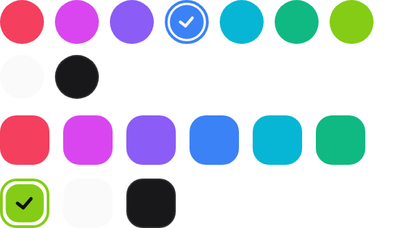
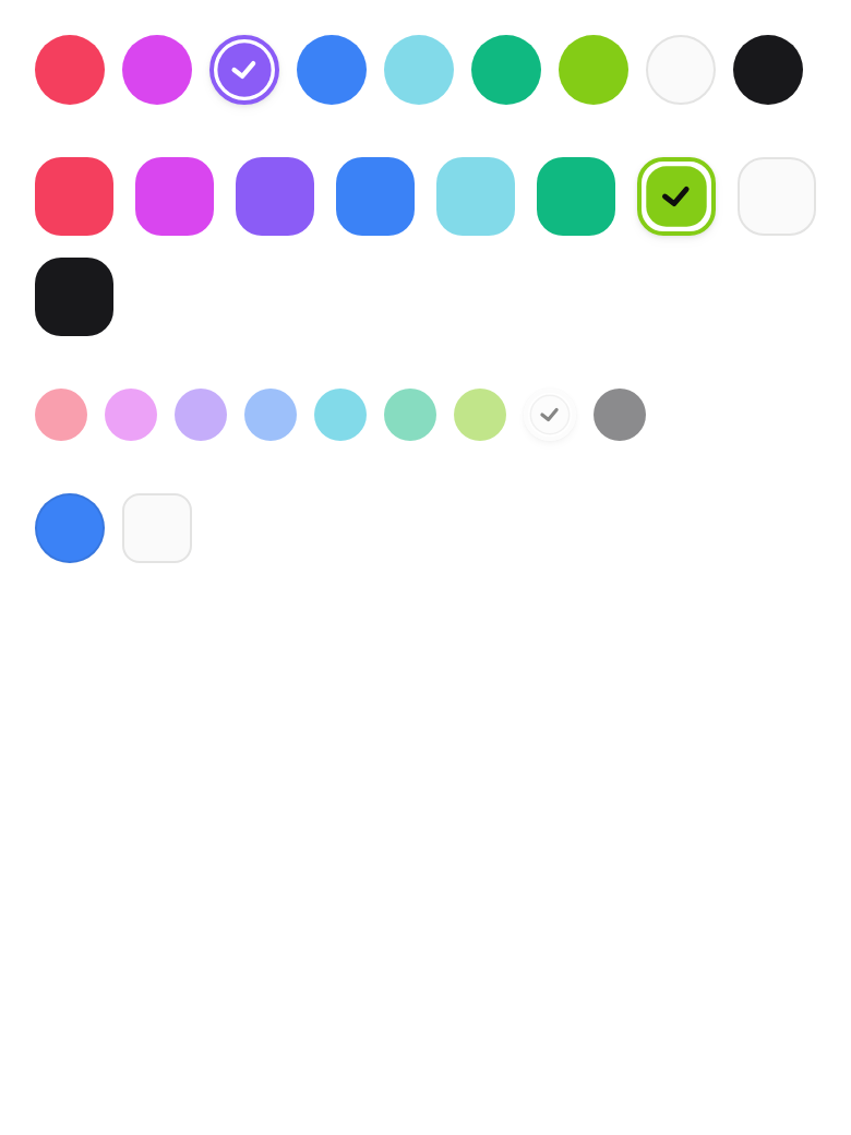
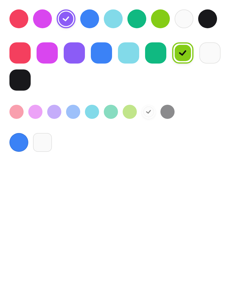
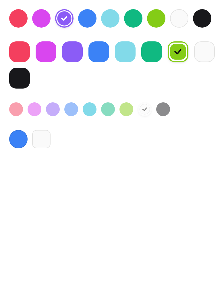
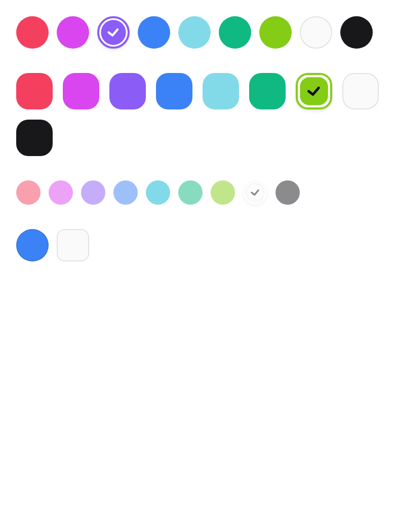
Picks a shade from a palette the app provides, such as a product or label color: the chosen dot shrinks inside a ring and gets a check mark, and each dot is read by its name.
Import
In a Flutter app where fliin init has run:
Examples
Example
Pick one color from swatches, round by default or square and larger with size and shape. Each item has a label for the screen reader.
import 'package:your_app/ui/fliin/components/color_swatch_picker/fl_color_swatch_picker.dart';
import 'package:your_app/ui/fliin/core/fliin.dart';
import 'package:flutter/widgets.dart';

class ColorSwatchPickerExample extends StatefulWidget {
  const ColorSwatchPickerExample({super.key});

  @override
  State<ColorSwatchPickerExample> createState() => _ColorSwatchPickerExampleState();
}

class _ColorSwatchPickerExampleState extends State<ColorSwatchPickerExample> {
  String? _color = 'blue';
  String? _accent = 'lime';

  @override
  Widget build(BuildContext context) {
    return Column(
      mainAxisSize: MainAxisSize.min,
      crossAxisAlignment: CrossAxisAlignment.stretch,
      spacing: FlScope.of(context).space.md,
      children: [
        FlColorSwatchPicker<String>(
          semanticLabel: 'Color',
          value: _color,
          onChanged: (value) => setState(() => _color = value),
          items: _colors,
        ),
        FlColorSwatchPicker<String>(
          semanticLabel: 'Color',
          value: _accent,
          size: FlColorSwatchSize.lg,
          shape: FlColorSwatchShape.square,
          onChanged: (value) => setState(() => _accent = value),
          items: _colors,
        ),
      ],
    );
  }
}

/// The colors to choose from, each with the name the screen reader says.
const _colors = [
  FlColorSwatchItem(value: 'rose', color: Color(0xFFF43F5E), label: 'Rose'),
  FlColorSwatchItem(value: 'fuchsia', color: Color(0xFFD946EF), label: 'Fuchsia'),
  FlColorSwatchItem(value: 'violet', color: Color(0xFF8B5CF6), label: 'Violet'),
  FlColorSwatchItem(value: 'blue', color: Color(0xFF3B82F6), label: 'Blue'),
  FlColorSwatchItem(value: 'cyan', color: Color(0xFF06B6D4), label: 'Cyan'),
  FlColorSwatchItem(value: 'emerald', color: Color(0xFF10B981), label: 'Emerald'),
  FlColorSwatchItem(value: 'lime', color: Color(0xFF84CC16), label: 'Lime'),
  FlColorSwatchItem(value: 'white', color: Color(0xFFFAFAFA), label: 'White'),
  FlColorSwatchItem(value: 'black', color: Color(0xFF18181B), label: 'Black'),
];Selected
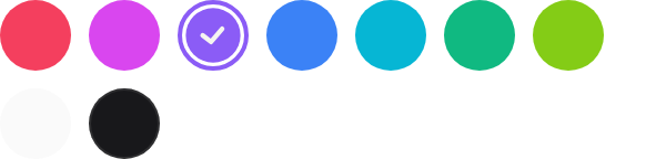
The chosen swatch carries a ring.
import 'package:your_app/ui/fliin/components/color_swatch_picker/fl_color_swatch_picker.dart';
import 'package:flutter/widgets.dart';

class ColorSwatchPickerSelectedExample extends StatefulWidget {
  const ColorSwatchPickerSelectedExample({super.key});

  @override
  State<ColorSwatchPickerSelectedExample> createState() => _ColorSwatchPickerSelectedExampleState();
}

class _ColorSwatchPickerSelectedExampleState extends State<ColorSwatchPickerSelectedExample> {
  String? _color = 'violet';

  @override
  Widget build(BuildContext context) {
    return FlColorSwatchPicker<String>(
      semanticLabel: 'Color',
      value: _color,
      onChanged: (value) => setState(() => _color = value),
      items: _colors,
    );
  }
}

/// The colors to choose from, each with the name the screen reader says.
const _colors = [
  FlColorSwatchItem(value: 'rose', color: Color(0xFFF43F5E), label: 'Rose'),
  FlColorSwatchItem(value: 'fuchsia', color: Color(0xFFD946EF), label: 'Fuchsia'),
  FlColorSwatchItem(value: 'violet', color: Color(0xFF8B5CF6), label: 'Violet'),
  FlColorSwatchItem(value: 'blue', color: Color(0xFF3B82F6), label: 'Blue'),
  FlColorSwatchItem(value: 'cyan', color: Color(0xFF06B6D4), label: 'Cyan'),
  FlColorSwatchItem(value: 'emerald', color: Color(0xFF10B981), label: 'Emerald'),
  FlColorSwatchItem(value: 'lime', color: Color(0xFF84CC16), label: 'Lime'),
  FlColorSwatchItem(value: 'white', color: Color(0xFFFAFAFA), label: 'White'),
  FlColorSwatchItem(value: 'black', color: Color(0xFF18181B), label: 'Black'),
];Unselected
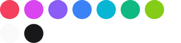
With value: null, no color is chosen yet.
import 'package:your_app/ui/fliin/components/color_swatch_picker/fl_color_swatch_picker.dart';
import 'package:flutter/widgets.dart';

class ColorSwatchPickerUnselectedExample extends StatefulWidget {
  const ColorSwatchPickerUnselectedExample({super.key});

  @override
  State<ColorSwatchPickerUnselectedExample> createState() => _ColorSwatchPickerUnselectedExampleState();
}

class _ColorSwatchPickerUnselectedExampleState extends State<ColorSwatchPickerUnselectedExample> {
  String? _color;

  @override
  Widget build(BuildContext context) {
    return FlColorSwatchPicker<String>(
      semanticLabel: 'Color',
      value: _color,
      onChanged: (value) => setState(() => _color = value),
      items: _colors,
    );
  }
}

/// The colors to choose from, each with the name the screen reader says.
const _colors = [
  FlColorSwatchItem(value: 'rose', color: Color(0xFFF43F5E), label: 'Rose'),
  FlColorSwatchItem(value: 'fuchsia', color: Color(0xFFD946EF), label: 'Fuchsia'),
  FlColorSwatchItem(value: 'violet', color: Color(0xFF8B5CF6), label: 'Violet'),
  FlColorSwatchItem(value: 'blue', color: Color(0xFF3B82F6), label: 'Blue'),
  FlColorSwatchItem(value: 'cyan', color: Color(0xFF06B6D4), label: 'Cyan'),
  FlColorSwatchItem(value: 'emerald', color: Color(0xFF10B981), label: 'Emerald'),
  FlColorSwatchItem(value: 'lime', color: Color(0xFF84CC16), label: 'Lime'),
  FlColorSwatchItem(value: 'white', color: Color(0xFFFAFAFA), label: 'White'),
  FlColorSwatchItem(value: 'black', color: Color(0xFF18181B), label: 'Black'),
];Disabled
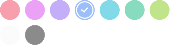
enabled: false keeps the choice visible and locks the swatches.
import 'package:your_app/ui/fliin/components/color_swatch_picker/fl_color_swatch_picker.dart';
import 'package:flutter/widgets.dart';

class ColorSwatchPickerDisabledExample extends StatefulWidget {
  const ColorSwatchPickerDisabledExample({super.key});

  @override
  State<ColorSwatchPickerDisabledExample> createState() => _ColorSwatchPickerDisabledExampleState();
}

class _ColorSwatchPickerDisabledExampleState extends State<ColorSwatchPickerDisabledExample> {
  String? _color = 'blue';

  @override
  Widget build(BuildContext context) {
    return FlColorSwatchPicker<String>(
      semanticLabel: 'Color',
      value: _color,
      enabled: false,
      onChanged: (value) => setState(() => _color = value),
      items: _colors,
    );
  }
}

/// The colors to choose from, each with the name the screen reader says.
const _colors = [
  FlColorSwatchItem(value: 'rose', color: Color(0xFFF43F5E), label: 'Rose'),
  FlColorSwatchItem(value: 'fuchsia', color: Color(0xFFD946EF), label: 'Fuchsia'),
  FlColorSwatchItem(value: 'violet', color: Color(0xFF8B5CF6), label: 'Violet'),
  FlColorSwatchItem(value: 'blue', color: Color(0xFF3B82F6), label: 'Blue'),
  FlColorSwatchItem(value: 'cyan', color: Color(0xFF06B6D4), label: 'Cyan'),
  FlColorSwatchItem(value: 'emerald', color: Color(0xFF10B981), label: 'Emerald'),
  FlColorSwatchItem(value: 'lime', color: Color(0xFF84CC16), label: 'Lime'),
  FlColorSwatchItem(value: 'white', color: Color(0xFFFAFAFA), label: 'White'),
  FlColorSwatchItem(value: 'black', color: Color(0xFF18181B), label: 'Black'),
];Stack
FlColorSwatchLayout.stack lines the swatches up in a column, beside a preview or in a narrow toolbar.

import 'package:your_app/ui/fliin/components/color_swatch_picker/fl_color_swatch_picker.dart';
import 'package:flutter/widgets.dart';

class ColorSwatchPickerStackExample extends StatefulWidget {
  const ColorSwatchPickerStackExample({super.key});

  @override
  State<ColorSwatchPickerStackExample> createState() => _ColorSwatchPickerStackExampleState();
}

class _ColorSwatchPickerStackExampleState extends State<ColorSwatchPickerStackExample> {
  String? _color = 'blue';

  @override
  Widget build(BuildContext context) {
    return FlColorSwatchPicker<String>(
      semanticLabel: 'Highlight color',
      value: _color,
      layout: FlColorSwatchLayout.stack,
      size: FlColorSwatchSize.sm,
      onChanged: (value) => setState(() => _color = value),
      items: const [
        FlColorSwatchItem(value: 'rose', color: Color(0xFFF43F5E), label: 'Rose'),
        FlColorSwatchItem(value: 'amber', color: Color(0xFFF59E0B), label: 'Amber'),
        FlColorSwatchItem(value: 'emerald', color: Color(0xFF10B981), label: 'Emerald'),
        FlColorSwatchItem(value: 'blue', color: Color(0xFF3B82F6), label: 'Blue'),
      ],
    );
  }
}Usage
The code the reference images render:
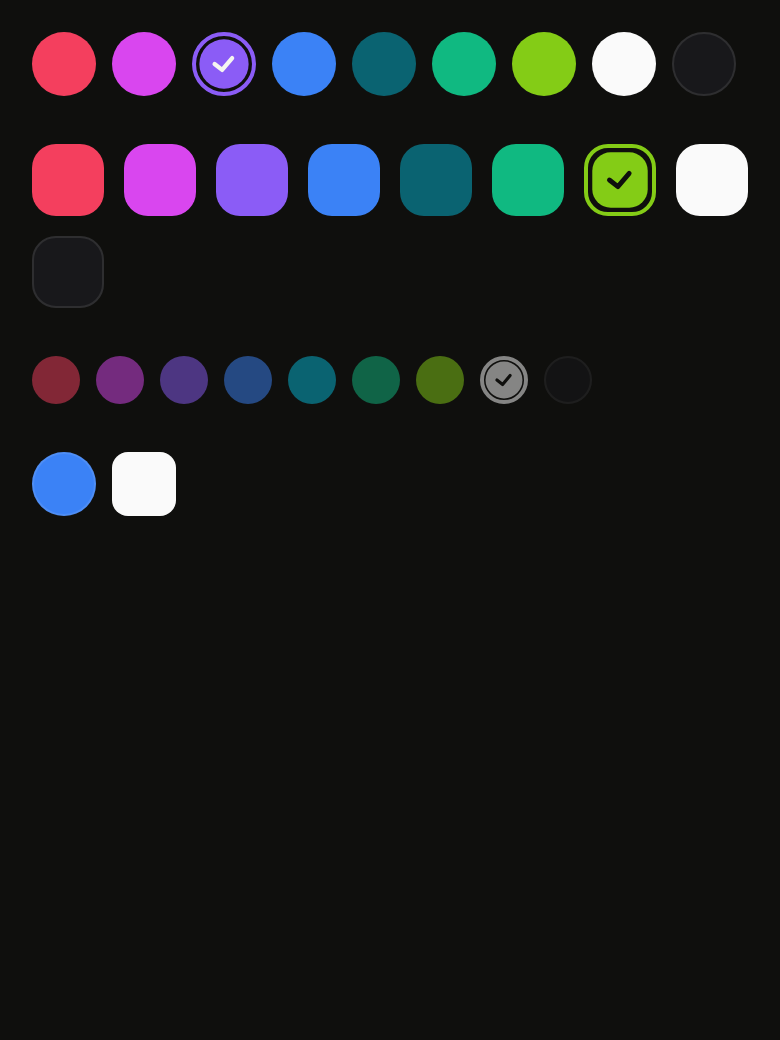
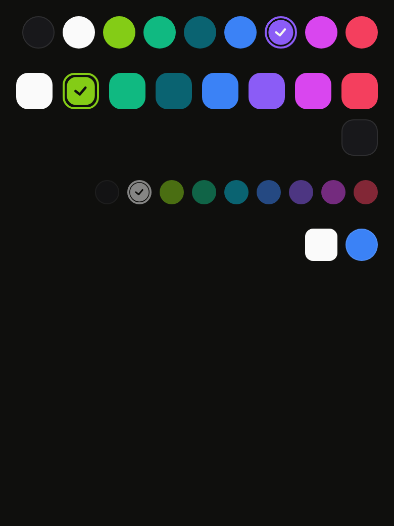
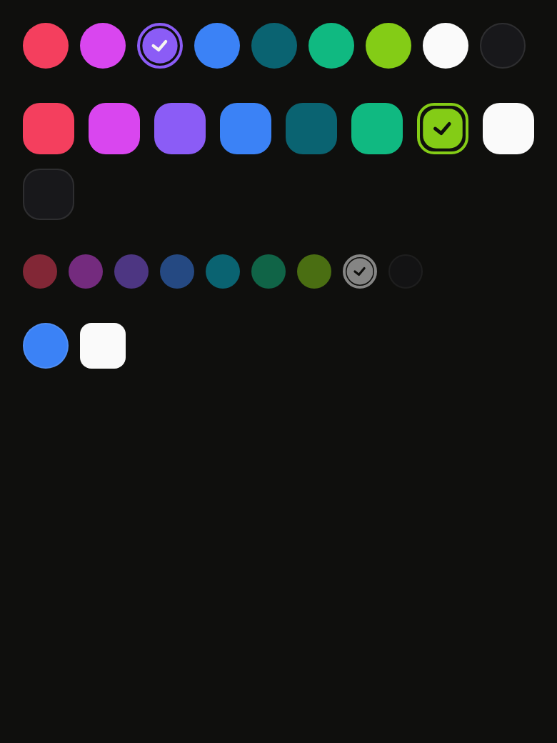
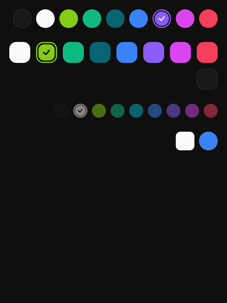
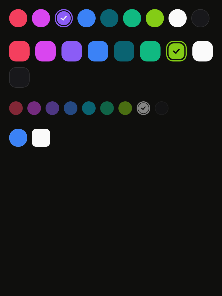
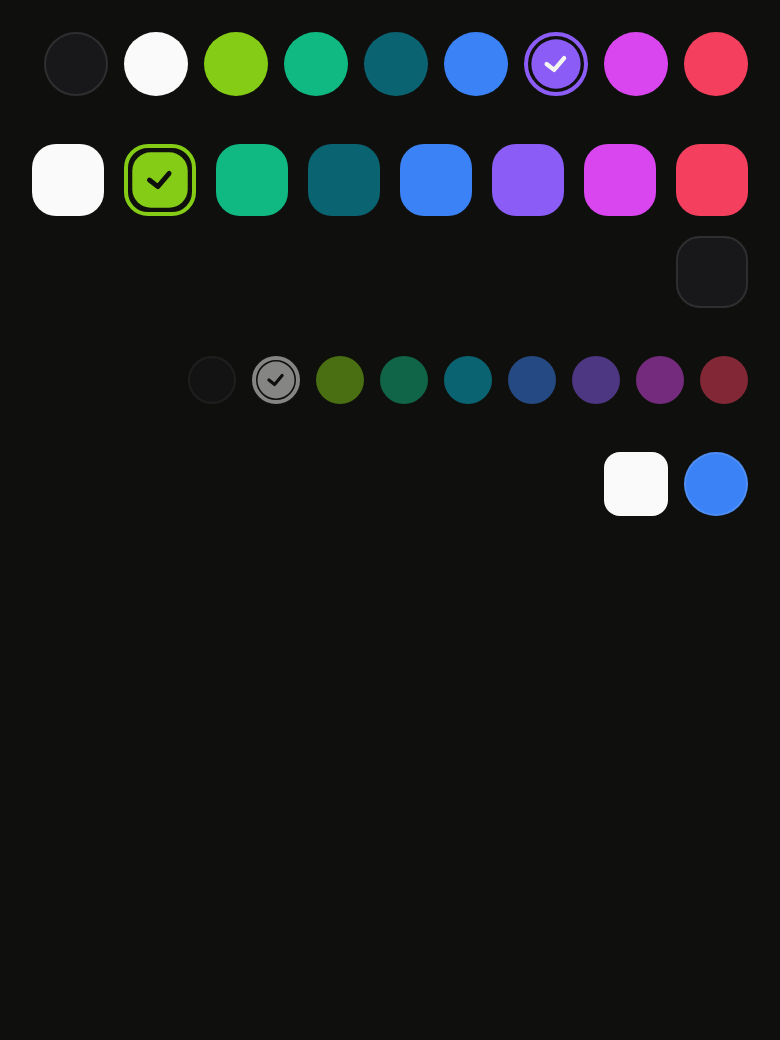
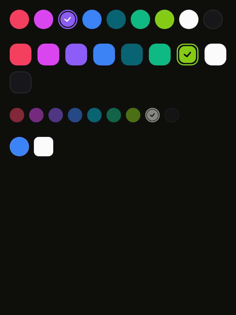
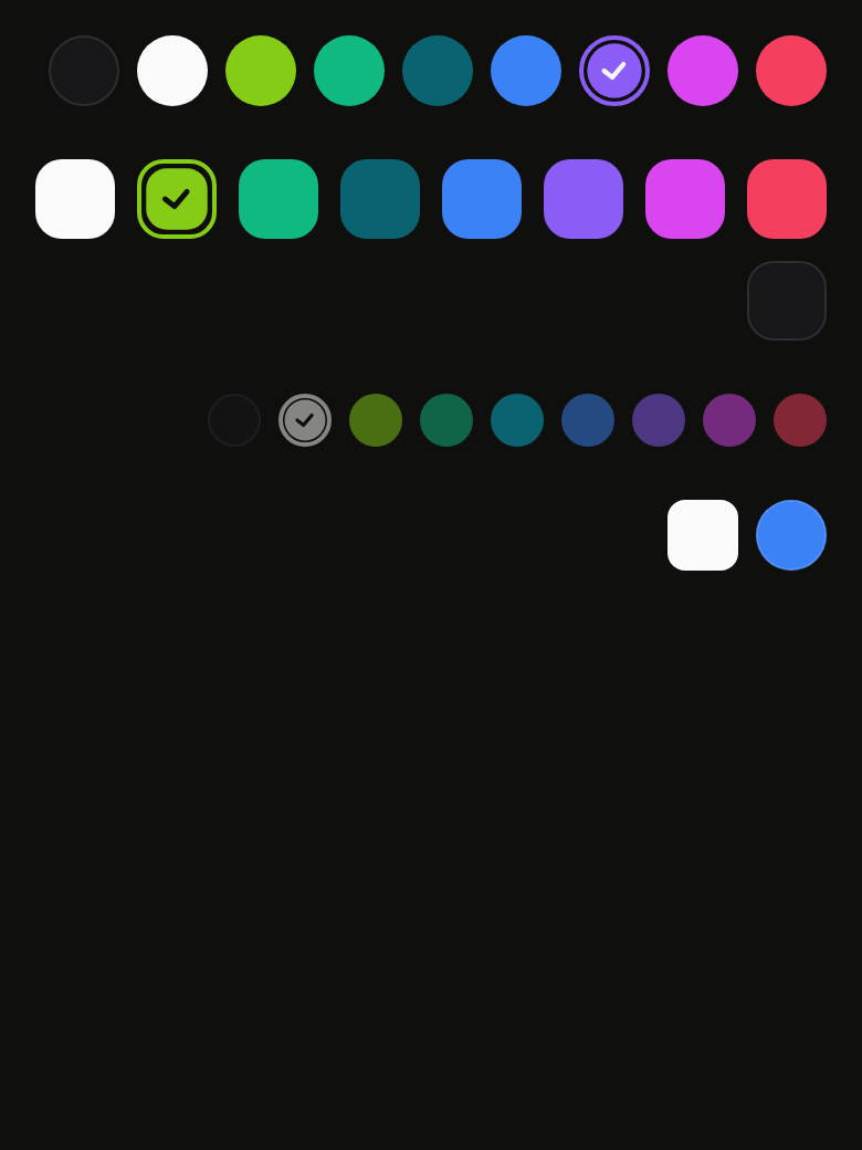
Localizations(locale: Locale'en', delegates: const [DefaultWidgetsLocalizations.delegate], child: Directionality(textDirection: variant.dir, child: ColoredBox(color: FlScope.of(context).colors.surface, child: Padding(padding: EdgeInsetsDirectional.all(FlScope.of(context).space.lg), child: Column(crossAxisAlignment: CrossAxisAlignment.start, spacing: FlScope.of(context).space.xl, children: [FlColorSwatchPicker<String>(semanticLabel: 'Color', value: 'Purple', onChanged: (_) {}, items: [for (final (fr, ar, color) in const [('Pink', 'وردي', 0xFFF43F5E), ('Fuchsia', 'فوشيا', 0xFFD946EF), ('Purple', 'بنفسجي', 0xFF8B5CF6), ('Blue', 'أزرق', 0xFF3B82F6), ('Cyan', 'سماوي', 0xFF06B6D4), ('Emerald', 'زمردي', 0xFF10B981), ('Lime', 'ليموني', 0xFF84CC16), ('White', 'أبيض', 0xFFFAFAFA), ('Black', 'أسود', 0xFF18181B)]) FlColorSwatchItem(value: fr, color: Color(color), label: fr, disabled: fr == 'Cyan')]), FlColorSwatchPicker<String>(semanticLabel: 'Label color', value: 'Lime', size: FlColorSwatchSize.lg, shape: FlColorSwatchShape.square, onChanged: (_) {}, items: [for (final (fr, ar, color) in const [('Pink', 'وردي', 0xFFF43F5E), ('Fuchsia', 'فوشيا', 0xFFD946EF), ('Purple', 'بنفسجي', 0xFF8B5CF6), ('Blue', 'أزرق', 0xFF3B82F6), ('Cyan', 'سماوي', 0xFF06B6D4), ('Emerald', 'زمردي', 0xFF10B981), ('Lime', 'ليموني', 0xFF84CC16), ('White', 'أبيض', 0xFFFAFAFA), ('Black', 'أسود', 0xFF18181B)]) FlColorSwatchItem(value: fr, color: Color(color), label: fr, disabled: fr == 'Cyan')]), FlColorSwatchPicker<String>(semanticLabel: 'Calendar color', value: 'White', size: FlColorSwatchSize.sm, enabled: false, onChanged: (_) {}, items: [for (final (fr, ar, color) in const [('Pink', 'وردي', 0xFFF43F5E), ('Fuchsia', 'فوشيا', 0xFFD946EF), ('Purple', 'بنفسجي', 0xFF8B5CF6), ('Blue', 'أزرق', 0xFF3B82F6), ('Cyan', 'سماوي', 0xFF06B6D4), ('Emerald', 'زمردي', 0xFF10B981), ('Lime', 'ليموني', 0xFF84CC16), ('White', 'أبيض', 0xFFFAFAFA), ('Black', 'أسود', 0xFF18181B)]) FlColorSwatchItem(value: fr, color: Color(color), label: fr, disabled: fr == 'Cyan')]), Row(spacing: FlScope.of(context).space.sm, children: [FlColorSwatch(color: const Color(0xFF3B82F6), label: 'Blue', FlColorSwatch(color: const Color(0xFFFAFAFA), label: 'White', shape: FlColorSwatchShape.square)])])))))API
FlColorSwatchLayout: enum {wrap, stack}
FlColorSwatchLayout.wrap: static final FlColorSwatchLayout
FlColorSwatchLayout.stack: static final FlColorSwatchLayout
FlColorSwatchItem: class<T>
FlColorSwatchItem.new: const new({required T value, required Color color, required String label, bool disabled})
FlColorSwatchItem.value: get T
FlColorSwatchItem.color: get Color
FlColorSwatchItem.label: get String
FlColorSwatchItem.disabled: get bool
FlColorSwatchPicker: class<T> extends StatelessWidget
FlColorSwatchPicker.new: const new({super.key, required String semanticLabel, required T? value, required ValueChanged<T> onChanged, required List<FlColorSwatchItem<T>> items, FlColorSwatchSize size, FlColorSwatchShape shape, FlColorSwatchLayout layout, bool enabled})
FlColorSwatchPicker.semanticLabel: get String
FlColorSwatchPicker.value: get T?
FlColorSwatchPicker.onChanged: get ValueChanged<T>
FlColorSwatchPicker.items: get List<FlColorSwatchItem<T>>
FlColorSwatchPicker.size: get FlColorSwatchSize
FlColorSwatchPicker.shape: get FlColorSwatchShape
FlColorSwatchPicker.layout: get FlColorSwatchLayout
FlColorSwatchPicker.enabled: get bool
FlColorSwatchPicker.build: Widget(BuildContext context)Reference renders
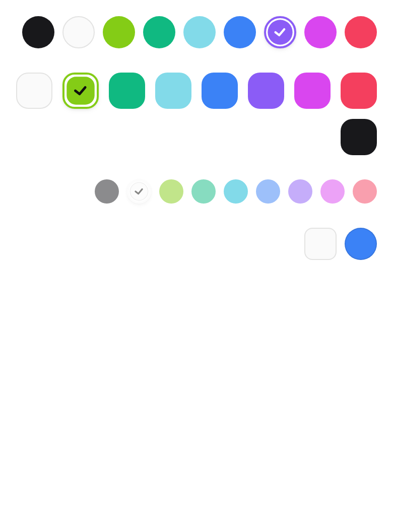
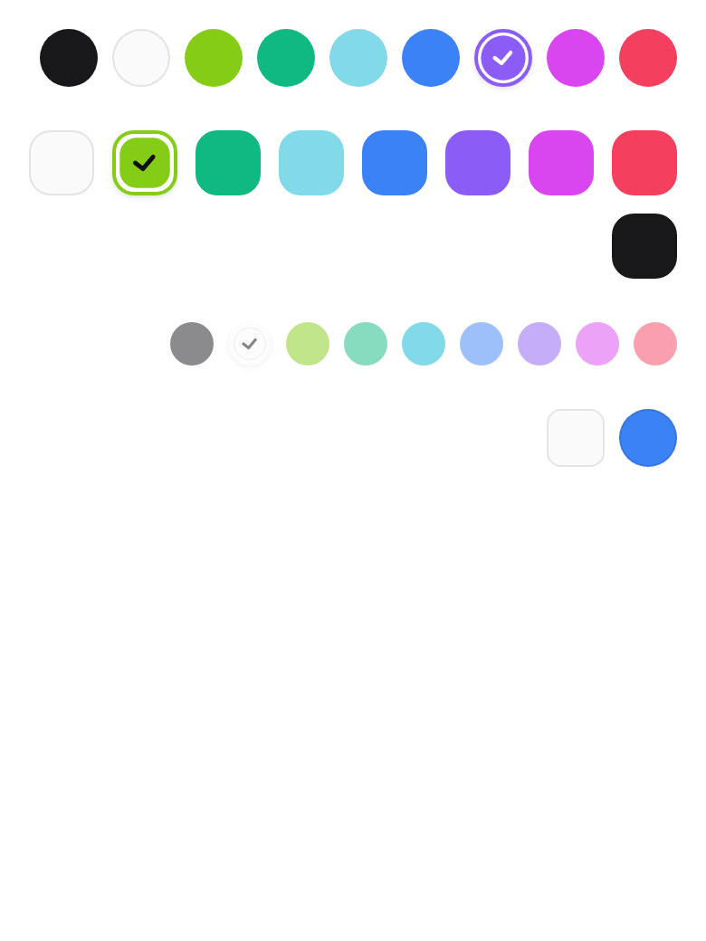
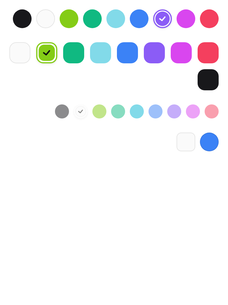
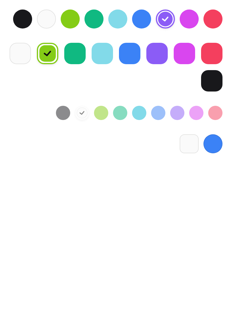
The 16 images published with version 0.3.0, rendered by the shared harness on macOS with Flutter 3.47.7. fliin verify color-swatch-picker compares your copy to them.
Use it to
- pick a product colour from a palette
- give a calendar its own colour
- offer colour dots to tap
- show which shade is chosen
- give each shade a name for screen readers
- Not for
- an option with a text label: use radio buttons (radio)
- a continuous value set by hand, such as an opacity: use a slider (slider)
- an option you check or uncheck: use a checkbox (checkbox)
- States
Source
The files fliin add color-swatch-picker copies into your app, before your prefix and imports are applied.
color_swatch_picker/fl_color_swatch_picker.dart
// Modified from the ColorSwatchPicker and ColorSwatch of HeroUI React v3,
// Copyright 2020 Next UI Inc., licensed under the MIT license below and under
// Apache 2.0: https://www.apache.org/licenses/LICENSE-2.0
//
// Permission is hereby granted, free of charge, to any person obtaining a copy
// of this software and associated documentation files (the "Software"), to
// deal in the Software without restriction, including without limitation the
// rights to use, copy, modify, merge, publish, distribute, sublicense, and/or
// sell copies of the Software, and to permit persons to whom the Software is
// furnished to do so, subject to the following conditions:
//
// The above copyright notice and this permission notice shall be included in
// all copies or substantial portions of the Software.
//
// THE SOFTWARE IS PROVIDED "AS IS", WITHOUT WARRANTY OF ANY KIND, EXPRESS OR
// IMPLIED, INCLUDING BUT NOT LIMITED TO THE WARRANTIES OF MERCHANTABILITY,
// FITNESS FOR A PARTICULAR PURPOSE AND NONINFRINGEMENT. IN NO EVENT SHALL THE
// AUTHORS OR COPYRIGHT HOLDERS BE LIABLE FOR ANY CLAIM, DAMAGES OR OTHER
// LIABILITY, WHETHER IN AN ACTION OF CONTRACT, TORT OR OTHERWISE, ARISING
// FROM, OUT OF OR IN CONNECTION WITH THE SOFTWARE OR THE USE OR OTHER DEALINGS
// IN THE SOFTWARE.
//
// Also modified from the theme colors of HeroUI Native 1.0.10, Copyright 2025
// NextUI Inc., licensed under Apache 2.0.
import 'dart:math' as math;

import 'package:flutter/widgets.dart';
import 'package:fliin_ui/components/color_swatch/fl_color_swatch.dart';
import 'package:fliin_ui/core/fliin.dart';

// The swatch's types stay importable from the picker, which they were part of.
export 'package:fliin_ui/components/color_swatch/fl_color_swatch.dart'
    show FlColorSwatch, FlColorSwatchShape, FlColorSwatchSize;

// color-swatch-picker.css: a swatch grows to 1.1 on hover.
const double _hoverScale = 1.1;

/// Selected, the swatch shrinks to 0.77 inside its ring, and a check a third of its
/// side grows in.
const double _selectedScale = 0.77;
const double _checkSide = 1 / 3;
const double _checkContrast = 3;

// The picker draws this rule only below this contrast with the background:
// common tints are far from it (1.81 at least), a palette's white and black
// below it (1.04 and 1.14).
const double _edgeBelow = 1.5;

/// The layout of the swatches of a [FlColorSwatchPicker].
enum FlColorSwatchLayout {
  /// In a row that wraps. The default.
  wrap,

  /// In a column (`stack`).
  stack,
}

/// The radius of a square swatch, according to its size.
double _squareRadius(FlShapeTokens shape, FlColorSwatchSize size) => switch (size) {
  FlColorSwatchSize.xs => shape.radiusMd,
  FlColorSwatchSize.sm => shape.radiusLg,
  FlColorSwatchSize.md || FlColorSwatchSize.lg || FlColorSwatchSize.xl => shape.radiusXl,
};

/// A tint of a [FlColorSwatchPicker]: the value it gives to the selection,
/// its color and its name.
class FlColorSwatchItem<T> {
  /// The tint [value], painted in [color], named [label].
  const FlColorSwatchItem({required this.value, required this.color, required this.label, this.disabled = false});

  /// The value the tint gives to the selection.
  final T value;

  /// The painted color; preferably opaque: a translucent color is laid
  /// over the background.
  final Color color;

  /// The tint's name, given by the app ("Midnight blue"): the screen reader
  /// reads it, since the color alone says nothing.
  final String label;

  /// True: this tint alone cannot be selected, and fades.
  final bool disabled;
}

/// The choice of a tint from a provided palette: the color of a product, a label or a calendar.
///
/// The selected tint is recognizable by more than its color: it shrinks inside a ring of its tint drawn at the edge of its box,
/// lifted by the `field` shadow, and a check grows in on it (in `surface`
/// or `onSurface`, whichever stands out more). Each swatch is tappable within a 44 or 48
/// target. A tint that
/// blends with the background (below 1.5:1) carries the inner rule of
/// `FlColorSwatch`, to be visible.
///
/// The screen reader reads a radio button group named [semanticLabel], each
/// tint under its name. On the keyboard, a single Tab stop; the arrows
/// select the neighboring tint and wrap back to the start after the last,
/// Space selects the one that has the focus.
class FlColorSwatchPicker<T> extends StatelessWidget {
  /// The choice among [items], with the tint [value] selected.
  const FlColorSwatchPicker({
    super.key,
    required this.semanticLabel,
    required this.value,
    required this.onChanged,
    required this.items,
    this.size = FlColorSwatchSize.md,
    this.shape = FlColorSwatchShape.circle,
    this.layout = FlColorSwatchLayout.wrap,
    this.enabled = true,
  });

  /// The group's name for the screen reader ("Color").
  final String semanticLabel;

  /// The value of the selected tint, null if none is.
  final T? value;

  /// Receives the value of the tapped tint; the parent passes it back in
  /// [value].
  final ValueChanged<T> onChanged;

  /// The tints, in reading order.
  final List<FlColorSwatchItem<T>> items;

  /// The side of the swatches; `md` (32) by default.
  final FlColorSwatchSize size;

  /// Round by default.
  final FlColorSwatchShape shape;

  /// In a wrapping row by default, or in a column.
  final FlColorSwatchLayout layout;

  /// False: no tint can be selected, and each one fades.
  final bool enabled;

  @override
  Widget build(BuildContext context) {
    final theme = FlScope.of(context);
    final swatches = [
      for (final item in items)
        _Swatch<T>(
          key: ValueKey<T>(item.value),
          item: item,
          size: size,
          shape: shape,
          enabled: enabled && !item.disabled,
        ),
    ];
    // The canvas spaces the large swatches by 10, the others by 8.
    final gap = switch (size) {
      FlColorSwatchSize.lg || FlColorSwatchSize.xl => theme.space.xs * 2.5,
      _ => theme.space.sm,
    };
    return RadioGroup<T>(
      groupValue: value,
      onChanged: (next) {
        if (next != null) onChanged(next);
      },
      // No container: the name joins the radioGroup node that RadioGroup sets.
      child: Semantics(
        label: semanticLabel,
        child: switch (layout) {
          FlColorSwatchLayout.wrap => Wrap(spacing: gap, runSpacing: gap, children: swatches),
          FlColorSwatchLayout.stack => Column(mainAxisSize: MainAxisSize.min, spacing: gap, children: swatches),
        },
      ),
    );
  }
}

class _Swatch<T> extends StatefulWidget {
  const _Swatch({super.key, required this.item, required this.size, required this.shape, required this.enabled});

  final FlColorSwatchItem<T> item;
  final FlColorSwatchSize size;
  final FlColorSwatchShape shape;
  final bool enabled;

  @override
  State<_Swatch<T>> createState() => _SwatchState<T>();
}

class _SwatchState<T> extends State<_Swatch<T>> with SingleTickerProviderStateMixin {
  final FocusNode _focus = FocusNode();

  /// 0 unselected, 1 selected: the ring fades in over `short3`, along
  /// `easeOut`.
  late final AnimationController _selection = AnimationController(vsync: this);
  bool? _selected;

  void _follow(bool selected) {
    if (selected == _selected) return;
    final first = _selected == null;
    _selected = selected;
    final motion = FlMotion.of(context);
    if (first || motion.reduced) {
      _selection.value = selected ? 1 : 0;
      return;
    }
    _selection.animateTo(selected ? 1 : 0, duration: motion.tokens.short3);
  }

  @override
  void dispose() {
    _selection.dispose();
    _focus.dispose();
    super.dispose();
  }

  /// The WCAG contrast ratio between [other] and the tint laid over the background.
  double _contrast(Color other, FlColorTokens colors) {
    final tint = Color.alphaBlend(widget.item.color, colors.surface).computeLuminance();
    final l = other.computeLuminance();
    return l > tint ? (l + 0.05) / (tint + 0.05) : (tint + 0.05) / (l + 0.05);
  }

  @override
  Widget build(BuildContext context) {
    final theme = FlScope.of(context);
    final group = RadioGroup.maybeOf<T>(context);
    _follow(group?.groupValue == widget.item.value);
    final extent = widget.size.extent;
    final ring = widget.size.ring;
    final radius = _squareRadius(theme.shape, widget.size);
    final swatchShape = flColorSwatchOutline(widget.shape, radius);
    // The swatch's edge rule, only on a tint that blends with the
    // background: without it,
    // a white on the light background (1.04:1) is invisible.
    final edge = _contrast(theme.colors.surface, theme.colors) < _edgeBelow;
    // `data-light-color`: a white check, unless the tint is too light for
    // it (below 3:1), then a black one, from the theme's two poles.
    final light = theme.colors.surface.computeLuminance() > theme.colors.onSurface.computeLuminance()
        ? theme.colors.surface
        : theme.colors.onSurface;
    final dark = light == theme.colors.surface ? theme.colors.onSurface : theme.colors.surface;
    final check = _contrast(light, theme.colors) >= _checkContrast ? light : dark;
    return FlHitTarget(
      child: Semantics(
        label: widget.item.label,
        child: RawRadio<T>(
          value: widget.item.value,
          groupRegistry: group,
          enabled: widget.enabled && group != null,
          toggleable: false,
          focusNode: _focus,
          autofocus: false,
          mouseCursor: WidgetStateProperty.resolveWith(
            (states) => states.contains(WidgetState.disabled) ? MouseCursor.defer : SystemMouseCursors.click,
          ),
          builder: (context, state) {
            final hovered = state.states.contains(WidgetState.hovered) && !(state.value ?? false);
            final body = AnimatedBuilder(
              animation: _selection,
              builder: (context, _) {
                final t = theme.motion.easeOut.transform(_selection.value);
                final swatch = Transform.scale(
                  scale: (hovered ? _hoverScale : 1) * (1 - (1 - _selectedScale) * t),
                  child: FlColorSwatch(
                    color: widget.item.color,
                    label: null,
                    size: widget.size,
                    shape: widget.shape,
                    radius: radius,
                    edge: edge,
                  ),
                );
                if (t == 0) return swatch;
                return FlShadow(
                  layers: [
                    for (final layer in theme.shadows.field)
                      FlShadowLayer(
                        color: layer.color.withValues(alpha: layer.color.a * t),
                        offset: layer.offset,
                        blur: layer.blur,
                        spread: layer.spread,
                        inset: layer.inset,
                      ),
                  ],
                  shape: swatchShape,
                  child: CustomPaint(
                    painter: _RingPainter(
                      shape: widget.shape,
                      radius: radius,
                      width: ring,
                      color: widget.item.color.withValues(alpha: widget.item.color.a * t),
                    ),
                    foregroundPainter: _CheckPainter(progress: t, color: check),
                    child: swatch,
                  ),
                );
              },
            );
            return Opacity(
              opacity: widget.enabled ? 1 : theme.size.disabledOpacity,
              child: FlFocusRing(
                visible: state.states.contains(WidgetState.focused),
                borderRadius: BorderRadius.circular(widget.shape == FlColorSwatchShape.circle ? extent / 2 : radius),
                child: body,
              ),
            );
          },
        ),
      ),
    );
  }
}

/// The ring of the selected swatch, inside the edge of its box, [width]
/// thick (`border-2` of `color-swatch-picker__item`).
class _RingPainter extends CustomPainter {
  const _RingPainter({required this.shape, required this.radius, required this.width, required this.color});

  final FlColorSwatchShape shape;
  final double radius;
  final double width;
  final Color color;

  @override
  void paint(Canvas canvas, Size size) {
    final reach = -width / 2;
    final box = (Offset.zero & size).inflate(reach);
    final paint = Paint()
      ..color = color
      ..style = PaintingStyle.stroke
      ..strokeWidth = width;
    switch (shape) {
      case FlColorSwatchShape.circle:
        canvas.drawCircle(box.center, box.width / 2, paint);
      case FlColorSwatchShape.square:
        canvas.drawRRect(RRect.fromRectAndRadius(box, Radius.circular(math.max(0, radius + reach))), paint);
    }
  }

  @override
  bool shouldRepaint(_RingPainter oldDelegate) =>
      shape != oldDelegate.shape ||
      radius != oldDelegate.radius ||
      width != oldDelegate.width ||
      color != oldDelegate.color;
}

/// The check on the selected swatch, a third of its side, scaled in with
/// [progress].
class _CheckPainter extends CustomPainter {
  const _CheckPainter({required this.progress, required this.color});

  final double progress;
  final Color color;

  @override
  void paint(Canvas canvas, Size size) {
    if (progress <= 0) return;
    final side = size.shortestSide * _checkSide * progress;
    final center = size.center(Offset.zero);
    // The check of the checkbox (`polyline 1 9 7 14 15 4` in 17 by 18),
    // centered in a square of [side].
    final origin = center - Offset(side / 2, side / 2);
    Offset at(double x, double y) => origin + Offset(x / 17 * side, y / 18 * side);
    canvas.drawPath(
      Path()
        ..moveTo(at(1, 9).dx, at(1, 9).dy)
        ..lineTo(at(7, 14).dx, at(7, 14).dy)
        ..lineTo(at(15, 4).dx, at(15, 4).dy),
      Paint()
        ..style = PaintingStyle.stroke
        ..strokeWidth = side / 5
        ..strokeCap = StrokeCap.round
        ..strokeJoin = StrokeJoin.round
        ..color = color,
    );
  }

  @override
  bool shouldRepaint(_CheckPainter oldDelegate) => progress != oldDelegate.progress || color != oldDelegate.color;
}