Components / data-display
Card
Groups a header, a title, a description and actions on a shadowed surface: a product, an offer, an account summary.
Import
In a Flutter app where fliin init has run:
Examples
Default
An icon in FlCardHeader, a title and its description in FlCardBody, then a link in FlCardFooter: the card's children follow one another space.md apart.

import 'package:your_app/ui/fliin/components/card/fl_card.dart';
import 'package:your_app/ui/fliin/components/link_button/fl_link_button.dart';
import 'package:your_app/ui/fliin/core/fliin.dart';
import 'package:your_app/ui/fliin/icons/fl_icons.dart';
import 'package:flutter/widgets.dart';

class CardDefaultExample extends StatelessWidget {
  const CardDefaultExample({super.key});

  @override
  Widget build(BuildContext context) {
    final theme = FlScope.of(context);
    return FlCard(
      children: [
        FlCardHeader(
          children: [
            FlIcon(
              FlIcons.starFill,
              size: theme.size.spinnerMd,
              color: theme.colors.accent,
            ),
          ],
        ),
        const FlCardBody(
          children: [
            FlCardTitle('Become an Acme Creator!'),
            FlCardDescription(
              'Visit the Acme Creator Hub to sign up today and start earning '
              'credits from your fans and followers.',
            ),
          ],
        ),
        FlCardFooter(
          axis: Axis.horizontal,
          children: [
            FlLinkButton(
              label: 'Creator Hub',
              link: true,
              accent: true,
              onPressed: () {},
            ),
          ],
        ),
      ],
    );
  }
}Variants
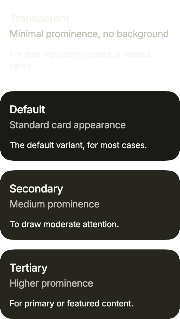
Four surfaces: primary by default, raised and shadowed; secondary and tertiary, flatter, for a card inside another surface; transparent, which keeps only the padding, for the least important content.
import 'package:your_app/ui/fliin/components/card/fl_card.dart';
import 'package:your_app/ui/fliin/components/surface/fl_surface.dart';
import 'package:your_app/ui/fliin/components/text/fl_text.dart';
import 'package:your_app/ui/fliin/core/fliin.dart';
import 'package:flutter/widgets.dart';

class CardVariantsExample extends StatelessWidget {
  const CardVariantsExample({super.key});

  @override
  Widget build(BuildContext context) {
    return Column(
      mainAxisSize: MainAxisSize.min,
      crossAxisAlignment: CrossAxisAlignment.stretch,
      spacing: FlScope.of(context).space.lg,
      children: [
        for (final (variant, title, description, content) in const [
          (
            FlSurfaceVariant.transparent,
            'Transparent',
            'Minimal prominence, no background',
            'For less important content or nested cards.',
          ),
          (
            FlSurfaceVariant.primary,
            'Default',
            'Standard card appearance',
            'The default variant, for most cases.',
          ),
          (
            FlSurfaceVariant.secondary,
            'Secondary',
            'Medium prominence',
            'To draw moderate attention.',
          ),
          (
            FlSurfaceVariant.tertiary,
            'Tertiary',
            'Higher prominence',
            'For primary or featured content.',
          ),
        ])
          FlCard(
            variant: variant,
            children: [
              FlCardBody(
                children: [FlCardTitle(title), FlCardDescription(description)],
              ),
              FlText(content, type: FlTextType.bodySm),
            ],
          ),
      ],
    );
  }
}Horizontal
axis: Axis.horizontal puts the media at the start, the content taking the rest of the width; trailing pins a close button in the top end corner, and the title keeps clear of it.

import 'package:your_app/ui/fliin/components/button/fl_button.dart';
import 'package:your_app/ui/fliin/components/card/fl_card.dart';
import 'package:your_app/ui/fliin/components/close_button/fl_close_button.dart';
import 'package:your_app/ui/fliin/components/text/fl_text.dart';
import 'package:your_app/ui/fliin/core/fliin.dart';
import 'package:your_app/ui/fliin/icons/fl_icons.dart';
import 'package:flutter/widgets.dart';

class CardHorizontalExample extends StatelessWidget {
  const CardHorizontalExample({super.key});

  @override
  Widget build(BuildContext context) {
    final space = FlScope.of(context).space;
    return FlCard(
      axis: Axis.horizontal,
      media: const FlCardMedia(width: 96, height: 96, child: _Picture()),
      trailing: FlCloseButton(label: 'Close banner', onPressed: () {}),
      children: [
        FlCardBody(
          spacing: space.xs,
          children: const [
            FlCardTitle('Become an ACME Creator!'),
            FlCardDescription('Start earning credits from your fans.'),
          ],
        ),
        FlCardFooter(
          axis: Axis.horizontal,
          spacing: space.sm,
          children: [
            Column(
              mainAxisSize: MainAxisSize.min,
              crossAxisAlignment: CrossAxisAlignment.start,
              children: [
                FlText(
                  'Only 10 spots',
                  type: FlTextType.bodySm,
                  weight: FlScope.of(context).tokens.typography.weight.medium,
                ),
                const FlText(
                  'Ends Oct 10.',
                  type: FlTextType.bodyXs,
                  tone: FlTextTone.muted,
                ),
              ],
            ),
            FlButton(
              label: 'Apply now',
              size: FlButtonSize.sm,
              onPressed: () {},
            ),
          ],
        ),
      ],
    );
  }
}

/// Stands in for a photo: put an `Image.asset(…, fit: BoxFit.cover)` here.
class _Picture extends StatelessWidget {
  const _Picture();

  @override
  Widget build(BuildContext context) {
    final theme = FlScope.of(context);
    return DecoratedBox(
      decoration: BoxDecoration(
        gradient: LinearGradient(
          begin: AlignmentDirectional.topStart,
          end: AlignmentDirectional.bottomEnd,
          colors: [theme.colors.dangerSoft, theme.colors.warningSoft],
        ),
      ),
      child: Center(
        child: FlIcon(
          FlIcons.heartFill,
          size: theme.size.spinnerLg,
          color: theme.colors.danger,
        ),
      ),
    );
  }
}With avatar
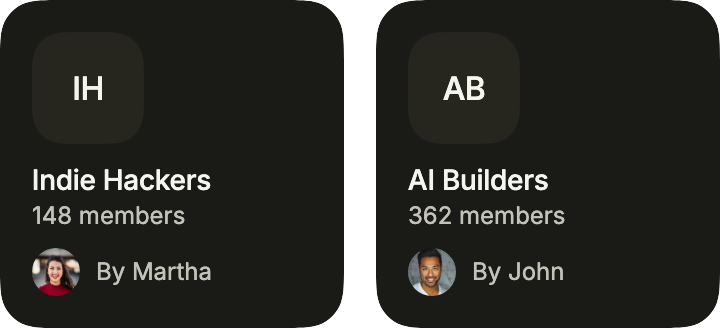
Two communities side by side: a rounded avatar as the logo, then the name and the count, and the author under them in a footer that keeps its children at the start. spacing tightens the card to space.sm.
import 'package:your_app/ui/fliin/components/avatar/fl_avatar.dart';
import 'package:your_app/ui/fliin/components/card/fl_card.dart';
import 'package:your_app/ui/fliin/components/text/fl_text.dart';
import 'package:your_app/ui/fliin/core/fliin.dart';
import 'package:flutter/widgets.dart';

class CardWithAvatarExample extends StatelessWidget {
  const CardWithAvatarExample({super.key});

  @override
  Widget build(BuildContext context) {
    final theme = FlScope.of(context);
    final space = theme.space;
    return Row(
      crossAxisAlignment: CrossAxisAlignment.start,
      spacing: space.lg,
      children: [
        for (final (logo, name, members, photo, author) in const [
          ('IH', 'Indie Hackers', '148 members', 1, 'Martha'),
          ('AB', 'AI Builders', '362 members', 2, 'John'),
        ])
          Expanded(
            child: FlCard(
              spacing: space.sm,
              children: [
                FlCardHeader(
                  children: [
                    FlAvatar(
                      initials: logo,
                      semanticLabel: name,
                      size: FlAvatarSize.lg,
                      dimension: 56,
                      radius: theme.shape.radiusXxl,
                      variant: FlAvatarVariant.soft,
                    ),
                  ],
                ),
                FlCardBody(
                  children: [
                    FlText(
                      name,
                      type: FlTextType.bodySm,
                      weight: theme.tokens.typography.weight.medium,
                    ),
                    FlText(
                      members,
                      type: FlTextType.bodyXs,
                      tone: FlTextTone.muted,
                    ),
                  ],
                ),
                FlCardFooter(
                  axis: Axis.horizontal,
                  alignment: WrapAlignment.start,
                  spacing: space.sm,
                  children: [
                    FlAvatar(
                      image: AssetImage('images/people/$photo.jpg'),
                      initials: author[0],
                      semanticLabel: author,
                      size: FlAvatarSize.sm,
                      dimension: 24,
                    ),
                    FlText(
                      'By $author',
                      type: FlTextType.bodyXs,
                      tone: FlTextTone.muted,
                    ),
                  ],
                ),
              ],
            ),
          ),
      ],
    );
  }
}With images
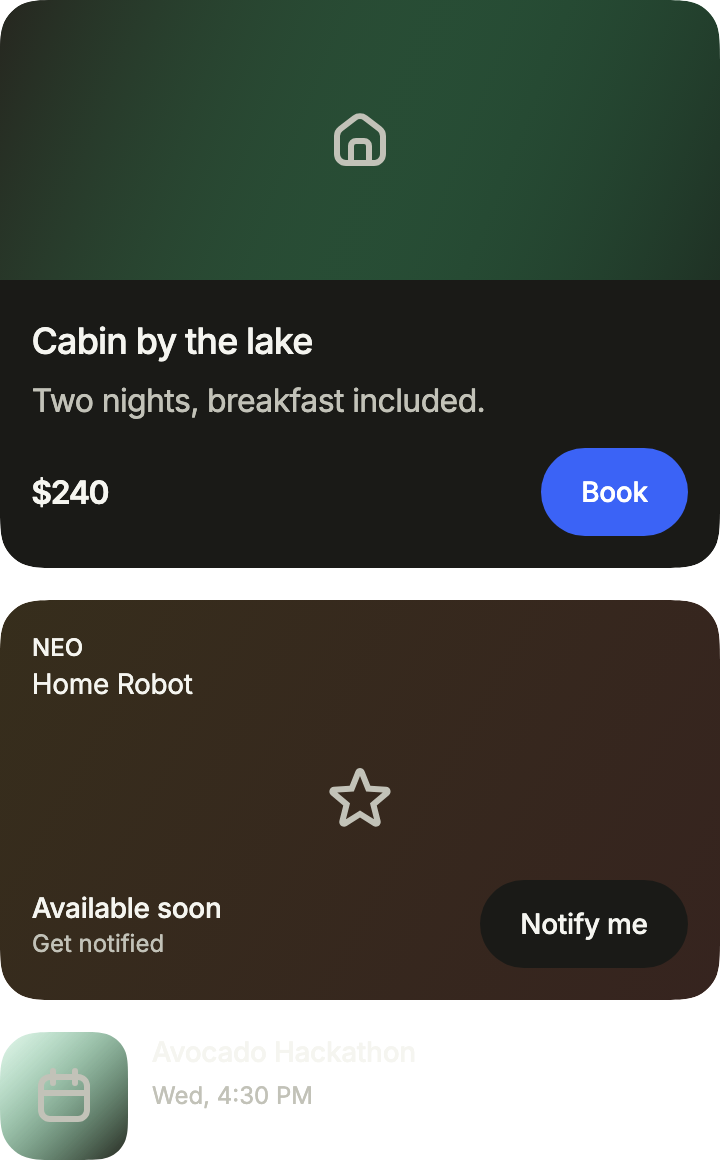
Images three ways: a FlCardMedia with bleed reaches the card's edges above the content; a background fills the whole card, the content over it, a Spacer pushing the footer down in a card of fixed height; and a transparent card lays a small image beside its text.
import 'package:your_app/ui/fliin/components/button/fl_button.dart';
import 'package:your_app/ui/fliin/components/card/fl_card.dart';
import 'package:your_app/ui/fliin/components/surface/fl_surface.dart';
import 'package:your_app/ui/fliin/components/text/fl_text.dart';
import 'package:your_app/ui/fliin/core/fliin.dart';
import 'package:your_app/ui/fliin/icons/fl_icons.dart';
import 'package:flutter/widgets.dart';

class CardWithImagesExample extends StatelessWidget {
  const CardWithImagesExample({super.key});

  @override
  Widget build(BuildContext context) {
    final theme = FlScope.of(context);
    final space = theme.space;
    final medium = theme.tokens.typography.weight.medium;
    return Column(
      mainAxisSize: MainAxisSize.min,
      crossAxisAlignment: CrossAxisAlignment.stretch,
      spacing: space.lg,
      children: [
        FlCard(
          media: FlCardMedia(
            bleed: true,
            height: 140,
            child: _Picture(
              colors: [theme.colors.accentSoft, theme.colors.successSoft],
              icon: FlIcons.house,
            ),
          ),
          children: [
            FlCardBody(
              spacing: space.xs,
              children: const [
                FlCardTitle('Cabin by the lake'),
                FlCardDescription('Two nights, breakfast included.'),
              ],
            ),
            FlCardFooter(
              axis: Axis.horizontal,
              spacing: space.sm,
              children: [
                FlText(r'$240', type: FlTextType.h6),
                FlButton(
                  label: 'Book',
                  size: FlButtonSize.sm,
                  onPressed: () {},
                ),
              ],
            ),
          ],
        ),
        SizedBox(
          // A fixed height that still grows with the text size.
          height: MediaQuery.textScalerOf(context).scale(200),
          child: FlCard(
            background: _Picture(
              colors: [theme.colors.warningSoft, theme.colors.dangerSoft],
              icon: FlIcons.star,
            ),
            children: [
              FlCardBody(
                children: [
                  FlText('NEO', type: FlTextType.bodyXs, weight: medium),
                  const FlText('Home Robot', type: FlTextType.bodySm),
                ],
              ),
              const Spacer(),
              FlCardFooter(
                axis: Axis.horizontal,
                spacing: space.sm,
                children: [
                  Column(
                    mainAxisSize: MainAxisSize.min,
                    crossAxisAlignment: CrossAxisAlignment.start,
                    children: [
                      FlText(
                        'Available soon',
                        type: FlTextType.bodySm,
                        weight: medium,
                      ),
                      const FlText(
                        'Get notified',
                        type: FlTextType.bodyXs,
                        tone: FlTextTone.muted,
                      ),
                    ],
                  ),
                  FlButton(
                    label: 'Notify me',
                    size: FlButtonSize.sm,
                    variant: FlButtonVariant.tertiary,
                    onPressed: () {},
                  ),
                ],
              ),
            ],
          ),
        ),
        FlCard(
          variant: FlSurfaceVariant.transparent,
          padding: EdgeInsets.zero,
          axis: Axis.horizontal,
          media: FlCardMedia(
            width: 64,
            height: 64,
            child: _Picture(
              colors: [theme.colors.successSoft, theme.colors.accentSoft],
              icon: FlIcons.calendar,
            ),
          ),
          children: [
            FlCardBody(
              spacing: space.xs,
              children: [
                FlText(
                  'Avocado Hackathon',
                  type: FlTextType.bodySm,
                  weight: medium,
                ),
                const FlText(
                  'Wed, 4:30 PM',
                  type: FlTextType.bodyXs,
                  tone: FlTextTone.muted,
                ),
              ],
            ),
          ],
        ),
      ],
    );
  }
}

/// Stands in for a photo: put an `Image.asset(…, fit: BoxFit.cover)` here.
class _Picture extends StatelessWidget {
  const _Picture({required this.colors, required this.icon});

  final List<Color> colors;
  final FlIconData icon;

  @override
  Widget build(BuildContext context) {
    final theme = FlScope.of(context);
    return DecoratedBox(
      decoration: BoxDecoration(
        gradient: LinearGradient(
          begin: AlignmentDirectional.topStart,
          end: AlignmentDirectional.bottomEnd,
          colors: colors,
        ),
      ),
      child: Center(
        child: FlIcon(
          icon,
          size: theme.size.spinnerLg,
          color: theme.colors.onSurfaceMuted,
        ),
      ),
    );
  }
}With form
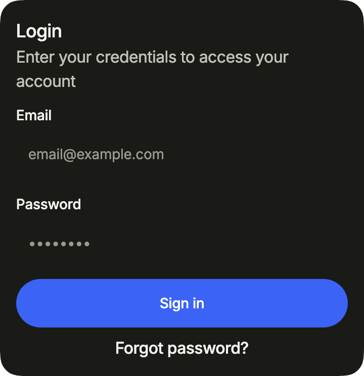
A sign-in form: white, shadowed fields space.lg apart in a second body, then the action and a link stacked in the footer.
import 'package:your_app/ui/fliin/components/button/fl_button.dart';
import 'package:your_app/ui/fliin/components/card/fl_card.dart';
import 'package:your_app/ui/fliin/components/link_button/fl_link_button.dart';
import 'package:your_app/ui/fliin/components/text_field/fl_text_field.dart';
import 'package:your_app/ui/fliin/core/fliin.dart';
import 'package:flutter/widgets.dart';

class CardWithFormExample extends StatelessWidget {
  const CardWithFormExample({super.key});

  @override
  Widget build(BuildContext context) {
    final space = FlScope.of(context).space;
    return FlCard(
      children: [
        const FlCardBody(
          children: [
            FlCardTitle('Login'),
            FlCardDescription('Enter your credentials to access your account'),
          ],
        ),
        FlCardBody(
          spacing: space.lg,
          children: const [
            FlTextField(
              label: 'Email',
              placeholder: '[email protected]',
              keyboardType: TextInputType.emailAddress,
            ),
            FlTextField(
              label: 'Password',
              placeholder: '••••••••',
              obscureText: true,
            ),
          ],
        ),
        FlCardFooter(
          spacing: space.sm,
          children: [
            FlButton(label: 'Sign in', onPressed: () {}),
            Center(
              child: FlLinkButton(label: 'Forgot password?', onPressed: () {}),
            ),
          ],
        ),
      ],
    );
  }
}Custom styles
An offer that stands out: an accent background gradient behind the content, a chip and an icon tile in the header, a list of features, and two stacked actions, only the first in the accent.

import 'package:your_app/ui/fliin/components/button/fl_button.dart';
import 'package:your_app/ui/fliin/components/card/fl_card.dart';
import 'package:your_app/ui/fliin/components/chip/fl_chip.dart';
import 'package:your_app/ui/fliin/components/text/fl_text.dart';
import 'package:your_app/ui/fliin/core/fliin.dart';
import 'package:your_app/ui/fliin/icons/fl_icons.dart';
import 'package:flutter/widgets.dart';

class CardCustomStylesExample extends StatelessWidget {
  const CardCustomStylesExample({super.key});

  static const _features = [
    'Unlimited projects and collaborators',
    'Priority support with 24h response',
    'Advanced analytics and exports',
  ];

  @override
  Widget build(BuildContext context) {
    final theme = FlScope.of(context);
    final colors = theme.colors;
    final space = theme.space;
    // A light tint of the accent, at 12 %.
    final tint = colors.accent.withValues(alpha: 0.12);
    return FlCard(
      background: DecoratedBox(
        decoration: BoxDecoration(
          gradient: LinearGradient(
            begin: AlignmentDirectional.topEnd,
            end: AlignmentDirectional.bottomStart,
            colors: [tint, tint.withValues(alpha: 0)],
          ),
        ),
      ),
      children: [
        FlCardHeader(
          spacing: space.md,
          children: [
            const FlChip(
              label: 'Recommended',
              size: FlChipSize.sm,
              variant: FlChipVariant.soft,
            ),
            Row(
              crossAxisAlignment: CrossAxisAlignment.start,
              spacing: space.md,
              children: [
                DecoratedBox(
                  decoration: ShapeDecoration(
                    color: tint,
                    shape: FlContinuousBorder(radius: theme.shape.radiusXl),
                  ),
                  child: SizedBox.square(
                    dimension: theme.size.controlCompact - space.xs,
                    child: Center(
                      child: FlIcon(
                        FlIcons.starFill,
                        size: theme.size.buttonIconLg,
                        color: colors.accent,
                      ),
                    ),
                  ),
                ),
                const Expanded(
                  child: FlCardBody(
                    children: [
                      FlCardTitle('Upgrade to Pro'),
                      FlCardDescription(
                        'Team workflows and insights for growing products.',
                      ),
                    ],
                  ),
                ),
              ],
            ),
          ],
        ),
        FlCardBody(
          spacing: space.sm,
          children: [
            for (final feature in _features)
              Row(
                spacing: space.sm,
                children: [
                  FlIcon(
                    FlIcons.check,
                    size: theme.size.indicatorIcon,
                    color: colors.accent,
                  ),
                  Expanded(
                    child: FlText(
                      feature,
                      type: FlTextType.bodySm,
                      tone: FlTextTone.muted,
                    ),
                  ),
                ],
              ),
          ],
        ),
        FlCardFooter(
          spacing: space.sm,
          children: [
            FlButton(label: 'Upgrade now', onPressed: () {}),
            FlButton(
              label: 'Compare plans',
              variant: FlButtonVariant.secondary,
              onPressed: () {},
            ),
          ],
        ),
      ],
    );
  }
}Product
A product: price, title and description in FlCardBody, then the actions in a horizontal FlCardFooter, spread to its edges, that wraps when they no longer fit.
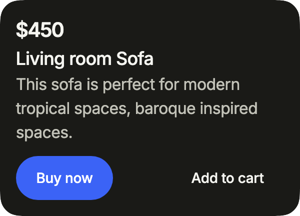
import 'package:your_app/ui/fliin/components/button/fl_button.dart';
import 'package:your_app/ui/fliin/components/card/fl_card.dart';
import 'package:your_app/ui/fliin/components/text/fl_text.dart';
import 'package:your_app/ui/fliin/core/fliin.dart';
import 'package:flutter/widgets.dart';

class CardProductExample extends StatelessWidget {
  const CardProductExample({super.key});

  @override
  Widget build(BuildContext context) {
    return FlCard(
      children: [
        const FlCardBody(
          children: [
            FlText(r'$450', type: FlTextType.h4),
            FlCardTitle('Living room Sofa'),
            FlCardDescription('This sofa is perfect for modern tropical spaces, baroque inspired spaces.'),
          ],
        ),
        FlCardFooter(
          axis: Axis.horizontal,
          spacing: FlScope.of(context).space.sm,
          children: [
            FlButton(label: 'Buy now', size: FlButtonSize.sm, onPressed: () {}),
            FlButton(label: 'Add to cart', size: FlButtonSize.sm, variant: FlButtonVariant.ghost, onPressed: () {}),
          ],
        ),
      ],
    );
  }
}Usage
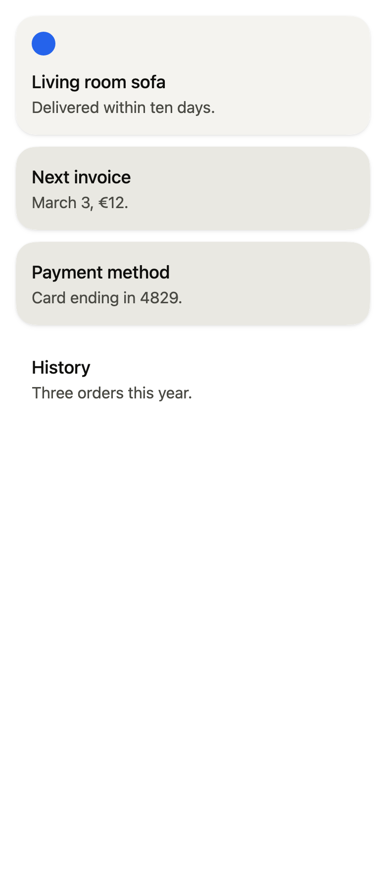
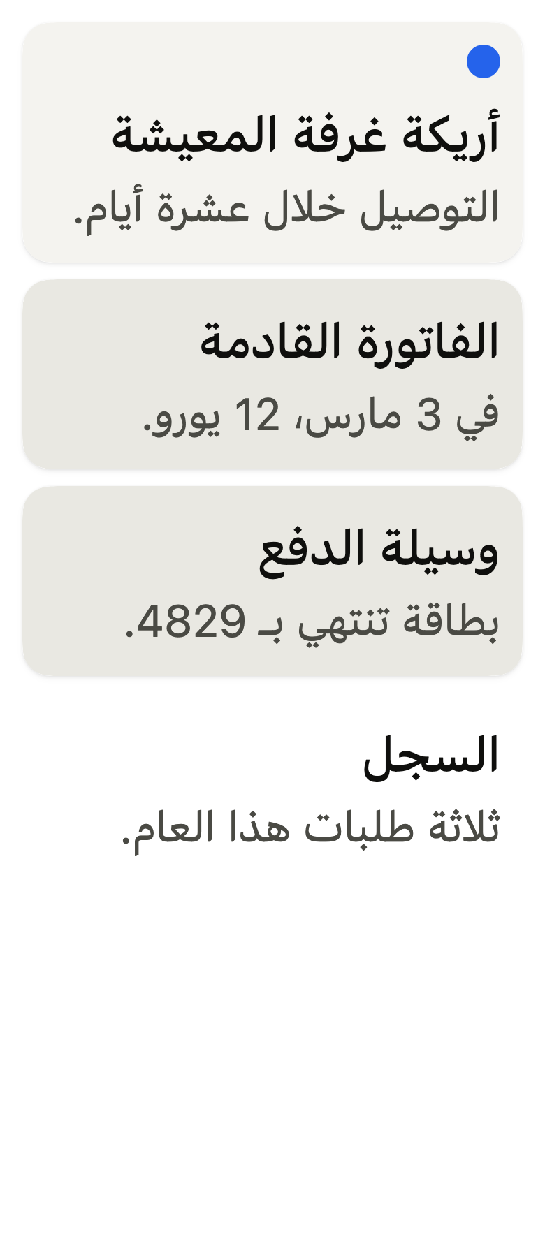
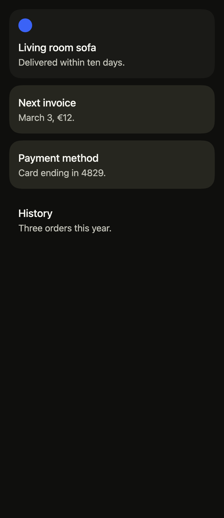
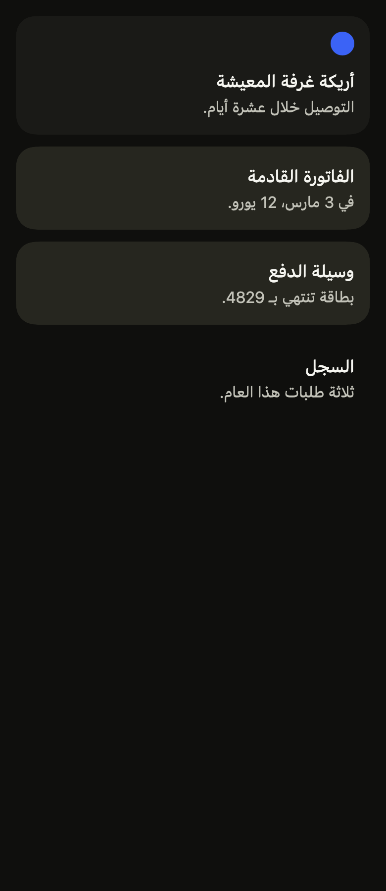
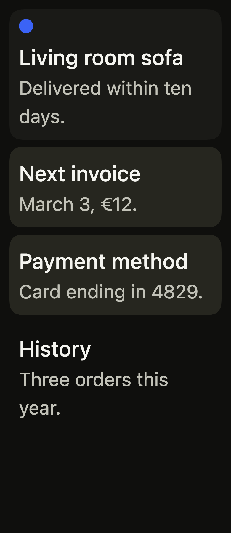
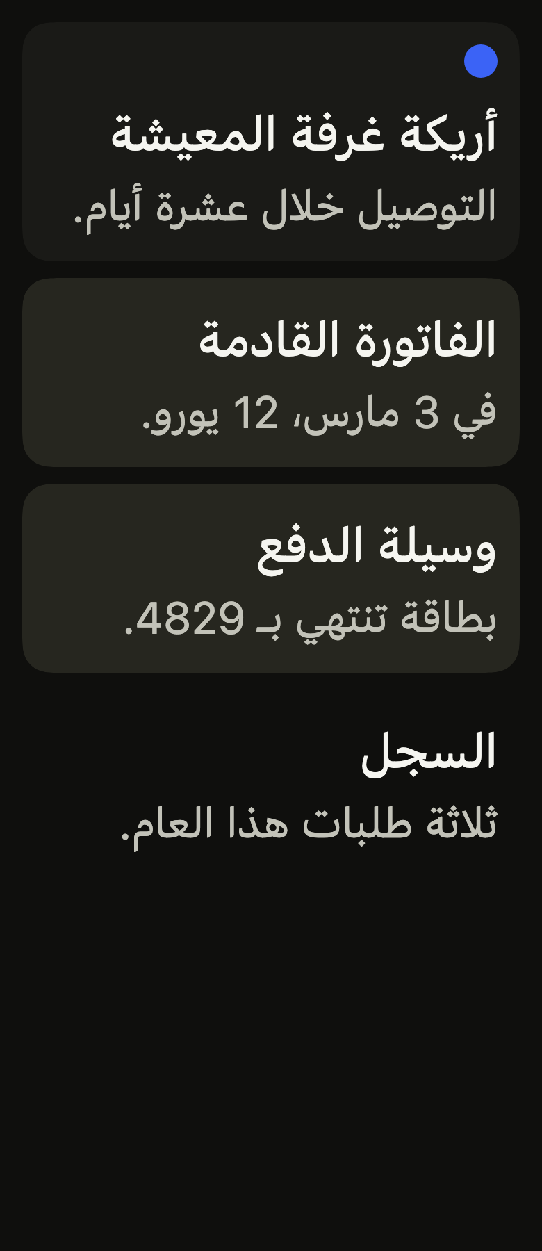
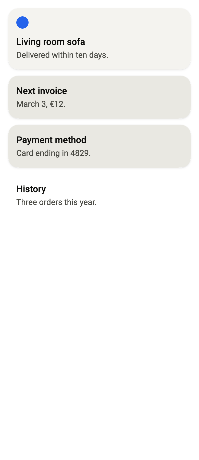
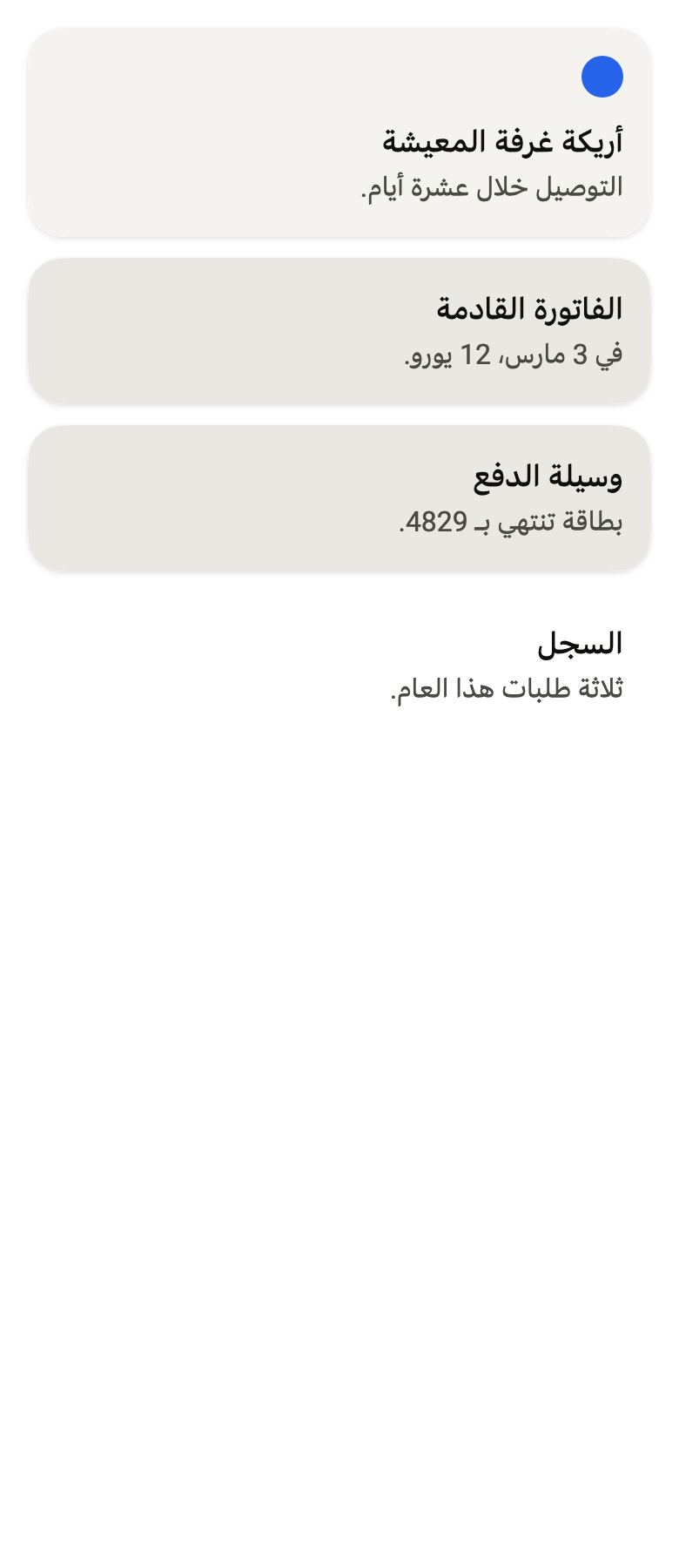
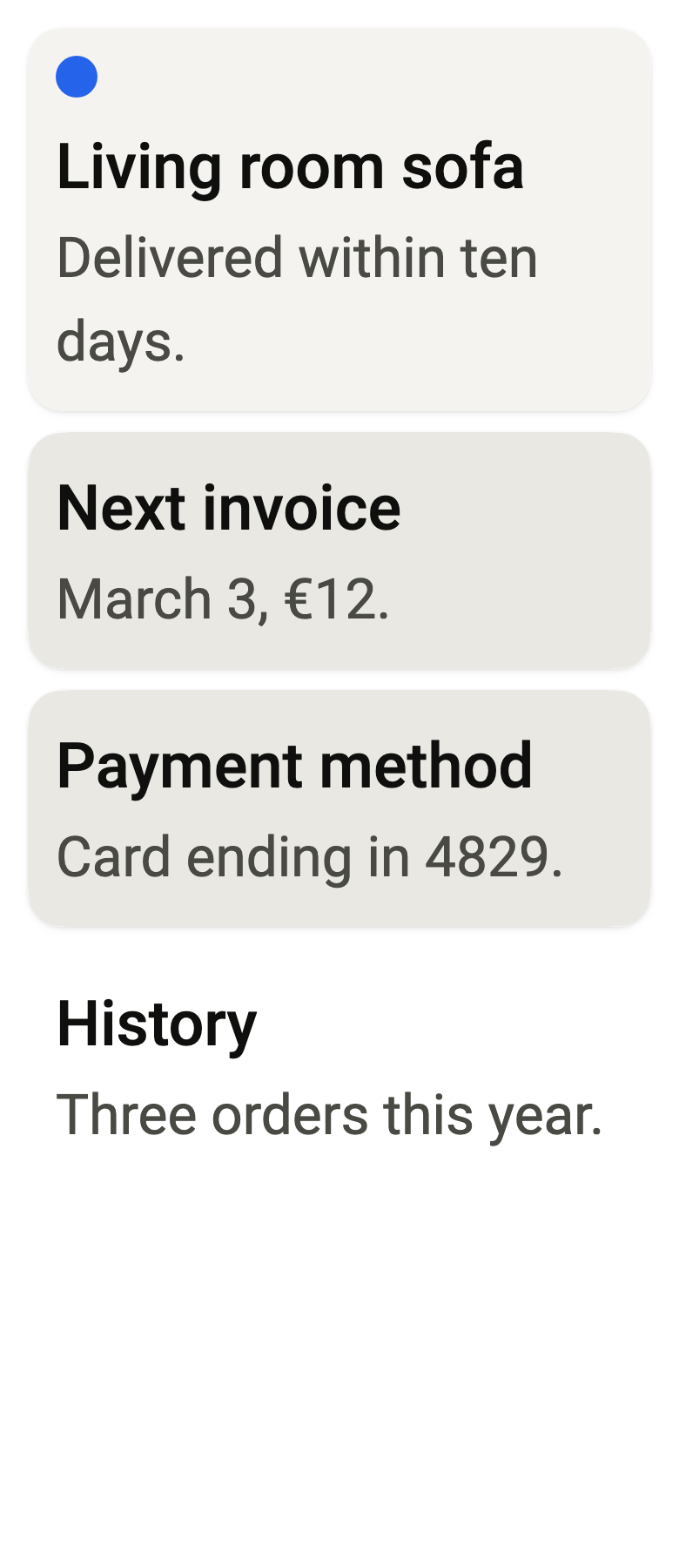
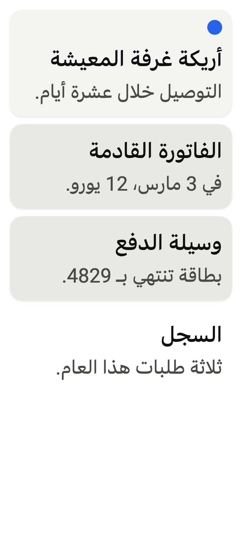
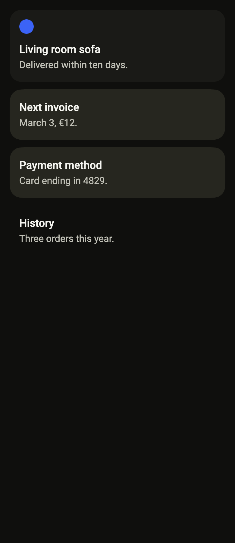
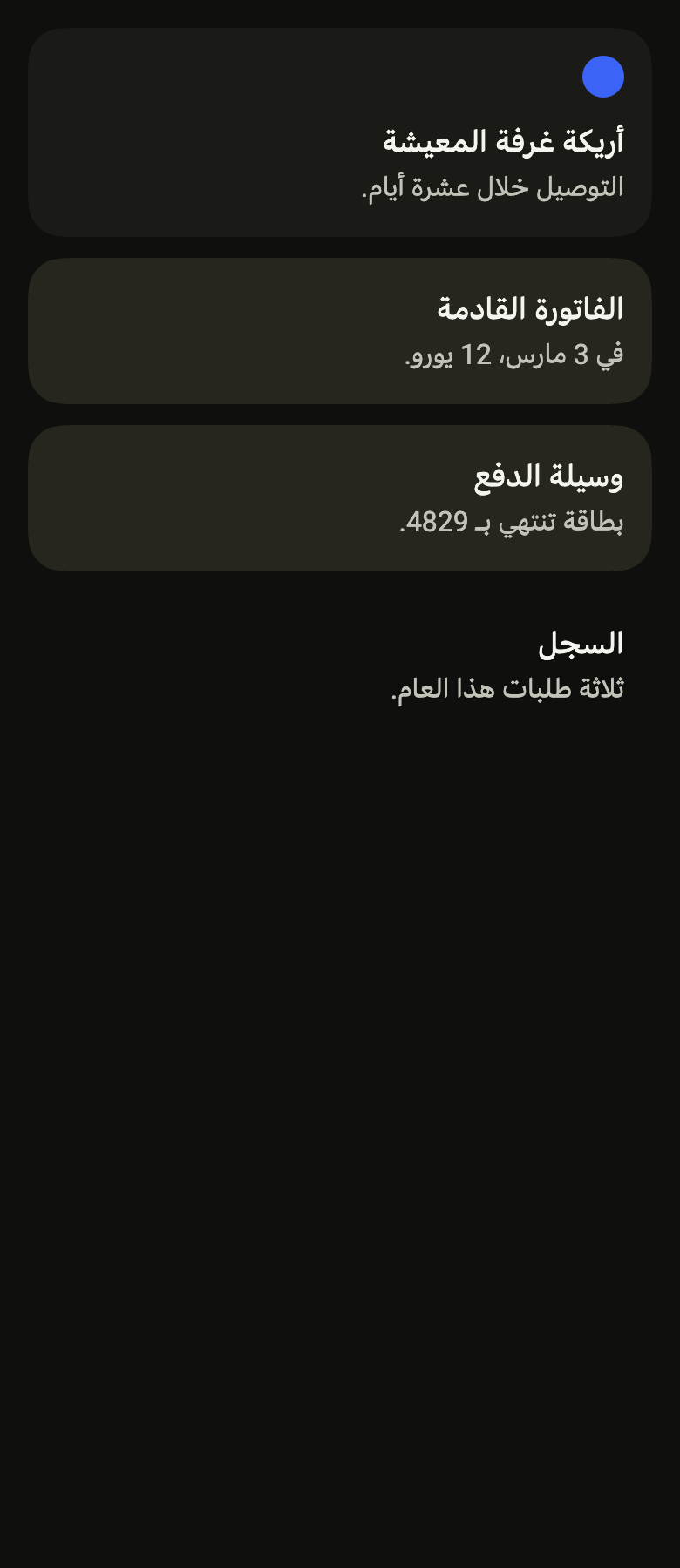
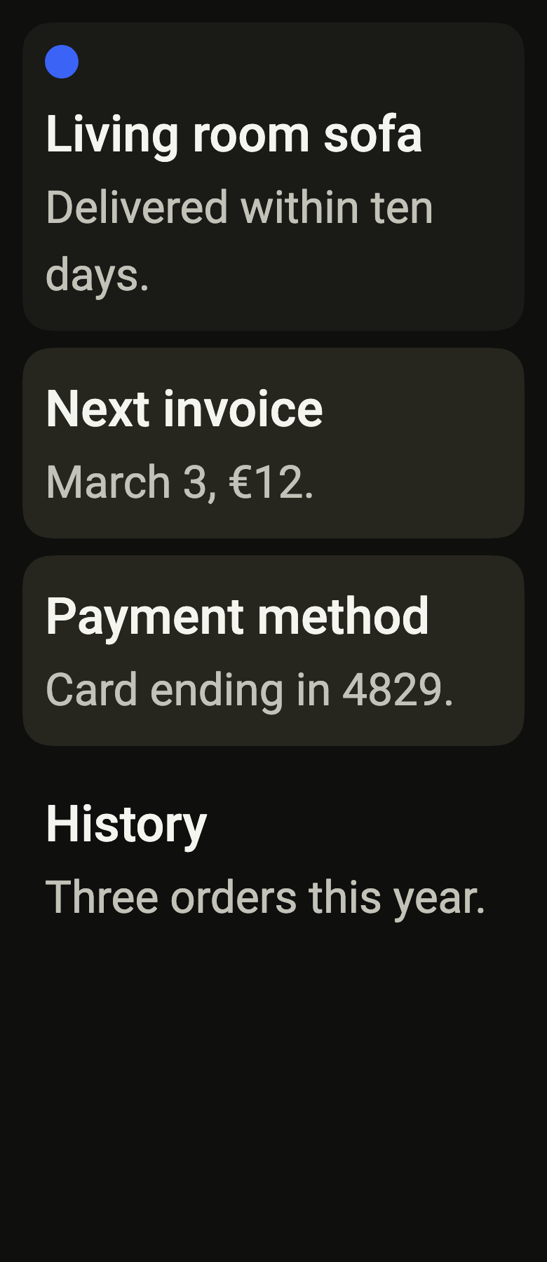
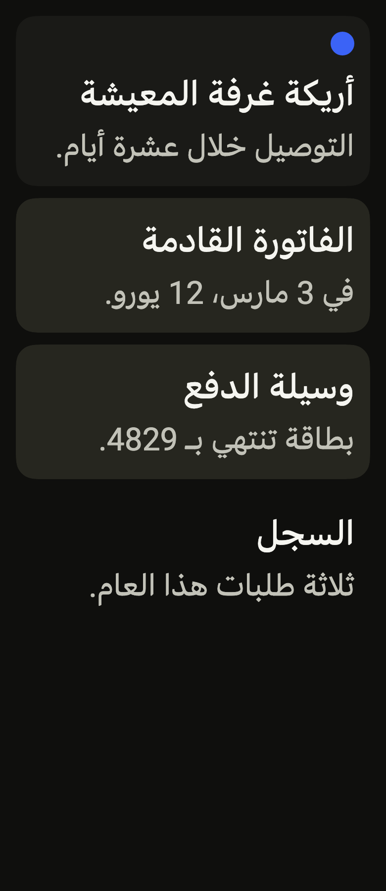
The code the reference images render:
final example = ColoredBox(
  color: FlScope.of(context).colors.surface,
  child: Padding(
    padding: EdgeInsetsDirectional.all(FlScope.of(context).space.lg),
    child: Column(
      crossAxisAlignment: CrossAxisAlignment.stretch,
      spacing: FlScope.of(context).space.md,
      children: [
        FlCard(
          variant: FlSurfaceVariant.primary,
          children: [
            FlCardHeader(
              children: [
                SizedBox.square(
                  dimension: 24,
                  child: DecoratedBox(
                    decoration: ShapeDecoration(
                      color: FlScope.of(context).colors.accent,
                      shape: const CircleBorder(),
                    ),
                  ),
                ),
              ],
            ),
            FlCardBody(
              children: [
                FlCardTitle('Living room sofa'),
                FlCardDescription('Delivered within ten days.'),
              ],
            ),
          ],
        ),
        FlCard(
          variant: FlSurfaceVariant.secondary,
          children: [
            FlCardBody(
              children: [
                FlCardTitle('Next invoice'),
                FlCardDescription('March 3, €12.'),
              ],
            ),
          ],
        ),
        FlCard(
          variant: FlSurfaceVariant.tertiary,
          children: [
            FlCardBody(
              children: [
                FlCardTitle('Payment method'),
                FlCardDescription('Card ending in 4829.'),
              ],
            ),
          ],
        ),
        FlCard(
          variant: FlSurfaceVariant.transparent,
          children: [
            FlCardBody(
              children: [
                FlCardTitle('History'),
                FlCardDescription('Three orders this year.'),
              ],
            ),
          ],
        ),
      ],
    ),
  ),
);API
FlCard: class extends StatelessWidget
FlCard.new: const new({super.key, FlSurfaceVariant variant, EdgeInsetsGeometry? padding, Axis axis, double? spacing, Widget? media, Widget? background, Widget? trailing, required List<Widget> children})
FlCard.variant: get FlSurfaceVariant
FlCard.padding: get EdgeInsetsGeometry?
FlCard.axis: get Axis
FlCard.spacing: get double?
FlCard.media: get Widget?
FlCard.background: get Widget?
FlCard.trailing: get Widget?
FlCard.children: get List<Widget>
FlCard.build: Widget(BuildContext context)
FlCardMedia: class extends StatelessWidget
FlCardMedia.new: const new({super.key, double? width, double? height, double? aspectRatio, bool bleed, required Widget child})
FlCardMedia.width: get double?
FlCardMedia.height: get double?
FlCardMedia.aspectRatio: get double?
FlCardMedia.bleed: get bool
FlCardMedia.child: get Widget
FlCardMedia.build: Widget(BuildContext context)
FlCardHeader: class extends StatelessWidget
FlCardHeader.new: const new({super.key, double spacing, required List<Widget> children})
FlCardHeader.spacing: get double
FlCardHeader.children: get List<Widget>
FlCardHeader.build: Widget(BuildContext context)
FlCardBody: class extends StatelessWidget
FlCardBody.new: const new({super.key, double spacing, required List<Widget> children})
FlCardBody.spacing: get double
FlCardBody.children: get List<Widget>
FlCardBody.build: Widget(BuildContext context)
FlCardFooter: class extends StatelessWidget
FlCardFooter.new: const new({super.key, Axis axis, double spacing, WrapAlignment alignment, required List<Widget> children})
FlCardFooter.axis: get Axis
FlCardFooter.spacing: get double
FlCardFooter.alignment: get WrapAlignment
FlCardFooter.children: get List<Widget>
FlCardFooter.build: Widget(BuildContext context)
FlCardTitle: class extends StatelessWidget
FlCardTitle.new: const new(String data, {super.key})
FlCardTitle.data: get String
FlCardTitle.build: Widget(BuildContext context)
FlCardDescription: class extends StatelessWidget
FlCardDescription.new: const new(String data, {super.key})
FlCardDescription.data: get String
FlCardDescription.build: Widget(BuildContext context)Reference renders
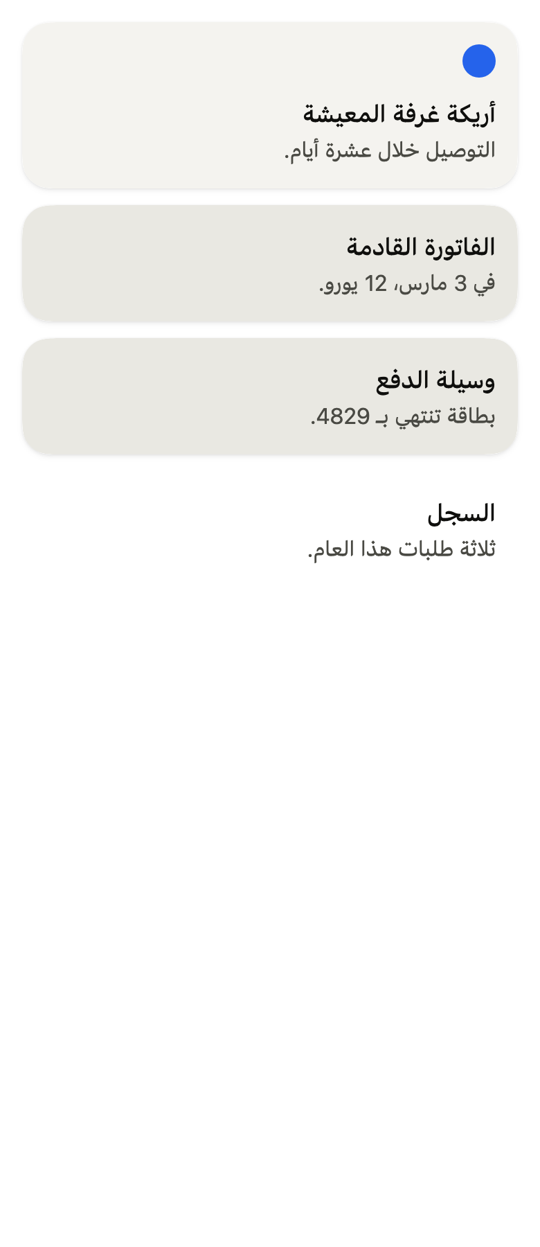
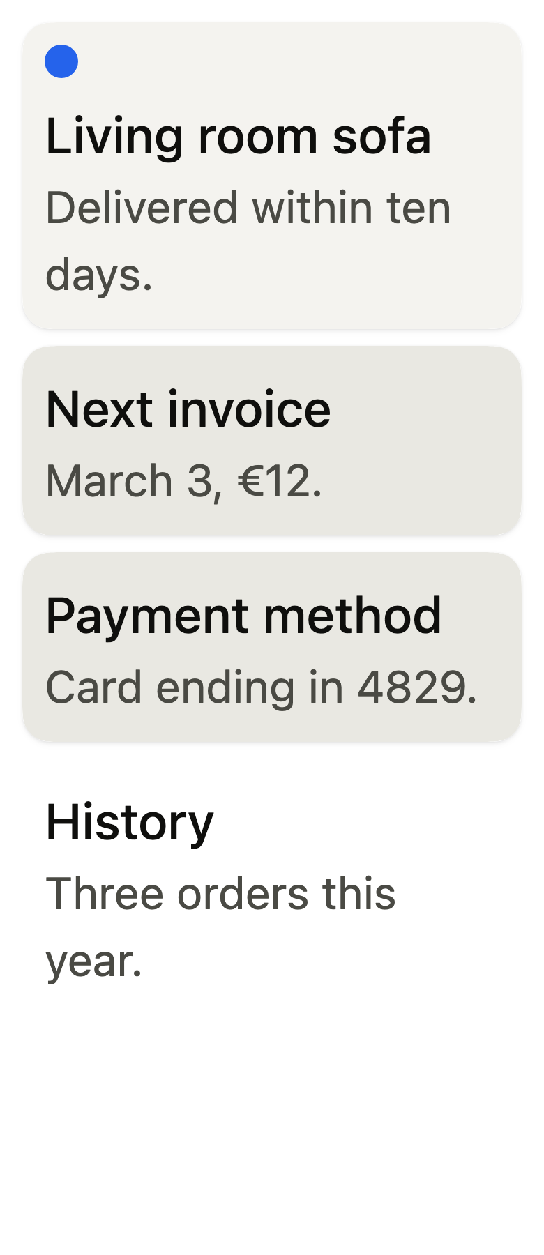
The 16 images published with version 0.2.3, rendered by the shared harness on macOS with Flutter 3.47.7. fliin verify card compares your copy to them.
Use it to
- present a product on a card with its price
- show an account summary in a raised block
- keep a heading, some text and action buttons together
- show an offer with an icon at the top
- keep related details together in stacked cards
- Not for
- a plain background with no title or description: use a surface (surface)
- a window over the page: use a dialog (dialog)
- a bubble opened against a button: use a popover (popover)
Source
The files fliin add card copies into your app, before your prefix and imports are applied.
card/fl_card.dart
// Modified from the Card of HeroUI Native 1.0.10, Copyright 2025 NextUI Inc.,
// licensed under Apache 2.0: https://www.apache.org/licenses/LICENSE-2.0
import 'dart:math' as math;

import 'package:flutter/widgets.dart';
import 'package:fliin_ui/components/surface/fl_surface.dart';
import 'package:fliin_ui/core/fliin.dart';

/// A card: a [FlSurface] whose [children] follow one
/// another in a column, [spacing] apart, stretched to its width. Place
/// [FlCardHeader], [FlCardBody] and [FlCardFooter] in it, or any other
/// content.
///
/// A [media], most often a [FlCardMedia], comes before the content: above it,
/// or at its start when [axis] is horizontal. A [background] fills the whole
/// card behind the content, and a [trailing] widget, a close button for
/// instance, sits in the top end corner.
class FlCard extends StatelessWidget {
  /// A `primary` card around [children].
  const FlCard({
    super.key,
    this.variant = FlSurfaceVariant.primary,
    this.padding,
    this.axis = Axis.vertical,
    this.spacing,
    this.media,
    this.background,
    this.trailing,
    required this.children,
  });

  /// The surface's background and shadow.
  final FlSurfaceVariant variant;

  /// The space between the card's edge and its content; when null,
  /// `size.surfacePadding` on each side. A [FlCardMedia] with `bleed` ignores
  /// it.
  final EdgeInsetsGeometry? padding;

  /// Where [media] goes: above the content when vertical, at its start, the
  /// content taking the rest of the width, when horizontal.
  final Axis axis;

  /// The gap between two [children], and between [media] and the content;
  /// when null, `space.md`.
  final double? spacing;

  /// An image or an illustration before the content, most often a
  /// [FlCardMedia].
  final Widget? media;

  /// A widget that fills the whole card behind the content, clipped to its
  /// shape: a photo, a gradient. The content keeps its padding over it.
  final Widget? background;

  /// A widget in the top end corner, `space.md` from both edges, over the
  /// content: a close button, a menu button. The first child keeps clear of
  /// a `size.closeButton` wide button at its end.
  final Widget? trailing;

  /// The content, top to bottom.
  final List<Widget> children;

  @override
  Widget build(BuildContext context) {
    final theme = FlScope.of(context);
    final direction = Directionality.maybeOf(context) ?? TextDirection.ltr;
    final inset = (padding ?? EdgeInsets.all(theme.size.surfacePadding)).resolve(direction);
    final gap = spacing ?? theme.space.md;
    final media = this.media;
    final trailing = this.trailing;
    final bleed = media is FlCardMedia && media.bleed;
    assert(
      media is! FlCardMedia || !media.bleed || axis == Axis.vertical || media.width != null,
      'A FlCardMedia with bleed in a horizontal card needs a width.',
    );
    // Above a top media, the corner widget sits over the image, not by the
    // first child.
    final reserve = trailing != null && (media == null || axis == Axis.horizontal)
        ? math.max(
            0.0,
            theme.space.md +
                theme.size.closeButton +
                theme.space.xs -
                (direction == TextDirection.ltr ? inset.right : inset.left),
          )
        : 0.0;
    final content = Column(
      mainAxisSize: MainAxisSize.min,
      crossAxisAlignment: CrossAxisAlignment.stretch,
      spacing: gap,
      children: [
        for (final (index, child) in children.indexed)
          if (index == 0 && reserve > 0)
            Padding(
              padding: EdgeInsetsDirectional.only(end: reserve),
              child: child,
            )
          else
            child,
      ],
    );
    final Widget body = switch ((media, axis)) {
      (null, _) => Padding(padding: inset, child: content),
      (final media?, Axis.vertical) when bleed => Column(
        mainAxisSize: MainAxisSize.min,
        crossAxisAlignment: CrossAxisAlignment.stretch,
        children: [
          media,
          Padding(padding: inset, child: content),
        ],
      ),
      (final media?, Axis.vertical) => Padding(
        padding: inset,
        child: Column(
          mainAxisSize: MainAxisSize.min,
          crossAxisAlignment: CrossAxisAlignment.stretch,
          spacing: gap,
          children: [media, content],
        ),
      ),
      (final FlCardMedia media, Axis.horizontal) when bleed => Stack(
        children: [
          PositionedDirectional(start: 0, top: 0, bottom: 0, width: media.width, child: media),
          Padding(
            padding: EdgeInsetsDirectional.only(start: media.width ?? 0),
            child: ConstrainedBox(
              constraints: BoxConstraints(minHeight: media.height ?? 0),
              child: Padding(padding: inset, child: content),
            ),
          ),
        ],
      ),
      (final media?, Axis.horizontal) => Padding(
        padding: inset,
        child: Row(
          crossAxisAlignment: CrossAxisAlignment.start,
          spacing: gap,
          children: [
            media,
            Expanded(child: content),
          ],
        ),
      ),
    };
    final background = this.background;
    return FlSurface(
      variant: variant,
      padding: EdgeInsets.zero,
      child: background == null && trailing == null
          ? body
          : Stack(
              children: [
                if (background != null) Positioned.fill(child: background),
                body,
                if (trailing != null) PositionedDirectional(top: theme.space.md, end: theme.space.md, child: trailing),
              ],
            ),
    );
  }
}

/// An image in a [FlCard]: [child], usually an `Image` with `BoxFit.cover`,
/// sized by [width], [height] or [aspectRatio] and clipped to corners of
/// `shape.radiusXxl`.
///
/// Given as the card's `media`, it sits above the content, or at its start
/// in a horizontal card; with [bleed], it reaches the card's edges instead,
/// the card's corners clipping it. Among the card's children, it keeps its
/// [width] at the start of the line.
class FlCardMedia extends StatelessWidget {
  /// An image of [child], rounded, inside the card's padding.
  const FlCardMedia({super.key, this.width, this.height, this.aspectRatio, this.bleed = false, required this.child})
    : assert(width == null || width >= 0, 'width must not be negative'),
      assert(height == null || height >= 0, 'height must not be negative');

  /// The width; when null, that of the card's content, or the full width of
  /// the card for a top media with [bleed]. A horizontal card needs it.
  final double? width;

  /// The height; when null, from [aspectRatio], or [child]'s own. In a
  /// horizontal card with [bleed], the card's smallest height.
  final double? height;

  /// The width divided by the height, used when [height] is null.
  final double? aspectRatio;

  /// True: the image reaches the card's edges, without padding or corners
  /// of its own: on top of a vertical card, at the start of a horizontal one.
  final bool bleed;

  /// The image.
  final Widget child;

  @override
  Widget build(BuildContext context) {
    final aspectRatio = this.aspectRatio;
    Widget image = SizedBox(
      width: width,
      height: height,
      child: height == null && aspectRatio != null ? AspectRatio(aspectRatio: aspectRatio, child: child) : child,
    );
    if (bleed) return image;
    image = ClipPath(
      clipper: ShapeBorderClipper(
        shape: FlContinuousBorder(radius: FlScope.of(context).shape.radiusXxl),
        textDirection: Directionality.maybeOf(context),
      ),
      child: image,
    );
    return width == null
        ? image
        : Align(alignment: AlignmentDirectional.topStart, widthFactor: 1, heightFactor: 1, child: image);
  }
}

/// The header of a card: icons and badges placed at the start of the line,
/// at their size.
class FlCardHeader extends StatelessWidget {
  /// A header that stacks [children].
  const FlCardHeader({super.key, this.spacing = 0, required this.children});

  /// The gap between two children.
  final double spacing;

  /// The content, top to bottom.
  final List<Widget> children;

  @override
  Widget build(BuildContext context) => Column(
    mainAxisSize: MainAxisSize.min,
    crossAxisAlignment: CrossAxisAlignment.start,
    spacing: spacing,
    children: children,
  );
}

/// The body of a card: title, description and main content, stretched to
/// its width.
class FlCardBody extends StatelessWidget {
  /// A body that stacks [children].
  const FlCardBody({super.key, this.spacing = 0, required this.children});

  /// The gap between two children; none by default.
  final double spacing;

  /// The content, top to bottom.
  final List<Widget> children;

  @override
  Widget build(BuildContext context) => Column(
    mainAxisSize: MainAxisSize.min,
    crossAxisAlignment: CrossAxisAlignment.stretch,
    spacing: spacing,
    children: children,
  );
}

/// The footer of a card: its actions, in a stretched column, or in a row in
/// reading order when [axis] is horizontal, by default the first at the
/// start, the last at the end, the others spread evenly between them. A row
/// that does not fit wraps onto the next line instead of overflowing.
class FlCardFooter extends StatelessWidget {
  /// A footer that stacks [children], or lines them up along [axis].
  const FlCardFooter({
    super.key,
    this.axis = Axis.vertical,
    this.spacing = 0,
    this.alignment = WrapAlignment.spaceBetween,
    required this.children,
  });

  /// Vertical by default, like a React Native view; horizontal for a row of
  /// buttons.
  final Axis axis;

  /// The smallest gap between two children, and between two lines of a
  /// horizontal footer that wraps.
  final double spacing;

  /// Where a horizontal footer puts its children along the line:
  /// `WrapAlignment.start` keeps them together at the start (an avatar and a
  /// name, a link).
  final WrapAlignment alignment;

  /// The content.
  final List<Widget> children;

  @override
  Widget build(BuildContext context) => switch (axis) {
    Axis.vertical => Column(
      mainAxisSize: MainAxisSize.min,
      crossAxisAlignment: CrossAxisAlignment.stretch,
      spacing: spacing,
      children: children,
    ),
    Axis.horizontal => Wrap(
      alignment: alignment,
      crossAxisAlignment: WrapCrossAlignment.center,
      spacing: spacing,
      runSpacing: spacing,
      children: children,
    ),
  };
}

/// The title of a card: medium-weight `textLg`, `onSurface`.
class FlCardTitle extends StatelessWidget {
  /// The title [data].
  const FlCardTitle(this.data, {super.key});

  /// The text.
  final String data;

  @override
  Widget build(BuildContext context) => _text(context, data, FlTextRole.textLg, muted: false, heading: true);
}

/// The description of a card: `textBase`, `onSurfaceMuted`.
class FlCardDescription extends StatelessWidget {
  /// The description [data].
  const FlCardDescription(this.data, {super.key});

  /// The text.
  final String data;

  @override
  Widget build(BuildContext context) => _text(context, data, FlTextRole.textBase, muted: true);
}

Text _text(BuildContext context, String data, FlTextRole role, {required bool muted, bool? heading}) {
  final theme = FlScope.of(context);
  final scale = theme.typography;
  return Text(
    data,
    textAlign: TextAlign.start,
    style: scale
        .resolve(role, heading: heading)
        .copyWith(
          color: muted ? theme.colors.onSurfaceMuted : theme.colors.onSurface,
          fontWeight: muted ? null : theme.tokens.typography.weight.medium,
        ),
    strutStyle: scale.strut(role, inheritedFamily: DefaultTextStyle.of(context).style.fontFamily, heading: heading),
  );
}