Components / data-display
Badge
Flags an unread count, a short word or a status dot on the corner of an icon, an avatar or a tab, capped at 99+ and read out with what it marks.
Import
In a Flutter app where fliin init has run:
Examples
Basic
Three badges on avatars: a count, a short text, and a dot that marks a status at the bottom end. Each badge sits over its child.

import 'package:your_app/ui/fliin/components/avatar/fl_avatar.dart';
import 'package:your_app/ui/fliin/components/badge/fl_badge.dart';
import 'package:your_app/ui/fliin/core/fliin.dart';
import 'package:flutter/widgets.dart';

class BadgeBasicExample extends StatelessWidget {
  const BadgeBasicExample({super.key});

  @override
  Widget build(BuildContext context) {
    final space = FlScope.of(context).space;
    return Wrap(
      alignment: WrapAlignment.center,
      crossAxisAlignment: WrapCrossAlignment.center,
      spacing: space.sm,
      runSpacing: space.sm,
      children: [
        FlBadge.count(count: 5, color: FlBadgeColor.danger, size: FlBadgeSize.sm, child: _avatar('JD')),
        FlBadge.text(text: 'New', color: FlBadgeColor.accent, size: FlBadgeSize.sm, child: _avatar('AB')),
        FlBadge.dot(
          semanticLabel: 'online',
          color: FlBadgeColor.success,
          placement: FlBadgePlacement.bottomEnd,
          child: _avatar('CD'),
        ),
      ],
    );
  }
}

FlAvatar _avatar(String initials) =>
FlAvatar(initials: initials, semanticLabel: initials, size: FlAvatarSize.sm, color: FlAvatarColor.neutral);Colors
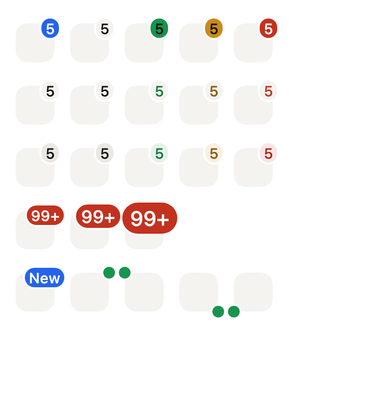
Five colors: neutral by default, accent for what is new, and success, warning and danger for a status.
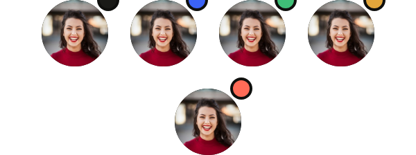
import 'package:your_app/ui/fliin/components/avatar/fl_avatar.dart';
import 'package:your_app/ui/fliin/components/badge/fl_badge.dart';
import 'package:your_app/ui/fliin/core/fliin.dart';
import 'package:flutter/widgets.dart';

class BadgeColorsExample extends StatelessWidget {
  const BadgeColorsExample({super.key});

  @override
  Widget build(BuildContext context) {
    return Wrap(
      alignment: WrapAlignment.center,
      spacing: FlScope.of(context).space.lg,
      runSpacing: FlScope.of(context).space.lg,
      children: [
        for (final (color, name) in const [
          (FlBadgeColor.neutral, 'neutral'),
          (FlBadgeColor.accent, 'accent'),
          (FlBadgeColor.success, 'success'),
          (FlBadgeColor.warning, 'warning'),
          (FlBadgeColor.danger, 'danger'),
        ])
          FlBadge.dot(
            semanticLabel: name,
            color: color,
            child: const FlAvatar(
              image: AssetImage('images/people/1.jpg'),
              initials: 'KW',
              semanticLabel: 'Kate Wilson',
            ),
          ),
      ],
    );
  }
}With content
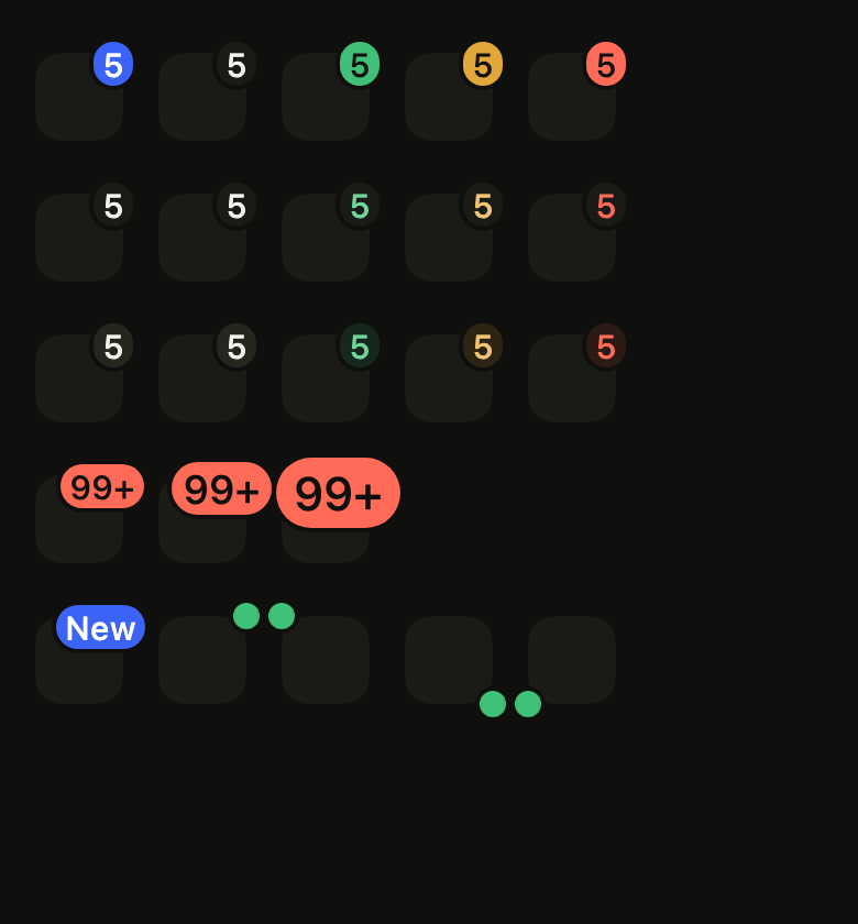
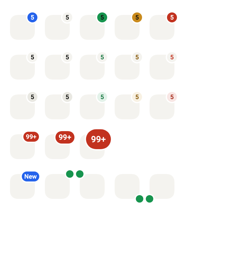
What a badge can carry: a count, a short word, a capped count, or an icon named by semanticLabel.

import 'package:your_app/ui/fliin/components/avatar/fl_avatar.dart';
import 'package:your_app/ui/fliin/components/badge/fl_badge.dart';
import 'package:your_app/ui/fliin/core/fliin.dart';
import 'package:your_app/ui/fliin/icons/fl_icons.dart';
import 'package:flutter/widgets.dart';

class BadgeWithContentExample extends StatelessWidget {
  const BadgeWithContentExample({super.key});

  @override
  Widget build(BuildContext context) {
    return Wrap(
      alignment: WrapAlignment.center,
      spacing: FlScope.of(context).space.lg,
      runSpacing: FlScope.of(context).space.lg,
      children: [
        FlBadge.count(count: 5, color: FlBadgeColor.danger, size: FlBadgeSize.sm, child: _avatar()),
        FlBadge.text(text: 'New', color: FlBadgeColor.danger, size: FlBadgeSize.sm, child: _avatar()),
        FlBadge.count(count: 120, color: FlBadgeColor.danger, size: FlBadgeSize.sm, child: _avatar()),
        FlBadge.icon(
          icon: FlIcon(FlIcons.bell),
          semanticLabel: 'notifications on',
          color: FlBadgeColor.accent,
          size: FlBadgeSize.sm,
          child: _avatar(),
        ),
      ],
    );
  }
}

FlAvatar _avatar() =>
const FlAvatar(image: AssetImage('images/people/1.jpg'), initials: 'KW', semanticLabel: 'Kate Wilson');Sizes
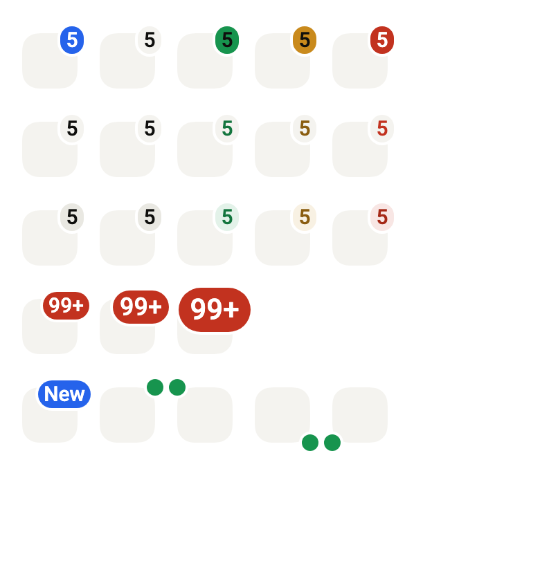
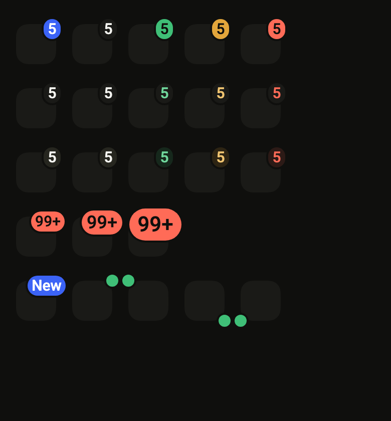
Every FlBadgeSize, on a count past 99 that shows "99+".

import 'package:your_app/ui/fliin/components/avatar/fl_avatar.dart';
import 'package:your_app/ui/fliin/components/badge/fl_badge.dart';
import 'package:your_app/ui/fliin/core/fliin.dart';
import 'package:flutter/widgets.dart';

class BadgeSizesExample extends StatelessWidget {
  const BadgeSizesExample({super.key});

  @override
  Widget build(BuildContext context) {
    final space = FlScope.of(context).space;
    return Wrap(
      alignment: WrapAlignment.center,
      crossAxisAlignment: WrapCrossAlignment.center,
      spacing: space.sm,
      runSpacing: space.sm,
      children: [
        for (final size in FlBadgeSize.values)
          FlBadge.count(count: 120, color: FlBadgeColor.danger, size: size, child: _avatar('JD')),
      ],
    );
  }
}

FlAvatar _avatar(String initials) =>
FlAvatar(initials: initials, semanticLabel: initials, size: FlAvatarSize.sm, color: FlAvatarColor.neutral);Variants
Every FlBadgeVariant in every FlBadgeColor: a row per variant, from the most to the least emphasis.
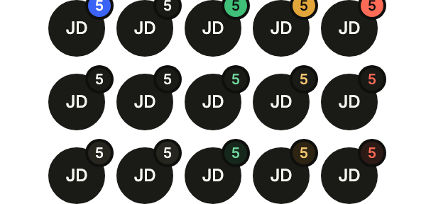
import 'package:your_app/ui/fliin/components/avatar/fl_avatar.dart';
import 'package:your_app/ui/fliin/components/badge/fl_badge.dart';
import 'package:your_app/ui/fliin/core/fliin.dart';
import 'package:flutter/widgets.dart';

class BadgeVariantsExample extends StatelessWidget {
  const BadgeVariantsExample({super.key});

  @override
  Widget build(BuildContext context) {
    final space = FlScope.of(context).space;
    return Column(
      mainAxisSize: MainAxisSize.min,
      spacing: space.md,
      children: [
        for (final variant in FlBadgeVariant.values)
          Wrap(
            alignment: WrapAlignment.center,
            crossAxisAlignment: WrapCrossAlignment.center,
            spacing: space.sm,
            runSpacing: space.sm,
            children: [
              for (final color in FlBadgeColor.values)
                FlBadge.count(count: 5, variant: variant, color: color, size: FlBadgeSize.sm, child: _avatar('JD')),
            ],
          ),
      ],
    );
  }
}

FlAvatar _avatar(String initials) =>
FlAvatar(initials: initials, semanticLabel: initials, size: FlAvatarSize.sm, color: FlAvatarColor.neutral);Count
A count of unread messages on an icon tile; semanticLabel says what it counts.

import 'package:your_app/ui/fliin/components/badge/fl_badge.dart';
import 'package:your_app/ui/fliin/core/fliin.dart';
import 'package:flutter/widgets.dart';

class BadgeCountExample extends StatelessWidget {
  const BadgeCountExample({super.key});

  @override
  Widget build(BuildContext context) {
    return Wrap(alignment: WrapAlignment.center, children: [_inbox(context, 3)]);
  }
}

/// An icon tile named "Messages", marked with [count] unread.
Widget _inbox(BuildContext context, int count) {
  final theme = FlScope.of(context);
  return FlBadge.count(
    count: count,
    color: FlBadgeColor.danger,
    size: FlBadgeSize.sm,
    semanticLabel: '$count unread',
    child: Semantics(
      label: 'Messages',
      child: SizedBox.square(
        dimension: theme.space.xs * 10,
        child: DecoratedBox(
          decoration: ShapeDecoration(
            color: theme.colors.control,
            shape: FlContinuousBorder(radius: theme.shape.radiusXl),
          ),
        ),
      ),
    ),
  );
}Overflow
Past 99, the count reads "99+" and keeps its width; the screen reader still hears the exact number.

import 'package:your_app/ui/fliin/components/badge/fl_badge.dart';
import 'package:your_app/ui/fliin/core/fliin.dart';
import 'package:flutter/widgets.dart';

class BadgeOverflowExample extends StatelessWidget {
  const BadgeOverflowExample({super.key});

  @override
  Widget build(BuildContext context) {
    return Wrap(alignment: WrapAlignment.center, children: [_inbox(context, 128)]);
  }
}

/// An icon tile named "Messages", marked with [count] unread.
Widget _inbox(BuildContext context, int count) {
  final theme = FlScope.of(context);
  return FlBadge.count(
    count: count,
    color: FlBadgeColor.danger,
    size: FlBadgeSize.sm,
    semanticLabel: '$count unread',
    child: Semantics(
      label: 'Messages',
      child: SizedBox.square(
        dimension: theme.space.xs * 10,
        child: DecoratedBox(
          decoration: ShapeDecoration(
            color: theme.colors.control,
            shape: FlContinuousBorder(radius: theme.shape.radiusXl),
          ),
        ),
      ),
    ),
  );
}Text
A short word instead of a number, such as "New", with FlBadge.text.

import 'package:your_app/ui/fliin/components/avatar/fl_avatar.dart';
import 'package:your_app/ui/fliin/components/badge/fl_badge.dart';
import 'package:flutter/widgets.dart';

class BadgeTextExample extends StatelessWidget {
  const BadgeTextExample({super.key});

  @override
  Widget build(BuildContext context) {
    return const Wrap(
      alignment: WrapAlignment.center,
      children: [
        FlBadge.text(
          text: 'New',
          color: FlBadgeColor.accent,
          size: FlBadgeSize.sm,
          child: FlAvatar(initials: 'AB', semanticLabel: 'AB', size: FlAvatarSize.sm, color: FlAvatarColor.neutral),
        ),
      ],
    );
  }
}Dot
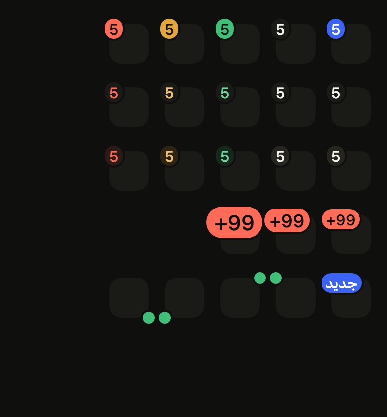
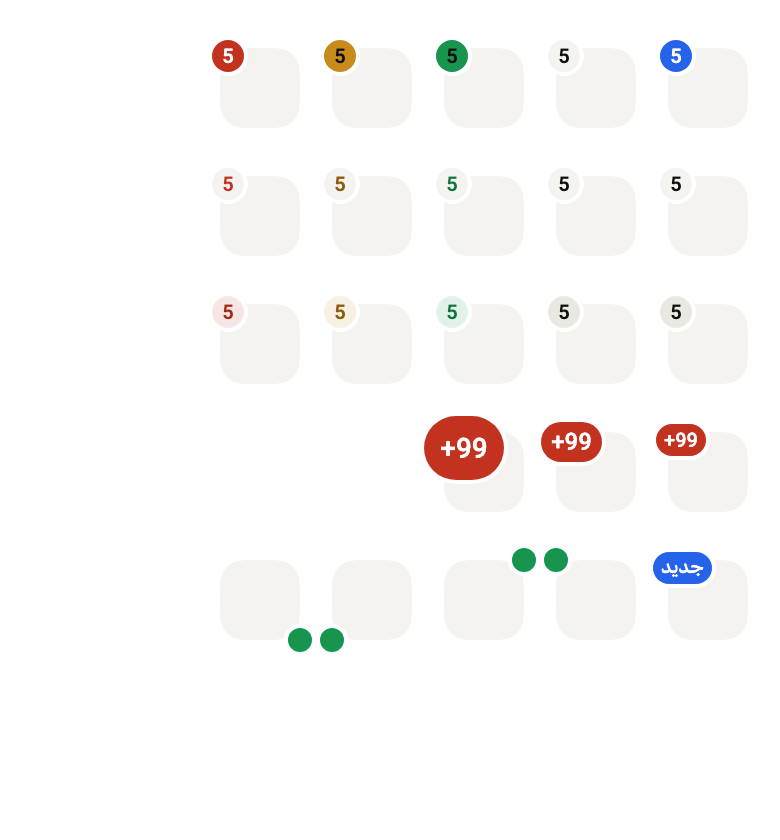
A dot without a number marks a status, such as online. placement puts it on any corner of its child, in the reading direction.

import 'package:your_app/ui/fliin/components/avatar/fl_avatar.dart';
import 'package:your_app/ui/fliin/components/badge/fl_badge.dart';
import 'package:your_app/ui/fliin/core/fliin.dart';
import 'package:flutter/widgets.dart';

class BadgeDotExample extends StatelessWidget {
  const BadgeDotExample({super.key});

  @override
  Widget build(BuildContext context) {
    final space = FlScope.of(context).space;
    return Wrap(
      alignment: WrapAlignment.center,
      crossAxisAlignment: WrapCrossAlignment.center,
      spacing: space.sm,
      runSpacing: space.sm,
      children: [
        for (final placement in FlBadgePlacement.values)
          FlBadge.dot(semanticLabel: 'online', color: FlBadgeColor.success, placement: placement, child: _avatar('JD')),
      ],
    );
  }
}

FlAvatar _avatar(String initials) =>
FlAvatar(initials: initials, semanticLabel: initials, size: FlAvatarSize.sm, color: FlAvatarColor.neutral);Usage
The code the reference images render:
final example = ColoredBox(
  color: FlScope.of(context).colors.surface,
  child: Padding(
    padding: EdgeInsetsDirectional.all(FlScope.of(context).space.lg),
    child: Column(
      crossAxisAlignment: CrossAxisAlignment.stretch,
      spacing: FlScope.of(context).space.sm,
      children: [
        for (final v in FlBadgeVariant.values)
          Padding(
            padding: EdgeInsetsDirectional.symmetric(
              vertical: FlScope.of(context).space.sm,
            ),
            child: Wrap(
              spacing: FlScope.of(context).space.lg,
              runSpacing: FlScope.of(context).space.lg,
              children: [
                for (final c in FlBadgeColor.values)
                  FlBadge.count(
                    count: 5,
                    semanticLabel: '5 unread',
                    variant: v,
                    color: c,
                    size: FlBadgeSize.sm,
                    child: Semantics(
                      label: 'Messages',
                      child: SizedBox.square(
                        dimension: FlScope.of(context).space.xs * 10,
                        child: DecoratedBox(
                          decoration: ShapeDecoration(
                            color: FlScope.of(context).colors.control,
                            shape: FlContinuousBorder(
                              radius: FlScope.of(context).shape.radiusXl,
                            ),
                          ),
                        ),
                      ),
                    ),
                  ),
              ],
            ),
          ),
        Padding(
          padding: EdgeInsetsDirectional.symmetric(
            vertical: FlScope.of(context).space.sm,
          ),
          child: Wrap(
            spacing: FlScope.of(context).space.lg,
            runSpacing: FlScope.of(context).space.lg,
            children: [
              for (final s in FlBadgeSize.values)
                FlBadge.count(
                  count: 120,
                  color: FlBadgeColor.danger,
                  size: s,
                  child: Semantics(
                    label: 'Messages',
                    child: SizedBox.square(
                      dimension: FlScope.of(context).space.xs * 10,
                      child: DecoratedBox(
                        decoration: ShapeDecoration(
                          color: FlScope.of(context).colors.control,
                          shape: FlContinuousBorder(
                            radius: FlScope.of(context).shape.radiusXl,
                          ),
                        ),
                      ),
                    ),
                  ),
                ),
            ],
          ),
        ),
        Padding(
          padding: EdgeInsetsDirectional.symmetric(
            vertical: FlScope.of(context).space.sm,
          ),
          child: Wrap(
            spacing: FlScope.of(context).space.lg,
            runSpacing: FlScope.of(context).space.lg,
            children: [
              FlBadge.text(
                text: 'New',
                color: FlBadgeColor.accent,
                size: FlBadgeSize.sm,
                child: Semantics(
                  label: 'What’s new',
                  child: SizedBox.square(
                    dimension: FlScope.of(context).space.xs * 10,
                    child: DecoratedBox(
                      decoration: ShapeDecoration(
                        color: FlScope.of(context).colors.control,
                        shape: FlContinuousBorder(
                          radius: FlScope.of(context).shape.radiusXl,
                        ),
                      ),
                    ),
                  ),
                ),
              ),
              for (final p in FlBadgePlacement.values)
                FlBadge.dot(
                  semanticLabel: 'online',
                  color: FlBadgeColor.success,
                  placement: p,
                  child: Semantics(
                    label: 'Jane',
                    child: SizedBox.square(
                      dimension: FlScope.of(context).space.xs * 10,
                      child: DecoratedBox(
                        decoration: ShapeDecoration(
                          color: FlScope.of(context).colors.control,
                          shape: FlContinuousBorder(
                            radius: FlScope.of(context).shape.radiusXl,
                          ),
                        ),
                      ),
                    ),
                  ),
                ),
            ],
          ),
        ),
      ],
    ),
  ),
);API
FlBadgeColor: enum {accent, neutral, success, warning, danger}
FlBadgeColor.accent: static final FlBadgeColor
FlBadgeColor.neutral: static final FlBadgeColor
FlBadgeColor.success: static final FlBadgeColor
FlBadgeColor.warning: static final FlBadgeColor
FlBadgeColor.danger: static final FlBadgeColor
FlBadgeVariant: enum {primary, secondary, soft}
FlBadgeVariant.primary: static final FlBadgeVariant
FlBadgeVariant.secondary: static final FlBadgeVariant
FlBadgeVariant.soft: static final FlBadgeVariant
FlBadgeSize: enum {sm, md, lg}
FlBadgeSize.sm: static final FlBadgeSize
FlBadgeSize.md: static final FlBadgeSize
FlBadgeSize.lg: static final FlBadgeSize
FlBadgePlacement: enum {topEnd, topStart, bottomEnd, bottomStart}
FlBadgePlacement.topEnd: static final FlBadgePlacement
FlBadgePlacement.topStart: static final FlBadgePlacement
FlBadgePlacement.bottomEnd: static final FlBadgePlacement
FlBadgePlacement.bottomStart: static final FlBadgePlacement
FlBadge: class extends StatelessWidget
FlBadge.count: const new({super.key, Widget? child, String? semanticLabel, FlBadgeColor color, FlBadgeVariant variant, FlBadgeSize size, FlBadgePlacement placement, Color? ringColor})
FlBadge.text: const new({super.key, Widget? child, String? semanticLabel, FlBadgeColor color, FlBadgeVariant variant, FlBadgeSize size, FlBadgePlacement placement, Color? ringColor})
FlBadge.icon: const new({super.key, Widget? child, required String semanticLabel, FlBadgeColor color, FlBadgeVariant variant, FlBadgeSize size, FlBadgePlacement placement, Color? ringColor})
FlBadge.dot: const new({super.key, Widget? child, required String semanticLabel, FlBadgeColor color, FlBadgeVariant variant, FlBadgeSize size, FlBadgePlacement placement, Color? ringColor})
FlBadge.child: get Widget?
FlBadge.semanticLabel: get String?
FlBadge.color: get FlBadgeColor
FlBadge.variant: get FlBadgeVariant
FlBadge.size: get FlBadgeSize
FlBadge.placement: get FlBadgePlacement
FlBadge.ringColor: get Color?
FlBadge.build: Widget(BuildContext context)
extension FlBadgePlacement.top: get bool
extension FlBadgePlacement.start: get boolReference renders
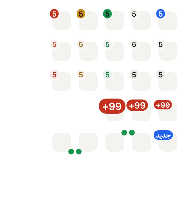
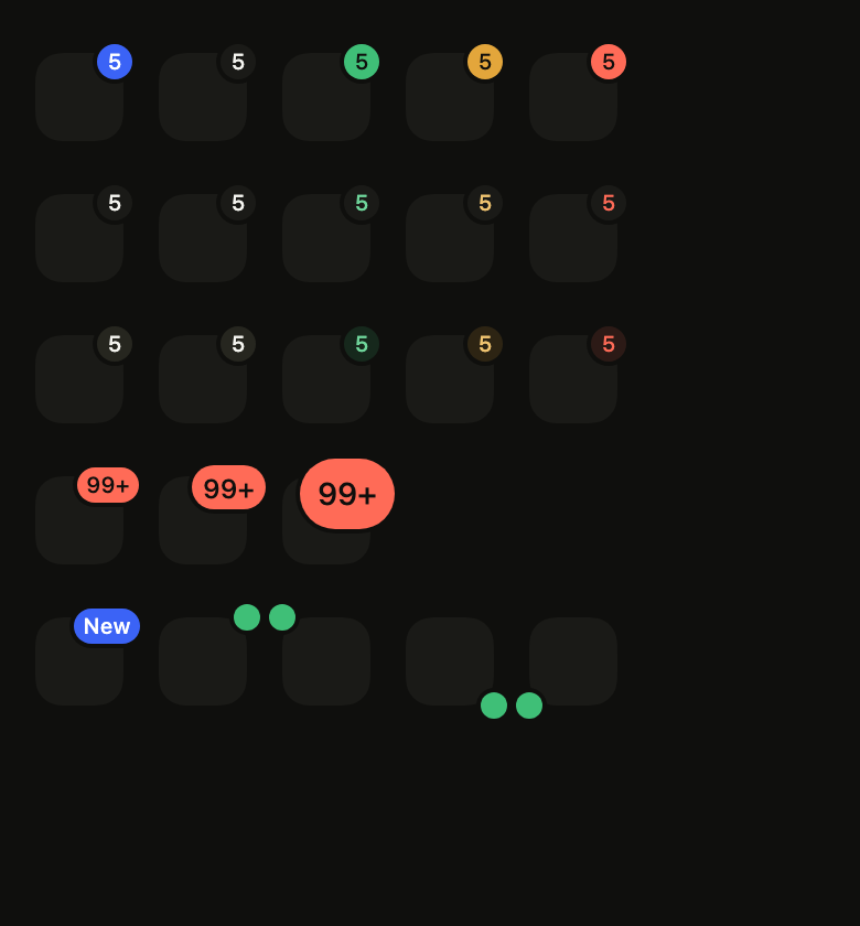
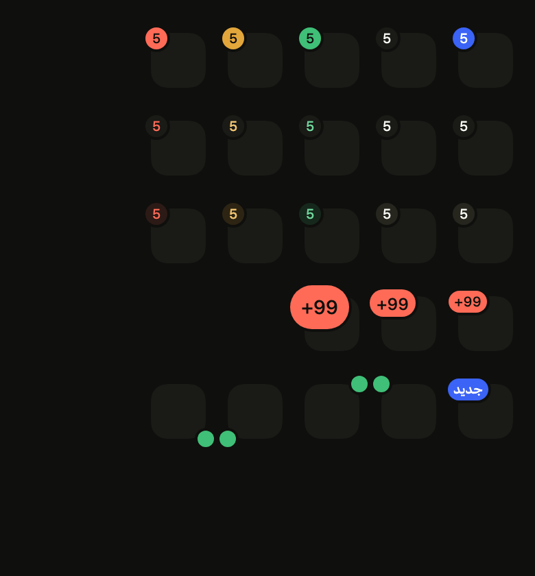
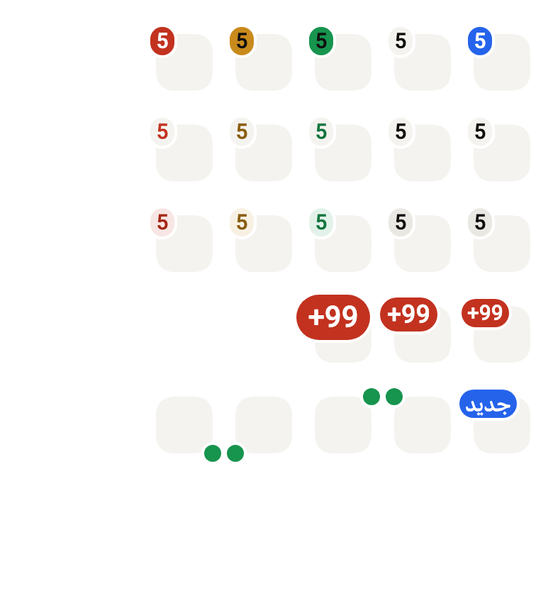
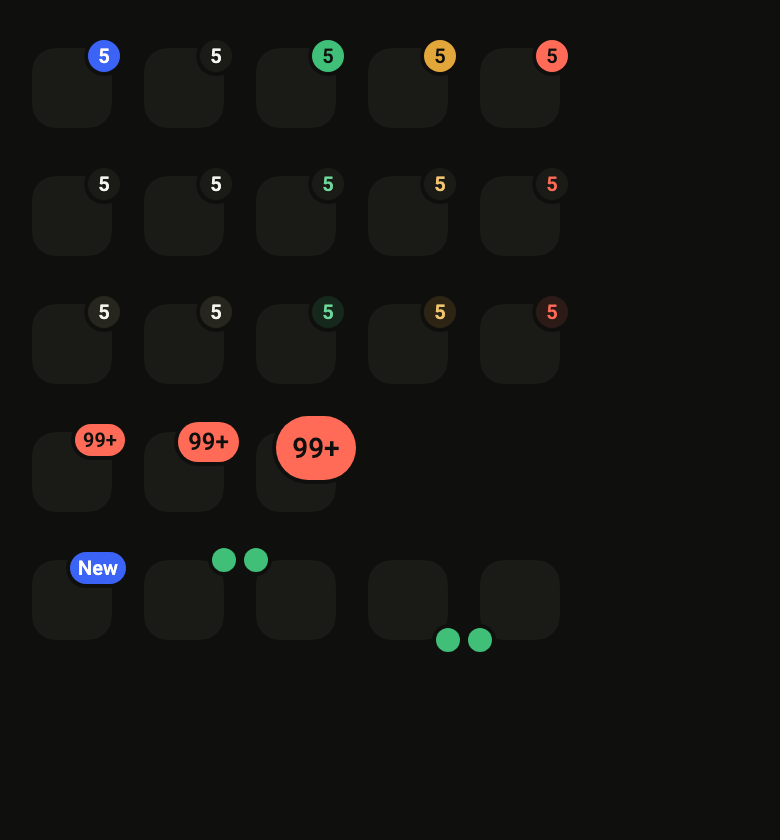
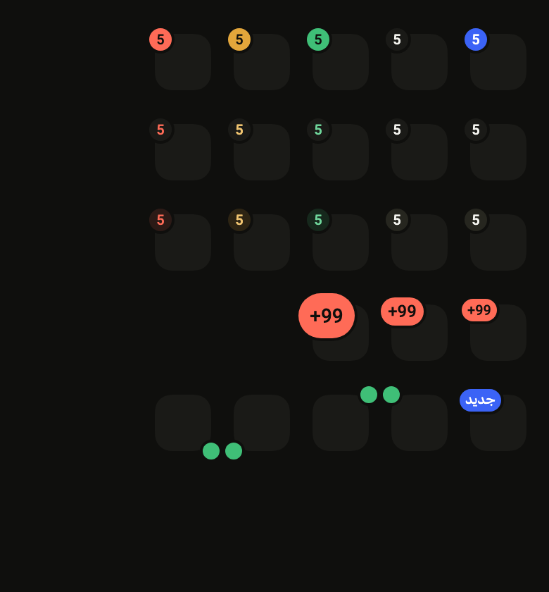
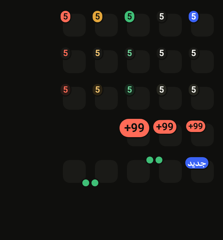
The 16 images published with version 0.2.4, rendered by the shared harness on macOS with Flutter 3.47.7. fliin verify badge compares your copy to them.
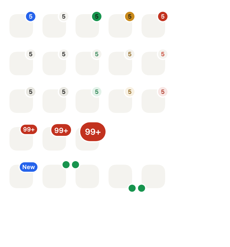
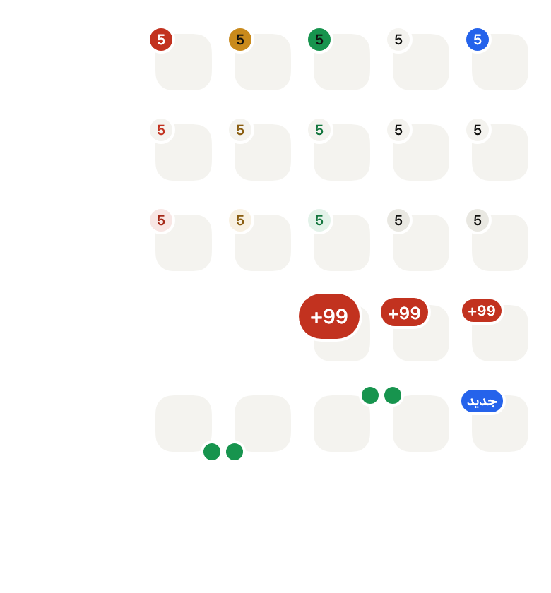
Use it to
- show the unread message count of the inbox
- show pending notifications on a tab
- show that a contact is online with a dot on their avatar
- add a short new label to a menu entry
- show 99+ once a counter passes a hundred
- add a count over the cart icon
- Not for
- a status or category in text only: use a chip (chip)
- short help shown on hover or long press: use a tooltip (tooltip)
- the progress of a task: use a progress indicator (progress)
- States
Source
The files fliin add badge copies into your app, before your prefix and imports are applied.
badge/fl_badge.dart
// Modified from the Badge of HeroUI React v3, Copyright 2020 Next UI Inc.,
// licensed under the MIT license below and under Apache 2.0:
// https://www.apache.org/licenses/LICENSE-2.0
//
// Permission is hereby granted, free of charge, to any person obtaining a copy
// of this software and associated documentation files (the "Software"), to
// deal in the Software without restriction, including without limitation the
// rights to use, copy, modify, merge, publish, distribute, sublicense, and/or
// sell copies of the Software, and to permit persons to whom the Software is
// furnished to do so, subject to the following conditions:
//
// The above copyright notice and this permission notice shall be included in
// all copies or substantial portions of the Software.
//
// THE SOFTWARE IS PROVIDED "AS IS", WITHOUT WARRANTY OF ANY KIND, EXPRESS OR
// IMPLIED, INCLUDING BUT NOT LIMITED TO THE WARRANTIES OF MERCHANTABILITY,
// FITNESS FOR A PARTICULAR PURPOSE AND NONINFRINGEMENT. IN NO EVENT SHALL THE
// AUTHORS OR COPYRIGHT HOLDERS BE LIABLE FOR ANY CLAIM, DAMAGES OR OTHER
// LIABILITY, WHETHER IN AN ACTION OF CONTRACT, TORT OR OTHERWISE, ARISING
// FROM, OUT OF OR IN CONNECTION WITH THE SOFTWARE OR THE USE OR OTHER DEALINGS
// IN THE SOFTWARE.
//
// Also modified from the theme colors of HeroUI Native 1.0.10, Copyright 2025
// NextUI Inc., licensed under Apache 2.0.
import 'package:flutter/widgets.dart';
import 'package:fliin_ui/core/fliin.dart';

/// The color of a [FlBadge].
enum FlBadgeColor {
  /// The highlighted color: solid, `selected` with
  /// `onSelected` text (the accent is reserved for the primary action);
  /// otherwise `onAccentSoft`, on `control` or `accentSoft`.
  accent,

  /// The neutral.
  neutral,

  /// Green.
  success,

  /// Orange.
  warning,

  /// Red.
  danger,
}

/// The fill of a [FlBadge].
enum FlBadgeVariant {
  /// The solid background of the color, its foreground text.
  primary,

  /// The `control` background, the color's soft text.
  secondary,

  /// The color's soft tint, its soft text.
  soft,
}

/// The size of a [FlBadge]: its minimum side and its text.
enum FlBadgeSize {
  /// At least 16 per side, 10 text.
  sm,

  /// At least 20 per side, `textXs` text.
  md,

  /// At least 32 per side, `textSm` text.
  lg,
}

/// The corner of the child on which a [FlBadge] sits, overflowing by a
/// quarter of its size. Start and end follow the reading direction.
enum FlBadgePlacement {
  /// Top, at the end (top right in LTR).
  topEnd,

  /// Top, at the start.
  topStart,

  /// Bottom, at the end.
  bottomEnd,

  /// Bottom, at the start.
  bottomStart,
}

/// `text-[10px]` of `.badge--sm`: no role of the scale has this size.
const double _smText = 10;

/// SF's tracking at 10 points, read from its `trak` table (24/2048 em): the
/// Core Text system font applies it, Skia does not.
const double _smTracking = 24 / 2048 * _smText;

/// `leading-[1.34]` (sm, md) and `leading-[1.43]` (lg) of `.badge`.
const double _leading = 1.34;
const double _leadingLg = 1.43;

/// `translate(±25%, ±25%)` of `.badge--top-right` and the other corners; a
/// dot sits on the corner itself (the canvas's `.badge-dot`).
const double _overhang = 0.25;
const double _dotOverhang = 0.5;

/// A badge placed on the corner of [child]: a
/// count, a short word, an icon or a plain dot, circled by a ring of
/// [ringColor] that separates it from what it overlaps. It does not change
/// the layout of [child], and its text does not grow beyond
/// `size.iconMaxScale`.
///
/// The screen reader announces it with [child], as a single node
/// ("Messages", then "3 unread"): [child] and its badge are merged, so
/// [child] must be a single element.
///
/// A count that changes rolls its digits to the new value; with `hideZero`,
/// the badge pops in when the count leaves zero and pops out when it returns
/// to it (`FlPop`). Under reduced motion, it changes at once or fades.
///
/// Without [child], the badge stands alone, in its place in the row (the
/// unread count at the end of a row, next to the time): no corner, no
/// overflow, and its label joins the node that contains it.
class FlBadge extends StatelessWidget {
  /// A count: beyond `max`, `<max>+`. At zero, the badge stays, unless
  /// `hideZero` is set. When [semanticLabel] is null: the displayed text.
  const FlBadge.count({
    super.key,
    this.child,
    required int this._count,
    this._max = 99,
    this._hideZero = false,
    this.semanticLabel,
    this.color = FlBadgeColor.neutral,
    this.variant = FlBadgeVariant.primary,
    this.size = FlBadgeSize.md,
    this.placement = FlBadgePlacement.topEnd,
    this.ringColor,
  }) : assert(_count >= 0, 'a count is not negative'),
       assert(_max > 0, 'the cap is positive'),
       _text = null,
       _icon = null;

  /// A short word ("New"). When [semanticLabel] is null: that word.
  const FlBadge.text({
    super.key,
    this.child,
    required String this._text,
    this.semanticLabel,
    this.color = FlBadgeColor.neutral,
    this.variant = FlBadgeVariant.primary,
    this.size = FlBadgeSize.md,
    this.placement = FlBadgePlacement.topEnd,
    this.ringColor,
  }) : _count = null,
       _max = 0,
       _hideZero = false,
       _icon = null;

  /// An icon at the size and color of the text, named by [semanticLabel].
  const FlBadge.icon({
    super.key,
    this.child,
    required Widget this._icon,
    required String this.semanticLabel,
    this.color = FlBadgeColor.neutral,
    this.variant = FlBadgeVariant.primary,
    this.size = FlBadgeSize.md,
    this.placement = FlBadgePlacement.topEnd,
    this.ringColor,
  }) : _count = null,
       _max = 0,
       _hideZero = false,
       _text = null;

  /// A dot with no content (online, new), named by [semanticLabel]; `sm` by
  /// default.
  const FlBadge.dot({
    super.key,
    this.child,
    required String this.semanticLabel,
    this.color = FlBadgeColor.neutral,
    this.variant = FlBadgeVariant.primary,
    this.size = FlBadgeSize.sm,
    this.placement = FlBadgePlacement.topEnd,
    this.ringColor,
  }) : _count = null,
       _max = 0,
       _hideZero = false,
       _text = null,
       _icon = null;

  /// What the badge marks: an icon, an avatar, a tab; when null, the badge
  /// alone.
  final Widget? child;

  /// What the screen reader reads after [child] ("3 unread").
  final String? semanticLabel;

  /// The color; the neutral by default.
  final FlBadgeColor color;

  /// The fill.
  final FlBadgeVariant variant;

  /// The size; `md` by default.
  final FlBadgeSize size;

  /// The corner; top end by default.
  final FlBadgePlacement placement;

  /// The ring's color: that of the background under [child]. When null:
  /// `surface`, the page background.
  final Color? ringColor;

  final int? _count;
  final int _max;
  final bool _hideZero;
  final String? _text;
  final Widget? _icon;

  /// The displayed text: the capped count or the word; null for an icon or
  /// a dot.
  String? get _shown => switch (_count) {
    final count? => count > _max ? '$_max+' : '$count',
    null => _text,
  };

  bool get _hidden => _hideZero && _count == 0;

  @override
  Widget build(BuildContext context) {
    final hidden = _hidden;
    final label = hidden ? null : semanticLabel ?? _shown;
    final child = this.child;
    // A count that leaves zero pops in, and pops out when it returns to it.
    if (child == null) {
      return Semantics(
        label: label,
        child: ExcludeSemantics(
          child: FlPop(shown: !hidden, child: _pastille(context)),
        ),
      );
    }
    return MergeSemantics(
      child: Stack(
        // The child keeps the parent's constraints: the badge does not change
        // its layout.
        fit: StackFit.passthrough,
        clipBehavior: Clip.none,
        children: [
          child,
          Positioned.directional(
            textDirection: Directionality.of(context),
            top: placement.top ? 0 : null,
            bottom: placement.top ? null : 0,
            start: placement.start ? 0 : null,
            end: placement.start ? null : 0,
            child: _overhanging(
              context,
              ExcludeSemantics(
                child: FlPop(shown: !hidden, child: _pastille(context)),
              ),
            ),
          ),
          if (label != null) Semantics(label: label),
        ],
      ),
    );
  }

  bool get _dot => _count == null && _text == null && _icon == null;

  /// The quarter of the badge that overflows its corner, on the corner's
  /// side; half of a dot.
  Widget _overhanging(BuildContext context, Widget child) {
    final rtl = Directionality.of(context) == TextDirection.rtl;
    final overhang = _dot ? _dotOverhang : _overhang;
    final outward = placement.start != rtl ? -overhang : overhang;
    return FractionalTranslation(translation: Offset(outward, placement.top ? -overhang : overhang), child: child);
  }

  Widget _pastille(BuildContext context) {
    final theme = FlScope.of(context);
    final colors = theme.colors;
    final scale = theme.typography;
    final (fill, ink) = switch ((variant, color)) {
      (FlBadgeVariant.primary, FlBadgeColor.accent) => (colors.selected, colors.onSelected),
      (FlBadgeVariant.primary, FlBadgeColor.neutral) => (colors.control, colors.onControl),
      (FlBadgeVariant.primary, FlBadgeColor.success) => (colors.success, colors.onSuccess),
      (FlBadgeVariant.primary, FlBadgeColor.warning) => (colors.warning, colors.onWarning),
      (FlBadgeVariant.primary, FlBadgeColor.danger) => (colors.dangerFill, colors.onDanger),
      (FlBadgeVariant.secondary, FlBadgeColor.accent) => (colors.control, colors.onAccentSoft),
      (FlBadgeVariant.secondary, FlBadgeColor.neutral) => (colors.control, colors.onControl),
      (FlBadgeVariant.secondary, FlBadgeColor.success) => (colors.control, colors.onSuccessSoft),
      (FlBadgeVariant.secondary, FlBadgeColor.warning) => (colors.control, colors.onWarningSoft),
      // `danger` holds 4.5:1 on `control`; `onDangerSoft` is darker only
      // for the soft tint.
      (FlBadgeVariant.secondary, FlBadgeColor.danger) => (colors.control, colors.danger),
      (FlBadgeVariant.soft, FlBadgeColor.accent) => (colors.accentSoft, colors.onAccentSoft),
      (FlBadgeVariant.soft, FlBadgeColor.neutral) => (colors.controlPressed, colors.onControl),
      (FlBadgeVariant.soft, FlBadgeColor.success) => (colors.successSoft, colors.onSuccessSoft),
      (FlBadgeVariant.soft, FlBadgeColor.warning) => (colors.warningSoft, colors.onWarningSoft),
      (FlBadgeVariant.soft, FlBadgeColor.danger) => (colors.dangerSoft, colors.onDangerSoft),
    };
    // The canvas's `.badge`: 16 high with a padding of 4 and 10 text, 20
    // with 5 and `textXs`, 32 with 8 and `textSm`; a dot of 12, 16 or 24.
    final xs = theme.space.xs;
    final (side, padding, radius, role) = switch (size) {
      FlBadgeSize.sm => (xs * 4, xs, theme.shape.radiusXl, FlTextRole.textXs),
      FlBadgeSize.md => (xs * 5, xs * 1.25, theme.shape.radiusCard, FlTextRole.textXs),
      FlBadgeSize.lg => (xs * 8, xs * 2, theme.shape.radiusXxl, FlTextRole.textSm),
    };
    final extent = _dot ? side * 3 / 4 : side;
    final base = scale.style(role);
    final systemFont = scale.familyOf(role) == null;
    final fontSize = size == FlBadgeSize.sm ? _smText : base.size;
    final style = scale
        .resolve(role)
        .copyWith(
          color: ink,
          fontSize: fontSize,
          fontWeight: theme.tokens.typography.weight.medium,
          letterSpacing: size == FlBadgeSize.sm && systemFont && theme.platform == TargetPlatform.iOS
              ? _smTracking
              : null,
          fontVariations: systemFont ? [FontVariation.opticalSize(fontSize)] : null,
        );
    final strut = StrutStyle(
      fontFamily: scale.familyOf(role) ?? DefaultTextStyle.of(context).style.fontFamily,
      fontSize: fontSize,
      height: size == FlBadgeSize.lg ? _leadingLg : _leading,
      leadingDistribution: TextLeadingDistribution.even,
      fontWeight: theme.tokens.typography.weight.medium,
    );
    final text = _shown;
    final icon = _icon;
    final content = icon != null
        ? IconTheme.merge(
            data: IconThemeData(color: ink, size: fontSize),
            child: icon,
          )
        : text != null
        ? Padding(
            padding: EdgeInsetsDirectional.symmetric(horizontal: padding),
            // A count rolls its digits to the new value.
            child: _count == null
                ? Text(text, maxLines: 1, softWrap: false, style: style, strutStyle: strut)
                : FlRollingText(text, maxLines: 1, softWrap: false, style: style, strutStyle: strut),
          )
        : null;
    // box-shadow: 0 0 0 2px var(--surface): outside the badge.
    final ring = theme.size.border * 2;
    return MediaQuery.withClampedTextScaling(
      maxScaleFactor: theme.size.iconMaxScale,
      child: FlPixelSnap(
        child: ConstrainedBox(
          constraints: BoxConstraints(minWidth: extent, minHeight: extent),
          child: CustomPaint(
            painter: _Pastille(
              fill: fill,
              // Alone, it overlaps nothing: no ring, which would leave a
              // fringe on a pressed row or a card.
              ring: child == null ? null : ringColor ?? colors.surface,
              ringWidth: ring,
              radius: radius,
            ),
            child: Center(widthFactor: 1, heightFactor: 1, child: content),
          ),
        ),
      ),
    );
  }
}

extension on FlBadgePlacement {
  bool get top => this == FlBadgePlacement.topEnd || this == FlBadgePlacement.topStart;

  bool get start => this == FlBadgePlacement.topStart || this == FlBadgePlacement.bottomStart;
}

/// The ring, outside the badge like a `box-shadow` spread, then the
/// background over it; both are drawn as paths.
class _Pastille extends CustomPainter {
  _Pastille({required this.fill, required this.ring, required this.ringWidth, required this.radius});

  final Color fill;
  final Color? ring;
  final double ringWidth;
  final double radius;

  @override
  void paint(Canvas canvas, Size size) {
    final body = RRect.fromRectAndRadius(Offset.zero & size, Radius.circular(radius)).scaleRadii();
    if (ring case final ring?) {
      canvas.drawPath(Path()..addRRect(body.inflate(ringWidth)), Paint()..color = ring);
    }
    canvas.drawPath(Path()..addRRect(body), Paint()..color = fill);
  }

  @override
  bool shouldRepaint(_Pastille old) =>
      old.fill != fill || old.ring != ring || old.ringWidth != ringWidth || old.radius != radius;
}