Components / forms
Tag group
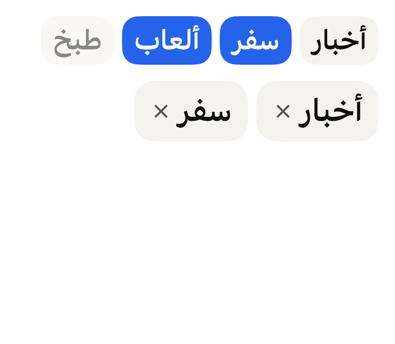
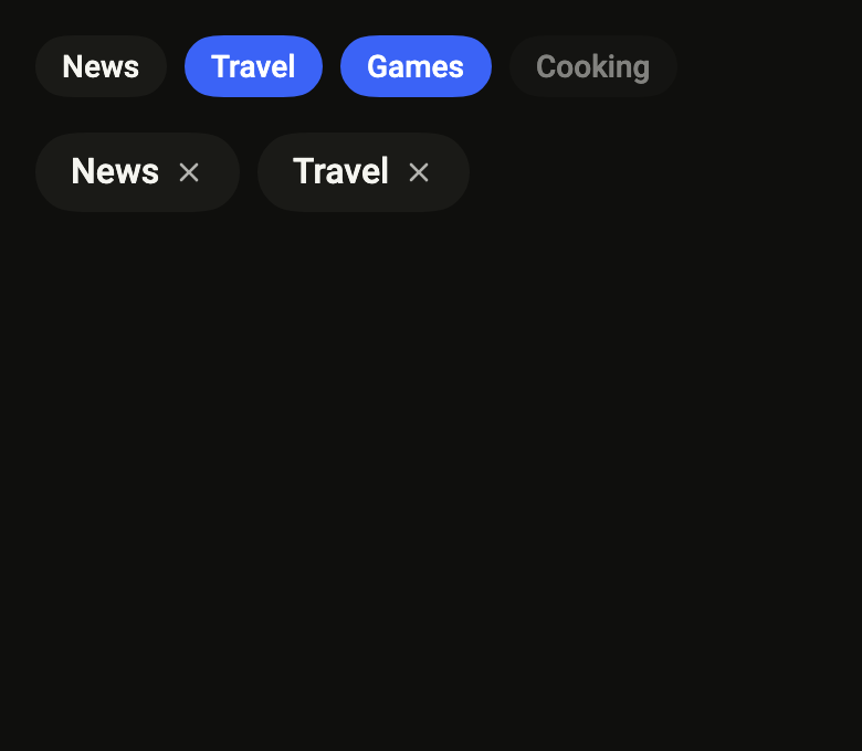
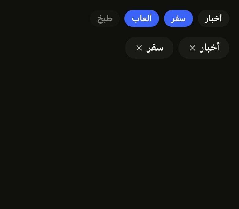
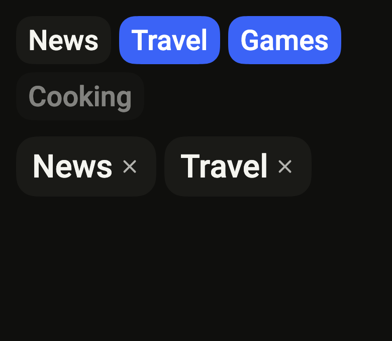
Lets people pick tags among wrapping capsules, such as interests or filters, and remove them with their cross. Single or multiple selection, two backgrounds, three sizes.
Import
In a Flutter app where fliin init has run:
Examples
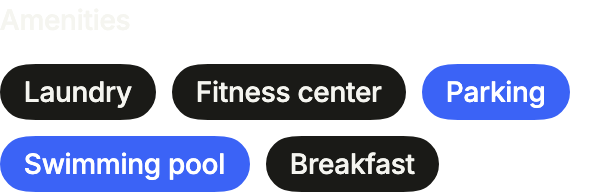
Amenities
Tags to pick several options from a short list, under a label: selected holds their values.
import 'package:your_app/ui/fliin/components/field/fl_field.dart';
import 'package:your_app/ui/fliin/components/tag_group/fl_tag_group.dart';
import 'package:your_app/ui/fliin/core/fliin.dart';
import 'package:flutter/widgets.dart';

class TagGroupAmenitiesExample extends StatefulWidget {
  const TagGroupAmenitiesExample({super.key});

  @override
  State<TagGroupAmenitiesExample> createState() => _TagGroupAmenitiesExampleState();
}

class _TagGroupAmenitiesExampleState extends State<TagGroupAmenitiesExample> {
  var _selected = <String>{'parking', 'pool'};

  @override
  Widget build(BuildContext context) {
    return Column(
      mainAxisSize: MainAxisSize.min,
      crossAxisAlignment: CrossAxisAlignment.start,
      spacing: FlScope.of(context).space.md,
      children: [
        const FlLabel('Amenities'),
        FlTagGroup<String>(
          tags: const [
            FlTag('laundry', 'Laundry'),
            FlTag('fitness', 'Fitness center'),
            FlTag('parking', 'Parking'),
            FlTag('pool', 'Swimming pool'),
            FlTag('breakfast', 'Breakfast'),
          ],
          selection: FlTagSelection.multiple,
          selected: _selected,
          onSelectionChanged: (selected) => setState(() => _selected = selected),
          removeLabel: (label) => 'Remove $label',
        ),
      ],
    );
  }
}Selected
Selected tags take the accent; touching one toggles it.

import 'package:your_app/ui/fliin/components/tag_group/fl_tag_group.dart';
import 'package:flutter/widgets.dart';

class TagGroupSelectedExample extends StatefulWidget {
  const TagGroupSelectedExample({super.key});

  @override
  State<TagGroupSelectedExample> createState() => _TagGroupSelectedExampleState();
}

class _TagGroupSelectedExampleState extends State<TagGroupSelectedExample> {
  var _selected = <String>{'news', 'travel'};

  @override
  Widget build(BuildContext context) {
    return FlTagGroup<String>(
      tags: const [
        FlTag('news', 'News'),
        FlTag('travel', 'Travel'),
        FlTag('gaming', 'Gaming'),
        FlTag('food', 'Food'),
      ],
      selection: FlTagSelection.multiple,
      selected: _selected,
      onSelectionChanged: (selected) => setState(() => _selected = selected),
      removeLabel: (label) => 'Remove $label',
    );
  }
}Unselected
Nothing selected yet.

import 'package:your_app/ui/fliin/components/tag_group/fl_tag_group.dart';
import 'package:flutter/widgets.dart';

class TagGroupUnselectedExample extends StatefulWidget {
  const TagGroupUnselectedExample({super.key});

  @override
  State<TagGroupUnselectedExample> createState() => _TagGroupUnselectedExampleState();
}

class _TagGroupUnselectedExampleState extends State<TagGroupUnselectedExample> {
  var _selected = <String>{};

  @override
  Widget build(BuildContext context) {
    return FlTagGroup<String>(
      tags: const [
        FlTag('news', 'News'),
        FlTag('travel', 'Travel'),
        FlTag('gaming', 'Gaming'),
        FlTag('food', 'Food'),
      ],
      selection: FlTagSelection.multiple,
      selected: _selected,
      onSelectionChanged: (selected) => setState(() => _selected = selected),
      removeLabel: (label) => 'Remove $label',
    );
  }
}Disabled
disabled locks every tag and keeps the selection visible.

import 'package:your_app/ui/fliin/components/tag_group/fl_tag_group.dart';
import 'package:flutter/widgets.dart';

class TagGroupDisabledExample extends StatefulWidget {
  const TagGroupDisabledExample({super.key});

  @override
  State<TagGroupDisabledExample> createState() => _TagGroupDisabledExampleState();
}

class _TagGroupDisabledExampleState extends State<TagGroupDisabledExample> {
  var _selected = <String>{'news'};

  @override
  Widget build(BuildContext context) {
    return FlTagGroup<String>(
      tags: const [
        FlTag('news', 'News'),
        FlTag('travel', 'Travel'),
        FlTag('gaming', 'Gaming'),
        FlTag('food', 'Food'),
      ],
      selection: FlTagSelection.multiple,
      selected: _selected,
      disabled: true,
      onSelectionChanged: (selected) => setState(() => _selected = selected),
      removeLabel: (label) => 'Remove $label',
    );
  }
}Removable
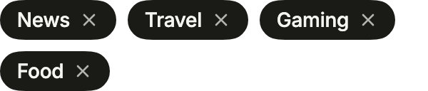
With onRemove, each tag gets a remove button; removeLabel names it for the screen reader.
import 'package:your_app/ui/fliin/components/tag_group/fl_tag_group.dart';
import 'package:flutter/widgets.dart';

class TagGroupRemovableExample extends StatefulWidget {
  const TagGroupRemovableExample({super.key});

  @override
  State<TagGroupRemovableExample> createState() => _TagGroupRemovableExampleState();
}

class _TagGroupRemovableExampleState extends State<TagGroupRemovableExample> {
  var _selected = <String>{};
  var _tags = const [
    FlTag('news', 'News'),
    FlTag('travel', 'Travel'),
    FlTag('gaming', 'Gaming'),
    FlTag('food', 'Food'),
  ];

  @override
  Widget build(BuildContext context) {
    return FlTagGroup<String>(
      tags: _tags,
      selection: FlTagSelection.multiple,
      selected: _selected,
      onSelectionChanged: (selected) => setState(() => _selected = selected),
      onRemove: (value) => setState(() => _tags = [
        for (final tag in _tags)
          if (tag.value != value) tag,
      ]),
      removeLabel: (label) => 'Remove $label',
    );
  }
}Sizes
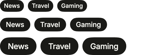
Three sizes: sm, md (the default) and lg.
import 'package:your_app/ui/fliin/components/tag_group/fl_tag_group.dart';
import 'package:your_app/ui/fliin/core/fliin.dart';
import 'package:flutter/widgets.dart';

class TagGroupSizesExample extends StatelessWidget {
  const TagGroupSizesExample({super.key});

  @override
  Widget build(BuildContext context) {
    return Column(
      mainAxisSize: MainAxisSize.min,
      crossAxisAlignment: CrossAxisAlignment.start,
      spacing: FlScope.of(context).space.md,
      children: [
        for (final size in FlTagSize.values)
          FlTagGroup<String>(
            key: ValueKey(size),
            size: size,
            tags: const [FlTag('news', 'News'), FlTag('travel', 'Travel'), FlTag('gaming', 'Gaming')],
          ),
      ],
    );
  }
}Leading
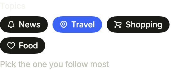
leading puts an icon or a small avatar before the label, in the tag's color; label and description frame the group.
import 'package:your_app/ui/fliin/components/tag_group/fl_tag_group.dart';
import 'package:your_app/ui/fliin/core/fliin.dart';
import 'package:your_app/ui/fliin/icons/fl_icons.dart';
import 'package:flutter/widgets.dart';

class TagGroupLeadingExample extends StatefulWidget {
  const TagGroupLeadingExample({super.key});

  @override
  State<TagGroupLeadingExample> createState() => _TagGroupLeadingExampleState();
}

class _TagGroupLeadingExampleState extends State<TagGroupLeadingExample> {
  var _topic = <String>{'travel'};

  @override
  Widget build(BuildContext context) {
    return FlTagGroup<String>(
      label: 'Topics',
      description: 'Pick the one you follow most',
      selection: FlTagSelection.single,
      selected: _topic,
      onSelectionChanged: (value) => setState(() => _topic = value),
      tags: [
        FlTag('news', 'News', leading: FlIcon(FlIcons.bell)),
        FlTag('travel', 'Travel', leading: FlIcon(FlIcons.mapPin)),
        FlTag('shopping', 'Shopping', leading: FlIcon(FlIcons.shoppingCart)),
        FlTag('food', 'Food', leading: FlIcon(FlIcons.heart)),
      ],
    );
  }
}Error
error shows why the selection is rejected, in place of the description, until the user picks a tag.
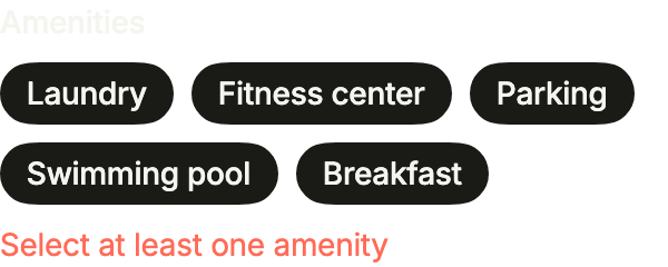
import 'package:your_app/ui/fliin/components/tag_group/fl_tag_group.dart';
import 'package:flutter/widgets.dart';

class TagGroupErrorExample extends StatefulWidget {
  const TagGroupErrorExample({super.key});

  @override
  State<TagGroupErrorExample> createState() => _TagGroupErrorExampleState();
}

class _TagGroupErrorExampleState extends State<TagGroupErrorExample> {
  var _amenities = <String>{};

  @override
  Widget build(BuildContext context) {
    return FlTagGroup<String>(
      label: 'Amenities',
      description: 'Selected: ${_amenities.length}',
      error: _amenities.isEmpty ? 'Select at least one amenity' : null,
      selection: FlTagSelection.multiple,
      selected: _amenities,
      onSelectionChanged: (value) => setState(() => _amenities = value),
      tags: const [
        FlTag('laundry', 'Laundry'),
        FlTag('fitness', 'Fitness center'),
        FlTag('parking', 'Parking'),
        FlTag('pool', 'Swimming pool'),
        FlTag('breakfast', 'Breakfast'),
      ],
    );
  }
}Usage
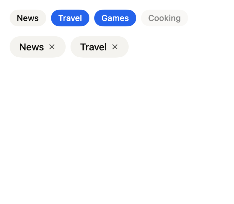
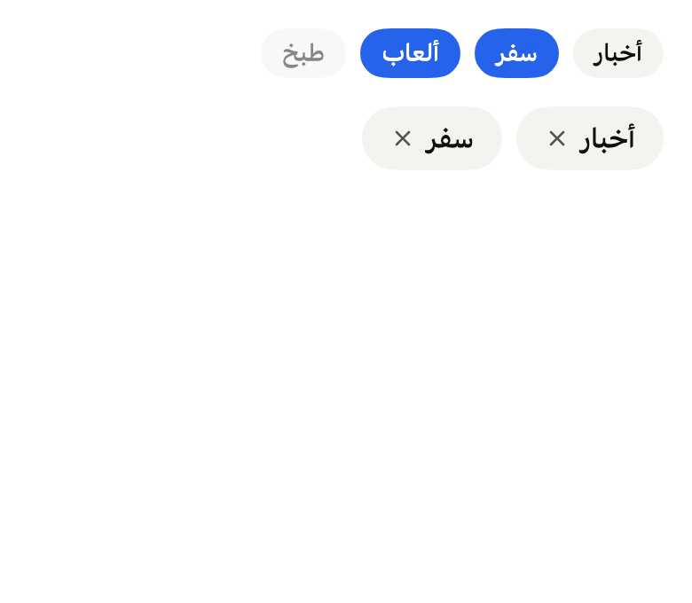
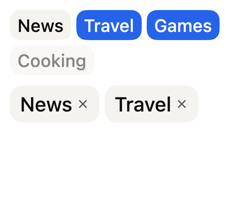
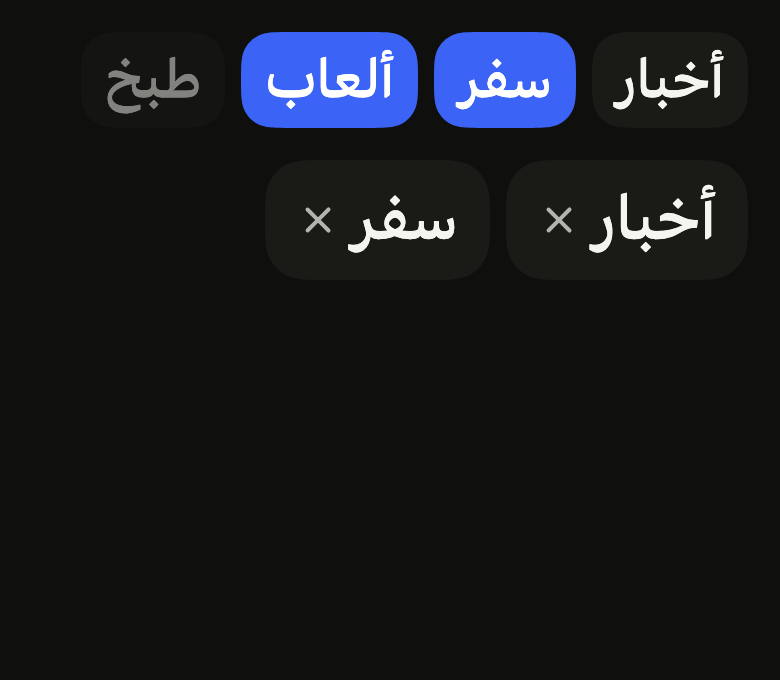
The code the reference images render:
final example = ColoredBox(
  color: FlScope.of(context).colors.surface,
  child: Padding(
    padding: EdgeInsetsDirectional.all(FlScope.of(context).space.lg),
    child: Column(
      crossAxisAlignment: CrossAxisAlignment.stretch,
      spacing: FlScope.of(context).space.lg,
      children: [
        FlTagGroup<int>(
          tags: [
            for (final (i, label)
                in (variant.dir == TextDirection.rtl
                        ? const ['أخبار', 'سفر', 'ألعاب', 'طبخ']
                        : const ['News', 'Travel', 'Games', 'Cooking'])
                    .indexed)
              FlTag(i, label, disabled: i == 3),
          ],
          selection: FlTagSelection.multiple,
          selected: const {1, 2},
          onSelectionChanged: (_) {},
        ),
        FlTagGroup<int>(
          tags: [
            for (final (i, label)
                in (variant.dir == TextDirection.rtl
                        ? const ['أخبار', 'سفر']
                        : const ['News', 'Travel'])
                    .indexed)
              FlTag(i, label),
          ],
          variant: FlTagGroupVariant.surface,
          size: FlTagSize.lg,
          onRemove: (_) {},
          removeLabel: (label) => 'Remove $label',
        ),
      ],
    ),
  ),
);API
FlTagGroupVariant: enum {primary, surface}
FlTagGroupVariant.primary: static final FlTagGroupVariant
FlTagGroupVariant.surface: static final FlTagGroupVariant
FlTagSize: enum {sm, md, lg}
FlTagSize.sm: static final FlTagSize
FlTagSize.md: static final FlTagSize
FlTagSize.lg: static final FlTagSize
FlTagSelection: enum {none, single, multiple}
FlTagSelection.none: static final FlTagSelection
FlTagSelection.single: static final FlTagSelection
FlTagSelection.multiple: static final FlTagSelection
FlTag: final class<T>
FlTag.new: const new(T value, String label, {bool disabled, Widget? leading})
FlTag.value: get T
FlTag.label: get String
FlTag.leading: get Widget?
FlTag.disabled: get bool
FlTagGroup: class<T> extends StatelessWidget
FlTagGroup.new: const new({super.key, required List<FlTag<T>> tags, FlTagSelection selection, Set<T> selected, ValueChanged<Set<T>>? onSelectionChanged, ValueChanged<T>? onRemove, String Function(String label)? removeLabel, FlTagGroupVariant variant, FlTagSize size, bool disabled, Widget? empty, String? label, String? description, String? error})
FlTagGroup.label: get String?
FlTagGroup.description: get String?
FlTagGroup.error: get String?
FlTagGroup.tags: get List<FlTag<T>>
FlTagGroup.selection: get FlTagSelection
FlTagGroup.selected: get Set<T>
FlTagGroup.onSelectionChanged: get ValueChanged<Set<T>>?
FlTagGroup.onRemove: get ValueChanged<T>?
FlTagGroup.removeLabel: get String Function(String label)?
FlTagGroup.variant: get FlTagGroupVariant
FlTagGroup.size: get FlTagSize
FlTagGroup.disabled: get bool
FlTagGroup.empty: get Widget?
FlTagGroup.build: Widget(BuildContext context)Reference renders
The 16 images published with version 0.2.3, rendered by the shared harness on macOS with Flutter 3.47.7. fliin verify tag-group compares your copy to them.
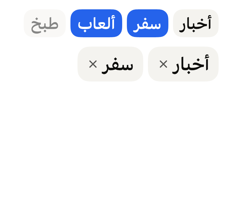
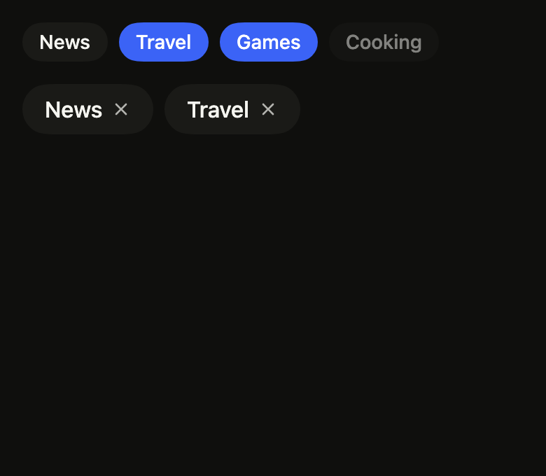
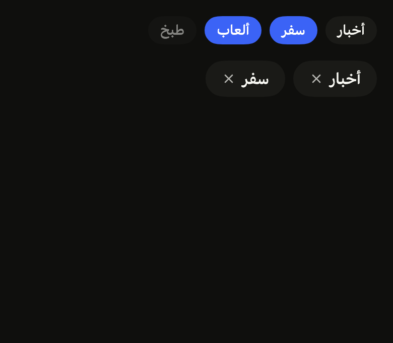
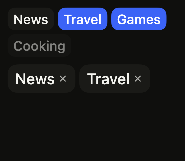
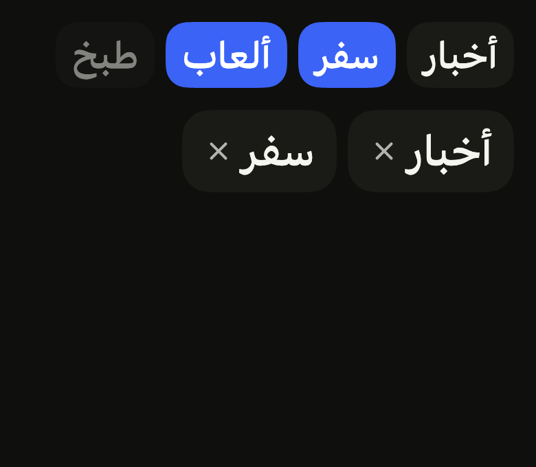
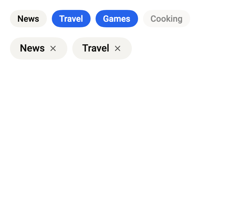
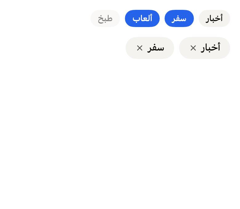
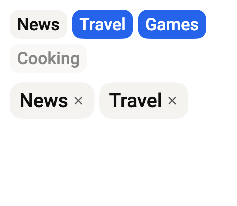
Use it to
- pick interests from a set of tags
- let users filter a list by categories
- select several tags at once
- remove a tag from a keyword list
- let guests choose amenities like parking or pool
- Not for
- a status shown without a choice: use a chip (chip)
- an exclusive choice in a form: use radio buttons (radio)
- States
Source
The files fliin add tag-group copies into your app, before your prefix and imports are applied.
tag_group/fl_tag_group.dart
// Modified from the TagGroup of HeroUI Native 1.0.10, Copyright 2025 NextUI
// Inc., licensed under Apache 2.0: https://www.apache.org/licenses/LICENSE-2.0
import 'package:flutter/semantics.dart' show SemanticsRole;
import 'package:flutter/widgets.dart';
import 'package:fliin_ui/components/field/fl_field.dart';
import 'package:fliin_ui/core/fliin.dart';
import 'package:fliin_ui/icons/fl_icons.dart';

/// The fill of the tags of an [FlTagGroup].
enum FlTagGroupVariant {
  /// The `control` fill.
  primary,

  /// The `surfaceRaised` fill, for a group placed on the page rather than on
  /// a surface.
  surface,
}

/// The size of the tags of an [FlTagGroup]: padding, radius and text.
enum FlTagSize {
  /// `px-2 py-1`, radius `xl`, text `textXs`.
  sm,

  /// `px-3 py-1`, radius `xxl`, text `textSm`.
  md,

  /// `px-4 py-1.5`, radius `radiusCard`, text `textBase`.
  lg,
}

/// What a tap does to a tag.
enum FlTagSelection {
  /// Nothing: the tags are display only.
  none,

  /// At most one tag; tapping it again deselects it.
  single,

  /// As many tags as wanted; each tap toggles its own.
  multiple,
}

/// A tag of an [FlTagGroup], identified by [value].
final class FlTag<T> {
  /// A tag that displays [label].
  const FlTag(this.value, this.label, {this.disabled = false, this.leading});

  /// The value that identifies it in the selection and on removal.
  final T value;

  /// The displayed text, also read by the screen reader.
  final String label;

  /// An icon or a small avatar before the label,
  /// given the tag's text color and a side that follows its size (12, 14
  /// or 16) through the `IconTheme`; left out of the semantics.
  final Widget? leading;

  /// True: at `disabledOpacity`, neither selectable nor removable.
  final bool disabled;
}

/// A group of tags: inline capsules that wrap, picked
/// one or several at a time according to [selection], and removable by
/// their cross when [onRemove] is given.
class FlTagGroup<T> extends StatelessWidget {
  /// A group of the [tags].
  const FlTagGroup({
    super.key,
    required this.tags,
    this.selection = FlTagSelection.none,
    this.selected = const {},
    this.onSelectionChanged,
    this.onRemove,
    this.removeLabel,
    this.variant = FlTagGroupVariant.primary,
    this.size = FlTagSize.md,
    this.disabled = false,
    this.empty,
    this.label,
    this.description,
    this.error,
  }) : assert(onRemove == null || removeLabel != null, 'removeLabel names the cross for the screen reader');

  /// The group's name above the tags ("Amenities"), which names the list
  /// for the screen reader; null, none.
  final String? label;

  /// A help text under the tags; hidden while [error] is non-null.
  final String? description;

  /// Non-null: the selection is rejected, and this text shows under the
  /// tags in `danger` ("Select at least one").
  final String? error;

  /// The tags, in order.
  final List<FlTag<T>> tags;

  /// What a tap does to a tag; `none` by default.
  final FlTagSelection selection;

  /// The values of the chosen tags: `selected`, `onSelected` text. The group
  /// does not keep them: the caller updates them from
  /// [onSelectionChanged].
  final Set<T> selected;

  /// Receives the new selection on each tap.
  final ValueChanged<Set<T>>? onSelectionChanged;

  /// When given: each tag carries a cross that reports it removed.
  final ValueChanged<T>? onRemove;

  /// The name of a tag's cross for the screen reader ("Remove Travel"),
  /// required with [onRemove].
  final String Function(String label)? removeLabel;

  /// The fill; `primary` by default.
  final FlTagGroupVariant variant;

  /// The size; `md` by default.
  final FlTagSize size;

  /// True: the whole group is disabled.
  final bool disabled;

  /// What is shown when [tags] is empty (`renderEmptyState`).
  final Widget? empty;

  void _toggle(T value) {
    final next = switch (selection) {
      FlTagSelection.none => selected,
      FlTagSelection.single => selected.contains(value) ? <T>{} : {value},
      FlTagSelection.multiple => selected.contains(value) ? ({...selected}..remove(value)) : {...selected, value},
    };
    onSelectionChanged?.call(next);
  }

  @override
  Widget build(BuildContext context) {
    final theme = FlScope.of(context);
    final empty = this.empty;
    if (tags.isEmpty && empty != null) return empty;
    final gap = theme.space.xs * 2;
    final label = this.label;
    final description = this.description;
    final error = this.error;
    final list = Semantics(
      container: true,
      role: SemanticsRole.list,
      label: label,
      explicitChildNodes: true,
      // flex-wrap, gap-2, items-start of `tag-group__list`.
      child: Wrap(spacing: gap, runSpacing: gap, children: [for (final tag in tags) _tag(context, theme, tag)]),
    );
    if (label == null && description == null && error == null) return list;
    return FlFieldScope(
      invalid: error != null,
      disabled: disabled,
      required: false,
      child: Column(
        mainAxisSize: MainAxisSize.min,
        crossAxisAlignment: CrossAxisAlignment.stretch,
        spacing: theme.space.sm,
        children: [
          if (label != null) ExcludeSemantics(child: FlLabel(label)),
          list,
          if (description != null && error == null) FlDescription(description),
          if (error != null) FlFieldError(error),
        ],
      ),
    );
  }

  Widget _tag(BuildContext context, FlTheme theme, FlTag<T> tag) {
    final colors = theme.colors;
    final xs = theme.space.xs;
    final on = selected.contains(tag.value);
    final enabled = !disabled && !tag.disabled;
    final rest = switch (variant) {
      FlTagGroupVariant.primary => colors.control,
      FlTagGroupVariant.surface => colors.surfaceRaised,
    };
    final (role, horizontal, vertical, spacing, radius) = switch (size) {
      // 4 above and below, not 2: Flutter's contrast rule looks 4 around the
      // text, and a chosen tag's `selected` fill must fill that.
      FlTagSize.sm => (FlTextRole.textXs, xs * 2, xs, xs, theme.shape.radiusXl),
      FlTagSize.md => (FlTextRole.textSm, xs * 3, xs, xs * 1.5, theme.shape.radiusXxl),
      FlTagSize.lg => (FlTextRole.textBase, xs * 4, xs * 1.5, xs * 1.5, theme.shape.radiusCard),
    };
    // Izydesk's state matrix: hovered or pressed, a `control` tag steps to
    // `controlPressed`.
    // A chosen tag takes the selection color, which fades in over `short2`
    // (a 100 ms color transition).
    Widget body(BuildContext context, {bool hovered = false}) => TweenAnimationBuilder<double>(
      tween: Tween(end: on ? 1 : 0),
      duration: FlMotion.of(context).reduced ? Duration.zero : theme.motion.short2,
      curve: theme.motion.standard,
      builder: (context, t, _) => _body(
        context,
        theme,
        tag,
        fill: Color.lerp(hovered && rest == colors.control ? colors.controlPressed : rest, colors.selected, t)!,
        ink: Color.lerp(colors.onField, colors.onSelected, t)!,
        role: role,
        horizontal: horizontal,
        vertical: vertical,
        spacing: spacing,
        radius: radius,
        enabled: enabled,
      ),
    );
    final Widget item = selection == FlTagSelection.none
        ? Semantics(container: true, role: SemanticsRole.listItem, child: body(context))
        : FlPressable(
            onPressed: enabled ? () => _toggle(tag.value) : null,
            role: SemanticsRole.listItem,
            borderRadius: BorderRadius.circular(radius),
            scaleOnPress: false,
            overlay: FlPressOverlay.none,
            builder: (context, states) => Semantics(
              selected: on,
              child: body(
                context,
                hovered: states.contains(WidgetState.hovered) || states.contains(WidgetState.pressed),
              ),
            ),
          );
    return Opacity(opacity: enabled ? 1 : theme.size.disabledOpacity, child: item);
  }

  Widget _body(
    BuildContext context,
    FlTheme theme,
    FlTag<T> tag, {
    required Color fill,
    required Color ink,
    required FlTextRole role,
    required double horizontal,
    required double vertical,
    required double spacing,
    required double radius,
    required bool enabled,
  }) {
    final onRemove = this.onRemove;
    final removeLabel = this.removeLabel;
    return FlPixelSnap(
      child: DecoratedBox(
        decoration: ShapeDecoration(
          color: fill,
          shape: FlContinuousBorder(radius: radius),
        ),
        child: Padding(
          padding: EdgeInsetsDirectional.symmetric(horizontal: horizontal, vertical: vertical),
          child: Row(
            mainAxisSize: MainAxisSize.min,
            spacing: spacing,
            children: [
              if (tag.leading case final leading?)
                ExcludeSemantics(
                  child: IconTheme.merge(
                    data: IconThemeData(
                      color: ink,
                      size: MediaQuery.textScalerOf(context)
                          .clamp(maxScaleFactor: theme.size.iconMaxScale)
                          .scale(switch (size) {
                            FlTagSize.sm => theme.space.xs * 3,
                            FlTagSize.md => theme.space.xs * 3.5,
                            FlTagSize.lg => theme.space.xs * 4,
                          }),
                    ),
                    child: leading,
                  ),
                ),
              Flexible(
                // Yoga rounds the text box to the pixel: the cross lands after it.
                child: FlPixelSnap(
                  child: Text(
                    tag.label,
                    style: theme.typography
                        .resolve(role)
                        .copyWith(color: ink, fontWeight: theme.tokens.typography.weight.medium),
                    strutStyle: theme.typography.strut(
                      role,
                      inheritedFamily: DefaultTextStyle.of(context).style.fontFamily,
                    ),
                  ),
                ),
              ),
              if (onRemove != null && removeLabel != null)
                _Remove(
                  label: removeLabel(tag.label),
                  color: ink,
                  radius: theme.shape.radiusLg,
                  onPressed: enabled ? () => onRemove(tag.value) : null,
                ),
            ],
          ),
        ),
      ),
    );
  }
}

/// The cross of the canvas's `.tag .i`, 14 per side at 70 %, which no token
/// carries.
const _removeIcon = 14.0;
const _removeOpacity = 0.7;

/// The cross that removes a tag: 14 per side, in the text color at 70 %,
/// with the platform's touch target.
class _Remove extends StatelessWidget {
  const _Remove({required this.label, required this.color, required this.radius, required this.onPressed});

  final String label;
  final Color color;
  final double radius;
  final VoidCallback? onPressed;

  @override
  Widget build(BuildContext context) {
    final theme = FlScope.of(context);
    final side = MediaQuery.textScalerOf(context).clamp(maxScaleFactor: theme.size.iconMaxScale).scale(_removeIcon);
    return FlPressable(
      onPressed: onPressed,
      label: label,
      borderRadius: BorderRadius.circular(radius),
      scaleOnPress: false,
      overlay: FlPressOverlay.none,
      builder: (context, states) => FlIcon(
        FlIcons.xmark,
        size: side,
        color: color.withValues(alpha: color.a * _removeOpacity),
      ),
    );
  }
}