Components / overlays
Anchored popover
Opens free content next to the control that opens it, closed by a tap outside or Escape. A panel with a title, text, a close button and an arrow, or a bottom sheet.
Import
In a Flutter app where fliin init has run:
Examples
Open
A popover anchored to its trigger, with a title and a description. The FlPopoverController opens and closes it; pass yours to drive it from code.
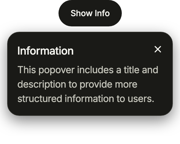
import 'package:your_app/ui/fliin/components/button/fl_button.dart';
import 'package:your_app/ui/fliin/components/popover/fl_popover.dart';
import 'package:flutter/widgets.dart';

class PopoverOpenExample extends StatefulWidget {
  const PopoverOpenExample({super.key, this.controller});

  final FlPopoverController? controller;

  @override
  State<PopoverOpenExample> createState() => _PopoverOpenExampleState();
}

class _PopoverOpenExampleState extends State<PopoverOpenExample> {
  late final _controller = widget.controller ?? FlPopoverController();

  @override
  Widget build(BuildContext context) {
    return FlPopover(
      controller: _controller,
      label: 'Information',
      title: 'Information',
      description: 'This popover includes a title and description to provide more structured information to users.',
      closeLabel: 'Close',
      width: 280,
      child: FlButton(
        label: 'Show Info',
        size: FlButtonSize.sm,
        variant: FlButtonVariant.tertiary,
        onPressed: _controller.toggle,
      ),
    );
  }
}Arrow
arrow points at the trigger, here an icon button; side puts the panel above it, flipped below when it lacks room.
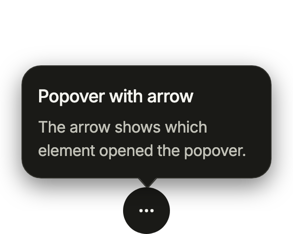
import 'package:your_app/ui/fliin/components/button/fl_button.dart';
import 'package:your_app/ui/fliin/components/popover/fl_popover.dart';
import 'package:your_app/ui/fliin/core/fliin.dart';
import 'package:your_app/ui/fliin/icons/fl_icons.dart';
import 'package:flutter/widgets.dart';

class PopoverArrowExample extends StatefulWidget {
  const PopoverArrowExample({super.key, this.controller});

  final FlPopoverController? controller;

  @override
  State<PopoverArrowExample> createState() => _PopoverArrowExampleState();
}

class _PopoverArrowExampleState extends State<PopoverArrowExample> {
  late final _controller = widget.controller ?? FlPopoverController();

  @override
  Widget build(BuildContext context) {
    return FlPopover(
      controller: _controller,
      label: 'Popover with arrow',
      title: 'Popover with arrow',
      description: 'The arrow shows which element opened the popover.',
      arrow: true,
      side: FlSide.top,
      width: 256,
      child: FlButton.icon(
        label: 'More options',
        icon: FlIcon(FlIcons.ellipsis),
        variant: FlButtonVariant.tertiary,
        onPressed: _controller.toggle,
      ),
    );
  }
}Interactive
Any widget as content, with its own state: a profile card opened from an author's name, whose Follow button stays live inside the panel.
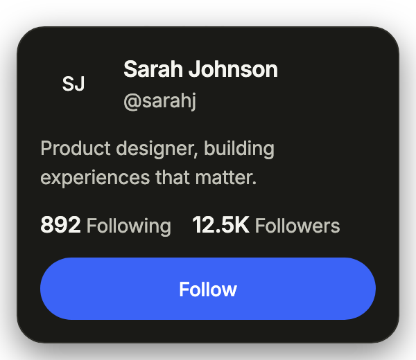
import 'package:your_app/ui/fliin/components/avatar/fl_avatar.dart';
import 'package:your_app/ui/fliin/components/button/fl_button.dart';
import 'package:your_app/ui/fliin/components/popover/fl_popover.dart';
import 'package:your_app/ui/fliin/core/fliin.dart';
import 'package:flutter/widgets.dart';

class PopoverInteractiveExample extends StatefulWidget {
  const PopoverInteractiveExample({super.key, this.controller});

  final FlPopoverController? controller;

  @override
  State<PopoverInteractiveExample> createState() => _PopoverInteractiveExampleState();
}

class _PopoverInteractiveExampleState extends State<PopoverInteractiveExample> {
  late final _controller = widget.controller ?? FlPopoverController();
  var _following = false;

  @override
  Widget build(BuildContext context) {
    final theme = FlScope.of(context);
    final muted = theme.typography.resolve(FlTextRole.textSm).copyWith(color: theme.colors.onSurfaceMuted);
    final strong = theme.typography
        .resolve(FlTextRole.textBase)
        .copyWith(fontWeight: theme.tokens.typography.weight.semibold);
    return FlPopover(
      controller: _controller,
      label: 'Sarah Johnson',
      width: 320,
      // Scrolls when the text is enlarged and the panel reaches the screen's edge.
      content: SingleChildScrollView(
        child: Column(
          mainAxisSize: MainAxisSize.min,
          crossAxisAlignment: CrossAxisAlignment.stretch,
          spacing: theme.space.md,
          children: [
            Row(
              spacing: theme.space.md,
              children: [
                const FlAvatar(initials: 'SJ'),
                Expanded(
                  child: Column(
                    crossAxisAlignment: CrossAxisAlignment.start,
                    children: [
                      Text('Sarah Johnson', style: strong),
                      Text('@sarahj', style: muted),
                    ],
                  ),
                ),
              ],
            ),
            Text('Product designer, building experiences that matter.', style: muted),
            Text.rich(
              TextSpan(
                children: [
                  TextSpan(text: '892', style: strong),
                  TextSpan(text: ' Following    ', style: muted),
                  TextSpan(text: '12.5K', style: strong),
                  TextSpan(text: ' Followers', style: muted),
                ],
              ),
            ),
            FlButton(
              label: _following ? 'Following' : 'Follow',
              size: FlButtonSize.sm,
              variant: _following ? FlButtonVariant.tertiary : FlButtonVariant.primary,
              onPressed: () => setState(() => _following = !_following),
            ),
          ],
        ),
      ),
      child: FlButton(label: 'Sarah Johnson', variant: FlButtonVariant.ghost, onPressed: _controller.toggle),
    );
  }
}Usage
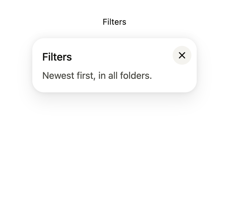
The code the reference images render:
final example = Overlay(
  initialEntries: [
    OverlayEntry(
      builder: (context) => ColoredBox(
        color: FlScope.of(context).colors.surface,
        child: Padding(
          padding: EdgeInsetsDirectional.all(FlScope.of(context).space.lg),
          child: Align(
            alignment: AlignmentDirectional.topCenter,
            child: Builder(
              builder: (context) {
                final controller = FlPopoverController();
                WidgetsBinding.instance.addPostFrameCallback(
                  (_) => controller.open(),
                );
                return FlPopover(
                  controller: controller,
                  label: 'Filters',
                  title: 'Filters',
                  description: 'Newest first, in all folders.',
                  closeLabel: 'Close',
                  width: 280,
                  child: FlPressable(
                    onPressed: controller.toggle,
                    label: 'Filters',
                    borderRadius: FlScope.of(context).shape.buttonRadius,
                    builder: (context, states) => Padding(
                      padding: EdgeInsetsDirectional.all(
                        FlScope.of(context).space.md,
                      ),
                      child: Text(
                        'Filters',
                        style: TextStyle(
                          color: FlScope.of(context).colors.onSurface,
                        ),
                      ),
                    ),
                  ),
                );
              },
            ),
          ),
        ),
      ),
    ),
  ],
);API
FlPopoverPresentation: enum {popover, sheet}
FlPopoverPresentation.popover: static final FlPopoverPresentation
FlPopoverPresentation.sheet: static final FlPopoverPresentation
FlPopoverController: class
FlPopoverController.new: new()
FlPopoverController.isOpen: get bool
FlPopoverController.open: void()
FlPopoverController.close: void()
FlPopoverController.toggle: void()
FlPopover: class extends StatefulWidget
FlPopover.new: const new({super.key, required FlPopoverController controller, required String label, required Widget child, String? title, String? description, Widget? content, String? closeLabel, FlSide side, FlAlign align, double? width, bool arrow, FlPopoverPresentation presentation, String? barrierLabel, double? offset, EdgeInsetsGeometry? padding, bool matchAnchorWidth, ValueChanged<bool>? onOpenChanged, bool fitBesideAnchor, bool takesFocus})
FlPopover.controller: get FlPopoverController
FlPopover.label: get String
FlPopover.title: get String?
FlPopover.description: get String?
FlPopover.content: get Widget?
FlPopover.closeLabel: get String?
FlPopover.child: get Widget
FlPopover.side: get FlSide
FlPopover.align: get FlAlign
FlPopover.width: get double?
FlPopover.arrow: get bool
FlPopover.presentation: get FlPopoverPresentation
FlPopover.barrierLabel: get String?
FlPopover.offset: get double?
FlPopover.padding: get EdgeInsetsGeometry?
FlPopover.matchAnchorWidth: get bool
FlPopover.onOpenChanged: get ValueChanged<bool>?
FlPopover.fitBesideAnchor: get bool
FlPopover.takesFocus: get bool
FlPopover.createState: State<FlPopover>()
FlPopoverTitle: class extends StatelessWidget
FlPopoverTitle.new: const new(String data, {super.key})
FlPopoverTitle.data: get String
FlPopoverTitle.build: Widget(BuildContext context)
FlPopoverDescription: class extends StatelessWidget
FlPopoverDescription.new: const new(String data, {super.key})
FlPopoverDescription.data: get String
FlPopoverDescription.build: Widget(BuildContext context)
flYogaRect: Rect(Rect rect, double ratio)
flPopoverText: Widget(BuildContext context, FlTextRole role, {required Color color, FontWeight? weight, double? lineHeight, bool? heading, required Widget child})Reference renders
The 16 images published with version 0.2.4, rendered by the shared harness on macOS with Flutter 3.47.7. fliin verify popover compares your copy to them.
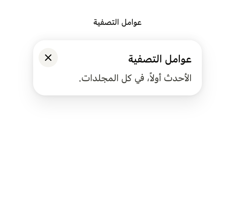
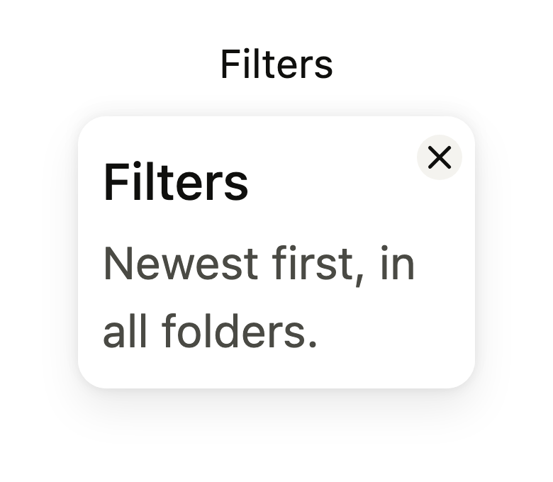
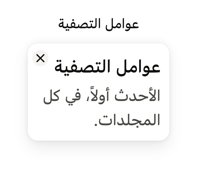
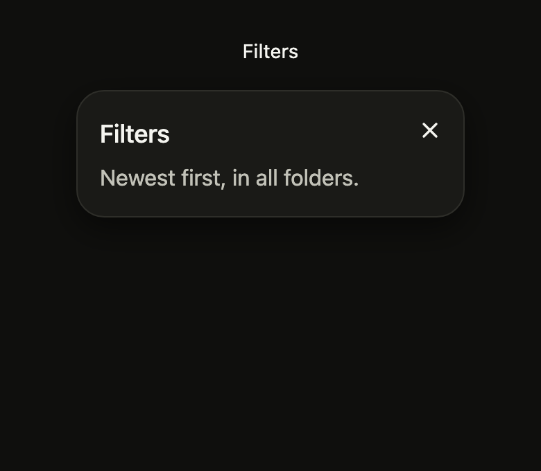
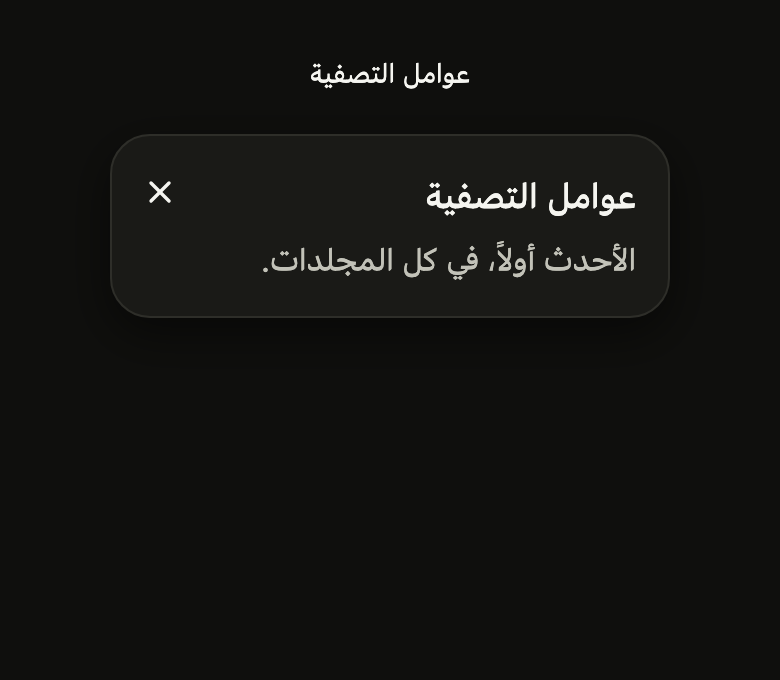
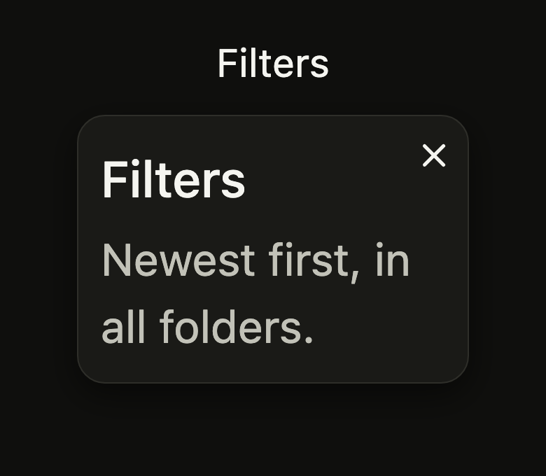

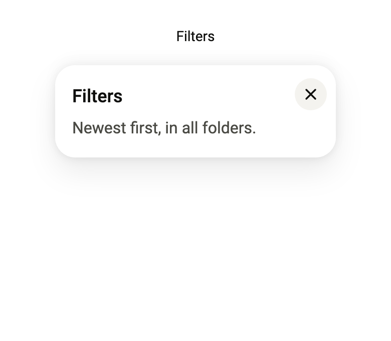
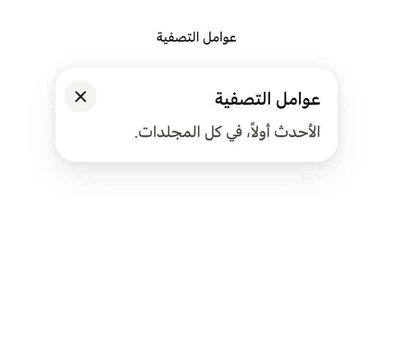
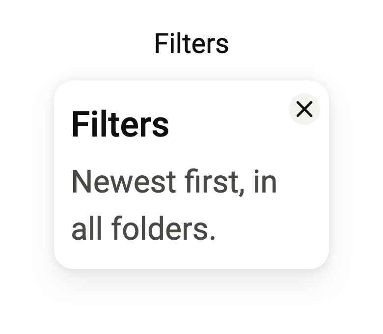
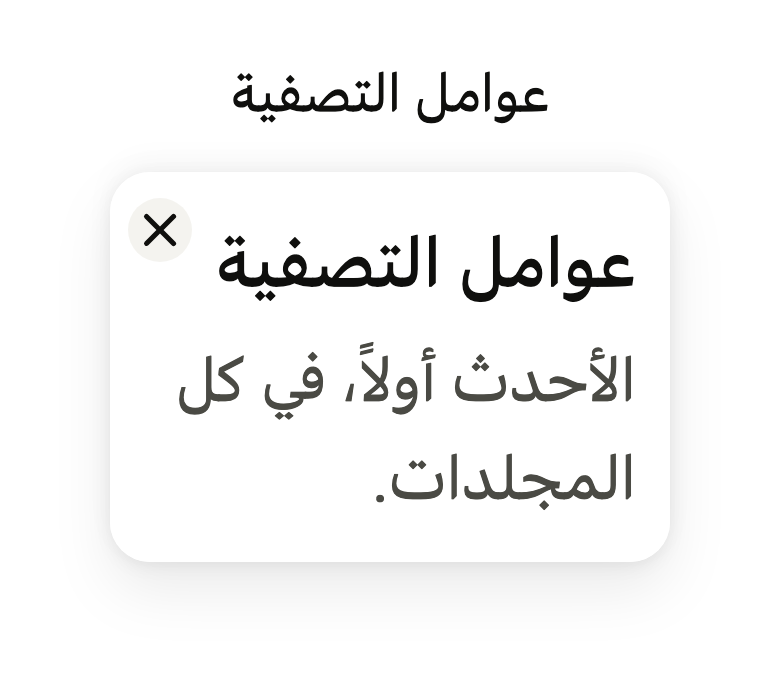
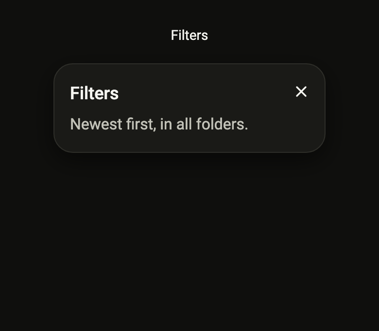
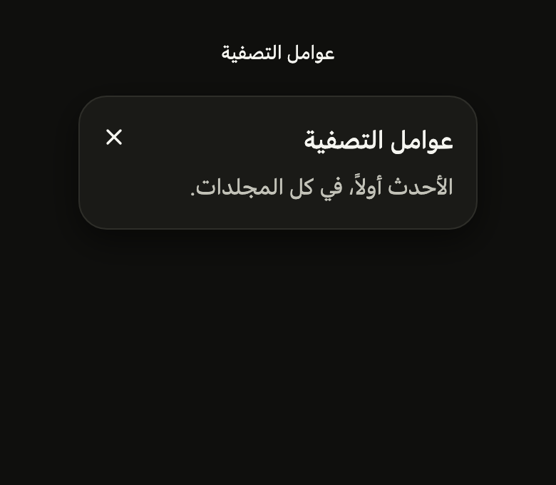
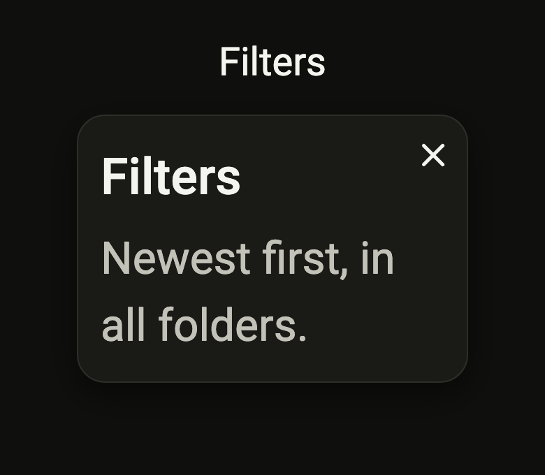

Use it to
- show filters under a button
- open an anchored floating panel
- add a popover that closes on outside tap
- reach quick settings without leaving the screen
- show rich contextual help next to a control
- Not for
- a list of actions to pick from: use a menu (menu)
- a short label on hover or long press: use a tooltip (tooltip)
- a decision that blocks the screen: use a dialog (dialog)
- States
Source
The files fliin add popover copies into your app, before your prefix and imports are applied.
popover/fl_popover.dart
// Modified from the Popover of HeroUI Native 1.0.10, Copyright 2025 NextUI
// Inc., licensed under Apache 2.0: https://www.apache.org/licenses/LICENSE-2.0
import 'dart:math' as math;
import 'dart:ui' show ViewFocusEvent, ViewFocusState;

import 'package:flutter/rendering.dart';
import 'package:flutter/widgets.dart';
import 'package:fliin_ui/components/close_button/fl_close_button.dart';
import 'package:fliin_ui/components/sheet/fl_sheet.dart';
import 'package:fliin_ui/core/fliin.dart';

/// The `Popover.Arrow` arrow: 20 × 12, a corner of 2 at the tip, at least 12
/// from the panel's corners.
const double _arrowWidth = 20;
const double _arrowHeight = 12;
const double _arrowTipRadius = 2;
const double _arrowEdge = 12;

/// How the popover presents its content.
enum FlPopoverPresentation {
  /// A panel floating against the anchor.
  popover,

  /// A modal bottom sheet ([showFlSheet]), dismissed through its barrier.
  sheet,
}

/// Opens and closes the [FlPopover] it is given to, once that one is
/// mounted.
class FlPopoverController {
  _FlPopoverState? _state;

  /// True from the start of opening to the start of closing; false as long
  /// as no mounted [FlPopover] uses this controller.
  bool get isOpen => _state?._open ?? false;

  /// Opens the popover and gives it focus, unless [FlPopover.takesFocus] is
  /// false. No effect if it is already open or not yet mounted.
  void open() => _state?._show();

  /// Closes the popover and gives focus back to whatever had it before. No
  /// effect if it is already closed or not mounted.
  void close() => _state?._dismiss();

  /// Closes the popover if it is open, opens it otherwise: the call usually
  /// wired to the anchor button.
  void toggle() => isOpen ? close() : open();
}

/// A panel placed against [child]: [title] in medium
/// `textLg`, [description] in muted `textBase`, then [content], on
/// `surfaceOverlay`, with the continuous corners of `shape.radiusCard` and
/// the `overlay` shadow. It is centered on the anchor by default, 9 points
/// from it and 12 from the safe edges; flipped when it does not fit on the
/// requested side, shifted to stay on screen, clear of notches and the
/// keyboard. It grows out of the anchor from 0.92 to 1 and shrinks
/// back towards it (`FlPopup`), fading only under reduced motion.
///
/// It is a non-modal dialog (unless [takesFocus] is false, see that
/// parameter): it takes focus when opening, but Tab can leave it, and it
/// then closes, as on a tap outside, on Escape, or when its anchor leaves
/// the screen. Focus returns to whatever had it before. A menu or popover
/// opened from its content stays "inside".
///
/// With [presentation] `sheet`, the same content opens in a modal bottom
/// sheet.
class FlPopover extends StatefulWidget {
  /// Creates a closed popover, placed below [child] and centered on it by default.
  const FlPopover({
    super.key,
    required this.controller,
    required this.label,
    required this.child,
    this.title,
    this.description,
    this.content,
    this.closeLabel,
    this.side = FlSide.bottom,
    this.align = FlAlign.center,
    this.width,
    this.arrow = false,
    this.presentation = FlPopoverPresentation.popover,
    this.barrierLabel,
    this.offset,
    this.padding,
    this.matchAnchorWidth = false,
    this.onOpenChanged,
    this.fitBesideAnchor = false,
    this.takesFocus = true,
  }) : assert(
         presentation == FlPopoverPresentation.popover || barrierLabel != null,
         'the sheet is dismissed through its barrier, which must be named',
       );

  /// Opens and closes this popover. Give it to only one [FlPopover] at a
  /// time: the last one mounted takes it.
  final FlPopoverController controller;

  /// The popover's name, announced by screen readers.
  final String label;

  /// The title at the top (`Popover.Title`), in medium-weight `textLg`;
  /// when null, no title.
  final String? title;

  /// The text below the title (`Popover.Description`), in muted `textBase`;
  /// when null, no text.
  final String? description;

  /// Free content below the title and text, `space.md` under them, in
  /// `textBase` and `onSurface` by default; when null, nothing.
  final Widget? content;

  /// The name of the close button (`Popover.Close`), placed in the top end
  /// corner; when null, no button.
  final String? closeLabel;

  /// The anchor, usually the button that calls `controller.toggle`.
  final Widget child;

  /// The side of the anchor where the popover sits, `bottom` by default;
  /// flipped when it does not fit.
  final FlSide side;

  /// The popover's alignment along the anchor, centered by default.
  final FlAlign align;

  /// The panel's width; when null, it takes its content's width
  /// (`content-fit`), bounded by the safe area.
  final double? width;

  /// True: an arrow points at the anchor (`Popover.Arrow`), which joins the
  /// panel's `border` outline. False by default.
  final bool arrow;

  /// Anchored panel by default, or bottom sheet.
  final FlPopoverPresentation presentation;

  /// The name of the sheet's barrier, required by the `sheet` presentation.
  final String? barrierLabel;

  /// The gap between the anchor and the panel; when null,
  /// `size.popoverOffset` (`DEFAULT_OFFSET`, 9). The panel slides across it
  /// on entry, by `size.popoverTravel` at most.
  final double? offset;

  /// The panel's padding; when null, 12 vertically and 16 horizontally.
  final EdgeInsetsGeometry? padding;

  /// True: the panel takes the anchor's width (`width="trigger"`), and
  /// [width] is ignored.
  final bool matchAnchorWidth;

  /// Called when the popover opens or starts closing, whatever the cause
  /// (controller, tap outside, Escape, sheet dismissed).
  final ValueChanged<bool>? onOpenChanged;

  /// True: the panel does not exceed the larger of the spaces above and
  /// below the anchor, so that scrolling content (a list) never covers it.
  /// False by default: it takes at most the safe area, and slides over the
  /// anchor if it lacks room.
  final bool fitBesideAnchor;

  /// True by default: the panel is a dialog, which takes focus on opening
  /// and closes when Tab leaves it. False: focus stays on the anchor, a field
  /// that filters the panel's list (React Aria's `isNonModal`); nothing in
  /// the panel takes it, Tab included, the panel is not a dialog, and the
  /// anchor handles the keyboard. The panel then sees neither Escape nor the
  /// loss of focus: the anchor closes it itself, through [controller]. A tap
  /// outside and an anchor off screen always close it.
  final bool takesFocus;

  @override
  State<FlPopover> createState() => _FlPopoverState();
}

class _FlPopoverState extends State<FlPopover> with SingleTickerProviderStateMixin, WidgetsBindingObserver {
  final OverlayPortalController _portal = OverlayPortalController(debugLabel: 'FlPopover');

  /// Tab past the last element exits to the page's scope.
  final FocusScopeNode _scope = FocusScopeNode(
    debugLabel: 'FlPopover',
    traversalEdgeBehavior: TraversalEdgeBehavior.parentScope,
  );

  /// Created on the first `didChangeDependencies`, which reads the theme's durations.
  AnimationController? _controller;
  AnimationController get _reveal => _controller!;
  bool _open = false;

  /// The open sheet's context, to close it.
  BuildContext? _sheet;

  @override
  void initState() {
    super.initState();
    widget.controller._state = this;
    WidgetsBinding.instance.addObserver(this);
  }

  @override
  void didChangeDependencies() {
    super.didChangeDependencies();
    _controller ??= (flPopupController(vsync: this, motion: FlScope.of(context).motion)..addStatusListener(_settle));
  }

  @override
  void didUpdateWidget(FlPopover oldWidget) {
    super.didUpdateWidget(oldWidget);
    if (oldWidget.controller != widget.controller) {
      oldWidget.controller._state = null;
      widget.controller._state = this;
    }
  }

  @override
  void dispose() {
    if (widget.controller._state == this) widget.controller._state = null;
    WidgetsBinding.instance.removeObserver(this);
    _controller?.dispose();
    _scope.dispose();
    super.dispose();
  }

  void _show() {
    if (_open) return;
    setState(() => _open = true);
    widget.onOpenChanged?.call(true);
    if (widget.presentation == FlPopoverPresentation.sheet) {
      _showSheet();
      return;
    }
    _portal.show();
    _reveal.forward();
    if (!widget.takesFocus) return;
    // Autofocus does not take over when the anchor already has focus.
    WidgetsBinding.instance.addPostFrameCallback((_) {
      if (mounted && _open) _scope.requestFocus();
    });
  }

  Future<void> _showSheet() async {
    await showFlSheet<void>(
      context,
      label: widget.label,
      barrierLabel: widget.barrierLabel!,
      title: widget.title,
      description: widget.description,
      closeLabel: widget.closeLabel,
      builder: (context) {
        _sheet = context;
        return widget.content ?? const SizedBox.shrink();
      },
    );
    _sheet = null;
    if (!mounted) return;
    setState(() => _open = false);
    widget.onOpenChanged?.call(false);
  }

  /// On closing, `ExcludeFocus` removes focus from the popover: its scope
  /// returns it to whatever had it before, the anchor when it was opened
  /// from the keyboard.
  void _dismiss() {
    if (!_open) return;
    if (widget.presentation == FlPopoverPresentation.sheet) {
      if (_sheet case final sheet? when sheet.mounted) {
        Navigator.of(sheet).pop();
      }
      return;
    }
    setState(() => _open = false);
    widget.onOpenChanged?.call(false);
    _reveal.reverse();
  }

  void _onFocusChange(bool focused) {
    if (!focused) _dismiss();
  }

  /// The view that regains focus gives it to its first element, most often
  /// the anchor: while open, the popover keeps it. On Flutter web, an
  /// unfocused view whose panel takes focus asks the browser for it, which
  /// hands it back at once; without this, the popover would close on
  /// opening.
  @override
  void didChangeViewFocus(ViewFocusEvent event) {
    if (_open &&
        widget.takesFocus &&
        widget.presentation == FlPopoverPresentation.popover &&
        event.state == ViewFocusState.focused &&
        event.viewId == View.of(context).viewId) {
      _scope.requestFocus();
    }
  }

  final GlobalKey _panel = GlobalKey();

  /// When closed, the portal is removed. When open, the panel repaints once:
  /// the arrow is positioned at paint time, and the entry painted it at scale
  /// 0.92 under an opacity layer that no longer repaints it.
  void _settle(AnimationStatus status) {
    if (status.isDismissed && _portal.isShowing) _portal.hide();
    if (status.isCompleted) {
      _panel.currentContext?.findRenderObject()?.markNeedsPaint();
    }
  }

  Widget _overlay(BuildContext context, OverlayChildLayoutInfo info) {
    final anchor = flYogaRect(
      MatrixUtils.transformRect(info.childPaintTransform, Offset.zero & info.childSize),
      MediaQuery.devicePixelRatioOf(context),
    );
    // The anchor scrolled off screen: the panel does not float on its own.
    if (!anchor.overlaps(Offset.zero & info.overlaySize)) {
      WidgetsBinding.instance.addPostFrameCallback((_) {
        if (mounted) _dismiss();
      });
      return const SizedBox.shrink();
    }
    final theme = FlScope.of(context);
    final reduced = FlMotion.of(context).reduced;
    final offset = widget.offset ?? theme.size.popoverOffset;
    final travel = reduced ? 0.0 : (offset < theme.size.popoverTravel ? offset : theme.size.popoverTravel);
    final panel = TapRegion(
      groupId: this,
      onTapOutside: (_) => _dismiss(),
      child: FlTapGroup(
        id: this,
        child: Actions(
          actions: {DismissIntent: CallbackAction<DismissIntent>(onInvoke: (_) => _dismiss())},
          child: FocusScope(
            node: _scope,
            onFocusChange: _onFocusChange,
            child: Semantics(
              container: true,
              explicitChildNodes: true,
              role: widget.takesFocus ? SemanticsRole.dialog : null,
              label: widget.label,
              child: ConstrainedBox(
                constraints: BoxConstraints(
                  maxHeight: widget.fitBesideAnchor ? _room(context, anchor, info.overlaySize) : double.infinity,
                ),
                child: _Panel(
                  key: _panel,
                  popover: widget,
                  anchor: arrowAnchor(context, anchor),
                  anchorWidth: anchor.width,
                ),
              ),
            ),
          ),
        ),
      ),
    );
    return ListenableBuilder(
      listenable: _reveal,
      builder: (context, child) => FlAnchoredLayout(
        anchor: anchor,
        side: widget.side,
        align: widget.align,
        gap: offset,
        margin: theme.size.overlayInset,
        // The panel slides from the anchor on entry and towards it on exit.
        travel: (1 - theme.motion.easeOut.transform(_reveal.value)) * travel,
        child: child!,
      ),
      // Snapped to pixels above the entry: FlAnchoredLayout moves and
      // repaints it every frame, and the entry scale, under an opacity layer
      // that no longer repaints the panel, does not skew its offset.
      child: FlPixelSnap(
        child: RepaintBoundary(
          child: FlPopupContent(
            animation: _reveal,
            entrance: FlPopupEntrance.popover,
            side: widget.side,
            // The slide goes through FlAnchoredLayout, which knows the chosen
            // side; FlPopupContent keeps only the fade and the scale.
            offset: 0,
            child: IgnorePointer(
              ignoring: !_open,
              child: ExcludeFocus(excluding: !_open || !widget.takesFocus, child: panel),
            ),
          ),
        ),
      ),
    );
  }

  /// The height in which the panel fits without covering its anchor: the
  /// larger of the spaces above and below, within the safe area, minus the
  /// gap. On a lateral side, the whole safe area.
  double _room(BuildContext context, Rect anchor, Size overlay) {
    final size = FlScope.of(context).size;
    final bounds = flAnchorBounds(
      overlay: overlay,
      padding: MediaQuery.maybePaddingOf(context) ?? EdgeInsets.zero,
      viewInsets: MediaQuery.maybeViewInsetsOf(context) ?? EdgeInsets.zero,
      margin: size.overlayInset,
    );
    final vertical = widget.side == FlSide.top || widget.side == FlSide.bottom;
    if (!vertical) return math.max(bounds.height, 0);
    final above = anchor.top - bounds.top;
    final below = bounds.bottom - anchor.bottom;
    return math.max(math.max(above, below) - (widget.offset ?? size.popoverOffset), 0);
  }

  /// The anchor in the `Overlay`'s coordinate space, with the `Overlay`'s
  /// render object, so the arrow can be positioned at paint time.
  _ArrowAnchor? arrowAnchor(BuildContext context, Rect anchor) {
    if (!widget.arrow) return null;
    final overlay = Overlay.of(context).context.findRenderObject();
    return overlay == null ? null : (rect: anchor, overlay: overlay, ratio: MediaQuery.devicePixelRatioOf(context));
  }

  @override
  Widget build(BuildContext context) => OverlayPortal.overlayChildLayoutBuilder(
    controller: _portal,
    overlayChildBuilder: _overlay,
    child: TapRegion(groupId: this, child: widget.child),
  );
}

typedef _ArrowAnchor = ({Rect rect, RenderObject overlay, double ratio});

class _Panel extends StatelessWidget {
  const _Panel({super.key, required this.popover, required this.anchor, required this.anchorWidth});

  final FlPopover popover;
  final _ArrowAnchor? anchor;
  final double anchorWidth;

  @override
  Widget build(BuildContext context) {
    final theme = FlScope.of(context);
    final colors = theme.colors;
    final radius = theme.shape.radiusCard;
    final title = popover.title;
    final description = popover.description;
    final content = popover.content;
    final closeLabel = popover.closeLabel;
    // Outlined in dark only, arrow or not (flOverlayOutline).
    final border = BorderSide(color: flOverlayOutline(theme), width: theme.size.border);
    final padding = popover.padding ?? EdgeInsetsDirectional.all(theme.space.lg);
    // The first text keeps room for the close button, in width and height:
    // the button sits on top, and a title shorter than it (reduced text)
    // would let the description pass underneath.
    final closeBottom = theme.space.md + theme.size.closeButton - padding.resolve(Directionality.of(context)).top;
    Widget beside(Widget child) => closeLabel == null
        ? child
        : ConstrainedBox(
            constraints: BoxConstraints(minHeight: math.max(0, closeBottom)),
            child: Padding(
              padding: EdgeInsetsDirectional.only(end: theme.size.closeButton),
              child: child,
            ),
          );
    final body = Column(
      mainAxisSize: MainAxisSize.min,
      crossAxisAlignment: CrossAxisAlignment.start,
      children: [
        if (title != null) beside(FlPopoverTitle(title)),
        if (description != null)
          title == null
              ? beside(FlPopoverDescription(description))
              : Padding(
                  // gap-1.5 of Izydesk's popover.
                  padding: EdgeInsetsDirectional.only(top: theme.space.xs * 1.5),
                  child: FlPopoverDescription(description),
                ),
        // Scrolling content takes the panel's remaining height, `space.md`
        // under a title or a text.
        if (content != null)
          Flexible(
            child: Padding(
              padding: EdgeInsetsDirectional.only(top: title == null && description == null ? 0 : theme.space.md),
              child: flPopoverText(context, FlTextRole.textBase, color: colors.onSurface, child: content),
            ),
          ),
      ],
    );
    // Yoga counts the border inside the box, on top of `py-3 px-4`.
    final inset = border.width;
    final layers = theme.shadows.overlay;
    final panel = FlShadow(
      layers: [
        for (final layer in layers)
          if (!layer.inset) layer,
      ],
      // React Native shadows a view from its circular corners (FlSurface).
      shape: RoundedRectangleBorder(borderRadius: BorderRadius.circular(radius)),
      child: DecoratedBox(
        decoration: ShapeDecoration(
          color: colors.surfaceOverlay,
          // React Native draws a bordered view with circular corners, even
          // under `borderCurve: continuous` (measured on the bench: the border
          // meets the straight edge 24 points from the corner, not 37).
          shape: RoundedRectangleBorder(borderRadius: BorderRadius.circular(radius), side: border),
        ),
        child: Padding(
          padding: EdgeInsets.all(inset),
          // The inner shadow (the dark theme's edge line) sits inside the
          // border, like CSS's inset `box-shadow`.
          child: FlShadow(
            layers: [
              for (final layer in layers)
                if (layer.inset) layer,
            ],
            shape: RoundedRectangleBorder(borderRadius: BorderRadius.circular(radius - inset)),
            child: Stack(
              children: [
                Padding(padding: padding, child: body),
                if (closeLabel != null)
                  // On the title's line, drawn toward the corner as in
                  // Izydesk's popover.
                  PositionedDirectional(
                    top: theme.space.md,
                    end: theme.space.sm,
                    child: FlCloseButton(label: closeLabel, onPressed: popover.controller.close),
                  ),
              ],
            ),
          ),
        ),
      ),
    );
    final width = popover.matchAnchorWidth ? anchorWidth : popover.width;
    final sized = width == null ? panel : SizedBox(width: width, child: panel);
    final anchor = this.anchor;
    return anchor == null
        ? sized
        : _ArrowHost(
            anchor: anchor,
            fill: colors.surfaceOverlay,
            stroke: border.color,
            border: border.width,
            child: sized,
          );
  }
}

/// A popover's title (`Popover.Title`): medium-weight `textLg`,
/// `onSurface`, announced as a header.
class FlPopoverTitle extends StatelessWidget {
  /// The title [data].
  const FlPopoverTitle(this.data, {super.key});

  /// The title's text.
  final String data;

  @override
  Widget build(BuildContext context) {
    final theme = FlScope.of(context);
    return Semantics(
      header: true,
      child: flPopoverText(
        context,
        FlTextRole.textLg,
        color: theme.colors.onSurface,
        weight: theme.tokens.typography.weight.medium,
        heading: true,
        child: Text(data),
      ),
    );
  }
}

/// A popover's text (`Popover.Description`): `textBase` at its own line
/// height, as Izydesk's `t-base`, `onSurfaceMuted`.
class FlPopoverDescription extends StatelessWidget {
  /// The text [data].
  const FlPopoverDescription(this.data, {super.key});

  /// The text.
  final String data;

  @override
  Widget build(BuildContext context) =>
      flPopoverText(context, FlTextRole.textBase, color: FlScope.of(context).colors.onSurfaceMuted, child: Text(data));
}

/// [rect] with its edges rounded to the nearest physical pixel, the way Yoga
/// lays out each view: an anchor of 75.5 points centered at 162.25 is at
/// 162.5, and so is the panel centered on it.
Rect flYogaRect(Rect rect, double ratio) {
  double round(double v) => (v * ratio).roundToDouble() / ratio;
  return Rect.fromLTRB(round(rect.left), round(rect.top), round(rect.right), round(rect.bottom));
}

/// [child] in the role [role], shared by popover and select: the line
/// height (the role's, or [lineHeight] times the size) forced on the system
/// font, as a minimum for a named font.
Widget flPopoverText(
  BuildContext context,
  FlTextRole role, {
  required Color color,
  FontWeight? weight,
  double? lineHeight,
  bool? heading,
  required Widget child,
}) {
  final scale = FlScope.of(context).typography;
  final metrics = scale.style(role);
  final style = scale.resolve(role, heading: heading).copyWith(color: color, fontWeight: weight);
  final height = lineHeight ?? metrics.lineHeight / metrics.size;
  return DefaultTextStyle.merge(
    style: scale.familyOf(role, heading: heading) == null
        ? style.copyWith(height: height, leadingDistribution: TextLeadingDistribution.even)
        : style,
    child: child,
  );
}

/// Paints the `Popover.Arrow` arrow over the panel edge facing the anchor,
/// centered on it and at least 12 from the corners. The side and position
/// are read at paint time, once the panel is laid out and flipped.
class _ArrowHost extends SingleChildRenderObjectWidget {
  const _ArrowHost({
    required this.anchor,
    required this.fill,
    required this.stroke,
    required this.border,
    required super.child,
  });

  final _ArrowAnchor anchor;
  final Color fill;
  final Color stroke;

  /// The panel's border: Yoga positions an absolute child from the inner
  /// edge of the border.
  final double border;

  @override
  RenderObject createRenderObject(BuildContext context) => _RenderArrowHost(anchor, fill, stroke, border);

  @override
  void updateRenderObject(BuildContext context, _RenderArrowHost renderObject) => renderObject
    ..anchor = anchor
    ..fill = fill
    ..stroke = stroke
    ..border = border;
}

class _RenderArrowHost extends RenderProxyBox {
  _RenderArrowHost(this._anchor, this._fill, this._stroke, this._border);

  double _border;
  set border(double value) {
    if (value == _border) return;
    _border = value;
    markNeedsPaint();
  }

  _ArrowAnchor _anchor;
  set anchor(_ArrowAnchor value) {
    if (value == _anchor) return;
    _anchor = value;
    markNeedsPaint();
  }

  Color _fill;
  set fill(Color value) {
    if (value == _fill) return;
    _fill = value;
    markNeedsPaint();
  }

  Color _stroke;
  set stroke(Color value) {
    if (value == _stroke) return;
    _stroke = value;
    markNeedsPaint();
  }

  @override
  void paint(PaintingContext context, Offset offset) {
    super.paint(context, offset);
    final panel = MatrixUtils.transformRect(getTransformTo(_anchor.overlay), Offset.zero & size);
    final anchor = _anchor.rect;
    final Path fill;
    final Path stroke;
    Offset at;
    final vertical = anchor.bottom <= panel.top || anchor.top >= panel.bottom;
    // `strokeBaselineInset`: the arrow overlaps the border by one point.
    const inset = 1.0;
    if (vertical) {
      final below = anchor.bottom <= panel.top;
      // The position is measured on the whole box and applied from the inner
      // edge: the arrow ends up that much right of the anchor's center.
      final x = (anchor.center.dx - panel.left - _arrowWidth / 2).clamp(
        _arrowEdge,
        size.width - _arrowWidth - _arrowEdge,
      );
      at = Offset(_border + x, below ? _border - _arrowHeight + inset : size.height - _border - inset);
      (fill, stroke) = _arrowPaths(pointsUp: below);
    } else {
      final right = anchor.right <= panel.left;
      final y = (anchor.center.dy - panel.top - _arrowWidth / 2).clamp(
        _arrowEdge,
        size.height - _arrowWidth - _arrowEdge,
      );
      at = Offset(right ? _border - _arrowHeight + inset : size.width - _border - inset, _border + y);
      final (f, s) = _arrowPaths(pointsUp: right);
      // The lateral paths are the top and bottom ones turned a quarter.
      final turn = Matrix4.identity()
        ..translateByDouble(0, _arrowWidth, 0, 1)
        ..rotateZ(-1.5707963267948966);
      fill = f.transform(turn.storage);
      stroke = s.transform(turn.storage);
    }
    // Yoga places the arrow's view on the nearest pixel.
    double snap(double v) => (v * _anchor.ratio).roundToDouble() / _anchor.ratio - v;
    at = at.translate(snap(panel.left + at.dx), snap(panel.top + at.dy));
    final canvas = context.canvas
      ..save()
      ..translate(offset.dx + at.dx, offset.dy + at.dy)
      ..drawPath(fill, Paint()..color = _fill)
      ..drawPath(
        stroke,
        Paint()
          ..color = _stroke
          ..style = PaintingStyle.stroke
          ..strokeWidth = _border
          ..strokeCap = StrokeCap.round
          ..strokeJoin = StrokeJoin.round,
      );
    canvas.restore();
  }
}

/// The paths of `arrow-svg.tsx` for `bottom` (tip up, [pointsUp]) and `top`
/// (tip down), in the 20 × 12 box, with a stroke of 1.
(Path, Path) _arrowPaths({required bool pointsUp}) {
  const pad = 0.5;
  const w = _arrowWidth;
  const h = _arrowHeight;
  const r = _arrowTipRadius;
  if (pointsUp) {
    const tip = Offset(w / 2, pad);
    return (
      Path()
        ..moveTo(pad, h - pad)
        ..lineTo(tip.dx, tip.dy)
        ..lineTo(w - pad, h - pad)
        ..close(),
      Path()
        ..moveTo(pad, h - pad - 1)
        ..lineTo(tip.dx - r, tip.dy + r * 0.8)
        ..quadraticBezierTo(tip.dx, tip.dy, tip.dx + r, tip.dy + r * 0.8)
        ..lineTo(w - pad, h - pad - 1),
    );
  }
  const tip = Offset(w / 2, h - pad);
  return (
    Path()
      ..moveTo(pad, pad)
      ..lineTo(tip.dx, tip.dy)
      ..lineTo(w - pad, pad)
      ..close(),
    Path()
      ..moveTo(pad, pad + 1)
      ..lineTo(tip.dx - r, tip.dy - r * 0.8)
      ..quadraticBezierTo(tip.dx, tip.dy, tip.dx + r, tip.dy - r * 0.8)
      ..lineTo(w - pad, pad + 1),
  );
}