Components / forms
Date picker
Picks a date from a form field that opens the calendar, as a bottom sheet on phones and a popover on tablets, with the chosen date written out in full and a button to clear it.
Import
In a Flutter app where fliin init has run:
Examples
Example
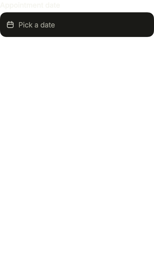
A field that opens a calendar: in a sheet on a phone, in a popover on a large screen. The clear button empties it.
import 'package:your_app/ui/fliin/components/date_picker/fl_date_picker.dart';
import 'package:flutter/widgets.dart';

class DatePickerExample extends StatefulWidget {
  const DatePickerExample({super.key});

  @override
  State<DatePickerExample> createState() => _DatePickerExampleState();
}

class _DatePickerExampleState extends State<DatePickerExample> {
  DateTime? _value;

  @override
  Widget build(BuildContext context) {
    return FlDatePicker(
      label: 'Appointment date',
      placeholder: 'Pick a date',
      clearLabel: 'Clear the date',
      barrierLabel: 'Close the calendar',
      value: _value,
      onChanged: (date) => setState(() => _value = date),
    );
  }
}Open
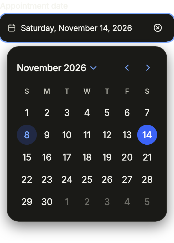
Open on its chosen day. presentation forces the popover or the sheet; defaultOpen opens it on the first frame.
import 'package:your_app/ui/fliin/components/date_picker/fl_date_picker.dart';
import 'package:flutter/widgets.dart';

class DatePickerOpenExample extends StatefulWidget {
  const DatePickerOpenExample({super.key});

  @override
  State<DatePickerOpenExample> createState() => _DatePickerOpenExampleState();
}

class _DatePickerOpenExampleState extends State<DatePickerOpenExample> {
  DateTime? _value = _thisMonth(14);

  @override
  Widget build(BuildContext context) {
    return FlDatePicker(
      label: 'Appointment date',
      placeholder: 'Pick a date',
      clearLabel: 'Clear the date',
      barrierLabel: 'Close the calendar',
      value: _value,
      onChanged: (date) => setState(() => _value = date),
      presentation: FlDatePickerPresentation.popover,
      defaultOpen: true,
    );
  }
}

/// Day [day] of the current month.
DateTime _thisMonth(int day) {
  final now = DateTime.now();
  return DateTime(now.year, now.month, day);
}Selected
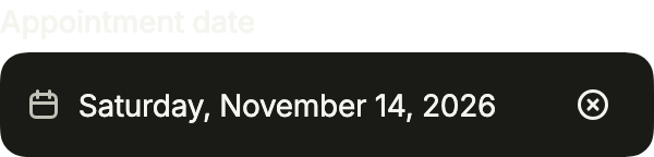
A chosen date, written in the field in the user's format.
import 'package:your_app/ui/fliin/components/date_picker/fl_date_picker.dart';
import 'package:flutter/widgets.dart';

class DatePickerSelectedExample extends StatefulWidget {
  const DatePickerSelectedExample({super.key});

  @override
  State<DatePickerSelectedExample> createState() => _DatePickerSelectedExampleState();
}

class _DatePickerSelectedExampleState extends State<DatePickerSelectedExample> {
  DateTime? _value = _thisMonth(14);

  @override
  Widget build(BuildContext context) {
    return FlDatePicker(
      label: 'Appointment date',
      placeholder: 'Pick a date',
      clearLabel: 'Clear the date',
      barrierLabel: 'Close the calendar',
      value: _value,
      onChanged: (date) => setState(() => _value = date),
    );
  }
}

/// Day [day] of the current month.
DateTime _thisMonth(int day) {
  final now = DateTime.now();
  return DateTime(now.year, now.month, day);
}Placeholder
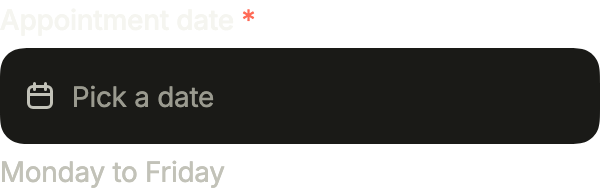
Empty, with its placeholder. required marks the label and description says what is expected.
import 'package:your_app/ui/fliin/components/date_picker/fl_date_picker.dart';
import 'package:flutter/widgets.dart';

class DatePickerPlaceholderExample extends StatefulWidget {
  const DatePickerPlaceholderExample({super.key});

  @override
  State<DatePickerPlaceholderExample> createState() => _DatePickerPlaceholderExampleState();
}

class _DatePickerPlaceholderExampleState extends State<DatePickerPlaceholderExample> {
  DateTime? _value;

  @override
  Widget build(BuildContext context) {
    return FlDatePicker(
      label: 'Appointment date',
      placeholder: 'Pick a date',
      clearLabel: 'Clear the date',
      barrierLabel: 'Close the calendar',
      value: _value,
      onChanged: (date) => setState(() => _value = date),
      required: true,
      description: 'Monday to Friday',
    );
  }
}Invalid
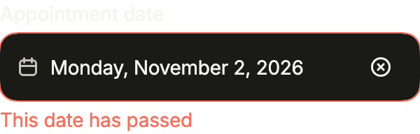
error turns the field red and says why, below it.
import 'package:your_app/ui/fliin/components/date_picker/fl_date_picker.dart';
import 'package:flutter/widgets.dart';

class DatePickerInvalidExample extends StatefulWidget {
  const DatePickerInvalidExample({super.key});

  @override
  State<DatePickerInvalidExample> createState() => _DatePickerInvalidExampleState();
}

class _DatePickerInvalidExampleState extends State<DatePickerInvalidExample> {
  DateTime? _value = _thisMonth(2);

  @override
  Widget build(BuildContext context) {
    return FlDatePicker(
      label: 'Appointment date',
      placeholder: 'Pick a date',
      clearLabel: 'Clear the date',
      barrierLabel: 'Close the calendar',
      value: _value,
      onChanged: (date) => setState(() => _value = date),
      error: 'This date has passed',
    );
  }
}

/// Day [day] of the current month.
DateTime _thisMonth(int day) {
  final now = DateTime.now();
  return DateTime(now.year, now.month, day);
}Disabled
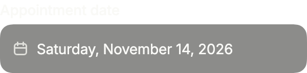
onChanged: null disables the field: the date stays readable and the calendar cannot open.
import 'package:your_app/ui/fliin/components/date_picker/fl_date_picker.dart';
import 'package:flutter/widgets.dart';

class DatePickerDisabledExample extends StatelessWidget {
  const DatePickerDisabledExample({super.key});

  @override
  Widget build(BuildContext context) {
    return FlDatePicker(
      label: 'Appointment date',
      placeholder: 'Pick a date',
      clearLabel: 'Clear the date',
      barrierLabel: 'Close the calendar',
      value: _thisMonth(14),
      onChanged: null,
    );
  }
}

/// Day [day] of the current month.
DateTime _thisMonth(int day) {
  final now = DateTime.now();
  return DateTime(now.year, now.month, day);
}Format
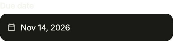
format writes the date the app's way, here short; the screen reader reads the same text.
import 'package:your_app/ui/fliin/components/date_picker/fl_date_picker.dart';
import 'package:flutter/widgets.dart';

class DatePickerFormatExample extends StatefulWidget {
  const DatePickerFormatExample({super.key});

  @override
  State<DatePickerFormatExample> createState() => _DatePickerFormatExampleState();
}

class _DatePickerFormatExampleState extends State<DatePickerFormatExample> {
  DateTime? _value = _thisMonth(14);

  @override
  Widget build(BuildContext context) {
    return FlDatePicker(
      label: 'Due date',
      placeholder: 'Pick a date',
      barrierLabel: 'Close the calendar',
      format: _short,
      value: _value,
      onChanged: (date) => setState(() => _value = date),
    );
  }
}

const _months = ['Jan', 'Feb', 'Mar', 'Apr', 'May', 'Jun', 'Jul', 'Aug', 'Sep', 'Oct', 'Nov', 'Dec'];

/// "Oct 14, 2026".
String _short(DateTime date) => '${_months[date.month - 1]} ${date.day}, ${date.year}';

/// Day [day] of the current month.
DateTime _thisMonth(int day) {
  final now = DateTime.now();
  return DateTime(now.year, now.month, day);
}On surface
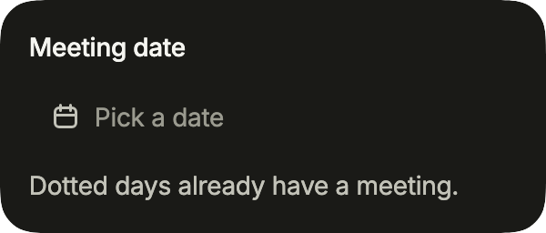
On a card, FlInputVariant.secondary fills the field; indicatorOf marks the days that already have something on, in the open calendar.
import 'package:your_app/ui/fliin/components/date_picker/fl_date_picker.dart';
import 'package:your_app/ui/fliin/components/surface/fl_surface.dart';
import 'package:flutter/widgets.dart';

class DatePickerOnSurfaceExample extends StatefulWidget {
  const DatePickerOnSurfaceExample({super.key});

  @override
  State<DatePickerOnSurfaceExample> createState() => _DatePickerOnSurfaceExampleState();
}

class _DatePickerOnSurfaceExampleState extends State<DatePickerOnSurfaceExample> {
  DateTime? _value;

  @override
  Widget build(BuildContext context) {
    return FlSurface(
      child: FlDatePicker(
        label: 'Meeting date',
        placeholder: 'Pick a date',
        description: 'Dotted days already have a meeting.',
        barrierLabel: 'Close the calendar',
        variant: FlInputVariant.secondary,
        indicatorOf: (day) => const {6, 13, 20, 27}.contains(day.day) ? 'Meeting' : null,
        value: _value,
        onChanged: (date) => setState(() => _value = date),
      ),
    );
  }
}Usage
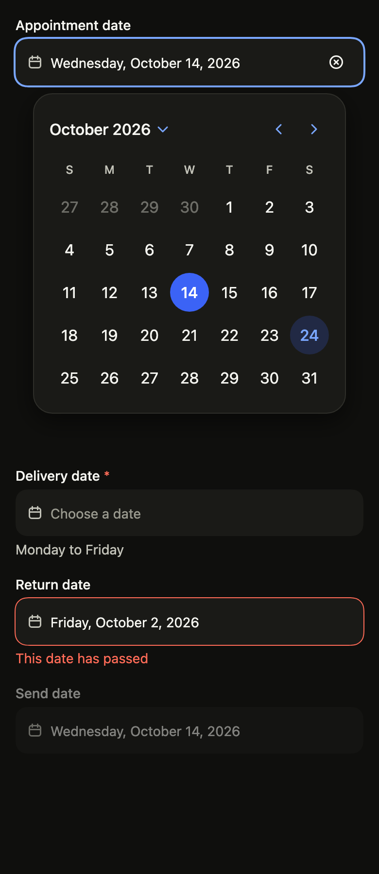
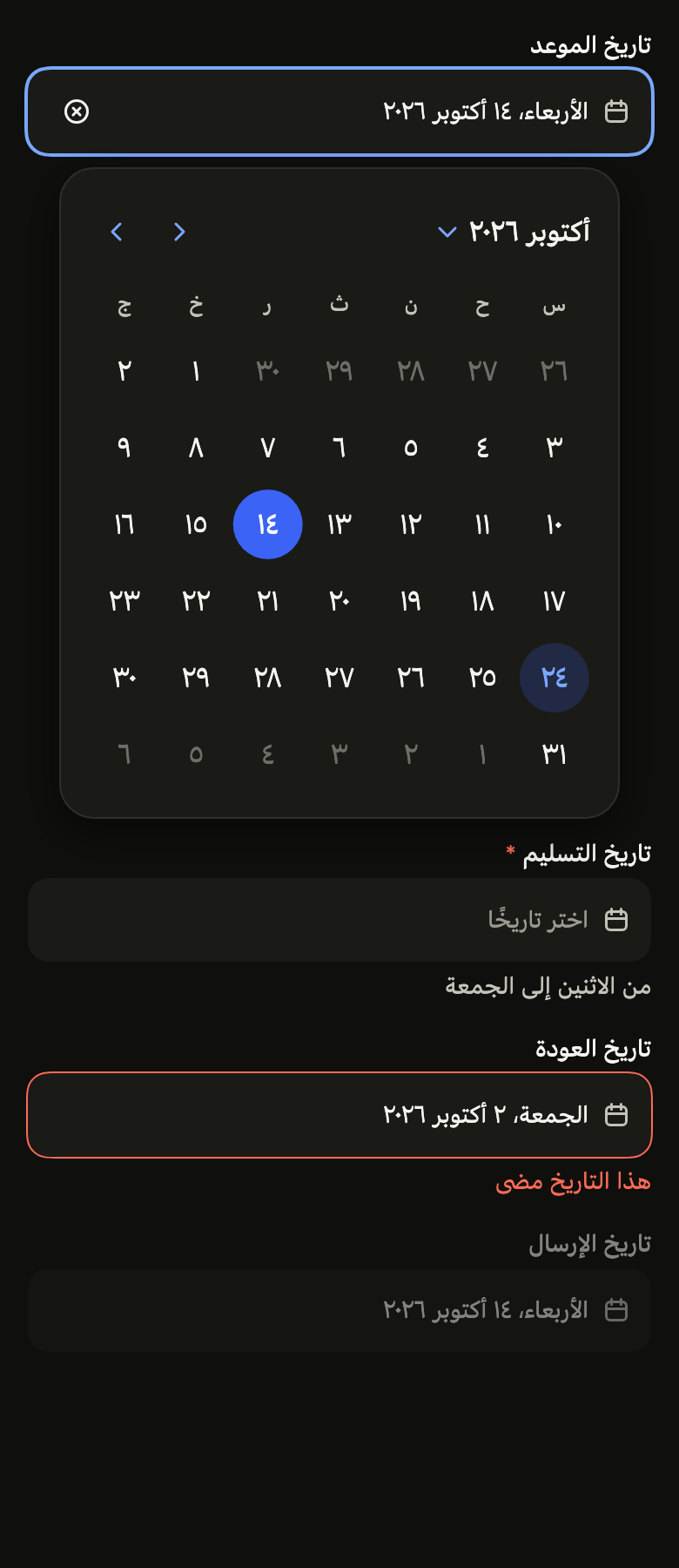
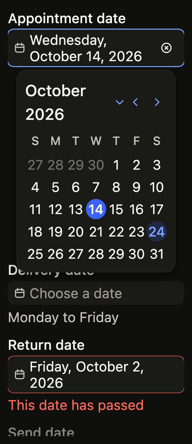
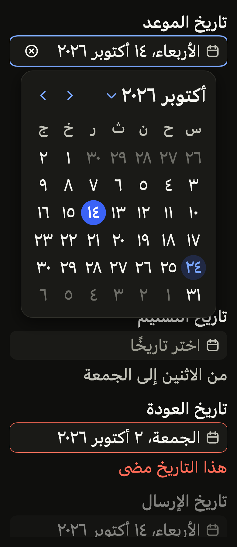
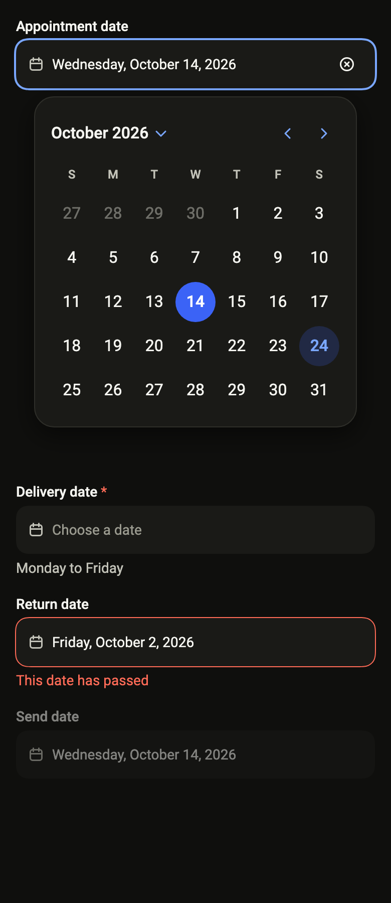
The code the reference images render:
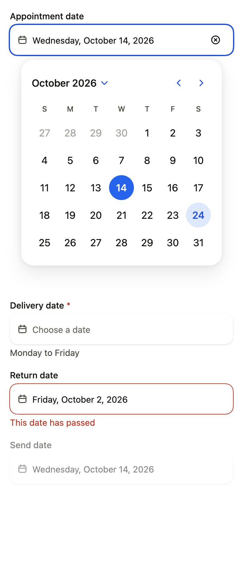
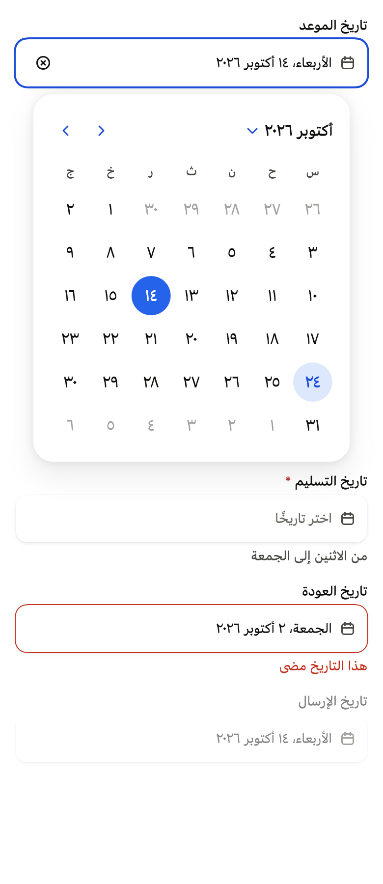
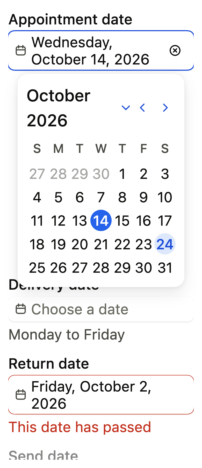
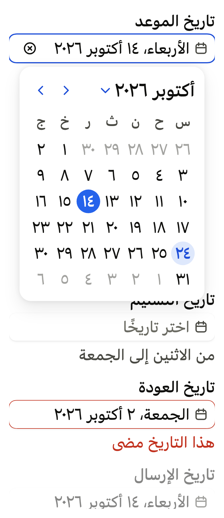
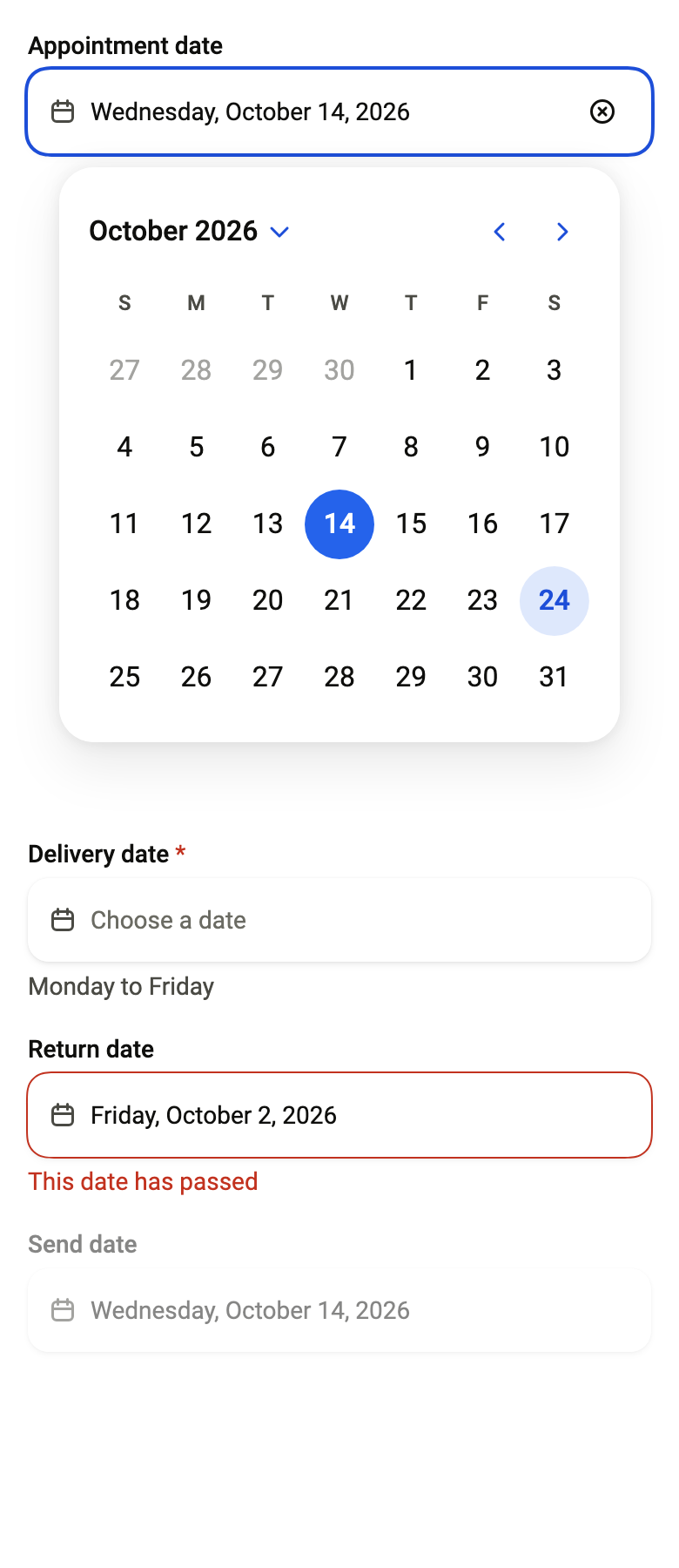
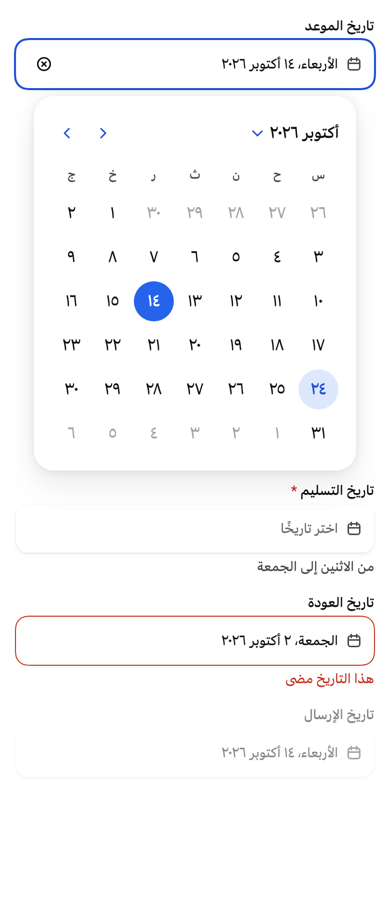
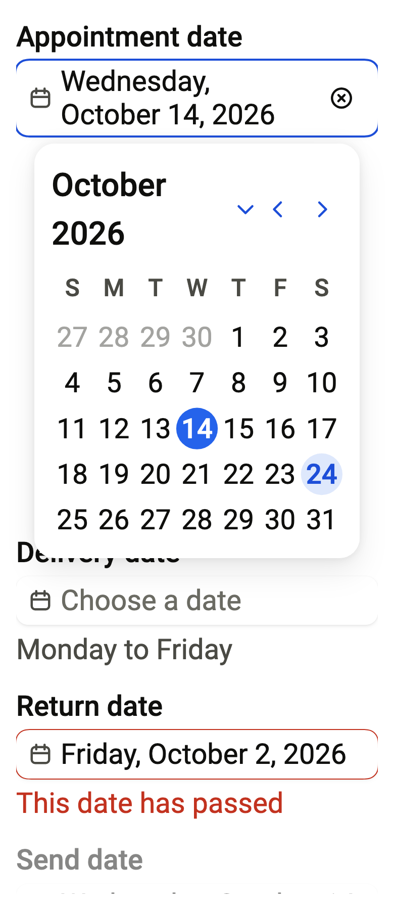
Overlay(initialEntries: [OverlayEntry(builder: (context) => ColoredBox(color: FlScope.of(context).colors.surface, child: Padding(padding: EdgeInsetsDirectional.all(FlScope.of(context).space.lg), child: SingleChildScrollView(child: Column(crossAxisAlignment: CrossAxisAlignment.stretch, spacing: FlScope.of(context).space.lg, children: [FlDatePicker(label: 'Appointment date', placeholder: 'Choose a date', clearLabel: 'Clear the date', value: DateTime(2026, 10, 14), onChanged: (_) {}, presentation: FlDatePickerPresentation.popover, defaultOpen: true, today: DateTime(2026, 10, 24), strings: FlCalendarStrings.language'en'), const SizedBox(height: 360), FlDatePicker(label: 'Delivery date', placeholder: 'Choose a date', description: 'Monday to Friday', required: true, value: null, onChanged: (_) {}, presentation: FlDatePickerPresentation.popover, today: DateTime(2026, 10, 24), strings: FlCalendarStrings.language'en'), FlDatePicker(label: 'Return date', placeholder: 'Choose a date', error: 'This date has passed', value: DateTime(2026, 10, 2), onChanged: (_) {}, presentation: FlDatePickerPresentation.popover, today: DateTime(2026, 10, 24), strings: FlCalendarStrings.language'en'), FlDatePicker(label: 'Send date', placeholder: 'Choose a date', value: DateTime(2026, 10, 14), onChanged: null, presentation: FlDatePickerPresentation.popover, today: DateTime(2026, 10, 24), strings: FlCalendarStrings.language'en')])))))])API
FlDatePickerPresentation: enum {popover, sheet}
FlDatePickerPresentation.popover: static final FlDatePickerPresentation
FlDatePickerPresentation.sheet: static final FlDatePickerPresentation
flDatePickerPresentationOf: FlDatePickerPresentation(BuildContext context)
FlDatePickerField: class extends StatefulWidget
FlDatePickerField.new: const new({super.key, required String label, required String? text, required String placeholder, required VoidCallback? onOpen, bool open, String? description, String? error, bool required, VoidCallback? onClear, String? clearLabel, FlInputVariant variant})
FlDatePickerField.label: get String
FlDatePickerField.text: get String?
FlDatePickerField.placeholder: get String
FlDatePickerField.onOpen: get VoidCallback?
FlDatePickerField.open: get bool
FlDatePickerField.description: get String?
FlDatePickerField.error: get String?
FlDatePickerField.required: get bool
FlDatePickerField.onClear: get VoidCallback?
FlDatePickerField.clearLabel: get String?
FlDatePickerField.variant: get FlInputVariant
FlDatePickerField.createState: State<FlDatePickerField>()
FlCalendarIcon: class extends StatelessWidget
FlCalendarIcon.new: const new({super.key, required double size, required Color color})
FlCalendarIcon.size: get double
FlCalendarIcon.color: get Color
FlCalendarIcon.build: Widget(BuildContext context)
FlDatePickerOverlay: class extends StatefulWidget
FlDatePickerOverlay.new: const new({super.key, required String label, required Widget Function(BuildContext context, bool open, VoidCallback toggle) field, required Widget Function(BuildContext context, VoidCallback close) calendar, String? barrierLabel, FlDatePickerPresentation? presentation, bool defaultOpen})
FlDatePickerOverlay.defaultOpen: get bool
FlDatePickerOverlay.label: get String
FlDatePickerOverlay.barrierLabel: get String?
FlDatePickerOverlay.presentation: get FlDatePickerPresentation?
FlDatePickerOverlay.field: get Widget Function(BuildContext context, bool open, VoidCallback toggle)
FlDatePickerOverlay.calendar: get Widget Function(BuildContext context, VoidCallback close)
FlDatePickerOverlay.createState: State<FlDatePickerOverlay>()
FlDatePicker: class extends StatelessWidget
FlDatePicker.new: const new({super.key, required String label, required DateTime? value, required ValueChanged<DateTime?>? onChanged, required String placeholder, String? description, String? error, bool required, String? clearLabel, String? barrierLabel, FlDatePickerPresentation? presentation, FlCalendarStrings? strings, DateTime? today, DateTime? minDate, DateTime? maxDate, bool Function(DateTime day)? isUnavailable, int? firstDayOfWeek, bool defaultOpen, String Function(DateTime date)? format, FlInputVariant variant, String? Function(DateTime day)? indicatorOf})
FlDatePicker.label: get String
FlDatePicker.defaultOpen: get bool
FlDatePicker.value: get DateTime?
FlDatePicker.onChanged: get ValueChanged<DateTime?>?
FlDatePicker.placeholder: get String
FlDatePicker.description: get String?
FlDatePicker.error: get String?
FlDatePicker.required: get bool
FlDatePicker.clearLabel: get String?
FlDatePicker.barrierLabel: get String?
FlDatePicker.presentation: get FlDatePickerPresentation?
FlDatePicker.strings: get FlCalendarStrings?
FlDatePicker.today: get DateTime?
FlDatePicker.minDate: get DateTime?
FlDatePicker.maxDate: get DateTime?
FlDatePicker.isUnavailable: get bool Function(DateTime day)?
FlDatePicker.firstDayOfWeek: get int?
FlDatePicker.format: get String Function(DateTime date)?
FlDatePicker.variant: get FlInputVariant
FlDatePicker.indicatorOf: get String? Function(DateTime day)?
FlDatePicker.build: Widget(BuildContext context)Reference renders
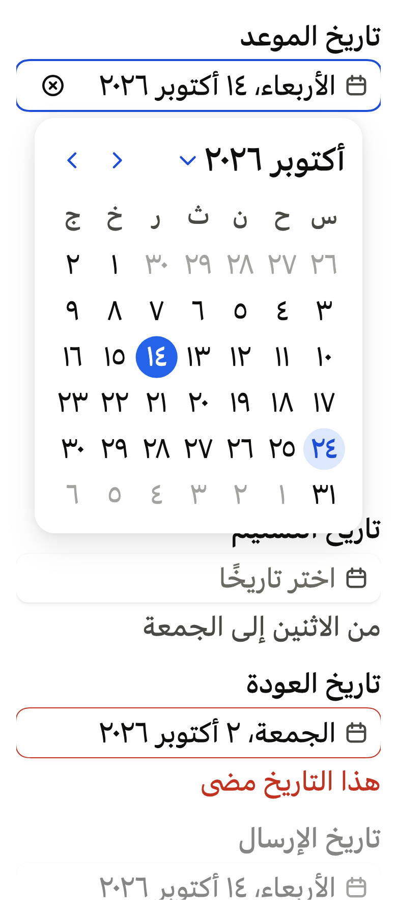
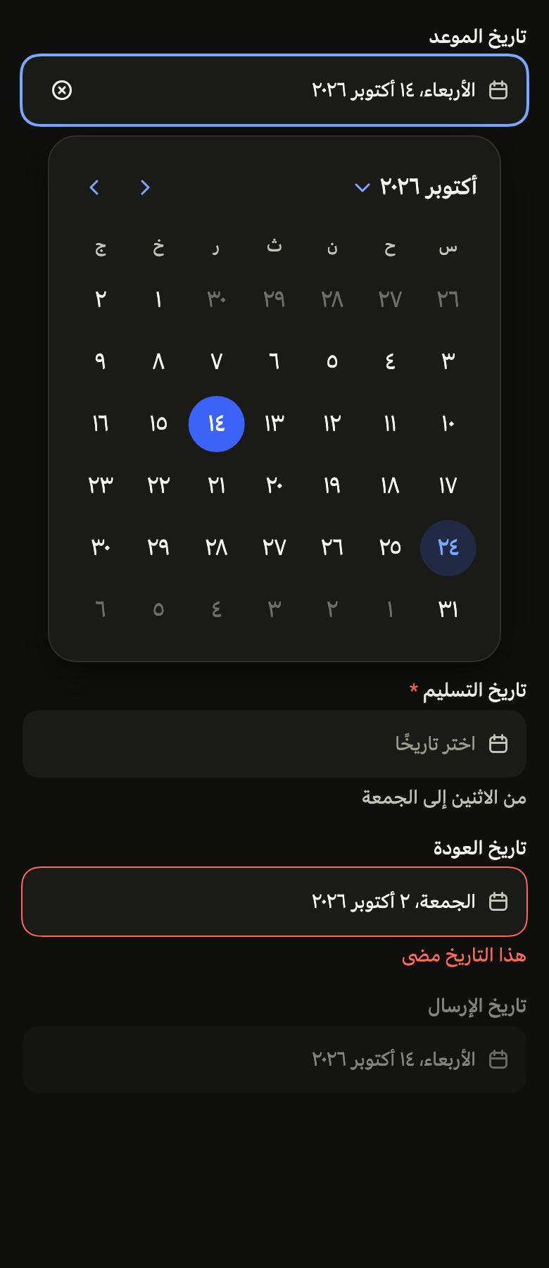
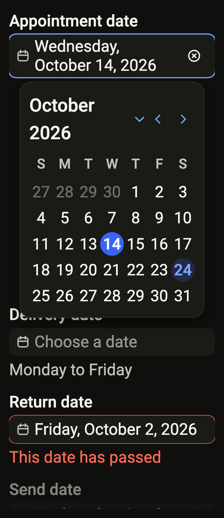
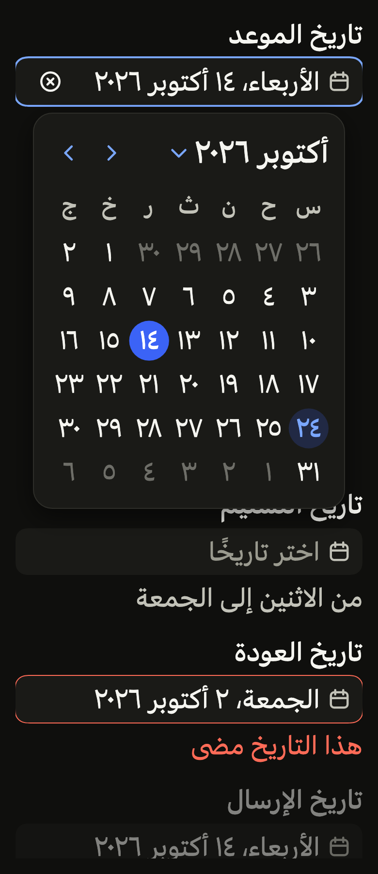
The 16 images published with version 0.2.3, rendered by the shared harness on macOS with Flutter 3.47.7. fliin verify date-picker compares your copy to them.
Use it to
- pick a due date from a form field
- open the calendar when a date input is tapped
- show the chosen date spelled out in the field
- let people clear the date they chose
- offer a floating calendar under a date input on tablets
- use a date input with a calendar popover to select a date
- Not for
- a month grid always visible on the screen: use a calendar (calendar)
- a period with a start and an end: use a date range picker (date-range-picker)
- a known date typed on the keyboard: use a date field (date-field)
- States
Source
The files fliin add date-picker copies into your app, before your prefix and imports are applied.
date_picker/fl_date_picker.dart
// Modified from the DatePicker and its calendar icon of HeroUI React v3,
// Copyright 2020 Next UI Inc., licensed under the MIT license below and under
// Apache 2.0: https://www.apache.org/licenses/LICENSE-2.0
//
// Permission is hereby granted, free of charge, to any person obtaining a copy
// of this software and associated documentation files (the "Software"), to
// deal in the Software without restriction, including without limitation the
// rights to use, copy, modify, merge, publish, distribute, sublicense, and/or
// sell copies of the Software, and to permit persons to whom the Software is
// furnished to do so, subject to the following conditions:
//
// The above copyright notice and this permission notice shall be included in
// all copies or substantial portions of the Software.
//
// THE SOFTWARE IS PROVIDED "AS IS", WITHOUT WARRANTY OF ANY KIND, EXPRESS OR
// IMPLIED, INCLUDING BUT NOT LIMITED TO THE WARRANTIES OF MERCHANTABILITY,
// FITNESS FOR A PARTICULAR PURPOSE AND NONINFRINGEMENT. IN NO EVENT SHALL THE
// AUTHORS OR COPYRIGHT HOLDERS BE LIABLE FOR ANY CLAIM, DAMAGES OR OTHER
// LIABILITY, WHETHER IN AN ACTION OF CONTRACT, TORT OR OTHERWISE, ARISING
// FROM, OUT OF OR IN CONNECTION WITH THE SOFTWARE OR THE USE OR OTHER DEALINGS
// IN THE SOFTWARE.
//
// Also modified from the Input frame of HeroUI Native 1.0.10, Copyright 2025
// NextUI Inc., licensed under Apache 2.0.
import 'dart:async';
import 'dart:math' as math;

import 'package:flutter/semantics.dart';
import 'package:flutter/widgets.dart';
import 'package:fliin_ui/components/button/fl_button.dart';
import 'package:fliin_ui/components/calendar/fl_calendar.dart';
import 'package:fliin_ui/components/calendar/fl_calendar_strings.dart';
import 'package:fliin_ui/components/field/fl_field.dart';
import 'package:fliin_ui/components/popover/fl_popover.dart';
import 'package:fliin_ui/components/sheet/fl_sheet.dart';
import 'package:fliin_ui/components/text_field/fl_input.dart';
import 'package:fliin_ui/core/fliin.dart';
import 'package:fliin_ui/icons/fl_icons.dart';

export 'package:fliin_ui/components/text_field/fl_input.dart' show FlInputVariant;

/// The smallest screen side from which the calendar opens as a popover:
/// that of a tablet (Android's `sw600dp`; the smallest iPad has 744, the
/// largest iPhone 440).
const double _tabletShortestSide = 600;

/// The width of the calendar in the popover (Izydesk's `.cal-grid`).
const double _popoverCalendarWidth = 288;

/// The icon (`date-picker__trigger-indicator`, `size-4`) and the clear
/// button, Izydesk's `.input-btn` of 32 around a 16 `circle-xmark`.
const double _indicator = 16;
const double _clearSize = 32;

/// Where the calendar of a [FlDatePicker] or a `FlDateRangePicker` opens.
enum FlDatePickerPresentation {
  /// A floating panel under the field.
  popover,

  /// A bottom sheet, at the screen's width.
  sheet,
}

/// The presentation a date picker takes with no setting: a sheet on a
/// phone, a popover on a tablet or a desktop. The threshold applies to the
/// screen's smallest side, not its width: a rotated phone remains a phone,
/// and its height could not hold a calendar floating above the keyboard or
/// the field.
FlDatePickerPresentation flDatePickerPresentationOf(BuildContext context) =>
    MediaQuery.sizeOf(context).shortestSide >= _tabletShortestSide
    ? FlDatePickerPresentation.popover
    : FlDatePickerPresentation.sheet;

/// The field of a date picker, shared by [FlDatePicker] and
/// `FlDateRangePicker`: the `FlLabel` label, a trigger framed like an input
/// (`FlInputFrame`) that writes [text] or [placeholder] and carries the
/// calendar icon, a clear button when [onClear] is given, then the
/// `FlDescription` description or the `FlFieldError` error.
///
/// The screen reader reads a button named by [label], with value [text],
/// expanded when [open] is true. The text wraps rather than being cut: a
/// date reads in full, even at 2.0.
class FlDatePickerField extends StatefulWidget {
  /// A field that calls [onOpen] on tap.
  const FlDatePickerField({
    super.key,
    required this.label,
    required this.text,
    required this.placeholder,
    required this.onOpen,
    this.open = false,
    this.description,
    this.error,
    this.required = false,
    this.onClear,
    this.clearLabel,
    this.variant = FlInputVariant.primary,
  }) : assert(onClear == null || clearLabel != null, 'the clear button must be named');

  /// The field's name, displayed above and read by the screen reader.
  final String label;

  /// The written value; when null, [placeholder] in `fieldPlaceholder`.
  final String? text;

  /// The text with no value, read as a hint.
  final String placeholder;

  /// Called on tap; null disables the field.
  final VoidCallback? onOpen;

  /// True while the calendar is open: a `focusRing` ring, that of a focused
  /// field, and the expanded state.
  final bool open;

  /// The help under the field, hidden by [error].
  final String? description;

  /// When non-null: the field is invalid, and this text replaces [description].
  final String? error;

  /// True: an asterisk follows the label, and the field announces itself required.
  final bool required;

  /// Called by the clear button, at the end of the field; when null, no button.
  final VoidCallback? onClear;

  /// The name of the clear button.
  final String? clearLabel;

  /// `primary` on the page, `secondary` on a surface (a card, a sheet).
  final FlInputVariant variant;

  @override
  State<FlDatePickerField> createState() => _FlDatePickerFieldState();
}

class _FlDatePickerFieldState extends State<FlDatePickerField> {
  @override
  void didUpdateWidget(FlDatePickerField oldWidget) {
    super.didUpdateWidget(oldWidget);
    if (widget.error case final error? when oldWidget.error == null && MediaQuery.supportsAnnounceOf(context)) {
      SemanticsService.sendAnnouncement(View.of(context), error, Directionality.of(context));
    }
  }

  @override
  Widget build(BuildContext context) {
    final theme = FlScope.of(context);
    final colors = theme.colors;
    final announces = MediaQuery.supportsAnnounceOf(context);
    final error = widget.error;
    final description = widget.description;
    final disabled = widget.onOpen == null;
    final invalid = error != null;
    final text = widget.text;
    final described = error == null ? description : (announces ? error : null);
    final iconScaler = MediaQuery.textScalerOf(context).clamp(maxScaleFactor: theme.size.iconMaxScale);
    final onClear = disabled || text == null ? null : widget.onClear;
    final style = DefaultTextStyle.of(context).style.merge(theme.typography.resolve(FlTextRole.textSm));
    final role = theme.typography.style(FlTextRole.textSm);
    final lineHeight = MediaQuery.textScalerOf(context).scale(role.size) * role.lineHeight / role.size;
    final clearExtent = iconScaler.scale(_clearSize);
    // Far enough from the edge for its 44 or 48 target to stay within the
    // frame, so that a clipping ancestor (a list) does not cut it off.
    final clearInset = math.max(theme.space.md, (theme.hitTarget - clearExtent) / 2);
    final clearSlot = clearExtent + theme.space.sm + clearInset - theme.space.md;
    final trigger = FlPressable(
      onPressed: widget.onOpen,
      borderRadius: BorderRadius.circular(theme.shape.radiusControl),
      scaleOnPress: false,
      overlay: FlPressOverlay.none,
      expanded: widget.open,
      builder: (context, states) => Semantics(
        label: widget.label,
        value: text,
        hint: [if (text == null) widget.placeholder, ?described].join('\n'),
        isRequired: widget.required ? true : null,
        validationResult: invalid ? SemanticsValidationResult.invalid : SemanticsValidationResult.none,
        excludeSemantics: true,
        child: Opacity(
          opacity: disabled ? theme.size.disabledOpacity : 1,
          child: FlInputFrame(
            variant: widget.variant,
            outline: invalid ? colors.danger : null,
            focused: widget.open,
            child: ConstrainedBox(
              constraints: BoxConstraints(minHeight: theme.controlHeight),
              child: Padding(
                padding: EdgeInsetsDirectional.only(
                  start: theme.space.md,
                  end: theme.space.md + (onClear == null ? 0 : clearSlot),
                  top: theme.space.xs,
                  bottom: theme.space.xs,
                ),
                child: Row(
                  spacing: theme.space.sm,
                  children: [
                    // Izydesk's date fields lead with their icon, `.input .i`.
                    FlCalendarIcon(size: iconScaler.scale(_indicator), color: colors.onSurfaceMuted),
                    Expanded(
                      child: ConstrainedBox(
                        constraints: BoxConstraints(minHeight: lineHeight),
                        child: Align(
                          alignment: AlignmentDirectional.centerStart,
                          child: Text(
                            text ?? widget.placeholder,
                            style: style.copyWith(color: text == null ? colors.fieldPlaceholder : colors.onSurface),
                          ),
                        ),
                      ),
                    ),
                  ],
                ),
              ),
            ),
          ),
        ),
      ),
    );
    return FlFieldScope(
      invalid: invalid,
      disabled: disabled,
      required: widget.required,
      child: Column(
        mainAxisSize: MainAxisSize.min,
        crossAxisAlignment: CrossAxisAlignment.stretch,
        // Izydesk's `.field` gap, like FlTextField.
        spacing: flFieldGap(theme),
        children: [
          Align(
            alignment: AlignmentDirectional.centerStart,
            child: ExcludeSemantics(child: FlLabel(widget.label)),
          ),
          Stack(
            // The clear button's target overflows the frame: without
            // overflow, the frame would cut it below 44 or 48.
            clipBehavior: Clip.none,
            children: [
              trigger,
              if (onClear != null)
                PositionedDirectional(
                  end: clearInset,
                  top: 0,
                  bottom: 0,
                  child: Center(
                    child: FlButton.icon(
                      label: widget.clearLabel!,
                      variant: FlButtonVariant.ghost,
                      size: FlButtonSize.sm,
                      extent: clearExtent,
                      onPressed: onClear,
                      icon: FlIcon(FlIcons.circleXmark, size: iconScaler.scale(_indicator), color: colors.onField),
                    ),
                  ),
                ),
            ],
          ),
          if (description != null && error == null) ExcludeSemantics(child: FlDescription(description)),
          if (error != null)
            announces
                ? ExcludeSemantics(child: FlFieldError(error))
                : Align(
                    alignment: AlignmentDirectional.centerStart,
                    child: Semantics(container: true, child: FlFieldError(error)),
                  ),
        ],
      ),
    );
  }
}

/// The `calendar` icon of the chosen set, in a square of [size] per side.
/// Decorative: the field that carries it is named.
class FlCalendarIcon extends StatelessWidget {
  /// An icon of [size] per side, in color [color].
  const FlCalendarIcon({super.key, required this.size, required this.color});

  /// The square's side, in logical pixels.
  final double size;

  /// The icon's color.
  final Color color;

  @override
  Widget build(BuildContext context) => ExcludeSemantics(
    child: FlIcon(FlIcons.calendar, size: size, color: color),
  );
}

/// What opens and closes the calendar of a date picker, shared by
/// [FlDatePicker] and `FlDateRangePicker`: a [FlPopover] under the field,
/// the calendar 288 wide (`space.lg` around it), or a bottom sheet ([showFlSheet]
/// with `fitContent`) at the calendar's height, which follows it when the
/// month, the keyboard or the orientation change, and scrolls beyond the
/// screen.
///
/// The open calendar, popover or sheet, rebuilds with the picker: a value,
/// unavailable days or bounds that the app changes while it is open reach
/// it. The presentation is the one from opening until closing, even if the
/// window changes size in between.
///
/// Opened by touch, the calendar first takes the focus away from whatever
/// had it outside the picker (a text field, whose keyboard would reopen on
/// closing); opened by keyboard, it gives it back to the field.
class FlDatePickerOverlay extends StatefulWidget {
  /// A field, built by [field], that opens the calendar of [calendar].
  const FlDatePickerOverlay({
    super.key,
    required this.label,
    required this.field,
    required this.calendar,
    this.barrierLabel,
    this.presentation,
    this.defaultOpen = false,
  }) : assert(
         presentation == FlDatePickerPresentation.popover || barrierLabel != null,
         'the sheet closes through its barrier, which must be named',
       );

  /// True: the calendar opens after the first frame.
  final bool defaultOpen;

  /// The name of the open calendar, popover or sheet.
  final String label;

  /// The name of the sheet's barrier.
  final String? barrierLabel;

  /// Where the calendar opens; when null, [flDatePickerPresentationOf].
  final FlDatePickerPresentation? presentation;

  /// The field: [open] true while the calendar is open, [toggle] opens or
  /// closes it.
  final Widget Function(BuildContext context, bool open, VoidCallback toggle) field;

  /// The calendar, which calls [close] when the choice is made.
  final Widget Function(BuildContext context, VoidCallback close) calendar;

  @override
  State<FlDatePickerOverlay> createState() => _FlDatePickerOverlayState();
}

class _FlDatePickerOverlayState extends State<FlDatePickerOverlay> {
  final FlPopoverController _popover = FlPopoverController();

  /// The presentation of the open calendar; when null, it is closed.
  FlDatePickerPresentation? _openedAs;

  /// The calendar of the open sheet rebuilds on each version.
  final ValueNotifier<int> _revision = ValueNotifier(0);

  /// The open sheet, to close it.
  BuildContext? _sheet;

  bool get _open => _openedAs != null;

  @override
  void initState() {
    super.initState();
    if (widget.defaultOpen) {
      WidgetsBinding.instance.addPostFrameCallback((_) {
        if (mounted && !_open) _toggle();
      });
    }
  }

  @override
  void didUpdateWidget(FlDatePickerOverlay oldWidget) {
    super.didUpdateWidget(oldWidget);
    if (_openedAs != FlDatePickerPresentation.sheet) return;
    // The sheet's route is not under this widget: it rebuilds after this
    // frame, when the tree is no longer being built.
    WidgetsBinding.instance.addPostFrameCallback((_) => _revision.value++);
  }

  @override
  void dispose() {
    _revision.dispose();
    super.dispose();
  }

  FlDatePickerPresentation get _presentation => widget.presentation ?? flDatePickerPresentationOf(context);

  void _toggle() {
    if (_open) {
      _close();
      return;
    }
    final focused = FocusManager.instance.primaryFocus?.context;
    if (focused != null && focused.findAncestorStateOfType<_FlDatePickerOverlayState>() != this) {
      FocusManager.instance.primaryFocus?.unfocus();
    }
    final presentation = _presentation;
    setState(() => _openedAs = presentation);
    if (presentation == FlDatePickerPresentation.popover) {
      _popover.open();
    } else {
      unawaited(_showSheet());
    }
  }

  void _close() {
    switch (_openedAs) {
      case FlDatePickerPresentation.popover:
        _popover.close();
      case FlDatePickerPresentation.sheet:
        if (_sheet case final sheet? when sheet.mounted) {
          Navigator.of(sheet).pop();
        }
      case null:
    }
  }

  Future<void> _showSheet() async {
    final theme = FlScope.of(context);
    await showFlSheet<void>(
      context,
      label: widget.label,
      barrierLabel: widget.barrierLabel!,
      fitContent: true,
      builder: (context) {
        _sheet = context;
        return ValueListenableBuilder<int>(
          valueListenable: _revision,
          builder: (context, _, _) => LayoutBuilder(
            // In landscape, the grid keeps the width of a phone panel: at full
            // width, its days would exceed the screen's height.
            builder: (context, box) => Center(
              child: SizedBox(
                width: math.min(box.maxWidth, theme.size.dialogMaxWidth),
                child: widget.calendar(context, _close),
              ),
            ),
          ),
        );
      },
    );
    _sheet = null;
    if (mounted) setState(() => _openedAs = null);
  }

  @override
  Widget build(BuildContext context) {
    final field = widget.field(context, _open, _toggle);
    if ((_openedAs ?? _presentation) == FlDatePickerPresentation.sheet) {
      return field;
    }
    final theme = FlScope.of(context);
    return FlPopover(
      controller: _popover,
      label: widget.label,
      offset: theme.size.selectOffset,
      padding: EdgeInsetsDirectional.all(theme.space.lg),
      onOpenChanged: (open) {
        if (!open) setState(() => _openedAs = null);
      },
      content: SizedBox(width: _popoverCalendarWidth, child: widget.calendar(context, _close)),
      child: field,
    );
  }
}

/// The choice of a date from a form field: a
/// field that writes the chosen date in full (`FlCalendarStrings.date`,
/// "Wednesday, October 14, 2026") and opens a [FlCalendar], as a sheet on a
/// phone and as a popover on a tablet ([flDatePickerPresentationOf]).
///
/// The choice is immediate: the tapped day is sent to
/// [onChanged] and the calendar closes. The field writes only [value], the
/// app's date: closed without a choice, or refused by the app, it keeps the
/// previous one. The clear button returns `null`.
///
/// On opening, the focus moves to the grid, on the chosen day; on closing,
/// it returns to the field.
class FlDatePicker extends StatelessWidget {
  /// A picker whose chosen date is [value].
  const FlDatePicker({
    super.key,
    required this.label,
    required this.value,
    required this.onChanged,
    required this.placeholder,
    this.description,
    this.error,
    this.required = false,
    this.clearLabel,
    this.barrierLabel,
    this.presentation,
    this.strings,
    this.today,
    this.minDate,
    this.maxDate,
    this.isUnavailable,
    this.firstDayOfWeek,
    this.defaultOpen = false,
    this.format,
    this.variant = FlInputVariant.primary,
    this.indicatorOf,
  }) : assert(
         presentation == FlDatePickerPresentation.popover || barrierLabel != null,
         'the sheet closes through its barrier, which must be named',
       );

  /// The field's name, and that of the open calendar.
  final String label;

  /// True: the calendar opens on first render (React Aria's `defaultOpen`).
  final bool defaultOpen;

  /// The chosen date, without time; null with no choice.
  final DateTime? value;

  /// Receives the tapped day (`DateTime(year, month, day)`), or `null` when
  /// the user clears; null disables the field.
  final ValueChanged<DateTime?>? onChanged;

  /// The field's text with no date.
  final String placeholder;

  /// The help under the field.
  final String? description;

  /// When non-null: the field is invalid, and this text replaces [description].
  final String? error;

  /// True: an asterisk follows the label, and the field announces itself required.
  final bool required;

  /// The name of the button that clears the date; when null, no button.
  final String? clearLabel;

  /// The name of the sheet's barrier, which closes it; required except as a popover.
  final String? barrierLabel;

  /// Where the calendar opens; when null, [flDatePickerPresentationOf].
  final FlDatePickerPresentation? presentation;

  /// The texts of the calendar and the field; those of the app's language by
  /// default.
  final FlCalendarStrings? strings;

  /// See `FlCalendarView.today`.
  final DateTime? today;

  /// See `FlCalendarView.minDate`.
  final DateTime? minDate;

  /// See `FlCalendarView.maxDate`.
  final DateTime? maxDate;

  /// See `FlCalendarView.isUnavailable`.
  final bool Function(DateTime day)? isUnavailable;

  /// See `FlCalendarView.firstDayOfWeek`.
  final int? firstDayOfWeek;

  /// How the field writes the date, also read by
  /// the screen reader; by default in full, `FlCalendarStrings.date`
  /// ("Wednesday, October 14, 2026").
  final String Function(DateTime date)? format;

  /// The field's look: `primary` on the page, `secondary` on a surface.
  final FlInputVariant variant;

  /// See `FlCalendarView.indicatorOf`.
  final String? Function(DateTime day)? indicatorOf;

  @override
  Widget build(BuildContext context) {
    final strings = this.strings ?? FlCalendarStrings.of(context);
    final format = this.format ?? strings.date;
    final value = this.value;
    final onChanged = this.onChanged;
    return FlDatePickerOverlay(
      label: label,
      barrierLabel: barrierLabel,
      presentation: presentation,
      defaultOpen: defaultOpen,
      calendar: (context, close) => FlCalendar(
        value: value,
        onChanged: (day) {
          onChanged?.call(day);
          close();
        },
        autofocus: true,
        today: today,
        minDate: minDate,
        maxDate: maxDate,
        isUnavailable: isUnavailable,
        firstDayOfWeek: firstDayOfWeek,
        strings: strings,
        semanticLabel: label,
        indicatorOf: indicatorOf,
      ),
      field: (context, open, toggle) => FlDatePickerField(
        label: label,
        text: value == null ? null : format(value),
        variant: variant,
        placeholder: placeholder,
        open: open,
        onOpen: onChanged == null ? null : toggle,
        description: description,
        error: error,
        required: required,
        clearLabel: clearLabel,
        onClear: clearLabel == null || onChanged == null ? null : () => onChanged(null),
      ),
    );
  }
}