Components / actions
Link
Opens a related page from a sentence, such as terms or help: a pressable label with no background or padding, in three sizes.
Import
In a Flutter app where fliin init has run:
Examples
Inline
Links next to a form, to read the terms before agreeing. A link button navigates; it never submits.
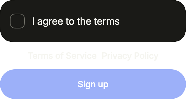
import 'package:your_app/ui/fliin/components/button/fl_button.dart';
import 'package:your_app/ui/fliin/components/control_field/fl_control_field.dart';
import 'package:your_app/ui/fliin/components/link_button/fl_link_button.dart';
import 'package:your_app/ui/fliin/core/fliin.dart';
import 'package:flutter/widgets.dart';

class LinkButtonInlineExample extends StatefulWidget {
  const LinkButtonInlineExample({super.key});

  @override
  State<LinkButtonInlineExample> createState() => _LinkButtonInlineExampleState();
}

class _LinkButtonInlineExampleState extends State<LinkButtonInlineExample> {
  var _agreed = false;

  @override
  Widget build(BuildContext context) {
    final space = FlScope.of(context).space;
    return Column(
      mainAxisSize: MainAxisSize.min,
      crossAxisAlignment: CrossAxisAlignment.stretch,
      spacing: space.md,
      children: [
        FlControlField(
          value: _agreed,
          onChanged: (agreed) => setState(() => _agreed = agreed),
          indicator: FlControlFieldIndicator.checkbox,
          label: 'I agree to the terms',
        ),
        Wrap(
          alignment: WrapAlignment.center,
          spacing: space.sm,
          runSpacing: space.sm,
          children: [
            FlLinkButton(label: 'Terms of Service', size: FlButtonSize.sm, onPressed: () {}),
            FlLinkButton(label: 'Privacy Policy', size: FlButtonSize.sm, onPressed: () {}),
          ],
        ),
        FlButton(label: 'Sign up', onPressed: _agreed ? () {} : null),
      ],
    );
  }
}With icon
An icon after the label with trailing, or before it with leading, at three quarters of the text size and in its color. Only the words are underlined.
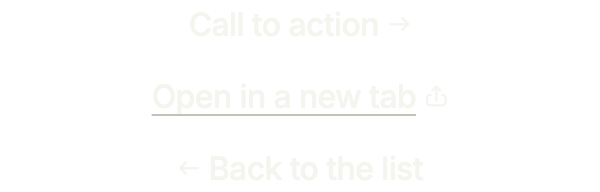
import 'package:your_app/ui/fliin/components/link_button/fl_link_button.dart';
import 'package:your_app/ui/fliin/core/fliin.dart';
import 'package:your_app/ui/fliin/icons/fl_icons.dart';
import 'package:flutter/widgets.dart';

class LinkButtonWithIconExample extends StatelessWidget {
  const LinkButtonWithIconExample({super.key});

  @override
  Widget build(BuildContext context) {
    return Column(
      mainAxisSize: MainAxisSize.min,
      spacing: FlScope.of(context).space.md,
      children: [
        FlLinkButton(label: 'Call to action', trailing: FlIcon(FlIcons.arrowRight), link: true, onPressed: () {}),
        FlLinkButton(
          label: 'Open in a new tab',
          trailing: FlIcon(FlIcons.arrowUpFromSquare),
          underline: true,
          link: true,
          onPressed: () {},
        ),
        FlLinkButton(label: 'Back to the list', leading: FlIcon(FlIcons.arrowLeft), link: true, onPressed: () {}),
      ],
    );
  }
}Underline
Without underline, the line shows only under the pointer and on press; with it, always, which a link inside a sentence needs to stand apart from the text around it.
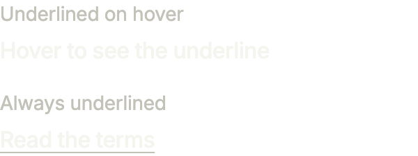
import 'package:your_app/ui/fliin/components/link_button/fl_link_button.dart';
import 'package:your_app/ui/fliin/components/text/fl_text.dart';
import 'package:your_app/ui/fliin/core/fliin.dart';
import 'package:flutter/widgets.dart';

class LinkButtonUnderlineExample extends StatelessWidget {
  const LinkButtonUnderlineExample({super.key});

  @override
  Widget build(BuildContext context) {
    final space = FlScope.of(context).space;
    return Column(
      mainAxisSize: MainAxisSize.min,
      crossAxisAlignment: CrossAxisAlignment.start,
      spacing: space.lg,
      children: [
        Column(
          crossAxisAlignment: CrossAxisAlignment.start,
          spacing: space.xs,
          children: [
            const FlText('Underlined on hover', type: FlTextType.bodySm, tone: FlTextTone.muted),
            FlLinkButton(label: 'Hover to see the underline', onPressed: () {}),
          ],
        ),
        Column(
          crossAxisAlignment: CrossAxisAlignment.start,
          spacing: space.xs,
          children: [
            const FlText('Always underlined', type: FlTextType.bodySm, tone: FlTextTone.muted),
            FlLinkButton(label: 'Read the terms', underline: true, onPressed: () {}),
          ],
        ),
      ],
    );
  }
}Tones
The actions under a comment: muted for the quiet ones, danger for the one that deletes, weight lighter than the default medium.

import 'package:your_app/ui/fliin/components/button/fl_button.dart';
import 'package:your_app/ui/fliin/components/link_button/fl_link_button.dart';
import 'package:your_app/ui/fliin/core/fliin.dart';
import 'package:flutter/widgets.dart';

class LinkButtonTonesExample extends StatelessWidget {
  const LinkButtonTonesExample({super.key});

  @override
  Widget build(BuildContext context) {
    final theme = FlScope.of(context);
    return Wrap(
      alignment: WrapAlignment.center,
      spacing: theme.space.lg,
      runSpacing: theme.space.sm,
      children: [
        FlLinkButton(label: 'Reply', size: FlButtonSize.sm, onPressed: () {}),
        FlLinkButton(label: 'Edit', size: FlButtonSize.sm, tone: FlLinkButtonTone.muted, onPressed: () {}),
        FlLinkButton(
          label: 'Report',
          size: FlButtonSize.sm,
          tone: FlLinkButtonTone.muted,
          weight: theme.tokens.typography.weight.normal,
          onPressed: () {},
        ),
        FlLinkButton(label: 'Delete', size: FlButtonSize.sm, tone: FlLinkButtonTone.danger, onPressed: () {}),
      ],
    );
  }
}Sizes
The three sizes of FlButtonSize, like the buttons: sm inside a row of text, md on its own, lg under a large title.

import 'package:your_app/ui/fliin/components/button/fl_button.dart';
import 'package:your_app/ui/fliin/components/link_button/fl_link_button.dart';
import 'package:your_app/ui/fliin/core/fliin.dart';
import 'package:flutter/widgets.dart';

class LinkButtonSizesExample extends StatelessWidget {
  const LinkButtonSizesExample({super.key});

  @override
  Widget build(BuildContext context) {
    final space = FlScope.of(context).space;
    return Wrap(
      alignment: WrapAlignment.center,
      crossAxisAlignment: WrapCrossAlignment.center,
      spacing: space.sm,
      runSpacing: space.sm,
      children: [
        FlLinkButton(label: 'Small', size: FlButtonSize.sm, onPressed: () {}),
        FlLinkButton(label: 'Medium', size: FlButtonSize.md, onPressed: () {}),
        FlLinkButton(label: 'Large', size: FlButtonSize.lg, onPressed: () {}),
      ],
    );
  }
}Enabled
A link to another page: underlined text in the accent, as tall as a touch target.

import 'package:your_app/ui/fliin/components/link_button/fl_link_button.dart';
import 'package:flutter/widgets.dart';

class LinkButtonEnabledExample extends StatelessWidget {
  const LinkButtonEnabledExample({super.key});

  @override
  Widget build(BuildContext context) {
    return Center(child: FlLinkButton(label: 'Learn more', onPressed: () {}));
  }
}Disabled
onPressed: null disables the link: it fades and takes no touch.

import 'package:your_app/ui/fliin/components/link_button/fl_link_button.dart';
import 'package:flutter/widgets.dart';

class LinkButtonDisabledExample extends StatelessWidget {
  const LinkButtonDisabledExample({super.key});

  @override
  Widget build(BuildContext context) {
    return const Center(child: FlLinkButton(label: 'Disabled link', onPressed: null));
  }
}Usage
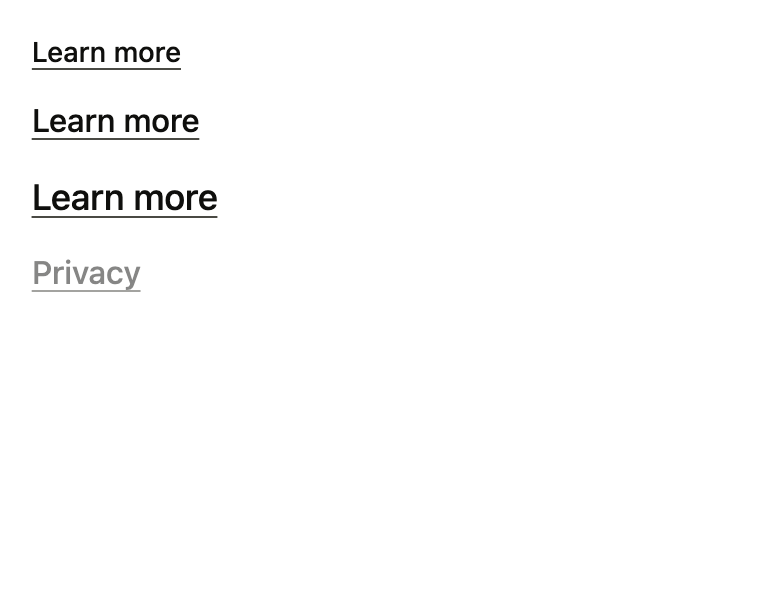
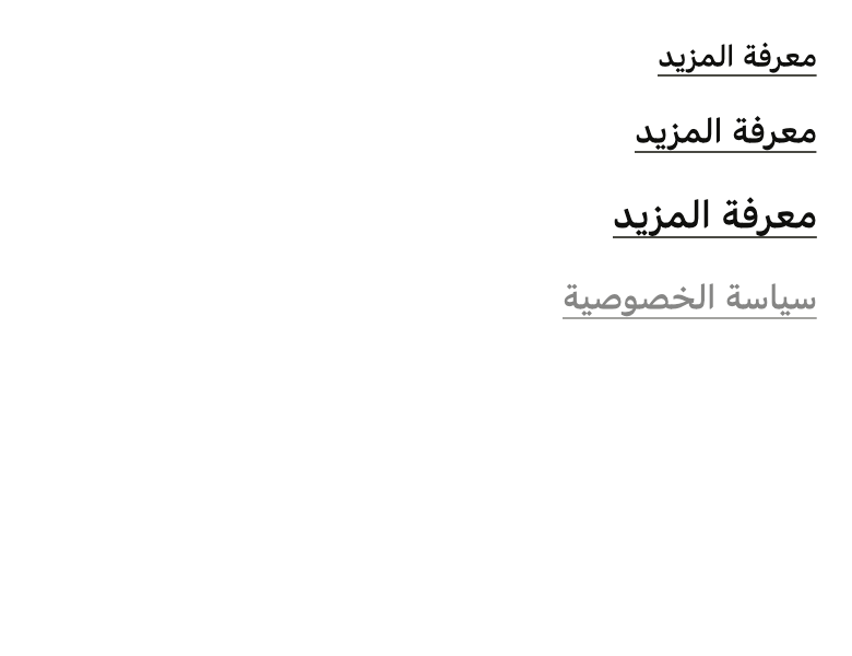
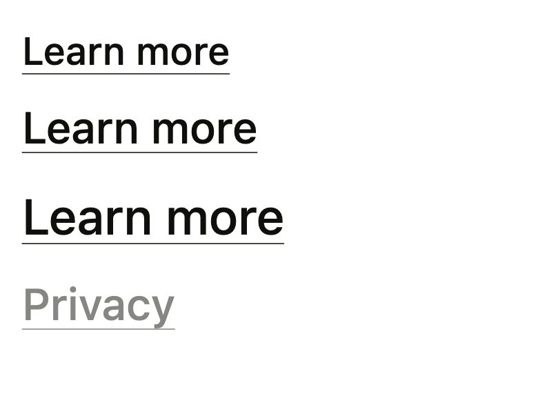
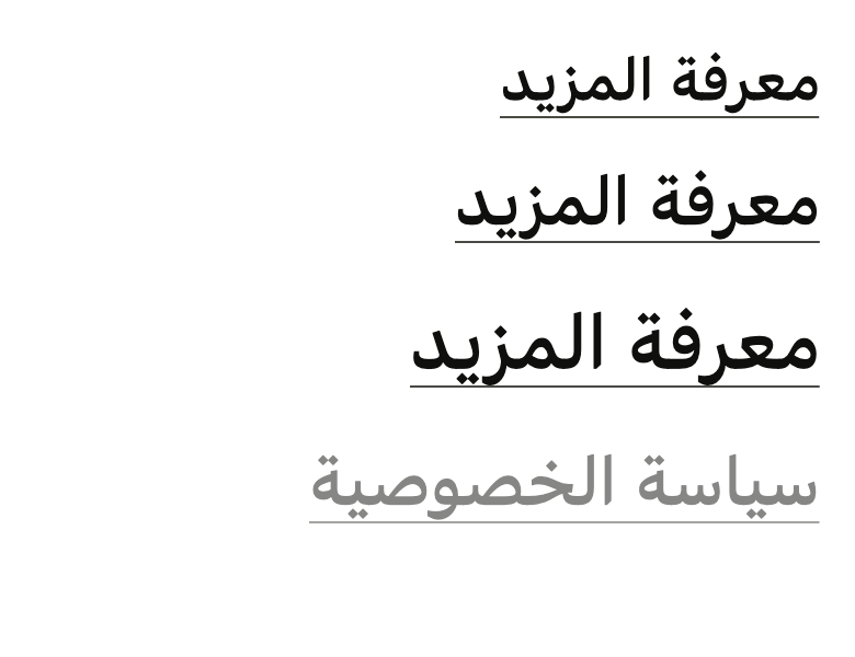
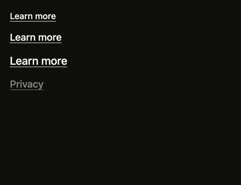
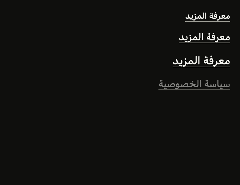
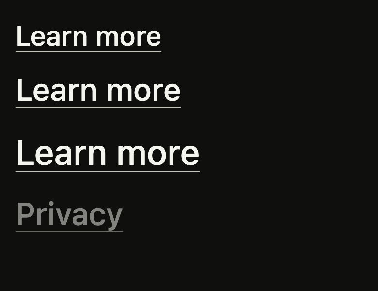
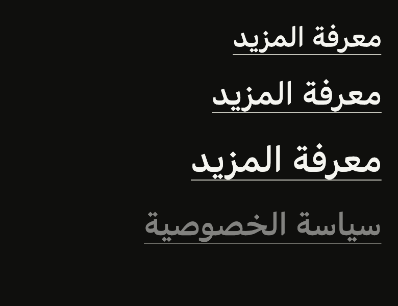
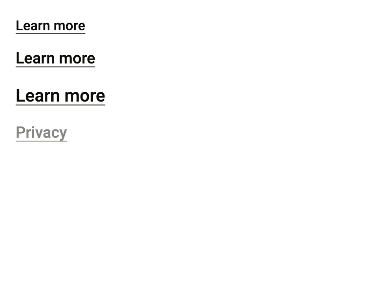
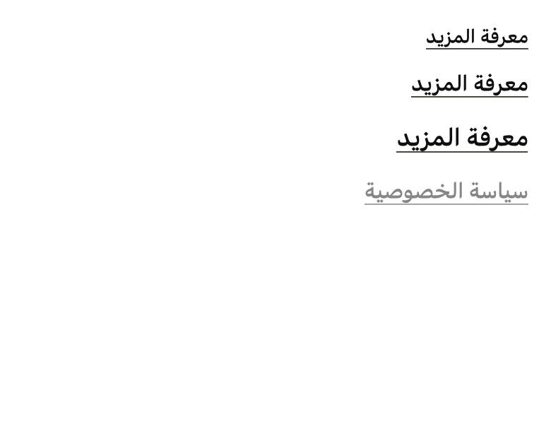
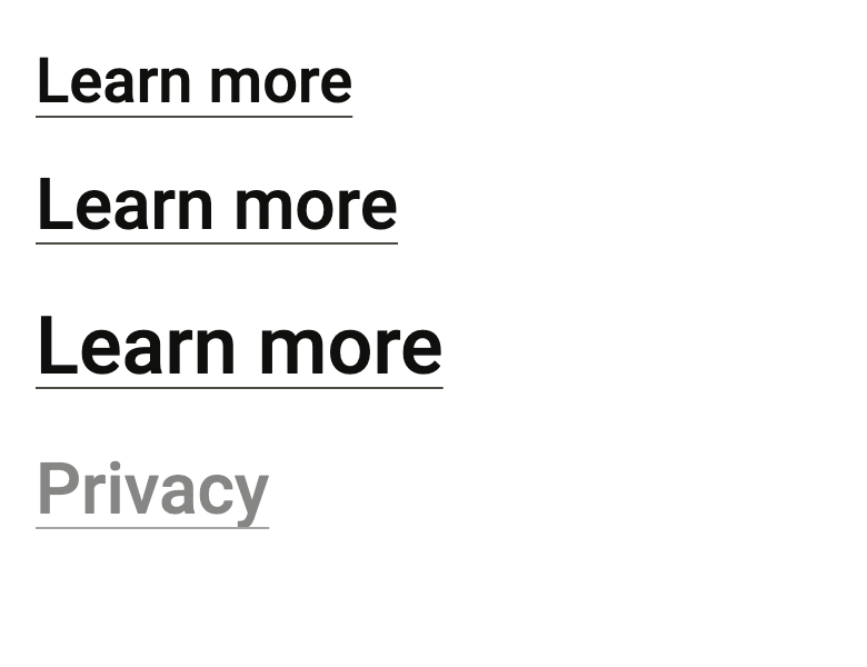
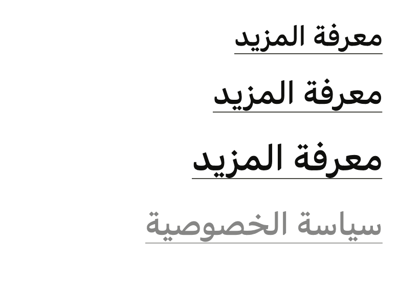
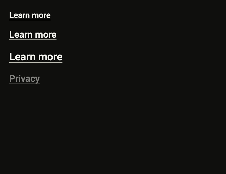
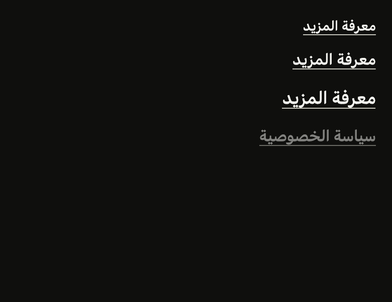
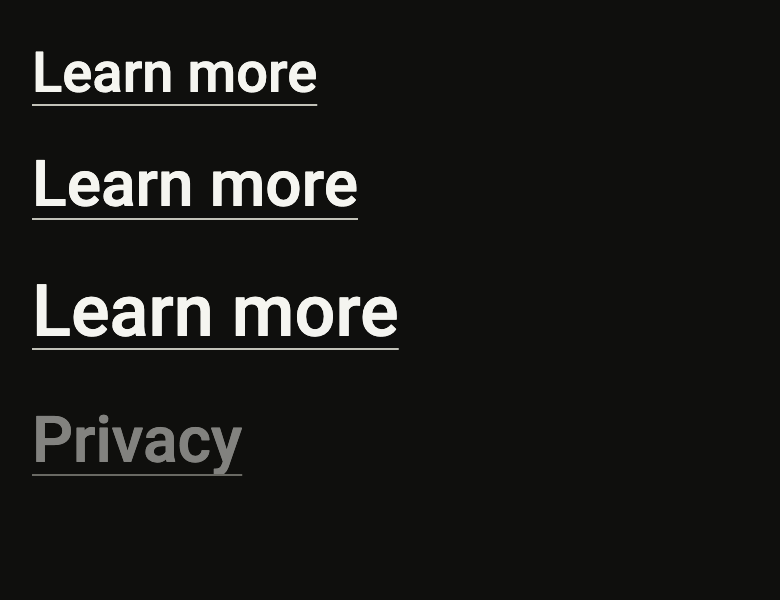
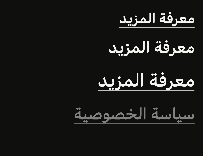
The code the reference images render:
final example = ColoredBox(
  color: FlScope.of(context).colors.surface,
  child: Padding(
    padding: EdgeInsetsDirectional.all(FlScope.of(context).space.lg),
    child: Column(
      crossAxisAlignment: CrossAxisAlignment.start,
      spacing: FlScope.of(context).space.md,
      children: [
        for (final s in FlButtonSize.values)
          FlLinkButton(
            label: 'Learn more',
            size: s,
            underline: true,
            onPressed: () {},
          ),
        FlLinkButton(label: 'Privacy', underline: true, onPressed: null),
      ],
    ),
  ),
);API
FlLinkButtonTone: enum {normal, muted, danger}
FlLinkButtonTone.normal: static final FlLinkButtonTone
FlLinkButtonTone.muted: static final FlLinkButtonTone
FlLinkButtonTone.danger: static final FlLinkButtonTone
FlLinkButton: class extends StatelessWidget
FlLinkButton.new: const new({super.key, required String label, required VoidCallback? onPressed, FlButtonSize? size, bool accent, bool underline, bool link, FlLinkButtonTone tone, FontWeight? weight, WidgetStatesController? statesController, String? semanticLabel, Widget? leading, Widget? trailing})
FlLinkButton.leading: get Widget?
FlLinkButton.trailing: get Widget?
FlLinkButton.tone: get FlLinkButtonTone
FlLinkButton.weight: get FontWeight?
FlLinkButton.label: get String
FlLinkButton.semanticLabel: get String?
FlLinkButton.onPressed: get VoidCallback?
FlLinkButton.size: get FlButtonSize?
FlLinkButton.accent: get bool
FlLinkButton.underline: get bool
FlLinkButton.link: get bool
FlLinkButton.statesController: get WidgetStatesController?
FlLinkButton.build: Widget(BuildContext context)Reference renders
The 16 images published with version 0.2.4, rendered by the shared harness on macOS with Flutter 3.47.7. fliin verify link-button compares your copy to them.
Use it to
- add a terms of service link
- add a learn more link under some text
- add an inline link inside a sentence
- open the privacy policy from a sign up form
- show a subtle link to the help page
- Not for
- a screen's main action: use a button (button)
- States
Source
The files fliin add link-button copies into your app, before your prefix and imports are applied.
link_button/fl_link_button.dart
// Modified from LinkButton of HeroUI Native 1.0.10, Copyright 2025 NextUI Inc.,
// licensed under Apache 2.0: https://www.apache.org/licenses/LICENSE-2.0
import 'dart:math' as math;

import 'package:flutter/rendering.dart';
import 'package:flutter/widgets.dart';
import 'package:fliin_ui/components/button/fl_button.dart';
import 'package:fliin_ui/core/fliin.dart';

/// The gap between the baseline and the underline, Izydesk's
/// `text-underline-offset: 3px`.
const double _underlineOffset = 3;

/// The icon's side as a share of the text size.
const double _iconEm = 0.75;

/// The color of an [FlLinkButton], its underline included.
enum FlLinkButtonTone {
  /// `onControl`: a link of the page.
  normal,

  /// `onSurfaceMuted`: a secondary action under a text, a comment's "Reply".
  muted,

  /// `danger`: a destructive action, a comment's "Delete".
  danger,
}

/// An inline link ("Terms of use", "Learn more"): a ghost button
/// without height, padding or veil, reduced to its label. It shrinks on
/// press like an [FlButton] and turns half opaque when disabled; its touch
/// target stays the platform's. It is written in `onControl` and announced
/// as a button: in a sentence, [accent] or [underline] underline it to set
/// it apart from the text other than by its position (WCAG 1.4.1), and
/// [link] announces it as a link. Without [underline], the underline shows
/// under the pointer and on press. [leading] and
/// [trailing] take an icon at three quarters of the text size, in its color
/// ("Learn more →", an external link).
class FlLinkButton extends StatelessWidget {
  /// A link that shows [label].
  const FlLinkButton({
    super.key,
    required this.label,
    required this.onPressed,
    this.size,
    this.accent = false,
    this.underline = false,
    this.link = false,
    this.tone = FlLinkButtonTone.normal,
    this.weight,
    this.statesController,
    this.semanticLabel,
    this.leading,
    this.trailing,
  });

  /// An icon before the label, at
  /// three quarters of the text size and in its color, `space.xs` away;
  /// not underlined and not read.
  final Widget? leading;

  /// An icon after the label (an arrow or an external
  /// link mark), sized and tinted like [leading].
  final Widget? trailing;

  /// The text and underline color: `onControl` by default, `muted` or
  /// `danger` for the actions under a comment.
  final FlLinkButtonTone tone;

  /// The label's weight; null, `typography.weight.medium`. Izydesk sets a
  /// link in the normal weight when it sits under a heavier action.
  final FontWeight? weight;

  /// The text shown, and read by the screen reader unless [semanticLabel].
  final String label;

  /// The name read instead of [label], when the word shown is not enough out
  /// of context ("Remove Linen tote bag" for "Remove"). It must contain the
  /// word shown, preferably first (WCAG 2.5.3); null, [label].
  final String? semanticLabel;

  /// Called when the link is pressed. Null: it drops to
  /// `size.disabledOpacity` and announces itself as disabled.
  final VoidCallback? onPressed;

  /// The label size: `textSm`, `textBase` or `textLg` in medium weight,
  /// Izydesk's `.link-sm`, `.link` and `.link-lg`. Null, it follows the
  /// theme's density.
  final FlButtonSize? size;

  /// True: the link stands apart from the surrounding text. It stays in
  /// `onControl` and is underlined, like [underline]: an Izydesk link is
  /// never blue, the accent is reserved for the screen's primary action.
  final bool accent;

  /// True: the label is underlined.
  final bool underline;

  /// True: the screen reader announces it as a link, not as a button (the
  /// default).
  final bool link;

  /// The link's states, which the app can read or force; see
  /// `FlPressable.statesController`.
  final WidgetStatesController? statesController;

  @override
  Widget build(BuildContext context) {
    final theme = FlScope.of(context);
    final role = switch (size ?? FlButtonSize.of(theme.density)) {
      FlButtonSize.sm => FlTextRole.textSm,
      FlButtonSize.md => FlTextRole.textBase,
      FlButtonSize.lg => FlTextRole.textLg,
    };
    final color = switch (tone) {
      FlLinkButtonTone.normal => theme.colors.onControl,
      FlLinkButtonTone.muted => theme.colors.onSurfaceMuted,
      FlLinkButtonTone.danger => theme.colors.danger,
    };
    final underlined = accent || underline;
    final leading = this.leading;
    final trailing = this.trailing;
    final style = theme.typography
        .resolve(role)
        .copyWith(color: color, fontWeight: weight ?? theme.tokens.typography.weight.medium);
    final strut = theme.typography.strut(role, inheritedFamily: DefaultTextStyle.of(context).style.fontFamily);
    Widget withIcons(BuildContext context, Widget text) {
      final side = MediaQuery.textScalerOf(context)
          .clamp(maxScaleFactor: theme.size.iconMaxScale)
          .scale(theme.typography.style(role).size * _iconEm);
      return IconTheme.merge(
        data: IconThemeData(color: color, size: side),
        child: Row(
          mainAxisSize: MainAxisSize.min,
          spacing: theme.space.xs,
          children: [
            ?leading,
            Flexible(child: text),
            ?trailing,
          ],
        ),
      );
    }

    final pressable = FlPressable(
      onPressed: onPressed,
      statesController: statesController,
      label: semanticLabel ?? label,
      // Izydesk's focused link: a ring with `radius.xs` corners.
      borderRadius: BorderRadius.circular(theme.shape.radiusXs),
      overlay: FlPressOverlay.none,
      // Pressed, the link fades by the press veil's share (0.7). At rest the
      // underline of a normal link is `onSurfaceMuted`, quieter than the word
      // yet a text color: the
      // contrast check reads the stroke as the text. Hovered, it takes the
      // word's color.
      builder: (context, states) {
        final active = states.contains(WidgetState.hovered) || states.contains(WidgetState.pressed);
        // A link without an underline shows one under the pointer, in the
        // quieter `onSurfaceMuted`.
        final lined = underlined || (active && !states.contains(WidgetState.disabled));
        final text = _Underlined(
          underline: lined
              ? _Underline(
                  text: TextSpan(text: label, style: DefaultTextStyle.of(context).style.merge(style)),
                  strutStyle: strut,
                  textScaler: MediaQuery.textScalerOf(context),
                  textDirection: Directionality.of(context),
                  color: !underlined
                      ? theme.colors.onSurfaceMuted
                      : active
                      ? color
                      : tone == FlLinkButtonTone.normal
                      ? theme.colors.onSurfaceMuted
                      : color,
                  thickness: theme.size.border,
                )
              : null,
          child: Text(label, style: style, strutStyle: strut),
        );
        return Opacity(
          opacity: states.contains(WidgetState.disabled)
              ? theme.size.disabledOpacity
              : states.contains(WidgetState.pressed)
              ? 1 - theme.size.pressedOverlayOpacity
              : 1,
          child: FlPixelSnap(child: leading == null && trailing == null ? text : withIcons(context, text)),
        );
      },
    );
    if (!link) return pressable;
    // FlPressable always announces itself as a button: the link's node
    // replaces it, at the platform's touch target.
    return FlHitTarget(
      child: Semantics(
        link: true,
        enabled: onPressed != null,
        label: semanticLabel ?? label,
        onTap: onPressed,
        child: ExcludeSemantics(child: pressable),
      ),
    );
  }
}

/// Izydesk's underline: a stroke of [thickness] at [_underlineOffset] under
/// each line's baseline, on whole logical pixels. The font's underline lands
/// between pixels, where antialiasing turns it into a grey row wider than any
/// letter: Flutter's contrast rule then measures the text against that grey.
@immutable
class _Underline {
  const _Underline({
    required this.text,
    required this.strutStyle,
    required this.textScaler,
    required this.textDirection,
    required this.color,
    required this.thickness,
  });

  final TextSpan text;
  final StrutStyle strutStyle;
  final TextScaler textScaler;
  final TextDirection textDirection;
  final Color color;
  final double thickness;

  @override
  bool operator ==(Object other) =>
      other is _Underline &&
      text == other.text &&
      strutStyle == other.strutStyle &&
      textScaler == other.textScaler &&
      textDirection == other.textDirection &&
      color == other.color &&
      thickness == other.thickness;

  @override
  int get hashCode => Object.hash(text, strutStyle, textScaler, textDirection, color, thickness);
}

class _Underlined extends SingleChildRenderObjectWidget {
  const _Underlined({required this.underline, required super.child});

  final _Underline? underline;

  @override
  RenderObject createRenderObject(BuildContext context) => _RenderUnderlined(underline);

  @override
  void updateRenderObject(BuildContext context, _RenderUnderlined renderObject) => renderObject.underline = underline;
}

class _RenderUnderlined extends RenderProxyBox {
  _RenderUnderlined(this._underline);

  _Underline? _underline;
  set underline(_Underline? value) {
    if (value == _underline) return;
    _underline = value;
    markNeedsPaint();
  }

  @override
  void paint(PaintingContext context, Offset offset) {
    super.paint(context, offset);
    final underline = _underline;
    if (underline == null) return;
    final painter = TextPainter(
      text: underline.text,
      strutStyle: underline.strutStyle,
      textScaler: underline.textScaler,
      textDirection: underline.textDirection,
    )..layout(maxWidth: size.width);
    // Global and logical: the snap holds through the press's scale layer.
    final top = localToGlobal(Offset.zero).dy;
    final thickness = math.max(1.0, underline.thickness.roundToDouble());
    final paint = Paint()..color = underline.color;
    for (final line in painter.computeLineMetrics()) {
      final y = (top + line.baseline + underline.textScaler.scale(_underlineOffset)).roundToDouble() - top;
      context.canvas.drawRect(Rect.fromLTWH(offset.dx + line.left, offset.dy + y, line.width, thickness), paint);
    }
    painter.dispose();
  }
}