Components / data-display
Keyboard key
Shows a key or a shortcut to type on a keyboard, such as ⌘ K: Apple symbols on iOS and macOS, Ctrl or Alt elsewhere, on a key cap or bare.
Import
In a Flutter app where fliin init has run:
Examples
Shortcut
A shortcut: modifier keys from FlKbdKey, then the letter as text. Give semanticLabel when the glyphs alone would read poorly.

import 'package:your_app/ui/fliin/components/kbd/fl_kbd.dart';
import 'package:your_app/ui/fliin/core/fliin.dart';
import 'package:flutter/widgets.dart';

class KbdShortcutExample extends StatelessWidget {
  const KbdShortcutExample({super.key});

  @override
  Widget build(BuildContext context) {
    final space = FlScope.of(context).space;
    return Wrap(
      alignment: WrapAlignment.center,
      crossAxisAlignment: WrapCrossAlignment.center,
      spacing: space.sm,
      runSpacing: space.sm,
      children: [
        const FlKbd(keys: [FlKbdKey.command], text: 'K', semanticLabel: 'Command K'),
        const FlKbd(keys: [FlKbdKey.command, FlKbdKey.shift], text: 'Z'),
        const FlKbd(keys: [FlKbdKey.option, FlKbdKey.control], text: 'F'),
      ],
    );
  }
}Keys
The named keys: enter, escape, tab, delete and the four arrows, each drawn with its symbol.

import 'package:your_app/ui/fliin/components/kbd/fl_kbd.dart';
import 'package:your_app/ui/fliin/core/fliin.dart';
import 'package:flutter/widgets.dart';

class KbdKeysExample extends StatelessWidget {
  const KbdKeysExample({super.key});

  @override
  Widget build(BuildContext context) {
    final space = FlScope.of(context).space;
    return Wrap(
      alignment: WrapAlignment.center,
      crossAxisAlignment: WrapCrossAlignment.center,
      spacing: space.sm,
      runSpacing: space.sm,
      children: [
        const FlKbd(keys: [FlKbdKey.enter]),
        const FlKbd(keys: [FlKbdKey.escape]),
        const FlKbd(keys: [FlKbdKey.tab]),
        const FlKbd(keys: [FlKbdKey.delete]),
        const FlKbd(keys: [FlKbdKey.up]),
        const FlKbd(keys: [FlKbdKey.down]),
        const FlKbd(keys: [FlKbdKey.left]),
        const FlKbd(keys: [FlKbdKey.right]),
      ],
    );
  }
}Inline
Inside a sentence, the light variant sits on the text without weighing on it.

import 'package:your_app/ui/fliin/components/kbd/fl_kbd.dart';
import 'package:your_app/ui/fliin/components/text/fl_text.dart';
import 'package:your_app/ui/fliin/core/fliin.dart';
import 'package:flutter/widgets.dart';

class KbdInlineExample extends StatelessWidget {
  const KbdInlineExample({super.key});

  @override
  Widget build(BuildContext context) {
    final space = FlScope.of(context).space;
    return Wrap(
      alignment: WrapAlignment.center,
      crossAxisAlignment: WrapCrossAlignment.center,
      spacing: space.sm,
      runSpacing: space.sm,
      children: [
        const FlText('Press'),
        const FlKbd(keys: [FlKbdKey.command], text: 'K', variant: FlKbdVariant.light),
        const FlText('to search'),
      ],
    );
  }
}Variants
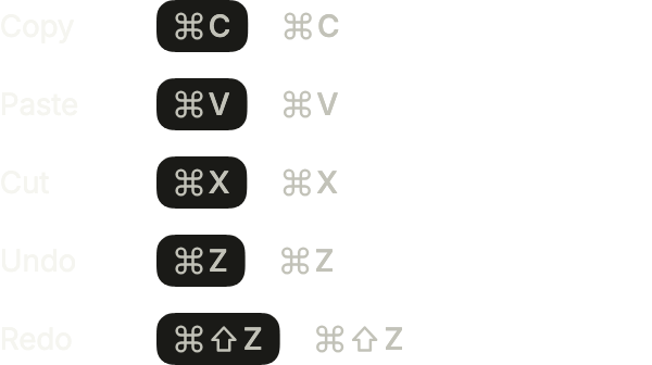
Each shortcut twice: the default filled cap, then light, without a background, for a menu row or a dense list.
import 'package:your_app/ui/fliin/components/kbd/fl_kbd.dart';
import 'package:your_app/ui/fliin/components/text/fl_text.dart';
import 'package:your_app/ui/fliin/core/fliin.dart';
import 'package:flutter/widgets.dart';

class KbdVariantsExample extends StatelessWidget {
  const KbdVariantsExample({super.key});

  @override
  Widget build(BuildContext context) {
    final space = FlScope.of(context).space;
    Widget row(String action, List<FlKbdKey> keys, String letter) => Wrap(
      crossAxisAlignment: WrapCrossAlignment.center,
      spacing: space.sm,
      runSpacing: space.xs,
      children: [
        ConstrainedBox(
          constraints: BoxConstraints(minWidth: space.xxl * 2),
          child: FlText(action, type: FlTextType.bodySm),
        ),
        FlKbd(keys: keys, text: letter),
        FlKbd(keys: keys, text: letter, variant: FlKbdVariant.light),
      ],
    );
    return Column(
      mainAxisSize: MainAxisSize.min,
      crossAxisAlignment: CrossAxisAlignment.start,
      spacing: space.md,
      children: [
        row('Copy', const [FlKbdKey.command], 'C'),
        row('Paste', const [FlKbdKey.command], 'V'),
        row('Cut', const [FlKbdKey.command], 'X'),
        row('Undo', const [FlKbdKey.command], 'Z'),
        row('Redo', const [FlKbdKey.command, FlKbdKey.shift], 'Z'),
      ],
    );
  }
}Navigation
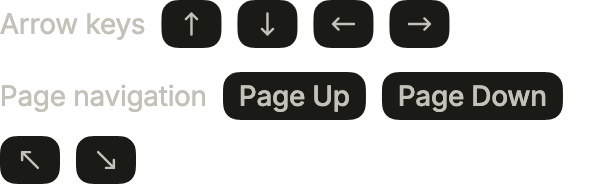
The arrows, drawn on every platform and never mirrored, then the page keys: words outside Apple platforms, ↖ and ↘ for Home and End on iOS and macOS.
import 'package:your_app/ui/fliin/components/kbd/fl_kbd.dart';
import 'package:your_app/ui/fliin/components/text/fl_text.dart';
import 'package:your_app/ui/fliin/core/fliin.dart';
import 'package:flutter/widgets.dart';

class KbdNavigationExample extends StatelessWidget {
  const KbdNavigationExample({super.key});

  @override
  Widget build(BuildContext context) {
    final space = FlScope.of(context).space;
    Widget row(String title, List<FlKbdKey> keys) => Wrap(
      crossAxisAlignment: WrapCrossAlignment.center,
      spacing: space.sm,
      runSpacing: space.sm,
      children: [
        FlText(title, type: FlTextType.bodySm, tone: FlTextTone.muted),
        for (final key in keys) FlKbd(keys: [key]),
      ],
    );
    return Column(
      mainAxisSize: MainAxisSize.min,
      crossAxisAlignment: CrossAxisAlignment.start,
      spacing: space.md,
      children: [
        row('Arrow keys', const [FlKbdKey.up, FlKbdKey.down, FlKbdKey.left, FlKbdKey.right]),
        row('Page navigation', const [FlKbdKey.pageUp, FlKbdKey.pageDown, FlKbdKey.home, FlKbdKey.end]),
      ],
    );
  }
}Special
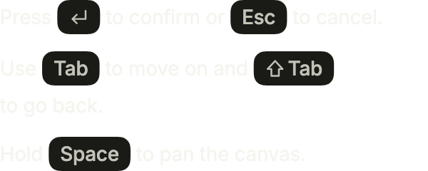
Enter, Escape, Tab and Space inside sentences; Shift and Tab held together share one cap.
import 'package:your_app/ui/fliin/components/kbd/fl_kbd.dart';
import 'package:your_app/ui/fliin/components/text/fl_text.dart';
import 'package:your_app/ui/fliin/core/fliin.dart';
import 'package:flutter/widgets.dart';

class KbdSpecialExample extends StatelessWidget {
  const KbdSpecialExample({super.key});

  @override
  Widget build(BuildContext context) {
    final space = FlScope.of(context).space;
    Widget sentence(List<Widget> parts) =>
        Wrap(crossAxisAlignment: WrapCrossAlignment.center, spacing: space.xs, runSpacing: space.xs, children: parts);
    const sm = FlTextType.bodySm;
    return Column(
      mainAxisSize: MainAxisSize.min,
      crossAxisAlignment: CrossAxisAlignment.start,
      spacing: space.md,
      children: [
        sentence(const [
          FlText('Press', type: sm),
          FlKbd(keys: [FlKbdKey.enter]),
          FlText('to confirm or', type: sm),
          FlKbd(keys: [FlKbdKey.escape]),
          FlText('to cancel.', type: sm),
        ]),
        sentence(const [
          FlText('Use', type: sm),
          FlKbd(keys: [FlKbdKey.tab]),
          FlText('to move on and', type: sm),
          FlKbd(keys: [FlKbdKey.shift, FlKbdKey.tab]),
          FlText('to go back.', type: sm),
        ]),
        sentence(const [
          FlText('Hold', type: sm),
          FlKbd(keys: [FlKbdKey.space]),
          FlText('to pan the canvas.', type: sm),
        ]),
      ],
    );
  }
}Instructional
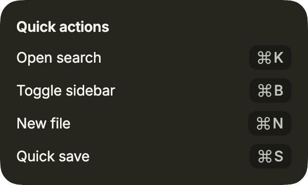
A list of shortcuts in a surface, each action at the start and its keys at the end, like the keyboard help of an iPad app.
import 'package:your_app/ui/fliin/components/kbd/fl_kbd.dart';
import 'package:your_app/ui/fliin/components/surface/fl_surface.dart';
import 'package:your_app/ui/fliin/components/text/fl_text.dart';
import 'package:your_app/ui/fliin/core/fliin.dart';
import 'package:flutter/widgets.dart';

class KbdInstructionalExample extends StatelessWidget {
  const KbdInstructionalExample({super.key});

  @override
  Widget build(BuildContext context) {
    final theme = FlScope.of(context);
    Widget shortcut(String action, String letter) => Row(
      spacing: theme.space.sm,
      children: [
        Expanded(child: FlText(action, type: FlTextType.bodySm)),
        FlKbd(keys: const [FlKbdKey.command], text: letter),
      ],
    );
    return FlSurface(
      variant: FlSurfaceVariant.secondary,
      child: Column(
        mainAxisSize: MainAxisSize.min,
        crossAxisAlignment: CrossAxisAlignment.stretch,
        spacing: theme.space.sm,
        children: [
          FlText('Quick actions', type: FlTextType.bodySm, weight: theme.tokens.typography.weight.semibold),
          shortcut('Open search', 'K'),
          shortcut('Toggle sidebar', 'B'),
          shortcut('New file', 'N'),
          shortcut('Quick save', 'S'),
        ],
      ),
    );
  }
}Custom colors
color and foregroundColor repaint the cap from your theme's colors, for a key that matches a selected row or a brand.

import 'package:your_app/ui/fliin/components/kbd/fl_kbd.dart';
import 'package:your_app/ui/fliin/core/fliin.dart';
import 'package:flutter/widgets.dart';

class KbdCustomColorsExample extends StatelessWidget {
  const KbdCustomColorsExample({super.key});

  @override
  Widget build(BuildContext context) {
    final theme = FlScope.of(context);
    return Wrap(
      alignment: WrapAlignment.center,
      crossAxisAlignment: WrapCrossAlignment.center,
      spacing: theme.space.sm,
      runSpacing: theme.space.sm,
      children: [
        FlKbd(
          keys: const [FlKbdKey.command],
          text: 'K',
          color: theme.colors.selected,
          foregroundColor: theme.colors.onSelected,
        ),
        FlKbd(
          keys: const [FlKbdKey.shift],
          text: 'P',
          color: theme.colors.surfaceSecondary,
          foregroundColor: theme.colors.onSurface,
        ),
      ],
    );
  }
}Usage
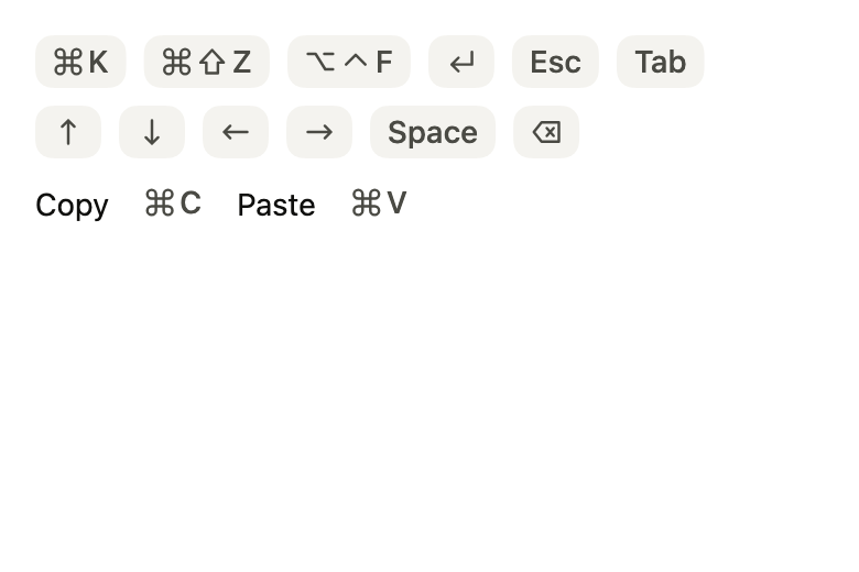
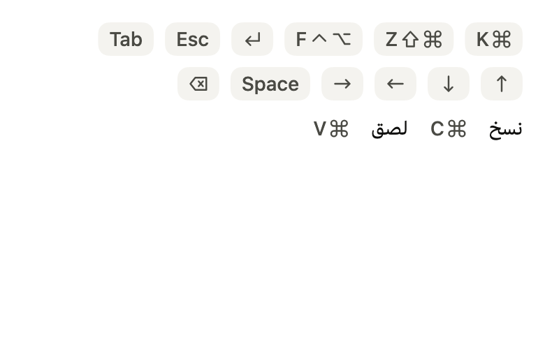
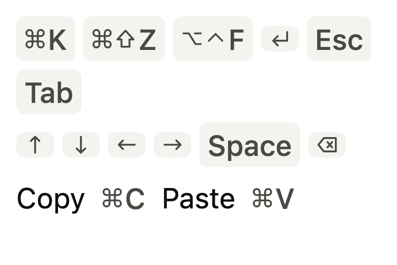
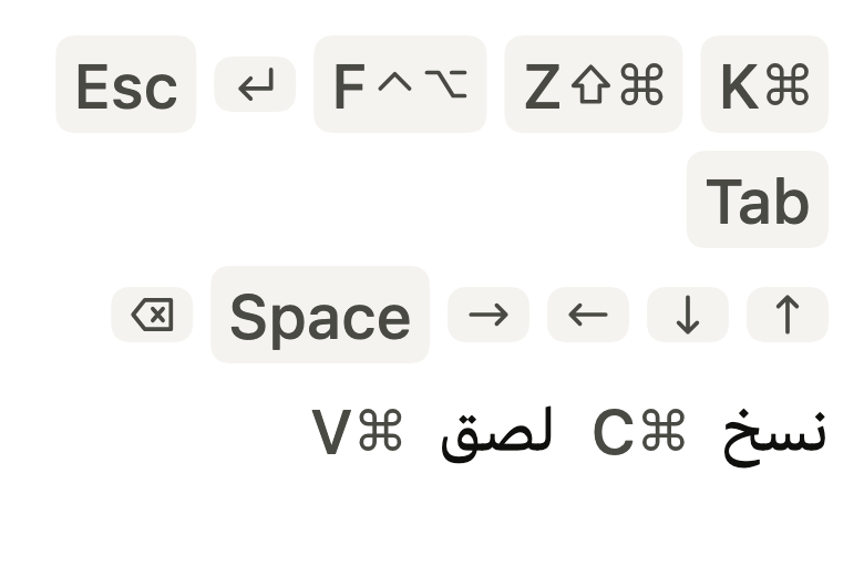
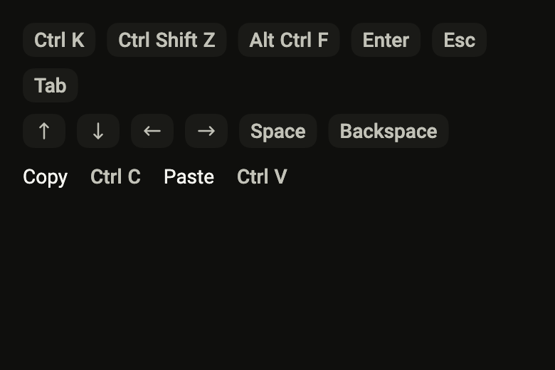
The code the reference images render:
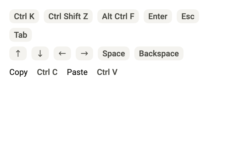
final example = ColoredBox(
  color: FlScope.of(context).colors.surface,
  child: SingleChildScrollView(
    padding: EdgeInsetsDirectional.all(FlScope.of(context).space.lg),
    child: Column(
      crossAxisAlignment: CrossAxisAlignment.stretch,
      spacing: FlScope.of(context).space.sm,
      children: [
        Wrap(
          spacing: FlScope.of(context).space.sm,
          runSpacing: FlScope.of(context).space.sm,
          crossAxisAlignment: WrapCrossAlignment.center,
          children: [
            FlKbd(
              keys: const [FlKbdKey.command],
              text: 'K',
              semanticLabel: 'Command K',
            ),
            FlKbd(keys: const [FlKbdKey.command, FlKbdKey.shift], text: 'Z'),
            FlKbd(keys: const [FlKbdKey.option, FlKbdKey.control], text: 'F'),
            FlKbd(keys: const [FlKbdKey.enter]),
            FlKbd(keys: const [FlKbdKey.escape]),
            FlKbd(keys: const [FlKbdKey.tab]),
          ],
        ),
        Wrap(
          spacing: FlScope.of(context).space.sm,
          runSpacing: FlScope.of(context).space.sm,
          crossAxisAlignment: WrapCrossAlignment.center,
          children: [
            FlKbd(keys: const [FlKbdKey.up]),
            FlKbd(keys: const [FlKbdKey.down]),
            FlKbd(keys: const [FlKbdKey.left]),
            FlKbd(keys: const [FlKbdKey.right]),
            FlKbd(keys: const [FlKbdKey.space]),
            FlKbd(keys: const [FlKbdKey.delete]),
          ],
        ),
        Wrap(
          spacing: FlScope.of(context).space.sm,
          runSpacing: FlScope.of(context).space.sm,
          crossAxisAlignment: WrapCrossAlignment.center,
          children: [
            Text(
              'Copy',
              style: FlScope.of(context).typography
                  .resolve(FlTextRole.textSm)
                  .copyWith(color: FlScope.of(context).colors.onSurface),
            ),
            FlKbd(
              keys: const [FlKbdKey.command],
              text: 'C',
              variant: FlKbdVariant.light,
            ),
            Text(
              'Paste',
              style: FlScope.of(context).typography
                  .resolve(FlTextRole.textSm)
                  .copyWith(color: FlScope.of(context).colors.onSurface),
            ),
            FlKbd(
              keys: const [FlKbdKey.command],
              text: 'V',
              variant: FlKbdVariant.light,
            ),
          ],
        ),
      ],
    ),
  ),
);API
FlKbdKey: enum {command, shift, control, option, enter, delete, escape, tab, capsLock, up, right, down, left, pageUp, pageDown, home, end, space, fn}
FlKbdKey.command: static final FlKbdKey
FlKbdKey.shift: static final FlKbdKey
FlKbdKey.control: static final FlKbdKey
FlKbdKey.option: static final FlKbdKey
FlKbdKey.enter: static final FlKbdKey
FlKbdKey.delete: static final FlKbdKey
FlKbdKey.escape: static final FlKbdKey
FlKbdKey.tab: static final FlKbdKey
FlKbdKey.capsLock: static final FlKbdKey
FlKbdKey.up: static final FlKbdKey
FlKbdKey.right: static final FlKbdKey
FlKbdKey.down: static final FlKbdKey
FlKbdKey.left: static final FlKbdKey
FlKbdKey.pageUp: static final FlKbdKey
FlKbdKey.pageDown: static final FlKbdKey
FlKbdKey.home: static final FlKbdKey
FlKbdKey.end: static final FlKbdKey
FlKbdKey.space: static final FlKbdKey
FlKbdKey.fn: static final FlKbdKey
FlKbdKey.new: const new(String word, {String? apple})
FlKbdKey.word: get String
FlKbdKey.apple: get String?
FlKbdVariant: enum {filled, light}
FlKbdVariant.filled: static final FlKbdVariant
FlKbdVariant.light: static final FlKbdVariant
FlKbd: class extends StatelessWidget
FlKbd.new: const new({super.key, List<FlKbdKey> keys, String? text, FlKbdVariant variant, String? semanticLabel, Color? color, Color? foregroundColor})
FlKbd.keys: get List<FlKbdKey>
FlKbd.text: get String?
FlKbd.variant: get FlKbdVariant
FlKbd.semanticLabel: get String?
FlKbd.color: get Color?
FlKbd.foregroundColor: get Color?
FlKbd.build: Widget(BuildContext context)Reference renders
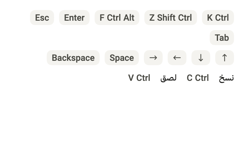
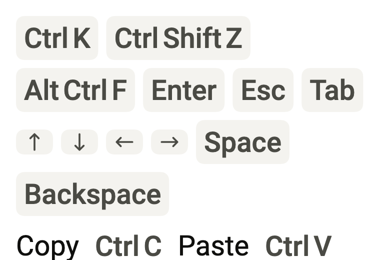
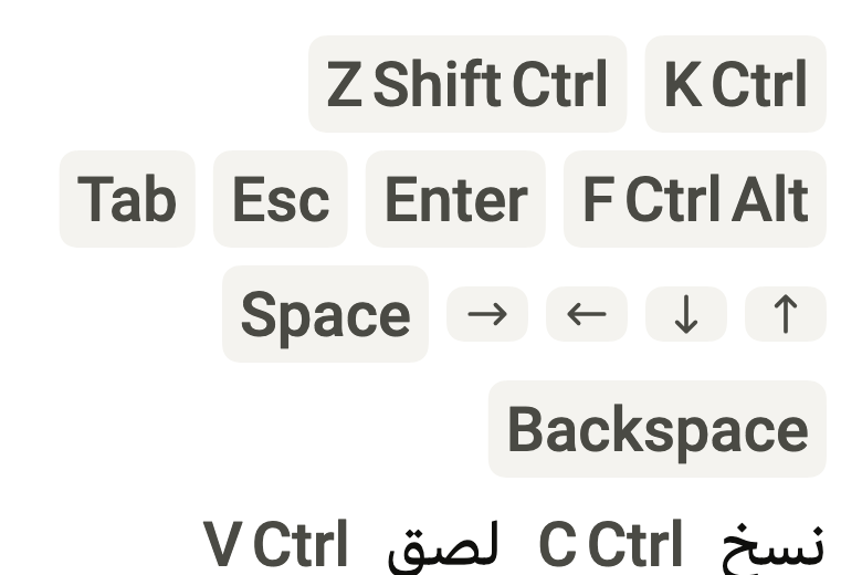
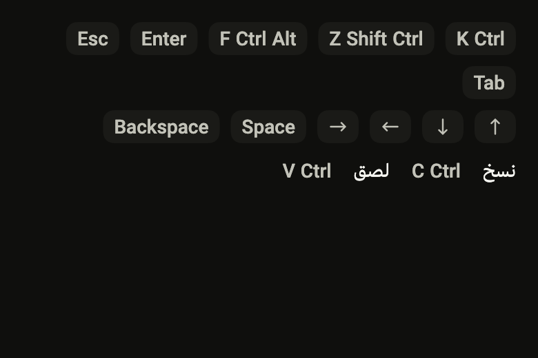
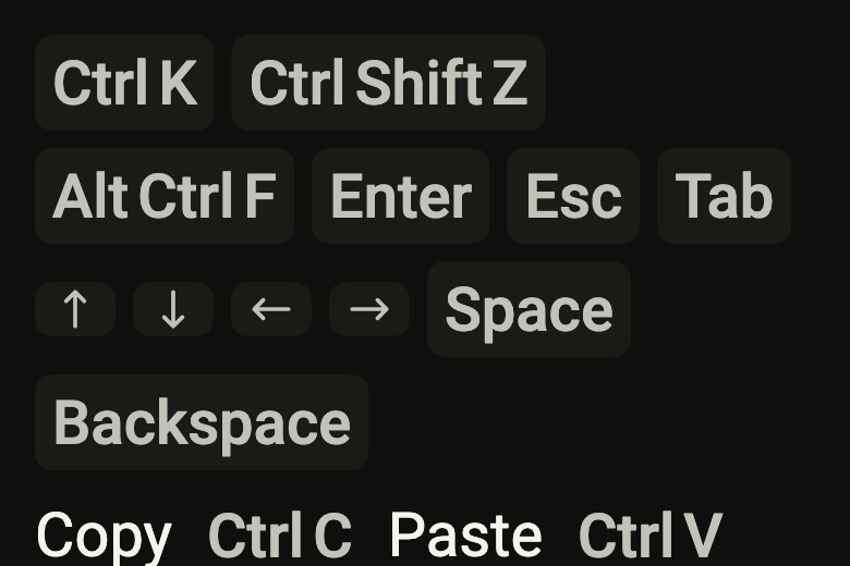
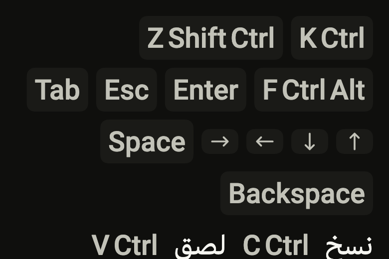
The 16 images published with version 0.1.1, rendered by the shared harness on macOS with Flutter 3.47.7. fliin verify kbd compares your copy to them.
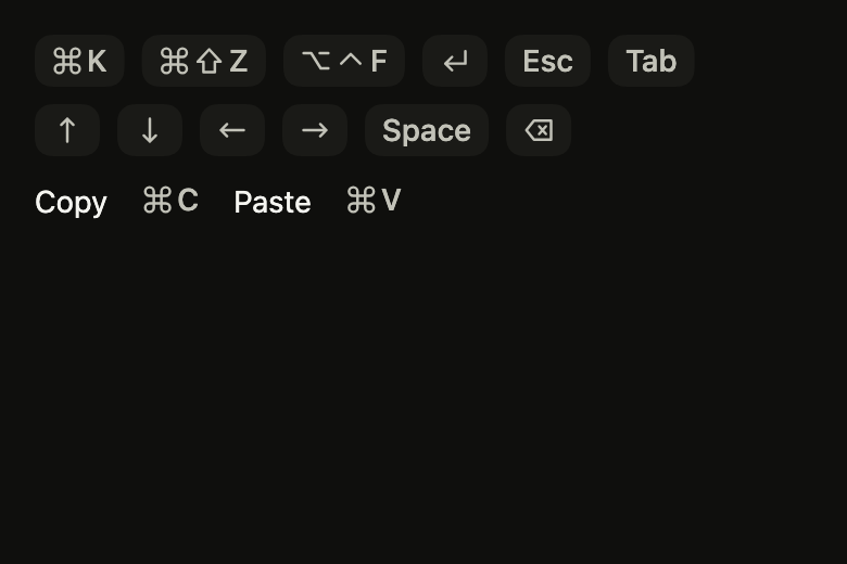
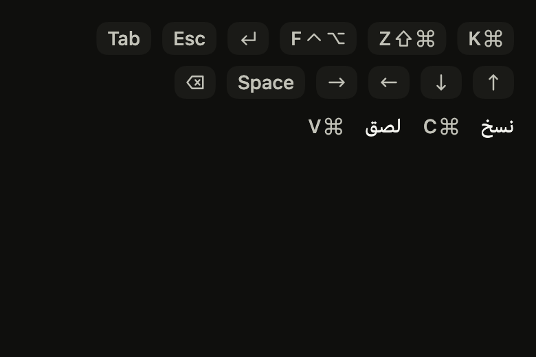
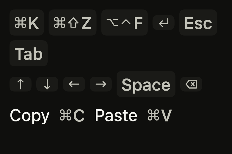
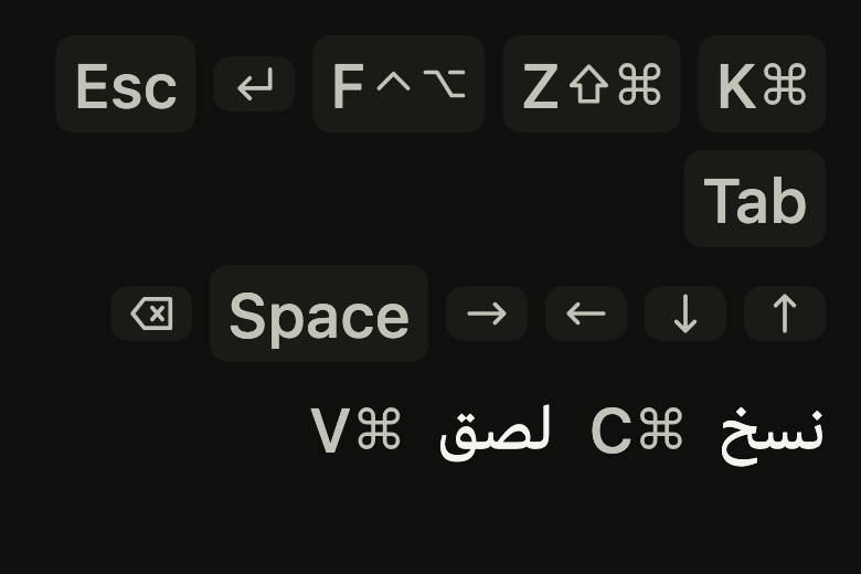
Use it to
- show a keyboard shortcut next to a command
- explain that Escape closes the panel
- present Cmd K or Ctrl K in a help text
- use arrow key caps in keyboard navigation hints
- give the hotkeys of an iPad with a hardware keyboard
- Not for
- a status or category label: use a chip (chip)
- a counter on an icon: use a badge (badge)
- States
Source
The files fliin add kbd copies into your app, before your prefix and imports are applied.
kbd/fl_kbd.dart
// Modified from the Kbd of HeroUI React v3, Copyright 2025 NextUI Inc.,
// licensed under Apache 2.0: https://www.apache.org/licenses/LICENSE-2.0
import 'dart:math' as math;

import 'package:flutter/widgets.dart';
import 'package:fliin_ui/core/fliin.dart';

/// A special key of an [FlKbd]: Apple's symbol on iOS and macOS (⌘, ⇧, ⌥),
/// the word elsewhere (Ctrl, Shift, Alt), as each platform's keyboards
/// print it. The symbols and the arrows are drawn, not typeset: no font
/// has to carry them.
enum FlKbdKey {
  /// ⌘, or Ctrl outside Apple platforms.
  command('Ctrl'),

  /// ⇧, or Shift.
  shift('Shift'),

  /// ⌃, or Ctrl.
  control('Ctrl'),

  /// ⌥, or Alt.
  option('Alt'),

  /// ⏎, or Enter.
  enter('Enter'),

  /// ⌫, or Backspace.
  delete('Backspace'),

  /// Esc, written on every platform, as Apple's keyboards print it too.
  escape('Esc'),

  /// Tab, written on every platform.
  tab('Tab'),

  /// ⇪, or Caps Lock.
  capsLock('Caps Lock'),

  /// ↑, drawn on every platform.
  up('↑'),

  /// →, drawn on every platform, never mirrored: the key is the physical one.
  right('→'),

  /// ↓, drawn on every platform.
  down('↓'),

  /// ←, drawn on every platform, never mirrored.
  left('←'),

  /// Page Up, PgUp outside Apple platforms.
  pageUp('PgUp', apple: 'Page Up'),

  /// Page Down, PgDn outside Apple platforms.
  pageDown('PgDn', apple: 'Page Down'),

  /// ↖, or Home.
  home('Home'),

  /// ↘, or End.
  end('End'),

  /// Space, written on every platform.
  space('Space'),

  /// Fn, written on every platform.
  fn('Fn');

  const FlKbdKey(this.word, {this.apple});

  /// The key as written outside Apple platforms, and read by default.
  final String word;

  /// The word on iOS and macOS, when it differs and no symbol stands for it.
  final String? apple;
}

/// The background of an [FlKbd].
enum FlKbdVariant {
  /// A `control` key cap.
  filled,

  /// No background: a key inside a sentence or a menu row.
  light,
}

const _line = FlIconStroke(width: 1.4);

Path _polyline(List<(double, double)> points, {bool close = false}) {
  final path = Path()..moveTo(points.first.$1, points.first.$2);
  for (final (x, y) in points.skip(1)) {
    path.lineTo(x, y);
  }
  if (close) path.close();
  return path;
}

Path _arrow(double x0, double y0, double x1, double y1) {
  // The head's two strokes, a quarter turn apart, 4.5 back from the tip.
  final angle = math.atan2(y1 - y0, x1 - x0);
  const reach = 4.5;
  (double, double) wing(double turn) => (x1 - reach * math.cos(angle + turn), y1 - reach * math.sin(angle + turn));
  return _polyline([(x0, y0), (x1, y1)])
    ..addPath(_polyline([wing(math.pi / 4), (x1, y1), wing(-math.pi / 4)]), Offset.zero);
}

/// The drawn symbols, in a box of 16: Apple's modifiers and the arrows.
final Map<String, FlIconData> _glyphs = {
  'command': FlIconData(() {
    final path = Path();
    // Three quarters of a loop at each corner, the quarter facing the
    // middle left out, then the four sides of the square through them.
    for (final (cx, cy, start) in [
      (3.75, 3.75, math.pi / 2),
      (12.25, 3.75, math.pi),
      (12.25, 12.25, 3 * math.pi / 2),
      (3.75, 12.25, 0.0),
    ]) {
      path.addArc(Rect.fromCircle(center: Offset(cx, cy), radius: 2.25), start, 3 * math.pi / 2);
    }
    for (final at in [6.0, 10.0]) {
      path
        ..moveTo(3.75, at)
        ..lineTo(12.25, at)
        ..moveTo(at, 3.75)
        ..lineTo(at, 12.25);
    }
    return path;
  }(), stroke: _line),
  'shift': FlIconData(
    _polyline([(8, 2), (14, 8.5), (11, 8.5), (11, 14), (5, 14), (5, 8.5), (2, 8.5)], close: true),
    stroke: _line,
  ),
  'control': FlIconData(_polyline([(3, 9.5), (8, 4.5), (13, 9.5)]), stroke: _line),
  'option': FlIconData(
    _polyline([(1.5, 4), (5.5, 4), (10.5, 12), (14.5, 12)])
      ..moveTo(10, 4)
      ..lineTo(14.5, 4),
    stroke: _line,
  ),
  'enter': FlIconData(
    _polyline([(13.5, 3), (13.5, 9.5), (3, 9.5)])..addPath(_polyline([(6.5, 6), (3, 9.5), (6.5, 13)]), Offset.zero),
    stroke: _line,
  ),
  'delete': FlIconData(
    _polyline([(5.5, 3), (14.5, 3), (14.5, 13), (5.5, 13), (1.5, 8)], close: true)
      ..moveTo(8.25, 6)
      ..lineTo(11.75, 10)
      ..moveTo(11.75, 6)
      ..lineTo(8.25, 10),
    stroke: _line,
  ),
  'capsLock': FlIconData(
    _polyline([(8, 1.5), (14, 7.5), (11, 7.5), (11, 10.5), (5, 10.5), (5, 7.5), (2, 7.5)], close: true)
      ..addRect(const Rect.fromLTRB(5, 13, 11, 14.5)),
    stroke: _line,
  ),
  'home': FlIconData(_arrow(12.5, 12.5, 3.5, 3.5), stroke: _line),
  'end': FlIconData(_arrow(3.5, 3.5, 12.5, 12.5), stroke: _line),
  'right': FlIconData(_arrow(2, 8, 14, 8), stroke: _line),
};

/// A key or a shortcut to type on a keyboard: the special
/// [keys], then [text], on a `control` cap `space.xl` high with
/// `radiusLg` corners and `space.sm` of padding, in `textSm` medium
/// `onSurfaceMuted`. It shows, it does not act: on a phone, it tells the
/// shortcut of a hardware keyboard (iPad, Chromebook, desktop).
///
/// The screen reader reads [semanticLabel], or else the keys' words and
/// [text]; give it the words of the app's language ("Commande K").
///
/// [color] and [foregroundColor] repaint the cap and its glyphs, for a key
/// that matches a highlighted row or a brand color.
///
/// ```dart
/// FlKbd(keys: [FlKbdKey.command], text: 'K', semanticLabel: 'Command K')
/// ```
class FlKbd extends StatelessWidget {
  /// A key cap showing [keys], then [text]; at least one of the two.
  const FlKbd({
    super.key,
    this.keys = const [],
    this.text,
    this.variant = FlKbdVariant.filled,
    this.semanticLabel,
    this.color,
    this.foregroundColor,
  });

  /// The special keys, in the order they are held.
  final List<FlKbdKey> keys;

  /// The key typed last, as written on it ("K", "Delete").
  final String? text;

  /// A `control` cap, or none; `filled` by default.
  final FlKbdVariant variant;

  /// What the screen reader reads instead ("Command K").
  final String? semanticLabel;

  /// The cap's fill, in place of [variant]'s: `control` for `filled`, none
  /// for `light`.
  final Color? color;

  /// The color of the symbols and the text; `onSurfaceMuted` by default.
  final Color? foregroundColor;

  @override
  Widget build(BuildContext context) {
    final theme = FlScope.of(context);
    final apple = switch (theme.platform) {
      TargetPlatform.iOS || TargetPlatform.macOS => true,
      _ => false,
    };
    const role = FlTextRole.textSm;
    final style = theme.typography
        .resolve(role)
        .copyWith(
          color: foregroundColor ?? theme.colors.onSurfaceMuted,
          fontWeight: theme.tokens.typography.weight.medium,
        );
    final strut = theme.typography.strut(role, inheritedFamily: DefaultTextStyle.of(context).style.fontFamily);
    // As tall as the text's capitals and the symbols of the system font.
    final glyphSize = MediaQuery.textScalerOf(context)
        .clamp(maxScaleFactor: theme.size.iconMaxScale)
        .scale(theme.typography.style(role).size);

    Widget drawn(FlIconData glyph, {int turns = 0}) => Directionality(
      // The key's arrow points the same way in RTL.
      textDirection: TextDirection.ltr,
      child: RotatedBox(
        quarterTurns: turns,
        child: FlIcon(glyph, size: glyphSize, color: style.color),
      ),
    );

    Widget written(String word) => Text(word, style: style, strutStyle: strut);

    Widget glyph(FlKbdKey key) => switch (key) {
      FlKbdKey.up => drawn(_glyphs['right']!, turns: 3),
      FlKbdKey.right => drawn(_glyphs['right']!),
      FlKbdKey.down => drawn(_glyphs['right']!, turns: 1),
      FlKbdKey.left => drawn(_glyphs['right']!, turns: 2),
      _ when apple => switch (_glyphs[key.name]) {
        final symbol? => drawn(symbol),
        null => written(key.apple ?? key.word),
      },
      _ => written(key.word),
    };

    final text = this.text;
    final spoken = semanticLabel ?? [for (final key in keys) key.word, ?text].join(' ');
    // Half a gap between symbols; words take a full one.
    final words = !apple && keys.any((key) => key.index < FlKbdKey.up.index || key.index > FlKbdKey.left.index);
    final content = Row(
      mainAxisSize: MainAxisSize.min,
      spacing: words ? theme.space.xs : theme.space.xs / 2,
      children: [for (final key in keys) glyph(key), if (text != null) written(text)],
    );
    return Semantics(
      container: true,
      label: spoken,
      child: ExcludeSemantics(
        child: ConstrainedBox(
          constraints: BoxConstraints(minHeight: theme.space.xl, minWidth: theme.space.xl),
          child: DecoratedBox(
            decoration: ShapeDecoration(
              color: color ?? (variant == FlKbdVariant.filled ? theme.colors.control : null),
              shape: FlContinuousBorder(radius: theme.shape.radiusLg),
            ),
            child: Padding(
              padding: EdgeInsetsDirectional.symmetric(horizontal: theme.space.sm, vertical: theme.space.xs / 2),
              child: Center(widthFactor: 1, heightFactor: 1, child: content),
            ),
          ),
        ),
      ),
    );
  }
}