Components / overlays
Tooltip
Explains an icon or a control on hover, long press or keyboard focus, and closes on Escape. An anchored bubble, read by screen readers.
Import
In a Flutter app where fliin init has run:
Examples
Visible
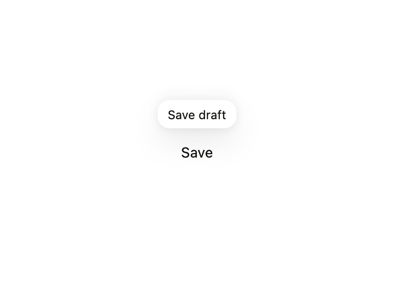
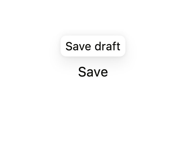
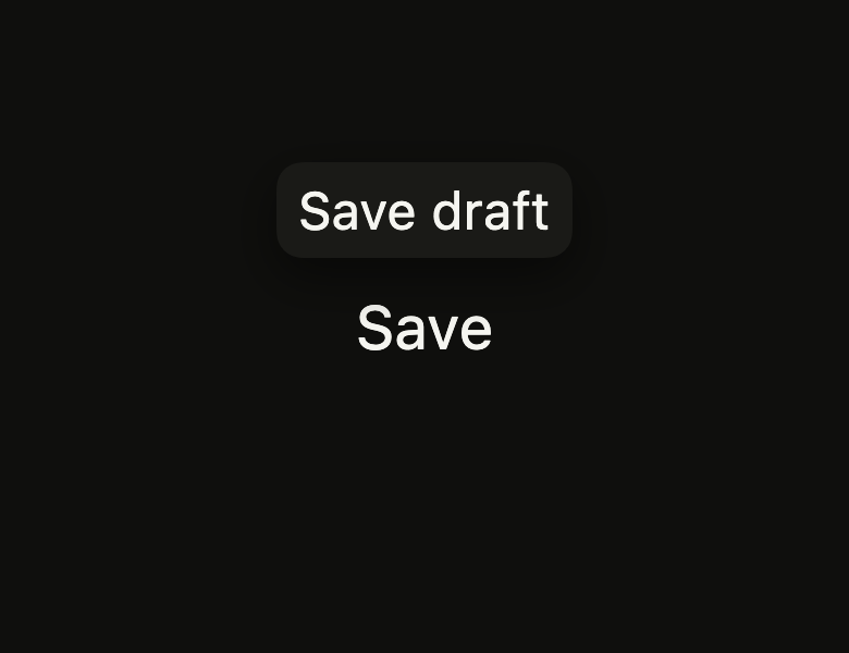
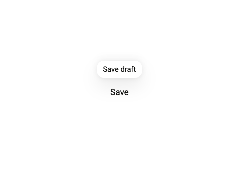
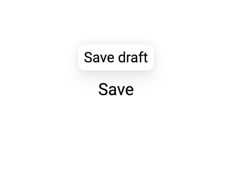
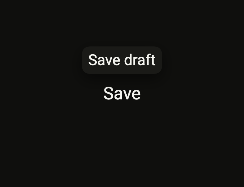
A tooltip names what a control does; it shows on a long press or a hover, or from code through its FlTooltipController.

import 'package:your_app/ui/fliin/components/button/fl_button.dart';
import 'package:your_app/ui/fliin/components/tooltip/fl_tooltip.dart';
import 'package:flutter/widgets.dart';

class TooltipVisibleExample extends StatelessWidget {
  const TooltipVisibleExample({super.key, this.controller});

  final FlTooltipController? controller;

  @override
  Widget build(BuildContext context) {
    return FlTooltip(
      message: 'Save draft',
      controller: controller,
      child: FlButton(label: 'Save', variant: FlButtonVariant.secondary, onPressed: () {}),
    );
  }
}Arrow
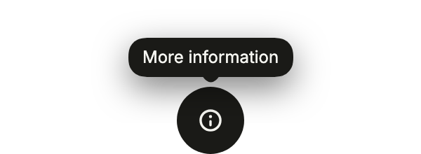
arrow: true points the bubble at what it describes, here an icon button whose name only shows on a long press.
import 'package:your_app/ui/fliin/components/button/fl_button.dart';
import 'package:your_app/ui/fliin/components/tooltip/fl_tooltip.dart';
import 'package:your_app/ui/fliin/core/fliin.dart';
import 'package:your_app/ui/fliin/icons/fl_icons.dart';
import 'package:flutter/widgets.dart';

class TooltipArrowExample extends StatelessWidget {
  const TooltipArrowExample({super.key, this.controller});

  final FlTooltipController? controller;

  @override
  Widget build(BuildContext context) {
    return FlTooltip(
      message: 'More information',
      arrow: true,
      controller: controller,
      child: FlButton.icon(
        label: 'More information',
        icon: FlIcon(FlIcons.circleInfo),
        variant: FlButtonVariant.tertiary,
        onPressed: () {},
      ),
    );
  }
}Content
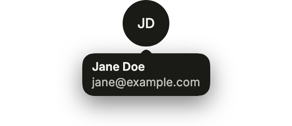
content lays out the bubble, a name above an address, on any trigger; message says the same to the screen reader.
import 'package:your_app/ui/fliin/components/avatar/fl_avatar.dart';
import 'package:your_app/ui/fliin/components/tooltip/fl_tooltip.dart';
import 'package:your_app/ui/fliin/core/fliin.dart';
import 'package:flutter/widgets.dart';

class TooltipContentExample extends StatelessWidget {
  const TooltipContentExample({super.key, this.controller});

  final FlTooltipController? controller;

  @override
  Widget build(BuildContext context) {
    final theme = FlScope.of(context);
    return FlTooltip(
      message: 'Jane Doe, [email protected]',
      arrow: true,
      side: FlSide.bottom,
      controller: controller,
      content: Column(
        mainAxisSize: MainAxisSize.min,
        crossAxisAlignment: CrossAxisAlignment.start,
        children: [
          Text('Jane Doe', style: TextStyle(fontWeight: theme.tokens.typography.weight.semibold)),
          Text('[email protected]', style: TextStyle(color: theme.colors.onSurfaceMuted)),
        ],
      ),
      child: const FlAvatar(initials: 'JD', semanticLabel: 'Jane Doe'),
    );
  }
}Usage
The code the reference images render:
final example = Overlay(
  initialEntries: [
    OverlayEntry(
      builder: (context) => ColoredBox(
        color: FlScope.of(context).colors.surface,
        child: Center(
          child: Builder(
            builder: (context) {
              final controller = FlTooltipController();
              WidgetsBinding.instance.addPostFrameCallback(
                (_) => controller.show(),
              );
              return FlTooltip(
                message: 'Save draft',
                controller: controller,
                child: FlPressable(
                  onPressed: () {},
                  label: 'Save',
                  borderRadius: FlScope.of(context).shape.buttonRadius,
                  builder: (context, states) => Padding(
                    padding: EdgeInsetsDirectional.all(
                      FlScope.of(context).space.md,
                    ),
                    child: Text(
                      'Save',
                      style: TextStyle(
                        color: FlScope.of(context).colors.onSurface,
                      ),
                    ),
                  ),
                ),
              );
            },
          ),
        ),
      ),
    ),
  ],
);API
FlTooltipController: class
FlTooltipController.new: new()
FlTooltipController.show: void()
FlTooltipController.hide: void()
FlTooltip: class extends StatefulWidget
FlTooltip.new: const new({super.key, required String message, required Widget child, FlSide side, FlTooltipController? controller, bool arrow, Widget? content, double? offset})
FlTooltip.message: get String
FlTooltip.arrow: get bool
FlTooltip.content: get Widget?
FlTooltip.offset: get double?
FlTooltip.child: get Widget
FlTooltip.side: get FlSide
FlTooltip.controller: get FlTooltipController?
FlTooltip.createState: State<FlTooltip>()Reference renders
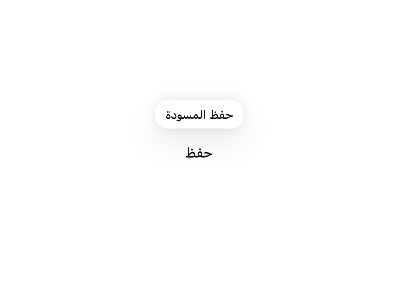
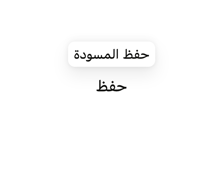
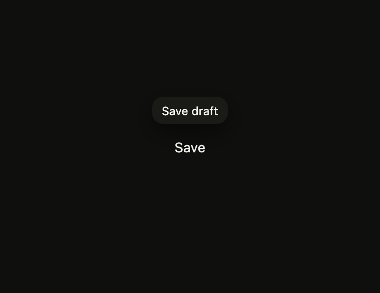
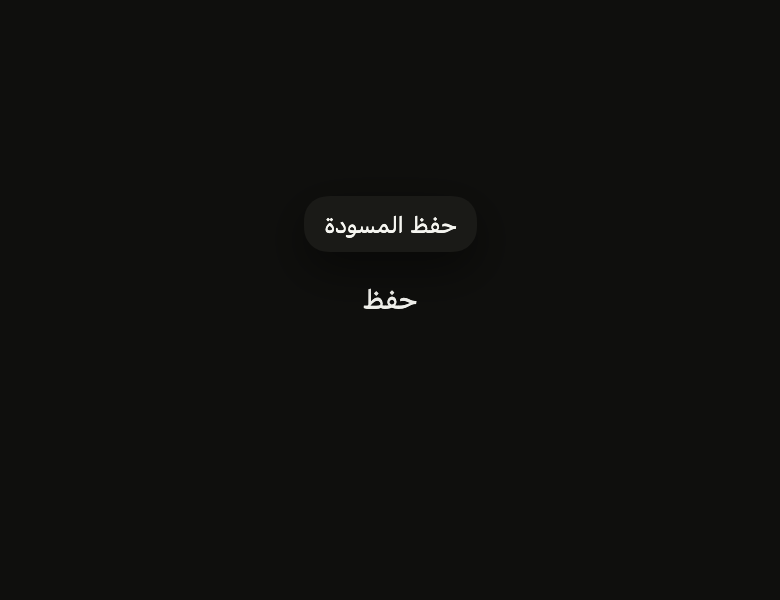
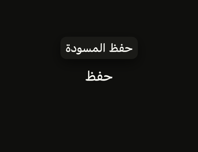
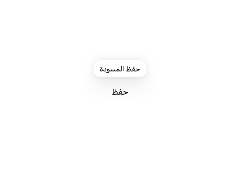
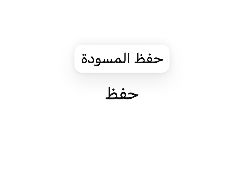
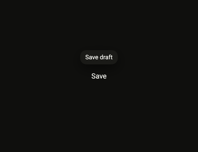
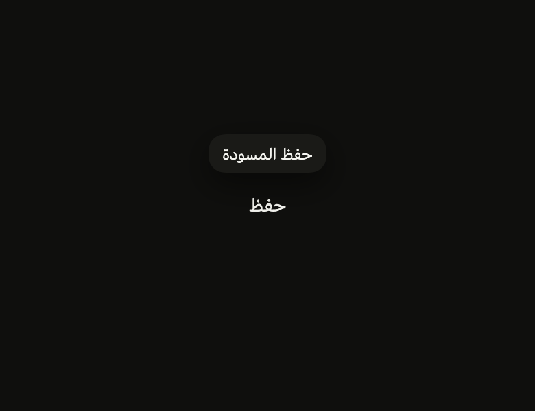
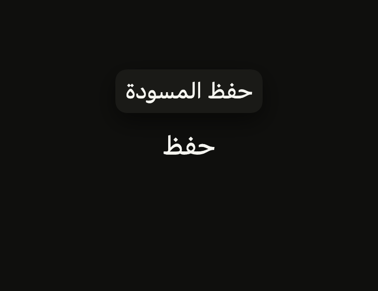
The 16 images published with version 0.2.2, rendered by the shared harness on macOS with Flutter 3.47.7. fliin verify tooltip compares your copy to them.
Use it to
- explain an icon on hover
- show a tooltip on a button
- describe an action on long press
- give a hint on keyboard focus
- add an accessible tooltip
- show a short hint about an icon
- Not for
- rich or interactive anchored content: use a popover (popover)
- a list of actions: use a menu (menu)
- a label always visible under a field: use a text field (text-field)
- States
Source
The files fliin add tooltip copies into your app, before your prefix and imports are applied.
tooltip/fl_tooltip.dart
// Modified from the Tooltip of HeroUI React v3, Copyright 2020 Next UI Inc.,
// licensed under the MIT license below and under Apache 2.0:
// https://www.apache.org/licenses/LICENSE-2.0
//
// Permission is hereby granted, free of charge, to any person obtaining a copy
// of this software and associated documentation files (the "Software"), to
// deal in the Software without restriction, including without limitation the
// rights to use, copy, modify, merge, publish, distribute, sublicense, and/or
// sell copies of the Software, and to permit persons to whom the Software is
// furnished to do so, subject to the following conditions:
//
// The above copyright notice and this permission notice shall be included in
// all copies or substantial portions of the Software.
//
// THE SOFTWARE IS PROVIDED "AS IS", WITHOUT WARRANTY OF ANY KIND, EXPRESS OR
// IMPLIED, INCLUDING BUT NOT LIMITED TO THE WARRANTIES OF MERCHANTABILITY,
// FITNESS FOR A PARTICULAR PURPOSE AND NONINFRINGEMENT. IN NO EVENT SHALL THE
// AUTHORS OR COPYRIGHT HOLDERS BE LIABLE FOR ANY CLAIM, DAMAGES OR OTHER
// LIABILITY, WHETHER IN AN ACTION OF CONTRACT, TORT OR OTHERWISE, ARISING
// FROM, OUT OF OR IN CONNECTION WITH THE SOFTWARE OR THE USE OR OTHER DEALINGS
// IN THE SOFTWARE.
//
// Also modified from the colors, shadow and continuous corners of HeroUI Native
// 1.0.10, Copyright 2025 NextUI Inc., licensed under Apache 2.0.
import 'dart:math' as math;

import 'package:flutter/widgets.dart';
import 'package:fliin_ui/core/fliin.dart';

/// `zoom-in-90` and `zoom-out-95` of `.tooltip`.
const double _enterScale = 0.9;
const double _exitScale = 0.95;

/// `slide-in-from-*-1` of `.tooltip`: 0.25rem.
const double _slide = 4;

/// `Tooltip.Arrow`: a 12-wide point, 6 deep (`M0 0C5.48 8 6.5 8 12 0Z`).
const double _arrowWidth = 12;
const double _arrowDepth = 6;

/// Shows and hides the [FlTooltip] it is given to, once that one is
/// mounted: an onboarding hint, a reminder after an error.
class FlTooltipController {
  _FlTooltipState? _state;

  /// Opens the bubble, as on hover. No effect while the [FlTooltip] is not
  /// mounted.
  void show() => _state?._tooltip.currentState?.ensureTooltipVisible();

  /// Closes the bubble if it is open. `RawTooltip` can only close all tooltips
  /// at once: the other open ones close too.
  void hide() {
    if (_state?._visible ?? false) RawTooltip.dismissAllToolTips();
  }
}

/// A tooltip on `RawTooltip`: on hover, on long press, and on keyboard
/// focus. [message] becomes the `tooltip` semantics of [child], which screen
/// readers read without waiting for the bubble. Escape closes it without
/// moving the pointer or the focus (WCAG 1.4.13).
///
/// The bubble: `textXs` `onSurface` on
/// `surfaceOverlay`, padding 10 by 6 (in `space.xs`), continuous corners of
/// `shape.radiusXl`, `overlay` shadow, at most 320 wide, 3 points from
/// [child]. It enters in `short3` along `ease`, fading in, scaling from 0.9 to
/// 1 and sliding 4 points from [child], and exits in `short2`, fading out,
/// towards scale 0.95; fade only under reduced motion.
///
/// [arrow] points the bubble at [child] (`showArrow`), and [content] lays
/// out more than one line of text, a name above an address, while
/// [message] stays what the screen reader reads.
class FlTooltip extends StatefulWidget {
  /// Creates a tooltip that shows [message] near [child], on the [side]
  /// side.
  const FlTooltip({
    super.key,
    required this.message,
    required this.child,
    this.side = FlSide.top,
    this.controller,
    this.arrow = false,
    this.content,
    this.offset,
  });

  /// The bubble's text, also read by the screen reader as the tooltip of
  /// [child].
  final String message;

  /// True: a point on the bubble's edge aims at the middle of [child], and
  /// the bubble sits `space.xs` further away to make room for it. False by
  /// default.
  final bool arrow;

  /// What the bubble shows instead of [message], in `textXs` and
  /// `onSurface` by default: a bold name above a muted address, a status
  /// dot before a sentence. Never read: [message] says the same thing to
  /// the screen reader. When null, [message].
  final Widget? content;

  /// The gap between [child] and the bubble; when null, `size.tooltipOffset`
  /// (3), plus `space.xs` with an [arrow] (7).
  final double? offset;

  /// The widget the bubble describes, and whose hover, long press or focus
  /// opens it.
  final Widget child;

  /// Above by default, where the finger does not hide it; flipped below when
  /// it does not fit.
  final FlSide side;

  /// To show it without hover, press or focus.
  final FlTooltipController? controller;

  @override
  State<FlTooltip> createState() => _FlTooltipState();
}

class _FlTooltipState extends State<FlTooltip> {
  final GlobalKey<RawTooltipState> _tooltip = GlobalKey();

  /// True while the bubble is mounted: `RawTooltip` does not say whether it
  /// is, and Escape must not be swallowed when it is not.
  bool _visible = false;

  /// The side chosen at the bubble's last layout, which it slides from.
  FlSide? _placed;

  /// The middle of [FlTooltip.child] in the bubble's coordinates, at the
  /// bubble's last layout: where the arrow points.
  Offset _target = Offset.zero;

  @override
  void initState() {
    super.initState();
    widget.controller?._state = this;
  }

  @override
  void didUpdateWidget(FlTooltip oldWidget) {
    super.didUpdateWidget(oldWidget);
    if (oldWidget.controller != widget.controller) {
      oldWidget.controller?._state = null;
      widget.controller?._state = this;
    }
  }

  @override
  void dispose() {
    if (widget.controller?._state == this) widget.controller?._state = null;
    super.dispose();
  }

  void _onFocusChange(bool focused) {
    if (!focused) {
      if (_visible) RawTooltip.dismissAllToolTips();
    } else if (FocusManager.instance.highlightMode == FocusHighlightMode.traditional) {
      _tooltip.currentState?.ensureTooltipVisible();
    }
  }

  @override
  Widget build(BuildContext context) {
    final theme = FlScope.of(context);
    final motion = theme.motion;
    final direction = Directionality.of(context);
    final padding = MediaQuery.maybePaddingOf(context) ?? EdgeInsets.zero;
    return Actions(
      actions: {DismissIntent: _DismissTooltip(this)},
      child: Focus(
        canRequestFocus: false,
        skipTraversal: true,
        onFocusChange: _onFocusChange,
        child: RawTooltip(
          key: _tooltip,
          semanticsTooltip: widget.message,
          animationStyle: AnimationStyle(curve: motion.ease, duration: motion.short3, reverseDuration: motion.short2),
          positionDelegate: (position) {
            final fit = flAnchor(
              anchor: Rect.fromCenter(
                center: position.target,
                width: position.targetSize.width,
                height: position.targetSize.height,
              ),
              child: position.tooltipSize,
              // `RawTooltip` already takes the keyboard out of the overlay.
              bounds: flAnchorBounds(
                overlay: position.overlaySize,
                padding: padding,
                viewInsets: EdgeInsets.zero,
                margin: theme.size.overlayInset,
              ),
              side: widget.side,
              align: FlAlign.center,
              direction: direction,
              gap: widget.offset ?? theme.size.tooltipOffset + (widget.arrow ? theme.space.xs : 0),
            );
            _placed = fit.side;
            _target = position.target - fit.offset;
            return fit.offset;
          },
          tooltipBuilder: (context, animation) => _Presence(
            state: this,
            // Snapped on the pixels under the entrance, not inside the bubble:
            // the bubble paints scaled under an opacity layer that no longer
            // repaints it, and would keep the offset of one entrance frame.
            child: FlPixelSnap(
              child: _Entrance(
                animation: animation,
                side: () => _placed ?? widget.side,
                child: _Bubble(
                  message: widget.message,
                  content: widget.content,
                  arrow: widget.arrow ? (side: () => _placed ?? widget.side, target: () => _target) : null,
                ),
              ),
            ),
          ),
          child: widget.child,
        ),
      ),
    );
  }
}

/// `Actions` stops at the first handler found, even a disabled one: with the
/// bubble closed, Escape is handed back to the ancestors (a dialog, a
/// popover).
class _DismissTooltip extends DismissAction {
  _DismissTooltip(this.state);

  final _FlTooltipState state;

  @override
  Object? invoke(DismissIntent intent) =>
      state._visible ? RawTooltip.dismissAllToolTips() : Actions.maybeInvoke(state.context, intent);
}

class _Presence extends StatefulWidget {
  const _Presence({required this.state, required this.child});

  final _FlTooltipState state;
  final Widget child;

  @override
  State<_Presence> createState() => _PresenceState();
}

class _PresenceState extends State<_Presence> {
  @override
  void initState() {
    super.initState();
    widget.state._visible = true;
  }

  @override
  void dispose() {
    widget.state._visible = false;
    super.dispose();
  }

  @override
  Widget build(BuildContext context) => widget.child;
}

/// The fade, scale and slide of `.tooltip`: from [side] on entry, in place
/// on exit; the fade only under reduced motion.
class _Entrance extends AnimatedWidget {
  const _Entrance({required Animation<double> animation, required this.side, required this.child})
    : super(listenable: animation);

  final FlSide Function() side;
  final Widget child;

  @override
  Widget build(BuildContext context) {
    final animation = listenable as Animation<double>;
    final t = animation.value;
    final faded = Opacity(opacity: t, child: child);
    if (FlMotion.of(context).reduced) return faded;
    if (animation.status == AnimationStatus.reverse) {
      return Transform.scale(scale: 1 - (1 - _exitScale) * (1 - t), child: faded);
    }
    final away = _slide * (1 - t);
    final rtl = Directionality.of(context) == TextDirection.rtl;
    // The bubble comes from the anchor: from below for a bubble placed above.
    final shift = switch (side()) {
      FlSide.top => Offset(0, away),
      FlSide.bottom => Offset(0, -away),
      FlSide.start => Offset(rtl ? -away : away, 0),
      FlSide.end => Offset(rtl ? away : -away, 0),
    };
    return Transform.translate(
      offset: shift,
      child: Transform.scale(scale: 1 - (1 - _enterScale) * (1 - t), child: faded),
    );
  }
}

/// Where the arrow points, read at paint time: the bubble is laid out before
/// `RawTooltip` places it.
typedef _ArrowSpot = ({FlSide Function() side, Offset Function() target});

class _Bubble extends StatelessWidget {
  const _Bubble({required this.message, required this.content, required this.arrow});

  final String message;
  final Widget? content;
  final _ArrowSpot? arrow;

  @override
  Widget build(BuildContext context) {
    final theme = FlScope.of(context);
    final radius = theme.shape.radiusXl;
    final scale = theme.typography;
    final metrics = scale.style(FlTextRole.textXs);
    final style = scale.resolve(FlTextRole.textXs).copyWith(color: theme.colors.onSurface);
    final arrow = this.arrow;
    return ExcludeSemantics(
      child: ConstrainedBox(
        constraints: BoxConstraints(maxWidth: theme.size.tooltipMaxWidth),
        child: FlShadow(
          layers: theme.shadows.overlay,
          // React Native shadows a view from its circular corners (FlSurface).
          shape: RoundedRectangleBorder(borderRadius: BorderRadius.circular(radius)),
          child: CustomPaint(
            foregroundPainter: arrow == null
                ? null
                : _ArrowPainter(
                    spot: arrow,
                    color: theme.colors.surfaceOverlay,
                    radius: radius,
                    direction: Directionality.of(context),
                  ),
            child: DecoratedBox(
              decoration: ShapeDecoration(
                color: theme.colors.surfaceOverlay,
                shape: FlContinuousBorder(radius: radius),
              ),
              child: Padding(
                padding: EdgeInsetsDirectional.symmetric(
                  horizontal: theme.space.xs * 2.5,
                  vertical: theme.space.xs * 1.5,
                ),
                child: DefaultTextStyle.merge(
                  // The role's line height forced on the system font, as a
                  // minimum for a named font.
                  style: scale.familyOf(FlTextRole.textXs) == null
                      ? style.copyWith(
                          height: metrics.lineHeight / metrics.size,
                          leadingDistribution: TextLeadingDistribution.even,
                        )
                      : style,
                  child: content ?? Text(message),
                ),
              ),
            ),
          ),
        ),
      ),
    );
  }
}

/// The arrow of a bubble, on its edge facing the anchor, kept clear of the
/// rounded corners.
class _ArrowPainter extends CustomPainter {
  _ArrowPainter({required this.spot, required this.color, required this.radius, required this.direction});

  final _ArrowSpot spot;
  final Color color;
  final double radius;
  final TextDirection direction;

  @override
  void paint(Canvas canvas, Size size) {
    final rtl = direction == TextDirection.rtl;
    // The physical edge beyond which the anchor lies, and whether it is the
    // bottom or right one.
    final (horizontal, far) = switch (spot.side()) {
      FlSide.top => (true, true),
      FlSide.bottom => (true, false),
      FlSide.start => (false, !rtl),
      FlSide.end => (false, rtl),
    };
    final target = spot.target();
    final length = horizontal ? size.width : size.height;
    final inset = math.min(radius + _arrowWidth / 2, length / 2);
    final along = (horizontal ? target.dx : target.dy).clamp(inset, length - inset);
    final edge = far ? (horizontal ? size.height : size.width) : 0.0;
    // A hair inside the edge, so that no seam shows under antialiasing; the
    // control point a third past the tip, like the curve of `Tooltip.Arrow`.
    final base = far ? edge - 0.5 : edge + 0.5;
    final control = far ? edge + _arrowDepth * 4 / 3 : edge - _arrowDepth * 4 / 3;
    Offset at(double a, double b) => horizontal ? Offset(a, b) : Offset(b, a);
    final start = at(along - _arrowWidth / 2, base);
    final tip = at(along, control);
    final end = at(along + _arrowWidth / 2, base);
    canvas.drawPath(
      Path()
        ..moveTo(start.dx, start.dy)
        ..quadraticBezierTo(tip.dx, tip.dy, end.dx, end.dy)
        ..close(),
      Paint()..color = color,
    );
  }

  @override
  bool shouldRepaint(_ArrowPainter old) => true;
}