Components / forms
Search field
Searches or filters a list: a field with a magnifier, the search key of the keyboard and a button that clears the query.
Import
In a Flutter app where fliin init has run:
Examples
Example
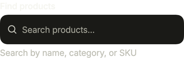
A search field with its label and a hint below, from FlField. The clear button appears once there is text.
import 'package:your_app/ui/fliin/components/field/fl_field.dart';
import 'package:your_app/ui/fliin/components/search_field/fl_search_field.dart';
import 'package:flutter/widgets.dart';

class SearchFieldExample extends StatefulWidget {
  const SearchFieldExample({super.key});

  @override
  State<SearchFieldExample> createState() => _SearchFieldExampleState();
}

class _SearchFieldExampleState extends State<SearchFieldExample> {
  final _query = TextEditingController();

  @override
  void dispose() {
    _query.dispose();
    super.dispose();
  }

  @override
  Widget build(BuildContext context) {
    return FlField(
      label: 'Find products',
      helper: 'Search by name, category, or SKU',
      child: FlSearchField(
        label: 'Find products',
        clearLabel: 'Clear search',
        placeholder: 'Search products...',
        controller: _query,
      ),
    );
  }
}Enabled
An empty search field: the magnifier, then the placeholder.

import 'package:your_app/ui/fliin/components/search_field/fl_search_field.dart';
import 'package:flutter/widgets.dart';

class SearchFieldEnabledExample extends StatefulWidget {
  const SearchFieldEnabledExample({super.key});

  @override
  State<SearchFieldEnabledExample> createState() => _SearchFieldEnabledExampleState();
}

class _SearchFieldEnabledExampleState extends State<SearchFieldEnabledExample> {
  final _query = TextEditingController();

  @override
  void dispose() {
    _query.dispose();
    super.dispose();
  }

  @override
  Widget build(BuildContext context) {
    return FlSearchField(
      label: 'Search',
      clearLabel: 'Clear search',
      placeholder: 'Search products...',
      controller: _query,
    );
  }
}Filled
With a query typed, the clear button empties the field in one touch.

import 'package:your_app/ui/fliin/components/search_field/fl_search_field.dart';
import 'package:flutter/widgets.dart';

class SearchFieldFilledExample extends StatefulWidget {
  const SearchFieldFilledExample({super.key});

  @override
  State<SearchFieldFilledExample> createState() => _SearchFieldFilledExampleState();
}

class _SearchFieldFilledExampleState extends State<SearchFieldFilledExample> {
  final _query = TextEditingController(text: 'Running shoes');

  @override
  void dispose() {
    _query.dispose();
    super.dispose();
  }

  @override
  Widget build(BuildContext context) {
    return FlSearchField(
      label: 'Search',
      clearLabel: 'Clear search',
      placeholder: 'Search products...',
      controller: _query,
    );
  }
}Error
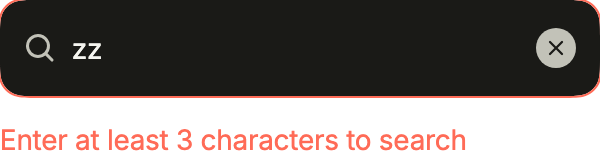
A query too short to search: invalid outlines the field and FlFieldError says why.
import 'package:your_app/ui/fliin/components/field/fl_field.dart';
import 'package:your_app/ui/fliin/components/search_field/fl_search_field.dart';
import 'package:your_app/ui/fliin/core/fliin.dart';
import 'package:flutter/widgets.dart';

class SearchFieldErrorExample extends StatefulWidget {
  const SearchFieldErrorExample({super.key});

  @override
  State<SearchFieldErrorExample> createState() => _SearchFieldErrorExampleState();
}

class _SearchFieldErrorExampleState extends State<SearchFieldErrorExample> {
  final _query = TextEditingController(text: 'zz');

  @override
  void dispose() {
    _query.dispose();
    super.dispose();
  }

  @override
  Widget build(BuildContext context) {
    return FlFieldScope(
      invalid: true,
      child: Column(
        mainAxisSize: MainAxisSize.min,
        crossAxisAlignment: CrossAxisAlignment.stretch,
        spacing: FlScope.of(context).space.md,
        children: [
          FlSearchField(
            label: 'Search',
            clearLabel: 'Clear search',
            placeholder: 'Search products...',
            controller: _query,
            invalid: true,
          ),
          const FlFieldError('Enter at least 3 characters to search'),
        ],
      ),
    );
  }
}Disabled
disabled keeps the last query visible while searching is unavailable.

import 'package:your_app/ui/fliin/components/search_field/fl_search_field.dart';
import 'package:flutter/widgets.dart';

class SearchFieldDisabledExample extends StatefulWidget {
  const SearchFieldDisabledExample({super.key});

  @override
  State<SearchFieldDisabledExample> createState() => _SearchFieldDisabledExampleState();
}

class _SearchFieldDisabledExampleState extends State<SearchFieldDisabledExample> {
  final _query = TextEditingController(text: 'Previous query');

  @override
  void dispose() {
    _query.dispose();
    super.dispose();
  }

  @override
  Widget build(BuildContext context) {
    return FlSearchField(
      label: 'Search',
      clearLabel: 'Clear search',
      placeholder: 'Search products...',
      controller: _query,
      disabled: true,
    );
  }
}Keyboard shortcut
trailing shows the shortcut that focuses the field while it is empty; once there is text, the clear button takes its place.

import 'package:your_app/ui/fliin/components/kbd/fl_kbd.dart';
import 'package:your_app/ui/fliin/components/search_field/fl_search_field.dart';
import 'package:flutter/widgets.dart';

class SearchFieldKeyboardShortcutExample extends StatelessWidget {
  const SearchFieldKeyboardShortcutExample({super.key});

  @override
  Widget build(BuildContext context) {
    return const FlSearchField(
      label: 'Search',
      clearLabel: 'Clear search',
      placeholder: 'Search…',
      trailing: FlKbd(keys: [FlKbdKey.command], text: 'K'),
    );
  }
}Custom icon
icon replaces the magnifier with one that says what is searched: here a pin, for places.

import 'package:your_app/ui/fliin/components/search_field/fl_search_field.dart';
import 'package:your_app/ui/fliin/core/fliin.dart';
import 'package:your_app/ui/fliin/icons/fl_icons.dart';
import 'package:flutter/widgets.dart';

class SearchFieldCustomIconExample extends StatelessWidget {
  const SearchFieldCustomIconExample({super.key});

  @override
  Widget build(BuildContext context) {
    return FlSearchField(
      label: 'Search places',
      clearLabel: 'Clear search',
      placeholder: 'City, address or venue',
      icon: FlIcon(FlIcons.mapPin),
    );
  }
}Variants
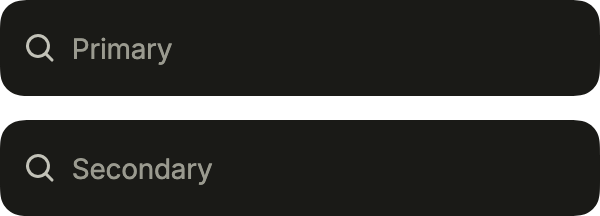
primary, white and lifted, on the page; FlInputVariant.secondary, filled with the control grey, in a white sheet or a toolbar.
import 'package:your_app/ui/fliin/components/search_field/fl_search_field.dart';
import 'package:your_app/ui/fliin/components/text_field/fl_text_field.dart';
import 'package:your_app/ui/fliin/core/fliin.dart';
import 'package:flutter/widgets.dart';

class SearchFieldVariantsExample extends StatelessWidget {
  const SearchFieldVariantsExample({super.key});

  @override
  Widget build(BuildContext context) {
    return Column(
      mainAxisSize: MainAxisSize.min,
      crossAxisAlignment: CrossAxisAlignment.stretch,
      spacing: FlScope.of(context).space.md,
      children: const [
        FlSearchField(
          label: 'Search',
          clearLabel: 'Clear search',
          placeholder: 'Primary',
        ),
        FlSearchField(
          label: 'Search',
          clearLabel: 'Clear search',
          placeholder: 'Secondary',
          variant: FlInputVariant.secondary,
        ),
      ],
    );
  }
}Usage
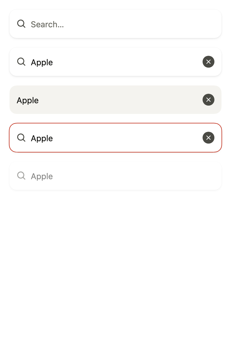
The code the reference images render:
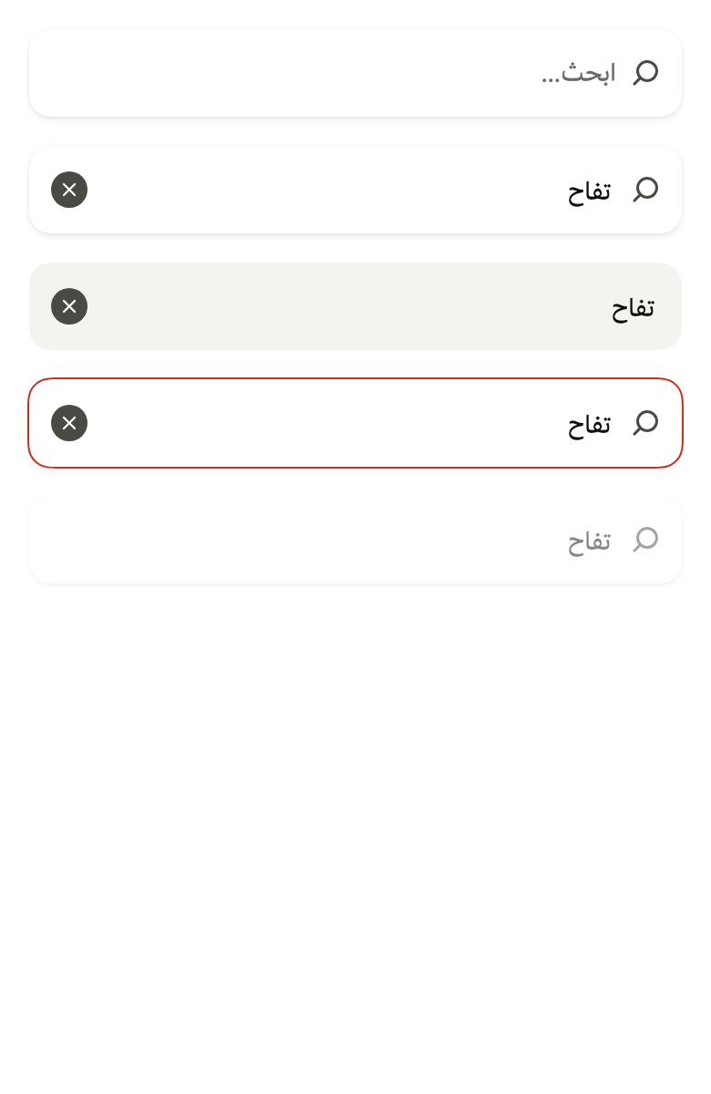
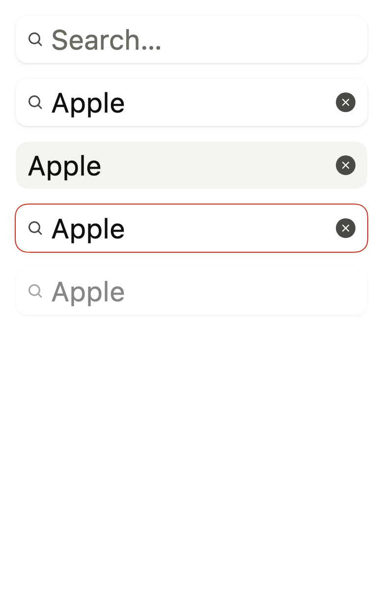
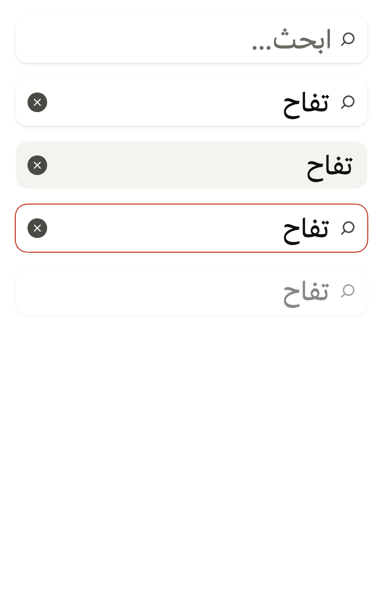
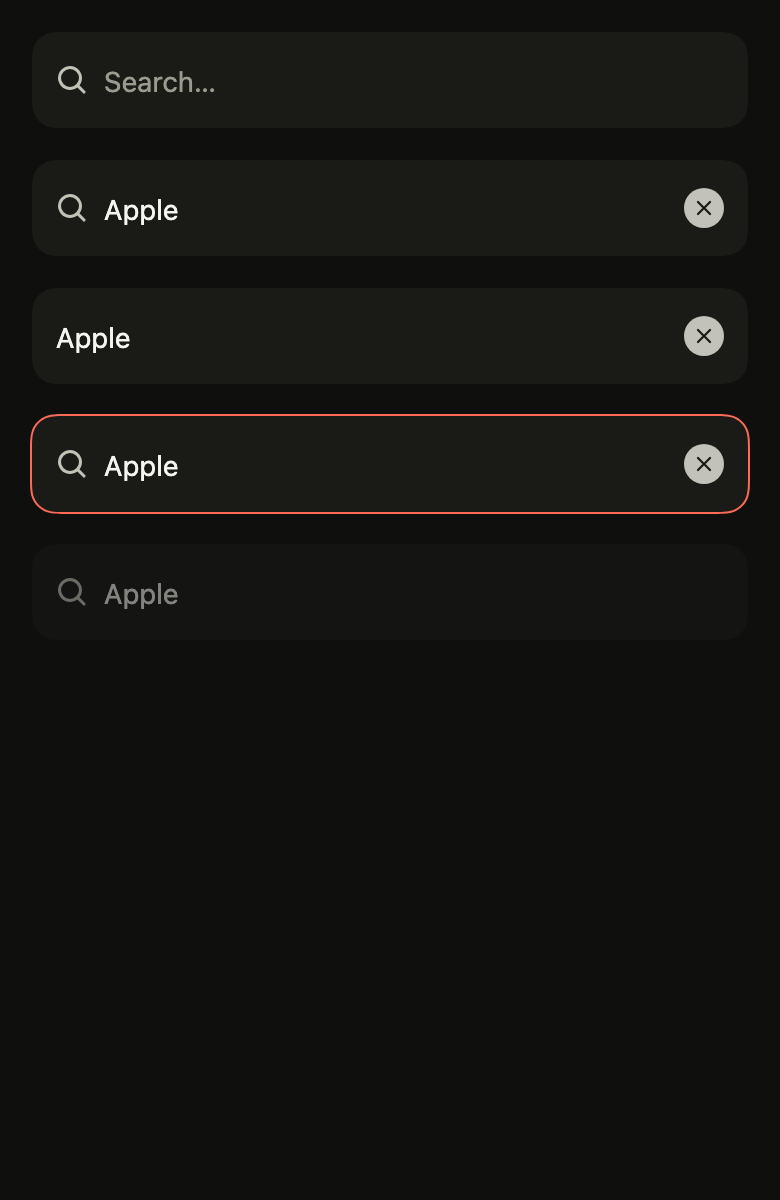
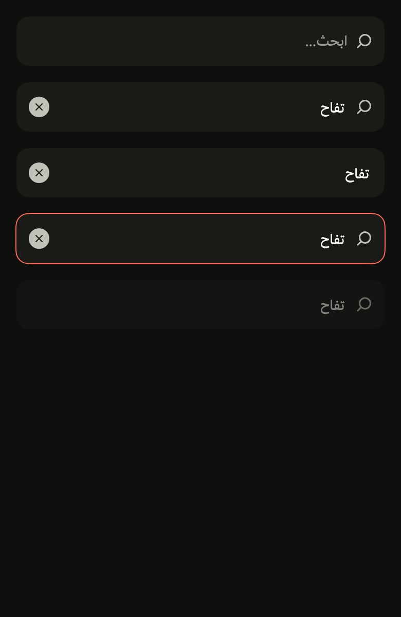
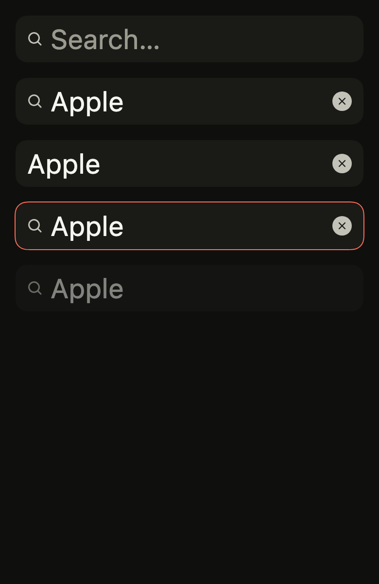
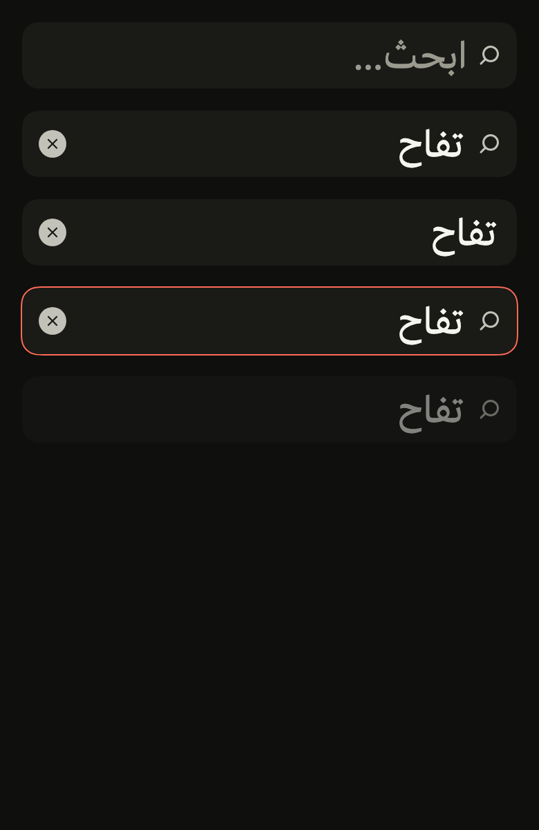
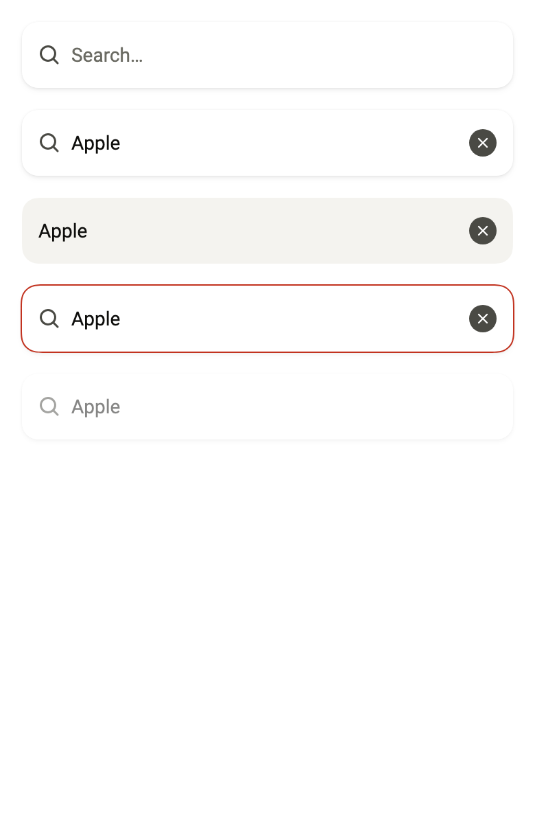
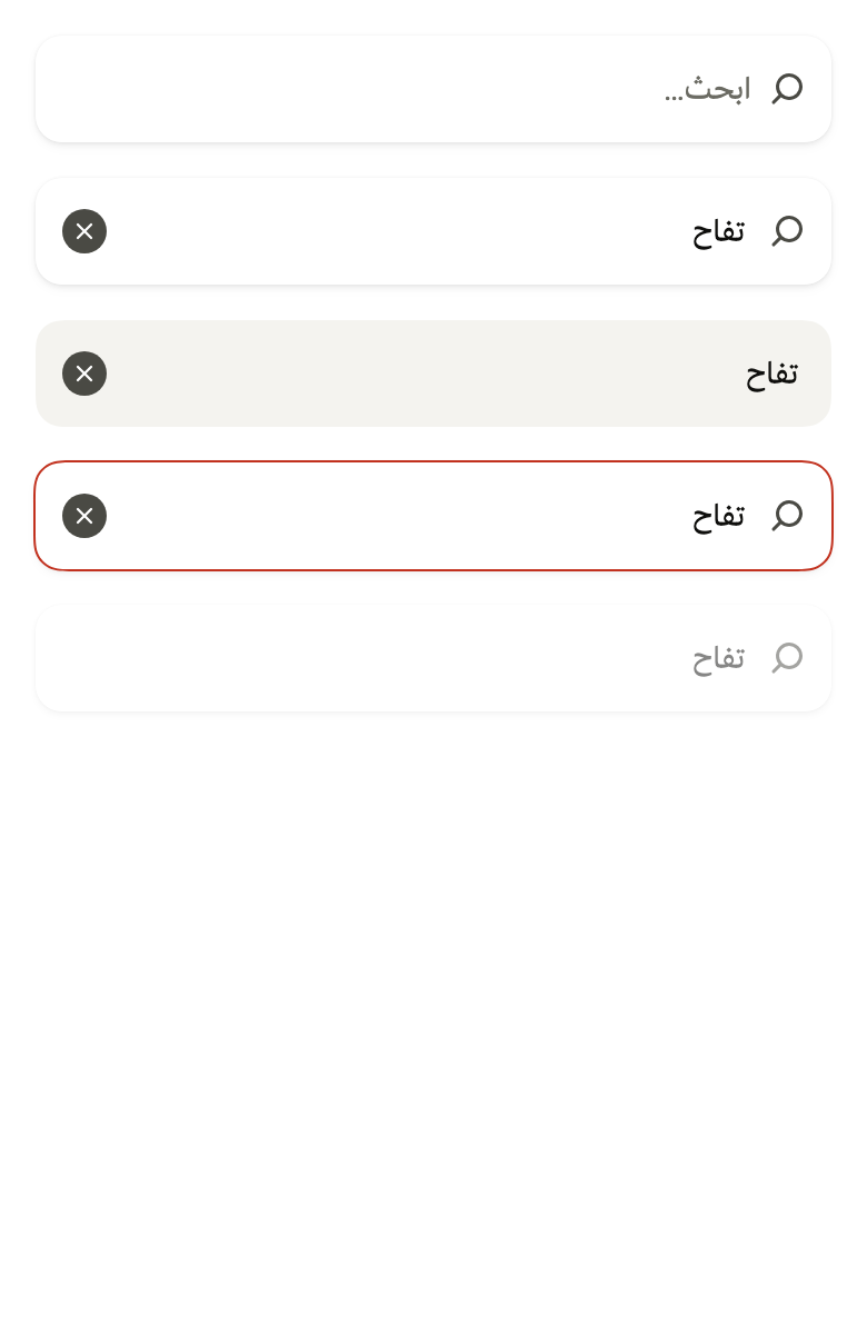
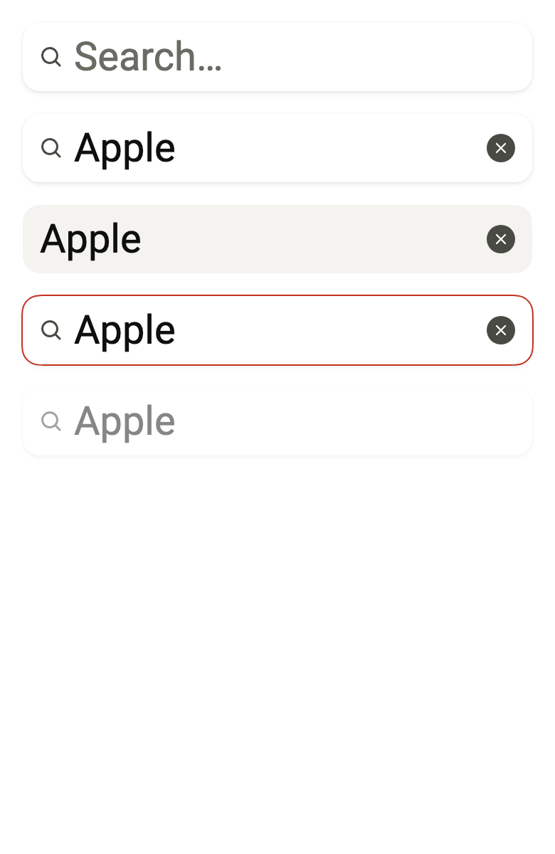
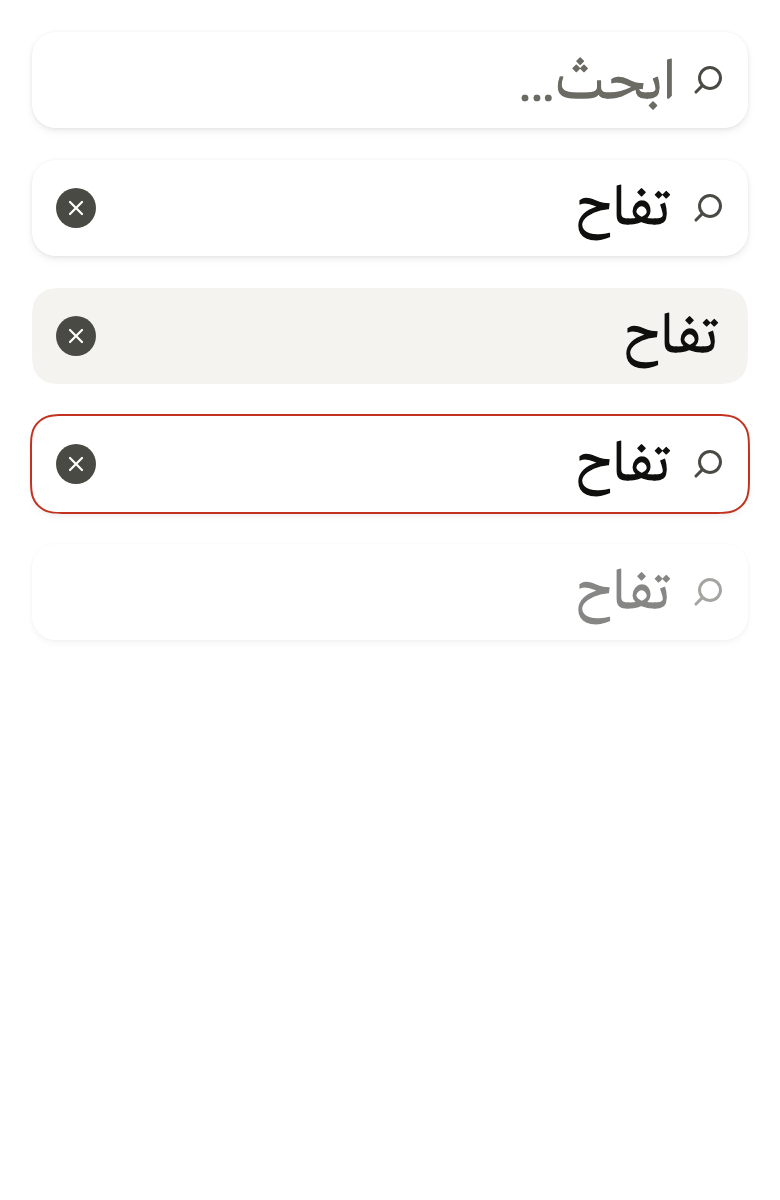
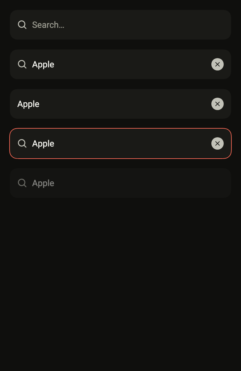
final example = Localizations(
  locale: const Locale('en'),
  delegates: const [DefaultWidgetsLocalizations.delegate],
  child: Directionality(
    textDirection: variant.dir,
    child: Overlay(
      initialEntries: [
        OverlayEntry(
          builder: (context) => ColoredBox(
            color: FlScope.of(context).colors.surface,
            child: Padding(
              padding: EdgeInsetsDirectional.all(FlScope.of(context).space.lg),
              child: Column(
                crossAxisAlignment: CrossAxisAlignment.stretch,
                spacing: FlScope.of(context).space.lg,
                children: [
                  FlSearchField(
                    label: 'Search',
                    clearLabel: 'Clear search',
                    placeholder: 'Search…',
                  ),
                  FlSearchField(
                    label: 'Search',
                    clearLabel: 'Clear search',
                    controller: TextEditingController(text: 'Apple'),
                  ),
                  FlSearchField(
                    label: 'Search',
                    clearLabel: 'Clear search',
                    controller: TextEditingController(text: 'Apple'),
                    variant: FlInputVariant.secondary,
                    searchIcon: false,
                  ),
                  FlSearchField(
                    label: 'Search',
                    clearLabel: 'Clear search',
                    controller: TextEditingController(text: 'Apple'),
                    invalid: true,
                  ),
                  FlSearchField(
                    label: 'Search',
                    clearLabel: 'Clear search',
                    controller: TextEditingController(text: 'Apple'),
                    disabled: true,
                  ),
                ],
              ),
            ),
          ),
        ),
      ],
    ),
  ),
);API
FlSearchField: class extends StatefulWidget
FlSearchField.new: const new({super.key, required String label, required String clearLabel, TextEditingController? controller, FocusNode? focusNode, String? placeholder, FlInputVariant variant, bool searchIcon, Widget? icon, Widget? trailing, bool? invalid, bool? disabled, bool autofocus, ValueChanged<String>? onChanged, ValueChanged<String>? onSubmitted, VoidCallback? onCleared})
FlSearchField.label: get String
FlSearchField.clearLabel: get String
FlSearchField.controller: get TextEditingController?
FlSearchField.focusNode: get FocusNode?
FlSearchField.placeholder: get String?
FlSearchField.variant: get FlInputVariant
FlSearchField.searchIcon: get bool
FlSearchField.icon: get Widget?
FlSearchField.trailing: get Widget?
FlSearchField.invalid: get bool?
FlSearchField.disabled: get bool?
FlSearchField.autofocus: get bool
FlSearchField.onChanged: get ValueChanged<String>?
FlSearchField.onSubmitted: get ValueChanged<String>?
FlSearchField.onCleared: get VoidCallback?
FlSearchField.createState: State<FlSearchField>()Reference renders
The 16 images published with version 0.2.3, rendered by the shared harness on macOS with Flutter 3.47.7. fliin verify search-field compares your copy to them.
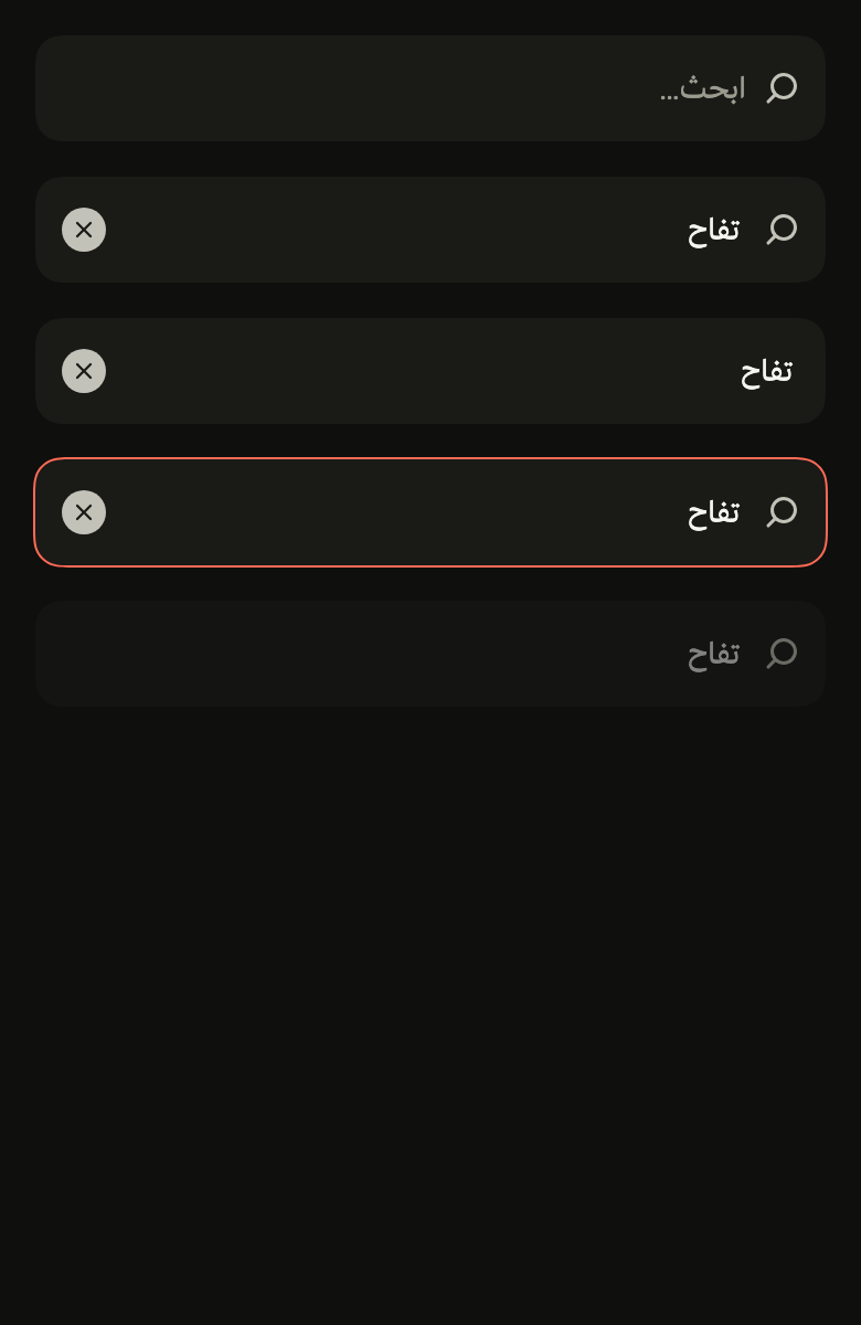
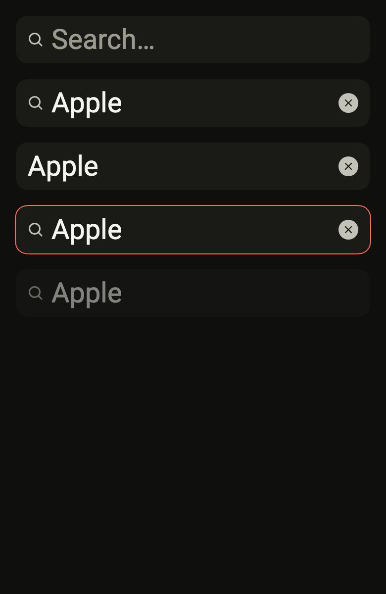
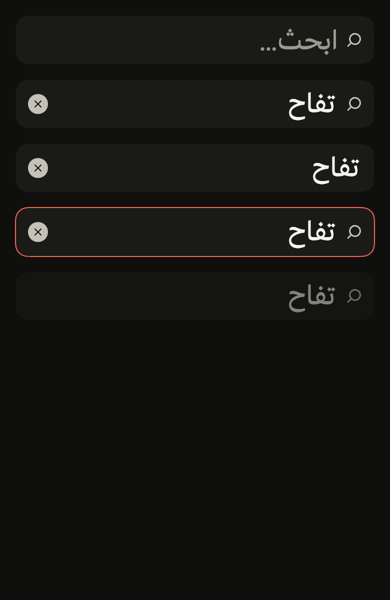
Use it to
- use a query to narrow the items of a list
- reach a contact or a product by name
- show filtered results while typing
- remove the search text with one tap
- add a search box above a list
- submit the search from the keyboard key
- Not for
- entering text that is not a search: use a text field (text-field)
- picking a value among suggestions under the field: use a combo box (combo-box)
- States
Source
The files fliin add search-field copies into your app, before your prefix and imports are applied.
search_field/fl_search_field.dart
// Modified from SearchField of HeroUI Native 1.0.10, Copyright 2025 NextUI
// Inc., licensed under Apache 2.0: https://www.apache.org/licenses/LICENSE-2.0
import 'dart:math' as math;

import 'package:flutter/services.dart';
import 'package:flutter/widgets.dart';
import 'package:fliin_ui/components/text_field/fl_text_field.dart';
import 'package:fliin_ui/core/fliin.dart';
import 'package:fliin_ui/icons/fl_icons.dart';

// `search-field.css` and `search-field.tsx`: the `size.indicatorIcon`
// magnifier at `space.md` from the start, the text at 36 from the start; the
// clear button at `space.md` from the end: Izydesk's 20 disc in
// `onSurfaceMuted` with its 12 cross in `field`, specific to this field.
const double _clearSize = 20;
const double _crossSize = 12;

/// A search field: an [FlInput] with a
/// magnifier, the keyboard's "search" key, and a round `onSurfaceMuted` button
/// that clears the input, shown as long as it isn't empty. The text keeps
/// its place when the button appears. When disabled, the whole field fades,
/// magnifier included, and the button disappears. [icon] replaces the
/// magnifier; [trailing] shows at the end while the input is empty (a key
/// cap for the shortcut that focuses it), and gives way to the clear button.
/// Put it in an `FlField` for a visible label and a help line.
class FlSearchField extends StatefulWidget {
  /// A search field named [label], whose clear button is named
  /// [clearLabel].
  const FlSearchField({
    super.key,
    required this.label,
    required this.clearLabel,
    this.controller,
    this.focusNode,
    this.placeholder,
    this.variant = FlInputVariant.primary,
    this.searchIcon = true,
    this.icon,
    this.trailing,
    this.invalid,
    this.disabled,
    this.autofocus = false,
    this.onChanged,
    this.onSubmitted,
    this.onCleared,
  });

  /// The field name, read by the screen reader ("Search").
  final String label;

  /// The clear button's name ("Clear search").
  final String clearLabel;

  /// The input. Null, the field creates its own; a provided controller stays
  /// owned by the caller.
  final TextEditingController? controller;

  /// The focus node; null, the field creates one.
  final FocusNode? focusNode;

  /// The placeholder text ("Search…"), shown while the input is empty.
  final String? placeholder;

  /// The input background: `primary` by default.
  final FlInputVariant variant;

  /// False: no magnifier, the text starts at `space.md`.
  final bool searchIcon;

  /// The icon at the start instead of the magnifier, at `size.indicatorIcon`
  /// in `onSurfaceMuted` unless it sets its own; when null, the magnifier.
  /// Ignored when [searchIcon] is false.
  final Widget? icon;

  /// At the end while the input is empty, `space.sm` from the edge: the key
  /// cap of the shortcut that focuses the field.
  /// Neither read nor touchable; the clear button replaces it once there is
  /// text. When null, nothing.
  final Widget? trailing;

  /// True: `danger` border. Null, the `FlFieldScope` state.
  final bool? invalid;

  /// True: the field fades, with neither focus nor clearing. Null, the
  /// `FlFieldScope` state.
  final bool? disabled;

  /// Takes focus on the first frame.
  final bool autofocus;

  /// Receives the input on each keystroke, and the empty string on clearing.
  final ValueChanged<String>? onChanged;

  /// Receives the input on the keyboard's "search" key.
  final ValueChanged<String>? onSubmitted;

  /// Called after the button clears the input.
  final VoidCallback? onCleared;

  @override
  State<FlSearchField> createState() => _FlSearchFieldState();
}

class _FlSearchFieldState extends State<FlSearchField> {
  TextEditingController? _own;

  TextEditingController get _controller => widget.controller ?? (_own ??= TextEditingController());

  @override
  void didUpdateWidget(FlSearchField oldWidget) {
    super.didUpdateWidget(oldWidget);
    switch ((oldWidget.controller, widget.controller)) {
      case (final previous?, null):
        _own = TextEditingController.fromValue(previous.value);
      case (null, _?):
        _own?.dispose();
        _own = null;
      case _:
    }
  }

  @override
  void dispose() {
    _own?.dispose();
    super.dispose();
  }

  void _clear() {
    _controller.clear();
    widget.onChanged?.call('');
    widget.onCleared?.call();
  }

  @override
  Widget build(BuildContext context) {
    final theme = FlScope.of(context);
    final space = theme.space;
    final ltr = Directionality.of(context) == TextDirection.ltr;
    // The magnifier faces the reading direction (`rtl:-scale-x-100`).
    final custom = widget.icon;
    final icon = Padding(
      padding: EdgeInsetsDirectional.only(start: space.md, end: space.sm),
      child: custom == null
          ? Transform.flip(
              flipX: !ltr,
              child: FlIcon(FlIcons.magnifier, size: theme.size.indicatorIcon, color: theme.colors.onSurfaceMuted),
            )
          : IconTheme.merge(
              data: IconThemeData(size: theme.size.indicatorIcon, color: theme.colors.onSurfaceMuted),
              child: custom,
            ),
    );
    // A disc by default; the theme's `radiusXxl` squares it (`square` preset).
    final clearRadius = BorderRadius.circular(math.min(theme.shape.radiusXxl, _clearSize / 2));
    // Disabled, the field shows no clear button (Izydesk's search field at
    // half opacity): it could not be pressed.
    final disabled = widget.disabled ?? FlFieldScope.maybeOf(context)?.disabled ?? false;
    final trailing = widget.trailing;
    final clear = Padding(
      padding: EdgeInsetsDirectional.only(start: space.sm, end: space.md),
      child: SizedBox.square(
        dimension: _clearSize,
        child: ValueListenableBuilder<TextEditingValue>(
          valueListenable: _controller,
          builder: (context, value, _) => value.text.isEmpty || disabled
              ? const SizedBox.shrink()
              : FlPressable(
                  label: widget.clearLabel,
                  borderRadius: clearRadius,
                  onPressed: _clear,
                  builder: (context, states) => DecoratedBox(
                    decoration: BoxDecoration(color: theme.colors.onSurfaceMuted, borderRadius: clearRadius),
                    child: Center(
                      child: FlIcon(FlIcons.xmark, size: _crossSize, color: theme.colors.field),
                    ),
                  ),
                ),
        ),
      ),
    );
    final suffix = trailing == null
        ? clear
        : ValueListenableBuilder<TextEditingValue>(
            valueListenable: _controller,
            builder: (context, value, _) => value.text.isEmpty
                ? IgnorePointer(
                    child: ExcludeSemantics(
                      child: Padding(
                        padding: EdgeInsetsDirectional.only(start: space.sm, end: space.sm),
                        child: trailing,
                      ),
                    ),
                  )
                : clear,
          );
    return FlInputAffixes(
      prefix: widget.searchIcon ? icon : null,
      suffix: suffix,
      child: FlInput(
        label: widget.label,
        controller: _controller,
        focusNode: widget.focusNode,
        placeholder: widget.placeholder,
        variant: widget.variant,
        invalid: widget.invalid,
        disabled: widget.disabled,
        autofocus: widget.autofocus,
        textInputAction: TextInputAction.search,
        onChanged: widget.onChanged,
        onSubmitted: widget.onSubmitted,
      ),
    );
  }
}