Components / forms
Radio button
Lets people choose exactly one option among several. A group and options, labels included, on the Flutter RadioGroup: one Tab stop, arrows change the option.
Import
In a Flutter app where fliin init has run:
Examples
Shipping
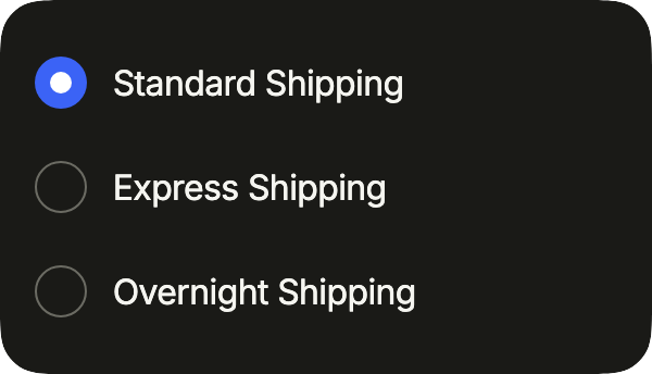
Delivery options on a surface: FlRadioVariant.secondary keeps the circles readable on a raised background. One choice among a few, all visible.
import 'package:your_app/ui/fliin/components/radio/fl_radio.dart';
import 'package:your_app/ui/fliin/components/surface/fl_surface.dart';
import 'package:flutter/widgets.dart';

class RadioShippingExample extends StatefulWidget {
  const RadioShippingExample({super.key});

  @override
  State<RadioShippingExample> createState() => _RadioShippingExampleState();
}

class _RadioShippingExampleState extends State<RadioShippingExample> {
  String? _value = 'standard';

  @override
  Widget build(BuildContext context) {
    return FlSurface(
      child: FlRadioGroup<String>(
        groupValue: _value,
        onChanged: (value) => setState(() => _value = value),
        children: [
          FlRadioGroupItem(
            key: const ValueKey('standard'),
            value: 'standard',
            label: 'Standard Shipping',
            variant: FlRadioVariant.secondary,
          ),
          FlRadioGroupItem(
            key: const ValueKey('express'),
            value: 'express',
            label: 'Express Shipping',
            variant: FlRadioVariant.secondary,
          ),
          FlRadioGroupItem(
            key: const ValueKey('overnight'),
            value: 'overnight',
            label: 'Overnight Shipping',
            variant: FlRadioVariant.secondary,
          ),
        ],
      ),
    );
  }
}Enabled
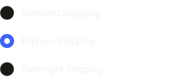
A radio group: exactly one option is chosen, and onChanged receives the new value.
import 'package:your_app/ui/fliin/components/radio/fl_radio.dart';
import 'package:flutter/widgets.dart';

class RadioEnabledExample extends StatefulWidget {
  const RadioEnabledExample({super.key});

  @override
  State<RadioEnabledExample> createState() => _RadioEnabledExampleState();
}

class _RadioEnabledExampleState extends State<RadioEnabledExample> {
  String? _value = 'express';

  @override
  Widget build(BuildContext context) {
    return FlRadioGroup<String>(
      groupValue: _value,
      onChanged: (value) => setState(() => _value = value),
      children: [
        FlRadioGroupItem(key: const ValueKey('standard'), value: 'standard', label: 'Standard Shipping'),
        FlRadioGroupItem(key: const ValueKey('express'), value: 'express', label: 'Express Shipping'),
        FlRadioGroupItem(key: const ValueKey('overnight'), value: 'overnight', label: 'Overnight Shipping'),
      ],
    );
  }
}Selected
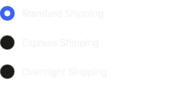
The chosen option is the one whose value equals groupValue.
import 'package:your_app/ui/fliin/components/radio/fl_radio.dart';
import 'package:flutter/widgets.dart';

class RadioSelectedExample extends StatefulWidget {
  const RadioSelectedExample({super.key});

  @override
  State<RadioSelectedExample> createState() => _RadioSelectedExampleState();
}

class _RadioSelectedExampleState extends State<RadioSelectedExample> {
  String? _value = 'standard';

  @override
  Widget build(BuildContext context) {
    return FlRadioGroup<String>(
      groupValue: _value,
      onChanged: (value) => setState(() => _value = value),
      children: [
        FlRadioGroupItem(key: const ValueKey('standard'), value: 'standard', label: 'Standard Shipping'),
        FlRadioGroupItem(key: const ValueKey('express'), value: 'express', label: 'Express Shipping'),
        FlRadioGroupItem(key: const ValueKey('overnight'), value: 'overnight', label: 'Overnight Shipping'),
      ],
    );
  }
}Unselected
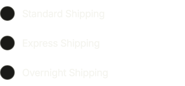
With groupValue: null, nothing is chosen yet; touching an option picks it.
import 'package:your_app/ui/fliin/components/radio/fl_radio.dart';
import 'package:flutter/widgets.dart';

class RadioUnselectedExample extends StatefulWidget {
  const RadioUnselectedExample({super.key});

  @override
  State<RadioUnselectedExample> createState() => _RadioUnselectedExampleState();
}

class _RadioUnselectedExampleState extends State<RadioUnselectedExample> {
  String? _value;

  @override
  Widget build(BuildContext context) {
    return FlRadioGroup<String>(
      groupValue: _value,
      onChanged: (value) => setState(() => _value = value),
      children: [
        FlRadioGroupItem(key: const ValueKey('standard'), value: 'standard', label: 'Standard Shipping'),
        FlRadioGroupItem(key: const ValueKey('express'), value: 'express', label: 'Express Shipping'),
        FlRadioGroupItem(key: const ValueKey('overnight'), value: 'overnight', label: 'Overnight Shipping'),
      ],
    );
  }
}Disabled
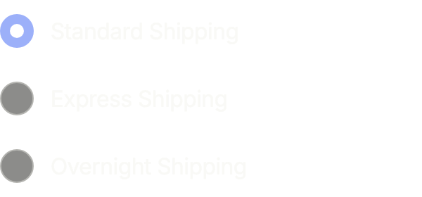
disabled: true keeps the choice visible but locked, for every option of the group.
import 'package:your_app/ui/fliin/components/radio/fl_radio.dart';
import 'package:flutter/widgets.dart';

class RadioDisabledExample extends StatefulWidget {
  const RadioDisabledExample({super.key});

  @override
  State<RadioDisabledExample> createState() => _RadioDisabledExampleState();
}

class _RadioDisabledExampleState extends State<RadioDisabledExample> {
  String? _value = 'standard';

  @override
  Widget build(BuildContext context) {
    return FlRadioGroup<String>(
      groupValue: _value,
      onChanged: (value) => setState(() => _value = value),
      disabled: true,
      children: [
        FlRadioGroupItem(key: const ValueKey('standard'), value: 'standard', label: 'Standard Shipping'),
        FlRadioGroupItem(key: const ValueKey('express'), value: 'express', label: 'Express Shipping'),
        FlRadioGroupItem(key: const ValueKey('overnight'), value: 'overnight', label: 'Overnight Shipping'),
      ],
    );
  }
}With description
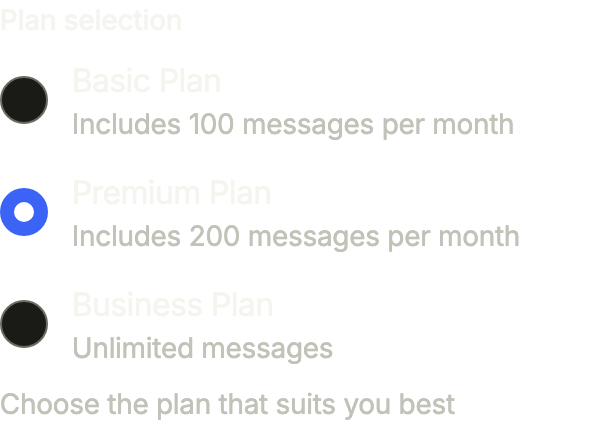
A plan to pick: FlField names the group, and each option's description says what it includes.
import 'package:your_app/ui/fliin/components/field/fl_field.dart';
import 'package:your_app/ui/fliin/components/radio/fl_radio.dart';
import 'package:flutter/widgets.dart';

class RadioWithDescriptionExample extends StatefulWidget {
  const RadioWithDescriptionExample({super.key});

  @override
  State<RadioWithDescriptionExample> createState() =>
      _RadioWithDescriptionExampleState();
}

class _RadioWithDescriptionExampleState
    extends State<RadioWithDescriptionExample> {
  String? _plan = 'premium';

  @override
  Widget build(BuildContext context) {
    return FlField(
      label: 'Plan selection',
      helper: 'Choose the plan that suits you best',
      child: FlRadioGroup<String>(
        groupValue: _plan,
        onChanged: (value) => setState(() => _plan = value),
        children: const [
          FlRadioGroupItem(
            value: 'basic',
            label: 'Basic Plan',
            description: 'Includes 100 messages per month',
          ),
          FlRadioGroupItem(
            value: 'premium',
            label: 'Premium Plan',
            description: 'Includes 200 messages per month',
          ),
          FlRadioGroupItem(
            value: 'business',
            label: 'Business Plan',
            description: 'Unlimited messages',
          ),
        ],
      ),
    );
  }
}Horizontal
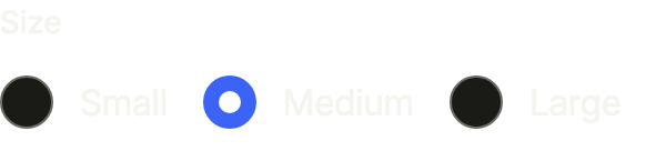
direction: Axis.horizontal puts short options side by side; they wrap onto a new line when they no longer fit.
import 'package:your_app/ui/fliin/components/field/fl_field.dart';
import 'package:your_app/ui/fliin/components/radio/fl_radio.dart';
import 'package:flutter/widgets.dart';

class RadioHorizontalExample extends StatefulWidget {
  const RadioHorizontalExample({super.key});

  @override
  State<RadioHorizontalExample> createState() => _RadioHorizontalExampleState();
}

class _RadioHorizontalExampleState extends State<RadioHorizontalExample> {
  String? _size = 'm';

  @override
  Widget build(BuildContext context) {
    return FlField(
      label: 'Size',
      child: FlRadioGroup<String>(
        groupValue: _size,
        onChanged: (value) => setState(() => _size = value),
        direction: Axis.horizontal,
        children: const [
          FlRadioGroupItem(value: 's', label: 'Small'),
          FlRadioGroupItem(value: 'm', label: 'Medium'),
          FlRadioGroupItem(value: 'l', label: 'Large'),
        ],
      ),
    );
  }
}Invalid
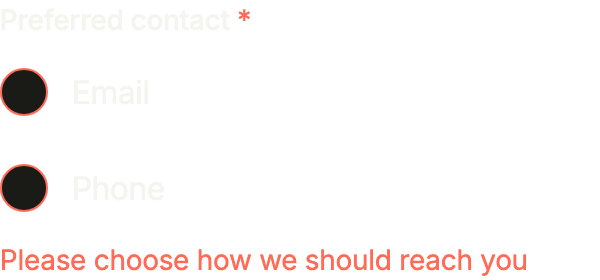
No choice made after a submit: the group's invalid outlines every radio in danger, and FlField shows the error under them.
import 'package:your_app/ui/fliin/components/field/fl_field.dart';
import 'package:your_app/ui/fliin/components/radio/fl_radio.dart';
import 'package:flutter/widgets.dart';

class RadioInvalidExample extends StatefulWidget {
  const RadioInvalidExample({super.key});

  @override
  State<RadioInvalidExample> createState() => _RadioInvalidExampleState();
}

class _RadioInvalidExampleState extends State<RadioInvalidExample> {
  String? _contact;

  @override
  Widget build(BuildContext context) {
    final invalid = _contact == null;
    return FlField(
      label: 'Preferred contact',
      required: true,
      error: invalid ? 'Please choose how we should reach you' : null,
      child: FlRadioGroup<String>(
        groupValue: _contact,
        onChanged: (value) => setState(() => _contact = value),
        invalid: invalid,
        children: const [
          FlRadioGroupItem(value: 'email', label: 'Email'),
          FlRadioGroupItem(value: 'phone', label: 'Phone'),
        ],
      ),
    );
  }
}Usage
The code the reference images render:
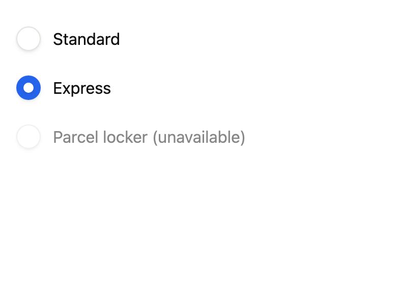
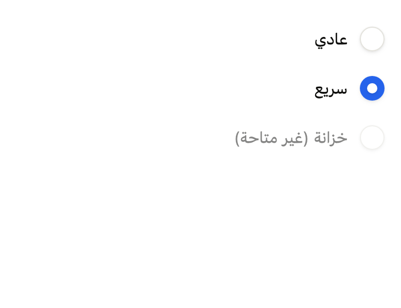
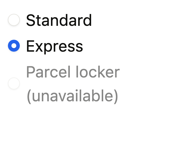
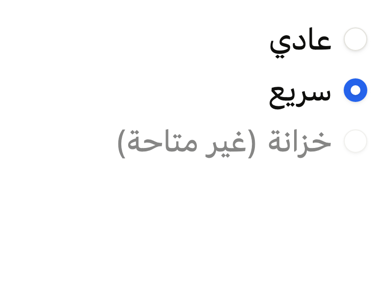
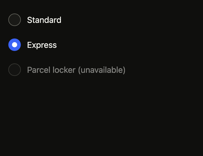
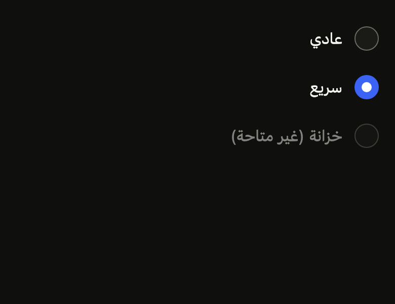
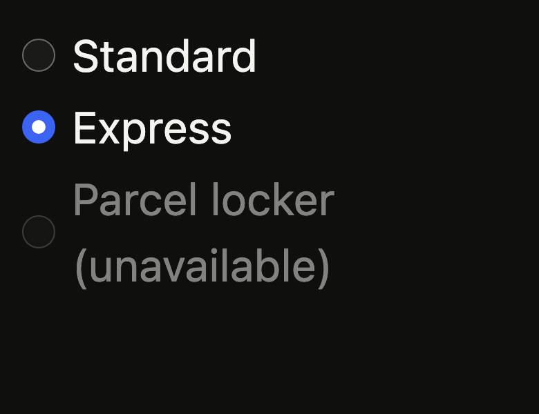
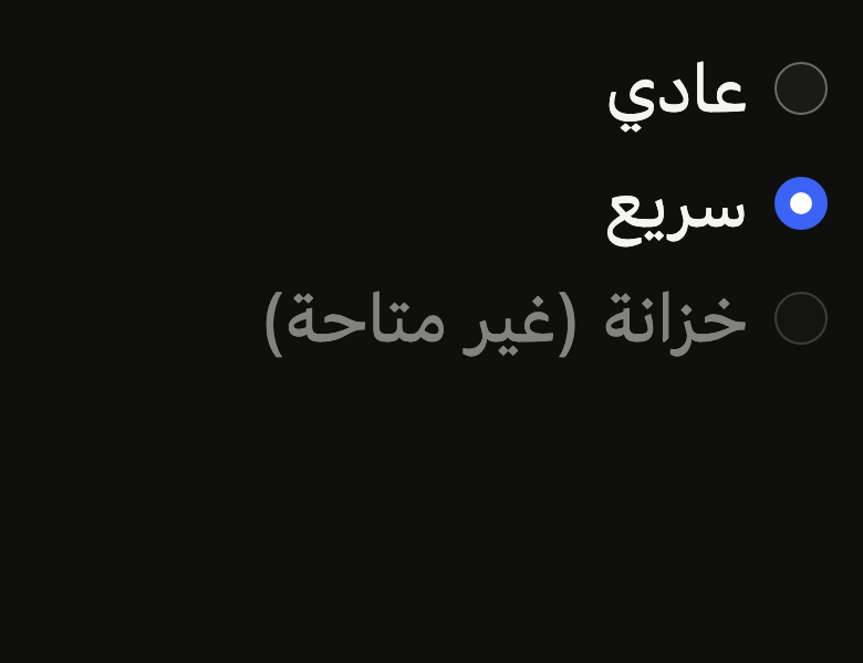
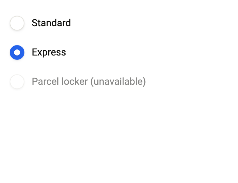
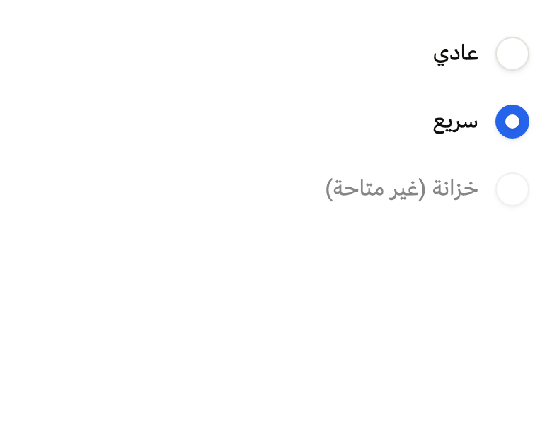
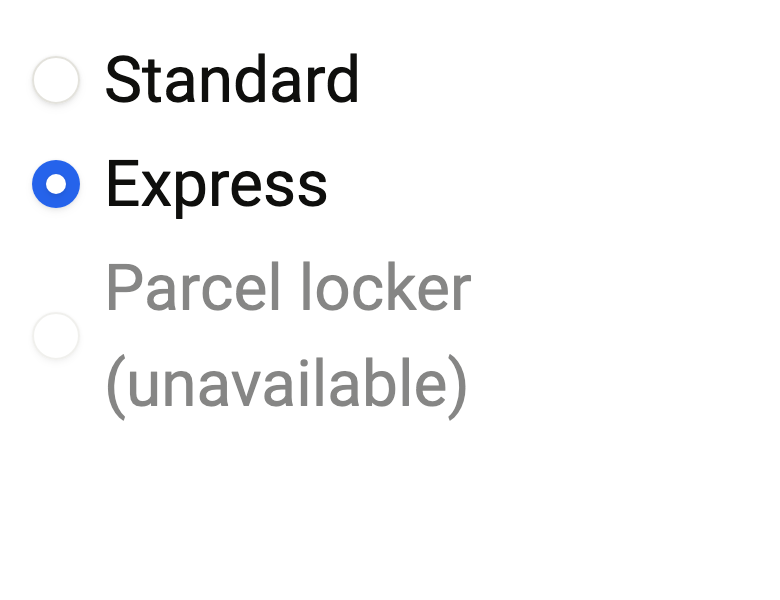
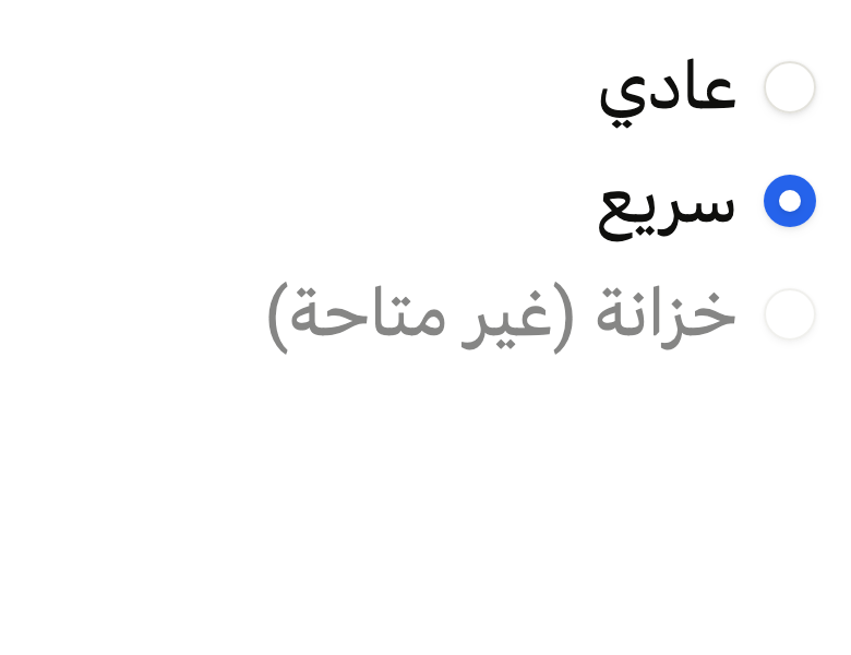
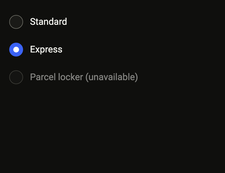
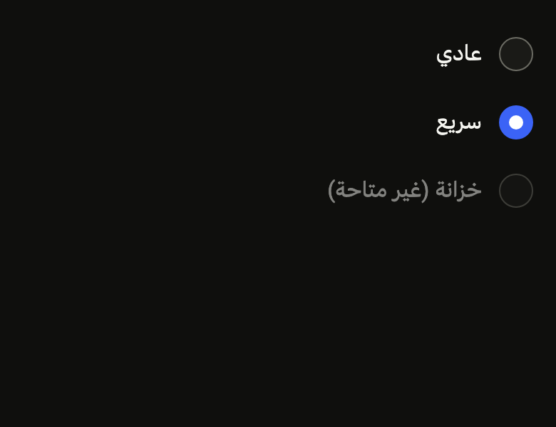
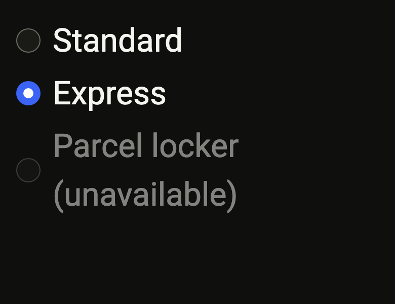
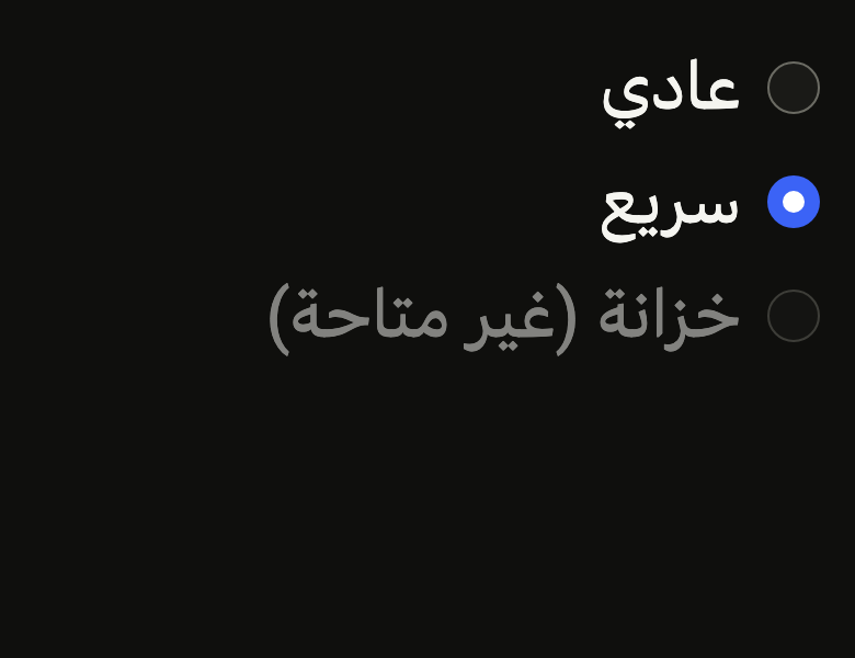
Localizations(locale: Locale'en', delegates: const [DefaultWidgetsLocalizations.delegate], child: Directionality(textDirection: variant.dir, child: ColoredBox(color: FlScope.of(context).colors.surface, child: Padding(padding: EdgeInsetsDirectional.all(FlScope.of(context).space.lg), child: FlRadioGroup<int>(groupValue: 2, onChanged: (_) {}, children: [for (final (fr, ar, on, enabled) in [('Standard', 'عادي', 1, true), ('Express', 'سريع', 2, true), ('Parcel locker (unavailable)', 'خزانة (غير متاحة)', 3, false)]) FlRadioGroupItem<int>(value: on, label: fr, disabled: enabled ? null : true)])))))API
FlRadioVariant: enum {primary, secondary}
FlRadioVariant.primary: static final FlRadioVariant
FlRadioVariant.secondary: static final FlRadioVariant
FlRadioGroup: class<T> extends StatelessWidget
FlRadioGroup.new: const new({super.key, required T? groupValue, required ValueChanged<T?> onChanged, required List<Widget> children, bool disabled, bool invalid, Axis direction})
FlRadioGroup.groupValue: get T?
FlRadioGroup.onChanged: get ValueChanged<T?>
FlRadioGroup.children: get List<Widget>
FlRadioGroup.disabled: get bool
FlRadioGroup.invalid: get bool
FlRadioGroup.direction: get Axis
FlRadioGroup.build: Widget(BuildContext context)
FlRadioGroupItem: class<T> extends StatelessWidget
FlRadioGroupItem.new: const new({super.key, required T value, required String label, String? description, bool? disabled, FlRadioVariant variant, bool autofocus})
FlRadioGroupItem.value: get T
FlRadioGroupItem.label: get String
FlRadioGroupItem.description: get String?
FlRadioGroupItem.disabled: get bool?
FlRadioGroupItem.variant: get FlRadioVariant
FlRadioGroupItem.autofocus: get bool
FlRadioGroupItem.build: Widget(BuildContext context)
FlRadio: class<T> extends StatelessWidget
FlRadio.new: const new({super.key, required T value, required String label, bool enabled, FlRadioVariant variant, bool? invalid, bool autofocus, WidgetStatesController? statesController})
FlRadio.statesController: get WidgetStatesController?
FlRadio.value: get T
FlRadio.label: get String
FlRadio.enabled: get bool
FlRadio.variant: get FlRadioVariant
FlRadio.invalid: get bool?
FlRadio.autofocus: get bool
FlRadio.build: Widget(BuildContext context)Reference renders
The 16 images published with version 0.2.3, rendered by the shared harness on macOS with Flutter 3.47.7. fliin verify radio compares your copy to them.
Use it to
- pick one option among several
- choose a delivery method
- select a single answer in a form
- add radio buttons
- offer mutually exclusive options
- make a single choice among a few visible options
- Not for
- several choices allowed: use checkboxes (checkbox)
- an on/off setting that takes effect immediately: use a switch (switch)
- States
Source
The files fliin add radio copies into your app, before your prefix and imports are applied.
radio/fl_radio.dart
// Modified from the Radio and RadioGroup of HeroUI Native 1.0.10, Copyright
// 2025 NextUI Inc., licensed under Apache 2.0:
// https://www.apache.org/licenses/LICENSE-2.0
import 'package:flutter/widgets.dart';
import 'package:fliin_ui/core/fliin.dart';

// The thumb's entry scale from `radio.animation.ts`, specific to this
// drawing.
const double _thumbEnterScale = 1.5;

/// The emphasis of an [FlRadio].
enum FlRadioVariant {
  /// `field` background and `field` shadow: a radio placed on the page.
  primary,

  /// `control` background, no shadow: a radio placed on a surface.
  secondary,
}

/// A radio group: holds the chosen value through a
/// `RadioGroup<T>` from `widgets.dart` (a single Tab stop, arrows to change
/// the choice) and stacks its [children], usually [FlRadioGroupItem]s,
/// `space.xs` apart, or lays them on a line that wraps, `space.lg` apart, when
/// [direction] is horizontal. [disabled] and [invalid] reach each option
/// through an `FlFieldScope`.
class FlRadioGroup<T> extends StatelessWidget {
  /// A group whose chosen option is [groupValue].
  const FlRadioGroup({
    super.key,
    required this.groupValue,
    required this.onChanged,
    required this.children,
    this.disabled = false,
    this.invalid = false,
    this.direction = Axis.vertical,
  });

  /// The value of the chosen option, null if none is.
  final T? groupValue;

  /// Receives the value of the tapped option; the parent is responsible for
  /// passing it back in [groupValue].
  final ValueChanged<T?> onChanged;

  /// The options, top to bottom.
  final List<Widget> children;

  /// True: no option responds, and their labels drop to
  /// `size.disabledOpacity`.
  final bool disabled;

  /// True: the choice is rejected, the options and their labels turn
  /// `danger`.
  final bool invalid;

  /// `vertical` by default: one option per line. `horizontal`: the options
  /// side by side at their own width, `space.lg` apart, wrapping onto a
  /// new line when they do not fit.
  final Axis direction;

  @override
  Widget build(BuildContext context) {
    final theme = FlScope.of(context);
    return RadioGroup<T>(
      groupValue: groupValue,
      onChanged: onChanged,
      child: FlFieldScope(
        disabled: disabled,
        invalid: invalid,
        child: switch (direction) {
          Axis.vertical => Column(
            mainAxisSize: MainAxisSize.min,
            crossAxisAlignment: CrossAxisAlignment.stretch,
            spacing: theme.space.xs,
            children: children,
          ),
          // Each option at its own width: a row option otherwise fills the
          // line to take the touch beside its label.
          Axis.horizontal => Wrap(
            spacing: theme.space.lg,
            runSpacing: theme.space.xs,
            children: [for (final child in children) IntrinsicWidth(child: child)],
          ),
        },
      ),
    );
  }
}

/// A text option of an [FlRadioGroup]: the
/// radio, then the [label] in `textBase`, on a row at least
/// `size.controlCompact` high. The whole row is tappable.
class FlRadioGroupItem<T> extends StatelessWidget {
  /// The option [value], named [label].
  const FlRadioGroupItem({
    super.key,
    required this.value,
    required this.label,
    this.description,
    this.disabled,
    this.variant = FlRadioVariant.primary,
    this.autofocus = false,
  });

  /// The value the option gives the group.
  final T value;

  /// The displayed label, also read by the screen reader.
  final String label;

  /// A line under the label, `textSm` in `onSurfaceMuted`, read as a hint:
  /// what the option includes, its delay, its price. When null, the label
  /// alone.
  final String? description;

  /// True: this option alone does not respond; when null, the group's state.
  final bool? disabled;

  /// The background of the unchosen radio; `primary` by default.
  final FlRadioVariant variant;

  /// Takes focus on first build if nothing else in its scope has it.
  final bool autofocus;

  @override
  Widget build(BuildContext context) {
    final scope = FlFieldScope.maybeOf(context);
    final off = disabled ?? scope?.disabled ?? false;
    return FlFieldScope(
      disabled: off,
      invalid: scope?.invalid ?? false,
      child: _RadioControl<T>(
        value: value,
        label: label,
        description: description,
        enabled: !off,
        variant: variant,
        autofocus: autofocus,
        showLabel: true,
      ),
    );
  }
}

/// A radio button: a `field` circle lifted by the `field`
/// shadow, with a hairline `border` edge (`fieldBorder` when hovered, or
/// when the theme has no `field` shadow), that fills with `selected` when the option is chosen, without outline,
/// with an `onSelected` dot that shrinks in. It sits under an [FlRadioGroup]
/// or a `RadioGroup<T>` from `widgets.dart`, which holds the chosen value.
///
/// Without a group of the same type above, an enabled option throws an
/// assertion in debug; in release it stays disabled.
class FlRadio<T> extends StatelessWidget {
  /// Creates the option [value] of the nearest `RadioGroup<T>`, named [label].
  const FlRadio({
    super.key,
    required this.value,
    required this.label,
    this.enabled = true,
    this.variant = FlRadioVariant.primary,
    this.invalid,
    this.autofocus = false,
    this.statesController,
  });

  /// The radio's states, which the app can read or force (a hovered or
  /// pressed preview), added to its own; see `FlPressable.statesController`.
  final WidgetStatesController? statesController;

  /// The value the option carries: it is checked when the `RadioGroup<T>`'s
  /// `groupValue` equals it, and choosing it passes this value to the
  /// group's `onChanged`.
  final T value;

  /// The option's name for the screen reader. It is not displayed: the
  /// visible label sits next to the button, or goes through
  /// [FlRadioGroupItem].
  final String label;

  /// False, or under a disabled `FlFieldScope`: the option responds to
  /// neither touch, keyboard nor focus. On its own, it drops to
  /// `size.disabledOpacity`; in a field, the field's label fades. Without a `RadioGroup<T>` above, the option stays disabled.
  final bool enabled;

  /// The background of the unchosen radio; `primary` by default.
  final FlRadioVariant variant;

  /// True: the choice is rejected, the radio turns `danger`. When null, the
  /// state of the enclosing `FlFieldScope`, otherwise false.
  final bool? invalid;

  /// Takes focus on first build if nothing else in its scope has it.
  /// False by default.
  final bool autofocus;

  @override
  Widget build(BuildContext context) => _RadioControl<T>(
    value: value,
    label: label,
    enabled: enabled && !(FlFieldScope.maybeOf(context)?.disabled ?? false),
    variant: variant,
    invalid: invalid,
    autofocus: autofocus,
    showLabel: false,
    statesController: statesController,
  );
}

class _RadioControl<T> extends StatefulWidget {
  const _RadioControl({
    super.key,
    required this.value,
    required this.label,
    required this.enabled,
    required this.variant,
    required this.autofocus,
    required this.showLabel,
    this.description,
    this.invalid,
    this.statesController,
  });

  final T value;
  final String label;
  final String? description;
  final bool enabled;
  final FlRadioVariant variant;
  final bool? invalid;
  final bool autofocus;
  final bool showLabel;
  final WidgetStatesController? statesController;

  @override
  State<_RadioControl<T>> createState() => _RadioControlState<T>();
}

class _RadioControlState<T> extends State<_RadioControl<T>> with SingleTickerProviderStateMixin {
  final FocusNode _focus = FocusNode();
  late final AnimationController _enter = AnimationController(vsync: this);
  late FlMotion _motion;
  RadioGroupRegistry<T>? _group;
  bool? _selected;

  @override
  void initState() {
    super.initState();
    widget.statesController?.addListener(_rebuild);
  }

  @override
  void didChangeDependencies() {
    super.didChangeDependencies();
    _motion = FlMotion.of(context);
    _group = RadioGroup.maybeOf<T>(context);
    _follow();
  }

  @override
  void didUpdateWidget(_RadioControl<T> oldWidget) {
    super.didUpdateWidget(oldWidget);
    if (oldWidget.statesController != widget.statesController) {
      oldWidget.statesController?.removeListener(_rebuild);
      widget.statesController?.addListener(_rebuild);
    }
    _follow();
  }

  void _rebuild() => setState(() {});

  /// `useRadioIndicatorThumbAnimation`: the chosen thumb goes from scale 1.5
  /// to 1 in `medium2` along `easeOut`; no scaling under reduced motion.
  void _follow() {
    final selected = _group?.groupValue == widget.value;
    if (selected == _selected) return;
    final first = _selected == null;
    _selected = selected;
    if (!selected || first || _motion.reduced) {
      _enter.value = 1;
      return;
    }
    _enter
      ..value = 0
      ..animateTo(1, duration: _motion.tokens.medium2, curve: _motion.tokens.easeOut);
  }

  @override
  void dispose() {
    widget.statesController?.removeListener(_rebuild);
    _enter.dispose();
    _focus.dispose();
    super.dispose();
  }

  Widget _indicator(FlTheme theme, {required bool selected, required bool invalid, required bool hovered}) {
    final colors = theme.colors;
    final primary = widget.variant == FlRadioVariant.primary;
    // Izydesk's state matrix: hovered or pressed, an empty radio steps to a grey.
    final fill = switch ((selected, invalid)) {
      (true, true) => colors.danger,
      (true, false) => colors.selected,
      (false, _) when hovered => colors.controlPressed,
      (false, _) => primary ? colors.field : colors.control,
    };
    const circle = CircleBorder();
    // Invalid and empty, only the outline turns `danger`. Where the `field`
    // shadow lifts the circle, its edge at rest is the hairline `border`,
    // and `fieldBorder` comes on hover; without a shadow, `fieldBorder` draws it.
    final lifted = primary && theme.shadows.field.any((layer) => layer.color.a > 0);
    final edge = switch ((invalid, hovered || !lifted)) {
      (true, _) => colors.danger,
      (false, true) => colors.fieldBorder,
      (false, false) => colors.border,
    };
    final outline = selected
        ? circle
        : CircleBorder(
            side: BorderSide(width: theme.size.border, color: edge),
          );
    return FlShadow(
      layers: primary ? theme.shadows.field : const [],
      shape: circle,
      child: SizedBox.square(
        dimension: theme.size.toggle,
        child: DecoratedBox(
          decoration: ShapeDecoration(color: fill, shape: outline),
          child: !selected
              ? null
              : Center(
                  child: AnimatedBuilder(
                    animation: _enter,
                    builder: (context, child) =>
                        Transform.scale(scale: _thumbEnterScale - (_thumbEnterScale - 1) * _enter.value, child: child),
                    child: FlShadow(
                      layers: theme.shadows.field,
                      shape: circle,
                      child: SizedBox.square(
                        dimension: theme.size.radioDot,
                        child: DecoratedBox(
                          decoration: ShapeDecoration(
                            color: invalid ? colors.onDanger : colors.onSelected,
                            shape: circle,
                          ),
                        ),
                      ),
                    ),
                  ),
                ),
        ),
      ),
    );
  }

  @override
  Widget build(BuildContext context) {
    final theme = FlScope.of(context);
    final group = _group;
    assert(
      !widget.enabled || group != null,
      'FlRadio<$T> "${widget.label}" without a RadioGroup<$T> above: add an FlRadioGroup<$T> or a '
      'RadioGroup<$T> (the exact type, nullability included), or pass enabled: false.',
    );
    final scope = FlFieldScope.maybeOf(context);
    final invalid = widget.invalid ?? scope?.invalid ?? false;
    // Its own size even under a tight constraint (alone in a stretched
    // column): otherwise the track or box takes the full width.
    return Align(
      alignment: AlignmentDirectional.centerStart,
      widthFactor: 1,
      heightFactor: 1,
      child: FlHitTarget(
        child: Semantics(
          label: widget.label,
          hint: widget.showLabel ? widget.description : null,
          child: RawRadio<T>(
            value: widget.value,
            groupRegistry: group,
            enabled: widget.enabled && group != null,
            toggleable: false,
            focusNode: _focus,
            autofocus: widget.autofocus,
            mouseCursor: WidgetStateProperty.resolveWith(
              (states) => states.contains(WidgetState.disabled) ? MouseCursor.defer : SystemMouseCursors.click,
            ),
            builder: (context, state) {
              final all = {...state.states, ...?widget.statesController?.value};
              final hovered =
                  state.isInteractive && (all.contains(WidgetState.hovered) || all.contains(WidgetState.pressed));
              final indicator = Opacity(
                opacity: state.isInteractive ? 1 : theme.size.disabledOpacity,
                child: FlFocusRing(
                  visible: all.contains(WidgetState.focused),
                  borderRadius: BorderRadius.circular(theme.size.toggle / 2),
                  child: FlPixelSnap(
                    child: _indicator(theme, selected: state.value ?? false, invalid: invalid, hovered: hovered),
                  ),
                ),
              );
              if (!widget.showLabel) return indicator;
              final family = DefaultTextStyle.of(context).style.fontFamily;
              final description = widget.description;
              Widget text(String data, FlTextRole role, Color color) => Text(
                data,
                style: theme.typography
                    .resolve(role)
                    .copyWith(color: color, fontWeight: theme.tokens.typography.weight.normal),
                strutStyle: theme.typography.strut(role, inheritedFamily: family),
              );
              final title = text(widget.label, FlTextRole.textBase, theme.colors.onSurface);
              // Two lines fill the row's minimum height: `space.xs` above and
              // below keeps options with a description apart.
              final label = description == null
                  ? title
                  : Padding(
                      padding: EdgeInsetsDirectional.symmetric(vertical: theme.space.xs),
                      child: Column(
                        mainAxisSize: MainAxisSize.min,
                        crossAxisAlignment: CrossAxisAlignment.start,
                        children: [title, text(description, FlTextRole.textSm, theme.colors.onSurfaceMuted)],
                      ),
                    );
              // A disabled option fades its label with its radio, and falls
              // outside the contrast rule like it (WCAG 1.4.3).
              // The whole row takes the touch, above and below the label too.
              return MetaData(
                behavior: HitTestBehavior.opaque,
                child: ConstrainedBox(
                  constraints: BoxConstraints(minHeight: theme.size.controlCompact),
                  child: Row(
                    spacing: theme.space.md,
                    children: [
                      indicator,
                      Expanded(
                        child: ExcludeSemantics(
                          child: state.isInteractive
                              ? label
                              : Opacity(opacity: theme.size.disabledOpacity, child: label),
                        ),
                      ),
                    ],
                  ),
                ),
              );
            },
          ),
        ),
      ),
    );
  }
}