Components / forms
Stepper
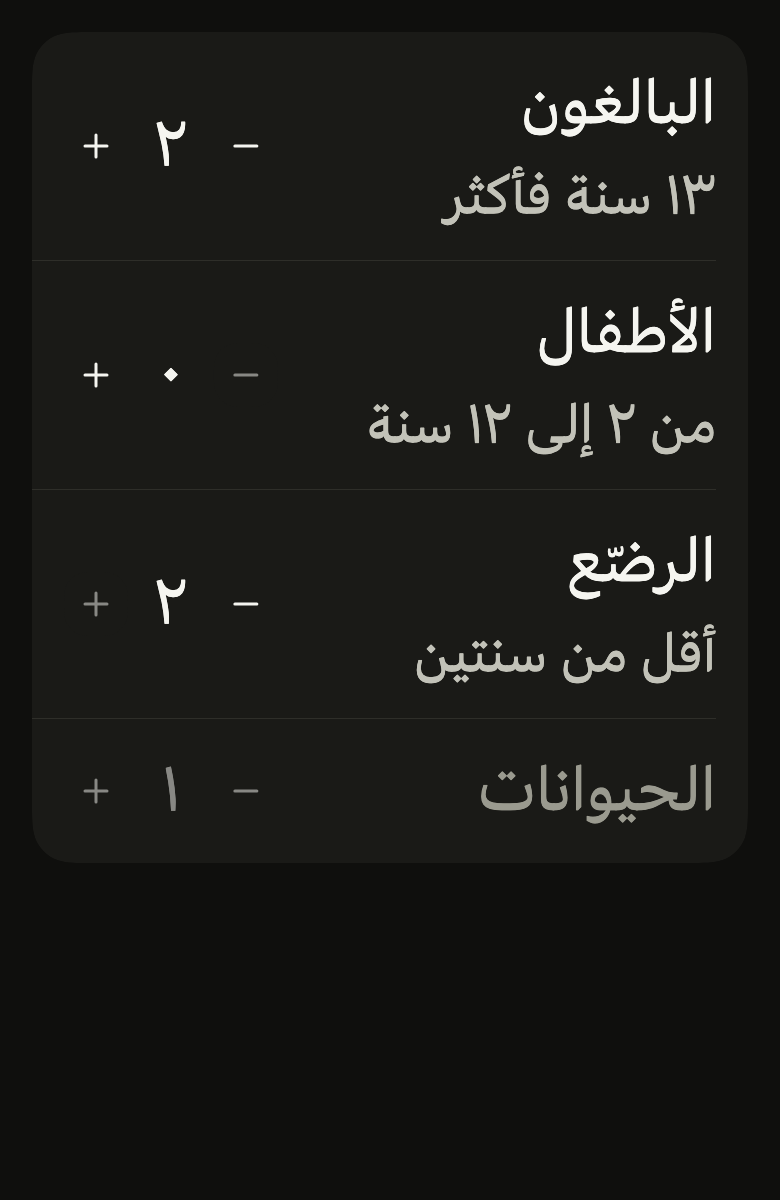
Sets a small count one step at a time, with round minus and plus buttons around the number at the end of a row: guests, quantity, seats. Each button turns off at its limit.
Import
In a Flutter app where fliin init has run:
Examples
Value
A stepper at the end of a list row: minus and plus around the count, for small whole numbers.
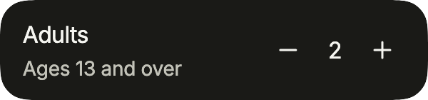
import 'package:your_app/ui/fliin/components/list_row/fl_list_row.dart';
import 'package:your_app/ui/fliin/components/stepper/fl_stepper.dart';
import 'package:flutter/widgets.dart';

class StepperValueExample extends StatefulWidget {
  const StepperValueExample({super.key});

  @override
  State<StepperValueExample> createState() => _StepperValueExampleState();
}

class _StepperValueExampleState extends State<StepperValueExample> {
  var _adults = 2;

  @override
  Widget build(BuildContext context) {
    return FlListGroup(
      children: [
        FlListRow(
          title: 'Adults',
          subtitle: 'Ages 13 and over',
          trailing: FlStepper(
            label: 'Adults',
            value: _adults,
            min: 1,
            max: 6,
            decrementLabel: 'Fewer adults',
            incrementLabel: 'More adults',
            format: (n) => '$n',
            onChanged: (value) => setState(() => _adults = value),
          ),
        ),
      ],
    );
  }
}At min
At min, the minus button turns off.
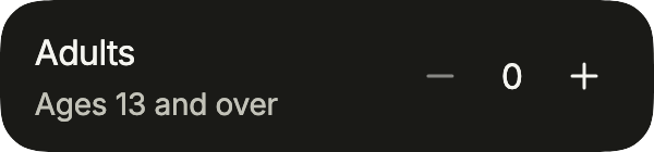
import 'package:your_app/ui/fliin/components/list_row/fl_list_row.dart';
import 'package:your_app/ui/fliin/components/stepper/fl_stepper.dart';
import 'package:flutter/widgets.dart';

class StepperAtMinExample extends StatefulWidget {
  const StepperAtMinExample({super.key});

  @override
  State<StepperAtMinExample> createState() => _StepperAtMinExampleState();
}

class _StepperAtMinExampleState extends State<StepperAtMinExample> {
  var _adults = 0;

  @override
  Widget build(BuildContext context) {
    return FlListGroup(
      children: [
        FlListRow(
          title: 'Adults',
          subtitle: 'Ages 13 and over',
          trailing: FlStepper(
            label: 'Adults',
            value: _adults,
            min: 0,
            max: 4,
            decrementLabel: 'Fewer adults',
            incrementLabel: 'More adults',
            format: (n) => '$n',
            onChanged: (value) => setState(() => _adults = value),
          ),
        ),
      ],
    );
  }
}At max
At max, the plus button turns off.
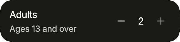
import 'package:your_app/ui/fliin/components/list_row/fl_list_row.dart';
import 'package:your_app/ui/fliin/components/stepper/fl_stepper.dart';
import 'package:flutter/widgets.dart';

class StepperAtMaxExample extends StatefulWidget {
  const StepperAtMaxExample({super.key});

  @override
  State<StepperAtMaxExample> createState() => _StepperAtMaxExampleState();
}

class _StepperAtMaxExampleState extends State<StepperAtMaxExample> {
  var _adults = 2;

  @override
  Widget build(BuildContext context) {
    return FlListGroup(
      children: [
        FlListRow(
          title: 'Adults',
          subtitle: 'Ages 13 and over',
          trailing: FlStepper(
            label: 'Adults',
            value: _adults,
            min: 0,
            max: 2,
            decrementLabel: 'Fewer adults',
            incrementLabel: 'More adults',
            format: (n) => '$n',
            onChanged: (value) => setState(() => _adults = value),
          ),
        ),
      ],
    );
  }
}Disabled
onChanged: null disables the stepper, and enabled: false the row around it.
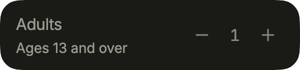
import 'package:your_app/ui/fliin/components/list_row/fl_list_row.dart';
import 'package:your_app/ui/fliin/components/stepper/fl_stepper.dart';
import 'package:flutter/widgets.dart';

class StepperDisabledExample extends StatefulWidget {
  const StepperDisabledExample({super.key});

  @override
  State<StepperDisabledExample> createState() => _StepperDisabledExampleState();
}

class _StepperDisabledExampleState extends State<StepperDisabledExample> {
  final _adults = 1;

  @override
  Widget build(BuildContext context) {
    return FlListGroup(
      children: [
        FlListRow(
          title: 'Adults',
          subtitle: 'Ages 13 and over',
          enabled: false,
          trailing: FlStepper(
            label: 'Adults',
            value: _adults,
            min: 0,
            max: 2,
            decrementLabel: 'Fewer adults',
            incrementLabel: 'More adults',
            format: (n) => '$n',
            onChanged: null,
          ),
        ),
      ],
    );
  }
}Outline
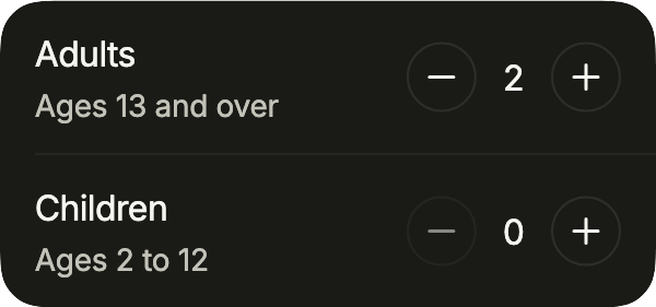
FlStepperVariant.outline: round buttons ringed by a rule, the guest picker of a booking app.
import 'package:your_app/ui/fliin/components/list_row/fl_list_row.dart';
import 'package:your_app/ui/fliin/components/stepper/fl_stepper.dart';
import 'package:flutter/widgets.dart';

class StepperOutlineExample extends StatefulWidget {
  const StepperOutlineExample({super.key});

  @override
  State<StepperOutlineExample> createState() => _StepperOutlineExampleState();
}

class _StepperOutlineExampleState extends State<StepperOutlineExample> {
  var _adults = 2;
  var _children = 0;

  @override
  Widget build(BuildContext context) {
    return FlListGroup(
      children: [
        FlListRow(
          title: 'Adults',
          subtitle: 'Ages 13 and over',
          trailing: FlStepper(
            label: 'Adults',
            value: _adults,
            min: 1,
            max: 16,
            variant: FlStepperVariant.outline,
            decrementLabel: 'Fewer adults',
            incrementLabel: 'More adults',
            onChanged: (value) => setState(() => _adults = value),
          ),
        ),
        FlListRow(
          title: 'Children',
          subtitle: 'Ages 2 to 12',
          trailing: FlStepper(
            label: 'Children',
            value: _children,
            max: 8,
            variant: FlStepperVariant.outline,
            decrementLabel: 'Fewer children',
            incrementLabel: 'More children',
            onChanged: (value) => setState(() => _children = value),
          ),
        ),
      ],
    );
  }
}Step
step counts by more than one, here by quarter hours; near a bound the number stops at the bound.

import 'package:your_app/ui/fliin/components/list_row/fl_list_row.dart';
import 'package:your_app/ui/fliin/components/stepper/fl_stepper.dart';
import 'package:flutter/widgets.dart';

class StepperStepExample extends StatefulWidget {
  const StepperStepExample({super.key});

  @override
  State<StepperStepExample> createState() => _StepperStepExampleState();
}

class _StepperStepExampleState extends State<StepperStepExample> {
  var _minutes = 30;

  @override
  Widget build(BuildContext context) {
    return FlListGroup(
      children: [
        FlListRow(
          title: 'Duration',
          trailing: FlStepper(
            label: 'Duration',
            value: _minutes,
            min: 15,
            max: 180,
            step: 15,
            format: (minutes) => '$minutes min',
            decrementLabel: 'Shorter',
            incrementLabel: 'Longer',
            onChanged: (value) => setState(() => _minutes = value),
          ),
        ),
      ],
    );
  }
}Usage
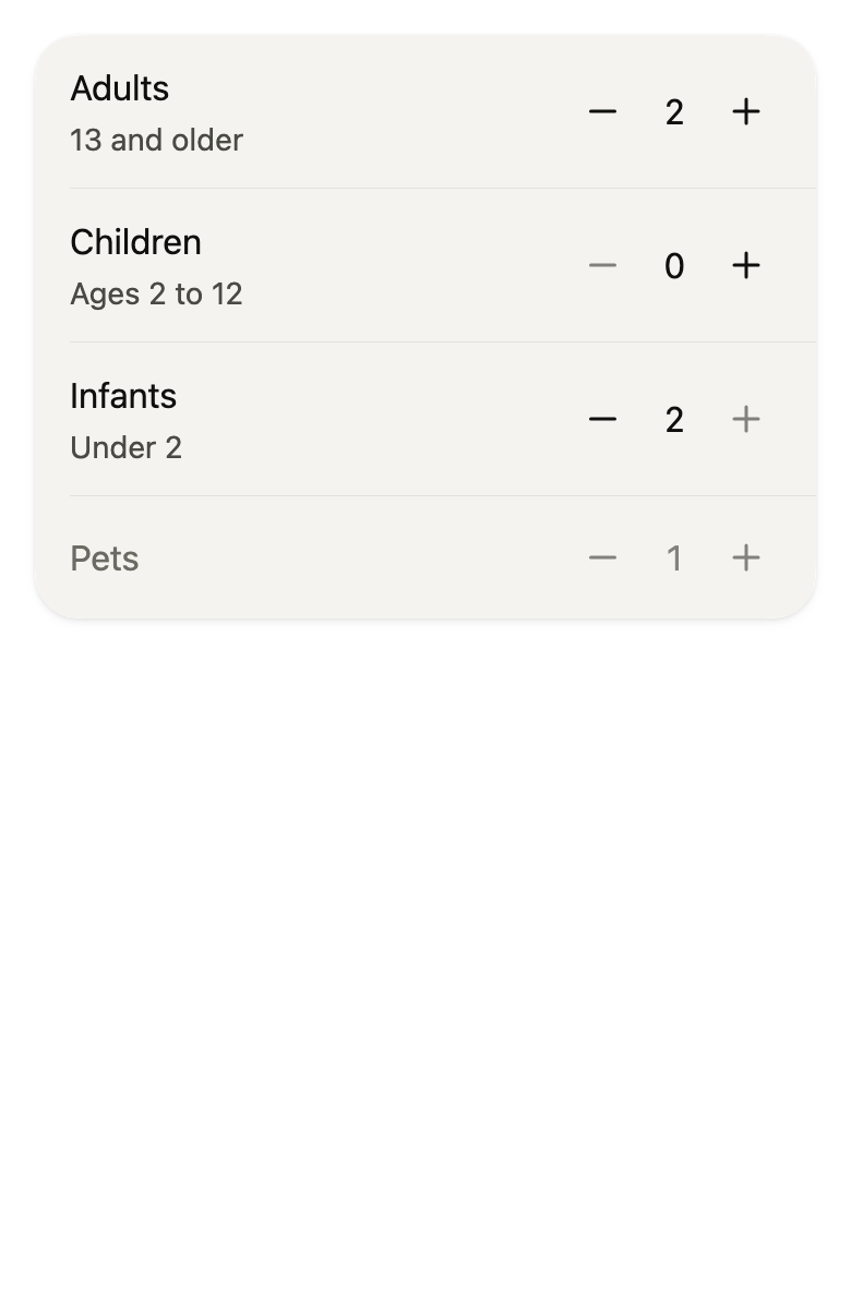
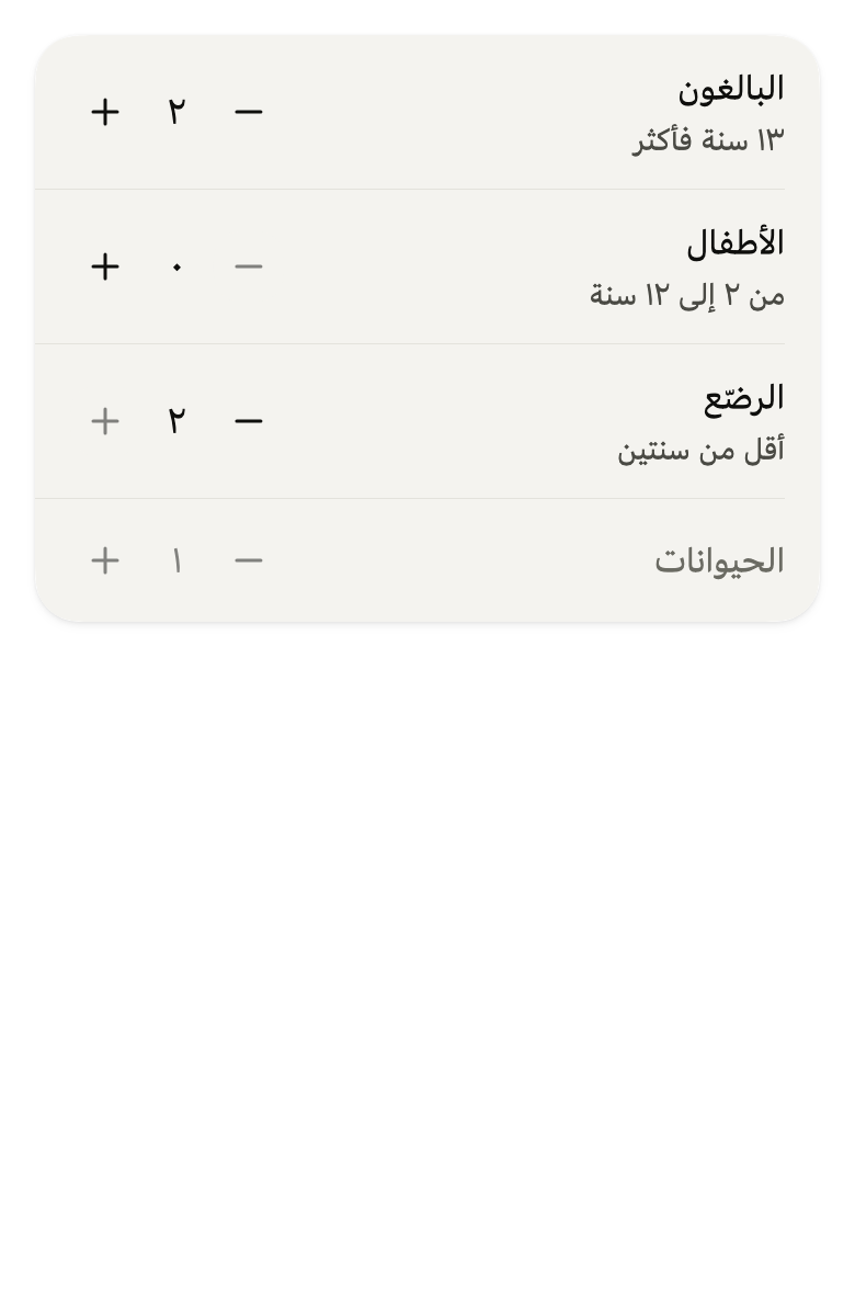
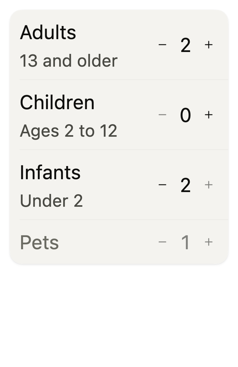
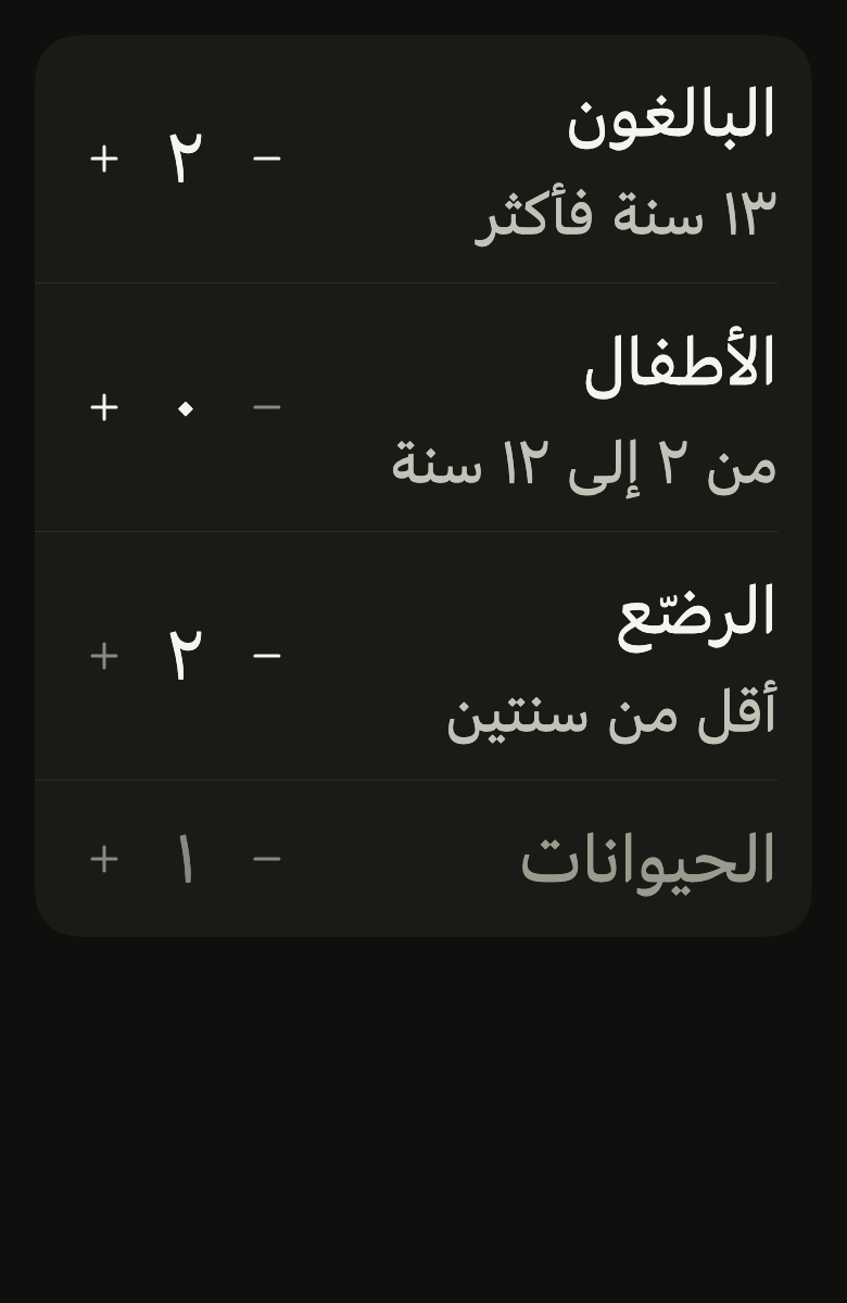
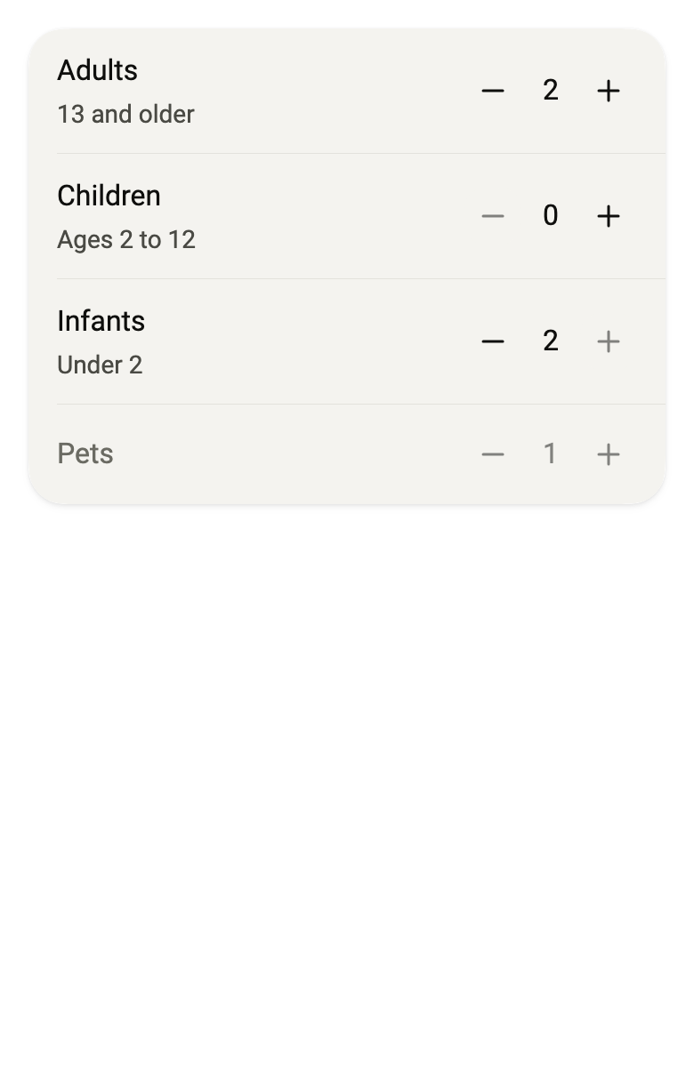
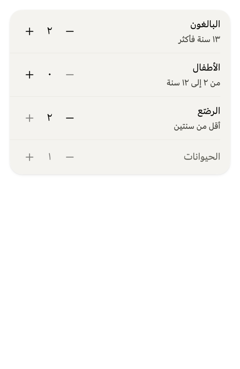
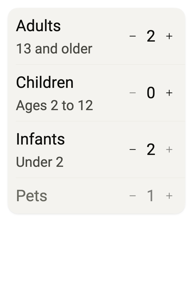
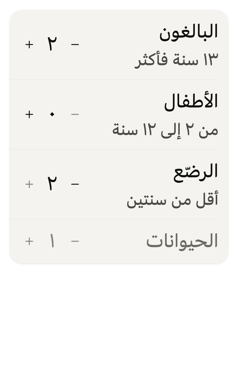
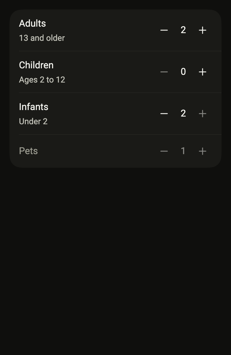
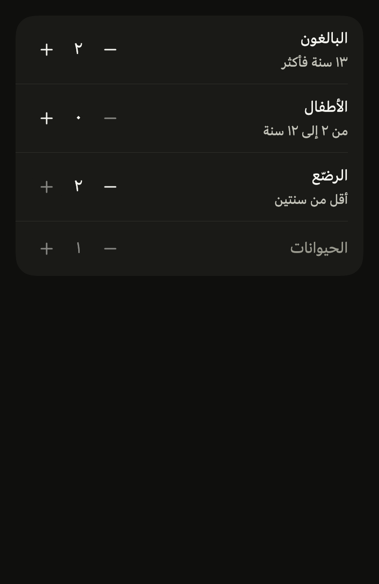
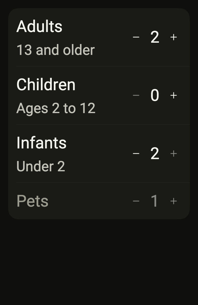
The code the reference images render:
final example = ColoredBox(
  color: FlScope.of(context).colors.surface,
  child: SingleChildScrollView(
    padding: EdgeInsetsDirectional.all(FlScope.of(context).space.lg),
    child: Column(
      crossAxisAlignment: CrossAxisAlignment.stretch,
      children: [
        FlListGroup(
          children: [
            FlListRow(
              title: (variant.dir == TextDirection.rtl ? "البالغون" : "Adults"),
              subtitle: (variant.dir == TextDirection.rtl
                  ? "١٣ سنة فأكثر"
                  : "13 and older"),
              enabled: true,
              trailing: FlStepper(
                label: (variant.dir == TextDirection.rtl
                    ? "البالغون"
                    : "Adults"),
                value: 2,
                min: 1,
                max: 6,
                decrementLabel: (variant.dir == TextDirection.rtl
                    ? "أقل"
                    : "Fewer"),
                incrementLabel: (variant.dir == TextDirection.rtl
                    ? "أكثر"
                    : "Plus"),
                format: (int n) => variant.dir == TextDirection.rtl
                    ? "$n".replaceAllMapped(
                        RegExp("[0-9]"),
                        (m) => "٠١٢٣٤٥٦٧٨٩"[int.parse(m[0]!)],
                      )
                    : "$n",
                onChanged: (_) {},
              ),
            ),
            FlListRow(
              title: (variant.dir == TextDirection.rtl
                  ? "الأطفال"
                  : "Children"),
              subtitle: (variant.dir == TextDirection.rtl
                  ? "من ٢ إلى ١٢ سنة"
                  : "Ages 2 to 12"),
              enabled: true,
              trailing: FlStepper(
                label: (variant.dir == TextDirection.rtl
                    ? "الأطفال"
                    : "Children"),
                value: 0,
                min: 0,
                max: 4,
                decrementLabel: (variant.dir == TextDirection.rtl
                    ? "أقل"
                    : "Fewer"),
                incrementLabel: (variant.dir == TextDirection.rtl
                    ? "أكثر"
                    : "Plus"),
                format: (int n) => variant.dir == TextDirection.rtl
                    ? "$n".replaceAllMapped(
                        RegExp("[0-9]"),
                        (m) => "٠١٢٣٤٥٦٧٨٩"[int.parse(m[0]!)],
                      )
                    : "$n",
                onChanged: (_) {},
              ),
            ),
            FlListRow(
              title: (variant.dir == TextDirection.rtl ? "الرضّع" : "Infants"),
              subtitle: (variant.dir == TextDirection.rtl
                  ? "أقل من سنتين"
                  : "Under 2"),
              enabled: true,
              trailing: FlStepper(
                label: (variant.dir == TextDirection.rtl
                    ? "الرضّع"
                    : "Infants"),
                value: 2,
                min: 0,
                max: 2,
                decrementLabel: (variant.dir == TextDirection.rtl
                    ? "أقل"
                    : "Fewer"),
                incrementLabel: (variant.dir == TextDirection.rtl
                    ? "أكثر"
                    : "Plus"),
                format: (int n) => variant.dir == TextDirection.rtl
                    ? "$n".replaceAllMapped(
                        RegExp("[0-9]"),
                        (m) => "٠١٢٣٤٥٦٧٨٩"[int.parse(m[0]!)],
                      )
                    : "$n",
                onChanged: (_) {},
              ),
            ),
            FlListRow(
              title: (variant.dir == TextDirection.rtl ? "الحيوانات" : "Pets"),
              enabled: false,
              trailing: FlStepper(
                label: (variant.dir == TextDirection.rtl
                    ? "الحيوانات"
                    : "Pets"),
                value: 1,
                min: 0,
                max: 2,
                decrementLabel: (variant.dir == TextDirection.rtl
                    ? "أقل"
                    : "Fewer"),
                incrementLabel: (variant.dir == TextDirection.rtl
                    ? "أكثر"
                    : "Plus"),
                format: (int n) => variant.dir == TextDirection.rtl
                    ? "$n".replaceAllMapped(
                        RegExp("[0-9]"),
                        (m) => "٠١٢٣٤٥٦٧٨٩"[int.parse(m[0]!)],
                      )
                    : "$n",
                onChanged: null,
              ),
            ),
          ],
        ),
      ],
    ),
  ),
);API
FlStepperVariant: enum {control, outline}
FlStepperVariant.control: static final FlStepperVariant
FlStepperVariant.outline: static final FlStepperVariant
FlStepper: class extends StatelessWidget
FlStepper.new: const new({super.key, required int value, required ValueChanged<int>? onChanged, required String label, required String decrementLabel, required String incrementLabel, int min, int? max, String Function(int value)? format, int step, FlStepperVariant variant})
FlStepper.value: get int
FlStepper.onChanged: get ValueChanged<int>?
FlStepper.label: get String
FlStepper.decrementLabel: get String
FlStepper.incrementLabel: get String
FlStepper.min: get int
FlStepper.max: get int?
FlStepper.format: get String Function(int value)?
FlStepper.step: get int
FlStepper.variant: get FlStepperVariant
FlStepper.build: Widget(BuildContext context)Reference renders
The 16 images published with version 0.1.4, rendered by the shared harness on macOS with Flutter 3.47.7. fliin verify stepper compares your copy to them.
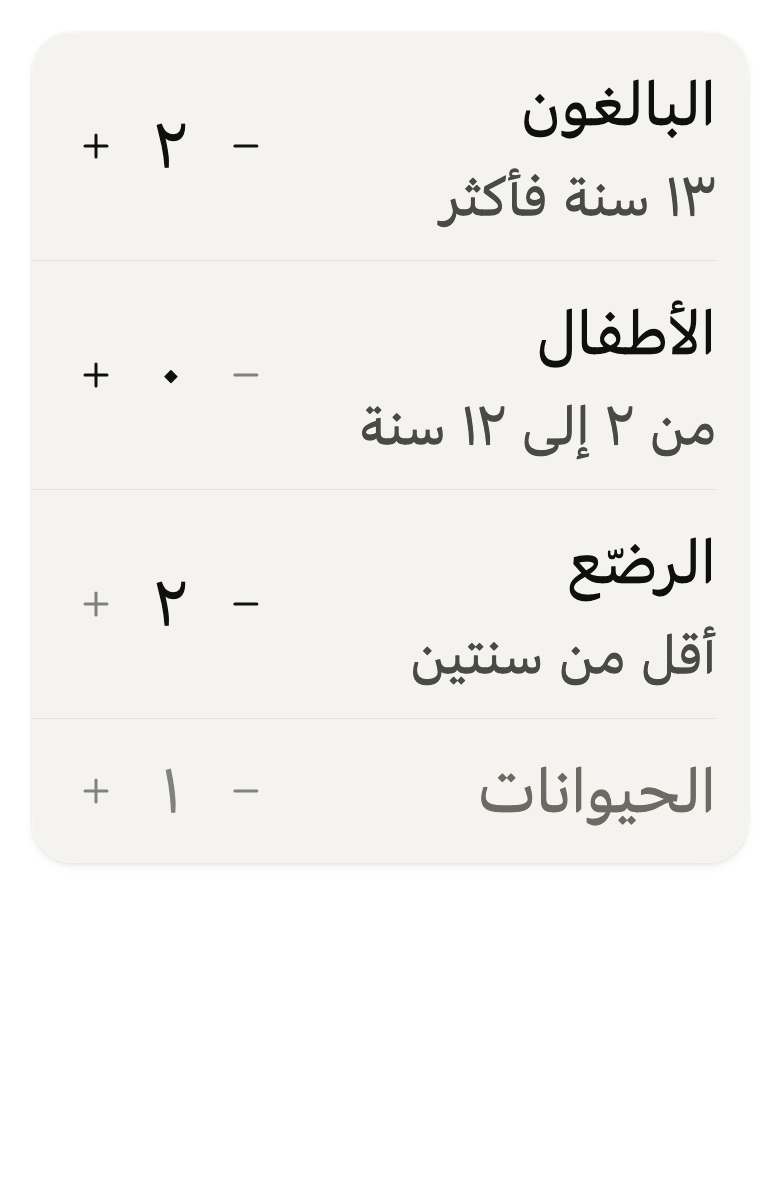
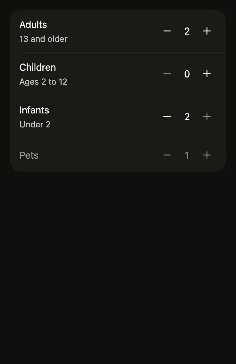
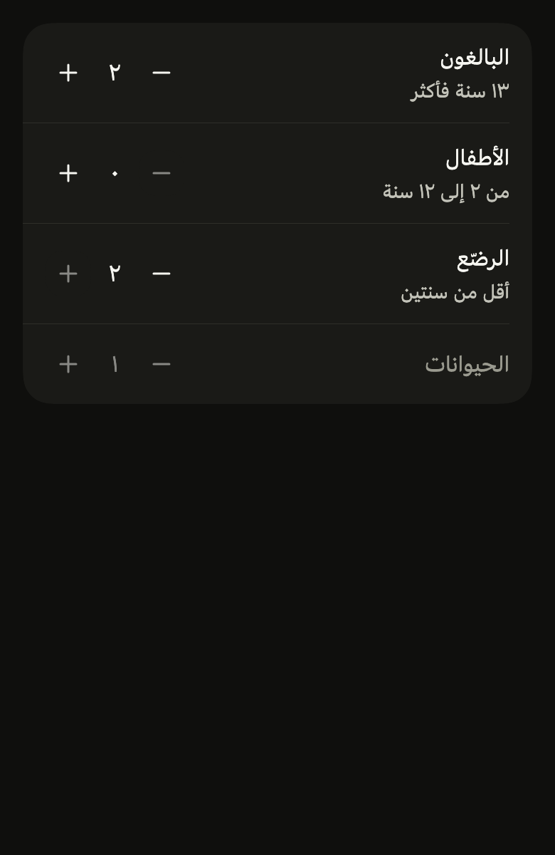
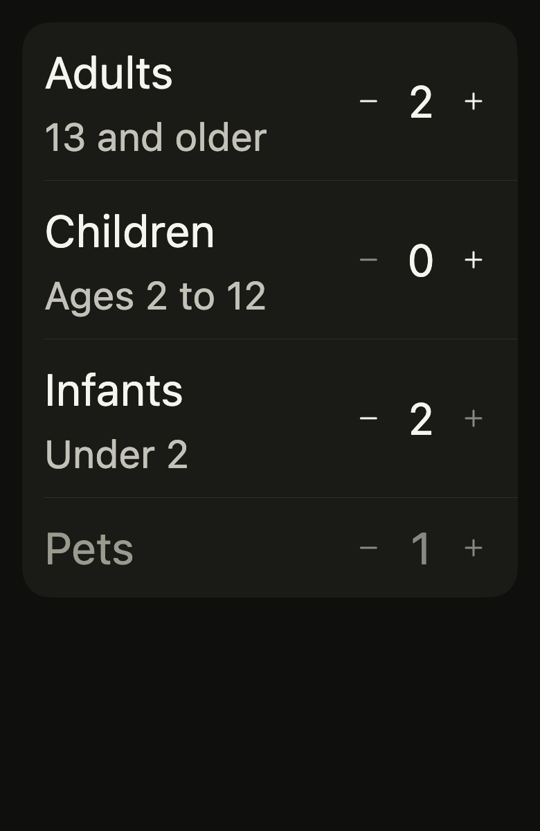
Use it to
- pick how many adults and children are in a booking
- adjust how many tickets or seats with a counter
- use a small counter at the end of a list row
- add guests one at a time
- disable a counter button at its limit
- Not for
- a number typed on the keyboard, a price, a weight: use the number field (number-field)
- a value on a continuous range: use the slider (slider)
- a quantity in a cart line: use the cart line (cart-line)
- States
Source
The files fliin add stepper copies into your app, before your prefix and imports are applied.
stepper/fl_stepper.dart
import 'dart:math' as math;

import 'package:flutter/widgets.dart';
import 'package:fliin_ui/core/fliin.dart';
import 'package:fliin_ui/icons/fl_icons.dart';

/// The look of an [FlStepper]'s buttons.
enum FlStepperVariant {
  /// `control` squares with `shape.radiusXl` corners: the default.
  control,

  /// Circles outlined by a `border` rule on no fill, which take
  /// `controlPressed` under the finger: the guest counter of a booking app.
  outline,
}

/// A compact counter: minus, the number, plus. The buttons are small
/// `control` squares with `shape.radiusXl` corners (outlined circles with
/// [variant]), as wide as a close button (`size.closeButton`), inside the
/// platform's touch target; each one disables itself at its bound, at
/// `size.disabledOpacity`. To
/// be placed at the end of a row ("Adults", "Quantity") rather than alone in
/// a form, where `number-field` also lets the user type the number.
///
/// The screen reader reads the counter as one adjustable node, named
/// [label], which speaks the number and steps up or down through the
/// platform's gestures; both buttons stay reachable, by touch as by
/// keyboard, named [decrementLabel] and [incrementLabel].
class FlStepper extends StatelessWidget {
  /// A counter showing [value], between [min] and [max].
  const FlStepper({
    super.key,
    required this.value,
    required this.onChanged,
    required this.label,
    required this.decrementLabel,
    required this.incrementLabel,
    this.min = 0,
    this.max,
    this.format,
    this.step = 1,
    this.variant = FlStepperVariant.control,
  }) : assert(max == null || max >= min, 'max at least min'),
       assert(step > 0, 'a positive step');

  /// The number shown, between [min] and [max].
  final int value;

  /// Receives the number one step higher or lower; when null, the counter is
  /// disabled.
  final ValueChanged<int>? onChanged;

  /// What the counter counts, for the screen reader ("Adults").
  final String label;

  /// The name of the minus button ("Fewer adults").
  final String decrementLabel;

  /// The name of the plus button ("More adults").
  final String incrementLabel;

  /// The smallest number; 0 by default.
  final int min;

  /// The largest number; when null, unbounded.
  final int? max;

  /// The number written in the app's language ("٢" in Arabic); when null, in
  /// Latin digits.
  final String Function(int value)? format;

  /// What a button adds or removes; 1 by default. Near a bound, the number
  /// stops at the bound.
  final int step;

  /// The buttons' look; `control` squares by default.
  final FlStepperVariant variant;

  @override
  Widget build(BuildContext context) {
    final theme = FlScope.of(context);
    final onChanged = this.onChanged;
    final max = this.max;
    String text(int n) => format?.call(n) ?? '$n';
    final canDecrease = onChanged != null && value > min;
    final canIncrease = onChanged != null && (max == null || value < max);
    final increased = max == null ? value + step : math.min(value + step, max);
    final decreased = math.max(value - step, min);
    final colors = theme.colors;
    final outline = variant == FlStepperVariant.outline;
    final side = theme.size.closeButton;
    final radius = outline ? side / 2 : theme.shape.radiusXl;
    Widget button(String label, FlIconData icon, int next, {required bool enabled}) => FlPressable(
      label: label,
      onPressed: enabled ? () => onChanged!(next) : null,
      borderRadius: BorderRadius.circular(radius),
      builder: (context, states) => Opacity(
        opacity: states.contains(WidgetState.disabled) ? theme.size.disabledOpacity : 1,
        child: SizedBox.square(
          dimension: side,
          child: DecoratedBox(
            decoration: ShapeDecoration(
              color: states.contains(WidgetState.pressed) || states.contains(WidgetState.hovered)
                  ? colors.controlPressed
                  : (outline ? colors.controlPressed.withValues(alpha: 0) : colors.control),
              shape: outline
                  ? CircleBorder(
                      side: BorderSide(color: colors.border, width: theme.size.border),
                    )
                  : FlContinuousBorder(radius: radius),
            ),
            child: Center(
              child: FlIcon(icon, size: theme.size.indicatorIcon, color: colors.onControl),
            ),
          ),
        ),
      ),
    );
    final style = theme.typography
        .resolve(FlTextRole.textBase)
        .copyWith(color: colors.onSurface, fontFeatures: const [FontFeature.tabularFigures()]);
    return Semantics(
      container: true,
      explicitChildNodes: true,
      label: label,
      value: text(value),
      increasedValue: canIncrease ? text(increased) : null,
      decreasedValue: canDecrease ? text(decreased) : null,
      onIncrease: canIncrease ? () => onChanged(increased) : null,
      onDecrease: canDecrease ? () => onChanged(decreased) : null,
      enabled: onChanged != null,
      child: Row(
        mainAxisSize: MainAxisSize.min,
        spacing: theme.space.md,
        children: [
          button(decrementLabel, FlIcons.minus, decreased, enabled: canDecrease),
          // As wide as its digits, as in the canvas: from 9 to 10, the minus
          // button moves away.
          ExcludeSemantics(
            child: _Rolling(
              value: value,
              child: Text(
                text(value),
                key: ValueKey(value),
                textAlign: TextAlign.center,
                style: onChanged == null
                    ? style.copyWith(color: style.color?.withValues(alpha: theme.size.disabledOpacity))
                    : style,
                strutStyle: theme.typography.strut(
                  FlTextRole.textBase,
                  inheritedFamily: DefaultTextStyle.of(context).style.fontFamily,
                ),
              ),
            ),
          ),
          button(incrementLabel, FlIcons.plus, increased, enabled: canIncrease),
        ],
      ),
    );
  }
}

/// The number rolls to its new value: the old one slides out and fades
/// away from the direction of the change, the new one slides in from it,
/// over `short4`. Under reduced motion, the number is replaced at once.
class _Rolling extends StatefulWidget {
  const _Rolling({required this.value, required this.child});

  final int value;
  final Widget child;

  @override
  State<_Rolling> createState() => _RollingState();
}

class _RollingState extends State<_Rolling> {
  /// 1 when the value went up: the new number comes from below.
  double _direction = 1;

  @override
  void didUpdateWidget(_Rolling oldWidget) {
    super.didUpdateWidget(oldWidget);
    if (widget.value != oldWidget.value) {
      _direction = widget.value > oldWidget.value ? 1 : -1;
    }
  }

  @override
  Widget build(BuildContext context) {
    final motion = FlMotion.of(context);
    return ClipRect(
      child: AnimatedSwitcher(
        duration: motion.reduced ? Duration.zero : motion.tokens.short4,
        switchInCurve: motion.tokens.easeOut,
        switchOutCurve: motion.tokens.easeOut,
        layoutBuilder: (current, previous) => Stack(alignment: Alignment.center, children: [...previous, ?current]),
        transitionBuilder: (child, animation) {
          final entering = child.key == ValueKey(widget.value);
          // The leaving number runs its animation backward, from 1 to 0.
          final offset = Tween<Offset>(
            begin: Offset(0, (entering ? 1 : -1) * _direction * 0.5),
            end: Offset.zero,
          ).animate(animation);
          return FadeTransition(
            opacity: animation,
            child: SlideTransition(position: offset, child: child),
          );
        },
        child: widget.child,
      ),
    );
  }
}