Blocks / dashboard
Stat card
Shows a key figure such as a balance in large type, with its change in a signed pill, a short note and an optional action to hide it.
Import
Stat card is part of Fliin Pro. With a license key, sign in once with fliin login, then add it in a Flutter app where fliin init has run:
fliin login
fliin add stat-cardExamples
Positive
The balance with its change this week. The “Hide” button masks the amount, and valueSemanticLabel says so to the screen reader.
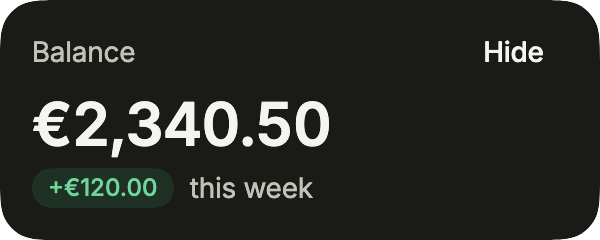
import 'package:your_app/ui/fliin/components/button/fl_button.dart';
import 'package:your_app/ui/fliin/components/stat_card/fl_stat_card.dart';
import 'package:flutter/widgets.dart';

class StatCardPositiveExample extends StatefulWidget {
  const StatCardPositiveExample({super.key});

  @override
  State<StatCardPositiveExample> createState() => _StatCardPositiveExampleState();
}

class _StatCardPositiveExampleState extends State<StatCardPositiveExample> {
  var _hidden = false;

  @override
  Widget build(BuildContext context) {
    return FlStatCard(
      label: 'Balance',
      value: _hidden ? '••••••' : '€2,340.50',
      valueSemanticLabel: _hidden ? 'Balance hidden' : null,
      change: _hidden ? null : const FlStatChange(label: '+€120.00', tone: FlStatTone.positive),
      caption: _hidden ? null : 'this week',
      action: FlButton(
        label: 'Hide',
        size: FlButtonSize.sm,
        variant: _hidden ? FlButtonVariant.secondary : FlButtonVariant.ghost,
        selected: _hidden,
        onPressed: () => setState(() => _hidden = !_hidden),
      ),
    );
  }
}Hidden
The same card with the amount hidden from the start: the change and the caption go too.
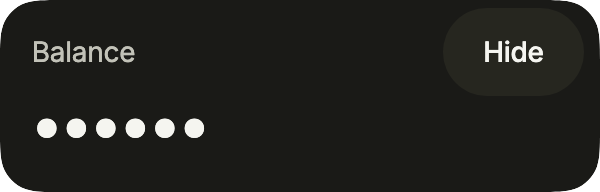
import 'package:your_app/ui/fliin/components/button/fl_button.dart';
import 'package:your_app/ui/fliin/components/stat_card/fl_stat_card.dart';
import 'package:flutter/widgets.dart';

class StatCardHiddenExample extends StatefulWidget {
  const StatCardHiddenExample({super.key});

  @override
  State<StatCardHiddenExample> createState() => _StatCardHiddenExampleState();
}

class _StatCardHiddenExampleState extends State<StatCardHiddenExample> {
  var _hidden = true;

  @override
  Widget build(BuildContext context) {
    return FlStatCard(
      label: 'Balance',
      value: _hidden ? '••••••' : '€2,340.50',
      valueSemanticLabel: _hidden ? 'Balance hidden' : null,
      change: _hidden ? null : const FlStatChange(label: '+€120.00', tone: FlStatTone.positive),
      caption: _hidden ? null : 'this week',
      action: FlButton(
        label: 'Hide',
        size: FlButtonSize.sm,
        variant: _hidden ? FlButtonVariant.secondary : FlButtonVariant.ghost,
        selected: _hidden,
        onPressed: () => setState(() => _hidden = !_hidden),
      ),
    );
  }
}Negative
A rise in spending is bad news: FlStatTone.negative colors the change, whatever its sign.
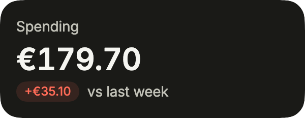
import 'package:your_app/ui/fliin/components/stat_card/fl_stat_card.dart';
import 'package:flutter/widgets.dart';

class StatCardNegativeExample extends StatelessWidget {
  const StatCardNegativeExample({super.key});

  @override
  Widget build(BuildContext context) {
    return const FlStatCard(
      label: 'Spending',
      value: '€179.70',
      change: FlStatChange(label: '+€35.10', tone: FlStatTone.negative),
      caption: 'vs last week',
    );
  }
}Neutral
A figure that did not move: without a tone, the change stays neutral.

import 'package:your_app/ui/fliin/components/stat_card/fl_stat_card.dart';
import 'package:flutter/widgets.dart';

class StatCardNeutralExample extends StatelessWidget {
  const StatCardNeutralExample({super.key});

  @override
  Widget build(BuildContext context) {
    return const FlStatCard(label: 'Subscriptions', value: '4', change: FlStatChange(label: '0'));
  }
}Grid
Two figures side by side, as at the top of a dashboard: size: sm keeps each figure on its line in half the width, and an icon before the name says what it measures.
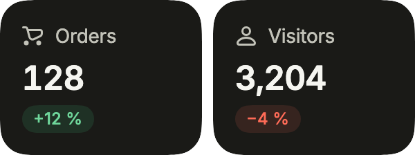
import 'package:your_app/ui/fliin/components/stat_card/fl_stat_card.dart';
import 'package:your_app/ui/fliin/core/fliin.dart';
import 'package:your_app/ui/fliin/icons/fl_icons.dart';
import 'package:flutter/widgets.dart';

class StatCardGridExample extends StatelessWidget {
  const StatCardGridExample({super.key});

  @override
  Widget build(BuildContext context) {
    final space = FlScope.of(context).space;
    return Row(
      crossAxisAlignment: CrossAxisAlignment.start,
      spacing: space.sm,
      children: [
        Expanded(
          child: FlStatCard(
            icon: FlIcon(FlIcons.shoppingCart),
            label: 'Orders',
            value: '128',
            change: const FlStatChange(label: '+12 %', tone: FlStatTone.positive),
            size: FlStatCardSize.sm,
          ),
        ),
        Expanded(
          child: FlStatCard(
            icon: FlIcon(FlIcons.person),
            label: 'Visitors',
            value: '3,204',
            change: const FlStatChange(label: '−4 %', tone: FlStatTone.negative),
            size: FlStatCardSize.sm,
          ),
        ),
      ],
    );
  }
}Trend
The figure and its trend: a small area FlChart in the footer, without its time axis nor its tooltip, scaled to its values rather than to zero.
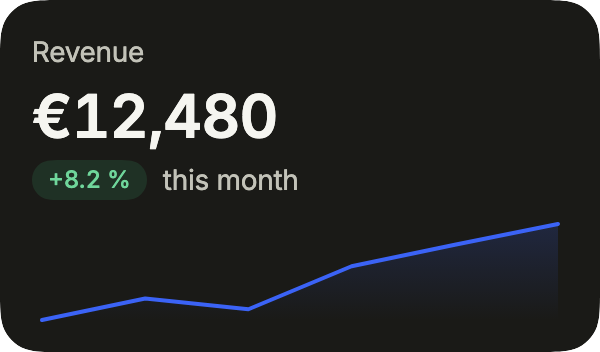
import 'package:your_app/ui/fliin/components/chart/fl_chart.dart';
import 'package:your_app/ui/fliin/components/stat_card/fl_stat_card.dart';
import 'package:flutter/widgets.dart';

String _euros(double value) => '€${value.round()}';

class StatCardTrendExample extends StatelessWidget {
  const StatCardTrendExample({super.key});

  @override
  Widget build(BuildContext context) {
    return FlStatCard(
      label: 'Revenue',
      value: '€12,480',
      change: const FlStatChange(label: '+8.2 %', tone: FlStatTone.positive),
      caption: 'this month',
      footer: FlChart.line(
        points: const [
          FlChartPoint('W1', semanticLabel: 'Week 1'),
          FlChartPoint('W2', semanticLabel: 'Week 2'),
          FlChartPoint('W3', semanticLabel: 'Week 3'),
          FlChartPoint('W4', semanticLabel: 'Week 4'),
          FlChartPoint('W5', semanticLabel: 'Week 5'),
          FlChartPoint('W6', semanticLabel: 'Week 6'),
        ],
        series: const [
          FlChartSeries(label: 'Revenue', values: [9800, 10400, 10100, 11300, 11900, 12480]),
        ],
        formatValue: _euros,
        semanticLabel: 'Revenue by week',
        plotHeight: 48,
        showTimeAxis: false,
        tooltip: false,
        area: true,
        zeroBased: false,
      ),
    );
  }
}Usage
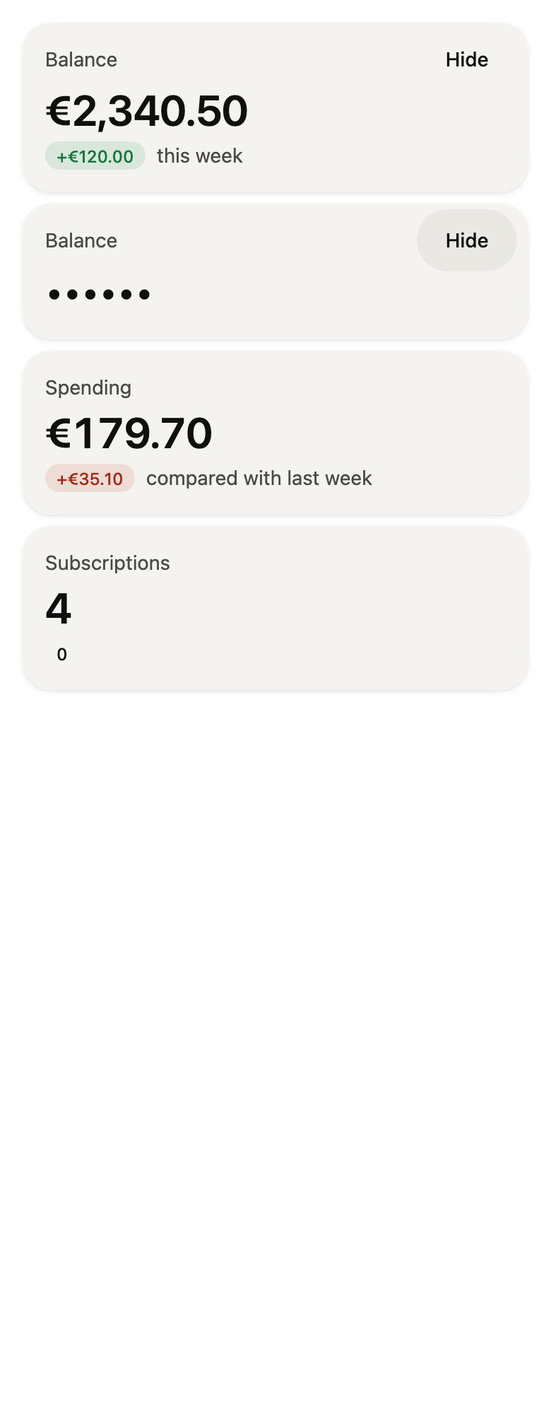
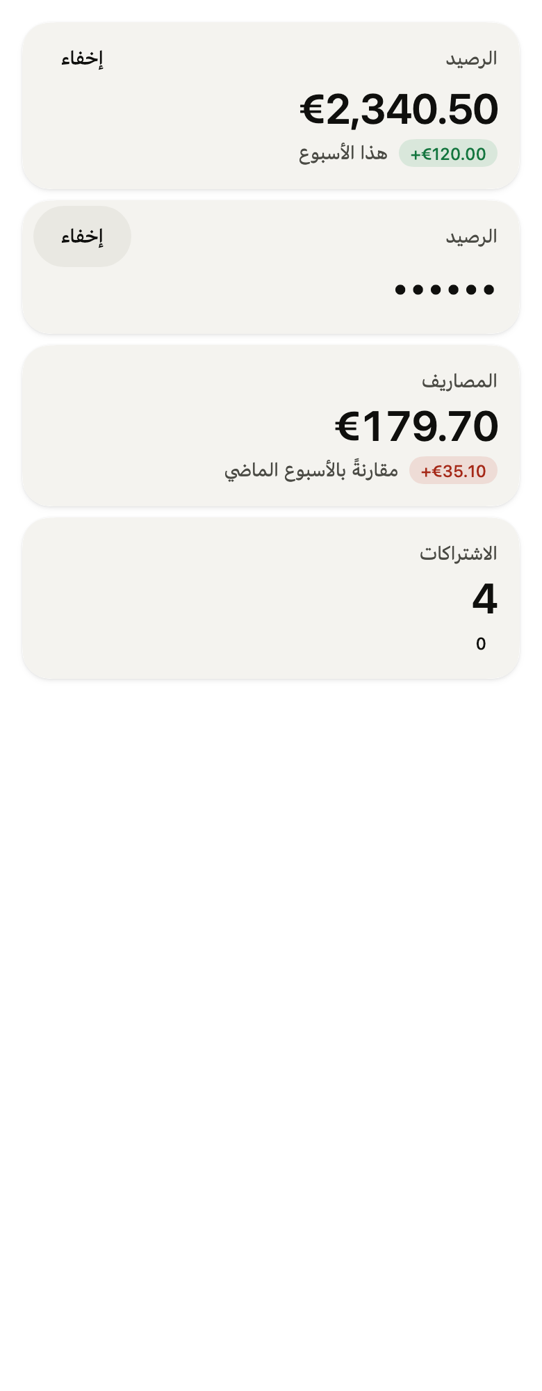
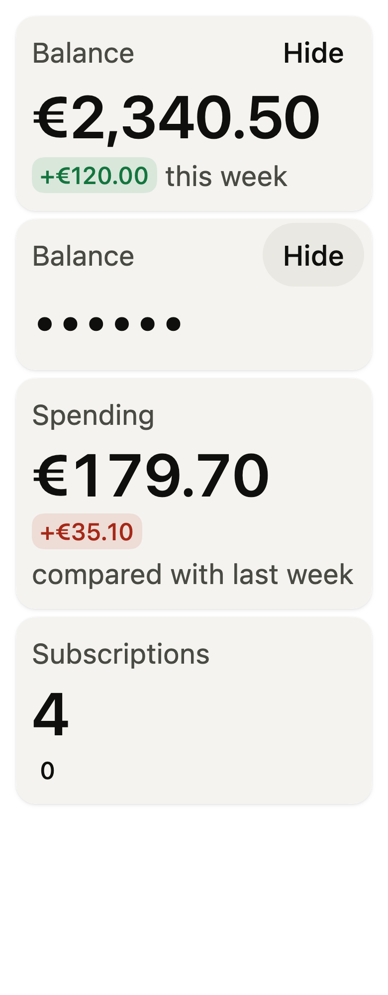
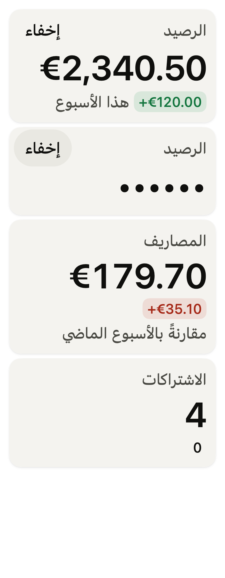
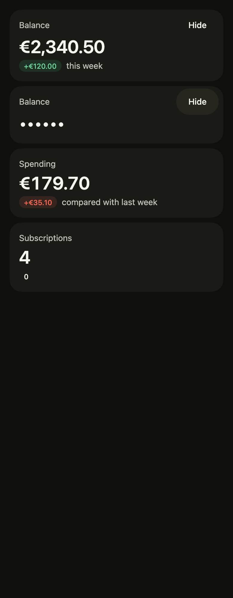
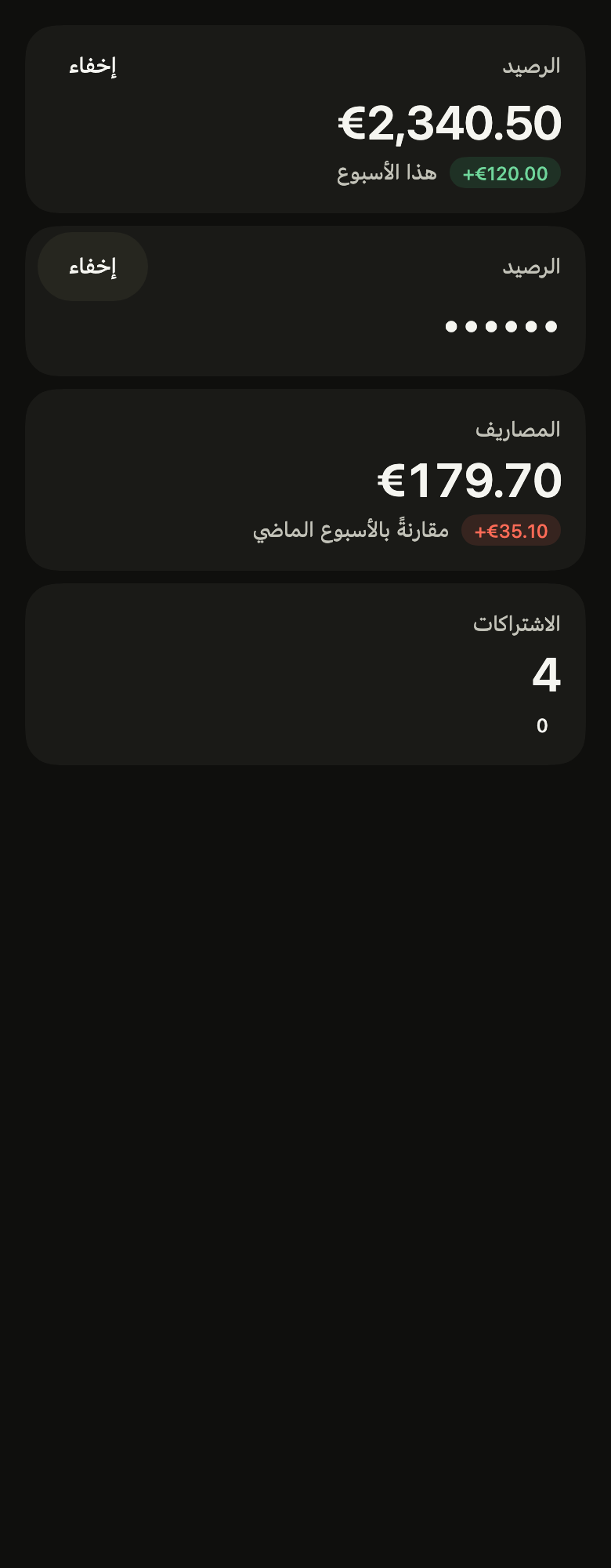
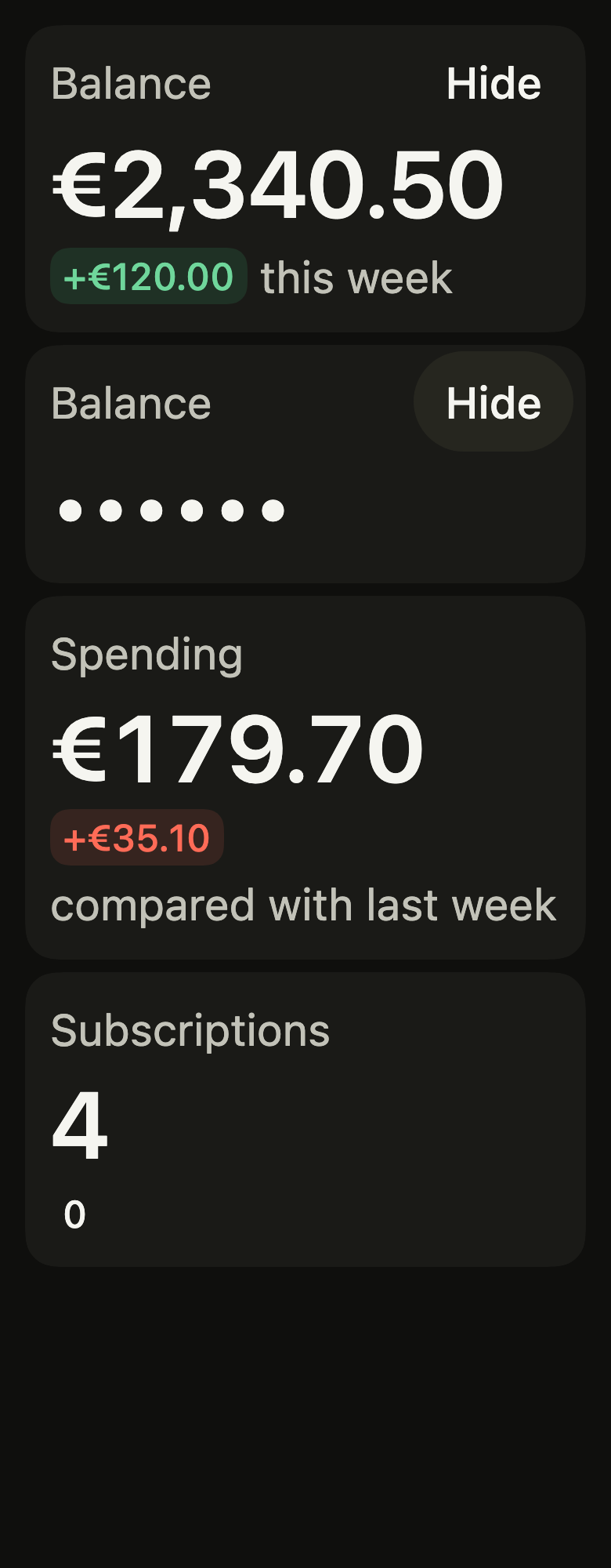
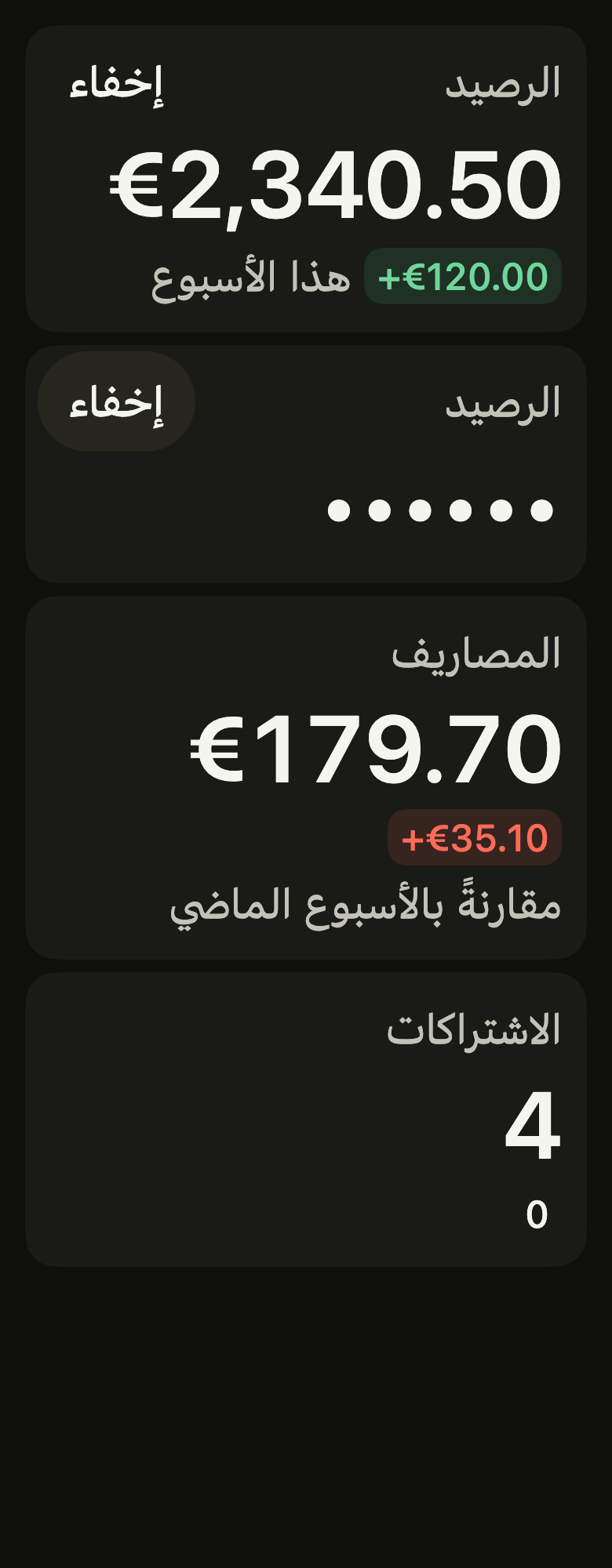
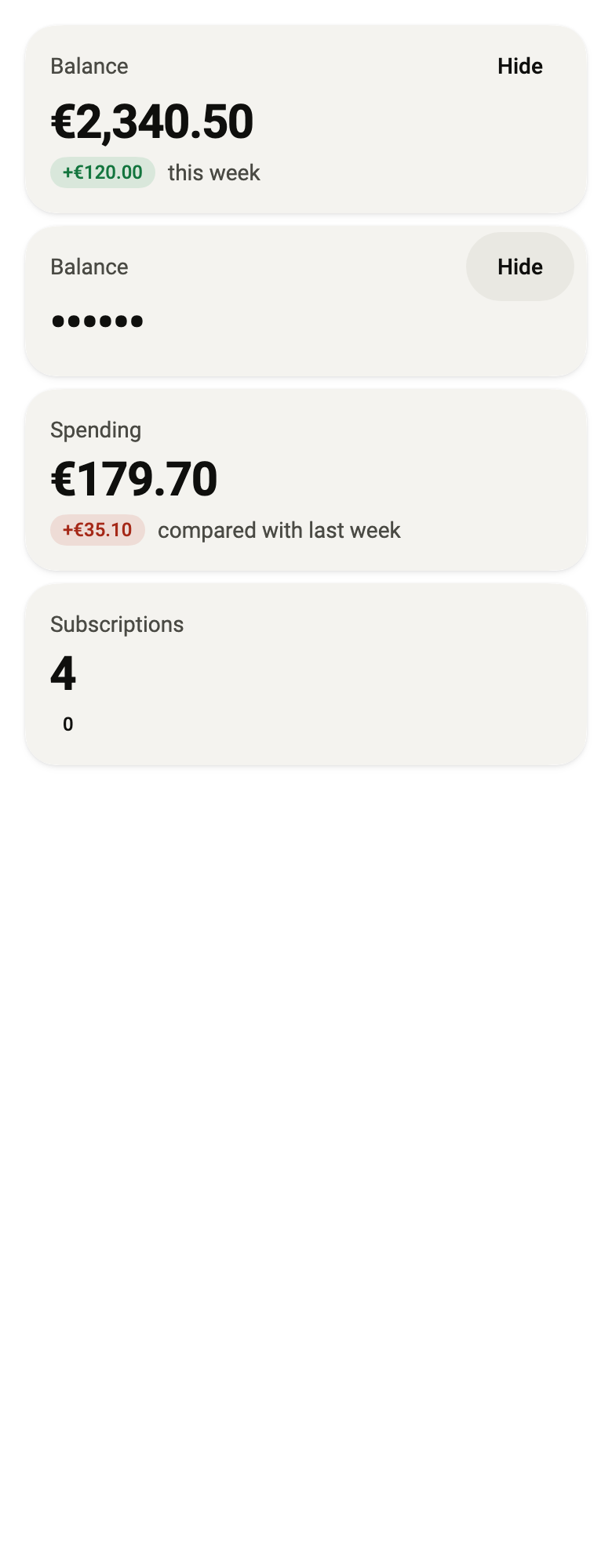
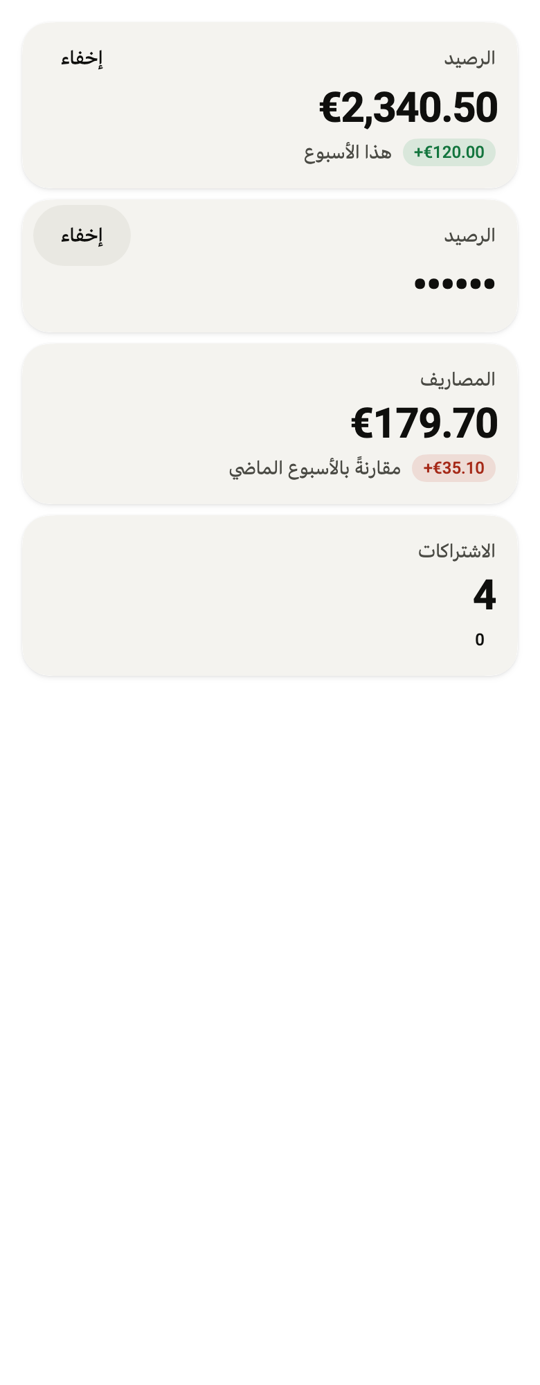
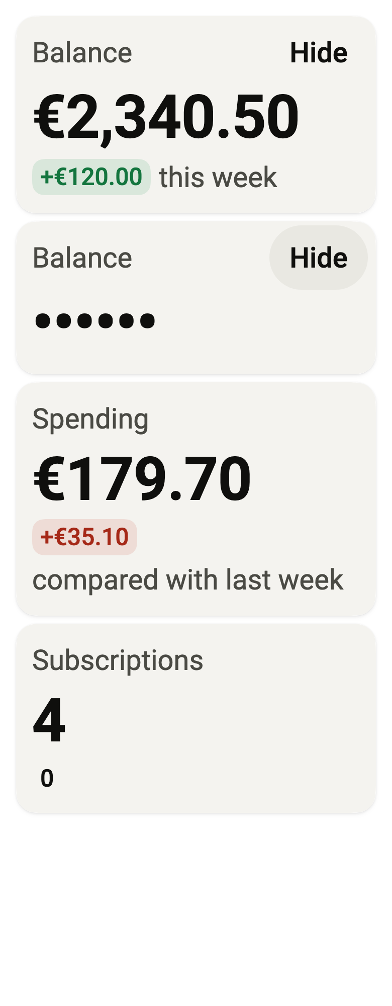
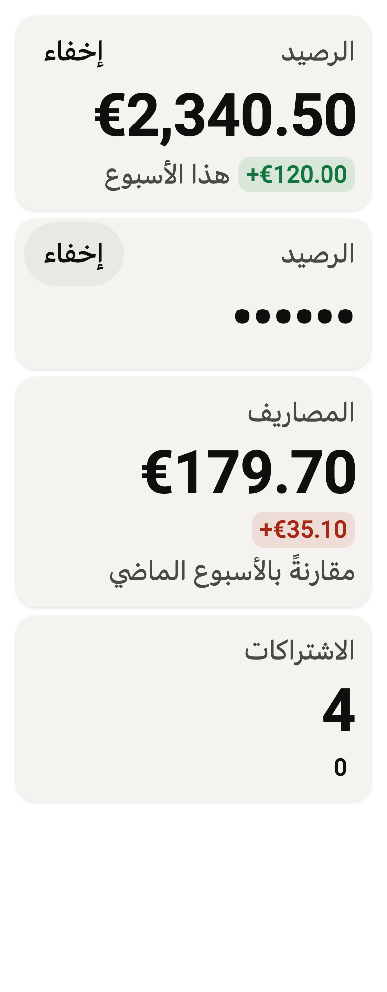
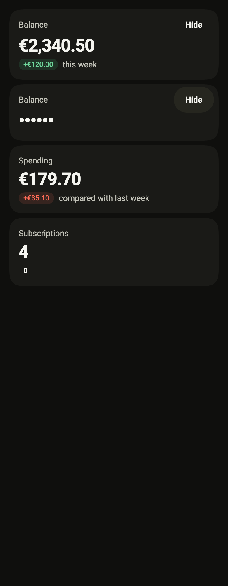
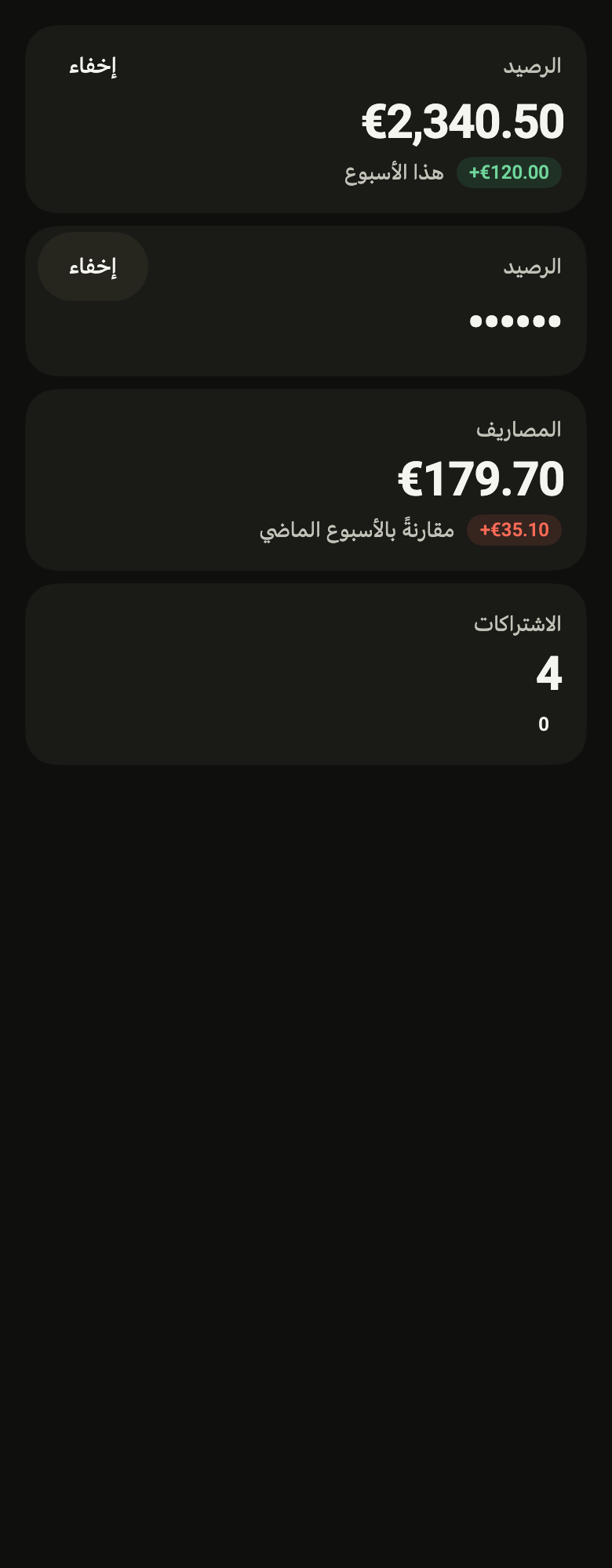
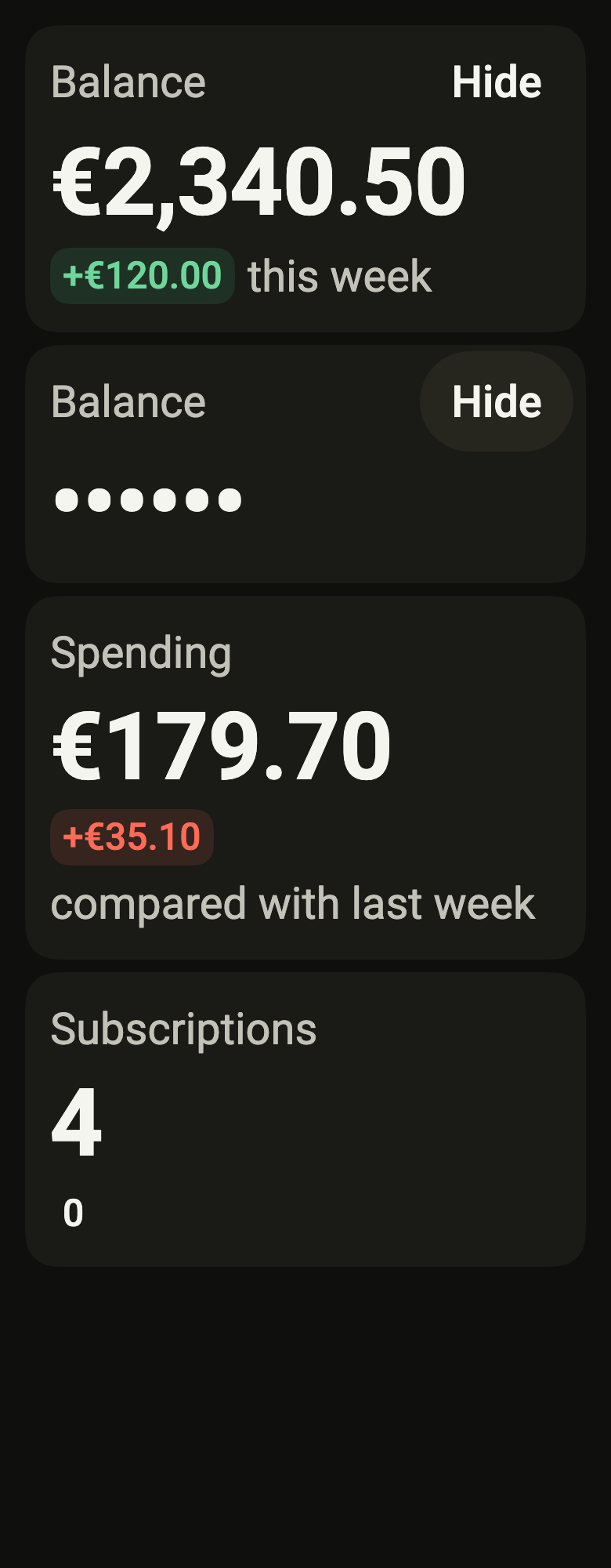
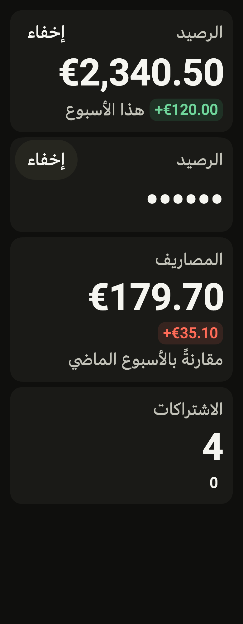
The code the reference images render:
final example = ColoredBox(
  color: FlScope.of(context).colors.surface,
  child: SingleChildScrollView(
    padding: EdgeInsetsDirectional.all(FlScope.of(context).space.lg),
    child: Column(
      crossAxisAlignment: CrossAxisAlignment.stretch,
      spacing: FlScope.of(context).space.sm,
      children: [
        FlStatCard(
          label: 'Balance',
          value: '€2,340.50',
          change: FlStatChange(label: '+€120.00', tone: FlStatTone.positive),
          caption: 'this week',
          action: FlButton(
            label: 'Hide',
            size: FlButtonSize.sm,
            variant: FlButtonVariant.ghost,
            selected: false,
            onPressed: () {},
          ),
        ),
        FlStatCard(
          label: 'Balance',
          value: '••••••',
          valueSemanticLabel: 'Balance hidden',
          action: FlButton(
            label: 'Hide',
            size: FlButtonSize.sm,
            variant: FlButtonVariant.secondary,
            selected: true,
            onPressed: () {},
          ),
        ),
        FlStatCard(
          label: 'Spending',
          value: '€179.70',
          change: FlStatChange(label: '+€35.10', tone: FlStatTone.negative),
          caption: 'compared with last week',
        ),
        FlStatCard(
          label: 'Subscriptions',
          value: '4',
          change: FlStatChange(label: '0'),
        ),
      ],
    ),
  ),
);API
FlStatTone: enum {positive, negative, neutral}
FlStatTone.positive: static final FlStatTone
FlStatTone.negative: static final FlStatTone
FlStatTone.neutral: static final FlStatTone
FlStatCardSize: enum {md, sm}
FlStatCardSize.md: static final FlStatCardSize
FlStatCardSize.sm: static final FlStatCardSize
FlStatChange: final class
FlStatChange.new: const new({required String label, FlStatTone tone, String? semanticLabel})
FlStatChange.label: get String
FlStatChange.tone: get FlStatTone
FlStatChange.semanticLabel: get String?
FlStatCard: class extends StatelessWidget
FlStatCard.new: const new({super.key, required String label, required String value, String? valueSemanticLabel, FlStatChange? change, String? caption, Widget? action, Widget? icon, Widget? footer, FlStatCardSize size})
FlStatCard.label: get String
FlStatCard.value: get String
FlStatCard.valueSemanticLabel: get String?
FlStatCard.change: get FlStatChange?
FlStatCard.caption: get String?
FlStatCard.action: get Widget?
FlStatCard.icon: get Widget?
FlStatCard.footer: get Widget?
FlStatCard.size: get FlStatCardSize
FlStatCard.build: Widget(BuildContext context)Reference renders
The 16 images published with version 0.2.4, rendered by the shared harness on macOS with Flutter 3.47.7. fliin verify stat-card compares your copy to them.
Use it to
- show an account balance in large type with its change
- show a key figure going up or down with a signed pill
- hide a sensitive amount behind dots
- present this period's spending against the last one
- show several headline figures at the top of a dashboard
- Not for
- progress toward a goal: use a progress indicator (progress)
- change over time: use a chart (chart)
- States