Components / foundation
Core
Gives every component its tokens, light and dark themes, density, platform typography, reduced motion and an accessible pressable surface. No Material, no Cupertino.
Import
In a Flutter app where fliin init has run:
Examples
Colors
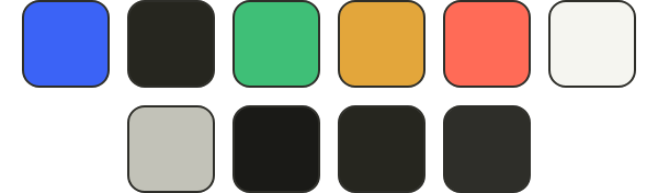
The theme’s color roles, read from FlScope.of(context).colors: build your own widgets from them and they follow every theme.
import 'package:your_app/ui/fliin/core/fliin.dart';
import 'package:flutter/widgets.dart';

class CoreColorsExample extends StatelessWidget {
  const CoreColorsExample({super.key});

  @override
  Widget build(BuildContext context) {
    final scope = FlScope.of(context);
    final colors = scope.colors;
    return Wrap(
      alignment: WrapAlignment.center,
      spacing: scope.space.sm,
      runSpacing: scope.space.sm,
      children: [
        for (final color in [
          colors.accent,
          colors.accentSoft,
          colors.success,
          colors.warning,
          colors.danger,
          colors.onSurface,
          colors.onSurfaceMuted,
          colors.control,
          colors.surfaceSecondary,
          colors.border,
        ])
          SizedBox.square(
            dimension: 40,
            child: DecoratedBox(
              decoration: ShapeDecoration(
                color: color,
                shape: RoundedRectangleBorder(
                  side: BorderSide(color: colors.border),
                  borderRadius: BorderRadius.all(Radius.circular(scope.shape.radiusMd)),
                ),
              ),
            ),
          ),
      ],
    );
  }
}Type
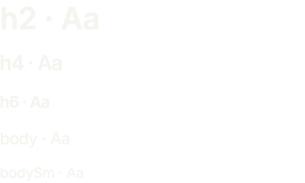
Steps of the type scale the core defines; FlText reads them, and so can your own text.
import 'package:your_app/ui/fliin/components/text/fl_text.dart';
import 'package:your_app/ui/fliin/core/fliin.dart';
import 'package:flutter/widgets.dart';

class CoreTypeExample extends StatelessWidget {
  const CoreTypeExample({super.key});

  @override
  Widget build(BuildContext context) {
    return Column(
      mainAxisSize: MainAxisSize.min,
      crossAxisAlignment: CrossAxisAlignment.start,
      spacing: FlScope.of(context).space.md,
      children: [
        for (final type in const [FlTextType.h2, FlTextType.h4, FlTextType.h6, FlTextType.body, FlTextType.bodySm])
          FlText('${type.name} · Aa', type: type),
      ],
    );
  }
}Usage
The code the reference images render:
ColoredBox(color: FlScope.of(context).colors.surface, child: Center(child: FlPressable(onPressed: () {}, label: 'Press', borderRadius: FlScope.of(context).shape.buttonRadius, builder: (context, states) => Padding(padding: EdgeInsetsDirectional.all(FlScope.of(context).space.md), child: Text'Press', style: TextStyle(color: FlScope.of(context).colors.onSurface))))))API
FlColorRole: enum {surface, surfaceRaised, surfaceOverlay, surfacePressed, surfaceSecondary, surfaceTertiary, onSurface, onSurfaceMuted, border, borderSecondary, borderTertiary, separator, separatorSecondary, separatorTertiary, accent, accentPressed, onAccent, accentSoft, accentSoftPressed, onAccentSoft, control, controlPressed, onControl, disabled, onDisabled, focusRing, switchThumb, switchTrack, danger, dangerFill, dangerPressed, onDanger, dangerSoft, dangerSoftPressed, onDangerSoft, dangerFaint, success, onSuccess, successPressed, successSoft, onSuccessSoft, warning, onWarning, onStatusAction, warningPressed, warningSoft, onWarningSoft, field, onField, fieldPlaceholder, fieldBorder, segment, onSegment, pressHighlight, skeleton, skeletonShimmer, selection, scrim, selected, onSelected, link}
FlColorRole.surface: static final FlColorRole
FlColorRole.surfaceRaised: static final FlColorRole
FlColorRole.surfaceOverlay: static final FlColorRole
FlColorRole.surfacePressed: static final FlColorRole
FlColorRole.surfaceSecondary: static final FlColorRole
FlColorRole.surfaceTertiary: static final FlColorRole
FlColorRole.onSurface: static final FlColorRole
FlColorRole.onSurfaceMuted: static final FlColorRole
FlColorRole.border: static final FlColorRole
FlColorRole.borderSecondary: static final FlColorRole
FlColorRole.borderTertiary: static final FlColorRole
FlColorRole.separator: static final FlColorRole
FlColorRole.separatorSecondary: static final FlColorRole
FlColorRole.separatorTertiary: static final FlColorRole
FlColorRole.accent: static final FlColorRole
FlColorRole.accentPressed: static final FlColorRole
FlColorRole.onAccent: static final FlColorRole
FlColorRole.accentSoft: static final FlColorRole
FlColorRole.accentSoftPressed: static final FlColorRole
FlColorRole.onAccentSoft: static final FlColorRole
FlColorRole.control: static final FlColorRole
FlColorRole.controlPressed: static final FlColorRole
FlColorRole.onControl: static final FlColorRole
FlColorRole.disabled: static final FlColorRole
FlColorRole.onDisabled: static final FlColorRole
FlColorRole.focusRing: static final FlColorRole
FlColorRole.switchThumb: static final FlColorRole
FlColorRole.switchTrack: static final FlColorRole
FlColorRole.danger: static final FlColorRole
FlColorRole.dangerFill: static final FlColorRole
FlColorRole.dangerPressed: static final FlColorRole
FlColorRole.onDanger: static final FlColorRole
FlColorRole.dangerSoft: static final FlColorRole
FlColorRole.dangerSoftPressed: static final FlColorRole
FlColorRole.onDangerSoft: static final FlColorRole
FlColorRole.dangerFaint: static final FlColorRole
FlColorRole.success: static final FlColorRole
FlColorRole.onSuccess: static final FlColorRole
FlColorRole.successPressed: static final FlColorRole
FlColorRole.successSoft: static final FlColorRole
FlColorRole.onSuccessSoft: static final FlColorRole
FlColorRole.warning: static final FlColorRole
FlColorRole.onWarning: static final FlColorRole
FlColorRole.onStatusAction: static final FlColorRole
FlColorRole.warningPressed: static final FlColorRole
FlColorRole.warningSoft: static final FlColorRole
FlColorRole.onWarningSoft: static final FlColorRole
FlColorRole.field: static final FlColorRole
FlColorRole.onField: static final FlColorRole
FlColorRole.fieldPlaceholder: static final FlColorRole
FlColorRole.fieldBorder: static final FlColorRole
FlColorRole.segment: static final FlColorRole
FlColorRole.onSegment: static final FlColorRole
FlColorRole.pressHighlight: static final FlColorRole
FlColorRole.skeleton: static final FlColorRole
FlColorRole.skeletonShimmer: static final FlColorRole
FlColorRole.selection: static final FlColorRole
FlColorRole.scrim: static final FlColorRole
FlColorRole.selected: static final FlColorRole
FlColorRole.onSelected: static final FlColorRole
FlColorRole.link: static final FlColorRole
FlContrastKind: enum {text, ui}
FlContrastKind.text: static final FlContrastKind
FlContrastKind.ui: static final FlContrastKind
FlContrastPair: typedef = ({FlColorRole foreground, FlColorRole background, List<FlColorRole> over, FlContrastKind kind})
FlContrastException: typedef = ({FlContrastPair pair, Brightness brightness, double ratio, String reason})
FlColorTokens: final class
FlColorTokens.new: const new({required Color surface, required Color surfaceRaised, required Color surfaceOverlay, required Color surfacePressed, required Color surfaceSecondary, required Color surfaceTertiary, required Color onSurface, required Color onSurfaceMuted, required Color border, required Color borderSecondary, required Color borderTertiary, required Color separator, required Color separatorSecondary, required Color separatorTertiary, required Color accent, required Color accentPressed, required Color onAccent, required Color accentSoft, required Color accentSoftPressed, required Color onAccentSoft, required Color control, required Color controlPressed, required Color onControl, required Color disabled, required Color onDisabled, required Color focusRing, required Color switchThumb, required Color switchTrack, required Color danger, required Color dangerFill, required Color dangerPressed, required Color onDanger, required Color dangerSoft, required Color dangerSoftPressed, required Color onDangerSoft, required Color dangerFaint, required Color success, required Color onSuccess, required Color successPressed, required Color successSoft, required Color onSuccessSoft, required Color warning, required Color onWarning, required Color onStatusAction, required Color warningPressed, required Color warningSoft, required Color onWarningSoft, required Color field, required Color onField, required Color fieldPlaceholder, required Color fieldBorder, required Color segment, required Color onSegment, required Color pressHighlight, required Color skeleton, required Color skeletonShimmer, required Color selection, required Color scrim, required Color selected, required Color onSelected, required Color link})
FlColorTokens.surface: get Color
FlColorTokens.surfaceRaised: get Color
FlColorTokens.surfaceOverlay: get Color
FlColorTokens.surfacePressed: get Color
FlColorTokens.surfaceSecondary: get Color
FlColorTokens.surfaceTertiary: get Color
FlColorTokens.onSurface: get Color
FlColorTokens.onSurfaceMuted: get Color
FlColorTokens.border: get Color
FlColorTokens.borderSecondary: get Color
FlColorTokens.borderTertiary: get Color
FlColorTokens.separator: get Color
FlColorTokens.separatorSecondary: get Color
FlColorTokens.separatorTertiary: get Color
FlColorTokens.accent: get Color
FlColorTokens.accentPressed: get Color
FlColorTokens.onAccent: get Color
FlColorTokens.accentSoft: get Color
FlColorTokens.accentSoftPressed: get Color
FlColorTokens.onAccentSoft: get Color
FlColorTokens.control: get Color
FlColorTokens.controlPressed: get Color
FlColorTokens.onControl: get Color
FlColorTokens.disabled: get Color
FlColorTokens.onDisabled: get Color
FlColorTokens.focusRing: get Color
FlColorTokens.switchThumb: get Color
FlColorTokens.switchTrack: get Color
FlColorTokens.danger: get Color
FlColorTokens.dangerFill: get Color
FlColorTokens.dangerPressed: get Color
FlColorTokens.onDanger: get Color
FlColorTokens.dangerSoft: get Color
FlColorTokens.dangerSoftPressed: get Color
FlColorTokens.onDangerSoft: get Color
FlColorTokens.dangerFaint: get Color
FlColorTokens.success: get Color
FlColorTokens.onSuccess: get Color
FlColorTokens.successPressed: get Color
FlColorTokens.successSoft: get Color
FlColorTokens.onSuccessSoft: get Color
FlColorTokens.warning: get Color
FlColorTokens.onWarning: get Color
FlColorTokens.onStatusAction: get Color
FlColorTokens.warningPressed: get Color
FlColorTokens.warningSoft: get Color
FlColorTokens.onWarningSoft: get Color
FlColorTokens.field: get Color
FlColorTokens.onField: get Color
FlColorTokens.fieldPlaceholder: get Color
FlColorTokens.fieldBorder: get Color
FlColorTokens.segment: get Color
FlColorTokens.onSegment: get Color
FlColorTokens.pressHighlight: get Color
FlColorTokens.skeleton: get Color
FlColorTokens.skeletonShimmer: get Color
FlColorTokens.selection: get Color
FlColorTokens.scrim: get Color
FlColorTokens.selected: get Color
FlColorTokens.onSelected: get Color
FlColorTokens.link: get Color
FlColorTokens.operator []: Color(FlColorRole role)
FlColorTokens.contrastPairs: static const List<FlContrastPair>
FlButtonShape: enum {square, rounded, pill}
FlButtonShape.square: static final FlButtonShape
FlButtonShape.rounded: static final FlButtonShape
FlButtonShape.pill: static final FlButtonShape
FlShapeTokens: final class
FlShapeTokens.new: const new({required double radiusControl, required double radiusCard, required double radiusSheet, required double radiusButton, required double radiusButtonLarge, required double radiusXs, required double radiusSm, required double radiusMd, required double radiusLg, required double radiusXl, required double radiusXxl, required FlButtonShape button})
FlShapeTokens.radiusControl: get double
FlShapeTokens.radiusCard: get double
FlShapeTokens.radiusSheet: get double
FlShapeTokens.radiusButton: get double
FlShapeTokens.radiusButtonLarge: get double
FlShapeTokens.radiusXs: get double
FlShapeTokens.radiusSm: get double
FlShapeTokens.radiusMd: get double
FlShapeTokens.radiusLg: get double
FlShapeTokens.radiusXl: get double
FlShapeTokens.radiusXxl: get double
FlShapeTokens.button: get FlButtonShape
FlShapeTokens.buttonRadius: get BorderRadius
FlShadowLayer: final class
FlShadowLayer.new: const new({required Color color, required Offset offset, required double blur, required double spread, required bool inset})
FlShadowLayer.color: get Color
FlShadowLayer.offset: get Offset
FlShadowLayer.blur: get double
FlShadowLayer.spread: get double
FlShadowLayer.inset: get bool
FlShadows: final class
FlShadows.new: const new({required List<FlShadowLayer> surface, required List<FlShadowLayer> overlay, required List<FlShadowLayer> field, required List<FlShadowLayer> glow, required List<FlShadowLayer> dangerGlow, required List<FlShadowLayer> thumb})
FlShadows.surface: get List<FlShadowLayer>
FlShadows.overlay: get List<FlShadowLayer>
FlShadows.field: get List<FlShadowLayer>
FlShadows.glow: get List<FlShadowLayer>
FlShadows.dangerGlow: get List<FlShadowLayer>
FlShadows.thumb: get List<FlShadowLayer>
FlShadowTokens: final class
FlShadowTokens.new: const new({required FlShadows light, required FlShadows dark})
FlShadowTokens.light: get FlShadows
FlShadowTokens.dark: get FlShadows
FlSpaceTokens: final class
FlSpaceTokens.new: const new({required double xs, required double sm, required double md, required double lg, required double xl, required double xxl})
FlSpaceTokens.xs: get double
FlSpaceTokens.sm: get double
FlSpaceTokens.md: get double
FlSpaceTokens.lg: get double
FlSpaceTokens.xl: get double
FlSpaceTokens.xxl: get double
FlSizeTokens: final class
FlSizeTokens.new: const new({required double controlCompact, required double controlComfortable, required double controlSpacious, required double listPaddingCompact, required double listPaddingComfortable, required double listPaddingSpacious, required double hitTargetIos, required double hitTargetAndroid, required double hitTargetDesktop, required double border, required double focusRing, required double focusRingGap, required double indicatorStroke, required double iconMaxScale, required double switchWidth, required double switchHeight, required double switchThumbWidth, required double switchThumbHeight, required double switchThumbInset, required double toggle, required double radioDot, required double controlPressedScale, required double indicatorIcon, required double indicatorBox, required double snugLineHeight, required double otpSlotWidth, required double otpSlotHeight, required double cursorWidth, required double selectionHandleAndroid, required double selectionKnobIos, required double scrimOpacity, required double menuMinWidth, required double menuMaxWidth, required double tooltipMaxWidth, required double dialogMaxWidth, required double buttonPaddingSm, required double buttonPaddingMd, required double buttonPaddingLg, required double buttonGapSm, required double buttonGapMd, required double buttonGapLg, required double buttonIconSm, required double buttonIconMd, required double buttonIconLg, required double pressScaleReference, required double disabledOpacity, required double hoverBrightness, required double pressedOverlayOpacity, required double rippleDiagonal, required double pressHighlightOpacity, required double separatorThick, required double spinnerSm, required double spinnerMd, required double spinnerLg, required double closeButton, required double closeIcon, required double fieldInset, required double codePaddingX, required double codePaddingY, required double surfacePadding, required double surfaceBorder, required double popoverTravel, required double popoverOffset, required double selectOffset, required double tooltipOffset, required double overlayInset})
FlSizeTokens.controlCompact: get double
FlSizeTokens.controlComfortable: get double
FlSizeTokens.controlSpacious: get double
FlSizeTokens.listPaddingCompact: get double
FlSizeTokens.listPaddingComfortable: get double
FlSizeTokens.listPaddingSpacious: get double
FlSizeTokens.hitTargetIos: get double
FlSizeTokens.hitTargetAndroid: get double
FlSizeTokens.hitTargetDesktop: get double
FlSizeTokens.border: get double
FlSizeTokens.focusRing: get double
FlSizeTokens.focusRingGap: get double
FlSizeTokens.indicatorStroke: get double
FlSizeTokens.iconMaxScale: get double
FlSizeTokens.switchWidth: get double
FlSizeTokens.switchHeight: get double
FlSizeTokens.switchThumbWidth: get double
FlSizeTokens.switchThumbHeight: get double
FlSizeTokens.switchThumbInset: get double
FlSizeTokens.toggle: get double
FlSizeTokens.radioDot: get double
FlSizeTokens.controlPressedScale: get double
FlSizeTokens.indicatorIcon: get double
FlSizeTokens.indicatorBox: get double
FlSizeTokens.snugLineHeight: get double
FlSizeTokens.otpSlotWidth: get double
FlSizeTokens.otpSlotHeight: get double
FlSizeTokens.cursorWidth: get double
FlSizeTokens.selectionHandleAndroid: get double
FlSizeTokens.selectionKnobIos: get double
FlSizeTokens.scrimOpacity: get double
FlSizeTokens.menuMinWidth: get double
FlSizeTokens.menuMaxWidth: get double
FlSizeTokens.tooltipMaxWidth: get double
FlSizeTokens.dialogMaxWidth: get double
FlSizeTokens.buttonPaddingSm: get double
FlSizeTokens.buttonPaddingMd: get double
FlSizeTokens.buttonPaddingLg: get double
FlSizeTokens.buttonGapSm: get double
FlSizeTokens.buttonGapMd: get double
FlSizeTokens.buttonGapLg: get double
FlSizeTokens.buttonIconSm: get double
FlSizeTokens.buttonIconMd: get double
FlSizeTokens.buttonIconLg: get double
FlSizeTokens.pressScaleReference: get double
FlSizeTokens.disabledOpacity: get double
FlSizeTokens.hoverBrightness: get double
FlSizeTokens.pressedOverlayOpacity: get double
FlSizeTokens.rippleDiagonal: get double
FlSizeTokens.pressHighlightOpacity: get double
FlSizeTokens.separatorThick: get double
FlSizeTokens.spinnerSm: get double
FlSizeTokens.spinnerMd: get double
FlSizeTokens.spinnerLg: get double
FlSizeTokens.closeButton: get double
FlSizeTokens.closeIcon: get double
FlSizeTokens.fieldInset: get double
FlSizeTokens.codePaddingX: get double
FlSizeTokens.codePaddingY: get double
FlSizeTokens.surfacePadding: get double
FlSizeTokens.surfaceBorder: get double
FlSizeTokens.popoverTravel: get double
FlSizeTokens.popoverOffset: get double
FlSizeTokens.selectOffset: get double
FlSizeTokens.tooltipOffset: get double
FlSizeTokens.overlayInset: get double
FlMotionTokens: final class
FlMotionTokens.new: const new({required SpringDescription press, required SpringDescription spatial, required SpringDescription spatialSlow, required SpringDescription release, required SpringDescription effects, required SpringDescription effectsFast, required SpringDescription gentle, required SpringDescription indicator, required SpringDescription layout, required SpringDescription segment, required SpringDescription thumb, required SpringDescription expand, required SpringDescription stack, required SpringDescription toastEnter, required SpringDescription sliderThumb, required SpringDescription pop, required SpringDescription roll, required SpringDescription shake, required Curve standard, required Curve easeOut, required Curve easeInOutQuad, required Curve easeIn, required Curve easeInOut, required Curve ease, required Curve accelerate, required Curve otpEnter, required Curve otpExit, required Curve decelerate, required Curve easeInOutCubic, required Duration short2, required Duration short3, required Duration short4, required Duration medium2, required Duration indicatorTurn, required Duration progressSweep, required Duration short1, required Duration toggle, required Duration medium1, required Duration long2, required Duration rippleMin, required Duration ripple, required Duration pulse, required Duration shimmer, required double pressedScale})
FlMotionTokens.press: get SpringDescription
FlMotionTokens.spatial: get SpringDescription
FlMotionTokens.spatialSlow: get SpringDescription
FlMotionTokens.release: get SpringDescription
FlMotionTokens.effects: get SpringDescription
FlMotionTokens.effectsFast: get SpringDescription
FlMotionTokens.gentle: get SpringDescription
FlMotionTokens.indicator: get SpringDescription
FlMotionTokens.layout: get SpringDescription
FlMotionTokens.segment: get SpringDescription
FlMotionTokens.thumb: get SpringDescription
FlMotionTokens.expand: get SpringDescription
FlMotionTokens.stack: get SpringDescription
FlMotionTokens.toastEnter: get SpringDescription
FlMotionTokens.sliderThumb: get SpringDescription
FlMotionTokens.pop: get SpringDescription
FlMotionTokens.roll: get SpringDescription
FlMotionTokens.shake: get SpringDescription
FlMotionTokens.standard: get Curve
FlMotionTokens.easeOut: get Curve
FlMotionTokens.easeInOutQuad: get Curve
FlMotionTokens.easeIn: get Curve
FlMotionTokens.easeInOut: get Curve
FlMotionTokens.ease: get Curve
FlMotionTokens.accelerate: get Curve
FlMotionTokens.otpEnter: get Curve
FlMotionTokens.otpExit: get Curve
FlMotionTokens.decelerate: get Curve
FlMotionTokens.easeInOutCubic: get Curve
FlMotionTokens.short2: get Duration
FlMotionTokens.short3: get Duration
FlMotionTokens.short4: get Duration
FlMotionTokens.medium2: get Duration
FlMotionTokens.indicatorTurn: get Duration
FlMotionTokens.progressSweep: get Duration
FlMotionTokens.short1: get Duration
FlMotionTokens.toggle: get Duration
FlMotionTokens.medium1: get Duration
FlMotionTokens.long2: get Duration
FlMotionTokens.rippleMin: get Duration
FlMotionTokens.ripple: get Duration
FlMotionTokens.pulse: get Duration
FlMotionTokens.shimmer: get Duration
FlMotionTokens.pressedScale: get double
FlTypeStyle: final class
FlTypeStyle.new: const new({required double size, required double lineHeight, required FontWeight weight, required double tracking})
FlTypeStyle.size: get double
FlTypeStyle.lineHeight: get double
FlTypeStyle.weight: get FontWeight
FlTypeStyle.tracking: get double
FlTypeScale: final class
FlTypeScale.new: const new({required FlTypeStyle display, required FlTypeStyle title1, required FlTypeStyle title2, required FlTypeStyle title3, required FlTypeStyle headline, required FlTypeStyle body, required FlTypeStyle callout, required FlTypeStyle label, required FlTypeStyle footnote, required FlTypeStyle caption, required FlTypeStyle controlSm, required FlTypeStyle controlMd, required FlTypeStyle controlLg, required FlTypeStyle heading1, required FlTypeStyle heading2, required FlTypeStyle heading3, required FlTypeStyle heading4, required FlTypeStyle heading5, required FlTypeStyle heading6, required FlTypeStyle paragraph, required FlTypeStyle paragraphSm, required FlTypeStyle paragraphXs, required FlTypeStyle code, required FlTypeStyle textXs, required FlTypeStyle textSm, required FlTypeStyle textBase, required FlTypeStyle textLg, required String? fontFamily, required String monospaceFamily, String? headingFamily})
FlTypeScale.display: get FlTypeStyle
FlTypeScale.title1: get FlTypeStyle
FlTypeScale.title2: get FlTypeStyle
FlTypeScale.title3: get FlTypeStyle
FlTypeScale.headline: get FlTypeStyle
FlTypeScale.body: get FlTypeStyle
FlTypeScale.callout: get FlTypeStyle
FlTypeScale.label: get FlTypeStyle
FlTypeScale.footnote: get FlTypeStyle
FlTypeScale.caption: get FlTypeStyle
FlTypeScale.controlSm: get FlTypeStyle
FlTypeScale.controlMd: get FlTypeStyle
FlTypeScale.controlLg: get FlTypeStyle
FlTypeScale.heading1: get FlTypeStyle
FlTypeScale.heading2: get FlTypeStyle
FlTypeScale.heading3: get FlTypeStyle
FlTypeScale.heading4: get FlTypeStyle
FlTypeScale.heading5: get FlTypeStyle
FlTypeScale.heading6: get FlTypeStyle
FlTypeScale.paragraph: get FlTypeStyle
FlTypeScale.paragraphSm: get FlTypeStyle
FlTypeScale.paragraphXs: get FlTypeStyle
FlTypeScale.code: get FlTypeStyle
FlTypeScale.textXs: get FlTypeStyle
FlTypeScale.textSm: get FlTypeStyle
FlTypeScale.textBase: get FlTypeStyle
FlTypeScale.textLg: get FlTypeStyle
FlTypeScale.fontFamily: get String?
FlTypeScale.monospaceFamily: get String
FlTypeScale.headingFamily: get String?
FlFontWeights: final class
FlFontWeights.new: const new({required FontWeight normal, required FontWeight medium, required FontWeight semibold, required FontWeight bold})
FlFontWeights.normal: get FontWeight
FlFontWeights.medium: get FontWeight
FlFontWeights.semibold: get FontWeight
FlFontWeights.bold: get FontWeight
FlTypography: final class
FlTypography.new: const new({required FlTypeScale ios, required FlTypeScale android, required FlFontWeights weight})
FlTypography.ios: get FlTypeScale
FlTypography.android: get FlTypeScale
FlTypography.weight: get FlFontWeights
FlTokens: final class
FlTokens.new: const new({required FlColorTokens light, required FlColorTokens dark, required FlShapeTokens shape, required FlShadowTokens shadow, required FlSpaceTokens space, required FlSizeTokens size, required FlMotionTokens motion, required FlTypography typography, List<FlContrastException> contrastExceptions})
FlTokens.light: get FlColorTokens
FlTokens.dark: get FlColorTokens
FlTokens.shape: get FlShapeTokens
FlTokens.shadow: get FlShadowTokens
FlTokens.space: get FlSpaceTokens
FlTokens.size: get FlSizeTokens
FlTokens.motion: get FlMotionTokens
FlTokens.typography: get FlTypography
FlTokens.contrastExceptions: get List<FlContrastException>
FlTokens.defaults: static get FlTokens
FlDensity: enum {compact, comfortable, spacious}
FlDensity.compact: static final FlDensity
FlDensity.comfortable: static final FlDensity
FlDensity.spacious: static final FlDensity
FlDensity.defaultFor: static FlDensity(TargetPlatform platform)
FlDensityMetrics: typedef = ({double controlHeight, double listPadding})
FlSizeDensity: extension on FlSizeTokens
FlSizeDensity.metricsFor: FlDensityMetrics(FlDensity density)
FlTheme: final class
FlTheme.new: const new({required FlTokens tokens, required Brightness brightness, required TargetPlatform platform, required FlDensity density, required bool reduceMotion})
FlTheme.tokens: get FlTokens
FlTheme.brightness: get Brightness
FlTheme.platform: get TargetPlatform
FlTheme.density: get FlDensity
FlTheme.reduceMotion: get bool
FlTheme.colors: get FlColorTokens
FlTheme.typography: get FlTypeScale
FlTheme.shadows: get FlShadows
FlTheme.shape: get FlShapeTokens
FlTheme.space: get FlSpaceTokens
FlTheme.size: get FlSizeTokens
FlTheme.motion: get FlMotionTokens
FlTheme.controlHeight: get double
FlTheme.listPadding: get double
FlTheme.hitTarget: get double
FlTheme.operator ==: bool(Object other)
FlTheme.hashCode: get int
FlScope: class extends StatefulWidget
FlScope.new: const new({super.key, FlTokens? tokens, Brightness? brightness, TargetPlatform? platform, FlDensity? density, required Widget child})
FlScope.tokens: get FlTokens?
FlScope.brightness: get Brightness?
FlScope.platform: get TargetPlatform?
FlScope.density: get FlDensity?
FlScope.child: get Widget
FlScope.of: static FlTheme(BuildContext context)
FlScope.createState: State<FlScope>()
FlTextRole: enum {display, title1, title2, title3, headline, body, callout, label, footnote, caption, controlSm, controlMd, controlLg, heading1, heading2, heading3, heading4, heading5, heading6, paragraph, paragraphSm, paragraphXs, code, textXs, textSm, textBase, textLg}
FlTextRole.display: static final FlTextRole
FlTextRole.title1: static final FlTextRole
FlTextRole.title2: static final FlTextRole
FlTextRole.title3: static final FlTextRole
FlTextRole.headline: static final FlTextRole
FlTextRole.body: static final FlTextRole
FlTextRole.callout: static final FlTextRole
FlTextRole.label: static final FlTextRole
FlTextRole.footnote: static final FlTextRole
FlTextRole.caption: static final FlTextRole
FlTextRole.controlSm: static final FlTextRole
FlTextRole.controlMd: static final FlTextRole
FlTextRole.controlLg: static final FlTextRole
FlTextRole.heading1: static final FlTextRole
FlTextRole.heading2: static final FlTextRole
FlTextRole.heading3: static final FlTextRole
FlTextRole.heading4: static final FlTextRole
FlTextRole.heading5: static final FlTextRole
FlTextRole.heading6: static final FlTextRole
FlTextRole.paragraph: static final FlTextRole
FlTextRole.paragraphSm: static final FlTextRole
FlTextRole.paragraphXs: static final FlTextRole
FlTextRole.code: static final FlTextRole
FlTextRole.textXs: static final FlTextRole
FlTextRole.textSm: static final FlTextRole
FlTextRole.textBase: static final FlTextRole
FlTextRole.textLg: static final FlTextRole
FlTextRole.isHeading: get bool
FlTypeScaleResolve: extension on FlTypeScale
FlTypeScaleResolve.resolve: TextStyle(FlTextRole role, {bool? heading})
FlTypeScaleResolve.familyOf: String?(FlTextRole role, {bool? heading})
FlTypeScaleResolve.strut: StrutStyle(FlTextRole role, {String? inheritedFamily, bool? heading})
FlTypeScaleResolve.style: FlTypeStyle(FlTextRole role)
FlSpring: enum {press, spatial, spatialSlow, release, effects, effectsFast}
FlSpring.press: static final FlSpring
FlSpring.spatial: static final FlSpring
FlSpring.spatialSlow: static final FlSpring
FlSpring.release: static final FlSpring
FlSpring.effects: static final FlSpring
FlSpring.effectsFast: static final FlSpring
FlMotionSpec: sealed class permits {FlFadeMotion, FlSpringMotion}
FlMotionSpec.new: const new()
FlSpringMotion: final class extends FlMotionSpec
FlSpringMotion.new: const new(SpringDescription description)
FlSpringMotion.description: get SpringDescription
FlFadeMotion: final class extends FlMotionSpec
FlFadeMotion.new: const new(Duration duration)
FlFadeMotion.duration: get Duration
FlMotion: final class
FlMotion.new: const new({required FlMotionTokens tokens, required bool reduced})
FlMotion.tokens: get FlMotionTokens
FlMotion.reduced: get bool
FlMotion.of: static FlMotion(BuildContext context)
FlMotion.spring: FlMotionSpec(FlSpring spring)
FlMotionDrive: extension on AnimationController
FlMotionDrive.driveTo: Future<bool>(double target, FlMotionSpec spec, {double? velocity})
FlPop: class extends StatefulWidget
FlPop.new: const new({super.key, bool shown, bool appear, double from, Duration delay, bool replay, required Widget child})
FlPop.shown: get bool
FlPop.appear: get bool
FlPop.from: get double
FlPop.delay: get Duration
FlPop.replay: get bool
FlPop.child: get Widget
FlPop.createState: State<FlPop>()
FlRollingText: class extends StatefulWidget
FlRollingText.new: const new(String data, {super.key, required TextStyle style, StrutStyle? strutStyle, TextAlign? textAlign, int? maxLines, bool? softWrap})
FlRollingText.data: get String
FlRollingText.style: get TextStyle
FlRollingText.strutStyle: get StrutStyle?
FlRollingText.textAlign: get TextAlign?
FlRollingText.maxLines: get int?
FlRollingText.softWrap: get bool?
FlRollingText.createState: State<FlRollingText>()
FlShake: class extends StatefulWidget
FlShake.new: const new({super.key, required bool active, required Widget child})
FlShake.active: get bool
FlShake.child: get Widget
FlShake.createState: State<FlShake>()
FlPixelSnap: class extends SingleChildRenderObjectWidget
FlPixelSnap.new: const new({super.key, required Widget child})
FlPixelSnap.createRenderObject: RenderObject(BuildContext context)
FlPixelSnap.updateRenderObject: void(BuildContext context, RenderObject renderObject)
FlContinuousBorder: class extends OutlinedBorder
FlContinuousBorder.new: const new({super.side, double radius})
FlContinuousBorder.radius: get double
FlContinuousBorder.dimensions: get EdgeInsetsGeometry
FlContinuousBorder.pathFor: static Path(Rect rect, double radius)
FlContinuousBorder.getOuterPath: Path(Rect rect, {TextDirection? textDirection})
FlContinuousBorder.getInnerPath: Path(Rect rect, {TextDirection? textDirection})
FlContinuousBorder.paint: void(Canvas canvas, Rect rect, {TextDirection? textDirection})
FlContinuousBorder.copyWith: FlContinuousBorder({BorderSide? side, double? radius})
FlContinuousBorder.scale: ShapeBorder(double t)
FlContinuousBorder.operator ==: bool(Object other)
FlContinuousBorder.hashCode: get int
FlShadow: class extends StatelessWidget
FlShadow.new: const new({super.key, required List<FlShadowLayer> layers, required ShapeBorder shape, required Widget child})
FlShadow.layers: get List<FlShadowLayer>
FlShadow.shape: get ShapeBorder
FlShadow.child: get Widget
FlShadow.build: Widget(BuildContext context)
FlCloseIcon: class extends StatelessWidget
FlCloseIcon.new: const new({super.key, required double size, required Color color})
FlCloseIcon.size: get double
FlCloseIcon.color: get Color
FlCloseIcon.build: Widget(BuildContext context)
FlIconStroke: final class
FlIconStroke.new: const new({required double width, StrokeCap cap, StrokeJoin join})
FlIconStroke.width: get double
FlIconStroke.cap: get StrokeCap
FlIconStroke.join: get StrokeJoin
FlIconData: final class
FlIconData.new: new(Path path, {double viewBox, bool mirrorInRtl, FlIconStroke? stroke})
FlIconData.path: get Path
FlIconData.viewBox: get double
FlIconData.mirrorInRtl: get bool
FlIconData.stroke: get FlIconStroke?
FlIcon: class extends StatelessWidget
FlIcon.new: const new(FlIconData icon, {super.key, double? size, Color? color, String? semanticLabel})
FlIcon.icon: get FlIconData
FlIcon.size: get double?
FlIcon.color: get Color?
FlIcon.semanticLabel: get String?
FlIcon.build: Widget(BuildContext context)
FlFieldScope: class extends InheritedWidget
FlFieldScope.new: const new({super.key, bool invalid, bool disabled, bool required, bool inset, required super.child})
FlFieldScope.invalid: get bool
FlFieldScope.disabled: get bool
FlFieldScope.required: get bool
FlFieldScope.inset: get bool
FlFieldScope.maybeOf: static FlFieldScope?(BuildContext context)
FlFieldScope.updateShouldNotify: bool(FlFieldScope oldWidget)
FlPressOverlay: enum {highlight, ripple, none}
FlPressOverlay.highlight: static final FlPressOverlay
FlPressOverlay.ripple: static final FlPressOverlay
FlPressOverlay.none: static final FlPressOverlay
FlPressable: class extends StatefulWidget
FlPressable.new: const new({super.key, required VoidCallback? onPressed, required BorderRadiusGeometry borderRadius, required Widget Function(BuildContext context, Set<WidgetState> states) builder, String? label, bool autofocus, bool scaleOnPress, FlPressOverlay overlay, FlFocusRingPlacement focusRing, SemanticsRole? role, bool? expanded, bool? selected, WidgetStatesController? statesController})
FlPressable.onPressed: get VoidCallback?
FlPressable.borderRadius: get BorderRadiusGeometry
FlPressable.builder: get Widget Function(BuildContext context, Set<WidgetState> states)
FlPressable.label: get String?
FlPressable.autofocus: get bool
FlPressable.scaleOnPress: get bool
FlPressable.overlay: get FlPressOverlay
FlPressable.focusRing: get FlFocusRingPlacement
FlPressable.role: get SemanticsRole?
FlPressable.expanded: get bool?
FlPressable.selected: get bool?
FlPressable.statesController: get WidgetStatesController?
FlPressable.createState: State<FlPressable>()
FlPressHighlight: class extends StatelessWidget
FlPressHighlight.new: const new({super.key, required Color color})
FlPressHighlight.color: get Color
FlPressHighlight.build: Widget(BuildContext context)
FlFocusRingPlacement: enum {outside, inside}
FlFocusRingPlacement.outside: static final FlFocusRingPlacement
FlFocusRingPlacement.inside: static final FlFocusRingPlacement
FlFocusRing: class extends StatelessWidget
FlFocusRing.new: const new({super.key, required bool visible, required BorderRadiusGeometry borderRadius, required Widget child, FlFocusRingPlacement placement, double? gap})
FlFocusRing.visible: get bool
FlFocusRing.borderRadius: get BorderRadiusGeometry
FlFocusRing.child: get Widget
FlFocusRing.placement: get FlFocusRingPlacement
FlFocusRing.gap: get double?
FlFocusRing.build: Widget(BuildContext context)
FlHitTarget: class extends SingleChildRenderObjectWidget
FlHitTarget.new: const new({super.key, required Widget child})
FlHitTarget.createRenderObject: RenderObject(BuildContext context)
FlHitTarget.updateRenderObject: void(BuildContext context, RenderObject renderObject)
FlHitTargetHost: class extends SingleChildRenderObjectWidget
FlHitTargetHost.new: const new({super.key, required Widget child})
FlHitTargetHost.createRenderObject: RenderObject(BuildContext context)
FlSide: enum {top, bottom, start, end}
FlSide.top: static final FlSide
FlSide.bottom: static final FlSide
FlSide.start: static final FlSide
FlSide.end: static final FlSide
FlAlign: enum {start, center, end}
FlAlign.start: static final FlAlign
FlAlign.center: static final FlAlign
FlAlign.end: static final FlAlign
FlAnchorFit: typedef = ({Offset offset, FlSide side})
extension _Edge.vertical: get bool
extension _Edge.opposite: get _Edge
extension _Edge.side: FlSide(TextDirection direction)
extension _Edge.room: double(Rect anchor, Rect bounds, double gap)
extension _Edge.place: double(Rect anchor, Size child, double gap)
flAnchor: FlAnchorFit({required Rect anchor, required Size child, required Rect bounds, required FlSide side, required FlAlign align, required TextDirection direction, required double gap})
flAnchorBounds: Rect({required Size overlay, required EdgeInsets padding, required EdgeInsets viewInsets, required double margin})
FlAnchoredLayout: class extends StatelessWidget
FlAnchoredLayout.new: const new({super.key, required Rect anchor, FlSide side, FlAlign align, double travel, double? gap, double? margin, required Widget child})
FlAnchoredLayout.anchor: get Rect
FlAnchoredLayout.side: get FlSide
FlAnchoredLayout.align: get FlAlign
FlAnchoredLayout.travel: get double
FlAnchoredLayout.gap: get double?
FlAnchoredLayout.margin: get double?
FlAnchoredLayout.child: get Widget
FlAnchoredLayout.build: Widget(BuildContext context)
FlPopupBackdrop: enum {opaque, transparent}
FlPopupBackdrop.opaque: static final FlPopupBackdrop
FlPopupBackdrop.transparent: static final FlPopupBackdrop
FlPopupEntrance: enum {dialog, popover, sheet}
FlPopupEntrance.dialog: static final FlPopupEntrance
FlPopupEntrance.popover: static final FlPopupEntrance
FlPopupEntrance.sheet: static final FlPopupEntrance
flOverlayOutline: Color(FlTheme theme)
flPopupController: AnimationController({required TickerProvider vsync, required FlMotionTokens motion})
FlPopupOverlay: class extends StatelessWidget
FlPopupOverlay.new: const new({super.key, required Animation<double> animation, FlPopupBackdrop backdrop, VoidCallback? onDismiss, String? dismissLabel})
FlPopupOverlay.animation: get Animation<double>
FlPopupOverlay.backdrop: get FlPopupBackdrop
FlPopupOverlay.onDismiss: get VoidCallback?
FlPopupOverlay.dismissLabel: get String?
FlPopupOverlay.build: Widget(BuildContext context)
FlPopupContent: class extends StatelessWidget
FlPopupContent.new: const new({super.key, required Animation<double> animation, required FlPopupEntrance entrance, FlSide side, double? offset, required Widget child})
FlPopupContent.animation: get Animation<double>
FlPopupContent.entrance: get FlPopupEntrance
FlPopupContent.side: get FlSide
FlPopupContent.offset: get double?
FlPopupContent.child: get Widget
FlPopupContent.build: Widget(BuildContext context)
FlTapGroup: class extends StatelessWidget
FlTapGroup.new: const new({super.key, required Object id, required Widget child})
FlTapGroup.id: get Object
FlTapGroup.child: get Widget
FlTapGroup.build: Widget(BuildContext context)
FlTextSelectionControls: class extends TextSelectionControls with TextSelectionHandleControls
FlTextSelectionControls.new: new(FlTheme theme)
FlTextSelectionControls.overhang: get ({double above, double below})
FlTextSelectionControls.getHandleSize: Size(double textLineHeight)
FlTextSelectionControls.getHandleAnchor: Offset(TextSelectionHandleType type, double textLineHeight)
FlTextSelectionControls.buildHandle: Widget(BuildContext context, TextSelectionHandleType type, double textLineHeight, [VoidCallback? onTap])
FlTextSelectionControls.operator ==: bool(Object other)
FlTextSelectionControls.hashCode: get int
flTextContextMenuBuilder: EditableTextContextMenuBuilder(BuildContext field, {Rect? Function()? frame})
FlTextSelectionToolbar: class extends StatelessWidget
FlTextSelectionToolbar.new: const new({super.key, required TextSelectionToolbarAnchors anchors, required List<ContextMenuButtonItem> items, ({double above, double below}) clearance})
FlTextSelectionToolbar.anchors: get TextSelectionToolbarAnchors
FlTextSelectionToolbar.items: get List<ContextMenuButtonItem>
FlTextSelectionToolbar.clearance: get ({double above, double below})
FlTextSelectionToolbar.build: Widget(BuildContext context)Reference renders
The 16 images published with version 0.2.5, rendered by the shared harness on macOS with Flutter 3.47.7. fliin verify core compares your copy to them.

Use it to
- share design tokens across components
- use light and dark themes
- use platform typography
- respect reduced motion
- ensure tap targets and keyboard focus
- choose compact, comfortable or spacious density
Source
The files fliin add core copies into your app, before your prefix and imports are applied.
LICENSE
Fliin (https://fliin.dev)

The files in this folder were copied by fliin. The free ones are licensed
under the MIT License below. A file whose first line reads "// Part of Fliin
Pro." is licensed under the Fliin Pro License instead:
https://fliin.dev/pro/license

Some files are modified from third-party work. The header of each one names
its origin, its copyright and its license. The third-party notices and the
full texts of their licenses follow the MIT License of Fliin.

===============================================================================
Fliin
===============================================================================

MIT License

Copyright (c) 2026 Simon Lascaud

Permission is hereby granted, free of charge, to any person obtaining a copy
of this software and associated documentation files (the "Software"), to deal
in the Software without restriction, including without limitation the rights
to use, copy, modify, merge, publish, distribute, sublicense, and/or sell
copies of the Software, and to permit persons to whom the Software is
furnished to do so, subject to the following conditions:

The above copyright notice and this permission notice shall be included in all
copies or substantial portions of the Software.

THE SOFTWARE IS PROVIDED "AS IS", WITHOUT WARRANTY OF ANY KIND, EXPRESS OR
IMPLIED, INCLUDING BUT NOT LIMITED TO THE WARRANTIES OF MERCHANTABILITY,
FITNESS FOR A PARTICULAR PURPOSE AND NONINFRINGEMENT. IN NO EVENT SHALL THE
AUTHORS OR COPYRIGHT HOLDERS BE LIABLE FOR ANY CLAIM, DAMAGES OR OTHER
LIABILITY, WHETHER IN AN ACTION OF CONTRACT, TORT OR OTHERWISE, ARISING FROM,
OUT OF OR IN CONNECTION WITH THE SOFTWARE OR THE USE OR OTHER DEALINGS IN THE
SOFTWARE.

===============================================================================
Third-party notices
===============================================================================

HeroUI Native
Copyright 2025 NextUI Inc.
Licensed under the Apache License 2.0 (full text below).
https://github.com/heroui-inc/heroui-native, version 1.0.10.
The structure of many components, part of their sizes, and the
fliin.tokens.json and tokens.g.dart files derive from it. Each modified file
says so in its header.

HeroUI React v3
Copyright 2025 NextUI Inc.
Licensed under the Apache License 2.0 (full text below).
https://github.com/heroui-inc/heroui, branch v3.
The files ported while its package.json declared the MIT license also carry
that license in their header: Copyright (c) 2020 Next UI Inc., full text
below.

Gravity UI Icons
Copyright (c) 2022 YANDEX LLC
Licensed under the MIT License (full text below).
https://github.com/gravity-ui/icons, version 2.23.0.
The paths of icons/fl_icons.dart.

When a preset picks another icon set (Lucide, Tabler or Phosphor), its
icons/fl_icons.dart carries its copyright and the full text of its license in
its header. Fliin copies no font: the app adds the fonts it names.

===============================================================================
MIT License of HeroUI
===============================================================================

MIT License

Copyright (c) 2020 Next UI Inc.

Permission is hereby granted, free of charge, to any person obtaining a copy
of this software and associated documentation files (the "Software"), to deal
in the Software without restriction, including without limitation the rights
to use, copy, modify, merge, publish, distribute, sublicense, and/or sell
copies of the Software, and to permit persons to whom the Software is
furnished to do so, subject to the following conditions:

The above copyright notice and this permission notice shall be included in all
copies or substantial portions of the Software.

THE SOFTWARE IS PROVIDED "AS IS", WITHOUT WARRANTY OF ANY KIND, EXPRESS OR
IMPLIED, INCLUDING BUT NOT LIMITED TO THE WARRANTIES OF MERCHANTABILITY,
FITNESS FOR A PARTICULAR PURPOSE AND NONINFRINGEMENT. IN NO EVENT SHALL THE
AUTHORS OR COPYRIGHT HOLDERS BE LIABLE FOR ANY CLAIM, DAMAGES OR OTHER
LIABILITY, WHETHER IN AN ACTION OF CONTRACT, TORT OR OTHERWISE, ARISING FROM,
OUT OF OR IN CONNECTION WITH THE SOFTWARE OR THE USE OR OTHER DEALINGS IN THE
SOFTWARE.

===============================================================================
MIT License of Gravity UI Icons
===============================================================================

The MIT License (MIT)

Copyright (c) 2022 YANDEX LLC

Permission is hereby granted, free of charge, to any person obtaining a copy
of this software and associated documentation files (the "Software"), to deal
in the Software without restriction, including without limitation the rights
to use, copy, modify, merge, publish, distribute, sublicense, and/or sell
copies of the Software, and to permit persons to whom the Software is
furnished to do so, subject to the following conditions:

The above copyright notice and this permission notice shall be included in
all copies or substantial portions of the Software.

THE SOFTWARE IS PROVIDED "AS IS", WITHOUT WARRANTY OF ANY KIND, EXPRESS OR
IMPLIED, INCLUDING BUT NOT LIMITED TO THE WARRANTIES OF MERCHANTABILITY,
FITNESS FOR A PARTICULAR PURPOSE AND NONINFRINGEMENT. IN NO EVENT SHALL THE
AUTHORS OR COPYRIGHT HOLDERS BE LIABLE FOR ANY CLAIM, DAMAGES OR OTHER
LIABILITY, WHETHER IN AN ACTION OF CONTRACT, TORT OR OTHERWISE, ARISING FROM,
OUT OF OR IN CONNECTION WITH THE SOFTWARE OR THE USE OR OTHER DEALINGS IN
THE SOFTWARE.

===============================================================================
Apache License 2.0
===============================================================================

                                 Apache License
                           Version 2.0, January 2004
                        http://www.apache.org/licenses/

   TERMS AND CONDITIONS FOR USE, REPRODUCTION, AND DISTRIBUTION

   1. Definitions.

      "License" shall mean the terms and conditions for use, reproduction,
      and distribution as defined by Sections 1 through 9 of this document.

      "Licensor" shall mean the copyright owner or entity authorized by
      the copyright owner that is granting the License.

      "Legal Entity" shall mean the union of the acting entity and all
      other entities that control, are controlled by, or are under common
      control with that entity. For the purposes of this definition,
      "control" means (i) the power, direct or indirect, to cause the
      direction or management of such entity, whether by contract or
      otherwise, or (ii) ownership of fifty percent (50%) or more of the
      outstanding shares, or (iii) beneficial ownership of such entity.

      "You" (or "Your") shall mean an individual or Legal Entity
      exercising permissions granted by this License.

      "Source" form shall mean the preferred form for making modifications,
      including but not limited to software source code, documentation
      source, and configuration files.

      "Object" form shall mean any form resulting from mechanical
      transformation or translation of a Source form, including but
      not limited to compiled object code, generated documentation,
      and conversions to other media types.

      "Work" shall mean the work of authorship, whether in Source or
      Object form, made available under the License, as indicated by a
      copyright notice that is included in or attached to the work
      (an example is provided in the Appendix below).

      "Derivative Works" shall mean any work, whether in Source or Object
      form, that is based on (or derived from) the Work and for which the
      editorial revisions, annotations, elaborations, or other modifications
      represent, as a whole, an original work of authorship. For the purposes
      of this License, Derivative Works shall not include works that remain
      separable from, or merely link (or bind by name) to the interfaces of,
      the Work and Derivative Works thereof.

      "Contribution" shall mean any work of authorship, including
      the original version of the Work and any modifications or additions
      to that Work or Derivative Works thereof, that is intentionally
      submitted to the Licensor for inclusion in the Work by the copyright owner
      or by an individual or Legal Entity authorized to submit on behalf of
      the copyright owner. For the purposes of this definition, "submitted"
      means any form of electronic, verbal, or written communication sent
      to the Licensor or its representatives, including but not limited to
      communication on electronic mailing lists, source code control systems,
      and issue tracking systems that are managed by, or on behalf of, the
      Licensor for the purpose of discussing and improving the Work, but
      excluding communication that is conspicuously marked or otherwise
      designated in writing by the copyright owner as "Not a Contribution."

      "Contributor" shall mean Licensor and any individual or Legal Entity
      on behalf of whom a Contribution has been received by the Licensor and
      subsequently incorporated within the Work.

   2. Grant of Copyright License. Subject to the terms and conditions of
      this License, each Contributor hereby grants to You a perpetual,
      worldwide, non-exclusive, no-charge, royalty-free, irrevocable
      copyright license to reproduce, prepare Derivative Works of,
      publicly display, publicly perform, sublicense, and distribute the
      Work and such Derivative Works in Source or Object form.

   3. Grant of Patent License. Subject to the terms and conditions of
      this License, each Contributor hereby grants to You a perpetual,
      worldwide, non-exclusive, no-charge, royalty-free, irrevocable
      (except as stated in this section) patent license to make, have made,
      use, offer to sell, sell, import, and otherwise transfer the Work,
      where such license applies only to those patent claims licensable
      by such Contributor that are necessarily infringed by their
      Contribution(s) alone or by combination of their Contribution(s)
      with the Work to which such Contribution(s) was submitted. If You
      institute patent litigation against any entity (including a
      cross-claim or counterclaim in a lawsuit) alleging that the Work
      or a Contribution incorporated within the Work constitutes direct
      or contributory patent infringement, then any patent licenses
      granted to You under this License for that Work shall terminate
      as of the date such litigation is filed.

   4. Redistribution. You may reproduce and distribute copies of the
      Work or Derivative Works thereof in any medium, with or without
      modifications, and in Source or Object form, provided that You
      meet the following conditions:

      (a) You must give any other recipients of the Work or
          Derivative Works a copy of this License; and

      (b) You must cause any modified files to carry prominent notices
          stating that You changed the files; and

      (c) You must retain, in the Source form of any Derivative Works
          that You distribute, all copyright, patent, trademark, and
          attribution notices from the Source form of the Work,
          excluding those notices that do not pertain to any part of
          the Derivative Works; and

      (d) If the Work includes a "NOTICE" text file as part of its
          distribution, then any Derivative Works that You distribute must
          include a readable copy of the attribution notices contained
          within such NOTICE file, excluding any notices that do not
          pertain to any part of the Derivative Works, in at least one
          of the following places: within a NOTICE text file distributed
          as part of the Derivative Works; within the Source form or
          documentation, if provided along with the Derivative Works; or,
          within a display generated by the Derivative Works, if and
          wherever such third-party notices normally appear. The contents
          of the NOTICE file are for informational purposes only and
          do not modify the License. You may add Your own attribution
          notices within Derivative Works that You distribute, alongside
          or as an addendum to the NOTICE text from the Work, provided
          that such additional attribution notices cannot be construed
          as modifying the License.

      You may add Your own copyright statement to Your modifications and
      may provide additional or different license terms and conditions
      for use, reproduction, or distribution of Your modifications, or
      for any such Derivative Works as a whole, provided Your use,
      reproduction, and distribution of the Work otherwise complies with
      the conditions stated in this License.

   5. Submission of Contributions. Unless You explicitly state otherwise,
      any Contribution intentionally submitted for inclusion in the Work
      by You to the Licensor shall be under the terms and conditions of
      this License, without any additional terms or conditions.
      Notwithstanding the above, nothing herein shall supersede or modify
      the terms of any separate license agreement you may have executed
      with Licensor regarding such Contributions.

   6. Trademarks. This License does not grant permission to use the trade
      names, trademarks, service marks, or product names of the Licensor,
      except as required for reasonable and customary use in describing the
      origin of the Work and reproducing the content of the NOTICE file.

   7. Disclaimer of Warranty. Unless required by applicable law or
      agreed to in writing, Licensor provides the Work (and each
      Contributor provides its Contributions) on an "AS IS" BASIS,
      WITHOUT WARRANTIES OR CONDITIONS OF ANY KIND, either express or
      implied, including, without limitation, any warranties or conditions
      of TITLE, NON-INFRINGEMENT, MERCHANTABILITY, or FITNESS FOR A
      PARTICULAR PURPOSE. You are solely responsible for determining the
      appropriateness of using or redistributing the Work and assume any
      risks associated with Your exercise of permissions under this License.

   8. Limitation of Liability. In no event and under no legal theory,
      whether in tort (including negligence), contract, or otherwise,
      unless required by applicable law (such as deliberate and grossly
      negligent acts) or agreed to in writing, shall any Contributor be
      liable to You for damages, including any direct, indirect, special,
      incidental, or consequential damages of any character arising as a
      result of this License or out of the use or inability to use the
      Work (including but not limited to damages for loss of goodwill,
      work stoppage, computer failure or malfunction, or any and all
      other commercial damages or losses), even if such Contributor
      has been advised of the possibility of such damages.

   9. Accepting Warranty or Additional Liability. While redistributing
      the Work or Derivative Works thereof, You may choose to offer,
      and charge a fee for, acceptance of support, warranty, indemnity,
      or other liability obligations and/or rights consistent with this
      License. However, in accepting such obligations, You may act only
      on Your own behalf and on Your sole responsibility, not on behalf
      of any other Contributor, and only if You agree to indemnify,
      defend, and hold each Contributor harmless for any liability
      incurred by, or claims asserted against, such Contributor by reason
      of your accepting any such warranty or additional liability.

   END OF TERMS AND CONDITIONS

   APPENDIX: How to apply the Apache License to your work.

      To apply the Apache License to your work, attach the following
      boilerplate notice, with the fields enclosed by brackets "[]"
      replaced with your own identifying information. (Don't include
      the brackets!)  The text should be enclosed in the appropriate
      comment syntax for the file format. Please also get an approval
      from the project maintainers before using the Apache License.

   Copyright 2025 NextUI Inc.

   Licensed under the Apache License, Version 2.0 (the "License");
   you may not use this file except in compliance with the License.
   You may obtain a copy of the License at

       http://www.apache.org/licenses/LICENSE-2.0

   Unless required by applicable law or agreed to in writing, software
   distributed under the License is distributed on an "AS IS" BASIS,
   WITHOUT WARRANTIES OR CONDITIONS OF ANY KIND, either express or implied.
   See the License for the specific language governing permissions and
   limitations under the License.
fliin.dart
export 'package:fliin_ui/core/form/fl_field_scope.dart';
export 'package:fliin_ui/core/icon/fl_close_icon.dart';
export 'package:fliin_ui/core/icon/fl_icon.dart';
export 'package:fliin_ui/core/interaction/fl_focus_ring.dart';
export 'package:fliin_ui/core/interaction/fl_hit_target.dart';
export 'package:fliin_ui/core/interaction/fl_pressable.dart';
export 'package:fliin_ui/core/layout/fl_pixel_snap.dart';
export 'package:fliin_ui/core/motion/fl_motion_scope.dart';
export 'package:fliin_ui/core/motion/fl_pop.dart';
export 'package:fliin_ui/core/motion/fl_rolling_text.dart';
export 'package:fliin_ui/core/motion/fl_shake.dart';
export 'package:fliin_ui/core/overlay/fl_anchor.dart';
export 'package:fliin_ui/core/overlay/fl_popup.dart';
export 'package:fliin_ui/core/overlay/fl_tap_group.dart';
export 'package:fliin_ui/core/shape/fl_continuous_border.dart';
export 'package:fliin_ui/core/shape/fl_shadow.dart';
export 'package:fliin_ui/core/text/fl_selection_controls.dart';
export 'package:fliin_ui/core/text/fl_text_context_menu.dart';
export 'package:fliin_ui/core/theme/fl_density.dart';
export 'package:fliin_ui/core/theme/fl_scope.dart';
export 'package:fliin_ui/core/theme/fl_typography.dart';
export 'package:fliin_ui/core/tokens/tokens.g.dart';
tokens/fliin.tokens.json
{
"$schema": "https://www.designtokens.org/schemas/2025.10/format.json",
"$description": "Fliin tokens. Source of tokens.g.dart (fliin tokens). What has no DTCG type lives in $extensions dev.fliin.*.",
"color": {
"$type": "color",
"$description": "Colors of the Izydesk design system (handoff du 2026-10-31), blue accent. The shipped theme passes AA without exception; `fliin theme` adapts it to a brand.",
"$extensions": {
"dev.fliin.contrast": [
{
"foreground": "onSurface",
"background": "surface",
"kind": "text"
},
{
"foreground": "onSurface",
"background": "surfaceRaised",
"kind": "text"
},
{
"foreground": "onSurface",
"background": "surfaceOverlay",
"kind": "text"
},
{
"foreground": "onSurface",
"background": "surfacePressed",
"kind": "text"
},
{
"foreground": "onSurfaceMuted",
"background": "surface",
"kind": "text"
},
{
"foreground": "onSurfaceMuted",
"background": "surfaceRaised",
"kind": "text"
},
{
"foreground": "onSurfaceMuted",
"background": "surfaceOverlay",
"kind": "text"
},
{
"foreground": "onAccent",
"background": "accent",
"kind": "text"
},
{
"foreground": "onAccent",
"background": "accentPressed",
"kind": "text"
},
{
"foreground": "accent",
"background": "surface",
"kind": "ui"
},
{
"foreground": "accent",
"background": "surfaceRaised",
"kind": "ui"
},
{
"foreground": "onDisabled",
"background": "disabled",
"kind": "text"
},
{
"foreground": "onDisabled",
"background": "surface",
"kind": "text"
},
{
"foreground": "focusRing",
"background": "surface",
"kind": "ui"
},
{
"foreground": "focusRing",
"background": "surfaceRaised",
"kind": "ui"
},
{
"foreground": "danger",
"background": "surface",
"kind": "text"
},
{
"foreground": "onSurface",
"background": "selection",
"kind": "text"
},
{
"foreground": "onSurfaceMuted",
"background": "surfacePressed",
"kind": "text"
},
{
"foreground": "focusRing",
"background": "surfaceOverlay",
"kind": "ui"
},
{
"foreground": "accent",
"background": "surfaceOverlay",
"kind": "ui"
},
{
"foreground": "onDisabled",
"background": "surfaceOverlay",
"kind": "text"
},
{
"foreground": "danger",
"background": "surfaceOverlay",
"kind": "text"
},
{
"foreground": "danger",
"background": "surfacePressed",
"kind": "text"
},
{
"foreground": "onControl",
"background": "control",
"kind": "text"
},
{
"foreground": "onAccentSoft",
"background": "control",
"kind": "text"
},
{
"foreground": "onAccentSoft",
"background": "surface",
"kind": "text"
},
{
"foreground": "onAccentSoft",
"background": "surfaceRaised",
"kind": "text"
},
{
"foreground": "onAccentSoft",
"background": "surfaceOverlay",
"kind": "text"
},
{
"foreground": "onAccentSoft",
"background": "surfacePressed",
"kind": "text"
},
{
"foreground": "onDanger",
"background": "dangerFill",
"kind": "text"
},
{
"foreground": "onDanger",
"background": "dangerPressed",
"kind": "text"
},
{
"foreground": "onControl",
"background": "controlPressed",
"kind": "text"
},
{
"foreground": "onAccentSoft",
"background": "controlPressed",
"kind": "text"
},
{
"foreground": "onDangerSoft",
"background": "dangerSoft",
"over": [
"surface"
],
"kind": "text"
},
{
"foreground": "onDangerSoft",
"background": "dangerSoft",
"over": [
"surfaceRaised"
],
"kind": "text"
},
{
"foreground": "onDangerSoft",
"background": "dangerSoftPressed",
"over": [
"dangerSoft",
"surface"
],
"kind": "text"
},
{
"foreground": "accent",
"background": "surfacePressed",
"kind": "ui"
},
{
"foreground": "onSurface",
"background": "surfaceSecondary",
"kind": "text"
},
{
"foreground": "onSurface",
"background": "surfaceTertiary",
"kind": "text"
},
{
"foreground": "onSurfaceMuted",
"background": "surfaceSecondary",
"kind": "text"
},
{
"foreground": "onSurfaceMuted",
"background": "surfaceTertiary",
"kind": "text"
},
{
"foreground": "danger",
"background": "surfaceRaised",
"kind": "text"
},
{
"foreground": "onField",
"background": "field",
"kind": "text"
},
{
"foreground": "fieldPlaceholder",
"background": "field",
"kind": "text"
},
{
"foreground": "onSegment",
"background": "segment",
"kind": "text"
},
{
"foreground": "onSuccess",
"background": "success",
"kind": "text"
},
{
"foreground": "onWarning",
"background": "warning",
"kind": "text"
},
{
"foreground": "onAccentSoft",
"background": "accentSoft",
"over": [
"surface"
],
"kind": "text"
},
{
"foreground": "onAccentSoft",
"background": "accentSoft",
"over": [
"surfaceRaised"
],
"kind": "text"
},
{
"foreground": "onSuccessSoft",
"background": "successSoft",
"over": [
"surface"
],
"kind": "text"
},
{
"foreground": "onSuccessSoft",
"background": "successSoft",
"over": [
"surfaceRaised"
],
"kind": "text"
},
{
"foreground": "onWarningSoft",
"background": "warningSoft",
"over": [
"surface"
],
"kind": "text"
},
{
"foreground": "onWarningSoft",
"background": "warningSoft",
"over": [
"surfaceRaised"
],
"kind": "text"
},
{
"foreground": "onStatusAction",
"background": "success",
"kind": "text"
},
{
"foreground": "onStatusAction",
"background": "warning",
"kind": "text"
},
{
"foreground": "onSuccessSoft",
"background": "control",
"kind": "text"
},
{
"foreground": "onWarningSoft",
"background": "control",
"kind": "text"
},
{
"foreground": "onDangerSoft",
"background": "control",
"kind": "text"
},
{
"foreground": "onSuccessSoft",
"background": "surface",
"kind": "text"
},
{
"foreground": "onWarningSoft",
"background": "surface",
"kind": "text"
},
{
"foreground": "onDangerSoft",
"background": "surface",
"kind": "text"
},
{
"foreground": "onSuccessSoft",
"background": "surfaceRaised",
"kind": "text"
},
{
"foreground": "onWarningSoft",
"background": "surfaceRaised",
"kind": "text"
},
{
"foreground": "onDangerSoft",
"background": "surfaceRaised",
"kind": "text"
},
{
"foreground": "onSelected",
"background": "selected",
"kind": "text"
},
{
"foreground": "selected",
"background": "surface",
"kind": "ui"
},
{
"foreground": "selected",
"background": "surfaceRaised",
"kind": "ui"
},
{
"foreground": "selected",
"background": "surfaceOverlay",
"kind": "ui"
},
{
"foreground": "fieldBorder",
"background": "surface",
"kind": "ui"
},
{
"foreground": "fieldBorder",
"background": "surfaceRaised",
"kind": "ui"
},
{
"foreground": "borderSecondary",
"background": "surface",
"kind": "ui"
},
{
"foreground": "borderSecondary",
"background": "surfaceRaised",
"kind": "ui"
},
{
"foreground": "fieldBorder",
"background": "surfaceOverlay",
"kind": "ui"
},
{
"foreground": "link",
"background": "surface",
"kind": "text"
},
{
"foreground": "link",
"background": "surfaceRaised",
"kind": "text"
},
{
"foreground": "link",
"background": "surfaceOverlay",
"kind": "text"
}
],
"dev.fliin.contrastExceptions": []
},
"neutral": {
"0": {
"$value": {
"colorSpace": "srgb",
"components": [
1.0,
1.0,
1.0
],
"hex": "#FFFFFF"
}
},
"31": {
"$value": {
"colorSpace": "srgb",
"components": [
0.9608,
0.9608,
0.9412
],
"hex": "#F5F5F0"
}
},
"36": {
"$value": {
"colorSpace": "srgb",
"components": [
0.9569,
0.9529,
0.9373
],
"hex": "#F4F3EF"
}
},
"70": {
"$value": {
"colorSpace": "srgb",
"components": [
0.9137,
0.9098,
0.8863
],
"hex": "#E9E8E2"
}
},
"88": {
"$value": {
"colorSpace": "srgb",
"components": [
0.8902,
0.8863,
0.8627
],
"hex": "#E3E2DC"
}
},
"189": {
"$value": {
"colorSpace": "srgb",
"components": [
0.7608,
0.7608,
0.7216
],
"hex": "#C2C2B8"
}
},
"317": {
"$value": {
"colorSpace": "srgb",
"components": [
0.6039,
0.6039,
0.5608
],
"hex": "#9A9A8F"
}
},
"365": {
"$value": {
"colorSpace": "srgb",
"components": [
0.549,
0.5451,
0.5098
],
"hex": "#8C8B82"
}
},
"475": {
"$value": {
"colorSpace": "srgb",
"components": [
0.4196,
0.4196,
0.3882
],
"hex": "#6B6B63"
}
},
"593": {
"$value": {
"colorSpace": "srgb",
"components": [
0.2902,
0.2902,
0.2667
],
"hex": "#4A4A44"
}
},
"701": {
"$value": {
"colorSpace": "srgb",
"components": [
0.1804,
0.1804,
0.1608
],
"hex": "#2E2E29"
}
},
"734": {
"$value": {
"colorSpace": "srgb",
"components": [
0.149,
0.149,
0.1216
],
"hex": "#26261F"
}
},
"783": {
"$value": {
"colorSpace": "srgb",
"components": [
0.102,
0.102,
0.0902
],
"hex": "#1A1A17"
}
},
"832": {
"$value": {
"colorSpace": "srgb",
"components": [
0.0588,
0.0588,
0.051
],
"hex": "#0F0F0D"
}
}
},
"accent": {
"100": {
"$value": {
"colorSpace": "srgb",
"components": [
0.4784,
0.6549,
1.0
],
"hex": "#7AA7FF"
}
},
"200": {
"$value": {
"colorSpace": "srgb",
"components": [
0.1137,
0.3059,
0.8471
],
"hex": "#1D4ED8"
}
},
"300": {
"$value": {
"colorSpace": "srgb",
"components": [
0.2314,
0.3882,
0.9647
],
"hex": "#3B63F6"
}
},
"500": {
"$value": {
"colorSpace": "srgb",
"components": [
0.1451,
0.3882,
0.9216
],
"hex": "#2563EB"
}
},
"600": {
"$value": {
"colorSpace": "srgb",
"components": [
0.1137,
0.3059,
0.8471
],
"hex": "#1D4ED8"
}
}
},
"light": {
"surface": {
"$value": "{color.neutral.0}",
"$description": "Screen background, Izydesk `page`."
},
"surfaceRaised": {
"$value": "{color.neutral.36}",
"$description": "Card, list group, Izydesk `surface`."
},
"surfaceOverlay": {
"$value": "{color.neutral.0}",
"$description": "Popover, menu, dialog, sheet: `page` in light mode, `surface` in dark mode."
},
"surfacePressed": {
"$value": "{color.neutral.70}",
"$description": "A hovered or pressed surface, `surface-2`."
},
"surfaceSecondary": {
"$value": "{color.neutral.70}",
"$description": "Izydesk `surface-2`."
},
"surfaceTertiary": {
"$value": "{color.neutral.70}",
"$description": "Izydesk `surface-2`."
},
"onSurface": {
"$value": "{color.neutral.832}",
"$description": "Body text, titles and amounts, `fg`."
},
"onSurfaceMuted": {
"$value": "{color.neutral.593}",
"$description": "Subtitles and hints, `fg-2`."
},
"border": {
"$value": "{color.neutral.88}",
"$description": "Decorative rule, `line`."
},
"borderSecondary": {
"$value": "{color.neutral.365}",
"$description": "Edge of a control, `line-strong`."
},
"borderTertiary": {
"$value": "{color.neutral.365}",
"$description": "Edge of a control, `line-strong`."
},
"separator": {
"$value": "{color.neutral.88}",
"$description": "Separator, `line`."
},
"separatorSecondary": {
"$value": "{color.neutral.88}",
"$description": "Separator, `line`."
},
"separatorTertiary": {
"$value": "{color.neutral.88}",
"$description": "Separator, `line`."
},
"accent": {
"$value": "{color.accent.500}",
"$description": "The main action, focus and what is highlighted, nothing else. In dark mode, Izydesk `#3B76F6` becomes `#3B63F6`: white reaches 4.5:1 on it, even measured on rendered text."
},
"accentPressed": {
"$value": "{color.accent.600}",
"$description": "The pressed main button, Izydesk `focus` in light mode; in dark mode too, under white text."
},
"onAccent": {
"$value": "{color.neutral.0}",
"$description": "Text on the accent, `on-accent`."
},
"accentSoft": {
"$value": "{color.neutral.70}",
"$description": "Soft background of a highlighted element, `surface-2`."
},
"accentSoftPressed": {
"$value": "{color.neutral.88}",
"$description": "The pressed soft background, one step below `surface-2`."
},
"onAccentSoft": {
"$value": "{color.neutral.832}",
"$description": "Text on a soft background: the text black, no more blue."
},
"control": {
"$value": "{color.neutral.36}",
"$description": "Background of a control, `surface`."
},
"controlPressed": {
"$value": "{color.neutral.70}",
"$description": "Hovered or pressed control, `surface-2`."
},
"onControl": {
"$value": "{color.neutral.832}",
"$description": "Text of a control, `fg`."
},
"disabled": {
"$value": "{color.neutral.36}",
"$description": "Disabled background, `surface`."
},
"onDisabled": {
"$value": "{color.neutral.475}",
"$description": "Disabled text, `fg-3`."
},
"focusRing": {
"$value": "{color.accent.600}",
"$description": "Keyboard focus ring, Izydesk `focus`."
},
"switchThumb": {
"$value": "{color.neutral.0}",
"$description": "Switch thumb."
},
"switchTrack": {
"$value": "{color.neutral.70}",
"$description": "Track of a switch that is off, `surface-2`."
},
"danger": {
"$value": {
"colorSpace": "srgb",
"components": [
0.7608,
0.1961,
0.1216
],
"hex": "#C2321F"
},
"$description": "Error and destructive action, `danger`."
},
"dangerFill": {
"$value": {
"colorSpace": "srgb",
"components": [
0.7608,
0.1961,
0.1216
],
"hex": "#C2321F"
},
"$description": "Background of a destructive button, `danger`."
},
"dangerPressed": {
"$value": {
"colorSpace": "srgb",
"components": [
0.7608,
0.1961,
0.1216
],
"hex": "#C2321F"
},
"$description": "Pressed destructive button, `danger`."
},
"onDanger": {
"$value": "{color.neutral.0}",
"$description": "Text on danger, `on-danger`."
},
"dangerSoft": {
"$value": {
"colorSpace": "srgb",
"components": {
"$ref": "#/color/light/danger/$value/components"
},
"alpha": 0.12
},
"$description": "`danger` at 12%."
},
"dangerSoftPressed": {
"$value": {
"colorSpace": "srgb",
"components": {
"$ref": "#/color/light/danger/$value/components"
},
"alpha": 0.16
},
"$description": "`danger` at 16%."
},
"onDangerSoft": {
"$value": {
"colorSpace": "srgb",
"components": [
0.6471,
0.1569,
0.0902
],
"hex": "#A52817"
},
"$description": "Danger text on a soft background: `danger` in dark mode; in light mode, darkened to 4.5:1 on `dangerSoftPressed`."
},
"dangerFaint": {
"$value": {
"colorSpace": "srgb",
"components": {
"$ref": "#/color/light/danger/$value/components"
},
"alpha": 0.08
},
"$description": "`danger` at 8%."
},
"success": {
"$value": {
"colorSpace": "srgb",
"components": [
0.0902,
0.5804,
0.3059
],
"hex": "#17944E"
},
"$description": "Success, outside Izydesk: the canvas's muted hue."
},
"onSuccess": {
"$value": "{color.neutral.832}",
"$description": "Text on `success`: Izydesk black."
},
"successPressed": {
"$value": {
"colorSpace": "srgb",
"components": [
0.0902,
0.5804,
0.3059
],
"hex": "#17944E"
},
"$description": "Pressed `success`."
},
"successSoft": {
"$value": {
"colorSpace": "srgb",
"components": {
"$ref": "#/color/light/success/$value/components"
},
"alpha": 0.12
},
"$description": "`success` at 12 or 14%."
},
"onSuccessSoft": {
"$value": {
"colorSpace": "srgb",
"components": [
0.0745,
0.4588,
0.2431
],
"hex": "#13753E"
},
"$description": "Success text, the canvas hue."
},
"warning": {
"$value": {
"colorSpace": "srgb",
"components": [
0.7882,
0.5412,
0.1098
],
"hex": "#C98A1C"
},
"$description": "Warning, outside Izydesk: the canvas's muted hue."
},
"onWarning": {
"$value": "{color.neutral.832}",
"$description": "Text on `warning`: Izydesk black."
},
"onStatusAction": {
"$value": "{color.neutral.832}",
"$description": "The action of a success or warning toast, on its background: Izydesk black."
},
"warningPressed": {
"$value": {
"colorSpace": "srgb",
"components": [
0.7882,
0.5412,
0.1098
],
"hex": "#C98A1C"
},
"$description": "Pressed `warning`."
},
"warningSoft": {
"$value": {
"colorSpace": "srgb",
"components": {
"$ref": "#/color/light/warning/$value/components"
},
"alpha": 0.12
},
"$description": "`warning` at 12 or 14%."
},
"onWarningSoft": {
"$value": {
"colorSpace": "srgb",
"components": [
0.5412,
0.3647,
0.0627
],
"hex": "#8A5D10"
},
"$description": "Warning text, the canvas hue."
},
"field": {
"$value": "{color.neutral.0}",
"$description": "Background of a field: white and shadowed in light mode, `surface` in dark mode."
},
"onField": {
"$value": "{color.neutral.832}",
"$description": "Input text of a field, `fg`."
},
"fieldPlaceholder": {
"$value": "{color.neutral.475}",
"$description": "Placeholder of a field, `fg-3`."
},
"fieldBorder": {
"$value": "{color.neutral.365}",
"$description": "Outline of a field, `line-strong`."
},
"segment": {
"$value": "{color.neutral.0}",
"$description": "Thumb of the chosen segment: shadowed white on the `control` track."
},
"onSegment": {
"$value": "{color.neutral.832}",
"$description": "Text of the chosen segment, `fg`."
},
"pressHighlight": {
"$value": "{color.neutral.832}",
"$description": "Press overlay, applied at `size.pressHighlightOpacity`."
},
"skeleton": {
"$value": "{color.neutral.70}",
"$description": "Bone of a skeleton, `surface-2`."
},
"skeletonShimmer": {
"$value": {
"colorSpace": "srgb",
"components": {
"$ref": "#/color/neutral/0/$value/components"
},
"alpha": 0.75
},
"$description": "Shimmer that sweeps the skeleton."
},
"selection": {
"$value": "{color.neutral.70}",
"$description": "Selected text, `surface-2`."
},
"scrim": {
"$value": {
"colorSpace": "srgb",
"components": {
"$ref": "#/color/neutral/832/$value/components"
},
"alpha": 0.35
},
"$description": "Scrim under a dialog or a sheet, opacity included; `size.scrimOpacity` scales it."
},
"selected": {
"$value": "{color.accent.500}",
"$description": "Everything checked, active or chosen: the accent."
},
"onSelected": {
"$value": "{color.neutral.0}",
"$description": "Text and check on `selected`, `on-accent`."
},
"link": {
"$value": "{color.accent.600}",
"$description": "Text written in accent on a surface (back and bar actions, link): the focus ring steps, Izydesk `focus` in light mode (6.7:1 on `surface`), `#7AA7FF` in dark mode, where `#3B63F6` only has 3.93:1 on `page`."
}
},
"dark": {
"surface": {
"$value": "{color.neutral.832}"
},
"surfaceRaised": {
"$value": "{color.neutral.783}"
},
"surfaceOverlay": {
"$value": "{color.neutral.783}"
},
"surfacePressed": {
"$value": "{color.neutral.734}"
},
"surfaceSecondary": {
"$value": "{color.neutral.734}"
},
"surfaceTertiary": {
"$value": "{color.neutral.734}"
},
"onSurface": {
"$value": "{color.neutral.31}"
},
"onSurfaceMuted": {
"$value": "{color.neutral.189}"
},
"border": {
"$value": "{color.neutral.701}"
},
"borderSecondary": {
"$value": "{color.neutral.475}"
},
"borderTertiary": {
"$value": "{color.neutral.475}"
},
"separator": {
"$value": "{color.neutral.701}"
},
"separatorSecondary": {
"$value": "{color.neutral.701}"
},
"separatorTertiary": {
"$value": "{color.neutral.701}"
},
"accent": {
"$value": "{color.accent.300}"
},
"accentPressed": {
"$value": "{color.accent.200}"
},
"onAccent": {
"$value": "{color.neutral.0}"
},
"accentSoft": {
"$value": "{color.neutral.734}"
},
"accentSoftPressed": {
"$value": "{color.neutral.701}"
},
"onAccentSoft": {
"$value": "{color.neutral.31}"
},
"control": {
"$value": "{color.neutral.783}"
},
"controlPressed": {
"$value": "{color.neutral.734}"
},
"onControl": {
"$value": "{color.neutral.31}"
},
"disabled": {
"$value": "{color.neutral.783}"
},
"onDisabled": {
"$value": "{color.neutral.317}"
},
"focusRing": {
"$value": "{color.accent.100}"
},
"switchThumb": {
"$value": "{color.neutral.0}"
},
"switchTrack": {
"$value": "{color.neutral.734}"
},
"danger": {
"$value": {
"colorSpace": "srgb",
"components": [
1.0,
0.4196,
0.3412
],
"hex": "#FF6B57"
}
},
"dangerFill": {
"$value": {
"colorSpace": "srgb",
"components": [
1.0,
0.4196,
0.3412
],
"hex": "#FF6B57"
}
},
"dangerPressed": {
"$value": {
"colorSpace": "srgb",
"components": [
1.0,
0.4196,
0.3412
],
"hex": "#FF6B57"
}
},
"onDanger": {
"$value": "{color.neutral.832}"
},
"dangerSoft": {
"$value": {
"colorSpace": "srgb",
"components": {
"$ref": "#/color/dark/danger/$value/components"
},
"alpha": 0.12
}
},
"dangerSoftPressed": {
"$value": {
"colorSpace": "srgb",
"components": {
"$ref": "#/color/dark/danger/$value/components"
},
"alpha": 0.16
}
},
"onDangerSoft": {
"$value": {
"colorSpace": "srgb",
"components": [
1.0,
0.4196,
0.3412
],
"hex": "#FF6B57"
}
},
"dangerFaint": {
"$value": {
"colorSpace": "srgb",
"components": {
"$ref": "#/color/dark/danger/$value/components"
},
"alpha": 0.08
}
},
"success": {
"$value": {
"colorSpace": "srgb",
"components": [
0.2471,
0.749,
0.4667
],
"hex": "#3FBF77"
}
},
"onSuccess": {
"$value": "{color.neutral.832}"
},
"successPressed": {
"$value": {
"colorSpace": "srgb",
"components": [
0.2471,
0.749,
0.4667
],
"hex": "#3FBF77"
}
},
"successSoft": {
"$value": {
"colorSpace": "srgb",
"components": {
"$ref": "#/color/dark/success/$value/components"
},
"alpha": 0.14
}
},
"onSuccessSoft": {
"$value": {
"colorSpace": "srgb",
"components": [
0.4353,
0.8392,
0.6078
],
"hex": "#6FD69B"
}
},
"warning": {
"$value": {
"colorSpace": "srgb",
"components": [
0.8902,
0.651,
0.2314
],
"hex": "#E3A63B"
}
},
"onWarning": {
"$value": "{color.neutral.832}"
},
"onStatusAction": {
"$value": "{color.neutral.832}"
},
"warningPressed": {
"$value": {
"colorSpace": "srgb",
"components": [
0.8902,
0.651,
0.2314
],
"hex": "#E3A63B"
}
},
"warningSoft": {
"$value": {
"colorSpace": "srgb",
"components": {
"$ref": "#/color/dark/warning/$value/components"
},
"alpha": 0.14
}
},
"onWarningSoft": {
"$value": {
"colorSpace": "srgb",
"components": [
0.9412,
0.7686,
0.4392
],
"hex": "#F0C470"
}
},
"field": {
"$value": "{color.neutral.783}"
},
"onField": {
"$value": "{color.neutral.31}"
},
"fieldPlaceholder": {
"$value": "{color.neutral.317}"
},
"fieldBorder": {
"$value": "{color.neutral.475}"
},
"segment": {
"$value": "{color.neutral.701}"
},
"onSegment": {
"$value": "{color.neutral.31}"
},
"pressHighlight": {
"$value": "{color.neutral.31}"
},
"skeleton": {
"$value": "{color.neutral.734}"
},
"skeletonShimmer": {
"$value": {
"colorSpace": "srgb",
"components": {
"$ref": "#/color/neutral/31/$value/components"
},
"alpha": 0.06
}
},
"selection": {
"$value": "{color.neutral.734}"
},
"scrim": {
"$value": {
"colorSpace": "srgb",
"components": [
0.0,
0.0,
0.0
],
"alpha": 0.55,
"hex": "#000000"
}
},
"selected": {
"$value": "{color.accent.300}"
},
"onSelected": {
"$value": "{color.neutral.0}"
},
"link": {
"$value": "{color.accent.100}"
}
}
},
"shape": {
"button": {
"$description": "Button shape. No DTCG type carries an enumeration: the value lives in $extensions.",
"$extensions": {
"dev.fliin.buttonShape": {
"value": "pill",
"allowed": [
"square",
"rounded",
"pill"
]
}
}
},
"radius": {
"$type": "dimension",
"control": {
"$value": {
"value": 12,
"unit": "px"
},
"$description": "Champ, menu, option : radius-md d'Izydesk."
},
"card": {
"$value": {
"value": 20,
"unit": "px"
},
"$description": "Carte, liste, alerte : radius-lg d'Izydesk."
},
"sheet": {
"$value": {
"value": 20,
"unit": "px"
},
"$description": "Sheet and dialog: Izydesk radius-lg."
},
"button": {
"$value": {
"value": 24,
"unit": "px"
},
"$description": "sm and md button in the rounded shape: already a capsule at 44 and 48 high. The default shape is pill; a finite radius keeps its effect with the radius scale and the rounded shape."
},
"buttonLarge": {
"$value": {
"value": 32,
"unit": "px"
},
"$description": "lg button in the rounded shape, a capsule at 56 high."
},
"xs": {
"$value": {
"value": 4,
"unit": "px"
},
"$description": "Small marks (code, selection caret)."
},
"sm": {
"$value": {
"value": 8,
"unit": "px"
},
"$description": "radius-sm d'Izydesk : cases, pastilles."
},
"md": {
"$value": {
"value": 8,
"unit": "px"
},
"$description": "radius-sm d'Izydesk."
},
"lg": {
"$value": {
"value": 8,
"unit": "px"
},
"$description": "radius-sm d'Izydesk : infobulles, vignettes."
},
"xl": {
"$value": {
"value": 12,
"unit": "px"
},
"$description": "radius-md d'Izydesk : options, petites puces."
},
"xxl": {
"$value": {
"value": 16,
"unit": "px"
},
"$description": "Chips, tags, large badges: half their height, so the Izydesk pill (radius-pill), without a 9999 that the radius scale would not reduce."
}
}
},
"space": {
"$type": "dimension",
"xs": {
"$value": {
"value": 4,
"unit": "px"
}
},
"sm": {
"$value": {
"value": 8,
"unit": "px"
}
},
"md": {
"$value": {
"value": 12,
"unit": "px"
}
},
"lg": {
"$value": {
"value": 16,
"unit": "px"
}
},
"xl": {
"$value": {
"value": 24,
"unit": "px"
}
},
"xxl": {
"$value": {
"value": 32,
"unit": "px"
}
}
},
"size": {
"$type": "dimension",
"$description": "Control heights and list paddings per density; tap targets (48 Android, 44 iOS, 24 desktop: WCAG 2.2 §2.5.8) and the icon scale limit: invariants, not brand settings.",
"controlCompact": {
"$value": {
"value": 44,
"unit": "px"
}
},
"controlComfortable": {
"$value": {
"value": 48,
"unit": "px"
}
},
"controlSpacious": {
"$value": {
"value": 56,
"unit": "px"
}
},
"listPaddingCompact": {
"$value": {
"value": 8,
"unit": "px"
}
},
"listPaddingComfortable": {
"$value": {
"value": 12,
"unit": "px"
}
},
"listPaddingSpacious": {
"$value": {
"value": 16,
"unit": "px"
}
},
"hitTargetIos": {
"$value": {
"value": 44,
"unit": "px"
}
},
"hitTargetAndroid": {
"$value": {
"value": 48,
"unit": "px"
}
},
"hitTargetDesktop": {
"$value": {
"value": 24,
"unit": "px"
}
},
"border": {
"$value": {
"value": 1,
"unit": "px"
}
},
"focusRing": {
"$value": {
"value": 2,
"unit": "px"
}
},
"focusRingGap": {
"$value": {
"value": 2,
"unit": "px"
}
},
"indicatorStroke": {
"$value": {
"value": 2,
"unit": "px"
}
},
"iconMaxScale": {
"$type": "number",
"$value": 1.5
},
"switchWidth": {
"$value": {
"value": 48,
"unit": "px"
},
"$description": "Width of the switch track."
},
"switchHeight": {
"$value": {
"value": 24,
"unit": "px"
},
"$description": "Height of the switch track."
},
"switchThumbWidth": {
"$value": {
"value": 28,
"unit": "px"
},
"$description": "Width of the switch thumb."
},
"switchThumbHeight": {
"$value": {
"value": 20,
"unit": "px"
},
"$description": "Height of the switch thumb."
},
"switchThumbInset": {
"$value": {
"value": 2,
"unit": "px"
},
"$description": "Gap between the switch thumb and the edge of its track."
},
"toggle": {
"$value": {
"value": 24,
"unit": "px"
},
"$description": "Side of the checkbox and of the radio circle."
},
"radioDot": {
"$value": {
"value": 10,
"unit": "px"
},
"$description": "Dot of the chosen radio."
},
"controlPressedScale": {
"$type": "number",
"$value": 0.96,
"$description": "Scale of the pressed switch and checkbox."
},
"indicatorIcon": {
"$value": {
"value": 16,
"unit": "px"
},
"$description": "Small indicator icon: chevrons (accordion, list-row, menu, select), menu check, search-field magnifier."
},
"indicatorBox": {
"$value": {
"value": 20,
"unit": "px"
},
"$description": "Box of an option's indicator (menu, select)."
},
"snugLineHeight": {
"$type": "number",
"$value": 1.375,
"$description": "`leading-snug` line height of secondary texts (popover, menu, select)."
},
"otpSlotWidth": {
"$value": {
"value": 44,
"unit": "px"
},
"$description": "Width of an input-otp slot."
},
"otpSlotHeight": {
"$value": {
"value": 48,
"unit": "px"
},
"$description": "Height of an input-otp slot."
},
"cursorWidth": {
"$value": {
"value": 2,
"unit": "px"
}
},
"selectionHandleAndroid": {
"$description": "Side of the teardrop selection handle (Android, and desktop on touch).",
"$value": {
"value": 22,
"unit": "px"
}
},
"selectionKnobIos": {
"$description": "Diameter of the iOS handle knob; their stem has the caret's width.",
"$value": {
"value": 12,
"unit": "px"
}
},
"scrimOpacity": {
"$type": "number",
"$value": 1
},
"menuMinWidth": {
"$value": {
"value": 180,
"unit": "px"
}
},
"menuMaxWidth": {
"$value": {
"value": 280,
"unit": "px"
}
},
"tooltipMaxWidth": {
"$value": {
"value": 320,
"unit": "px"
},
"$description": "Maximum width of the tooltip."
},
"dialogMaxWidth": {
"$value": {
"value": 400,
"unit": "px"
}
},
"buttonPaddingSm": {
"$value": {
"value": 20,
"unit": "px"
}
},
"buttonPaddingMd": {
"$value": {
"value": 24,
"unit": "px"
}
},
"buttonPaddingLg": {
"$value": {
"value": 28,
"unit": "px"
}
},
"buttonGapSm": {
"$value": {
"value": 6,
"unit": "px"
}
},
"buttonGapMd": {
"$value": {
"value": 8,
"unit": "px"
}
},
"buttonGapLg": {
"$value": {
"value": 10,
"unit": "px"
}
},
"buttonIconSm": {
"$value": {
"value": 16,
"unit": "px"
}
},
"buttonIconMd": {
"$value": {
"value": 18,
"unit": "px"
}
},
"buttonIconLg": {
"$value": {
"value": 20,
"unit": "px"
}
},
"pressScaleReference": {
"$value": {
"value": 300,
"unit": "px"
},
"$description": "Reference width of the press scale: a control of width w shrinks by (1 − pressedScale) × pressScaleReference / w."
},
"disabledOpacity": {
"$type": "number",
"$value": 0.5,
"$description": "Opacity of a disabled control: the opacity: .5 of every disabled state of the Izydesk canvas (.btn, .link, .field, .switch, .seg, .tag)."
},
"hoverBrightness": {
"$type": "number",
"$value": 0.92,
"$description": "Brightness of a filled button (primary, danger, inverse) on hover: the filter: brightness(.92) of the Izydesk canvas."
},
"pressedOverlayOpacity": {
"$type": "number",
"$value": 0.3,
"$description": "Opacity of the press overlay of a control without background (outline, ghost)."
},
"rippleDiagonal": {
"$value": {
"value": 450,
"unit": "px"
},
"$description": "The reference diagonal of the press ripple (pressable-feedback)."
},
"pressHighlightOpacity": {
"$type": "number",
"$value": 0.1,
"$description": "Opacity of the default PressableFeedback overlay and ripple."
},
"separatorThick": {
"$value": {
"value": 6,
"unit": "px"
},
"$description": "Thickness of a `thick` separator."
},
"spinnerSm": {
"$value": {
"value": 16,
"unit": "px"
},
"$description": "Spinner sm."
},
"spinnerMd": {
"$value": {
"value": 24,
"unit": "px"
},
"$description": "Spinner md."
},
"spinnerLg": {
"$value": {
"value": 32,
"unit": "px"
},
"$description": "Spinner lg."
},
"closeButton": {
"$value": {
"value": 32,
"unit": "px"
},
"$description": "Side of the close button (close-button, h-8)."
},
"closeIcon": {
"$value": {
"value": 18,
"unit": "px"
},
"$description": "Icon of the close button."
},
"fieldInset": {
"$value": {
"value": 6,
"unit": "px"
},
"$description": "Inset of the label, description and error in a field (px-1.5)."
},
"codePaddingX": {
"$value": {
"value": 6,
"unit": "px"
},
"$description": "Horizontal padding of code (px-1.5)."
},
"codePaddingY": {
"$value": {
"value": 2,
"unit": "px"
},
"$description": "Vertical padding of code (py-0.5)."
},
"surfacePadding": {
"$value": {
"value": 16,
"unit": "px"
},
"$description": "Inner padding of a surface (p-4)."
},
"surfaceBorder": {
"$value": {
"value": 0,
"unit": "px"
},
"$description": "Stroke around a surface (FlSurface): 0, set apart by its shadow; the “flat cards” preset gives it the size.border thickness."
},
"popoverTravel": {
"$value": {
"value": 12,
"unit": "px"
},
"$description": "Maximum slide of a popover entering from its anchor."
},
"popoverOffset": {
"$value": {
"value": 9,
"unit": "px"
},
"$description": "Gap between the popover or menu and its anchor."
},
"selectOffset": {
"$value": {
"value": 8,
"unit": "px"
},
"$description": "Gap between the select list and its trigger."
},
"tooltipOffset": {
"$value": {
"value": 3,
"unit": "px"
},
"$description": "Gap between the tooltip and its anchor, without an arrow."
},
"overlayInset": {
"$value": {
"value": 12,
"unit": "px"
},
"$description": "Margin of an anchored overlay to the screen edges (popover, menu, tooltip)."
}
},
"motion": {
"spring": {
"$type": "number",
"$description": "SpringDescription.withDampingRatio, mass 1: three number tokens per spring, marked dev.fliin.spring.",
"press": {
"$extensions": {
"dev.fliin.spring": true
},
"stiffness": {
"$value": 1400
},
"dampingRatio": {
"$value": 0.9
},
"mass": {
"$value": 1
}
},
"spatial": {
"$extensions": {
"dev.fliin.spring": true
},
"stiffness": {
"$value": 700
},
"dampingRatio": {
"$value": 0.9
},
"mass": {
"$value": 1
}
},
"spatialSlow": {
"$extensions": {
"dev.fliin.spring": true
},
"stiffness": {
"$value": 300
},
"dampingRatio": {
"$value": 0.9
},
"mass": {
"$value": 1
}
},
"release": {
"$extensions": {
"dev.fliin.spring": true
},
"stiffness": {
"$value": 157.9
},
"dampingRatio": {
"$value": 0.85
},
"mass": {
"$value": 1
}
},
"effects": {
"$extensions": {
"dev.fliin.spring": true
},
"stiffness": {
"$value": 1600
},
"dampingRatio": {
"$value": 1.0
},
"mass": {
"$value": 1
}
},
"effectsFast": {
"$extensions": {
"dev.fliin.spring": true
},
"stiffness": {
"$value": 3800
},
"dampingRatio": {
"$value": 1.0
},
"mass": {
"$value": 1
}
},
"gentle": {
"$extensions": {
"dev.fliin.spring": true
},
"$description": "Reanimated 4 default withSpring (mass 4, damping 120, stiffness 900): released dialog, toast stack, menu.",
"stiffness": {
"$value": 900
},
"dampingRatio": {
"$value": 1.0
},
"mass": {
"$value": 4
}
},
"indicator": {
"$extensions": {
"dev.fliin.spring": true
},
"$description": "Rotation of a chevron (accordion, select, sub-menu): mass 4, damping 140, stiffness 1000.",
"stiffness": {
"$value": 1000
},
"dampingRatio": {
"$value": 1.106797
},
"mass": {
"$value": 4
}
},
"layout": {
"$extensions": {
"dev.fliin.spring": true
},
"$description": "Height of an accordion opening or closing (the accordion's LinearTransition): mass 4, damping 140, stiffness 1600.",
"stiffness": {
"$value": 1600
},
"dampingRatio": {
"$value": 0.875
},
"mass": {
"$value": 4
}
},
"segment": {
"$extensions": {
"dev.fliin.spring": true
},
"$description": "Tab indicator (tabs): mass 4, damping 120, stiffness 1200.",
"stiffness": {
"$value": 1200
},
"dampingRatio": {
"$value": 0.866025
},
"mass": {
"$value": 4
}
},
"thumb": {
"$extensions": {
"dev.fliin.spring": true
},
"$description": "Switch thumb: mass 2, damping 120, stiffness 1600.",
"stiffness": {
"$value": 1600
},
"dampingRatio": {
"$value": 1.06066
},
"mass": {
"$value": 2
}
},
"expand": {
"$extensions": {
"dev.fliin.spring": true
},
"$description": "Expansion of a sub-menu: mass 3, damping 100, stiffness 950.",
"stiffness": {
"$value": 950
},
"dampingRatio": {
"$value": 0.936586
},
"mass": {
"$value": 3
}
},
"stack": {
"$extensions": {
"dev.fliin.spring": true
},
"$description": "Height of the toast stack: mass 3, damping 100, stiffness 1200.",
"stiffness": {
"$value": 1200
},
"dampingRatio": {
"$value": 0.833333
},
"mass": {
"$value": 3
}
},
"toastEnter": {
"$extensions": {
"dev.fliin.spring": true
},
"$description": "Entrance of a toast (`FadeInUp.springify().mass(3)`): the Reanimated 4 default withSpring at mass 3, damping 120, stiffness 900.",
"stiffness": {
"$value": 900
},
"dampingRatio": {
"$value": 1.154701
},
"mass": {
"$value": 3
}
},
"sliderThumb": {
"$extensions": {
"dev.fliin.spring": true
},
"$description": "Slider thumb: mass 0.5, damping 15, stiffness 200.",
"stiffness": {
"$value": 200
},
"dampingRatio": {
"$value": 0.75
},
"mass": {
"$value": 0.5
}
},
"pop": {
"$extensions": {
"dev.fliin.spring": true
},
"$description": "Bouncing entrance: a counter badge, the liked heart, the icon of a toast settling (overshoot of about 20%).",
"stiffness": {
"$value": 600
},
"dampingRatio": {
"$value": 0.45
},
"mass": {
"$value": 1
}
},
"roll": {
"$extensions": {
"dev.fliin.spring": true
},
"$description": "Wheel of a rolling digit (counter, amount of a stat card): about 450 ms, a slight overshoot.",
"stiffness": {
"$value": 300
},
"dampingRatio": {
"$value": 0.8
},
"mass": {
"$value": 1
}
},
"shake": {
"$extensions": {
"dev.fliin.spring": true
},
"$description": "Shake of a rejected code or field: started from rest, it oscillates three times around zero.",
"stiffness": {
"$value": 900
},
"dampingRatio": {
"$value": 0.2
},
"mass": {
"$value": 1
}
}
},
"curve": {
"$type": "cubicBezier",
"standard": {
"$value": [
0.2,
0,
0,
1
]
},
"easeOut": {
"$value": [
0,
0,
0.58,
1
],
"$description": "Reanimated Easing.out(Easing.ease): the press scale."
},
"easeInOutQuad": {
"$value": [
0.455,
0.03,
0.515,
0.955
],
"$description": "The default withTiming curve in Reanimated: the press overlay."
},
"easeIn": {
"$value": [
0.42,
0,
1,
1
],
"$description": "Reanimated Easing.in(Easing.ease): exits (dialog, popover)."
},
"easeInOut": {
"$value": [
0.42,
0,
0.58,
1
],
"$description": "Reanimated Easing.inOut(Easing.ease): skeleton pulse."
},
"ease": {
"$value": [
0.25,
0.1,
0.25,
1
],
"$description": "CSS ease: switch color."
},
"accelerate": {
"$value": [
0.4,
0,
1,
1
],
"$description": "Exit of a toast."
},
"otpEnter": {
"$value": [
0,
0.75,
0.5,
0.9
],
"$description": "Entrance of an input-otp digit."
},
"otpExit": {
"$value": [
0.6,
0.1,
0.4,
0.8
],
"$description": "Exit of an input-otp digit."
},
"decelerate": {
"$value": [
0,
0,
0.2,
1
],
"$description": "Tailwind `--ease-out`: the progress fill."
},
"easeInOutCubic": {
"$value": [
0.65,
0,
0.35,
1
],
"$description": "Sweep of the indeterminate progress bar (`progress-bar.css`)."
}
},
"duration": {
"$type": "duration",
"short2": {
"$value": {
"value": 100,
"unit": "ms"
}
},
"short3": {
"$value": {
"value": 150,
"unit": "ms"
}
},
"short4": {
"$value": {
"value": 200,
"unit": "ms"
}
},
"medium2": {
"$value": {
"value": 300,
"unit": "ms"
}
},
"indicatorTurn": {
"$value": {
"value": 1000,
"unit": "ms"
}
},
"progressSweep": {
"$value": {
"value": 1500,
"unit": "ms"
},
"$description": "One sweep of the indeterminate progress bar (`progress-bar.css`)."
},
"short1": {
"$value": {
"value": 50,
"unit": "ms"
},
"$description": "Checkbox check."
},
"toggle": {
"$value": {
"value": 175,
"unit": "ms"
},
"$description": "Switch color."
},
"medium1": {
"$value": {
"value": 250,
"unit": "ms"
},
"$description": "Chiffre d'input-otp."
},
"long2": {
"$value": {
"value": 500,
"unit": "ms"
},
"$description": "Curseur d'input-otp."
},
"rippleMin": {
"$value": {
"value": 750,
"unit": "ms"
},
"$description": "Minimum duration of the press ripple (pressable-feedback)."
},
"ripple": {
"$value": {
"value": 1000,
"unit": "ms"
},
"$description": "Press ripple over a 450 pt diagonal, proportional to the diagonal, between rippleMin and twice ripple."
},
"pulse": {
"$value": {
"value": 1000,
"unit": "ms"
},
"$description": "Skeleton pulse."
},
"shimmer": {
"$value": {
"value": 1500,
"unit": "ms"
},
"$description": "Skeleton shimmer."
}
},
"pressedScale": {
"$type": "number",
"$value": 0.985
}
},
"typography": {
"family": {
"$type": "fontFamily",
"ios": {
"$value": [
"system-ui",
"sans-serif"
],
"$extensions": {
"dev.fliin.fontFamily": {
"source": "platform-default"
}
}
},
"android": {
"$value": [
"system-ui",
"sans-serif"
],
"$extensions": {
"dev.fliin.fontFamily": {
"source": "platform-default"
}
}
}
},
"headingFamily": {
"$type": "fontFamily",
"$description": "Font of headings (roles display, title1 to title3, heading1 to heading6). inherit: the text font.",
"ios": {
"$value": [
"system-ui",
"sans-serif"
],
"$extensions": {
"dev.fliin.fontFamily": {
"source": "inherit"
}
}
},
"android": {
"$value": [
"system-ui",
"sans-serif"
],
"$extensions": {
"dev.fliin.fontFamily": {
"source": "inherit"
}
}
}
},
"scale": {
"ios": {
"display": {
"$extensions": {
"dev.fliin.typeStyle": true
},
"size": {
"$type": "dimension",
"$value": {
"value": 36,
"unit": "px"
}
},
"lineHeight": {
"$type": "dimension",
"$value": {
"value": 40,
"unit": "px"
}
},
"weight": {
"$type": "fontWeight",
"$value": 600
},
"tracking": {
"$type": "dimension",
"$value": {
"value": -0.72,
"unit": "px"
}
}
},
"title1": {
"$extensions": {
"dev.fliin.typeStyle": true
},
"size": {
"$type": "dimension",
"$value": {
"value": 24,
"unit": "px"
}
},
"lineHeight": {
"$type": "dimension",
"$value": {
"value": 32,
"unit": "px"
}
},
"weight": {
"$type": "fontWeight",
"$value": 600
},
"tracking": {
"$type": "dimension",
"$value": {
"value": -0.24,
"unit": "px"
}
}
},
"title2": {
"$extensions": {
"dev.fliin.typeStyle": true
},
"size": {
"$type": "dimension",
"$value": {
"value": 20,
"unit": "px"
}
},
"lineHeight": {
"$type": "dimension",
"$value": {
"value": 25,
"unit": "px"
}
},
"weight": {
"$type": "fontWeight",
"$value": 600
},
"tracking": {
"$type": "dimension",
"$value": {
"value": -0.2,
"unit": "px"
}
}
},
"title3": {
"$extensions": {
"dev.fliin.typeStyle": true
},
"size": {
"$type": "dimension",
"$value": {
"value": 20,
"unit": "px"
}
},
"lineHeight": {
"$type": "dimension",
"$value": {
"value": 25,
"unit": "px"
}
},
"weight": {
"$type": "fontWeight",
"$value": 600
}
},
"headline": {
"$extensions": {
"dev.fliin.typeStyle": true
},
"size": {
"$type": "dimension",
"$value": {
"value": 17,
"unit": "px"
}
},
"lineHeight": {
"$type": "dimension",
"$value": {
"value": 22,
"unit": "px"
}
},
"weight": {
"$type": "fontWeight",
"$value": 600
}
},
"body": {
"$extensions": {
"dev.fliin.typeStyle": true
},
"size": {
"$type": "dimension",
"$value": {
"value": 16,
"unit": "px"
}
},
"lineHeight": {
"$type": "dimension",
"$value": {
"value": 24,
"unit": "px"
}
},
"weight": {
"$type": "fontWeight",
"$value": 400
}
},
"callout": {
"$extensions": {
"dev.fliin.typeStyle": true
},
"size": {
"$type": "dimension",
"$value": {
"value": 16,
"unit": "px"
}
},
"lineHeight": {
"$type": "dimension",
"$value": {
"value": 21,
"unit": "px"
}
},
"weight": {
"$type": "fontWeight",
"$value": 400
}
},
"label": {
"$extensions": {
"dev.fliin.typeStyle": true
},
"size": {
"$type": "dimension",
"$value": {
"value": 14,
"unit": "px"
}
},
"lineHeight": {
"$type": "dimension",
"$value": {
"value": 20,
"unit": "px"
}
},
"weight": {
"$type": "fontWeight",
"$value": 500
}
},
"footnote": {
"$extensions": {
"dev.fliin.typeStyle": true
},
"size": {
"$type": "dimension",
"$value": {
"value": 13,
"unit": "px"
}
},
"lineHeight": {
"$type": "dimension",
"$value": {
"value": 18,
"unit": "px"
}
},
"weight": {
"$type": "fontWeight",
"$value": 400
}
},
"caption": {
"$extensions": {
"dev.fliin.typeStyle": true
},
"size": {
"$type": "dimension",
"$value": {
"value": 12,
"unit": "px"
}
},
"lineHeight": {
"$type": "dimension",
"$value": {
"value": 16,
"unit": "px"
}
},
"weight": {
"$type": "fontWeight",
"$value": 500
}
},
"controlSm": {
"$extensions": {
"dev.fliin.typeStyle": true
},
"size": {
"$type": "dimension",
"$value": {
"value": 14,
"unit": "px"
}
},
"lineHeight": {
"$type": "dimension",
"$value": {
"value": 20,
"unit": "px"
}
},
"weight": {
"$type": "fontWeight",
"$value": 500
},
"tracking": {
"$type": "dimension",
"$value": {
"value": -0.1504,
"unit": "px"
}
},
"$description": "Label of an sm control (text-sm, font-medium); tracking: the SF trak table at 14 pt."
},
"controlMd": {
"$extensions": {
"dev.fliin.typeStyle": true
},
"size": {
"$type": "dimension",
"$value": {
"value": 14,
"unit": "px"
}
},
"lineHeight": {
"$type": "dimension",
"$value": {
"value": 20,
"unit": "px"
}
},
"weight": {
"$type": "fontWeight",
"$value": 500
},
"tracking": {
"$type": "dimension",
"$value": {
"value": -0.1504,
"unit": "px"
}
}
},
"controlLg": {
"$extensions": {
"dev.fliin.typeStyle": true
},
"size": {
"$type": "dimension",
"$value": {
"value": 16,
"unit": "px"
}
},
"lineHeight": {
"$type": "dimension",
"$value": {
"value": 24,
"unit": "px"
}
},
"weight": {
"$type": "fontWeight",
"$value": 500
},
"tracking": {
"$type": "dimension",
"$value": {
"value": -0.3125,
"unit": "px"
}
}
},
"heading1": {
"$extensions": {
"dev.fliin.typeStyle": true
},
"size": {
"$type": "dimension",
"$value": {
"value": 36,
"unit": "px"
}
},
"lineHeight": {
"$type": "dimension",
"$value": {
"value": 40,
"unit": "px"
}
},
"weight": {
"$type": "fontWeight",
"$value": 600
},
"tracking": {
"$type": "dimension",
"$value": {
"value": -0.5309,
"unit": "px"
}
},
"$description": "`Typography` h1 heading (text-4xl, semibold, tracking-tight)."
},
"heading2": {
"$extensions": {
"dev.fliin.typeStyle": true
},
"size": {
"$type": "dimension",
"$value": {
"value": 30,
"unit": "px"
}
},
"lineHeight": {
"$type": "dimension",
"$value": {
"value": 36,
"unit": "px"
}
},
"weight": {
"$type": "fontWeight",
"$value": 600
},
"tracking": {
"$type": "dimension",
"$value": {
"value": -0.3545,
"unit": "px"
}
},
"$description": "Titre h2 (text-3xl)."
},
"heading3": {
"$extensions": {
"dev.fliin.typeStyle": true
},
"size": {
"$type": "dimension",
"$value": {
"value": 24,
"unit": "px"
}
},
"lineHeight": {
"$type": "dimension",
"$value": {
"value": 32,
"unit": "px"
}
},
"weight": {
"$type": "fontWeight",
"$value": 600
},
"tracking": {
"$type": "dimension",
"$value": {
"value": -0.5297,
"unit": "px"
}
},
"$description": "Titre h3 (text-2xl)."
},
"heading4": {
"$extensions": {
"dev.fliin.typeStyle": true
},
"size": {
"$type": "dimension",
"$value": {
"value": 20,
"unit": "px"
}
},
"lineHeight": {
"$type": "dimension",
"$value": {
"value": 28,
"unit": "px"
}
},
"weight": {
"$type": "fontWeight",
"$value": 600
},
"tracking": {
"$type": "dimension",
"$value": {
"value": -0.9492,
"unit": "px"
}
},
"$description": "Titre h4 (text-xl)."
},
"heading5": {
"$extensions": {
"dev.fliin.typeStyle": true
},
"size": {
"$type": "dimension",
"$value": {
"value": 18,
"unit": "px"
}
},
"lineHeight": {
"$type": "dimension",
"$value": {
"value": 28,
"unit": "px"
}
},
"weight": {
"$type": "fontWeight",
"$value": 600
},
"tracking": {
"$type": "dimension",
"$value": {
"value": -0.8895,
"unit": "px"
}
},
"$description": "Titre h5 (text-lg)."
},
"heading6": {
"$extensions": {
"dev.fliin.typeStyle": true
},
"size": {
"$type": "dimension",
"$value": {
"value": 16,
"unit": "px"
}
},
"lineHeight": {
"$type": "dimension",
"$value": {
"value": 24,
"unit": "px"
}
},
"weight": {
"$type": "fontWeight",
"$value": 600
},
"tracking": {
"$type": "dimension",
"$value": {
"value": -0.7125,
"unit": "px"
}
},
"$description": "Titre h6 (text-base)."
},
"paragraph": {
"$extensions": {
"dev.fliin.typeStyle": true
},
"size": {
"$type": "dimension",
"$value": {
"value": 16,
"unit": "px"
}
},
"lineHeight": {
"$type": "dimension",
"$value": {
"value": 28,
"unit": "px"
}
},
"weight": {
"$type": "fontWeight",
"$value": 400
},
"tracking": {
"$type": "dimension",
"$value": {
"value": -0.3125,
"unit": "px"
}
},
"$description": "`Typography` `body` paragraph (text-base, leading-7)."
},
"paragraphSm": {
"$extensions": {
"dev.fliin.typeStyle": true
},
"size": {
"$type": "dimension",
"$value": {
"value": 14,
"unit": "px"
}
},
"lineHeight": {
"$type": "dimension",
"$value": {
"value": 24,
"unit": "px"
}
},
"weight": {
"$type": "fontWeight",
"$value": 400
},
"tracking": {
"$type": "dimension",
"$value": {
"value": -0.1504,
"unit": "px"
}
},
"$description": "Paragraphe `body-sm` (text-sm, leading-6)."
},
"paragraphXs": {
"$extensions": {
"dev.fliin.typeStyle": true
},
"size": {
"$type": "dimension",
"$value": {
"value": 12,
"unit": "px"
}
},
"lineHeight": {
"$type": "dimension",
"$value": {
"value": 20,
"unit": "px"
}
},
"weight": {
"$type": "fontWeight",
"$value": 400
},
"$description": "Paragraphe `body-xs` (text-xs, leading-5)."
},
"code": {
"$extensions": {
"dev.fliin.typeStyle": true
},
"size": {
"$type": "dimension",
"$value": {
"value": 14,
"unit": "px"
}
},
"lineHeight": {
"$type": "dimension",
"$value": {
"value": 20,
"unit": "px"
}
},
"weight": {
"$type": "fontWeight",
"$value": 400
},
"$description": "`Typography` code (text-sm), `typography.monospace` font, no tracking."
},
"textXs": {
"$extensions": {
"dev.fliin.typeStyle": true
},
"size": {
"$type": "dimension",
"$value": {
"value": 12,
"unit": "px"
}
},
"lineHeight": {
"$type": "dimension",
"$value": {
"value": 16,
"unit": "px"
}
},
"weight": {
"$type": "fontWeight",
"$value": 400
},
"$description": "text-xs, 12/16."
},
"textSm": {
"$extensions": {
"dev.fliin.typeStyle": true
},
"size": {
"$type": "dimension",
"$value": {
"value": 14,
"unit": "px"
}
},
"lineHeight": {
"$type": "dimension",
"$value": {
"value": 20,
"unit": "px"
}
},
"weight": {
"$type": "fontWeight",
"$value": 400
},
"tracking": {
"$type": "dimension",
"$value": {
"value": -0.1504,
"unit": "px"
}
},
"$description": "text-sm, 14/20: description, field error."
},
"textBase": {
"$extensions": {
"dev.fliin.typeStyle": true
},
"size": {
"$type": "dimension",
"$value": {
"value": 16,
"unit": "px"
}
},
"lineHeight": {
"$type": "dimension",
"$value": {
"value": 24,
"unit": "px"
}
},
"weight": {
"$type": "fontWeight",
"$value": 400
},
"tracking": {
"$type": "dimension",
"$value": {
"value": -0.3125,
"unit": "px"
}
},
"$description": "text-base, 16/24: field label (in medium)."
},
"textLg": {
"$extensions": {
"dev.fliin.typeStyle": true
},
"size": {
"$type": "dimension",
"$value": {
"value": 18,
"unit": "px"
}
},
"lineHeight": {
"$type": "dimension",
"$value": {
"value": 28,
"unit": "px"
}
},
"weight": {
"$type": "fontWeight",
"$value": 400
},
"tracking": {
"$type": "dimension",
"$value": {
"value": -0.4395,
"unit": "px"
}
},
"$description": "text-lg, 18/28."
}
},
"android": {
"display": {
"$extensions": {
"dev.fliin.typeStyle": true
},
"size": {
"$type": "dimension",
"$value": {
"value": 36,
"unit": "px"
}
},
"lineHeight": {
"$type": "dimension",
"$value": {
"value": 40,
"unit": "px"
}
},
"weight": {
"$type": "fontWeight",
"$value": 600
},
"tracking": {
"$type": "dimension",
"$value": {
"value": -0.72,
"unit": "px"
}
}
},
"title1": {
"$extensions": {
"dev.fliin.typeStyle": true
},
"size": {
"$type": "dimension",
"$value": {
"value": 24,
"unit": "px"
}
},
"lineHeight": {
"$type": "dimension",
"$value": {
"value": 32,
"unit": "px"
}
},
"weight": {
"$type": "fontWeight",
"$value": 600
},
"tracking": {
"$type": "dimension",
"$value": {
"value": -0.24,
"unit": "px"
}
}
},
"title2": {
"$extensions": {
"dev.fliin.typeStyle": true
},
"size": {
"$type": "dimension",
"$value": {
"value": 20,
"unit": "px"
}
},
"lineHeight": {
"$type": "dimension",
"$value": {
"value": 25,
"unit": "px"
}
},
"weight": {
"$type": "fontWeight",
"$value": 600
},
"tracking": {
"$type": "dimension",
"$value": {
"value": -0.2,
"unit": "px"
}
}
},
"title3": {
"$extensions": {
"dev.fliin.typeStyle": true
},
"size": {
"$type": "dimension",
"$value": {
"value": 18,
"unit": "px"
}
},
"lineHeight": {
"$type": "dimension",
"$value": {
"value": 24,
"unit": "px"
}
},
"weight": {
"$type": "fontWeight",
"$value": 600
}
},
"headline": {
"$extensions": {
"dev.fliin.typeStyle": true
},
"size": {
"$type": "dimension",
"$value": {
"value": 16,
"unit": "px"
}
},
"lineHeight": {
"$type": "dimension",
"$value": {
"value": 24,
"unit": "px"
}
},
"weight": {
"$type": "fontWeight",
"$value": 600
}
},
"body": {
"$extensions": {
"dev.fliin.typeStyle": true
},
"size": {
"$type": "dimension",
"$value": {
"value": 16,
"unit": "px"
}
},
"lineHeight": {
"$type": "dimension",
"$value": {
"value": 24,
"unit": "px"
}
},
"weight": {
"$type": "fontWeight",
"$value": 400
}
},
"callout": {
"$extensions": {
"dev.fliin.typeStyle": true
},
"size": {
"$type": "dimension",
"$value": {
"value": 15,
"unit": "px"
}
},
"lineHeight": {
"$type": "dimension",
"$value": {
"value": 20,
"unit": "px"
}
},
"weight": {
"$type": "fontWeight",
"$value": 400
}
},
"label": {
"$extensions": {
"dev.fliin.typeStyle": true
},
"size": {
"$type": "dimension",
"$value": {
"value": 14,
"unit": "px"
}
},
"lineHeight": {
"$type": "dimension",
"$value": {
"value": 20,
"unit": "px"
}
},
"weight": {
"$type": "fontWeight",
"$value": 500
}
},
"footnote": {
"$extensions": {
"dev.fliin.typeStyle": true
},
"size": {
"$type": "dimension",
"$value": {
"value": 13,
"unit": "px"
}
},
"lineHeight": {
"$type": "dimension",
"$value": {
"value": 18,
"unit": "px"
}
},
"weight": {
"$type": "fontWeight",
"$value": 400
}
},
"caption": {
"$extensions": {
"dev.fliin.typeStyle": true
},
"size": {
"$type": "dimension",
"$value": {
"value": 12,
"unit": "px"
}
},
"lineHeight": {
"$type": "dimension",
"$value": {
"value": 16,
"unit": "px"
}
},
"weight": {
"$type": "fontWeight",
"$value": 500
}
},
"controlSm": {
"$extensions": {
"dev.fliin.typeStyle": true
},
"size": {
"$type": "dimension",
"$value": {
"value": 14,
"unit": "px"
}
},
"lineHeight": {
"$type": "dimension",
"$value": {
"value": 20,
"unit": "px"
}
},
"weight": {
"$type": "fontWeight",
"$value": 500
}
},
"controlMd": {
"$extensions": {
"dev.fliin.typeStyle": true
},
"size": {
"$type": "dimension",
"$value": {
"value": 14,
"unit": "px"
}
},
"lineHeight": {
"$type": "dimension",
"$value": {
"value": 20,
"unit": "px"
}
},
"weight": {
"$type": "fontWeight",
"$value": 500
}
},
"controlLg": {
"$extensions": {
"dev.fliin.typeStyle": true
},
"size": {
"$type": "dimension",
"$value": {
"value": 16,
"unit": "px"
}
},
"lineHeight": {
"$type": "dimension",
"$value": {
"value": 24,
"unit": "px"
}
},
"weight": {
"$type": "fontWeight",
"$value": 500
}
},
"heading1": {
"$extensions": {
"dev.fliin.typeStyle": true
},
"size": {
"$type": "dimension",
"$value": {
"value": 36,
"unit": "px"
}
},
"lineHeight": {
"$type": "dimension",
"$value": {
"value": 40,
"unit": "px"
}
},
"weight": {
"$type": "fontWeight",
"$value": 600
},
"tracking": {
"$type": "dimension",
"$value": {
"value": -0.9,
"unit": "px"
}
},
"$description": "`Typography` h1 heading (text-4xl, semibold, tracking-tight)."
},
"heading2": {
"$extensions": {
"dev.fliin.typeStyle": true
},
"size": {
"$type": "dimension",
"$value": {
"value": 30,
"unit": "px"
}
},
"lineHeight": {
"$type": "dimension",
"$value": {
"value": 36,
"unit": "px"
}
},
"weight": {
"$type": "fontWeight",
"$value": 600
},
"tracking": {
"$type": "dimension",
"$value": {
"value": -0.75,
"unit": "px"
}
},
"$description": "Titre h2 (text-3xl)."
},
"heading3": {
"$extensions": {
"dev.fliin.typeStyle": true
},
"size": {
"$type": "dimension",
"$value": {
"value": 24,
"unit": "px"
}
},
"lineHeight": {
"$type": "dimension",
"$value": {
"value": 32,
"unit": "px"
}
},
"weight": {
"$type": "fontWeight",
"$value": 600
},
"tracking": {
"$type": "dimension",
"$value": {
"value": -0.6,
"unit": "px"
}
},
"$description": "Titre h3 (text-2xl)."
},
"heading4": {
"$extensions": {
"dev.fliin.typeStyle": true
},
"size": {
"$type": "dimension",
"$value": {
"value": 20,
"unit": "px"
}
},
"lineHeight": {
"$type": "dimension",
"$value": {
"value": 28,
"unit": "px"
}
},
"weight": {
"$type": "fontWeight",
"$value": 600
},
"tracking": {
"$type": "dimension",
"$value": {
"value": -0.5,
"unit": "px"
}
},
"$description": "Titre h4 (text-xl)."
},
"heading5": {
"$extensions": {
"dev.fliin.typeStyle": true
},
"size": {
"$type": "dimension",
"$value": {
"value": 18,
"unit": "px"
}
},
"lineHeight": {
"$type": "dimension",
"$value": {
"value": 28,
"unit": "px"
}
},
"weight": {
"$type": "fontWeight",
"$value": 600
},
"tracking": {
"$type": "dimension",
"$value": {
"value": -0.45,
"unit": "px"
}
},
"$description": "Titre h5 (text-lg)."
},
"heading6": {
"$extensions": {
"dev.fliin.typeStyle": true
},
"size": {
"$type": "dimension",
"$value": {
"value": 16,
"unit": "px"
}
},
"lineHeight": {
"$type": "dimension",
"$value": {
"value": 24,
"unit": "px"
}
},
"weight": {
"$type": "fontWeight",
"$value": 600
},
"tracking": {
"$type": "dimension",
"$value": {
"value": -0.4,
"unit": "px"
}
},
"$description": "Titre h6 (text-base)."
},
"paragraph": {
"$extensions": {
"dev.fliin.typeStyle": true
},
"size": {
"$type": "dimension",
"$value": {
"value": 16,
"unit": "px"
}
},
"lineHeight": {
"$type": "dimension",
"$value": {
"value": 28,
"unit": "px"
}
},
"weight": {
"$type": "fontWeight",
"$value": 400
},
"$description": "`Typography` `body` paragraph (text-base, leading-7)."
},
"paragraphSm": {
"$extensions": {
"dev.fliin.typeStyle": true
},
"size": {
"$type": "dimension",
"$value": {
"value": 14,
"unit": "px"
}
},
"lineHeight": {
"$type": "dimension",
"$value": {
"value": 24,
"unit": "px"
}
},
"weight": {
"$type": "fontWeight",
"$value": 400
},
"$description": "Paragraphe `body-sm` (text-sm, leading-6)."
},
"paragraphXs": {
"$extensions": {
"dev.fliin.typeStyle": true
},
"size": {
"$type": "dimension",
"$value": {
"value": 12,
"unit": "px"
}
},
"lineHeight": {
"$type": "dimension",
"$value": {
"value": 20,
"unit": "px"
}
},
"weight": {
"$type": "fontWeight",
"$value": 400
},
"$description": "Paragraphe `body-xs` (text-xs, leading-5)."
},
"code": {
"$extensions": {
"dev.fliin.typeStyle": true
},
"size": {
"$type": "dimension",
"$value": {
"value": 14,
"unit": "px"
}
},
"lineHeight": {
"$type": "dimension",
"$value": {
"value": 20,
"unit": "px"
}
},
"weight": {
"$type": "fontWeight",
"$value": 400
},
"$description": "`Typography` code (text-sm), `typography.monospace` font, no tracking."
},
"textXs": {
"$extensions": {
"dev.fliin.typeStyle": true
},
"size": {
"$type": "dimension",
"$value": {
"value": 12,
"unit": "px"
}
},
"lineHeight": {
"$type": "dimension",
"$value": {
"value": 16,
"unit": "px"
}
},
"weight": {
"$type": "fontWeight",
"$value": 400
},
"$description": "text-xs, 12/16."
},
"textSm": {
"$extensions": {
"dev.fliin.typeStyle": true
},
"size": {
"$type": "dimension",
"$value": {
"value": 14,
"unit": "px"
}
},
"lineHeight": {
"$type": "dimension",
"$value": {
"value": 20,
"unit": "px"
}
},
"weight": {
"$type": "fontWeight",
"$value": 400
},
"$description": "text-sm, 14/20: description, field error."
},
"textBase": {
"$extensions": {
"dev.fliin.typeStyle": true
},
"size": {
"$type": "dimension",
"$value": {
"value": 16,
"unit": "px"
}
},
"lineHeight": {
"$type": "dimension",
"$value": {
"value": 24,
"unit": "px"
}
},
"weight": {
"$type": "fontWeight",
"$value": 400
},
"$description": "text-base, 16/24: field label (in medium)."
},
"textLg": {
"$extensions": {
"dev.fliin.typeStyle": true
},
"size": {
"$type": "dimension",
"$value": {
"value": 18,
"unit": "px"
}
},
"lineHeight": {
"$type": "dimension",
"$value": {
"value": 28,
"unit": "px"
}
},
"weight": {
"$type": "fontWeight",
"$value": 400
},
"$description": "text-lg, 18/28."
}
}
},
"weight": {
"$type": "fontWeight",
"$description": "Named weights (font-normal, font-medium, font-semibold, font-bold).",
"normal": {
"$value": 400
},
"medium": {
"$value": 500
},
"semibold": {
"$value": 600
},
"bold": {
"$value": 700
}
},
"monospace": {
"$type": "fontFamily",
"$description": "Font of `FlText` code: Menlo on iOS, monospace elsewhere.",
"ios": {
"$value": [
"Menlo",
"monospace"
],
"$extensions": {
"dev.fliin.fontFamily": {
"source": "named"
}
}
},
"android": {
"$value": [
"monospace"
],
"$extensions": {
"dev.fliin.fontFamily": {
"source": "named"
}
}
}
}
},
"$extensions": {
"dev.fliin.notice": "Colors, radii, typography and shadows from the Izydesk design system (ADR 0019). The component structure and part of the sizes come from HeroUI Native 1.0.10 (https://github.com/heroui-inc/heroui-native), Copyright 2025 NextUI Inc., licensed under Apache 2.0: https://www.apache.org/licenses/LICENSE-2.0"
},
"shadow": {
"$type": "shadow",
"$description": "Izydesk shadows: `overlay` for what floats, `surface` and `field` very soft in light mode; `glow` and `dangerGlow` are the halo of the main and destructive buttons, in the accent and danger colors; `thumb` lifts the switch and slider thumb off its track.",
"light": {
"surface": {
"$value": [
{
"color": {
"colorSpace": "srgb",
"components": [
0.0,
0.0,
0.0
],
"alpha": 0.04,
"hex": "#000000"
},
"offsetX": {
"value": 0.0,
"unit": "px"
},
"offsetY": {
"value": 2.0,
"unit": "px"
},
"blur": {
"value": 4.0,
"unit": "px"
},
"spread": {
"value": 0.0,
"unit": "px"
}
},
{
"color": {
"colorSpace": "srgb",
"components": [
0.0,
0.0,
0.0
],
"alpha": 0.06,
"hex": "#000000"
},
"offsetX": {
"value": 0.0,
"unit": "px"
},
"offsetY": {
"value": 1.0,
"unit": "px"
},
"blur": {
"value": 2.0,
"unit": "px"
},
"spread": {
"value": 0.0,
"unit": "px"
}
},
{
"color": {
"colorSpace": "srgb",
"components": [
0.0,
0.0,
0.0
],
"alpha": 0.06,
"hex": "#000000"
},
"offsetX": {
"value": 0.0,
"unit": "px"
},
"offsetY": {
"value": 0.0,
"unit": "px"
},
"blur": {
"value": 1.0,
"unit": "px"
},
"spread": {
"value": 0.0,
"unit": "px"
}
}
]
},
"overlay": {
"$value": [
{
"color": {
"colorSpace": "srgb",
"components": [
0.0,
0.0,
0.0
],
"alpha": 0.06,
"hex": "#000000"
},
"offsetX": {
"value": 0.0,
"unit": "px"
},
"offsetY": {
"value": 2.0,
"unit": "px"
},
"blur": {
"value": 8.0,
"unit": "px"
},
"spread": {
"value": 0.0,
"unit": "px"
}
},
{
"color": {
"colorSpace": "srgb",
"components": [
0.0,
0.0,
0.0
],
"alpha": 0.03,
"hex": "#000000"
},
"offsetX": {
"value": 0.0,
"unit": "px"
},
"offsetY": {
"value": -6.0,
"unit": "px"
},
"blur": {
"value": 12.0,
"unit": "px"
},
"spread": {
"value": 0.0,
"unit": "px"
}
},
{
"color": {
"colorSpace": "srgb",
"components": [
0.0,
0.0,
0.0
],
"alpha": 0.08,
"hex": "#000000"
},
"offsetX": {
"value": 0.0,
"unit": "px"
},
"offsetY": {
"value": 14.0,
"unit": "px"
},
"blur": {
"value": 28.0,
"unit": "px"
},
"spread": {
"value": 0.0,
"unit": "px"
}
}
]
},
"field": {
"$value": [
{
"color": {
"colorSpace": "srgb",
"components": [
0.0,
0.0,
0.0
],
"alpha": 0.04,
"hex": "#000000"
},
"offsetX": {
"value": 0.0,
"unit": "px"
},
"offsetY": {
"value": 2.0,
"unit": "px"
},
"blur": {
"value": 4.0,
"unit": "px"
},
"spread": {
"value": 0.0,
"unit": "px"
}
},
{
"color": {
"colorSpace": "srgb",
"components": [
0.0,
0.0,
0.0
],
"alpha": 0.06,
"hex": "#000000"
},
"offsetX": {
"value": 0.0,
"unit": "px"
},
"offsetY": {
"value": 1.0,
"unit": "px"
},
"blur": {
"value": 2.0,
"unit": "px"
},
"spread": {
"value": 0.0,
"unit": "px"
}
},
{
"color": {
"colorSpace": "srgb",
"components": [
0.0,
0.0,
0.0
],
"alpha": 0.06,
"hex": "#000000"
},
"offsetX": {
"value": 0.0,
"unit": "px"
},
"offsetY": {
"value": 0.0,
"unit": "px"
},
"blur": {
"value": 1.0,
"unit": "px"
},
"spread": {
"value": 0.0,
"unit": "px"
}
}
]
},
"glow": {
"$value": [
{
"color": {
"colorSpace": "srgb",
"components": {
"$ref": "#/color/accent/500/$value/components"
},
"alpha": 0.2
},
"offsetX": {
"value": 0.0,
"unit": "px"
},
"offsetY": {
"value": 0.0,
"unit": "px"
},
"blur": {
"value": 0.0,
"unit": "px"
},
"spread": {
"value": 4.0,
"unit": "px"
}
},
{
"color": {
"colorSpace": "srgb",
"components": {
"$ref": "#/color/accent/500/$value/components"
},
"alpha": 0.35
},
"offsetX": {
"value": 0.0,
"unit": "px"
},
"offsetY": {
"value": 6.0,
"unit": "px"
},
"blur": {
"value": 20.0,
"unit": "px"
},
"spread": {
"value": 0.0,
"unit": "px"
}
}
]
},
"dangerGlow": {
"$value": [
{
"color": {
"colorSpace": "srgb",
"components": {
"$ref": "#/color/light/dangerFill/$value/components"
},
"alpha": 0.2
},
"offsetX": {
"value": 0.0,
"unit": "px"
},
"offsetY": {
"value": 0.0,
"unit": "px"
},
"blur": {
"value": 0.0,
"unit": "px"
},
"spread": {
"value": 4.0,
"unit": "px"
}
},
{
"color": {
"colorSpace": "srgb",
"components": {
"$ref": "#/color/light/dangerFill/$value/components"
},
"alpha": 0.35
},
"offsetX": {
"value": 0.0,
"unit": "px"
},
"offsetY": {
"value": 6.0,
"unit": "px"
},
"blur": {
"value": 20.0,
"unit": "px"
},
"spread": {
"value": 0.0,
"unit": "px"
}
}
]
},
"thumb": {
"$value": [
{
"color": {
"colorSpace": "srgb",
"components": [
0.0,
0.0,
0.0
],
"alpha": 0.18,
"hex": "#000000"
},
"offsetX": {
"value": 0.0,
"unit": "px"
},
"offsetY": {
"value": 1.0,
"unit": "px"
},
"blur": {
"value": 3.0,
"unit": "px"
},
"spread": {
"value": 0.0,
"unit": "px"
}
},
{
"color": {
"colorSpace": "srgb",
"components": [
0.0,
0.0,
0.0
],
"alpha": 0.2,
"hex": "#000000"
},
"offsetX": {
"value": 0.0,
"unit": "px"
},
"offsetY": {
"value": 0.0,
"unit": "px"
},
"blur": {
"value": 1.0,
"unit": "px"
},
"spread": {
"value": 0.0,
"unit": "px"
}
}
]
}
},
"dark": {
"surface": {
"$value": [
{
"color": {
"colorSpace": "srgb",
"components": [
0.0,
0.0,
0.0
],
"alpha": 0.0,
"hex": "#000000"
},
"offsetX": {
"value": 0.0,
"unit": "px"
},
"offsetY": {
"value": 0.0,
"unit": "px"
},
"blur": {
"value": 0.0,
"unit": "px"
},
"spread": {
"value": 0.0,
"unit": "px"
}
}
]
},
"overlay": {
"$value": [
{
"color": {
"colorSpace": "srgb",
"components": [
0.0,
0.0,
0.0
],
"alpha": 0.5,
"hex": "#000000"
},
"offsetX": {
"value": 0.0,
"unit": "px"
},
"offsetY": {
"value": 8.0,
"unit": "px"
},
"blur": {
"value": 24.0,
"unit": "px"
},
"spread": {
"value": 0.0,
"unit": "px"
}
}
]
},
"field": {
"$value": [
{
"color": {
"colorSpace": "srgb",
"components": [
0.0,
0.0,
0.0
],
"alpha": 0.0,
"hex": "#000000"
},
"offsetX": {
"value": 0.0,
"unit": "px"
},
"offsetY": {
"value": 0.0,
"unit": "px"
},
"blur": {
"value": 0.0,
"unit": "px"
},
"spread": {
"value": 0.0,
"unit": "px"
}
}
]
},
"glow": {
"$value": [
{
"color": {
"colorSpace": "srgb",
"components": {
"$ref": "#/color/accent/300/$value/components"
},
"alpha": 0.3
},
"offsetX": {
"value": 0.0,
"unit": "px"
},
"offsetY": {
"value": 0.0,
"unit": "px"
},
"blur": {
"value": 0.0,
"unit": "px"
},
"spread": {
"value": 4.0,
"unit": "px"
}
},
{
"color": {
"colorSpace": "srgb",
"components": {
"$ref": "#/color/accent/300/$value/components"
},
"alpha": 0.4
},
"offsetX": {
"value": 0.0,
"unit": "px"
},
"offsetY": {
"value": 6.0,
"unit": "px"
},
"blur": {
"value": 24.0,
"unit": "px"
},
"spread": {
"value": 0.0,
"unit": "px"
}
}
]
},
"dangerGlow": {
"$value": [
{
"color": {
"colorSpace": "srgb",
"components": {
"$ref": "#/color/dark/dangerFill/$value/components"
},
"alpha": 0.3
},
"offsetX": {
"value": 0.0,
"unit": "px"
},
"offsetY": {
"value": 0.0,
"unit": "px"
},
"blur": {
"value": 0.0,
"unit": "px"
},
"spread": {
"value": 4.0,
"unit": "px"
}
},
{
"color": {
"colorSpace": "srgb",
"components": {
"$ref": "#/color/dark/dangerFill/$value/components"
},
"alpha": 0.4
},
"offsetX": {
"value": 0.0,
"unit": "px"
},
"offsetY": {
"value": 6.0,
"unit": "px"
},
"blur": {
"value": 24.0,
"unit": "px"
},
"spread": {
"value": 0.0,
"unit": "px"
}
}
]
},
"thumb": {
"$value": [
{
"color": {
"colorSpace": "srgb",
"components": [
0.0,
0.0,
0.0
],
"alpha": 0.18,
"hex": "#000000"
},
"offsetX": {
"value": 0.0,
"unit": "px"
},
"offsetY": {
"value": 1.0,
"unit": "px"
},
"blur": {
"value": 3.0,
"unit": "px"
},
"spread": {
"value": 0.0,
"unit": "px"
}
},
{
"color": {
"colorSpace": "srgb",
"components": [
0.0,
0.0,
0.0
],
"alpha": 0.2,
"hex": "#000000"
},
"offsetX": {
"value": 0.0,
"unit": "px"
},
"offsetY": {
"value": 0.0,
"unit": "px"
},
"blur": {
"value": 1.0,
"unit": "px"
},
"spread": {
"value": 0.0,
"unit": "px"
}
}
]
}
}
}
}
tokens/tokens.g.dart
// Generated by fliin tokens from fliin.tokens.json. Do not edit: change the JSON and rerun.
// Colors, radii, typography and shadows from the Izydesk design system (ADR 0019). The component structure and part of the sizes come from HeroUI Native 1.0.10 (https://github.com/heroui-inc/heroui-native), Copyright 2025 NextUI Inc., licensed under Apache 2.0: https://www.apache.org/licenses/LICENSE-2.0
import 'package:flutter/widgets.dart';
/// The color roles of `color.light` and `color.dark`, in the order of fliin.tokens.json;
/// `colors[role]` reads a role from [FlColorTokens].
enum FlColorRole {
/// Role `surface`: `color.light.surface` and `color.dark.surface`.
surface,
/// Role `surfaceRaised`: `color.light.surfaceRaised` and `color.dark.surfaceRaised`.
surfaceRaised,
/// Role `surfaceOverlay`: `color.light.surfaceOverlay` and `color.dark.surfaceOverlay`.
surfaceOverlay,
/// Role `surfacePressed`: `color.light.surfacePressed` and `color.dark.surfacePressed`.
surfacePressed,
/// Role `surfaceSecondary`: `color.light.surfaceSecondary` and `color.dark.surfaceSecondary`.
surfaceSecondary,
/// Role `surfaceTertiary`: `color.light.surfaceTertiary` and `color.dark.surfaceTertiary`.
surfaceTertiary,
/// Role `onSurface`: `color.light.onSurface` and `color.dark.onSurface`.
onSurface,
/// Role `onSurfaceMuted`: `color.light.onSurfaceMuted` and `color.dark.onSurfaceMuted`.
onSurfaceMuted,
/// Role `border`: `color.light.border` and `color.dark.border`.
border,
/// Role `borderSecondary`: `color.light.borderSecondary` and `color.dark.borderSecondary`.
borderSecondary,
/// Role `borderTertiary`: `color.light.borderTertiary` and `color.dark.borderTertiary`.
borderTertiary,
/// Role `separator`: `color.light.separator` and `color.dark.separator`.
separator,
/// Role `separatorSecondary`: `color.light.separatorSecondary` and `color.dark.separatorSecondary`.
separatorSecondary,
/// Role `separatorTertiary`: `color.light.separatorTertiary` and `color.dark.separatorTertiary`.
separatorTertiary,
/// Role `accent`: `color.light.accent` and `color.dark.accent`.
accent,
/// Role `accentPressed`: `color.light.accentPressed` and `color.dark.accentPressed`.
accentPressed,
/// Role `onAccent`: `color.light.onAccent` and `color.dark.onAccent`.
onAccent,
/// Role `accentSoft`: `color.light.accentSoft` and `color.dark.accentSoft`.
accentSoft,
/// Role `accentSoftPressed`: `color.light.accentSoftPressed` and `color.dark.accentSoftPressed`.
accentSoftPressed,
/// Role `onAccentSoft`: `color.light.onAccentSoft` and `color.dark.onAccentSoft`.
onAccentSoft,
/// Role `control`: `color.light.control` and `color.dark.control`.
control,
/// Role `controlPressed`: `color.light.controlPressed` and `color.dark.controlPressed`.
controlPressed,
/// Role `onControl`: `color.light.onControl` and `color.dark.onControl`.
onControl,
/// Role `disabled`: `color.light.disabled` and `color.dark.disabled`.
disabled,
/// Role `onDisabled`: `color.light.onDisabled` and `color.dark.onDisabled`.
onDisabled,
/// Role `focusRing`: `color.light.focusRing` and `color.dark.focusRing`.
focusRing,
/// Role `switchThumb`: `color.light.switchThumb` and `color.dark.switchThumb`.
switchThumb,
/// Role `switchTrack`: `color.light.switchTrack` and `color.dark.switchTrack`.
switchTrack,
/// Role `danger`: `color.light.danger` and `color.dark.danger`.
danger,
/// Role `dangerFill`: `color.light.dangerFill` and `color.dark.dangerFill`.
dangerFill,
/// Role `dangerPressed`: `color.light.dangerPressed` and `color.dark.dangerPressed`.
dangerPressed,
/// Role `onDanger`: `color.light.onDanger` and `color.dark.onDanger`.
onDanger,
/// Role `dangerSoft`: `color.light.dangerSoft` and `color.dark.dangerSoft`.
dangerSoft,
/// Role `dangerSoftPressed`: `color.light.dangerSoftPressed` and `color.dark.dangerSoftPressed`.
dangerSoftPressed,
/// Role `onDangerSoft`: `color.light.onDangerSoft` and `color.dark.onDangerSoft`.
onDangerSoft,
/// Role `dangerFaint`: `color.light.dangerFaint` and `color.dark.dangerFaint`.
dangerFaint,
/// Role `success`: `color.light.success` and `color.dark.success`.
success,
/// Role `onSuccess`: `color.light.onSuccess` and `color.dark.onSuccess`.
onSuccess,
/// Role `successPressed`: `color.light.successPressed` and `color.dark.successPressed`.
successPressed,
/// Role `successSoft`: `color.light.successSoft` and `color.dark.successSoft`.
successSoft,
/// Role `onSuccessSoft`: `color.light.onSuccessSoft` and `color.dark.onSuccessSoft`.
onSuccessSoft,
/// Role `warning`: `color.light.warning` and `color.dark.warning`.
warning,
/// Role `onWarning`: `color.light.onWarning` and `color.dark.onWarning`.
onWarning,
/// Role `onStatusAction`: `color.light.onStatusAction` and `color.dark.onStatusAction`.
onStatusAction,
/// Role `warningPressed`: `color.light.warningPressed` and `color.dark.warningPressed`.
warningPressed,
/// Role `warningSoft`: `color.light.warningSoft` and `color.dark.warningSoft`.
warningSoft,
/// Role `onWarningSoft`: `color.light.onWarningSoft` and `color.dark.onWarningSoft`.
onWarningSoft,
/// Role `field`: `color.light.field` and `color.dark.field`.
field,
/// Role `onField`: `color.light.onField` and `color.dark.onField`.
onField,
/// Role `fieldPlaceholder`: `color.light.fieldPlaceholder` and `color.dark.fieldPlaceholder`.
fieldPlaceholder,
/// Role `fieldBorder`: `color.light.fieldBorder` and `color.dark.fieldBorder`.
fieldBorder,
/// Role `segment`: `color.light.segment` and `color.dark.segment`.
segment,
/// Role `onSegment`: `color.light.onSegment` and `color.dark.onSegment`.
onSegment,
/// Role `pressHighlight`: `color.light.pressHighlight` and `color.dark.pressHighlight`.
pressHighlight,
/// Role `skeleton`: `color.light.skeleton` and `color.dark.skeleton`.
skeleton,
/// Role `skeletonShimmer`: `color.light.skeletonShimmer` and `color.dark.skeletonShimmer`.
skeletonShimmer,
/// Role `selection`: `color.light.selection` and `color.dark.selection`.
selection,
/// Role `scrim`: `color.light.scrim` and `color.dark.scrim`.
scrim,
/// Role `selected`: `color.light.selected` and `color.dark.selected`.
selected,
/// Role `onSelected`: `color.light.onSelected` and `color.dark.onSelected`.
onSelected,
/// Role `link`: `color.light.link` and `color.dark.link`.
link,
}
/// The WCAG contrast threshold a [FlContrastPair] must reach.
enum FlContrastKind {
/// Text: at least 4.5:1.
text,
/// User interface component (stroke, ring, track): at least 3:1.
ui,
}
/// A [foreground] text or component placed on [background], itself
/// placed on the [over] layers (from top to bottom, the last one opaque),
/// whose contrast must reach the threshold of [kind].
typedef FlContrastPair = ({
FlColorRole foreground,
FlColorRole background,
List<FlColorRole> over,
FlContrastKind kind,
});
/// A [pair] the theme declares below its threshold in [brightness], with its
/// [ratio] measured rounded down to the hundredth and the [reason] for the choice
/// (`$extensions.dev.fliin.contrastExceptions` of `color`).
typedef FlContrastException = ({
FlContrastPair pair,
Brightness brightness,
double ratio,
String reason,
});
/// The colors of one mode, light or dark, one per [FlColorRole].
final class FlColorTokens {
/// One value per field; [FlTokens.defaults] holds the project's.
const FlColorTokens({
required this.surface,
required this.surfaceRaised,
required this.surfaceOverlay,
required this.surfacePressed,
required this.surfaceSecondary,
required this.surfaceTertiary,
required this.onSurface,
required this.onSurfaceMuted,
required this.border,
required this.borderSecondary,
required this.borderTertiary,
required this.separator,
required this.separatorSecondary,
required this.separatorTertiary,
required this.accent,
required this.accentPressed,
required this.onAccent,
required this.accentSoft,
required this.accentSoftPressed,
required this.onAccentSoft,
required this.control,
required this.controlPressed,
required this.onControl,
required this.disabled,
required this.onDisabled,
required this.focusRing,
required this.switchThumb,
required this.switchTrack,
required this.danger,
required this.dangerFill,
required this.dangerPressed,
required this.onDanger,
required this.dangerSoft,
required this.dangerSoftPressed,
required this.onDangerSoft,
required this.dangerFaint,
required this.success,
required this.onSuccess,
required this.successPressed,
required this.successSoft,
required this.onSuccessSoft,
required this.warning,
required this.onWarning,
required this.onStatusAction,
required this.warningPressed,
required this.warningSoft,
required this.onWarningSoft,
required this.field,
required this.onField,
required this.fieldPlaceholder,
required this.fieldBorder,
required this.segment,
required this.onSegment,
required this.pressHighlight,
required this.skeleton,
required this.skeletonShimmer,
required this.selection,
required this.scrim,
required this.selected,
required this.onSelected,
required this.link,
});
/// Role `surface`, token `color.<mode>.surface`.
final Color surface;
/// Role `surfaceRaised`, token `color.<mode>.surfaceRaised`.
final Color surfaceRaised;
/// Role `surfaceOverlay`, token `color.<mode>.surfaceOverlay`.
final Color surfaceOverlay;
/// Role `surfacePressed`, token `color.<mode>.surfacePressed`.
final Color surfacePressed;
/// Role `surfaceSecondary`, token `color.<mode>.surfaceSecondary`.
final Color surfaceSecondary;
/// Role `surfaceTertiary`, token `color.<mode>.surfaceTertiary`.
final Color surfaceTertiary;
/// Role `onSurface`, token `color.<mode>.onSurface`.
final Color onSurface;
/// Role `onSurfaceMuted`, token `color.<mode>.onSurfaceMuted`.
final Color onSurfaceMuted;
/// Role `border`, token `color.<mode>.border`.
final Color border;
/// Role `borderSecondary`, token `color.<mode>.borderSecondary`.
final Color borderSecondary;
/// Role `borderTertiary`, token `color.<mode>.borderTertiary`.
final Color borderTertiary;
/// Role `separator`, token `color.<mode>.separator`.
final Color separator;
/// Role `separatorSecondary`, token `color.<mode>.separatorSecondary`.
final Color separatorSecondary;
/// Role `separatorTertiary`, token `color.<mode>.separatorTertiary`.
final Color separatorTertiary;
/// Role `accent`, token `color.<mode>.accent`.
final Color accent;
/// Role `accentPressed`, token `color.<mode>.accentPressed`.
final Color accentPressed;
/// Role `onAccent`, token `color.<mode>.onAccent`.
final Color onAccent;
/// Role `accentSoft`, token `color.<mode>.accentSoft`.
final Color accentSoft;
/// Role `accentSoftPressed`, token `color.<mode>.accentSoftPressed`.
final Color accentSoftPressed;
/// Role `onAccentSoft`, token `color.<mode>.onAccentSoft`.
final Color onAccentSoft;
/// Role `control`, token `color.<mode>.control`.
final Color control;
/// Role `controlPressed`, token `color.<mode>.controlPressed`.
final Color controlPressed;
/// Role `onControl`, token `color.<mode>.onControl`.
final Color onControl;
/// Role `disabled`, token `color.<mode>.disabled`.
final Color disabled;
/// Role `onDisabled`, token `color.<mode>.onDisabled`.
final Color onDisabled;
/// Role `focusRing`, token `color.<mode>.focusRing`.
final Color focusRing;
/// Role `switchThumb`, token `color.<mode>.switchThumb`.
final Color switchThumb;
/// Role `switchTrack`, token `color.<mode>.switchTrack`.
final Color switchTrack;
/// Role `danger`, token `color.<mode>.danger`.
final Color danger;
/// Role `dangerFill`, token `color.<mode>.dangerFill`.
final Color dangerFill;
/// Role `dangerPressed`, token `color.<mode>.dangerPressed`.
final Color dangerPressed;
/// Role `onDanger`, token `color.<mode>.onDanger`.
final Color onDanger;
/// Role `dangerSoft`, token `color.<mode>.dangerSoft`.
final Color dangerSoft;
/// Role `dangerSoftPressed`, token `color.<mode>.dangerSoftPressed`.
final Color dangerSoftPressed;
/// Role `onDangerSoft`, token `color.<mode>.onDangerSoft`.
final Color onDangerSoft;
/// Role `dangerFaint`, token `color.<mode>.dangerFaint`.
final Color dangerFaint;
/// Role `success`, token `color.<mode>.success`.
final Color success;
/// Role `onSuccess`, token `color.<mode>.onSuccess`.
final Color onSuccess;
/// Role `successPressed`, token `color.<mode>.successPressed`.
final Color successPressed;
/// Role `successSoft`, token `color.<mode>.successSoft`.
final Color successSoft;
/// Role `onSuccessSoft`, token `color.<mode>.onSuccessSoft`.
final Color onSuccessSoft;
/// Role `warning`, token `color.<mode>.warning`.
final Color warning;
/// Role `onWarning`, token `color.<mode>.onWarning`.
final Color onWarning;
/// Role `onStatusAction`, token `color.<mode>.onStatusAction`.
final Color onStatusAction;
/// Role `warningPressed`, token `color.<mode>.warningPressed`.
final Color warningPressed;
/// Role `warningSoft`, token `color.<mode>.warningSoft`.
final Color warningSoft;
/// Role `onWarningSoft`, token `color.<mode>.onWarningSoft`.
final Color onWarningSoft;
/// Role `field`, token `color.<mode>.field`.
final Color field;
/// Role `onField`, token `color.<mode>.onField`.
final Color onField;
/// Role `fieldPlaceholder`, token `color.<mode>.fieldPlaceholder`.
final Color fieldPlaceholder;
/// Role `fieldBorder`, token `color.<mode>.fieldBorder`.
final Color fieldBorder;
/// Role `segment`, token `color.<mode>.segment`.
final Color segment;
/// Role `onSegment`, token `color.<mode>.onSegment`.
final Color onSegment;
/// Role `pressHighlight`, token `color.<mode>.pressHighlight`.
final Color pressHighlight;
/// Role `skeleton`, token `color.<mode>.skeleton`.
final Color skeleton;
/// Role `skeletonShimmer`, token `color.<mode>.skeletonShimmer`.
final Color skeletonShimmer;
/// Role `selection`, token `color.<mode>.selection`.
final Color selection;
/// Role `scrim`, token `color.<mode>.scrim`.
final Color scrim;
/// Role `selected`, token `color.<mode>.selected`.
final Color selected;
/// Role `onSelected`, token `color.<mode>.onSelected`.
final Color onSelected;
/// Role `link`, token `color.<mode>.link`.
final Color link;
/// The color of [role] in this mode.
Color operator [](FlColorRole role) => switch (role) {
FlColorRole.surface => surface,
FlColorRole.surfaceRaised => surfaceRaised,
FlColorRole.surfaceOverlay => surfaceOverlay,
FlColorRole.surfacePressed => surfacePressed,
FlColorRole.surfaceSecondary => surfaceSecondary,
FlColorRole.surfaceTertiary => surfaceTertiary,
FlColorRole.onSurface => onSurface,
FlColorRole.onSurfaceMuted => onSurfaceMuted,
FlColorRole.border => border,
FlColorRole.borderSecondary => borderSecondary,
FlColorRole.borderTertiary => borderTertiary,
FlColorRole.separator => separator,
FlColorRole.separatorSecondary => separatorSecondary,
FlColorRole.separatorTertiary => separatorTertiary,
FlColorRole.accent => accent,
FlColorRole.accentPressed => accentPressed,
FlColorRole.onAccent => onAccent,
FlColorRole.accentSoft => accentSoft,
FlColorRole.accentSoftPressed => accentSoftPressed,
FlColorRole.onAccentSoft => onAccentSoft,
FlColorRole.control => control,
FlColorRole.controlPressed => controlPressed,
FlColorRole.onControl => onControl,
FlColorRole.disabled => disabled,
FlColorRole.onDisabled => onDisabled,
FlColorRole.focusRing => focusRing,
FlColorRole.switchThumb => switchThumb,
FlColorRole.switchTrack => switchTrack,
FlColorRole.danger => danger,
FlColorRole.dangerFill => dangerFill,
FlColorRole.dangerPressed => dangerPressed,
FlColorRole.onDanger => onDanger,
FlColorRole.dangerSoft => dangerSoft,
FlColorRole.dangerSoftPressed => dangerSoftPressed,
FlColorRole.onDangerSoft => onDangerSoft,
FlColorRole.dangerFaint => dangerFaint,
FlColorRole.success => success,
FlColorRole.onSuccess => onSuccess,
FlColorRole.successPressed => successPressed,
FlColorRole.successSoft => successSoft,
FlColorRole.onSuccessSoft => onSuccessSoft,
FlColorRole.warning => warning,
FlColorRole.onWarning => onWarning,
FlColorRole.onStatusAction => onStatusAction,
FlColorRole.warningPressed => warningPressed,
FlColorRole.warningSoft => warningSoft,
FlColorRole.onWarningSoft => onWarningSoft,
FlColorRole.field => field,
FlColorRole.onField => onField,
FlColorRole.fieldPlaceholder => fieldPlaceholder,
FlColorRole.fieldBorder => fieldBorder,
FlColorRole.segment => segment,
FlColorRole.onSegment => onSegment,
FlColorRole.pressHighlight => pressHighlight,
FlColorRole.skeleton => skeleton,
FlColorRole.skeletonShimmer => skeletonShimmer,
FlColorRole.selection => selection,
FlColorRole.scrim => scrim,
FlColorRole.selected => selected,
FlColorRole.onSelected => onSelected,
FlColorRole.link => link,
};
/// The role pairs whose contrast is required in both modes,
/// read from `$extensions.dev.fliin.contrast` of `color`.
static const List<FlContrastPair> contrastPairs = [
(
foreground: FlColorRole.onSurface,
background: FlColorRole.surface,
over: [],
kind: FlContrastKind.text,
),
(
foreground: FlColorRole.onSurface,
background: FlColorRole.surfaceRaised,
over: [],
kind: FlContrastKind.text,
),
(
foreground: FlColorRole.onSurface,
background: FlColorRole.surfaceOverlay,
over: [],
kind: FlContrastKind.text,
),
(
foreground: FlColorRole.onSurface,
background: FlColorRole.surfacePressed,
over: [],
kind: FlContrastKind.text,
),
(
foreground: FlColorRole.onSurfaceMuted,
background: FlColorRole.surface,
over: [],
kind: FlContrastKind.text,
),
(
foreground: FlColorRole.onSurfaceMuted,
background: FlColorRole.surfaceRaised,
over: [],
kind: FlContrastKind.text,
),
(
foreground: FlColorRole.onSurfaceMuted,
background: FlColorRole.surfaceOverlay,
over: [],
kind: FlContrastKind.text,
),
(
foreground: FlColorRole.onAccent,
background: FlColorRole.accent,
over: [],
kind: FlContrastKind.text,
),
(
foreground: FlColorRole.onAccent,
background: FlColorRole.accentPressed,
over: [],
kind: FlContrastKind.text,
),
(
foreground: FlColorRole.accent,
background: FlColorRole.surface,
over: [],
kind: FlContrastKind.ui,
),
(
foreground: FlColorRole.accent,
background: FlColorRole.surfaceRaised,
over: [],
kind: FlContrastKind.ui,
),
(
foreground: FlColorRole.onDisabled,
background: FlColorRole.disabled,
over: [],
kind: FlContrastKind.text,
),
(
foreground: FlColorRole.onDisabled,
background: FlColorRole.surface,
over: [],
kind: FlContrastKind.text,
),
(
foreground: FlColorRole.focusRing,
background: FlColorRole.surface,
over: [],
kind: FlContrastKind.ui,
),
(
foreground: FlColorRole.focusRing,
background: FlColorRole.surfaceRaised,
over: [],
kind: FlContrastKind.ui,
),
(
foreground: FlColorRole.danger,
background: FlColorRole.surface,
over: [],
kind: FlContrastKind.text,
),
(
foreground: FlColorRole.onSurface,
background: FlColorRole.selection,
over: [],
kind: FlContrastKind.text,
),
(
foreground: FlColorRole.onSurfaceMuted,
background: FlColorRole.surfacePressed,
over: [],
kind: FlContrastKind.text,
),
(
foreground: FlColorRole.focusRing,
background: FlColorRole.surfaceOverlay,
over: [],
kind: FlContrastKind.ui,
),
(
foreground: FlColorRole.accent,
background: FlColorRole.surfaceOverlay,
over: [],
kind: FlContrastKind.ui,
),
(
foreground: FlColorRole.onDisabled,
background: FlColorRole.surfaceOverlay,
over: [],
kind: FlContrastKind.text,
),
(
foreground: FlColorRole.danger,
background: FlColorRole.surfaceOverlay,
over: [],
kind: FlContrastKind.text,
),
(
foreground: FlColorRole.danger,
background: FlColorRole.surfacePressed,
over: [],
kind: FlContrastKind.text,
),
(
foreground: FlColorRole.onControl,
background: FlColorRole.control,
over: [],
kind: FlContrastKind.text,
),
(
foreground: FlColorRole.onAccentSoft,
background: FlColorRole.control,
over: [],
kind: FlContrastKind.text,
),
(
foreground: FlColorRole.onAccentSoft,
background: FlColorRole.surface,
over: [],
kind: FlContrastKind.text,
),
(
foreground: FlColorRole.onAccentSoft,
background: FlColorRole.surfaceRaised,
over: [],
kind: FlContrastKind.text,
),
(
foreground: FlColorRole.onAccentSoft,
background: FlColorRole.surfaceOverlay,
over: [],
kind: FlContrastKind.text,
),
(
foreground: FlColorRole.onAccentSoft,
background: FlColorRole.surfacePressed,
over: [],
kind: FlContrastKind.text,
),
(
foreground: FlColorRole.onDanger,
background: FlColorRole.dangerFill,
over: [],
kind: FlContrastKind.text,
),
(
foreground: FlColorRole.onDanger,
background: FlColorRole.dangerPressed,
over: [],
kind: FlContrastKind.text,
),
(
foreground: FlColorRole.onControl,
background: FlColorRole.controlPressed,
over: [],
kind: FlContrastKind.text,
),
(
foreground: FlColorRole.onAccentSoft,
background: FlColorRole.controlPressed,
over: [],
kind: FlContrastKind.text,
),
(
foreground: FlColorRole.onDangerSoft,
background: FlColorRole.dangerSoft,
over: [FlColorRole.surface],
kind: FlContrastKind.text,
),
(
foreground: FlColorRole.onDangerSoft,
background: FlColorRole.dangerSoft,
over: [FlColorRole.surfaceRaised],
kind: FlContrastKind.text,
),
(
foreground: FlColorRole.onDangerSoft,
background: FlColorRole.dangerSoftPressed,
over: [FlColorRole.dangerSoft, FlColorRole.surface],
kind: FlContrastKind.text,
),
(
foreground: FlColorRole.accent,
background: FlColorRole.surfacePressed,
over: [],
kind: FlContrastKind.ui,
),
(
foreground: FlColorRole.onSurface,
background: FlColorRole.surfaceSecondary,
over: [],
kind: FlContrastKind.text,
),
(
foreground: FlColorRole.onSurface,
background: FlColorRole.surfaceTertiary,
over: [],
kind: FlContrastKind.text,
),
(
foreground: FlColorRole.onSurfaceMuted,
background: FlColorRole.surfaceSecondary,
over: [],
kind: FlContrastKind.text,
),
(
foreground: FlColorRole.onSurfaceMuted,
background: FlColorRole.surfaceTertiary,
over: [],
kind: FlContrastKind.text,
),
(
foreground: FlColorRole.danger,
background: FlColorRole.surfaceRaised,
over: [],
kind: FlContrastKind.text,
),
(
foreground: FlColorRole.onField,
background: FlColorRole.field,
over: [],
kind: FlContrastKind.text,
),
(
foreground: FlColorRole.fieldPlaceholder,
background: FlColorRole.field,
over: [],
kind: FlContrastKind.text,
),
(
foreground: FlColorRole.onSegment,
background: FlColorRole.segment,
over: [],
kind: FlContrastKind.text,
),
(
foreground: FlColorRole.onSuccess,
background: FlColorRole.success,
over: [],
kind: FlContrastKind.text,
),
(
foreground: FlColorRole.onWarning,
background: FlColorRole.warning,
over: [],
kind: FlContrastKind.text,
),
(
foreground: FlColorRole.onAccentSoft,
background: FlColorRole.accentSoft,
over: [FlColorRole.surface],
kind: FlContrastKind.text,
),
(
foreground: FlColorRole.onAccentSoft,
background: FlColorRole.accentSoft,
over: [FlColorRole.surfaceRaised],
kind: FlContrastKind.text,
),
(
foreground: FlColorRole.onSuccessSoft,
background: FlColorRole.successSoft,
over: [FlColorRole.surface],
kind: FlContrastKind.text,
),
(
foreground: FlColorRole.onSuccessSoft,
background: FlColorRole.successSoft,
over: [FlColorRole.surfaceRaised],
kind: FlContrastKind.text,
),
(
foreground: FlColorRole.onWarningSoft,
background: FlColorRole.warningSoft,
over: [FlColorRole.surface],
kind: FlContrastKind.text,
),
(
foreground: FlColorRole.onWarningSoft,
background: FlColorRole.warningSoft,
over: [FlColorRole.surfaceRaised],
kind: FlContrastKind.text,
),
(
foreground: FlColorRole.onStatusAction,
background: FlColorRole.success,
over: [],
kind: FlContrastKind.text,
),
(
foreground: FlColorRole.onStatusAction,
background: FlColorRole.warning,
over: [],
kind: FlContrastKind.text,
),
(
foreground: FlColorRole.onSuccessSoft,
background: FlColorRole.control,
over: [],
kind: FlContrastKind.text,
),
(
foreground: FlColorRole.onWarningSoft,
background: FlColorRole.control,
over: [],
kind: FlContrastKind.text,
),
(
foreground: FlColorRole.onDangerSoft,
background: FlColorRole.control,
over: [],
kind: FlContrastKind.text,
),
(
foreground: FlColorRole.onSuccessSoft,
background: FlColorRole.surface,
over: [],
kind: FlContrastKind.text,
),
(
foreground: FlColorRole.onWarningSoft,
background: FlColorRole.surface,
over: [],
kind: FlContrastKind.text,
),
(
foreground: FlColorRole.onDangerSoft,
background: FlColorRole.surface,
over: [],
kind: FlContrastKind.text,
),
(
foreground: FlColorRole.onSuccessSoft,
background: FlColorRole.surfaceRaised,
over: [],
kind: FlContrastKind.text,
),
(
foreground: FlColorRole.onWarningSoft,
background: FlColorRole.surfaceRaised,
over: [],
kind: FlContrastKind.text,
),
(
foreground: FlColorRole.onDangerSoft,
background: FlColorRole.surfaceRaised,
over: [],
kind: FlContrastKind.text,
),
(
foreground: FlColorRole.onSelected,
background: FlColorRole.selected,
over: [],
kind: FlContrastKind.text,
),
(
foreground: FlColorRole.selected,
background: FlColorRole.surface,
over: [],
kind: FlContrastKind.ui,
),
(
foreground: FlColorRole.selected,
background: FlColorRole.surfaceRaised,
over: [],
kind: FlContrastKind.ui,
),
(
foreground: FlColorRole.selected,
background: FlColorRole.surfaceOverlay,
over: [],
kind: FlContrastKind.ui,
),
(
foreground: FlColorRole.fieldBorder,
background: FlColorRole.surface,
over: [],
kind: FlContrastKind.ui,
),
(
foreground: FlColorRole.fieldBorder,
background: FlColorRole.surfaceRaised,
over: [],
kind: FlContrastKind.ui,
),
(
foreground: FlColorRole.borderSecondary,
background: FlColorRole.surface,
over: [],
kind: FlContrastKind.ui,
),
(
foreground: FlColorRole.borderSecondary,
background: FlColorRole.surfaceRaised,
over: [],
kind: FlContrastKind.ui,
),
(
foreground: FlColorRole.fieldBorder,
background: FlColorRole.surfaceOverlay,
over: [],
kind: FlContrastKind.ui,
),
(
foreground: FlColorRole.link,
background: FlColorRole.surface,
over: [],
kind: FlContrastKind.text,
),
(
foreground: FlColorRole.link,
background: FlColorRole.surfaceRaised,
over: [],
kind: FlContrastKind.text,
),
(
foreground: FlColorRole.link,
background: FlColorRole.surfaceOverlay,
over: [],
kind: FlContrastKind.text,
),
];
}
/// The shape of buttons, token `shape.button`.
enum FlButtonShape {
/// Square corners.
square,
/// Corners with the `radiusControl` radius.
rounded,
/// Semicircular ends.
pill,
}
/// The radii of `shape.radius` and the shape of buttons.
final class FlShapeTokens {
/// One value per field; [FlTokens.defaults] holds the project's.
const FlShapeTokens({
required this.radiusControl,
required this.radiusCard,
required this.radiusSheet,
required this.radiusButton,
required this.radiusButtonLarge,
required this.radiusXs,
required this.radiusSm,
required this.radiusMd,
required this.radiusLg,
required this.radiusXl,
required this.radiusXxl,
required this.button,
});
/// Radius in logical pixels, token `shape.radius.control`.
final double radiusControl;
/// Radius in logical pixels, token `shape.radius.card`.
final double radiusCard;
/// Radius in logical pixels, token `shape.radius.sheet`.
final double radiusSheet;
/// Radius in logical pixels, token `shape.radius.button`.
final double radiusButton;
/// Radius in logical pixels, token `shape.radius.buttonLarge`.
final double radiusButtonLarge;
/// Radius in logical pixels, token `shape.radius.xs`.
final double radiusXs;
/// Radius in logical pixels, token `shape.radius.sm`.
final double radiusSm;
/// Radius in logical pixels, token `shape.radius.md`.
final double radiusMd;
/// Radius in logical pixels, token `shape.radius.lg`.
final double radiusLg;
/// Radius in logical pixels, token `shape.radius.xl`.
final double radiusXl;
/// Radius in logical pixels, token `shape.radius.xxl`.
final double radiusXxl;
/// The shape of buttons, token `shape.button`.
final FlButtonShape button;
/// The border radius of buttons, derived from [button].
BorderRadius get buttonRadius => switch (button) {
FlButtonShape.square => BorderRadius.zero,
FlButtonShape.rounded => BorderRadius.circular(radiusControl),
FlButtonShape.pill => BorderRadius.circular(9999),
};
}
/// A shadow layer, DTCG type `shadow`: like a CSS `box-shadow`,
/// shifted by [offset], blurred by [blur] (the CSS radius, twice the standard
/// deviation), spread by [spread], and painted inside the shape when [inset].
final class FlShadowLayer {
/// One value per field; [FlTokens.defaults] holds the project's.
const FlShadowLayer({
required this.color,
required this.offset,
required this.blur,
required this.spread,
required this.inset,
});
/// The shadow color.
final Color color;
/// The offset, in logical pixels.
final Offset offset;
/// The CSS blur radius, in logical pixels.
final double blur;
/// The spread, in logical pixels.
final double spread;
/// True for an inner shadow.
final bool inset;
}
/// The shadows of one mode, light or dark, `shadow.<mode>`.
final class FlShadows {
/// One value per field; [FlTokens.defaults] holds the project's.
const FlShadows({
required this.surface,
required this.overlay,
required this.field,
required this.glow,
required this.dangerGlow,
required this.thumb,
});
/// Shadow `shadow.<mode>.surface`, its layers from top to bottom.
final List<FlShadowLayer> surface;
/// Shadow `shadow.<mode>.overlay`, its layers from top to bottom.
final List<FlShadowLayer> overlay;
/// Shadow `shadow.<mode>.field`, its layers from top to bottom.
final List<FlShadowLayer> field;
/// Shadow `shadow.<mode>.glow`, its layers from top to bottom.
final List<FlShadowLayer> glow;
/// Shadow `shadow.<mode>.dangerGlow`, its layers from top to bottom.
final List<FlShadowLayer> dangerGlow;
/// Shadow `shadow.<mode>.thumb`, its layers from top to bottom.
final List<FlShadowLayer> thumb;
}
/// The shadows of both modes, `shadow`.
final class FlShadowTokens {
/// One value per field; [FlTokens.defaults] holds the project's.
const FlShadowTokens({required this.light, required this.dark});
/// The light mode shadows, `shadow.light`.
final FlShadows light;
/// The dark mode shadows, `shadow.dark`.
final FlShadows dark;
}
/// The spacings of `space`, in logical pixels.
final class FlSpaceTokens {
/// One value per field; [FlTokens.defaults] holds the project's.
const FlSpaceTokens({
required this.xs,
required this.sm,
required this.md,
required this.lg,
required this.xl,
required this.xxl,
});
/// Token `space.xs`.
final double xs;
/// Token `space.sm`.
final double sm;
/// Token `space.md`.
final double md;
/// Token `space.lg`.
final double lg;
/// Token `space.xl`.
final double xl;
/// Token `space.xxl`.
final double xxl;
}
/// The sizes of `size`: control heights and paddings per density,
/// touch targets, strokes and control dimensions.
final class FlSizeTokens {
/// One value per field; [FlTokens.defaults] holds the project's.
const FlSizeTokens({
required this.controlCompact,
required this.controlComfortable,
required this.controlSpacious,
required this.listPaddingCompact,
required this.listPaddingComfortable,
required this.listPaddingSpacious,
required this.hitTargetIos,
required this.hitTargetAndroid,
required this.hitTargetDesktop,
required this.border,
required this.focusRing,
required this.focusRingGap,
required this.indicatorStroke,
required this.iconMaxScale,
required this.switchWidth,
required this.switchHeight,
required this.switchThumbWidth,
required this.switchThumbHeight,
required this.switchThumbInset,
required this.toggle,
required this.radioDot,
required this.controlPressedScale,
required this.indicatorIcon,
required this.indicatorBox,
required this.snugLineHeight,
required this.otpSlotWidth,
required this.otpSlotHeight,
required this.cursorWidth,
required this.selectionHandleAndroid,
required this.selectionKnobIos,
required this.scrimOpacity,
required this.menuMinWidth,
required this.menuMaxWidth,
required this.tooltipMaxWidth,
required this.dialogMaxWidth,
required this.buttonPaddingSm,
required this.buttonPaddingMd,
required this.buttonPaddingLg,
required this.buttonGapSm,
required this.buttonGapMd,
required this.buttonGapLg,
required this.buttonIconSm,
required this.buttonIconMd,
required this.buttonIconLg,
required this.pressScaleReference,
required this.disabledOpacity,
required this.hoverBrightness,
required this.pressedOverlayOpacity,
required this.rippleDiagonal,
required this.pressHighlightOpacity,
required this.separatorThick,
required this.spinnerSm,
required this.spinnerMd,
required this.spinnerLg,
required this.closeButton,
required this.closeIcon,
required this.fieldInset,
required this.codePaddingX,
required this.codePaddingY,
required this.surfacePadding,
required this.surfaceBorder,
required this.popoverTravel,
required this.popoverOffset,
required this.selectOffset,
required this.tooltipOffset,
required this.overlayInset,
});
/// Token `size.controlCompact`.
final double controlCompact;
/// Token `size.controlComfortable`.
final double controlComfortable;
/// Token `size.controlSpacious`.
final double controlSpacious;
/// Token `size.listPaddingCompact`.
final double listPaddingCompact;
/// Token `size.listPaddingComfortable`.
final double listPaddingComfortable;
/// Token `size.listPaddingSpacious`.
final double listPaddingSpacious;
/// Token `size.hitTargetIos`.
final double hitTargetIos;
/// Token `size.hitTargetAndroid`.
final double hitTargetAndroid;
/// Token `size.hitTargetDesktop`.
final double hitTargetDesktop;
/// Token `size.border`.
final double border;
/// Token `size.focusRing`.
final double focusRing;
/// Token `size.focusRingGap`.
final double focusRingGap;
/// Token `size.indicatorStroke`.
final double indicatorStroke;
/// Token `size.iconMaxScale`.
final double iconMaxScale;
/// Token `size.switchWidth`.
final double switchWidth;
/// Token `size.switchHeight`.
final double switchHeight;
/// Token `size.switchThumbWidth`.
final double switchThumbWidth;
/// Token `size.switchThumbHeight`.
final double switchThumbHeight;
/// Token `size.switchThumbInset`.
final double switchThumbInset;
/// Token `size.toggle`.
final double toggle;
/// Token `size.radioDot`.
final double radioDot;
/// Token `size.controlPressedScale`.
final double controlPressedScale;
/// Token `size.indicatorIcon`.
final double indicatorIcon;
/// Token `size.indicatorBox`.
final double indicatorBox;
/// Token `size.snugLineHeight`.
final double snugLineHeight;
/// Token `size.otpSlotWidth`.
final double otpSlotWidth;
/// Token `size.otpSlotHeight`.
final double otpSlotHeight;
/// Token `size.cursorWidth`.
final double cursorWidth;
/// Token `size.selectionHandleAndroid`.
final double selectionHandleAndroid;
/// Token `size.selectionKnobIos`.
final double selectionKnobIos;
/// Token `size.scrimOpacity`.
final double scrimOpacity;
/// Token `size.menuMinWidth`.
final double menuMinWidth;
/// Token `size.menuMaxWidth`.
final double menuMaxWidth;
/// Token `size.tooltipMaxWidth`.
final double tooltipMaxWidth;
/// Token `size.dialogMaxWidth`.
final double dialogMaxWidth;
/// Token `size.buttonPaddingSm`.
final double buttonPaddingSm;
/// Token `size.buttonPaddingMd`.
final double buttonPaddingMd;
/// Token `size.buttonPaddingLg`.
final double buttonPaddingLg;
/// Token `size.buttonGapSm`.
final double buttonGapSm;
/// Token `size.buttonGapMd`.
final double buttonGapMd;
/// Token `size.buttonGapLg`.
final double buttonGapLg;
/// Token `size.buttonIconSm`.
final double buttonIconSm;
/// Token `size.buttonIconMd`.
final double buttonIconMd;
/// Token `size.buttonIconLg`.
final double buttonIconLg;
/// Token `size.pressScaleReference`.
final double pressScaleReference;
/// Token `size.disabledOpacity`.
final double disabledOpacity;
/// Token `size.hoverBrightness`.
final double hoverBrightness;
/// Token `size.pressedOverlayOpacity`.
final double pressedOverlayOpacity;
/// Token `size.rippleDiagonal`.
final double rippleDiagonal;
/// Token `size.pressHighlightOpacity`.
final double pressHighlightOpacity;
/// Token `size.separatorThick`.
final double separatorThick;
/// Token `size.spinnerSm`.
final double spinnerSm;
/// Token `size.spinnerMd`.
final double spinnerMd;
/// Token `size.spinnerLg`.
final double spinnerLg;
/// Token `size.closeButton`.
final double closeButton;
/// Token `size.closeIcon`.
final double closeIcon;
/// Token `size.fieldInset`.
final double fieldInset;
/// Token `size.codePaddingX`.
final double codePaddingX;
/// Token `size.codePaddingY`.
final double codePaddingY;
/// Token `size.surfacePadding`.
final double surfacePadding;
/// Token `size.surfaceBorder`.
final double surfaceBorder;
/// Token `size.popoverTravel`.
final double popoverTravel;
/// Token `size.popoverOffset`.
final double popoverOffset;
/// Token `size.selectOffset`.
final double selectOffset;
/// Token `size.tooltipOffset`.
final double tooltipOffset;
/// Token `size.overlayInset`.
final double overlayInset;
}
/// The springs, curves and durations of `motion`.
final class FlMotionTokens {
/// One value per field; [FlTokens.defaults] holds the project's.
const FlMotionTokens({
required this.press,
required this.spatial,
required this.spatialSlow,
required this.release,
required this.effects,
required this.effectsFast,
required this.gentle,
required this.indicator,
required this.layout,
required this.segment,
required this.thumb,
required this.expand,
required this.stack,
required this.toastEnter,
required this.sliderThumb,
required this.pop,
required this.roll,
required this.shake,
required this.standard,
required this.easeOut,
required this.easeInOutQuad,
required this.easeIn,
required this.easeInOut,
required this.ease,
required this.accelerate,
required this.otpEnter,
required this.otpExit,
required this.decelerate,
required this.easeInOutCubic,
required this.short2,
required this.short3,
required this.short4,
required this.medium2,
required this.indicatorTurn,
required this.progressSweep,
required this.short1,
required this.toggle,
required this.medium1,
required this.long2,
required this.rippleMin,
required this.ripple,
required this.pulse,
required this.shimmer,
required this.pressedScale,
});
/// Spring `motion.spring.press`.
final SpringDescription press;
/// Spring `motion.spring.spatial`.
final SpringDescription spatial;
/// Spring `motion.spring.spatialSlow`.
final SpringDescription spatialSlow;
/// Spring `motion.spring.release`.
final SpringDescription release;
/// Spring `motion.spring.effects`.
final SpringDescription effects;
/// Spring `motion.spring.effectsFast`.
final SpringDescription effectsFast;
/// Spring `motion.spring.gentle`.
final SpringDescription gentle;
/// Spring `motion.spring.indicator`.
final SpringDescription indicator;
/// Spring `motion.spring.layout`.
final SpringDescription layout;
/// Spring `motion.spring.segment`.
final SpringDescription segment;
/// Spring `motion.spring.thumb`.
final SpringDescription thumb;
/// Spring `motion.spring.expand`.
final SpringDescription expand;
/// Spring `motion.spring.stack`.
final SpringDescription stack;
/// Spring `motion.spring.toastEnter`.
final SpringDescription toastEnter;
/// Spring `motion.spring.sliderThumb`.
final SpringDescription sliderThumb;
/// Spring `motion.spring.pop`.
final SpringDescription pop;
/// Spring `motion.spring.roll`.
final SpringDescription roll;
/// Spring `motion.spring.shake`.
final SpringDescription shake;
/// Cubic Bézier curve `motion.curve.standard`.
final Curve standard;
/// Cubic Bézier curve `motion.curve.easeOut`.
final Curve easeOut;
/// Cubic Bézier curve `motion.curve.easeInOutQuad`.
final Curve easeInOutQuad;
/// Cubic Bézier curve `motion.curve.easeIn`.
final Curve easeIn;
/// Cubic Bézier curve `motion.curve.easeInOut`.
final Curve easeInOut;
/// Cubic Bézier curve `motion.curve.ease`.
final Curve ease;
/// Cubic Bézier curve `motion.curve.accelerate`.
final Curve accelerate;
/// Cubic Bézier curve `motion.curve.otpEnter`.
final Curve otpEnter;
/// Cubic Bézier curve `motion.curve.otpExit`.
final Curve otpExit;
/// Cubic Bézier curve `motion.curve.decelerate`.
final Curve decelerate;
/// Cubic Bézier curve `motion.curve.easeInOutCubic`.
final Curve easeInOutCubic;
/// Duration `motion.duration.short2`.
final Duration short2;
/// Duration `motion.duration.short3`.
final Duration short3;
/// Duration `motion.duration.short4`.
final Duration short4;
/// Duration `motion.duration.medium2`.
final Duration medium2;
/// Duration `motion.duration.indicatorTurn`.
final Duration indicatorTurn;
/// Duration `motion.duration.progressSweep`.
final Duration progressSweep;
/// Duration `motion.duration.short1`.
final Duration short1;
/// Duration `motion.duration.toggle`.
final Duration toggle;
/// Duration `motion.duration.medium1`.
final Duration medium1;
/// Duration `motion.duration.long2`.
final Duration long2;
/// Duration `motion.duration.rippleMin`.
final Duration rippleMin;
/// Duration `motion.duration.ripple`.
final Duration ripple;
/// Duration `motion.duration.pulse`.
final Duration pulse;
/// Duration `motion.duration.shimmer`.
final Duration shimmer;
/// Scale factor of a pressed element, token `motion.pressedScale`.
final double pressedScale;
}
/// A text style of a type scale.
final class FlTypeStyle {
/// One value per field; [FlTokens.defaults] holds the project's.
const FlTypeStyle({
required this.size,
required this.lineHeight,
required this.weight,
required this.tracking,
});
/// Font size in logical pixels.
final double size;
/// Line height in logical pixels.
final double lineHeight;
/// Font weight.
final FontWeight weight;
/// Tracking in logical pixels, the text's `letterSpacing`.
final double tracking;
}
/// The type scale of a platform, `typography.scale.<platform>`.
final class FlTypeScale {
/// One value per field; [FlTokens.defaults] holds the project's.
const FlTypeScale({
required this.display,
required this.title1,
required this.title2,
required this.title3,
required this.headline,
required this.body,
required this.callout,
required this.label,
required this.footnote,
required this.caption,
required this.controlSm,
required this.controlMd,
required this.controlLg,
required this.heading1,
required this.heading2,
required this.heading3,
required this.heading4,
required this.heading5,
required this.heading6,
required this.paragraph,
required this.paragraphSm,
required this.paragraphXs,
required this.code,
required this.textXs,
required this.textSm,
required this.textBase,
required this.textLg,
required this.fontFamily,
required this.monospaceFamily,
this.headingFamily,
});
/// Type role `display`, token `typography.scale.<platform>.display`.
final FlTypeStyle display;
/// Type role `title1`, token `typography.scale.<platform>.title1`.
final FlTypeStyle title1;
/// Type role `title2`, token `typography.scale.<platform>.title2`.
final FlTypeStyle title2;
/// Type role `title3`, token `typography.scale.<platform>.title3`.
final FlTypeStyle title3;
/// Type role `headline`, token `typography.scale.<platform>.headline`.
final FlTypeStyle headline;
/// Type role `body`, token `typography.scale.<platform>.body`.
final FlTypeStyle body;
/// Type role `callout`, token `typography.scale.<platform>.callout`.
final FlTypeStyle callout;
/// Type role `label`, token `typography.scale.<platform>.label`.
final FlTypeStyle label;
/// Type role `footnote`, token `typography.scale.<platform>.footnote`.
final FlTypeStyle footnote;
/// Type role `caption`, token `typography.scale.<platform>.caption`.
final FlTypeStyle caption;
/// Type role `controlSm`, token `typography.scale.<platform>.controlSm`.
final FlTypeStyle controlSm;
/// Type role `controlMd`, token `typography.scale.<platform>.controlMd`.
final FlTypeStyle controlMd;
/// Type role `controlLg`, token `typography.scale.<platform>.controlLg`.
final FlTypeStyle controlLg;
/// Type role `heading1`, token `typography.scale.<platform>.heading1`.
final FlTypeStyle heading1;
/// Type role `heading2`, token `typography.scale.<platform>.heading2`.
final FlTypeStyle heading2;
/// Type role `heading3`, token `typography.scale.<platform>.heading3`.
final FlTypeStyle heading3;
/// Type role `heading4`, token `typography.scale.<platform>.heading4`.
final FlTypeStyle heading4;
/// Type role `heading5`, token `typography.scale.<platform>.heading5`.
final FlTypeStyle heading5;
/// Type role `heading6`, token `typography.scale.<platform>.heading6`.
final FlTypeStyle heading6;
/// Type role `paragraph`, token `typography.scale.<platform>.paragraph`.
final FlTypeStyle paragraph;
/// Type role `paragraphSm`, token `typography.scale.<platform>.paragraphSm`.
final FlTypeStyle paragraphSm;
/// Type role `paragraphXs`, token `typography.scale.<platform>.paragraphXs`.
final FlTypeStyle paragraphXs;
/// Type role `code`, token `typography.scale.<platform>.code`.
final FlTypeStyle code;
/// Type role `textXs`, token `typography.scale.<platform>.textXs`.
final FlTypeStyle textXs;
/// Type role `textSm`, token `typography.scale.<platform>.textSm`.
final FlTypeStyle textSm;
/// Type role `textBase`, token `typography.scale.<platform>.textBase`.
final FlTypeStyle textBase;
/// Type role `textLg`, token `typography.scale.<platform>.textLg`.
final FlTypeStyle textLg;
/// The named font of `typography.family.<platform>`, or null for the system font.
final String? fontFamily;
/// The monospace font for code, `typography.monospace.<platform>`.
final String monospaceFamily;
/// The named heading font, `typography.headingFamily.<platform>`, or null for the text font.
final String? headingFamily;
}
/// The named weights of `typography.weight`.
final class FlFontWeights {
/// One value per field; [FlTokens.defaults] holds the project's.
const FlFontWeights({
required this.normal,
required this.medium,
required this.semibold,
required this.bold,
});
/// Weight `typography.weight.normal`.
final FontWeight normal;
/// Weight `typography.weight.medium`.
final FontWeight medium;
/// Weight `typography.weight.semibold`.
final FontWeight semibold;
/// Weight `typography.weight.bold`.
final FontWeight bold;
}
/// The type scales, one per platform, and the weights.
final class FlTypography {
/// One value per field; [FlTokens.defaults] holds the project's.
const FlTypography({
required this.ios,
required this.android,
required this.weight,
});
/// The `ios` scale, token `typography.scale.ios`.
final FlTypeScale ios;
/// The `android` scale, token `typography.scale.android`.
final FlTypeScale android;
/// The named weights, `typography.weight`.
final FlFontWeights weight;
}
/// All the tokens of a theme, grouped by family.
final class FlTokens {
/// One value per field; [FlTokens.defaults] holds the project's.
const FlTokens({
required this.light,
required this.dark,
required this.shape,
required this.shadow,
required this.space,
required this.size,
required this.motion,
required this.typography,
this.contrastExceptions = const [],
});
/// The light mode colors, `color.light`.
final FlColorTokens light;
/// The dark mode colors, `color.dark`.
final FlColorTokens dark;
/// The radii and the shape of buttons, `shape`.
final FlShapeTokens shape;
/// The shadows of both modes, `shadow`.
final FlShadowTokens shadow;
/// The spacings, `space`.
final FlSpaceTokens space;
/// The sizes, `size`.
final FlSizeTokens size;
/// The springs, curves and durations, `motion`.
final FlMotionTokens motion;
/// The type scales, `typography`.
final FlTypography typography;
/// The pairs this theme declares below their threshold, warnings of
/// `fliin verify` and `fliin theme`; empty by default.
final List<FlContrastException> contrastExceptions;
/// The values of fliin.tokens.json at generation time.
static final FlTokens defaults = FlTokens(
light: const FlColorTokens(
surface: Color(0xFFFFFFFF),
surfaceRaised: Color(0xFFF4F3EF),
surfaceOverlay: Color(0xFFFFFFFF),
surfacePressed: Color(0xFFE9E8E2),
surfaceSecondary: Color(0xFFE9E8E2),
surfaceTertiary: Color(0xFFE9E8E2),
onSurface: Color(0xFF0F0F0D),
onSurfaceMuted: Color(0xFF4A4A44),
border: Color(0xFFE3E2DC),
borderSecondary: Color(0xFF8C8B82),
borderTertiary: Color(0xFF8C8B82),
separator: Color(0xFFE3E2DC),
separatorSecondary: Color(0xFFE3E2DC),
separatorTertiary: Color(0xFFE3E2DC),
accent: Color(0xFF2563EB),
accentPressed: Color(0xFF1D4ED8),
onAccent: Color(0xFFFFFFFF),
accentSoft: Color(0xFFE9E8E2),
accentSoftPressed: Color(0xFFE3E2DC),
onAccentSoft: Color(0xFF0F0F0D),
control: Color(0xFFF4F3EF),
controlPressed: Color(0xFFE9E8E2),
onControl: Color(0xFF0F0F0D),
disabled: Color(0xFFF4F3EF),
onDisabled: Color(0xFF6B6B63),
focusRing: Color(0xFF1D4ED8),
switchThumb: Color(0xFFFFFFFF),
switchTrack: Color(0xFFE9E8E2),
danger: Color(0xFFC2321F),
dangerFill: Color(0xFFC2321F),
dangerPressed: Color(0xFFC2321F),
onDanger: Color(0xFFFFFFFF),
dangerSoft: Color(0x1FC2321F),
dangerSoftPressed: Color(0x29C2321F),
onDangerSoft: Color(0xFFA52817),
dangerFaint: Color(0x14C2321F),
success: Color(0xFF17944E),
onSuccess: Color(0xFF0F0F0D),
successPressed: Color(0xFF17944E),
successSoft: Color(0x1F17944E),
onSuccessSoft: Color(0xFF13753E),
warning: Color(0xFFC98A1C),
onWarning: Color(0xFF0F0F0D),
onStatusAction: Color(0xFF0F0F0D),
warningPressed: Color(0xFFC98A1C),
warningSoft: Color(0x1FC98A1C),
onWarningSoft: Color(0xFF8A5D10),
field: Color(0xFFFFFFFF),
onField: Color(0xFF0F0F0D),
fieldPlaceholder: Color(0xFF6B6B63),
fieldBorder: Color(0xFF8C8B82),
segment: Color(0xFFFFFFFF),
onSegment: Color(0xFF0F0F0D),
pressHighlight: Color(0xFF0F0F0D),
skeleton: Color(0xFFE9E8E2),
skeletonShimmer: Color(0xBFFFFFFF),
selection: Color(0xFFE9E8E2),
scrim: Color(0x590F0F0D),
selected: Color(0xFF2563EB),
onSelected: Color(0xFFFFFFFF),
link: Color(0xFF1D4ED8),
),
dark: const FlColorTokens(
surface: Color(0xFF0F0F0D),
surfaceRaised: Color(0xFF1A1A17),
surfaceOverlay: Color(0xFF1A1A17),
surfacePressed: Color(0xFF26261F),
surfaceSecondary: Color(0xFF26261F),
surfaceTertiary: Color(0xFF26261F),
onSurface: Color(0xFFF5F5F0),
onSurfaceMuted: Color(0xFFC2C2B8),
border: Color(0xFF2E2E29),
borderSecondary: Color(0xFF6B6B63),
borderTertiary: Color(0xFF6B6B63),
separator: Color(0xFF2E2E29),
separatorSecondary: Color(0xFF2E2E29),
separatorTertiary: Color(0xFF2E2E29),
accent: Color(0xFF3B63F6),
accentPressed: Color(0xFF1D4ED8),
onAccent: Color(0xFFFFFFFF),
accentSoft: Color(0xFF26261F),
accentSoftPressed: Color(0xFF2E2E29),
onAccentSoft: Color(0xFFF5F5F0),
control: Color(0xFF1A1A17),
controlPressed: Color(0xFF26261F),
onControl: Color(0xFFF5F5F0),
disabled: Color(0xFF1A1A17),
onDisabled: Color(0xFF9A9A8F),
focusRing: Color(0xFF7AA7FF),
switchThumb: Color(0xFFFFFFFF),
switchTrack: Color(0xFF26261F),
danger: Color(0xFFFF6B57),
dangerFill: Color(0xFFFF6B57),
dangerPressed: Color(0xFFFF6B57),
onDanger: Color(0xFF0F0F0D),
dangerSoft: Color(0x1FFF6B57),
dangerSoftPressed: Color(0x29FF6B57),
onDangerSoft: Color(0xFFFF6B57),
dangerFaint: Color(0x14FF6B57),
success: Color(0xFF3FBF77),
onSuccess: Color(0xFF0F0F0D),
successPressed: Color(0xFF3FBF77),
successSoft: Color(0x243FBF77),
onSuccessSoft: Color(0xFF6FD69B),
warning: Color(0xFFE3A63B),
onWarning: Color(0xFF0F0F0D),
onStatusAction: Color(0xFF0F0F0D),
warningPressed: Color(0xFFE3A63B),
warningSoft: Color(0x24E3A63B),
onWarningSoft: Color(0xFFF0C470),
field: Color(0xFF1A1A17),
onField: Color(0xFFF5F5F0),
fieldPlaceholder: Color(0xFF9A9A8F),
fieldBorder: Color(0xFF6B6B63),
segment: Color(0xFF2E2E29),
onSegment: Color(0xFFF5F5F0),
pressHighlight: Color(0xFFF5F5F0),
skeleton: Color(0xFF26261F),
skeletonShimmer: Color(0x0FF5F5F0),
selection: Color(0xFF26261F),
scrim: Color(0x8C000000),
selected: Color(0xFF3B63F6),
onSelected: Color(0xFFFFFFFF),
link: Color(0xFF7AA7FF),
),
shape: const FlShapeTokens(
radiusControl: 12,
radiusCard: 20,
radiusSheet: 20,
radiusButton: 24,
radiusButtonLarge: 32,
radiusXs: 4,
radiusSm: 8,
radiusMd: 8,
radiusLg: 8,
radiusXl: 12,
radiusXxl: 16,
button: FlButtonShape.pill,
),
shadow: const FlShadowTokens(
light: FlShadows(
surface: [
FlShadowLayer(
color: Color(0x0A000000),
offset: Offset(0, 2),
blur: 4,
spread: 0,
inset: false,
),
FlShadowLayer(
color: Color(0x0F000000),
offset: Offset(0, 1),
blur: 2,
spread: 0,
inset: false,
),
FlShadowLayer(
color: Color(0x0F000000),
offset: Offset(0, 0),
blur: 1,
spread: 0,
inset: false,
),
],
overlay: [
FlShadowLayer(
color: Color(0x0F000000),
offset: Offset(0, 2),
blur: 8,
spread: 0,
inset: false,
),
FlShadowLayer(
color: Color(0x08000000),
offset: Offset(0, -6),
blur: 12,
spread: 0,
inset: false,
),
FlShadowLayer(
color: Color(0x14000000),
offset: Offset(0, 14),
blur: 28,
spread: 0,
inset: false,
),
],
field: [
FlShadowLayer(
color: Color(0x0A000000),
offset: Offset(0, 2),
blur: 4,
spread: 0,
inset: false,
),
FlShadowLayer(
color: Color(0x0F000000),
offset: Offset(0, 1),
blur: 2,
spread: 0,
inset: false,
),
FlShadowLayer(
color: Color(0x0F000000),
offset: Offset(0, 0),
blur: 1,
spread: 0,
inset: false,
),
],
glow: [
FlShadowLayer(
color: Color(0x332563EB),
offset: Offset(0, 0),
blur: 0,
spread: 4,
inset: false,
),
FlShadowLayer(
color: Color(0x592563EB),
offset: Offset(0, 6),
blur: 20,
spread: 0,
inset: false,
),
],
dangerGlow: [
FlShadowLayer(
color: Color(0x33C2321F),
offset: Offset(0, 0),
blur: 0,
spread: 4,
inset: false,
),
FlShadowLayer(
color: Color(0x59C2321F),
offset: Offset(0, 6),
blur: 20,
spread: 0,
inset: false,
),
],
thumb: [
FlShadowLayer(
color: Color(0x2E000000),
offset: Offset(0, 1),
blur: 3,
spread: 0,
inset: false,
),
FlShadowLayer(
color: Color(0x33000000),
offset: Offset(0, 0),
blur: 1,
spread: 0,
inset: false,
),
],
),
dark: FlShadows(
surface: [
FlShadowLayer(
color: Color(0x00000000),
offset: Offset(0, 0),
blur: 0,
spread: 0,
inset: false,
),
],
overlay: [
FlShadowLayer(
color: Color(0x80000000),
offset: Offset(0, 8),
blur: 24,
spread: 0,
inset: false,
),
],
field: [
FlShadowLayer(
color: Color(0x00000000),
offset: Offset(0, 0),
blur: 0,
spread: 0,
inset: false,
),
],
glow: [
FlShadowLayer(
color: Color(0x4D3B63F6),
offset: Offset(0, 0),
blur: 0,
spread: 4,
inset: false,
),
FlShadowLayer(
color: Color(0x663B63F6),
offset: Offset(0, 6),
blur: 24,
spread: 0,
inset: false,
),
],
dangerGlow: [
FlShadowLayer(
color: Color(0x4DFF6B57),
offset: Offset(0, 0),
blur: 0,
spread: 4,
inset: false,
),
FlShadowLayer(
color: Color(0x66FF6B57),
offset: Offset(0, 6),
blur: 24,
spread: 0,
inset: false,
),
],
thumb: [
FlShadowLayer(
color: Color(0x2E000000),
offset: Offset(0, 1),
blur: 3,
spread: 0,
inset: false,
),
FlShadowLayer(
color: Color(0x33000000),
offset: Offset(0, 0),
blur: 1,
spread: 0,
inset: false,
),
],
),
),
space: const FlSpaceTokens(xs: 4, sm: 8, md: 12, lg: 16, xl: 24, xxl: 32),
size: const FlSizeTokens(
controlCompact: 44,
controlComfortable: 48,
controlSpacious: 56,
listPaddingCompact: 8,
listPaddingComfortable: 12,
listPaddingSpacious: 16,
hitTargetIos: 44,
hitTargetAndroid: 48,
hitTargetDesktop: 24,
border: 1,
focusRing: 2,
focusRingGap: 2,
indicatorStroke: 2,
iconMaxScale: 1.5,
switchWidth: 48,
switchHeight: 24,
switchThumbWidth: 28,
switchThumbHeight: 20,
switchThumbInset: 2,
toggle: 24,
radioDot: 10,
controlPressedScale: 0.96,
indicatorIcon: 16,
indicatorBox: 20,
snugLineHeight: 1.375,
otpSlotWidth: 44,
otpSlotHeight: 48,
cursorWidth: 2,
selectionHandleAndroid: 22,
selectionKnobIos: 12,
scrimOpacity: 1,
menuMinWidth: 180,
menuMaxWidth: 280,
tooltipMaxWidth: 320,
dialogMaxWidth: 400,
buttonPaddingSm: 20,
buttonPaddingMd: 24,
buttonPaddingLg: 28,
buttonGapSm: 6,
buttonGapMd: 8,
buttonGapLg: 10,
buttonIconSm: 16,
buttonIconMd: 18,
buttonIconLg: 20,
pressScaleReference: 300,
disabledOpacity: 0.5,
hoverBrightness: 0.92,
pressedOverlayOpacity: 0.3,
rippleDiagonal: 450,
pressHighlightOpacity: 0.1,
separatorThick: 6,
spinnerSm: 16,
spinnerMd: 24,
spinnerLg: 32,
closeButton: 32,
closeIcon: 18,
fieldInset: 6,
codePaddingX: 6,
codePaddingY: 2,
surfacePadding: 16,
surfaceBorder: 0,
popoverTravel: 12,
popoverOffset: 9,
selectOffset: 8,
tooltipOffset: 3,
overlayInset: 12,
),
motion: FlMotionTokens(
press: SpringDescription.withDampingRatio(
mass: 1,
stiffness: 1400,
ratio: 0.9,
),
spatial: SpringDescription.withDampingRatio(
mass: 1,
stiffness: 700,
ratio: 0.9,
),
spatialSlow: SpringDescription.withDampingRatio(
mass: 1,
stiffness: 300,
ratio: 0.9,
),
release: SpringDescription.withDampingRatio(
mass: 1,
stiffness: 157.9,
ratio: 0.85,
),
effects: SpringDescription.withDampingRatio(
mass: 1,
stiffness: 1600,
ratio: 1,
),
effectsFast: SpringDescription.withDampingRatio(
mass: 1,
stiffness: 3800,
ratio: 1,
),
gentle: SpringDescription.withDampingRatio(
mass: 4,
stiffness: 900,
ratio: 1,
),
indicator: SpringDescription.withDampingRatio(
mass: 4,
stiffness: 1000,
ratio: 1.106797,
),
layout: SpringDescription.withDampingRatio(
mass: 4,
stiffness: 1600,
ratio: 0.875,
),
segment: SpringDescription.withDampingRatio(
mass: 4,
stiffness: 1200,
ratio: 0.866025,
),
thumb: SpringDescription.withDampingRatio(
mass: 2,
stiffness: 1600,
ratio: 1.06066,
),
expand: SpringDescription.withDampingRatio(
mass: 3,
stiffness: 950,
ratio: 0.936586,
),
stack: SpringDescription.withDampingRatio(
mass: 3,
stiffness: 1200,
ratio: 0.833333,
),
toastEnter: SpringDescription.withDampingRatio(
mass: 3,
stiffness: 900,
ratio: 1.154701,
),
sliderThumb: SpringDescription.withDampingRatio(
mass: 0.5,
stiffness: 200,
ratio: 0.75,
),
pop: SpringDescription.withDampingRatio(
mass: 1,
stiffness: 600,
ratio: 0.45,
),
roll: SpringDescription.withDampingRatio(
mass: 1,
stiffness: 300,
ratio: 0.8,
),
shake: SpringDescription.withDampingRatio(
mass: 1,
stiffness: 900,
ratio: 0.2,
),
standard: const Cubic(0.2, 0, 0, 1),
easeOut: const Cubic(0, 0, 0.58, 1),
easeInOutQuad: const Cubic(0.455, 0.03, 0.515, 0.955),
easeIn: const Cubic(0.42, 0, 1, 1),
easeInOut: const Cubic(0.42, 0, 0.58, 1),
ease: const Cubic(0.25, 0.1, 0.25, 1),
accelerate: const Cubic(0.4, 0, 1, 1),
otpEnter: const Cubic(0, 0.75, 0.5, 0.9),
otpExit: const Cubic(0.6, 0.1, 0.4, 0.8),
decelerate: const Cubic(0, 0, 0.2, 1),
easeInOutCubic: const Cubic(0.65, 0, 0.35, 1),
short2: const Duration(milliseconds: 100),
short3: const Duration(milliseconds: 150),
short4: const Duration(milliseconds: 200),
medium2: const Duration(milliseconds: 300),
indicatorTurn: const Duration(milliseconds: 1000),
progressSweep: const Duration(milliseconds: 1500),
short1: const Duration(milliseconds: 50),
toggle: const Duration(milliseconds: 175),
medium1: const Duration(milliseconds: 250),
long2: const Duration(milliseconds: 500),
rippleMin: const Duration(milliseconds: 750),
ripple: const Duration(milliseconds: 1000),
pulse: const Duration(milliseconds: 1000),
shimmer: const Duration(milliseconds: 1500),
pressedScale: 0.985,
),
typography: const FlTypography(
ios: FlTypeScale(
display: FlTypeStyle(
size: 36,
lineHeight: 40,
weight: FontWeight.w600,
tracking: -0.72,
),
title1: FlTypeStyle(
size: 24,
lineHeight: 32,
weight: FontWeight.w600,
tracking: -0.24,
),
title2: FlTypeStyle(
size: 20,
lineHeight: 25,
weight: FontWeight.w600,
tracking: -0.2,
),
title3: FlTypeStyle(
size: 20,
lineHeight: 25,
weight: FontWeight.w600,
tracking: 0,
),
headline: FlTypeStyle(
size: 17,
lineHeight: 22,
weight: FontWeight.w600,
tracking: 0,
),
body: FlTypeStyle(
size: 16,
lineHeight: 24,
weight: FontWeight.w400,
tracking: 0,
),
callout: FlTypeStyle(
size: 16,
lineHeight: 21,
weight: FontWeight.w400,
tracking: 0,
),
label: FlTypeStyle(
size: 14,
lineHeight: 20,
weight: FontWeight.w500,
tracking: 0,
),
footnote: FlTypeStyle(
size: 13,
lineHeight: 18,
weight: FontWeight.w400,
tracking: 0,
),
caption: FlTypeStyle(
size: 12,
lineHeight: 16,
weight: FontWeight.w500,
tracking: 0,
),
controlSm: FlTypeStyle(
size: 14,
lineHeight: 20,
weight: FontWeight.w500,
tracking: -0.1504,
),
controlMd: FlTypeStyle(
size: 14,
lineHeight: 20,
weight: FontWeight.w500,
tracking: -0.1504,
),
controlLg: FlTypeStyle(
size: 16,
lineHeight: 24,
weight: FontWeight.w500,
tracking: -0.3125,
),
heading1: FlTypeStyle(
size: 36,
lineHeight: 40,
weight: FontWeight.w600,
tracking: -0.5309,
),
heading2: FlTypeStyle(
size: 30,
lineHeight: 36,
weight: FontWeight.w600,
tracking: -0.3545,
),
heading3: FlTypeStyle(
size: 24,
lineHeight: 32,
weight: FontWeight.w600,
tracking: -0.5297,
),
heading4: FlTypeStyle(
size: 20,
lineHeight: 28,
weight: FontWeight.w600,
tracking: -0.9492,
),
heading5: FlTypeStyle(
size: 18,
lineHeight: 28,
weight: FontWeight.w600,
tracking: -0.8895,
),
heading6: FlTypeStyle(
size: 16,
lineHeight: 24,
weight: FontWeight.w600,
tracking: -0.7125,
),
paragraph: FlTypeStyle(
size: 16,
lineHeight: 28,
weight: FontWeight.w400,
tracking: -0.3125,
),
paragraphSm: FlTypeStyle(
size: 14,
lineHeight: 24,
weight: FontWeight.w400,
tracking: -0.1504,
),
paragraphXs: FlTypeStyle(
size: 12,
lineHeight: 20,
weight: FontWeight.w400,
tracking: 0,
),
code: FlTypeStyle(
size: 14,
lineHeight: 20,
weight: FontWeight.w400,
tracking: 0,
),
textXs: FlTypeStyle(
size: 12,
lineHeight: 16,
weight: FontWeight.w400,
tracking: 0,
),
textSm: FlTypeStyle(
size: 14,
lineHeight: 20,
weight: FontWeight.w400,
tracking: -0.1504,
),
textBase: FlTypeStyle(
size: 16,
lineHeight: 24,
weight: FontWeight.w400,
tracking: -0.3125,
),
textLg: FlTypeStyle(
size: 18,
lineHeight: 28,
weight: FontWeight.w400,
tracking: -0.4395,
),
fontFamily: null,
monospaceFamily: 'Menlo',
),
android: FlTypeScale(
display: FlTypeStyle(
size: 36,
lineHeight: 40,
weight: FontWeight.w600,
tracking: -0.72,
),
title1: FlTypeStyle(
size: 24,
lineHeight: 32,
weight: FontWeight.w600,
tracking: -0.24,
),
title2: FlTypeStyle(
size: 20,
lineHeight: 25,
weight: FontWeight.w600,
tracking: -0.2,
),
title3: FlTypeStyle(
size: 18,
lineHeight: 24,
weight: FontWeight.w600,
tracking: 0,
),
headline: FlTypeStyle(
size: 16,
lineHeight: 24,
weight: FontWeight.w600,
tracking: 0,
),
body: FlTypeStyle(
size: 16,
lineHeight: 24,
weight: FontWeight.w400,
tracking: 0,
),
callout: FlTypeStyle(
size: 15,
lineHeight: 20,
weight: FontWeight.w400,
tracking: 0,
),
label: FlTypeStyle(
size: 14,
lineHeight: 20,
weight: FontWeight.w500,
tracking: 0,
),
footnote: FlTypeStyle(
size: 13,
lineHeight: 18,
weight: FontWeight.w400,
tracking: 0,
),
caption: FlTypeStyle(
size: 12,
lineHeight: 16,
weight: FontWeight.w500,
tracking: 0,
),
controlSm: FlTypeStyle(
size: 14,
lineHeight: 20,
weight: FontWeight.w500,
tracking: 0,
),
controlMd: FlTypeStyle(
size: 14,
lineHeight: 20,
weight: FontWeight.w500,
tracking: 0,
),
controlLg: FlTypeStyle(
size: 16,
lineHeight: 24,
weight: FontWeight.w500,
tracking: 0,
),
heading1: FlTypeStyle(
size: 36,
lineHeight: 40,
weight: FontWeight.w600,
tracking: -0.9,
),
heading2: FlTypeStyle(
size: 30,
lineHeight: 36,
weight: FontWeight.w600,
tracking: -0.75,
),
heading3: FlTypeStyle(
size: 24,
lineHeight: 32,
weight: FontWeight.w600,
tracking: -0.6,
),
heading4: FlTypeStyle(
size: 20,
lineHeight: 28,
weight: FontWeight.w600,
tracking: -0.5,
),
heading5: FlTypeStyle(
size: 18,
lineHeight: 28,
weight: FontWeight.w600,
tracking: -0.45,
),
heading6: FlTypeStyle(
size: 16,
lineHeight: 24,
weight: FontWeight.w600,
tracking: -0.4,
),
paragraph: FlTypeStyle(
size: 16,
lineHeight: 28,
weight: FontWeight.w400,
tracking: 0,
),
paragraphSm: FlTypeStyle(
size: 14,
lineHeight: 24,
weight: FontWeight.w400,
tracking: 0,
),
paragraphXs: FlTypeStyle(
size: 12,
lineHeight: 20,
weight: FontWeight.w400,
tracking: 0,
),
code: FlTypeStyle(
size: 14,
lineHeight: 20,
weight: FontWeight.w400,
tracking: 0,
),
textXs: FlTypeStyle(
size: 12,
lineHeight: 16,
weight: FontWeight.w400,
tracking: 0,
),
textSm: FlTypeStyle(
size: 14,
lineHeight: 20,
weight: FontWeight.w400,
tracking: 0,
),
textBase: FlTypeStyle(
size: 16,
lineHeight: 24,
weight: FontWeight.w400,
tracking: 0,
),
textLg: FlTypeStyle(
size: 18,
lineHeight: 28,
weight: FontWeight.w400,
tracking: 0,
),
fontFamily: null,
monospaceFamily: 'monospace',
),
weight: FlFontWeights(
normal: FontWeight.w400,
medium: FontWeight.w500,
semibold: FontWeight.w600,
bold: FontWeight.w700,
),
),
);
}
theme/fl_density.dart
import 'package:flutter/widgets.dart';
import 'package:fliin_ui/core/tokens/tokens.g.dart';

/// Density changes the visuals, never the touch target: `FlHitTarget` keeps
/// the platform's target whatever the density (DESIGN.md §2.5).
enum FlDensity {
  /// 40-point controls with the default tokens (`sm`); the default on
  /// desktop.
  compact,
  /// 48-point controls with the default tokens (`md`); the default on
  /// mobile.
  comfortable,
  /// 56-point controls with the default tokens (`lg`), for airy reading; never
  /// chosen by default.
  spacious;

  /// Compact on desktop, comfortable on mobile (DESIGN.md §2.5). On the web,
  /// [platform] is the OS the browser reports: the default is stable from the
  /// first frame, without waiting for a pointer. Spacious (a tablet used for
  /// reading) cannot be guessed: it is requested from `FlScope`.
  static FlDensity defaultFor(TargetPlatform platform) => switch (platform) {
    TargetPlatform.iOS || TargetPlatform.android || TargetPlatform.fuchsia => comfortable,
    TargetPlatform.macOS || TargetPlatform.windows || TargetPlatform.linux => compact,
  };
}

/// The measurements a density sets, in logical points: the minimum height of
/// a control and the vertical padding of a list row.
typedef FlDensityMetrics = ({double controlHeight, double listPadding});

/// Picks the measurements of a [FlDensity] from the size tokens.
extension FlSizeDensity on FlSizeTokens {
  /// The measurements of [density]. `FlTheme.controlHeight` and
  /// `FlTheme.listPadding` read them for the theme's density.
  FlDensityMetrics metricsFor(FlDensity density) => switch (density) {
    FlDensity.compact => (controlHeight: controlCompact, listPadding: listPaddingCompact),
    FlDensity.comfortable => (controlHeight: controlComfortable, listPadding: listPaddingComfortable),
    FlDensity.spacious => (controlHeight: controlSpacious, listPadding: listPaddingSpacious),
  };
}
theme/fl_scope.dart
import 'package:flutter/foundation.dart' show defaultTargetPlatform;
import 'package:flutter/widgets.dart';
import 'package:fliin_ui/core/interaction/fl_hit_target.dart';
import 'package:fliin_ui/core/theme/fl_density.dart';
import 'package:fliin_ui/core/tokens/tokens.g.dart';

/// The theme resolved under a [FlScope]: tokens, brightness, platform,
/// density and Reduce Motion, plus the shortcuts components read. Obtained
/// with `FlScope.of(context)`.
final class FlTheme {
  /// An already resolved theme; an app sets it through [FlScope] rather than
  /// building it.
  const FlTheme({
    required this.tokens,
    required this.brightness,
    required this.platform,
    required this.density,
    required this.reduceMotion,
  });

  /// The theme's tokens, `FlTokens.defaults` when no [FlScope] sets any. Two
  /// themes are only equal on the same token instance.
  final FlTokens tokens;
  /// Light or dark: picks [colors]. Follows the platform's brightness when no
  /// [FlScope] sets it.
  final Brightness brightness;
  /// The platform whose conventions the theme follows: [typography] scale,
  /// [hitTarget], default density. `defaultTargetPlatform` when no [FlScope]
  /// sets it.
  final TargetPlatform platform;
  /// The visual density, which sets [controlHeight] and [listPadding]; by
  /// default `FlDensity.defaultFor(platform)`.
  final FlDensity density;

  /// iOS's Reduce Motion, read from `PlatformDispatcher`: in 3.47 it does not
  /// go through `MediaQueryData.disableAnimations`, which `FlMotion` reads
  /// separately.
  final bool reduceMotion;

  /// The palette of [brightness]: `tokens.light` or `tokens.dark`.
  FlColorTokens get colors => switch (brightness) {
    Brightness.light => tokens.light,
    Brightness.dark => tokens.dark,
  };

  /// The type scale of [platform]: iOS's on iOS, Android's everywhere else.
  /// Read by role with `resolve` and `strut`.
  FlTypeScale get typography =>
      platform == TargetPlatform.iOS ? tokens.typography.ios : tokens.typography.android;

  /// The shadows of [brightness]: `tokens.shadow.light` or
  /// `tokens.shadow.dark`, to be painted by `FlShadow`.
  FlShadows get shadows => switch (brightness) {
    Brightness.light => tokens.shadow.light,
    Brightness.dark => tokens.shadow.dark,
  };

  /// The corner radii and the button shape, taken from the tokens.
  FlShapeTokens get shape => tokens.shape;
  /// The tokens' spacing scale, from `xs` to `xxl`, in logical points.
  FlSpaceTokens get space => tokens.space;
  /// The tokens' dimensions: control heights, touch targets, strokes,
  /// selection handles, in logical points; except `iconMaxScale`, a unitless
  /// factor, and `scrimOpacity`, an opacity from 0 to 1.
  FlSizeTokens get size => tokens.size;
  /// The tokens' springs and durations. A component reads them through
  /// `FlMotion.of`, which applies reduced motion.
  FlMotionTokens get motion => tokens.motion;

  FlDensityMetrics get _metrics => size.metricsFor(density);
  /// The minimum height of a control (button, field) at the theme's
  /// [density], in logical points: 40, 48 or 56 with the default tokens.
  double get controlHeight => _metrics.controlHeight;
  /// The vertical padding of a list row at the theme's [density], in logical
  /// points: 8, 12 or 16 with the default tokens.
  double get listPadding => _metrics.listPadding;

  /// The minimum touch target: 44 on iOS, 48 on Android and Fuchsia, 24 on
  /// desktop (WCAG 2.2 §2.5.8), where compact density must save space. On the
  /// web, `defaultTargetPlatform` is the OS the browser reports.
  double get hitTarget => switch (platform) {
    TargetPlatform.iOS => size.hitTargetIos,
    TargetPlatform.android || TargetPlatform.fuchsia => size.hitTargetAndroid,
    TargetPlatform.macOS || TargetPlatform.windows || TargetPlatform.linux => size.hitTargetDesktop,
  };

  @override
  bool operator ==(Object other) =>
      other is FlTheme &&
      identical(tokens, other.tokens) &&
      brightness == other.brightness &&
      platform == other.platform &&
      density == other.density &&
      reduceMotion == other.reduceMotion;

  @override
  int get hashCode => Object.hash(identityHashCode(tokens), brightness, platform, density, reduceMotion);
}

typedef _Overrides = ({FlTokens? tokens, Brightness? brightness, TargetPlatform? platform, FlDensity? density});

/// iOS's Reduce Motion, which `MediaQuery` does not carry in 3.47.
bool _readReduceMotion() => WidgetsBinding.instance.platformDispatcher.accessibilityFeatures.reduceMotion;

/// An unset value comes from the parent `FlScope`, otherwise from the
/// platform. Defaults resolve under the nearest scope: an unrequested density
/// follows the platform this scope sets, not the parent's.
FlTheme _resolve(BuildContext context, _Overrides overrides, {required bool reduceMotion}) {
  final platform = overrides.platform ?? defaultTargetPlatform;
  return FlTheme(
    tokens: overrides.tokens ?? FlTokens.defaults,
    brightness: overrides.brightness ?? MediaQuery.maybePlatformBrightnessOf(context) ?? Brightness.light,
    platform: platform,
    density: overrides.density ?? FlDensity.defaultFor(platform),
    reduceMotion: reduceMotion,
  );
}

/// Sets the Fliin theme of the subtree. Each null parameter is inherited from
/// the parent `FlScope`, otherwise taken from the platform. Each scope follows
/// Reduce Motion and notifies its dependents when it changes, and places
/// Fliin's `IconTheme` (`colors.onSurface`, `size.indicatorIcon` following the
/// text up to `size.iconMaxScale`) over the app's. The root scope also places
/// the app's scroll observer and the `FlHitTargetHost` of touch targets.
class FlScope extends StatefulWidget {
  /// A scope that only sets its non-null parameters.
  const FlScope({super.key, this.tokens, this.brightness, this.platform, this.density, required this.child});

  /// The subtree's tokens; null inherits from the parent, else `FlTokens.defaults`.
  final FlTokens? tokens;
  /// Light or dark for the subtree; null inherits from the parent, otherwise
  /// follows `MediaQuery.platformBrightnessOf`, and light without a
  /// `MediaQuery`.
  final Brightness? brightness;
  /// The platform whose conventions the subtree follows; null inherits from
  /// the parent, otherwise `defaultTargetPlatform`.
  final TargetPlatform? platform;
  /// The subtree's density; null inherits from the parent, otherwise
  /// `FlDensity.defaultFor` of the platform this scope retains.
  final FlDensity? density;
  /// The subtree that receives the theme.
  final Widget child;

  /// The theme of the nearest [FlScope]; [context] rebuilds when it changes.
  /// Without a scope above, a theme taken from the platform and the default
  /// tokens, which does not follow Reduce Motion changes.
  static FlTheme of(BuildContext context) =>
      context.dependOnInheritedWidgetOfExactType<_FlScopeData>()?.theme ??
      _resolve(
        context,
        (tokens: null, brightness: null, platform: null, density: null),
        reduceMotion: _readReduceMotion(),
      );

  @override
  State<FlScope> createState() => _FlScopeState();
}

class _FlScopeState extends State<FlScope> with WidgetsBindingObserver {
  bool _reduceMotion = _readReduceMotion();

  @override
  void initState() {
    super.initState();
    WidgetsBinding.instance.addObserver(this);
  }

  @override
  void dispose() {
    WidgetsBinding.instance.removeObserver(this);
    super.dispose();
  }

  @override
  void didChangeAccessibilityFeatures() => setState(() => _reduceMotion = _readReduceMotion());

  @override
  Widget build(BuildContext context) {
    final parent = context.dependOnInheritedWidgetOfExactType<_FlScopeData>()?.overrides;
    final _Overrides overrides = (
      tokens: widget.tokens ?? parent?.tokens,
      brightness: widget.brightness ?? parent?.brightness,
      platform: widget.platform ?? parent?.platform,
      density: widget.density ?? parent?.density,
    );
    final theme = _resolve(context, overrides, reduceMotion: _reduceMotion);
    final scope = _FlScopeData(
      overrides: overrides,
      theme: theme,
      // The app's Material or Cupertino theme places its own IconTheme above
      // the `builder`: a free-standing icon would take its color.
      child: IconTheme.merge(
        data: IconThemeData(
          color: theme.colors.onSurface,
          size: (MediaQuery.maybeTextScalerOf(context) ?? TextScaler.noScaling)
              .clamp(maxScaleFactor: theme.size.iconMaxScale)
              .scale(theme.size.indicatorIcon),
        ),
        child: widget.child,
      ),
    );
    // The root scope listens to the app's scrolling: `EditableText` hides its
    // selection toolbar there while a parent scrolls, as under a `Scaffold`.
    // It also places the area where touch targets overflow their ancestors.
    // A nested scope adds neither.
    return parent == null ? ScrollNotificationObserver(child: FlHitTargetHost(child: scope)) : scope;
  }
}

class _FlScopeData extends InheritedWidget {
  const _FlScopeData({required this.overrides, required this.theme, required super.child});

  final _Overrides overrides;
  final FlTheme theme;

  @override
  bool updateShouldNotify(_FlScopeData oldWidget) => theme != oldWidget.theme || overrides != oldWidget.overrides;
}
theme/fl_typography.dart
import 'package:flutter/widgets.dart';
import 'package:fliin_ui/core/tokens/tokens.g.dart';

/// The role of a text in the type scale (DESIGN.md §2.3). [FlTypeScaleResolve]
/// turns it into size, weight and line height according to the platform; the
/// sizes quoted are those of the default tokens.
enum FlTextRole {
  /// The largest title, at the top of a screen: 34 points, bold.
  display,
  /// First-level title: 28 points.
  title1,
  /// Second-level title: 22 points.
  title2,
  /// Third-level title, that of a dialog: 20 points on iOS, 18 on Android.
  title3,
  /// Emphasized body text, semibold: 17 points on iOS, 16 on Android.
  headline,
  /// Body text: 17 points on iOS, 16 on Android.
  body,
  /// Supporting text, one step below [body]: 16 points on iOS, 15 on Android.
  callout,
  /// The label of a control (button, tab), medium weight: 15 points on iOS, 14
  /// on Android.
  label,
  /// Secondary text under content (a field's message, tooltip, a row's
  /// detail): 13 points.
  footnote,
  /// The smallest text, a caption: 12 points.
  caption,
  /// The label of an sm control, medium weight: 14 points on 20 (`text-sm`).
  controlSm,
  /// The label of an md control: 16 points on 24 (`text-base`).
  controlMd,
  /// The label of an lg control: 18 points on 28 (`text-lg`).
  controlLg,
  /// h1 heading: 36 points on 40, semibold, tight tracking.
  heading1,
  /// h2 heading: 30 points on 36.
  heading2,
  /// h3 heading: 24 points on 32.
  heading3,
  /// h4 heading: 20 points on 28.
  heading4,
  /// h5 heading: 18 points on 28.
  heading5,
  /// h6 heading: 16 points on 24.
  heading6,
  /// Paragraph (`body`): 16 points on 28.
  paragraph,
  /// Small paragraph (`body-sm`): 14 points on 24.
  paragraphSm,
  /// Extra-small paragraph (`body-xs`): 12 points on 20.
  paragraphXs,
  /// Inline code: 14 points on 20, in the scale's monospace font.
  code,
  /// `text-xs`: 12 points on 16.
  textXs,
  /// `text-sm`: 14 points on 20, a field's description and error.
  textSm,
  /// `text-base`: 16 points on 24, a field's label.
  textBase,
  /// `text-lg`: 18 points on 28.
  textLg;

  /// A heading: it takes the scale's heading font (`headingFamily`), or the
  /// text font when none is named.
  bool get isHeading => switch (this) {
    display || title1 || title2 || title3 => true,
    heading1 || heading2 || heading3 || heading4 || heading5 || heading6 => true,
    _ => false,
  };
}

/// Reads a [FlTextRole] from a scale, usually
/// `FlScope.of(context).typography`.
extension FlTypeScaleResolve on FlTypeScale {
  /// Size, weight, tracking and font of the role, on the font's metrics. The
  /// tokens' line height comes from [strut]: forced on the text through
  /// `TextStyle.height`, it would clip a font whose ascender and descender
  /// exceed the line, and its ink would spill across the control.
  ///
  /// [heading] says whether the text is a heading, which takes the heading
  /// font: by default that of the role ([FlTextRole.isHeading]); true for a
  /// dialog or card title written in a text role (`textLg`), false for a
  /// number written in a heading role.
  TextStyle resolve(FlTextRole role, {bool? heading}) {
    final style = this.style(role);
    final family = familyOf(role, heading: heading);
    return TextStyle(
      fontSize: style.size,
      fontWeight: style.weight,
      // The tracking is SF's, which Core Text applies to the system font: a
      // named font keeps its own.
      letterSpacing: family == null ? style.tracking : 0,
      fontFamily: family,
      fontVariations: family == null ? [FontVariation.opticalSize(style.size)] : null,
    );
  }

  /// The role's font: [monospaceFamily] for [FlTextRole.code], [headingFamily]
  /// for a heading ([heading], by default [FlTextRole.isHeading]) when it is
  /// named, otherwise [fontFamily], null for the system font.
  String? familyOf(FlTextRole role, {bool? heading}) => switch (role) {
    FlTextRole.code => monospaceFamily,
    _ when heading ?? role.isHeading => headingFamily ?? fontFamily,
    _ => fontFamily,
  };

  /// The role's line height (DESIGN.md §2.3) as a minimum: a line never goes
  /// below it, and grows for a font with large metrics. It is measured in the
  /// font the text actually uses, [inheritedFamily] (that of the
  /// `DefaultTextStyle`) when the scale sets none.
  /// [heading] as for [resolve].
  StrutStyle strut(FlTextRole role, {String? inheritedFamily, bool? heading}) {
    final style = this.style(role);
    return StrutStyle(
      fontFamily: familyOf(role, heading: heading) ?? inheritedFamily,
      fontSize: style.size,
      height: style.lineHeight / style.size,
      leadingDistribution: TextLeadingDistribution.even,
      fontWeight: style.weight,
    );
  }

  /// Size, line height, weight and tracking of the role, as token values.
  FlTypeStyle style(FlTextRole role) => switch (role) {
    FlTextRole.display => display,
    FlTextRole.title1 => title1,
    FlTextRole.title2 => title2,
    FlTextRole.title3 => title3,
    FlTextRole.headline => headline,
    FlTextRole.body => body,
    FlTextRole.callout => callout,
    FlTextRole.label => label,
    FlTextRole.footnote => footnote,
    FlTextRole.caption => caption,
    FlTextRole.controlSm => controlSm,
    FlTextRole.controlMd => controlMd,
    FlTextRole.controlLg => controlLg,
    FlTextRole.heading1 => heading1,
    FlTextRole.heading2 => heading2,
    FlTextRole.heading3 => heading3,
    FlTextRole.heading4 => heading4,
    FlTextRole.heading5 => heading5,
    FlTextRole.heading6 => heading6,
    FlTextRole.paragraph => paragraph,
    FlTextRole.paragraphSm => paragraphSm,
    FlTextRole.paragraphXs => paragraphXs,
    FlTextRole.code => code,
    FlTextRole.textXs => textXs,
    FlTextRole.textSm => textSm,
    FlTextRole.textBase => textBase,
    FlTextRole.textLg => textLg,
  };
}
motion/fl_motion_scope.dart
import 'package:flutter/physics.dart';
import 'package:flutter/widgets.dart';
import 'package:fliin_ui/core/theme/fl_scope.dart';
import 'package:fliin_ui/core/tokens/tokens.g.dart';

/// The spring of an animation, chosen by use (DESIGN.md §2.4). [FlMotion.spring]
/// turns it into a [FlMotionSpec] according to the tokens and reduced motion;
/// the durations quoted are those of the default tokens.
enum FlSpring {
  /// Pressed state, switches, checkboxes (about 120 ms). Under reduced motion,
  /// a fade lasting `motion.duration.short3`, with no spring or overshoot.
  press,
  /// Opening a popover, a menu, an accordion (about 170 ms). A fade under
  /// reduced motion.
  spatial,
  /// Sheet, page transition (about 260 ms). A fade under reduced motion.
  spatialSlow,
  /// End of a gesture released with velocity: released sheet, swipe to delete
  /// (about 375 ms, slight overshoot). A fade under reduced motion.
  release,
  /// Color, opacity, shadow (about 145 ms). Stays a spring, without overshoot,
  /// under reduced motion.
  effects,
  /// Hover, focus (about 95 ms). Stays a spring, without overshoot, under
  /// reduced motion.
  effectsFast,
}

/// How an animation advances: a spring ([FlSpringMotion]) or a linear fade
/// ([FlFadeMotion]). Obtained from [FlMotion.spring] and played by `driveTo`.
sealed class FlMotionSpec {
  const FlMotionSpec();
}

/// A physical spring animation, starting from the current velocity.
final class FlSpringMotion extends FlMotionSpec {
  /// A spring described by [description].
  const FlSpringMotion(this.description);

  /// Mass, stiffness and damping of the spring.
  final SpringDescription description;
}

/// The linear fade of reduced motion, in place of a spatial spring: the
/// animated value must only drive an opacity.
final class FlFadeMotion extends FlMotionSpec {
  /// A fade of [duration].
  const FlFadeMotion(this.duration);

  /// The fade's duration, `short3` (150 ms) with the default tokens.
  final Duration duration;
}

/// The motion tokens of a context and the reduced-motion state. A component
/// reads it with [FlMotion.of] and picks its animations with [spring].
final class FlMotion {
  /// Motion on [tokens], reduced when [reduced] is true. [FlMotion.of] builds
  /// it from the context.
  const FlMotion({required this.tokens, required this.reduced});

  /// The theme's springs and durations.
  final FlMotionTokens tokens;
  /// True when the user asked for fewer animations: Reduce Motion on iOS,
  /// "Remove animations" on Android.
  final bool reduced;

  /// Android's "Remove animations" arrives through `MediaQuery`, iOS's Reduce
  /// Motion through `FlScope`, which listens for it on `PlatformDispatcher`.
  static FlMotion of(BuildContext context) {
    final theme = FlScope.of(context);
    return FlMotion(
      tokens: theme.motion,
      reduced: theme.reduceMotion || (MediaQuery.maybeDisableAnimationsOf(context) ?? false),
    );
  }

  /// The specification of [spring]: the token spring, or under reduced motion a
  /// `short3` fade for a spatial spring and a critically damped spring for an
  /// effect.
  FlMotionSpec spring(FlSpring spring) {
    final description = switch (spring) {
      FlSpring.press => tokens.press,
      FlSpring.spatial => tokens.spatial,
      FlSpring.spatialSlow => tokens.spatialSlow,
      FlSpring.release => tokens.release,
      FlSpring.effects => tokens.effects,
      FlSpring.effectsFast => tokens.effectsFast,
    };
    if (!reduced) return FlSpringMotion(description);
    return switch (spring) {
      FlSpring.press || FlSpring.spatial || FlSpring.spatialSlow || FlSpring.release => FlFadeMotion(tokens.short3),
      FlSpring.effects || FlSpring.effectsFast => FlSpringMotion(
        SpringDescription.withDampingRatio(mass: description.mass, stiffness: description.stiffness),
      ),
    };
  }
}

/// Plays a [FlMotionSpec] on an `AnimationController`.
extension FlMotionDrive on AnimationController {
  /// Goes to [target] from the current value and velocity, so that an
  /// interruption does not make the animation jump (DESIGN.md §2.4). The
  /// spring stops within a tolerance: the value is set to [target] at the
  /// end, so that the resting state is exact.
  ///
  /// [FlFadeMotion] is the reduced-motion fade (DESIGN.md §2.4, "spatial
  /// springs become 150 ms fades"; §9.3, "no translation"): the value goes
  /// linearly to [target] over the fade's duration, even when Android shortens
  /// durations, if the controller keeps `AnimationBehavior.preserve`, like
  /// `AnimationController.unbounded`. It must then only drive an opacity,
  /// never a position or a scale.
  ///
  /// The future always completes: `true` when the value is set to [target],
  /// `false` when another animation, `stop` or `dispose` interrupts this one.
  /// It can therefore be awaited without risk of hanging.
  Future<bool> driveTo(double target, FlMotionSpec spec, {double? velocity}) {
    final run = switch (spec) {
      FlSpringMotion(:final description) => animateWith(
        SpringSimulation(description, value, target, velocity ?? this.velocity),
      ),
      FlFadeMotion(:final duration) => animateTo(target, duration: duration),
    };
    return run.orCancel.then(
      (_) {
        value = target;
        return true;
      },
      onError: (Object error) => error is TickerCanceled ? false : throw error,
    );
  }
}
motion/fl_pop.dart
import 'dart:math' as math;

import 'package:flutter/physics.dart';
import 'package:flutter/rendering.dart';
import 'package:flutter/widgets.dart';
import 'package:fliin_ui/core/motion/fl_motion_scope.dart';

/// Shows [child] by scaling it from [from] to full size on the `pop` spring,
/// which overshoots slightly, while it fades in over `short3`; hides it by
/// shrinking it back while it fades out over `short2`. A count's badge that
/// appears, a liked heart, a toast's icon once the toast has landed. Under
/// reduced motion, it only fades.
///
/// [replay] bumps a child that stays: turning true, it scales [child] back
/// to [from] and lets the spring bring it back, past full size and down
/// again (a box being checked, a heart being liked); nothing moves under
/// reduced motion.
///
/// At rest, shown, it paints [child] untouched. On its way out, it keeps
/// painting the child it last showed (a badge leaves with its last count,
/// not with 0). Hidden and faded out, it lays out nothing.
class FlPop extends StatefulWidget {
  /// Pops [child] in when [shown] turns true, out when it turns false.
  const FlPop({
    super.key,
    this.shown = true,
    this.appear = false,
    this.from = 0,
    this.delay = Duration.zero,
    this.replay = false,
    required this.child,
  }) : assert(from >= 0 && from < 1, 'the starting scale is below full size');

  /// True: [child] shows; turning false pops it out.
  final bool shown;

  /// True: [child] also pops in when this widget is first built shown,
  /// instead of showing at once.
  final bool appear;

  /// The scale [child] starts from on its way in, and returns to on its way
  /// out: 0, it grows from nothing; 0.6, it bumps.
  final double from;

  /// How long [child] waits, hidden, before popping in: a toast's icon waits
  /// for the toast to land.
  final Duration delay;

  /// Turning true pops [child] again from [from], without fading it.
  final bool replay;

  /// What pops.
  final Widget child;

  @override
  State<FlPop> createState() => _FlPopState();
}

class _FlPopState extends State<FlPop> with TickerProviderStateMixin {
  late final AnimationController _scale = AnimationController.unbounded(vsync: this, value: _rest);
  // Reduced-motion fades keep their duration when the system shortens
  // animations (DESIGN.md §2.4).
  late final AnimationController _opacity = AnimationController(
    vsync: this,
    value: _rest,
    animationBehavior: AnimationBehavior.preserve,
  );
  var _started = false;
  late Widget _shownChild = widget.child;

  double get _rest => widget.shown && !widget.appear ? 1 : 0;

  @override
  void didChangeDependencies() {
    super.didChangeDependencies();
    if (_started) return;
    _started = true;
    if (widget.shown && widget.appear) _show();
  }

  @override
  void didUpdateWidget(FlPop oldWidget) {
    super.didUpdateWidget(oldWidget);
    if (widget.shown != oldWidget.shown) {
      widget.shown ? _show() : _hide();
    } else if (widget.shown && widget.replay && !oldWidget.replay) {
      _bump();
    }
  }

  void _bump() {
    final motion = FlMotion.of(context);
    if (motion.reduced) return;
    _settle(_scale, SpringSimulation(motion.tokens.pop, widget.from, 1, 0), 1);
  }

  void _show() {
    final motion = FlMotion.of(context);
    final tokens = motion.tokens;
    final delay = widget.delay.inMicroseconds / Duration.microsecondsPerSecond;
    final fade = tokens.short3.inMicroseconds / Duration.microsecondsPerSecond;
    _settle(_opacity, _Delayed(_Linear(_opacity.value, 1, fade), delay), 1);
    if (motion.reduced) {
      _scale.value = 1;
      return;
    }
    final start = math.max(_scale.value, widget.from);
    _settle(_scale, _Delayed(SpringSimulation(tokens.pop, start, 1, 0), delay), 1);
  }

  void _hide() {
    final motion = FlMotion.of(context);
    final tokens = motion.tokens;
    _settle(_opacity, _Linear(_opacity.value, 0, tokens.short2.inMicroseconds / Duration.microsecondsPerSecond), 0);
    if (!motion.reduced) {
      _scale.driveTo(widget.from, FlSpringMotion(tokens.effects));
    }
  }

  /// Runs [simulation], then sets [target] exactly: a spring stops within a
  /// tolerance, and a scale of 0.999 would blur the child at rest.
  static void _settle(AnimationController controller, Simulation simulation, double target) {
    controller
        .animateWith(simulation)
        .orCancel
        .then<void>(
          (_) => controller.value = target,
          onError: (Object error) => error is TickerCanceled ? null : throw error,
        );
  }

  @override
  void dispose() {
    _scale.dispose();
    _opacity.dispose();
    super.dispose();
  }

  @override
  Widget build(BuildContext context) {
    if (widget.shown) _shownChild = widget.child;
    return AnimatedBuilder(
      animation: Listenable.merge([_scale, _opacity]),
      builder: (context, child) {
        final opacity = _opacity.value.clamp(0.0, 1.0);
        if (!widget.shown && opacity == 0) return const SizedBox.shrink();
        return _Fade(
          alpha: Color.getAlphaFromOpacity(opacity),
          child: Transform.scale(scale: math.max(0, _scale.value), child: child),
        );
      },
      child: _shownChild,
    );
  }
}

/// [child] at [alpha]. Unlike `Opacity`, fully opaque it adds no layer: an
/// opacity layer, even at 255, moves the antialiasing of what it holds, and
/// [FlPop] at rest must paint its child as if it were not there.
class _Fade extends SingleChildRenderObjectWidget {
  const _Fade({required this.alpha, super.child});

  final int alpha;

  @override
  _RenderFade createRenderObject(BuildContext context) => _RenderFade(alpha);

  @override
  void updateRenderObject(BuildContext context, _RenderFade renderObject) => renderObject.alpha = alpha;
}

class _RenderFade extends RenderProxyBox {
  _RenderFade(this._alpha);

  int _alpha;
  set alpha(int value) {
    if (value == _alpha) return;
    final composited = alwaysNeedsCompositing;
    final visible = _alpha > 0;
    _alpha = value;
    if (composited != alwaysNeedsCompositing) markNeedsCompositingBitsUpdate();
    if (visible != _alpha > 0) markNeedsSemanticsUpdate();
    markNeedsPaint();
  }

  @override
  bool get alwaysNeedsCompositing => child != null && _alpha > 0 && _alpha < 255;

  @override
  void paint(PaintingContext context, Offset offset) {
    final child = this.child;
    if (child == null || _alpha == 0) {
      layer = null;
      return;
    }
    if (_alpha == 255) {
      layer = null;
      context.paintChild(child, offset);
      return;
    }
    layer = context.pushOpacity(offset, _alpha, super.paint, oldLayer: layer as OpacityLayer?);
  }

  @override
  void visitChildrenForSemantics(RenderObjectVisitor visitor) {
    if (child case final child? when _alpha > 0) visitor(child);
  }
}

/// [inner], held at its start for [delay] seconds.
class _Delayed extends Simulation {
  _Delayed(this.inner, this.delay);

  final Simulation inner;
  final double delay;

  @override
  double x(double time) => inner.x(math.max(0, time - delay));

  @override
  double dx(double time) => time < delay ? 0 : inner.dx(time - delay);

  @override
  bool isDone(double time) => time >= delay && inner.isDone(time - delay);
}

/// From [from] to [to] at constant speed over [duration] seconds.
class _Linear extends Simulation {
  _Linear(this.from, this.to, this.duration);

  final double from;
  final double to;
  final double duration;

  @override
  double x(double time) => duration <= 0 ? to : from + (to - from) * math.min(1, time / duration);

  @override
  double dx(double time) => duration <= 0 || time >= duration ? 0 : (to - from) / duration;

  @override
  bool isDone(double time) => time >= duration;
}
motion/fl_rolling_text.dart
import 'dart:math' as math;
import 'package:flutter/widgets.dart';
import 'package:fliin_ui/core/motion/fl_motion_scope.dart';
/// A number written as text whose digits roll when it changes, like an
/// odometer: each digit that changes turns on the `roll` spring through the
/// faces between its old value and its new one, upwards when the number
/// grows, downwards when it shrinks, its faces fading as they leave the line.
/// A digit that appears rolls in from 0; the other characters (separators,
/// currency, "k") change at once.
///
/// At rest, and under reduced motion, it is the plain [Text] of [data]: the
/// roll only lasts while the digits move. A text without digits, one that
/// had none before, or one written right to left, changes at once. The screen reader reads [data].
class FlRollingText extends StatefulWidget {
/// [data] in [style], rolling its digits when [data] changes.
const FlRollingText(
this.data, {
super.key,
required this.style,
this.strutStyle,
this.textAlign,
this.maxLines,
this.softWrap,
});
/// The text, a number and its marks ("12 480 €", "1,2 k", "99+").
final String data;
/// Its style, merged over the ambient `DefaultTextStyle`.
final TextStyle style;
/// Its strut, which fixes the line height of the rolling faces too.
final StrutStyle? strutStyle;
/// The alignment of the text at rest.
final TextAlign? textAlign;
/// The line limit of the text at rest.
final int? maxLines;
/// Whether the text at rest wraps.
final bool? softWrap;
@override
State<FlRollingText> createState() => _FlRollingTextState();
}
/// One character of the rolling text: a digit that turns from [from] to
/// [to] (positions on an unwrapped wheel, 13 being the face 3), or a mark
/// that stays.
final class _Cell {
_Cell.digit(this.from, this.to) : mark = null;
_Cell.mark(String this.mark) : from = 0, to = 0;
final double from;
final double to;
final String? mark;
double at(double t) => from + (to - from) * t;
}
bool _isDigit(int unit) => unit >= 0x30 && unit <= 0x39;
/// The digits of [text] alone: the same figure re-dressed (isolated for a
/// right-to-left line, another currency sign) has not moved.
String _digits(String text) => String.fromCharCodes(text.codeUnits.where(_isDigit));
final RegExp _rightToLeft = RegExp('[-ࣿיִ-﷿ﹰ-]');
double _mod(double value, double by) => ((value % by) + by) % by;
class _FlRollingTextState extends State<FlRollingText> with SingleTickerProviderStateMixin {
late final AnimationController _progress = AnimationController.unbounded(vsync: this, value: 1);
/// The cells while the digits roll, from the end of the text; null at rest.
List<_Cell>? _cells;
@override
void didUpdateWidget(FlRollingText oldWidget) {
super.didUpdateWidget(oldWidget);
if (widget.data == oldWidget.data) return;
final motion = FlMotion.of(context);
final next = widget.data;
// A value that appears from no digits at all, such as a balance revealed
// from its mask, is not a count that moved: it shows at once.
if (motion.reduced ||
!next.codeUnits.any(_isDigit) ||
!oldWidget.data.codeUnits.any(_isDigit) ||
_rightToLeft.hasMatch(next) ||
_digits(next) == _digits(oldWidget.data)) {
_stop();
return;
}
// Where each digit's wheel stands now, from the end: mid-roll, the new
// roll starts from there instead of jumping.
final current = <double?>[];
final cells = _cells;
if (cells != null) {
for (final cell in cells) {
current.add(cell.mark == null ? cell.at(_progress.value) : null);
}
} else {
final previous = oldWidget.data.codeUnits;
for (var i = previous.length - 1; i >= 0; i--) {
current.add(_isDigit(previous[i]) ? (previous[i] - 0x30).toDouble() : null);
}
}
final up = _compare(next, oldWidget.data) >= 0;
final units = next.codeUnits;
final rolling = <_Cell>[];
var moves = false;
for (var i = 0; i < units.length; i++) {
final unit = units[units.length - 1 - i];
if (!_isDigit(unit)) {
rolling.add(_Cell.mark(String.fromCharCode(unit)));
continue;
}
final digit = (unit - 0x30).toDouble();
final from = i < current.length ? current[i] ?? 0.0 : 0.0;
final to = up ? from + _mod(digit - from, 10) : from - _mod(from - digit, 10);
if (to != from) moves = true;
rolling.add(_Cell.digit(from, to));
}
if (!moves) {
_stop();
return;
}
setState(() => _cells = rolling);
_progress.value = 0;
_progress.driveTo(1, FlSpringMotion(motion.tokens.roll)).then((done) {
if (done && mounted) setState(() => _cells = null);
});
}
void _stop() {
_progress.stop();
_progress.value = 1;
if (_cells != null) setState(() => _cells = null);
}
/// The order of two numbers written as text, by their digits.
static int _compare(String a, String b) {
String digits(String text) => String.fromCharCodes(text.codeUnits.where(_isDigit)).replaceFirst(RegExp('^0+'), '');
final x = digits(a);
final y = digits(b);
if (x.length != y.length) return x.length.compareTo(y.length);
return x.compareTo(y);
}
@override
void dispose() {
_progress.dispose();
super.dispose();
}
@override
Widget build(BuildContext context) {
final cells = _cells;
if (cells == null) {
return Text(
widget.data,
style: widget.style,
strutStyle: widget.strutStyle,
textAlign: widget.textAlign,
maxLines: widget.maxLines,
softWrap: widget.softWrap,
);
}
final style = DefaultTextStyle.of(context).style.merge(widget.style);
final scaler = MediaQuery.textScalerOf(context);
var width = 0.0;
var height = 0.0;
for (var digit = 0; digit < 10; digit++) {
final painter = TextPainter(
text: TextSpan(text: '$digit', style: style),
strutStyle: widget.strutStyle,
textDirection: TextDirection.ltr,
textScaler: scaler,
)..layout();
width = math.max(width, painter.width);
height = math.max(height, painter.height);
painter.dispose();
}
Widget face(int digit) => Text('$digit', style: widget.style, strutStyle: widget.strutStyle, softWrap: false);
return Semantics(
label: widget.data,
child: ExcludeSemantics(
child: AnimatedBuilder(
animation: _progress,
builder: (context, _) {
final t = _progress.value;
return Row(
mainAxisSize: MainAxisSize.min,
textDirection: TextDirection.ltr,
children: [
for (final cell in cells.reversed)
if (cell.mark case final mark?)
Text(mark, style: widget.style, strutStyle: widget.strutStyle, softWrap: false)
else
_wheel(cell.at(t), width, height, face),
],
);
},
),
),
);
}
/// The two faces around [position] on a wheel [height] high: the one
/// leaving moves out of the line as the next comes in, each fading with
/// its distance from the line.
Widget _wheel(double position, double width, double height, Widget Function(int) face) {
final base = position.floorToDouble();
final turn = position - base;
Widget at(double offset, int digit) => PositionedDirectional(
start: 0,
end: 0,
top: offset,
height: height,
child: Opacity(
opacity: (1 - offset.abs() / height).clamp(0.0, 1.0),
child: Center(child: face(digit)),
),
);
return SizedBox(
width: width,
height: height,
child: ClipRect(
child: Stack(
clipBehavior: Clip.none,
children: [
at(-turn * height, _mod(base, 10).toInt()),
if (turn > 0) at((1 - turn) * height, _mod(base + 1, 10).toInt()),
],
),
),
);
}
}
motion/fl_shake.dart
import 'dart:math' as math;

import 'package:flutter/physics.dart';
import 'package:flutter/widgets.dart';
import 'package:fliin_ui/core/motion/fl_motion_scope.dart';
import 'package:fliin_ui/core/theme/fl_scope.dart';

/// Shakes [child] sideways once each time [active] turns true: a code or a
/// value the app refuses. The `shake` spring is thrown from rest, towards
/// the start of the line first, and swings about three times around its
/// place, `space.xs × 1.5` at most. Nothing moves under reduced motion: the
/// refusal is already written, outlined or announced.
class FlShake extends StatefulWidget {
  /// Shakes [child] when [active] turns true.
  const FlShake({super.key, required this.active, required this.child});

  /// Turning true shakes [child]; staying true does not shake it again.
  final bool active;

  /// What shakes.
  final Widget child;

  @override
  State<FlShake> createState() => _FlShakeState();
}

class _FlShakeState extends State<FlShake> with SingleTickerProviderStateMixin {
  late final AnimationController _x = AnimationController.unbounded(vsync: this);

  @override
  void didUpdateWidget(FlShake oldWidget) {
    super.didUpdateWidget(oldWidget);
    if (!widget.active || oldWidget.active) return;
    final motion = FlMotion.of(context);
    if (motion.reduced) return;
    final spring = motion.tokens.shake;
    // The peak of a spring thrown from rest is close to its velocity over its
    // angular frequency.
    final amplitude = FlScope.of(context).space.xs * 1.5;
    final towardStart = Directionality.of(context) == TextDirection.rtl ? 1.0 : -1.0;
    final velocity = towardStart * amplitude * math.sqrt(spring.stiffness / spring.mass);
    _x
        .animateWith(SpringSimulation(spring, 0, 0, velocity))
        .orCancel
        .then<void>((_) => _x.value = 0, onError: (Object error) => error is TickerCanceled ? null : throw error);
  }

  @override
  void dispose() {
    _x.dispose();
    super.dispose();
  }

  @override
  Widget build(BuildContext context) => AnimatedBuilder(
    animation: _x,
    builder: (context, child) => Transform.translate(offset: Offset(_x.value, 0), child: child),
    child: widget.child,
  );
}
layout/fl_pixel_snap.dart
import 'package:flutter/rendering.dart';
import 'package:flutter/widgets.dart';

/// Places [child] on the physical pixel grid, as Yoga and UIKit do for every
/// view in React Native: its size rounds up to the next whole
/// pixel (the child is laid out again with that minimum), and its top-left
/// corner is painted at the nearest pixel. Its edges stay sharp instead of
/// smearing into antialiasing over half a pixel. Hit testing reuses the
/// offset of the last paint, the one the eye sees, even if an ancestor has
/// moved since without repainting it.
class FlPixelSnap extends SingleChildRenderObjectWidget {
  /// Aligns [child] on the grid of `MediaQuery.devicePixelRatioOf`.
  const FlPixelSnap({super.key, required Widget super.child});

  @override
  RenderObject createRenderObject(BuildContext context) => _RenderPixelSnap(MediaQuery.devicePixelRatioOf(context));

  @override
  void updateRenderObject(BuildContext context, RenderObject renderObject) {
    (renderObject as _RenderPixelSnap).ratio = MediaQuery.devicePixelRatioOf(context);
  }
}

class _RenderPixelSnap extends RenderShiftedBox {
  _RenderPixelSnap(this._ratio) : super(null);

  double _ratio;
  set ratio(double value) {
    if (value == _ratio) return;
    _ratio = value;
    markNeedsLayout();
  }

  double _up(double v) => (v * _ratio - 1e-6).ceilToDouble() / _ratio;

  Size _snapped(BoxConstraints constraints, Size child) =>
      constraints.constrain(Size(_up(child.width), _up(child.height)));

  @override
  Size computeDryLayout(BoxConstraints constraints) =>
      _snapped(constraints, child?.getDryLayout(constraints) ?? Size.zero);

  @override
  void performLayout() {
    final child = this.child;
    if (child == null) {
      size = constraints.smallest;
      return;
    }
    child.layout(constraints, parentUsesSize: true);
    size = _snapped(constraints, child.size);
    // A minimum, not a tight size: if tight, the child would become a relayout
    // boundary and would no longer tell this parent that its natural size
    // changed.
    if (child.size != size) {
      child.layout(constraints.copyWith(minWidth: size.width, minHeight: size.height), parentUsesSize: true);
    }
  }

  /// The offset, at the last paint, between the on-screen top-left corner and
  /// the nearest pixel.
  Offset _nudge = Offset.zero;

  @override
  void paint(PaintingContext context, Offset offset) {
    final toScreen = getTransformTo(null);
    final origin = MatrixUtils.transformPoint(toScreen, Offset.zero);
    double round(double v) => (v * _ratio).roundToDouble() / _ratio - v;
    _nudge = Offset(round(origin.dx), round(origin.dy));
    final moved = toScreen != _toScreen;
    _toScreen = toScreen;
    if (moved) _realignDescendants();
    super.paint(context, offset + _nudge);
  }

  /// The transform to the screen at the last paint, offset included.
  Matrix4? _toScreen;

  /// True when a realignment is waiting for this one's position to settle.
  bool _realignPending = false;

  /// A descendant [FlPixelSnap] under a repaint boundary computed its offset
  /// from this one's former on-screen position (an entrance scale, an offset),
  /// and its boundary will not repaint by itself: `flushPaint` repaints the
  /// deepest first, and does not repaint a clean boundary. It is marked for
  /// paint once, when this one's position has stopped moving from one frame
  /// to the next: during an ancestor's animation, it waits for the end instead
  /// of repainting every frame. An unchanged position marks nothing for paint:
  /// the frames stop.
  void _realignDescendants() {
    if (_realignPending) return;
    _realignPending = true;
    final scheduler = WidgetsBinding.instance;
    Matrix4? seen;
    void settle(Duration _) {
      if (!attached) {
        _realignPending = false;
        return;
      }
      final now = getTransformTo(null);
      if (now != seen) {
        seen = now;
        scheduler
          ..addPostFrameCallback(settle)
          ..scheduleFrame();
        return;
      }
      _realignPending = false;
      // A descendant painted in the same boundary as this one has already been
      // repainted with it: marking it again would repaint this boundary, and
      // this one with it.
      void visit(RenderObject node, {required bool apart}) {
        if (node is _RenderPixelSnap && apart) {
          node.markNeedsPaint();
          return;
        }
        node.visitChildren((child) => visit(child, apart: apart || child.isRepaintBoundary));
      }

      visitChildren((child) => visit(child, apart: child.isRepaintBoundary));
    }

    scheduler
      ..addPostFrameCallback(settle)
      ..scheduleFrame();
  }

  @override
  bool hitTest(BoxHitTestResult result, {required Offset position}) {
    if (!size.contains(position - _nudge)) return false;
    if (!hitTestChildren(result, position: position)) return false;
    result.add(BoxHitTestEntry(this, position));
    return true;
  }

  @override
  bool hitTestChildren(BoxHitTestResult result, {required Offset position}) {
    final child = this.child;
    if (child == null) return false;
    final childOffset = (child.parentData! as BoxParentData).offset + _nudge;
    return result.addWithPaintOffset(
      offset: childOffset,
      position: position,
      hitTest: (result, transformed) => child.hitTest(result, position: transformed),
    );
  }

  @override
  void applyPaintTransform(RenderBox child, Matrix4 transform) {
    final offset = (child.parentData! as BoxParentData).offset + _nudge;
    transform.translateByDouble(offset.dx, offset.dy, 0, 1);
  }
}
shape/fl_continuous_border.dart
import 'dart:math' as math;

import 'package:flutter/widgets.dart';

/// Continuous corners, as Core Animation draws them (ADR 0014 §17). The
/// radius is capped at half the short side, like React Native's `ensureNoOverlap`.
/// Three paths, depending on the room each edge has, measured on the bench:
///
/// - each edge has room for two full corners (1.53 radii each): UIKit's
///   continuous corner, sampled point by point;
/// - the radius reaches half the length of the short side (a capsule): a
///   semicircle on that side and, on the other, Figma's squircle
///   construction with a smoothing of 0.75, which matches buttons and chips;
/// - in between: the path of Core Graphics'
///   `CGPathCreateWithContinuousRoundedRect`, sampled under macOS, each
///   control point of which varies linearly with the room its edge has
///   (error under 0.001 point over 300 random rectangles).
class FlContinuousBorder extends OutlinedBorder {
  /// Continuous corners of radius [radius], and a [side] stroke drawn inside.
  const FlContinuousBorder({super.side, this.radius = 0});

  /// The requested radius, in logical pixels, before capping.
  final double radius;

  @override
  EdgeInsetsGeometry get dimensions => EdgeInsets.all(side.strokeInset);

  /// The extent of a UIKit continuous corner along each edge, in radii.
  static const double _reach = 1.52866483;

  /// A UIKit continuous corner, in the top-right corner's frame (x to the left,
  /// y downwards, in radii): the entry cubic, a short segment, the apex cubic
  /// and the exit cubic, mirroring the entry.
  static const List<List<Offset>> _uiKitCorner = [
    [Offset(1.08849323, 0), Offset(0.86840689, 0), Offset(0.66993427, 0.06549600)],
    [Offset(0.63149399, 0.07491100)],
    [Offset(0.37282392, 0.16905899), Offset(0.16906013, 0.37282401), Offset(0.07491176, 0.63149399)],
    [Offset(0, 0.86840701), Offset(0, 1.08849299), Offset(0, _reach)],
  ];

  /// The points of a half-corner, in radii from the angle (`n` inwards, `s`
  /// along the edge), when the edge only has two radii ([_tight]) and when it
  /// has room for a full corner ([_roomy]).
  static const _tight = _Half(
    a: 0.8732602355268561,
    b: 0.024092519875899456,
    c: 0.7476756885741366,
    d: 0.07099462715854132,
    e: 0.62993376642592466,
    f: 0.1726399214289621,
    g: 0.3747658642120895,
  );
  static const _roomy = _Half(a: 1.08849, b: 0, c: 0.868407, d: 0.0749114, e: 0.631494, f: 0.16906, g: 0.372824);

  /// The outline of [rect] with continuous corners of radius [radius].
  static Path pathFor(Rect rect, double radius) {
    final r = math.max(0.0, math.min(radius, rect.shortestSide / 2));
    if (r == 0) return Path()..addRect(rect);
    double room(double side) => ((side / 2 / r - 1) / (_reach - 1)).clamp(0.0, 1.0);
    final horizontal = room(rect.width);
    final vertical = room(rect.height);
    if (math.min(horizontal, vertical) == 1) return _uiKitPath(rect, r);
    if (math.min(horizontal, vertical) == 0) return _capsule(rect, r);
    return _coreGraphicsPath(rect, r, _Half.lerp(horizontal), _Half.lerp(vertical));
  }

  /// The Core Graphics path, when an edge has neither exactly two radii nor
  /// room for two full corners.
  static Path _coreGraphicsPath(Rect rect, double r, _Half horizontal, _Half vertical) {
    final path = Path();
    // Core Graphics' order and direction: from the middle of the start edge,
    // each corner arrives along one edge (`inN`, `inS`) and leaves along the
    // other.
    final corners = [
      (rect.topLeft, const Offset(1, 0), const Offset(0, 1), vertical, horizontal),
      (rect.topRight, const Offset(0, 1), const Offset(-1, 0), horizontal, vertical),
      (rect.bottomRight, const Offset(-1, 0), const Offset(0, -1), vertical, horizontal),
      (rect.bottomLeft, const Offset(0, -1), const Offset(1, 0), horizontal, vertical),
    ];
    for (final (i, (corner, inN, inS, arrive, leave)) in corners.indexed) {
      Offset at(Offset n, Offset s, double dn, double ds) => corner + n * (dn * r) + s * (ds * r);
      Offset inward(double dn, double ds) => at(inN, inS, dn, ds);
      Offset outward(double dn, double ds) => at(inS, inN, dn, ds);
      final start = inward(0, arrive.reach);
      if (i == 0) {
        path.moveTo(start.dx, start.dy);
      } else {
        path.lineTo(start.dx, start.dy);
      }
      void cubic(Offset p1, Offset p2, Offset p3) => path.cubicTo(p1.dx, p1.dy, p2.dx, p2.dy, p3.dx, p3.dy);
      cubic(inward(0, arrive.a), inward(arrive.b, arrive.c), inward(arrive.d, arrive.e));
      // Core Graphics takes the second control point's distance to the exit
      // edge from the arriving half-corner.
      cubic(inward(arrive.f, arrive.g), outward(arrive.f, leave.g), outward(leave.d, leave.e));
      cubic(outward(leave.b, leave.c), outward(0, leave.a), outward(0, leave.reach));
    }
    return path..close();
  }

  /// When each edge has room for two full corners, the path of UIKit's
  /// `cornerCurve = .continuous`, sampled point by point.
  static Path _uiKitPath(Rect rect, double r) {
    final path = Path();
    final corners = [
      (rect.topRight, const Offset(-1, 0), const Offset(0, 1)),
      (rect.bottomRight, const Offset(0, -1), const Offset(-1, 0)),
      (rect.bottomLeft, const Offset(1, 0), const Offset(0, -1)),
      (rect.topLeft, const Offset(0, 1), const Offset(1, 0)),
    ];
    for (final (i, (corner, back, down)) in corners.indexed) {
      Offset at(Offset p) => corner + back * (p.dx * r) + down * (p.dy * r);
      final start = at(const Offset(_reach, 0));
      if (i == 0) {
        path.moveTo(start.dx, start.dy);
      } else {
        path.lineTo(start.dx, start.dy);
      }
      for (final segment in _uiKitCorner) {
        final points = [for (final p in segment) at(p)];
        if (points.length == 1) {
          path.lineTo(points[0].dx, points[0].dy);
        } else {
          path.cubicTo(points[0].dx, points[0].dy, points[1].dx, points[1].dy, points[2].dx, points[2].dy);
        }
      }
    }
    return path..close();
  }

  /// The smoothing of a capsule's long side, in the sense of Figma's squircle
  /// construction: the curve leaves the edge at `(1 + s) × r` from the angle.
  static const double _capsuleSmoothing = 0.75;

  /// A capsule: a semicircle on each short side, and on the long side a
  /// blending cubic up to `1.75 × r` from the angle.
  static Path _capsule(Rect rect, double r) {
    final horizontal = rect.width / 2 > r ? _capsuleSmoothing : 0.0;
    final vertical = rect.height / 2 > r ? _capsuleSmoothing : 0.0;
    final path = Path();
    // Each corner, traversed clockwise: it arrives along one edge (direction
    // `back`, backwards) and leaves along the other (`out`).
    final corners = [
      (rect.topRight, const Offset(-1, 0), const Offset(0, 1), horizontal, vertical),
      (rect.bottomRight, const Offset(0, -1), const Offset(-1, 0), vertical, horizontal),
      (rect.bottomLeft, const Offset(1, 0), const Offset(0, -1), horizontal, vertical),
      (rect.topLeft, const Offset(0, 1), const Offset(1, 0), vertical, horizontal),
    ];
    for (final (i, (corner, back, out, incoming, outgoing)) in corners.indexed) {
      Offset at(Offset local, {required bool flip}) =>
          flip ? corner + out * local.dx + back * local.dy : corner + back * local.dx + out * local.dy;
      final arrive = _figmaHalf(r, incoming);
      final leave = _figmaHalf(r, outgoing);
      final start = at(arrive.tangent, flip: false);
      if (i == 0) {
        path.moveTo(start.dx, start.dy);
      } else {
        path.lineTo(start.dx, start.dy);
      }
      if (arrive.cubic case (final c1, final c2, final end)) {
        final (p1, p2, p3) = (at(c1, flip: false), at(c2, flip: false), at(end, flip: false));
        path.cubicTo(p1.dx, p1.dy, p2.dx, p2.dy, p3.dx, p3.dy);
      }
      final bisector = at(arrive.bisector, flip: false);
      path.arcToPoint(bisector, radius: Radius.circular(r));
      final leaveArcEnd = at(leave.cubic?.$3 ?? leave.tangent, flip: true);
      path.arcToPoint(leaveArcEnd, radius: Radius.circular(r));
      if (leave.cubic case (final c1, final c2, _)) {
        final (p1, p2, p3) = (at(c2, flip: true), at(c1, flip: true), at(leave.tangent, flip: true));
        path.cubicTo(p1.dx, p1.dy, p2.dx, p2.dy, p3.dx, p3.dy);
      }
    }
    return path..close();
  }

  /// A Figma half-corner in the angle's frame: the edge on the x axis, the
  /// circle's center at (r, r). From the point where the curve leaves the edge
  /// to the circle's point at 45°, through a blending cubic when [s] > 0, then
  /// an arc.
  static ({Offset tangent, (Offset, Offset, Offset)? cubic, Offset bisector}) _figmaHalf(double r, double s) {
    final bisector = Offset(r - r * math.sqrt1_2, r - r * math.sqrt1_2);
    if (s == 0) return (tangent: Offset(r, 0), cubic: null, bisector: bisector);
    double rad(double degrees) => degrees * math.pi / 180;
    final p = (1 + s) * r;
    final arcMeasure = 90 * (1 - s);
    final arcSection = math.sin(rad(arcMeasure / 2)) * r * math.sqrt2;
    final alpha = (90 - arcMeasure) / 2;
    final p3ToP4 = r * math.tan(rad(alpha / 2));
    final beta = 45 * s;
    final c = p3ToP4 * math.cos(rad(beta));
    final d = c * math.tan(rad(beta));
    final b = (p - arcSection - c - d) / 3;
    final a = 2 * b;
    return (
      tangent: Offset(p, 0),
      cubic: (Offset(p - a, 0), Offset(p - a - b, 0), Offset(p - a - b - c, d)),
      bisector: bisector,
    );
  }

  @override
  Path getOuterPath(Rect rect, {TextDirection? textDirection}) => pathFor(rect, radius);

  @override
  Path getInnerPath(Rect rect, {TextDirection? textDirection}) =>
      pathFor(rect.deflate(side.strokeInset), math.max(0, radius - side.strokeInset));

  @override
  void paint(Canvas canvas, Rect rect, {TextDirection? textDirection}) {
    if (side.style == BorderStyle.none || side.width == 0) return;
    // A ring by the even-odd rule rather than `Path.combine`: under CanvasKit,
    // the operation fails on some paths and the whole painting is lost
    // (ADR 0014 §17).
    canvas.drawPath(
      Path()
        ..fillType = PathFillType.evenOdd
        ..addPath(getOuterPath(rect), Offset.zero)
        ..addPath(getInnerPath(rect), Offset.zero),
      Paint()..color = side.color,
    );
  }

  @override
  FlContinuousBorder copyWith({BorderSide? side, double? radius}) =>
      FlContinuousBorder(side: side ?? this.side, radius: radius ?? this.radius);

  @override
  ShapeBorder scale(double t) => FlContinuousBorder(side: side.scale(t), radius: radius * t);

  @override
  bool operator ==(Object other) => other is FlContinuousBorder && other.side == side && other.radius == radius;

  @override
  int get hashCode => Object.hash(side, radius);
}

/// A continuous half-corner, in radii: see [FlContinuousBorder._tight].
class _Half {
  const _Half({
    required this.a,
    required this.b,
    required this.c,
    required this.d,
    required this.e,
    required this.f,
    required this.g,
    this.reach = 1,
  });

  /// The half-corner of an edge whose room is [room], from 0 (two radii) to 1
  /// (two full corners).
  factory _Half.lerp(double room) {
    double mix(double tight, double roomy) => tight + (roomy - tight) * room;
    const t = FlContinuousBorder._tight;
    const u = FlContinuousBorder._roomy;
    return _Half(
      a: mix(t.a, u.a),
      b: mix(t.b, u.b),
      c: mix(t.c, u.c),
      d: mix(t.d, u.d),
      e: mix(t.e, u.e),
      f: mix(t.f, u.f),
      g: mix(t.g, u.g),
      reach: mix(1, FlContinuousBorder._reach),
    );
  }

  final double a, b, c, d, e, f, g, reach;
}
shape/fl_shadow.dart
import 'package:flutter/widgets.dart';
import 'package:fliin_ui/core/tokens/tokens.g.dart';

/// Paints the layers of a token shadow (`shadow.<mode>.<name>`) around and
/// inside [child], with the shape [shape], like a CSS `box-shadow`: the outer
/// shadow only shows outside the shape, the inner shadow
/// ([FlShadowLayer.inset]) only inside, on top of [child]. The first layer of
/// the list is painted above the others.
class FlShadow extends StatelessWidget {
  /// The [layers] around [child], clipped by [shape].
  const FlShadow({super.key, required this.layers, required this.shape, required this.child});

  /// The layers, from top to bottom, usually
  /// `FlScope.of(context).shadows.surface`.
  final List<FlShadowLayer> layers;

  /// The shape of [child], that of its background.
  final ShapeBorder shape;

  /// The shadowed content.
  final Widget child;

  @override
  Widget build(BuildContext context) {
    final outer = [
      for (final layer in layers.reversed)
        if (!layer.inset && layer.color.a > 0) layer,
    ];
    final inner = [
      for (final layer in layers.reversed)
        if (layer.inset && layer.color.a > 0) layer,
    ];
    if (outer.isEmpty && inner.isEmpty) return child;
    final direction = Directionality.maybeOf(context);
    return CustomPaint(
      painter: outer.isEmpty ? null : _ShadowPainter(outer, shape, direction),
      foregroundPainter: inner.isEmpty ? null : _ShadowPainter(inner, shape, direction),
      child: child,
    );
  }
}

/// The standard deviation of a CSS `box-shadow`'s Gaussian blur: half the
/// blur radius (CSS Backgrounds 3, §7.1.1).
double _sigma(double blur) => blur / 2;

class _ShadowPainter extends CustomPainter {
  const _ShadowPainter(this.layers, this.shape, this.direction);

  final List<FlShadowLayer> layers;
  final ShapeBorder shape;
  final TextDirection? direction;

  @override
  void paint(Canvas canvas, Size size) {
    final box = Offset.zero & size;
    final outline = shape.getOuterPath(box, textDirection: direction);
    for (final layer in layers) {
      final reach = layer.blur + layer.spread.abs() + layer.offset.distance;
      final bounds = box.inflate(reach + 1);
      final paint = Paint()..color = layer.color;
      if (layer.blur > 0) {
        paint.maskFilter = MaskFilter.blur(BlurStyle.normal, _sigma(layer.blur));
      }
      canvas.save();
      if (layer.inset) {
        canvas.clipPath(outline);
        final hole = shape.getOuterPath(box.deflate(layer.spread).shift(layer.offset), textDirection: direction);
        canvas.drawPath(_outside(bounds, hole), paint);
      } else {
        canvas.clipPath(_outside(bounds, outline));
        canvas.drawPath(
          shape.getOuterPath(box.inflate(layer.spread).shift(layer.offset), textDirection: direction),
          paint,
        );
      }
      canvas.restore();
    }
  }

  @override
  bool shouldRepaint(_ShadowPainter oldDelegate) {
    if (shape != oldDelegate.shape || direction != oldDelegate.direction) {
      return true;
    }
    if (layers.length != oldDelegate.layers.length) return true;
    for (var i = 0; i < layers.length; i++) {
      if (!identical(layers[i], oldDelegate.layers[i])) return true;
    }
    return false;
  }
}

/// [bounds] minus [shape], by the even-odd rule: `Path.combine` fails on some
/// paths under CanvasKit, and the whole painting is lost.
Path _outside(Rect bounds, Path shape) => Path()
  ..fillType = PathFillType.evenOdd
  ..addRect(bounds)
  ..addPath(shape, Offset.zero);
icon/fl_close_icon.dart
// Modified from close-icon.tsx of HeroUI Native 1.0.10, Copyright 2025 NextUI
// Inc., licensed under Apache 2.0: https://www.apache.org/licenses/LICENSE-2.0
import 'package:flutter/widgets.dart';

import 'package:fliin_ui/core/icon/fl_icon.dart';

/// A cross, in a square of side [size], in [color].
/// Kept for one version for the apps that call it: the registry's items use
/// `FlIcon(FlIcons.xmark)` from the `icons` item, the same path.
@Deprecated('Use FlIcon(FlIcons.xmark, size: size, color: color) from the icons item; removed in 0.2.0.')
class FlCloseIcon extends StatelessWidget {
  /// A cross of side [size], in [color].
  const FlCloseIcon({super.key, required this.size, required this.color});

  /// The side of the square, in logical pixels.
  final double size;

  /// The stroke color.
  final Color color;

  @override
  Widget build(BuildContext context) => FlIcon(_cross, size: size, color: color);
}

/// The path of `close-icon.tsx`, in its 16 × 16 box: `core` does not depend on
/// the `icons` item.
final FlIconData _cross = FlIconData(
  Path()
    ..moveTo(3.47, 3.47)
    ..arcToPoint(const Offset(4.53, 3.47), radius: const Radius.circular(0.75))
    ..lineTo(8, 6.94)
    ..lineTo(11.47, 3.47)
    ..arcToPoint(const Offset(12.53, 4.53), radius: const Radius.circular(0.75), largeArc: true)
    ..lineTo(9.06, 8)
    ..lineTo(12.53, 11.47)
    ..arcToPoint(const Offset(11.47, 12.53), radius: const Radius.circular(0.75), largeArc: true)
    ..lineTo(8, 9.06)
    ..lineTo(4.53, 12.53)
    ..arcToPoint(const Offset(3.47, 11.47), radius: const Radius.circular(0.75))
    ..lineTo(6.94, 8)
    ..lineTo(3.47, 4.53)
    ..arcToPoint(const Offset(3.47, 3.47), radius: const Radius.circular(0.75))
    ..close(),
);
icon/fl_icon.dart
import 'package:flutter/widgets.dart';

/// The stroke of a line icon (Lucide, Tabler…), in units of its box: it
/// follows the icon's size like the rest of the path.
final class FlIconStroke {
  /// A stroke of [width], with [cap] ends and [join] joins.
  const FlIconStroke({required this.width, this.cap = StrokeCap.round, this.join = StrokeJoin.round});

  /// The thickness, in box units.
  final double width;

  /// The shape of the ends.
  final StrokeCap cap;

  /// The shape of the joins.
  final StrokeJoin join;
}

/// The path of an icon, in its box of side [viewBox]: what `FlIcons` from the
/// `icons` item provides, or a path of your own. Filled, or stroked when
/// [stroke] is given; a path can have several subpaths (circles, lines,
/// polygons).
final class FlIconData {
  /// The [path], drawn in a square of side [viewBox]. It is copied: modifying
  /// it afterwards does not change the icon.
  FlIconData(Path path, {this.viewBox = 16, this.mirrorInRtl = false, this.stroke}) : _path = Path.from(path);

  final Path _path;

  /// A copy of the path: the icon is shared by the whole app.
  Path get path => Path.from(_path);

  /// The side of the path's box, in path units.
  final double viewBox;

  /// True for an icon that shows a reading direction (back, chevron towards the
  /// next element): it flips when text runs right to left. False for those
  /// that have none, including the play icon.
  final bool mirrorInRtl;

  /// The stroke, for a line icon; when null, the path is filled according to
  /// its `fillType`.
  final FlIconStroke? stroke;
}

/// An icon: [icon] in a square of [size], in [color].
///
/// Without [size] or [color], those of the `IconTheme`: that of the component
/// that holds it (a button, a row), otherwise the one `FlScope` places over
/// the app's theme, `size.indicatorIcon` scaled with the text up to
/// `size.iconMaxScale` and `colors.onSurface`. A given size is final.
///
/// Without [semanticLabel], it is decorative and absent from the
/// accessibility tree: the button or row that holds it names itself.
class FlIcon extends StatelessWidget {
  /// The icon [icon].
  const FlIcon(this.icon, {super.key, this.size, this.color, this.semanticLabel});

  /// The path.
  final FlIconData icon;

  /// The side of the square, in logical pixels.
  final double? size;

  /// The fill color.
  final Color? color;

  /// What the screen reader announces for an icon that carries meaning alone.
  final String? semanticLabel;

  @override
  Widget build(BuildContext context) {
    final ambient = IconTheme.of(context);
    final paint = CustomPaint(
      size: Size.square(size ?? ambient.size!),
      painter: _IconPainter(icon, color ?? ambient.color!),
    );
    final glyph = icon.mirrorInRtl
        ? Transform.flip(flipX: Directionality.of(context) == TextDirection.rtl, child: paint)
        : paint;
    // A CustomPaint without a semanticsBuilder creates no node: without a
    // label, the icon has none.
    final label = semanticLabel;
    return label == null ? glyph : Semantics(label: label, image: true, child: glyph);
  }
}

class _IconPainter extends CustomPainter {
  const _IconPainter(this.icon, this.color);

  final FlIconData icon;
  final Color color;

  @override
  void paint(Canvas canvas, Size size) {
    // A box narrower than requested (a row that is too short) keeps the whole
    // path, centered, without distorting it.
    final side = size.shortestSide;
    final paint = Paint()..color = color;
    if (icon.stroke case final stroke?) {
      paint
        ..style = PaintingStyle.stroke
        ..strokeWidth = stroke.width
        ..strokeCap = stroke.cap
        ..strokeJoin = stroke.join;
    }
    canvas
      ..save()
      ..translate((size.width - side) / 2, (size.height - side) / 2)
      ..scale(side / icon.viewBox)
      ..drawPath(icon._path, paint)
      ..restore();
  }

  @override
  bool shouldRepaint(_IconPainter oldDelegate) => icon != oldDelegate.icon || color != oldDelegate.color;
}
form/fl_field_scope.dart
// Modified from the form-field-context of HeroUI Native 1.0.10, Copyright 2025
// NextUI Inc., licensed under Apache 2.0:
// https://www.apache.org/licenses/LICENSE-2.0
import 'package:flutter/widgets.dart';

/// The state of a form field, read by its parts: label, description, error
/// message, input and controls. A field
/// (`text-field`, `control-field`, a radio group) places it around its parts;
/// a part placed alone reads a null [FlFieldScope.maybeOf] and keeps its own
/// settings.
class FlFieldScope extends InheritedWidget {
  /// The state of the field around [child].
  const FlFieldScope({
    super.key,
    this.invalid = false,
    this.disabled = false,
    this.required = false,
    this.inset = false,
    required super.child,
  });

  /// True when the field's value is rejected: the error shows, and the label
  /// and description switch to the `danger` color.
  final bool invalid;

  /// True when the field cannot be edited: its parts drop to
  /// `size.disabledOpacity`.
  final bool disabled;

  /// True when the field must be filled in: the label carries an asterisk.
  final bool required;

  /// True when the parts align with the input's text, indented by
  /// `size.fieldInset` (set by `FlTextField` and `FlSearchField`).
  final bool inset;

  /// The state of the nearest field, null outside a field; [context] rebuilds
  /// when it changes.
  static FlFieldScope? maybeOf(BuildContext context) => context.dependOnInheritedWidgetOfExactType<FlFieldScope>();

  @override
  bool updateShouldNotify(FlFieldScope oldWidget) =>
      invalid != oldWidget.invalid ||
      disabled != oldWidget.disabled ||
      required != oldWidget.required ||
      inset != oldWidget.inset;
}
interaction/fl_pressable.dart
// The press feedback is modified from PressableFeedback of HeroUI Native
// 1.0.10, Copyright 2025 NextUI Inc., licensed under Apache 2.0:
// https://www.apache.org/licenses/LICENSE-2.0
import 'package:flutter/rendering.dart';
import 'package:flutter/widgets.dart';
import 'package:fliin_ui/core/interaction/fl_focus_ring.dart';
import 'package:fliin_ui/core/interaction/fl_hit_target.dart';
import 'package:fliin_ui/core/motion/fl_motion_scope.dart';
import 'package:fliin_ui/core/theme/fl_scope.dart';

/// The press overlay a [FlPressHighlight] paints.
enum FlPressOverlay {
  /// A flat overlay that appears on press (`PressableFeedback.Highlight`).
  highlight,

  /// A ripple that starts from the touched point and covers the control, then
  /// fades on release (`PressableFeedback.Ripple`). A flat overlay under
  /// reduced motion.
  ripple,

  /// No overlay: the pressed state relies on scale or color.
  none,
}

/// The base of every control that can be touched: tap, keyboard activation,
/// hover, focus ring, the platform's touch target, press feedback and button
/// semantics. The visuals come from [builder], according to the current
/// states.
///
/// The press feedback: the control shrinks by `(1 − motion.pressedScale) ×
/// size.pressScaleReference / width` in `motion.duration.medium2` along
/// `motion.curve.easeOut`, except under reduced motion, and a
/// [FlPressHighlight] placed in [builder] appears in `short4`, or spreads as a
/// ripple from the touched point depending on [overlay].
class FlPressable extends StatefulWidget {
  /// A control, disabled when [onPressed] is null.
  const FlPressable({
    super.key,
    required this.onPressed,
    required this.borderRadius,
    required this.builder,
    this.label,
    this.autofocus = false,
    this.scaleOnPress = true,
    this.overlay = FlPressOverlay.highlight,
    this.focusRing = FlFocusRingPlacement.outside,
    this.role,
    this.expanded,
    this.selected,
    this.statesController,
  });

  /// Called on tap, click and keyboard activation; null disables the control
  /// (`disabled` state, no focus and no link cursor).
  final VoidCallback? onPressed;

  /// The control's corners, which the focus ring follows.
  final BorderRadiusGeometry borderRadius;

  /// Builds the visuals from the current states (`pressed`, `hovered`,
  /// `focused`, `disabled`); called again on every state change.
  final Widget Function(BuildContext context, Set<WidgetState> states) builder;

  /// The text read by the screen reader in place of the content's semantics;
  /// null keeps that of [builder].
  final String? label;

  /// True to take focus on the first build. No effect when [onPressed] is
  /// null: when disabled, the surface does not take focus.
  final bool autofocus;

  /// False for a wide surface, a list row, which shrinking would shift by
  /// several points: its pressed state relies on its color or its
  /// [FlPressHighlight].
  final bool scaleOnPress;

  /// What the control's [FlPressHighlight] paints: a flat overlay by default,
  /// a ripple, or nothing.
  final FlPressOverlay overlay;

  /// Where the focus ring is drawn: around the control by default, within its
  /// edge for a full-width surface.
  final FlFocusRingPlacement focusRing;

  /// The role of the button's semantics node, when it plays another one
  /// (`menuItem`). The [builder]'s content cannot carry it: when [label] is
  /// given, it replaces its semantics.
  final SemanticsRole? role;

  /// Expanded or collapsed, for a button that expands something; null otherwise.
  final bool? expanded;

  /// Selected or not, for a toggle button (a favorite); null otherwise. The
  /// state goes to the touch target's node, which the screen reader announces
  /// as "selected": a `UIButton`'s `selected` trait on iOS, Android's selected
  /// state. The button's name itself does not change.
  final bool? selected;

  /// The control's states, which the app can read or force (a pressed
  /// preview); when null, the control keeps its own. The controller stays
  /// owned by whoever created it.
  final WidgetStatesController? statesController;

  @override
  State<FlPressable> createState() => _FlPressableState();
}

class _FlPressableState extends State<FlPressable> with TickerProviderStateMixin {
  WidgetStatesController? _own;
  late final AnimationController _scale = AnimationController(vsync: this);
  late final AnimationController _highlight = AnimationController(vsync: this);
  // Two alternating ripples: a new press starts on the other while the
  // previous one finishes fading. Progress from 0 to 1 on press, from 1 to 2
  // on release.
  late final List<AnimationController> _ripples = [
    for (var i = 0; i < 2; i++) AnimationController(vsync: this, upperBound: 2),
  ];
  final List<Offset?> _rippleCenters = [null, null];
  var _activeRipple = 0;
  Offset? _touch;
  late FlMotion _motion;

  WidgetStatesController get _states => widget.statesController ?? (_own ??= WidgetStatesController());

  bool get _enabled => widget.onPressed != null;

  @override
  void initState() {
    super.initState();
    _states.update(WidgetState.disabled, !_enabled);
    _states.addListener(_animatePress);
  }

  @override
  void didChangeDependencies() {
    super.didChangeDependencies();
    _motion = FlMotion.of(context);
    if (_motion.reduced) _scale.value = 0;
    // A controller that arrives already pressed (a preview) animates from the start.
    if (_states.value.contains(WidgetState.pressed)) _animatePress();
  }

  @override
  void didUpdateWidget(FlPressable oldWidget) {
    super.didUpdateWidget(oldWidget);
    if (oldWidget.statesController != widget.statesController) {
      (oldWidget.statesController ?? _own)?.removeListener(_animatePress);
      _states.addListener(_animatePress);
    }
    _states.update(WidgetState.disabled, !_enabled);
    if (!_enabled) _states.update(WidgetState.pressed, false);
  }

  @override
  void dispose() {
    _states.removeListener(_animatePress);
    _scale.dispose();
    _highlight.dispose();
    for (final ripple in _ripples) {
      ripple.dispose();
    }
    _own?.dispose();
    super.dispose();
  }

  void _animatePress() {
    final pressed = _states.value.contains(WidgetState.pressed);
    final target = pressed ? 1.0 : 0.0;
    final tokens = _motion.tokens;
    if (!_motion.reduced) {
      _scale.animateTo(target, duration: tokens.medium2, curve: tokens.easeOut);
    }
    if (widget.overlay == FlPressOverlay.ripple && !_motion.reduced) {
      _animateRipple(pressed);
    } else {
      _highlight.animateTo(target, duration: tokens.short4, curve: tokens.easeInOutQuad);
    }
  }

  /// `usePressableFeedbackRippleAnimation`: the duration follows the
  /// control's diagonal (`size.rippleDiagonal` for `motion.duration.ripple`),
  /// bounded by `rippleMin` and twice `ripple`.
  void _animateRipple(bool pressed) {
    final size = context.size ?? Size.zero;
    final tokens = _motion.tokens;
    final ripple = tokens.ripple.inMicroseconds;
    final scaled = ripple * Offset(size.width, size.height).distance / FlScope.of(context).size.rippleDiagonal;
    final duration = Duration(
      microseconds: scaled.clamp(tokens.rippleMin.inMicroseconds.toDouble(), 2.0 * ripple).round(),
    );
    final active = _ripples[_activeRipple];
    if (!pressed) {
      active.animateTo(2, duration: duration, curve: tokens.easeInOutQuad);
      return;
    }
    if (active.value > 0 && active.value < 2) {
      active.animateTo(2, duration: duration, curve: tokens.easeInOutQuad);
    }
    _activeRipple = 1 - _activeRipple;
    _rippleCenters[_activeRipple] = _touch;
    _touch = null;
    _ripples[_activeRipple]
      ..value = 0
      ..animateTo(1, duration: duration, curve: tokens.easeInOutQuad);
  }

  void _setPressed(bool pressed, [Offset? at]) {
    if (pressed) _touch = at;
    _states.update(WidgetState.pressed, pressed);
  }

  @override
  Widget build(BuildContext context) {
    final theme = FlScope.of(context);
    return FlHitTarget(
      child: Semantics(
        button: true,
        role: widget.role,
        expanded: widget.expanded,
        selected: widget.selected,
        enabled: _enabled,
        onTap: widget.onPressed,
        child: FocusableActionDetector(
          enabled: _enabled,
          autofocus: widget.autofocus,
          mouseCursor: _enabled ? SystemMouseCursors.click : MouseCursor.defer,
          actions: {ActivateIntent: CallbackAction<ActivateIntent>(onInvoke: (_) => widget.onPressed?.call())},
          onShowFocusHighlight: (visible) => _states.update(WidgetState.focused, visible),
          onShowHoverHighlight: (visible) => _states.update(WidgetState.hovered, visible),
          child: GestureDetector(
            behavior: HitTestBehavior.opaque,
            excludeFromSemantics: true,
            onTapDown: _enabled ? (details) => _setPressed(true, details.globalPosition) : null,
            onTapUp: _enabled ? (_) => _setPressed(false) : null,
            onTapCancel: _enabled ? () => _setPressed(false) : null,
            onTap: widget.onPressed,
            child: _PressScope(
              highlight: _highlight,
              overlay: _motion.reduced && widget.overlay == FlPressOverlay.ripple
                  ? FlPressOverlay.highlight
                  : widget.overlay,
              ripples: _ripples,
              rippleCenters: _rippleCenters,
              child: ValueListenableBuilder<Set<WidgetState>>(
                valueListenable: _states,
                builder: (context, states, _) {
                  final content = widget.builder(context, states);
                  return FlFocusRing(
                    visible: states.contains(WidgetState.focused),
                    borderRadius: widget.borderRadius,
                    placement: widget.focusRing,
                    child: _PressScale(
                      progress: widget.scaleOnPress ? _scale : kAlwaysDismissedAnimation,
                      pressedScale: theme.motion.pressedScale,
                      reference: theme.size.pressScaleReference,
                      child: widget.label == null
                          ? content
                          : Semantics(label: widget.label, excludeSemantics: true, child: content),
                    ),
                  );
                },
              ),
            ),
          ),
        ),
      ),
    );
  }
}

/// The press overlay of a [FlPressable]: [color] at an opacity that follows
/// the press, from 0 at rest to 1 when pressed, or a [color] ripple starting from the
/// touched point when the [FlPressable] requests [FlPressOverlay.ripple]. The
/// control places it under its content and clips it to its shape; outside a
/// [FlPressable], it stays invisible.
class FlPressHighlight extends StatelessWidget {
  /// An overlay of [color].
  const FlPressHighlight({super.key, required this.color});

  /// The color of the pressed overlay.
  final Color color;

  @override
  Widget build(BuildContext context) {
    final scope = context.dependOnInheritedWidgetOfExactType<_PressScope>();
    return switch (scope?.overlay) {
      null || FlPressOverlay.none => const SizedBox.expand(),
      FlPressOverlay.highlight => FadeTransition(
        opacity: scope!.highlight,
        child: ColoredBox(color: color),
      ),
      FlPressOverlay.ripple => _Ripple(color: color, layers: scope!.ripples, centers: scope.rippleCenters),
    };
  }
}

class _PressScope extends InheritedWidget {
  const _PressScope({
    required this.highlight,
    required this.overlay,
    required this.ripples,
    required this.rippleCenters,
    required super.child,
  });

  final Animation<double> highlight;
  final FlPressOverlay overlay;
  final List<Animation<double>> ripples;
  final List<Offset?> rippleCenters;

  @override
  bool updateShouldNotify(_PressScope oldWidget) => highlight != oldWidget.highlight || overlay != oldWidget.overlay;
}

/// The two ripples of `PressableFeedback.Ripple`: a disc of radius 1.25 times
/// the diagonal, centered on the touched point (the center without a touch),
/// whose scale goes from 0 to 1 and opacity from 0 to 1 then 0 as progress
/// goes from 0 to 1 then 2.
class _Ripple extends LeafRenderObjectWidget {
  const _Ripple({required this.color, required this.layers, required this.centers});

  final Color color;
  final List<Animation<double>> layers;
  final List<Offset?> centers;

  @override
  RenderObject createRenderObject(BuildContext context) => _RenderRipple(color, layers, centers);

  @override
  void updateRenderObject(BuildContext context, _RenderRipple renderObject) {
    renderObject
      ..color = color
      ..layers = layers
      ..centers = centers;
  }
}

class _RenderRipple extends RenderBox {
  _RenderRipple(this._color, this._layers, this.centers);

  Color _color;
  set color(Color value) {
    if (value == _color) return;
    _color = value;
    markNeedsPaint();
  }

  List<Animation<double>> _layers;
  set layers(List<Animation<double>> value) {
    if (identical(value, _layers)) return;
    if (attached) {
      for (final layer in _layers) {
        layer.removeListener(markNeedsPaint);
      }
      for (final layer in value) {
        layer.addListener(markNeedsPaint);
      }
    }
    _layers = value;
    markNeedsPaint();
  }

  List<Offset?> centers;

  @override
  bool get sizedByParent => true;

  @override
  Size computeDryLayout(BoxConstraints constraints) => constraints.biggest;

  @override
  void attach(PipelineOwner owner) {
    super.attach(owner);
    for (final layer in _layers) {
      layer.addListener(markNeedsPaint);
    }
  }

  @override
  void detach() {
    for (final layer in _layers) {
      layer.removeListener(markNeedsPaint);
    }
    super.detach();
  }

  @override
  void paint(PaintingContext context, Offset offset) {
    final radius = Offset(size.width, size.height).distance * 1.25;
    for (final (i, layer) in _layers.indexed) {
      final progress = layer.value;
      if (progress <= 0 || progress >= 2) continue;
      final opacity = progress <= 1 ? progress : 2 - progress;
      final scale = progress <= 1 ? progress : 1.0;
      final center = switch (centers[i]) {
        final global? => globalToLocal(global),
        null => size.center(Offset.zero),
      };
      context.canvas.drawCircle(
        offset + center,
        radius * scale,
        Paint()..color = _color.withValues(alpha: _color.a * opacity),
      );
    }
  }
}

/// Shrinks [child] around its center, the more so the narrower it is: when
/// fully pressed, its scale is `1 − (1 − pressedScale) × reference / width`,
/// The top and bottom edges of the
/// shrunk frame land on the nearest physical pixel, like those of a layer
/// transformed by Core Animation, which does not antialias them.
class _PressScale extends SingleChildRenderObjectWidget {
  const _PressScale({required this.progress, required this.pressedScale, required this.reference, super.child});

  final Animation<double> progress;
  final double pressedScale;
  final double reference;

  @override
  RenderObject createRenderObject(BuildContext context) =>
      _RenderPressScale(progress, pressedScale, reference, MediaQuery.devicePixelRatioOf(context));

  @override
  void updateRenderObject(BuildContext context, _RenderPressScale renderObject) {
    renderObject
      ..progress = progress
      ..pressedScale = pressedScale
      ..reference = reference
      ..ratio = MediaQuery.devicePixelRatioOf(context);
  }
}

class _RenderPressScale extends RenderProxyBox {
  _RenderPressScale(this._progress, this._pressedScale, this._reference, this._ratio);

  Animation<double> _progress;
  set progress(Animation<double> value) {
    if (value == _progress) return;
    if (attached) {
      _progress.removeListener(markNeedsPaint);
      value.addListener(markNeedsPaint);
    }
    _progress = value;
    markNeedsPaint();
  }

  double _pressedScale;
  set pressedScale(double value) {
    if (value == _pressedScale) return;
    _pressedScale = value;
    markNeedsPaint();
  }

  double _reference;
  set reference(double value) {
    if (value == _reference) return;
    _reference = value;
    markNeedsPaint();
  }

  double _ratio;
  set ratio(double value) {
    if (value == _ratio) return;
    _ratio = value;
    markNeedsPaint();
  }

  double get _scale {
    if (_progress.value == 0 || size.width == 0) return 1;
    return 1 - (1 - _pressedScale) * _reference / size.width * _progress.value;
  }

  Matrix4 get _transform {
    final scale = _scale;
    if (scale == 1 || !attached) return Matrix4.identity();
    final origin = localToGlobal(Offset.zero);
    double snap(double v) => (v * _ratio).roundToDouble() / _ratio;
    final scaled = Rect.fromCenter(
      center: origin + size.center(Offset.zero),
      width: size.width * scale,
      height: size.height * scale,
    );
    // Measured on the references: the top and bottom edges land on the pixel,
    // the rounded sides keep their antialiasing.
    final snapped = Rect.fromLTRB(scaled.left, snap(scaled.top), scaled.right, snap(scaled.bottom));
    return Matrix4.identity()
      ..translateByDouble(snapped.left - origin.dx, snapped.top - origin.dy, 0, 1)
      ..scaleByDouble(snapped.width / size.width, snapped.height / size.height, 1, 1);
  }

  @override
  void attach(PipelineOwner owner) {
    super.attach(owner);
    _progress.addListener(markNeedsPaint);
  }

  @override
  void detach() {
    _progress.removeListener(markNeedsPaint);
    super.detach();
  }

  @override
  bool get alwaysNeedsCompositing => child != null && _progress.status != AnimationStatus.dismissed;

  @override
  void paint(PaintingContext context, Offset offset) {
    if (_scale == 1) {
      layer = null;
      super.paint(context, offset);
      return;
    }
    layer = context.pushTransform(
      needsCompositing,
      offset,
      _transform,
      super.paint,
      oldLayer: layer as TransformLayer?,
    );
  }

  @override
  bool hitTestChildren(BoxHitTestResult result, {required Offset position}) => result.addWithPaintTransform(
    transform: _transform,
    position: position,
    hitTest: (result, position) => super.hitTestChildren(result, position: position),
  );

  @override
  void applyPaintTransform(RenderBox child, Matrix4 transform) => transform.multiply(_transform);
}
interaction/fl_focus_ring.dart
import 'package:flutter/widgets.dart';
import 'package:fliin_ui/core/theme/fl_scope.dart';

/// Around the control, or within its edge when it spans the full width (a
/// list row): outside, the ring would leave the screen and overlap the
/// neighboring rows.
enum FlFocusRingPlacement {
  /// The ring surrounds the control, `size.focusRingGap` from its edge.
  outside,

  /// The ring is drawn within the control's edge, for a full-width surface.
  inside,
}

/// Draws the keyboard focus ring over [child] when [visible] is true, in the
/// `focusRing` color and `size.focusRing` thick. `FlPressable` places it on
/// the `focused` state.
class FlFocusRing extends StatelessWidget {
  /// A ring that follows [borderRadius], outside by default.
  const FlFocusRing({
    super.key,
    required this.visible,
    required this.borderRadius,
    required this.child,
    this.placement = FlFocusRingPlacement.outside,
    this.gap,
  });

  /// True to draw the ring; false renders [child] alone.
  final bool visible;

  /// The corners of [child], which the ring follows, enlarged by the gap when
  /// it is outside.
  final BorderRadiusGeometry borderRadius;

  /// The surrounded control; the ring paints over it without changing its size.
  final Widget child;

  /// Outside or within the edge, see [FlFocusRingPlacement].
  final FlFocusRingPlacement placement;

  /// The distance between the control's edge and an outside ring; when
  /// null, `size.focusRingGap`. A field takes 0: its ring hugs its outline.
  final double? gap;

  @override
  Widget build(BuildContext context) {
    if (!visible) return child;
    final theme = FlScope.of(context);
    return CustomPaint(
      foregroundPainter: _FocusRingPainter(
        color: theme.colors.focusRing,
        width: theme.size.focusRing,
        gap: gap ?? theme.size.focusRingGap,
        borderRadius: borderRadius.resolve(Directionality.of(context)),
        placement: placement,
      ),
      child: child,
    );
  }
}

class _FocusRingPainter extends CustomPainter {
  const _FocusRingPainter({
    required this.color,
    required this.width,
    required this.gap,
    required this.borderRadius,
    required this.placement,
  });

  final Color color;
  final double width;
  final double gap;
  final BorderRadius borderRadius;
  final FlFocusRingPlacement placement;

  @override
  void paint(Canvas canvas, Size size) {
    final shape = borderRadius.toRRect(Offset.zero & size);
    canvas.drawRRect(
      switch (placement) {
        FlFocusRingPlacement.outside => shape.inflate(gap + width / 2),
        FlFocusRingPlacement.inside => shape.deflate(width / 2),
      },
      Paint()
        ..style = PaintingStyle.stroke
        ..strokeWidth = width
        ..color = color,
    );
  }

  @override
  bool shouldRepaint(_FocusRingPainter oldDelegate) =>
      color != oldDelegate.color ||
      width != oldDelegate.width ||
      gap != oldDelegate.gap ||
      borderRadius != oldDelegate.borderRadius ||
      placement != oldDelegate.placement;
}
interaction/fl_hit_target.dart
import 'dart:math' as math;

import 'package:flutter/rendering.dart';
import 'package:flutter/widgets.dart';
import 'package:fliin_ui/core/theme/fl_scope.dart';

/// Extends the touch target of [child] to `FlTheme.hitTarget` (48×48 Android,
/// 44×44 iOS, 24×24 desktop) outside of layout, like React Native's
/// `hitSlop`: the box keeps the size of [child], and only the touch and the
/// semantic rectangle overflow, centered on it.
///
/// The semantics node is the target's: the control's semantics sit beneath
/// it, without `container`, so that screen readers and guidelines read its
/// rectangle.
///
/// Under a [FlHitTargetHost] (placed by the root `FlScope`), a touch in the
/// margin passes through ancestors smaller than the target, and goes to the
/// nearest target when several margins overlap. Without a host, the margin
/// only receives what the ancestors let through.
///
/// Near a screen edge, the target is pulled back inside: the part that would
/// stick out moves to the other side of the control, without ever uncovering
/// it. The touch follows it under a host, which always leaves a neighbor's
/// visible part to that neighbor. Without a host, the touch keeps the target
/// centered: pulled back, it would take a larger share of the visible part of
/// the neighbor painted before it. Only the semantic rectangle is then pulled
/// back.
class FlHitTarget extends SingleChildRenderObjectWidget {
  /// A touch target around `child`, at the size given by the nearest
  /// `FlScope`.
  const FlHitTarget({super.key, required Widget super.child});

  @override
  RenderObject createRenderObject(BuildContext context) =>
      _RenderHitTarget(FlScope.of(context).hitTarget, Scrollable.maybeOf(context)?.position);

  @override
  void updateRenderObject(BuildContext context, RenderObject renderObject) {
    (renderObject as _RenderHitTarget)
      ..side = FlScope.of(context).hitTarget
      ..scroll = Scrollable.maybeOf(context)?.position;
  }
}

class _RenderHitTarget extends RenderProxyBox {
  _RenderHitTarget(this._side, this._scroll);

  double _side;
  set side(double value) {
    if (value == _side) return;
    _side = value;
    markNeedsSemanticsUpdate();
  }

  /// The nearest scroll: it moves the target without relaying it out, and its
  /// position on screen changes its semantic rectangle.
  Listenable? _scroll;
  set scroll(Listenable? value) {
    if (value == _scroll) return;
    if (attached) {
      _scroll?.removeListener(_moved);
      value?.addListener(_moved);
    }
    _scroll = value;
  }

  /// The target's rectangle is computed with the geometry of its semantic
  /// parent: that parent is the one that must recompute it.
  void _moved() => parent?.markNeedsSemanticsUpdate();

  final List<_RenderHitTargetHost> _hosts = [];

  bool get _slops => size.width < _side || size.height < _side;

  /// The target, centered on the control.
  Rect get _centered => Rect.fromCenter(
    center: size.center(Offset.zero),
    width: math.max(size.width, _side),
    height: math.max(size.height, _side),
  );

  /// The screen reader's target: centered, then pulled back onto the screen.
  Rect get _target {
    final centered = _centered;
    if (!_slops || !attached) return centered;
    final screen = _screenIn(this);
    return screen == null ? centered : _within(centered, Offset.zero & size, screen);
  }

  /// The screen (the view) in the frame of [object], or null if there is no
  /// view above it or the transform is not invertible.
  static Rect? _screenIn(RenderObject object) {
    RenderObject root = object;
    for (var node = object.parent; node != null; node = node.parent) {
      root = node;
    }
    if (root is! RenderView) return null;
    final toObject = Matrix4.tryInvert(object.getTransformTo(root));
    // The view's frame is in physical pixels: its paint bounds, not its size.
    return toObject == null ? null : MatrixUtils.transformRect(toObject, root.paintBounds);
  }

  /// [target] pulled back into [screen]: near an edge, the part that would
  /// stick out moves to the other side of the control, without ever
  /// uncovering [visible]. The three rectangles are in the same frame.
  static Rect _within(Rect target, Rect visible, Rect screen) {
    double shift(double low, double high, double visibleLow, double visibleHigh, double screenLow, double screenHigh) {
      final wanted = low < screenLow
          ? screenLow - low
          : high > screenHigh
          ? screenHigh - high
          : 0.0;
      return math.min(math.max(wanted, visibleHigh - high), visibleLow - low);
    }

    return target.translate(
      shift(target.left, target.right, visible.left, visible.right, screen.left, screen.right),
      shift(target.top, target.bottom, visible.top, visible.bottom, screen.top, screen.bottom),
    );
  }

  @override
  void attach(PipelineOwner owner) {
    super.attach(owner);
    _scroll?.addListener(_moved);
    for (var node = parent; node != null; node = node.parent) {
      if (node is _RenderHitTargetHost) {
        node._targets.add(this);
        _hosts.add(node);
      }
    }
  }

  @override
  void detach() {
    _scroll?.removeListener(_moved);
    for (final host in _hosts) {
      host._targets.remove(this);
    }
    _hosts.clear();
    super.detach();
  }

  @override
  Rect get semanticBounds => _target;

  @override
  void describeSemanticsConfiguration(SemanticsConfiguration config) {
    super.describeSemanticsConfiguration(config);
    config.isSemanticBoundary = true;
  }

  @override
  bool hitTest(BoxHitTestResult result, {required Offset position}) {
    if (size.contains(position)) {
      return super.hitTest(result, position: position);
    }
    if (_hosts.isNotEmpty || !_centered.contains(position)) return false;
    final center = size.center(Offset.zero);
    if (!hitTestChildren(result, position: center)) return false;
    result.add(BoxHitTestEntry(this, position));
    return true;
  }

  bool _isBelow(RenderObject ancestor) {
    for (var node = parent; node != null; node = node.parent) {
      if (node == ancestor) return true;
    }
    return false;
  }

  /// The squared distance from [position] (in [host]'s frame) to the visible
  /// part, if it falls within the margin left by the clipping ancestors.
  double? _reach(_RenderHitTargetHost host, Offset position, Rect? screen) {
    if (!hasSize || !_slops) return null;
    final transform = getTransformTo(host);
    final centered = MatrixUtils.transformRect(transform, _centered);
    final visible = MatrixUtils.transformRect(transform, Offset.zero & size);
    if (!(screen == null ? centered : _within(centered, visible, screen)).contains(position)) {
      return null;
    }
    for (RenderObject child = this; child != host; child = child.parent!) {
      final parent = child.parent!;
      final clip = parent.describeApproximatePaintClip(child);
      if (clip != null && !MatrixUtils.transformRect(parent.getTransformTo(host), clip).contains(position)) {
        return null;
      }
    }
    final dx = math.max(0.0, math.max(visible.left - position.dx, position.dx - visible.right));
    final dy = math.max(0.0, math.max(visible.top - position.dy, position.dy - visible.bottom));
    return dx * dx + dy * dy;
  }
}

/// The area where [FlHitTarget]s extend their touch beyond their ancestors.
/// The root `FlScope` places it; an app without a `FlScope` above its
/// controls places it itself, above the `Navigator`.
///
/// A touch that falls on no target's visible part, but within the margin of
/// one or more, goes to the nearest, among those the touched point contains
/// (a target inside a target wins over it): it is replayed at the center of
/// that target, and all its ancestors receive it, a scrolling list included.
/// Whatever the point touches that is painted above the target (an open
/// popover, a card, an app's detector) keeps the touch, and the cursor. A
/// clipping ancestor (`ClipRect`, a list's viewport) bounds the margin, and a
/// target covered at its center (a modal route above) does not receive it.
class FlHitTargetHost extends SingleChildRenderObjectWidget {
  /// An extension area around [child].
  const FlHitTargetHost({super.key, required Widget super.child});

  @override
  RenderObject createRenderObject(BuildContext context) => _RenderHitTargetHost();
}

class _RenderHitTargetHost extends RenderProxyBox {
  final Set<_RenderHitTarget> _targets = {};

  static bool _holds(BoxHitTestResult result, _RenderHitTarget target) =>
      result.path.any((entry) => entry.target == target);

  /// True if [touched], what the point directly touches, is an ancestor of
  /// [target] or is painted before it: the margin never passes under what is
  /// painted above the target, as in React Native.
  static bool _beneath(RenderObject touched, _RenderHitTarget target) {
    final branches = <RenderObject, RenderObject>{};
    for (RenderObject node = touched; node.parent != null; node = node.parent!) {
      branches[node.parent!] = node;
    }
    if (branches.containsKey(target)) return false;
    for (RenderObject node = target; node.parent != null; node = node.parent!) {
      final common = node.parent!;
      if (common == touched) return true;
      final other = branches[common];
      if (other == null) continue;
      RenderObject? first;
      common.visitChildren((child) => first ??= child == other || child == node ? child : null);
      return first == other;
    }
    return false;
  }

  @override
  bool hitTest(BoxHitTestResult result, {required Offset position}) {
    if (!size.contains(position)) return false;
    // The screen once per touch, in the host's frame, for all targets.
    final screen = _targets.isEmpty ? null : _RenderHitTarget._screenIn(this);
    final reached = [
      for (final target in _targets)
        if (target._reach(this, position, screen) case final distance?) (target, distance),
    ];
    if (reached.isEmpty) return super.hitTest(result, position: position);
    final direct = BoxHitTestResult();
    hitTestChildren(direct, position: position);
    final touched = direct.path.map((entry) => entry.target).whereType<RenderObject>();
    final deepest = touched.firstOrNull;
    final innermost = touched.whereType<_RenderHitTarget>().firstOrNull;
    final candidates = [
      for (final (target, distance) in reached)
        if (target != innermost &&
            (innermost == null || target._isBelow(innermost)) &&
            (deepest == null || _beneath(deepest, target)))
          (target, distance),
    ]..sort((a, b) => a.$2.compareTo(b.$2));
    for (final (target, _) in candidates) {
      final center = MatrixUtils.transformPoint(target.getTransformTo(this), target.size.center(Offset.zero));
      final trial = BoxHitTestResult();
      if (!hitTestChildren(trial, position: center) || !_holds(trial, target)) {
        continue;
      }
      hitTestChildren(result, position: center);
      result.add(BoxHitTestEntry(this, position));
      return true;
    }
    return super.hitTest(result, position: position);
  }
}
overlay/fl_anchor.dart
import 'dart:math' as math;

import 'package:flutter/widgets.dart';
import 'package:fliin_ui/core/theme/fl_scope.dart';

/// The side of the anchor where the overlay sits. [start] and [end] follow
/// the reading direction.
enum FlSide {
  /// Above the anchor.
  top,
  /// Below the anchor.
  bottom,
  /// On the side where reading starts: left in LTR, right in RTL.
  start,
  /// On the side where reading ends: right in LTR, left in RTL.
  end,
}

/// The alignment of the overlay along the anchor: on a [FlSide.top] or
/// [FlSide.bottom] side, [start] and [end] follow the reading direction; on a
/// [FlSide.start] or [FlSide.end] side, they go from top to bottom.
enum FlAlign {
  /// The overlay's start edge on the anchor's, or their top edges on a lateral
  /// side.
  start,
  /// The overlay centered on the anchor.
  center,
  /// The overlay's end edge on the anchor's, or their bottom edges on a lateral
  /// side.
  end,
}

/// Where the overlay sits: its top-left corner in the overlay's frame, and the
/// side retained, which is not the requested side when it had to flip.
typedef FlAnchorFit = ({Offset offset, FlSide side});

enum _Edge { top, bottom, left, right }

extension on _Edge {
  bool get vertical => this == _Edge.top || this == _Edge.bottom;

  _Edge get opposite => switch (this) {
    _Edge.top => _Edge.bottom,
    _Edge.bottom => _Edge.top,
    _Edge.left => _Edge.right,
    _Edge.right => _Edge.left,
  };

  FlSide side(TextDirection direction) => switch ((this, direction)) {
    (_Edge.top, _) => FlSide.top,
    (_Edge.bottom, _) => FlSide.bottom,
    (_Edge.left, TextDirection.ltr) || (_Edge.right, TextDirection.rtl) => FlSide.start,
    (_Edge.right, TextDirection.ltr) || (_Edge.left, TextDirection.rtl) => FlSide.end,
  };

  /// The room between the anchor and the edge of [bounds], on this side.
  double room(Rect anchor, Rect bounds, double gap) => switch (this) {
    _Edge.top => anchor.top - gap - bounds.top,
    _Edge.bottom => bounds.bottom - anchor.bottom - gap,
    _Edge.left => anchor.left - gap - bounds.left,
    _Edge.right => bounds.right - anchor.right - gap,
  };

  /// The coordinate of the top or left edge of the child placed on this side.
  double place(Rect anchor, Size child, double gap) => switch (this) {
    _Edge.top => anchor.top - gap - child.height,
    _Edge.bottom => anchor.bottom + gap,
    _Edge.left => anchor.left - gap - child.width,
    _Edge.right => anchor.right + gap,
  };
}

_Edge _edge(FlSide side, TextDirection direction) => switch ((side, direction)) {
  (FlSide.top, _) => _Edge.top,
  (FlSide.bottom, _) => _Edge.bottom,
  (FlSide.start, TextDirection.ltr) || (FlSide.end, TextDirection.rtl) => _Edge.left,
  (FlSide.end, TextDirection.ltr) || (FlSide.start, TextDirection.rtl) => _Edge.right,
};

/// Brings [value] into [min, max - extent]. A child larger than the area
/// sticks to the start edge: left, or right when [fromEnd].
double _shift(double value, double min, double max, double extent, {bool fromEnd = false}) {
  if (max - min < extent) return fromEnd ? max - extent : min;
  return value.clamp(min, max - extent);
}

/// Places a child of size [child] against [anchor], within [bounds], on side
/// [side] and aligned by [align], [gap] from the anchor.
///
/// If the child does not fit on the requested side, it takes the side with
/// the most room; if it does not fit there either, it overflows onto the
/// anchor rather than out of [bounds]. Along the anchor, it slides to stay
/// within [bounds].
FlAnchorFit flAnchor({
  required Rect anchor,
  required Size child,
  required Rect bounds,
  required FlSide side,
  required FlAlign align,
  required TextDirection direction,
  required double gap,
}) {
  final preferred = _edge(side, direction);
  final extent = preferred.vertical ? child.height : child.width;
  final room = preferred.room(anchor, bounds, gap);
  final edge = room >= extent || room >= preferred.opposite.room(anchor, bounds, gap) ? preferred : preferred.opposite;
  final rtl = direction == TextDirection.rtl;
  final main = edge.place(anchor, child, gap);
  if (edge.vertical) {
    final (start, end) = rtl ? (anchor.right - child.width, anchor.left) : (anchor.left, anchor.right - child.width);
    final cross = switch (align) {
      FlAlign.start => start,
      FlAlign.center => anchor.center.dx - child.width / 2,
      FlAlign.end => end,
    };
    return (
      offset: Offset(
        _shift(cross, bounds.left, bounds.right, child.width, fromEnd: rtl),
        _shift(main, bounds.top, bounds.bottom, child.height),
      ),
      side: edge.side(direction),
    );
  }
  final cross = switch (align) {
    FlAlign.start => anchor.top,
    FlAlign.center => anchor.center.dy - child.height / 2,
    FlAlign.end => anchor.bottom - child.height,
  };
  return (
    offset: Offset(
      _shift(main, bounds.left, bounds.right, child.width, fromEnd: rtl),
      _shift(cross, bounds.top, bounds.bottom, child.height),
    ),
    side: edge.side(direction),
  );
}

/// The area of an overlay of size [overlay] where an anchored child can sit:
/// without the notches and system bars ([padding]) or the keyboard
/// ([viewInsets]), [margin] from the edges.
Rect flAnchorBounds({
  required Size overlay,
  required EdgeInsets padding,
  required EdgeInsets viewInsets,
  required double margin,
}) => Rect.fromLTRB(
  math.max(padding.left, viewInsets.left) + margin,
  math.max(padding.top, viewInsets.top) + margin,
  overlay.width - math.max(padding.right, viewInsets.right) - margin,
  overlay.height - math.max(padding.bottom, viewInsets.bottom) - margin,
);

/// Places [child] against [anchor], a rectangle in the frame of the
/// surrounding overlay, with [flAnchor]: [gap] from the anchor, [margin] from
/// the safe edges of `MediaQuery`. The child never exceeds the safe area.
///
/// [travel] moves the child that many points closer to the anchor, on the
/// retained side: an entrance that starts from the anchor without knowing the
/// final side.
class FlAnchoredLayout extends StatelessWidget {
  /// A child placed below the anchor and aligned with its start, by default.
  const FlAnchoredLayout({
    super.key,
    required this.anchor,
    this.side = FlSide.bottom,
    this.align = FlAlign.start,
    this.travel = 0,
    this.gap,
    this.margin,
    required this.child,
  });

  /// The anchor's rectangle, in the overlay's frame.
  final Rect anchor;
  /// The requested side; the child moves to the opposite side when it does not
  /// fit and the other has more room.
  final FlSide side;
  /// The child's alignment along the anchor.
  final FlAlign align;
  /// The entrance offset towards the anchor, in logical points, on the
  /// retained side; 0 at rest.
  final double travel;
  /// The gap between the anchor and the child; when null: `space.xs`.
  final double? gap;
  /// The margin between the child and the safe edges; when null: `space.sm`.
  final double? margin;
  /// The panel to place, kept within the safe area.
  final Widget child;

  @override
  Widget build(BuildContext context) {
    final theme = FlScope.of(context);
    return CustomSingleChildLayout(
      delegate: _AnchorDelegate(
        anchor: anchor,
        side: side,
        align: align,
        direction: Directionality.of(context),
        gap: gap ?? theme.space.xs,
        margin: margin ?? theme.space.sm,
        padding: MediaQuery.maybePaddingOf(context) ?? EdgeInsets.zero,
        viewInsets: MediaQuery.maybeViewInsetsOf(context) ?? EdgeInsets.zero,
        travel: travel,
      ),
      child: child,
    );
  }
}

class _AnchorDelegate extends SingleChildLayoutDelegate {
  const _AnchorDelegate({
    required this.anchor,
    required this.side,
    required this.align,
    required this.direction,
    required this.gap,
    required this.margin,
    required this.padding,
    required this.viewInsets,
    required this.travel,
  });

  final Rect anchor;
  final FlSide side;
  final FlAlign align;
  final TextDirection direction;
  final double gap;
  final double margin;
  final EdgeInsets padding;
  final EdgeInsets viewInsets;
  final double travel;

  Rect _bounds(Size overlay) =>
      flAnchorBounds(overlay: overlay, padding: padding, viewInsets: viewInsets, margin: margin);

  @override
  BoxConstraints getConstraintsForChild(BoxConstraints constraints) {
    final bounds = _bounds(constraints.biggest);
    return BoxConstraints.loose(Size(math.max(bounds.width, 0), math.max(bounds.height, 0)));
  }

  @override
  Offset getPositionForChild(Size size, Size childSize) {
    final fit = flAnchor(
      anchor: anchor,
      child: childSize,
      bounds: _bounds(size),
      side: side,
      align: align,
      direction: direction,
      gap: gap,
    );
    final toward = switch (_edge(fit.side, direction)) {
      _Edge.top => Offset(0, travel),
      _Edge.bottom => Offset(0, -travel),
      _Edge.left => Offset(travel, 0),
      _Edge.right => Offset(-travel, 0),
    };
    return fit.offset + toward;
  }

  @override
  bool shouldRelayout(_AnchorDelegate oldDelegate) =>
      anchor != oldDelegate.anchor ||
      side != oldDelegate.side ||
      align != oldDelegate.align ||
      direction != oldDelegate.direction ||
      gap != oldDelegate.gap ||
      margin != oldDelegate.margin ||
      padding != oldDelegate.padding ||
      viewInsets != oldDelegate.viewInsets ||
      travel != oldDelegate.travel;
}
overlay/fl_popup.dart
// Modified from the use-popup-* hooks of HeroUI Native 1.0.10, Copyright 2025
// NextUI Inc., licensed under Apache 2.0:
// https://www.apache.org/licenses/LICENSE-2.0
import 'dart:math' as math;

import 'package:flutter/widgets.dart';
import 'package:fliin_ui/core/motion/fl_motion_scope.dart';
import 'package:fliin_ui/core/overlay/fl_anchor.dart';
import 'package:fliin_ui/core/theme/fl_scope.dart';
import 'package:fliin_ui/core/tokens/tokens.g.dart';

/// The scrim under a popup.
enum FlPopupBackdrop {
  /// `scrim`, modulated by `size.scrimOpacity`: dialog and sheet.
  opaque,

  /// Invisible, it only receives the tap that closes: popover and menu.
  transparent,
}

/// The dialog settles from this scale as it appears (a little less than 1.05,
/// on a phone's narrower panel).
const double _dialogEnterScale = 1.04;

/// The scale a dialog or popover shrinks to as it leaves.
const double _exitScale = 0.96;

/// The scale a popover grows from, at its anchor.
const double _popoverEnterScale = 0.92;

/// The entrance of a popup's content, one per presentation.
enum FlPopupEntrance {
  /// Settles from 1.04 to 1 when appearing, shrinks to 0.96 when leaving: a
  /// modal.
  dialog,

  /// Slides from the anchor, by at most `size.popoverTravel`, growing from
  /// 0.92 to 1 out of the anchor's side; leaves shrinking to 0.96 towards it:
  /// a popover or a dropdown.
  popover,

  /// Rises from the bottom by its full height.
  sheet,
}

/// The outline of a floating panel (popover, menu): `border` in dark, where
/// the `overlay` shadow barely detaches the panel from the page; transparent
/// in light, where the three soft layers of `overlay` draw the edge.
/// Transparent rather than absent, so the panel keeps its
/// insets in both appearances.
Color flOverlayOutline(FlTheme theme) => switch (theme.brightness) {
  Brightness.dark => theme.colors.border,
  Brightness.light => theme.colors.border.withValues(alpha: 0),
};

/// The controller of a popup: it opens in `motion.duration.short4` and closes
/// in `short3`. A value of 0 is closed, 1
/// open. It keeps its durations when the system disables animations: the
/// reduced-motion fade lasts as long (DESIGN.md §2.4).
AnimationController flPopupController({required TickerProvider vsync, required FlMotionTokens motion}) =>
    AnimationController(
      vsync: vsync,
      duration: motion.short4,
      reverseDuration: motion.short3,
      animationBehavior: AnimationBehavior.preserve,
    );

/// The scrim of a popup, whose opacity follows [animation] along
/// `motion.curve.easeInOutQuad`. A tap calls [onDismiss]; when null, the scrim
/// blocks the tap without closing. [dismissLabel] names this tap for screen
/// readers.
class FlPopupOverlay extends StatelessWidget {
  /// A [backdrop] scrim that follows [animation].
  const FlPopupOverlay({
    super.key,
    required this.animation,
    this.backdrop = FlPopupBackdrop.opaque,
    this.onDismiss,
    this.dismissLabel,
  });

  /// The popup's openness, from 0 to 1.
  final Animation<double> animation;

  /// Opaque or transparent.
  final FlPopupBackdrop backdrop;

  /// Called when the scrim is tapped.
  final VoidCallback? onDismiss;

  /// The name of the closing tap, for screen readers.
  final String? dismissLabel;

  @override
  Widget build(BuildContext context) {
    final theme = FlScope.of(context);
    final veil = switch (backdrop) {
      FlPopupBackdrop.opaque => FadeTransition(
        opacity: CurvedAnimation(parent: animation, curve: theme.motion.easeInOutQuad),
        // `scrim` carries its opacity (35 % in light, 55 % in dark); `scrimOpacity` modulates it.
        child: ColoredBox(color: theme.colors.scrim.withValues(alpha: theme.colors.scrim.a * theme.size.scrimOpacity)),
      ),
      FlPopupBackdrop.transparent => const SizedBox.expand(),
    };
    return Semantics(
      label: onDismiss == null ? null : dismissLabel,
      onTap: onDismiss,
      excludeSemantics: true,
      child: GestureDetector(behavior: HitTestBehavior.opaque, onTap: onDismiss, child: veil),
    );
  }
}

/// The content of a popup, which enters and leaves according to [entrance] as
/// [animation] goes from 0 to 1 and back: `easeOut` on entry, `easeIn` on the
/// dialog's exit, `easeOut` both ways for the popover. Under reduced motion,
/// it only fades in.
class FlPopupContent extends StatelessWidget {
  /// [child] placed by [entrance].
  const FlPopupContent({
    super.key,
    required this.animation,
    required this.entrance,
    this.side = FlSide.bottom,
    this.offset,
    required this.child,
  });

  /// The popup's openness, from 0 to 1.
  final Animation<double> animation;

  /// Dialog, popover or sheet.
  final FlPopupEntrance entrance;

  /// The side of the anchor where a popover sits: it comes from there.
  final FlSide side;

  /// The gap between a popover and its anchor; it slides by the smaller of
  /// [offset] and `size.popoverTravel`. When null: `size.popoverTravel`.
  final double? offset;

  /// The content.
  final Widget child;

  @override
  Widget build(BuildContext context) {
    final motion = FlMotion.of(context);
    final travel = FlScope.of(context).size.popoverTravel;
    final curved = CurvedAnimation(
      parent: animation,
      curve: motion.tokens.easeOut,
      reverseCurve: entrance == FlPopupEntrance.dialog ? motion.tokens.easeIn : motion.tokens.easeOut,
    );
    final faded = FadeTransition(opacity: curved, child: child);
    if (motion.reduced) return faded;
    return switch (entrance) {
      FlPopupEntrance.dialog => _DialogEntrance(animation: curved, child: faded),
      FlPopupEntrance.popover => _PopoverEntrance(
        animation: curved,
        distance: math.min(offset ?? travel, travel),
        side: side,
        child: faded,
      ),
      FlPopupEntrance.sheet => SlideTransition(
        position: Tween(begin: const Offset(0, 1), end: Offset.zero).animate(curved),
        child: child,
      ),
    };
  }
}

class _PopoverEntrance extends AnimatedWidget {
  const _PopoverEntrance({
    required Animation<double> animation,
    required this.distance,
    required this.side,
    required this.child,
  }) : super(listenable: animation);

  final double distance;
  final FlSide side;
  final Widget child;

  @override
  Widget build(BuildContext context) {
    final animation = listenable as Animation<double>;
    final t = animation.value;
    final away = distance * (1 - t);
    final rtl = Directionality.of(context) == TextDirection.rtl;
    // The content comes from the anchor: from below for a popover placed above.
    final shift = switch (side) {
      FlSide.top => Offset(0, away),
      FlSide.bottom => Offset(0, -away),
      FlSide.start => Offset(rtl ? -away : away, 0),
      FlSide.end => Offset(rtl ? away : -away, 0),
    };
    final scale = animation.status == AnimationStatus.reverse
        ? _exitScale + (1 - _exitScale) * t
        : _popoverEnterScale + (1 - _popoverEnterScale) * t;
    // The panel grows out of its anchor, like CSS's `--trigger-anchor-point`.
    final origin = switch (side) {
      FlSide.top => AlignmentDirectional.bottomCenter,
      FlSide.bottom => AlignmentDirectional.topCenter,
      FlSide.start => AlignmentDirectional.centerEnd,
      FlSide.end => AlignmentDirectional.centerStart,
    };
    return Transform.translate(
      offset: shift,
      child: Transform.scale(scale: scale, alignment: origin.resolve(Directionality.of(context)), child: child),
    );
  }
}

class _DialogEntrance extends AnimatedWidget {
  const _DialogEntrance({required Animation<double> animation, required this.child}) : super(listenable: animation);

  final Widget child;

  @override
  Widget build(BuildContext context) {
    final animation = listenable as Animation<double>;
    final t = animation.value;
    final scale = animation.status == AnimationStatus.reverse
        ? _exitScale + (1 - _exitScale) * t
        : _dialogEnterScale - (_dialogEnterScale - 1) * t;
    return Transform.scale(scale: scale, child: child);
  }
}
overlay/fl_tap_group.dart
import 'package:flutter/foundation.dart' show listEquals;
import 'package:flutter/widgets.dart';

/// Makes [child], the panel of an overlay in `TapRegion` group [id], count as
/// "inside" for every overlay opened beneath it: a menu opened from a popover
/// is placed in the `Overlay`, outside the popover's `TapRegion`, and a tap on
/// one of its actions would otherwise close the popover.
class FlTapGroup extends StatelessWidget {
  /// The panel of the overlay in group [id].
  const FlTapGroup({super.key, required this.id, required this.child});

  /// The `groupId` of the `TapRegion` of the overlay that places this panel,
  /// usually its `State`.
  final Object id;
  /// The panel's content. A tap on it counts as inside for every parent overlay
  /// of the group.
  final Widget child;

  @override
  Widget build(BuildContext context) {
    final outer = context.dependOnInheritedWidgetOfExactType<_Groups>()?.ids ?? const [];
    Widget result = _Groups(ids: [...outer, id], child: child);
    for (final group in outer) {
      result = TapRegion(groupId: group, child: result);
    }
    return result;
  }
}

class _Groups extends InheritedWidget {
  const _Groups({required this.ids, required super.child});

  final List<Object> ids;

  @override
  bool updateShouldNotify(_Groups oldWidget) => !listEquals(ids, oldWidget.ids);
}
text/fl_selection_controls.dart
import 'dart:math' as math;

import 'package:flutter/widgets.dart';
import 'package:fliin_ui/core/theme/fl_scope.dart';

/// The touch area `SelectionOverlay` gives each handle
/// (`kMinInteractiveDimension`, which `widgets.dart` does not export).
const double _sdkTarget = 48;

/// A field's selection handles under a theme, in the `selected` color.
///
/// On iOS, a stem the width of the cursor and a knob of
/// `size.selectionKnobIos`: at the top of the left handle, at the bottom of
/// the right one; the cursor alone has no visible handle, only its grab area.
/// Elsewhere, a drop of `size.selectionHandleAndroid` whose tip touches the
/// selection; tapping the cursor's one calls `onTap`. The SDK picks the left
/// or right handle according to the text direction.
///
/// A handle's touch area is the larger of 48 × 48, set by the SDK, and the
/// platform's target: beyond 48, the handle's box grows and the drawing stays
/// centered in it.
///
/// Two controls are equal when they draw the same thing: an app that recreates
/// its tokens on every build does not cause the selection overlay to be
/// recreated.
///
/// The action toolbar is outside these controls:
/// `EditableText.contextMenuBuilder`.
@immutable
class FlTextSelectionControls extends TextSelectionControls with TextSelectionHandleControls {
  /// The handles under [theme]: platform, `selected` and sizes are read once,
  /// at construction.
  FlTextSelectionControls(FlTheme theme)
    : _ios = theme.platform == TargetPlatform.iOS,
      _color = theme.colors.selected,
      _drop = theme.size.selectionHandleAndroid,
      _knob = theme.size.selectionKnobIos,
      _stem = theme.size.cursorWidth,
      _target = theme.hitTarget > _sdkTarget ? theme.hitTarget : 0;

  final bool _ios;
  final Color _color;
  final double _drop;
  final double _knob;
  final double _stem;

  /// The target the box must reach, or 0 when the SDK's 48 is enough.
  final double _target;

  /// What the drawn handles take up above and below the selected line: the iOS
  /// start knob sticks out at the top, the end knob and the drop at the
  /// bottom. A toolbar placed against the selection leaves them visible.
  ({double above, double below}) get overhang => _ios ? (above: _knob, below: _knob) : (above: 0, below: _drop);

  Size _drawn(double textLineHeight) => _ios ? Size(_knob, textLineHeight + _knob) : Size.square(_drop);

  /// The offset of the drawing within its enlarged box.
  Offset _inset(double textLineHeight) {
    final drawn = _drawn(textLineHeight);
    final box = getHandleSize(textLineHeight);
    return Offset((box.width - drawn.width) / 2, (box.height - drawn.height) / 2);
  }

  @override
  Size getHandleSize(double textLineHeight) {
    final drawn = _drawn(textLineHeight);
    return Size(math.max(drawn.width, _target), math.max(drawn.height, _target));
  }

  @override
  Offset getHandleAnchor(TextSelectionHandleType type, double textLineHeight) {
    final drawn = switch ((_ios, type)) {
      (true, TextSelectionHandleType.left) => Offset(_knob / 2, textLineHeight + _knob),
      (true, TextSelectionHandleType.right) => Offset(_knob / 2, textLineHeight),
      (true, TextSelectionHandleType.collapsed) => Offset(_knob / 2, textLineHeight + _knob / 2),
      // The tip of the drop: the corner of the square quarter, after its
      // rotation around the center.
      (false, TextSelectionHandleType.left) => Offset(_drop, 0),
      (false, TextSelectionHandleType.right) => Offset.zero,
      (false, TextSelectionHandleType.collapsed) => Offset(_drop / 2, _drop / 2 * (1 - math.sqrt2)),
    };
    return drawn + _inset(textLineHeight);
  }

  @override
  Widget buildHandle(BuildContext context, TextSelectionHandleType type, double textLineHeight, [VoidCallback? onTap]) {
    final Widget drawn;
    if (_ios) {
      final size = _drawn(textLineHeight);
      drawn = switch (type) {
        TextSelectionHandleType.collapsed => SizedBox.fromSize(size: size),
        TextSelectionHandleType.left || TextSelectionHandleType.right => CustomPaint(
          size: size,
          painter: _KnobPainter(
            color: _color,
            knob: _knob,
            stem: _stem,
            knobOnTop: type == TextSelectionHandleType.left,
          ),
        ),
      };
    } else {
      final drop = SizedBox.square(
        dimension: _drop,
        child: CustomPaint(painter: _DropPainter(_color)),
      );
      drawn = switch (type) {
        TextSelectionHandleType.left => Transform.rotate(angle: math.pi / 2, child: drop),
        TextSelectionHandleType.right => drop,
        TextSelectionHandleType.collapsed => Transform.rotate(angle: math.pi / 4, child: drop),
      };
    }
    return GestureDetector(
      onTap: _ios ? null : onTap,
      behavior: HitTestBehavior.translucent,
      child: SizedBox.fromSize(
        size: getHandleSize(textLineHeight),
        child: Center(child: drawn),
      ),
    );
  }

  @override
  bool operator ==(Object other) =>
      other is FlTextSelectionControls &&
      other._ios == _ios &&
      other._color == _color &&
      other._drop == _drop &&
      other._knob == _knob &&
      other._stem == _stem &&
      other._target == _target;

  @override
  int get hashCode => Object.hash(_ios, _color, _drop, _knob, _stem, _target);
}

/// A disc with its top-left quarter filled: a drop whose tip is the top-left
/// corner.
class _DropPainter extends CustomPainter {
  const _DropPainter(this.color);

  final Color color;

  @override
  void paint(Canvas canvas, Size size) {
    final radius = size.width / 2;
    canvas.drawPath(
      Path()
        ..addOval(Rect.fromCircle(center: Offset(radius, radius), radius: radius))
        ..addRect(Rect.fromLTWH(0, 0, radius, radius)),
      Paint()..color = color,
    );
  }

  @override
  bool shouldRepaint(_DropPainter oldDelegate) => color != oldDelegate.color;
}

class _KnobPainter extends CustomPainter {
  const _KnobPainter({required this.color, required this.knob, required this.stem, required this.knobOnTop});

  final Color color;
  final double knob;
  final double stem;
  final bool knobOnTop;

  @override
  void paint(Canvas canvas, Size size) {
    final paint = Paint()..color = color;
    final center = size.width / 2;
    final knobCenter = knobOnTop ? knob / 2 : size.height - knob / 2;
    canvas
      ..drawCircle(Offset(center, knobCenter), knob / 2, paint)
      ..drawRect(
        Rect.fromLTRB(
          center - stem / 2,
          knobOnTop ? knobCenter : 0,
          center + stem / 2,
          knobOnTop ? size.height : knobCenter,
        ),
        paint,
      );
  }

  @override
  bool shouldRepaint(_KnobPainter oldDelegate) =>
      color != oldDelegate.color ||
      knob != oldDelegate.knob ||
      stem != oldDelegate.stem ||
      knobOnTop != oldDelegate.knobOnTop;
}
text/fl_text_context_menu.dart
import 'dart:math' as math;

import 'package:flutter/widgets.dart';
import 'package:fliin_ui/core/interaction/fl_focus_ring.dart';
import 'package:fliin_ui/core/interaction/fl_pressable.dart';
import 'package:fliin_ui/core/overlay/fl_anchor.dart';
import 'package:fliin_ui/core/text/fl_selection_controls.dart';
import 'package:fliin_ui/core/theme/fl_scope.dart';
import 'package:fliin_ui/core/theme/fl_typography.dart';

/// The `contextMenuBuilder` of the field built in [field].
///
/// The toolbar is placed in the root overlay, outside the field's theme,
/// reading direction and text style: they are read here, in the field's
/// context, and put back around it. [frame] returns the field's visible frame
/// (border included) in global coordinates: the toolbar sits outside it
/// rather than against the glyphs.
///
/// On iOS, when the field allows it (`SystemContextMenu.isSupportedByField`:
/// iOS 16 and later, editable field), it is the system edit menu: its "Paste"
/// does not trigger the clipboard permission alert that a button drawn by
/// Flutter causes. Elsewhere, [FlTextSelectionToolbar].
EditableTextContextMenuBuilder flTextContextMenuBuilder(BuildContext field, {Rect? Function()? frame}) {
  final theme = FlScope.of(field);
  final direction = Directionality.of(field);
  final style = DefaultTextStyle.of(field).style;
  final overhang = FlTextSelectionControls(theme).overhang;
  return (context, state) {
    if (SystemContextMenu.isSupportedByField(state)) {
      return SystemContextMenu.editableText(editableTextState: state);
    }
    final anchors = state.contextMenuAnchors;
    final box = frame?.call();
    final below = anchors.secondaryAnchor ?? anchors.primaryAnchor;
    return FlScope(
      tokens: theme.tokens,
      brightness: theme.brightness,
      platform: theme.platform,
      density: theme.density,
      child: Directionality(
        textDirection: direction,
        child: DefaultTextStyle(
          style: style,
          child: FlTextSelectionToolbar(
            anchors: anchors,
            items: state.contextMenuButtonItems,
            clearance: (
              above: math.max(overhang.above, box == null ? 0 : anchors.primaryAnchor.dy - box.top),
              below: math.max(overhang.below, box == null ? 0 : box.bottom - below.dy),
            ),
          ),
        ),
      ),
    );
  };
}

/// The label of an action, from [WidgetsLocalizations]; null for those that
/// have no label there (delete, Live Text): they are not shown.
String? _label(WidgetsLocalizations localizations, ContextMenuButtonItem item) =>
    item.label ??
    switch (item.type) {
      ContextMenuButtonType.cut => localizations.cutButtonLabel,
      ContextMenuButtonType.copy => localizations.copyButtonLabel,
      ContextMenuButtonType.paste => localizations.pasteButtonLabel,
      ContextMenuButtonType.selectAll => localizations.selectAllButtonLabel,
      ContextMenuButtonType.lookUp => localizations.lookUpButtonLabel,
      ContextMenuButtonType.searchWeb => localizations.searchWebButtonLabel,
      ContextMenuButtonType.share => localizations.shareButtonLabel,
      ContextMenuButtonType.delete || ContextMenuButtonType.liveTextInput || ContextMenuButtonType.custom => null,
    };

/// The action toolbar of a text selection ([items], usually
/// `EditableTextState.contextMenuButtonItems`), on `surfaceOverlay`.
///
/// After a tap ([anchors] has a `secondaryAnchor`), it is a row centered above
/// the selection, flipped below it when there is not enough room at the top,
/// slid into the safe area, at least [clearance] from the selection: without
/// covering the handles or the field's frame. Too many actions for the width,
/// or enlarged text, and the row wraps: every action stays one tap away,
/// without a "more" button whose label `WidgetsLocalizations` lacks. After a
/// right click, it is a list below the pointer, like a desktop menu.
///
/// Escape closes it through `EditableText`, which has focus: a toolbar button
/// that took focus would remove it from the field, and the field closes its
/// toolbar.
class FlTextSelectionToolbar extends StatelessWidget {
  /// A toolbar for [items] placed by [anchors], with no clearance around the
  /// selection by default.
  const FlTextSelectionToolbar({
    super.key,
    required this.anchors,
    required this.items,
    this.clearance = (above: 0, below: 0),
  });

  /// The selection's points: `primaryAnchor` at the top and `secondaryAnchor`
  /// at the bottom after a tap; without `secondaryAnchor` after a right click,
  /// the toolbar sits below `primaryAnchor`, the pointer.
  final TextSelectionToolbarAnchors anchors;
  /// The offered actions. An action without a `label` takes the
  /// `WidgetsLocalizations` label for its type; those whose type has none
  /// (delete, Live Text, custom) are dropped, and the toolbar renders nothing
  /// when none remain.
  final List<ContextMenuButtonItem> items;
  /// The minimum distance between the row and the selection, in logical
  /// points: `above` above `primaryAnchor`, `below` below `secondaryAnchor`.
  /// Ignored after a right click.
  final ({double above, double below}) clearance;

  @override
  Widget build(BuildContext context) {
    final theme = FlScope.of(context);
    final localizations = WidgetsLocalizations.of(context);
    final buttons = [
      for (final item in items)
        if (_label(localizations, item) case final label?) _Button(label: label, onPressed: item.onPressed),
    ];
    if (buttons.isEmpty) return const SizedBox.shrink();
    final top = anchors.primaryAnchor;
    final bottom = anchors.secondaryAnchor;
    final colors = theme.colors;
    final panel = DecoratedBox(
      decoration: BoxDecoration(
        color: colors.surfaceOverlay,
        border: Border.all(color: colors.border, width: theme.size.border),
        borderRadius: BorderRadius.circular(theme.shape.radiusCard),
      ),
      child: Padding(
        padding: EdgeInsetsDirectional.all(theme.size.border),
        child: ClipRRect(
          borderRadius: BorderRadius.circular(math.max(theme.shape.radiusCard - theme.size.border, 0)),
          child: bottom == null
              ? ConstrainedBox(
                  constraints: BoxConstraints(minWidth: theme.size.menuMinWidth, maxWidth: theme.size.menuMaxWidth),
                  child: IntrinsicWidth(
                    child: Column(
                      mainAxisSize: MainAxisSize.min,
                      crossAxisAlignment: CrossAxisAlignment.stretch,
                      children: buttons,
                    ),
                  ),
                )
              : Wrap(children: buttons),
        ),
      ),
    );
    return FlAnchoredLayout(
      anchor: bottom == null
          ? Rect.fromPoints(top, top)
          : Rect.fromLTRB(top.dx, top.dy - clearance.above, bottom.dx, bottom.dy + clearance.below),
      side: bottom == null ? FlSide.bottom : FlSide.top,
      align: bottom == null ? FlAlign.start : FlAlign.center,
      child: Semantics(container: true, explicitChildNodes: true, child: panel),
    );
  }
}

class _Button extends StatelessWidget {
  const _Button({required this.label, required this.onPressed});

  final String label;
  final VoidCallback? onPressed;

  @override
  Widget build(BuildContext context) {
    final theme = FlScope.of(context);
    final colors = theme.colors;
    return FlPressable(
      onPressed: onPressed,
      label: label,
      borderRadius: BorderRadius.zero,
      scaleOnPress: false,
      focusRing: FlFocusRingPlacement.inside,
      builder: (context, states) => ConstrainedBox(
        constraints: BoxConstraints(
          minWidth: theme.hitTarget,
          minHeight: math.max(theme.controlHeight, theme.hitTarget),
        ),
        child: ColoredBox(
          color: states.contains(WidgetState.pressed) || states.contains(WidgetState.hovered)
              ? colors.surfacePressed
              : colors.surfaceOverlay,
          child: Padding(
            padding: EdgeInsetsDirectional.symmetric(horizontal: theme.space.md, vertical: theme.space.sm),
            child: Align(
              alignment: AlignmentDirectional.centerStart,
              widthFactor: 1,
              heightFactor: 1,
              child: Text(
                label,
                style: theme.typography.resolve(FlTextRole.body).copyWith(color: colors.onSurface),
                strutStyle: theme.typography.strut(
                  FlTextRole.body,
                  inheritedFamily: DefaultTextStyle.of(context).style.fontFamily,
                ),
              ),
            ),
          ),
        ),
      ),
    );
  }
}