Components / data-display
Accordion
Groups sections that open one at a time or together from their header, with a spring height, a content fade and a turning chevron.
Import
In a Flutter app where fliin init has run:
Examples
Multiple
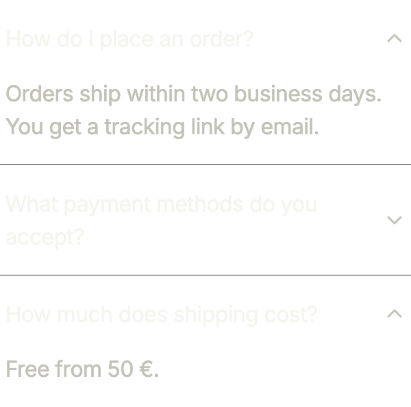
With FlAccordionSelection.multiple, several answers stay open at once; initialExpanded names the ones open at first.
import 'package:your_app/ui/fliin/components/accordion/fl_accordion.dart';
import 'package:your_app/ui/fliin/components/text/fl_text.dart';
import 'package:flutter/widgets.dart';

class AccordionMultipleExample extends StatelessWidget {
  const AccordionMultipleExample({super.key});

  @override
  Widget build(BuildContext context) {
    return FlAccordion<String>(
      selection: FlAccordionSelection.multiple,
      initialExpanded: const {'order', 'ship'},
      items: [
          FlAccordionItem(
            value: 'order',
            title: 'How do I place an order?',
            content: const FlText('Orders ship within two business days. You get a tracking link by email.', tone: FlTextTone.muted),
          ),
          FlAccordionItem(
            value: 'pay',
            title: 'What payment methods do you accept?',
            content: const FlText('Card, Apple Pay and PayPal.', tone: FlTextTone.muted),
          ),
          FlAccordionItem(
            value: 'ship',
            title: 'How much does shipping cost?',
            content: const FlText('Free from 50 €.', tone: FlTextTone.muted),
          ),
      ],
    );
  }
}Surface
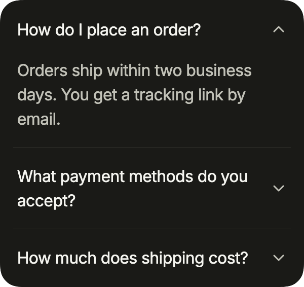
The surface variant sets the questions on a raised card, for an accordion that stands alone on the page.
import 'package:your_app/ui/fliin/components/accordion/fl_accordion.dart';
import 'package:your_app/ui/fliin/components/text/fl_text.dart';
import 'package:flutter/widgets.dart';

class AccordionSurfaceExample extends StatelessWidget {
  const AccordionSurfaceExample({super.key});

  @override
  Widget build(BuildContext context) {
    return FlAccordion<String>(
      variant: FlAccordionVariant.surface,
      initialExpanded: const {'order'},
      items: [
          FlAccordionItem(
            value: 'order',
            title: 'How do I place an order?',
            content: const FlText('Orders ship within two business days. You get a tracking link by email.', tone: FlTextTone.muted),
          ),
          FlAccordionItem(
            value: 'pay',
            title: 'What payment methods do you accept?',
            content: const FlText('Card, Apple Pay and PayPal.', tone: FlTextTone.muted),
          ),
          FlAccordionItem(
            value: 'ship',
            title: 'How much does shipping cost?',
            content: const FlText('Free from 50 €.', tone: FlTextTone.muted),
          ),
      ],
    );
  }
}With icons
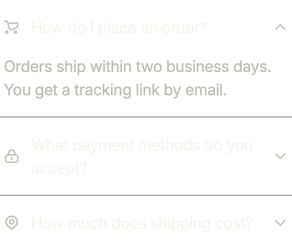
An icon before each question, through leading, helps the eye find a topic in a long list.
import 'package:your_app/ui/fliin/components/accordion/fl_accordion.dart';
import 'package:your_app/ui/fliin/components/text/fl_text.dart';
import 'package:your_app/ui/fliin/core/fliin.dart';
import 'package:your_app/ui/fliin/icons/fl_icons.dart';
import 'package:flutter/widgets.dart';

class AccordionWithIconsExample extends StatelessWidget {
  const AccordionWithIconsExample({super.key});

  @override
  Widget build(BuildContext context) {
    return FlAccordion<String>(
      initialExpanded: const {'order'},
      items: [
          FlAccordionItem(
            value: 'order',
            leading: FlIcon(FlIcons.shoppingCart),
            title: 'How do I place an order?',
            content: const FlText('Orders ship within two business days. You get a tracking link by email.', tone: FlTextTone.muted),
          ),
          FlAccordionItem(
            value: 'pay',
            leading: FlIcon(FlIcons.lock),
            title: 'What payment methods do you accept?',
            content: const FlText('Card, Apple Pay and PayPal.', tone: FlTextTone.muted),
          ),
          FlAccordionItem(
            value: 'ship',
            leading: FlIcon(FlIcons.mapPin),
            title: 'How much does shipping cost?',
            content: const FlText('Free from 50 €.', tone: FlTextTone.muted),
          ),
      ],
    );
  }
}Custom indicator
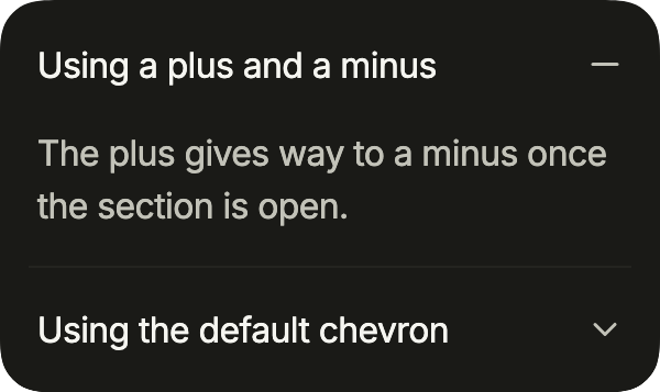
indicator replaces the turning chevron; with expandedIndicator, the two cross-fade as the section opens and closes: a plus, then a minus.
import 'package:your_app/ui/fliin/components/accordion/fl_accordion.dart';
import 'package:your_app/ui/fliin/components/text/fl_text.dart';
import 'package:your_app/ui/fliin/core/fliin.dart';
import 'package:your_app/ui/fliin/icons/fl_icons.dart';
import 'package:flutter/widgets.dart';

class AccordionCustomIndicatorExample extends StatelessWidget {
  const AccordionCustomIndicatorExample({super.key});

  @override
  Widget build(BuildContext context) {
    return FlAccordion<String>(
      variant: FlAccordionVariant.surface,
      initialExpanded: const {'plus'},
      items: [
        FlAccordionItem(
          value: 'plus',
          title: 'Using a plus and a minus',
          indicator: FlIcon(FlIcons.plus),
          expandedIndicator: FlIcon(FlIcons.minus),
          content: const FlText(
            'The plus gives way to a minus once the section is open.',
            tone: FlTextTone.muted,
          ),
        ),
        FlAccordionItem(
          value: 'chevron',
          title: 'Using the default chevron',
          content: const FlText(
            'Without an indicator, the chevron turns half a turn.',
            tone: FlTextTone.muted,
          ),
        ),
      ],
    );
  }
}Custom styles
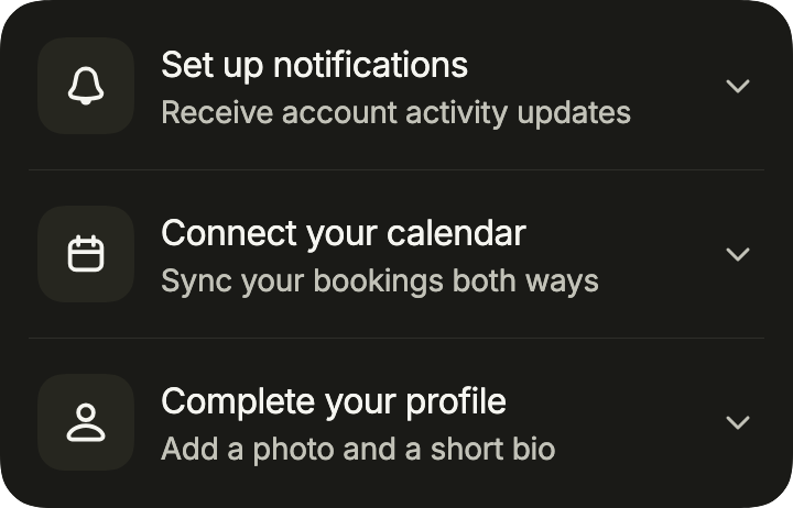
A setup checklist: a tinted tile as leading, a subtitle under each title that says what the step holds, on the surface variant.
import 'package:your_app/ui/fliin/components/accordion/fl_accordion.dart';
import 'package:your_app/ui/fliin/components/text/fl_text.dart';
import 'package:your_app/ui/fliin/core/fliin.dart';
import 'package:your_app/ui/fliin/icons/fl_icons.dart';
import 'package:flutter/widgets.dart';

class AccordionCustomStylesExample extends StatelessWidget {
  const AccordionCustomStylesExample({super.key});

  @override
  Widget build(BuildContext context) {
    return FlAccordion<String>(
      variant: FlAccordionVariant.surface,
      items: [
        for (final (value, icon, title, subtitle, content) in [
          (
            'notifications',
            FlIcons.bell,
            'Set up notifications',
            'Receive account activity updates',
            'Stay informed about your account activity in real time.',
          ),
          (
            'calendar',
            FlIcons.calendar,
            'Connect your calendar',
            'Sync your bookings both ways',
            'Your bookings appear in your calendar as soon as they are made.',
          ),
          (
            'profile',
            FlIcons.person,
            'Complete your profile',
            'Add a photo and a short bio',
            'A complete profile gets three times more replies.',
          ),
        ])
          FlAccordionItem(
            value: value,
            leading: _Tile(icon: icon),
            title: title,
            subtitle: subtitle,
            content: FlText(content, tone: FlTextTone.muted),
          ),
      ],
    );
  }
}

/// An icon on an accent tint, the size of a control.
class _Tile extends StatelessWidget {
  const _Tile({required this.icon});

  final FlIconData icon;

  @override
  Widget build(BuildContext context) {
    final theme = FlScope.of(context);
    return DecoratedBox(
      decoration: ShapeDecoration(
        color: theme.colors.accentSoft,
        shape: FlContinuousBorder(radius: theme.shape.radiusXl),
      ),
      child: SizedBox.square(
        dimension: theme.size.controlCompact,
        child: Center(
          child: FlIcon(
            icon,
            size: theme.size.buttonIconLg,
            color: theme.colors.onAccentSoft,
          ),
        ),
      ),
    );
  }
}Faq
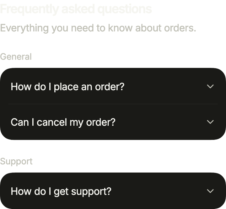
A help page: a heading, then one surface accordion per category under its name.
import 'package:your_app/ui/fliin/components/accordion/fl_accordion.dart';
import 'package:your_app/ui/fliin/components/text/fl_text.dart';
import 'package:your_app/ui/fliin/core/fliin.dart';
import 'package:flutter/widgets.dart';

class AccordionFaqExample extends StatelessWidget {
  const AccordionFaqExample({super.key});

  static const _categories = [
    (
      'General',
      [
        (
          'How do I place an order?',
          'Add items to your cart, then check out with your shipping and '
              'payment details.',
        ),
        (
          'Can I cancel my order?',
          'Yes, until it ships. After that, you can return it within 30 days.',
        ),
      ],
    ),
    (
      'Support',
      [
        (
          'How do I get support?',
          'Write to us from the contact form; we answer within a day.',
        ),
      ],
    ),
  ];

  @override
  Widget build(BuildContext context) {
    final space = FlScope.of(context).space;
    return Column(
      mainAxisSize: MainAxisSize.min,
      crossAxisAlignment: CrossAxisAlignment.stretch,
      spacing: space.xl,
      children: [
        Column(
          mainAxisSize: MainAxisSize.min,
          crossAxisAlignment: CrossAxisAlignment.stretch,
          spacing: space.xs,
          children: const [
            FlText('Frequently asked questions', type: FlTextType.h4),
            FlText(
              'Everything you need to know about orders.',
              tone: FlTextTone.muted,
            ),
          ],
        ),
        for (final (category, questions) in _categories)
          Column(
            mainAxisSize: MainAxisSize.min,
            crossAxisAlignment: CrossAxisAlignment.stretch,
            spacing: space.sm,
            children: [
              FlText(category, type: FlTextType.bodySm, tone: FlTextTone.muted),
              FlAccordion<String>(
                variant: FlAccordionVariant.surface,
                items: [
                  for (final (question, answer) in questions)
                    FlAccordionItem(
                      value: question,
                      title: question,
                      content: FlText(answer, tone: FlTextTone.muted),
                    ),
                ],
              ),
            ],
          ),
      ],
    );
  }
}Collapsed
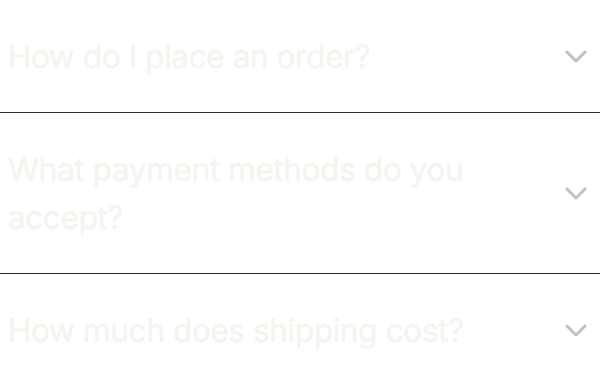
Every answer folded: the questions alone, for a page that should read at a glance.
import 'package:your_app/ui/fliin/components/accordion/fl_accordion.dart';
import 'package:your_app/ui/fliin/components/text/fl_text.dart';
import 'package:flutter/widgets.dart';

class AccordionCollapsedExample extends StatelessWidget {
  const AccordionCollapsedExample({super.key});

  @override
  Widget build(BuildContext context) {
    return FlAccordion<String>(
      items: [
          FlAccordionItem(
            value: 'order',
            title: 'How do I place an order?',
            content: const FlText('Orders ship within two business days. You get a tracking link by email.', tone: FlTextTone.muted),
          ),
          FlAccordionItem(
            value: 'pay',
            title: 'What payment methods do you accept?',
            content: const FlText('Card, Apple Pay and PayPal.', tone: FlTextTone.muted),
          ),
          FlAccordionItem(
            value: 'ship',
            title: 'How much does shipping cost?',
            content: const FlText('Free from 50 €.', tone: FlTextTone.muted),
          ),
      ],
    );
  }
}Expanded
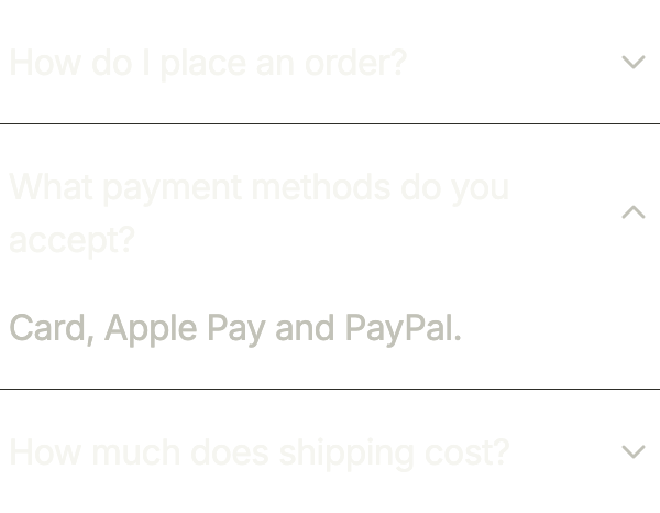
One answer open from the start, through initialExpanded; opening another closes it.
import 'package:your_app/ui/fliin/components/accordion/fl_accordion.dart';
import 'package:your_app/ui/fliin/components/text/fl_text.dart';
import 'package:flutter/widgets.dart';

class AccordionExpandedExample extends StatelessWidget {
  const AccordionExpandedExample({super.key});

  @override
  Widget build(BuildContext context) {
    return FlAccordion<String>(
      initialExpanded: const {'pay'},
      items: [
          FlAccordionItem(
            value: 'order',
            title: 'How do I place an order?',
            content: const FlText('Orders ship within two business days. You get a tracking link by email.', tone: FlTextTone.muted),
          ),
          FlAccordionItem(
            value: 'pay',
            title: 'What payment methods do you accept?',
            content: const FlText('Card, Apple Pay and PayPal.', tone: FlTextTone.muted),
          ),
          FlAccordionItem(
            value: 'ship',
            title: 'How much does shipping cost?',
            content: const FlText('Free from 50 €.', tone: FlTextTone.muted),
          ),
      ],
    );
  }
}Disabled
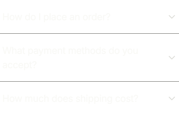
enabled: false keeps the questions visible but lets no one open them.
import 'package:your_app/ui/fliin/components/accordion/fl_accordion.dart';
import 'package:your_app/ui/fliin/components/text/fl_text.dart';
import 'package:flutter/widgets.dart';

class AccordionDisabledExample extends StatelessWidget {
  const AccordionDisabledExample({super.key});

  @override
  Widget build(BuildContext context) {
    return FlAccordion<String>(
      enabled: false,
      items: [
          FlAccordionItem(
            value: 'order',
            title: 'How do I place an order?',
            content: const FlText('Orders ship within two business days. You get a tracking link by email.', tone: FlTextTone.muted),
          ),
          FlAccordionItem(
            value: 'pay',
            title: 'What payment methods do you accept?',
            content: const FlText('Card, Apple Pay and PayPal.', tone: FlTextTone.muted),
          ),
          FlAccordionItem(
            value: 'ship',
            title: 'How much does shipping cost?',
            content: const FlText('Free from 50 €.', tone: FlTextTone.muted),
          ),
      ],
    );
  }
}Usage
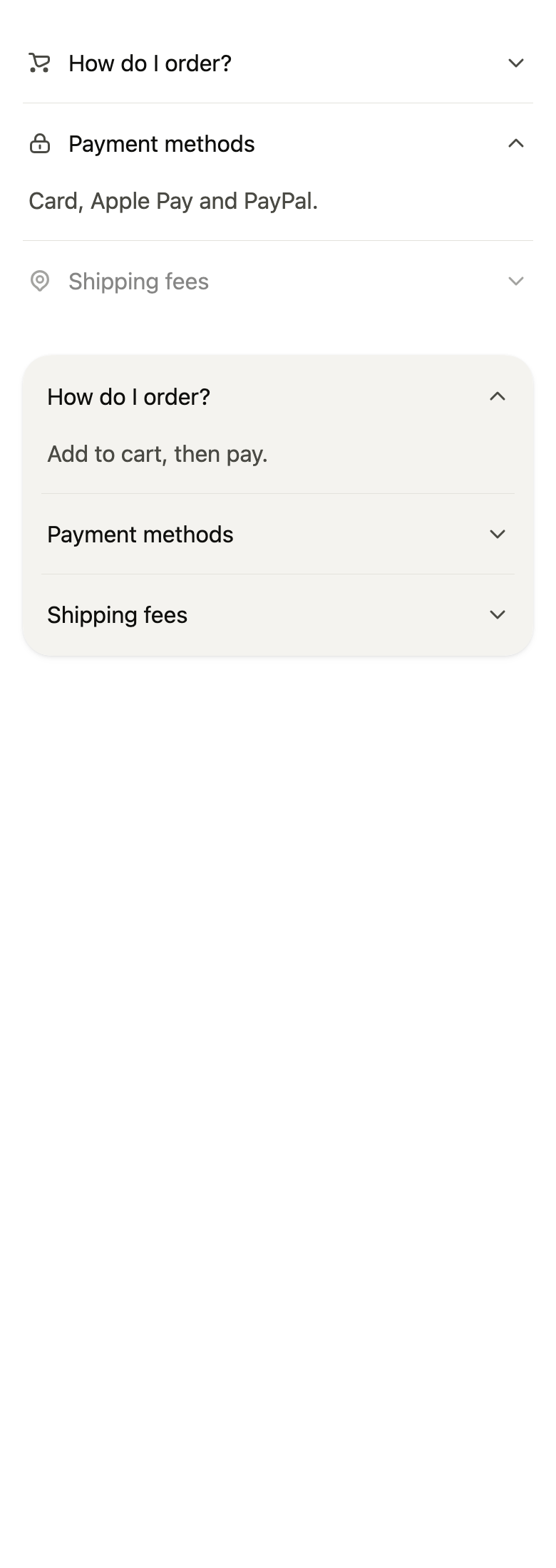
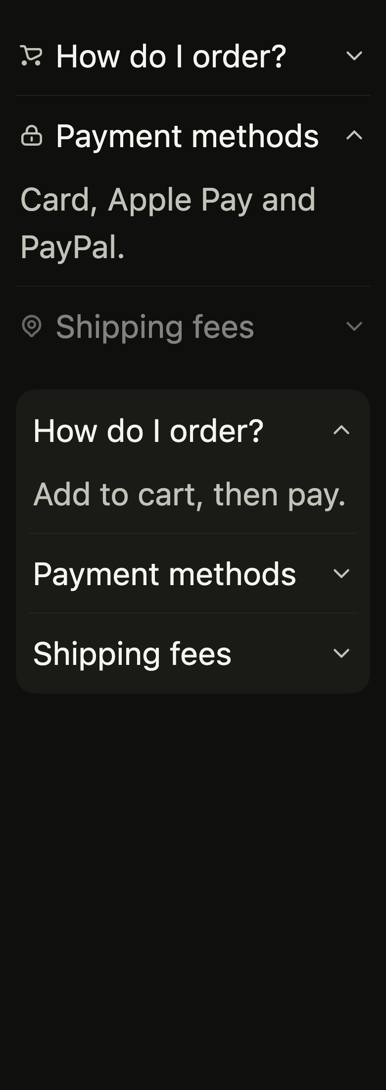
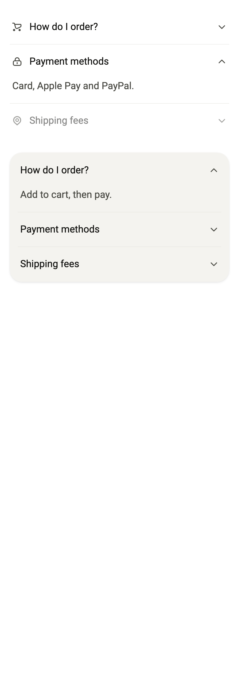
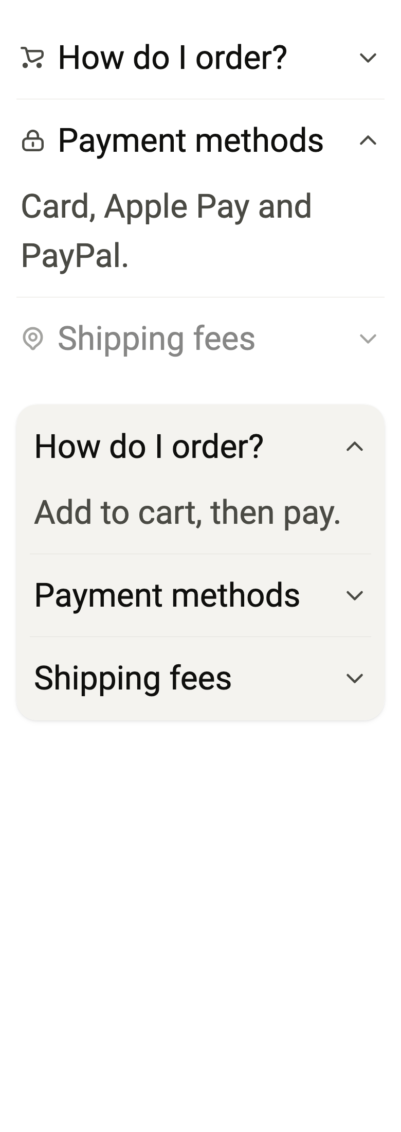
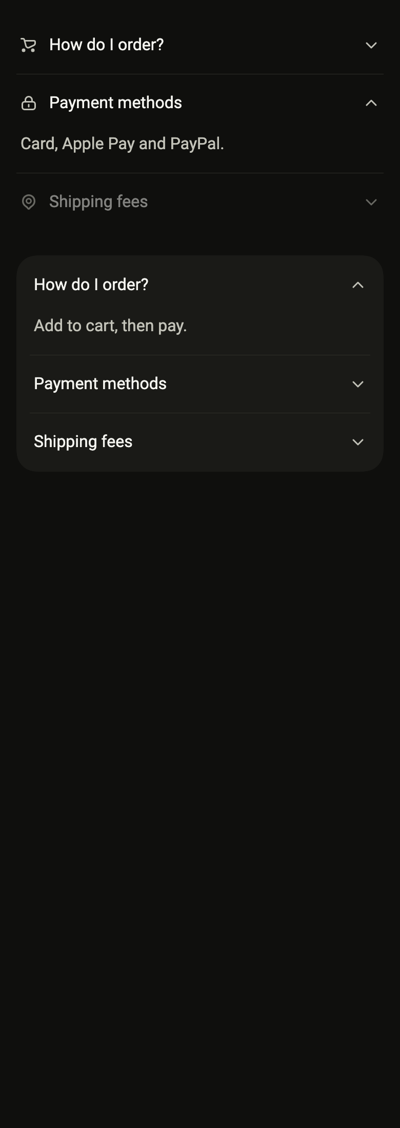
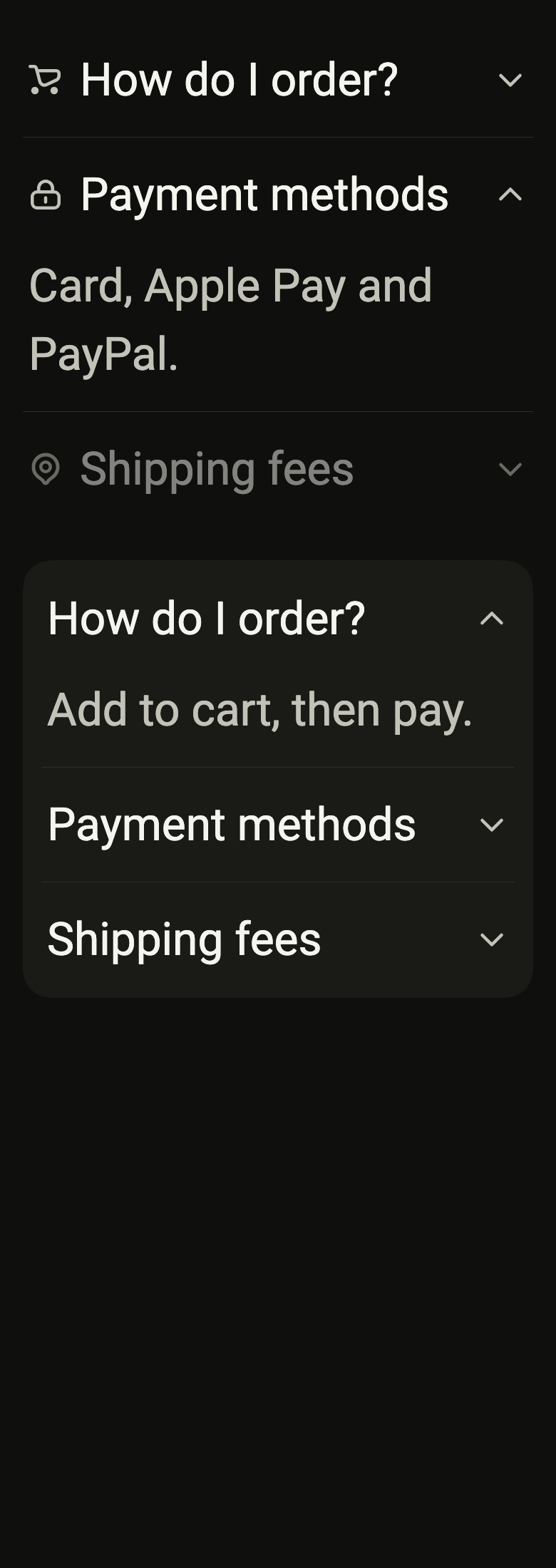
The code the reference images render:
final example = ColoredBox(
  color: FlScope.of(context).colors.surface,
  child: Padding(
    padding: EdgeInsetsDirectional.all(FlScope.of(context).space.lg),
    child: Column(
      crossAxisAlignment: CrossAxisAlignment.stretch,
      spacing: FlScope.of(context).space.xl,
      children: [
        FlAccordion<String>(
          initialExpanded: const {'b'},
          items: [
            FlAccordionItem(
              value: 'a',
              leading: FlIcon(FlIcons.shoppingCart),
              title: 'How do I order?',
              content: Text('Add to cart, then pay.'),
            ),
            FlAccordionItem(
              value: 'b',
              leading: FlIcon(FlIcons.lock),
              title: 'Payment methods',
              content: Text('Card, Apple Pay and PayPal.'),
            ),
            FlAccordionItem(
              value: 'c',
              leading: FlIcon(FlIcons.mapPin),
              title: 'Shipping fees',
              content: Text('Free from €50.'),
              enabled: false,
            ),
          ],
        ),
        FlAccordion<String>(
          variant: FlAccordionVariant.surface,
          initialExpanded: const {'a'},
          items: [
            FlAccordionItem(
              value: 'a',
              title: 'How do I order?',
              content: Text('Add to cart, then pay.'),
            ),
            FlAccordionItem(
              value: 'b',
              title: 'Payment methods',
              content: Text('Card, Apple Pay and PayPal.'),
            ),
            FlAccordionItem(
              value: 'c',
              title: 'Shipping fees',
              content: Text('Free from €50.'),
            ),
          ],
        ),
      ],
    ),
  ),
);API
FlAccordionVariant: enum {plain, surface}
FlAccordionVariant.plain: static final FlAccordionVariant
FlAccordionVariant.surface: static final FlAccordionVariant
FlAccordionSelection: enum {single, multiple}
FlAccordionSelection.single: static final FlAccordionSelection
FlAccordionSelection.multiple: static final FlAccordionSelection
FlAccordionItem: final class<T>
FlAccordionItem.new: const new({required T value, required String title, required Widget content, List<InlineSpan>? titleSpans, Widget? leading, Widget? indicator, bool enabled, String? subtitle, Widget? expandedIndicator})
FlAccordionItem.value: get T
FlAccordionItem.title: get String
FlAccordionItem.titleSpans: get List<InlineSpan>?
FlAccordionItem.content: get Widget
FlAccordionItem.leading: get Widget?
FlAccordionItem.indicator: get Widget?
FlAccordionItem.enabled: get bool
FlAccordionItem.subtitle: get String?
FlAccordionItem.expandedIndicator: get Widget?
FlAccordion: class<T> extends StatefulWidget
FlAccordion.new: const new({super.key, required List<FlAccordionItem<T>> items, FlAccordionVariant variant, FlAccordionSelection selection, bool collapsible, Set<T>? expanded, Set<T> initialExpanded, ValueChanged<Set<T>>? onExpandedChanged, bool enabled, bool separators})
FlAccordion.items: get List<FlAccordionItem<T>>
FlAccordion.variant: get FlAccordionVariant
FlAccordion.selection: get FlAccordionSelection
FlAccordion.collapsible: get bool
FlAccordion.expanded: get Set<T>?
FlAccordion.initialExpanded: get Set<T>
FlAccordion.onExpandedChanged: get ValueChanged<Set<T>>?
FlAccordion.enabled: get bool
FlAccordion.separators: get bool
FlAccordion.createState: State<FlAccordion<T>>()Reference renders
The 16 images published with version 0.2.5, rendered by the shared harness on macOS with Flutter 3.47.7. fliin verify accordion compares your copy to them.








Use it to
- show a collapsible list of frequent questions
- hide the details of a section behind a tap
- keep advanced settings folded away
- show a single open answer at a time
- open several detail sections together
- hide shipping and returns details in collapsible panels
- Not for
- navigation between sibling views: use tabs (tabs)
- a list of settings that open a screen: use a list row (list-row)
- States
Source
The files fliin add accordion copies into your app, before your prefix and imports are applied.
accordion/fl_accordion.dart
// Modified from the Accordion of HeroUI Native 1.0.10, Copyright 2025 NextUI
// Inc., licensed under Apache 2.0: https://www.apache.org/licenses/LICENSE-2.0
import 'dart:math' as math;

import 'package:flutter/widgets.dart';
import 'package:fliin_ui/components/separator/fl_separator.dart';
import 'package:fliin_ui/components/surface/fl_surface.dart';
import 'package:fliin_ui/core/fliin.dart';
import 'package:fliin_ui/icons/fl_icons.dart';

/// The container of a [FlAccordion].
enum FlAccordionVariant {
  /// No background: the sections and their rules on the page.
  plain,

  /// On a shadowed surface with continuous corners, wider margins.
  surface,
}

/// How many sections a [FlAccordion] opens at once.
enum FlAccordionSelection {
  /// Only one: opening one closes the other.
  single,

  /// As many as wanted.
  multiple,
}

/// A section of a [FlAccordion] (`Accordion.Item`): a pressable header and
/// content that unfolds.
final class FlAccordionItem<T> {
  /// The section [value], titled [title].
  const FlAccordionItem({
    required this.value,
    required this.title,
    required this.content,
    this.titleSpans,
    this.leading,
    this.indicator,
    this.enabled = true,
    this.subtitle,
    this.expandedIndicator,
  });

  /// The section's identifier among the open ones.
  final T value;

  /// The header's title, in `textBase` and `onSurface`, and its spoken name.
  final String title;

  /// The title in styled pieces (a word highlighted by a search), in the
  /// style of [title]; when null, [title] alone. Their text must be [title],
  /// so that the screen shows what is read.
  final List<InlineSpan>? titleSpans;

  /// The unfolded content, in muted `textBase` by default.
  final Widget content;

  /// An icon before the title, 12 away from it, in muted `onSurface` at
  /// `size.indicatorIcon` following the text up to `size.iconMaxScale`.
  final Widget? leading;

  /// An indicator in place of the rotating chevron (`Accordion.Indicator`
  /// and its children), with the icon theme of [leading]; it does not
  /// rotate.
  final Widget? indicator;

  /// False: the header is no longer pressable and fades to `disabledOpacity`.
  final bool enabled;

  /// A line under the title, in muted `textSm`: what the section holds.
  final String? subtitle;

  /// The indicator shown instead of [indicator] while the section is open,
  /// cross-faded over `short3`: a minus after a plus. It needs an
  /// [indicator]; when null, [indicator] stays.
  final Widget? expandedIndicator;
}

/// An accordion: sections whose header folds and
/// unfolds the content. The height follows the `motion.spring.layout`
/// spring, the content fades in and out over `short4` while it settles
/// `space.sm` down into the opening, and the chevron
/// turns half a turn on the `indicator` spring. Under reduced motion, the
/// height jumps and the content fades over `short3`.
///
/// The open sections are [expanded] when the app holds them, otherwise
/// [initialExpanded] then those the user opens; [onExpandedChanged]
/// receives each new set.
class FlAccordion<T> extends StatefulWidget {
  /// An accordion of [items], one section open at a time.
  const FlAccordion({
    super.key,
    required this.items,
    this.variant = FlAccordionVariant.plain,
    this.selection = FlAccordionSelection.single,
    this.collapsible = true,
    this.expanded,
    this.initialExpanded = const {},
    this.onExpandedChanged,
    this.enabled = true,
    this.separators = true,
  });

  /// The sections, top to bottom.
  final List<FlAccordionItem<T>> items;

  /// The container.
  final FlAccordionVariant variant;

  /// One section open at a time, or several.
  final FlAccordionSelection selection;

  /// False: an open section does not close through its header
  /// (`isCollapsible`).
  final bool collapsible;

  /// The open sections, held by the app; when null, the accordion holds them.
  final Set<T>? expanded;

  /// The sections open at creation, when [expanded] is null.
  final Set<T> initialExpanded;

  /// Called with the open sections after a press.
  final ValueChanged<Set<T>>? onExpandedChanged;

  /// False: no section is pressable (`isDisabled`).
  final bool enabled;

  /// False: no rule between the sections (`hideSeparator`).
  final bool separators;

  @override
  State<FlAccordion<T>> createState() => _FlAccordionState<T>();
}

class _FlAccordionState<T> extends State<FlAccordion<T>> {
  late Set<T> _expanded = widget.expanded ?? widget.initialExpanded;

  Set<T> get _current => widget.expanded ?? _expanded;

  void _toggle(T value) {
    final current = _current;
    final open = current.contains(value);
    if (open && !widget.collapsible) return;
    final next = switch (widget.selection) {
      FlAccordionSelection.single => open ? <T>{} : {value},
      FlAccordionSelection.multiple => open ? ({...current}..remove(value)) : {...current, value},
    };
    if (widget.expanded == null) setState(() => _expanded = next);
    widget.onExpandedChanged?.call(next);
  }

  @override
  Widget build(BuildContext context) {
    final theme = FlScope.of(context);
    final surface = widget.variant == FlAccordionVariant.surface;
    final xs = theme.space.xs;
    final current = _current;
    final column = Column(
      mainAxisSize: MainAxisSize.min,
      crossAxisAlignment: CrossAxisAlignment.stretch,
      children: [
        for (final (index, item) in widget.items.indexed) ...[
          if (widget.separators && index > 0)
            Padding(
              // The surface's 12 of padding.
              padding: EdgeInsetsDirectional.symmetric(horizontal: surface ? xs * 3 : 0),
              child: const FlSeparator(),
            ),
          _Section<T>(
            key: ValueKey(item.value),
            item: item,
            expanded: current.contains(item.value),
            enabled: widget.enabled && item.enabled,
            // The canvas's `.acc-head`: 4 in, 16 on the surface (its 12 of
            // padding, then 4).
            inset: surface ? xs * 4 : xs,
            onPressed: () => _toggle(item.value),
          ),
        ],
      ],
    );
    if (!surface) return column;
    // The 1-wide border in the background color insets the content by as
    // much, and its antialiased stroke thickens the surface's edge.
    return DecoratedBox(
      position: DecorationPosition.foreground,
      decoration: ShapeDecoration(
        shape: FlContinuousBorder(
          radius: theme.shape.radiusCard,
          side: BorderSide(color: theme.colors.surfaceRaised, width: theme.size.border),
        ),
      ),
      child: FlSurface(padding: EdgeInsets.all(theme.size.border), child: column),
    );
  }
}

class _Section<T> extends StatefulWidget {
  const _Section({
    super.key,
    required this.item,
    required this.expanded,
    required this.enabled,
    required this.inset,
    required this.onPressed,
  });

  final FlAccordionItem<T> item;
  final bool expanded;
  final bool enabled;
  final double inset;
  final VoidCallback onPressed;

  @override
  State<_Section<T>> createState() => _SectionState<T>();
}

class _SectionState<T> extends State<_Section<T>> with TickerProviderStateMixin {
  late final AnimationController _height = AnimationController.unbounded(vsync: this, value: widget.expanded ? 1 : 0);
  late final AnimationController _turn = AnimationController.unbounded(vsync: this, value: widget.expanded ? 1 : 0);
  late final AnimationController _fade = AnimationController(vsync: this, value: widget.expanded ? 1 : 0);

  @override
  void didUpdateWidget(_Section<T> old) {
    super.didUpdateWidget(old);
    if (old.expanded == widget.expanded) return;
    final motion = FlMotion.of(context);
    final tokens = motion.tokens;
    final target = widget.expanded ? 1.0 : 0.0;
    if (motion.reduced) {
      _height.value = target;
      _turn.value = target;
      _fade.duration = tokens.short3;
    } else {
      _height.driveTo(target, FlSpringMotion(tokens.layout));
      _turn.driveTo(target, FlSpringMotion(tokens.indicator));
      _fade.duration = tokens.short4;
    }
    widget.expanded ? _fade.forward() : _fade.reverse();
  }

  @override
  void dispose() {
    _height.dispose();
    _turn.dispose();
    _fade.dispose();
    super.dispose();
  }

  @override
  Widget build(BuildContext context) {
    final theme = FlScope.of(context);
    final colors = theme.colors;
    final scale = theme.typography;
    final family = DefaultTextStyle.of(context).style.fontFamily;
    final item = widget.item;
    final xs = theme.space.xs;
    final leading = item.leading;
    final spans = item.titleSpans;
    assert(
      spans == null || TextSpan(children: spans).toPlainText() == item.title,
      'the text of titleSpans must be title',
    );
    final metrics = scale.style(FlTextRole.textBase);
    final subtitle = item.subtitle;
    final title = Text.rich(
      TextSpan(text: spans == null ? item.title : null, children: spans),
      style: scale.resolve(FlTextRole.textBase).copyWith(color: colors.onSurface),
      strutStyle: scale.strut(FlTextRole.textBase, inheritedFamily: family),
    );
    final indicator = switch ((item.indicator, item.expandedIndicator)) {
      (final closed?, final open?) => AnimatedCrossFade(
        firstChild: closed,
        secondChild: open,
        crossFadeState: widget.expanded ? CrossFadeState.showSecond : CrossFadeState.showFirst,
        duration: FlMotion.of(context).reduced ? Duration.zero : theme.motion.short3,
      ),
      (final closed, _) => closed,
    };
    final icons = IconThemeData(
      color: colors.onSurfaceMuted,
      size: MediaQuery.textScalerOf(context)
          .clamp(maxScaleFactor: theme.size.iconMaxScale)
          .scale(theme.size.indicatorIcon),
    );
    final trigger = FlPressable(
      onPressed: widget.enabled ? widget.onPressed : null,
      borderRadius: BorderRadius.zero,
      scaleOnPress: false,
      // The trigger tints under the pointer or the finger, a hair of the
      // text color over the whole header.
      overlay: FlPressOverlay.highlight,
      focusRing: FlFocusRingPlacement.inside,
      expanded: widget.expanded,
      builder: (context, states) => Semantics(
        header: true,
        child: Opacity(
          opacity: widget.enabled ? 1 : theme.size.disabledOpacity,
          // At least the platform's target: the surface clips what
          // overflows, and the target of a shorter header would be cut off.
          // py-4 and gap-4; the title and its icon at gap-3.
          child: Container(
            constraints: BoxConstraints(minHeight: theme.hitTarget),
            alignment: AlignmentDirectional.centerStart,
            padding: EdgeInsetsDirectional.symmetric(horizontal: widget.inset, vertical: xs * 4),
            child: IconTheme.merge(
              data: icons,
              child: Row(
                spacing: xs * 4,
                children: [
                  Expanded(
                    child: Row(
                      spacing: xs * 3,
                      children: [
                        ?leading,
                        Expanded(
                          child: subtitle == null
                              ? title
                              : Column(
                                  mainAxisSize: MainAxisSize.min,
                                  crossAxisAlignment: CrossAxisAlignment.stretch,
                                  children: [
                                    title,
                                    Text(
                                      subtitle,
                                      style: scale.resolve(FlTextRole.textSm).copyWith(color: colors.onSurfaceMuted),
                                      strutStyle: scale.strut(FlTextRole.textSm, inheritedFamily: family),
                                    ),
                                  ],
                                ),
                        ),
                      ],
                    ),
                  ),
                  indicator ??
                      AnimatedBuilder(
                        animation: _turn,
                        builder: (context, child) => Transform.rotate(angle: -math.pi * _turn.value, child: child),
                        child: FlIcon(FlIcons.chevronDown),
                      ),
                ],
              ),
            ),
          ),
        ),
      ),
    );
    final content = Padding(
      // pb-4.
      padding: EdgeInsetsDirectional.only(start: widget.inset, end: widget.inset, bottom: xs * 4),
      child: DefaultTextStyle.merge(
        style: scale
            .resolve(FlTextRole.textBase)
            .copyWith(
              color: colors.onSurfaceMuted,
              height: metrics.lineHeight / metrics.size,
              leadingDistribution: TextLeadingDistribution.even,
            ),
        child: item.content,
      ),
    );
    final curve = theme.motion.easeOut;
    final reduced = FlMotion.of(context).reduced;
    final opacity = CurvedAnimation(parent: _fade, curve: curve, reverseCurve: theme.motion.easeIn.flipped);
    return Column(
      mainAxisSize: MainAxisSize.min,
      crossAxisAlignment: CrossAxisAlignment.stretch,
      children: [
        trigger,
        AnimatedBuilder(
          animation: Listenable.merge([_height, _fade]),
          builder: (context, child) {
            if (!widget.expanded && _height.value <= 0 && _fade.value <= 0) {
              return const SizedBox.shrink();
            }
            return ClipRect(
              child: Align(
                alignment: AlignmentDirectional.topStart,
                heightFactor: math.max(0, _height.value),
                // The content settles down into the opening as it fades in,
                // and lifts as it fades out; it only fades under reduced
                // motion.
                child: Transform.translate(
                  offset: Offset(0, reduced ? 0 : -(1 - opacity.value) * theme.space.sm),
                  child: FadeTransition(opacity: opacity, child: child),
                ),
              ),
            );
          },
          child: content,
        ),
      ],
    );
  }
}