Components / forms
Color field
Types a color as a hex code, with its swatch at the start of the field; a code that is not a color gives the previous one back on leaving.
Import
In a Flutter app where fliin init has run:
Examples
Example
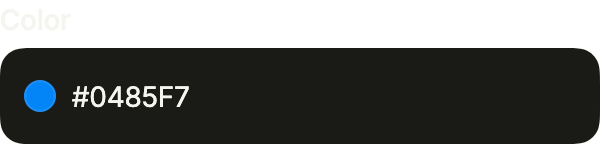
A field for a hexadecimal color, with its swatch beside the text. It hands you a Color once the six digits are valid.
import 'package:your_app/ui/fliin/components/color_field/fl_color_field.dart';
import 'package:flutter/widgets.dart';

class ColorFieldExample extends StatefulWidget {
  const ColorFieldExample({super.key});

  @override
  State<ColorFieldExample> createState() => _ColorFieldExampleState();
}

class _ColorFieldExampleState extends State<ColorFieldExample> {
  Color? _color = const Color(0xFF0485F7);

  @override
  Widget build(BuildContext context) {
    return Column(
      mainAxisSize: MainAxisSize.min,
      crossAxisAlignment: CrossAxisAlignment.stretch,
      children: [
        FlColorField(
          label: 'Color',
          value: _color,
          placeholder: '#0485F7',
          onChanged: (color) => setState(() => _color = color),
        ),
      ],
    );
  }
}Filled
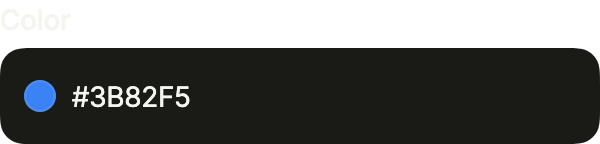
The field filled with a color your app already has.
import 'package:your_app/ui/fliin/components/color_field/fl_color_field.dart';
import 'package:flutter/widgets.dart';

class ColorFieldFilledExample extends StatefulWidget {
  const ColorFieldFilledExample({super.key});

  @override
  State<ColorFieldFilledExample> createState() => _ColorFieldFilledExampleState();
}

class _ColorFieldFilledExampleState extends State<ColorFieldFilledExample> {
  Color? _color = const HSVColor.fromAHSV(1, 217, 0.76, 0.96).toColor();

  @override
  Widget build(BuildContext context) {
    return Column(
      mainAxisSize: MainAxisSize.min,
      crossAxisAlignment: CrossAxisAlignment.stretch,
      children: [
        FlColorField(
          label: 'Color',
          value: _color,
          placeholder: '#0485F7',
          onChanged: (color) => setState(() => _color = color),
        ),
      ],
    );
  }
}Empty
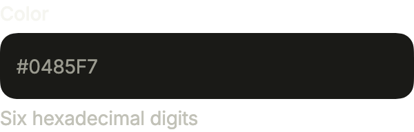
Empty, the placeholder shows the format and helper says what to type.
import 'package:your_app/ui/fliin/components/color_field/fl_color_field.dart';
import 'package:flutter/widgets.dart';

class ColorFieldEmptyExample extends StatefulWidget {
  const ColorFieldEmptyExample({super.key});

  @override
  State<ColorFieldEmptyExample> createState() => _ColorFieldEmptyExampleState();
}

class _ColorFieldEmptyExampleState extends State<ColorFieldEmptyExample> {
  Color? _color;

  @override
  Widget build(BuildContext context) {
    return Column(
      mainAxisSize: MainAxisSize.min,
      crossAxisAlignment: CrossAxisAlignment.stretch,
      children: [
        FlColorField(
          label: 'Color',
          value: _color,
          placeholder: '#0485F7',
          helper: 'Six hexadecimal digits',
          onChanged: (color) => setState(() => _color = color),
        ),
      ],
    );
  }
}Invalid
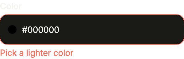
error replaces the helper and marks the field when the color does not suit.
import 'package:your_app/ui/fliin/components/color_field/fl_color_field.dart';
import 'package:flutter/widgets.dart';

class ColorFieldInvalidExample extends StatefulWidget {
  const ColorFieldInvalidExample({super.key});

  @override
  State<ColorFieldInvalidExample> createState() => _ColorFieldInvalidExampleState();
}

class _ColorFieldInvalidExampleState extends State<ColorFieldInvalidExample> {
  Color? _color = const Color(0xFF000000);

  @override
  Widget build(BuildContext context) {
    return Column(
      mainAxisSize: MainAxisSize.min,
      crossAxisAlignment: CrossAxisAlignment.stretch,
      children: [
        FlColorField(
          label: 'Color',
          value: _color,
          placeholder: '#0485F7',
          error: 'Pick a lighter color',
          onChanged: (color) => setState(() => _color = color),
        ),
      ],
    );
  }
}Disabled
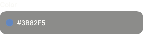
enabled: false keeps the color readable but not editable.
import 'package:your_app/ui/fliin/components/color_field/fl_color_field.dart';
import 'package:flutter/widgets.dart';

class ColorFieldDisabledExample extends StatefulWidget {
  const ColorFieldDisabledExample({super.key});

  @override
  State<ColorFieldDisabledExample> createState() => _ColorFieldDisabledExampleState();
}

class _ColorFieldDisabledExampleState extends State<ColorFieldDisabledExample> {
  Color? _color = const HSVColor.fromAHSV(1, 217, 0.76, 0.96).toColor();

  @override
  Widget build(BuildContext context) {
    return Column(
      mainAxisSize: MainAxisSize.min,
      crossAxisAlignment: CrossAxisAlignment.stretch,
      children: [
        FlColorField(
          label: 'Color',
          value: _color,
          placeholder: '#0485F7',
          enabled: false,
          onChanged: (color) => setState(() => _color = color),
        ),
      ],
    );
  }
}On surface
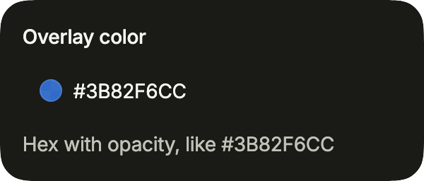
On a surface, FlInputVariant.secondary; alpha reads and writes the opacity too (#RRGGBBAA).
import 'package:your_app/ui/fliin/components/color_field/fl_color_field.dart';
import 'package:your_app/ui/fliin/components/surface/fl_surface.dart';
import 'package:your_app/ui/fliin/components/text_field/fl_text_field.dart';
import 'package:flutter/widgets.dart';

class ColorFieldOnSurfaceExample extends StatefulWidget {
  const ColorFieldOnSurfaceExample({super.key});

  @override
  State<ColorFieldOnSurfaceExample> createState() => _ColorFieldOnSurfaceExampleState();
}

class _ColorFieldOnSurfaceExampleState extends State<ColorFieldOnSurfaceExample> {
  Color? _color = const Color(0xCC3B82F6);

  @override
  Widget build(BuildContext context) {
    return FlSurface(
      child: FlColorField(
        label: 'Overlay color',
        value: _color,
        alpha: true,
        variant: FlInputVariant.secondary,
        helper: 'Hex with opacity, like #3B82F6CC',
        onChanged: (color) => setState(() => _color = color),
      ),
    );
  }
}Usage
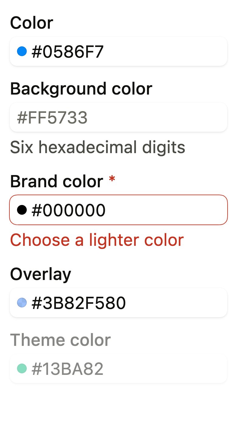
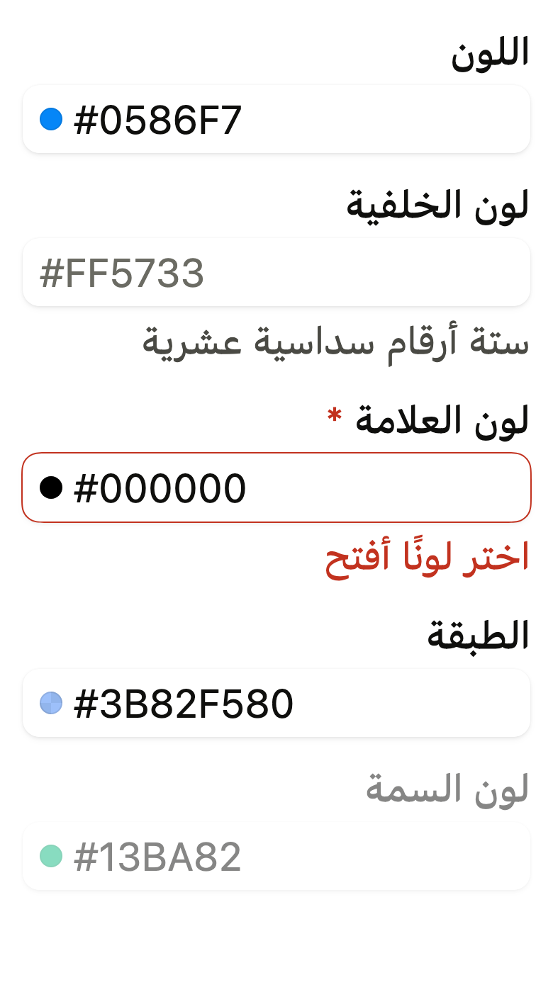
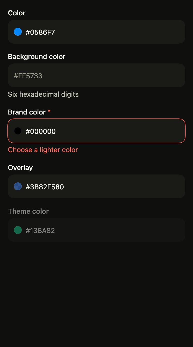
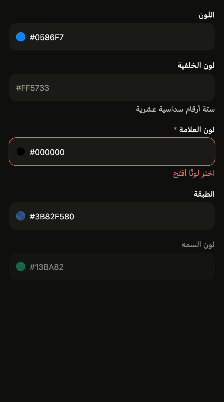
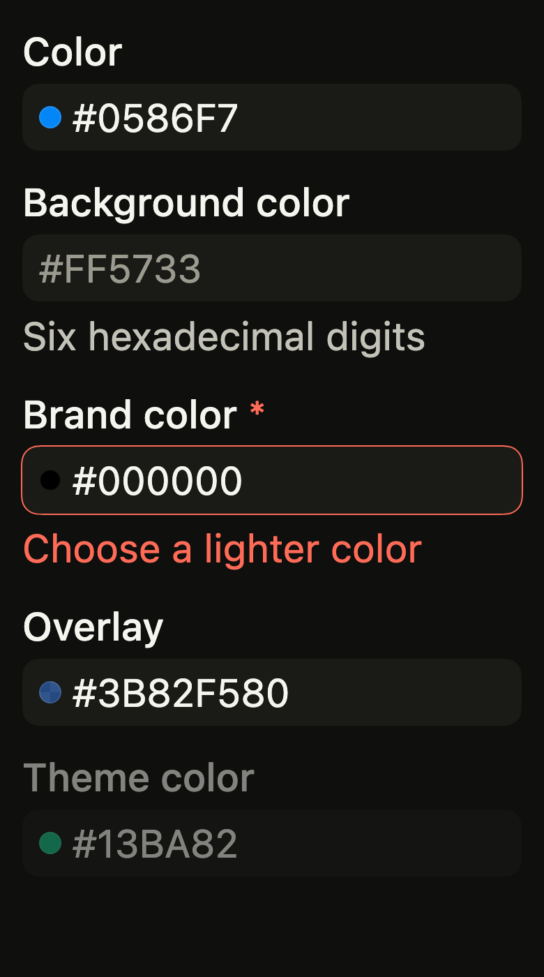
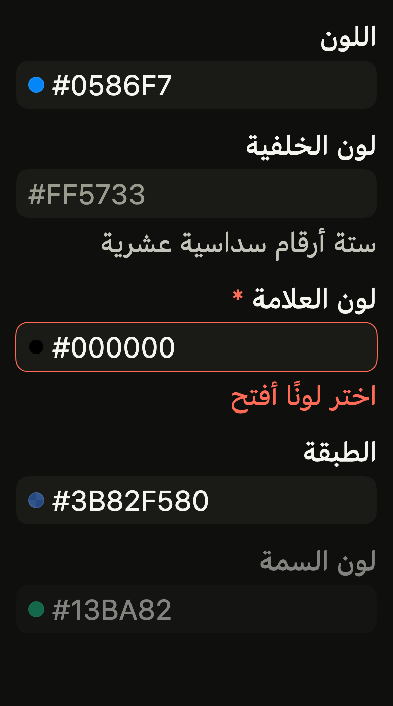
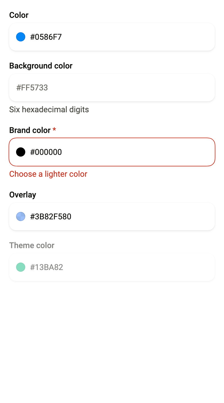
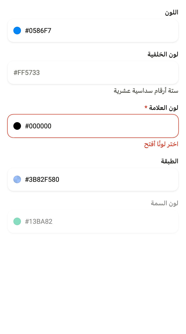
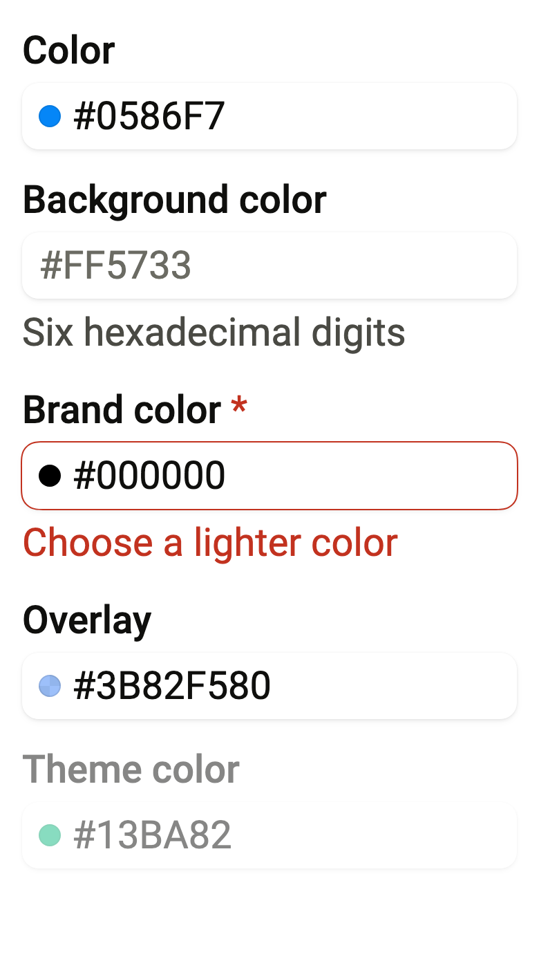
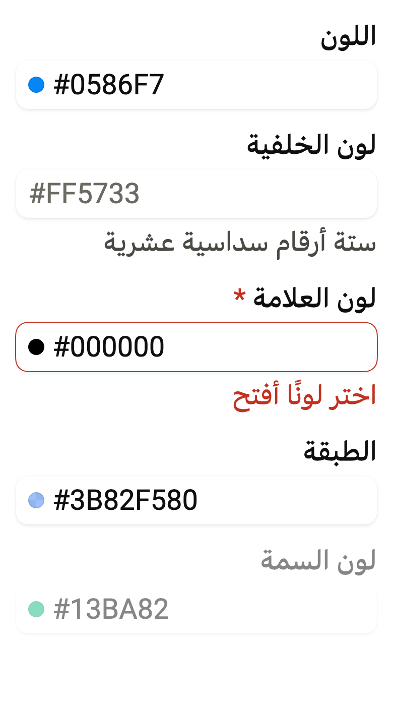
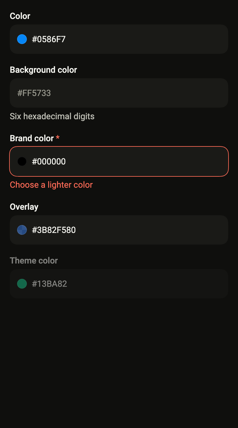
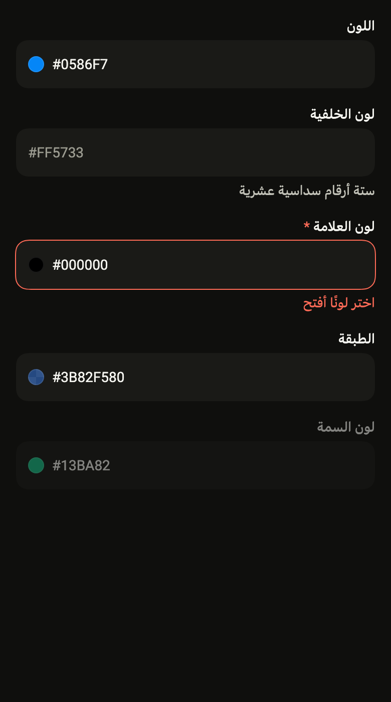
The code the reference images render:
final example = Builder(
  builder: (context) {
    final rtl = variant.dir == TextDirection.rtl;
    final theme = FlScope.of(context);
    String tr(String fr, String ar) => rtl ? ar : fr;
    return ColoredBox(
      color: theme.colors.surface,
      child: SingleChildScrollView(
        padding: EdgeInsetsDirectional.all(theme.space.lg),
        child: Column(
          crossAxisAlignment: CrossAxisAlignment.stretch,
          spacing: theme.space.lg,
          children: [
            FlColorField(
              label: tr('Color', 'اللون'),
              value: HSVColor.fromAHSV(1, 208, 0.98, 0.97).toColor(),
              onChanged: (_) {},
            ),
            FlColorField(
              label: tr('Background color', 'لون الخلفية'),
              value: null,
              placeholder: '#FF5733',
              helper: tr('Six hexadecimal digits', 'ستة أرقام سداسية عشرية'),
              onChanged: (_) {},
            ),
            FlColorField(
              label: tr('Brand color', 'لون العلامة'),
              value: HSVColor.fromAHSV(1, 0, 0, 0).toColor(),
              required: true,
              error: tr('Choose a lighter color', 'اختر لونًا أفتح'),
              onChanged: (_) {},
            ),
            FlColorField(
              label: tr('Overlay', 'الطبقة'),
              value: HSVColor.fromAHSV(0.5, 217, 0.76, 0.96).toColor(),
              alpha: true,
              onChanged: (_) {},
            ),
            FlColorField(
              label: tr('Theme color', 'لون السمة'),
              value: HSVColor.fromAHSV(1, 160, 0.9, 0.73).toColor(),
              enabled: false,
              onChanged: (_) {},
            ),
          ],
        ),
      ),
    );
  },
);API
FlColorField: class extends StatefulWidget
FlColorField.new: const new({super.key, required String label, required Color? value, required ValueChanged<Color?> onChanged, String? placeholder, String? helper, String? error, bool alpha, bool required, bool enabled, FlInputVariant variant, FocusNode? focusNode, bool autofocus})
FlColorField.label: get String
FlColorField.value: get Color?
FlColorField.onChanged: get ValueChanged<Color?>
FlColorField.placeholder: get String?
FlColorField.helper: get String?
FlColorField.error: get String?
FlColorField.alpha: get bool
FlColorField.required: get bool
FlColorField.enabled: get bool
FlColorField.variant: get FlInputVariant
FlColorField.focusNode: get FocusNode?
FlColorField.autofocus: get bool
FlColorField.createState: State<FlColorField>()Reference renders
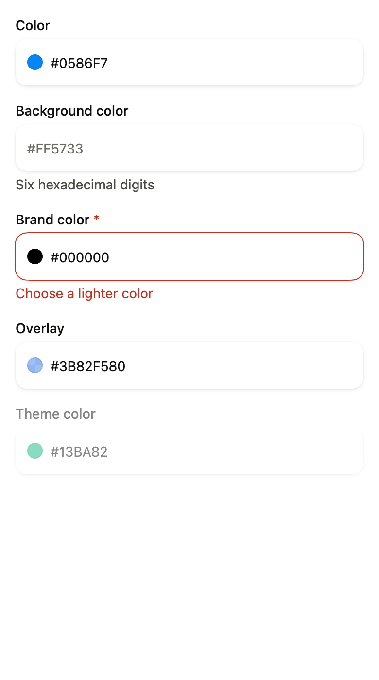
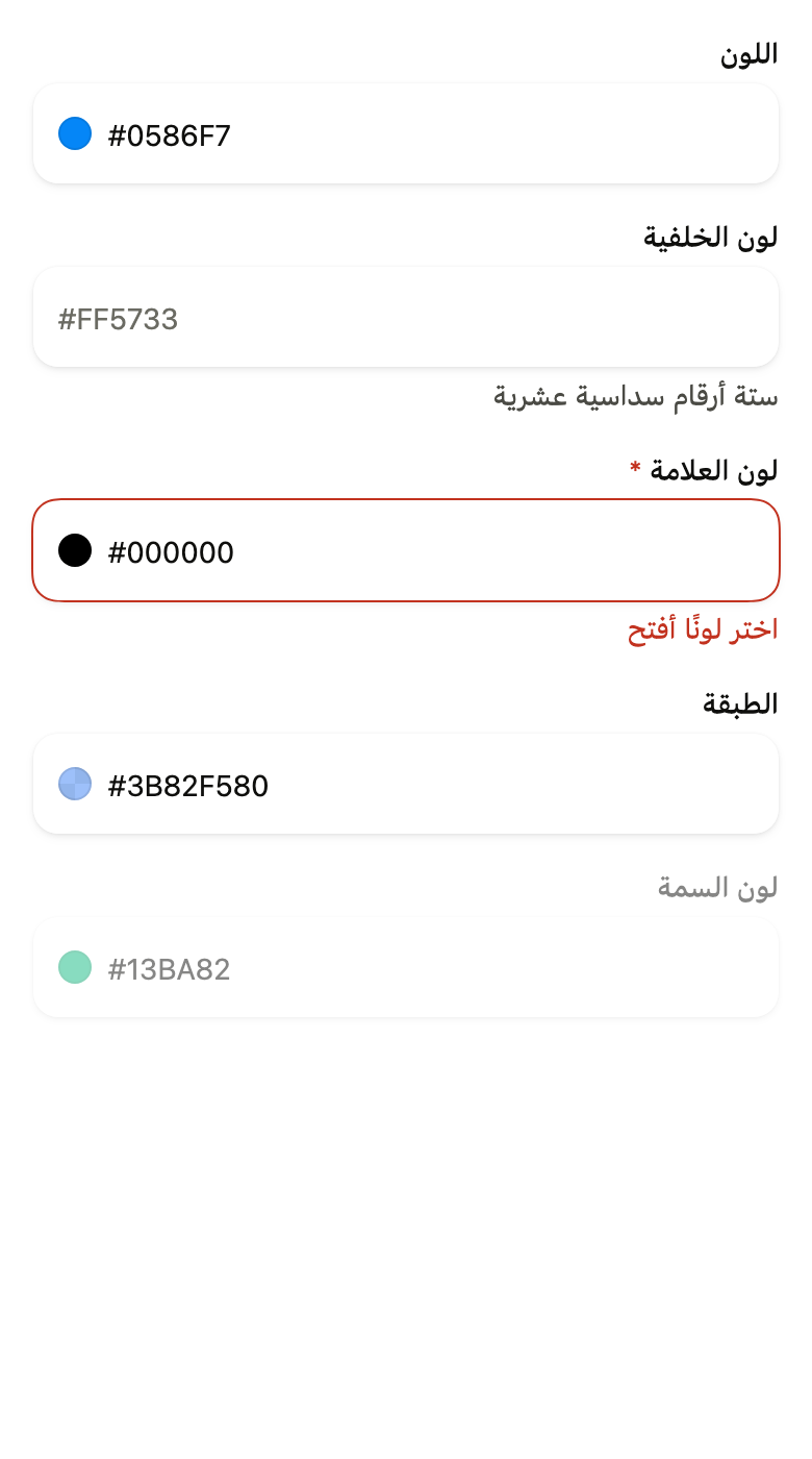
The 16 images published with version 0.1.0, rendered by the shared harness on macOS with Flutter 3.47.7. fliin verify color-field compares your copy to them.
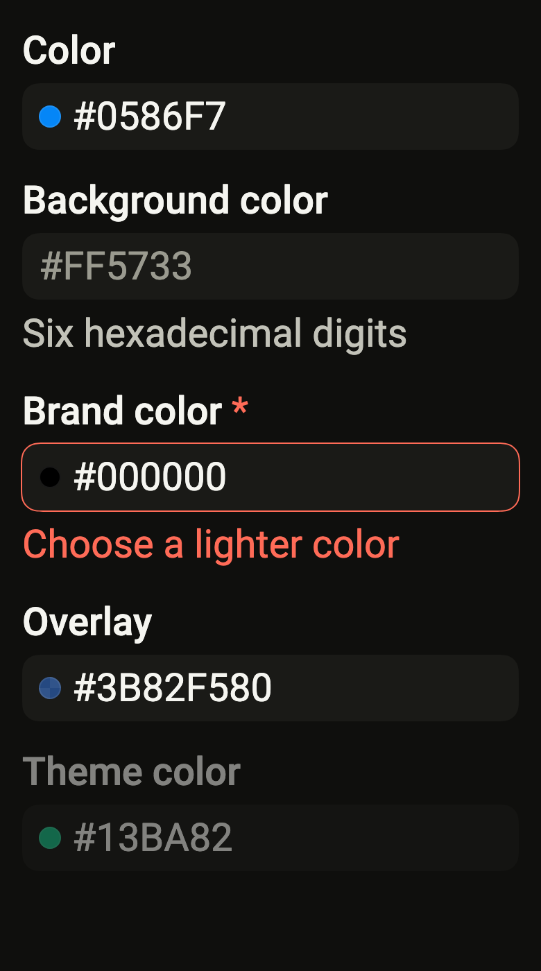
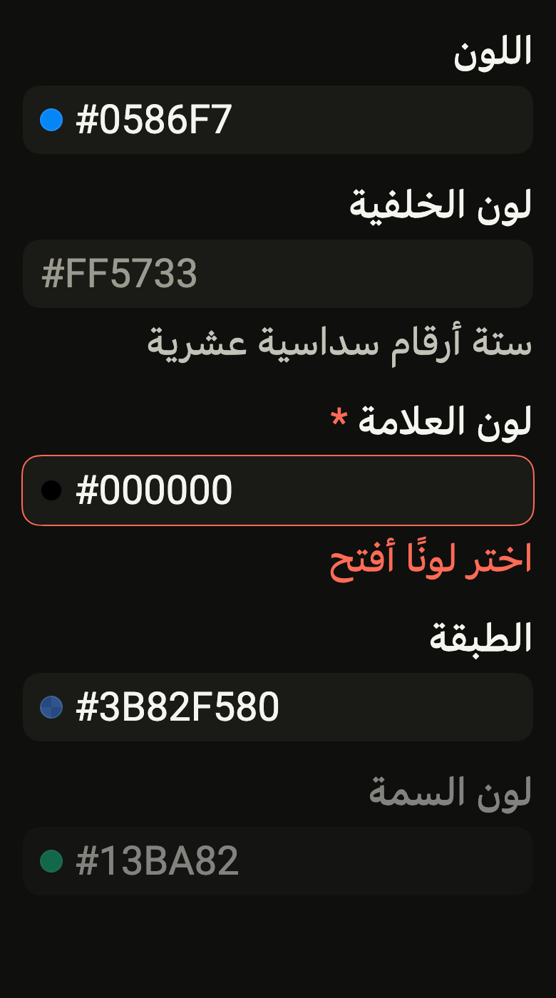
Use it to
- edit a colour as a hex code
- change a brand colour written as #RRGGBB
- show a swatch of the typed colour in the field
- show an error under an invalid hex colour
- accept a colour with its opacity as eight hex digits
- Not for
- free text: use a text field (text-field)
- picking a color by eye: use a color picker (color-picker)
- a number with minus and plus: use a number field (number-field)
- States
Source
The files fliin add color-field copies into your app, before your prefix and imports are applied.
color_field/fl_color_field.dart
// Modified from the ColorField and ColorInputGroup of HeroUI React v3,
// Copyright 2025 NextUI Inc., licensed under Apache 2.0:
// https://www.apache.org/licenses/LICENSE-2.0
import 'package:flutter/services.dart';
import 'package:flutter/widgets.dart';
import 'package:fliin_ui/components/color_swatch/fl_color_swatch.dart';
import 'package:fliin_ui/components/text_field/fl_text_field.dart';

/// A hexadecimal color field: the label, an input that writes the color as
/// `#RRGGBB` with a 16 swatch of it at its start, then the help or the
/// error. It has the frame of a `FlTextField`: white, lifted by the
/// `field` shadow, the accent ring on focus, the `danger` outline when
/// [error] is given.
///
/// Typed text counts as soon as it is a color (`#RGB` or `#RRGGBB`, the
/// `#` optional; with [alpha], `#RGBA` and `#RRGGBBAA` too): [onChanged]
/// receives it at once, and the swatch follows. On leaving the field or on
/// the action key, a color is rewritten in full capitals, and text that is
/// not one gives the previous color back, as React Aria's `ColorField`
/// does; an emptied field gives null, unless [required].
///
/// The hex is written left to right on an Arabic page too. The color is a
/// value of the app, never a theme color.
class FlColorField extends StatefulWidget {
  /// A field named [label] that shows [value] and offers the colors typed to
  /// [onChanged].
  const FlColorField({
    super.key,
    required this.label,
    required this.value,
    required this.onChanged,
    this.placeholder,
    this.helper,
    this.error,
    this.alpha = false,
    this.required = false,
    this.enabled = true,
    this.variant = FlInputVariant.primary,
    this.focusNode,
    this.autofocus = false,
  });

  /// The field's name, shown above and read by the screen reader.
  final String label;

  /// The color shown; null, an empty field. A value different from the one
  /// being typed replaces the text: the parent has the last word.
  final Color? value;

  /// Receives each color typed, and null when the field is emptied (unless
  /// [required]); up to the parent to give it back in [value].
  final ValueChanged<Color?> onChanged;

  /// The example text of an empty field ("#0485F7").
  final String? placeholder;

  /// The help under the field, read as a hint. Hidden while [error] is
  /// non-null.
  final String? helper;

  /// Non-null: the field is invalid, and this text replaces [helper].
  final String? error;

  /// True: the field reads and writes the opacity (`#RRGGBBAA`).
  final bool alpha;

  /// True: an asterisk follows the label, and an emptied field gives the
  /// previous color back.
  final bool required;

  /// False: the whole field is half opaque, without touch or focus.
  final bool enabled;

  /// The background: `primary` by default, `secondary` on a surface.
  final FlInputVariant variant;

  /// The input's focus node; null, the field creates its own.
  final FocusNode? focusNode;

  /// Takes focus on the first frame if nothing else has it within its scope.
  final bool autofocus;

  @override
  State<FlColorField> createState() => _FlColorFieldState();
}

class _FlColorFieldState extends State<FlColorField> {
  final TextEditingController _text = TextEditingController();
  FocusNode? _ownFocus;
  FocusNode get _focus => widget.focusNode ?? (_ownFocus ??= FocusNode());

  /// The last color the input gave the parent: given back in
  /// [FlColorField.value], it does not rewrite the text being typed.
  Color? _typed;

  @override
  void initState() {
    super.initState();
    _text.text = _format(widget.value);
    _focus.addListener(_onFocusChange);
  }

  @override
  void didUpdateWidget(FlColorField oldWidget) {
    super.didUpdateWidget(oldWidget);
    if (oldWidget.focusNode != widget.focusNode) {
      (oldWidget.focusNode ?? _ownFocus)?.removeListener(_onFocusChange);
      _focus.addListener(_onFocusChange);
    }
    if (oldWidget.value != widget.value && !(_focus.hasFocus && widget.value == _typed)) {
      _show(widget.value);
    }
  }

  @override
  void dispose() {
    _focus.removeListener(_onFocusChange);
    _ownFocus?.dispose();
    _text.dispose();
    super.dispose();
  }

  String _format(Color? color) => color == null ? '' : flColorHex(color, alpha: widget.alpha);

  void _show(Color? color) {
    final text = _format(color);
    if (_text.text == text) return;
    _text.value = TextEditingValue(
      text: text,
      selection: TextSelection.collapsed(offset: text.length),
    );
  }

  void _onFocusChange() {
    if (!_focus.hasFocus) _settle();
  }

  void _onChanged(String text) {
    if (text.trim().isEmpty) {
      if (!widget.required && widget.value != null) {
        _typed = null;
        widget.onChanged(null);
      }
      return;
    }
    final color = flParseColorHex(text, alpha: widget.alpha);
    if (color == null || color == widget.value) return;
    _typed = color;
    widget.onChanged(color);
  }

  /// On leaving: a color is rewritten in full, anything else gives the
  /// previous color back.
  void _settle() {
    final color = flParseColorHex(_text.text, alpha: widget.alpha);
    if (color == null && _text.text.trim().isEmpty && !widget.required) {
      _show(null);
      return;
    }
    _show(color ?? widget.value);
  }

  @override
  Widget build(BuildContext context) {
    final shown = widget.value;
    return FlTextField(
      label: widget.label,
      controller: _text,
      focusNode: _focus,
      placeholder: widget.placeholder,
      helper: widget.helper,
      error: widget.error,
      required: widget.required,
      enabled: widget.enabled,
      variant: widget.variant,
      autofocus: widget.autofocus,
      keyboardType: TextInputType.visiblePassword,
      textInputAction: TextInputAction.done,
      textDirection: TextDirection.ltr,
      prefix: shown == null ? null : FlColorSwatch(color: shown, label: null, size: FlColorSwatchSize.xs),
      onChanged: _onChanged,
      onSubmitted: (_) => _settle(),
    );
  }
}