Components / actions
Toggle button
Turns an option on or off with one button that stays pressed, such as a favorite or an editor's bold: with text or an icon alone, filled or ghost.
Import
In a Flutter app where fliin init has run:
Examples
Off
A toggle button keeps its state: selected says whether it is on, onChanged gives you the new value. Off, it looks like a quiet button.

import 'package:your_app/ui/fliin/components/toggle_button/fl_toggle_button.dart';
import 'package:your_app/ui/fliin/core/fliin.dart';
import 'package:your_app/ui/fliin/icons/fl_icons.dart';
import 'package:flutter/widgets.dart';

class ToggleButtonOffExample extends StatefulWidget {
  const ToggleButtonOffExample({super.key});

  @override
  State<ToggleButtonOffExample> createState() => _ToggleButtonOffExampleState();
}

class _ToggleButtonOffExampleState extends State<ToggleButtonOffExample> {
  var _on = false;

  @override
  Widget build(BuildContext context) {
    return Center(
      child: FlToggleButton(
        label: 'Favorite',
        selected: _on,
        leading: FlIcon(FlIcons.heart),
        selectedLeading: FlIcon(FlIcons.heartFill),
        onChanged: (on) => setState(() => _on = on),
      ),
    );
  }
}On
On, the button fills and shows selectedLeading in place of leading, here an outlined heart that becomes a full one.

import 'package:your_app/ui/fliin/components/toggle_button/fl_toggle_button.dart';
import 'package:your_app/ui/fliin/core/fliin.dart';
import 'package:your_app/ui/fliin/icons/fl_icons.dart';
import 'package:flutter/widgets.dart';

class ToggleButtonOnExample extends StatefulWidget {
  const ToggleButtonOnExample({super.key});

  @override
  State<ToggleButtonOnExample> createState() => _ToggleButtonOnExampleState();
}

class _ToggleButtonOnExampleState extends State<ToggleButtonOnExample> {
  var _on = true;

  @override
  Widget build(BuildContext context) {
    return Center(
      child: FlToggleButton(
        label: 'Favorite',
        selected: _on,
        leading: FlIcon(FlIcons.heart),
        selectedLeading: FlIcon(FlIcons.heartFill),
        onChanged: (on) => setState(() => _on = on),
      ),
    );
  }
}Ghost
The ghost variant, off and on: no background until it is selected, for toolbars and dense rows.

import 'package:your_app/ui/fliin/components/toggle_button/fl_toggle_button.dart';
import 'package:your_app/ui/fliin/core/fliin.dart';
import 'package:your_app/ui/fliin/icons/fl_icons.dart';
import 'package:flutter/widgets.dart';

class ToggleButtonGhostExample extends StatefulWidget {
  const ToggleButtonGhostExample({super.key});

  @override
  State<ToggleButtonGhostExample> createState() => _ToggleButtonGhostExampleState();
}

class _ToggleButtonGhostExampleState extends State<ToggleButtonGhostExample> {
  var _first = false;
  var _second = true;

  @override
  Widget build(BuildContext context) {
    final space = FlScope.of(context).space;
    return Wrap(
      alignment: WrapAlignment.center,
      crossAxisAlignment: WrapCrossAlignment.center,
      spacing: space.sm,
      runSpacing: space.sm,
      children: [
        FlToggleButton(
          label: 'Favorite',
          selected: _first,
          variant: FlToggleButtonVariant.ghost,
          leading: FlIcon(_first ? FlIcons.heartFill : FlIcons.heart),
          onChanged: (on) => setState(() => _first = on),
        ),
        FlToggleButton(
          label: 'Favorite',
          selected: _second,
          variant: FlToggleButtonVariant.ghost,
          leading: FlIcon(_second ? FlIcons.heartFill : FlIcons.heart),
          onChanged: (on) => setState(() => _second = on),
        ),
      ],
    );
  }
}Icon
FlToggleButton.icon shows only the icon, in each size; label is what the screen reader says.

import 'package:your_app/ui/fliin/components/button/fl_button.dart';
import 'package:your_app/ui/fliin/components/toggle_button/fl_toggle_button.dart';
import 'package:your_app/ui/fliin/core/fliin.dart';
import 'package:your_app/ui/fliin/icons/fl_icons.dart';
import 'package:flutter/widgets.dart';

class ToggleButtonIconExample extends StatefulWidget {
  const ToggleButtonIconExample({super.key});

  @override
  State<ToggleButtonIconExample> createState() => _ToggleButtonIconExampleState();
}

class _ToggleButtonIconExampleState extends State<ToggleButtonIconExample> {
  final _on = {FlButtonSize.md};

  @override
  Widget build(BuildContext context) {
    final space = FlScope.of(context).space;
    return Wrap(
      alignment: WrapAlignment.center,
      crossAxisAlignment: WrapCrossAlignment.center,
      spacing: space.sm,
      runSpacing: space.sm,
      children: [
        for (final size in FlButtonSize.values)
          FlToggleButton.icon(
            label: 'Star',
            selected: _on.contains(size),
            size: size,
            icon: FlIcon(_on.contains(size) ? FlIcons.starFill : FlIcons.star),
            onChanged: (on) => setState(() => on ? _on.add(size) : _on.remove(size)),
          ),
      ],
    );
  }
}Disabled
onChanged: null disables the toggle, off or on: it keeps showing its state but ignores touches.

import 'package:your_app/ui/fliin/components/toggle_button/fl_toggle_button.dart';
import 'package:your_app/ui/fliin/core/fliin.dart';
import 'package:your_app/ui/fliin/icons/fl_icons.dart';
import 'package:flutter/widgets.dart';

class ToggleButtonDisabledExample extends StatelessWidget {
  const ToggleButtonDisabledExample({super.key});

  @override
  Widget build(BuildContext context) {
    final space = FlScope.of(context).space;
    return Wrap(
      alignment: WrapAlignment.center,
      crossAxisAlignment: WrapCrossAlignment.center,
      spacing: space.sm,
      runSpacing: space.sm,
      children: [
        for (final on in [false, true])
          FlToggleButton(label: 'Favorite', selected: on, leading: FlIcon(FlIcons.heart), onChanged: null),
      ],
    );
  }
}Sizes
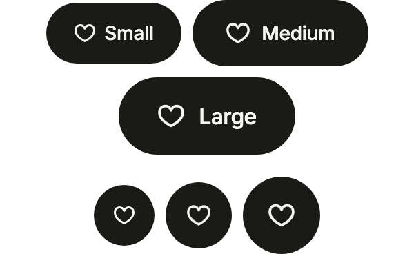
The three FlButtonSizes, with a label and as an icon alone: a toggle lines up with the buttons around it.
import 'package:your_app/ui/fliin/components/button/fl_button.dart';
import 'package:your_app/ui/fliin/components/toggle_button/fl_toggle_button.dart';
import 'package:your_app/ui/fliin/core/fliin.dart';
import 'package:your_app/ui/fliin/icons/fl_icons.dart';
import 'package:flutter/widgets.dart';

class ToggleButtonSizesExample extends StatefulWidget {
  const ToggleButtonSizesExample({super.key});

  @override
  State<ToggleButtonSizesExample> createState() => _ToggleButtonSizesExampleState();
}

class _ToggleButtonSizesExampleState extends State<ToggleButtonSizesExample> {
  final _on = <String>{};

  @override
  Widget build(BuildContext context) {
    final space = FlScope.of(context).space;
    Widget toggle(FlButtonSize size, String name, {bool iconOnly = false}) {
      final key = '$name$iconOnly';
      void changed(bool on) => setState(() => on ? _on.add(key) : _on.remove(key));
      return iconOnly
          ? FlToggleButton.icon(
              label: 'Like',
              size: size,
              selected: _on.contains(key),
              icon: FlIcon(FlIcons.heart),
              selectedIcon: FlIcon(FlIcons.heartFill),
              onChanged: changed,
            )
          : FlToggleButton(
              label: name,
              size: size,
              selected: _on.contains(key),
              leading: FlIcon(FlIcons.heart),
              selectedLeading: FlIcon(FlIcons.heartFill),
              onChanged: changed,
            );
    }

    const sizes = {FlButtonSize.sm: 'Small', FlButtonSize.md: 'Medium', FlButtonSize.lg: 'Large'};
    return Column(
      mainAxisSize: MainAxisSize.min,
      spacing: space.lg,
      children: [
        Wrap(
          alignment: WrapAlignment.center,
          crossAxisAlignment: WrapCrossAlignment.center,
          spacing: space.sm,
          runSpacing: space.sm,
          children: [for (final MapEntry(key: size, value: name) in sizes.entries) toggle(size, name)],
        ),
        Wrap(
          alignment: WrapAlignment.center,
          crossAxisAlignment: WrapCrossAlignment.center,
          spacing: space.sm,
          runSpacing: space.sm,
          children: [for (final MapEntry(key: size, value: name) in sizes.entries) toggle(size, name, iconOnly: true)],
        ),
      ],
    );
  }
}Controlled
Your state drives the toggle: selected comes from it, onChanged updates it, and the rest of the screen can read it.

import 'package:your_app/ui/fliin/components/text/fl_text.dart';
import 'package:your_app/ui/fliin/components/toggle_button/fl_toggle_button.dart';
import 'package:your_app/ui/fliin/core/fliin.dart';
import 'package:your_app/ui/fliin/icons/fl_icons.dart';
import 'package:flutter/widgets.dart';

class ToggleButtonControlledExample extends StatefulWidget {
  const ToggleButtonControlledExample({super.key});

  @override
  State<ToggleButtonControlledExample> createState() => _ToggleButtonControlledExampleState();
}

class _ToggleButtonControlledExampleState extends State<ToggleButtonControlledExample> {
  var _liked = false;

  @override
  Widget build(BuildContext context) {
    return Column(
      mainAxisSize: MainAxisSize.min,
      spacing: FlScope.of(context).space.md,
      children: [
        FlToggleButton(
          label: 'Like',
          selected: _liked,
          leading: FlIcon(FlIcons.heart),
          selectedLeading: FlIcon(FlIcons.heartFill),
          onChanged: (on) => setState(() => _liked = on),
        ),
        FlText('Status: ${_liked ? 'liked' : 'not liked'}', type: FlTextType.bodySm, tone: FlTextTone.muted),
      ],
    );
  }
}Usage
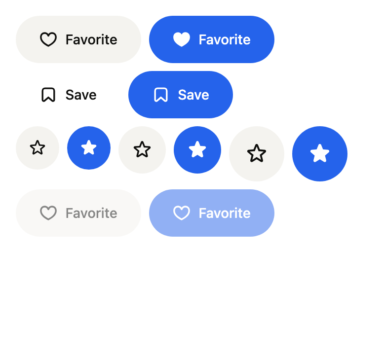
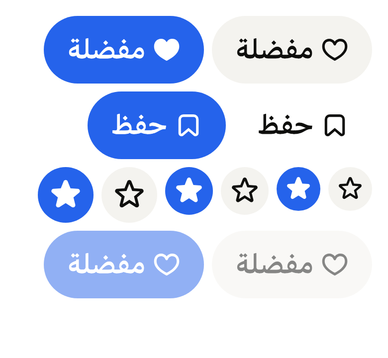
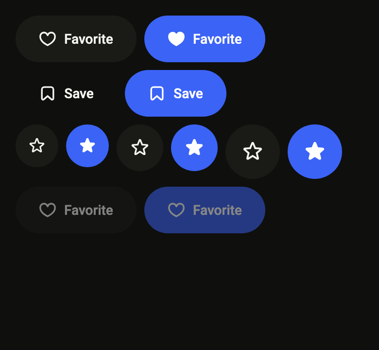
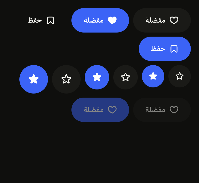
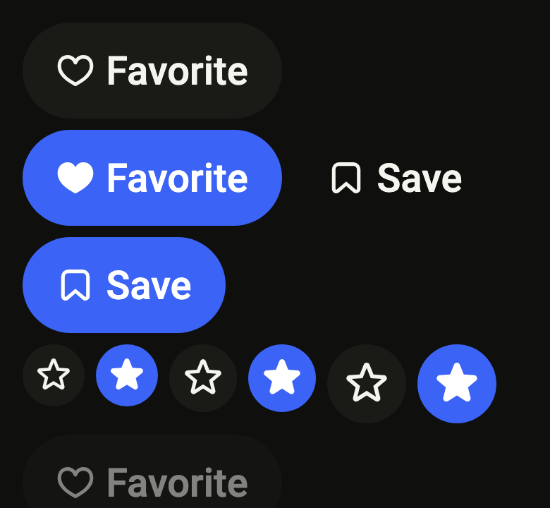
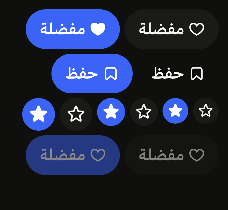
The code the reference images render:
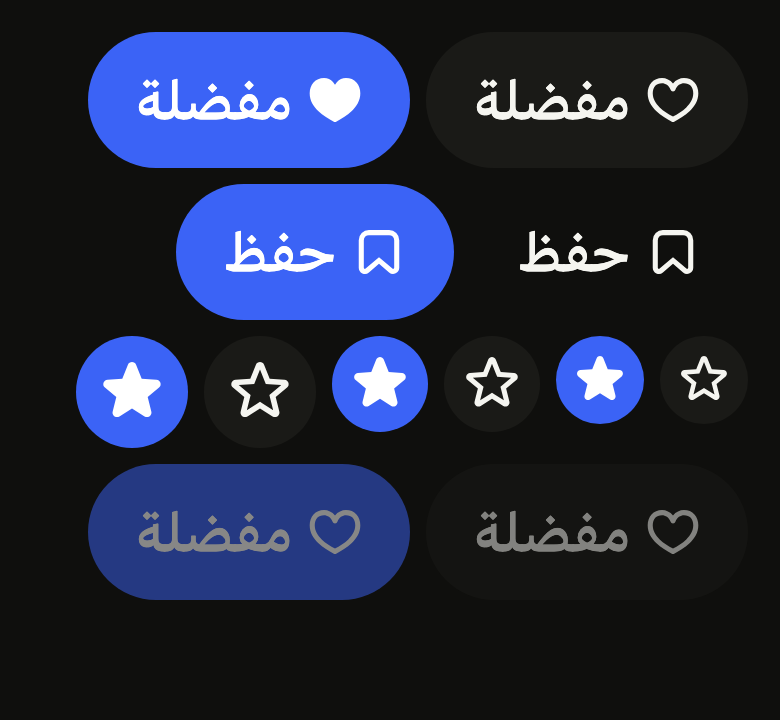
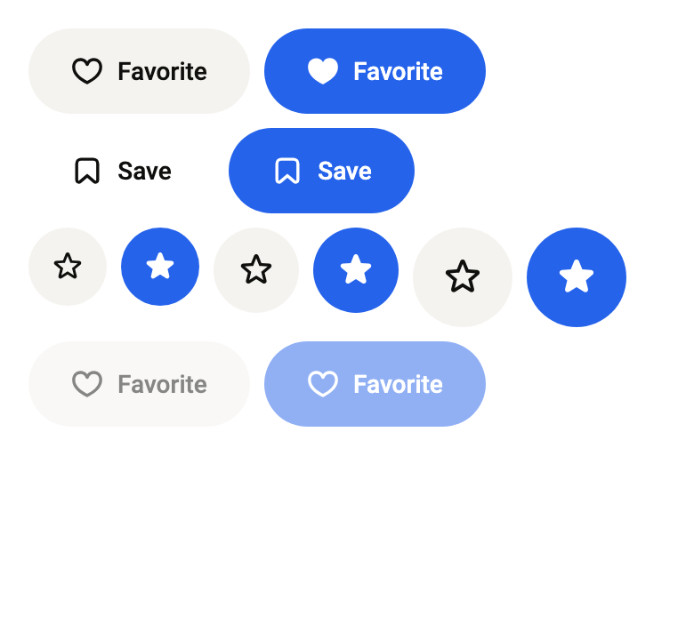
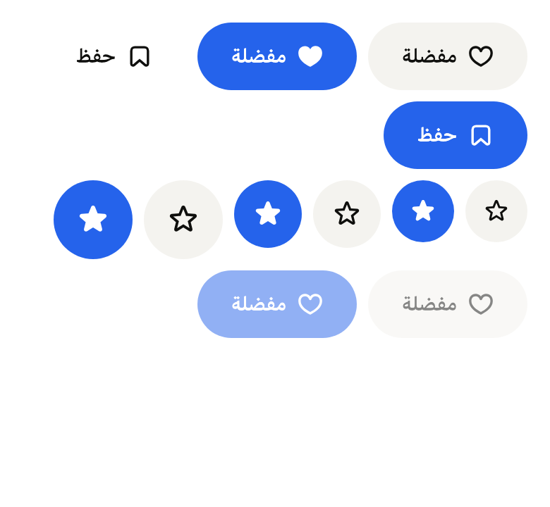
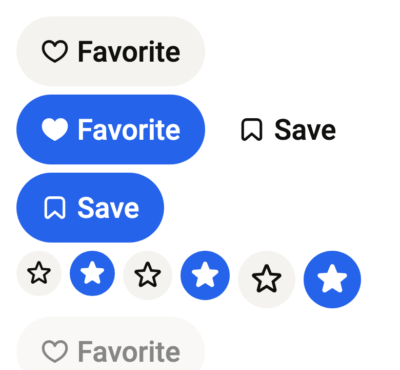
final example = ColoredBox(
  color: FlScope.of(context).colors.surface,
  child: SingleChildScrollView(
    padding: EdgeInsetsDirectional.all(FlScope.of(context).space.lg),
    child: Column(
      crossAxisAlignment: CrossAxisAlignment.stretch,
      spacing: FlScope.of(context).space.sm,
      children: [
        Wrap(
          spacing: FlScope.of(context).space.sm,
          runSpacing: FlScope.of(context).space.sm,
          children: [
            for (final on in [false, true])
              FlToggleButton(
                label: 'Favorite',
                selected: on,
                leading: FlIcon(on ? FlIcons.heartFill : FlIcons.heart),
                onChanged: (_) {},
              ),
            for (final on in [false, true])
              FlToggleButton(
                label: 'Save',
                selected: on,
                variant: FlToggleButtonVariant.ghost,
                leading: FlIcon(FlIcons.bookmark),
                onChanged: (_) {},
              ),
          ],
        ),
        Wrap(
          spacing: FlScope.of(context).space.sm,
          runSpacing: FlScope.of(context).space.sm,
          children: [
            for (final size in FlButtonSize.values)
              for (final on in [false, true])
                FlToggleButton.icon(
                  label: 'Favorite',
                  selected: on,
                  size: size,
                  icon: FlIcon(on ? FlIcons.starFill : FlIcons.star),
                  onChanged: (_) {},
                ),
          ],
        ),
        Wrap(
          spacing: FlScope.of(context).space.sm,
          runSpacing: FlScope.of(context).space.sm,
          children: [
            for (final on in [false, true])
              FlToggleButton(
                label: 'Favorite',
                selected: on,
                leading: FlIcon(FlIcons.heart),
                onChanged: null,
              ),
          ],
        ),
      ],
    ),
  ),
);API
FlToggleButtonVariant: enum {filled, ghost}
FlToggleButtonVariant.filled: static final FlToggleButtonVariant
FlToggleButtonVariant.ghost: static final FlToggleButtonVariant
FlToggleButton: class extends StatelessWidget
FlToggleButton.new: const new({super.key, required String label, required bool selected, required ValueChanged<bool>? onChanged, FlToggleButtonVariant variant, FlButtonSize? size, Widget? leading, Widget? selectedLeading, Widget? trailing})
FlToggleButton.icon: get Widget?
FlToggleButton.label: get String
FlToggleButton.selected: get bool
FlToggleButton.onChanged: get ValueChanged<bool>?
FlToggleButton.variant: get FlToggleButtonVariant
FlToggleButton.size: get FlButtonSize?
FlToggleButton.leading: get Widget?
FlToggleButton.selectedLeading: get Widget?
FlToggleButton.trailing: get Widget?
FlToggleButton.selectedIcon: get Widget?
FlToggleButton.build: Widget(BuildContext context)Reference renders
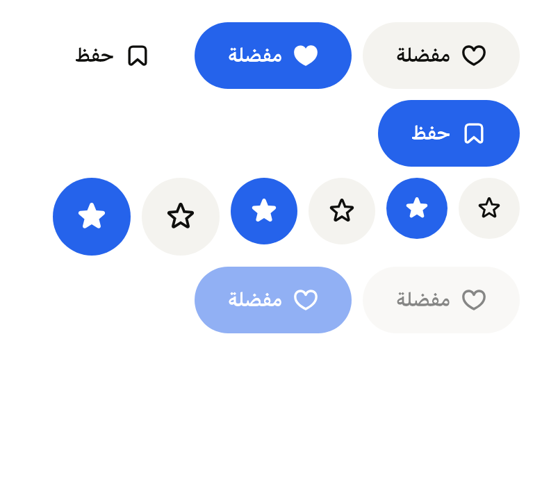
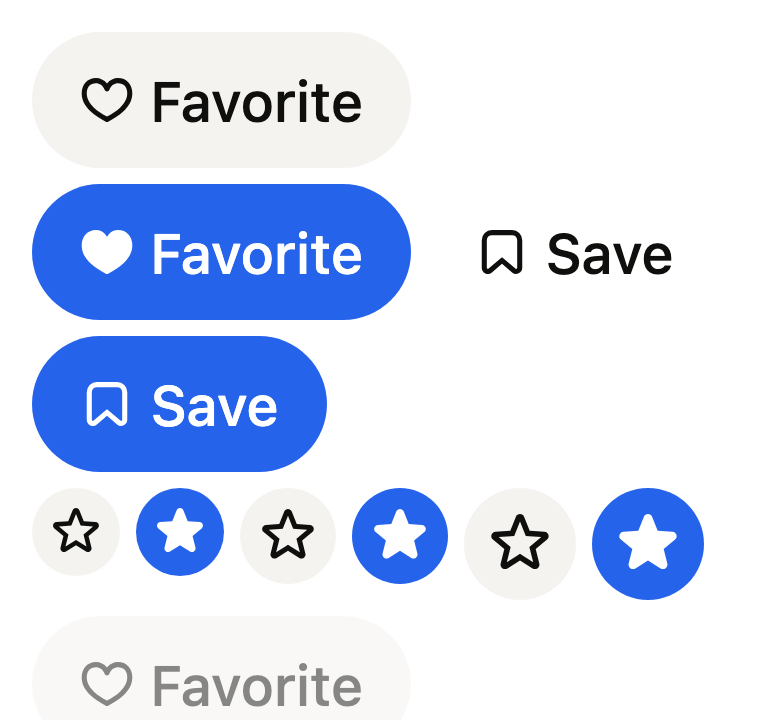
The 16 images published with version 0.1.1, rendered by the shared harness on macOS with Flutter 3.47.7. fliin verify toggle-button compares your copy to them.
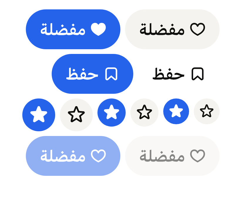
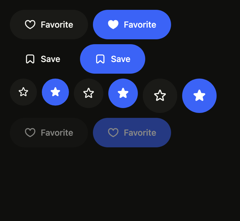
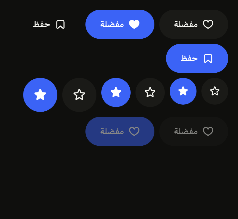
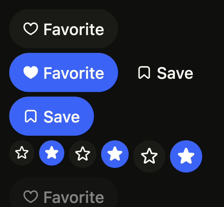
Use it to
- add an item to favorites with a heart
- toggle bold in a text editor
- mute or unmute the microphone during a call
- keep a conversation pinned to the top
- keep a button pressed while an option stays on
- switch following a show on and off
- Not for
- one exclusive choice among several options: use the segmented control (segmented)
- a setting switched on or off in a list: use a switch (switch)
- a one-off action: use a button (button)
- States
Source
The files fliin add toggle-button copies into your app, before your prefix and imports are applied.
toggle_button/fl_toggle_button.dart
// Modified from the ToggleButton of HeroUI React v3, Copyright 2025 NextUI
// Inc., licensed under Apache 2.0: https://www.apache.org/licenses/LICENSE-2.0
import 'package:flutter/widgets.dart';
import 'package:fliin_ui/components/button/fl_button.dart';

/// The look of an [FlToggleButton] when it is off.
enum FlToggleButtonVariant {
  /// A `control` fill.
  filled,

  /// No fill until hovered or on: in a toolbar.
  ghost,
}

/// A button that stays on or off: a favorite, an
/// editor's bold, a mute. Off, it is a `control` button (or a bare one,
/// [FlToggleButtonVariant.ghost]); on, it takes the `selected` fill and
/// `onSelected` text, like every chosen state, the fill crossfading in
/// `short2`. It is an [FlButton]: the same heights, padding, shape preset,
/// press scale and focus ring. For an exclusive choice among several, use
/// `segmented`.
///
/// The screen reader reads [label] and the selected state; [label] does not
/// change with it ("Bold", not "Bold on"). Color alone does not tell the
/// state: give [selectedLeading] or [selectedIcon], shown while it is on (a
/// filled heart).
///
/// ```dart
/// FlToggleButton(label: 'Like', selected: liked, onChanged: setLiked,
///     leading: FlIcon(FlIcons.heart), selectedLeading: FlIcon(FlIcons.heartFill))
/// ```
class FlToggleButton extends StatelessWidget {
  /// A labeled toggle button.
  const FlToggleButton({
    super.key,
    required this.label,
    required this.selected,
    required this.onChanged,
    this.variant = FlToggleButtonVariant.filled,
    this.size,
    this.leading,
    this.selectedLeading,
    this.trailing,
  }) : icon = null,
       selectedIcon = null;

  /// A square toggle button that shows only [icon]; [label] remains what the
  /// screen reader reads.
  const FlToggleButton.icon({
    super.key,
    required this.label,
    required Widget this.icon,
    required this.selected,
    required this.onChanged,
    this.variant = FlToggleButtonVariant.filled,
    this.size,
    this.selectedIcon,
  }) : leading = null,
       selectedLeading = null,
       trailing = null;

  /// The text shown, and read by the screen reader.
  final String label;

  /// On or off.
  final bool selected;

  /// Receives the opposite of [selected] when pressed; null disables the
  /// button, at `size.disabledOpacity`.
  final ValueChanged<bool>? onChanged;

  /// The look when off; `filled` by default.
  final FlToggleButtonVariant variant;

  /// The height, the padding and the text size; null follows the theme's
  /// density.
  final FlButtonSize? size;

  /// An icon before the text.
  final Widget? leading;

  /// The icon before the text while [selected], in place of [leading].
  final Widget? selectedLeading;

  /// An icon after the text, in the text's color (a chevron, a lock).
  final Widget? trailing;

  /// The icon of an [FlToggleButton.icon], alone in a square.
  final Widget? icon;

  /// The icon of an [FlToggleButton.icon] while [selected], in place of
  /// [icon].
  final Widget? selectedIcon;

  @override
  Widget build(BuildContext context) {
    // On, both variants become the `tertiary` button's selected state: the
    // `selected` fill. Off, `filled` is the `tertiary` button and `ghost` the
    // `ghost` one.
    final look = selected || variant == FlToggleButtonVariant.filled ? FlButtonVariant.tertiary : FlButtonVariant.ghost;
    final onChanged = this.onChanged;
    final onPressed = onChanged == null ? null : () => onChanged(!selected);
    final icon = selected ? selectedIcon ?? this.icon : this.icon;
    return icon == null
        ? FlButton(
            label: label,
            leading: selected ? selectedLeading ?? leading : leading,
            trailing: trailing,
            selected: selected,
            variant: look,
            size: size,
            onPressed: onPressed,
          )
        : FlButton.icon(label: label, icon: icon, selected: selected, variant: look, size: size, onPressed: onPressed);
  }
}