Components / navigation
Tabs
Moves between views at the same level of a screen. Segmented or underlined tabs with a spring indicator, disabled tabs, separators and arrow key navigation.
Import
In a Flutter app where fliin init has run:
Examples
Example
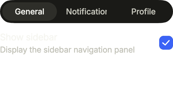
Settings split into three tabs, each with its own controls. The tab view keeps each tab's state while you switch.
import 'package:your_app/ui/fliin/components/button/fl_button.dart';
import 'package:your_app/ui/fliin/components/checkbox/fl_checkbox.dart';
import 'package:your_app/ui/fliin/components/tabs/fl_tabs.dart';
import 'package:your_app/ui/fliin/components/text/fl_text.dart';
import 'package:your_app/ui/fliin/components/text_field/fl_text_field.dart';
import 'package:your_app/ui/fliin/core/fliin.dart';
import 'package:flutter/widgets.dart';

class TabsExample extends StatefulWidget {
  const TabsExample({super.key});

  @override
  State<TabsExample> createState() => _TabsExampleState();
}

class _TabsExampleState extends State<TabsExample> {
  final _controller = FlTabController(length: 3);
  bool? _sidebar = true;
  bool? _activity = false;

  @override
  void dispose() {
    _controller.dispose();
    super.dispose();
  }

  @override
  Widget build(BuildContext context) {
    final space = FlScope.of(context).space;
    Widget setting(String label, String description, Widget control) => Row(
      spacing: space.md,
      children: [
        Expanded(
          child: Column(
            crossAxisAlignment: CrossAxisAlignment.start,
            children: [
              FlText(label),
              FlText(description, type: FlTextType.bodySm, tone: FlTextTone.muted),
            ],
          ),
        ),
        control,
      ],
    );
    return Column(
      mainAxisSize: MainAxisSize.min,
      crossAxisAlignment: CrossAxisAlignment.stretch,
      spacing: space.md,
      children: [
        FlTabs(controller: _controller, labels: const ['General', 'Notifications', 'Profile']),
        FlTabView(
          controller: _controller,
          children: [
            setting(
              'Show sidebar',
              'Display the sidebar navigation panel',
              FlCheckbox(value: _sidebar, onChanged: (value) => setState(() => _sidebar = value), label: 'Show sidebar'),
            ),
            setting(
              'Account activity',
              'Notifications about your account activity',
              FlCheckbox(
                key: const ValueKey('activity'),
                value: _activity,
                onChanged: (value) => setState(() => _activity = value),
                label: 'Account activity',
              ),
            ),
            Column(
              mainAxisSize: MainAxisSize.min,
              crossAxisAlignment: CrossAxisAlignment.stretch,
              spacing: space.md,
              children: [
                const FlTextField(
                  key: ValueKey('name'),
                  label: 'Name',
                  placeholder: 'Enter your full name',
                  required: true,
                ),
                FlButton(label: 'Update profile', size: FlButtonSize.sm, onPressed: () {}),
              ],
            ),
          ],
        ),
      ],
    );
  }
}Primary
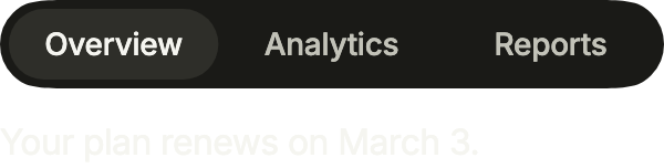
Tabs over the content they switch: FlTabs and FlTabView share one FlTabController. The primary variant slides a thumb under the selected tab.
import 'package:your_app/ui/fliin/components/tabs/fl_tabs.dart';
import 'package:your_app/ui/fliin/components/text/fl_text.dart';
import 'package:your_app/ui/fliin/core/fliin.dart';
import 'package:flutter/widgets.dart';

class TabsPrimaryExample extends StatefulWidget {
  const TabsPrimaryExample({super.key});

  @override
  State<TabsPrimaryExample> createState() => _TabsPrimaryExampleState();
}

class _TabsPrimaryExampleState extends State<TabsPrimaryExample> {
  final _controller = FlTabController(length: 3);

  @override
  void dispose() {
    _controller.dispose();
    super.dispose();
  }

  @override
  Widget build(BuildContext context) {
    return Column(
      mainAxisSize: MainAxisSize.min,
      crossAxisAlignment: CrossAxisAlignment.stretch,
      spacing: FlScope.of(context).space.md,
      children: [
        FlTabs(
          controller: _controller,
          labels: const ['Overview', 'Analytics', 'Reports'],
        ),
        FlTabView(
          controller: _controller,
          children: const [
            FlText('Your plan renews on March 3.'),
            FlText('1,204 visits this week.'),
            FlText('Two reports are ready.'),
          ],
        ),
      ],
    );
  }
}Secondary
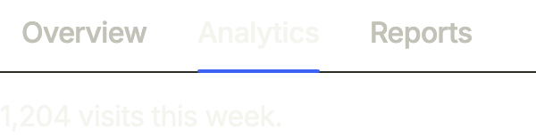
The secondary variant underlines the selected tab: quieter, for tabs inside a card or under a title. initialIndex picks the first tab shown.
import 'package:your_app/ui/fliin/components/tabs/fl_tabs.dart';
import 'package:your_app/ui/fliin/components/text/fl_text.dart';
import 'package:your_app/ui/fliin/core/fliin.dart';
import 'package:flutter/widgets.dart';

class TabsSecondaryExample extends StatefulWidget {
  const TabsSecondaryExample({super.key});

  @override
  State<TabsSecondaryExample> createState() => _TabsSecondaryExampleState();
}

class _TabsSecondaryExampleState extends State<TabsSecondaryExample> {
  final _controller = FlTabController(length: 3, initialIndex: 1);

  @override
  void dispose() {
    _controller.dispose();
    super.dispose();
  }

  @override
  Widget build(BuildContext context) {
    return Column(
      mainAxisSize: MainAxisSize.min,
      crossAxisAlignment: CrossAxisAlignment.stretch,
      spacing: FlScope.of(context).space.md,
      children: [
        FlTabs(
          controller: _controller,
          labels: const ['Overview', 'Analytics', 'Reports'],
          variant: FlTabsVariant.secondary,
        ),
        FlTabView(
          controller: _controller,
          children: const [
            FlText('Your plan renews on March 3.'),
            FlText('1,204 visits this week.'),
            FlText('Two reports are ready.'),
          ],
        ),
      ],
    );
  }
}Disabled
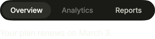
disabled takes the indexes of the tabs that cannot be selected: they fade and are skipped by touch and keyboard.
import 'package:your_app/ui/fliin/components/tabs/fl_tabs.dart';
import 'package:your_app/ui/fliin/components/text/fl_text.dart';
import 'package:your_app/ui/fliin/core/fliin.dart';
import 'package:flutter/widgets.dart';

class TabsDisabledExample extends StatefulWidget {
  const TabsDisabledExample({super.key});

  @override
  State<TabsDisabledExample> createState() => _TabsDisabledExampleState();
}

class _TabsDisabledExampleState extends State<TabsDisabledExample> {
  final _controller = FlTabController(length: 3);

  @override
  void dispose() {
    _controller.dispose();
    super.dispose();
  }

  @override
  Widget build(BuildContext context) {
    return Column(
      mainAxisSize: MainAxisSize.min,
      crossAxisAlignment: CrossAxisAlignment.stretch,
      spacing: FlScope.of(context).space.md,
      children: [
        FlTabs(
          controller: _controller,
          labels: const ['Overview', 'Analytics', 'Reports'],
          disabled: const {1},
        ),
        FlTabView(
          controller: _controller,
          children: const [
            FlText('Your plan renews on March 3.'),
            FlText('1,204 visits this week.'),
            FlText('Two reports are ready.'),
          ],
        ),
      ],
    );
  }
}With icons
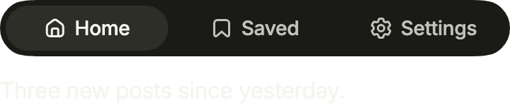
icons puts an icon before each label, in the label's color: it follows the selection and the text size.
import 'package:your_app/ui/fliin/components/tabs/fl_tabs.dart';
import 'package:your_app/ui/fliin/components/text/fl_text.dart';
import 'package:your_app/ui/fliin/core/fliin.dart';
import 'package:your_app/ui/fliin/icons/fl_icons.dart';
import 'package:flutter/widgets.dart';

class TabsWithIconsExample extends StatefulWidget {
  const TabsWithIconsExample({super.key});

  @override
  State<TabsWithIconsExample> createState() => _TabsWithIconsExampleState();
}

class _TabsWithIconsExampleState extends State<TabsWithIconsExample> {
  final _controller = FlTabController(length: 3);

  @override
  void dispose() {
    _controller.dispose();
    super.dispose();
  }

  @override
  Widget build(BuildContext context) {
    return Column(
      mainAxisSize: MainAxisSize.min,
      crossAxisAlignment: CrossAxisAlignment.stretch,
      spacing: FlScope.of(context).space.md,
      children: [
        FlTabs(
          controller: _controller,
          labels: const ['Home', 'Saved', 'Settings'],
          icons: [
            FlIcon(FlIcons.house),
            FlIcon(FlIcons.bookmark),
            FlIcon(FlIcons.gear),
          ],
        ),
        FlTabView(
          controller: _controller,
          children: const [
            FlText('Three new posts since yesterday.'),
            FlText('Twelve saved articles.'),
            FlText('Notifications are on.'),
          ],
        ),
      ],
    );
  }
}With separator
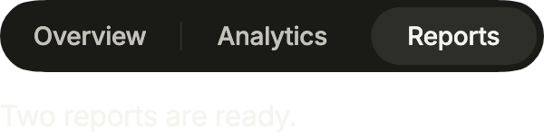
separators draws a short rule between two tabs, faded out beside the selected one.
import 'package:your_app/ui/fliin/components/tabs/fl_tabs.dart';
import 'package:your_app/ui/fliin/components/text/fl_text.dart';
import 'package:your_app/ui/fliin/core/fliin.dart';
import 'package:flutter/widgets.dart';

class TabsWithSeparatorExample extends StatefulWidget {
  const TabsWithSeparatorExample({super.key});

  @override
  State<TabsWithSeparatorExample> createState() =>
      _TabsWithSeparatorExampleState();
}

class _TabsWithSeparatorExampleState extends State<TabsWithSeparatorExample> {
  final _controller = FlTabController(length: 3, initialIndex: 2);

  @override
  void dispose() {
    _controller.dispose();
    super.dispose();
  }

  @override
  Widget build(BuildContext context) {
    return Column(
      mainAxisSize: MainAxisSize.min,
      crossAxisAlignment: CrossAxisAlignment.stretch,
      spacing: FlScope.of(context).space.md,
      children: [
        FlTabs(
          controller: _controller,
          labels: const ['Overview', 'Analytics', 'Reports'],
          separators: true,
        ),
        FlTabView(
          controller: _controller,
          children: const [
            FlText('Your plan renews on March 3.'),
            FlText('1,204 visits this week.'),
            FlText('Two reports are ready.'),
          ],
        ),
      ],
    );
  }
}Custom styles
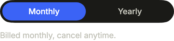
A billing cycle picker in the accent: indicatorColor fills the thumb, selectedLabelColor keeps its label readable on it.
import 'package:your_app/ui/fliin/components/tabs/fl_tabs.dart';
import 'package:your_app/ui/fliin/components/text/fl_text.dart';
import 'package:your_app/ui/fliin/core/fliin.dart';
import 'package:flutter/widgets.dart';

class TabsCustomStylesExample extends StatefulWidget {
  const TabsCustomStylesExample({super.key});

  @override
  State<TabsCustomStylesExample> createState() =>
      _TabsCustomStylesExampleState();
}

class _TabsCustomStylesExampleState extends State<TabsCustomStylesExample> {
  final _controller = FlTabController(length: 2);

  @override
  void dispose() {
    _controller.dispose();
    super.dispose();
  }

  @override
  Widget build(BuildContext context) {
    final theme = FlScope.of(context);
    return Column(
      mainAxisSize: MainAxisSize.min,
      crossAxisAlignment: CrossAxisAlignment.stretch,
      spacing: theme.space.md,
      children: [
        FlTabs(
          controller: _controller,
          labels: const ['Monthly', 'Yearly'],
          indicatorColor: theme.colors.accent,
          selectedLabelColor: theme.colors.onAccent,
        ),
        FlTabView(
          controller: _controller,
          children: const [
            FlText(
              'Billed monthly, cancel anytime.',
              type: FlTextType.bodySm,
              tone: FlTextTone.muted,
            ),
            FlText(
              'Save 20% with annual billing.',
              type: FlTextType.bodySm,
              tone: FlTextTone.muted,
            ),
          ],
        ),
      ],
    );
  }
}Usage
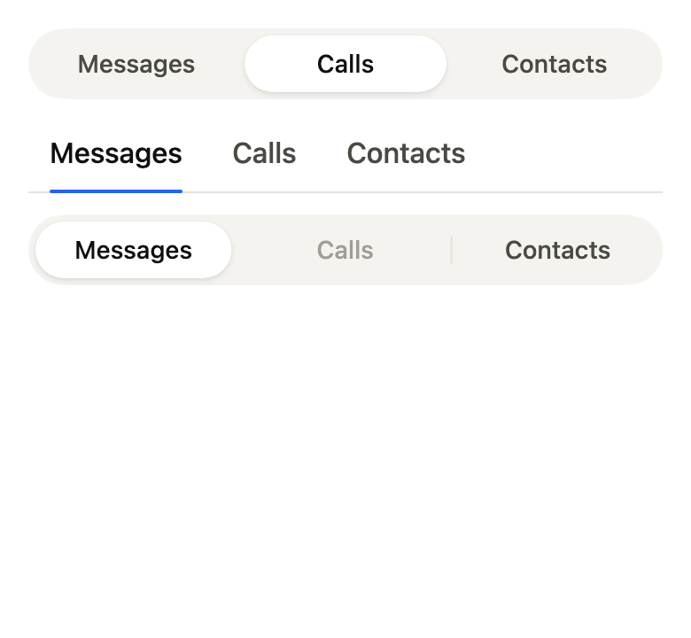
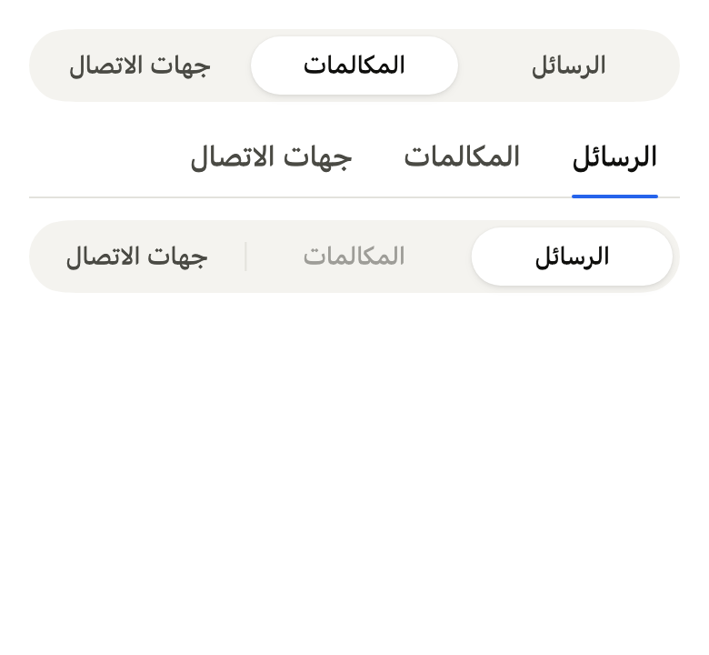
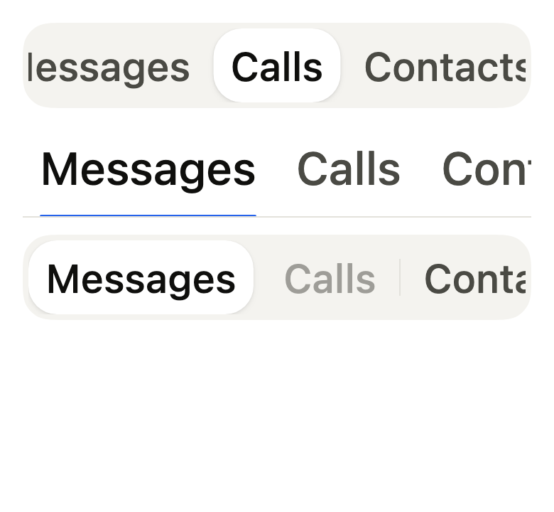
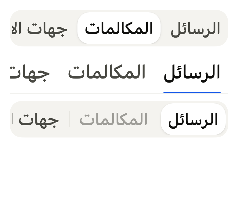
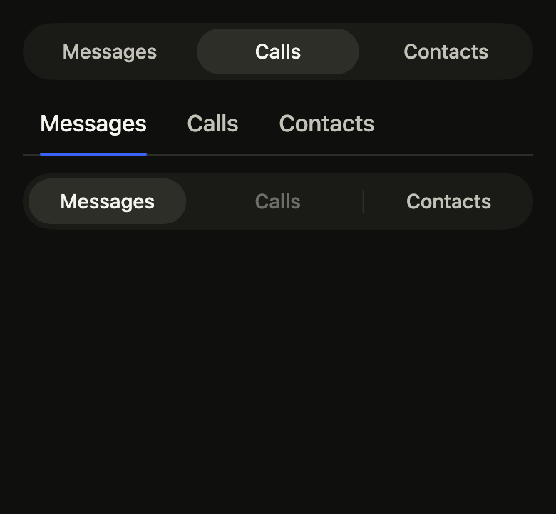
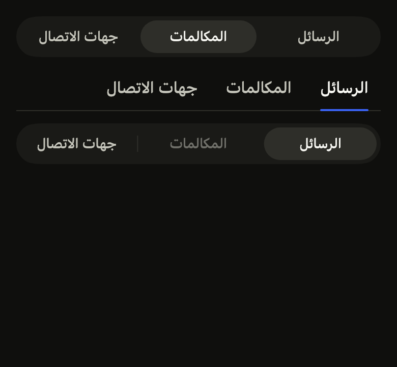
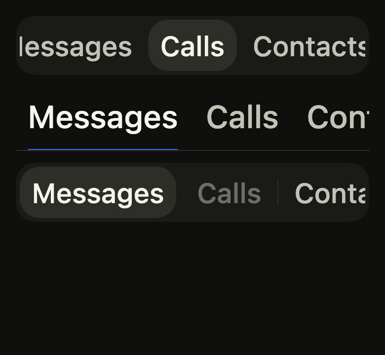
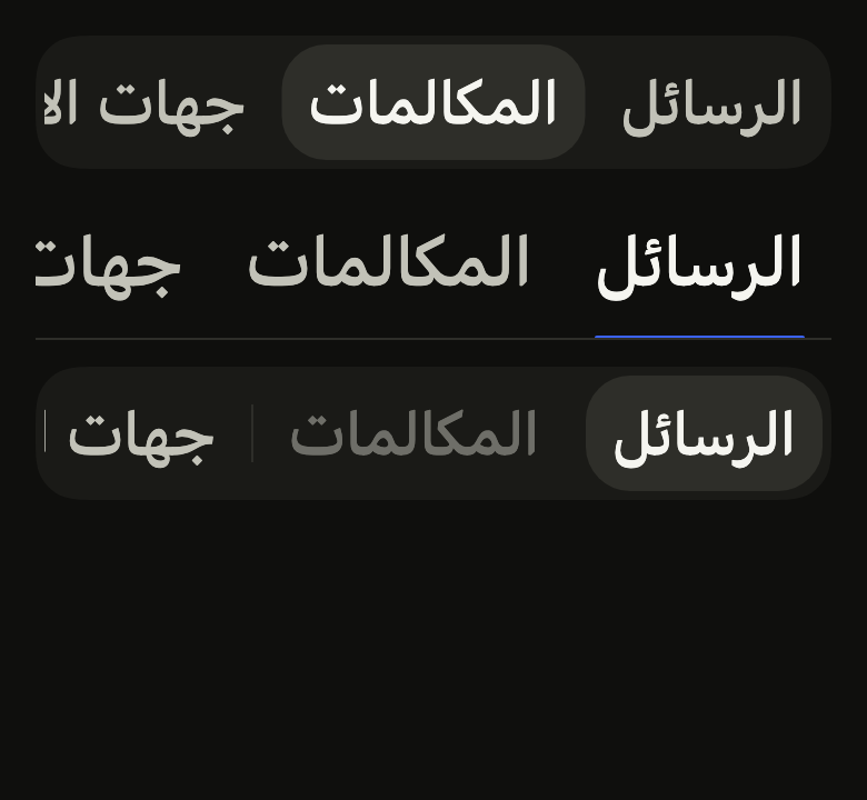
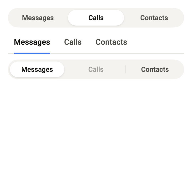
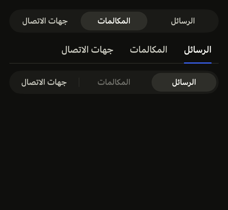
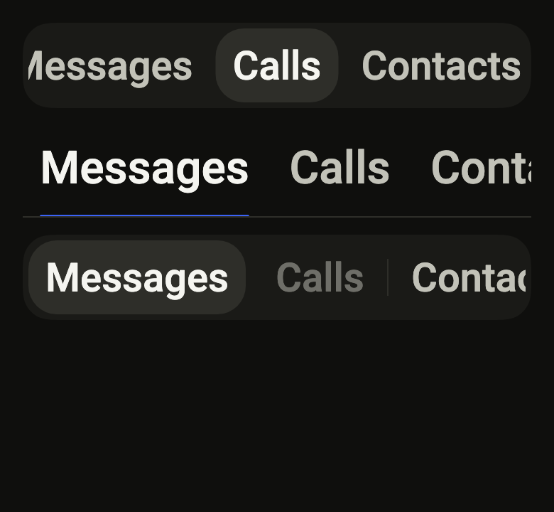
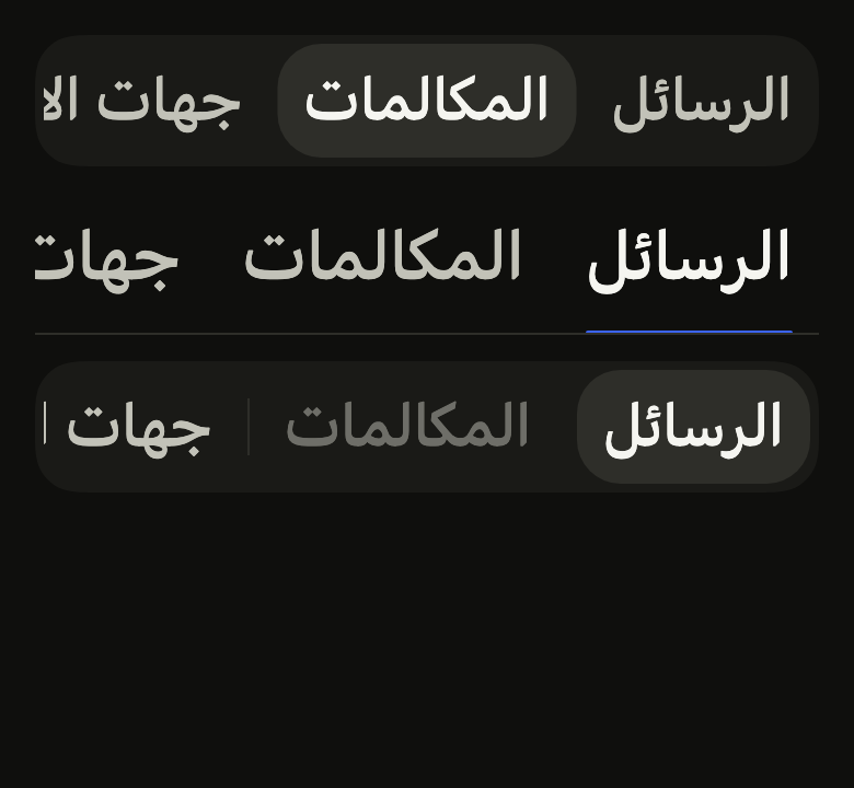
The code the reference images render:
final example = ColoredBox(
  color: FlScope.of(context).colors.surface,
  child: Padding(
    padding: EdgeInsetsDirectional.all(FlScope.of(context).space.lg),
    child: Column(
      crossAxisAlignment: CrossAxisAlignment.stretch,
      spacing: FlScope.of(context).space.md,
      children: [
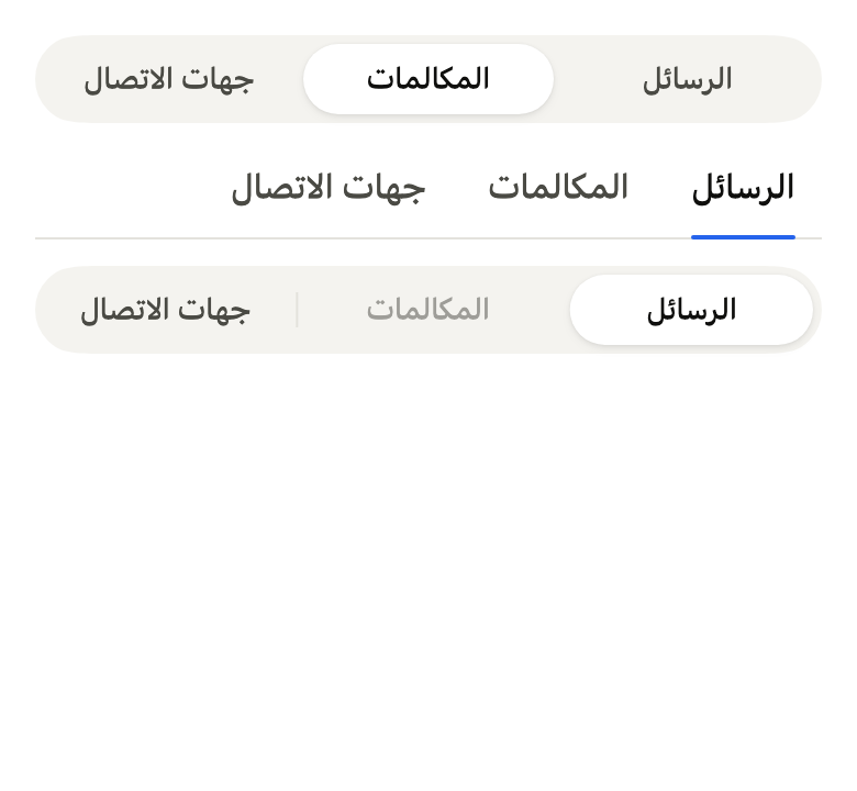
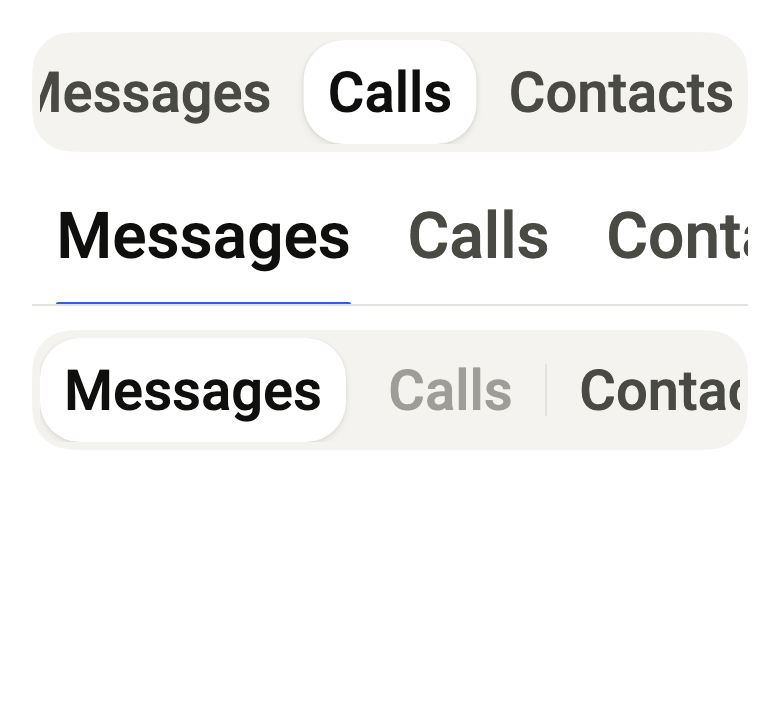
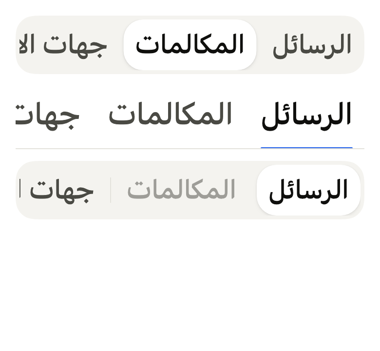
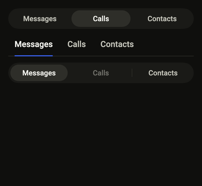
        FlTabs(
          controller: FlTabController(length: 3, initialIndex: 1),
          labels: ['Messages', 'Calls', 'Contacts'],
        ),
        FlTabs(
          controller: FlTabController(length: 3),
          variant: FlTabsVariant.secondary,
          labels: ['Messages', 'Calls', 'Contacts'],
        ),
        FlTabs(
          controller: FlTabController(length: 3),
          disabled: const {1},
          separators: true,
          labels: ['Messages', 'Calls', 'Contacts'],
        ),
      ],
    ),
  ),
);API
FlTabController: final class extends ChangeNotifier
FlTabController.new: new({required int length, int initialIndex})
FlTabController.length: get int
FlTabController.index: get int
FlTabController.index=: set int
FlTabsVariant: enum {primary, secondary}
FlTabsVariant.primary: static final FlTabsVariant
FlTabsVariant.secondary: static final FlTabsVariant
FlTabs: class extends StatefulWidget
FlTabs.new: const new({super.key, required FlTabController controller, required List<String> labels, FlTabsVariant variant, Set<int> disabled, bool separators, bool fill, List<Widget?>? icons, Color? indicatorColor, Color? selectedLabelColor})
FlTabs.controller: get FlTabController
FlTabs.labels: get List<String>
FlTabs.variant: get FlTabsVariant
FlTabs.disabled: get Set<int>
FlTabs.separators: get bool
FlTabs.fill: get bool
FlTabs.icons: get List<Widget?>?
FlTabs.indicatorColor: get Color?
FlTabs.selectedLabelColor: get Color?
FlTabs.createState: State<FlTabs>()
FlTabView: class extends StatelessWidget
FlTabView.new: const new({super.key, required FlTabController controller, required List<Widget> children})
FlTabView.controller: get FlTabController
FlTabView.children: get List<Widget>
FlTabView.build: Widget(BuildContext context)Reference renders
The 16 images published with version 0.3.3, rendered by the shared harness on macOS with Flutter 3.47.7. fliin verify tabs compares your copy to them.
Use it to
- switch between views on one screen
- add a tab bar at the top of a page
- split content into sections
- navigate sections without leaving the page
- let keyboard users move between tabs with arrows
- show segmented tabs above the content of each section
- Not for
- picking an exclusive option in a form: use radio buttons (radio)
- triggering a one-off action: use a button (button)
- picking a period or a filter among a few short options: use a segmented control (segmented)
- States
Source
The files fliin add tabs copies into your app, before your prefix and imports are applied.
tabs/fl_tabs.dart
// Modified from the Tabs of HeroUI Native 1.0.10, Copyright 2025 NextUI Inc.,
// licensed under Apache 2.0: https://www.apache.org/licenses/LICENSE-2.0
import 'dart:ui' show lerpDouble;

import 'package:flutter/rendering.dart'
    show BoxHitTestEntry, BoxHitTestResult, FlexParentData, RenderFlex, RenderProxyBox;
import 'package:flutter/scheduler.dart' show SchedulerBinding, SchedulerPhase;
import 'package:flutter/semantics.dart' show SemanticsRole;
import 'package:flutter/services.dart';
import 'package:flutter/widgets.dart';
import 'package:fliin_ui/core/fliin.dart';

/// The selected tab, shared by [FlTabs] and [FlTabView]. `TabController`
/// lives in material: this one only keeps the index and the number of tabs.
/// [length] is fixed: changing the number of tabs means passing a new
/// controller.
final class FlTabController extends ChangeNotifier {
  /// Creates a controller for [length] tabs, on tab [initialIndex] (0 by
  /// default).
  FlTabController({required this.length, int initialIndex = 0})
    : assert(length > 0),
      assert(initialIndex >= 0 && initialIndex < length),
      _index = initialIndex;

  /// The number of tabs, at least one. [FlTabs.labels] and
  /// [FlTabView.children] have as many.
  final int length;
  int _index;

  /// The index of the selected tab, in `0..length - 1`. Assigning it selects
  /// the tab and notifies listeners, unless it was already selected.
  int get index => _index;
  set index(int value) {
    assert(value >= 0 && value < length);
    if (value == _index) {
      return;
    }
    _index = value;
    notifyListeners();
  }
}

/// The look of an [FlTabs].
enum FlTabsVariant {
  /// A `control` track where the chosen tab is a `segment` thumb lifted by
  /// the `field` shadow, with `onSegment` text, like a segmented control.
  primary,

  /// Tabs on a `border` rule, the chosen tab in `onSurface`, underlined in
  /// `selected`.
  secondary,
}

/// The underline of the selected tab in `secondary` (`border-bottom-width:
/// 2px`) and the width of a separator (`width: 1px`).
const _underline = 2.0;
const _separatorWidth = 1.0;

/// The separator is half the row's height, 16 of a 32 tab (Izydesk's
/// `.tabs-sep`), in `separator`.
const _separatorHeight = 0.5;
const _separatorAlpha = 1.0;

/// A tab row, stretched across the width it is given:
/// in the capsule, the tabs share it; on the rule, they keep the width of
/// their labels, at the start. The indicator follows the selected tab on the `segment`
/// spring; under reduced motion, it fades out of the old tab and in on the
/// new one. Wider than the available space, the row scrolls and brings the
/// selected tab to the center. Tapping a tab selects it; with the keyboard,
/// the row is a single Tab stop, and the arrows, Home and End select and
/// focus the neighboring enabled tab (automatic activation).
class FlTabs extends StatefulWidget {
  /// Creates the row of tabs named by [labels], driven by [controller].
  const FlTabs({
    super.key,
    required this.controller,
    required this.labels,
    this.variant = FlTabsVariant.primary,
    this.disabled = const {},
    this.separators = false,
    this.fill = false,
    this.icons,
    this.indicatorColor,
    this.selectedLabelColor,
  }) : assert(icons == null || icons.length == labels.length, 'one icon per tab');

  /// The controller whose selected tab the row follows and changes, to be
  /// shared with the [FlTabView] it drives.
  final FlTabController controller;

  /// The displayed labels, one per tab, in order: as many as
  /// `controller.length`. Each one also names its tab for the screen reader.
  final List<String> labels;

  /// The look; `primary` by default.
  final FlTabsVariant variant;

  /// The indices of the disabled tabs: at `disabledOpacity`, neither
  /// tappable nor focusable, skipped by the arrows. The selected tab must
  /// not be one of them.
  final Set<int> disabled;

  /// True: a vertical rule between two neighboring tabs, faded out over
  /// `short4` when either one is selected (`Tabs.Separator`).
  final bool separators;

  /// True: on the rule too, the tabs share the width when they fit, like a
  /// profile's two tabs (`flex: 1` on each of Izydesk's `.tabs-line > *`).
  /// The capsule always shares it.
  final bool fill;

  /// An icon before each label, one per tab (a null entry leaves its tab
  /// without), at `size.buttonIconSm` in the label's color.
  final List<Widget?>? icons;

  /// The color of the indicator instead of the variant's (`segment` in the
  /// capsule, `selected` under the line): the accent, say, with
  /// [selectedLabelColor] set to `onAccent`.
  final Color? indicatorColor;

  /// The color of the selected tab's label instead of the variant's.
  final Color? selectedLabelColor;

  @override
  State<FlTabs> createState() => _FlTabsState();
}

class _MoveIntent extends Intent {
  const _MoveIntent(this.step, {this.edge = false});

  /// +1 toward the end, -1 toward the start; with [edge], all the way.
  final int step;
  final bool edge;
}

class _FlTabsState extends State<FlTabs> with TickerProviderStateMixin {
  late final AnimationController _move = AnimationController.unbounded(vsync: this, value: 1);
  late final AnimationController _fade = AnimationController.unbounded(vsync: this, value: 1);

  /// The indicator at the start of the current move; when null, it is at
  /// rest.
  Rect? _from;
  int _previous = 0;
  late List<FocusNode> _nodes = _makeNodes();
  final _TabSpans _spans = _TabSpans();
  final ScrollController _scroll = ScrollController();
  int? _hovered;
  int? _focused;

  List<FocusNode> _makeNodes() => [
    for (var i = 0; i < widget.controller.length; i++) FocusNode(debugLabel: 'FlTab $i'),
  ];

  @override
  void initState() {
    super.initState();
    _previous = widget.controller.index;
    widget.controller.addListener(_select);
    WidgetsBinding.instance.addPostFrameCallback((_) => _reveal(Duration.zero));
  }

  /// A new controller with the same number of tabs keeps the focus nodes,
  /// hence the focus; the indicator settles on its tab, without motion.
  @override
  void didUpdateWidget(FlTabs oldWidget) {
    super.didUpdateWidget(oldWidget);
    if (oldWidget.controller == widget.controller) {
      return;
    }
    oldWidget.controller.removeListener(_select);
    widget.controller.addListener(_select);
    if (oldWidget.controller.length != widget.controller.length) {
      final hadFocus = _nodes.any((node) => node.hasFocus);
      for (final node in _nodes) {
        node.dispose();
      }
      _nodes = _makeNodes();
      if (hadFocus) {
        WidgetsBinding.instance.addPostFrameCallback((_) => _nodes[widget.controller.index].requestFocus());
      }
    }
    _previous = widget.controller.index;
    _from = null;
    _move.value = 1;
    _fade.value = 1;
  }

  @override
  void dispose() {
    widget.controller.removeListener(_select);
    for (final node in _nodes) {
      node.dispose();
    }
    _scroll.dispose();
    _fade.dispose();
    _move.dispose();
    super.dispose();
  }

  /// The indicator starts from where it is and reaches the selected tab on
  /// the `segment` spring; under reduced motion, it fades out of the
  /// old tab and in on the new one over `short3`.
  void _select() {
    final motion = FlMotion.of(context);
    if (motion.reduced) {
      _from = _spans.rect(_previous);
      _move.value = 1;
      _fade.value = 0;
      _fade.driveTo(1, FlFadeMotion(motion.tokens.short3));
    } else {
      _from = _IndicatorPainter.current(_spans, _from, _previous, _move.value);
      _move.value = 0;
      _move.driveTo(1, FlSpringMotion(motion.tokens.segment));
    }
    _previous = widget.controller.index;
    _reveal(motion.reduced ? Duration.zero : motion.tokens.short4);
    if (SchedulerBinding.instance.schedulerPhase == SchedulerPhase.persistentCallbacks) {
      WidgetsBinding.instance.addPostFrameCallback((_) {
        if (mounted) {
          setState(() {});
        }
      });
    } else {
      setState(() {});
    }
  }

  /// Centers the selected tab when the row scrolls, without touching the
  /// scrollables that contain it.
  void _reveal(Duration duration) {
    final edges = _spans.edges;
    final index = widget.controller.index;
    if (!mounted || !_scroll.hasClients || index >= edges.length) {
      return;
    }
    final position = _scroll.position;
    final (left, right) = edges[index];
    final ltr = Directionality.of(context) == TextDirection.ltr;
    final center = ltr
        ? (left + right) / 2
        : position.maxScrollExtent + position.viewportDimension - (left + right) / 2;
    final target = (center - position.viewportDimension / 2).clamp(0.0, position.maxScrollExtent);
    if (duration == Duration.zero) {
      _scroll.jumpTo(target);
    } else {
      _scroll.animateTo(target, duration: duration, curve: FlScope.of(context).motion.standard);
    }
  }

  void _moveFocus(_MoveIntent intent) {
    final current = widget.controller.index;
    final enabled = [
      for (var i = 0; i < widget.controller.length; i++)
        if (!widget.disabled.contains(i)) i,
    ];
    final ahead = intent.step > 0 ? enabled.where((i) => i > current) : enabled.reversed.where((i) => i < current);
    final next = switch ((intent.edge, intent.step > 0)) {
      (true, true) => enabled.last,
      (true, false) => enabled.first,
      (false, _) => ahead.firstOrNull ?? current,
    };
    widget.controller.index = next;
    _nodes[next].requestFocus();
  }

  @override
  Widget build(BuildContext context) {
    assert(widget.labels.length == widget.controller.length, 'one label per tab');
    assert(!widget.disabled.contains(widget.controller.index), 'the selected tab is not disabled');
    final theme = FlScope.of(context);
    final colors = theme.colors;
    final primary = widget.variant == FlTabsVariant.primary;
    final forward = Directionality.of(context) == TextDirection.ltr ? 1 : -1;
    final selected = widget.controller.index;
    final gap = theme.space.xs;
    final separator = colors.separator.withValues(alpha: colors.separator.a * _separatorAlpha);
    // In the capsule, the tabs share its width when they fit (Izydesk's
    // `.seg > * { flex: 1 }`); on the rule, they keep the width of their
    // labels, at the start of a rule that runs across.
    Widget tabRow({required bool fill}) {
      final children = <Widget>[];
      for (var i = 0; i < widget.labels.length; i++) {
        if (i > 0 && widget.separators) {
          children.add(
            _Separator(visible: selected != i - 1 && selected != i, color: separator, duration: theme.motion.short4),
          );
        }
        final tab = _tab(context, theme, i, selected: i == selected);
        children.add(fill ? Expanded(child: tab) : tab);
      }
      return Semantics(
        container: true,
        role: SemanticsRole.tabBar,
        explicitChildNodes: true,
        child: CustomPaint(
          painter: _IndicatorPainter(
            move: _move,
            fade: _fade,
            from: _from,
            index: selected,
            spans: _spans,
            variant: widget.variant,
            color: widget.indicatorColor ?? (primary ? colors.segment : colors.selected),
            // The three layers of `field`.
            shadows: primary ? theme.shadows.field : const [],
            radius: theme.shape.radiusCard,
            underline: _underline,
            inset: theme.space.md,
            overlap: theme.size.border,
          ),
          child: IntrinsicHeight(
            child: _TabRow(
              spans: _spans,
              stride: widget.separators ? 2 : 1,
              // gap-1 of `tabs__list`.
              spacing: gap,
              children: children,
            ),
          ),
        ),
      );
    }

    // The row only scrolls if it overflows. A scroll view clips the tabs'
    // semantic rect to its height: it takes the touch target's height, and
    // reports the row's height to layout.
    final line = MediaQuery.textScalerOf(context).scale(theme.typography.style(_role).lineHeight);
    final (top, bottom) = _padding(theme);
    final margin = (theme.hitTarget - line - top - bottom).clamp(0.0, double.infinity) / 2;
    final scroller = LayoutBuilder(
      builder: (context, constraints) {
        if (_naturalWidth(context, theme) > constraints.maxWidth) {
          return _Overhang(
            margin: margin,
            child: SingleChildScrollView(
              controller: _scroll,
              scrollDirection: Axis.horizontal,
              child: Padding(
                padding: EdgeInsets.symmetric(vertical: margin),
                child: tabRow(fill: false),
              ),
            ),
          );
        }
        if (!constraints.hasBoundedWidth) return tabRow(fill: false);
        if (primary || widget.fill) return tabRow(fill: true);
        return Align(alignment: AlignmentDirectional.centerStart, heightFactor: 1, child: tabRow(fill: false));
      },
    );
    final list = primary
        ? DecoratedBox(
            decoration: ShapeDecoration(
              color: colors.control,
              shape: FlContinuousBorder(radius: theme.shape.radiusCard),
            ),
            child: Padding(padding: EdgeInsets.all(theme.space.xs), child: scroller),
          )
        : DecoratedBox(
            decoration: BoxDecoration(
              border: Border(
                bottom: BorderSide(color: colors.border, width: theme.size.border),
              ),
            ),
            child: Padding(
              padding: EdgeInsets.only(bottom: theme.size.border),
              child: scroller,
            ),
          );
    return Shortcuts(
      shortcuts: {
        const SingleActivator(LogicalKeyboardKey.arrowRight): _MoveIntent(forward),
        const SingleActivator(LogicalKeyboardKey.arrowLeft): _MoveIntent(-forward),
        const SingleActivator(LogicalKeyboardKey.home): const _MoveIntent(-1, edge: true),
        const SingleActivator(LogicalKeyboardKey.end): const _MoveIntent(1, edge: true),
      },
      child: Actions(
        actions: {_MoveIntent: CallbackAction<_MoveIntent>(onInvoke: _moveFocus)},
        // Izydesk's list stretches across the width it is given.
        child: FlPixelSnap(child: list),
      ),
    );
  }

  /// The row's width at the width of its labels: tabs, gaps and separators,
  /// rounded up to the pixel like the tabs.
  double _naturalWidth(BuildContext context, FlTheme theme) {
    final xs = theme.space.xs;
    final ratio = MediaQuery.devicePixelRatioOf(context);
    final style = DefaultTextStyle.of(context).style
        .merge(theme.typography.resolve(_role).copyWith(fontWeight: theme.tokens.typography.weight.medium));
    var width = 0.0;
    for (final label in widget.labels) {
      final painter = TextPainter(
        text: TextSpan(text: label, style: style),
        textScaler: MediaQuery.textScalerOf(context),
        textDirection: Directionality.of(context),
        maxLines: 1,
      )..layout();
      width += ((painter.width + 2 * xs * 3) * ratio).ceilToDouble() / ratio;
      painter.dispose();
    }
    for (final icon in widget.icons ?? const <Widget?>[]) {
      if (icon != null) width += _iconSize(context, theme) + _iconGap(theme);
    }
    final gaps = widget.labels.length - 1;
    return width + gaps * xs + (widget.separators ? gaps * (xs + _separatorWidth) : 0);
  }

  /// The space above and below a label: 6 in the capsule, 6 and 10 on the
  /// rule (Izydesk's `.tabs-line > *`).
  (double, double) _padding(FlTheme theme) {
    final xs = theme.space.xs;
    return widget.variant == FlTabsVariant.primary ? (xs * 1.5, xs * 1.5) : (xs * 1.5, xs * 2.5);
  }

  /// The side of a tab's icon, following the text up to `size.iconMaxScale`.
  double _iconSize(BuildContext context, FlTheme theme) =>
      MediaQuery.textScalerOf(context).clamp(maxScaleFactor: theme.size.iconMaxScale).scale(theme.size.buttonIconSm);

  /// The gap between a tab's icon and its label, that of an sm button.
  double _iconGap(FlTheme theme) => theme.size.buttonGapSm;

  /// Izydesk's labels: 14 on 20 in the capsule, 16 on 24 on the rule.
  FlTextRole get _role => widget.variant == FlTabsVariant.primary ? FlTextRole.controlSm : FlTextRole.textBase;

  /// [label] after [icon] in [color], or [label] alone.
  Widget _withIcon(BuildContext context, FlTheme theme, Widget? icon, Color color, Widget label) {
    if (icon == null) return label;
    return Row(
      mainAxisSize: MainAxisSize.min,
      spacing: _iconGap(theme),
      children: [
        IconTheme.merge(
          data: IconThemeData(color: color, size: _iconSize(context, theme)),
          child: icon,
        ),
        // A shared tab narrower than its icon and label cuts the label, as
        // it does without an icon, rather than overflowing.
        Flexible(child: label),
      ],
    );
  }

  Widget _tab(BuildContext context, FlTheme theme, int i, {required bool selected}) {
    final enabled = !widget.disabled.contains(i);
    _nodes[i].skipTraversal = !selected;
    final colors = theme.colors;
    final chosen =
        widget.selectedLabelColor ?? (widget.variant == FlTabsVariant.primary ? colors.onSegment : colors.onSurface);
    final icon = widget.icons?[i];
    final color = selected ? chosen : (_hovered == i && enabled ? colors.onSurface : colors.onSurfaceMuted);
    final role = _role;
    final xs = theme.space.xs;
    void choose() => widget.controller.index = i;
    return FlHitTarget(
      child: Semantics(
        role: SemanticsRole.tab,
        selected: selected,
        enabled: enabled,
        onTap: enabled ? choose : null,
        child: FocusableActionDetector(
          focusNode: _nodes[i],
          enabled: enabled,
          mouseCursor: enabled ? SystemMouseCursors.click : MouseCursor.defer,
          actions: {ActivateIntent: CallbackAction<ActivateIntent>(onInvoke: (_) => choose())},
          onShowHoverHighlight: (visible) => setState(() => _hovered = visible ? i : (_hovered == i ? null : _hovered)),
          onShowFocusHighlight: (visible) => setState(() => _focused = visible ? i : (_focused == i ? null : _focused)),
          child: GestureDetector(
            behavior: HitTestBehavior.opaque,
            excludeFromSemantics: true,
            onTap: enabled ? choose : null,
            child: FlFocusRing(
              visible: _focused == i,
              borderRadius: widget.variant == FlTabsVariant.primary
                  ? BorderRadius.circular(theme.shape.radiusCard)
                  : BorderRadius.zero,
              placement: FlFocusRingPlacement.inside,
              child: Opacity(
                opacity: enabled ? 1 : theme.size.disabledOpacity,
                // Yoga places each tab on the pixel grid: the indicator's
                // edge, measured on the tab, lands on it too.
                child: FlPixelSnap(
                  child: Padding(
                    padding: EdgeInsetsDirectional.fromSTEB(xs * 3, _padding(theme).$1, xs * 3, _padding(theme).$2),
                    child: Center(
                      widthFactor: 1,
                      child: _withIcon(
                        context,
                        theme,
                        icon,
                        color,
                        Text(
                          widget.labels[i],
                          maxLines: 1,
                          softWrap: false,
                          style: theme.typography
                              .resolve(role)
                              .copyWith(color: color, fontWeight: theme.tokens.typography.weight.medium),
                          strutStyle: theme.typography.strut(
                            role,
                            inheritedFamily: DefaultTextStyle.of(context).style.fontFamily,
                          ),
                        ),
                      ),
                    ),
                  ),
                ),
              ),
            ),
          ),
        ),
      ),
    );
  }
}

/// A box that reports to layout [margin] less at the top and bottom than its
/// child, and paints it shifted by as much: the scroll view has the touch
/// target's height without pushing what surrounds it.
class _Overhang extends SingleChildRenderObjectWidget {
  const _Overhang({required this.margin, required Widget super.child});

  final double margin;

  @override
  RenderObject createRenderObject(BuildContext context) => _RenderOverhang(margin);

  @override
  void updateRenderObject(BuildContext context, _RenderOverhang renderObject) => renderObject.margin = margin;
}

class _RenderOverhang extends RenderProxyBox {
  _RenderOverhang(this._margin);

  double _margin;
  set margin(double value) {
    if (value == _margin) return;
    _margin = value;
    markNeedsLayout();
  }

  @override
  void performLayout() {
    final c = constraints;
    child!.layout(
      c.copyWith(minHeight: c.minHeight + 2 * _margin, maxHeight: c.maxHeight + 2 * _margin),
      parentUsesSize: true,
    );
    size = c.constrain(Size(child!.size.width, child!.size.height - 2 * _margin));
  }

  @override
  void paint(PaintingContext context, Offset offset) => context.paintChild(child!, offset.translate(0, -_margin));

  @override
  void applyPaintTransform(RenderBox child, Matrix4 transform) => transform.translateByDouble(0, -_margin, 0, 1);

  @override
  bool hitTest(BoxHitTestResult result, {required Offset position}) {
    if (!(Offset.zero & size).inflate(_margin).contains(position)) return false;
    final hit = result.addWithPaintOffset(
      offset: Offset(0, -_margin),
      position: position,
      hitTest: (result, transformed) => child!.hitTest(result, position: transformed),
    );
    if (hit) result.add(BoxHitTestEntry(this, position));
    return hit;
  }
}

/// The rule between two tabs, hidden when either one is selected.
class _Separator extends StatelessWidget {
  const _Separator({required this.visible, required this.color, required this.duration});

  final bool visible;
  final Color color;
  final Duration duration;

  @override
  Widget build(BuildContext context) => AnimatedOpacity(
    opacity: visible ? 1 : 0,
    duration: FlMotion.of(context).reduced ? Duration.zero : duration,
    child: Center(
      child: FractionallySizedBox(
        heightFactor: _separatorHeight,
        child: SizedBox(
          width: _separatorWidth,
          child: ColoredBox(color: color),
        ),
      ),
    ),
  );
}

/// The edges of each tab in the row, left to right on screen, and its
/// height, recorded at layout and read by the indicator at paint in the
/// same frame.
final class _TabSpans {
  List<(double, double)> edges = const [];
  double height = 0;

  Rect? rect(int index) => index < edges.length ? Rect.fromLTRB(edges[index].$1, 0, edges[index].$2, height) : null;
}

/// A row that records where it placed its tabs: one child out of every
/// [stride]; the separators between them do not count.
class _TabRow extends Flex {
  const _TabRow({required this.spans, required this.stride, required super.spacing, required super.children})
    : super(direction: Axis.horizontal, mainAxisSize: MainAxisSize.min, crossAxisAlignment: CrossAxisAlignment.stretch);

  final _TabSpans spans;
  final int stride;

  @override
  RenderFlex createRenderObject(BuildContext context) => _RenderTabRow(spans, stride)
    ..direction = direction
    ..mainAxisSize = mainAxisSize
    ..crossAxisAlignment = crossAxisAlignment
    ..spacing = spacing
    ..textDirection = getEffectiveTextDirection(context);

  @override
  void updateRenderObject(BuildContext context, RenderFlex renderObject) {
    super.updateRenderObject(context, renderObject);
    (renderObject as _RenderTabRow).stride = stride;
  }
}

class _RenderTabRow extends RenderFlex {
  _RenderTabRow(this.spans, this.stride);

  final _TabSpans spans;
  int stride;

  @override
  void performLayout() {
    super.performLayout();
    final edges = <(double, double)>[];
    var i = 0;
    for (var child = firstChild; child != null; child = childAfter(child), i++) {
      if (i % stride != 0) continue;
      final left = (child.parentData! as FlexParentData).offset.dx;
      edges.add((left, left + child.size.width));
    }
    spans
      ..edges = edges
      ..height = size.height;
  }
}

/// The indicator of tab [index]: the `segment` thumb (`primary`) or the
/// `selected` underline (`secondary`), at the tab's measured place. In motion, it goes
/// from [from] to it following [move]; when fading, [from] fades out while
/// the new place appears.
class _IndicatorPainter extends CustomPainter {
  _IndicatorPainter({
    required this.move,
    required this.fade,
    required this.from,
    required this.index,
    required this.spans,
    required this.variant,
    required this.color,
    required this.shadows,
    required this.radius,
    required this.underline,
    required this.inset,
    required this.overlap,
  }) : super(repaint: Listenable.merge([move, fade]));

  final Animation<double> move;
  final Animation<double> fade;
  final Rect? from;
  final int index;
  final _TabSpans spans;
  final FlTabsVariant variant;
  final Color color;
  final List<FlShadowLayer> shadows;
  final double radius;
  final double underline;

  /// The underline stops this far from the tab's sides.
  final double inset;

  /// The underline overlaps the rule under the row by this much.
  final double overlap;

  /// The indicator's place when the move toward [index] is at [t].
  static Rect? current(_TabSpans spans, Rect? from, int index, double t) {
    final to = spans.rect(index);
    if (from == null || to == null) return to;
    return Rect.fromLTRB(
      lerpDouble(from.left, to.left, t)!,
      lerpDouble(from.top, to.top, t)!,
      lerpDouble(from.right, to.right, t)!,
      lerpDouble(from.bottom, to.bottom, t)!,
    );
  }

  @override
  void paint(Canvas canvas, Size size) {
    final f = fade.value.clamp(0.0, 1.0);
    final from = this.from;
    if (f < 1 && from != null) _paintAt(canvas, from, 1 - f);
    final at = current(spans, f < 1 ? null : from, index, move.value);
    if (at != null) _paintAt(canvas, at, f);
  }

  void _paintAt(Canvas canvas, Rect rect, double opacity) {
    switch (variant) {
      case FlTabsVariant.primary:
        final pill = RRect.fromRectAndRadius(rect, Radius.circular(radius));
        // CSS box-shadow: a Gaussian blur with a standard deviation of half the radius.
        for (final layer in shadows) {
          canvas.drawRRect(
            pill.inflate(layer.spread).shift(layer.offset),
            Paint()
              ..color = layer.color.withValues(alpha: layer.color.a * opacity)
              ..maskFilter = layer.blur > 0 ? MaskFilter.blur(BlurStyle.normal, layer.blur / 2) : null,
          );
        }
        canvas.drawRRect(pill, Paint()..color = color.withValues(alpha: color.a * opacity));
      case FlTabsVariant.secondary:
        canvas.drawRRect(
          RRect.fromLTRBR(
            rect.left + inset,
            rect.bottom + overlap - underline,
            rect.right - inset,
            rect.bottom + overlap,
            Radius.circular(underline / 2),
          ),
          Paint()..color = color.withValues(alpha: color.a * opacity),
        );
    }
  }

  @override
  bool shouldRepaint(_IndicatorPainter oldDelegate) =>
      move != oldDelegate.move ||
      fade != oldDelegate.fade ||
      from != oldDelegate.from ||
      index != oldDelegate.index ||
      spans != oldDelegate.spans ||
      variant != oldDelegate.variant ||
      color != oldDelegate.color ||
      !identical(shadows, oldDelegate.shadows) ||
      radius != oldDelegate.radius ||
      underline != oldDelegate.underline ||
      inset != oldDelegate.inset ||
      overlap != oldDelegate.overlap;
}

/// The content of the selected tab. The others stay mounted, off screen and
/// out of the semantics, and keep their state.
class FlTabView extends StatelessWidget {
  /// Creates the view that shows the one of [children] that [controller]
  /// designates.
  const FlTabView({super.key, required this.controller, required this.children});

  /// The controller shared with the [FlTabs]; the view rebuilds when the
  /// selected tab changes.
  final FlTabController controller;

  /// The content of each tab, in label order: as many as
  /// `controller.length`.
  final List<Widget> children;

  @override
  Widget build(BuildContext context) {
    assert(children.length == controller.length, 'one content per tab');
    return ListenableBuilder(
      listenable: controller,
      builder: (context, _) => Semantics(
        container: true,
        role: SemanticsRole.tabPanel,
        explicitChildNodes: true,
        child: IndexedStack(index: controller.index, children: children),
      ),
    );
  }
}