Components / forms
Segmented control
Picks one of two to five short options shown side by side, such as day, week or month, with a sliding selection and radio group semantics.
Import
In a Flutter app where fliin init has run:
Examples
Example
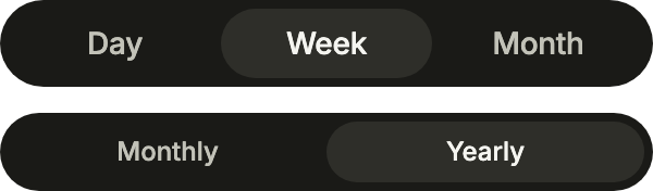
Segmented controls switch between a few views of the same content: one choice, always visible. FlSegmentedSize.sm fits a toolbar.
import 'package:your_app/ui/fliin/components/segmented/fl_segmented.dart';
import 'package:your_app/ui/fliin/core/fliin.dart';
import 'package:flutter/widgets.dart';

class SegmentedExample extends StatefulWidget {
  const SegmentedExample({super.key});

  @override
  State<SegmentedExample> createState() => _SegmentedExampleState();
}

class _SegmentedExampleState extends State<SegmentedExample> {
  var _period = 'week';
  var _billing = 'yearly';

  @override
  Widget build(BuildContext context) {
    return Column(
      mainAxisSize: MainAxisSize.min,
      crossAxisAlignment: CrossAxisAlignment.stretch,
      spacing: FlScope.of(context).space.md,
      children: [
        FlSegmented<String>(
          semanticLabel: 'Period',
          value: _period,
          onChanged: (value) => setState(() => _period = value),
          segments: const [
            FlSegment(value: 'day', label: 'Day'),
            FlSegment(value: 'week', label: 'Week'),
            FlSegment(value: 'month', label: 'Month'),
          ],
        ),
        FlSegmented<String>(
          semanticLabel: 'Billing',
          value: _billing,
          size: FlSegmentedSize.sm,
          onChanged: (value) => setState(() => _billing = value),
          segments: const [
            FlSegment(value: 'monthly', label: 'Monthly'),
            FlSegment(value: 'yearly', label: 'Yearly'),
          ],
        ),
      ],
    );
  }
}Selected
The selected segment carries the thumb; the others stay quiet.

import 'package:your_app/ui/fliin/components/segmented/fl_segmented.dart';
import 'package:flutter/widgets.dart';

class SegmentedSelectedExample extends StatefulWidget {
  const SegmentedSelectedExample({super.key});

  @override
  State<SegmentedSelectedExample> createState() => _SegmentedSelectedExampleState();
}

class _SegmentedSelectedExampleState extends State<SegmentedSelectedExample> {
  var _period = 'week';

  @override
  Widget build(BuildContext context) {
    return FlSegmented<String>(
      semanticLabel: 'Period',
      value: _period,
      onChanged: (value) => setState(() => _period = value),
      segments: const [
        FlSegment(value: 'day', label: 'Day'),
        FlSegment(value: 'week', label: 'Week'),
        FlSegment(value: 'month', label: 'Month'),
      ],
    );
  }
}Icons
Each segment can carry an icon before its label; use your app's icons in place of the sample disc.

import 'package:your_app/ui/fliin/components/segmented/fl_segmented.dart';
import 'package:flutter/widgets.dart';

class SegmentedIconsExample extends StatefulWidget {
  const SegmentedIconsExample({super.key});

  @override
  State<SegmentedIconsExample> createState() => _SegmentedIconsExampleState();
}

class _SegmentedIconsExampleState extends State<SegmentedIconsExample> {
  var _view = 'grid';

  @override
  Widget build(BuildContext context) {
    return FlSegmented<String>(
      semanticLabel: 'View',
      value: _view,
      size: FlSegmentedSize.lg,
      onChanged: (value) => setState(() => _view = value),
      segments: const [
        FlSegment(value: 'list', label: 'List', icon: _Dot()),
        FlSegment(value: 'grid', label: 'Grid', icon: _Dot()),
        FlSegment(value: 'map', label: 'Map', icon: _Dot()),
      ],
    );
  }
}

/// A sample icon: a disc half the icon's size, in its color.
class _Dot extends StatelessWidget {
  const _Dot();

  @override
  Widget build(BuildContext context) {
    final icon = IconTheme.of(context);
    return Center(
      child: SizedBox.square(
        dimension: icon.size! / 2,
        child: DecoratedBox(
          decoration: ShapeDecoration(color: icon.color, shape: const CircleBorder()),
        ),
      ),
    );
  }
}Disabled
enabled: false keeps the selection visible and locks the control.

import 'package:your_app/ui/fliin/components/segmented/fl_segmented.dart';
import 'package:flutter/widgets.dart';

class SegmentedDisabledExample extends StatefulWidget {
  const SegmentedDisabledExample({super.key});

  @override
  State<SegmentedDisabledExample> createState() => _SegmentedDisabledExampleState();
}

class _SegmentedDisabledExampleState extends State<SegmentedDisabledExample> {
  var _period = 'day';

  @override
  Widget build(BuildContext context) {
    return FlSegmented<String>(
      semanticLabel: 'Period',
      value: _period,
      enabled: false,
      onChanged: (value) => setState(() => _period = value),
      segments: const [
        FlSegment(value: 'day', label: 'Day'),
        FlSegment(value: 'week', label: 'Week'),
        FlSegment(value: 'month', label: 'Month'),
      ],
    );
  }
}Sizes
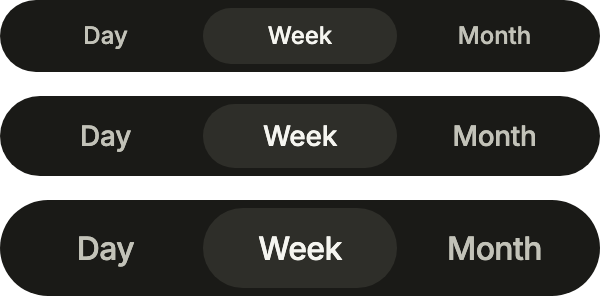
Three heights: sm (36), md (40, the default) and lg (48).
import 'package:your_app/ui/fliin/components/segmented/fl_segmented.dart';
import 'package:your_app/ui/fliin/core/fliin.dart';
import 'package:flutter/widgets.dart';

class SegmentedSizesExample extends StatefulWidget {
  const SegmentedSizesExample({super.key});

  @override
  State<SegmentedSizesExample> createState() => _SegmentedSizesExampleState();
}

class _SegmentedSizesExampleState extends State<SegmentedSizesExample> {
  var _period = 'week';

  @override
  Widget build(BuildContext context) {
    return Column(
      mainAxisSize: MainAxisSize.min,
      crossAxisAlignment: CrossAxisAlignment.stretch,
      spacing: FlScope.of(context).space.md,
      children: [
        for (final size in FlSegmentedSize.values)
          FlSegmented<String>(
            key: ValueKey(size),
            semanticLabel: 'Period',
            value: _period,
            size: size,
            onChanged: (value) => setState(() => _period = value),
            segments: const [
              FlSegment(value: 'day', label: 'Day'),
              FlSegment(value: 'week', label: 'Week'),
              FlSegment(value: 'month', label: 'Month'),
            ],
          ),
      ],
    );
  }
}Icon only
iconOnly shows the icon alone; the label still names the segment for the screen reader. expand: false keeps the group to its own width.

import 'package:your_app/ui/fliin/components/segmented/fl_segmented.dart';
import 'package:your_app/ui/fliin/core/fliin.dart';
import 'package:your_app/ui/fliin/icons/fl_icons.dart';
import 'package:flutter/widgets.dart';

class SegmentedIconOnlyExample extends StatefulWidget {
  const SegmentedIconOnlyExample({super.key});

  @override
  State<SegmentedIconOnlyExample> createState() => _SegmentedIconOnlyExampleState();
}

class _SegmentedIconOnlyExampleState extends State<SegmentedIconOnlyExample> {
  var _view = 'list';

  @override
  Widget build(BuildContext context) {
    return FlSegmented<String>(
      semanticLabel: 'View',
      value: _view,
      expand: false,
      onChanged: (value) => setState(() => _view = value),
      segments: [
        FlSegment(value: 'list', label: 'List', icon: FlIcon(FlIcons.bars), iconOnly: true),
        FlSegment(value: 'calendar', label: 'Calendar', icon: FlIcon(FlIcons.calendar), iconOnly: true),
        FlSegment(value: 'map', label: 'Map', icon: FlIcon(FlIcons.mapPin), iconOnly: true),
      ],
    );
  }
}Compact
expand: false: each segment takes its own width and the group sits at the start, beside a title here, instead of filling the row.

import 'package:your_app/ui/fliin/components/segmented/fl_segmented.dart';
import 'package:your_app/ui/fliin/core/fliin.dart';
import 'package:flutter/widgets.dart';

class SegmentedCompactExample extends StatefulWidget {
  const SegmentedCompactExample({super.key});

  @override
  State<SegmentedCompactExample> createState() => _SegmentedCompactExampleState();
}

class _SegmentedCompactExampleState extends State<SegmentedCompactExample> {
  var _sort = 'recent';

  @override
  Widget build(BuildContext context) {
    final theme = FlScope.of(context);
    return Row(
      spacing: theme.space.md,
      children: [
        Expanded(
          child: Text(
            'Comments',
            style: theme.typography.resolve(FlTextRole.textBase).copyWith(color: theme.colors.onSurface),
          ),
        ),
        FlSegmented<String>(
          semanticLabel: 'Sort',
          value: _sort,
          size: FlSegmentedSize.sm,
          expand: false,
          onChanged: (value) => setState(() => _sort = value),
          segments: const [
            FlSegment(value: 'recent', label: 'Recent'),
            FlSegment(value: 'top', label: 'Top'),
          ],
        ),
      ],
    );
  }
}Usage
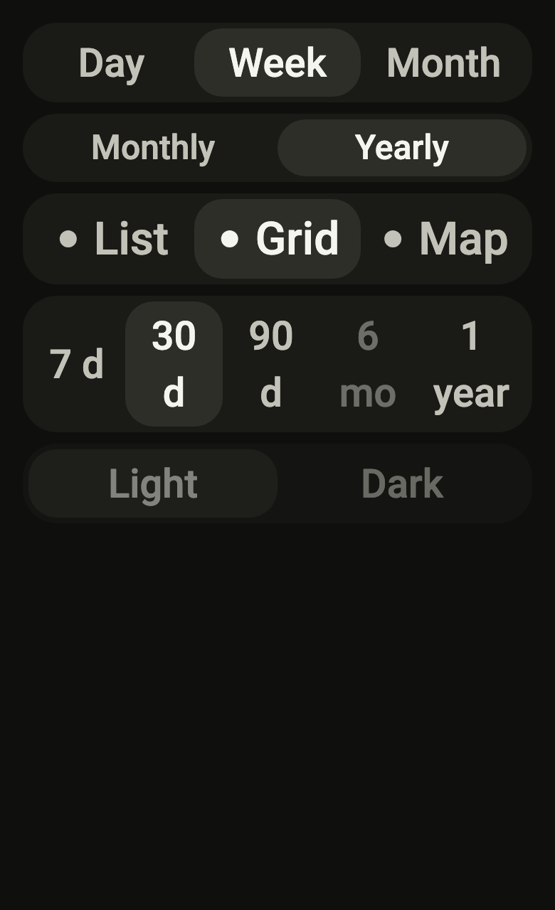
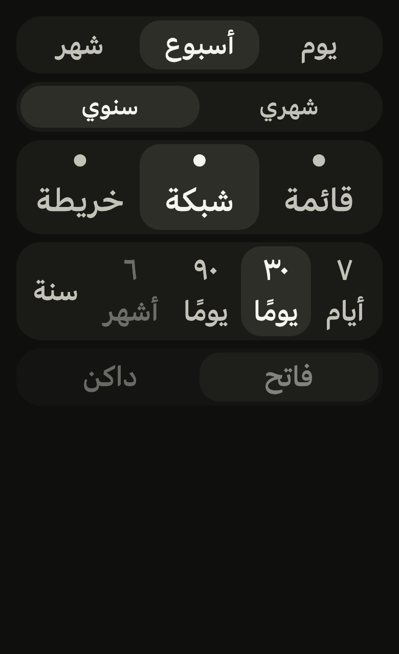
The code the reference images render:
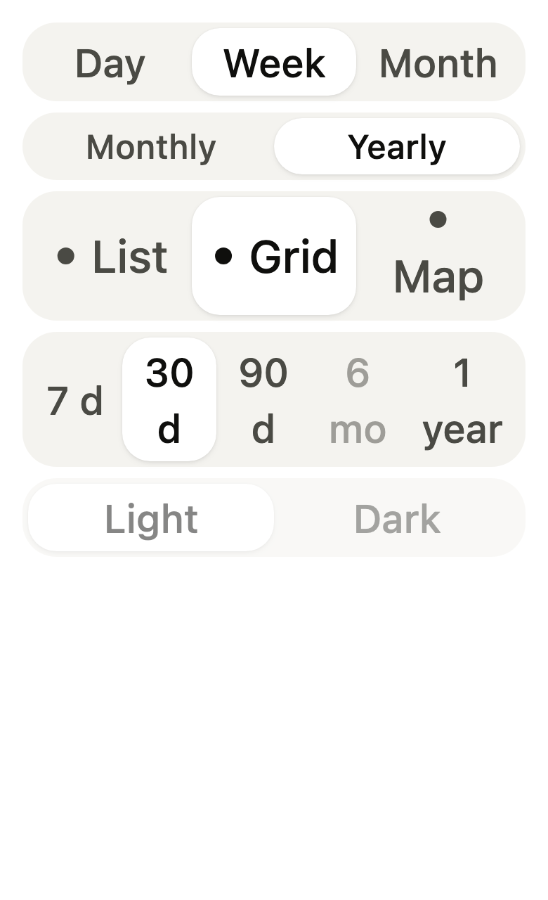
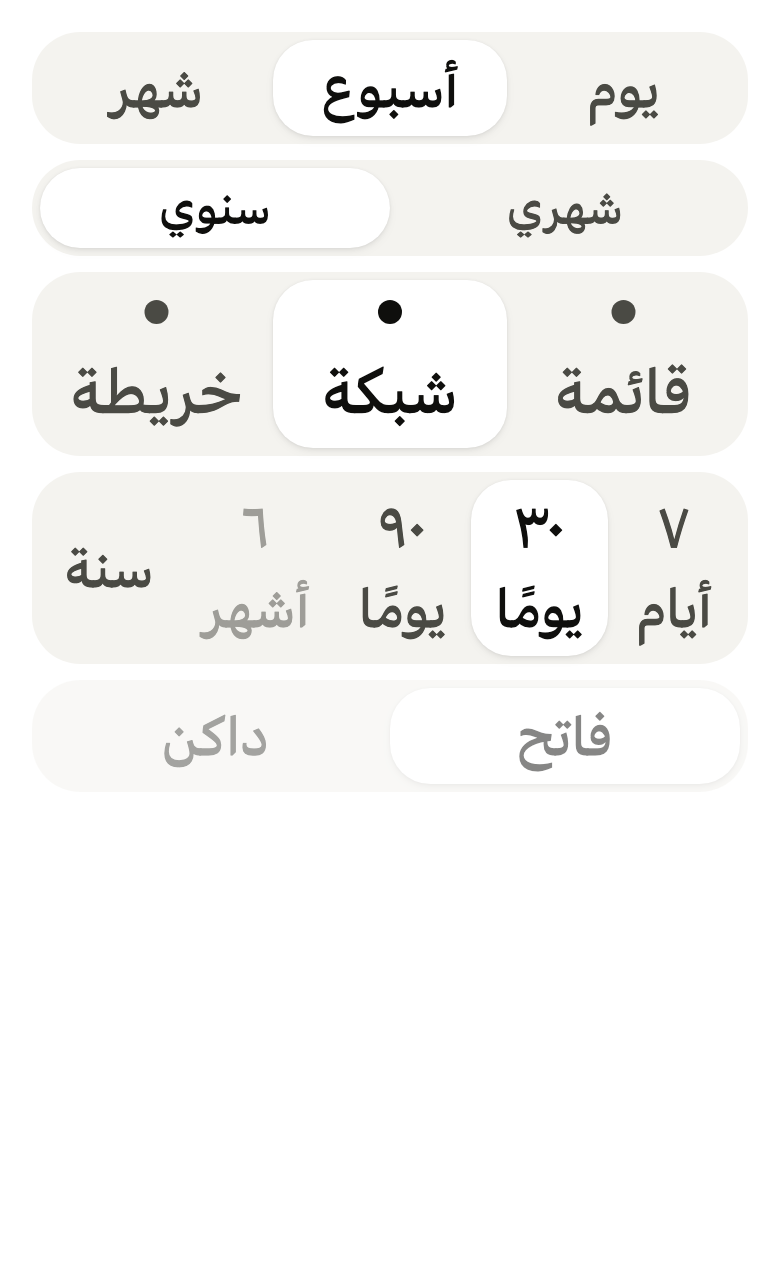
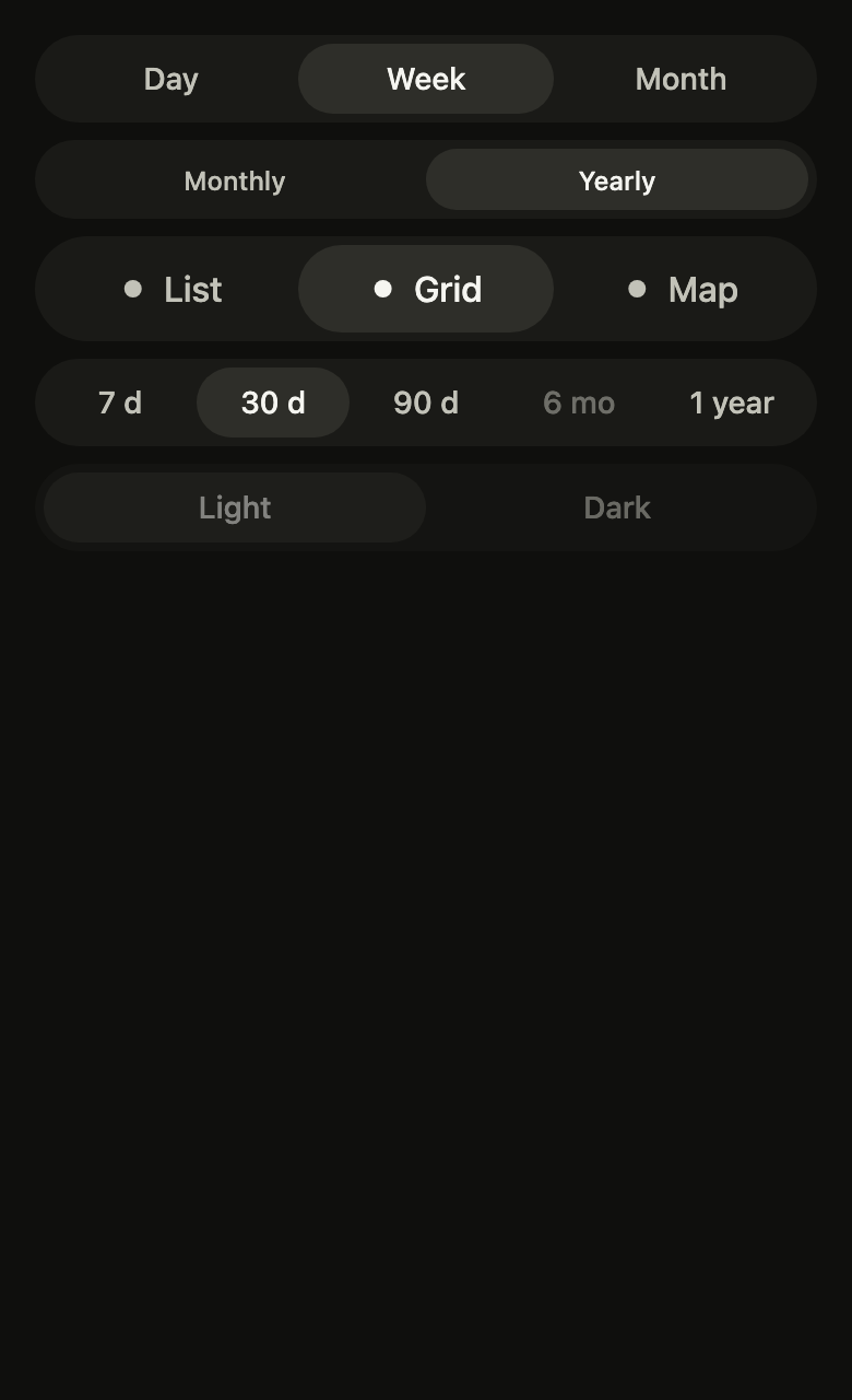
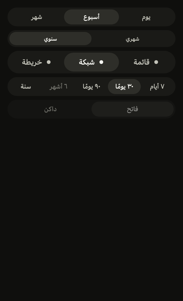
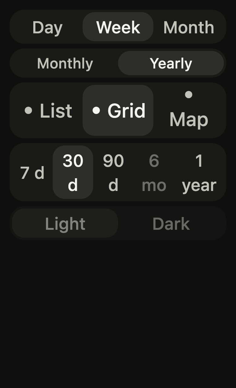
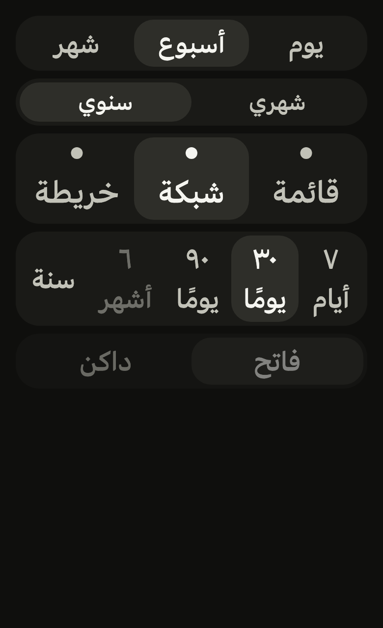
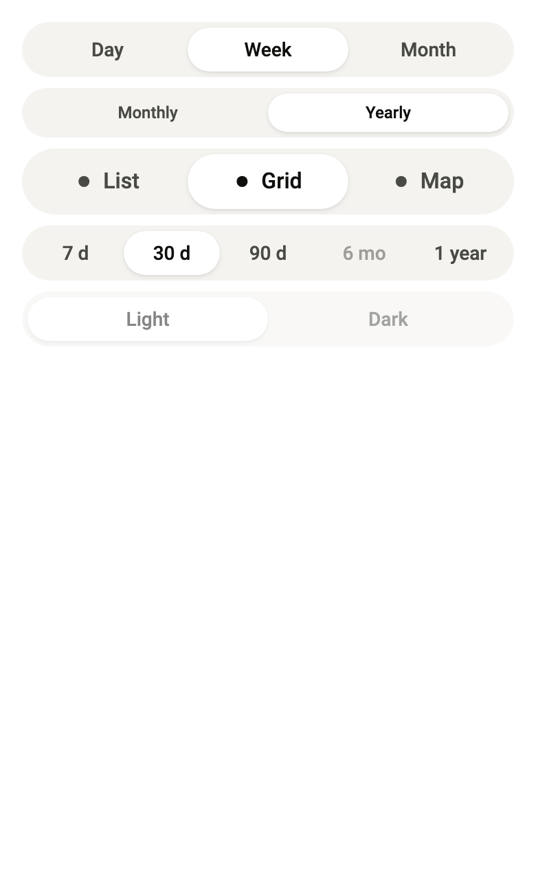
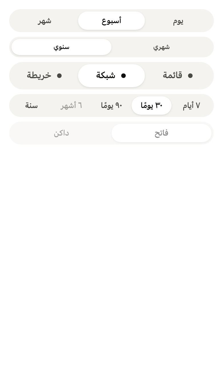
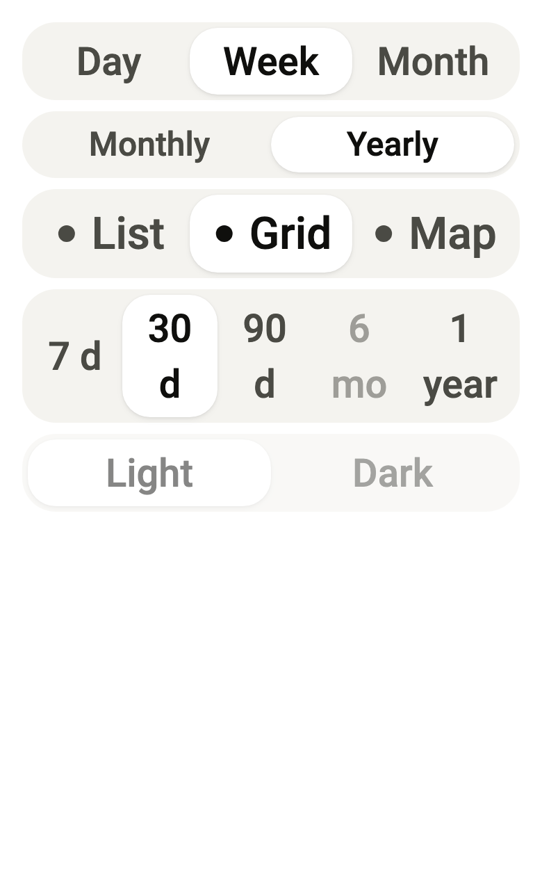
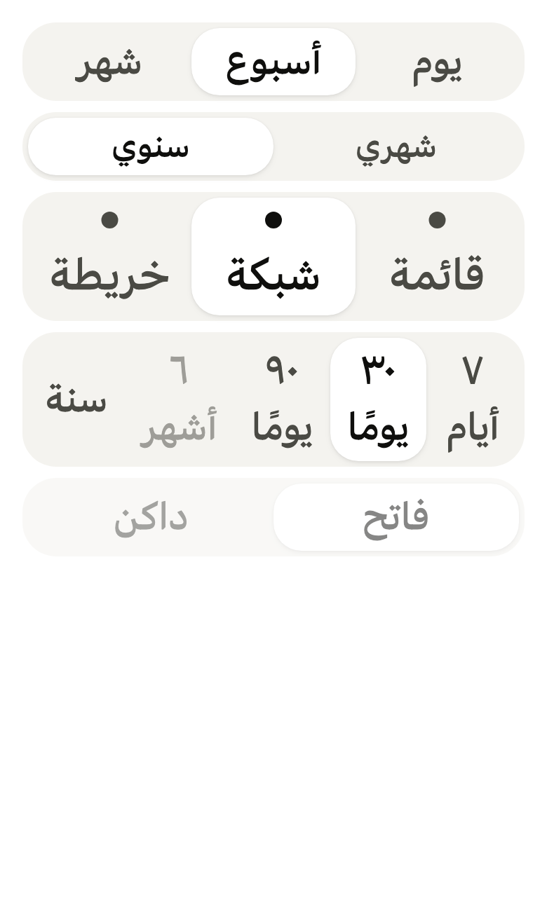
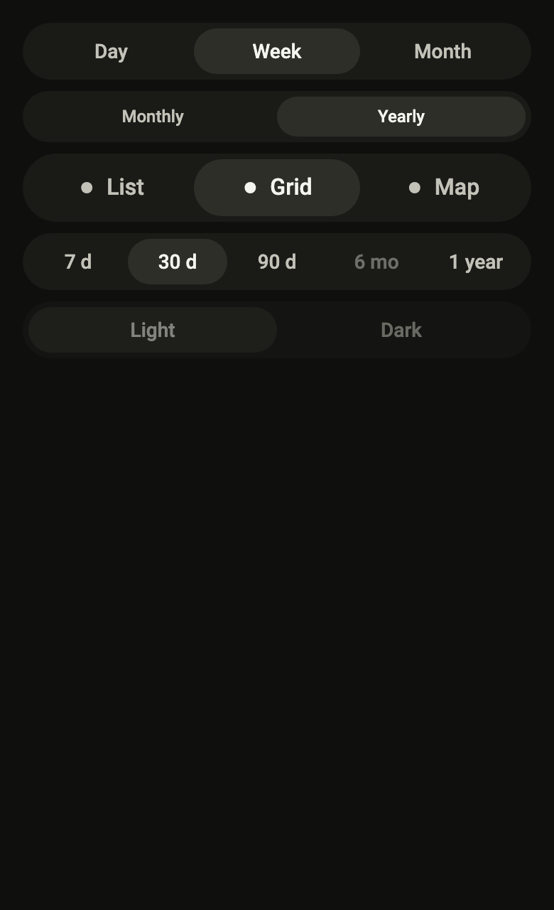
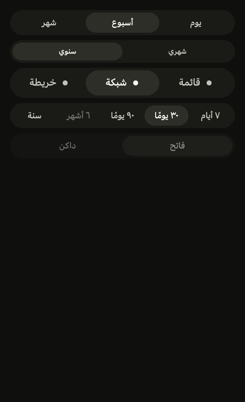
ColoredBox(color: FlScope.of(context).colors.surface, child: Padding(padding: EdgeInsetsDirectional.all(FlScope.of(context).space.lg), child: Column(crossAxisAlignment: CrossAxisAlignment.stretch, spacing: FlScope.of(context).space.sm, children: [FlSegmented<String>(semanticLabel: 'Period', value: 'Week', onChanged: (_) {}, segments: [for (final (fr, ar) in const [('Day', 'يوم'), ('Week', 'أسبوع'), ('Month', 'شهر')]) FlSegment(value: fr, label: fr]), FlSegmented<String>(semanticLabel: 'Billing', value: 'Yearly', size: FlSegmentedSize.sm, onChanged: (_) {}, segments: [for (final (fr, ar) in const [('Monthly', 'شهري'), ('Yearly', 'سنوي')]) FlSegment(value: fr, label: fr]), FlSegmented<String>(semanticLabel: 'View', value: 'Grid', size: FlSegmentedSize.lg, onChanged: (_) {}, segments: [for (final (fr, ar) in const [('List', 'قائمة'), ('Grid', 'شبكة'), ('Map', 'خريطة')]) FlSegment(value: fr, label: fr, icon: Builder(builder: (context) => Center(child: SizedBox.square(dimension: IconTheme.of(context).size! / 2, child: DecoratedBox(decoration: ShapeDecoration(color: IconTheme.of(context).color, shape: const CircleBorder()))))))]), FlSegmented<String>(semanticLabel: 'Duration', value: '30 d', onChanged: (_) {}, segments: [for (final (i, (fr, ar)) in const [('7 d', '٧ أيام'), ('30 d', '٣٠ يومًا'), ('90 d', '٩٠ يومًا'), ('6 mo', '٦ أشهر'), ('1 year', 'سنة')].indexed) FlSegment(value: fr, label: fr, disabled: i == 3)]), FlSegmented<String>(semanticLabel: 'Theme', value: 'Light', enabled: false, onChanged: (_) {}, segments: [for (final (fr, ar) in const [('Light', 'فاتح'), ('Dark', 'داكن')]) FlSegment(value: fr, label: fr])])))API
FlSegmentedSize: enum {sm, md, lg}
FlSegmentedSize.sm: static final FlSegmentedSize
FlSegmentedSize.md: static final FlSegmentedSize
FlSegmentedSize.lg: static final FlSegmentedSize
FlSegment: final class<T>
FlSegment.new: const new({required T value, required String label, Widget? icon, bool iconOnly, bool disabled, WidgetStatesController? statesController})
FlSegment.value: get T
FlSegment.label: get String
FlSegment.icon: get Widget?
FlSegment.iconOnly: get bool
FlSegment.disabled: get bool
FlSegment.statesController: get WidgetStatesController?
FlSegmented: class<T> extends StatefulWidget
FlSegmented.new: const new({super.key, required List<FlSegment<T>> segments, required T value, required ValueChanged<T> onChanged, FlSegmentedSize size, bool enabled, bool expand, String? semanticLabel})
FlSegmented.segments: get List<FlSegment<T>>
FlSegmented.value: get T
FlSegmented.onChanged: get ValueChanged<T>
FlSegmented.size: get FlSegmentedSize
FlSegmented.enabled: get bool
FlSegmented.expand: get bool
FlSegmented.semanticLabel: get String?
FlSegmented.createState: State<FlSegmented<T>>()Reference renders
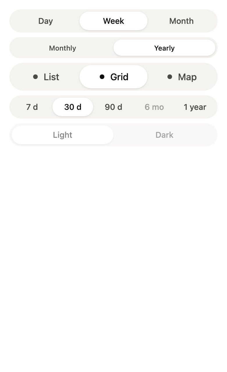
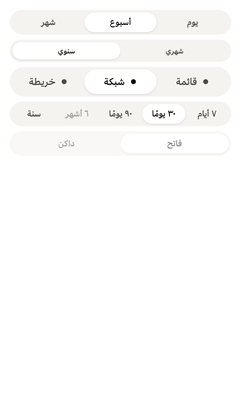
The 16 images published with version 0.3.4, rendered by the shared harness on macOS with Flutter 3.47.7. fliin verify segmented compares your copy to them.
Use it to
- pick day, week or month above a chart
- switch between monthly and yearly billing
- switch the results from a list to a grid
- offer a few short options as joined buttons
- choose a time range from buttons side by side
- make a group of toggle buttons where one stays pressed
- use a segmented control to filter what a chart shows
- Not for
- sections or categories that change the whole view: use tabs (tabs)
- long options, or more than five: use radio buttons (radio)
- a long list of choices in a form: use a select (select)
- a continuous value between a minimum and a maximum: use a slider (slider)
- States
Source
The files fliin add segmented copies into your app, before your prefix and imports are applied.
segmented/fl_segmented.dart
// Modified from the ToggleButtonGroup and ToggleButton of HeroUI React v3,
// Copyright 2020 Next UI Inc., licensed under the MIT license below and under
// Apache 2.0: https://www.apache.org/licenses/LICENSE-2.0
//
// Permission is hereby granted, free of charge, to any person obtaining a copy
// of this software and associated documentation files (the "Software"), to
// deal in the Software without restriction, including without limitation the
// rights to use, copy, modify, merge, publish, distribute, sublicense, and/or
// sell copies of the Software, and to permit persons to whom the Software is
// furnished to do so, subject to the following conditions:
//
// The above copyright notice and this permission notice shall be included in
// all copies or substantial portions of the Software.
//
// THE SOFTWARE IS PROVIDED "AS IS", WITHOUT WARRANTY OF ANY KIND, EXPRESS OR
// IMPLIED, INCLUDING BUT NOT LIMITED TO THE WARRANTIES OF MERCHANTABILITY,
// FITNESS FOR A PARTICULAR PURPOSE AND NONINFRINGEMENT. IN NO EVENT SHALL THE
// AUTHORS OR COPYRIGHT HOLDERS BE LIABLE FOR ANY CLAIM, DAMAGES OR OTHER
// LIABILITY, WHETHER IN AN ACTION OF CONTRACT, TORT OR OTHERWISE, ARISING
// FROM, OUT OF OR IN CONNECTION WITH THE SOFTWARE OR THE USE OR OTHER DEALINGS
// IN THE SOFTWARE.
//
// Also modified from the theme colors of HeroUI Native 1.0.10, Copyright 2025
// NextUI Inc., licensed under Apache 2.0.
import 'dart:math' as math;
import 'dart:ui' show lerpDouble;

import 'package:flutter/rendering.dart';
import 'package:flutter/services.dart';
import 'package:flutter/widgets.dart';
import 'package:fliin_ui/core/fliin.dart';

/// The inset of the segments within the capsule, the `padding: 4px` of the
/// Izydesk segmented control, which no token carries.
const double _inset = 4;

/// The icon margin (`-mx-0.5`): it bleeds by 2 on each side.
const double _iconBleed = 0.5;

/// The height of an [FlSegmented], sized for a phone.
enum FlSegmentedSize {
  /// 36 high, `px-3`, `textXs` text, 16 icon.
  sm,

  /// 40 high, `px-3`, `textSm` text, 16 icon.
  md,

  /// 48 high, `px-3`, `textBase` text, 16 icon.
  lg,
}

/// A segment of an [FlSegmented]: the [value] it picks, its displayed and
/// read [label], and an optional [icon] before it.
final class FlSegment<T> {
  /// A segment that picks [value].
  const FlSegment({
    required this.value,
    required this.label,
    this.icon,
    this.iconOnly = false,
    this.disabled = false,
    this.statesController,
  }) : assert(!iconOnly || icon != null, 'an icon-only segment needs its icon');

  /// The value the segment gives the group.
  final T value;

  /// The segment text, short: one or two words. It wraps between two words
  /// when space runs out. Read by the screen reader, shown unless
  /// [iconOnly].
  final String label;

  /// An icon before the label, given the segment's color and size through
  /// the `IconTheme`.
  final Widget? icon;

  /// True: the segment shows its [icon] alone (a list or grid view, a text
  /// alignment), and [label] only names it for the screen reader.
  final bool iconOnly;

  /// True: the segment is faded, with neither touch nor focus, and skipped
  /// by the arrow keys. The selected segment must not be.
  final bool disabled;

  /// The segment's states, which the app can read or force (a hovered or
  /// focused preview), added to its own; see `FlPressable.statesController`.
  final WidgetStatesController? statesController;
}

/// An exclusive choice between two and five short segments (day, week,
/// month): a `control` track holding the segments, inset by 4 from its edge,
/// the chosen segment a `segment` thumb lifted by the `field` shadow with
/// `onSegment` text, the others in `onSurfaceMuted` without fill or rule. The segments share the width; a segment with a
/// word that does not fit takes that word's width, and the others share the
/// rest. The thumb slides to the new choice with the
/// `segment` spring, and lands at once under reduced motion.
///
/// The screen reader reads a radio group named [semanticLabel]. With the
/// keyboard, the group is a single Tab stop; the arrow keys pick the
/// neighboring segment in reading order (reversed in RTL) and wrap around
/// to the first after the last, Home and End pick the first and the last.
class FlSegmented<T> extends StatefulWidget {
  /// A group whose selected segment carries [value].
  const FlSegmented({
    super.key,
    required this.segments,
    required this.value,
    required this.onChanged,
    this.size = FlSegmentedSize.md,
    this.enabled = true,
    this.expand = true,
    this.semanticLabel,
  }) : assert(segments.length >= 2 && segments.length <= 5, 'two to five segments');

  /// The segments, in reading order.
  final List<FlSegment<T>> segments;

  /// The value of the selected segment: that of one of the [segments].
  final T value;

  /// Receives the value of the segment tapped or reached by keyboard; the
  /// parent passes it back in [value].
  final ValueChanged<T> onChanged;

  /// The height and the text; `md` by default.
  final FlSegmentedSize size;

  /// False: the whole group is faded, with neither touch nor focus.
  final bool enabled;

  /// True (the default): the group takes the available width, shared by
  /// its segments. False: each segment takes its own width, and the group
  /// sits at the start of its space (a compact choice in a toolbar or a
  /// header).
  final bool expand;

  /// The group name for the screen reader ("Period").
  final String? semanticLabel;

  @override
  State<FlSegmented<T>> createState() => _FlSegmentedState<T>();
}

class _StepIntent extends Intent {
  const _StepIntent(this.step, {this.edge = false});

  /// +1 toward the end, -1 toward the start; with [edge], all the way.
  final int step;
  final bool edge;
}

class _FlSegmentedState<T> extends State<FlSegmented<T>> with SingleTickerProviderStateMixin {
  late final AnimationController _move = AnimationController.unbounded(vsync: this, value: 1);
  final _Spans _spans = _Spans();
  late List<FocusNode> _nodes = _makeNodes();

  /// The background at the start of the current move; null, it is at rest.
  Rect? _from;
  int? _pressed;
  int? _hovered;
  int? _focused;

  List<FocusNode> _makeNodes() => [
    for (var i = 0; i < widget.segments.length; i++) FocusNode(debugLabel: 'FlSegment $i'),
  ];

  int get _selected => widget.segments.indexWhere((segment) => segment.value == widget.value);

  @override
  void didUpdateWidget(FlSegmented<T> oldWidget) {
    super.didUpdateWidget(oldWidget);
    if (oldWidget.segments.length != widget.segments.length) {
      final hadFocus = _nodes.any((node) => node.hasFocus);
      for (final node in _nodes) {
        node.dispose();
      }
      _nodes = _makeNodes();
      _from = null;
      _move.value = 1;
      if (hadFocus) {
        WidgetsBinding.instance.addPostFrameCallback((_) => _nodes[_selected].requestFocus());
      }
      return;
    }
    final before = oldWidget.segments.indexWhere((segment) => segment.value == oldWidget.value);
    if (before == _selected) return;
    if (FlMotion.of(context).reduced) {
      _from = null;
      _move.value = 1;
      return;
    }
    _from = _pillAt(before);
    _move.value = 0;
    _move.driveTo(1, FlSpringMotion(FlMotion.of(context).tokens.segment));
  }

  /// Where the background is painted right now, if it were heading to
  /// [index].
  Rect? _pillAt(int index) => _Pill.current(_spans, _from, index, _move.value);

  @override
  void dispose() {
    for (final node in _nodes) {
      node.dispose();
    }
    _move.dispose();
    super.dispose();
  }

  /// The states the app forces on segment [i] through its controller.
  Set<WidgetState> _forced(int i) => widget.segments[i].statesController?.value ?? const {};

  /// The hovered or pressed segment, the app's forced ones included.
  int? get _highlighted {
    if (_pressed ?? _hovered case final i?) return i;
    for (var i = 0; i < widget.segments.length; i++) {
      final forced = _forced(i);
      if (forced.contains(WidgetState.hovered) || forced.contains(WidgetState.pressed)) {
        return i;
      }
    }
    return null;
  }

  @override
  Widget build(BuildContext context) {
    final controllers = [for (final segment in widget.segments) ?segment.statesController];
    if (controllers.isEmpty) return _build(context);
    return ListenableBuilder(listenable: Listenable.merge(controllers), builder: (context, _) => _build(context));
  }

  void _choose(int index) {
    final segment = widget.segments[index];
    if (segment.value != widget.value) widget.onChanged(segment.value);
  }

  void _step(_StepIntent intent) {
    final enabled = [
      for (var i = 0; i < widget.segments.length; i++)
        if (!widget.segments[i].disabled) i,
    ];
    final at = enabled.indexOf(_selected);
    final next = switch ((intent.edge, intent.step > 0)) {
      (true, true) => enabled.last,
      (true, false) => enabled.first,
      (false, _) => enabled[(at + intent.step) % enabled.length],
    };
    _choose(next);
    _nodes[next].requestFocus();
  }

  Widget _build(BuildContext context) {
    final selected = _selected;
    assert(selected >= 0, 'value must be that of one of the segments');
    assert(!widget.segments[selected].disabled, 'the selected segment must not be disabled');
    final theme = FlScope.of(context);
    final colors = theme.colors;
    final forward = Directionality.of(context) == TextDirection.ltr ? 1 : -1;
    final segments = widget.segments;
    final look = _Look.of(context, theme, widget.size);
    Color ink(int i) => i == selected ? colors.onSegment : colors.onSurfaceMuted;
    final radius = _innerRadius(theme);
    final group = DecoratedBox(
      decoration: BoxDecoration(color: colors.control, borderRadius: BorderRadius.circular(theme.shape.radiusButton)),
      child: Padding(
        padding: const EdgeInsets.all(_inset),
        child: LayoutBuilder(
          builder: (context, constraints) {
            final padding = _padding(context, look, constraints.maxWidth);
            return CustomPaint(
              painter: _Pill(
                move: _move,
                from: _from,
                selected: selected,
                spans: _spans,
                radius: radius,
                hover: colors.controlPressed,
                fill: colors.segment,
                // The three layers of `field`.
                shadows: theme.shadows.field,
                // Pressed, the thumb takes the press highlight of a surface.
                fillPressed: Color.alphaBlend(
                  colors.pressHighlight.withValues(alpha: theme.size.pressHighlightOpacity),
                  colors.segment,
                ),
                highlighted: _highlighted,
                disabled: {
                  for (var i = 0; i < segments.length; i++)
                    if (segments[i].disabled) i,
                },
              ),
              child: _SegmentRow(
                spans: _spans,
                pixelRatio: MediaQuery.devicePixelRatioOf(context),
                expand: widget.expand,
                children: [
                  for (var i = 0; i < segments.length; i++)
                    _segment(theme, look, i, padding: padding, selected: i == selected, color: ink(i)),
                ],
              ),
            );
          },
        ),
      ),
    );
    final Widget result = Shortcuts(
      shortcuts: {
        SingleActivator(LogicalKeyboardKey.arrowRight): _StepIntent(forward),
        SingleActivator(LogicalKeyboardKey.arrowLeft): _StepIntent(-forward),
        const SingleActivator(LogicalKeyboardKey.arrowDown): const _StepIntent(1),
        const SingleActivator(LogicalKeyboardKey.arrowUp): const _StepIntent(-1),
        const SingleActivator(LogicalKeyboardKey.home): const _StepIntent(-1, edge: true),
        const SingleActivator(LogicalKeyboardKey.end): const _StepIntent(1, edge: true),
      },
      child: Actions(
        actions: {_StepIntent: CallbackAction<_StepIntent>(onInvoke: _step)},
        child: Semantics(
          container: true,
          role: SemanticsRole.radioGroup,
          label: widget.semanticLabel,
          explicitChildNodes: true,
          child: Opacity(opacity: widget.enabled ? 1 : theme.size.disabledOpacity, child: group),
        ),
      ),
    );
    return widget.expand
        ? result
        : Align(alignment: AlignmentDirectional.centerStart, widthFactor: 1, heightFactor: 1, child: result);
  }

  /// The radius of a segment, concentric with the capsule: the button's
  /// minus the inset.
  double _innerRadius(FlTheme theme) => math.max(0, theme.shape.radiusButton - _inset);

  /// The margin on each side of a label, reduced down to
  /// `space.xs` when the longest word of each segment wouldn't otherwise fit
  /// in [available]. Beyond that, a word wider than its share breaks, as
  /// everywhere else.
  double _padding(BuildContext context, _Look look, double available) {
    if (!available.isFinite) return look.padding;
    final words = widget.segments.fold<double>(0, (sum, segment) {
      final painter = TextPainter(
        text: TextSpan(text: segment.label, style: DefaultTextStyle.of(context).style.merge(look.text)),
        strutStyle: look.strut,
        textScaler: MediaQuery.textScalerOf(context),
        textDirection: Directionality.of(context),
      )..layout();
      final word = segment.iconOnly ? 0.0 : painter.minIntrinsicWidth;
      painter.dispose();
      return sum + math.max(word, segment.icon == null ? 0 : look.icon - 2 * look.bleed);
    });
    final room = (available - words) / (2 * widget.segments.length);
    return room.clamp(look.minPadding, look.padding).floorToDouble();
  }

  Widget _segment(
    FlTheme theme,
    _Look look,
    int i, {
    required double padding,
    required bool selected,
    required Color color,
  }) {
    final segment = widget.segments[i];
    final enabled = widget.enabled && !segment.disabled;
    _nodes[i].skipTraversal = !selected;
    final icon = segment.icon;
    final label = Text(
      segment.label,
      textAlign: TextAlign.center,
      style: look.text.copyWith(color: color),
      strutStyle: look.strut,
    );
    // The icon and the label on one line, and the label moves below when
    // the two don't fit side by side.
    final content = Wrap(
      alignment: WrapAlignment.center,
      crossAxisAlignment: WrapCrossAlignment.center,
      // gap-2 from `toggle-button`.
      spacing: theme.space.sm,
      runSpacing: theme.space.xs,
      children: [
        if (icon != null)
          SizedBox(
            width: look.icon - 2 * look.bleed,
            height: look.icon,
            child: OverflowBox(
              maxWidth: look.icon,
              child: IconTheme.merge(
                data: IconThemeData(color: color, size: look.icon),
                child: icon,
              ),
            ),
          ),
        if (!segment.iconOnly) label,
      ],
    );
    void choose() => _choose(i);
    return FlHitTarget(
      child: Semantics(
        inMutuallyExclusiveGroup: true,
        checked: selected,
        enabled: enabled,
        label: segment.label,
        onTap: enabled ? choose : null,
        child: FocusableActionDetector(
          focusNode: _nodes[i],
          enabled: enabled,
          mouseCursor: enabled ? SystemMouseCursors.click : MouseCursor.defer,
          actions: {ActivateIntent: CallbackAction<ActivateIntent>(onInvoke: (_) => choose())},
          onShowHoverHighlight: (visible) => setState(() => _hovered = visible ? i : (_hovered == i ? null : _hovered)),
          onShowFocusHighlight: (visible) => setState(() => _focused = visible ? i : (_focused == i ? null : _focused)),
          child: GestureDetector(
            behavior: HitTestBehavior.opaque,
            excludeFromSemantics: true,
            onTapDown: enabled ? (_) => setState(() => _pressed = i) : null,
            onTapCancel: enabled ? () => setState(() => _pressed = null) : null,
            onTapUp: enabled ? (_) => setState(() => _pressed = null) : null,
            onTap: enabled ? choose : null,
            // Izydesk's focused segment: a ring 2 from its edge, within the
            // capsule's inset.
            child: FlFocusRing(
              visible: _focused == i || _forced(i).contains(WidgetState.focused),
              borderRadius: BorderRadius.circular(_innerRadius(theme)),
              child: Opacity(
                opacity: segment.disabled ? theme.size.disabledOpacity : 1,
                child: ConstrainedBox(
                  constraints: BoxConstraints(minHeight: look.height - 2 * _inset),
                  child: Padding(
                    padding: EdgeInsetsDirectional.symmetric(horizontal: padding, vertical: theme.space.xs),
                    child: Center(widthFactor: 1, child: ExcludeSemantics(child: content)),
                  ),
                ),
              ),
            ),
          ),
        ),
      ),
    );
  }
}

/// What the size sets for a segment: height, margin, text and icon.
final class _Look {
  const _Look({
    required this.height,
    required this.padding,
    required this.minPadding,
    required this.text,
    required this.strut,
    required this.icon,
    required this.bleed,
  });

  factory _Look.of(BuildContext context, FlTheme theme, FlSegmentedSize size) {
    final xs = theme.space.xs;
    final (height, padding, role, icon) = switch (size) {
      FlSegmentedSize.sm => (xs * 9, xs * 3, FlTextRole.textXs, xs * 4),
      FlSegmentedSize.md => (xs * 10, xs * 3, FlTextRole.textSm, xs * 4),
      // Izydesk's `.seg-lg` keeps the 16 icon of `.seg`.
      FlSegmentedSize.lg => (xs * 12, xs * 3, FlTextRole.textBase, xs * 4),
    };
    return _Look(
      height: height,
      padding: padding,
      minPadding: xs,
      text: theme.typography.resolve(role).copyWith(fontWeight: theme.tokens.typography.weight.medium),
      strut: theme.typography.strut(role, inheritedFamily: DefaultTextStyle.of(context).style.fontFamily),
      icon: MediaQuery.textScalerOf(context).clamp(maxScaleFactor: theme.size.iconMaxScale).scale(icon),
      bleed: xs * _iconBleed,
    );
  }

  /// 36, 40 or 48: the group's minimum height, inset included.
  final double height;

  /// `px-3`, and the narrowest margin when space runs out.
  final double padding;
  final double minPadding;

  final TextStyle text;
  final StrutStyle strut;

  /// The icon side, scaled with the text up to `size.iconMaxScale`, and its
  /// bleed on each side.
  final double icon;
  final double bleed;
}

/// The place of each segment in the group, left to right on screen,
/// recorded at layout and read by the background at paint in the same
/// frame.
final class _Spans {
  List<Rect> rects = const [];

  /// Segment [index] in reading order.
  Rect? rect(int index) => index < rects.length ? rects[index] : null;
}

/// The segments' capsules: the hovered or pressed segment's in
/// `controlPressed`, unless it is disabled, then the chosen segment's thumb
/// in `segment` over its shadow (with the press highlight when pressed),
/// which slides from [from] to its place following [move].
class _Pill extends CustomPainter {
  _Pill({
    required this.move,
    required this.from,
    required this.selected,
    required this.spans,
    required this.radius,
    required this.hover,
    required this.fill,
    required this.shadows,
    required this.fillPressed,
    required this.highlighted,
    required this.disabled,
  }) : super(repaint: move);

  final Animation<double> move;
  final Rect? from;
  final int selected;
  final _Spans spans;
  final double radius;
  final Color hover;
  final Color fill;
  final List<FlShadowLayer> shadows;
  final Color fillPressed;
  final int? highlighted;
  final Set<int> disabled;

  /// The background's place when the move toward [index] is at [t].
  static Rect? current(_Spans spans, Rect? from, int index, double t) {
    final to = spans.rect(index);
    if (from == null || to == null) return to;
    return Rect.fromLTRB(lerpDouble(from.left, to.left, t)!, to.top, lerpDouble(from.right, to.right, t)!, to.bottom);
  }

  @override
  void paint(Canvas canvas, Size size) {
    final pill = current(spans, from, selected, move.value);
    if (pill == null) return;
    final corner = Radius.circular(radius);
    final highlighted = this.highlighted;
    if (highlighted != null && highlighted != selected && !disabled.contains(highlighted)) {
      if (spans.rect(highlighted) case final rect?) {
        canvas.drawRRect(RRect.fromRectAndRadius(rect, corner), Paint()..color = hover);
      }
    }
    final thumb = RRect.fromRectAndRadius(pill, corner);
    // CSS box-shadow: a Gaussian blur whose standard deviation is half the
    // blur radius.
    for (final layer in shadows) {
      if (layer.color.a == 0) continue;
      canvas.drawRRect(
        thumb.inflate(layer.spread).shift(layer.offset),
        Paint()
          ..color = layer.color
          ..maskFilter = layer.blur > 0 ? MaskFilter.blur(BlurStyle.normal, layer.blur / 2) : null,
      );
    }
    canvas.drawRRect(thumb, Paint()..color = highlighted == selected ? fillPressed : fill);
  }

  @override
  bool shouldRepaint(_Pill oldDelegate) =>
      move != oldDelegate.move ||
      from != oldDelegate.from ||
      selected != oldDelegate.selected ||
      spans != oldDelegate.spans ||
      radius != oldDelegate.radius ||
      hover != oldDelegate.hover ||
      fill != oldDelegate.fill ||
      !identical(shadows, oldDelegate.shadows) ||
      fillPressed != oldDelegate.fillPressed ||
      highlighted != oldDelegate.highlighted ||
      !_sameSet(disabled, oldDelegate.disabled);

  static bool _sameSet(Set<int> a, Set<int> b) => a.length == b.length && a.containsAll(b);
}

/// The row of segments: each takes an equal share of the width; a segment
/// wider than its share (the longest word of its label) keeps its minimum
/// width, and the others share the rest. If even the minimum widths don't
/// fit, they shrink together. Edges land on the pixel grid, as under Yoga,
/// and all segments take the height of the tallest. Without a bounded
/// width, each takes its natural width.
class _SegmentRow extends MultiChildRenderObjectWidget {
  const _SegmentRow({required this.spans, required this.pixelRatio, required this.expand, required super.children});

  final _Spans spans;
  final double pixelRatio;
  final bool expand;

  @override
  RenderObject createRenderObject(BuildContext context) =>
      _RenderSegmentRow(spans, pixelRatio, Directionality.of(context), expand);

  @override
  void updateRenderObject(BuildContext context, _RenderSegmentRow renderObject) {
    renderObject
      ..pixelRatio = pixelRatio
      ..textDirection = Directionality.of(context)
      ..expand = expand;
  }
}

class _SegmentParentData extends ContainerBoxParentData<RenderBox> {}

class _RenderSegmentRow extends RenderBox
    with
        ContainerRenderObjectMixin<RenderBox, _SegmentParentData>,
        RenderBoxContainerDefaultsMixin<RenderBox, _SegmentParentData> {
  _RenderSegmentRow(this.spans, this._pixelRatio, this._textDirection, this._expand);

  final _Spans spans;

  bool _expand;
  set expand(bool value) {
    if (value == _expand) return;
    _expand = value;
    markNeedsLayout();
  }

  double _pixelRatio;
  set pixelRatio(double value) {
    if (value == _pixelRatio) return;
    _pixelRatio = value;
    markNeedsLayout();
  }

  TextDirection _textDirection;
  set textDirection(TextDirection value) {
    if (value == _textDirection) return;
    _textDirection = value;
    markNeedsLayout();
  }

  @override
  void setupParentData(RenderBox child) {
    if (child.parentData is! _SegmentParentData) {
      child.parentData = _SegmentParentData();
    }
  }

  List<RenderBox> get _children => [for (var child = firstChild; child != null; child = childAfter(child)) child];

  @override
  double computeMinIntrinsicWidth(double height) =>
      _children.fold(0, (sum, child) => sum + child.getMinIntrinsicWidth(height));

  @override
  double computeMaxIntrinsicWidth(double height) =>
      _children.fold(0, (sum, child) => sum + child.getMaxIntrinsicWidth(height));

  @override
  double computeMinIntrinsicHeight(double width) {
    final children = _children;
    final widths = _widths(width, children);
    return [for (var i = 0; i < children.length; i++) children[i].getMinIntrinsicHeight(widths[i])].fold(0, math.max);
  }

  @override
  double computeMaxIntrinsicHeight(double width) {
    final children = _children;
    final widths = _widths(width, children);
    return [for (var i = 0; i < children.length; i++) children[i].getMaxIntrinsicHeight(widths[i])].fold(0, math.max);
  }

  /// The segment widths within [available], their edges on the pixel grid.
  /// A segment that keeps its minimum width rounds it up to the next pixel,
  /// so its longest word fits.
  List<double> _widths(double available, List<RenderBox> children) {
    double snapUp(double w) => (w * _pixelRatio).ceilToDouble() / _pixelRatio;
    double snap(double w) => (w * _pixelRatio).roundToDouble() / _pixelRatio;
    if (!available.isFinite || !_expand) {
      final natural = [for (final child in children) snapUp(child.getMaxIntrinsicWidth(double.infinity))];
      // Without expand, each segment keeps its own width while they fit.
      if (!available.isFinite || natural.fold<double>(0, (sum, w) => sum + w) <= available) {
        return natural;
      }
    }
    final mins = [for (final child in children) snapUp(child.getMinIntrinsicWidth(double.infinity))];
    final total = mins.fold<double>(0, (sum, w) => sum + w);
    final kept = <int>{};
    var share = available / children.length;
    if (total > available) {
      kept.addAll(List.generate(children.length, (i) => i));
    } else {
      while (true) {
        final wider = [
          for (var i = 0; i < mins.length; i++)
            if (!kept.contains(i) && mins[i] > share) i,
        ];
        if (wider.isEmpty) break;
        kept.addAll(wider);
        share = (available - kept.fold<double>(0, (sum, i) => sum + mins[i])) / (children.length - kept.length);
      }
    }
    final widths = <double>[];
    var edge = 0.0;
    var snapped = 0.0;
    for (var i = 0; i < children.length; i++) {
      edge += total > available ? available * mins[i] / total : (kept.contains(i) ? mins[i] : share);
      final next = snap(edge);
      widths.add(next - snapped);
      snapped = next;
    }
    return widths;
  }

  Size _layout(BoxConstraints constraints, {required bool dry}) {
    final children = _children;
    if (children.isEmpty) return constraints.smallest;
    final widths = _widths(constraints.maxWidth, children);
    final height = [
      for (var i = 0; i < children.length; i++)
        dry
            ? children[i].getDryLayout(BoxConstraints.tightFor(width: widths[i])).height
            : (children[i]..layout(BoxConstraints.tightFor(width: widths[i]), parentUsesSize: true)).size.height,
    ].fold<double>(constraints.minHeight, math.max);
    final width = widths.fold<double>(0, (sum, w) => sum + w);
    if (!dry) {
      final ltr = _textDirection == TextDirection.ltr;
      final rects = <Rect>[];
      var x = ltr ? 0.0 : width;
      for (var i = 0; i < children.length; i++) {
        final child = children[i]..layout(BoxConstraints.tightFor(width: widths[i], height: height));
        final left = ltr ? x : x - widths[i];
        (child.parentData! as _SegmentParentData).offset = Offset(left, 0);
        rects.add(Rect.fromLTWH(left, 0, widths[i], height));
        x = ltr ? x + widths[i] : x - widths[i];
      }
      spans.rects = rects;
    }
    return constraints.constrain(Size(width, height));
  }

  @override
  Size computeDryLayout(BoxConstraints constraints) => _layout(constraints, dry: true);

  @override
  void performLayout() => size = _layout(constraints, dry: false);

  @override
  void paint(PaintingContext context, Offset offset) => defaultPaint(context, offset);

  @override
  bool hitTestChildren(BoxHitTestResult result, {required Offset position}) =>
      defaultHitTestChildren(result, position: position);
}