Components / lists
List row
Shows list or settings entries grouped on a surface between dividers, pressable by touch or keyboard, with prefix, title, subtitle, value and chevron.
Import
In a Flutter app where fliin init has run:
Examples
Settings
A settings page: rows grouped under a caption, each with a subtitle, a value or a badge, and a chevron when it leads somewhere.
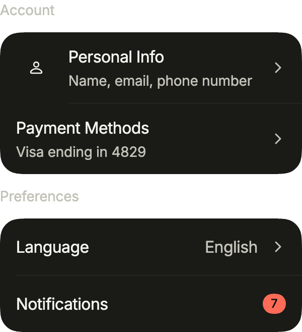
import 'package:your_app/ui/fliin/components/avatar/fl_avatar.dart';
import 'package:your_app/ui/fliin/components/chip/fl_chip.dart';
import 'package:your_app/ui/fliin/components/list_row/fl_list_row.dart';
import 'package:your_app/ui/fliin/components/text/fl_text.dart';
import 'package:your_app/ui/fliin/core/fliin.dart';
import 'package:flutter/widgets.dart';

class ListRowSettingsExample extends StatelessWidget {
  const ListRowSettingsExample({super.key});

  @override
  Widget build(BuildContext context) {
    return Column(
      mainAxisSize: MainAxisSize.min,
      crossAxisAlignment: CrossAxisAlignment.stretch,
      spacing: FlScope.of(context).space.md,
      children: [
        const FlText('Account', type: FlTextType.bodySm, tone: FlTextTone.muted),
        FlListGroup(
          children: [
            FlListRow(
              title: 'Personal Info',
              subtitle: 'Name, email, phone number',
              leading: const FlAvatar(semanticLabel: 'Profile', size: FlAvatarSize.sm),
              trailing: const FlListRowChevron(),
              onPressed: () {},
            ),
            FlListRow(
              title: 'Payment Methods',
              subtitle: 'Visa ending in 4829',
              trailing: const FlListRowChevron(),
              onPressed: () {},
            ),
          ],
        ),
        const FlText('Preferences', type: FlTextType.bodySm, tone: FlTextTone.muted),
        FlListGroup(
          children: [
            FlListRow(title: 'Language', value: 'English', trailing: const FlListRowChevron(), onPressed: () {}),
            FlListRow(
              title: 'Notifications',
              trailing: const FlChip(label: '7', color: FlChipColor.danger, size: FlChipSize.sm),
              onPressed: () {},
            ),
          ],
        ),
      ],
    );
  }
}With avatars
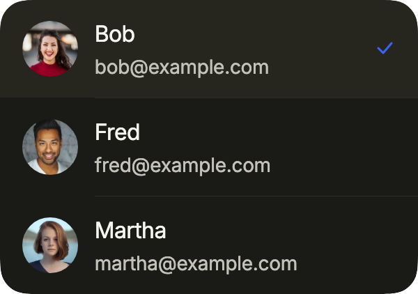
A list to choose a person from: an avatar as leading, the email as subtitle, and selected on the chosen row, which takes the soft accent fill and a check.
import 'package:your_app/ui/fliin/components/avatar/fl_avatar.dart';
import 'package:your_app/ui/fliin/components/list_row/fl_list_row.dart';
import 'package:flutter/widgets.dart';

class ListRowWithAvatarsExample extends StatefulWidget {
  const ListRowWithAvatarsExample({super.key});

  @override
  State<ListRowWithAvatarsExample> createState() =>
      _ListRowWithAvatarsExampleState();
}

class _ListRowWithAvatarsExampleState extends State<ListRowWithAvatarsExample> {
  static const _people = [
    (1, 'Bob', '[email protected]'),
    (2, 'Fred', '[email protected]'),
    (3, 'Martha', '[email protected]'),
  ];

  var _chosen = 'Bob';

  @override
  Widget build(BuildContext context) {
    return FlListGroup(
      children: [
        for (final (photo, name, email) in _people)
          FlListRow(
            title: name,
            subtitle: email,
            leading: FlAvatar(
              image: AssetImage('images/people/$photo.jpg'),
              initials: name[0],
              semanticLabel: name,
              size: FlAvatarSize.sm,
            ),
            selected: _chosen == name,
            onPressed: () => setState(() => _chosen = name),
          ),
      ],
    );
  }
}With sections
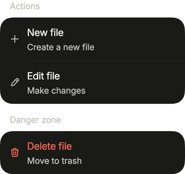
File actions in two sections, each under an FlSectionHeader: icons as leading, the rules lined up with the text by separatorInset, and a danger row for the destructive one.
import 'package:your_app/ui/fliin/components/list_row/fl_list_row.dart';
import 'package:your_app/ui/fliin/components/section_header/fl_section_header.dart';
import 'package:your_app/ui/fliin/core/fliin.dart';
import 'package:your_app/ui/fliin/icons/fl_icons.dart';
import 'package:flutter/widgets.dart';

class ListRowWithSectionsExample extends StatelessWidget {
  const ListRowWithSectionsExample({super.key});

  @override
  Widget build(BuildContext context) {
    final theme = FlScope.of(context);
    final space = theme.space;
    // The rows' padding, the icon, then the gap before the text.
    final inset =
        space.lg + theme.typography.style(FlTextRole.textBase).size + space.md;
    return Column(
      mainAxisSize: MainAxisSize.min,
      crossAxisAlignment: CrossAxisAlignment.stretch,
      children: [
        const FlSectionHeader(title: 'Actions'),
        FlListGroup(
          separatorInset: inset,
          children: [
            FlListRow(
              title: 'New file',
              subtitle: 'Create a new file',
              leading: FlIcon(FlIcons.plus),
              onPressed: () {},
            ),
            FlListRow(
              title: 'Edit file',
              subtitle: 'Make changes',
              leading: FlIcon(FlIcons.pencil),
              onPressed: () {},
            ),
          ],
        ),
        SizedBox(height: space.lg),
        const FlSectionHeader(title: 'Danger zone'),
        FlListGroup(
          children: [
            FlListRow(
              title: 'Delete file',
              subtitle: 'Move to trash',
              leading: FlIcon(FlIcons.trashBin, color: theme.colors.danger),
              danger: true,
              onPressed: () {},
            ),
          ],
        ),
      ],
    );
  }
}Enabled
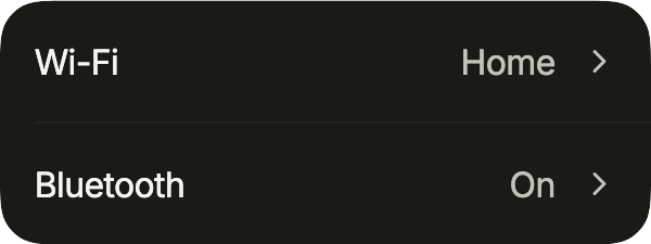
Two rows that open a detail page: the title, the current value, and a chevron.
import 'package:your_app/ui/fliin/components/list_row/fl_list_row.dart';
import 'package:flutter/widgets.dart';

class ListRowEnabledExample extends StatelessWidget {
  const ListRowEnabledExample({super.key});

  @override
  Widget build(BuildContext context) {
    return FlListGroup(
      children: [
        FlListRow(
          title: 'Wi-Fi',
          value: 'Home',
          trailing: const FlListRowChevron(),
          onPressed: () {},
        ),
        FlListRow(
          title: 'Bluetooth',
          value: 'On',
          trailing: const FlListRowChevron(),
          onPressed: () {},
        ),
      ],
    );
  }
}Disabled
enabled: false dims the rows and ignores touches, for a setting that does not apply right now.
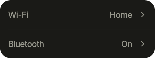
import 'package:your_app/ui/fliin/components/list_row/fl_list_row.dart';
import 'package:flutter/widgets.dart';

class ListRowDisabledExample extends StatelessWidget {
  const ListRowDisabledExample({super.key});

  @override
  Widget build(BuildContext context) {
    return FlListGroup(
      children: [
        FlListRow(
          title: 'Wi-Fi',
          value: 'Home',
          trailing: const FlListRowChevron(),
          enabled: false,
          onPressed: () {},
        ),
        FlListRow(
          title: 'Bluetooth',
          value: 'On',
          trailing: const FlListRowChevron(),
          enabled: false,
          onPressed: () {},
        ),
      ],
    );
  }
}Usage
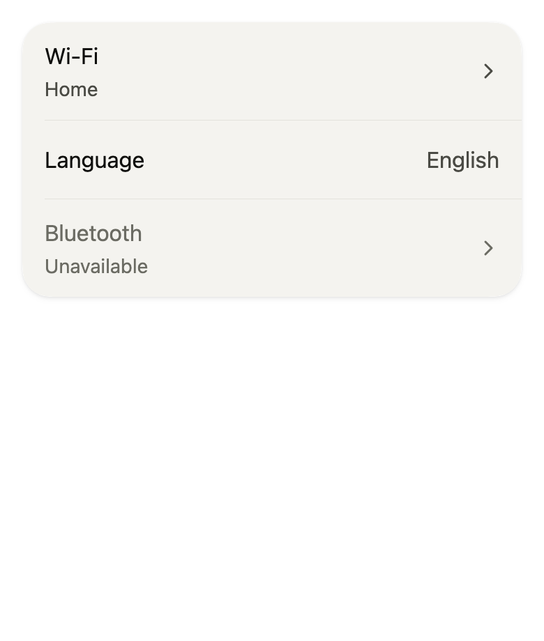
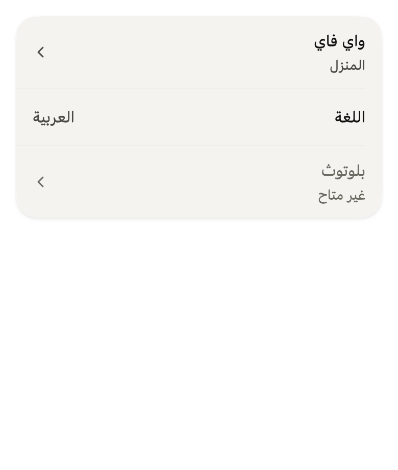
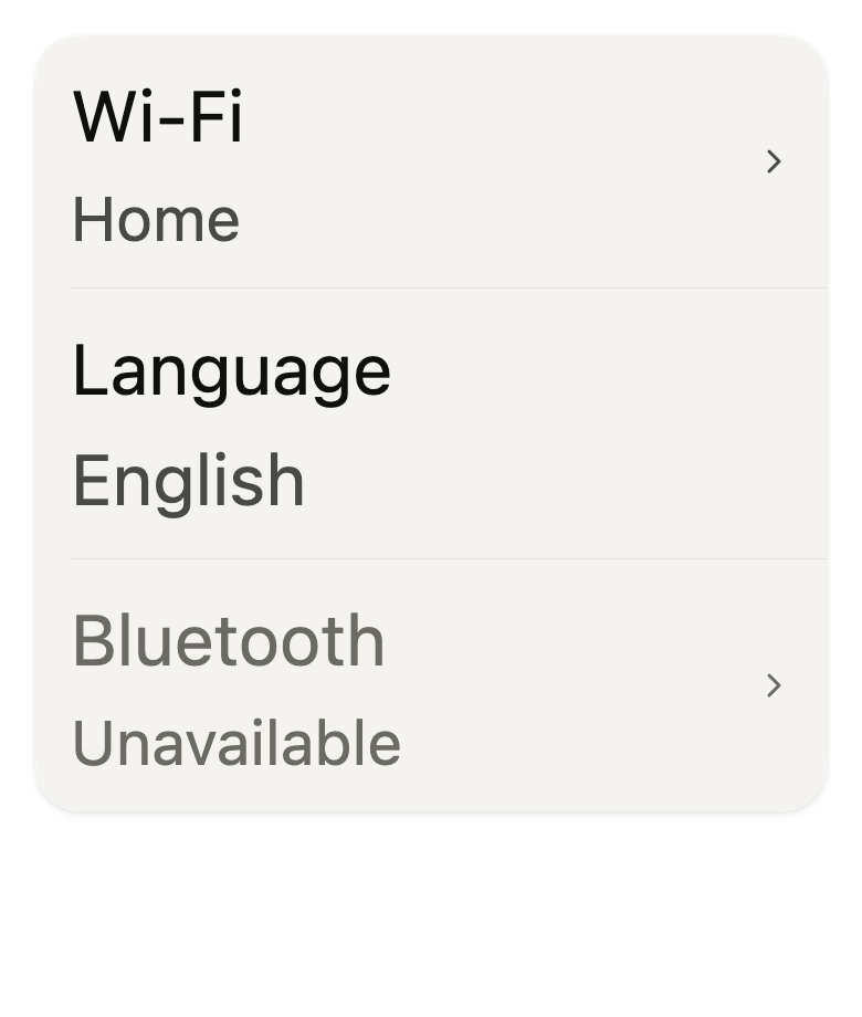
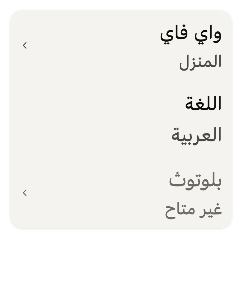
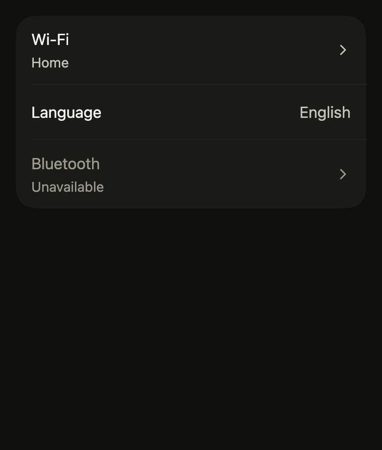
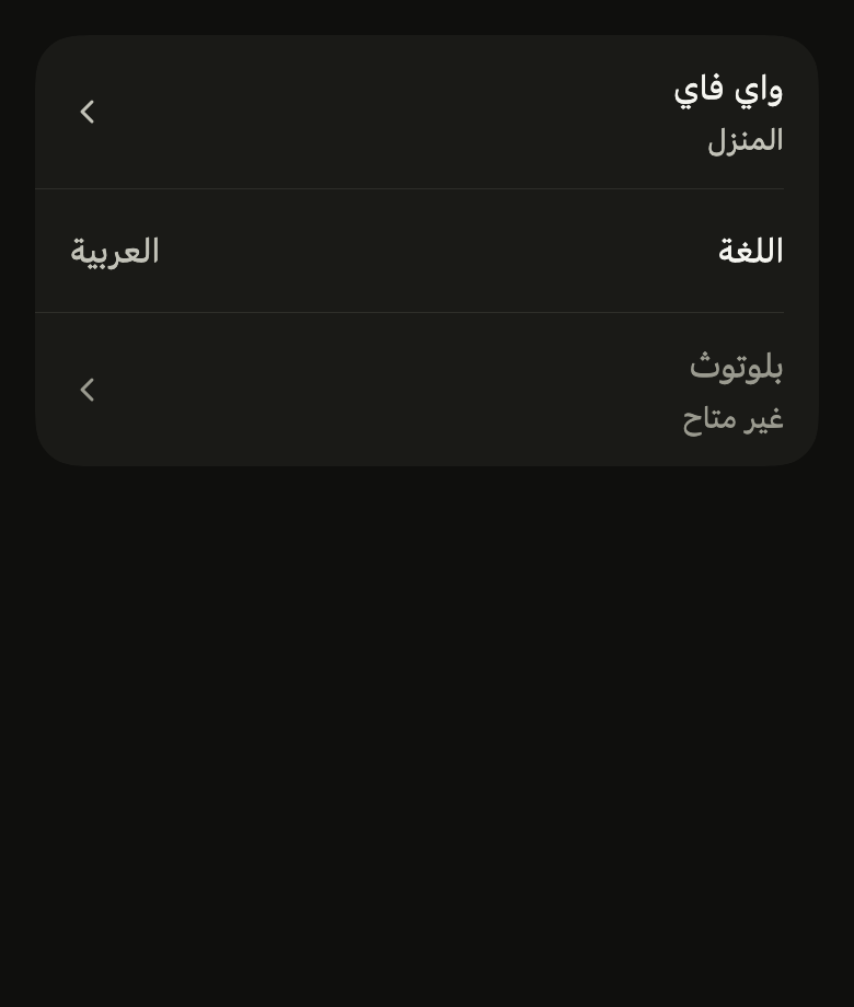
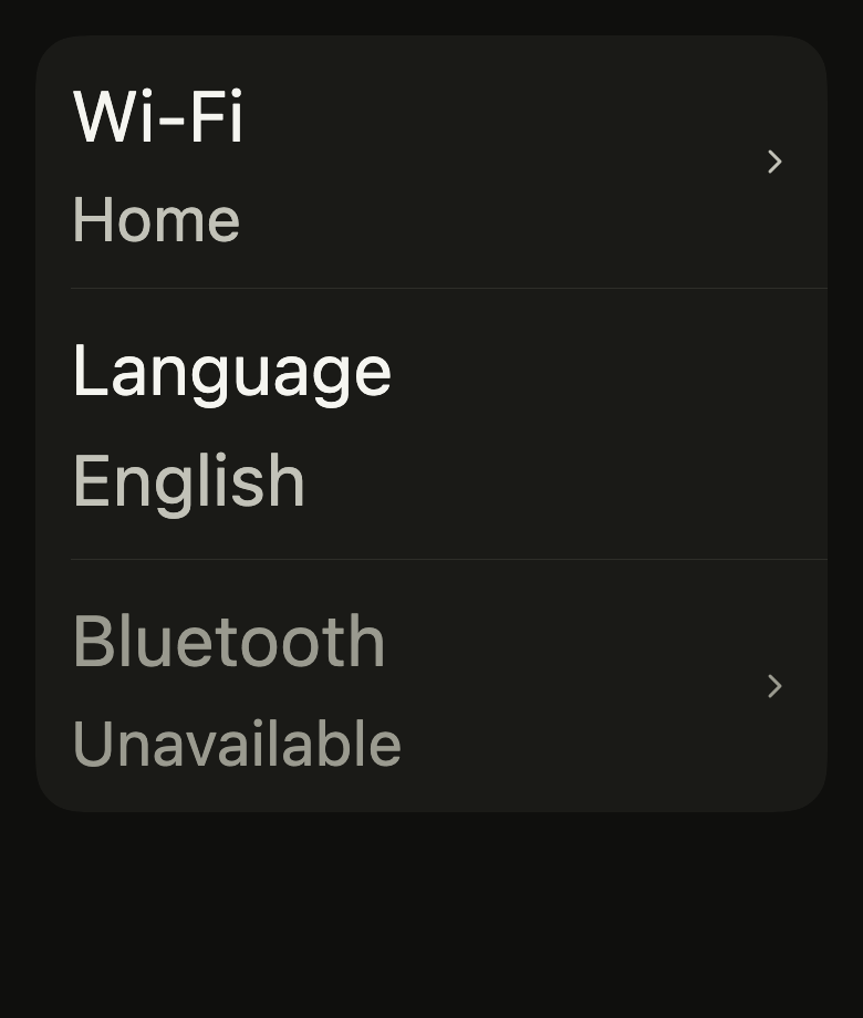
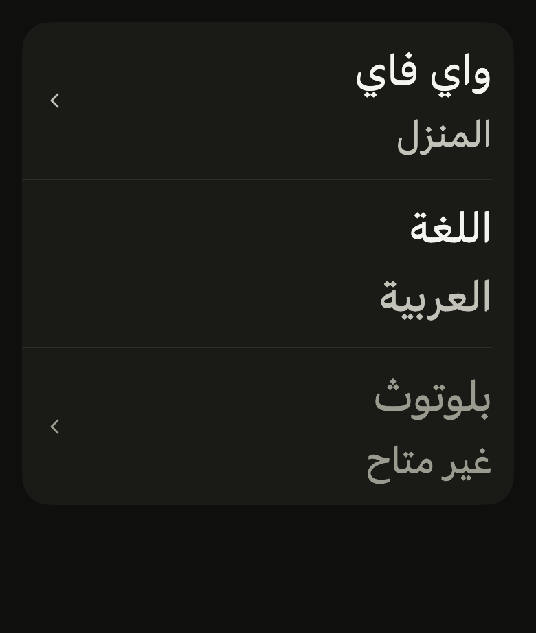
The code the reference images render:
final example = ColoredBox(
  color: FlScope.of(context).colors.surface,
  child: Padding(
    padding: EdgeInsetsDirectional.all(FlScope.of(context).space.lg),
    child: Column(
      crossAxisAlignment: CrossAxisAlignment.stretch,
      children: [
        FlListGroup(
          children: [
            FlListRow(
              title: 'Wi-Fi',
              subtitle: 'Home',
              trailing: const FlListRowChevron(),
              onPressed: () {},
            ),
            FlListRow(title: 'Language', value: 'English'),
            FlListRow(
              title: 'Bluetooth',
              subtitle: 'Unavailable',
              trailing: const FlListRowChevron(),
              enabled: false,
              onPressed: () {},
            ),
          ],
        ),
      ],
    ),
  ),
);API
FlListGroup: class extends StatelessWidget
FlListGroup.new: const new({super.key, FlSurfaceVariant variant, bool separators, double? separatorInset, required List<Widget> children})
FlListGroup.variant: get FlSurfaceVariant
FlListGroup.separators: get bool
FlListGroup.separatorInset: get double?
FlListGroup.children: get List<Widget>
FlListGroup.build: Widget(BuildContext context)
FlListRowChevron: class extends StatelessWidget
FlListRowChevron.new: const new({super.key})
FlListRowChevron.build: Widget(BuildContext context)
FlListRow: class extends StatelessWidget
FlListRow.new: const new({super.key, required String title, String? subtitle, String? value, Widget? leading, Widget? trailing, VoidCallback? onPressed, bool enabled, bool autofocus, bool selected, bool danger, WidgetStatesController? statesController})
FlListRow.danger: get bool
FlListRow.selected: get bool
FlListRow.statesController: get WidgetStatesController?
FlListRow.title: get String
FlListRow.subtitle: get String?
FlListRow.value: get String?
FlListRow.leading: get Widget?
FlListRow.trailing: get Widget?
FlListRow.onPressed: get VoidCallback?
FlListRow.enabled: get bool
FlListRow.autofocus: get bool
FlListRow.build: Widget(BuildContext context)Reference renders
The 16 images published with version 0.2.6, rendered by the shared harness on macOS with Flutter 3.47.7. fliin verify list-row compares your copy to them.
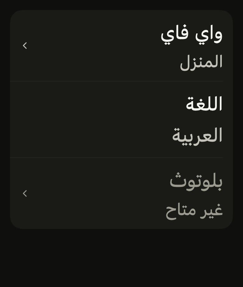
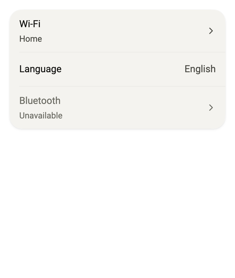
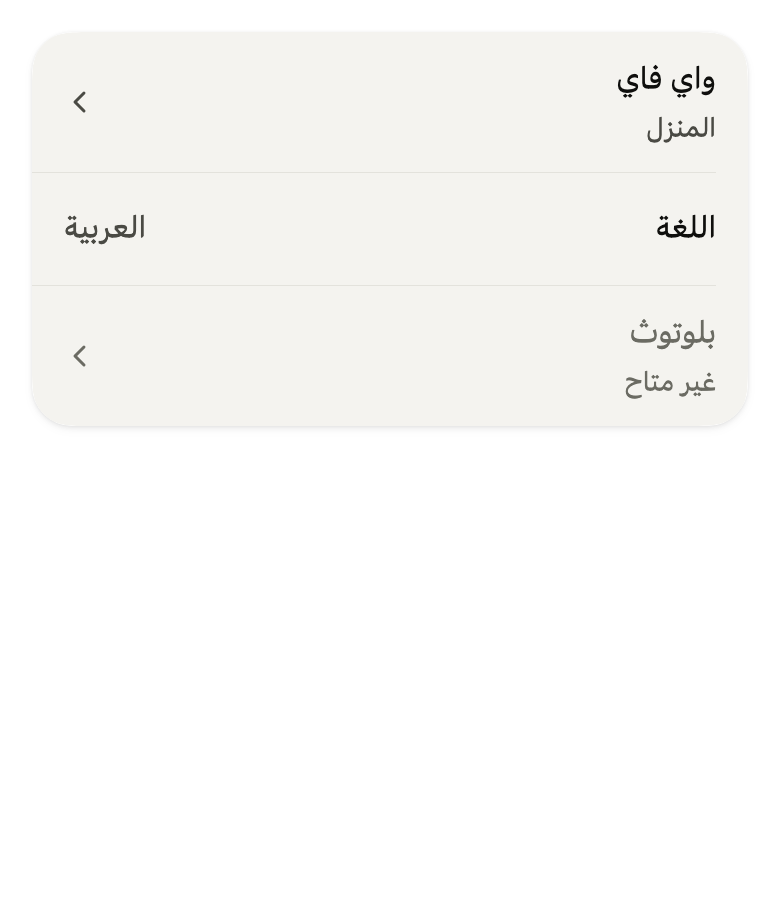
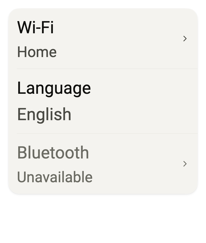
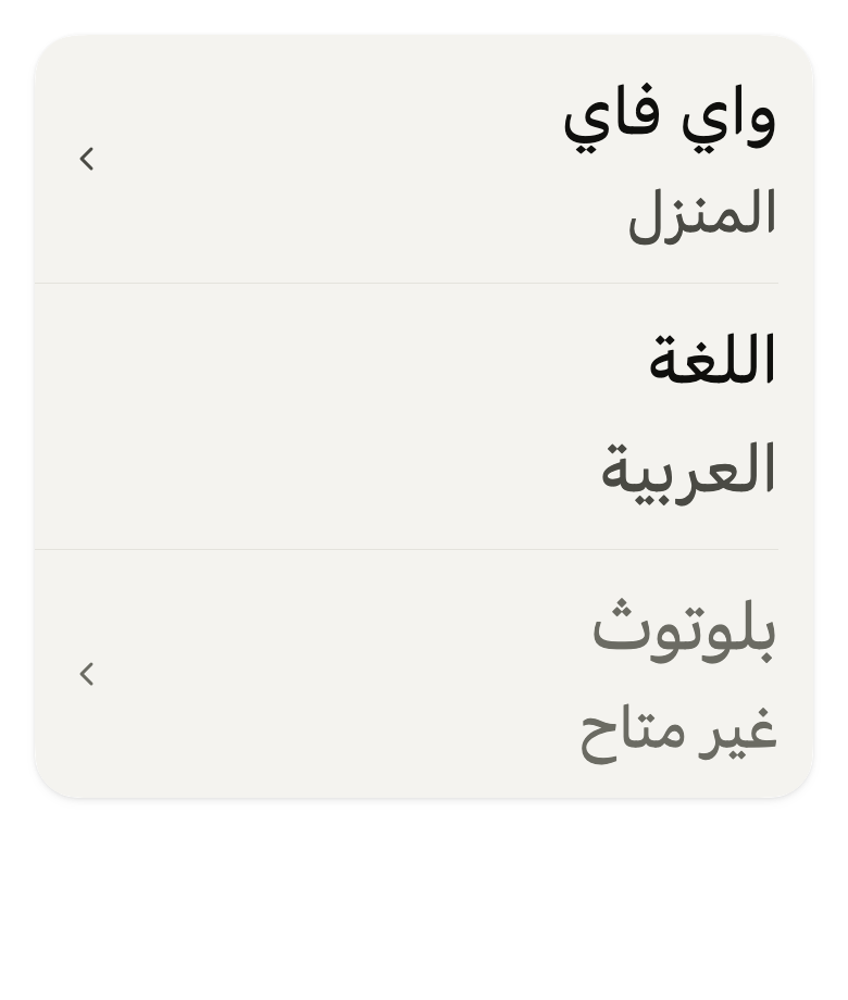
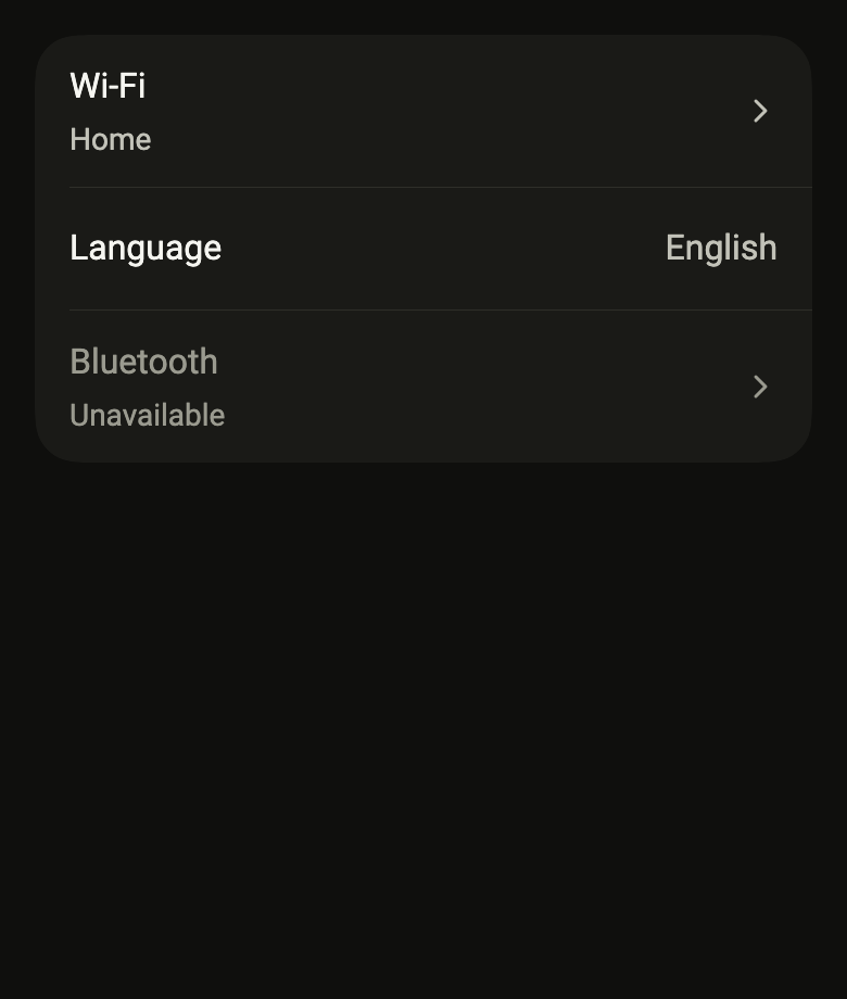
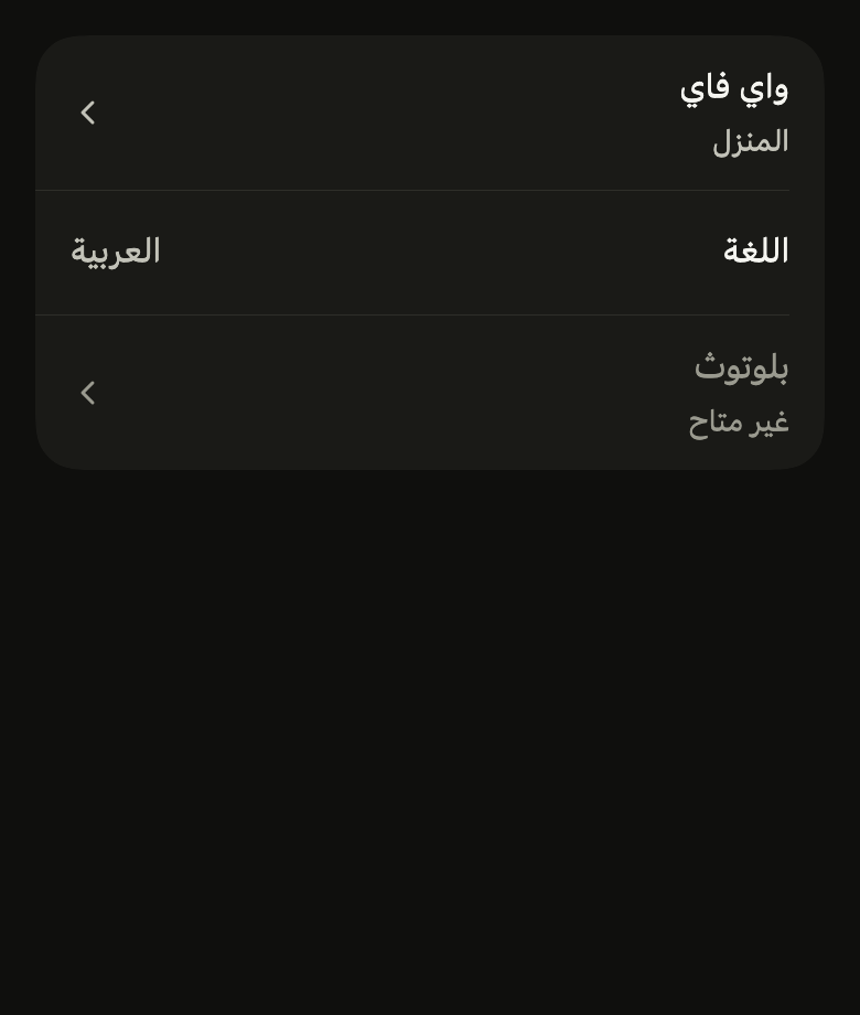
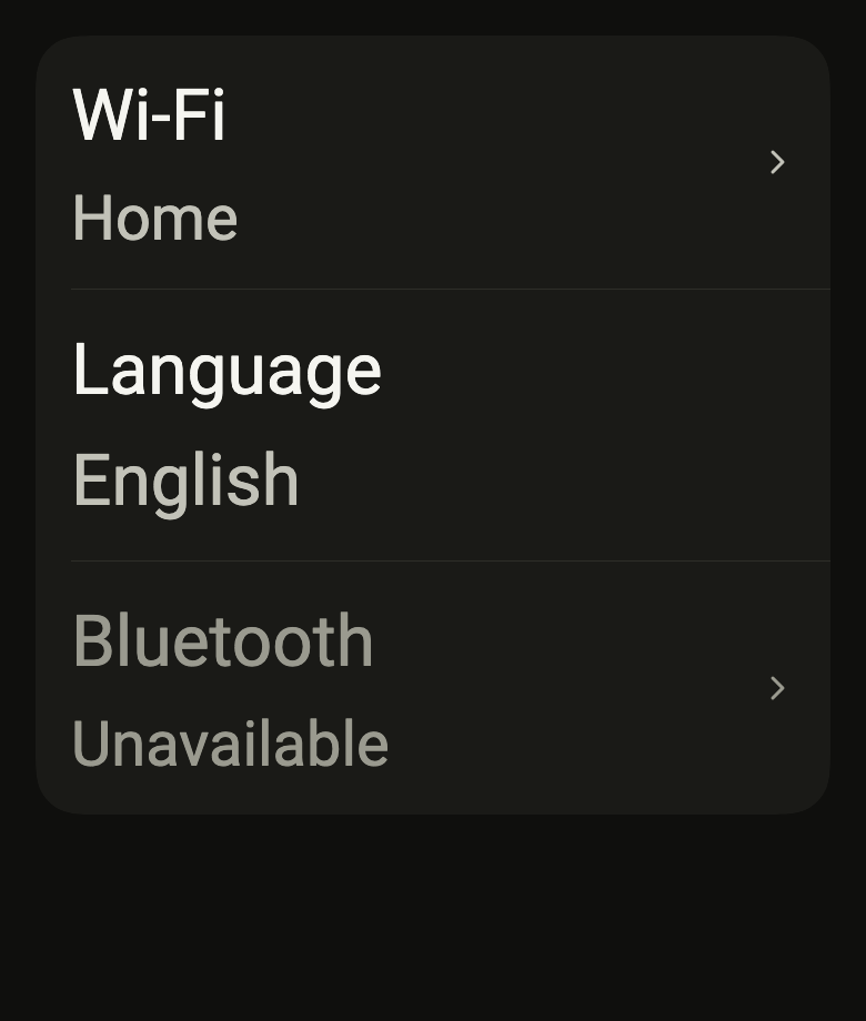
Use it to
- show a settings list row
- show items with an icon and subtitle
- open a detail from a tappable row
- show a trailing value or switch in a row
- separate list rows with divider lines
- Not for
- a standalone main action: use a button (button)
- States
Source
The files fliin add list-row copies into your app, before your prefix and imports are applied.
list_row/fl_list_row.dart
// Modified from ListGroup of HeroUI Native 1.0.10, Copyright 2025 NextUI Inc.,
// licensed under Apache 2.0: https://www.apache.org/licenses/LICENSE-2.0
import 'dart:math' as math;

import 'package:flutter/rendering.dart';
import 'package:flutter/widgets.dart';
import 'package:fliin_ui/components/separator/fl_separator.dart';
import 'package:fliin_ui/components/surface/fl_surface.dart';
import 'package:fliin_ui/core/fliin.dart';
import 'package:fliin_ui/icons/fl_icons.dart';

/// A group of rows: the [children], most often
/// [FlListRow]s, on an [FlSurface] without padding, separated by a rule
/// inset by `space.lg` at the start (past the leading of a row that has
/// one), which runs to the end.
class FlListGroup extends StatelessWidget {
  /// A `primary` group of [children], separated.
  const FlListGroup({
    super.key,
    this.variant = FlSurfaceVariant.primary,
    this.separators = true,
    this.separatorInset,
    required this.children,
  }) : assert(separatorInset == null || separatorInset >= 0, 'separatorInset must not be negative');

  /// The surface's background and shadow.
  final FlSurfaceVariant variant;

  /// False: the rows follow one another without a rule.
  final bool separators;

  /// Where every rule starts, from the group's start edge, instead of the
  /// computed inset that assumes an `sm` avatar as leading: `0` runs the
  /// rules edge to edge, and rows led by an icon line their rule up with
  /// their text by giving its start.
  final double? separatorInset;

  /// The rows, top to bottom.
  final List<Widget> children;

  @override
  Widget build(BuildContext context) {
    // Izydesk's rule starts under the rows' text and runs to the edge: past
    // the leading (an sm avatar, 40) when either neighbor has one.
    final theme = FlScope.of(context);
    double inset(int index) {
      final fixed = separatorInset;
      if (fixed != null) return fixed;
      bool lead(Widget row) => row is FlListRow && row.leading != null;
      return lead(children[index - 1]) || lead(children[index])
          ? theme.space.lg + theme.space.xs * 10 + theme.space.md
          : theme.space.lg;
    }

    return FlSurface(
      variant: variant,
      padding: EdgeInsets.zero,
      child: Column(
        mainAxisSize: MainAxisSize.min,
        crossAxisAlignment: CrossAxisAlignment.stretch,
        children: [
          for (final (index, child) in children.indexed) ...[
            if (separators && index > 0)
              Padding(
                padding: EdgeInsetsDirectional.only(start: inset(index)),
                child: const FlSeparator(),
              ),
            child,
          ],
        ],
      ),
    );
  }
}

/// A row's trailing chevron (`ListGroup.ItemSuffix` without a child): 16, in
/// the color of the `IconTheme` (muted in a row), pointing in the reading
/// direction.
class FlListRowChevron extends StatelessWidget {
  /// The chevron.
  const FlListRowChevron({super.key});

  @override
  Widget build(BuildContext context) => FlIcon(FlIcons.chevronRight, size: FlScope.of(context).size.indicatorIcon);
}

/// A list row: [title], [subtitle] and [value]
/// between [leading] and [trailing], `space.lg` from the sides and the
/// density's list padding above and below. It is pressable when
/// [onPressed] is given.
class FlListRow extends StatelessWidget {
  /// Creates an enabled row, not pressable without [onPressed].
  const FlListRow({
    super.key,
    required this.title,
    this.subtitle,
    this.value,
    this.leading,
    this.trailing,
    this.onPressed,
    this.enabled = true,
    this.autofocus = false,
    this.selected = false,
    this.danger = false,
    this.statesController,
  });

  /// True: a destructive action ("Delete account"), its title in `danger`,
  /// Izydesk's `.row-danger`. No effect on a [selected] or disabled row.
  final bool danger;

  /// True: the row is the chosen one of a list, on the soft `accentSoft`
  /// fill with its texts in `onAccentSoft` and, without [trailing], a
  /// `selected` check at the end (a chosen item stays quiet rather than
  /// filled with the accent), and announced selected.
  final bool selected;

  /// Drives and reports the row's interaction states (`hovered`, `pressed`,
  /// `focused`), as `FlPressable`'s.
  final WidgetStatesController? statesController;

  /// The main text, in regular `textBase` and `onSurface` (`onDisabled`
  /// when the row is disabled).
  final String title;

  /// A second line under the title, in muted `textSm` (`ItemDescription`).
  /// Null: the title alone.
  final String? subtitle;

  /// A text value at the end of the row ("On", "French"): beyond 1.5× it moves
  /// under the title (DESIGN.md §2.7), and when wider than its space (an
  /// IBAN), it moves there too, wrapping.
  final String? value;

  /// An icon or an avatar at the start of the row (`ItemPrefix`), vertically
  /// centered, tinted `onSurfaceMuted` and at the text size.
  final Widget? leading;

  /// An indicator or a control at the end of the row (`ItemSuffix`):
  /// [FlListRowChevron], a switch, a chip. The chevron stays at the end,
  /// centered; a control moves under the title, at the start, with the value,
  /// when the title's longest word would no longer fit beside them (DESIGN.md
  /// §2.7).
  final Widget? trailing;

  /// Null: the row is not pressable.
  final VoidCallback? onPressed;

  /// False: the row is greyed out, announced as disabled, and not pressable.
  final bool enabled;

  /// True: the row takes focus when it appears. No effect when [onPressed] is
  /// null.
  final bool autofocus;

  @override
  Widget build(BuildContext context) {
    final theme = FlScope.of(context);
    final colors = theme.colors;
    final family = DefaultTextStyle.of(context).style.fontFamily;
    final scale = theme.typography;
    // The line height comes from each text's strut, never from the style around
    // the row: a popover's content (line height 1.5) pushed the subtitle from 20
    // to 21.
    final body = scale.resolve(FlTextRole.textBase).copyWith(height: kTextHeightNone);
    final base = scale.style(FlTextRole.textBase).size;
    final scaler = MediaQuery.textScalerOf(context);
    final iconSize = scaler.clamp(maxScaleFactor: theme.size.iconMaxScale).scale(base);
    final stacked = scaler.scale(base) > 1.5 * base;
    final strong = selected
        ? colors.onAccentSoft
        : !enabled
        ? colors.onDisabled
        : danger
        ? colors.danger
        : colors.onSurface;
    final muted = enabled ? colors.onSurfaceMuted : colors.onDisabled;

    Widget mute(Widget child) => IconTheme.merge(
      data: IconThemeData(color: muted, size: iconSize),
      child: DefaultTextStyle.merge(
        style: body.copyWith(color: muted),
        child: child,
      ),
    );

    Widget row(Color? fill) {
      final leading = this.leading;
      // A chosen row without an end of its own takes the check of a chosen
      // select option, in `selected`.
      final trailing =
          this.trailing ??
          (selected ? FlIcon(FlIcons.check, size: theme.size.indicatorIcon, color: colors.selected) : null);
      final subtitle = this.subtitle;
      final value = this.value;
      final indicator = trailing is FlListRowChevron ? trailing : null;
      final control = indicator == null ? trailing : null;
      final valueText = value == null
          ? null
          : Text(
              value,
              style: body.copyWith(color: muted),
              strutStyle: scale.strut(FlTextRole.textBase, inheritedFamily: family),
            );
      return DecoratedBox(
        decoration: BoxDecoration(color: fill),
        // Izydesk's row: 12 above and below (the density's list padding), 16
        // at the sides, 56 high at least in comfortable density.
        child: _RowLayout(
          padding: EdgeInsetsDirectional.symmetric(horizontal: theme.space.lg, vertical: theme.listPadding),
          gap: theme.space.md,
          minHeight: math.max(theme.hitTarget, theme.controlHeight + theme.space.sm),
          stackGap: theme.space.sm,
          leading: leading == null ? null : mute(leading),
          body: Column(
            mainAxisSize: MainAxisSize.min,
            crossAxisAlignment: CrossAxisAlignment.start,
            // Izydesk's `.row-main`: 2 between the title and the subtitle.
            spacing: theme.space.xs / 2,
            children: [
              Text(
                title,
                style: body.copyWith(color: strong),
                strutStyle: scale.strut(FlTextRole.textBase, inheritedFamily: family),
              ),
              if (subtitle != null)
                Text(
                  subtitle,
                  style: scale.resolve(FlTextRole.textSm).copyWith(color: muted, height: kTextHeightNone),
                  strutStyle: scale.strut(FlTextRole.textSm, inheritedFamily: family),
                ),
              if (stacked) ?valueText,
            ],
          ),
          end: (stacked || valueText == null) && control == null
              ? null
              : _EndRow(
                  gap: theme.space.md,
                  stackGap: theme.space.sm,
                  value: stacked ? null : valueText,
                  control: control == null ? null : mute(control),
                ),
          indicator: indicator == null ? null : mute(indicator),
        ),
      );
    }

    final onPressed = this.onPressed;
    if (onPressed == null) {
      return Semantics(
        container: true,
        enabled: enabled ? null : false,
        selected: selected ? true : null,
        child: row(selected ? colors.accentSoft : null),
      );
    }
    return FlPressable(
      onPressed: enabled ? onPressed : null,
      autofocus: autofocus,
      statesController: statesController,
      borderRadius: BorderRadius.zero,
      scaleOnPress: false,
      focusRing: FlFocusRingPlacement.inside,
      builder: (context, states) => Semantics(
        selected: selected ? true : null,
        child: row(
          selected
              ? states.contains(WidgetState.pressed)
                    ? colors.accentSoftPressed
                    : colors.accentSoft
              : states.contains(WidgetState.pressed) || states.contains(WidgetState.hovered)
              ? colors.surfacePressed
              : null,
        ),
      ),
    );
  }
}

enum _EndSlot { value, control }

/// The end of a row: the [value] then the [control], centered, [gap] apart,
/// like a `Row`. The control takes the space the value leaves, and lies down
/// in it (an amount at 2.0). A value that does not fit beside the control's
/// minimum width never wraps beside it: it takes the full width, and the
/// control goes below, [stackGap] away, at the start. Alone, it wraps within
/// its space (an IBAN). The row then places the end under the title, like
/// iOS's `prefersSideBySideTextAndSecondaryText`.
class _EndRow extends SlottedMultiChildRenderObjectWidget<_EndSlot, RenderBox> {
  const _EndRow({required this.gap, required this.stackGap, required this.value, required this.control});

  final double gap;
  final double stackGap;
  final Widget? value;
  final Widget? control;

  @override
  Iterable<_EndSlot> get slots => _EndSlot.values;

  @override
  Widget? childForSlot(_EndSlot slot) => switch (slot) {
    _EndSlot.value => value,
    _EndSlot.control => control,
  };

  @override
  _RenderEndRow createRenderObject(BuildContext context) =>
      _RenderEndRow(gap: gap, stackGap: stackGap, textDirection: Directionality.of(context));

  @override
  void updateRenderObject(BuildContext context, _RenderEndRow renderObject) {
    renderObject
      ..gap = gap
      ..stackGap = stackGap
      ..textDirection = Directionality.of(context);
  }
}

class _RenderEndRow extends RenderBox with SlottedContainerRenderObjectMixin<_EndSlot, RenderBox> {
  _RenderEndRow({required this._gap, required this._stackGap, required this._textDirection});

  double _gap;
  set gap(double value) {
    if (value == _gap) return;
    _gap = value;
    markNeedsLayout();
  }

  double _stackGap;
  set stackGap(double value) {
    if (value == _stackGap) return;
    _stackGap = value;
    markNeedsLayout();
  }

  TextDirection _textDirection;
  set textDirection(TextDirection value) {
    if (value == _textDirection) return;
    _textDirection = value;
    markNeedsLayout();
  }

  RenderBox? get _value => childForSlot(_EndSlot.value);
  RenderBox? get _control => childForSlot(_EndSlot.control);

  @override
  Iterable<RenderBox> get children => [?_value, ?_control];

  double get _spacing => _value != null && _control != null ? _gap : 0;

  @override
  void setupParentData(RenderObject child) {
    if (child.parentData is! BoxParentData) child.parentData = BoxParentData();
  }

  /// True when the value, at its width, does not fit beside the control's
  /// minimum width within [width].
  bool _stacks(double width) => switch ((_value, _control)) {
    (final value?, final control?) =>
      value.getMaxIntrinsicWidth(double.infinity) + _gap + control.getMinIntrinsicWidth(double.infinity) > width,
    _ => false,
  };

  ({Size size, Size? value, Size? control, bool stacked}) _measure(
    BoxConstraints constraints,
    ChildLayouter layoutChild,
  ) {
    final tall = BoxConstraints(maxHeight: constraints.maxHeight);
    final wide = tall.copyWith(maxWidth: constraints.maxWidth);
    if (_stacks(constraints.maxWidth)) {
      final value = layoutChild(_value!, wide);
      final control = layoutChild(_control!, wide);
      return (
        size: constraints.constrain(
          Size(math.max(value.width, control.width), value.height + _stackGap + control.height),
        ),
        value: value,
        control: control,
        stacked: true,
      );
    }
    Size? value;
    if (_value case final child?) {
      value = layoutChild(child, tall);
      if (value.width > constraints.maxWidth) value = layoutChild(child, wide);
    }
    final control = switch (_control) {
      final child? => layoutChild(
        child,
        tall.copyWith(maxWidth: math.max(0.0, constraints.maxWidth - (value?.width ?? 0) - _spacing)),
      ),
      null => null,
    };
    return (
      size: constraints.constrain(
        Size(
          (value?.width ?? 0) + _spacing + (control?.width ?? 0),
          math.max(value?.height ?? 0, control?.height ?? 0),
        ),
      ),
      value: value,
      control: control,
      stacked: false,
    );
  }

  @override
  Size computeDryLayout(BoxConstraints constraints) => _measure(constraints, ChildLayoutHelper.dryLayoutChild).size;

  @override
  void performLayout() {
    final measure = _measure(constraints, ChildLayoutHelper.layoutChild);
    size = measure.size;
    final ltr = _textDirection == TextDirection.ltr;
    double start(Size child) => ltr ? 0 : size.width - child.width;
    if (measure.stacked) {
      final value = measure.value!;
      (_value!.parentData! as BoxParentData).offset = Offset(start(value), 0);
      (_control!.parentData! as BoxParentData).offset = Offset(start(measure.control!), value.height + _stackGap);
      return;
    }
    double y(Size child) => (size.height - child.height) / 2;
    if ((_value, measure.value) case (final value?, final valueSize?)) {
      (value.parentData! as BoxParentData).offset = Offset(start(valueSize), y(valueSize));
    }
    if ((_control, measure.control) case (final control?, final controlSize?)) {
      final before = (measure.value?.width ?? 0) + _spacing;
      (control.parentData! as BoxParentData).offset = Offset(
        ltr ? before : size.width - before - controlSize.width,
        y(controlSize),
      );
    }
  }

  @override
  double computeMinIntrinsicWidth(double height) =>
      _spacing + children.fold(0.0, (sum, child) => sum + child.getMinIntrinsicWidth(height));

  @override
  double computeMaxIntrinsicWidth(double height) =>
      _spacing + children.fold(0.0, (sum, child) => sum + child.getMaxIntrinsicWidth(height));

  @override
  double computeMinIntrinsicHeight(double width) =>
      _intrinsicHeight(width, (child, w) => child.getMinIntrinsicHeight(w));

  @override
  double computeMaxIntrinsicHeight(double width) =>
      _intrinsicHeight(width, (child, w) => child.getMaxIntrinsicHeight(w));

  double _intrinsicHeight(double width, double Function(RenderBox child, double width) height) {
    final value = _value;
    final control = _control;
    if (_stacks(width)) {
      return height(value!, width) + _stackGap + height(control!, width);
    }
    final valueWidth = value == null ? 0.0 : math.min(value.getMaxIntrinsicWidth(double.infinity), width);
    return math.max(
      value == null ? 0.0 : height(value, valueWidth),
      control == null ? 0.0 : height(control, math.max(0.0, width - valueWidth - _spacing)),
    );
  }

  @override
  void paint(PaintingContext context, Offset offset) {
    for (final child in children) {
      context.paintChild(child, offset + (child.parentData! as BoxParentData).offset);
    }
  }

  @override
  bool hitTestChildren(BoxHitTestResult result, {required Offset position}) {
    for (final child in children.toList().reversed) {
      final hit = result.addWithPaintOffset(
        offset: (child.parentData! as BoxParentData).offset,
        position: position,
        hitTest: (result, transformed) => child.hitTest(result, position: transformed),
      );
      if (hit) return true;
    }
    return false;
  }
}

enum _Slot { leading, body, end, indicator }

/// A row that centers the leading part, the body, the end and the indicator,
/// and gives the parent the title's baseline, in dry layout as in real
/// layout. The indicator stays at the end. The end moves under the body when,
/// beside it, the title would be narrower than its longest word: it would
/// break mid-word. The subtitle does not count: an address or a URL breaks
/// there as anywhere.
class _RowLayout extends SlottedMultiChildRenderObjectWidget<_Slot, RenderBox> {
  const _RowLayout({
    required this.padding,
    required this.gap,
    required this.minHeight,
    required this.stackGap,
    required this.leading,
    required this.body,
    required this.end,
    required this.indicator,
  });

  final EdgeInsetsDirectional padding;
  final double gap;

  /// The gap between the body and the end moved below it.
  final double stackGap;

  /// The platform's touch target: a pressable row is not enlarged by
  /// `FlHitTarget`, and its background covers its whole height.
  final double minHeight;
  final Widget? leading;
  final Widget body;
  final Widget? end;

  /// The chevron, always at the end.
  final Widget? indicator;

  @override
  Iterable<_Slot> get slots => _Slot.values;

  @override
  Widget? childForSlot(_Slot slot) => switch (slot) {
    _Slot.leading => leading,
    _Slot.body => body,
    _Slot.end => end,
    _Slot.indicator => indicator,
  };

  @override
  _RenderRowLayout createRenderObject(BuildContext context) => _RenderRowLayout(
    padding: padding,
    gap: gap,
    minHeight: minHeight,
    stackGap: stackGap,
    textDirection: Directionality.of(context),
  );

  @override
  void updateRenderObject(BuildContext context, _RenderRowLayout renderObject) {
    renderObject
      ..padding = padding
      ..gap = gap
      ..minHeight = minHeight
      ..stackGap = stackGap
      ..textDirection = Directionality.of(context);
  }
}

/// [stacked]: the end is under the body.
typedef _Measure = ({Size size, Size? leading, Size body, Size? end, Size? indicator, bool stacked});

class _RenderRowLayout extends RenderBox with SlottedContainerRenderObjectMixin<_Slot, RenderBox> {
  _RenderRowLayout({
    required this._padding,
    required this._gap,
    required this._minHeight,
    required this._stackGap,
    required this._textDirection,
  });

  EdgeInsetsDirectional _padding;
  set padding(EdgeInsetsDirectional value) {
    if (value == _padding) return;
    _padding = value;
    markNeedsLayout();
  }

  double _gap;
  set gap(double value) {
    if (value == _gap) return;
    _gap = value;
    markNeedsLayout();
  }

  double _minHeight;
  set minHeight(double value) {
    if (value == _minHeight) return;
    _minHeight = value;
    markNeedsLayout();
  }

  double _stackGap;
  set stackGap(double value) {
    if (value == _stackGap) return;
    _stackGap = value;
    markNeedsLayout();
  }

  TextDirection _textDirection;
  set textDirection(TextDirection value) {
    if (value == _textDirection) return;
    _textDirection = value;
    markNeedsLayout();
  }

  RenderBox? get _leading => childForSlot(_Slot.leading);
  RenderBox get _body => childForSlot(_Slot.body)!;
  RenderBox? get _end => childForSlot(_Slot.end);
  RenderBox? get _indicator => childForSlot(_Slot.indicator);

  @override
  Iterable<RenderBox> get children => [?_leading, ?childForSlot(_Slot.body), ?_end, ?_indicator];

  /// The title's longest word, the first line of the body (the `Column` of
  /// [FlListRow.build]).
  double get _titleMinWidth => switch (_body) {
    RenderFlex(:final firstChild?) => firstChild.getMinIntrinsicWidth(double.infinity),
    final body => body.getMinIntrinsicWidth(double.infinity),
  };

  @override
  void setupParentData(RenderObject child) {
    if (child.parentData is! BoxParentData) child.parentData = BoxParentData();
  }

  double get _leadingExtent => switch (_leading) {
    final leading? => leading.size.width + _gap,
    null => 0,
  };

  _Measure _measure(BoxConstraints constraints, ChildLayouter layoutChild) {
    assert(
      constraints.hasBoundedWidth,
      'FlListRow needs a bounded width: in a Row, put it in an Expanded or a SizedBox.',
    );
    final padding = _padding.resolve(_textDirection);
    final inner = math.max(0.0, constraints.maxWidth - padding.horizontal);
    final leading = switch (_leading) {
      final child? => layoutChild(child, BoxConstraints(maxWidth: inner)),
      null => null,
    };
    final indicator = switch (_indicator) {
      final child? => layoutChild(child, BoxConstraints(maxWidth: inner)),
      null => null,
    };
    final column = math.max(
      0.0,
      inner - (leading == null ? 0 : leading.width + _gap) - (indicator == null ? 0 : indicator.width + _gap),
    );
    final end = switch (_end) {
      final child? => layoutChild(child, BoxConstraints(maxWidth: column)),
      null => null,
    };
    final beside = end == null ? column : math.max(0.0, column - end.width - _gap);
    final stacked = end != null && beside < _titleMinWidth;
    final body = layoutChild(_body, BoxConstraints.tightFor(width: stacked ? column : beside));
    final content = switch (end) {
      null => body.height,
      _ when stacked => body.height + _stackGap + end.height,
      _ => math.max(body.height, end.height),
    };
    final height = math.max(
      _minHeight,
      math.max(math.max(leading?.height ?? 0, indicator?.height ?? 0), content) + padding.vertical,
    );
    return (
      size: constraints.constrain(Size(constraints.maxWidth, height)),
      leading: leading,
      body: body,
      end: end,
      indicator: indicator,
      stacked: stacked,
    );
  }

  /// The top of the body: centered alone, or with the end moved below it.
  double _bodyTop(_Measure measure) {
    final end = measure.end;
    return measure.stacked && end != null
        ? _centered(measure.size, Size(measure.body.width, measure.body.height + _stackGap + end.height))
        : _centered(measure.size, measure.body);
  }

  @override
  Size computeDryLayout(BoxConstraints constraints) => _measure(constraints, ChildLayoutHelper.dryLayoutChild).size;

  @override
  double? computeDryBaseline(BoxConstraints constraints, TextBaseline baseline) {
    final measure = _measure(constraints, ChildLayoutHelper.dryLayoutChild);
    final bodyBaseline = _body.getDryBaseline(BoxConstraints.tightFor(width: measure.body.width), baseline);
    return bodyBaseline == null ? null : bodyBaseline + _bodyTop(measure);
  }

  double _centered(Size size, Size child) {
    final padding = _padding.resolve(_textDirection);
    return padding.top + (size.height - padding.vertical - child.height) / 2;
  }

  @override
  void performLayout() {
    final measure = _measure(constraints, ChildLayoutHelper.layoutChild);
    size = measure.size;
    final padding = _padding.resolve(_textDirection);
    final ltr = _textDirection == TextDirection.ltr;
    double startX(double inset, double width) =>
        ltr ? padding.left + inset : size.width - padding.right - inset - width;
    if ((_leading, measure.leading) case (final leading?, final leadingSize?)) {
      (leading.parentData! as BoxParentData).offset = Offset(
        startX(0, leadingSize.width),
        _centered(size, leadingSize),
      );
    }
    final bodyTop = _bodyTop(measure);
    (_body.parentData! as BoxParentData).offset = Offset(startX(_leadingExtent, measure.body.width), bodyTop);
    final indicatorExtent = switch (measure.indicator) {
      final indicator? => indicator.width + _gap,
      null => 0.0,
    };
    if ((_end, measure.end) case (final end?, final endSize?)) {
      (end.parentData! as BoxParentData).offset = measure.stacked
          ? Offset(startX(_leadingExtent, endSize.width), bodyTop + measure.body.height + _stackGap)
          : Offset(
              startX(size.width - padding.horizontal - indicatorExtent - endSize.width, endSize.width),
              _centered(size, endSize),
            );
    }
    if ((_indicator, measure.indicator) case (final indicator?, final indicatorSize?)) {
      (indicator.parentData! as BoxParentData).offset = Offset(
        startX(size.width - padding.horizontal - indicatorSize.width, indicatorSize.width),
        _centered(size, indicatorSize),
      );
    }
  }

  @override
  double computeMinIntrinsicWidth(double height) => _intrinsicWidth((child) => child.getMinIntrinsicWidth(height));

  @override
  double computeMaxIntrinsicWidth(double height) => _intrinsicWidth((child) => child.getMaxIntrinsicWidth(height));

  double _intrinsicWidth(double Function(RenderBox child) width) {
    final leading = _leading;
    final end = _end;
    final indicator = _indicator;
    return _padding.horizontal +
        (leading == null ? 0 : width(leading) + _gap) +
        width(_body) +
        (end == null ? 0 : width(end) + _gap) +
        (indicator == null ? 0 : width(indicator) + _gap);
  }

  @override
  double computeMinIntrinsicHeight(double width) =>
      _intrinsicHeight(width, (child, w) => child.getMinIntrinsicHeight(w));

  @override
  double computeMaxIntrinsicHeight(double width) =>
      _intrinsicHeight(width, (child, w) => child.getMaxIntrinsicHeight(w));

  double _intrinsicHeight(double width, double Function(RenderBox child, double width) height) {
    final inner = math.max(0.0, width - _padding.horizontal);
    final leading = _leading;
    final leadingWidth = leading == null ? 0.0 : leading.getMaxIntrinsicWidth(double.infinity);
    final indicator = _indicator;
    final indicatorWidth = indicator == null ? 0.0 : indicator.getMaxIntrinsicWidth(double.infinity);
    final column = math.max(
      0.0,
      inner - (leading == null ? 0 : leadingWidth + _gap) - (indicator == null ? 0 : indicatorWidth + _gap),
    );
    final end = _end;
    final endWidth = end == null ? 0.0 : math.min(column, end.getMaxIntrinsicWidth(double.infinity));
    final beside = end == null ? column : math.max(0.0, column - endWidth - _gap);
    final double content;
    if (end == null) {
      content = height(_body, column);
    } else if (beside < _titleMinWidth) {
      content = height(_body, column) + _stackGap + height(end, endWidth);
    } else {
      content = math.max(height(_body, beside), height(end, endWidth));
    }
    return math.max(
      _minHeight,
      _padding.vertical +
          math.max(
            math.max(
              leading == null ? 0.0 : height(leading, leadingWidth),
              indicator == null ? 0.0 : height(indicator, indicatorWidth),
            ),
            content,
          ),
    );
  }

  @override
  double? computeDistanceToActualBaseline(TextBaseline baseline) {
    final bodyBaseline = _body.getDistanceToActualBaseline(baseline);
    return bodyBaseline == null ? null : bodyBaseline + (_body.parentData! as BoxParentData).offset.dy;
  }

  @override
  void paint(PaintingContext context, Offset offset) {
    for (final child in children) {
      context.paintChild(child, offset + (child.parentData! as BoxParentData).offset);
    }
  }

  @override
  bool hitTestChildren(BoxHitTestResult result, {required Offset position}) {
    for (final child in children.toList().reversed) {
      final offset = (child.parentData! as BoxParentData).offset;
      final hit = result.addWithPaintOffset(
        offset: offset,
        position: position,
        hitTest: (result, transformed) => child.hitTest(result, position: transformed),
      );
      if (hit) return true;
    }
    return false;
  }
}