Components / actions
Toolbar
Gathers the commands that act on the same content in one bar, floating or not, such as text formatting: the arrow keys move from one button to the next.
Import
In a Flutter app where fliin init has run:
Examples
Plain
A toolbar lines up toggles and actions, split by a separator; semanticLabel names it for the screen reader.

import 'package:your_app/ui/fliin/components/button/fl_button.dart';
import 'package:your_app/ui/fliin/components/separator/fl_separator.dart';
import 'package:your_app/ui/fliin/components/toggle_button/fl_toggle_button.dart';
import 'package:your_app/ui/fliin/components/toolbar/fl_toolbar.dart';
import 'package:your_app/ui/fliin/core/fliin.dart';
import 'package:your_app/ui/fliin/icons/fl_icons.dart';
import 'package:flutter/widgets.dart';

class ToolbarPlainExample extends StatefulWidget {
  const ToolbarPlainExample({super.key});

  @override
  State<ToolbarPlainExample> createState() => _ToolbarPlainExampleState();
}

class _ToolbarPlainExampleState extends State<ToolbarPlainExample> {
  var _favorite = true;
  var _bookmark = false;

  @override
  Widget build(BuildContext context) {
    return Center(
      child: FlToolbar(
        semanticLabel: 'Actions',
        children: [
          FlToggleButton.icon(
            label: 'Favorite',
            selected: _favorite,
            variant: FlToggleButtonVariant.ghost,
            icon: FlIcon(_favorite ? FlIcons.heartFill : FlIcons.heart),
            onChanged: (on) => setState(() => _favorite = on),
          ),
          FlToggleButton.icon(
            label: 'Bookmark',
            selected: _bookmark,
            variant: FlToggleButtonVariant.ghost,
            icon: FlIcon(FlIcons.bookmark),
            onChanged: (on) => setState(() => _bookmark = on),
          ),
          const FlSeparator(),
          FlButton.icon(label: 'Edit', variant: FlButtonVariant.ghost, icon: FlIcon(FlIcons.pencil), onPressed: () {}),
          FlButton.icon(
            label: 'Share',
            variant: FlButtonVariant.ghost,
            icon: FlIcon(FlIcons.arrowUpFromSquare),
            onPressed: () {},
          ),
        ],
      ),
    );
  }
}Attached
The attached variant draws a surface behind the tools, to float them over content.

import 'package:your_app/ui/fliin/components/button/fl_button.dart';
import 'package:your_app/ui/fliin/components/separator/fl_separator.dart';
import 'package:your_app/ui/fliin/components/toggle_button/fl_toggle_button.dart';
import 'package:your_app/ui/fliin/components/toolbar/fl_toolbar.dart';
import 'package:your_app/ui/fliin/core/fliin.dart';
import 'package:your_app/ui/fliin/icons/fl_icons.dart';
import 'package:flutter/widgets.dart';

class ToolbarAttachedExample extends StatefulWidget {
  const ToolbarAttachedExample({super.key});

  @override
  State<ToolbarAttachedExample> createState() => _ToolbarAttachedExampleState();
}

class _ToolbarAttachedExampleState extends State<ToolbarAttachedExample> {
  var _favorite = true;
  var _bookmark = false;

  @override
  Widget build(BuildContext context) {
    return Center(
      child: FlToolbar(
        variant: FlToolbarVariant.attached,
        semanticLabel: 'Actions',
        children: [
          FlToggleButton.icon(
            label: 'Favorite',
            selected: _favorite,
            variant: FlToggleButtonVariant.ghost,
            icon: FlIcon(_favorite ? FlIcons.heartFill : FlIcons.heart),
            onChanged: (on) => setState(() => _favorite = on),
          ),
          FlToggleButton.icon(
            label: 'Bookmark',
            selected: _bookmark,
            variant: FlToggleButtonVariant.ghost,
            icon: FlIcon(FlIcons.bookmark),
            onChanged: (on) => setState(() => _bookmark = on),
          ),
          const FlSeparator(),
          FlButton.icon(label: 'Edit', variant: FlButtonVariant.ghost, icon: FlIcon(FlIcons.pencil), onPressed: () {}),
          FlButton.icon(
            label: 'Share',
            variant: FlButtonVariant.ghost,
            icon: FlIcon(FlIcons.arrowUpFromSquare),
            onPressed: () {},
          ),
        ],
      ),
    );
  }
}Vertical
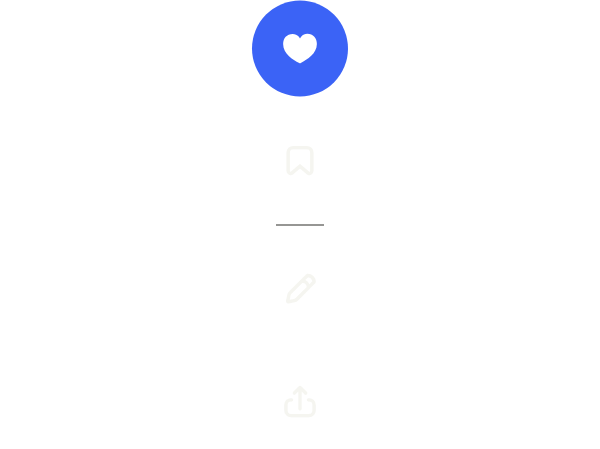
axis: Axis.vertical stacks the tools, for a side rail.
import 'package:your_app/ui/fliin/components/button/fl_button.dart';
import 'package:your_app/ui/fliin/components/separator/fl_separator.dart';
import 'package:your_app/ui/fliin/components/toggle_button/fl_toggle_button.dart';
import 'package:your_app/ui/fliin/components/toolbar/fl_toolbar.dart';
import 'package:your_app/ui/fliin/core/fliin.dart';
import 'package:your_app/ui/fliin/icons/fl_icons.dart';
import 'package:flutter/widgets.dart';

class ToolbarVerticalExample extends StatefulWidget {
  const ToolbarVerticalExample({super.key});

  @override
  State<ToolbarVerticalExample> createState() => _ToolbarVerticalExampleState();
}

class _ToolbarVerticalExampleState extends State<ToolbarVerticalExample> {
  var _favorite = true;
  var _bookmark = false;

  @override
  Widget build(BuildContext context) {
    return Center(
      child: FlToolbar(
        axis: Axis.vertical,
        children: [
          FlToggleButton.icon(
            label: 'Favorite',
            selected: _favorite,
            variant: FlToggleButtonVariant.ghost,
            icon: FlIcon(_favorite ? FlIcons.heartFill : FlIcons.heart),
            onChanged: (on) => setState(() => _favorite = on),
          ),
          FlToggleButton.icon(
            label: 'Bookmark',
            selected: _bookmark,
            variant: FlToggleButtonVariant.ghost,
            icon: FlIcon(FlIcons.bookmark),
            onChanged: (on) => setState(() => _bookmark = on),
          ),
          const FlSeparator(),
          FlButton.icon(label: 'Edit', variant: FlButtonVariant.ghost, icon: FlIcon(FlIcons.pencil), onPressed: () {}),
          FlButton.icon(
            label: 'Share',
            variant: FlButtonVariant.ghost,
            icon: FlIcon(FlIcons.arrowUpFromSquare),
            onPressed: () {},
          ),
        ],
      ),
    );
  }
}With button group
Button groups in a toolbar: a group of toggles whose selected items are on, a separator, then the actions. The arrow keys cross every button of the bar.

import 'package:your_app/ui/fliin/components/button_group/fl_button_group.dart';
import 'package:your_app/ui/fliin/components/separator/fl_separator.dart';
import 'package:your_app/ui/fliin/components/toolbar/fl_toolbar.dart';
import 'package:your_app/ui/fliin/core/fliin.dart';
import 'package:your_app/ui/fliin/icons/fl_icons.dart';
import 'package:flutter/widgets.dart';

class ToolbarWithButtonGroupExample extends StatefulWidget {
  const ToolbarWithButtonGroupExample({super.key});

  @override
  State<ToolbarWithButtonGroupExample> createState() => _ToolbarWithButtonGroupExampleState();
}

class _ToolbarWithButtonGroupExampleState extends State<ToolbarWithButtonGroupExample> {
  final _on = {'Favorite'};

  @override
  Widget build(BuildContext context) {
    FlButtonGroupItem toggle(String label, FlIconData icon) => FlButtonGroupItem.icon(
      label: label,
      icon: FlIcon(icon),
      selected: _on.contains(label),
      onPressed: () => setState(() => _on.contains(label) ? _on.remove(label) : _on.add(label)),
    );
    return Center(
      child: FlToolbar(
        variant: FlToolbarVariant.attached,
        semanticLabel: 'Post actions',
        children: [
          FlButtonGroup(
            semanticLabel: 'Keep',
            items: [toggle('Favorite', FlIcons.heart), toggle('Bookmark', FlIcons.bookmark)],
          ),
          const FlSeparator(),
          FlButtonGroup(
            items: [
              FlButtonGroupItem.icon(label: 'Edit', icon: FlIcon(FlIcons.pencil), onPressed: () {}),
              FlButtonGroupItem.icon(label: 'Share', icon: FlIcon(FlIcons.arrowUpFromSquare), onPressed: () {}),
            ],
          ),
        ],
      ),
    );
  }
}Custom styles
spacing packs the controls closer, and color paints the attached bar with another fill of your theme.

import 'package:your_app/ui/fliin/components/toggle_button/fl_toggle_button.dart';
import 'package:your_app/ui/fliin/components/toolbar/fl_toolbar.dart';
import 'package:your_app/ui/fliin/core/fliin.dart';
import 'package:your_app/ui/fliin/icons/fl_icons.dart';
import 'package:flutter/widgets.dart';

class ToolbarCustomStylesExample extends StatefulWidget {
  const ToolbarCustomStylesExample({super.key});

  @override
  State<ToolbarCustomStylesExample> createState() => _ToolbarCustomStylesExampleState();
}

class _ToolbarCustomStylesExampleState extends State<ToolbarCustomStylesExample> {
  final _on = {'Favorite'};

  @override
  Widget build(BuildContext context) {
    final theme = FlScope.of(context);
    Widget toggle(String label, FlIconData icon, FlIconData selectedIcon) => FlToggleButton.icon(
      label: label,
      variant: FlToggleButtonVariant.ghost,
      selected: _on.contains(label),
      icon: FlIcon(icon),
      selectedIcon: FlIcon(selectedIcon),
      onChanged: (on) => setState(() => on ? _on.add(label) : _on.remove(label)),
    );
    return Center(
      child: FlToolbar(
        variant: FlToolbarVariant.attached,
        spacing: theme.space.xs,
        color: theme.colors.surfaceSecondary,
        semanticLabel: 'Keep',
        children: [
          toggle('Favorite', FlIcons.heart, FlIcons.heartFill),
          toggle('Star', FlIcons.star, FlIcons.starFill),
          toggle('Bookmark', FlIcons.bookmark, FlIcons.bookmark),
        ],
      ),
    );
  }
}Usage
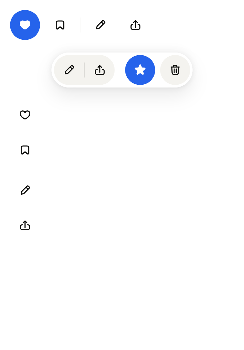
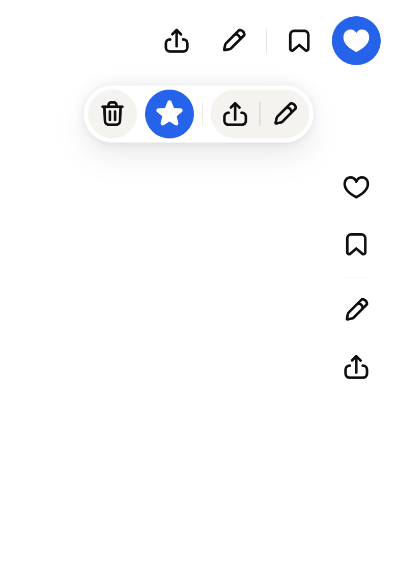
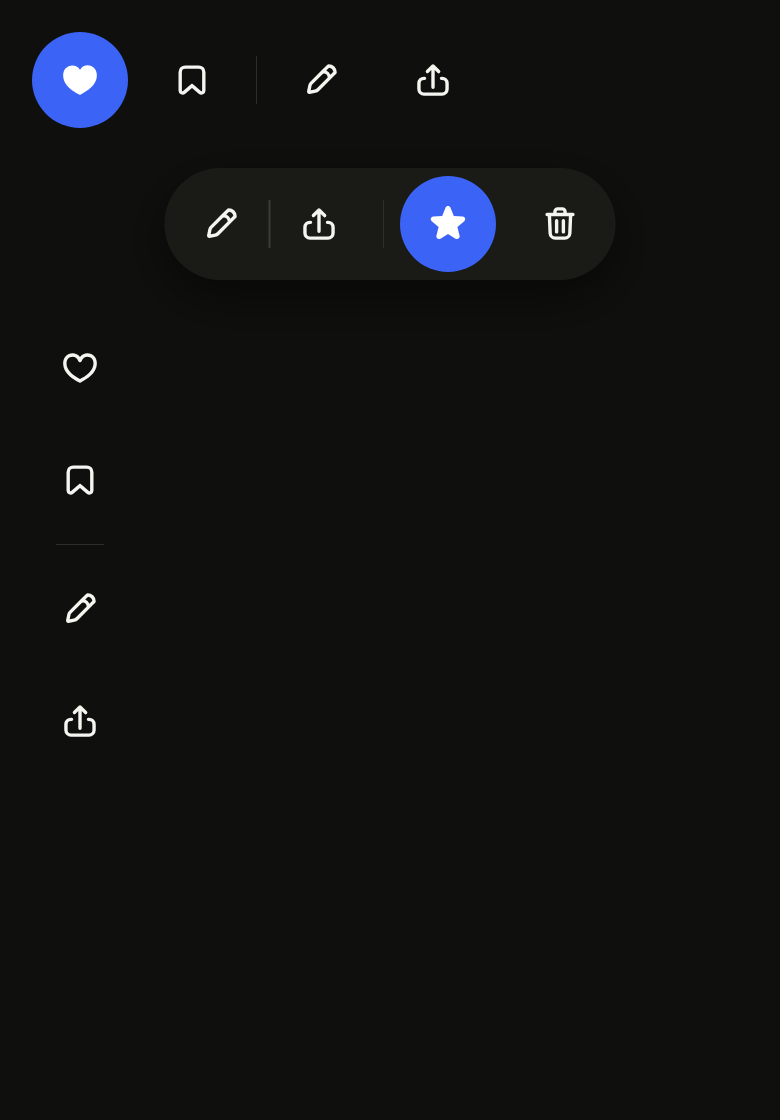
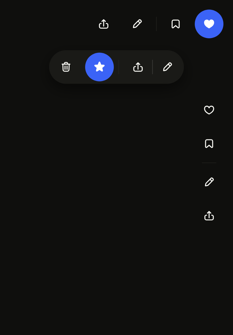
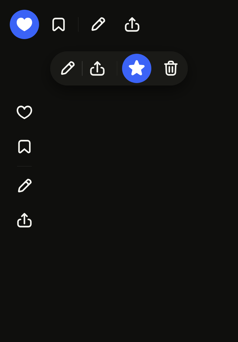
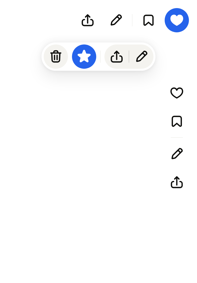
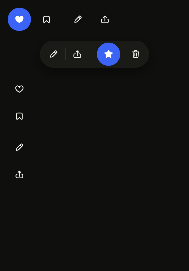
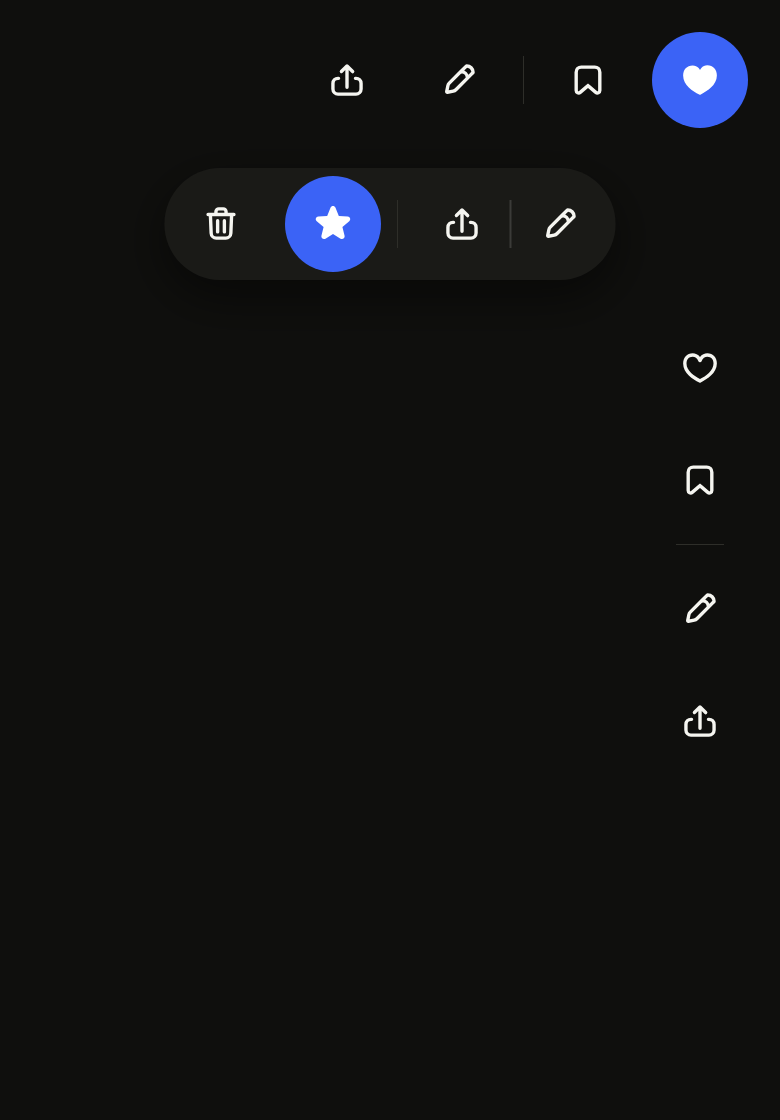
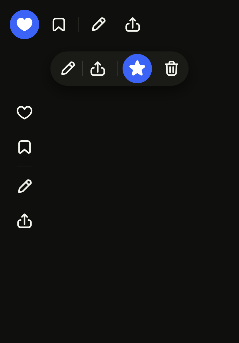
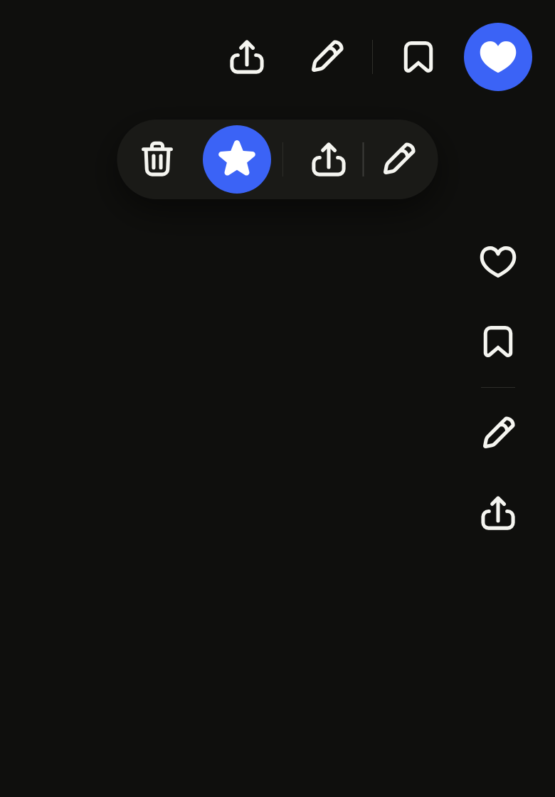
The code the reference images render:
final example = ColoredBox(
  color: FlScope.of(context).colors.surface,
  child: SingleChildScrollView(
    padding: EdgeInsetsDirectional.all(FlScope.of(context).space.lg),
    child: Column(
      crossAxisAlignment: CrossAxisAlignment.stretch,
      spacing: FlScope.of(context).space.sm,
      children: [
        Align(
          alignment: AlignmentDirectional.centerStart,
          child: FlToolbar(
            semanticLabel: 'Actions',
            children: [
              FlToggleButton.icon(
                label: 'Favorite',
                selected: true,
                variant: FlToggleButtonVariant.ghost,
                icon: FlIcon(FlIcons.heartFill),
                onChanged: (_) {},
              ),
              FlToggleButton.icon(
                label: 'Save',
                selected: false,
                variant: FlToggleButtonVariant.ghost,
                icon: FlIcon(FlIcons.bookmark),
                onChanged: (_) {},
              ),
              const FlSeparator(),
              FlButton.icon(
                label: 'Edit',
                variant: FlButtonVariant.ghost,
                icon: FlIcon(FlIcons.pencil),
                onPressed: () {},
              ),
              FlButton.icon(
                label: 'Share',
                variant: FlButtonVariant.ghost,
                icon: FlIcon(FlIcons.arrowUpFromSquare),
                onPressed: () {},
              ),
            ],
          ),
        ),
        Padding(
          padding: EdgeInsetsDirectional.symmetric(
            vertical: FlScope.of(context).space.md,
          ),
          child: Center(
            child: FlToolbar(
              variant: FlToolbarVariant.attached,
              children: [
                FlButtonGroup(
                  items: [
                    FlButtonGroupItem.icon(
                      label: 'Edit',
                      icon: FlIcon(FlIcons.pencil),
                      onPressed: () {},
                    ),
                    FlButtonGroupItem.icon(
                      label: 'Share',
                      icon: FlIcon(FlIcons.arrowUpFromSquare),
                      onPressed: () {},
                    ),
                  ],
                ),
                const FlSeparator(),
                FlToggleButton.icon(
                  label: 'Favorite',
                  selected: true,
                  icon: FlIcon(FlIcons.starFill),
                  onChanged: (_) {},
                ),
                FlButton.icon(
                  label: 'Delete',
                  variant: FlButtonVariant.tertiary,
                  icon: FlIcon(FlIcons.trashBin),
                  onPressed: () {},
                ),
              ],
            ),
          ),
        ),
        Align(
          alignment: AlignmentDirectional.centerStart,
          child: FlToolbar(
            axis: Axis.vertical,
            children: [
              FlToggleButton.icon(
                label: 'Favorite',
                selected: false,
                variant: FlToggleButtonVariant.ghost,
                icon: FlIcon(FlIcons.heart),
                onChanged: (_) {},
              ),
              FlToggleButton.icon(
                label: 'Save',
                selected: false,
                variant: FlToggleButtonVariant.ghost,
                icon: FlIcon(FlIcons.bookmark),
                onChanged: (_) {},
              ),
              const FlSeparator(),
              FlButton.icon(
                label: 'Edit',
                variant: FlButtonVariant.ghost,
                icon: FlIcon(FlIcons.pencil),
                onPressed: () {},
              ),
              FlButton.icon(
                label: 'Share',
                variant: FlButtonVariant.ghost,
                icon: FlIcon(FlIcons.arrowUpFromSquare),
                onPressed: () {},
              ),
            ],
          ),
        ),
      ],
    ),
  ),
);API
FlToolbarVariant: enum {plain, attached}
FlToolbarVariant.plain: static final FlToolbarVariant
FlToolbarVariant.attached: static final FlToolbarVariant
FlToolbar: class extends StatefulWidget
FlToolbar.new: const new({super.key, required List<Widget> children, Axis axis, FlToolbarVariant variant, String? semanticLabel, double? spacing, Color? color})
FlToolbar.children: get List<Widget>
FlToolbar.axis: get Axis
FlToolbar.variant: get FlToolbarVariant
FlToolbar.semanticLabel: get String?
FlToolbar.spacing: get double?
FlToolbar.color: get Color?
FlToolbar.createState: State<FlToolbar>()Reference renders
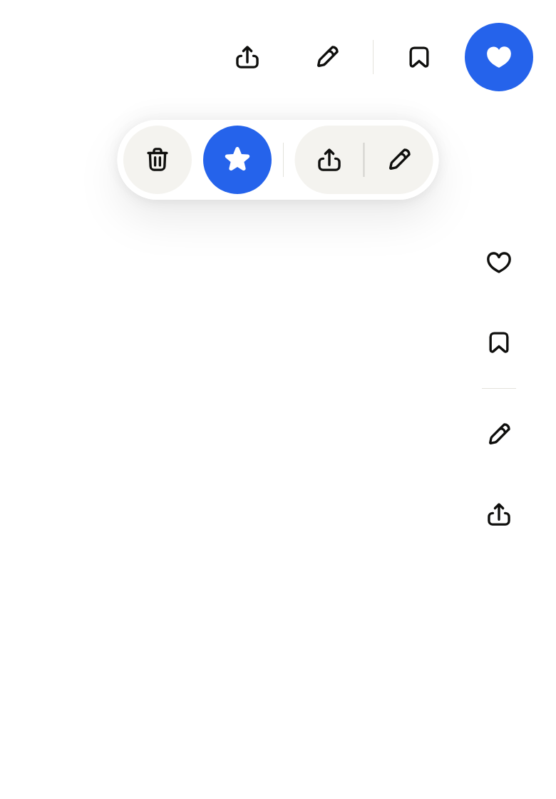
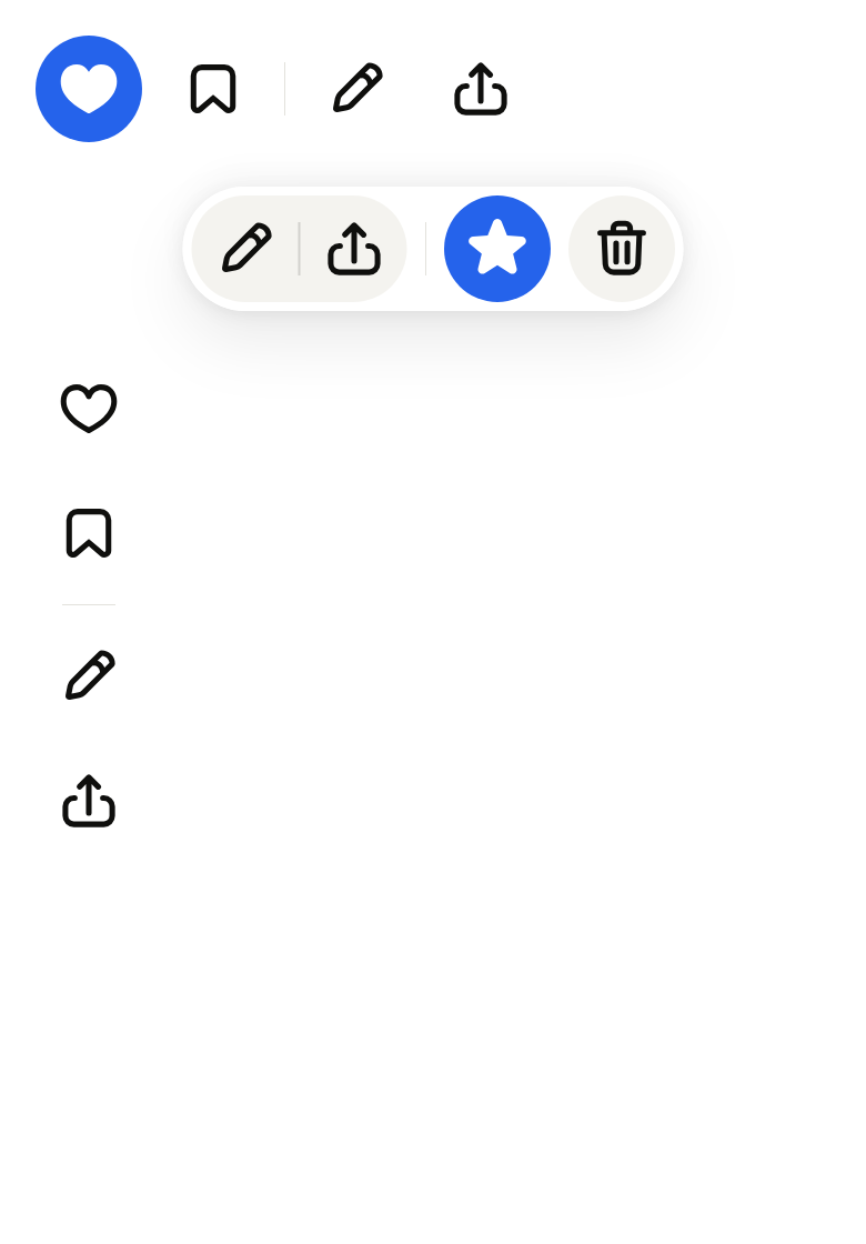
The 16 images published with version 0.1.1, rendered by the shared harness on macOS with Flutter 3.47.7. fliin verify toolbar compares your copy to them.
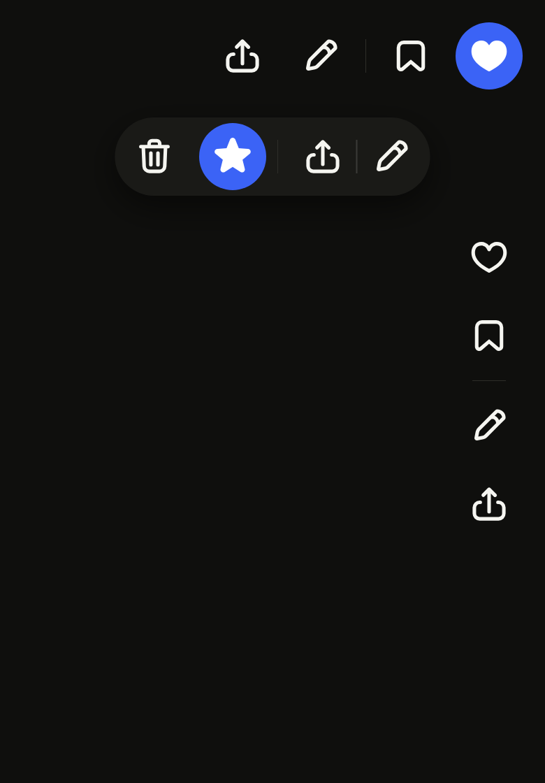
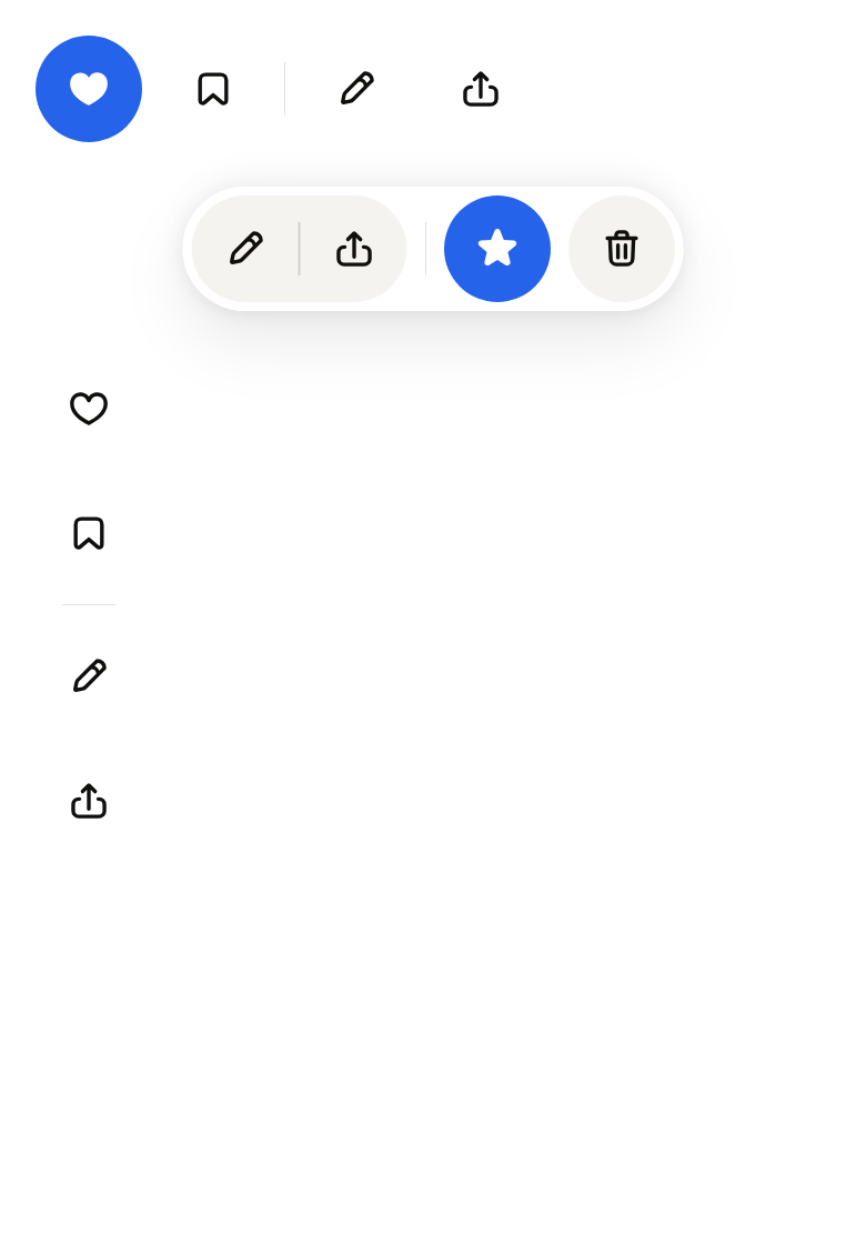
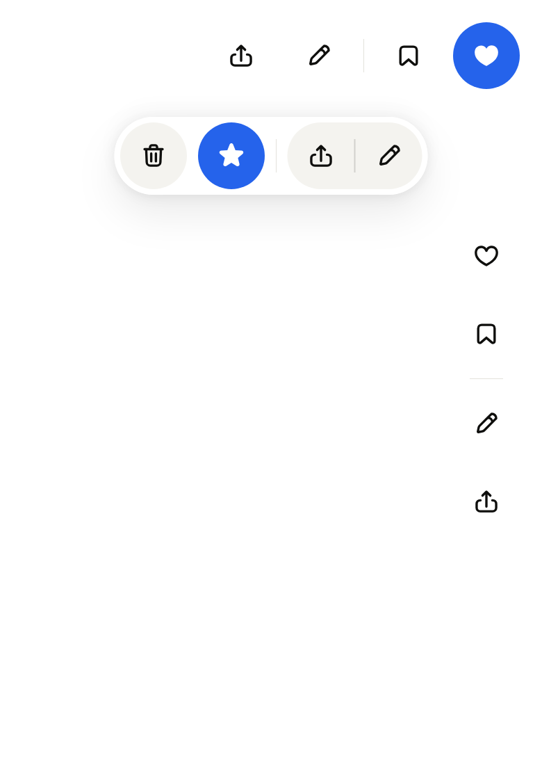
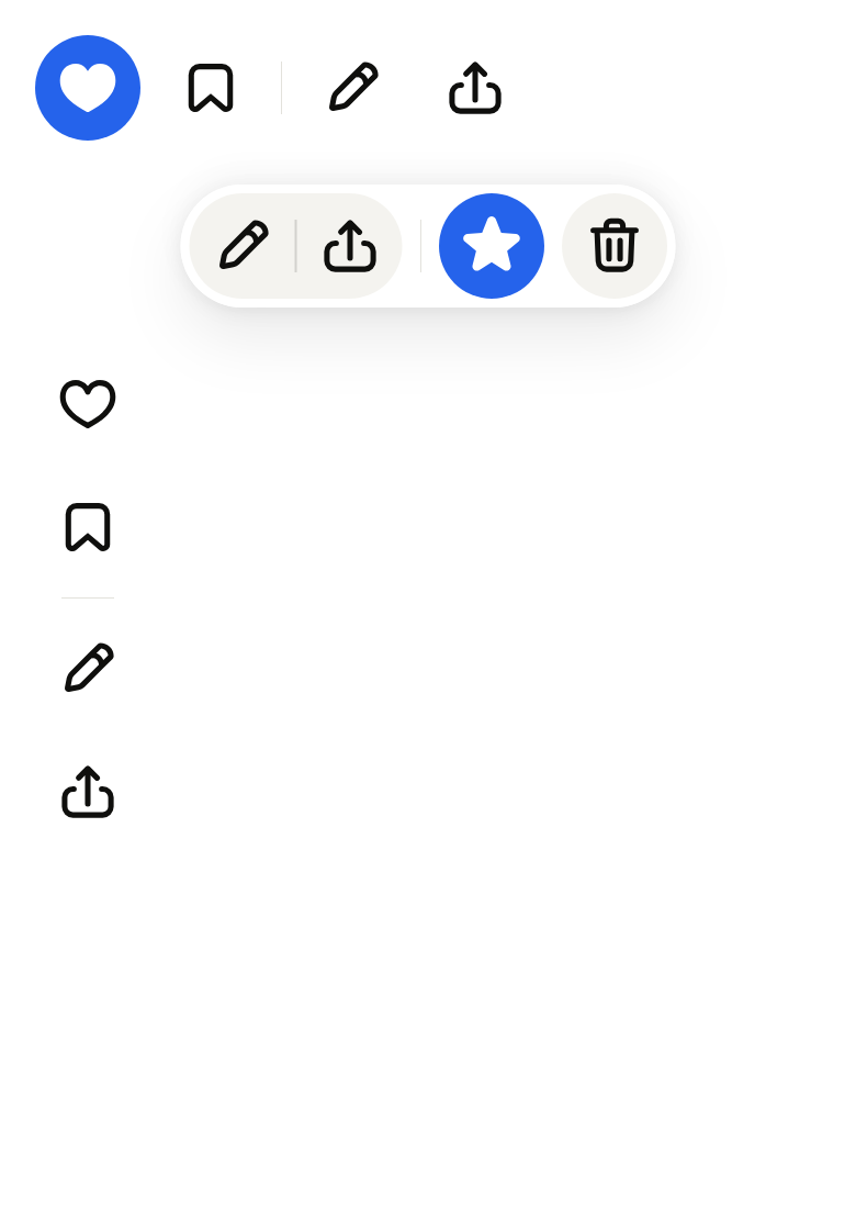
Use it to
- add a formatting toolbar above a text editor
- keep edit, share and delete together above a photo
- make a toolbar float over a document
- move between toolbar buttons with the arrow keys
- split two groups of tools with a divider
- Not for
- the main navigation between screens: use the tab bar (tab-bar)
- a screen's title and actions: use the app bar (app-bar)
- attached actions without a bar: use the button group (button-group)
- States
Source
The files fliin add toolbar copies into your app, before your prefix and imports are applied.
toolbar/fl_toolbar.dart
// Modified from the Toolbar of HeroUI React v3, Copyright 2025 NextUI Inc.,
// licensed under Apache 2.0: https://www.apache.org/licenses/LICENSE-2.0
import 'package:flutter/services.dart';
import 'package:flutter/widgets.dart';
import 'package:fliin_ui/components/separator/fl_separator.dart';
import 'package:fliin_ui/core/fliin.dart';

/// The background of an [FlToolbar].
enum FlToolbarVariant {
  /// No background: the controls sit on the page.
  plain,

  /// A `surfaceOverlay` bar lifted by the `overlay` shadow, inset by
  /// `space.xs`: a floating bar over content, an
  /// editor's formatting bar.
  attached,
}

class _MoveIntent extends Intent {
  const _MoveIntent(this.step, {this.edge = false});

  /// +1 toward the end, -1 toward the start; with [edge], all the way.
  final int step;
  final bool edge;
}

/// Tab order inside the bar: only the control last reached, so that the bar
/// is one stop, entered again where the user left it (a roving tab stop).
class _RovingPolicy extends ReadingOrderTraversalPolicy {
  _RovingPolicy(this._state);

  final _FlToolbarState _state;

  @override
  Iterable<FocusNode> sortDescendants(Iterable<FocusNode> descendants, FocusNode currentNode) {
    final sorted = super.sortDescendants(descendants, currentNode).toList();
    if (sorted.isEmpty) return sorted;
    final focused = sorted.where((node) => node.hasPrimaryFocus).firstOrNull;
    final kept = focused ?? (sorted.contains(_state._last) ? _state._last! : sorted.first);
    _state._last = kept;
    return [kept];
  }
}

/// A row of controls that act on the same thing:
/// buttons, toggle buttons, button groups, `space.sm` apart; an
/// `FlSeparator` among [children] becomes a line across the bar, at half
/// a control's height.
///
/// With a keyboard, the bar is a single Tab stop, as a toolbar should be:
/// the arrow keys move the focus from control to control in reading order
/// (reversed in RTL), Home and End to the first and the last, Tab leaves
/// the bar, and coming back lands on the control left last. Touch reaches
/// every control directly.
///
/// [spacing] tightens or loosens the controls, and [color] repaints the
/// bar of the `attached` variant.
///
/// The screen reader reads [semanticLabel], then each control.
///
/// ```dart
/// FlToolbar(semanticLabel: 'Formatting', children: [
///   FlButtonGroup(items: [/* bold, italic, underline */]),
///   const FlSeparator(),
///   FlButton.icon(label: 'Share', icon: FlIcon(FlIcons.arrowUpFromSquare), onPressed: share),
/// ])
/// ```
class FlToolbar extends StatefulWidget {
  /// A bar of [children].
  const FlToolbar({
    super.key,
    required this.children,
    this.axis = Axis.horizontal,
    this.variant = FlToolbarVariant.plain,
    this.semanticLabel,
    this.spacing,
    this.color,
  });

  /// The controls, in reading order.
  final List<Widget> children;

  /// A row, or a column aligned at the start.
  final Axis axis;

  /// No background, or a floating bar; `plain` by default.
  final FlToolbarVariant variant;

  /// The bar's name for the screen reader ("Formatting").
  final String? semanticLabel;

  /// The space between two controls; `space.sm` by default.
  final double? spacing;

  /// The fill of an `attached` bar, in place of `surfaceOverlay`.
  final Color? color;

  @override
  State<FlToolbar> createState() => _FlToolbarState();
}

class _FlToolbarState extends State<FlToolbar> {
  final FocusNode _scope = FocusNode(debugLabel: 'FlToolbar', skipTraversal: true, canRequestFocus: false);
  late final _RovingPolicy _policy = _RovingPolicy(this);

  /// The control the bar's Tab stop lands on.
  FocusNode? _last;

  @override
  void dispose() {
    _scope.dispose();
    super.dispose();
  }

  /// The controls that take focus, in the order of the tree.
  List<FocusNode> get _controls => _scope.traversalDescendants.toList();

  void _move(_MoveIntent intent) {
    final controls = _controls;
    if (controls.isEmpty) return;
    final at = controls.indexOf(FocusManager.instance.primaryFocus ?? _scope);
    final int next;
    if (intent.edge) {
      next = intent.step > 0 ? controls.length - 1 : 0;
    } else if (at < 0) {
      next = 0;
    } else {
      next = (at + intent.step).clamp(0, controls.length - 1);
    }
    _last = controls[next];
    controls[next].requestFocus();
  }

  @override
  Widget build(BuildContext context) {
    final theme = FlScope.of(context);
    final horizontal = widget.axis == Axis.horizontal;
    final rtl = Directionality.of(context) == TextDirection.rtl;
    final forward = rtl ? -1 : 1;
    final half = theme.controlHeight / 2;
    final children = [
      for (final child in widget.children)
        if (child is FlSeparator)
          // A square of half a control: the line across it, centered.
          SizedBox(
            width: horizontal ? null : half,
            height: horizontal ? half : null,
            child: FlSeparator(
              axis: horizontal ? Axis.vertical : Axis.horizontal,
              variant: child.variant,
              thickness: child.thickness,
            ),
          )
        else
          child,
    ];
    final gap = widget.spacing ?? theme.space.sm;
    Widget bar = horizontal
        ? Row(mainAxisSize: MainAxisSize.min, spacing: gap, children: children)
        : Column(
            mainAxisSize: MainAxisSize.min,
            crossAxisAlignment: CrossAxisAlignment.start,
            spacing: gap,
            children: [
              for (final (i, child) in children.indexed)
                widget.children[i] is FlSeparator
                    ? SizedBox(
                        width: theme.controlHeight,
                        child: Center(child: child),
                      )
                    : child,
            ],
          );
    if (widget.variant == FlToolbarVariant.attached) {
      final inset = theme.space.xs;
      final shape = switch (theme.shape.button) {
        FlButtonShape.square => const RoundedRectangleBorder(),
        // Concentric with the controls inside.
        FlButtonShape.rounded => RoundedRectangleBorder(
          borderRadius: BorderRadius.circular(theme.shape.radiusButton + inset),
        ),
        FlButtonShape.pill => const StadiumBorder(),
      };
      bar = FlShadow(
        layers: theme.shadows.overlay,
        shape: shape,
        child: DecoratedBox(
          decoration: ShapeDecoration(color: widget.color ?? theme.colors.surfaceOverlay, shape: shape),
          child: Padding(padding: EdgeInsetsDirectional.all(inset), child: bar),
        ),
      );
    }
    final next = horizontal ? LogicalKeyboardKey.arrowRight : LogicalKeyboardKey.arrowDown;
    final previous = horizontal ? LogicalKeyboardKey.arrowLeft : LogicalKeyboardKey.arrowUp;
    return Shortcuts(
      shortcuts: {
        SingleActivator(next): _MoveIntent(horizontal ? forward : 1),
        SingleActivator(previous): _MoveIntent(horizontal ? -forward : -1),
        const SingleActivator(LogicalKeyboardKey.home): const _MoveIntent(-1, edge: true),
        const SingleActivator(LogicalKeyboardKey.end): const _MoveIntent(1, edge: true),
      },
      child: Actions(
        actions: {_MoveIntent: CallbackAction<_MoveIntent>(onInvoke: _move)},
        child: FocusTraversalGroup(
          policy: _policy,
          child: Focus(
            focusNode: _scope,
            child: Semantics(container: true, label: widget.semanticLabel, explicitChildNodes: true, child: bar),
          ),
        ),
      ),
    );
  }
}