Components / forms
Date range picker
Picks a period from a form field that opens the range calendar, as a bottom sheet on phones: the field shows the first and last day, and a start alone is never sent.
Import
In a Flutter app where fliin init has run:
Examples
Example
A field for a start and an end, which opens a range calendar: in a sheet on a phone, in a popover on a large screen.
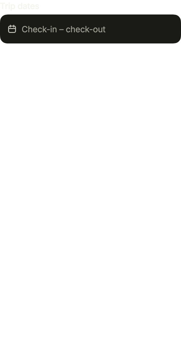
import 'package:your_app/ui/fliin/components/date_range_picker/fl_date_range_picker.dart';
import 'package:your_app/ui/fliin/components/range_calendar/fl_range_calendar.dart';
import 'package:flutter/widgets.dart';

class DateRangePickerExample extends StatefulWidget {
  const DateRangePickerExample({super.key});

  @override
  State<DateRangePickerExample> createState() => _DateRangePickerExampleState();
}

class _DateRangePickerExampleState extends State<DateRangePickerExample> {
  FlDateRange? _value;

  @override
  Widget build(BuildContext context) {
    return FlDateRangePicker(
      label: 'Trip dates',
      placeholder: 'Check-in – check-out',
      clearLabel: 'Clear the dates',
      barrierLabel: 'Close the calendar',
      value: _value,
      onChanged: (range) => setState(() => _value = range),
    );
  }
}Open
Open on its chosen range. presentation forces the popover or the sheet; defaultOpen opens it on the first frame.
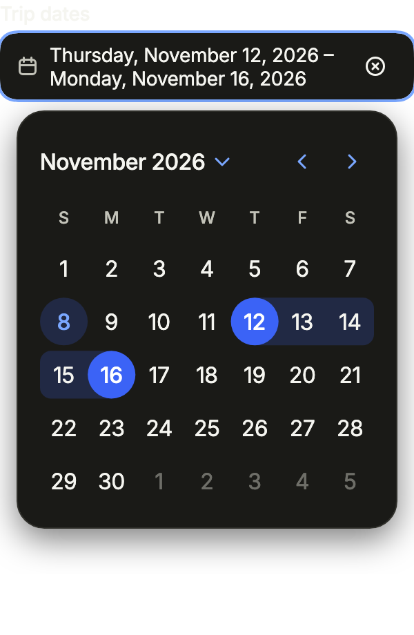
import 'package:your_app/ui/fliin/components/date_picker/fl_date_picker.dart';
import 'package:your_app/ui/fliin/components/date_range_picker/fl_date_range_picker.dart';
import 'package:your_app/ui/fliin/components/range_calendar/fl_range_calendar.dart';
import 'package:flutter/widgets.dart';

class DateRangePickerOpenExample extends StatefulWidget {
  const DateRangePickerOpenExample({super.key});

  @override
  State<DateRangePickerOpenExample> createState() => _DateRangePickerOpenExampleState();
}

class _DateRangePickerOpenExampleState extends State<DateRangePickerOpenExample> {
  FlDateRange? _value = FlDateRange(_thisMonth(12), _thisMonth(16));

  @override
  Widget build(BuildContext context) {
    return FlDateRangePicker(
      label: 'Trip dates',
      placeholder: 'Check-in – check-out',
      clearLabel: 'Clear the dates',
      barrierLabel: 'Close the calendar',
      value: _value,
      onChanged: (range) => setState(() => _value = range),
      presentation: FlDatePickerPresentation.popover,
      defaultOpen: true,
    );
  }
}

/// Day [day] of the current month.
DateTime _thisMonth(int day) {
  final now = DateTime.now();
  return DateTime(now.year, now.month, day);
}Range
A chosen range, written as two dates in the field.
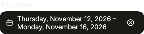
import 'package:your_app/ui/fliin/components/date_range_picker/fl_date_range_picker.dart';
import 'package:your_app/ui/fliin/components/range_calendar/fl_range_calendar.dart';
import 'package:flutter/widgets.dart';

class DateRangePickerRangeExample extends StatefulWidget {
  const DateRangePickerRangeExample({super.key});

  @override
  State<DateRangePickerRangeExample> createState() => _DateRangePickerRangeExampleState();
}

class _DateRangePickerRangeExampleState extends State<DateRangePickerRangeExample> {
  FlDateRange? _value = FlDateRange(_thisMonth(12), _thisMonth(16));

  @override
  Widget build(BuildContext context) {
    return FlDateRangePicker(
      label: 'Trip dates',
      placeholder: 'Check-in – check-out',
      clearLabel: 'Clear the dates',
      barrierLabel: 'Close the calendar',
      value: _value,
      onChanged: (range) => setState(() => _value = range),
    );
  }
}

/// Day [day] of the current month.
DateTime _thisMonth(int day) {
  final now = DateTime.now();
  return DateTime(now.year, now.month, day);
}Placeholder
Empty, with its placeholder.
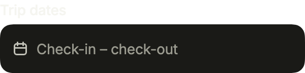
import 'package:your_app/ui/fliin/components/date_range_picker/fl_date_range_picker.dart';
import 'package:your_app/ui/fliin/components/range_calendar/fl_range_calendar.dart';
import 'package:flutter/widgets.dart';

class DateRangePickerPlaceholderExample extends StatefulWidget {
  const DateRangePickerPlaceholderExample({super.key});

  @override
  State<DateRangePickerPlaceholderExample> createState() => _DateRangePickerPlaceholderExampleState();
}

class _DateRangePickerPlaceholderExampleState extends State<DateRangePickerPlaceholderExample> {
  FlDateRange? _value;

  @override
  Widget build(BuildContext context) {
    return FlDateRangePicker(
      label: 'Trip dates',
      placeholder: 'Check-in – check-out',
      clearLabel: 'Clear the dates',
      barrierLabel: 'Close the calendar',
      value: _value,
      onChanged: (range) => setState(() => _value = range),
    );
  }
}Invalid
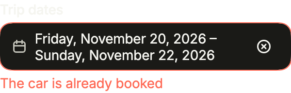
error turns the field red and says why, below it.
import 'package:your_app/ui/fliin/components/date_range_picker/fl_date_range_picker.dart';
import 'package:your_app/ui/fliin/components/range_calendar/fl_range_calendar.dart';
import 'package:flutter/widgets.dart';

class DateRangePickerInvalidExample extends StatefulWidget {
  const DateRangePickerInvalidExample({super.key});

  @override
  State<DateRangePickerInvalidExample> createState() => _DateRangePickerInvalidExampleState();
}

class _DateRangePickerInvalidExampleState extends State<DateRangePickerInvalidExample> {
  FlDateRange? _value = FlDateRange(_thisMonth(20), _thisMonth(22));

  @override
  Widget build(BuildContext context) {
    return FlDateRangePicker(
      label: 'Trip dates',
      placeholder: 'Check-in – check-out',
      clearLabel: 'Clear the dates',
      barrierLabel: 'Close the calendar',
      value: _value,
      onChanged: (range) => setState(() => _value = range),
      error: 'The car is already booked',
    );
  }
}

/// Day [day] of the current month.
DateTime _thisMonth(int day) {
  final now = DateTime.now();
  return DateTime(now.year, now.month, day);
}Disabled
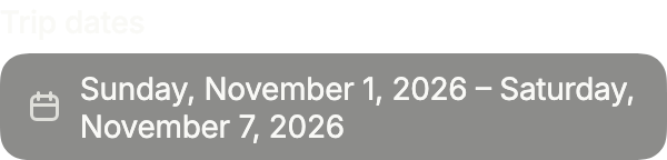
onChanged: null disables the field: the range stays readable and the calendar cannot open.
import 'package:your_app/ui/fliin/components/date_range_picker/fl_date_range_picker.dart';
import 'package:your_app/ui/fliin/components/range_calendar/fl_range_calendar.dart';
import 'package:flutter/widgets.dart';

class DateRangePickerDisabledExample extends StatelessWidget {
  const DateRangePickerDisabledExample({super.key});

  @override
  Widget build(BuildContext context) {
    return FlDateRangePicker(
      label: 'Trip dates',
      placeholder: 'Check-in – check-out',
      clearLabel: 'Clear the dates',
      barrierLabel: 'Close the calendar',
      value: FlDateRange(_thisMonth(1), _thisMonth(7)),
      onChanged: null,
    );
  }
}

/// Day [day] of the current month.
DateTime _thisMonth(int day) {
  final now = DateTime.now();
  return DateTime(now.year, now.month, day);
}Format
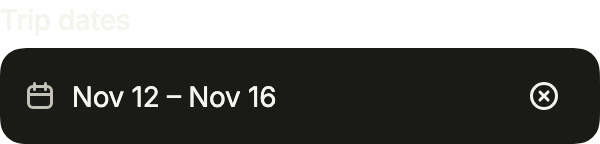
format writes each end of the range the app's way, here short, so that both fit on one line.
import 'package:your_app/ui/fliin/components/date_range_picker/fl_date_range_picker.dart';
import 'package:your_app/ui/fliin/components/range_calendar/fl_range_calendar.dart';
import 'package:flutter/widgets.dart';

class DateRangePickerFormatExample extends StatefulWidget {
  const DateRangePickerFormatExample({super.key});

  @override
  State<DateRangePickerFormatExample> createState() => _DateRangePickerFormatExampleState();
}

class _DateRangePickerFormatExampleState extends State<DateRangePickerFormatExample> {
  FlDateRange? _value = FlDateRange(_thisMonth(12), _thisMonth(16));

  @override
  Widget build(BuildContext context) {
    return FlDateRangePicker(
      label: 'Trip dates',
      placeholder: 'Check-in – check-out',
      clearLabel: 'Clear the dates',
      barrierLabel: 'Close the calendar',
      format: _short,
      value: _value,
      onChanged: (range) => setState(() => _value = range),
    );
  }
}

const _months = ['Jan', 'Feb', 'Mar', 'Apr', 'May', 'Jun', 'Jul', 'Aug', 'Sep', 'Oct', 'Nov', 'Dec'];

/// "Oct 12".
String _short(DateTime date) => '${_months[date.month - 1]} ${date.day}';

/// Day [day] of the current month.
DateTime _thisMonth(int day) {
  final now = DateTime.now();
  return DateTime(now.year, now.month, day);
}Usage
The code the reference images render:
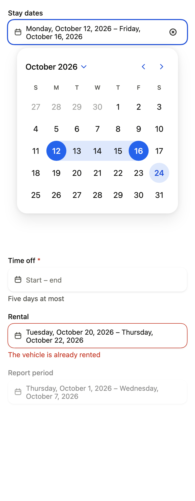
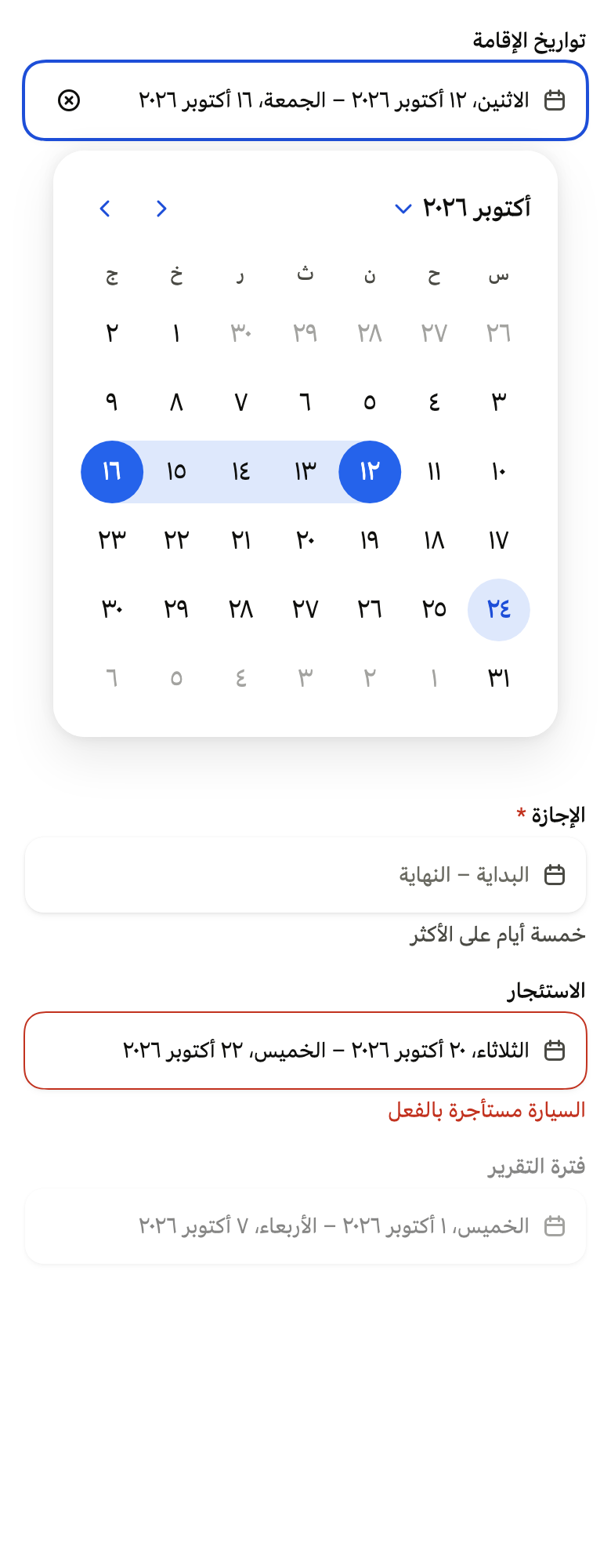
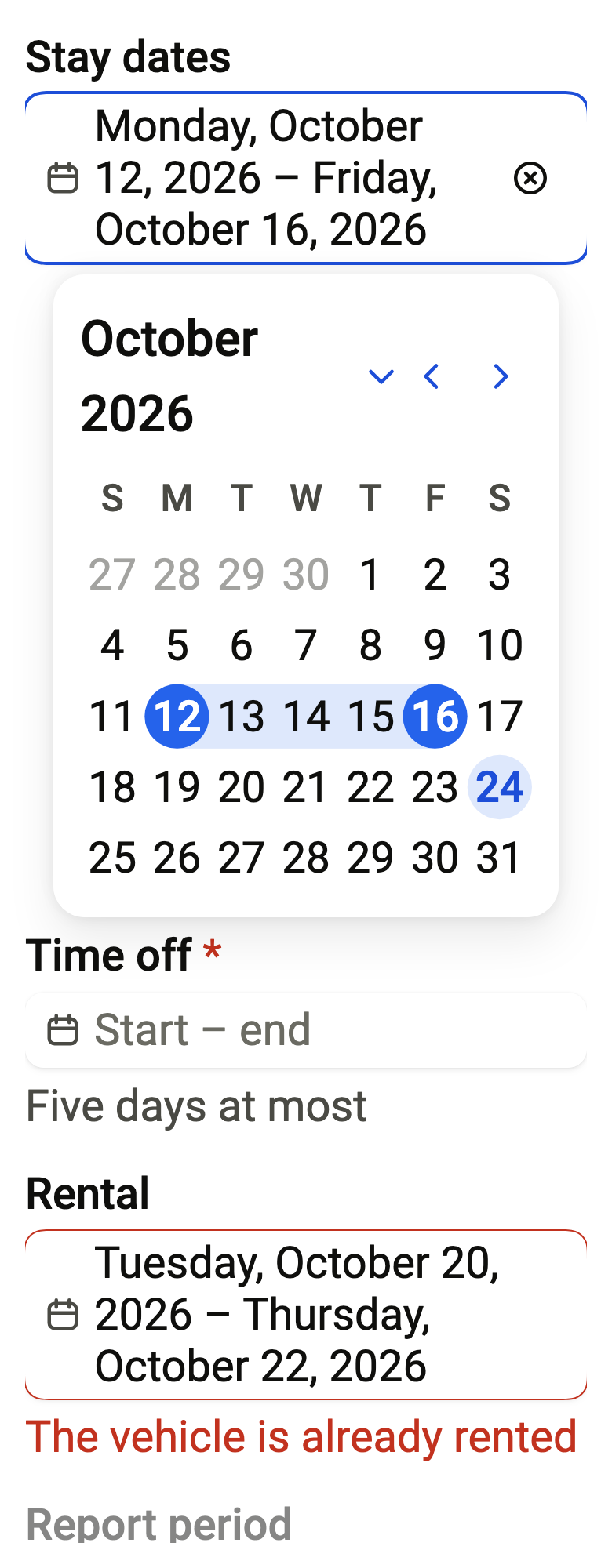
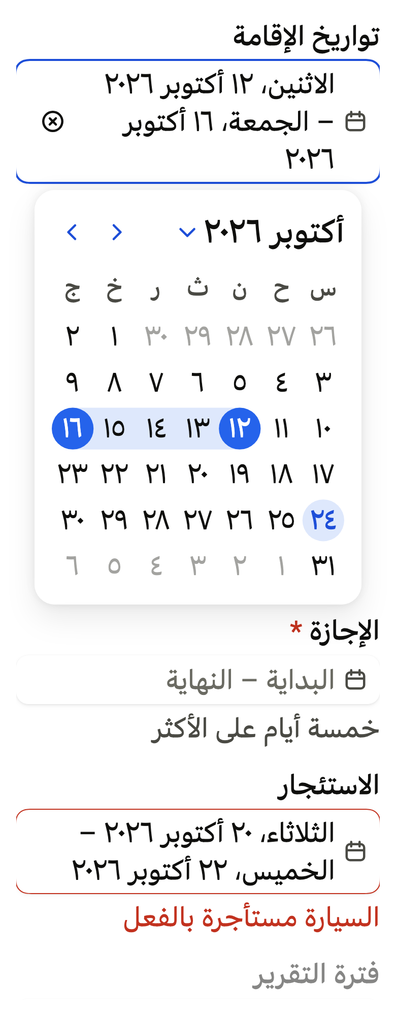
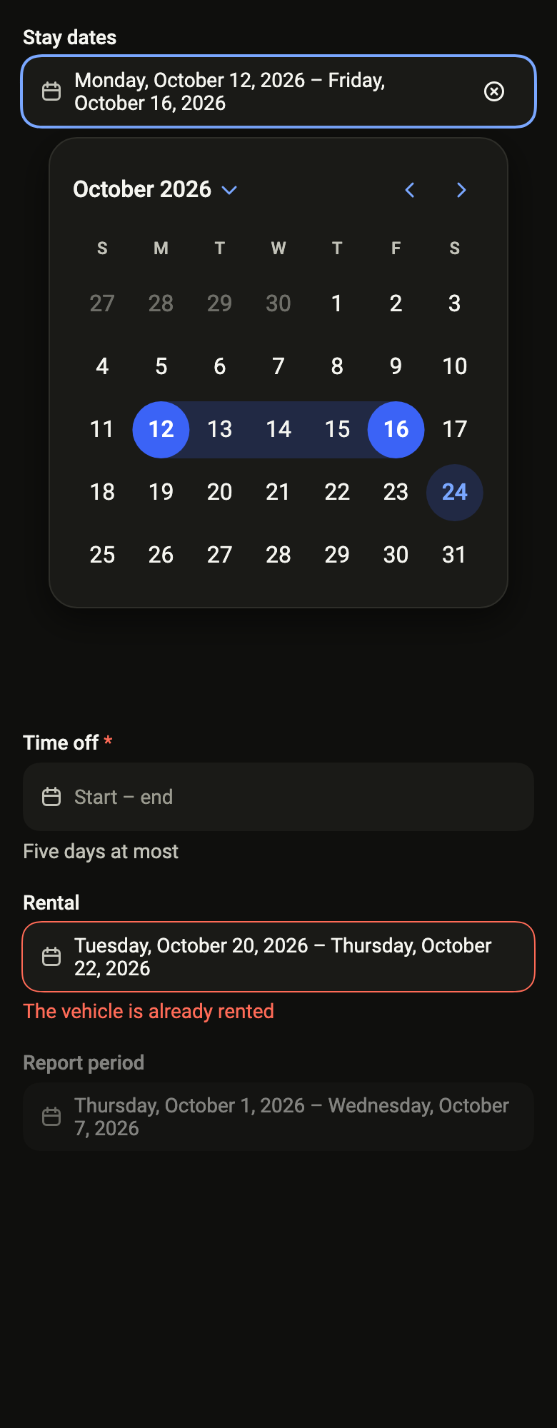
Overlay(initialEntries: [OverlayEntry(builder: (context) => ColoredBox(color: FlScope.of(context).colors.surface, child: Padding(padding: EdgeInsetsDirectional.all(FlScope.of(context).space.lg), child: SingleChildScrollView(child: Column(crossAxisAlignment: CrossAxisAlignment.stretch, spacing: FlScope.of(context).space.lg, children: [FlDateRangePicker(label: 'Stay dates', placeholder: 'Check-in – check-out', clearLabel: 'Clear the dates', value: FlDateRange(DateTime(2026, 10, 12), DateTime(2026, 10, 16)), onChanged: (_) {}, presentation: FlDatePickerPresentation.popover, defaultOpen: true, today: DateTime(2026, 10, 24), strings: FlCalendarStrings.language'en'), const SizedBox(height: 390), FlDateRangePicker(label: 'Time off', placeholder: 'Start – end', description: 'Five days at most', required: true, value: null, onChanged: (_) {}, presentation: FlDatePickerPresentation.popover, today: DateTime(2026, 10, 24), strings: FlCalendarStrings.language'en'), FlDateRangePicker(label: 'Rental', placeholder: 'Start – end', error: 'The vehicle is already rented', value: FlDateRange(DateTime(2026, 10, 20), DateTime(2026, 10, 22)), onChanged: (_) {}, presentation: FlDatePickerPresentation.popover, today: DateTime(2026, 10, 24), strings: FlCalendarStrings.language'en'), FlDateRangePicker(label: 'Report period', placeholder: 'Start – end', value: FlDateRange(DateTime(2026, 10, 1), DateTime(2026, 10, 7)), onChanged: null, presentation: FlDatePickerPresentation.popover, today: DateTime(2026, 10, 24), strings: FlCalendarStrings.language'en')])))))])API
FlDateRangePicker: class extends StatelessWidget
FlDateRangePicker.new: const new({super.key, required String label, required FlDateRange? value, required ValueChanged<FlDateRange?>? onChanged, required String placeholder, String? description, String? error, bool required, String? clearLabel, String? barrierLabel, FlDatePickerPresentation? presentation, FlCalendarStrings? strings, DateTime? today, DateTime? minDate, DateTime? maxDate, bool Function(DateTime day)? isUnavailable, FlRangeUnit unit, int? firstDayOfWeek, bool defaultOpen, ValueChanged<DateTime>? onMonthChanged, String Function(DateTime date)? format, FlInputVariant variant, String? Function(DateTime day)? indicatorOf})
FlDateRangePicker.label: get String
FlDateRangePicker.defaultOpen: get bool
FlDateRangePicker.value: get FlDateRange?
FlDateRangePicker.onChanged: get ValueChanged<FlDateRange?>?
FlDateRangePicker.placeholder: get String
FlDateRangePicker.description: get String?
FlDateRangePicker.error: get String?
FlDateRangePicker.required: get bool
FlDateRangePicker.clearLabel: get String?
FlDateRangePicker.barrierLabel: get String?
FlDateRangePicker.presentation: get FlDatePickerPresentation?
FlDateRangePicker.strings: get FlCalendarStrings?
FlDateRangePicker.today: get DateTime?
FlDateRangePicker.minDate: get DateTime?
FlDateRangePicker.maxDate: get DateTime?
FlDateRangePicker.isUnavailable: get bool Function(DateTime day)?
FlDateRangePicker.unit: get FlRangeUnit
FlDateRangePicker.firstDayOfWeek: get int?
FlDateRangePicker.onMonthChanged: get ValueChanged<DateTime>?
FlDateRangePicker.format: get String Function(DateTime date)?
FlDateRangePicker.variant: get FlInputVariant
FlDateRangePicker.indicatorOf: get String? Function(DateTime day)?
FlDateRangePicker.build: Widget(BuildContext context)Reference renders
The 16 images published with version 0.2.3, rendered by the shared harness on macOS with Flutter 3.47.7. fliin verify date-range-picker compares your copy to them.
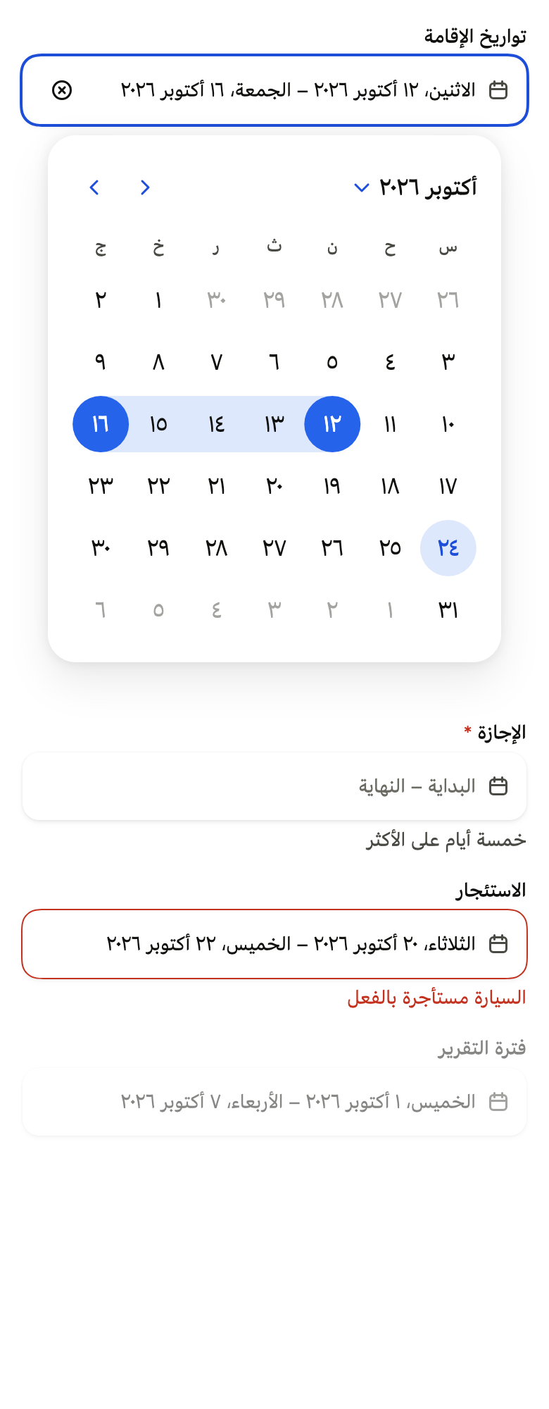
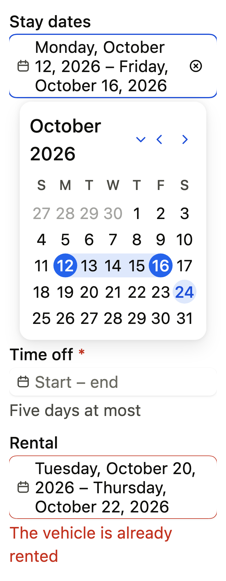
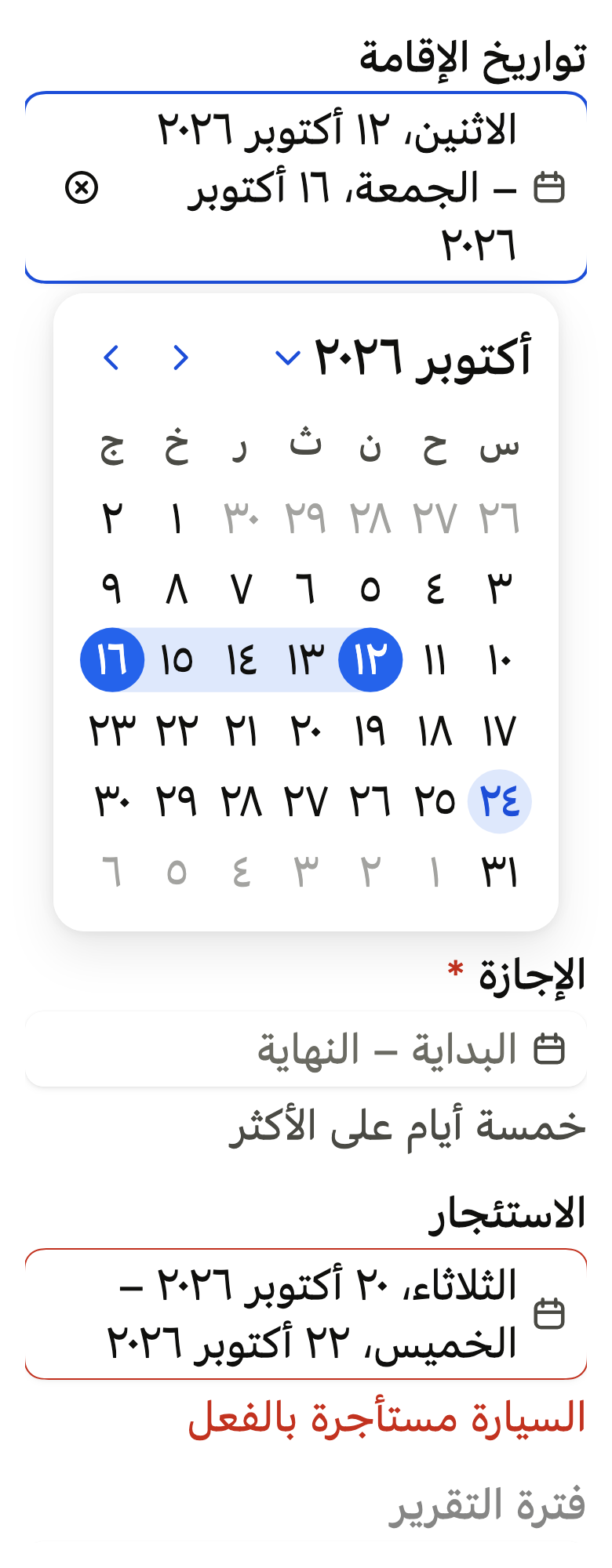
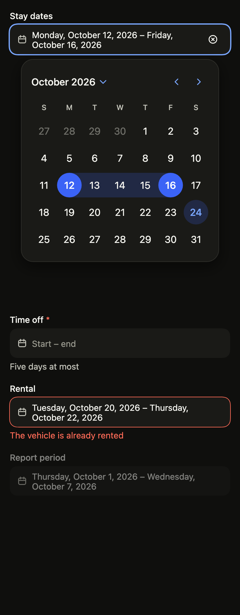
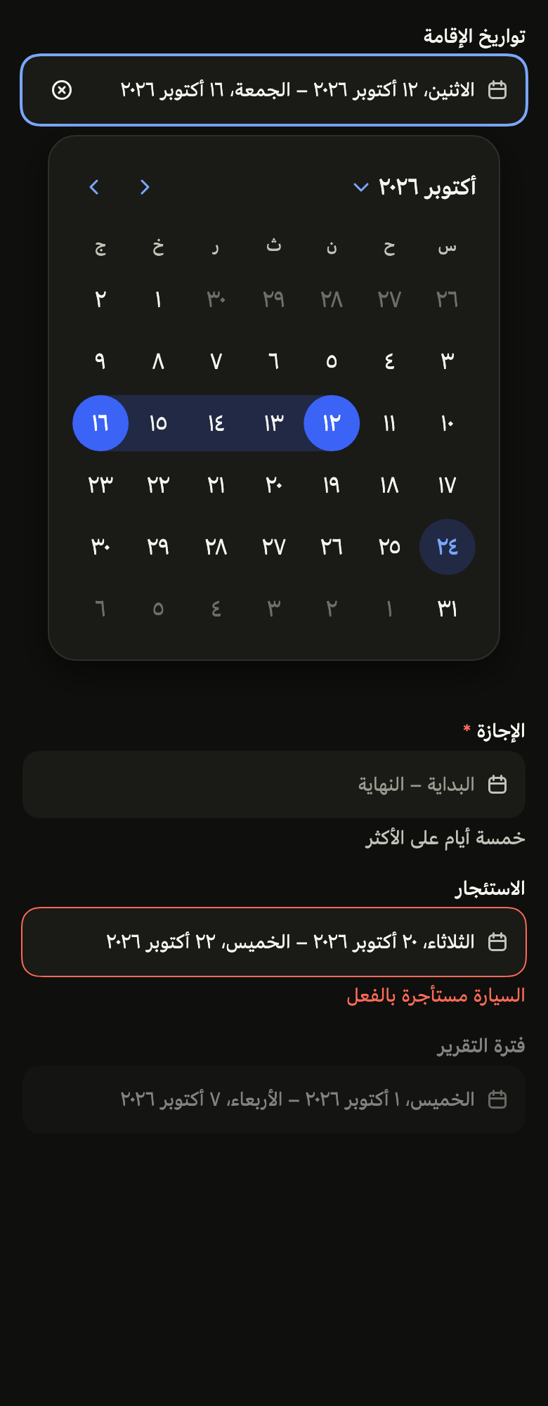
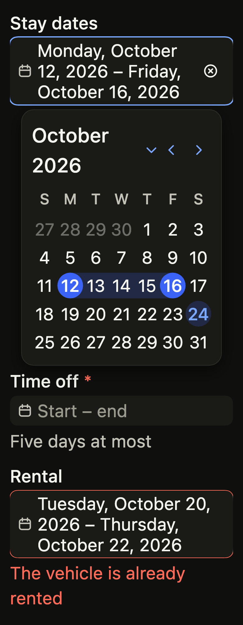
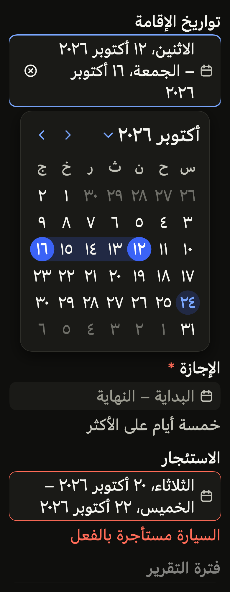
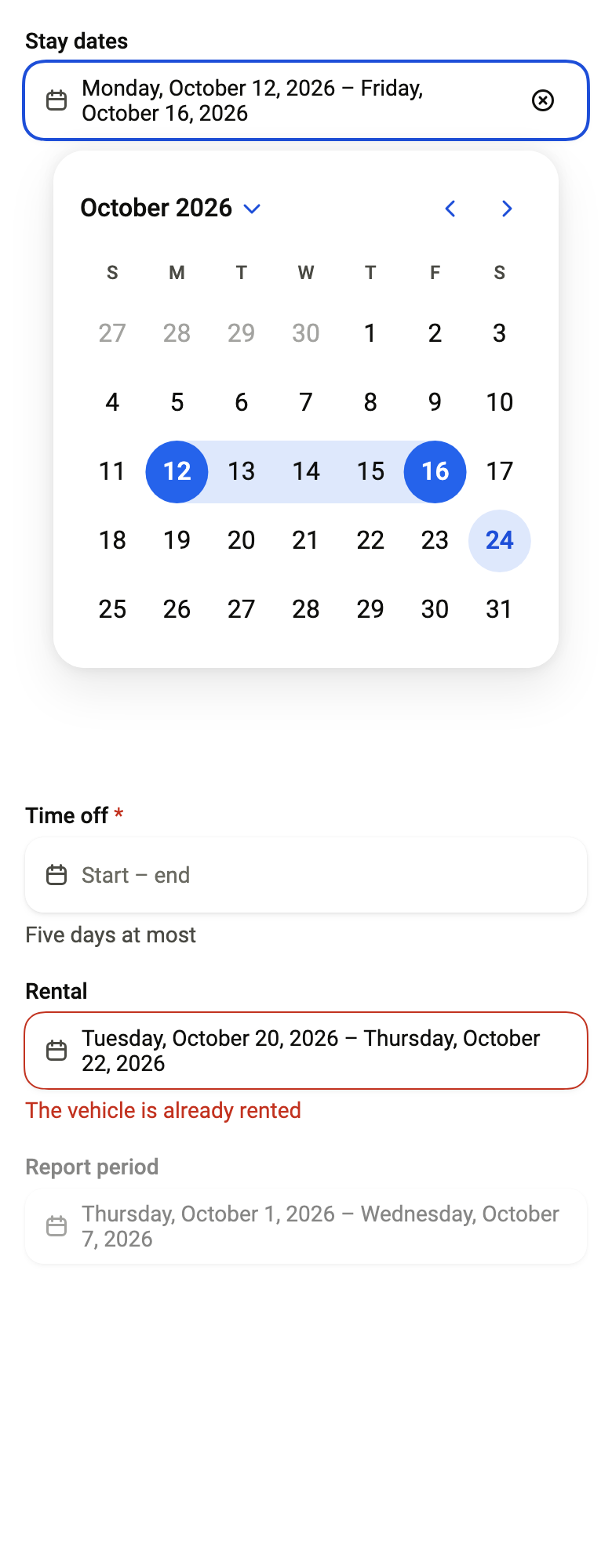
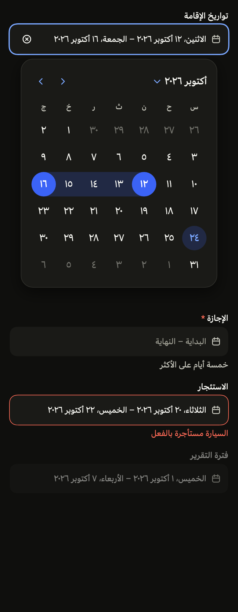
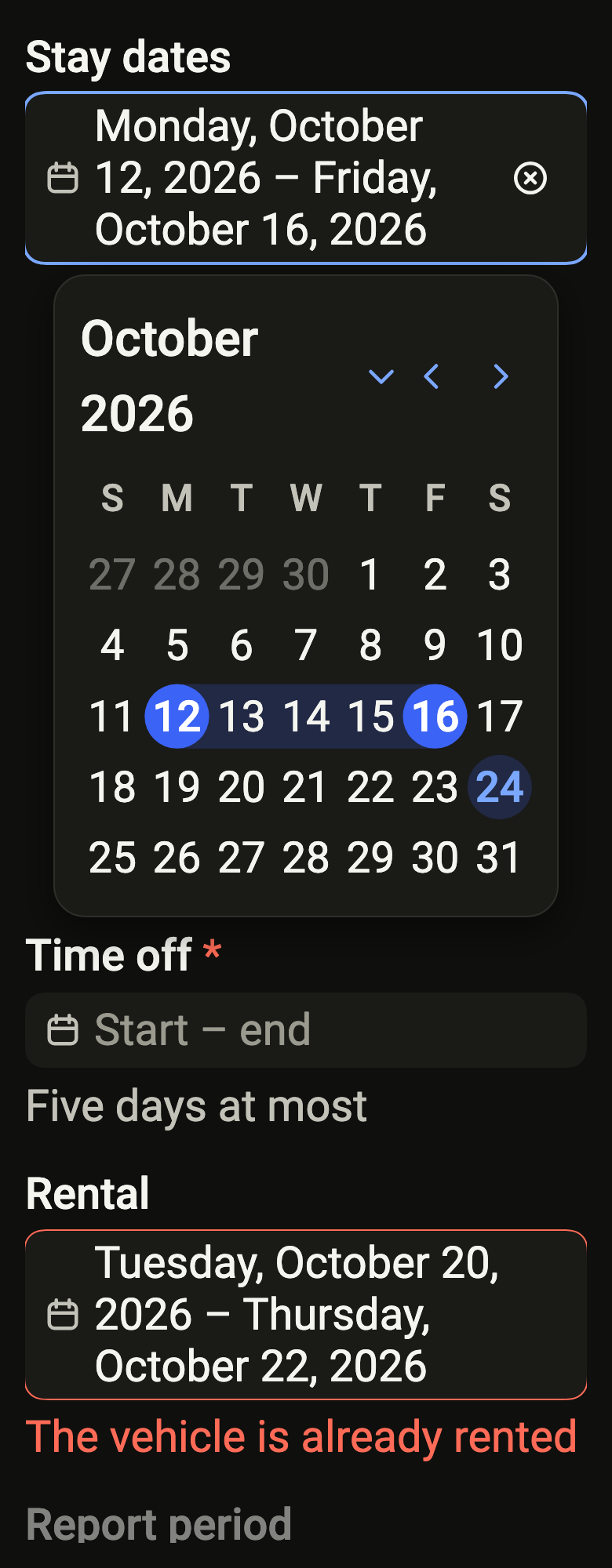
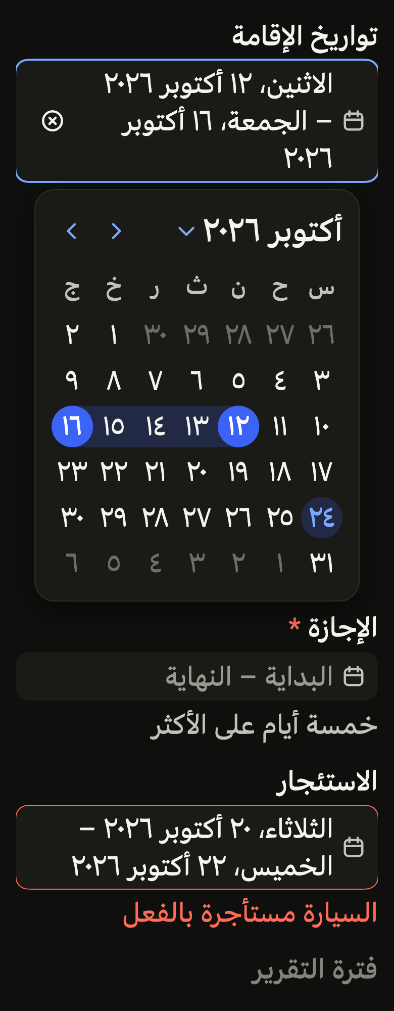
Use it to
- pick a period of several days from a form field
- open a range calendar when an input is tapped
- show both ends of the period in one field
- let people clear the period they chose
- select consecutive days in a form
- Not for
- a period always visible on the screen: use a range calendar (range-calendar)
- a single day: use a date picker (date-picker)
- States
Source
The files fliin add date-range-picker copies into your app, before your prefix and imports are applied.
date_range_picker/fl_date_range_picker.dart
// Modified from the DateRangePicker of HeroUI React v3, Copyright 2020 Next UI
// Inc., licensed under the MIT license below and under Apache 2.0:
// https://www.apache.org/licenses/LICENSE-2.0
//
// Permission is hereby granted, free of charge, to any person obtaining a copy
// of this software and associated documentation files (the "Software"), to
// deal in the Software without restriction, including without limitation the
// rights to use, copy, modify, merge, publish, distribute, sublicense, and/or
// sell copies of the Software, and to permit persons to whom the Software is
// furnished to do so, subject to the following conditions:
//
// The above copyright notice and this permission notice shall be included in
// all copies or substantial portions of the Software.
//
// THE SOFTWARE IS PROVIDED "AS IS", WITHOUT WARRANTY OF ANY KIND, EXPRESS OR
// IMPLIED, INCLUDING BUT NOT LIMITED TO THE WARRANTIES OF MERCHANTABILITY,
// FITNESS FOR A PARTICULAR PURPOSE AND NONINFRINGEMENT. IN NO EVENT SHALL THE
// AUTHORS OR COPYRIGHT HOLDERS BE LIABLE FOR ANY CLAIM, DAMAGES OR OTHER
// LIABILITY, WHETHER IN AN ACTION OF CONTRACT, TORT OR OTHERWISE, ARISING
// FROM, OUT OF OR IN CONNECTION WITH THE SOFTWARE OR THE USE OR OTHER DEALINGS
// IN THE SOFTWARE.
import 'package:flutter/widgets.dart';
import 'package:fliin_ui/components/calendar/fl_calendar_strings.dart';
import 'package:fliin_ui/components/date_picker/fl_date_picker.dart';
import 'package:fliin_ui/components/range_calendar/fl_range_calendar.dart';

/// What joins the start and the end in the field
/// (`date-range-picker__range-separator`): an en dash, with no word to
/// translate.
const String _rangeSeparator = ' – ';

/// The choice of a period from a form field: the field of `FlDatePicker`, which writes the start
/// and the end in full ("Monday, October 12, 2026 – Friday, October 16,
/// 2026") and opens a [FlRangeCalendar], as a sheet on a phone and as a
/// popover on a tablet.
///
/// The first tap sets the start: the calendar circles it and reads it as
/// "start set, choose the end", and nothing is sent to the app. The second
/// returns the period to [onChanged] and closes the calendar. A start set
/// without an end is not a value: the field keeps the app's period, and
/// closing the calendar (barrier, swipe, Escape) abandons it; reopened, the
/// calendar starts again from the app's period. The clear button returns
/// `null`.
class FlDateRangePicker extends StatelessWidget {
  /// A picker whose selected period is [value].
  const FlDateRangePicker({
    super.key,
    required this.label,
    required this.value,
    required this.onChanged,
    required this.placeholder,
    this.description,
    this.error,
    this.required = false,
    this.clearLabel,
    this.barrierLabel,
    this.presentation,
    this.strings,
    this.today,
    this.minDate,
    this.maxDate,
    this.isUnavailable,
    this.unit = FlRangeUnit.days,
    this.firstDayOfWeek,
    this.defaultOpen = false,
    this.onMonthChanged,
    this.format,
    this.variant = FlInputVariant.primary,
    this.indicatorOf,
  }) : assert(
         presentation == FlDatePickerPresentation.popover || barrierLabel != null,
         'the sheet closes through its barrier, which must be named',
       );

  /// The field's name, and that of the open calendar.
  final String label;

  /// True: the calendar opens on first render (React Aria's `defaultOpen`).
  final bool defaultOpen;

  /// The selected period; null with no selection.
  final FlDateRange? value;

  /// Receives the period on the second tap, or `null` when the user
  /// clears; null disables the field.
  final ValueChanged<FlDateRange?>? onChanged;

  /// The field's text with no period.
  final String placeholder;

  /// The help under the field.
  final String? description;

  /// When non-null: the field is invalid, and this text replaces [description].
  final String? error;

  /// True: an asterisk follows the label, and the field announces itself required.
  final bool required;

  /// The name of the button that clears the period; when null, no button.
  final String? clearLabel;

  /// The name of the sheet's barrier, which closes it; required except as a popover.
  final String? barrierLabel;

  /// Where the calendar opens; when null, [flDatePickerPresentationOf].
  final FlDatePickerPresentation? presentation;

  /// The texts of the calendar and the field; those of the app's language by
  /// default.
  final FlCalendarStrings? strings;

  /// See `FlCalendarView.today`.
  final DateTime? today;

  /// See `FlCalendarView.minDate`.
  final DateTime? minDate;

  /// See `FlCalendarView.maxDate`.
  final DateTime? maxDate;

  /// See [FlRangeCalendar.isUnavailable].
  final bool Function(DateTime day)? isUnavailable;

  /// See [FlRangeCalendar.unit]: in nights, the day whose night is taken
  /// remains a possible departure.
  final FlRangeUnit unit;

  /// See `FlCalendarView.firstDayOfWeek`.
  final int? firstDayOfWeek;

  /// Receives the month the open calendar shows, on opening then on each
  /// change: the app loads that month's unavailable days into it, and they
  /// arrive in the open calendar. See `FlCalendarView.onMonthChanged`.
  final ValueChanged<DateTime>? onMonthChanged;

  /// How the field writes each end of the period, joined by an en dash; by default in full,
  /// `FlCalendarStrings.date`.
  final String Function(DateTime date)? format;

  /// The field's look: `primary` on the page, `secondary` on a surface.
  final FlInputVariant variant;

  /// See `FlCalendarView.indicatorOf`.
  final String? Function(DateTime day)? indicatorOf;

  @override
  Widget build(BuildContext context) {
    final strings = this.strings ?? FlCalendarStrings.of(context);
    final format = this.format ?? strings.date;
    final value = this.value;
    final onChanged = this.onChanged;
    return FlDatePickerOverlay(
      label: label,
      barrierLabel: barrierLabel,
      presentation: presentation,
      defaultOpen: defaultOpen,
      calendar: (context, close) => FlRangeCalendar(
        value: value,
        onChanged: (range) {
          onChanged?.call(range);
          close();
        },
        autofocus: true,
        today: today,
        minDate: minDate,
        maxDate: maxDate,
        isUnavailable: isUnavailable,
        unit: unit,
        firstDayOfWeek: firstDayOfWeek,
        strings: strings,
        semanticLabel: label,
        onMonthChanged: onMonthChanged,
        indicatorOf: indicatorOf,
      ),
      field: (context, open, toggle) => FlDatePickerField(
        label: label,
        text: value == null ? null : '${format(value.start)}$_rangeSeparator${format(value.end)}',
        variant: variant,
        placeholder: placeholder,
        open: open,
        onOpen: onChanged == null ? null : toggle,
        description: description,
        error: error,
        required: required,
        clearLabel: clearLabel,
        onClear: clearLabel == null || onChanged == null ? null : () => onChanged(null),
      ),
    );
  }
}