Components / feedback
Toast
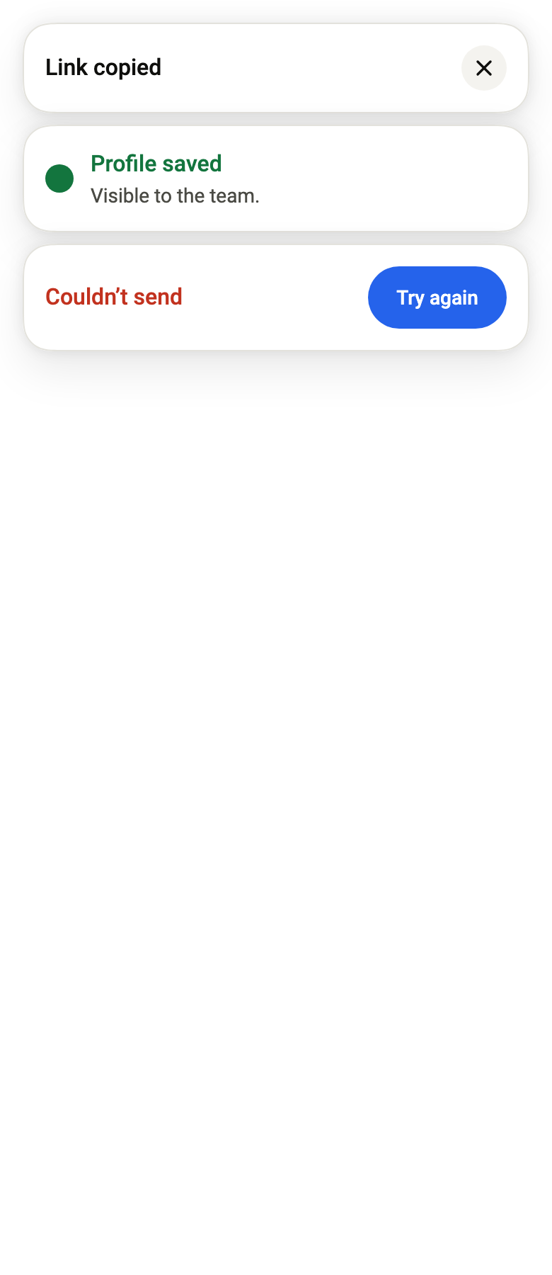
Reports the result of an action with a short message at the top or bottom of the screen, stacked with the previous ones, closed by time, swipe or its button.
Import
In a Flutter app where fliin init has run:
Examples
Archive
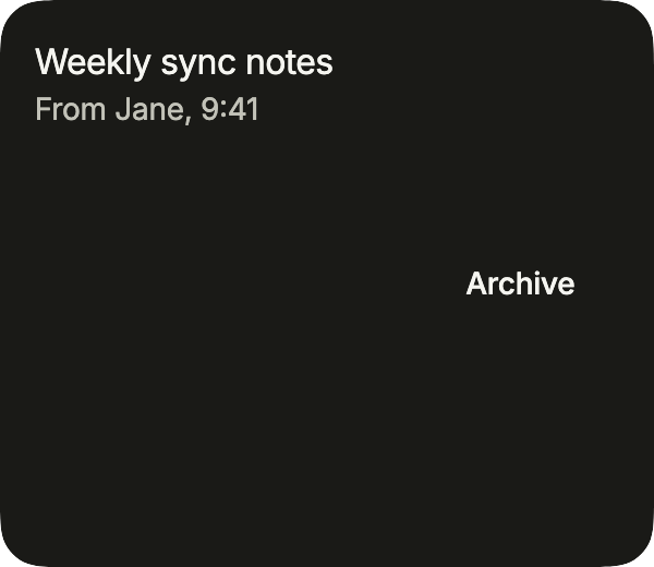
FlToaster.of(context).show shows a toast with an undo action after archiving a message. Place one FlToaster above your pages, around your app’s navigator.
import 'package:your_app/ui/fliin/components/button/fl_button.dart';
import 'package:your_app/ui/fliin/components/surface/fl_surface.dart';
import 'package:your_app/ui/fliin/components/text/fl_text.dart';
import 'package:your_app/ui/fliin/components/toast/fl_toast.dart';
import 'package:your_app/ui/fliin/core/fliin.dart';
import 'package:flutter/widgets.dart';

class ToastArchiveExample extends StatelessWidget {
  const ToastArchiveExample({super.key});

  @override
  Widget build(BuildContext context) {
    return Align(
      alignment: AlignmentDirectional.bottomCenter,
      child: FlSurface(
        child: Row(
          spacing: FlScope.of(context).space.md,
          children: [
            const Expanded(
              child: Column(
                crossAxisAlignment: CrossAxisAlignment.start,
                children: [
                  FlText('Weekly sync notes'),
                  FlText('From Jane, 9:41', type: FlTextType.bodySm, tone: FlTextTone.muted),
                ],
              ),
            ),
            FlButton(
              key: const ValueKey('archive'),
              label: 'Archive',
              size: FlButtonSize.sm,
              variant: FlButtonVariant.secondary,
              onPressed: () => FlToaster.of(context).show(
                FlToast(
                  title: 'Message archived',
                  variant: FlToastVariant.accent,
                  action: FlToastAction(label: 'Undo', onPressed: () {}),
                  closeLabel: 'Close',
                ),
              ),
            ),
          ],
        ),
      ),
    );
  }
}Example
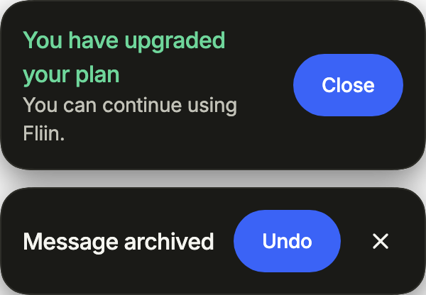
Two toasts as they appear: a title, an optional description, and an action or a close button.
import 'package:your_app/ui/fliin/components/toast/fl_toast.dart';
import 'package:your_app/ui/fliin/core/fliin.dart';
import 'package:flutter/widgets.dart';

class ToastExample extends StatelessWidget {
  const ToastExample({super.key});

  @override
  Widget build(BuildContext context) {
    return Column(
      mainAxisSize: MainAxisSize.min,
      crossAxisAlignment: CrossAxisAlignment.stretch,
      spacing: FlScope.of(context).space.md,
      children: [
        FlToast(
          title: 'You have upgraded your plan',
          description: 'You can continue using Fliin.',
          variant: FlToastVariant.success,
          action: FlToastAction(label: 'Close', onPressed: () {}),
        ),
        FlToast(
          title: 'Message archived',
          variant: FlToastVariant.accent,
          action: FlToastAction(label: 'Undo', onPressed: () {}),
          closeLabel: 'Close',
        ),
      ],
    );
  }
}Neutral
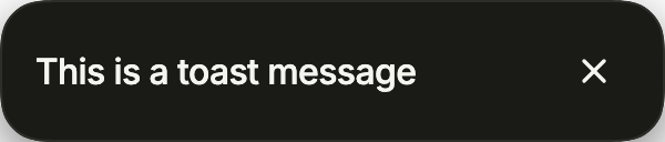
The neutral toast, with a close button through closeLabel.
import 'package:your_app/ui/fliin/components/toast/fl_toast.dart';
import 'package:flutter/widgets.dart';

class ToastNeutralExample extends StatelessWidget {
  const ToastNeutralExample({super.key});

  @override
  Widget build(BuildContext context) {
    return const FlToast(title: 'This is a toast message', closeLabel: 'Close');
  }
}Success
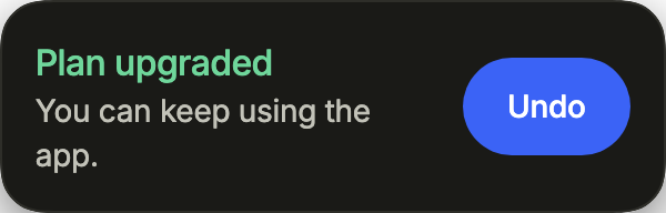
The success variant, to confirm an action, with an undo.
import 'package:your_app/ui/fliin/components/toast/fl_toast.dart';
import 'package:flutter/widgets.dart';

class ToastSuccessExample extends StatelessWidget {
  const ToastSuccessExample({super.key});

  @override
  Widget build(BuildContext context) {
    return FlToast(
      title: 'Plan upgraded',
      description: 'You can keep using the app.',
      variant: FlToastVariant.success,
      action: FlToastAction(label: 'Undo', onPressed: () {}),
    );
  }
}Danger
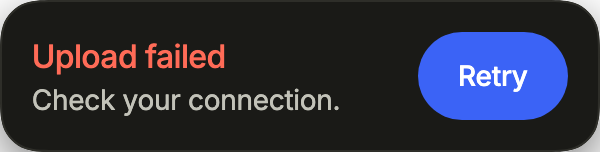
The danger variant, for a failure, with the action that retries.
import 'package:your_app/ui/fliin/components/toast/fl_toast.dart';
import 'package:flutter/widgets.dart';

class ToastDangerExample extends StatelessWidget {
  const ToastDangerExample({super.key});

  @override
  Widget build(BuildContext context) {
    return FlToast(
      title: 'Upload failed',
      description: 'Check your connection.',
      variant: FlToastVariant.danger,
      action: FlToastAction(label: 'Retry', onPressed: () {}),
    );
  }
}Variants
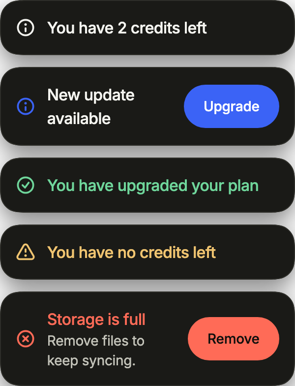
showIcon gives each variant its status icon; the action takes the look of what it does, danger for one that removes.
import 'package:your_app/ui/fliin/components/button/fl_button.dart';
import 'package:your_app/ui/fliin/components/toast/fl_toast.dart';
import 'package:your_app/ui/fliin/core/fliin.dart';
import 'package:flutter/widgets.dart';

class ToastVariantsExample extends StatelessWidget {
  const ToastVariantsExample({super.key});

  @override
  Widget build(BuildContext context) {
    return Column(
      mainAxisSize: MainAxisSize.min,
      crossAxisAlignment: CrossAxisAlignment.stretch,
      spacing: FlScope.of(context).space.md,
      children: [
        const FlToast(title: 'You have 2 credits left', showIcon: true),
        FlToast(
          title: 'New update available',
          variant: FlToastVariant.accent,
          showIcon: true,
          action: FlToastAction(label: 'Upgrade', onPressed: () {}),
        ),
        const FlToast(title: 'You have upgraded your plan', variant: FlToastVariant.success, showIcon: true),
        const FlToast(title: 'You have no credits left', variant: FlToastVariant.warning, showIcon: true),
        FlToast(
          title: 'Storage is full',
          description: 'Remove files to keep syncing.',
          variant: FlToastVariant.danger,
          showIcon: true,
          action: FlToastAction(label: 'Remove', variant: FlButtonVariant.danger, onPressed: () {}),
        ),
      ],
    );
  }
}Loading
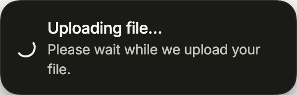
loading puts a spinner in place of the icon while an operation runs. Show it persistent, then replace it with FlToaster.of(context).update.
import 'package:your_app/ui/fliin/components/toast/fl_toast.dart';
import 'package:flutter/widgets.dart';

class ToastLoadingExample extends StatelessWidget {
  const ToastLoadingExample({super.key});

  @override
  Widget build(BuildContext context) {
    return const FlToast(
      title: 'Uploading file…',
      description: 'Please wait while we upload your file.',
      loading: true,
    );
  }
}Promise
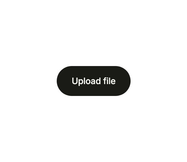
FlToaster.of(context).promise shows a loading toast while a Future runs, then the toast of its result, or of its error, in the same place.
import 'package:your_app/ui/fliin/components/button/fl_button.dart';
import 'package:your_app/ui/fliin/components/toast/fl_toast.dart';
import 'package:flutter/widgets.dart';

class ToastPromiseExample extends StatelessWidget {
  const ToastPromiseExample({super.key});

  Future<String> _upload() => Future.delayed(const Duration(seconds: 2), () => 'document.pdf');

  @override
  Widget build(BuildContext context) {
    return Center(
      child: FlButton(
        key: const ValueKey('upload'),
        label: 'Upload file',
        variant: FlButtonVariant.secondary,
        onPressed: () => FlToaster.of(context).promise(
          _upload(),
          loading: const FlToast(title: 'Uploading file…', loading: true),
          success: (name) => FlToast(title: '$name uploaded', variant: FlToastVariant.success, showIcon: true),
          error: (error) => const FlToast(title: 'Upload failed', variant: FlToastVariant.danger, showIcon: true),
        ),
      ),
    );
  }
}Usage
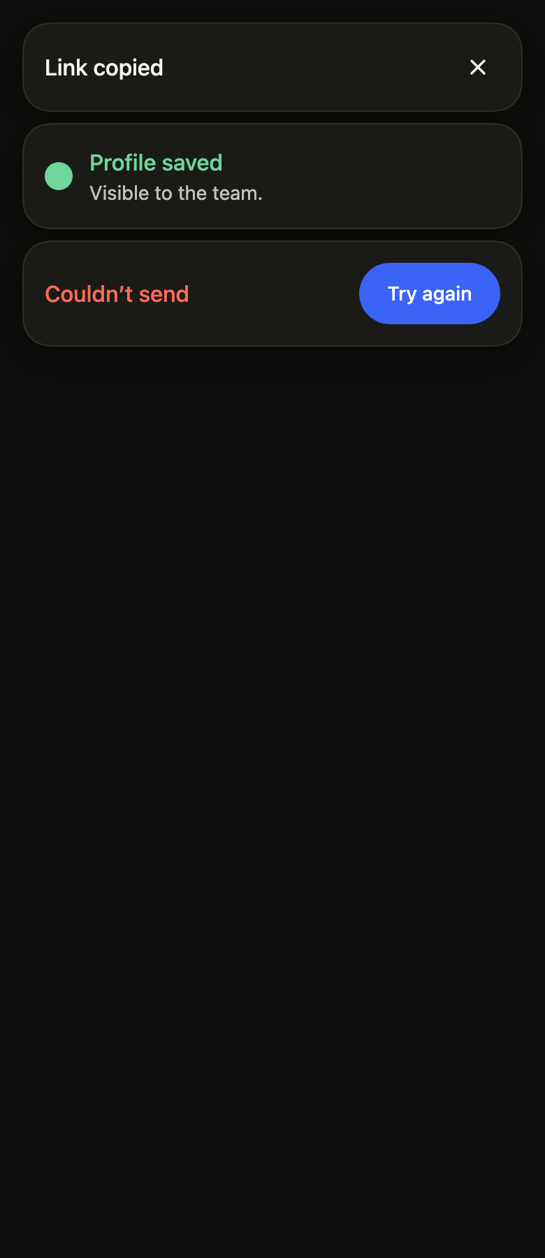
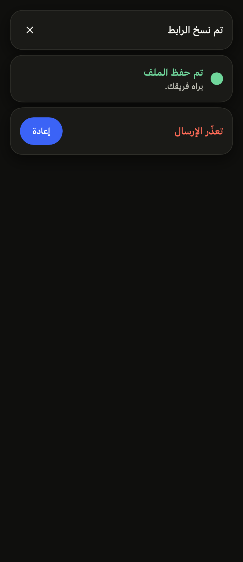
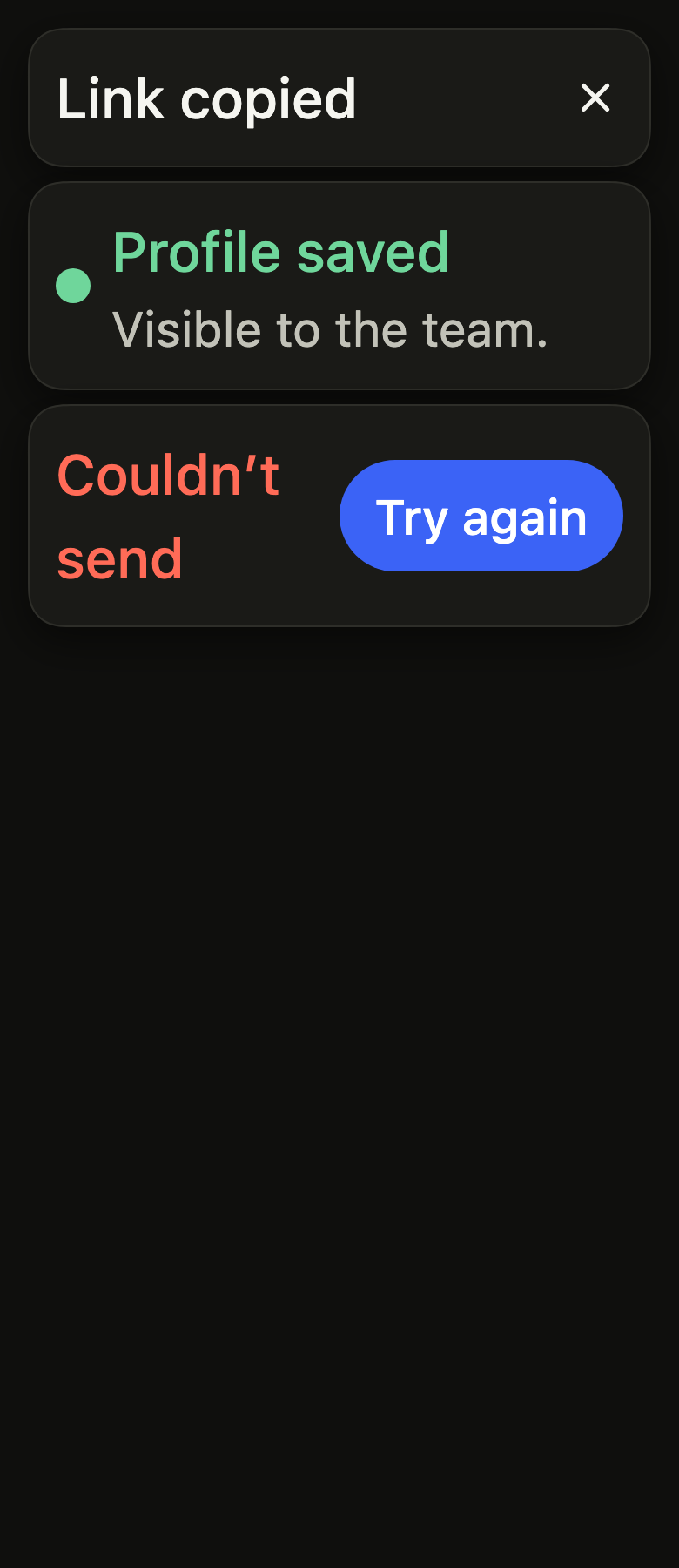
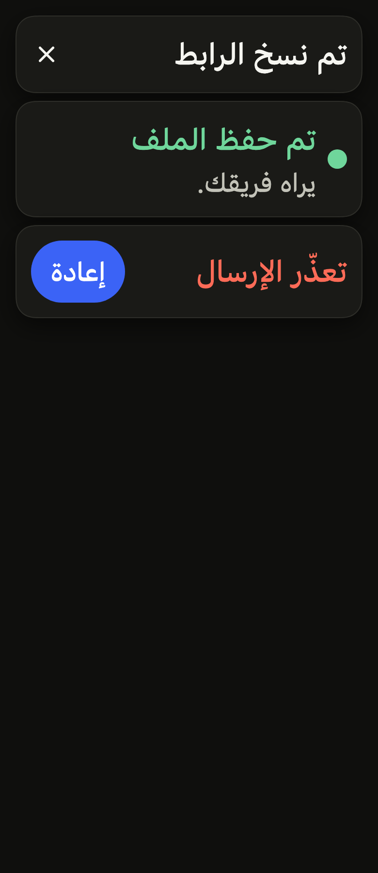
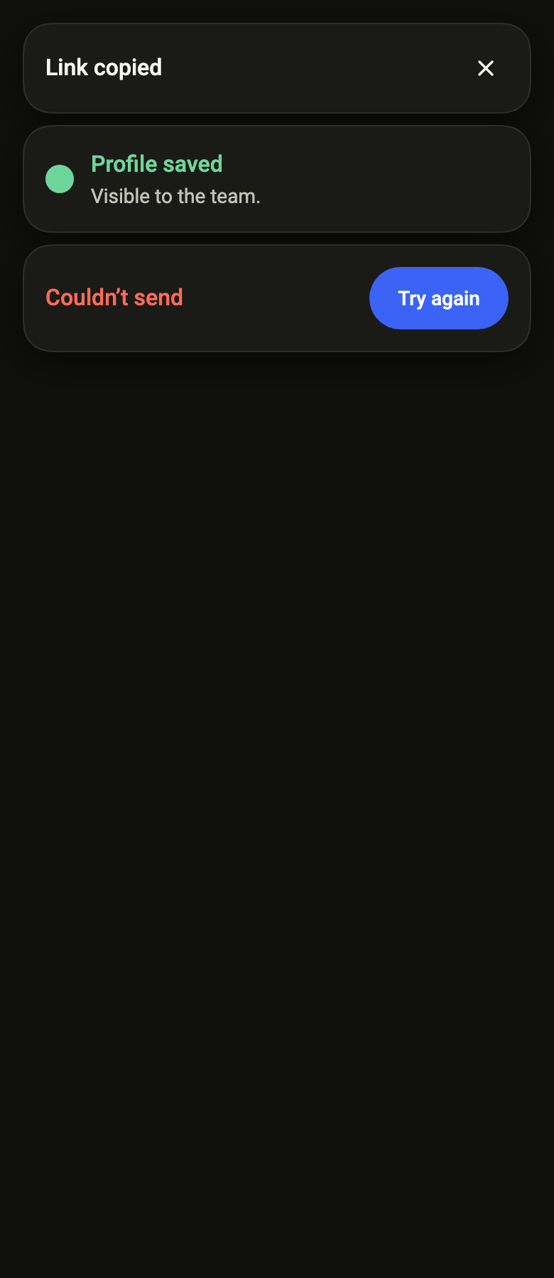
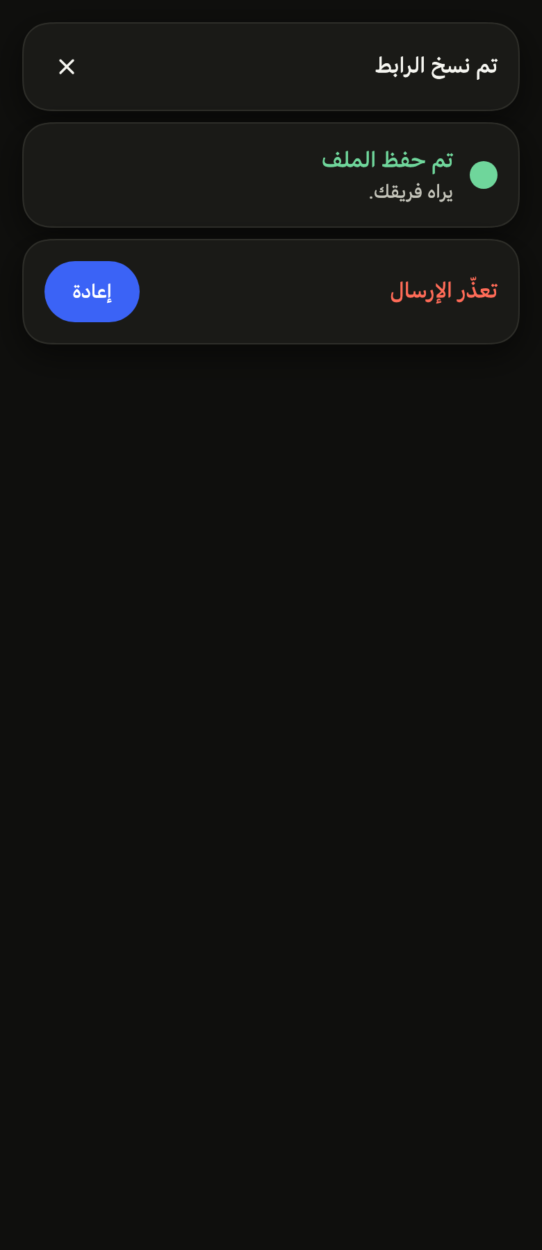
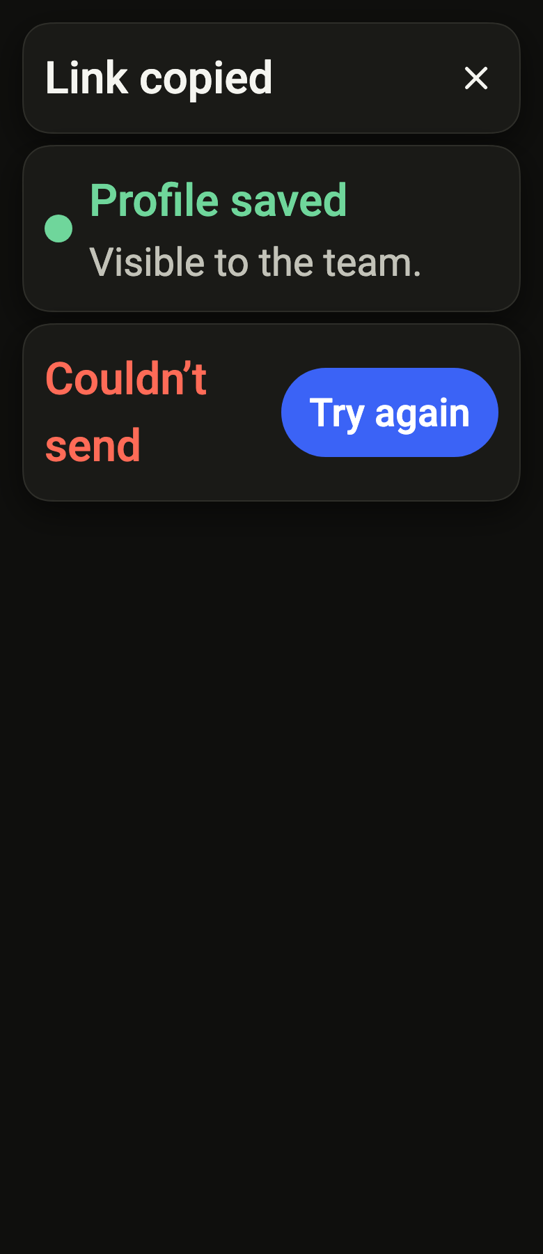
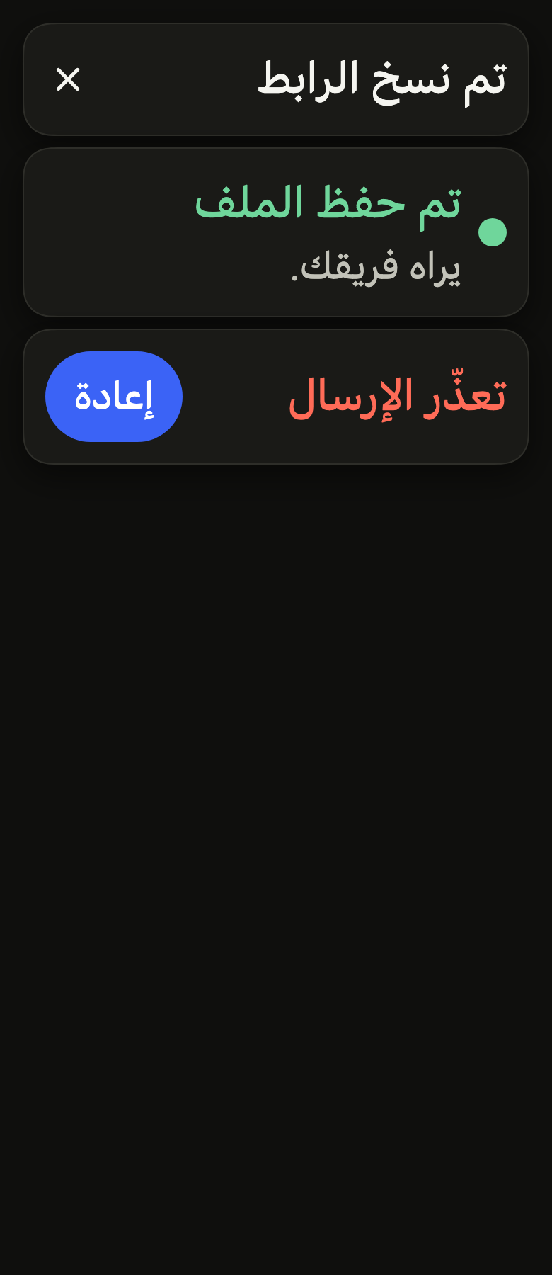
The code the reference images render:
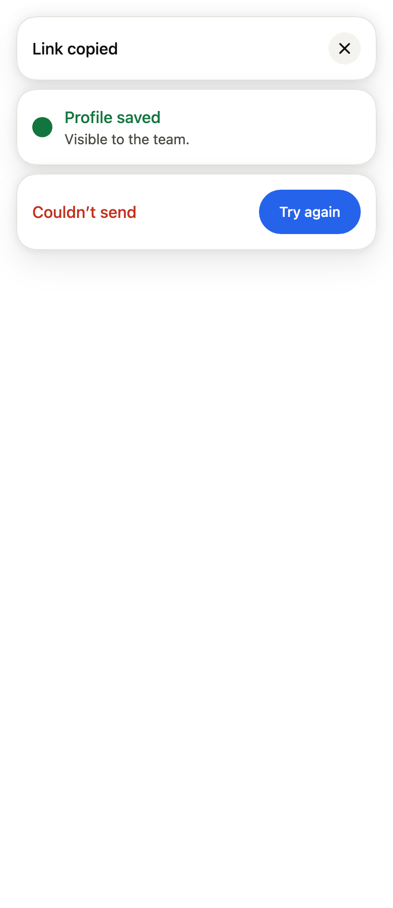
final example = ColoredBox(
  color: FlScope.of(context).colors.surface,
  child: Padding(
    padding: EdgeInsetsDirectional.all(FlScope.of(context).space.lg),
    child: Column(
      crossAxisAlignment: CrossAxisAlignment.stretch,
      spacing: FlScope.of(context).space.sm,
      children: [
        FlToast(title: 'Link copied', closeLabel: 'Close'),
        FlToast(
          title: 'Profile saved',
          description: 'Visible to the team.',
          variant: FlToastVariant.success,
          icon: Builder(
            builder: (context) => SizedBox.square(
              dimension: IconTheme.of(context).size,
              child: DecoratedBox(
                decoration: BoxDecoration(
                  color: IconTheme.of(context).color,
                  shape: BoxShape.circle,
                ),
              ),
            ),
          ),
        ),
        FlToast(
          title: 'Couldn’t send',
          variant: FlToastVariant.danger,
          action: FlToastAction(label: 'Try again', onPressed: () {}),
        ),
      ],
    ),
  ),
);API
FlToastVariant: enum {neutral, accent, success, warning, danger}
FlToastVariant.neutral: static final FlToastVariant
FlToastVariant.accent: static final FlToastVariant
FlToastVariant.success: static final FlToastVariant
FlToastVariant.warning: static final FlToastVariant
FlToastVariant.danger: static final FlToastVariant
FlToastPlacement: enum {top, bottom}
FlToastPlacement.top: static final FlToastPlacement
FlToastPlacement.bottom: static final FlToastPlacement
FlToastAction: final class
FlToastAction.new: const new({required String label, required VoidCallback onPressed, FlButtonVariant variant})
FlToastAction.label: get String
FlToastAction.variant: get FlButtonVariant
FlToastAction.onPressed: get VoidCallback
FlToast: class extends StatelessWidget
FlToast.new: const new({super.key, required String title, String? description, FlToastVariant variant, Widget? icon, FlToastAction? action, String? closeLabel, VoidCallback? onClose, bool showIcon, bool loading})
FlToast.title: get String
FlToast.description: get String?
FlToast.variant: get FlToastVariant
FlToast.icon: get Widget?
FlToast.showIcon: get bool
FlToast.loading: get bool
FlToast.action: get FlToastAction?
FlToast.closeLabel: get String?
FlToast.onClose: get VoidCallback?
FlToast.build: Widget(BuildContext context)
FlToastId: extension type
FlToaster: class extends StatefulWidget
FlToaster.new: const new({super.key, FlToastPlacement placement, int maxVisible, Duration duration, EdgeInsetsGeometry? insets, required Widget child})
FlToaster.placement: get FlToastPlacement
FlToaster.maxVisible: get int
FlToaster.duration: get Duration
FlToaster.insets: get EdgeInsetsGeometry?
FlToaster.child: get Widget
FlToaster.of: static FlToasterState(BuildContext context)
FlToaster.createState: State<FlToaster>()
FlToasterState: class extends State<FlToaster>
FlToasterState.new: new()
FlToasterState.show: FlToastId(FlToast toast, {FlToastPlacement? placement, Duration? duration, bool persistent})
FlToasterState.update: bool(FlToastId id, FlToast toast, {Duration? duration, bool persistent})
FlToasterState.promise: FlToastId<T>(Future<T> future, {required FlToast loading, required FlToast Function(T value) success, required FlToast Function(Object error) error, FlToastPlacement? placement, Duration? duration})
FlToasterState.hide: void(FlToastId id)
FlToasterState.hideAll: void()
FlToasterState.dispose: void()
FlToasterState.build: Widget(BuildContext context)Reference renders
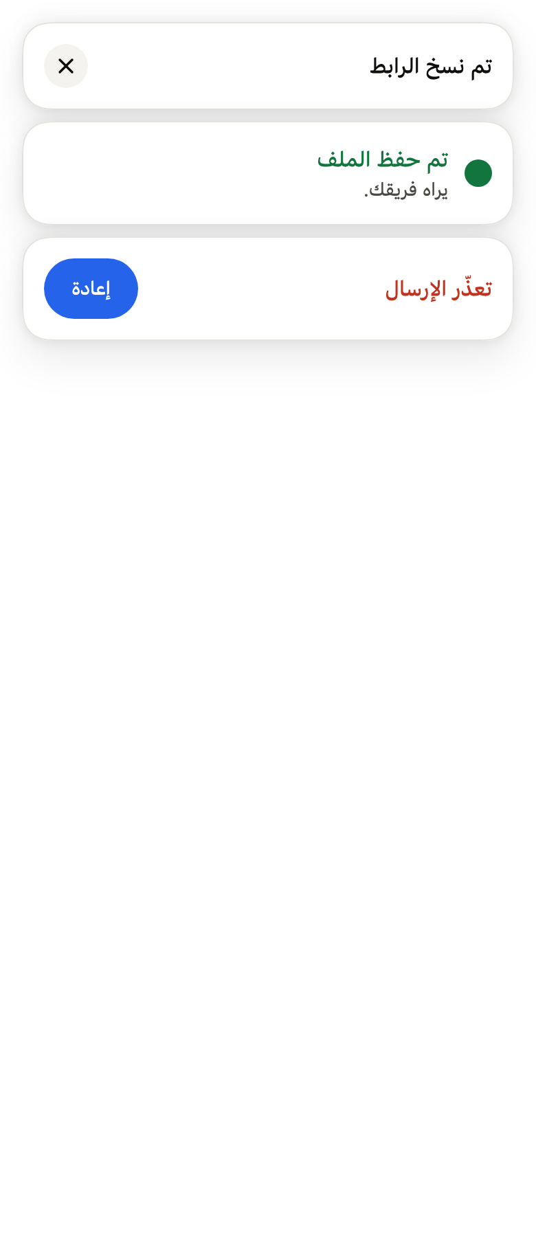
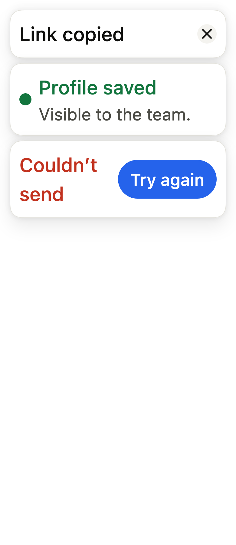
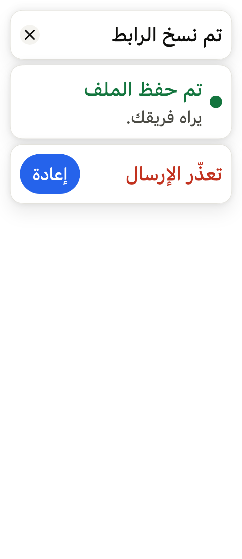
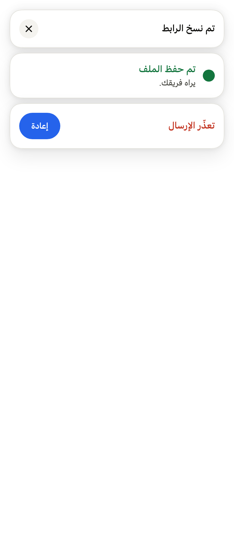
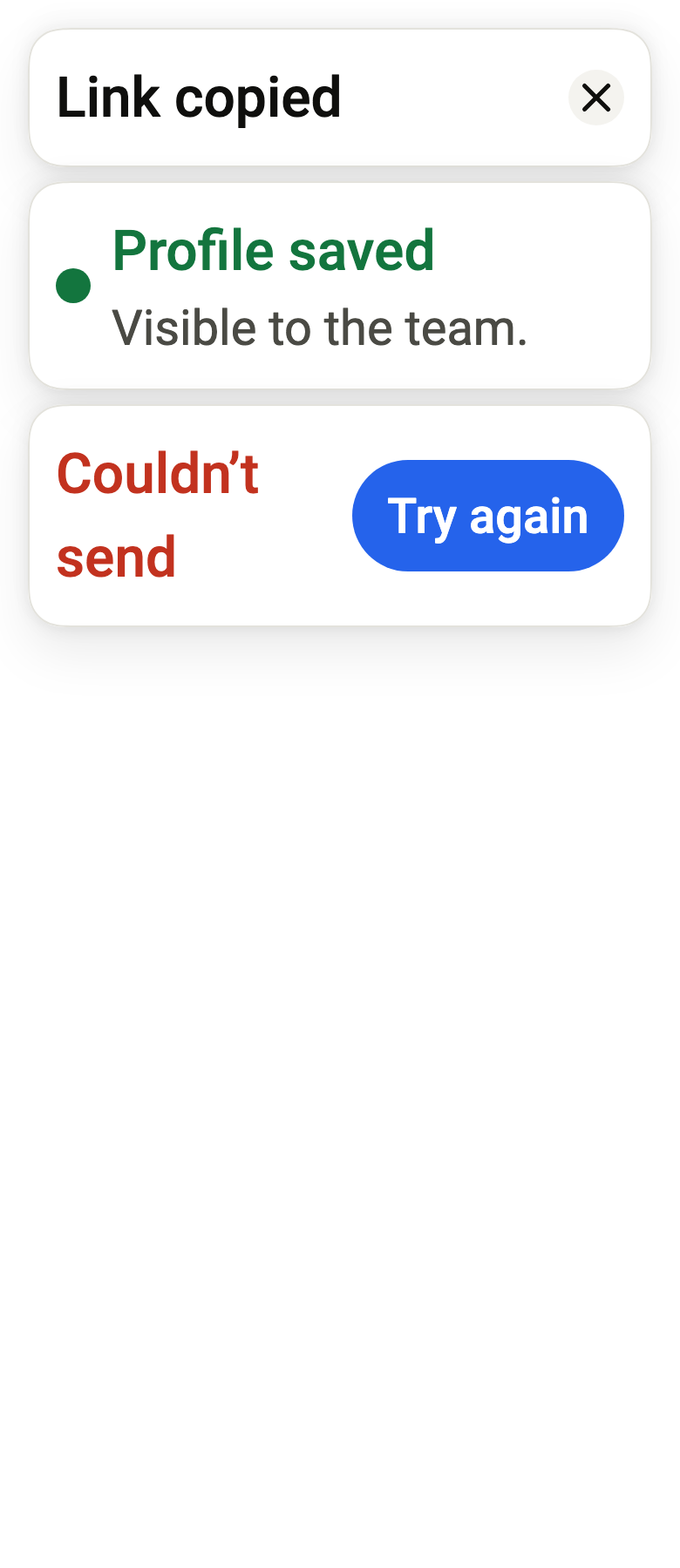
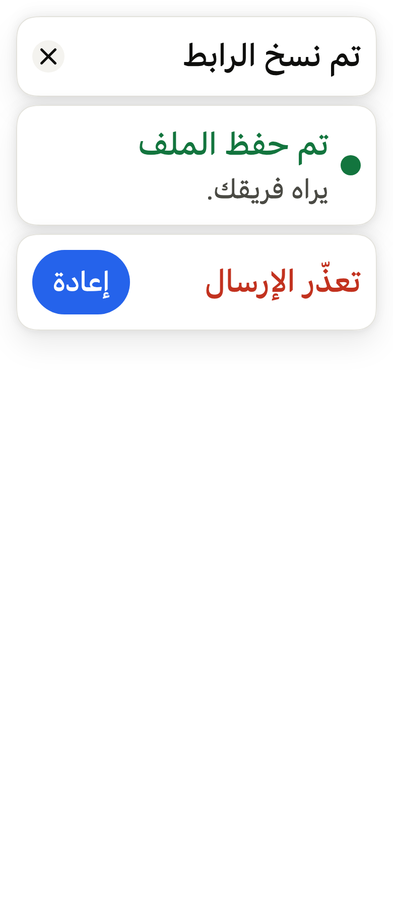
The 16 images published with version 0.2.6, rendered by the shared harness on macOS with Flutter 3.47.7. fliin verify toast compares your copy to them.
Use it to
- show a brief message after an action
- confirm that a save succeeded
- give word of a failed request in a passing message
- offer to undo a deletion
- show a notification that disappears on its own
- let the user know a file was uploaded
- Not for
- asking for confirmation before an irreversible action: use a dialog (dialog)
- explaining a control on hover or long press: use a tooltip (tooltip)
- reporting an input error in a form: use the field's error message (field)
- States
Source
The files fliin add toast copies into your app, before your prefix and imports are applied.
toast/fl_toast.dart
// Modified from the Toast and ToastProvider of HeroUI Native 1.0.10, Copyright
// 2025 NextUI Inc., licensed under Apache 2.0:
// https://www.apache.org/licenses/LICENSE-2.0
import 'dart:async';
import 'dart:math' as math;

import 'package:flutter/physics.dart';
import 'package:flutter/rendering.dart';
import 'package:flutter/widgets.dart';
import 'package:fliin_ui/components/button/fl_button.dart';
import 'package:fliin_ui/components/close_button/fl_close_button.dart';
import 'package:fliin_ui/components/spinner/fl_spinner.dart';
import 'package:fliin_ui/core/fliin.dart';
import 'package:fliin_ui/icons/fl_icons.dart';

/// The scale a toast's icon pops in from.
const double _iconFrom = 0.5;

/// The colour of a [FlToast]'s title and icon. Whatever the variant, the
/// action is the screen's primary button, in the accent with its glow.
enum FlToastVariant {
  /// `onSurface`: information.
  neutral,

  /// The icon in `accent`, the title in `onAccentSoft`, as [FlAlert].
  accent,

  /// `onSuccessSoft`: a successful operation.
  success,

  /// `onWarningSoft`: a warning.
  warning,

  /// `danger`, which holds 4.5:1 on the toast: a failure.
  danger,
}

/// The screen edge where a [FlToaster] places its toasts.
enum FlToastPlacement {
  /// At the top, below the safe area; a toast leaves upwards.
  top,

  /// At the bottom, above the safe area; a toast leaves downwards.
  bottom;

  /// The direction in which the toast enters, exits and is dragged: -1
  /// upwards, 1 downwards.
  double get _outward => this == top ? -1 : 1;
}

/// The action button of a [FlToast]: its label and what it does.
final class FlToastAction {
  /// An action [label] that calls [onPressed].
  const FlToastAction({required this.label, required this.onPressed, this.variant = FlButtonVariant.primary});

  /// The button's label, read as is by the screen reader.
  final String label;

  /// The button's look: `primary` by default, `danger` for an action that
  /// removes, `secondary` beside a toast that is only information.
  final FlButtonVariant variant;

  /// Called on tap, before the toast closes.
  final VoidCallback onPressed;
}

/// A brief message: an
/// optional icon, a [title] and a [description], an [action], a close
/// button, on the `surfaceOverlay` background with continuous corners of
/// `shape.radiusCard`, and the `overlay` shadow. It is usually shown through
/// `FlToaster.of(context).show`, which places, stacks and removes it; on its
/// own, it renders wherever it is put. Shown by a toaster, its icon pops in
/// once the toast has landed.
class FlToast extends StatelessWidget {
  /// A toast [title], `neutral` by default.
  const FlToast({
    super.key,
    required this.title,
    this.description,
    this.variant = FlToastVariant.neutral,
    this.icon,
    this.action,
    this.closeLabel,
    this.onClose,
    this.showIcon = false,
    this.loading = false,
  });

  /// The title, `textBase` in medium weight, in the colour of [variant].
  final String title;

  /// The text under the title, `textSm` in `onSurfaceMuted`.
  final String? description;

  /// The colour of the title and the icon.
  final FlToastVariant variant;

  /// An icon before the text, tinted with the title's colour.
  final Widget? icon;

  /// True and no [icon]: the status icon of [variant] before the text (info,
  /// check, warning, cross). False by default.
  final bool showIcon;

  /// True: a small spinner in place of the icon, in the title's colour,
  /// for an operation still running; usually shown
  /// `persistent`, then replaced through [FlToasterState.update].
  final bool loading;

  /// A primary size sm button after the text. Tapping it calls
  /// `onPressed`, then closes the toast when a [FlToaster] shows it.
  final FlToastAction? action;

  /// The close button's name for the screen reader, usually "Close"; when
  /// null, the toast has no close button.
  final String? closeLabel;

  /// Called when the close button is tapped, in addition to closing the toast
  /// when a [FlToaster] shows it.
  final VoidCallback? onClose;

  Color _tone(FlColorTokens c) => switch (variant) {
    FlToastVariant.neutral => c.onSurface,
    FlToastVariant.accent => c.onAccentSoft,
    FlToastVariant.success => c.onSuccessSoft,
    FlToastVariant.warning => c.onWarningSoft,
    FlToastVariant.danger => c.danger,
  };

  @override
  Widget build(BuildContext context) {
    final theme = FlScope.of(context);
    final colors = theme.colors;
    final scale = theme.typography;
    final slot = _ToastSlot.maybeOf(context);
    final motion = FlMotion.of(context);
    final tone = _tone(colors);
    final inheritedFamily = DefaultTextStyle.of(context).style.fontFamily;

    // The line height comes from the strut alone: a `height` in the style
    // on top of the strut adds 2 points to the SF line (26 for 24, measured).
    Text text(String data, FlTextRole role, Color color, {FontWeight? weight}) => Text(
      data,
      textAlign: TextAlign.start,
      style: scale.resolve(role).copyWith(color: color, fontWeight: weight),
      strutStyle: scale.strut(role, inheritedFamily: inheritedFamily),
    );

    final icon = loading
        ? ExcludeSemantics(
            child: FlSpinner(
              label: title,
              size: FlSpinnerSize.sm,
              color: variant == FlToastVariant.accent ? colors.accent : tone,
              extent: theme.space.xs * 5,
            ),
          )
        : this.icon ??
              (showIcon
                  ? FlIcon(switch (variant) {
                      FlToastVariant.success => FlIcons.circleCheck,
                      FlToastVariant.warning => FlIcons.triangleExclamation,
                      FlToastVariant.danger => FlIcons.circleXmark,
                      FlToastVariant.neutral || FlToastVariant.accent => FlIcons.circleInfo,
                    })
                  : null);
    final action = this.action;
    final closeLabel = this.closeLabel;
    final description = this.description;
    // p-4: calc(var(--spacing) * 4).
    final padding = theme.space.xs * 4;
    // Centered across, as Izydesk's toast: a single line sits level with
    // its close button.
    final row = Row(
      // gap-3: calc(var(--spacing) * 3).
      spacing: theme.space.xs * 3,
      children: [
        if (icon != null)
          // In a toaster, the icon waits for the toast to land, then pops
          // in from half its size: the eye goes to it once the card is still.
          FlPop(
            appear: slot != null,
            from: _iconFrom,
            delay: motion.reduced ? Duration.zero : motion.tokens.medium1,
            // A 20 icon.
            child: IconTheme.merge(
              data: IconThemeData(
                color: variant == FlToastVariant.accent ? colors.accent : tone,
                size: theme.space.xs * 5,
              ),
              child: icon,
            ),
          ),
        Expanded(
          child: Column(
            crossAxisAlignment: CrossAxisAlignment.start,
            children: [
              text(title, FlTextRole.textBase, tone, weight: theme.tokens.typography.weight.medium),
              if (description != null) text(description, FlTextRole.textSm, colors.onSurfaceMuted),
            ],
          ),
        ),
        if (action != null)
          FlButton(
            label: action.label,
            size: FlButtonSize.sm,
            variant: action.variant,
            onPressed: () {
              action.onPressed();
              slot?.dismiss();
            },
          ),
        if (closeLabel != null)
          FlCloseButton(
            label: closeLabel,
            onPressed: () {
              onClose?.call();
              slot?.dismiss();
            },
          ),
      ],
    );
    final radius = theme.shape.radiusCard;
    final shape = FlContinuousBorder(radius: radius);
    final panel = FlPixelSnap(
      // Two `overlay` bands as high as the padding, at the top and bottom,
      // over the content and the inner shadow. They
      // hide the bottom of a toast the stack shortens, and the dark rim on
      // those two edges; a toast at its own height has none, so that the
      // action's glow shows whole.
      child: CustomPaint(
        foregroundPainter: slot?.height == null
            ? null
            : _Bands(
                shape: shape,
                band: padding,
                color: colors.surfaceOverlay,
                direction: Directionality.maybeOf(context),
              ),
        child: FlShadow(
          layers: theme.shadows.overlay,
          // React Native shadows a view from its circular corners, even
          // continuous ones (see FlSurface).
          shape: RoundedRectangleBorder(borderRadius: BorderRadius.circular(radius)),
          child: ClipPath(
            clipper: ShapeBorderClipper(shape: shape, textDirection: Directionality.maybeOf(context)),
            child: DecoratedBox(
              decoration: ShapeDecoration(color: colors.surfaceOverlay, shape: shape),
              child: _StackHeight(
                height: slot?.height,
                onMeasured: slot?.onMeasured,
                child: Padding(padding: EdgeInsetsDirectional.all(padding), child: row),
              ),
            ),
          ),
        ),
      ),
    );
    // A hairline of `border` over the bands, as every floating panel: in
    // dark, the shadow alone leaves the toast's edge on the page.
    final outlined = DecoratedBox(
      position: DecorationPosition.foreground,
      decoration: ShapeDecoration(
        shape: FlContinuousBorder(
          radius: radius,
          side: BorderSide(color: colors.border, width: theme.size.border),
        ),
      ),
      child: panel,
    );
    return Semantics(container: true, liveRegion: true, child: outlined);
  }
}

/// What a [FlToaster] gives the toast it shows: the height imposed by the
/// stack, the measurement of its natural height, and its dismissal.
class _ToastSlot extends InheritedWidget {
  const _ToastSlot({required this.height, required this.onMeasured, required this.dismiss, required super.child});

  final double? height;
  final ValueChanged<double> onMeasured;
  final VoidCallback dismiss;

  static _ToastSlot? maybeOf(BuildContext context) => context.dependOnInheritedWidgetOfExactType<_ToastSlot>();

  @override
  bool updateShouldNotify(_ToastSlot oldWidget) =>
      height != oldWidget.height || onMeasured != oldWidget.onMeasured || dismiss != oldWidget.dismiss;
}

/// Lays out its child at its natural height, which it reports, and takes
/// [height] when the stack imposes one; overflowing content is clipped by
/// the toast's shape.
class _StackHeight extends SingleChildRenderObjectWidget {
  const _StackHeight({required this.height, required this.onMeasured, required super.child});

  final double? height;
  final ValueChanged<double>? onMeasured;

  @override
  _RenderStackHeight createRenderObject(BuildContext context) => _RenderStackHeight(height, onMeasured);

  @override
  void updateRenderObject(BuildContext context, _RenderStackHeight renderObject) {
    renderObject
      ..height = height
      ..onMeasured = onMeasured;
  }
}

class _RenderStackHeight extends RenderProxyBox {
  _RenderStackHeight(this._height, this.onMeasured);

  double? _height;
  set height(double? value) {
    if (value == _height) return;
    _height = value;
    markNeedsLayout();
  }

  ValueChanged<double>? onMeasured;

  static BoxConstraints _free(BoxConstraints constraints) =>
      constraints.copyWith(minHeight: 0, maxHeight: double.infinity);

  @override
  Size computeDryLayout(BoxConstraints constraints) {
    final natural = child!.getDryLayout(_free(constraints));
    return constraints.constrain(Size(natural.width, _height ?? natural.height));
  }

  @override
  void performLayout() {
    final child = this.child!..layout(_free(constraints), parentUsesSize: true);
    onMeasured?.call(child.size.height);
    size = constraints.constrain(Size(child.size.width, _height ?? child.size.height));
  }
}

class _Bands extends CustomPainter {
  const _Bands({required this.shape, required this.band, required this.color, required this.direction});

  final ShapeBorder shape;
  final double band;
  final Color color;
  final TextDirection? direction;

  @override
  void paint(Canvas canvas, Size size) {
    final paint = Paint()..color = color;
    canvas
      ..save()
      ..clipPath(shape.getOuterPath(Offset.zero & size, textDirection: direction))
      ..drawRect(Rect.fromLTWH(0, 0, size.width, band), paint)
      ..drawRect(Rect.fromLTWH(0, size.height - band, size.width, band), paint)
      ..restore();
  }

  @override
  bool shouldRepaint(_Bands oldDelegate) =>
      shape != oldDelegate.shape ||
      band != oldDelegate.band ||
      color != oldDelegate.color ||
      direction != oldDelegate.direction;
}

/// The identifier of a shown toast, returned by [FlToasterState.show].
extension type const FlToastId._(int _value) {}

/// Places toasts above [child]: the top of the tree, usually the `builder` of
/// `WidgetsApp`, so that they show above pages and dialogs: safe-area insets, a stack of [maxVisible] toasts shrunk
/// and offset behind the latest one, swipe to dismiss, dismissal after
/// [duration]. Each toast is announced to the screen reader. Under reduced
/// motion, it fades in and out.
class FlToaster extends StatefulWidget {
  /// A toaster around [child].
  const FlToaster({
    super.key,
    this.placement = FlToastPlacement.top,
    this.maxVisible = 3,
    // Long enough to read a title and a short description.
    this.duration = const Duration(seconds: 4),
    this.insets,
    required this.child,
  });

  /// The edge where a toast that does not choose one is shown.
  final FlToastPlacement placement;

  /// The number of visible toasts in a stack: older ones beyond it fade out,
  /// and remain until they are dismissed.
  final int maxVisible;

  /// The display time of a toast that does not choose one.
  final Duration duration;

  /// The toasts' insets from the screen edges. When null, the safe
  /// area, plus 12 on the sides, and on iOS 0 at the top and 6 at the bottom,
  /// 12 elsewhere.
  final EdgeInsetsGeometry? insets;

  /// The app, under the toasts.
  final Widget child;

  /// The nearest toaster above [context]. Throws a [FlutterError] when no
  /// [FlToaster] encloses [context].
  static FlToasterState of(BuildContext context) {
    final state = context.findAncestorStateOfType<FlToasterState>();
    if (state == null) {
      throw FlutterError('FlToaster.of: no FlToaster above this context. Place a FlToaster at the top of the app.');
    }
    return state;
  }

  @override
  State<FlToaster> createState() => FlToasterState();
}

final class _Entry {
  _Entry(this.id, this.toast, this.placement);

  final FlToastId id;
  FlToast toast;
  final FlToastPlacement placement;
  Timer? timer;
  bool leaving = false;
  double? height;
}

/// The state of a [FlToaster], through which an app shows and dismisses its
/// toasts.
class FlToasterState extends State<FlToaster> {
  final List<_Entry> _entries = [];
  var _next = 0;

  /// Shows [toast] at the [placement] edge (the toaster's when null), in front
  /// of the toasts already shown, and announces it to the screen reader. It
  /// closes after [duration] (the toaster's when null), unless [persistent].
  /// A toast with an action also stays while a screen reader is active, so
  /// that there is time to reach it.
  FlToastId show(FlToast toast, {FlToastPlacement? placement, Duration? duration, bool persistent = false}) {
    final id = FlToastId._(_next++);
    final entry = _Entry(id, toast, placement ?? widget.placement);
    _arm(entry, duration: duration, persistent: persistent);
    setState(() => _entries.add(entry));
    _announce(toast);
    return id;
  }

  /// Replaces the content of the toast [id], still shown, with [toast], in
  /// place and at its rank, and announces it: a loading toast that becomes
  /// its result. Its display time starts again, [duration] (the toaster's
  /// when null), unless [persistent]. Returns false, and does nothing, when
  /// the toast is already dismissed.
  bool update(FlToastId id, FlToast toast, {Duration? duration, bool persistent = false}) {
    for (final entry in _entries) {
      if (entry.id == id && !entry.leaving) {
        setState(() => entry.toast = toast);
        _arm(entry, duration: duration, persistent: persistent);
        _announce(toast);
        return true;
      }
    }
    return false;
  }

  /// Shows [loading] while [future] runs, without a display time, then
  /// replaces it with [success] of its value or [error] of its error
  /// The error is caught: await [future]
  /// elsewhere to act on it. Returns the toast's identifier.
  FlToastId promise<T>(
    Future<T> future, {
    required FlToast loading,
    required FlToast Function(T value) success,
    required FlToast Function(Object error) error,
    FlToastPlacement? placement,
    Duration? duration,
  }) {
    final id = show(loading, placement: placement, persistent: true);
    future.then(
      (value) {
        if (mounted) update(id, success(value), duration: duration);
      },
      onError: (Object e) {
        if (mounted) update(id, error(e), duration: duration);
      },
    );
    return id;
  }

  void _arm(_Entry entry, {Duration? duration, required bool persistent}) {
    entry.timer?.cancel();
    entry.timer = null;
    if (!persistent && !(entry.toast.action != null && MediaQuery.accessibleNavigationOf(context))) {
      entry.timer = Timer(duration ?? widget.duration, () => hide(entry.id));
    }
  }

  void _announce(FlToast toast) {
    if (MediaQuery.supportsAnnounceOf(context)) {
      final description = toast.description;
      SemanticsService.sendAnnouncement(
        View.of(context),
        description == null ? toast.title : '${toast.title}\n$description',
        Directionality.of(context),
      );
    }
  }

  /// Dismisses the toast [id]; no effect if it is already dismissed.
  void hide(FlToastId id) {
    for (final entry in _entries) {
      if (entry.id == id && !entry.leaving) {
        entry.timer?.cancel();
        setState(() => entry.leaving = true);
      }
    }
  }

  /// Dismisses all toasts.
  void hideAll() {
    for (final entry in _entries) {
      entry.timer?.cancel();
    }
    setState(() {
      for (final entry in _entries) {
        entry.leaving = true;
      }
    });
  }

  @override
  void dispose() {
    for (final entry in _entries) {
      entry.timer?.cancel();
    }
    super.dispose();
  }

  Widget _pile(FlToastPlacement placement) {
    final mine = [
      for (final entry in _entries)
        if (entry.placement == placement) entry,
    ];
    final active = [
      for (final entry in mine)
        if (!entry.leaving) entry,
    ];
    return Stack(
      alignment: placement == FlToastPlacement.top ? AlignmentDirectional.topCenter : AlignmentDirectional.bottomCenter,
      clipBehavior: Clip.none,
      children: [
        for (final entry in mine)
          _ToastItem(
            key: ObjectKey(entry),
            toast: entry.toast,
            placement: placement,
            depth: entry.leaving ? null : active.length - 1 - active.indexOf(entry),
            height: active.lastOrNull?.height,
            maxVisible: widget.maxVisible,
            onMeasured: (height) {
              if (mounted && entry.height != height) {
                setState(() => entry.height = height);
              }
            },
            onDismiss: () => hide(entry.id),
            onRemoved: () => setState(() => _entries.remove(entry)),
          ),
      ],
    );
  }

  @override
  Widget build(BuildContext context) {
    final theme = FlScope.of(context);
    final ios = theme.platform == TargetPlatform.iOS;
    // InsetsContainer: the safe area, plus 12 on the sides, and on iOS 0 at
    // the top and 6 at the bottom, 12 elsewhere (expressed in `space.xs` for
    // lack of a token).
    final edge = theme.space.xs * 3;
    final insets =
        widget.insets ??
        MediaQuery.paddingOf(context).add(
          EdgeInsetsDirectional.only(
            top: ios ? 0 : edge,
            bottom: ios ? theme.space.xs * 1.5 : edge,
            start: edge,
            end: edge,
          ),
        );
    return Stack(
      fit: StackFit.passthrough,
      children: [
        widget.child,
        if (_entries.isNotEmpty)
          Positioned.fill(
            child: Padding(
              padding: insets,
              child: Stack(
                children: [
                  for (final placement in FlToastPlacement.values)
                    if (_entries.any((entry) => entry.placement == placement))
                      Align(
                        alignment: placement == FlToastPlacement.top
                            ? AlignmentDirectional.topCenter
                            : AlignmentDirectional.bottomCenter,
                        child: _pile(placement),
                      ),
                ],
              ),
            ),
          ),
      ],
    );
  }
}

/// A toast in its stack: entrance, place in the stack, drag, exit.
class _ToastItem extends StatefulWidget {
  const _ToastItem({
    super.key,
    required this.toast,
    required this.placement,
    required this.depth,
    required this.height,
    required this.maxVisible,
    required this.onMeasured,
    required this.onDismiss,
    required this.onRemoved,
  });

  final FlToast toast;
  final FlToastPlacement placement;

  /// The rank from the front of the stack, 0 for the latest shown; null when
  /// the toast exits.
  final int? depth;

  /// The natural height of the front toast, which the whole stack takes.
  final double? height;
  final int maxVisible;
  final ValueChanged<double> onMeasured;
  final VoidCallback onDismiss;
  final VoidCallback onRemoved;

  @override
  State<_ToastItem> createState() => _ToastItemState();
}

/// The settings of `toast.animation.ts` with no length unit.
abstract final class _Stack {
  /// The scale lost on exit (`scale: [1, 0.97]`).
  static const shrink = 0.03;

  /// The scale lost per stack rank (the canvas's stacked toasts).
  static const rankShrink = 0.1;

  /// The scale during a drag (`gestureScale.set(0.995)`).
  static const dragScale = 0.995;

  /// The velocity beyond which a drag dismisses, in points per second.
  static const flingVelocity = 500.0;

  /// `withDecay`: velocity multiplied by 1.5, then slowed by 0.998 per
  /// millisecond, that is 0.998¹⁰⁰⁰ per second.
  static const flingBoost = 1.5;
  static final flingDrag = math.pow(0.998, 1000).toDouble();
}

class _ToastItemState extends State<_ToastItem> with TickerProviderStateMixin {
  late final AnimationController _slide = AnimationController.unbounded(vsync: this);
  // Reduced-motion fades keep their duration when the system disables
  // animations (DESIGN.md §2.4).
  late final AnimationController _fadeIn = AnimationController(
    vsync: this,
    value: 1,
    animationBehavior: AnimationBehavior.preserve,
  );
  late final AnimationController _depth = AnimationController.unbounded(
    vsync: this,
    value: (widget.depth ?? 0).toDouble(),
  );
  late final AnimationController _height = AnimationController.unbounded(vsync: this);
  late final AnimationController _drag = AnimationController.unbounded(vsync: this);
  late final AnimationController _dragScale = AnimationController.unbounded(vsync: this, value: 1);
  late final AnimationController _exit = AnimationController(
    vsync: this,
    animationBehavior: AnimationBehavior.preserve,
  );
  late FlMotion _motion;
  late FlTheme _theme;
  var _started = false;
  var _heightSet = false;
  double? _measured;
  double _dragged = 0;
  Timer? _flingHide;

  double get _travel => _theme.space.xs * 25;

  @override
  void didChangeDependencies() {
    super.didChangeDependencies();
    _motion = FlMotion.of(context);
    _theme = FlScope.of(context);
    if (_started) return;
    _started = true;
    if (_motion.reduced) {
      _fadeIn
        ..value = 0
        ..animateTo(1, duration: _motion.tokens.short3);
    } else {
      // FadeInUp.springify().mass(3), from 100 points out of place; the
      // opacity rises over the first 150 ms of the spring, so the toast never
      // slides in as a block.
      _slide
        ..value = widget.placement._outward * _travel
        ..driveTo(0, FlSpringMotion(_motion.tokens.toastEnter));
      _fadeIn
        ..value = 0
        ..animateTo(1, duration: _motion.tokens.short3, curve: _motion.tokens.decelerate);
    }
    _sizeTo(widget.height);
  }

  @override
  void didUpdateWidget(_ToastItem oldWidget) {
    super.didUpdateWidget(oldWidget);
    final depth = widget.depth;
    if (depth == null) {
      if (oldWidget.depth != null) _leave();
      return;
    }
    if (depth != oldWidget.depth) {
      if (_motion.reduced) {
        _depth.value = depth.toDouble();
      } else {
        _depth.animateTo(depth.toDouble(), duration: _motion.tokens.medium2, curve: _motion.tokens.easeInOutQuad);
      }
    }
    _sizeTo(widget.height);
  }

  void _sizeTo(double? height) {
    if (height == null || widget.depth == null) return;
    if (!_heightSet || _motion.reduced) {
      _heightSet = true;
      _height.value = height;
    } else if (height != _height.value) {
      _height.driveTo(height, FlSpringMotion(_motion.tokens.stack));
    }
  }

  void _leave() {
    _flingHide?.cancel();
    _exit.duration = _motion.tokens.short3;
    _exit.forward().then((_) {
      if (mounted) widget.onRemoved();
    });
  }

  void _onMeasured(double height) {
    if (height == _measured) return;
    _measured = height;
    WidgetsBinding.instance.addPostFrameCallback((_) {
      if (mounted) widget.onMeasured(height);
    });
  }

  void _dragStart(DragStartDetails details) {
    _dragged = 0;
    _drag.stop();
    _dragScale.driveTo(_Stack.dragScale, FlSpringMotion(_motion.tokens.gentle));
  }

  void _dragUpdate(DragUpdateDetails details) {
    _dragged += details.primaryDelta ?? 0;
    final outward = widget.placement._outward;
    if (_dragged * outward >= 0) {
      _drag.value = _dragged;
    } else {
      // A rubber band: dragging the screen's full height moves the
      // toast by only 40 points.
      final screen = MediaQuery.sizeOf(context).height;
      _drag.value = -outward * _theme.space.xs * 10 * math.min(_dragged.abs(), screen) / screen;
    }
  }

  void _dragEnd(DragEndDetails details) {
    _dragScale.driveTo(1, FlSpringMotion(_motion.tokens.gentle));
    final velocity = details.primaryVelocity ?? 0;
    final outward = widget.placement._outward;
    // 50 points or 500 points per second dismiss, towards the edge only.
    final far = _dragged.abs() > _theme.space.xs * 12.5 || velocity.abs() > _Stack.flingVelocity;
    if (!far || _dragged * outward <= 0) {
      if (_motion.reduced) {
        _drag.value = 0;
      } else {
        _drag.driveTo(0, FlSpringMotion(_motion.tokens.gentle));
      }
      return;
    }
    if (_motion.reduced) {
      widget.onDismiss();
      return;
    }
    final fling = velocity * outward > 0 ? velocity : 0.0;
    _drag.animateWith(FrictionSimulation(_Stack.flingDrag, _drag.value, fling * _Stack.flingBoost));
    // Wait min(200, |velocity|) milliseconds before dismissing.
    final wait = math.min(_motion.tokens.short4.inMilliseconds, velocity.abs().round());
    _flingHide = Timer(Duration(milliseconds: wait), widget.onDismiss);
  }

  @override
  void dispose() {
    _flingHide?.cancel();
    for (final controller in [_slide, _fadeIn, _depth, _height, _drag, _dragScale, _exit]) {
      controller.dispose();
    }
    super.dispose();
  }

  @override
  Widget build(BuildContext context) {
    final outward = widget.placement._outward;
    final active = widget.depth != null;
    return GestureDetector(
      onVerticalDragStart: widget.depth == 0 ? _dragStart : null,
      onVerticalDragUpdate: widget.depth == 0 ? _dragUpdate : null,
      onVerticalDragEnd: widget.depth == 0 ? _dragEnd : null,
      child: AnimatedBuilder(
        animation: Listenable.merge([_slide, _fadeIn, _depth, _height, _drag, _dragScale, _exit]),
        builder: (context, _) {
          final depth = _depth.value;
          final shown = (widget.maxVisible - depth).clamp(0.0, 1.0);
          final exit = _motion.reduced ? _exit.value : _motion.tokens.accelerate.transform(_exit.value);
          final opacity = shown * _fadeIn.value * (_motion.reduced ? 1 - exit : 1 - exit / 2);
          // Stack rank, as the canvas's stacked toasts: 14 points towards
          // the inside of the screen, and 10 % of scale, per rank.
          final dy =
              _slide.value -
              outward * _theme.space.xs * 3.5 * depth +
              (_motion.reduced ? 0 : outward * _travel * exit) +
              _drag.value;
          final scale =
              (1 - _Stack.rankShrink * depth) * (_motion.reduced ? 1 : 1 - _Stack.shrink * exit) * _dragScale.value;
          final hidden = !active || shown == 0;
          return IgnorePointer(
            ignoring: hidden,
            child: ExcludeSemantics(
              excluding: hidden,
              child: Opacity(
                opacity: opacity.clamp(0.0, 1.0),
                child: Transform.translate(
                  offset: Offset(0, dy),
                  child: Transform.scale(
                    scale: scale,
                    child: _ToastSlot(
                      height: _heightSet ? _height.value : null,
                      onMeasured: _onMeasured,
                      dismiss: widget.onDismiss,
                      child: widget.toast,
                    ),
                  ),
                ),
              ),
            ),
          );
        },
      ),
    );
  }
}