Components / forms
Color picker
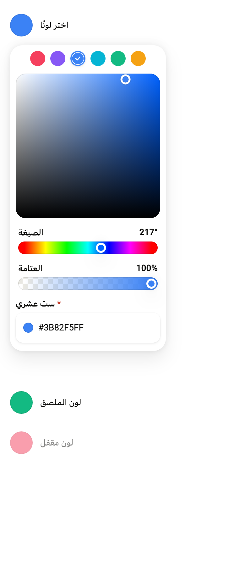
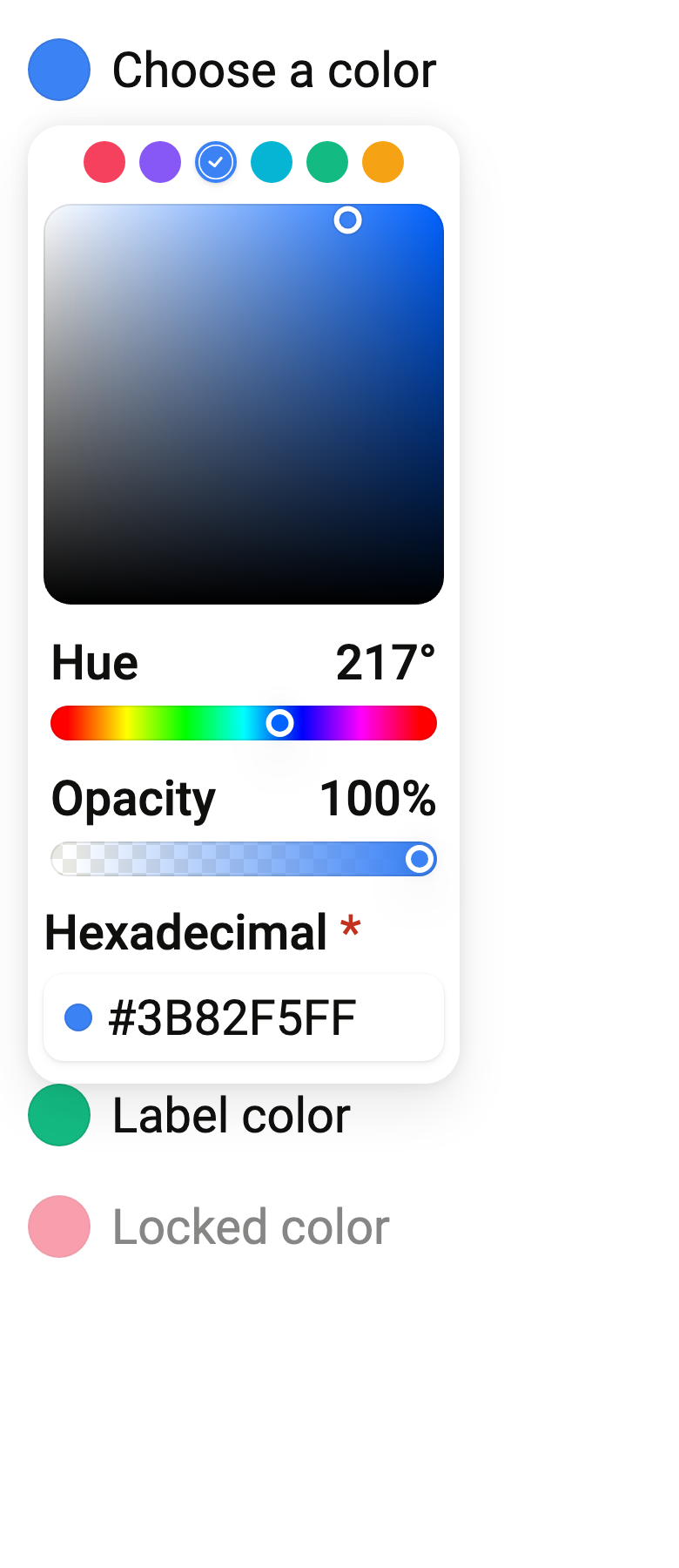
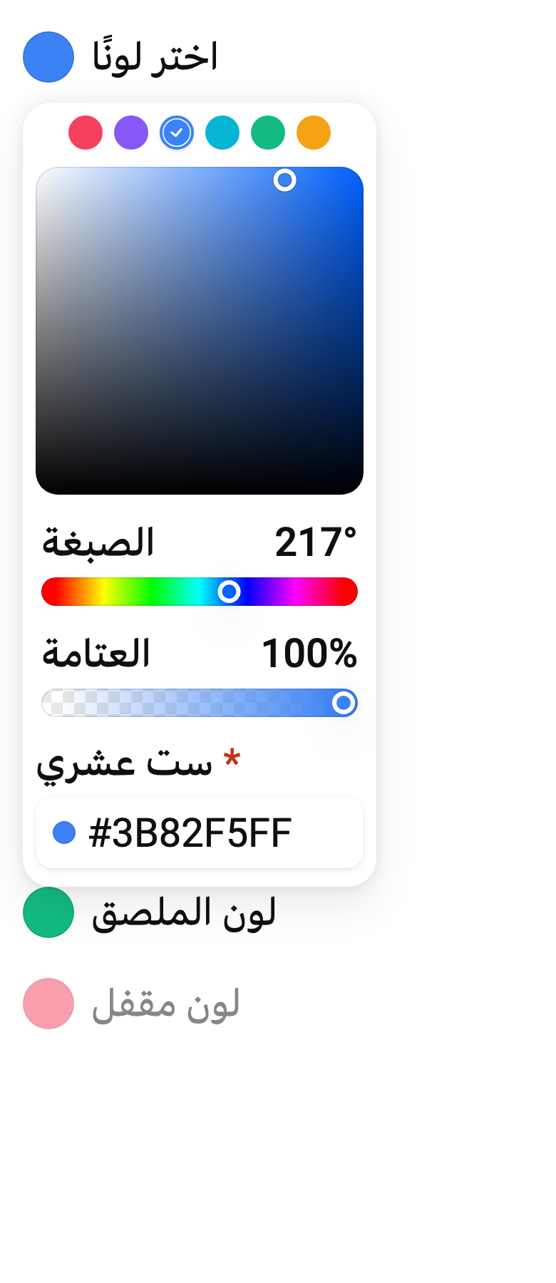
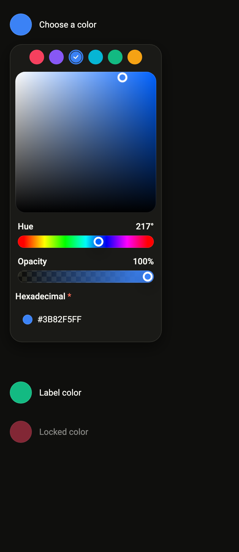
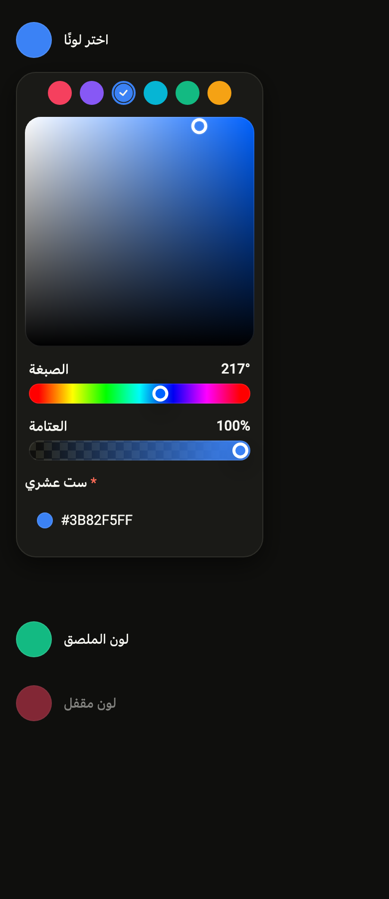
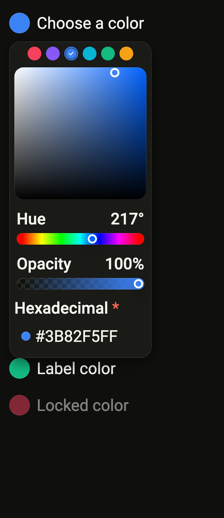
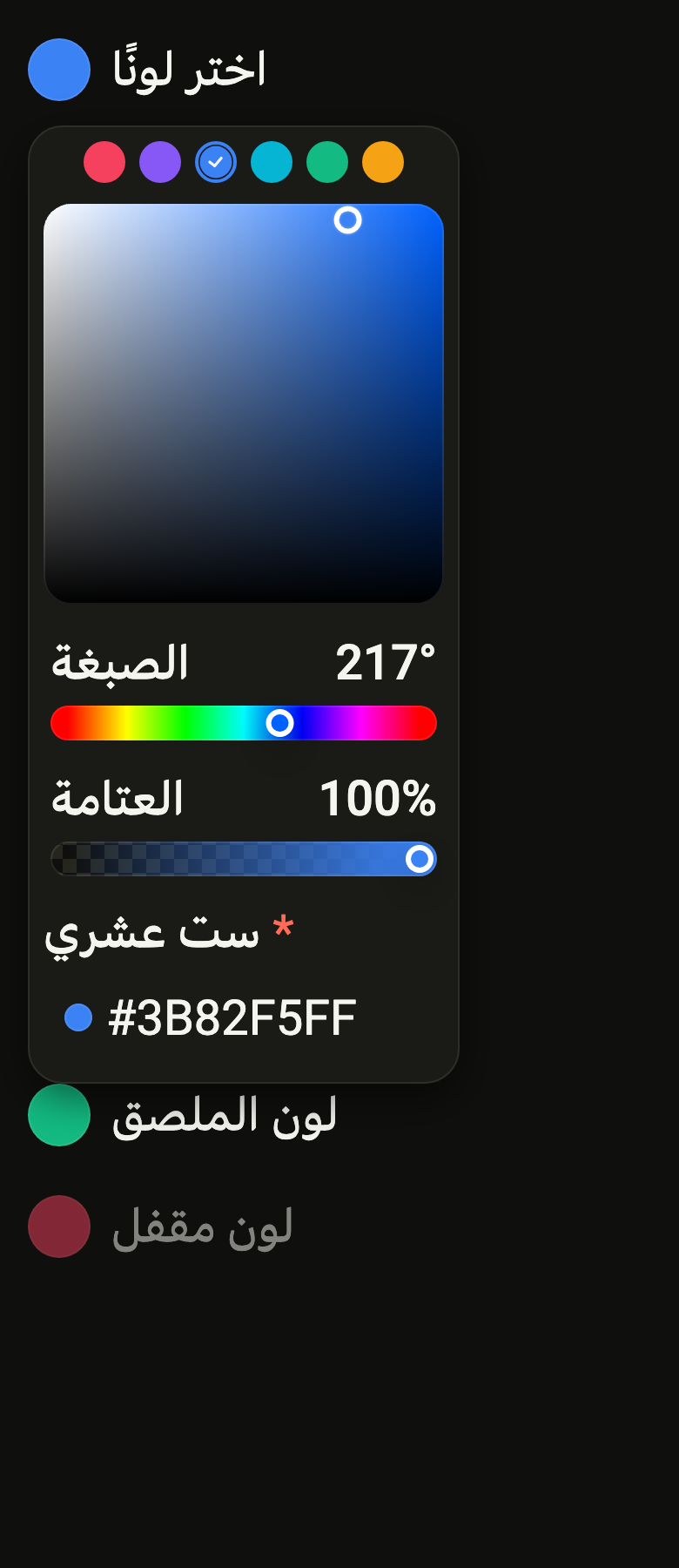
Opens, under a swatch and its label, the color area, the hue slider, opacity, the hex code and presets, all in sync.
Import
In a Flutter app where fliin init has run:
Examples
Example
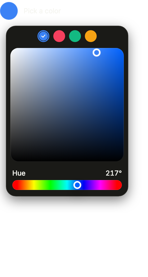
A swatch that opens an area, a hue slider and your presets in a popover. defaultOpen shows it open from the start.
import 'package:your_app/ui/fliin/components/color_picker/fl_color_picker.dart';
import 'package:your_app/ui/fliin/components/color_swatch_picker/fl_color_swatch_picker.dart';
import 'package:flutter/widgets.dart';

class ColorPickerExample extends StatefulWidget {
  const ColorPickerExample({super.key});

  @override
  State<ColorPickerExample> createState() => _ColorPickerExampleState();
}

class _ColorPickerExampleState extends State<ColorPickerExample> {
  var _color = const HSVColor.fromAHSV(1, 217, 0.76, 0.96);

  @override
  Widget build(BuildContext context) {
    return FlColorPicker(
      label: 'Pick a color',
      value: _color,
      defaultOpen: true,
      labels: const FlColorPickerLabels(
        saturation: 'Saturation',
        brightness: 'Brightness',
        hue: 'Hue',
        alpha: 'Opacity',
        hex: 'Hex',
        swatches: 'Presets',
      ),
      swatches: [
        for (final (name, color) in _tints)
          FlColorSwatchItem(value: color.toColor(), color: color.toColor(), label: name),
      ],
      onChanged: (color) => setState(() => _color = color),
    );
  }
}

const _tints = [
  ('Blue', HSVColor.fromAHSV(1, 217, 0.76, 0.96)),
  ('Rose', HSVColor.fromAHSV(1, 350, 0.74, 0.96)),
  ('Emerald', HSVColor.fromAHSV(1, 160, 0.9, 0.73)),
  ('Amber', HSVColor.fromAHSV(1, 38, 0.92, 0.96)),
];Open
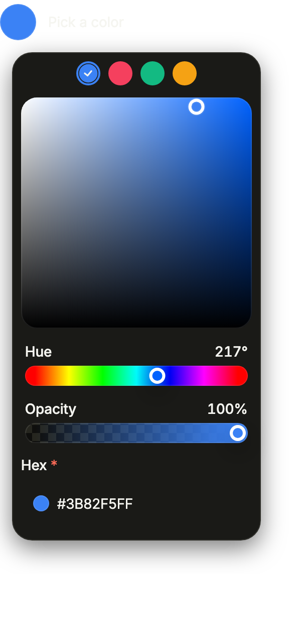
Open with everything: showField adds the hexadecimal field, showAlpha the opacity slider.
import 'package:your_app/ui/fliin/components/color_picker/fl_color_picker.dart';
import 'package:your_app/ui/fliin/components/color_swatch_picker/fl_color_swatch_picker.dart';
import 'package:flutter/widgets.dart';

class ColorPickerOpenExample extends StatefulWidget {
  const ColorPickerOpenExample({super.key});

  @override
  State<ColorPickerOpenExample> createState() => _ColorPickerOpenExampleState();
}

class _ColorPickerOpenExampleState extends State<ColorPickerOpenExample> {
  var _color = const HSVColor.fromAHSV(1, 217, 0.76, 0.96);

  @override
  Widget build(BuildContext context) {
    return FlColorPicker(
      label: 'Pick a color',
      value: _color,
      defaultOpen: true,
      showField: true,
      showAlpha: true,
      labels: const FlColorPickerLabels(
        saturation: 'Saturation',
        brightness: 'Brightness',
        hue: 'Hue',
        alpha: 'Opacity',
        hex: 'Hex',
        swatches: 'Presets',
      ),
      swatches: [
        for (final (name, color) in _tints)
          FlColorSwatchItem(value: color.toColor(), color: color.toColor(), label: name),
      ],
      onChanged: (color) => setState(() => _color = color),
    );
  }
}

const _tints = [
  ('Blue', HSVColor.fromAHSV(1, 217, 0.76, 0.96)),
  ('Rose', HSVColor.fromAHSV(1, 350, 0.74, 0.96)),
  ('Emerald', HSVColor.fromAHSV(1, 160, 0.9, 0.73)),
  ('Amber', HSVColor.fromAHSV(1, 38, 0.92, 0.96)),
];Closed
Closed, the picker is just its swatch and label; touching it opens the popover.

import 'package:your_app/ui/fliin/components/color_picker/fl_color_picker.dart';
import 'package:your_app/ui/fliin/components/color_swatch_picker/fl_color_swatch_picker.dart';
import 'package:flutter/widgets.dart';

class ColorPickerClosedExample extends StatefulWidget {
  const ColorPickerClosedExample({super.key});

  @override
  State<ColorPickerClosedExample> createState() => _ColorPickerClosedExampleState();
}

class _ColorPickerClosedExampleState extends State<ColorPickerClosedExample> {
  var _color = const HSVColor.fromAHSV(1, 217, 0.76, 0.96);

  @override
  Widget build(BuildContext context) {
    return FlColorPicker(
      label: 'Pick a color',
      value: _color,
      labels: const FlColorPickerLabels(
        saturation: 'Saturation',
        brightness: 'Brightness',
        hue: 'Hue',
        alpha: 'Opacity',
        hex: 'Hex',
        swatches: 'Presets',
      ),
      swatches: [
        for (final (name, color) in _tints)
          FlColorSwatchItem(value: color.toColor(), color: color.toColor(), label: name),
      ],
      onChanged: (color) => setState(() => _color = color),
    );
  }
}

const _tints = [
  ('Blue', HSVColor.fromAHSV(1, 217, 0.76, 0.96)),
  ('Rose', HSVColor.fromAHSV(1, 350, 0.74, 0.96)),
  ('Emerald', HSVColor.fromAHSV(1, 160, 0.9, 0.73)),
  ('Amber', HSVColor.fromAHSV(1, 38, 0.92, 0.96)),
];Disabled
onChanged: null disables the picker: the swatch no longer opens.

import 'package:your_app/ui/fliin/components/color_picker/fl_color_picker.dart';
import 'package:your_app/ui/fliin/components/color_swatch_picker/fl_color_swatch_picker.dart';
import 'package:flutter/widgets.dart';

class ColorPickerDisabledExample extends StatefulWidget {
  const ColorPickerDisabledExample({super.key});

  @override
  State<ColorPickerDisabledExample> createState() => _ColorPickerDisabledExampleState();
}

class _ColorPickerDisabledExampleState extends State<ColorPickerDisabledExample> {
  final _color = const HSVColor.fromAHSV(1, 217, 0.76, 0.96);

  @override
  Widget build(BuildContext context) {
    return FlColorPicker(
      label: 'Pick a color',
      value: _color,
      labels: const FlColorPickerLabels(
        saturation: 'Saturation',
        brightness: 'Brightness',
        hue: 'Hue',
        alpha: 'Opacity',
        hex: 'Hex',
        swatches: 'Presets',
      ),
      swatches: [
        for (final (name, color) in _tints)
          FlColorSwatchItem(value: color.toColor(), color: color.toColor(), label: name),
      ],
      onChanged: null,
    );
  }
}

const _tints = [
  ('Blue', HSVColor.fromAHSV(1, 217, 0.76, 0.96)),
  ('Rose', HSVColor.fromAHSV(1, 350, 0.74, 0.96)),
  ('Emerald', HSVColor.fromAHSV(1, 160, 0.9, 0.73)),
  ('Amber', HSVColor.fromAHSV(1, 38, 0.92, 0.96)),
];With sliders
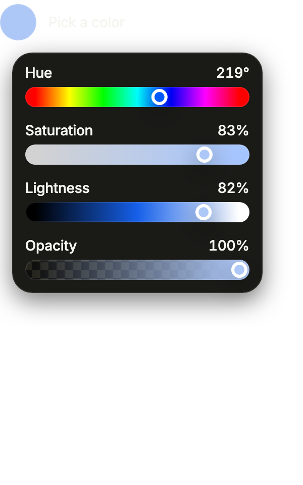
showArea: false trades the area for saturation and lightness sliders in HSL under the hue: a lower panel, read channel by channel.
import 'package:your_app/ui/fliin/components/color_picker/fl_color_picker.dart';
import 'package:flutter/widgets.dart';

class ColorPickerWithSlidersExample extends StatefulWidget {
  const ColorPickerWithSlidersExample({super.key});

  @override
  State<ColorPickerWithSlidersExample> createState() => _ColorPickerWithSlidersExampleState();
}

class _ColorPickerWithSlidersExampleState extends State<ColorPickerWithSlidersExample> {
  var _color = const HSVColor.fromAHSV(1, 219, 0.3, 0.97);

  @override
  Widget build(BuildContext context) {
    return FlColorPicker(
      label: 'Pick a color',
      value: _color,
      defaultOpen: true,
      showArea: false,
      showAlpha: true,
      labels: const FlColorPickerLabels(
        saturation: 'Saturation',
        brightness: 'Brightness',
        hue: 'Hue',
        lightness: 'Lightness',
        alpha: 'Opacity',
      ),
      onChanged: (color) => setState(() => _color = color),
    );
  }
}Usage
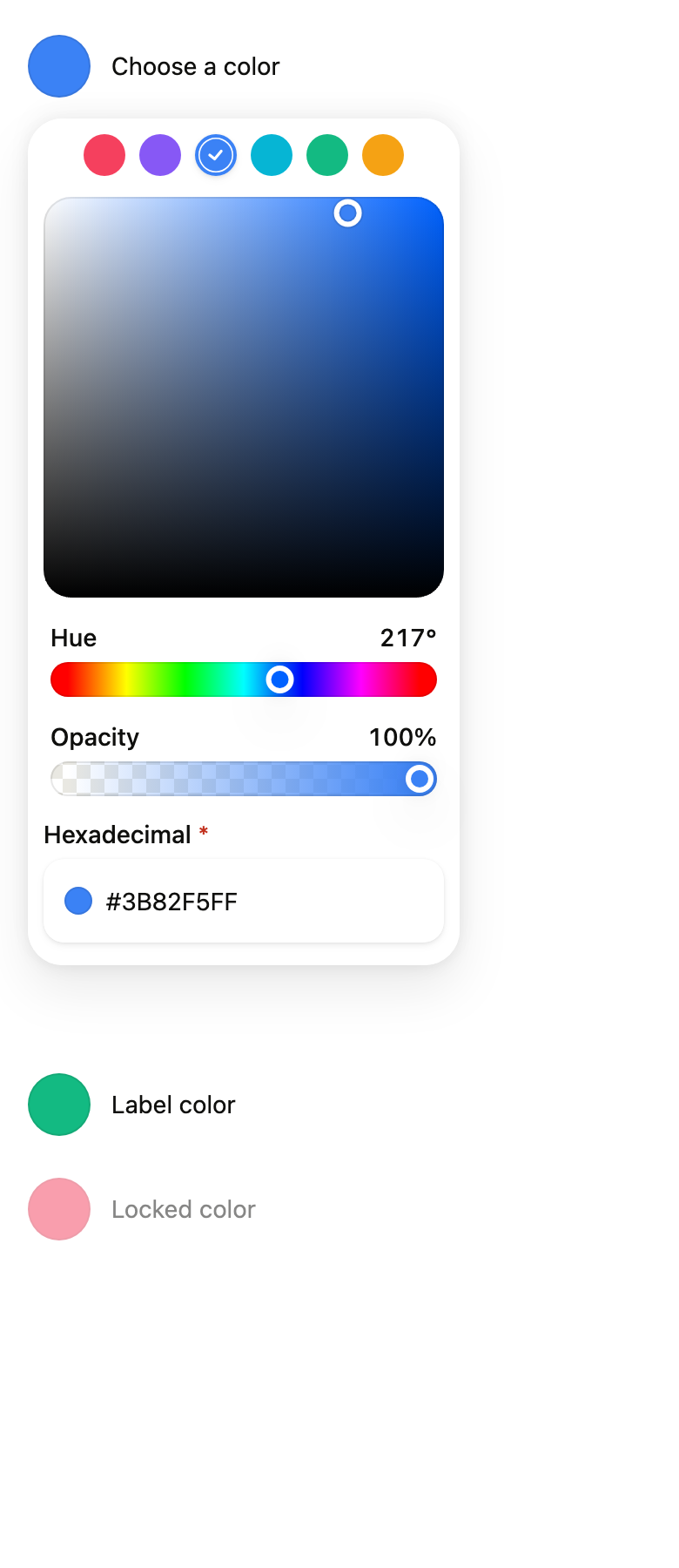
The code the reference images render:
final example = Builder(
  builder: (context) {
    final rtl = variant.dir == TextDirection.rtl;
    String tr(String fr, String ar) => rtl ? ar : fr;
    final labels = FlColorPickerLabels(
      saturation: tr('Saturation', 'التشبع'),
      brightness: tr('Brightness', 'السطوع'),
      hue: tr('Hue', 'الصبغة'),
      alpha: tr('Opacity', 'العتامة'),
      hex: tr('Hexadecimal', 'ست عشري'),
      swatches: tr('Presets', 'ألوان جاهزة'),
    );
    final presets = [
      for (final (fr, ar, hue, s, v) in const [
        ('Pink', 'وردي', 350.0, 0.74, 0.96),
        ('Purple', 'بنفسجي', 258.0, 0.64, 0.96),
        ('Blue', 'أزرق', 217.0, 0.76, 0.96),
        ('Cyan', 'سماوي', 189.0, 0.97, 0.83),
        ('Emerald', 'زمردي', 160.0, 0.9, 0.73),
        ('Amber', 'كهرماني', 38.0, 0.92, 0.96),
      ])
        FlColorSwatchItem<Color>(
          value: HSVColor.fromAHSV(1, hue, s, v).toColor(),
          color: HSVColor.fromAHSV(1, hue, s, v).toColor(),
          label: tr(fr, ar),
        ),
    ];
    return Localizations(
      locale: Locale(rtl ? 'ar' : 'en'),
      delegates: const [DefaultWidgetsLocalizations.delegate],
      child: Overlay(
        initialEntries: [
          OverlayEntry(
            builder: (context) => ColoredBox(
              color: FlScope.of(context).colors.surface,
              child: Padding(
                padding: EdgeInsetsDirectional.all(
                  FlScope.of(context).space.lg,
                ),
                child: SingleChildScrollView(
                  child: Column(
                    crossAxisAlignment: CrossAxisAlignment.start,
                    spacing: FlScope.of(context).space.lg,
                    children: [
                      FlColorPicker(
                        label: tr('Choose a color', 'اختر لونًا'),
                        value: const HSVColor.fromAHSV(1, 217, 0.76, 0.96),
                        labels: labels,
                        swatches: presets,
                        showField: true,
                        showAlpha: true,
                        defaultOpen: true,
                        onChanged: (_) {},
                      ),
                      const SizedBox(height: 520),
                      FlColorPicker(
                        label: tr('Label color', 'لون الملصق'),
                        value: const HSVColor.fromAHSV(1, 160, 0.9, 0.73),
                        labels: labels,
                        onChanged: (_) {},
                      ),
                      FlColorPicker(
                        label: tr('Locked color', 'لون مقفل'),
                        value: const HSVColor.fromAHSV(1, 350, 0.74, 0.96),
                        labels: labels,
                        onChanged: null,
                      ),
                    ],
                  ),
                ),
              ),
            ),
          ),
        ],
      ),
    );
  },
);API
FlColorPickerLabels: final class
FlColorPickerLabels.new: const new({required String saturation, required String brightness, required String hue, String? alpha, String? hex, String? swatches, String? lightness})
FlColorPickerLabels.saturation: get String
FlColorPickerLabels.brightness: get String
FlColorPickerLabels.hue: get String
FlColorPickerLabels.alpha: get String?
FlColorPickerLabels.hex: get String?
FlColorPickerLabels.swatches: get String?
FlColorPickerLabels.lightness: get String?
FlColorPickerPanel: class extends StatelessWidget
FlColorPickerPanel.new: const new({super.key, required HSVColor value, required ValueChanged<HSVColor>? onChanged, required FlColorPickerLabels labels, ValueChanged<HSVColor>? onChangeEnd, bool showAlpha, bool showField, List<FlColorSwatchItem<Color>>? swatches, bool showArea})
FlColorPickerPanel.value: get HSVColor
FlColorPickerPanel.onChanged: get ValueChanged<HSVColor>?
FlColorPickerPanel.onChangeEnd: get ValueChanged<HSVColor>?
FlColorPickerPanel.labels: get FlColorPickerLabels
FlColorPickerPanel.showAlpha: get bool
FlColorPickerPanel.showField: get bool
FlColorPickerPanel.swatches: get List<FlColorSwatchItem<Color>>?
FlColorPickerPanel.showArea: get bool
FlColorPickerPanel.build: Widget(BuildContext context)
FlColorPicker: class extends StatefulWidget
FlColorPicker.new: const new({super.key, required String label, required HSVColor value, required ValueChanged<HSVColor>? onChanged, required FlColorPickerLabels labels, ValueChanged<HSVColor>? onChangeEnd, bool showAlpha, bool showField, List<FlColorSwatchItem<Color>>? swatches, bool defaultOpen, bool showArea})
FlColorPicker.label: get String
FlColorPicker.value: get HSVColor
FlColorPicker.onChanged: get ValueChanged<HSVColor>?
FlColorPicker.onChangeEnd: get ValueChanged<HSVColor>?
FlColorPicker.labels: get FlColorPickerLabels
FlColorPicker.showAlpha: get bool
FlColorPicker.showField: get bool
FlColorPicker.swatches: get List<FlColorSwatchItem<Color>>?
FlColorPicker.defaultOpen: get bool
FlColorPicker.showArea: get bool
FlColorPicker.createState: State<FlColorPicker>()Reference renders
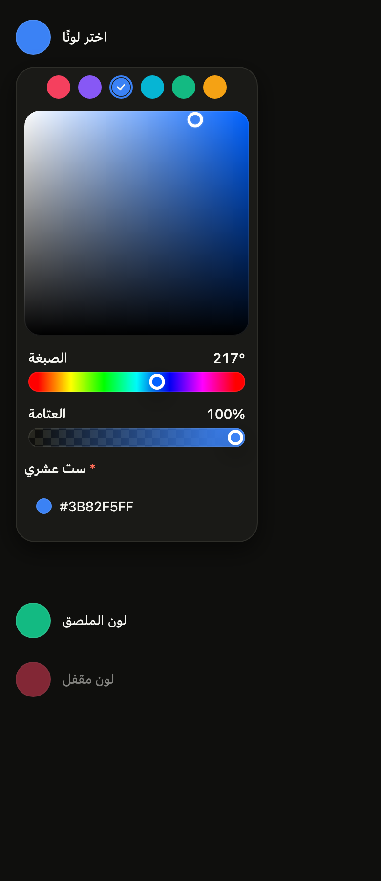
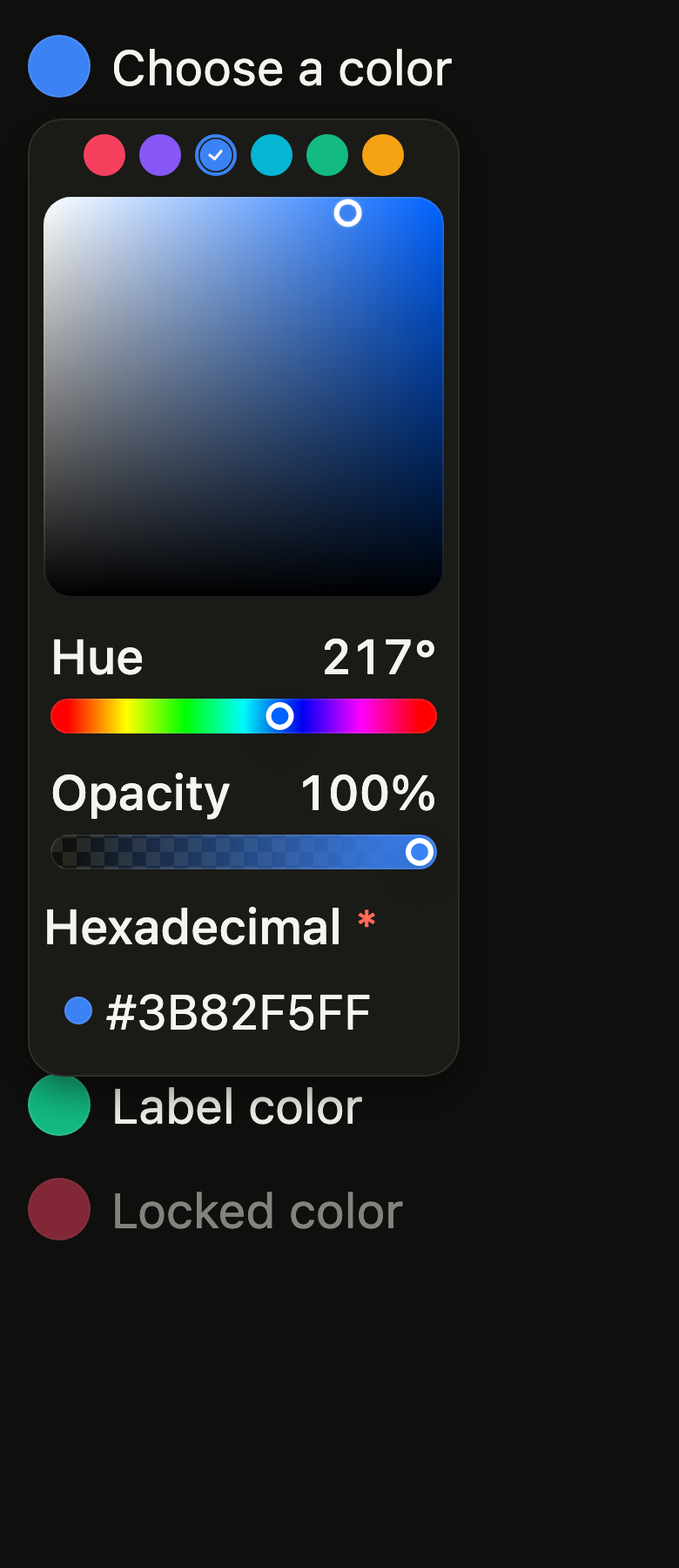
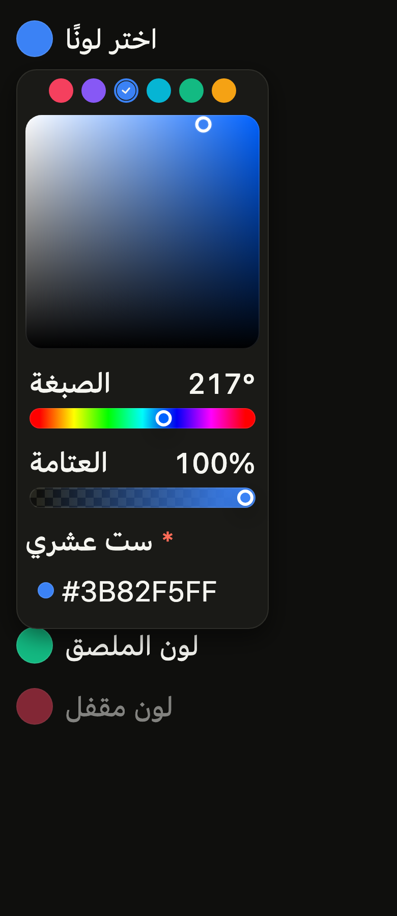
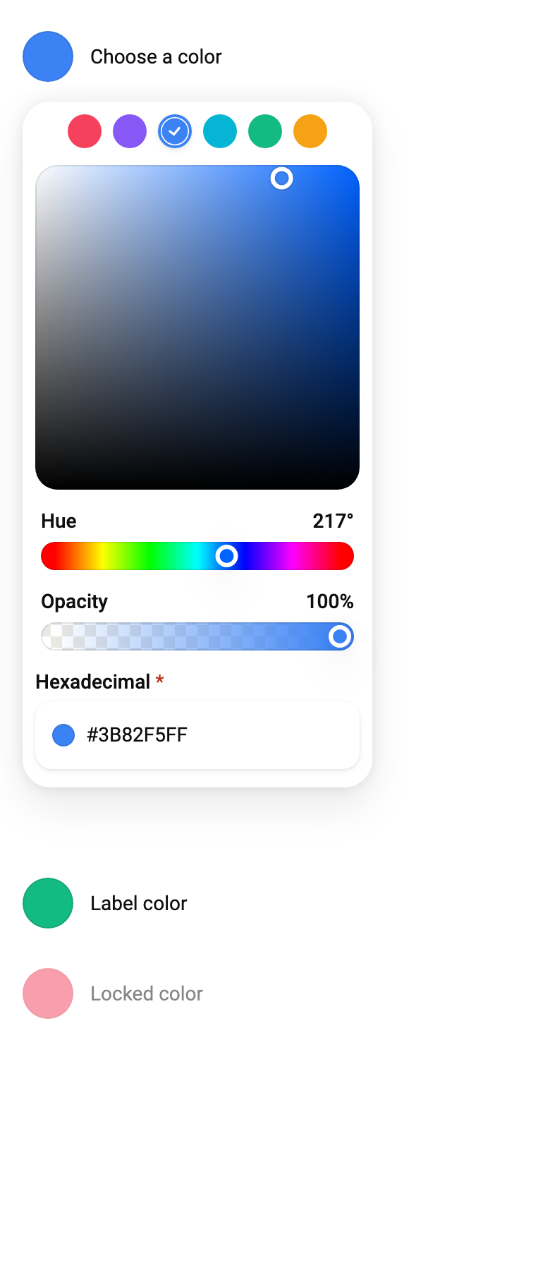
The 16 images published with version 0.1.1, rendered by the shared harness on macOS with Flutter 3.47.7. fliin verify color-picker compares your copy to them.
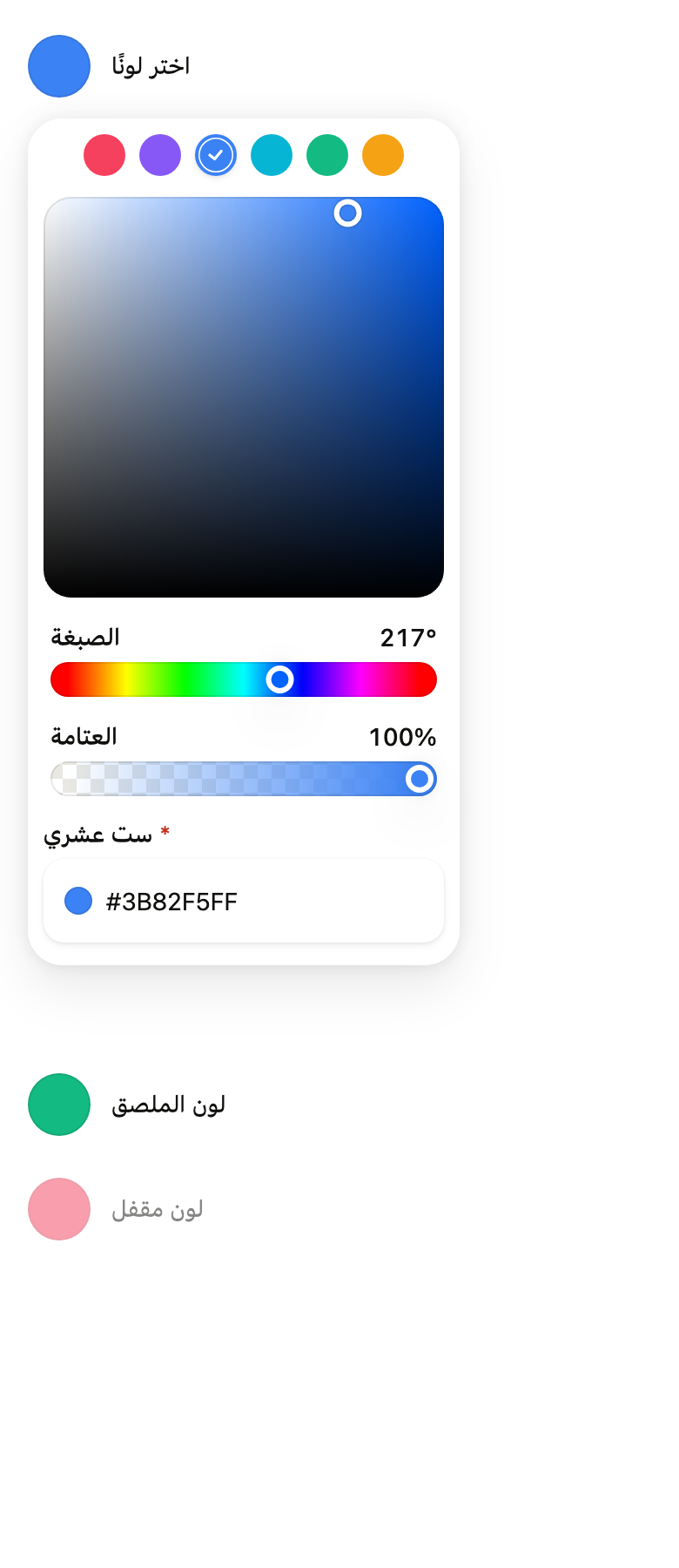
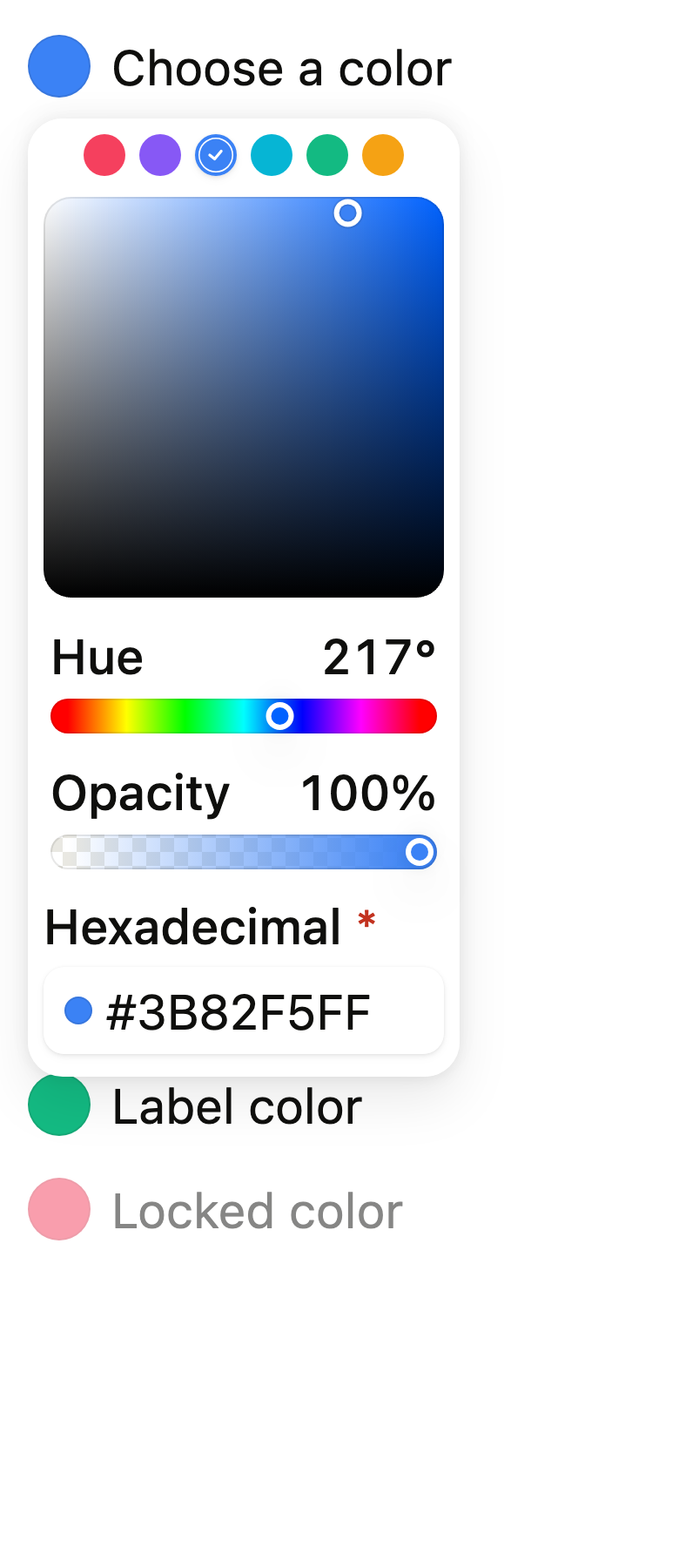
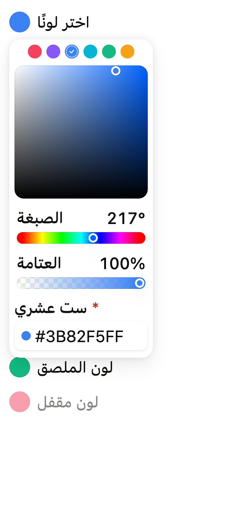
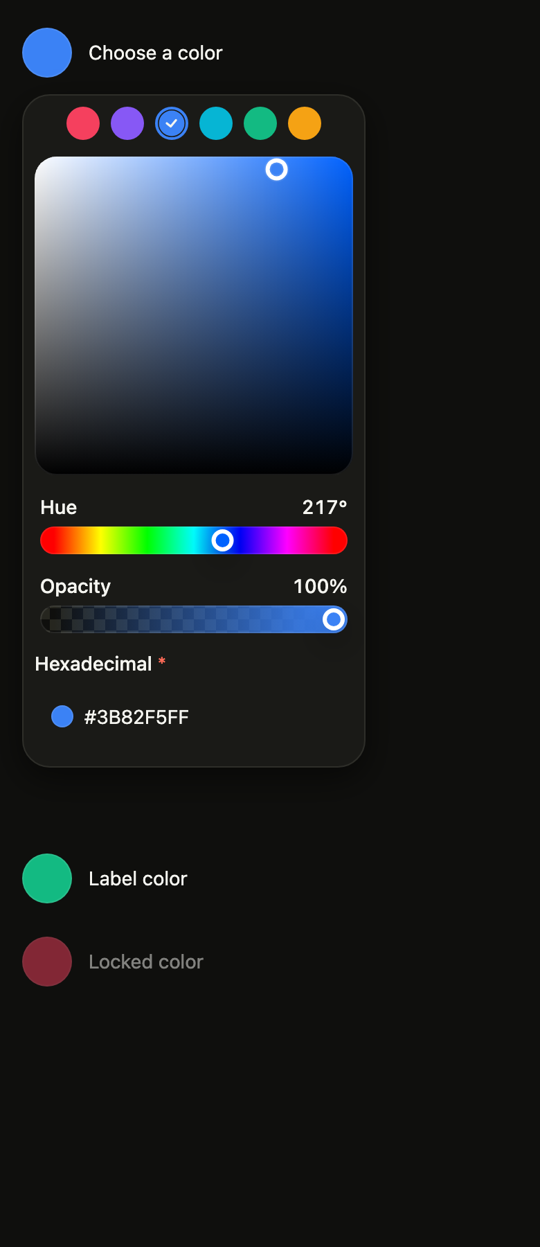
Use it to
- let users choose a custom colour by eye
- open a colour chooser under a swatch button
- adjust a colour and read its hex code
- offer preset shades above the colour square
- change a colour, its hue and its opacity in one place
- Not for
- a shade from a fixed palette: use a color swatch picker (color-swatch-picker)
- a code typed on the keyboard only: use a color field (color-field)
- a color shown without changing it: use a color swatch (color-swatch)
- States
Source
The files fliin add color-picker copies into your app, before your prefix and imports are applied.
color_picker/fl_color_picker.dart
// Modified from the ColorPicker of HeroUI React v3, Copyright 2025 NextUI Inc.,
// licensed under Apache 2.0: https://www.apache.org/licenses/LICENSE-2.0
import 'package:flutter/widgets.dart';
import 'package:fliin_ui/components/color_area/fl_color_area.dart';
import 'package:fliin_ui/components/color_field/fl_color_field.dart';
import 'package:fliin_ui/components/color_slider/fl_color_slider.dart';
import 'package:fliin_ui/components/color_swatch/fl_color_swatch.dart';
import 'package:fliin_ui/components/color_swatch_picker/fl_color_swatch_picker.dart';
import 'package:fliin_ui/components/popover/fl_popover.dart';
import 'package:fliin_ui/core/fliin.dart';

/// The names a [FlColorPickerPanel] gives its controls, for the screen
/// reader and, for the sliders and the field, on screen.
final class FlColorPickerLabels {
  /// The names of the controls, in the app's language.
  const FlColorPickerLabels({
    required this.saturation,
    required this.brightness,
    required this.hue,
    this.alpha,
    this.hex,
    this.swatches,
    this.lightness,
  });

  /// The area's horizontal channel ("Saturation").
  final String saturation;

  /// The area's vertical channel ("Brightness").
  final String brightness;

  /// The hue slider, shown above it ("Hue").
  final String hue;

  /// The opacity slider ("Opacity"); required with `showAlpha`.
  final String? alpha;

  /// The hex field ("Hex"); required with `showField`.
  final String? hex;

  /// The palette group ("Presets"); required with `swatches`.
  final String? swatches;

  /// The HSL lightness slider ("Lightness"); required with `showArea:
  /// false`.
  final String? lightness;
}

/// The content of a color picker, usable on its own in a page or a sheet
/// (the content of the picker's popover): a saturation and brightness
/// [FlColorArea] at the available width, the hue [FlColorSlider], an
/// optional opacity slider, an optional hexadecimal [FlColorField], and an
/// optional palette of presets ([FlColorSwatchPicker]). All of them show
/// [value] and send the same color to [onChanged]: moving one moves the
/// others.
///
/// The color is a value of the app, held as an [HSVColor] (a gray keeps its
/// hue); the panel does not keep it.
class FlColorPickerPanel extends StatelessWidget {
  /// A panel over [value].
  const FlColorPickerPanel({
    super.key,
    required this.value,
    required this.onChanged,
    required this.labels,
    this.onChangeEnd,
    this.showAlpha = false,
    this.showField = false,
    this.swatches,
    this.showArea = true,
  });

  /// The color shown.
  final HSVColor value;

  /// Receives the color each control picks; null, the panel is disabled.
  final ValueChanged<HSVColor>? onChanged;

  /// Receives the color when a drag ends, a tap or a key press.
  final ValueChanged<HSVColor>? onChangeEnd;

  /// The names of the controls.
  final FlColorPickerLabels labels;

  /// True: an opacity slider under the hue.
  final bool showAlpha;

  /// True: a hexadecimal field, which writes the opacity with [showAlpha].
  final bool showField;

  /// Preset tints, tapped to pick them; null, none.
  final List<FlColorSwatchItem<Color>>? swatches;

  /// True (the default): the saturation and brightness area. False: a
  /// saturation and a lightness slider in HSL under the hue slider instead,
  /// lower and readable channel by channel.
  final bool showArea;

  @override
  Widget build(BuildContext context) {
    assert(showArea || labels.lightness != null, 'the lightness slider needs labels.lightness');
    assert(!showAlpha || labels.alpha != null, 'the opacity slider needs labels.alpha');
    assert(!showField || labels.hex != null, 'the hex field needs labels.hex');
    assert(this.swatches == null || labels.swatches != null, 'the palette needs labels.swatches');
    final theme = FlScope.of(context);
    final onChanged = this.onChanged;
    final color = value.toColor();
    final swatches = this.swatches;
    void pick(HSVColor next) {
      onChanged?.call(next);
      onChangeEnd?.call(next);
    }

    // The value of the palette: the preset equal to the color, if any.
    Color? picked;
    if (swatches != null) {
      for (final item in swatches) {
        if (flColorHex(item.value, alpha: true) == flColorHex(color, alpha: true)) {
          picked = item.value;
        }
      }
    }
    return Column(
      mainAxisSize: MainAxisSize.min,
      crossAxisAlignment: CrossAxisAlignment.stretch,
      // gap-3 of `color-picker__popover`.
      spacing: theme.space.md,
      children: [
        if (swatches != null)
          Center(
            child: FlColorSwatchPicker<Color>(
              semanticLabel: labels.swatches!,
              value: picked,
              size: FlColorSwatchSize.sm,
              enabled: onChanged != null,
              onChanged: (tint) {
                // A preset keeps the hue of the current color when it is a gray.
                final next = HSVColor.fromColor(tint);
                pick(next.saturation == 0 ? next.withHue(value.hue) : next);
              },
              items: swatches,
            ),
          ),
        if (showArea)
          FlColorArea(
            value: value,
            onChanged: onChanged,
            onChangeEnd: onChangeEnd,
            xLabel: labels.saturation,
            yLabel: labels.brightness,
            expand: true,
          ),
        // `px-1` of the story's slider.
        Padding(
          padding: EdgeInsetsDirectional.symmetric(horizontal: theme.space.xs),
          child: Column(
            mainAxisSize: MainAxisSize.min,
            crossAxisAlignment: CrossAxisAlignment.stretch,
            spacing: theme.space.md,
            children: [
              FlColorSlider(
                value: value,
                channel: FlColorChannel.hue,
                onChanged: onChanged,
                onChangeEnd: onChangeEnd,
                label: labels.hue,
              ),
              if (!showArea)
                for (final (channel, label) in [
                  (FlColorChannel.saturation, labels.saturation),
                  (FlColorChannel.lightness, labels.lightness!),
                ])
                  FlColorSlider(
                    value: value,
                    channel: channel,
                    space: FlColorSpace.hsl,
                    onChanged: onChanged,
                    onChangeEnd: onChangeEnd,
                    label: label,
                  ),
              if (showAlpha)
                FlColorSlider(
                  value: value,
                  channel: FlColorChannel.alpha,
                  onChanged: onChanged,
                  onChangeEnd: onChangeEnd,
                  label: labels.alpha!,
                ),
            ],
          ),
        ),
        if (showField)
          FlColorField(
            label: labels.hex!,
            value: color,
            alpha: showAlpha,
            required: true,
            enabled: onChanged != null,
            onChanged: (next) {
              if (next == null) return;
              final hsv = HSVColor.fromColor(next);
              pick(hsv.saturation == 0 ? hsv.withHue(value.hue) : hsv);
            },
          ),
      ],
    );
  }
}

/// A color picker: a trigger, the picked color in
/// a 36 swatch followed by [label], that opens a [FlColorPickerPanel] in a
/// [FlPopover] under it, 248 wide, padded 8
/// around and 12 at the bottom. The panel follows [value] while open.
///
/// The screen reader reads a button named [label] whose value is the color
/// in hexadecimal, expanded while the panel is open; the panel is a
/// non-modal dialog, closed by a tap outside or Escape.
class FlColorPicker extends StatefulWidget {
  /// A trigger named [label] over [value].
  const FlColorPicker({
    super.key,
    required this.label,
    required this.value,
    required this.onChanged,
    required this.labels,
    this.onChangeEnd,
    this.showAlpha = false,
    this.showField = false,
    this.swatches,
    this.defaultOpen = false,
    this.showArea = true,
  });

  /// The trigger's text ("Pick a color"), and the name of the panel.
  final String label;

  /// The color shown.
  final HSVColor value;

  /// Receives the color the panel picks; null, the trigger is disabled.
  final ValueChanged<HSVColor>? onChanged;

  /// Receives the color when a drag ends, a tap or a key press.
  final ValueChanged<HSVColor>? onChangeEnd;

  /// The names of the panel's controls.
  final FlColorPickerLabels labels;

  /// True: an opacity slider.
  final bool showAlpha;

  /// True: a hexadecimal field.
  final bool showField;

  /// Preset tints; null, none.
  final List<FlColorSwatchItem<Color>>? swatches;

  /// True: the panel opens after the first frame (React Aria's
  /// `defaultOpen`).
  final bool defaultOpen;

  /// False: saturation and lightness sliders in place of the area; see
  /// [FlColorPickerPanel.showArea].
  final bool showArea;

  @override
  State<FlColorPicker> createState() => _FlColorPickerState();
}

class _FlColorPickerState extends State<FlColorPicker> {
  final FlPopoverController _popover = FlPopoverController();
  bool _open = false;

  @override
  void initState() {
    super.initState();
    if (widget.defaultOpen) {
      WidgetsBinding.instance.addPostFrameCallback((_) {
        if (mounted && !_popover.isOpen) _popover.open();
      });
    }
  }

  @override
  Widget build(BuildContext context) {
    final theme = FlScope.of(context);
    const role = FlTextRole.textSm;
    final enabled = widget.onChanged != null;
    final color = widget.value.toColor();
    final xs = theme.space.xs;
    final trigger = FlPressable(
      onPressed: enabled ? _popover.toggle : null,
      borderRadius: BorderRadius.circular(theme.shape.radiusSm),
      label: '${widget.label}, ${flColorHex(color, alpha: widget.showAlpha)}',
      expanded: _open,
      builder: (context, states) => Opacity(
        opacity: enabled ? 1 : theme.size.disabledOpacity,
        // As high as the touch target: a trigger at the top of a scroll
        // keeps all of it.
        child: ConstrainedBox(
          constraints: BoxConstraints(minHeight: theme.hitTarget),
          child: Row(
            mainAxisSize: MainAxisSize.min,
            // gap-3 of `color-picker__trigger`.
            spacing: theme.space.md,
            children: [
              FlColorSwatch(color: color, label: null, size: FlColorSwatchSize.lg),
              Flexible(
                child: Text(
                  widget.label,
                  style: theme.typography.resolve(role).copyWith(color: theme.colors.onSurface),
                  strutStyle: theme.typography.strut(
                    role,
                    inheritedFamily: DefaultTextStyle.of(context).style.fontFamily,
                  ),
                ),
              ),
            ],
          ),
        ),
      ),
    );
    return FlPopover(
      controller: _popover,
      label: widget.label,
      align: FlAlign.start,
      width: xs * 62,
      offset: theme.size.selectOffset,
      padding: EdgeInsetsDirectional.fromSTEB(xs * 2, xs * 2, xs * 2, xs * 3),
      onOpenChanged: (open) => setState(() => _open = open),
      content: FlColorPickerPanel(
        value: widget.value,
        onChanged: widget.onChanged,
        onChangeEnd: widget.onChangeEnd,
        labels: widget.labels,
        showAlpha: widget.showAlpha,
        showField: widget.showField,
        swatches: widget.swatches,
        showArea: widget.showArea,
      ),
      child: trigger,
    );
  }
}