Components / overlays
Modal dialog
Asks for a decision or a confirmation before going on, over a dimmed page. Title, scrolling text, actions, close button, swipe down to dismiss, trapped focus, Escape and focus returned on close.
Import
In a Flutter app where fliin init has run:
Examples
Open
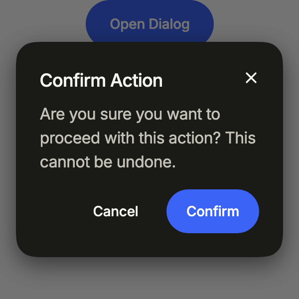
showFlDialog pushes a modal dialog over the page: a title, a message, and the actions that close it. The close button and the barrier dismiss it too.
import 'package:your_app/ui/fliin/components/button/fl_button.dart';
import 'package:your_app/ui/fliin/components/dialog/fl_dialog.dart';
import 'package:flutter/widgets.dart';

class DialogOpenExample extends StatelessWidget {
  const DialogOpenExample({super.key});

  @override
  Widget build(BuildContext context) {
    return FlButton(
      label: 'Open Dialog',
      onPressed: () => showFlDialog<void>(
        context: context,
        barrierLabel: 'Close',
        builder: (context) => const ConfirmActionDialog(),
      ),
    );
  }
}

class ConfirmActionDialog extends StatelessWidget {
  const ConfirmActionDialog({super.key});

  @override
  Widget build(BuildContext context) {
    return FlDialog(
      title: 'Confirm Action',
      closeLabel: 'Close',
      content: const Text('Are you sure you want to proceed with this action? This cannot be undone.'),
      actions: [
        FlButton(
          label: 'Cancel',
          variant: FlButtonVariant.ghost,
          size: FlButtonSize.sm,
          onPressed: () => Navigator.pop(context),
        ),
        FlButton(label: 'Confirm', size: FlButtonSize.sm, onPressed: () => Navigator.pop(context)),
      ],
    );
  }
}Icon
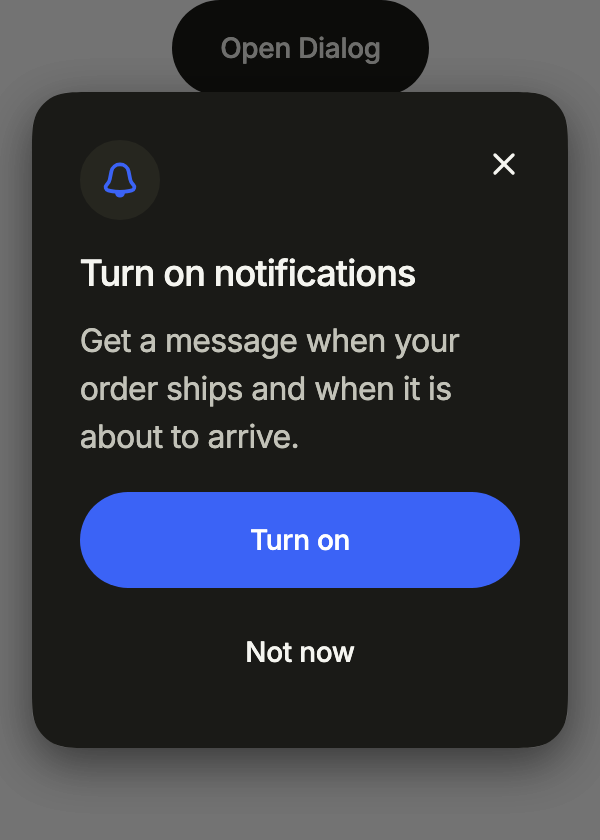
An icon in a soft disc above the title, and stacked actions across the panel, the main one first: the welcome or the permission request of a phone app.
import 'package:your_app/ui/fliin/components/button/fl_button.dart';
import 'package:your_app/ui/fliin/components/dialog/fl_dialog.dart';
import 'package:your_app/ui/fliin/core/fliin.dart';
import 'package:your_app/ui/fliin/icons/fl_icons.dart';
import 'package:flutter/widgets.dart';

class DialogIconExample extends StatelessWidget {
  const DialogIconExample({super.key});

  @override
  Widget build(BuildContext context) {
    return FlButton(
      label: 'Open Dialog',
      variant: FlButtonVariant.secondary,
      onPressed: () => showFlDialog<void>(
        context: context,
        barrierLabel: 'Close',
        builder: (context) => const NotificationsDialog(),
      ),
    );
  }
}

class NotificationsDialog extends StatelessWidget {
  const NotificationsDialog({super.key});

  @override
  Widget build(BuildContext context) {
    return FlDialog(
      icon: FlIcon(FlIcons.bell),
      iconTone: FlDialogIconTone.accent,
      title: 'Turn on notifications',
      closeLabel: 'Close',
      content: const Text('Get a message when your order ships and when it is about to arrive.'),
      actionsLayout: FlDialogActionsLayout.stacked,
      actions: [
        FlButton(label: 'Turn on', onPressed: () => Navigator.pop(context)),
        FlButton(label: 'Not now', variant: FlButtonVariant.ghost, onPressed: () => Navigator.pop(context)),
      ],
    );
  }
}Status
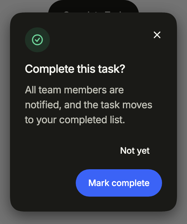
iconTone colors the disc after the status: accent, success, warning or danger. Here, a task about to be marked complete.
import 'package:your_app/ui/fliin/components/button/fl_button.dart';
import 'package:your_app/ui/fliin/components/dialog/fl_dialog.dart';
import 'package:your_app/ui/fliin/core/fliin.dart';
import 'package:your_app/ui/fliin/icons/fl_icons.dart';
import 'package:flutter/widgets.dart';

class DialogStatusExample extends StatelessWidget {
  const DialogStatusExample({super.key});

  @override
  Widget build(BuildContext context) {
    return FlButton(
      label: 'Complete Task',
      variant: FlButtonVariant.secondary,
      onPressed: () =>
          showFlDialog<void>(context: context, barrierLabel: 'Close', builder: (context) => const CompleteTaskDialog()),
    );
  }
}

class CompleteTaskDialog extends StatelessWidget {
  const CompleteTaskDialog({super.key});

  @override
  Widget build(BuildContext context) {
    return FlDialog(
      icon: FlIcon(FlIcons.circleCheck),
      iconTone: FlDialogIconTone.success,
      title: 'Complete this task?',
      closeLabel: 'Close',
      content: const Text('All team members are notified, and the task moves to your completed list.'),
      actions: [
        FlButton(
          label: 'Not yet',
          variant: FlButtonVariant.ghost,
          size: FlButtonSize.sm,
          onPressed: () => Navigator.pop(context),
        ),
        FlButton(label: 'Mark complete', size: FlButtonSize.sm, onPressed: () => Navigator.pop(context)),
      ],
    );
  }
}Alert
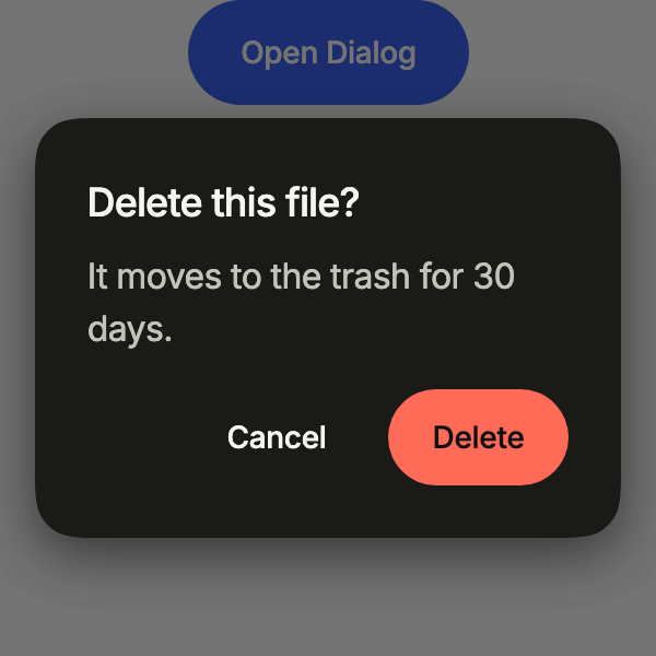
alert: true makes a dialog the user must answer: no close button, and the danger action names what it destroys. For a deletion or a loss.
import 'package:your_app/ui/fliin/components/button/fl_button.dart';
import 'package:your_app/ui/fliin/components/dialog/fl_dialog.dart';
import 'package:flutter/widgets.dart';

class DialogAlertExample extends StatelessWidget {
  const DialogAlertExample({super.key});

  @override
  Widget build(BuildContext context) {
    return FlButton(
      label: 'Open Dialog',
      onPressed: () => showFlDialog<void>(
        context: context,
        barrierLabel: 'Close',
        builder: (context) => const DeleteFileDialog(),
      ),
    );
  }
}

class DeleteFileDialog extends StatelessWidget {
  const DeleteFileDialog({super.key});

  @override
  Widget build(BuildContext context) {
    return FlDialog(
      alert: true,
      title: 'Delete this file?',
      content: const Text('It moves to the trash for 30 days.'),
      actions: [
        FlButton(
          label: 'Cancel',
          variant: FlButtonVariant.ghost,
          size: FlButtonSize.sm,
          onPressed: () => Navigator.pop(context),
        ),
        FlButton(
          label: 'Delete',
          variant: FlButtonVariant.danger,
          size: FlButtonSize.sm,
          onPressed: () => Navigator.pop(context),
        ),
      ],
    );
  }
}Form
A form as content: it scrolls between the title and the actions, which stay in place, and the panel moves above the keyboard.
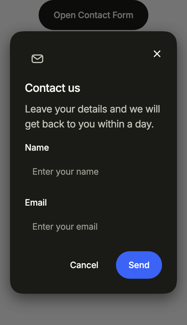
import 'package:your_app/ui/fliin/components/button/fl_button.dart';
import 'package:your_app/ui/fliin/components/dialog/fl_dialog.dart';
import 'package:your_app/ui/fliin/components/text_field/fl_text_field.dart';
import 'package:your_app/ui/fliin/core/fliin.dart';
import 'package:your_app/ui/fliin/icons/fl_icons.dart';
import 'package:flutter/widgets.dart';

class DialogFormExample extends StatelessWidget {
  const DialogFormExample({super.key});

  @override
  Widget build(BuildContext context) {
    return FlButton(
      label: 'Open Contact Form',
      variant: FlButtonVariant.secondary,
      onPressed: () =>
          showFlDialog<void>(context: context, barrierLabel: 'Close', builder: (context) => const ContactDialog()),
    );
  }
}

class ContactDialog extends StatelessWidget {
  const ContactDialog({super.key});

  @override
  Widget build(BuildContext context) {
    final space = FlScope.of(context).space;
    return FlDialog(
      icon: FlIcon(FlIcons.envelope),
      title: 'Contact us',
      closeLabel: 'Close',
      content: Column(
        crossAxisAlignment: CrossAxisAlignment.stretch,
        spacing: space.lg,
        children: const [
          Text('Leave your details and we will get back to you within a day.'),
          FlTextField(label: 'Name', placeholder: 'Enter your name'),
          FlTextField(label: 'Email', placeholder: 'Enter your email', keyboardType: TextInputType.emailAddress),
        ],
      ),
      actions: [
        FlButton(
          label: 'Cancel',
          variant: FlButtonVariant.ghost,
          size: FlButtonSize.sm,
          onPressed: () => Navigator.pop(context),
        ),
        FlButton(label: 'Send', size: FlButtonSize.sm, onPressed: () => Navigator.pop(context)),
      ],
    );
  }
}Usage
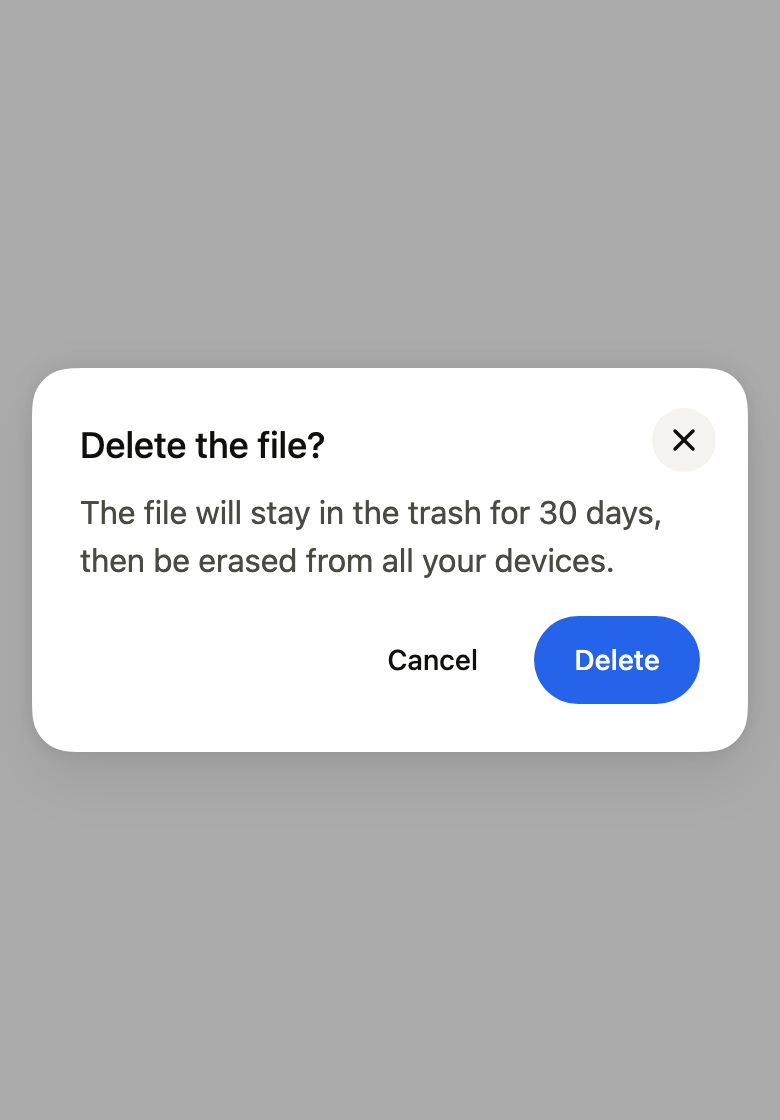
The code the reference images render:
final example = Navigator(
  onGenerateInitialRoutes: (navigator, _) => [
    PageRouteBuilder<void>(
      pageBuilder: (context, _, _) => ColoredBox(
        color: FlScope.of(context).colors.surface,
        child: const SizedBox.expand(),
      ),
    ),
    FlDialogRoute<void>(
      context: context,
      barrierLabel: 'Close',
      builder: (context) => FlDialog(
        title: 'Delete the file?',
        closeLabel: 'Close',
        content: Text(
          'The file will stay in the trash for 30 days, then be erased from all your devices.',
        ),
        actions: [
          FlButton(
            label: 'Cancel',
            variant: FlButtonVariant.ghost,
            size: FlButtonSize.sm,
            onPressed: () => Navigator.pop(context),
          ),
          FlButton(
            label: 'Delete',
            size: FlButtonSize.sm,
            onPressed: () => Navigator.pop(context),
          ),
        ],
      ),
    ),
  ],
);API
showFlDialog: Future<T?><T>({required BuildContext context, required WidgetBuilder builder, bool dismissible, String? barrierLabel, bool useRootNavigator})
FlDialogRoute: class<T> extends RawDialogRoute<T>
FlDialogRoute.new: new({required BuildContext context, required WidgetBuilder builder, bool dismissible, super.barrierLabel, super.settings})
FlDialogRoute.dismissible: get bool
FlDialogRoute.reverseTransitionDuration: get Duration
FlDialogRoute.popDisposition: get RoutePopDisposition
FlDialogRoute.install: void()
FlDialogRoute.dispose: void()
FlDialogRoute.createAnimationController: AnimationController()
FlDialogRoute.buildModalBarrier: Widget()
FlDialogRoute.buildTransitions: Widget(BuildContext context, Animation<double> animation, Animation<double> secondaryAnimation, Widget child)
FlDialogIconTone: enum {neutral, danger, accent, success, warning}
FlDialogIconTone.neutral: static final FlDialogIconTone
FlDialogIconTone.danger: static final FlDialogIconTone
FlDialogIconTone.accent: static final FlDialogIconTone
FlDialogIconTone.success: static final FlDialogIconTone
FlDialogIconTone.warning: static final FlDialogIconTone
FlDialogActionsLayout: enum {end, stacked}
FlDialogActionsLayout.end: static final FlDialogActionsLayout
FlDialogActionsLayout.stacked: static final FlDialogActionsLayout
FlDialog: class extends StatefulWidget
FlDialog.new: const new({super.key, required String title, Widget? content, List<Widget> actions, String? closeLabel, bool alert, Widget? icon, FlDialogIconTone iconTone, FlDialogActionsLayout actionsLayout})
FlDialog.icon: get Widget?
FlDialog.iconTone: get FlDialogIconTone
FlDialog.title: get String
FlDialog.content: get Widget?
FlDialog.actions: get List<Widget>
FlDialog.actionsLayout: get FlDialogActionsLayout
FlDialog.closeLabel: get String?
FlDialog.alert: get bool
FlDialog.createState: State<FlDialog>()Reference renders
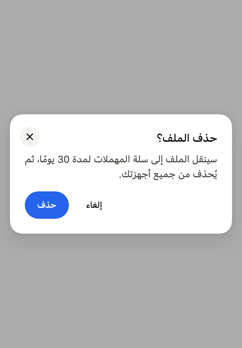
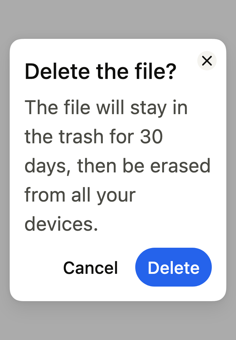
The 16 images published with version 0.2.4, rendered by the shared harness on macOS with Flutter 3.47.7. fliin verify dialog compares your copy to them.
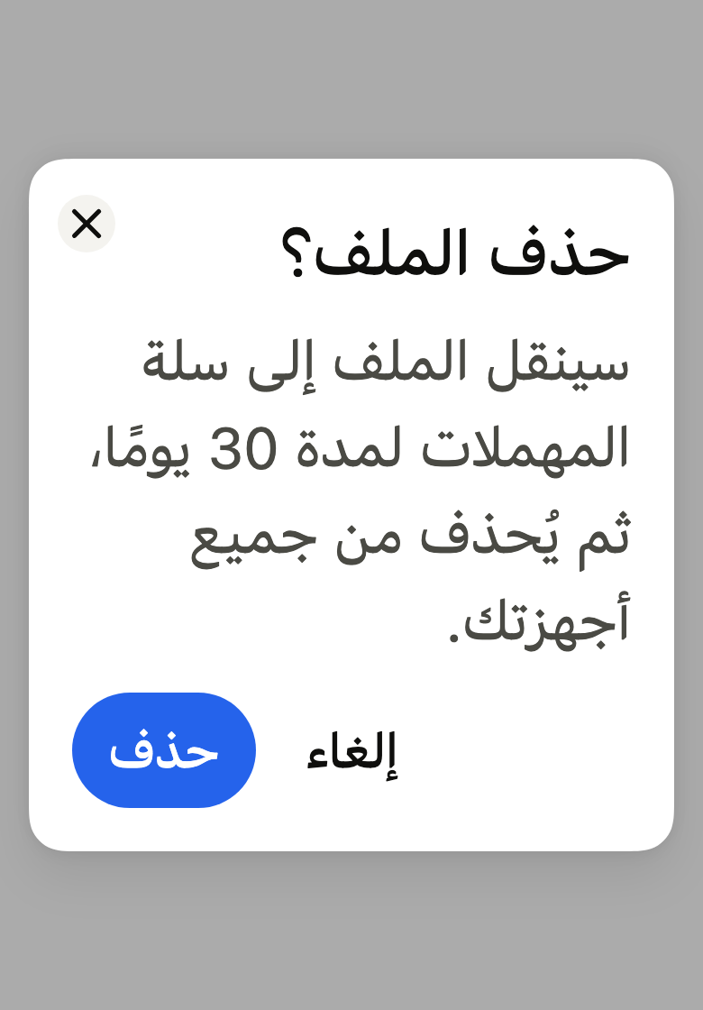
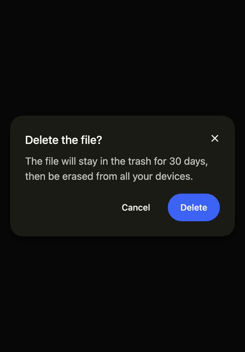
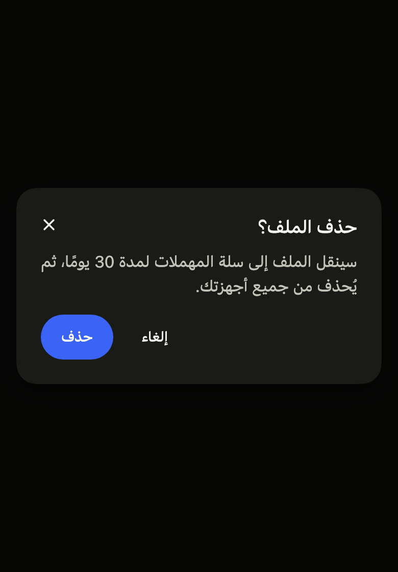
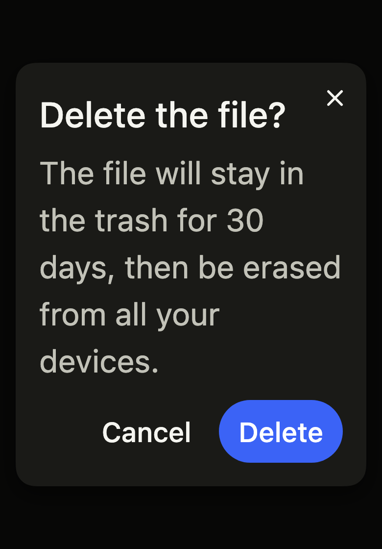
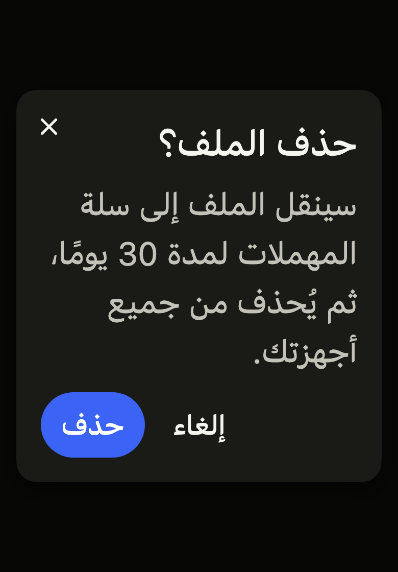
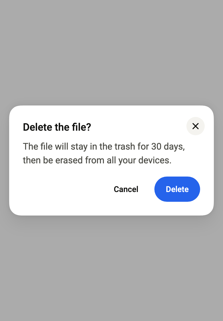
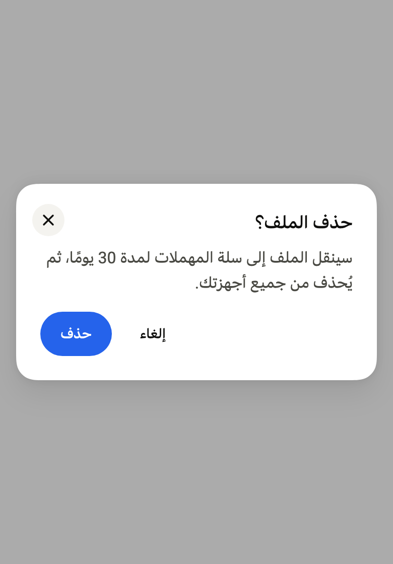
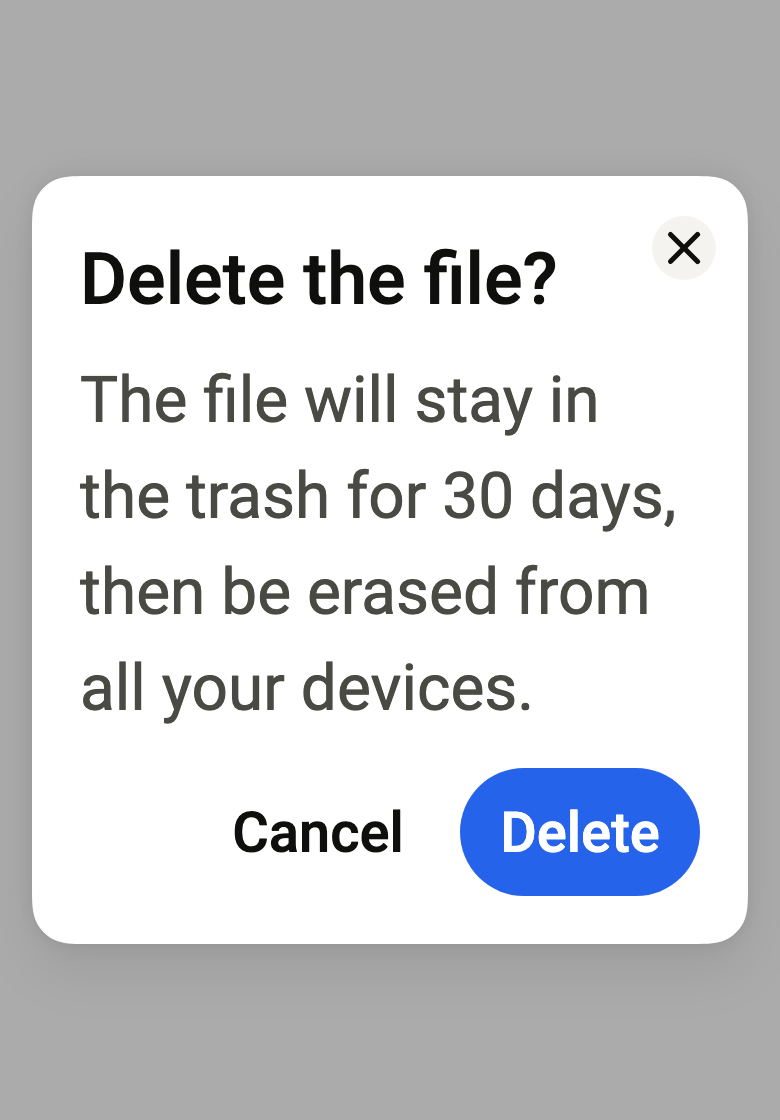
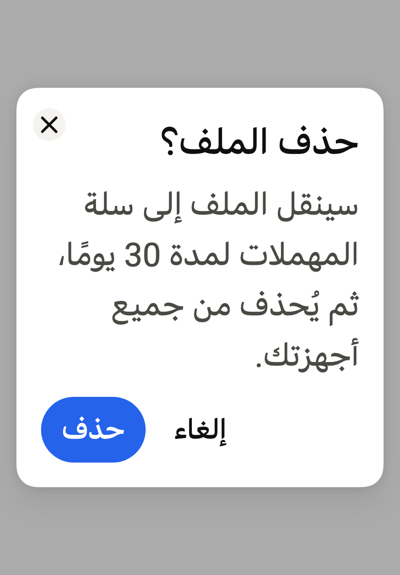
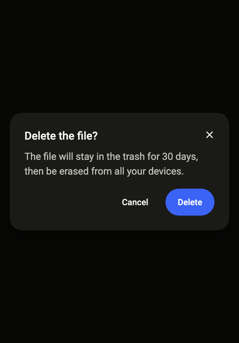
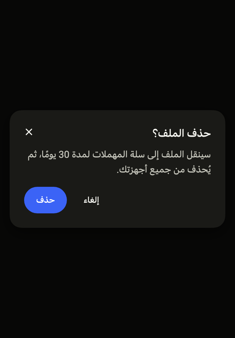
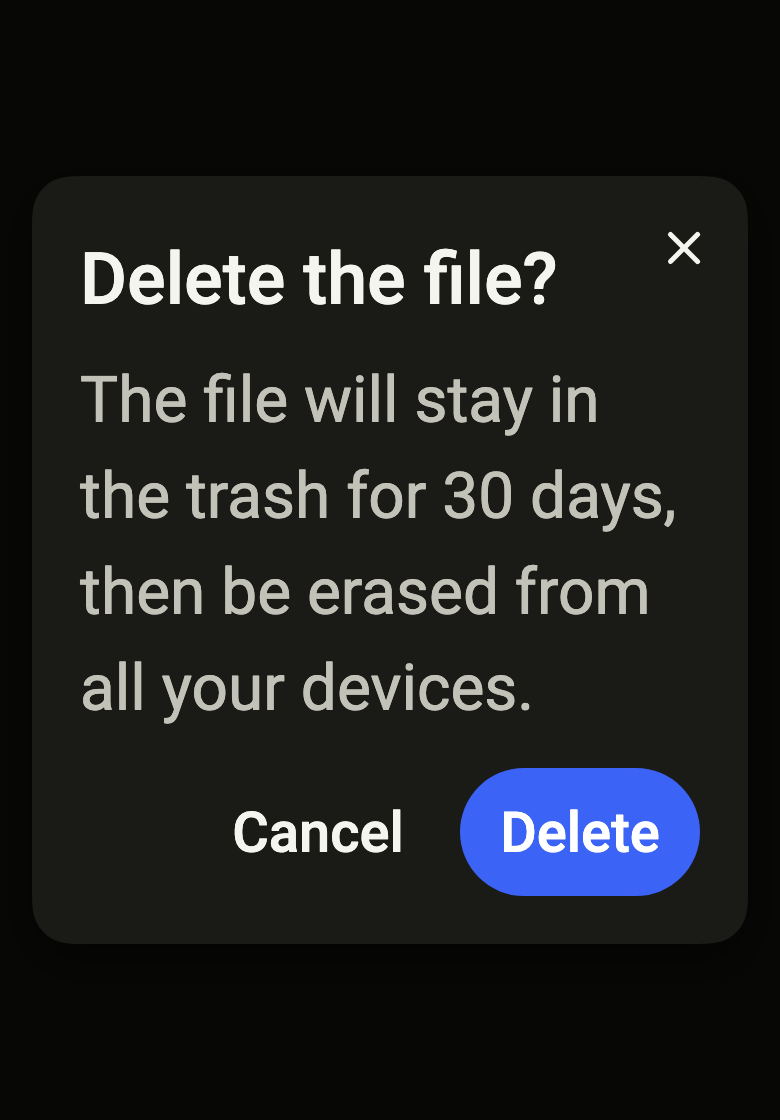
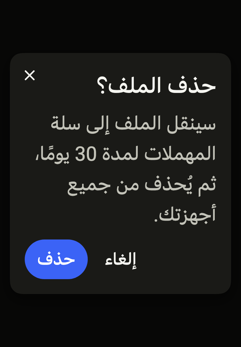
Use it to
- confirm a deletion
- ask for a decision before continuing
- open a modal dialog
- show a blocking alert
- keep focus inside a modal window
- Not for
- anchored content that does not block the page: use a popover (popover)
- a list of actions: use a menu (menu)
- a hint on hover: use a tooltip (tooltip)
- States
Source
The files fliin add dialog copies into your app, before your prefix and imports are applied.
dialog/fl_dialog.dart
// Modified from the Dialog of HeroUI Native 1.0.10, Copyright 2025 NextUI Inc.,
// licensed under Apache 2.0: https://www.apache.org/licenses/LICENSE-2.0
import 'dart:ui' show SemanticsRole;
import 'package:flutter/widgets.dart';
import 'package:fliin_ui/components/close_button/fl_close_button.dart';
import 'package:fliin_ui/core/fliin.dart';
/// Opens [builder], usually a [FlDialog], in a [FlDialogRoute] and returns
/// the value passed to `Navigator.pop`. The root navigator by default: the
/// barrier then covers the tab bars of a nested navigator.
///
/// [dismissible]: Escape, Android back and swiping down close the dialog
/// (true by default, as WAI-ARIA requires, alerts included).
/// [barrierLabel]: the barrier closes it on tap too, and is announced under
/// that name; it requires [dismissible]. A dialog that does not close must
/// have an action.
Future<T?> showFlDialog<T>({
required BuildContext context,
required WidgetBuilder builder,
bool dismissible = true,
String? barrierLabel,
bool useRootNavigator = true,
}) => Navigator.of(
context,
rootNavigator: useRootNavigator,
).push(FlDialogRoute<T>(context: context, builder: builder, dismissible: dismissible, barrierLabel: barrierLabel));
/// A modal route from `widgets`, without material, set up by `FlPopup`: the
/// opaque barrier, which hides the page from screen readers, and the
/// dialog entrance, which settles from 1.04 to 1 as it appears
/// (`motion.duration.short4`) and shrinks on exit (`short3`). Under reduced
/// motion, it fades in place, with the same duration. The route's focus
/// scope keeps Tab inside the dialog and returns the focus to whatever had
/// it when it closes.
class FlDialogRoute<T> extends RawDialogRoute<T> {
/// Reads the motion from [context] at creation; [dismissible] and
/// [barrierLabel] follow the rules of [showFlDialog].
FlDialogRoute({
required BuildContext context,
required WidgetBuilder builder,
this.dismissible = true,
super.barrierLabel,
super.settings,
}) : assert(dismissible || barrierLabel == null, 'a barrier that closes requires a dismissible dialog'),
_motion = FlScope.of(context).motion,
super(
pageBuilder: (context, _, _) => builder(context),
barrierDismissible: dismissible,
barrierColor: null,
transitionDuration: FlScope.of(context).motion.short4,
);
/// Escape, Android back and swiping down close it.
final bool dismissible;
final FlMotionTokens _motion;
/// 1 at rest; swiping down moves it toward 0, and the barrier lightens
/// by as much.
late final AnimationController _presence;
@override
Duration get reverseTransitionDuration => _motion.short3;
@override
RoutePopDisposition get popDisposition => dismissible ? super.popDisposition : RoutePopDisposition.doNotPop;
@override
void install() {
super.install();
_presence = AnimationController(vsync: navigator!, value: 1);
}
@override
void dispose() {
_presence.dispose();
super.dispose();
}
@override
AnimationController createAnimationController() => flPopupController(vsync: navigator!, motion: _motion);
/// The `FlPopup` barrier, which closes on tap only if it has a name;
/// Escape follows [dismissible] through `barrierDismissible`, like back.
@override
Widget buildModalBarrier() => BlockSemantics(
child: FlPopupOverlay(
animation: _Product(animation!, _presence),
onDismiss: barrierLabel == null ? null : () => navigator?.maybePop(),
dismissLabel: barrierLabel,
),
);
@override
Widget buildTransitions(
BuildContext context,
Animation<double> animation,
Animation<double> secondaryAnimation,
Widget child,
) => FlPopupContent(animation: animation, entrance: FlPopupEntrance.dialog, child: child);
}
/// The barrier follows the route's opening and the dialog's swipe.
class _Product extends CompoundAnimation<double> {
_Product(Animation<double> first, Animation<double> next) : super(first: first, next: next);
@override
double get value => first.value * next.value;
}
/// The disc behind an [FlDialog]'s icon.
enum FlDialogIconTone {
/// `control` disc, `onSurfaceMuted` icon.
neutral,
/// `dangerSoft` disc, `onDangerSoft` icon: a destructive confirmation.
danger,
/// `accentSoft` disc, `accent` icon: an invitation or a piece of news.
accent,
/// `successSoft` disc, `onSuccessSoft` icon: a task about to be completed.
success,
/// `warningSoft` disc, `onWarningSoft` icon: changes about to be lost.
warning,
}
/// How an [FlDialog] lays out its actions.
enum FlDialogActionsLayout {
/// On one line at the end, in the order given (the main action last), and
/// stacked when they do not fit: a confirmation.
end,
/// Each one across the panel's width, one under the other, in the order
/// given (the main action first): the welcome
/// or the form of a phone.
stacked,
}
/// The panel of a dialog: `surfaceOverlay`
/// background, `overlay` shadow, continuous corners of `shape.radiusCard`.
/// [title], with a close button named [closeLabel] at the end of its line,
/// then [content], in a single scrolling area, with a scrollbar visible when it scrolls
/// (text at 2.0×, keyboard open), then [actions], fixed at the bottom,
/// aligned to the end and stacked when they do not fit on one line. It
/// stays clear of notches, system bars and the keyboard, at most
/// `size.dialogMaxWidth` wide.
///
/// In a route that closes, swipe it down to close it: released after a tenth of the travel to the bottom of the
/// screen, it closes; before that, it springs back. No swipe under reduced
/// motion.
///
/// It announces itself as a dialog (or an alert with [alert]) named by
/// [title], which carries and names its route.
class FlDialog extends StatefulWidget {
/// Creates a dialog panel. Without [actions], its route must let it close
/// through Escape and back: an assertion checks this in debug.
const FlDialog({
super.key,
required this.title,
this.content,
this.actions = const [],
this.closeLabel,
this.alert = false,
this.icon,
this.iconTone = FlDialogIconTone.neutral,
this.actionsLayout = FlDialogActionsLayout.end,
});
/// An icon above the title, in a disc of `space.xxl + space.sm` (40 with
/// the default tokens), Izydesk's confirmation of a deletion; decorative,
/// never read. When null, none.
final Widget? icon;
/// The disc's colors: neutral by default, `danger` for a deletion,
/// `accent`, `success` or `warning` for the other statuses.
final FlDialogIconTone iconTone;
/// The title at the top of the panel, in medium-weight `textLg`
/// (`Dialog.Title`), which also names the dialog for screen readers.
final String title;
/// The body under the title, in `textBase` and `onSurfaceMuted` by default
/// (`Dialog.Description`), which scrolls with it. When null: the title alone.
final Widget? content;
/// The bottom buttons, outside the scrolling area, usually `sm`
/// `FlButton`s. Empty by default.
final List<Widget> actions;
/// On one line at the end by default, or [FlDialogActionsLayout.stacked]
/// across the panel's width.
final FlDialogActionsLayout actionsLayout;
/// The name of the close button (`Dialog.Close`), placed at the top, at
/// the end of the line; when null, no button. It requires a route that closes.
final String? closeLabel;
/// True: announced as an alert (`alertDialog`), for a message that awaits
/// an answer. False by default: a dialog (`dialog`).
final bool alert;
@override
State<FlDialog> createState() => _FlDialogState();
}
class _FlDialogState extends State<FlDialog> {
final ScrollController _scroll = ScrollController();
final GlobalKey _panel = GlobalKey();
/// The swipe travel: from the top of the panel to the bottom of the screen.
double _travel = 1;
Animation<double>? _entrance;
@override
void didChangeDependencies() {
super.didChangeDependencies();
_entrance?.removeStatusListener(_settled);
_entrance = ModalRoute.of(context)?.animation?..addStatusListener(_settled);
}
/// The entrance scales the panel over the page's paint boundary, which is
/// not repainted: once settled, it repaints once so that `FlPixelSnap`
/// aligns it to the pixels at scale 1, not at 0.96.
void _settled(AnimationStatus status) {
if (status.isCompleted) {
_panel.currentContext?.findRenderObject()?.markNeedsPaint();
}
}
@override
void dispose() {
_entrance?.removeStatusListener(_settled);
_scroll.dispose();
super.dispose();
}
FlDialogRoute<Object?>? get _route => switch (ModalRoute.of(context)) {
final FlDialogRoute<Object?> route => route,
_ => null,
};
void _dragStart(DragStartDetails details) {
final box = _panel.currentContext!.findRenderObject()! as RenderBox;
final top = box.localToGlobal(Offset.zero).dy;
_travel = MediaQuery.sizeOf(context).height - top;
_route!._presence.stop();
}
void _dragUpdate(DragUpdateDetails details) {
final presence = _route!._presence;
presence.value = (presence.value - details.primaryDelta! / _travel).clamp(0.0, 1.0);
}
void _dragEnd(DragEndDetails details) {
final route = _route!;
if (1 - route._presence.value > 0.1) {
route.navigator?.maybePop();
return;
}
route._presence.driveTo(1, FlMotion.of(context).spring(FlSpring.release));
}
@override
Widget build(BuildContext context) {
final route = _route;
assert(
route == null || route.dismissible || widget.actions.isNotEmpty,
'a dialog that closes neither through Escape nor through back must have an action',
);
assert(
route == null || route.dismissible || widget.closeLabel == null,
'a close button requires a dismissible dialog',
);
final theme = FlScope.of(context);
final colors = theme.colors;
final content = widget.content;
final closeLabel = widget.closeLabel;
final swipeable = route != null && route.dismissible && !FlMotion.of(context).reduced;
final radius = theme.shape.radiusCard;
// Izydesk's dialog sits 16 from the screen's edges.
final margin = theme.space.lg;
// Izydesk's dialog: 24 inside, 16 above the actions. The title and its
// body go together, 8 apart, under an icon 12 above them.
final padding = theme.space.xl;
final gap = theme.space.lg;
Widget panel = FlPixelSnap(
key: _panel,
child: FlShadow(
layers: theme.shadows.overlay,
// React Native shadows a view based on its circular corners (FlSurface).
shape: RoundedRectangleBorder(borderRadius: BorderRadius.circular(radius)),
child: DecoratedBox(
decoration: ShapeDecoration(
color: colors.surfaceOverlay,
shape: FlContinuousBorder(radius: radius),
),
child: Padding(
padding: EdgeInsetsDirectional.all(padding),
child: Column(
mainAxisSize: MainAxisSize.min,
crossAxisAlignment: CrossAxisAlignment.stretch,
children: [
Flexible(
child: Stack(
clipBehavior: Clip.none,
children: [
RawScrollbar(
controller: _scroll,
thumbVisibility: true,
thickness: theme.size.indicatorStroke,
radius: Radius.circular(theme.size.indicatorStroke),
thumbColor: colors.onSurfaceMuted,
child: SingleChildScrollView(
controller: _scroll,
child: Column(
crossAxisAlignment: CrossAxisAlignment.stretch,
children: [
if (widget.icon case final icon?)
Padding(
padding: EdgeInsetsDirectional.only(bottom: theme.space.md),
child: Align(
alignment: AlignmentDirectional.centerStart,
child: ExcludeSemantics(
child: SizedBox.square(
dimension: theme.space.xxl + theme.space.sm,
child: DecoratedBox(
decoration: ShapeDecoration(
// A disc by default, square under a
// square preset, like an avatar.
shape: FlContinuousBorder(radius: theme.shape.radiusButtonLarge),
color: switch (widget.iconTone) {
FlDialogIconTone.neutral => colors.control,
FlDialogIconTone.danger => colors.dangerSoft,
FlDialogIconTone.accent => colors.accentSoft,
FlDialogIconTone.success => colors.successSoft,
FlDialogIconTone.warning => colors.warningSoft,
},
),
child: Center(
child: IconTheme.merge(
data: IconThemeData(
size: theme.space.lg + theme.space.xs,
color: switch (widget.iconTone) {
FlDialogIconTone.neutral => colors.onSurfaceMuted,
FlDialogIconTone.danger => colors.onDangerSoft,
FlDialogIconTone.accent => colors.accent,
FlDialogIconTone.success => colors.onSuccessSoft,
FlDialogIconTone.warning => colors.onWarningSoft,
},
),
child: icon,
),
),
),
),
),
),
),
ExcludeSemantics(
child: Padding(
// The title stops before the close button,
// `space.md` away.
padding: EdgeInsetsDirectional.only(
end: closeLabel == null
? 0
: theme.size.closeButton + theme.space.md - theme.space.sm,
),
child: _text(
context,
FlTextRole.textLg,
color: colors.onSurface,
weight: theme.tokens.typography.weight.medium,
heading: true,
child: Text(
widget.title,
strutStyle: theme.typography.strut(
FlTextRole.textLg,
inheritedFamily: DefaultTextStyle.of(context).style.fontFamily,
heading: true,
),
),
),
),
),
if (content != null)
Padding(
padding: EdgeInsetsDirectional.only(top: theme.space.sm),
child: _text(
context,
FlTextRole.textBase,
color: colors.onSurfaceMuted,
child: content,
),
),
],
),
),
),
// On the title's line, outside the scrolling view (which
// would clip its touch target), drawn into the corner
// as in Izydesk's dialog.
if (closeLabel != null)
PositionedDirectional(
top: -theme.space.xs,
end: -theme.space.sm,
child: FlCloseButton(label: closeLabel, onPressed: () => Navigator.maybePop(context)),
),
],
),
),
if (widget.actions.isNotEmpty)
Padding(
padding: EdgeInsetsDirectional.only(top: gap),
child: switch (widget.actionsLayout) {
FlDialogActionsLayout.end => OverflowBar(
alignment: MainAxisAlignment.end,
overflowAlignment: OverflowBarAlignment.end,
spacing: theme.space.sm,
overflowSpacing: theme.space.sm,
children: widget.actions,
),
FlDialogActionsLayout.stacked => Column(
mainAxisSize: MainAxisSize.min,
crossAxisAlignment: CrossAxisAlignment.stretch,
spacing: theme.space.sm,
children: widget.actions,
),
},
),
],
),
),
),
),
);
if (route != null) {
panel = AnimatedBuilder(
animation: route._presence,
builder: (context, child) {
final away = 1 - route._presence.value;
return Transform.translate(
offset: Offset(0, away * _travel),
child: Transform.scale(scale: 1 - 0.05 * away, child: child),
);
},
child: GestureDetector(
excludeFromSemantics: true,
onVerticalDragStart: swipeable ? _dragStart : null,
onVerticalDragUpdate: swipeable ? _dragUpdate : null,
onVerticalDragEnd: swipeable ? _dragEnd : null,
child: panel,
),
);
}
return LayoutBuilder(
builder: (context, constraints) => Stack(
children: [
Positioned.fromRect(
rect: flAnchorBounds(
overlay: constraints.biggest,
padding: MediaQuery.paddingOf(context),
viewInsets: MediaQuery.viewInsetsOf(context),
margin: margin,
),
child: Center(
child: ConstrainedBox(
constraints: BoxConstraints(maxWidth: theme.size.dialogMaxWidth),
child: Semantics(
container: true,
explicitChildNodes: true,
scopesRoute: true,
namesRoute: true,
role: widget.alert ? SemanticsRole.alertDialog : SemanticsRole.dialog,
label: widget.title,
child: panel,
),
),
),
),
],
),
);
}
}
/// [child] in the role [role]: the role's line height forced on the system
/// font (see FlText), as a minimum for a named font.
Widget _text(
BuildContext context,
FlTextRole role, {
required Color color,
FontWeight? weight,
bool? heading,
required Widget child,
}) {
final scale = FlScope.of(context).typography;
final metrics = scale.style(role);
final style = scale.resolve(role, heading: heading).copyWith(color: color, fontWeight: weight);
return DefaultTextStyle.merge(
style: scale.familyOf(role, heading: heading) == null
? style.copyWith(height: metrics.lineHeight / metrics.size, leadingDistribution: TextLeadingDistribution.even)
: style,
child: child,
);
}