Components / forms
Checkbox
Lets people check one option, or several in a list. A box with a check drawn stroke by stroke, mixed and invalid states, visible keyboard focus.
Import
In a Flutter app where fliin init has run:
Examples
Example
Checkboxes with a label and a description, in a card: FlControlField with the checkbox indicator makes the whole row touchable.

import 'package:your_app/ui/fliin/components/control_field/fl_control_field.dart';
import 'package:your_app/ui/fliin/components/separator/fl_separator.dart';
import 'package:your_app/ui/fliin/components/surface/fl_surface.dart';
import 'package:your_app/ui/fliin/core/fliin.dart';
import 'package:flutter/widgets.dart';

class CheckboxExample extends StatefulWidget {
  const CheckboxExample({super.key});

  @override
  State<CheckboxExample> createState() => _CheckboxExampleState();
}

class _CheckboxExampleState extends State<CheckboxExample> {
  final _checked = {'newsletter': true, 'marketing': false, 'terms': false};

  @override
  Widget build(BuildContext context) {
    return FlSurface(
      child: Column(
        mainAxisSize: MainAxisSize.min,
        spacing: FlScope.of(context).space.md,
        children: [
          for (final (i, (id, label, description)) in [
            (
              'newsletter',
              'Subscribe to newsletter',
              'Get weekly updates about new features and tips',
            ),
            (
              'marketing',
              'Marketing communications',
              'Receive promotional emails and special offers',
            ),
            (
              'terms',
              'Accept terms and conditions',
              'Agree to our Terms of Service and Privacy Policy',
            ),
          ].indexed) ...[
            if (i > 0) const FlSeparator(),
            FlControlField(
              key: ValueKey(id),
              value: _checked[id]!,
              onChanged: (value) => setState(() => _checked[id] = value),
              indicator: FlControlFieldIndicator.checkbox,
              variant: FlControlFieldVariant.secondary,
              label: label,
              description: description,
            ),
          ],
        ],
      ),
    );
  }
}Enabled
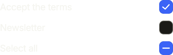
Checked, unchecked and mixed. With tristate, value may be null: the mixed state of a "select all" whose items are only partly checked.
import 'package:your_app/ui/fliin/components/checkbox/fl_checkbox.dart';
import 'package:your_app/ui/fliin/components/text/fl_text.dart';
import 'package:your_app/ui/fliin/core/fliin.dart';
import 'package:flutter/widgets.dart';

class CheckboxEnabledExample extends StatefulWidget {
  const CheckboxEnabledExample({super.key});

  @override
  State<CheckboxEnabledExample> createState() => _CheckboxEnabledExampleState();
}

class _CheckboxEnabledExampleState extends State<CheckboxEnabledExample> {
  final List<bool?> _values = [true, false, null];

  @override
  Widget build(BuildContext context) {
    final space = FlScope.of(context).space;
    return Column(
      mainAxisSize: MainAxisSize.min,
      crossAxisAlignment: CrossAxisAlignment.stretch,
      spacing: space.md,
      children: [
        for (final (i, label) in [
          'Accept the terms',
          'Newsletter',
          'Select all',
        ].indexed)
          Row(
            spacing: space.md,
            children: [
              Expanded(child: FlText(label)),
              FlCheckbox(
                value: _values[i],
                tristate: true,
                label: label,
                onChanged: (value) => setState(() => _values[i] = value),
              ),
            ],
          ),
      ],
    );
  }
}Checked
A checked box: filled with the accent, a tick inside.

import 'package:your_app/ui/fliin/components/checkbox/fl_checkbox.dart';
import 'package:your_app/ui/fliin/components/text/fl_text.dart';
import 'package:your_app/ui/fliin/core/fliin.dart';
import 'package:flutter/widgets.dart';

class CheckboxCheckedExample extends StatefulWidget {
  const CheckboxCheckedExample({super.key});

  @override
  State<CheckboxCheckedExample> createState() => _CheckboxCheckedExampleState();
}

class _CheckboxCheckedExampleState extends State<CheckboxCheckedExample> {
  bool? _value = true;

  @override
  Widget build(BuildContext context) {
    return Row(
      spacing: FlScope.of(context).space.md,
      children: [
        const Expanded(child: FlText('Accept the terms')),
        FlCheckbox(
          value: _value,
          tristate: true,
          label: 'Accept the terms',
          onChanged: (value) => setState(() => _value = value),
        ),
      ],
    );
  }
}Unchecked
An unchecked box: an empty square with a border.

import 'package:your_app/ui/fliin/components/checkbox/fl_checkbox.dart';
import 'package:your_app/ui/fliin/components/text/fl_text.dart';
import 'package:your_app/ui/fliin/core/fliin.dart';
import 'package:flutter/widgets.dart';

class CheckboxUncheckedExample extends StatefulWidget {
  const CheckboxUncheckedExample({super.key});

  @override
  State<CheckboxUncheckedExample> createState() =>
      _CheckboxUncheckedExampleState();
}

class _CheckboxUncheckedExampleState extends State<CheckboxUncheckedExample> {
  bool? _value = false;

  @override
  Widget build(BuildContext context) {
    return Row(
      spacing: FlScope.of(context).space.md,
      children: [
        const Expanded(child: FlText('Accept the terms')),
        FlCheckbox(
          value: _value,
          tristate: true,
          label: 'Accept the terms',
          onChanged: (value) => setState(() => _value = value),
        ),
      ],
    );
  }
}Mixed
The mixed state, value: null with tristate: a dash, for a parent whose items are only partly checked. Touching it checks it.

import 'package:your_app/ui/fliin/components/checkbox/fl_checkbox.dart';
import 'package:your_app/ui/fliin/components/text/fl_text.dart';
import 'package:your_app/ui/fliin/core/fliin.dart';
import 'package:flutter/widgets.dart';

class CheckboxMixedExample extends StatefulWidget {
  const CheckboxMixedExample({super.key});

  @override
  State<CheckboxMixedExample> createState() => _CheckboxMixedExampleState();
}

class _CheckboxMixedExampleState extends State<CheckboxMixedExample> {
  bool? _value;

  @override
  Widget build(BuildContext context) {
    return Row(
      spacing: FlScope.of(context).space.md,
      children: [
        const Expanded(child: FlText('Select all')),
        FlCheckbox(
          value: _value,
          tristate: true,
          label: 'Select all',
          onChanged: (value) => setState(() => _value = value),
        ),
      ],
    );
  }
}Disabled
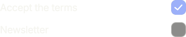
onChanged: null disables a checkbox: it fades, keeps its value, and the screen reader announces it as unavailable.
import 'package:your_app/ui/fliin/components/checkbox/fl_checkbox.dart';
import 'package:your_app/ui/fliin/components/text/fl_text.dart';
import 'package:your_app/ui/fliin/core/fliin.dart';
import 'package:flutter/widgets.dart';

class CheckboxDisabledExample extends StatelessWidget {
  const CheckboxDisabledExample({super.key});

  @override
  Widget build(BuildContext context) {
    final space = FlScope.of(context).space;
    return Column(
      mainAxisSize: MainAxisSize.min,
      crossAxisAlignment: CrossAxisAlignment.stretch,
      spacing: space.md,
      children: [
        Row(
          spacing: space.md,
          children: const [
            Expanded(child: FlText('Accept the terms')),
            FlCheckbox(
              value: true,
              tristate: true,
              label: 'Accept the terms',
              onChanged: null,
            ),
          ],
        ),
        Row(
          spacing: space.md,
          children: const [
            Expanded(child: FlText('Newsletter')),
            FlCheckbox(
              value: false,
              tristate: true,
              label: 'Newsletter',
              onChanged: null,
            ),
          ],
        ),
      ],
    );
  }
}Shapes
shape turns the box into a disc, a fully rounded checkbox: a task to tick off rather than an option to choose.

import 'package:your_app/ui/fliin/components/checkbox/fl_checkbox.dart';
import 'package:your_app/ui/fliin/core/fliin.dart';
import 'package:flutter/widgets.dart';

class CheckboxShapesExample extends StatefulWidget {
  const CheckboxShapesExample({super.key});

  @override
  State<CheckboxShapesExample> createState() => _CheckboxShapesExampleState();
}

class _CheckboxShapesExampleState extends State<CheckboxShapesExample> {
  final _checked = {FlCheckboxShape.square: true, FlCheckboxShape.circle: true};

  @override
  Widget build(BuildContext context) {
    return Row(
      mainAxisSize: MainAxisSize.min,
      spacing: FlScope.of(context).space.lg,
      children: [
        for (final shape in FlCheckboxShape.values) ...[
          FlCheckbox(
            key: ValueKey(shape),
            value: _checked[shape]!,
            label: shape.name,
            shape: shape,
            onChanged: (value) => setState(() => _checked[shape] = value!),
          ),
          FlCheckbox(
            value: false,
            label: '${shape.name}, empty',
            shape: shape,
            onChanged: (_) {},
          ),
        ],
      ],
    );
  }
}With label
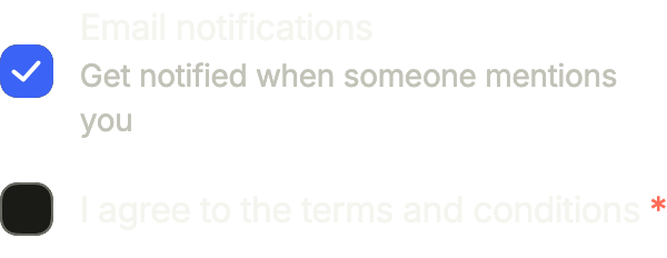
A checkbox with its label and a description under it, straight on the page: FlControlField with framed: false. The whole row toggles the box.
import 'package:your_app/ui/fliin/components/control_field/fl_control_field.dart';
import 'package:your_app/ui/fliin/core/fliin.dart';
import 'package:flutter/widgets.dart';

class CheckboxWithLabelExample extends StatefulWidget {
  const CheckboxWithLabelExample({super.key});

  @override
  State<CheckboxWithLabelExample> createState() =>
      _CheckboxWithLabelExampleState();
}

class _CheckboxWithLabelExampleState extends State<CheckboxWithLabelExample> {
  var _notifications = true;
  var _terms = false;

  @override
  Widget build(BuildContext context) {
    return Column(
      mainAxisSize: MainAxisSize.min,
      crossAxisAlignment: CrossAxisAlignment.stretch,
      spacing: FlScope.of(context).space.sm,
      children: [
        FlControlField(
          value: _notifications,
          onChanged: (value) => setState(() => _notifications = value),
          indicator: FlControlFieldIndicator.checkbox,
          framed: false,
          label: 'Email notifications',
          description: 'Get notified when someone mentions you',
        ),
        FlControlField(
          value: _terms,
          onChanged: (value) => setState(() => _terms = value),
          indicator: FlControlFieldIndicator.checkbox,
          framed: false,
          required: true,
          label: 'I agree to the terms and conditions',
        ),
      ],
    );
  }
}Invalid
A required box left empty after a submit: invalid outlines it in danger and error says why, under the label.

import 'package:your_app/ui/fliin/components/control_field/fl_control_field.dart';
import 'package:flutter/widgets.dart';

class CheckboxInvalidExample extends StatefulWidget {
  const CheckboxInvalidExample({super.key});

  @override
  State<CheckboxInvalidExample> createState() => _CheckboxInvalidExampleState();
}

class _CheckboxInvalidExampleState extends State<CheckboxInvalidExample> {
  var _accepted = false;

  @override
  Widget build(BuildContext context) {
    return FlControlField(
      value: _accepted,
      onChanged: (value) => setState(() => _accepted = value),
      indicator: FlControlFieldIndicator.checkbox,
      framed: false,
      required: true,
      invalid: !_accepted,
      label: 'I agree to the terms and conditions',
      error: 'You must accept the terms to continue',
    );
  }
}Variants
primary, a white box lifted by a shadow, on the page or a raised card; FlCheckboxVariant.secondary, filled with the control grey, in a white sheet or dialog.

import 'package:your_app/ui/fliin/components/checkbox/fl_checkbox.dart';
import 'package:your_app/ui/fliin/core/fliin.dart';
import 'package:flutter/widgets.dart';

class CheckboxVariantsExample extends StatelessWidget {
  const CheckboxVariantsExample({super.key});

  @override
  Widget build(BuildContext context) {
    return Row(
      mainAxisSize: MainAxisSize.min,
      spacing: FlScope.of(context).space.lg,
      children: [
        for (final variant in FlCheckboxVariant.values)
          for (final value in [false, true])
            FlCheckbox(
              value: value,
              label: '${variant.name}, ${value ? 'checked' : 'empty'}',
              variant: variant,
              onChanged: (_) {},
            ),
      ],
    );
  }
}Usage
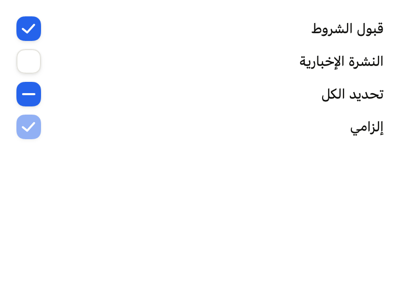
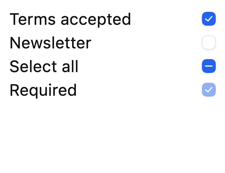
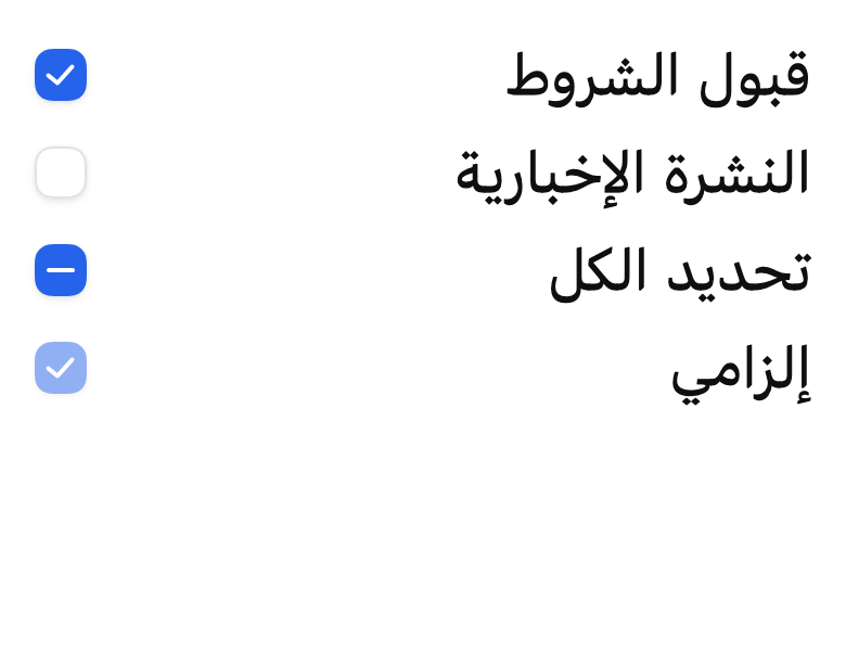
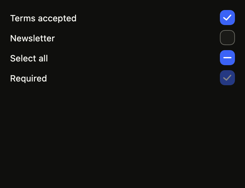
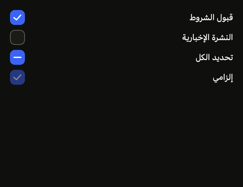
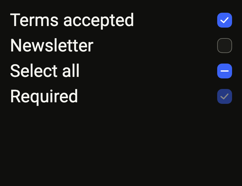
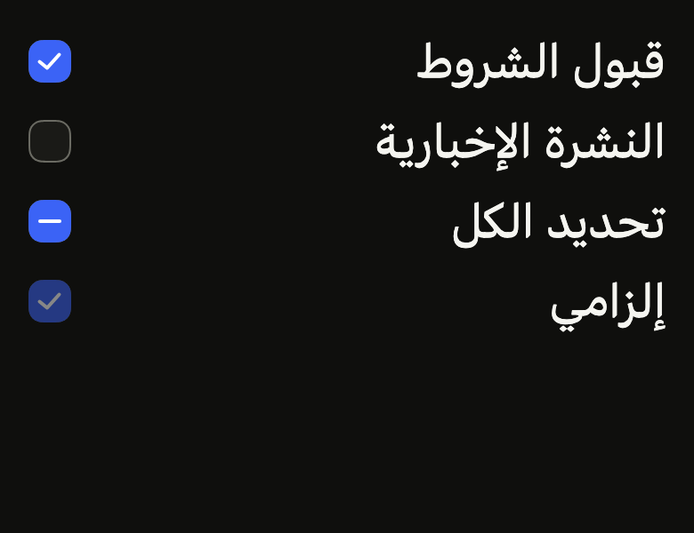
The code the reference images render:
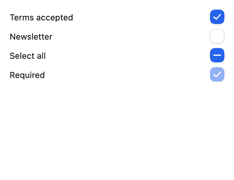
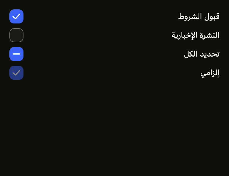
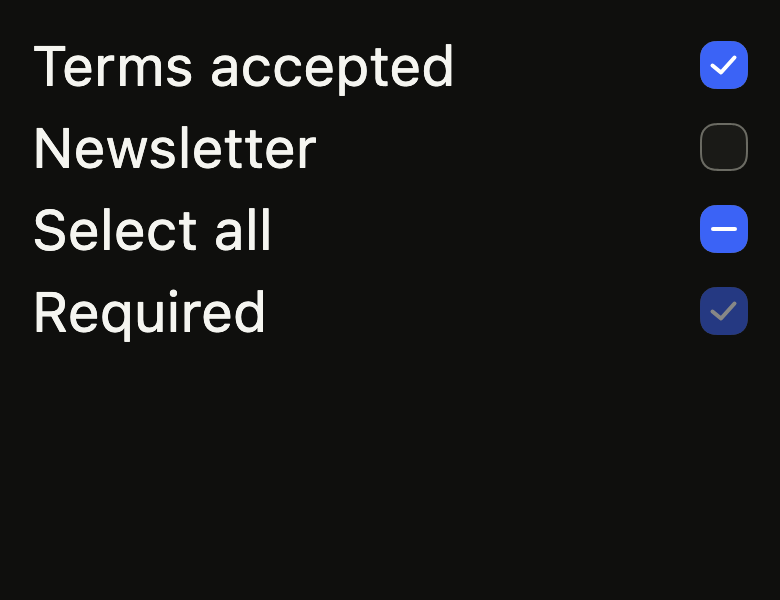
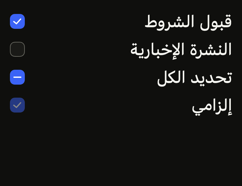
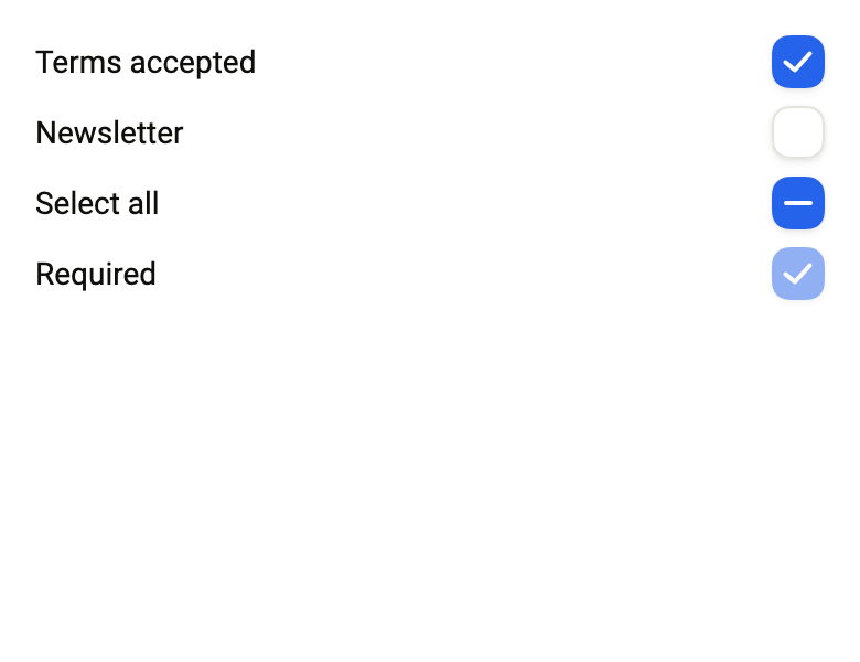
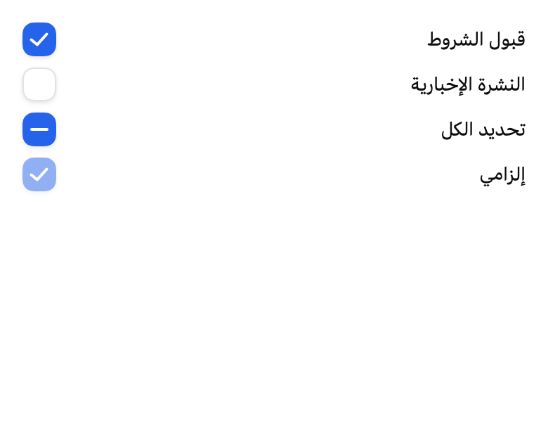
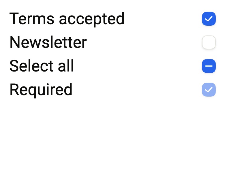
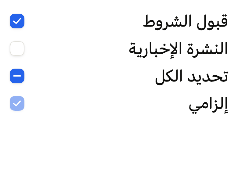
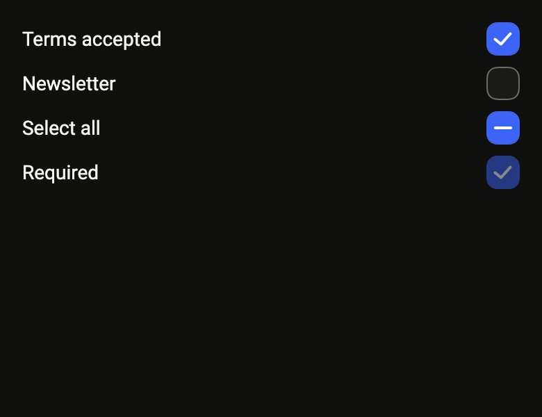
ColoredBox(color: FlScope.of(context).colors.surface, child: Padding(padding: EdgeInsetsDirectional.all(FlScope.of(context).space.lg), child: Column(crossAxisAlignment: CrossAxisAlignment.stretch, spacing: FlScope.of(context).space.sm, children: [for (final (fr, ar, on, enabled) in [('Terms accepted', 'قبول الشروط', true, true), ('Newsletter', 'النشرة الإخبارية', false, true), ('Select all', 'تحديد الكل', null, true), ('Required', 'إلزامي', true, false)]) Row(spacing: FlScope.of(context).space.md, children: [Expanded(child: Textfr, style: TextStyle(color: FlScope.of(context).colors.onSurface))), FlCheckbox(value: on, tristate: true, label: fr, onChanged: enabled ? (_) {} : null)])])))API
FlCheckboxVariant: enum {primary, secondary}
FlCheckboxVariant.primary: static final FlCheckboxVariant
FlCheckboxVariant.secondary: static final FlCheckboxVariant
FlCheckboxShape: enum {square, circle}
FlCheckboxShape.square: static final FlCheckboxShape
FlCheckboxShape.circle: static final FlCheckboxShape
FlCheckbox: class extends StatefulWidget
FlCheckbox.new: const new({super.key, required bool? value, required ValueChanged<bool?>? onChanged, required String label, bool tristate, FlCheckboxVariant variant, FlCheckboxShape shape, bool? invalid, bool autofocus, FocusNode? focusNode, String? hint, WidgetStatesController? statesController})
FlCheckbox.value: get bool?
FlCheckbox.onChanged: get ValueChanged<bool?>?
FlCheckbox.label: get String
FlCheckbox.tristate: get bool
FlCheckbox.variant: get FlCheckboxVariant
FlCheckbox.shape: get FlCheckboxShape
FlCheckbox.invalid: get bool?
FlCheckbox.autofocus: get bool
FlCheckbox.focusNode: get FocusNode?
FlCheckbox.hint: get String?
FlCheckbox.statesController: get WidgetStatesController?
FlCheckbox.createState: State<FlCheckbox>()Reference renders
The 16 images published with version 0.2.3, rendered by the shared harness on macOS with Flutter 3.47.7. fliin verify checkbox compares your copy to them.
Use it to
- select several items in a list
- select all with a partial state
- opt into an optional form field
- add a checkbox
- accept the terms before sending a form
- Not for
- a setting that takes effect immediately: use a switch (switch)
- a single choice among several: use radio buttons (radio)
- a form that requires at least one checked box: use a checkbox group (checkbox-group)
- States
Source
The files fliin add checkbox copies into your app, before your prefix and imports are applied.
checkbox/fl_checkbox.dart
// Modified from the Checkbox of HeroUI Native 1.0.10, Copyright 2025 NextUI
// Inc., licensed under Apache 2.0: https://www.apache.org/licenses/LICENSE-2.0
import 'dart:math' as math;
import 'dart:ui' show PathMetric;

import 'package:flutter/widgets.dart';
import 'package:fliin_ui/core/fliin.dart';

// The indicator enters shifted and scaled down. The check mark is the
// polyline 1 9 7 14 15 4 of a 17 by 18 view box, drawn 10 wide in a 16 box,
// carried over to an 18 square: a 2 stroke for the check and the mixed dash.
const double _indicatorShift = -4;
const double _indicatorScale = 0.8;
const double _glyph = 18;
const double _checkStroke = 2;
const double _dashStroke = 2;

/// The emphasis of a [FlCheckbox].
enum FlCheckboxVariant {
  /// `field` background and `field` shadow: a box placed on the page.
  primary,

  /// `control` background, no shadow: a box placed on a surface.
  secondary,
}

/// The outline of an [FlCheckbox].
enum FlCheckboxShape {
  /// A square with `shape.radiusLg` corners: a checkbox.
  square,

  /// A disc: a task to tick off, Izydesk's task row.
  circle,
}

/// A checkbox: while empty, a `field` box lifted by the
/// `field` shadow with a hairline `border` edge (`fieldBorder` when
/// hovered, or when the theme has no `field` shadow).
/// Checked, a `selected` fill grows in and the `onSelected` check draws
/// stroke by stroke. With [tristate], a null [value] is the mixed state (a
/// partial selection), drawn as a dash, and a tap goes from checked to
/// mixed, then to unchecked. Invalid, the box is outlined in `danger` and
/// fills with `danger`. Hovered or pressed, it steps to `controlPressed`.
class FlCheckbox extends StatefulWidget {
  /// Creates a two-state box, or a three-state one with [tristate]; a null
  /// [value] requires [tristate].
  const FlCheckbox({
    super.key,
    required this.value,
    required this.onChanged,
    required this.label,
    this.tristate = false,
    this.variant = FlCheckboxVariant.primary,
    this.shape = FlCheckboxShape.square,
    this.invalid,
    this.autofocus = false,
    this.focusNode,
    this.hint,
    this.statesController,
  }) : assert(tristate || value != null, 'value can be null only when tristate is true');

  /// Checked (true), unchecked (false) or mixed (null, only with
  /// [tristate]). The parent holds it: the box does not change by itself.
  final bool? value;

  /// Receives the next value on tap; the parent passes it back in [value].
  /// When null, or under a disabled `FlFieldScope`: the box goes to
  /// `size.disabledOpacity` and announces itself disabled.
  final ValueChanged<bool?>? onChanged;

  /// The name of the box, read by the screen reader. It is not displayed:
  /// the neighboring visible text is up to the caller.
  final String label;

  /// True: the box accepts the mixed state (null) and cycles through it on
  /// tap. False by default.
  final bool tristate;

  /// The background of the unchecked box; `primary` by default.
  final FlCheckboxVariant variant;

  /// A square by default; a disc for a task to tick off.
  final FlCheckboxShape shape;

  /// True: the value is rejected, the box goes to `danger`. When null, the
  /// state of the enclosing `FlFieldScope`, otherwise false.
  final bool? invalid;

  /// True: the box takes the focus when it appears, if nothing else in its
  /// scope already has it.
  final bool autofocus;

  /// The box's focus node, so that a form can focus it (the first rejected
  /// field); when null, the box holds its own. A provided node stays with
  /// the caller, who disposes of it.
  final FocusNode? focusNode;

  /// Read as a hint by the screen reader, after the name and the state: the
  /// error of a form that rejects the unchecked box. When null, no hint.
  final String? hint;

  /// A `pressed` state set here shrinks the box like a finger resting on
  /// it: a field (`control-field`) presses it when its row is touched.
  final WidgetStatesController? statesController;

  @override
  State<FlCheckbox> createState() => _FlCheckboxState();
}

class _FlCheckboxState extends State<FlCheckbox> with TickerProviderStateMixin, ToggleableStateMixin {
  late final AnimationController _enter = AnimationController(vsync: this, value: _target(widget.value));
  late final AnimationController _corner = AnimationController(vsync: this, value: _target(widget.value));
  late final AnimationController _draw = AnimationController(vsync: this, value: _target(widget.value));
  late final AnimationController _press = AnimationController(vsync: this);
  bool _pressed = false;
  FlFieldScope? _scope;
  late FlMotion _motion;

  static double _target(bool? value) => value == false ? 0 : 1;

  @override
  ValueChanged<bool?>? get onChanged => (_scope?.disabled ?? false) ? null : widget.onChanged;

  @override
  bool get tristate => widget.tristate;

  @override
  bool? get value => widget.value;

  @override
  void initState() {
    super.initState();
    widget.statesController?.addListener(_rebuild);
  }

  @override
  void didChangeDependencies() {
    super.didChangeDependencies();
    _motion = FlMotion.of(context);
    _scope = FlFieldScope.maybeOf(context);
    if (_motion.reduced) _press.value = 0;
  }

  @override
  void didUpdateWidget(FlCheckbox oldWidget) {
    super.didUpdateWidget(oldWidget);
    if (oldWidget.statesController != widget.statesController) {
      oldWidget.statesController?.removeListener(_rebuild);
      widget.statesController?.addListener(_rebuild);
    }
    if (_target(oldWidget.value) != _target(widget.value)) {
      _animate(_target(widget.value));
    }
  }

  void _rebuild() => setState(() {});

  /// `useCheckboxIndicatorAnimation`: the background enters over `short2`
  /// (opacity, offset, scale) and its corners close over `short1`, along
  /// `easeInOutQuad`, the default curve of `withTiming`. The check mark is
  /// drawn `short2` later, over `short3` along `easeOut`, and fades out
  /// over `short3`. Under reduced motion, only a fade of `short3`.
  void _animate(double target) {
    final t = _motion.tokens;
    if (_motion.reduced) {
      _corner.value = target;
      _draw.value = target;
      _enter.animateTo(target, duration: t.short3);
      return;
    }
    _enter.animateTo(target, duration: t.short2, curve: t.easeInOutQuad);
    _corner.animateTo(target, duration: t.short1, curve: t.easeInOutQuad);
    if (target == 1) {
      final total = t.short2 + t.short3;
      _draw.animateTo(
        1,
        duration: total,
        curve: Interval(t.short2.inMicroseconds / total.inMicroseconds, 1, curve: t.easeOut),
      );
    } else {
      _draw.animateTo(0, duration: t.short3, curve: t.easeInOutQuad);
    }
  }

  void _follow(bool pressed) {
    if (pressed == _pressed) return;
    _pressed = pressed;
    if (_motion.reduced) return;
    _press.animateTo(pressed ? 1 : 0, duration: _motion.tokens.short3, curve: _motion.tokens.easeInOutQuad);
  }

  @override
  void dispose() {
    widget.statesController?.removeListener(_rebuild);
    _press.dispose();
    _draw.dispose();
    _corner.dispose();
    _enter.dispose();
    super.dispose();
  }

  /// The `selected` (or `danger`) fill that enters on selection, and its mark.
  Widget _indicator(FlTheme theme, {required bool invalid, required double radius}) {
    final enter = _enter.value;
    final reduced = _motion.reduced;
    return Opacity(
      opacity: enter,
      child: Transform.translate(
        offset: Offset(reduced ? 0 : _indicatorShift * (1 - enter), 0),
        child: Transform.scale(
          scale: reduced ? 1 : _indicatorScale + (1 - _indicatorScale) * enter,
          child: DecoratedBox(
            decoration: ShapeDecoration(
              color: invalid ? theme.colors.danger : theme.colors.selected,
              shape: RoundedRectangleBorder(borderRadius: BorderRadius.circular(radius * (1 - _corner.value))),
            ),
            child: Center(
              child: CustomPaint(
                size: const Size.square(_glyph),
                painter: _MarkPainter(
                  mark: widget.value == null ? _Mark.dash : _Mark.check,
                  progress: _draw.value,
                  color: invalid ? theme.colors.onDanger : theme.colors.onSelected,
                ),
              ),
            ),
          ),
        ),
      ),
    );
  }

  /// `.checkbox__root`: the box, its shadow, its `fieldBorder` outline that
  /// the indicator covers as it enters (a chosen fill has no border), its
  /// invalid border laid over the content like a layer's, and the indicator
  /// clipped to its shape.
  double _radius(FlTheme theme) => switch (widget.shape) {
    FlCheckboxShape.square => theme.shape.radiusLg,
    // A disc by default, square under a square preset, like an avatar.
    FlCheckboxShape.circle => math.min(theme.shape.radiusButtonLarge, theme.size.toggle / 2),
  };

  Widget _box(FlTheme theme, {required bool invalid, required bool hovered}) {
    final colors = theme.colors;
    final radius = _radius(theme);
    final shape = FlContinuousBorder(radius: radius);
    final primary = widget.variant == FlCheckboxVariant.primary;
    // Izydesk's state matrix: hovered or pressed, the box steps to a grey.
    final fill = hovered ? colors.controlPressed : (primary ? colors.field : colors.control);
    final border = invalid ? theme.size.border : 0.0;
    // Where the `field` shadow lifts the box, its edge at rest is the
    // hairline `border`, and `fieldBorder` comes on hover; without a shadow, `fieldBorder` draws it.
    final lifted = primary && theme.shadows.field.any((layer) => layer.color.a > 0);
    // Like a layer with `masksToBounds`, background, indicator and border are
    // clipped together, once: their edges do not add up.
    return FlShadow(
      layers: primary ? theme.shadows.field : const [],
      // React Native shadows a view based on its circular corners.
      shape: RoundedRectangleBorder(borderRadius: BorderRadius.circular(radius)),
      child: ClipPath(
        clipper: ShapeBorderClipper(shape: shape, textDirection: Directionality.of(context)),
        child: CustomPaint(
          foregroundPainter: invalid ? _RingPainter(radius: radius, width: border, color: colors.danger) : null,
          child: SizedBox.square(
            dimension: theme.size.toggle,
            child: DecoratedBox(
              decoration: BoxDecoration(color: fill),
              child: CustomPaint(
                painter: invalid
                    ? null
                    : _RingPainter(
                        radius: radius,
                        width: theme.size.border,
                        color: hovered || !lifted ? colors.fieldBorder : colors.border,
                      ),
                child: _enter.value == 0 ? null : _indicator(theme, invalid: invalid, radius: radius),
              ),
            ),
          ),
        ),
      ),
    );
  }

  @override
  Widget build(BuildContext context) {
    final theme = FlScope.of(context);
    _follow(downPosition != null || (widget.statesController?.value.contains(WidgetState.pressed) ?? false));
    final invalid = widget.invalid ?? _scope?.invalid ?? false;
    final all = {...states, ...?widget.statesController?.value};
    final hovered =
        isInteractive && (all.contains(WidgetState.hovered) || all.contains(WidgetState.pressed) || _pressed);
    // Its own size even under a tight constraint (alone in a stretched
    // column): otherwise the track or the box takes the whole width.
    return Align(
      alignment: AlignmentDirectional.centerStart,
      widthFactor: 1,
      heightFactor: 1,
      child: FlHitTarget(
        child: Semantics(
          checked: widget.value ?? false,
          mixed: widget.tristate ? widget.value == null : null,
          label: widget.label,
          hint: widget.hint,
          child: buildToggleableWithChild(
            focusNode: widget.focusNode,
            autofocus: widget.autofocus,
            mouseCursor: WidgetStateProperty.resolveWith(
              (states) => states.contains(WidgetState.disabled) ? MouseCursor.defer : SystemMouseCursors.click,
            ),
            child: FlFocusRing(
              visible: all.contains(WidgetState.focused),
              borderRadius: BorderRadius.circular(_radius(theme)),
              child: FlPixelSnap(
                child: Opacity(
                  opacity: isInteractive ? 1 : theme.size.disabledOpacity,
                  child: AnimatedBuilder(
                    animation: Listenable.merge([_enter, _corner, _draw, _press]),
                    builder: (context, _) => Transform.scale(
                      scale: 1 - (1 - theme.size.controlPressedScale) * _press.value,
                      child: _box(theme, invalid: invalid, hovered: hovered),
                    ),
                  ),
                ),
              ),
            ),
          ),
        ),
      ),
    );
  }
}

/// The border of a Core Animation layer: the ring between the shape and the
/// same shape inset by [width], filled, like an antialiased flat fill.
class _RingPainter extends CustomPainter {
  const _RingPainter({required this.radius, required this.width, required this.color});

  final double radius;
  final double width;
  final Color color;

  /// Everything outside the shape inset by [width]; the box's clipping
  /// gives the outer edge.
  @override
  void paint(Canvas canvas, Size size) {
    final box = Offset.zero & size;
    final inner = FlContinuousBorder(radius: radius - width).getOuterPath(box.deflate(width));
    canvas.drawPath(
      Path()
        ..fillType = PathFillType.evenOdd
        ..addRect(box.inflate(width))
        ..addPath(inner, Offset.zero),
      Paint()..color = color,
    );
  }

  @override
  bool shouldRepaint(_RingPainter oldDelegate) =>
      radius != oldDelegate.radius || width != oldDelegate.width || color != oldDelegate.color;
}

/// The check mark, or the mixed state's dash, in the check mark's 18 box.
enum _Mark { check, dash }

class _MarkPainter extends CustomPainter {
  const _MarkPainter({required this.mark, required this.progress, required this.color});

  final _Mark mark;
  final double progress;
  final Color color;

  static final Path _check = Path()
    ..moveTo(3.25, 9.25)
    ..lineTo(7.5, 12.75)
    ..lineTo(14.25, 5.25);
  static final Path _dash = Path()
    ..moveTo(3.5, 9)
    ..lineTo(14.5, 9);

  /// `strokeDasharray` equals the path's length: at [progress] p, the
  /// stroke shows its first p of it.
  @override
  void paint(Canvas canvas, Size size) {
    if (progress <= 0) return;
    canvas.scale(size.width / _glyph, size.height / _glyph);
    final path = switch (mark) {
      _Mark.check => _check,
      _Mark.dash => _dash,
    };
    final visible = Path();
    for (final PathMetric metric in path.computeMetrics()) {
      visible.addPath(metric.extractPath(0, metric.length * progress), Offset.zero);
    }
    canvas.drawPath(
      visible,
      Paint()
        ..style = PaintingStyle.stroke
        ..strokeWidth = switch (mark) {
          _Mark.check => _checkStroke,
          _Mark.dash => _dashStroke,
        }
        ..strokeCap = StrokeCap.round
        ..strokeJoin = StrokeJoin.round
        ..color = color,
    );
  }

  @override
  bool shouldRepaint(_MarkPainter oldDelegate) =>
      mark != oldDelegate.mark || progress != oldDelegate.progress || color != oldDelegate.color;
}