Components / data-display
Scroll shadow
Fades the edges of a scrolling list into the page to show there is more to scroll, vertically or horizontally.
Import
In a Flutter app where fliin init has run:
Examples
Vertical
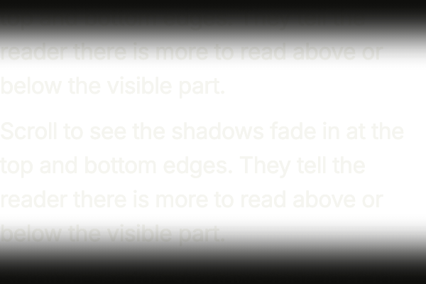
Shadows fade in at the top and bottom edges while there is more to read; wrap any scrolling list in FlScrollShadow.
import 'package:your_app/ui/fliin/components/scroll_shadow/fl_scroll_shadow.dart';
import 'package:your_app/ui/fliin/components/text/fl_text.dart';
import 'package:your_app/ui/fliin/core/fliin.dart';
import 'package:flutter/widgets.dart';

class ScrollShadowVerticalExample extends StatefulWidget {
  const ScrollShadowVerticalExample({super.key});

  @override
  State<ScrollShadowVerticalExample> createState() => _ScrollShadowVerticalExampleState();
}

class _ScrollShadowVerticalExampleState extends State<ScrollShadowVerticalExample> {
  final _scroll = ScrollController(initialScrollOffset: 60);

  @override
  void dispose() {
    _scroll.dispose();
    super.dispose();
  }

  @override
  Widget build(BuildContext context) {
    return SizedBox(
      height: 200,
      child: FlScrollShadow(
        child: ListView(
          controller: _scroll,
          children: [
            const FlText('Long Content', type: FlTextType.h5),
            for (var i = 0; i < 3; i++)
              Padding(
                padding: EdgeInsetsDirectional.only(top: FlScope.of(context).space.sm),
                child: const FlText(
                  'Scroll to see the shadows fade in at the top and bottom edges. They tell the reader there is more '
                  'to read above or below the visible part.',
                ),
              ),
          ],
        ),
      ),
    );
  }
}Horizontal
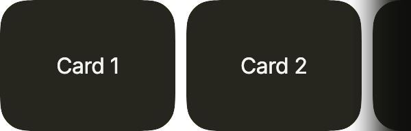
On a horizontal list, the shadows sit at the start and end edges, and follow the reading direction.
import 'package:your_app/ui/fliin/components/scroll_shadow/fl_scroll_shadow.dart';
import 'package:your_app/ui/fliin/components/surface/fl_surface.dart';
import 'package:your_app/ui/fliin/components/text/fl_text.dart';
import 'package:your_app/ui/fliin/core/fliin.dart';
import 'package:flutter/widgets.dart';

class ScrollShadowHorizontalExample extends StatelessWidget {
  const ScrollShadowHorizontalExample({super.key});

  @override
  Widget build(BuildContext context) {
    return SizedBox(
      height: 96,
      child: FlScrollShadow(
        child: ListView(
          scrollDirection: Axis.horizontal,
          children: [
            for (var i = 1; i <= 10; i++)
              Padding(
                padding: EdgeInsetsDirectional.only(end: FlScope.of(context).space.sm),
                child: SizedBox(
                  width: 128,
                  child: FlSurface(
                    variant: FlSurfaceVariant.secondary,
                    child: Center(child: FlText('Card $i')),
                  ),
                ),
              ),
          ],
        ),
      ),
    );
  }
}With card
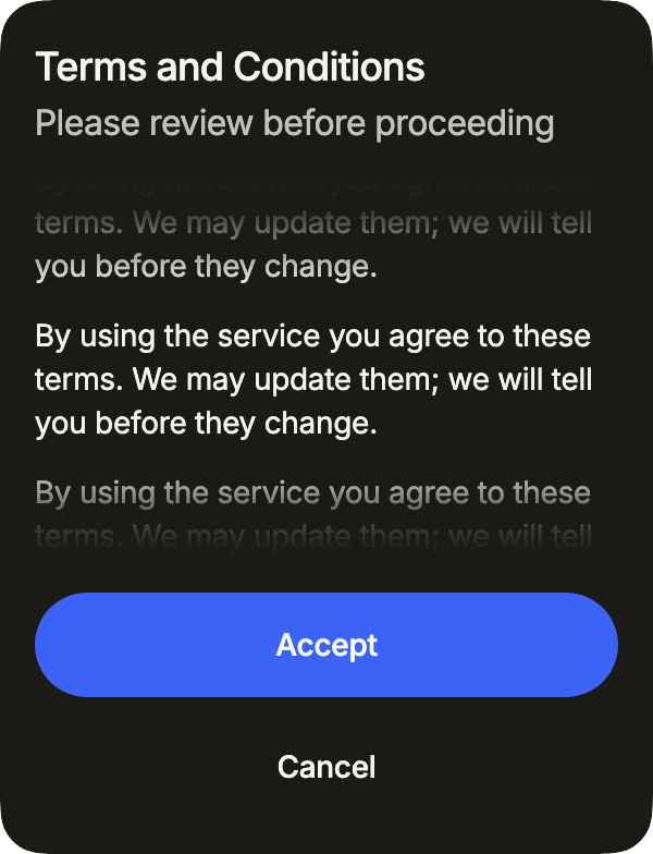
Terms to read inside a card: with mask, the text itself fades out at the edges, whatever the card's color, instead of a shadow painted in the page color.
import 'package:your_app/ui/fliin/components/button/fl_button.dart';
import 'package:your_app/ui/fliin/components/card/fl_card.dart';
import 'package:your_app/ui/fliin/components/scroll_shadow/fl_scroll_shadow.dart';
import 'package:your_app/ui/fliin/components/text/fl_text.dart';
import 'package:your_app/ui/fliin/core/fliin.dart';
import 'package:flutter/widgets.dart';

class ScrollShadowWithCardExample extends StatefulWidget {
  const ScrollShadowWithCardExample({super.key});

  @override
  State<ScrollShadowWithCardExample> createState() =>
      _ScrollShadowWithCardExampleState();
}

class _ScrollShadowWithCardExampleState
    extends State<ScrollShadowWithCardExample> {
  final _scroll = ScrollController(initialScrollOffset: 80);

  @override
  void dispose() {
    _scroll.dispose();
    super.dispose();
  }

  @override
  Widget build(BuildContext context) {
    final space = FlScope.of(context).space;
    return FlCard(
      children: [
        const FlCardBody(
          children: [
            FlCardTitle('Terms and Conditions'),
            FlCardDescription('Please review before proceeding'),
          ],
        ),
        SizedBox(
          height: 180,
          child: FlScrollShadow(
            mask: true,
            size: 64,
            child: ListView.separated(
              controller: _scroll,
              itemCount: 6,
              separatorBuilder: (context, index) => SizedBox(height: space.md),
              itemBuilder: (context, index) => const FlText(
                'By using the service you agree to these terms. We may update '
                'them; we will tell you before they change.',
                type: FlTextType.bodySm,
              ),
            ),
          ),
        ),
        FlCardFooter(
          spacing: space.sm,
          children: [
            FlButton(label: 'Accept', onPressed: () {}),
            FlButton(
              label: 'Cancel',
              variant: FlButtonVariant.secondary,
              onPressed: () {},
            ),
          ],
        ),
      ],
    );
  }
}Visibility change
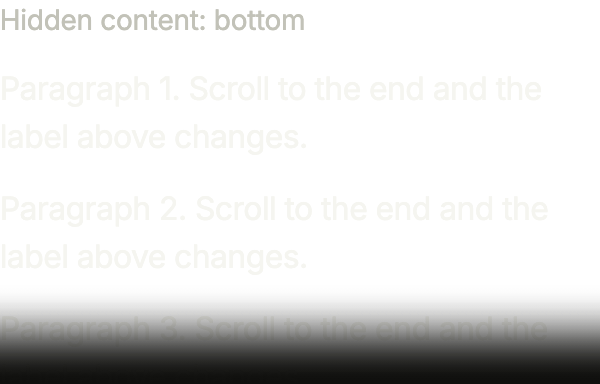
onVisibilityChange tells which edges hide content as the user scrolls: top, bottom, both or none. Show a "back to top" button from it, or mark a text as read.
import 'package:your_app/ui/fliin/components/scroll_shadow/fl_scroll_shadow.dart';
import 'package:your_app/ui/fliin/components/text/fl_text.dart';
import 'package:your_app/ui/fliin/core/fliin.dart';
import 'package:flutter/widgets.dart';

class ScrollShadowVisibilityChangeExample extends StatefulWidget {
  const ScrollShadowVisibilityChangeExample({super.key});

  @override
  State<ScrollShadowVisibilityChangeExample> createState() =>
      _ScrollShadowVisibilityChangeExampleState();
}

class _ScrollShadowVisibilityChangeExampleState
    extends State<ScrollShadowVisibilityChangeExample> {
  var _visibility = FlScrollShadowVisibility.none;

  @override
  Widget build(BuildContext context) {
    final space = FlScope.of(context).space;
    return Column(
      mainAxisSize: MainAxisSize.min,
      crossAxisAlignment: CrossAxisAlignment.stretch,
      spacing: space.md,
      children: [
        FlText(
          'Hidden content: ${_visibility.name}',
          type: FlTextType.bodySm,
          tone: FlTextTone.muted,
        ),
        SizedBox(
          height: 160,
          child: FlScrollShadow(
            onVisibilityChange: (visibility) =>
                setState(() => _visibility = visibility),
            child: ListView.separated(
              itemCount: 6,
              separatorBuilder: (context, index) => SizedBox(height: space.md),
              itemBuilder: (context, index) => FlText(
                'Paragraph ${index + 1}. Scroll to the end and the label '
                'above changes.',
              ),
            ),
          ),
        ),
      ],
    );
  }
}Usage
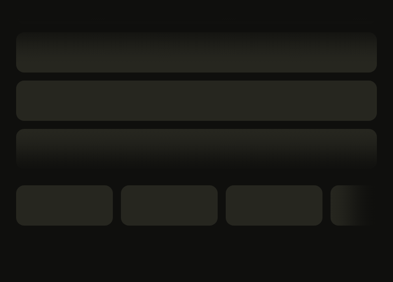
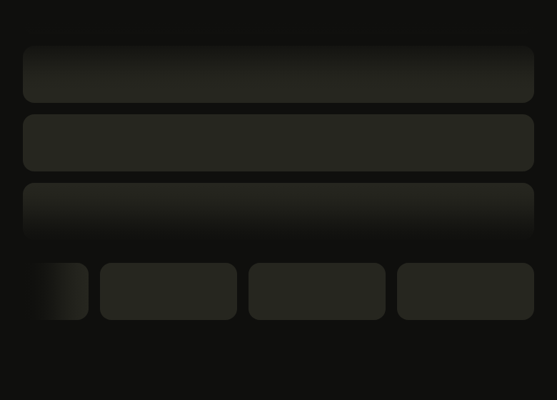
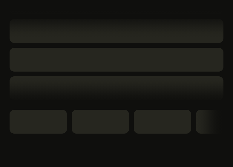
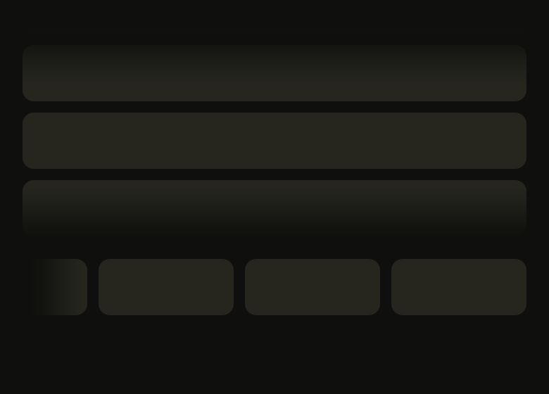
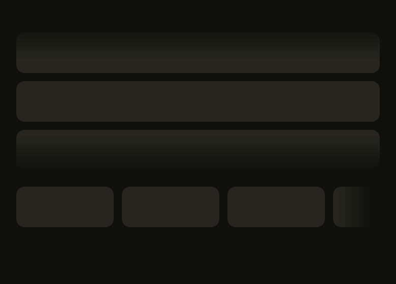
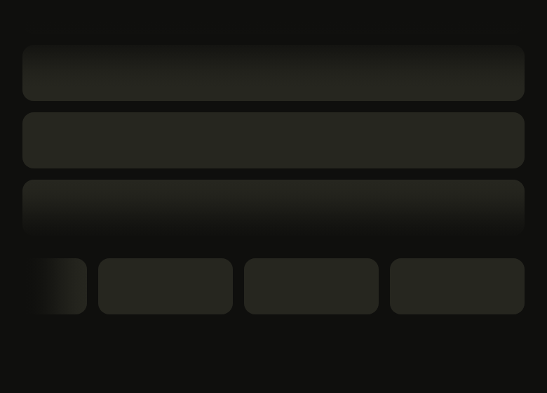
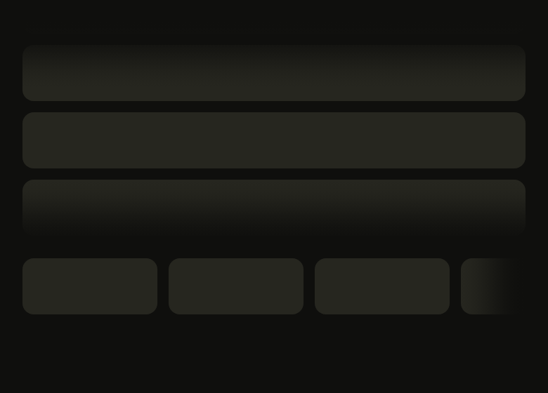
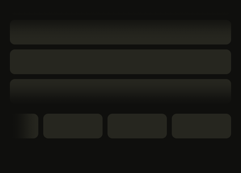
The code the reference images render:
final example = ColoredBox(
  color: FlScope.of(context).colors.surface,
  child: Padding(
    padding: EdgeInsetsDirectional.all(FlScope.of(context).space.lg),
    child: Column(
      crossAxisAlignment: CrossAxisAlignment.stretch,
      spacing: FlScope.of(context).space.sm,
      children: [
        SizedBox(
          height: 160,
          child: FlScrollShadow(
            child: ListView(
              controller: ScrollController(initialScrollOffset: 80),
              children: [
                for (var i = 0; i < 8; i++)
                  Padding(
                    padding: EdgeInsetsDirectional.only(
                      bottom: FlScope.of(context).space.sm,
                    ),
                    child: SizedBox(
                      width: null,
                      height: 40,
                      child: DecoratedBox(
                        decoration: BoxDecoration(
                          color: FlScope.of(context).colors.surfaceSecondary,
                          borderRadius: BorderRadius.all(
                            Radius.circular(FlScope.of(context).shape.radiusMd),
                          ),
                        ),
                      ),
                    ),
                  ),
              ],
            ),
          ),
        ),
        SizedBox(
          height: 40,
          child: FlScrollShadow(
            child: ListView(
              scrollDirection: Axis.horizontal,
              children: [
                for (var i = 0; i < 8; i++)
                  Padding(
                    padding: EdgeInsetsDirectional.only(
                      end: FlScope.of(context).space.sm,
                    ),
                    child: SizedBox(
                      width: 96,
                      height: 40,
                      child: DecoratedBox(
                        decoration: BoxDecoration(
                          color: FlScope.of(context).colors.surfaceSecondary,
                          borderRadius: BorderRadius.all(
                            Radius.circular(FlScope.of(context).shape.radiusMd),
                          ),
                        ),
                      ),
                    ),
                  ),
              ],
            ),
          ),
        ),
      ],
    ),
  ),
);API
FlScrollShadowVisibility: enum {auto, both, top, bottom, start, end, none}
FlScrollShadowVisibility.auto: static final FlScrollShadowVisibility
FlScrollShadowVisibility.both: static final FlScrollShadowVisibility
FlScrollShadowVisibility.top: static final FlScrollShadowVisibility
FlScrollShadowVisibility.bottom: static final FlScrollShadowVisibility
FlScrollShadowVisibility.start: static final FlScrollShadowVisibility
FlScrollShadowVisibility.end: static final FlScrollShadowVisibility
FlScrollShadowVisibility.none: static final FlScrollShadowVisibility
FlScrollShadow: class extends StatefulWidget
FlScrollShadow.new: const new({super.key, double size, FlScrollShadowVisibility visibility, bool enabled, Color? color, bool mask, ValueChanged<FlScrollShadowVisibility>? onVisibilityChange, required Widget child})
FlScrollShadow.size: get double
FlScrollShadow.visibility: get FlScrollShadowVisibility
FlScrollShadow.enabled: get bool
FlScrollShadow.color: get Color?
FlScrollShadow.mask: get bool
FlScrollShadow.onVisibilityChange: get ValueChanged<FlScrollShadowVisibility>?
FlScrollShadow.child: get Widget
FlScrollShadow.createState: State<FlScrollShadow>()Reference renders
The 16 images published with version 0.2.1, rendered by the shared harness on macOS with Flutter 3.47.7. fliin verify scroll-shadow compares your copy to them.








Use it to
- show that a list continues past its edge
- hide the edges of a scrolling area behind a fade
- show users there is more to scroll
- add a gradient at the top and bottom of a scroll view
- make a horizontal carousel hint at more items
- Not for
- separating two fixed blocks: use a separator (separator)
Source
The files fliin add scroll-shadow copies into your app, before your prefix and imports are applied.
scroll_shadow/fl_scroll_shadow.dart
// Modified from the ScrollShadow of HeroUI Native 1.0.10, Copyright 2025 NextUI
// Inc., licensed under Apache 2.0: https://www.apache.org/licenses/LICENSE-2.0
// The eased gradient follows easeGradient from react-native-easing-gradient
// (@phamfoo, MIT).
import 'package:flutter/scheduler.dart';
import 'package:flutter/widgets.dart';
import 'package:fliin_ui/core/fliin.dart';

/// The edges of an [FlScrollShadow] that can carry a shadow. `top` and
/// `start` name the same edge: the top of a vertical scroll, the start (on
/// the right in RTL) of a horizontal scroll; `bottom` and `end`, the
/// opposite edge.
enum FlScrollShadowVisibility {
  /// Both edges, each when content overflows on its side.
  auto,

  /// Same as [auto].
  both,

  /// The top, or the start: the edge where already-scrolled content
  /// overflows.
  top,

  /// The bottom, or the end: the edge where upcoming content overflows.
  bottom,

  /// Same as [top], for a horizontal scroll.
  start,

  /// Same as [bottom], for a horizontal scroll.
  end,

  /// No edge.
  none,
}

/// Fades the edges of a scrollable into the page color: a gradient of
/// [size] points at each edge where content overflows, opaque at the edge
/// and transparent toward the inside, along `motion.curve.easeInOut`. Its
/// opacity follows the scroll: zero when the edge is reached, full once a
/// quarter of [size] of content is hidden on that side.
///
/// [child] is the scrollable (`ListView`, `SingleChildScrollView`…), whose
/// axis gives the orientation. A shadow removed by [visibility] or
/// [enabled] fades out over `motion.duration.short4`, at once under reduced
/// motion.
class FlScrollShadow extends StatefulWidget {
  /// Shadows on both edges, 50 points deep, `surface` colored.
  const FlScrollShadow({
    super.key,
    this.size = 50,
    this.visibility = FlScrollShadowVisibility.auto,
    this.enabled = true,
    this.color,
    this.mask = false,
    this.onVisibilityChange,
    required this.child,
  });

  /// The depth of each gradient, in points: 50 by default.
  final double size;

  /// The edges that can carry a shadow.
  final FlScrollShadowVisibility visibility;

  /// False, both shadows fade out.
  final bool enabled;

  /// The shadow color; null, `surface`, the page background. Unused with
  /// [mask].
  final Color? color;

  /// True: the content itself fades out at the edges, as a mask, instead of
  /// a color painted over it, so the shadow works over a gradient, an image
  /// or a tinted card.
  final bool mask;

  /// Called with the edges where content is hidden, whenever they change
  /// while scrolling: [FlScrollShadowVisibility.top], `bottom`, `both` or
  /// `none` for a vertical scroll, `start`, `end`, `both` or `none` for a
  /// horizontal one.
  final ValueChanged<FlScrollShadowVisibility>? onVisibilityChange;

  /// The scrollable.
  final Widget child;

  @override
  State<FlScrollShadow> createState() => _FlScrollShadowState();
}

class _FlScrollShadowState extends State<FlScrollShadow> with TickerProviderStateMixin {
  late final AnimationController _leading = AnimationController(vsync: this);
  late final AnimationController _trailing = AnimationController(vsync: this);
  ScrollMetrics? _metrics;
  FlScrollShadowVisibility? _reported;

  @override
  void didChangeDependencies() {
    super.didChangeDependencies();
    _sync();
  }

  @override
  void didUpdateWidget(FlScrollShadow oldWidget) {
    super.didUpdateWidget(oldWidget);
    _sync();
  }

  @override
  void dispose() {
    _leading.dispose();
    _trailing.dispose();
    super.dispose();
  }

  bool _onScroll(int depth, ScrollMetrics metrics) {
    if (depth != 0) return false;
    final axisChanged = metrics.axis != _metrics?.axis;
    _metrics = metrics;
    if (axisChanged) setState(() {});
    _sync();
    _report(metrics);
    return false;
  }

  void _report(ScrollMetrics metrics) {
    final onVisibilityChange = widget.onVisibilityChange;
    if (onVisibilityChange == null) return;
    final reading = switch (metrics.axis) {
      Axis.vertical => AxisDirection.down,
      Axis.horizontal => textDirectionToAxisDirection(Directionality.of(context)),
    };
    final forward = metrics.axisDirection == reading;
    final before = (forward ? metrics.extentBefore : metrics.extentAfter) > 0;
    final after = (forward ? metrics.extentAfter : metrics.extentBefore) > 0;
    final vertical = metrics.axis == Axis.vertical;
    final visibility = switch ((before, after)) {
      (true, true) => FlScrollShadowVisibility.both,
      (true, false) => vertical ? FlScrollShadowVisibility.top : FlScrollShadowVisibility.start,
      (false, true) => vertical ? FlScrollShadowVisibility.bottom : FlScrollShadowVisibility.end,
      (false, false) => FlScrollShadowVisibility.none,
    };
    if (visibility == _reported) return;
    _reported = visibility;
    // The first metrics arrive during layout, where the parent cannot
    // rebuild yet.
    if (SchedulerBinding.instance.schedulerPhase == SchedulerPhase.persistentCallbacks) {
      SchedulerBinding.instance.addPostFrameCallback((_) {
        if (mounted) onVisibilityChange(visibility);
      });
    } else {
      onVisibilityChange(visibility);
    }
  }

  void _sync() {
    final metrics = _metrics;
    if (metrics == null) return;
    final reading = switch (metrics.axis) {
      Axis.vertical => AxisDirection.down,
      Axis.horizontal => textDirectionToAxisDirection(Directionality.of(context)),
    };
    final forward = metrics.axisDirection == reading;
    final (leading, trailing) = switch (widget.visibility) {
      _ when !widget.enabled => (false, false),
      FlScrollShadowVisibility.auto || FlScrollShadowVisibility.both => (true, true),
      FlScrollShadowVisibility.top || FlScrollShadowVisibility.start => (true, false),
      FlScrollShadowVisibility.bottom || FlScrollShadowVisibility.end => (false, true),
      FlScrollShadowVisibility.none => (false, false),
    };
    final motion = FlMotion.of(context);
    void drive(AnimationController shade, {required bool shown, required double hidden}) {
      if (shown) {
        shade.value = (hidden / (widget.size / 4)).clamp(0.0, 1.0);
      } else if (motion.reduced) {
        shade.value = 0;
      } else if (shade.value > 0 && !shade.isAnimating) {
        shade.animateTo(0, duration: motion.tokens.short4, curve: motion.tokens.easeInOutQuad);
      }
    }

    drive(_leading, shown: leading, hidden: forward ? metrics.extentBefore : metrics.extentAfter);
    drive(_trailing, shown: trailing, hidden: forward ? metrics.extentAfter : metrics.extentBefore);
  }

  @override
  Widget build(BuildContext context) {
    final theme = FlScope.of(context);
    final color = widget.color ?? theme.colors.surface;
    final ease = theme.motion.easeInOut;
    // An eased gradient: 14 stops, opacity eased from the edge toward
    // the inside.
    final steps = [for (var i = 0; i <= 13; i++) i / 13];
    final colors = [for (final t in steps) color.withValues(alpha: 1 - ease.transform(t))];
    Widget shade(AnimationController opacity, AlignmentGeometry edge, AlignmentGeometry inside) => IgnorePointer(
      child: FadeTransition(
        opacity: opacity,
        child: DecoratedBox(
          decoration: BoxDecoration(
            gradient: LinearGradient(begin: edge, end: inside, colors: colors, stops: steps),
          ),
        ),
      ),
    );
    final size = widget.size;
    final axis = _metrics?.axis;
    Widget listen(Widget child) => NotificationListener<ScrollMetricsNotification>(
      onNotification: (n) => _onScroll(n.depth, n.metrics),
      child: NotificationListener<ScrollNotification>(
        onNotification: (n) => _onScroll(n.depth, n.metrics),
        child: child,
      ),
    );
    if (widget.mask) {
      return listen(
        AnimatedBuilder(
          animation: Listenable.merge([_leading, _trailing]),
          builder: (context, child) => axis == null
              ? child!
              : ShaderMask(
                  blendMode: BlendMode.dstIn,
                  shaderCallback: (bounds) {
                    final extent = axis == Axis.vertical ? bounds.height : bounds.width;
                    final reach = extent <= 0 ? 0.0 : (size / extent).clamp(0.0, 0.5);
                    // The content's opacity, eased from the edge inward as
                    // the colored shadow's.
                    final stops = [for (final t in steps) t * reach, for (final t in steps.reversed) 1 - t * reach];
                    final alphas = [
                      for (final t in steps) 1 - _leading.value * (1 - ease.transform(t)),
                      for (final t in steps.reversed) 1 - _trailing.value * (1 - ease.transform(t)),
                    ];
                    final opaque = theme.colors.onSurface;
                    return LinearGradient(
                      begin: axis == Axis.vertical ? Alignment.topCenter : AlignmentDirectional.centerStart,
                      end: axis == Axis.vertical ? Alignment.bottomCenter : AlignmentDirectional.centerEnd,
                      colors: [for (final a in alphas) opaque.withValues(alpha: a)],
                      stops: stops,
                    ).createShader(bounds, textDirection: Directionality.of(context));
                  },
                  child: child,
                ),
          child: widget.child,
        ),
      );
    }
    return listen(
      Stack(
        children: [
          widget.child,
          ...switch (axis) {
            null => const <Widget>[],
            Axis.vertical => [
              PositionedDirectional(
                top: 0,
                start: 0,
                end: 0,
                height: size,
                child: shade(_leading, Alignment.topCenter, Alignment.bottomCenter),
              ),
              PositionedDirectional(
                bottom: 0,
                start: 0,
                end: 0,
                height: size,
                child: shade(_trailing, Alignment.bottomCenter, Alignment.topCenter),
              ),
            ],
            Axis.horizontal => [
              PositionedDirectional(
                start: 0,
                top: 0,
                bottom: 0,
                width: size,
                child: shade(_leading, AlignmentDirectional.centerStart, AlignmentDirectional.centerEnd),
              ),
              PositionedDirectional(
                end: 0,
                top: 0,
                bottom: 0,
                width: size,
                child: shade(_trailing, AlignmentDirectional.centerEnd, AlignmentDirectional.centerStart),
              ),
            ],
          },
        ],
      ),
    );
  }
}