Components / data-display
Meter
Shows a quantity within a known range, such as storage used or battery: label, value and a filled track, in three sizes and five colors.
Import
In a Flutter app where fliin init has run:
Examples
Value
A meter shows a known amount out of a whole, not progress. valueLabel writes the value in your units.

import 'package:your_app/ui/fliin/components/meter/fl_meter.dart';
import 'package:your_app/ui/fliin/core/fliin.dart';
import 'package:flutter/widgets.dart';

class MeterValueExample extends StatelessWidget {
  const MeterValueExample({super.key});

  @override
  Widget build(BuildContext context) {
    return Column(
      mainAxisSize: MainAxisSize.min,
      crossAxisAlignment: CrossAxisAlignment.stretch,
      spacing: FlScope.of(context).space.md,
      children: [
        FlMeter(label: 'Storage', value: 64, valueLabel: (_) => '6.4 of 10 GB'),
      ],
    );
  }
}Colors
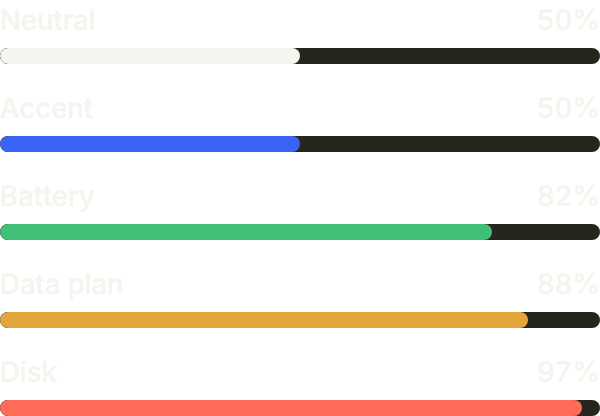
Five colors: accent by default, neutral, then success, warning and danger when the level itself is the news.
import 'package:your_app/ui/fliin/components/meter/fl_meter.dart';
import 'package:your_app/ui/fliin/core/fliin.dart';
import 'package:flutter/widgets.dart';

class MeterColorsExample extends StatelessWidget {
  const MeterColorsExample({super.key});

  @override
  Widget build(BuildContext context) {
    return Column(
      mainAxisSize: MainAxisSize.min,
      crossAxisAlignment: CrossAxisAlignment.stretch,
      spacing: FlScope.of(context).space.md,
      children: [
        const FlMeter(label: 'Neutral', value: 50, color: FlMeterColor.neutral),
        const FlMeter(label: 'Accent', value: 50),
        const FlMeter(label: 'Battery', value: 82, color: FlMeterColor.success),
        const FlMeter(label: 'Data plan', value: 88, color: FlMeterColor.warning),
        const FlMeter(label: 'Disk', value: 97, color: FlMeterColor.danger),
      ],
    );
  }
}Without label
Every size, with showLabel: false when the meter sits next to its own title. The label still names it for the screen reader.

import 'package:your_app/ui/fliin/components/meter/fl_meter.dart';
import 'package:your_app/ui/fliin/core/fliin.dart';
import 'package:flutter/widgets.dart';

class MeterWithoutLabelExample extends StatelessWidget {
  const MeterWithoutLabelExample({super.key});

  @override
  Widget build(BuildContext context) {
    return Column(
      mainAxisSize: MainAxisSize.min,
      crossAxisAlignment: CrossAxisAlignment.stretch,
      spacing: FlScope.of(context).space.md,
      children: [
        for (final size in FlMeterSize.values) FlMeter(label: 'Memory', value: 40, size: size, showLabel: false),
      ],
    );
  }
}Sizes
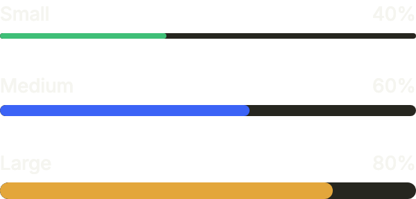
Three track heights: sm for a dense row, md by default, lg when the meter is the main figure of a card.
import 'package:your_app/ui/fliin/components/meter/fl_meter.dart';
import 'package:your_app/ui/fliin/core/fliin.dart';
import 'package:flutter/widgets.dart';

class MeterSizesExample extends StatelessWidget {
  const MeterSizesExample({super.key});

  @override
  Widget build(BuildContext context) {
    return Column(
      mainAxisSize: MainAxisSize.min,
      crossAxisAlignment: CrossAxisAlignment.stretch,
      spacing: FlScope.of(context).space.xl,
      children: const [
        FlMeter(label: 'Small', value: 40, size: FlMeterSize.sm, color: FlMeterColor.success),
        FlMeter(label: 'Medium', value: 60),
        FlMeter(label: 'Large', value: 80, size: FlMeterSize.lg, color: FlMeterColor.warning),
      ],
    );
  }
}Custom value
min and max set the range, and valueLabel writes the value in its unit: here a revenue out of a monthly goal.

import 'package:your_app/ui/fliin/components/meter/fl_meter.dart';
import 'package:flutter/widgets.dart';

class MeterCustomValueExample extends StatelessWidget {
  const MeterCustomValueExample({super.key});

  @override
  Widget build(BuildContext context) {
    return FlMeter(label: 'Revenue', value: 750, max: 1000, valueLabel: (value) => '\$${value.round()} of \$1,000');
  }
}Custom styles
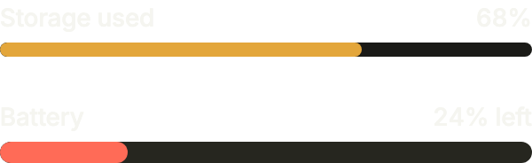
pill rounds both ends fully, and fillColor and trackColor take your own colors, like a battery gauge.
import 'package:your_app/ui/fliin/components/meter/fl_meter.dart';
import 'package:your_app/ui/fliin/core/fliin.dart';
import 'package:flutter/widgets.dart';

class MeterCustomStylesExample extends StatelessWidget {
  const MeterCustomStylesExample({super.key});

  @override
  Widget build(BuildContext context) {
    final theme = FlScope.of(context);
    return Column(
      mainAxisSize: MainAxisSize.min,
      crossAxisAlignment: CrossAxisAlignment.stretch,
      spacing: theme.space.xl,
      children: [
        FlMeter(
          label: 'Storage used',
          value: 68,
          pill: true,
          trackColor: theme.colors.control,
          fillColor: theme.colors.warning,
        ),
        FlMeter(
          label: 'Battery',
          value: 24,
          size: FlMeterSize.lg,
          pill: true,
          fillColor: theme.colors.dangerFill,
          valueLabel: (value) => '${value.round()}% left',
        ),
      ],
    );
  }
}Usage
The code the reference images render:
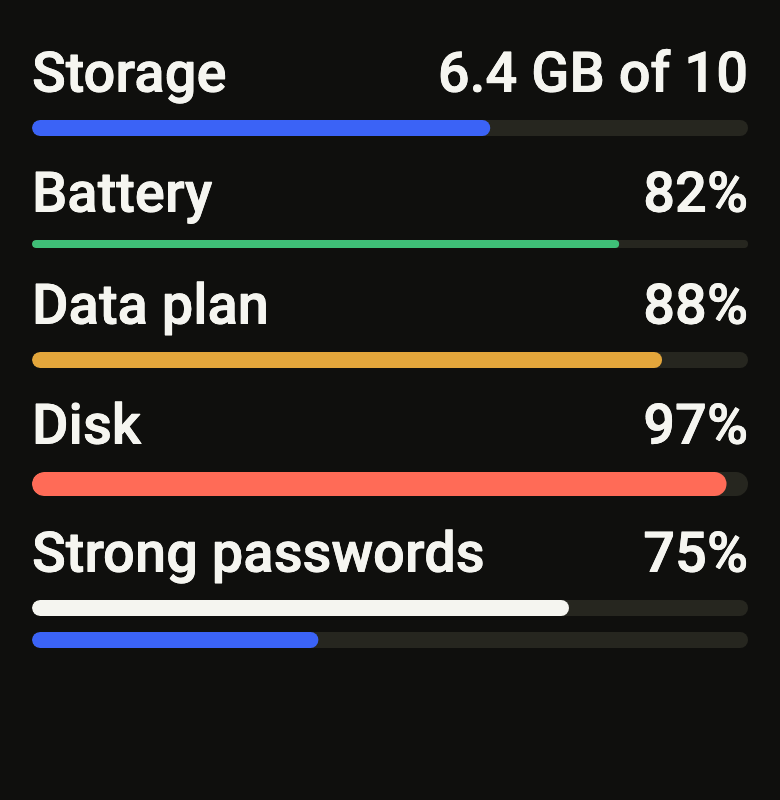
final example = ColoredBox(
  color: FlScope.of(context).colors.surface,
  child: SingleChildScrollView(
    padding: EdgeInsetsDirectional.all(FlScope.of(context).space.lg),
    child: Column(
      crossAxisAlignment: CrossAxisAlignment.stretch,
      spacing: FlScope.of(context).space.sm,
      children: [
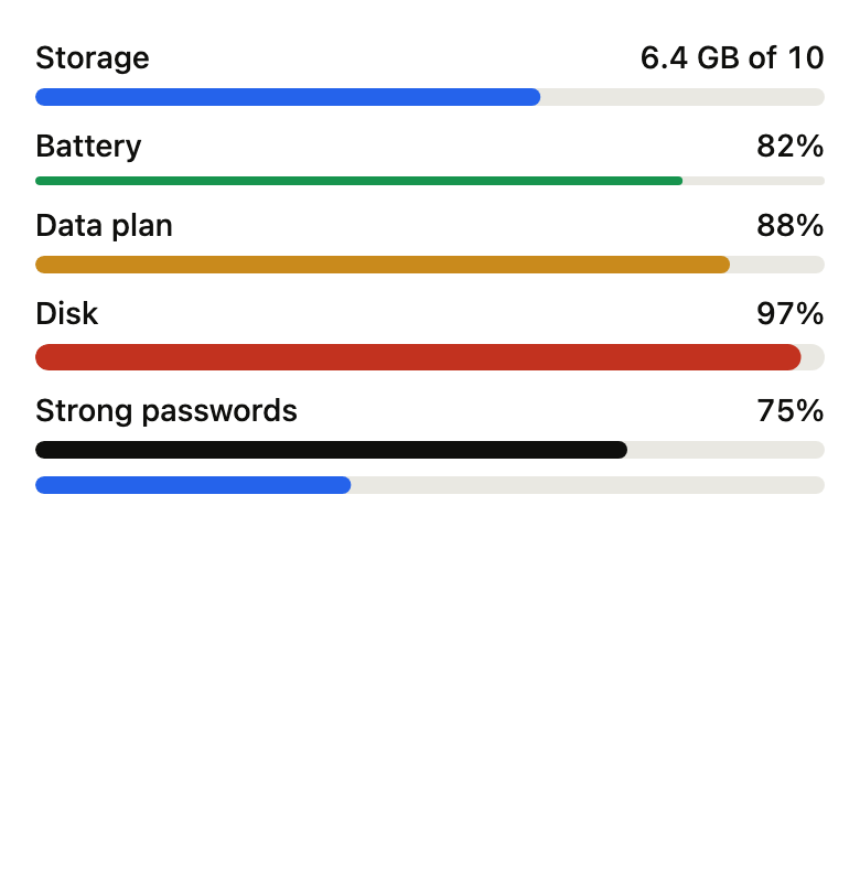
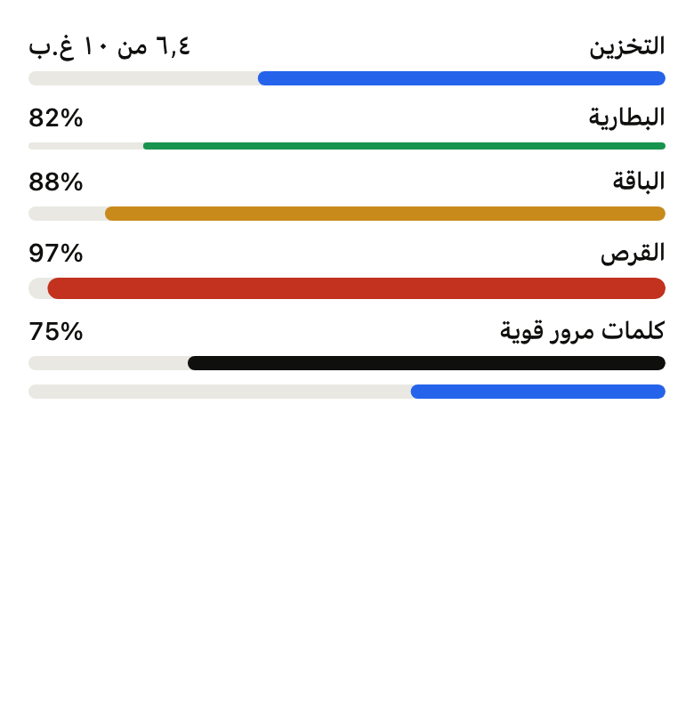
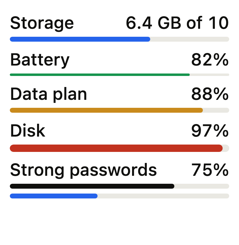
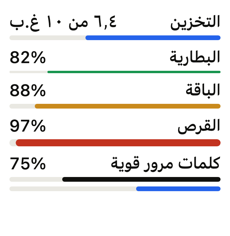
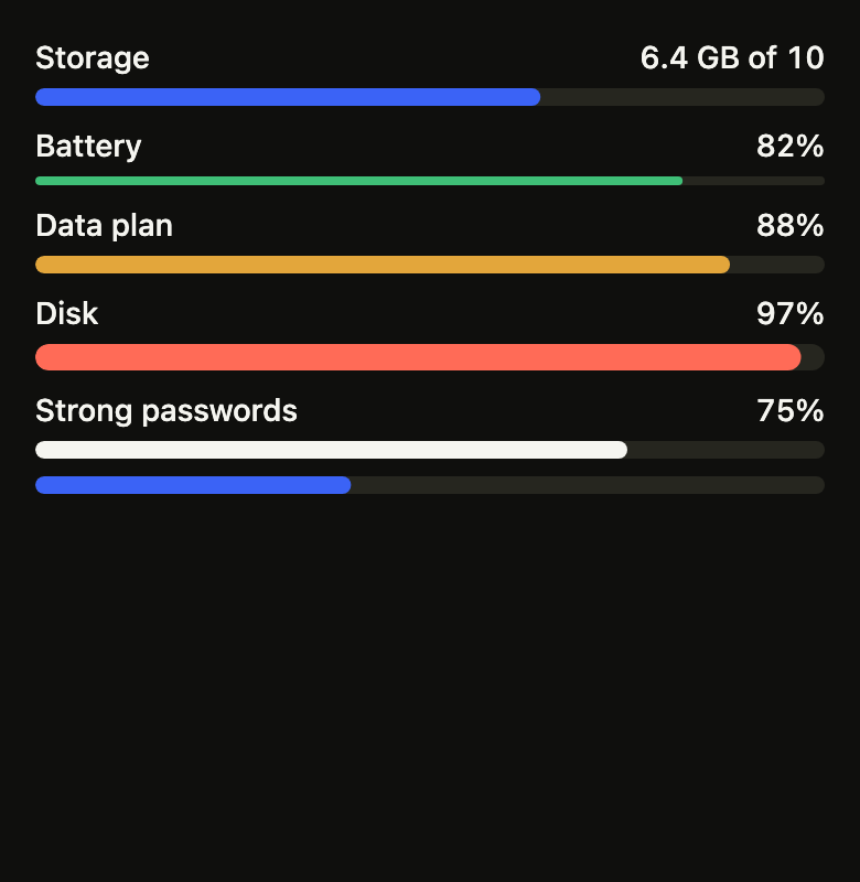
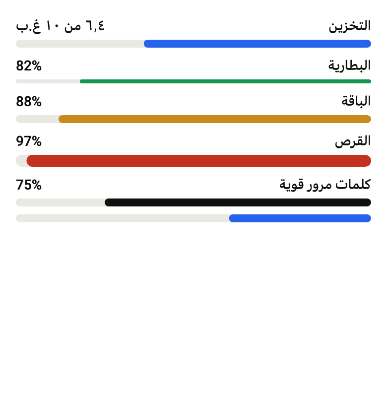
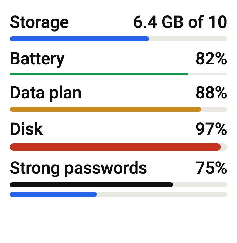
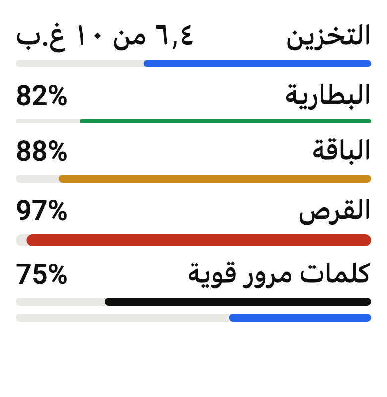
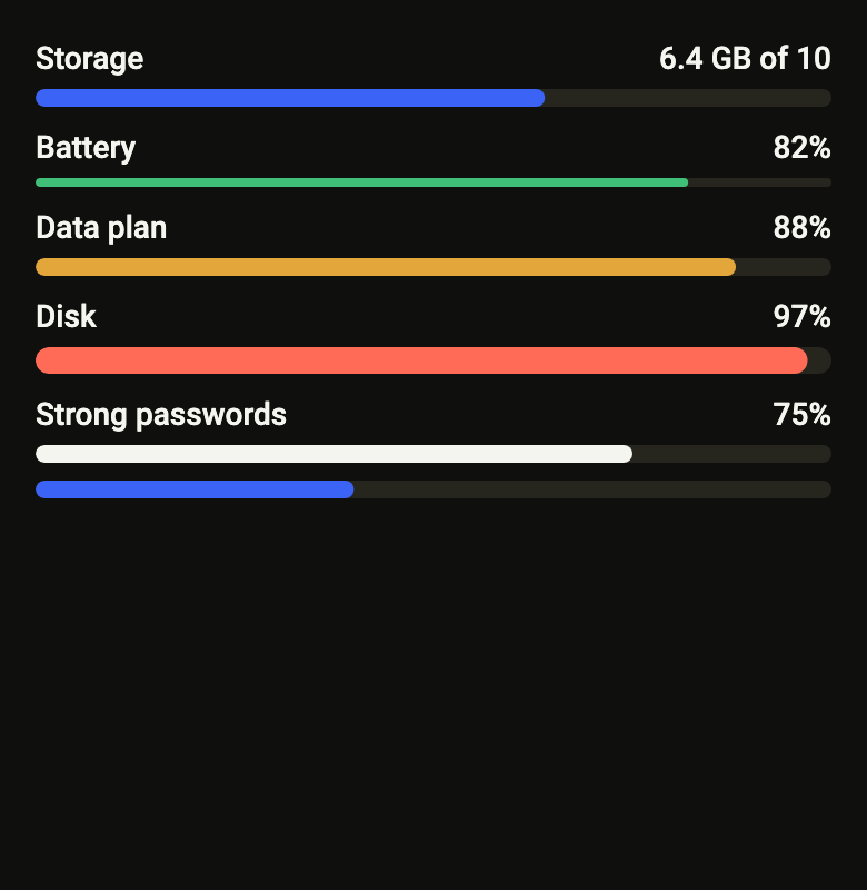
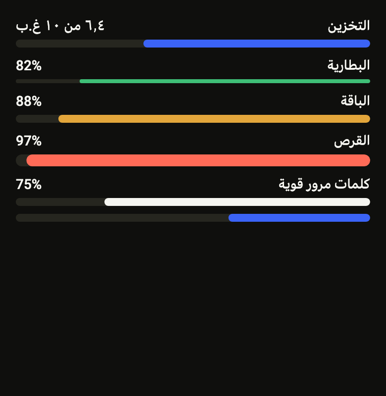
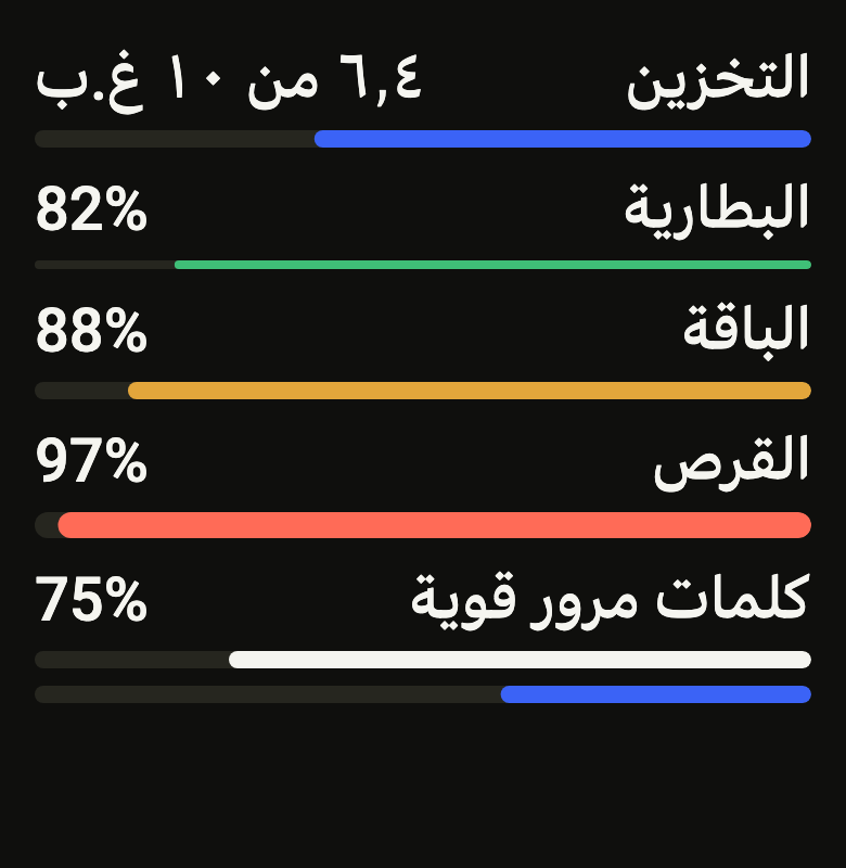
        FlMeter(label: 'Storage', value: 64, valueLabel: (_) => '6.4 GB of 10'),
        FlMeter(
          label: 'Battery',
          value: 82,
          size: FlMeterSize.sm,
          color: FlMeterColor.success,
        ),
        FlMeter(
          label: 'Data plan',
          value: 88,
          size: FlMeterSize.md,
          color: FlMeterColor.warning,
        ),
        FlMeter(
          label: 'Disk',
          value: 97,
          size: FlMeterSize.lg,
          color: FlMeterColor.danger,
        ),
        FlMeter(
          label: 'Strong passwords',
          value: 3,
          max: 4,
          color: FlMeterColor.neutral,
        ),
        FlMeter(label: 'Memory', value: 40, showLabel: false),
      ],
    ),
  ),
);API
FlMeterSize: enum {sm, md, lg}
FlMeterSize.sm: static final FlMeterSize
FlMeterSize.md: static final FlMeterSize
FlMeterSize.lg: static final FlMeterSize
FlMeterColor: enum {neutral, accent, success, warning, danger}
FlMeterColor.neutral: static final FlMeterColor
FlMeterColor.accent: static final FlMeterColor
FlMeterColor.success: static final FlMeterColor
FlMeterColor.warning: static final FlMeterColor
FlMeterColor.danger: static final FlMeterColor
FlMeter: class extends StatelessWidget
FlMeter.new: const new({super.key, required double value, required String label, double min, double max, FlMeterSize size, FlMeterColor color, bool showLabel, String Function(double value)? valueLabel, Color? fillColor, Color? trackColor, bool pill})
FlMeter.value: get double
FlMeter.label: get String
FlMeter.min: get double
FlMeter.max: get double
FlMeter.size: get FlMeterSize
FlMeter.color: get FlMeterColor
FlMeter.showLabel: get bool
FlMeter.valueLabel: get String Function(double value)?
FlMeter.fillColor: get Color?
FlMeter.trackColor: get Color?
FlMeter.pill: get bool
FlMeter.build: Widget(BuildContext context)Reference renders
The 16 images published with version 0.1.1, rendered by the shared harness on macOS with Flutter 3.47.7. fliin verify meter compares your copy to them.
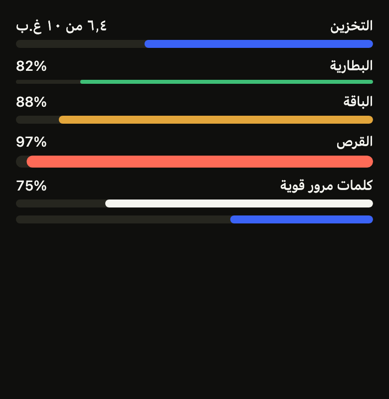
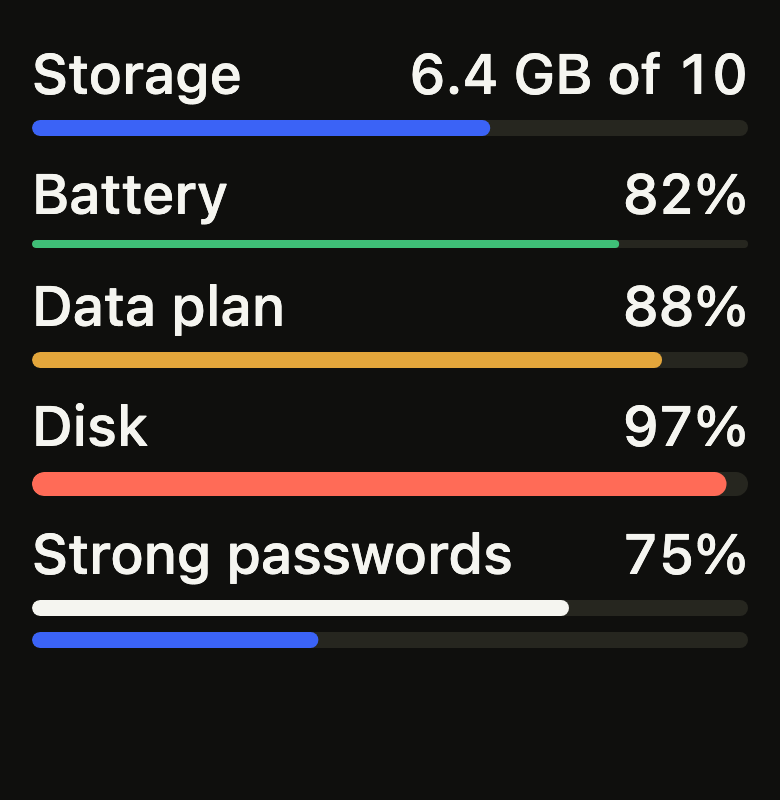
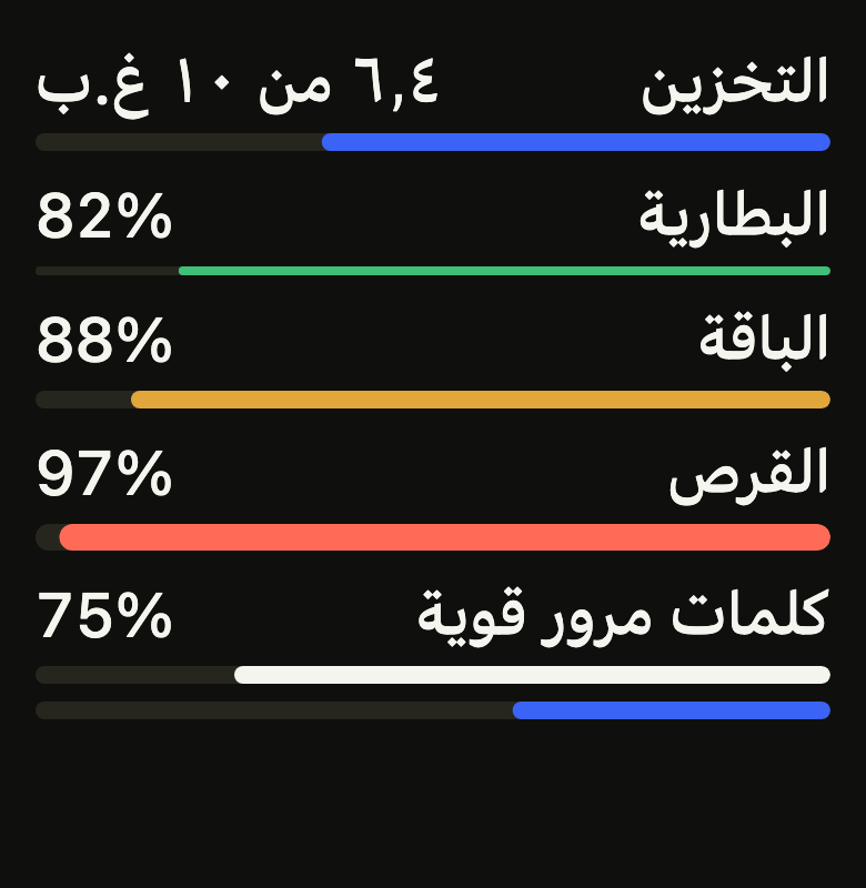
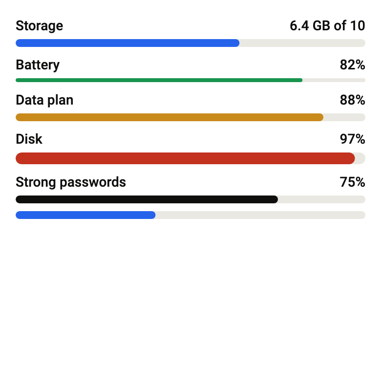
Use it to
- show how much storage is used out of the total
- present a device battery level
- make password strength visible
- keep track of data plan usage against its quota
- use a 0 to 100 scale for a score
- turn red when a disk is nearly full
- Not for
- a task under way, an upload: use the progress indicator (progress)
- a value the user sets: use the slider (slider)
- a key figure with its trend: use the stat card (stat-card)
- States
Source
The files fliin add meter copies into your app, before your prefix and imports are applied.
meter/fl_meter.dart
// Modified from the Meter of HeroUI React v3, Copyright 2025 NextUI Inc.,
// licensed under Apache 2.0: https://www.apache.org/licenses/LICENSE-2.0
import 'package:flutter/widgets.dart';
import 'package:fliin_ui/core/fliin.dart';

/// The size of an [FlMeter]'s track.
enum FlMeterSize {
  /// A track of `space.xs` (4), `radiusXs` corners.
  sm,

  /// A track of 8, `radiusSm` corners.
  md,

  /// A track of 12, `radiusMd` corners.
  lg,
}

/// The fill color of an [FlMeter], on a `surfaceSecondary` track.
enum FlMeterColor {
  /// `onControl`, the neutral.
  neutral,

  /// `selected`, like the progress bar's.
  accent,

  /// Green: a quantity in good standing.
  success,

  /// Orange: a quantity close to its limit.
  warning,

  /// Red: a quantity at or past its limit.
  danger,
}

/// A quantity within a known range: storage used, a
/// battery level, a password's strength. [label] at the start and the value
/// at the end above a track filled up to [value] in the reading direction.
/// Unlike `progress`, nothing is under way: the value is a measure, and
/// it can go down. The fill moves in `medium2` along `easeOut` when [value]
/// changes, at once under reduced motion.
///
/// [fillColor] and [trackColor] repaint it with the app's own colors, and
/// [pill] rounds both ends fully, like a battery gauge.
///
/// The screen reader reads [label] and the value as written above the
/// track.
///
/// ```dart
/// FlMeter(label: 'Storage', value: 64, valueLabel: (_) => '6.4 of 10 GB')
/// ```
class FlMeter extends StatelessWidget {
  /// A meter at [value], between [min] and [max].
  const FlMeter({
    super.key,
    required this.value,
    required this.label,
    this.min = 0,
    this.max = 100,
    this.size = FlMeterSize.md,
    this.color = FlMeterColor.accent,
    this.showLabel = true,
    this.valueLabel,
    this.fillColor,
    this.trackColor,
    this.pill = false,
  }) : assert(max > min, 'max above min');

  /// The measure, clamped between [min] and [max].
  final double value;

  /// What is measured ("Storage"), shown above the track at the start, and
  /// read by the screen reader.
  final String label;

  /// The bottom of the range; 0 by default.
  final double min;

  /// The top of the range; 100 by default.
  final double max;

  /// The track's height; `md` by default.
  final FlMeterSize size;

  /// The fill color; `accent` by default.
  final FlMeterColor color;

  /// False: the track alone, [label] and the value only for the screen
  /// reader.
  final bool showLabel;

  /// The value as written and spoken, from [value]; by default, the share
  /// of the range as a whole percentage ("40%"). French writes "40 %", and
  /// a quantity can say itself: "6.4 GB of 8".
  final String Function(double value)? valueLabel;

  /// The fill, in place of [color]'s: a value of the app ("the brand green").
  final Color? fillColor;

  /// The track under the fill; `surfaceSecondary` by default.
  final Color? trackColor;

  /// True: both ends of the track and of the fill are fully round, whatever
  /// the [size].
  final bool pill;

  @override
  Widget build(BuildContext context) {
    final theme = FlScope.of(context);
    final motion = FlMotion.of(context);
    final clamped = value.clamp(min, max);
    final share = (clamped - min) / (max - min);
    final written = valueLabel?.call(clamped) ?? '${(share * 100).round()}%';
    final xs = theme.space.xs;
    final (height, sized) = switch (size) {
      FlMeterSize.sm => (xs, theme.shape.radiusXs),
      FlMeterSize.md => (xs * 2, theme.shape.radiusSm),
      FlMeterSize.lg => (xs * 3, theme.shape.radiusMd),
    };
    final radius = pill ? height / 2 : sized;
    final fill =
        fillColor ??
        switch (color) {
          FlMeterColor.neutral => theme.colors.onControl,
          FlMeterColor.accent => theme.colors.selected,
          FlMeterColor.success => theme.colors.success,
          FlMeterColor.warning => theme.colors.warning,
          FlMeterColor.danger => theme.colors.dangerFill,
        };
    final track = TweenAnimationBuilder<double>(
      tween: Tween(end: share),
      duration: motion.reduced ? Duration.zero : theme.motion.medium2,
      curve: theme.motion.easeOut,
      builder: (context, share, _) => SizedBox(
        height: height,
        width: double.infinity,
        child: CustomPaint(
          painter: _TrackPainter(
            share: share,
            radius: radius,
            track: trackColor ?? theme.colors.surfaceSecondary,
            fill: fill,
            direction: Directionality.of(context),
          ),
        ),
      ),
    );
    // The node covers only the track: the text line, which the node already
    // says, stays out of the semantics, and the contrast check reads the
    // text against the page rather than against the fill.
    final indicator = Semantics(container: true, label: label, value: written, child: track);
    if (!showLabel) return indicator;
    const role = FlTextRole.textSm;
    // The label and the value: both medium, the value in tabular figures.
    final style = theme.typography
        .resolve(role)
        .copyWith(color: theme.colors.onSurface, fontWeight: theme.tokens.typography.weight.medium);
    final strut = theme.typography.strut(role, inheritedFamily: DefaultTextStyle.of(context).style.fontFamily);
    return Column(
      mainAxisSize: MainAxisSize.min,
      crossAxisAlignment: CrossAxisAlignment.stretch,
      spacing: xs,
      children: [
        ExcludeSemantics(
          child: Row(
            spacing: theme.space.sm,
            crossAxisAlignment: CrossAxisAlignment.start,
            children: [
              Expanded(
                child: Text(label, style: style, strutStyle: strut),
              ),
              Text(
                written,
                style: style.copyWith(fontFeatures: const [FontFeature.tabularFigures()]),
                strutStyle: strut,
              ),
            ],
          ),
        ),
        indicator,
      ],
    );
  }
}

class _TrackPainter extends CustomPainter {
  const _TrackPainter({
    required this.share,
    required this.radius,
    required this.track,
    required this.fill,
    required this.direction,
  });

  final double share;
  final double radius;
  final Color track;
  final Color fill;
  final TextDirection direction;

  @override
  void paint(Canvas canvas, Size size) {
    final bounds = RRect.fromRectAndRadius(Offset.zero & size, Radius.circular(radius));
    canvas.drawRRect(bounds, Paint()..color = track);
    if (share <= 0) return;
    final width = size.width * share;
    final left = direction == TextDirection.ltr ? 0.0 : size.width - width;
    canvas
      ..save()
      ..clipRRect(bounds)
      ..drawRRect(RRect.fromLTRBR(left, 0, left + width, size.height, Radius.circular(radius)), Paint()..color = fill)
      ..restore();
  }

  @override
  bool shouldRepaint(_TrackPainter oldDelegate) =>
      share != oldDelegate.share ||
      radius != oldDelegate.radius ||
      track != oldDelegate.track ||
      fill != oldDelegate.fill ||
      direction != oldDelegate.direction;
}