Components / data-display
Chip
Shows a status, a category or a filter as a short label in a colored capsule, pressable when needed.
Import
In a Flutter app where fliin init has run:
Examples
Filters
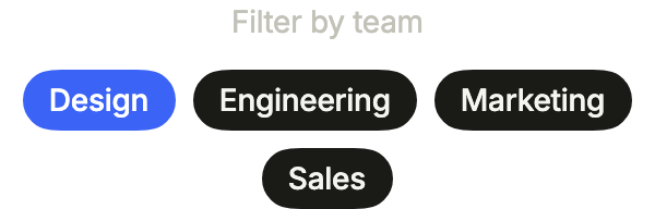
Chips as filters: each one toggles with onPressed, and a chosen one switches to the primary variant in the accent color.
import 'package:your_app/ui/fliin/components/chip/fl_chip.dart';
import 'package:your_app/ui/fliin/components/text/fl_text.dart';
import 'package:your_app/ui/fliin/core/fliin.dart';
import 'package:flutter/widgets.dart';

class ChipFiltersExample extends StatefulWidget {
  const ChipFiltersExample({super.key});

  @override
  State<ChipFiltersExample> createState() => _ChipFiltersExampleState();
}

class _ChipFiltersExampleState extends State<ChipFiltersExample> {
  final _chosen = {'design'};

  @override
  Widget build(BuildContext context) {
    final space = FlScope.of(context).space;
    return Column(
      mainAxisSize: MainAxisSize.min,
      spacing: space.md,
      children: [
        const FlText('Filter by team', type: FlTextType.bodySm, tone: FlTextTone.muted),
        Wrap(
          alignment: WrapAlignment.center,
          spacing: space.sm,
          runSpacing: space.sm,
          children: [
            for (final (id, label) in [
              ('design', 'Design'),
              ('engineering', 'Engineering'),
              ('marketing', 'Marketing'),
              ('sales', 'Sales'),
            ])
              FlChip(
                key: ValueKey(id),
                label: label,
                variant: _chosen.contains(id) ? FlChipVariant.primary : FlChipVariant.secondary,
                color: _chosen.contains(id) ? FlChipColor.accent : FlChipColor.neutral,
                onPressed: () => setState(() => _chosen.contains(id) ? _chosen.remove(id) : _chosen.add(id)),
              ),
          ],
        ),
      ],
    );
  }
}Colors
Five colors: accent for what is highlighted, neutral for plain labels, and success, warning and danger for a status.

import 'package:your_app/ui/fliin/components/chip/fl_chip.dart';
import 'package:your_app/ui/fliin/core/fliin.dart';
import 'package:flutter/widgets.dart';

class ChipColorsExample extends StatelessWidget {
  const ChipColorsExample({super.key});

  @override
  Widget build(BuildContext context) {
    final space = FlScope.of(context).space;
    return Wrap(
      alignment: WrapAlignment.center,
      spacing: space.sm,
      runSpacing: space.sm,
      children: const [
        FlChip(label: 'Accent', variant: FlChipVariant.primary),
        FlChip(label: 'Default', variant: FlChipVariant.primary, color: FlChipColor.neutral),
        FlChip(label: 'Success', variant: FlChipVariant.primary, color: FlChipColor.success),
        FlChip(label: 'Warning', variant: FlChipVariant.primary, color: FlChipColor.warning),
        FlChip(label: 'Danger', variant: FlChipVariant.primary, color: FlChipColor.danger),
      ],
    );
  }
}Statuses
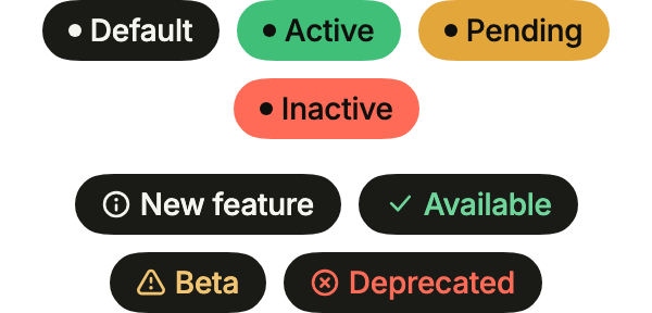
Statuses: dot puts a dot of the label's color before it, on a solid chip; on a quieter one, an icon in leading says the same thing.
import 'package:your_app/ui/fliin/components/chip/fl_chip.dart';
import 'package:your_app/ui/fliin/core/fliin.dart';
import 'package:your_app/ui/fliin/icons/fl_icons.dart';
import 'package:flutter/widgets.dart';

class ChipStatusesExample extends StatelessWidget {
  const ChipStatusesExample({super.key});

  @override
  Widget build(BuildContext context) {
    final space = FlScope.of(context).space;
    return Column(
      mainAxisSize: MainAxisSize.min,
      spacing: space.lg,
      children: [
        Wrap(
          alignment: WrapAlignment.center,
          spacing: space.sm,
          runSpacing: space.sm,
          children: const [
            FlChip(label: 'Default', color: FlChipColor.neutral, dot: true),
            FlChip(label: 'Active', color: FlChipColor.success, dot: true),
            FlChip(label: 'Pending', color: FlChipColor.warning, dot: true),
            FlChip(label: 'Inactive', color: FlChipColor.danger, dot: true),
          ],
        ),
        Wrap(
          alignment: WrapAlignment.center,
          spacing: space.sm,
          runSpacing: space.sm,
          children: [
            FlChip(
              label: 'New feature',
              variant: FlChipVariant.secondary,
              color: FlChipColor.accent,
              leading: FlIcon(FlIcons.circleInfo),
            ),
            FlChip(
              label: 'Available',
              variant: FlChipVariant.secondary,
              color: FlChipColor.success,
              leading: FlIcon(FlIcons.check),
            ),
            FlChip(
              label: 'Beta',
              variant: FlChipVariant.secondary,
              color: FlChipColor.warning,
              leading: FlIcon(FlIcons.triangleExclamation),
            ),
            FlChip(
              label: 'Deprecated',
              variant: FlChipVariant.secondary,
              color: FlChipColor.danger,
              leading: FlIcon(FlIcons.circleXmark),
            ),
          ],
        ),
      ],
    );
  }
}With icon
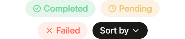
An icon before the label in leading, or after it in trailing, tinted with the label and at its size.
import 'package:your_app/ui/fliin/components/chip/fl_chip.dart';
import 'package:your_app/ui/fliin/core/fliin.dart';
import 'package:your_app/ui/fliin/icons/fl_icons.dart';
import 'package:flutter/widgets.dart';

class ChipWithIconExample extends StatelessWidget {
  const ChipWithIconExample({super.key});

  @override
  Widget build(BuildContext context) {
    final space = FlScope.of(context).space;
    return Wrap(
      alignment: WrapAlignment.center,
      spacing: space.sm,
      runSpacing: space.sm,
      children: [
        FlChip(
          label: 'Completed',
          variant: FlChipVariant.soft,
          color: FlChipColor.success,
          leading: FlIcon(FlIcons.circleCheck),
        ),
        FlChip(
          label: 'Pending',
          variant: FlChipVariant.soft,
          color: FlChipColor.warning,
          leading: FlIcon(FlIcons.clock),
        ),
        FlChip(label: 'Failed', variant: FlChipVariant.soft, color: FlChipColor.danger, leading: FlIcon(FlIcons.xmark)),
        FlChip(
          label: 'Sort by',
          variant: FlChipVariant.secondary,
          color: FlChipColor.neutral,
          trailing: FlIcon(FlIcons.chevronDown),
          onPressed: () {},
        ),
      ],
    );
  }
}Sizes
Three sizes: sm inside a row or a card, md by default, lg when the chip is the main content.

import 'package:your_app/ui/fliin/components/chip/fl_chip.dart';
import 'package:your_app/ui/fliin/core/fliin.dart';
import 'package:flutter/widgets.dart';

class ChipSizesExample extends StatelessWidget {
  const ChipSizesExample({super.key});

  @override
  Widget build(BuildContext context) {
    final space = FlScope.of(context).space;
    return Wrap(
      alignment: WrapAlignment.center,
      crossAxisAlignment: WrapCrossAlignment.center,
      spacing: space.sm,
      runSpacing: space.sm,
      children: const [
        FlChip(label: 'Small', size: FlChipSize.sm),
        FlChip(label: 'Medium', size: FlChipSize.md),
        FlChip(label: 'Large', size: FlChipSize.lg),
      ],
    );
  }
}Primary
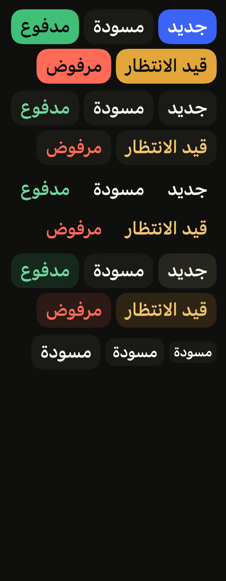
The primary variant, the default: the color's solid background with its foreground text, the strongest emphasis.

import 'package:your_app/ui/fliin/components/chip/fl_chip.dart';
import 'package:your_app/ui/fliin/core/fliin.dart';
import 'package:flutter/widgets.dart';

class ChipPrimaryExample extends StatelessWidget {
  const ChipPrimaryExample({super.key});

  @override
  Widget build(BuildContext context) {
    final space = FlScope.of(context).space;
    return Wrap(
      alignment: WrapAlignment.center,
      spacing: space.sm,
      runSpacing: space.sm,
      children: const [
        FlChip(label: 'Accent', variant: FlChipVariant.primary),
        FlChip(label: 'Default', variant: FlChipVariant.primary, color: FlChipColor.neutral),
        FlChip(label: 'Success', variant: FlChipVariant.primary, color: FlChipColor.success),
        FlChip(label: 'Warning', variant: FlChipVariant.primary, color: FlChipColor.warning),
        FlChip(label: 'Danger', variant: FlChipVariant.primary, color: FlChipColor.danger),
      ],
    );
  }
}Secondary
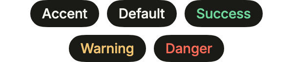
The secondary variant: the control background with the color's soft text, quieter next to other content.
import 'package:your_app/ui/fliin/components/chip/fl_chip.dart';
import 'package:your_app/ui/fliin/core/fliin.dart';
import 'package:flutter/widgets.dart';

class ChipSecondaryExample extends StatelessWidget {
  const ChipSecondaryExample({super.key});

  @override
  Widget build(BuildContext context) {
    final space = FlScope.of(context).space;
    return Wrap(
      alignment: WrapAlignment.center,
      spacing: space.sm,
      runSpacing: space.sm,
      children: const [
        FlChip(label: 'Accent', variant: FlChipVariant.secondary),
        FlChip(label: 'Default', variant: FlChipVariant.secondary, color: FlChipColor.neutral),
        FlChip(label: 'Success', variant: FlChipVariant.secondary, color: FlChipColor.success),
        FlChip(label: 'Warning', variant: FlChipVariant.secondary, color: FlChipColor.warning),
        FlChip(label: 'Danger', variant: FlChipVariant.secondary, color: FlChipColor.danger),
      ],
    );
  }
}Tertiary
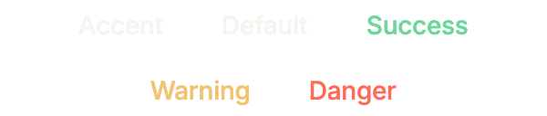
The tertiary variant: no background, only the color's soft text, for a status inside a dense row.
import 'package:your_app/ui/fliin/components/chip/fl_chip.dart';
import 'package:your_app/ui/fliin/core/fliin.dart';
import 'package:flutter/widgets.dart';

class ChipTertiaryExample extends StatelessWidget {
  const ChipTertiaryExample({super.key});

  @override
  Widget build(BuildContext context) {
    final space = FlScope.of(context).space;
    return Wrap(
      alignment: WrapAlignment.center,
      spacing: space.sm,
      runSpacing: space.sm,
      children: const [
        FlChip(label: 'Accent', variant: FlChipVariant.tertiary),
        FlChip(label: 'Default', variant: FlChipVariant.tertiary, color: FlChipColor.neutral),
        FlChip(label: 'Success', variant: FlChipVariant.tertiary, color: FlChipColor.success),
        FlChip(label: 'Warning', variant: FlChipVariant.tertiary, color: FlChipColor.warning),
        FlChip(label: 'Danger', variant: FlChipVariant.tertiary, color: FlChipColor.danger),
      ],
    );
  }
}Soft
The soft variant: a light tint of the color behind its soft text, a status that stands out without shouting.

import 'package:your_app/ui/fliin/components/chip/fl_chip.dart';
import 'package:your_app/ui/fliin/core/fliin.dart';
import 'package:flutter/widgets.dart';

class ChipSoftExample extends StatelessWidget {
  const ChipSoftExample({super.key});

  @override
  Widget build(BuildContext context) {
    final space = FlScope.of(context).space;
    return Wrap(
      alignment: WrapAlignment.center,
      spacing: space.sm,
      runSpacing: space.sm,
      children: const [
        FlChip(label: 'Accent', variant: FlChipVariant.soft),
        FlChip(label: 'Default', variant: FlChipVariant.soft, color: FlChipColor.neutral),
        FlChip(label: 'Success', variant: FlChipVariant.soft, color: FlChipColor.success),
        FlChip(label: 'Warning', variant: FlChipVariant.soft, color: FlChipColor.warning),
        FlChip(label: 'Danger', variant: FlChipVariant.soft, color: FlChipColor.danger),
      ],
    );
  }
}Usage
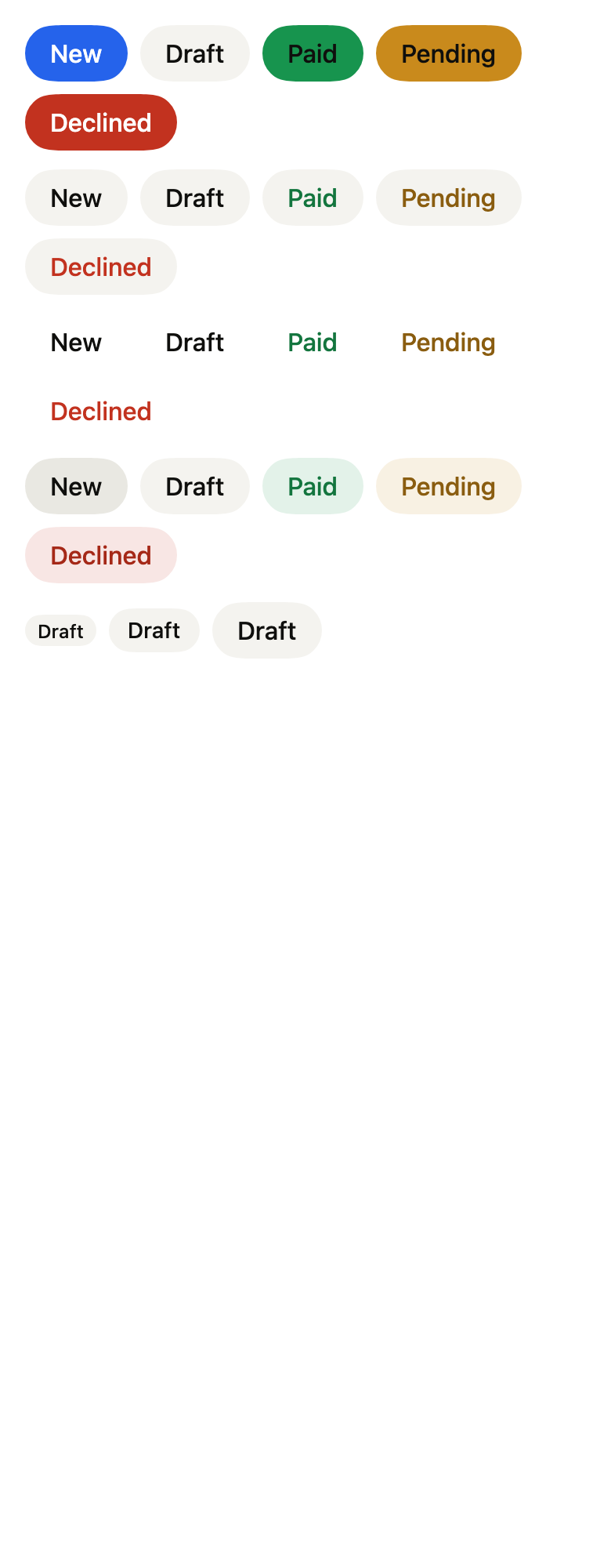
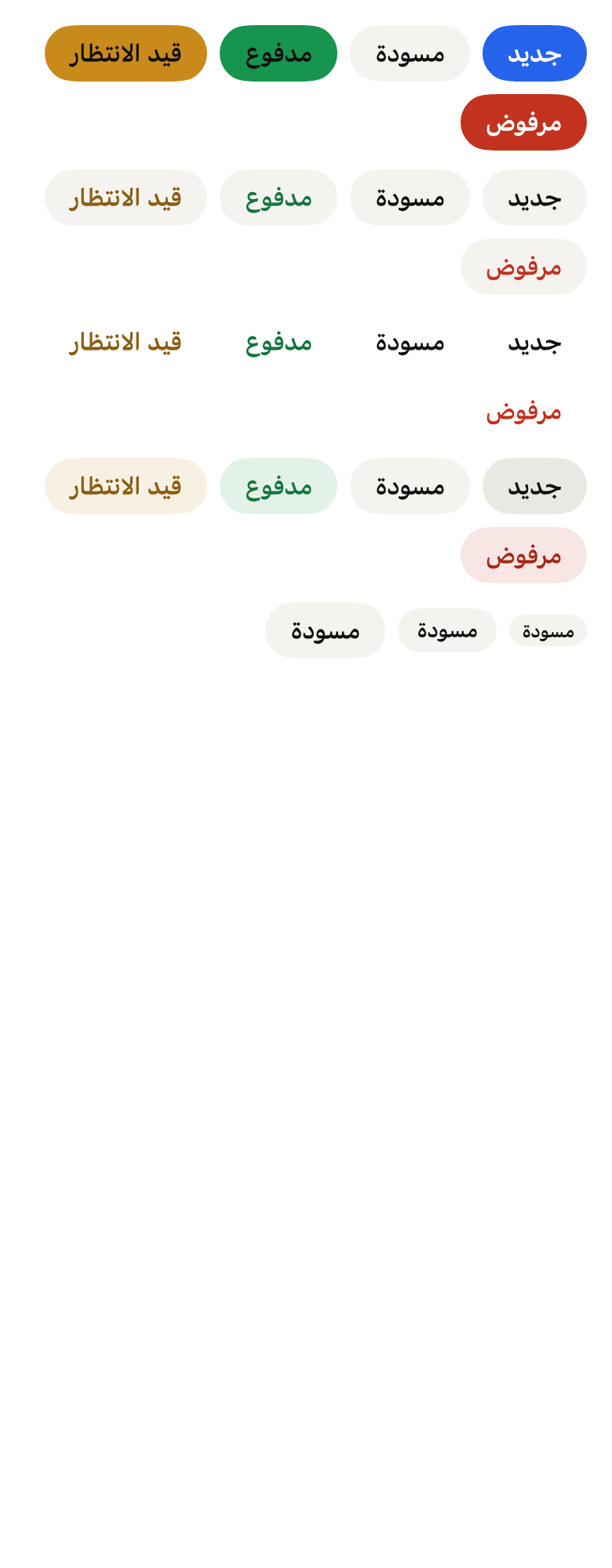
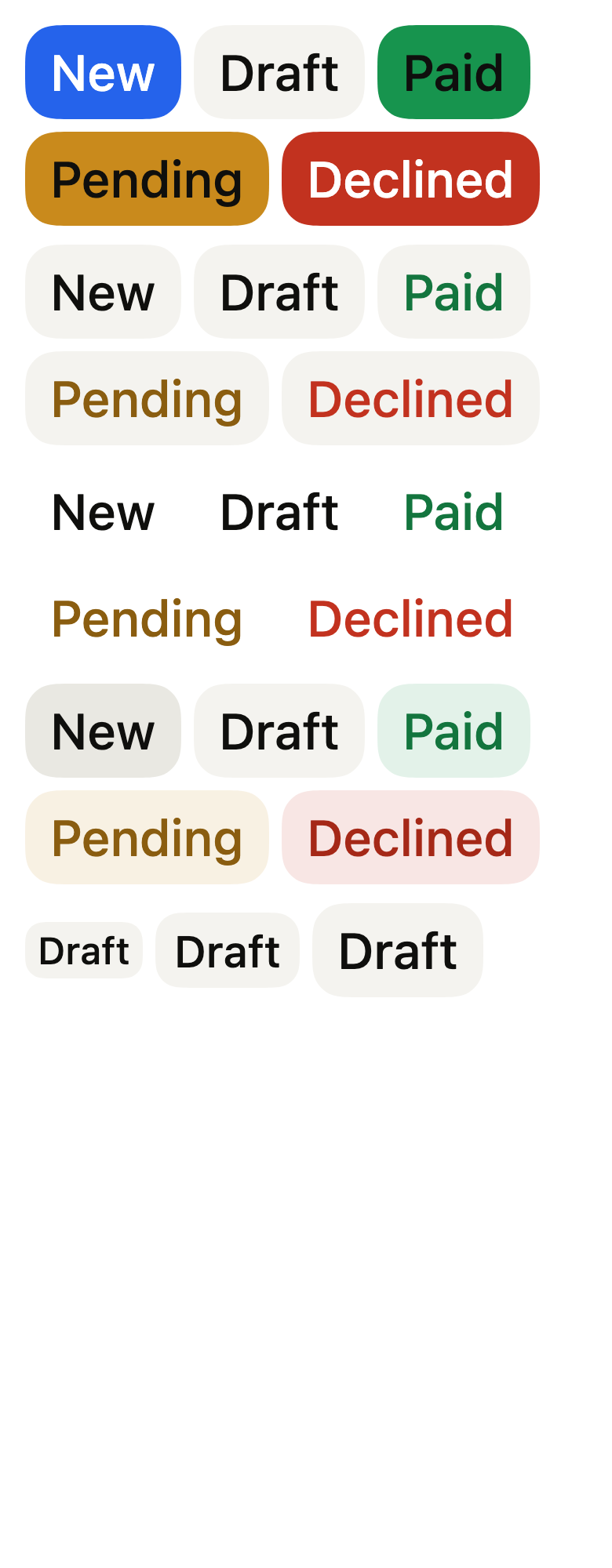
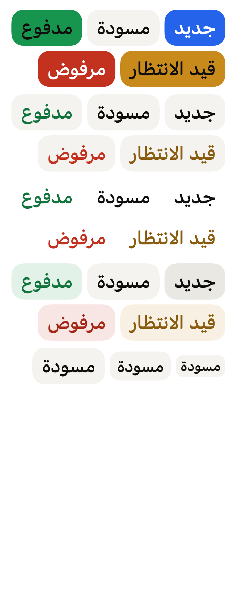
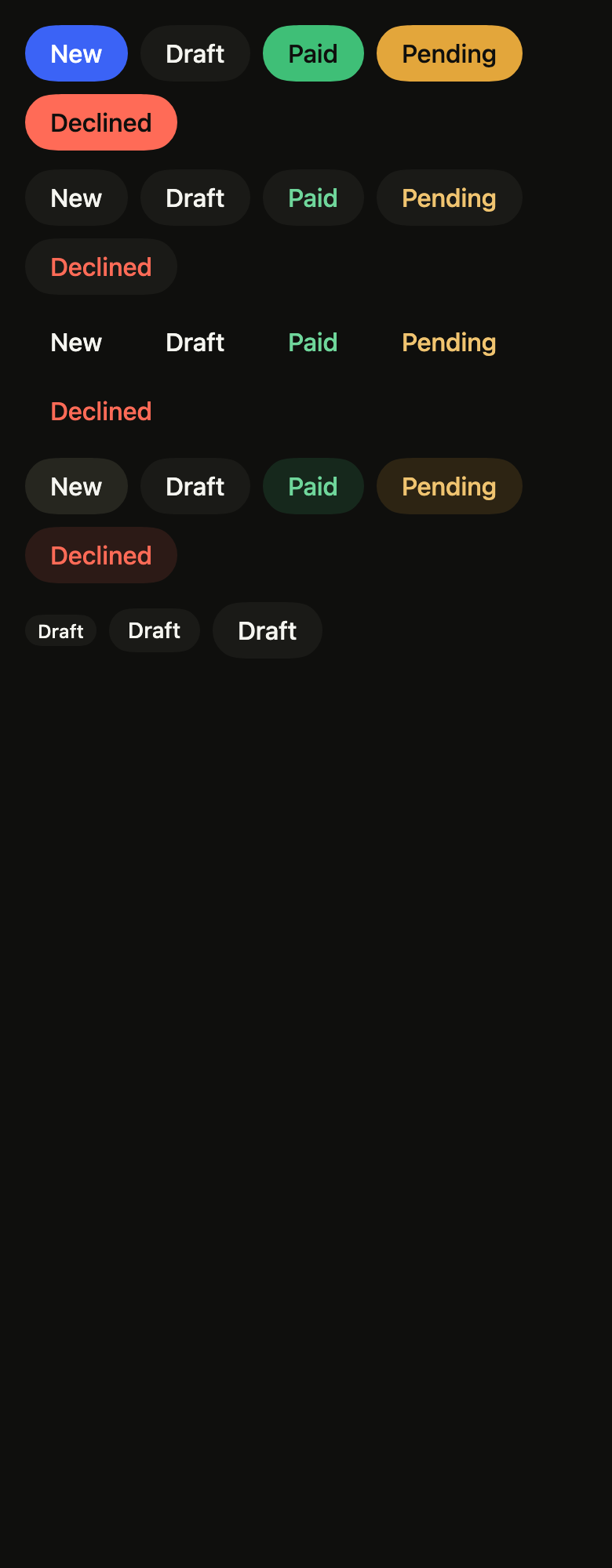
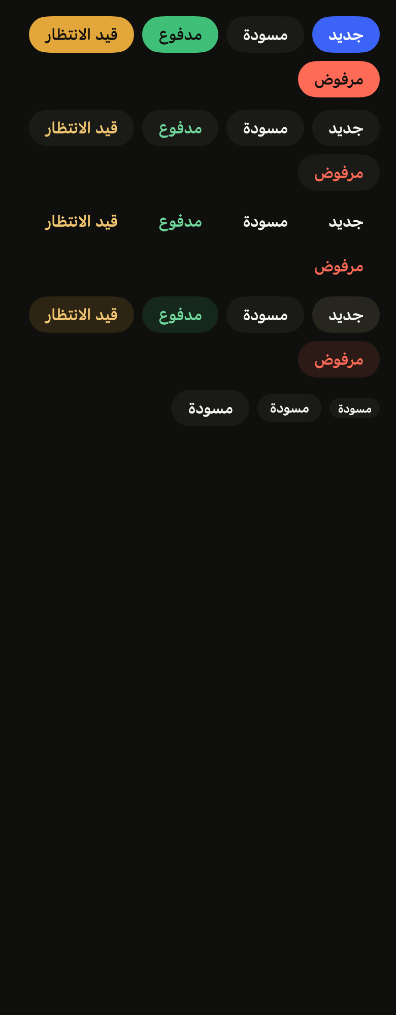
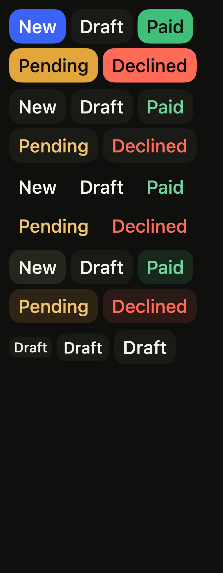
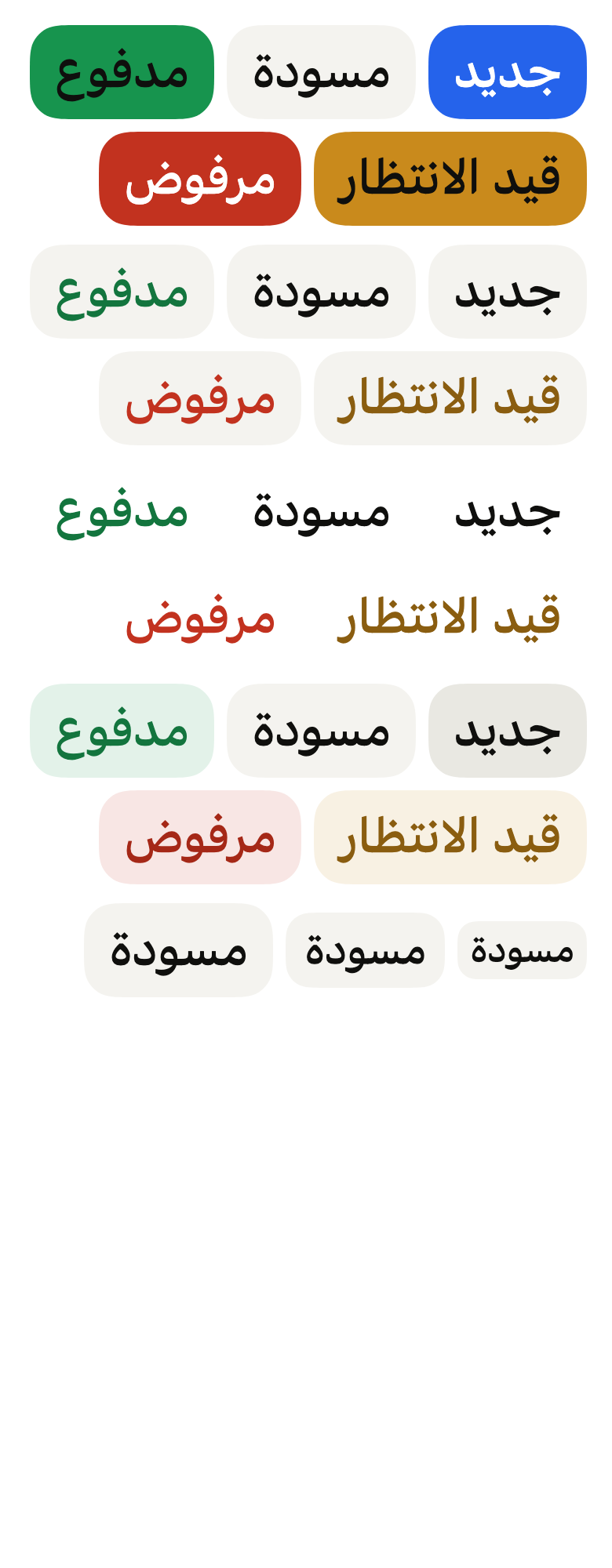
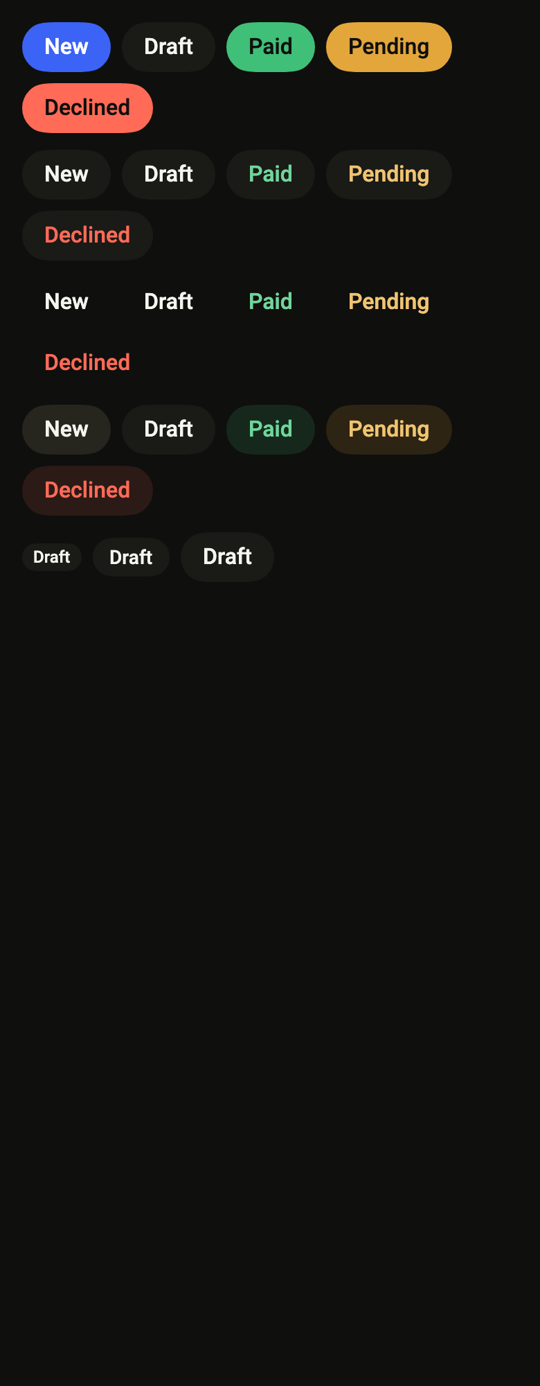
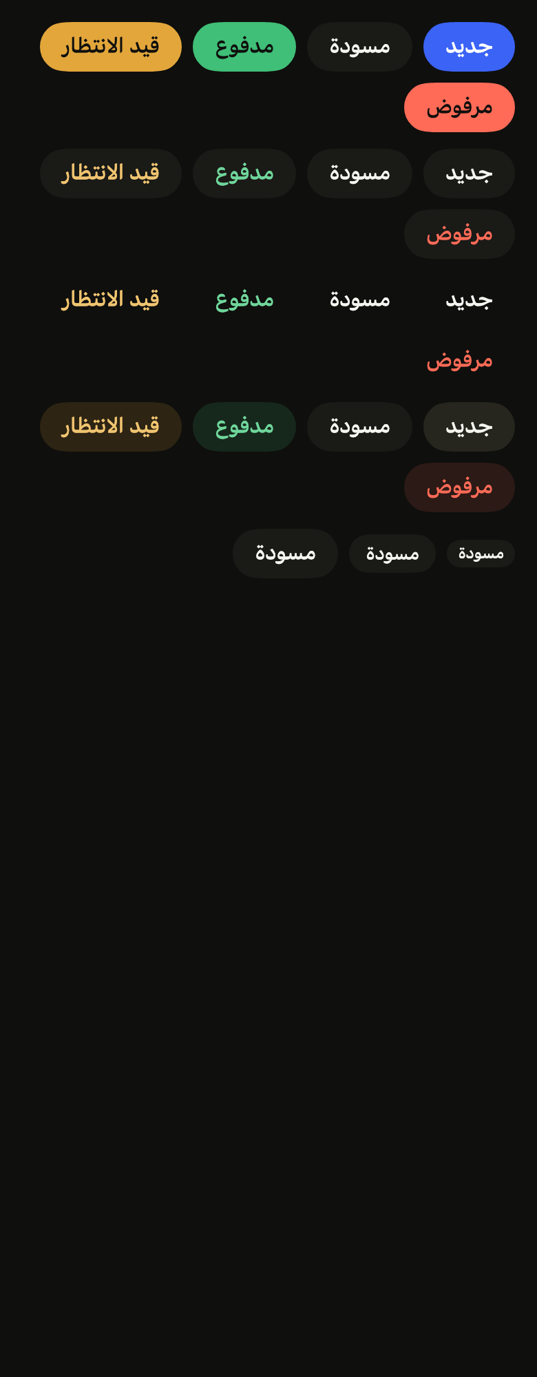
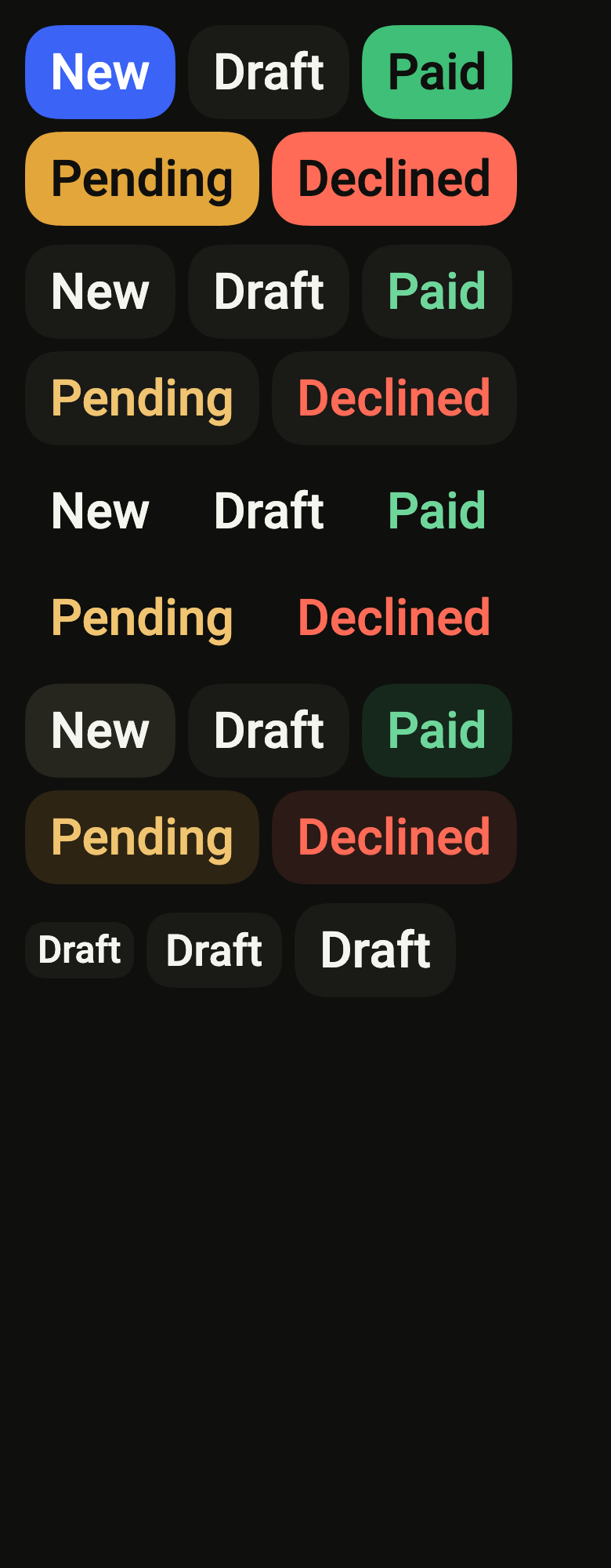
The code the reference images render:
final example = ColoredBox(
  color: FlScope.of(context).colors.surface,
  child: Padding(
    padding: EdgeInsetsDirectional.all(FlScope.of(context).space.lg),
    child: Column(
      crossAxisAlignment: CrossAxisAlignment.stretch,
      spacing: FlScope.of(context).space.md,
      children: [
        for (final v in FlChipVariant.values)
          Wrap(
            spacing: FlScope.of(context).space.sm,
            runSpacing: FlScope.of(context).space.sm,
            children: [
              for (final c in FlChipColor.values)
                FlChip(
                  label: (variant.dir == TextDirection.rtl
                      ? const [
                          'جديد',
                          'مسودة',
                          'مدفوع',
                          'قيد الانتظار',
                          'مرفوض',
                        ]
                      : const [
                          'New',
                          'Draft',
                          'Paid',
                          'Pending',
                          'Declined',
                        ])[c.index],
                  variant: v,
                  color: c,
                  size: FlChipSize.lg,
                ),
            ],
          ),
        Wrap(
          spacing: FlScope.of(context).space.sm,
          runSpacing: FlScope.of(context).space.sm,
          crossAxisAlignment: WrapCrossAlignment.center,
          children: [
            for (final s in FlChipSize.values)
              FlChip(
                label: (variant.dir == TextDirection.rtl
                    ? const ['جديد', 'مسودة', 'مدفوع', 'قيد الانتظار', 'مرفوض']
                    : const ['New', 'Draft', 'Paid', 'Pending', 'Declined'])[1],
                variant: FlChipVariant.secondary,
                color: FlChipColor.neutral,
                size: s,
                onPressed: () {},
              ),
          ],
        ),
      ],
    ),
  ),
);API
FlChipVariant: enum {primary, secondary, tertiary, soft}
FlChipVariant.primary: static final FlChipVariant
FlChipVariant.secondary: static final FlChipVariant
FlChipVariant.tertiary: static final FlChipVariant
FlChipVariant.soft: static final FlChipVariant
FlChipColor: enum {accent, neutral, success, warning, danger}
FlChipColor.accent: static final FlChipColor
FlChipColor.neutral: static final FlChipColor
FlChipColor.success: static final FlChipColor
FlChipColor.warning: static final FlChipColor
FlChipColor.danger: static final FlChipColor
FlChipSize: enum {sm, md, lg}
FlChipSize.sm: static final FlChipSize
FlChipSize.md: static final FlChipSize
FlChipSize.lg: static final FlChipSize
FlChip: class extends StatelessWidget
FlChip.new: const new({super.key, required String label, FlChipVariant variant, FlChipColor color, FlChipSize size, Widget? leading, Widget? trailing, VoidCallback? onPressed, bool enabled, WidgetStatesController? statesController, bool dot})
FlChip.label: get String
FlChip.variant: get FlChipVariant
FlChip.color: get FlChipColor
FlChip.size: get FlChipSize
FlChip.leading: get Widget?
FlChip.trailing: get Widget?
FlChip.dot: get bool
FlChip.onPressed: get VoidCallback?
FlChip.enabled: get bool
FlChip.statesController: get WidgetStatesController?
FlChip.build: Widget(BuildContext context)Reference renders
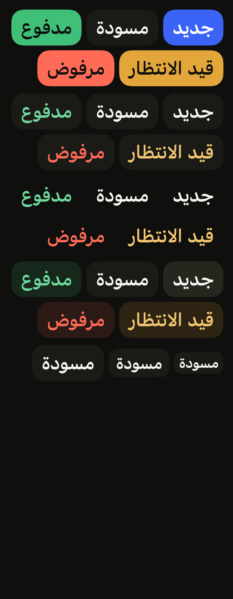
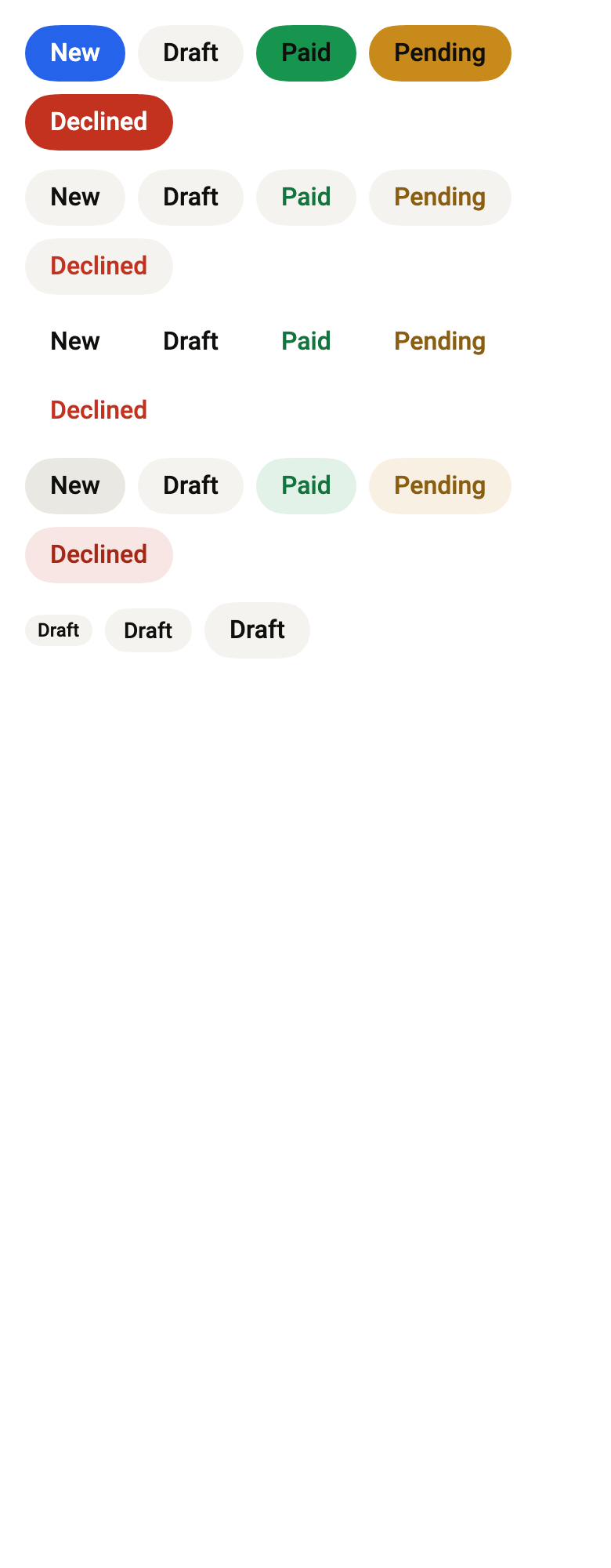
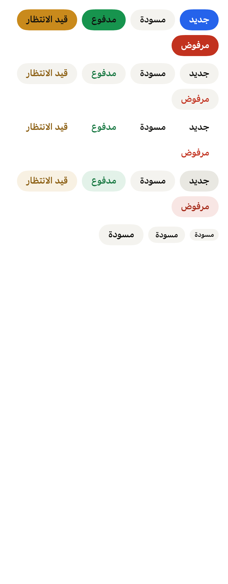
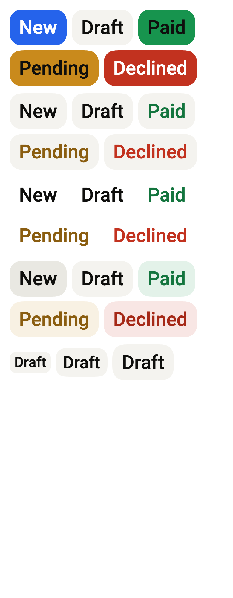
The 16 images published with version 0.2.3, rendered by the shared harness on macOS with Flutter 3.47.7. fliin verify chip compares your copy to them.
Use it to
- show an order status as a colored tag
- let people see that an item is new
- show the topic of an article as a tag
- show a notification count at the end of a row
- pick an active filter among tags
- Not for
- a main action: use a button (button)
- a message about the page's state: use an inline alert (alert)
- States
Source
The files fliin add chip copies into your app, before your prefix and imports are applied.
chip/fl_chip.dart
// Modified from the Chip of HeroUI Native 1.0.10, Copyright 2025 NextUI Inc.,
// licensed under Apache 2.0: https://www.apache.org/licenses/LICENSE-2.0
import 'package:flutter/widgets.dart';
import 'package:fliin_ui/core/fliin.dart';

/// The fill of a [FlChip].
enum FlChipVariant {
  /// The solid background of the color, its foreground text.
  primary,

  /// The `control` background, the color's soft text.
  secondary,

  /// No background, the color's soft text.
  tertiary,

  /// The color's tint at 15 %, its soft text.
  soft,
}

/// The color of a [FlChip].
enum FlChipColor {
  /// The highlighted color: solid, `selected` with
  /// `onSelected` text (the accent is reserved for the primary action);
  /// soft, `accentSoft` with `onAccentSoft` text.
  accent,

  /// The neutral.
  neutral,

  /// Green.
  success,

  /// Orange.
  warning,

  /// Red.
  danger,
}

/// The size of a [FlChip]: its padding, its radius and its text.
enum FlChipSize {
  /// 20 high, `textXs` text.
  sm,

  /// 28 high, `textSm` text.
  md,

  /// 36 high, `textBase` text.
  lg,
}

/// A chip: a short medium-weight label in a capsule,
/// between two optional pieces of content (an icon, a remove button). It is
/// pressable when [onPressed] is given, without changing appearance.
class FlChip extends StatelessWidget {
  /// A `primary` `accent` `md` chip that shows [label].
  const FlChip({
    super.key,
    required this.label,
    this.variant = FlChipVariant.primary,
    this.color = FlChipColor.accent,
    this.size = FlChipSize.md,
    this.leading,
    this.trailing,
    this.onPressed,
    this.enabled = true,
    this.statesController,
    this.dot = false,
  });

  /// The label.
  final String label;

  /// The fill.
  final FlChipVariant variant;

  /// The color.
  final FlChipColor color;

  /// The size.
  final FlChipSize size;

  /// Content before the label, tinted with its color and at its size.
  final Widget? leading;

  /// Content after the label, tinted likewise.
  final Widget? trailing;

  /// True: a dot of the label's color before it, a status chip
  /// ("Active", "Pending"), 6 across with the default tokens. It comes
  /// before [leading], and is not read: the label says the status.
  final bool dot;

  /// When null: the chip is not pressable.
  final VoidCallback? onPressed;

  /// False: a pressable chip that cannot be pressed now, faded to
  /// `size.disabledOpacity` and announced as disabled. No effect without
  /// [onPressed].
  final bool enabled;

  /// The chip's states, which the app can read or force; see
  /// `FlPressable.statesController`. Hovered or pressed, a `control` chip
  /// steps to `controlPressed`, Izydesk's state matrix.
  final WidgetStatesController? statesController;

  @override
  Widget build(BuildContext context) {
    final theme = FlScope.of(context);
    final colors = theme.colors;
    final xs = theme.space.xs;
    final scale = theme.typography;
    final soft = variant != FlChipVariant.primary;
    final fill = switch ((variant, color)) {
      (FlChipVariant.tertiary, _) => null,
      (FlChipVariant.secondary, _) || (_, FlChipColor.neutral) => colors.control,
      (FlChipVariant.primary, FlChipColor.accent) => colors.selected,
      (FlChipVariant.primary, FlChipColor.success) => colors.success,
      (FlChipVariant.primary, FlChipColor.warning) => colors.warning,
      (FlChipVariant.primary, FlChipColor.danger) => colors.dangerFill,
      (FlChipVariant.soft, FlChipColor.accent) => colors.accentSoft,
      (FlChipVariant.soft, FlChipColor.success) => colors.successSoft,
      (FlChipVariant.soft, FlChipColor.warning) => colors.warningSoft,
      (FlChipVariant.soft, FlChipColor.danger) => colors.dangerSoft,
    };
    final ink = switch (color) {
      FlChipColor.accent => soft ? colors.onAccentSoft : colors.onSelected,
      FlChipColor.neutral => colors.onControl,
      FlChipColor.success => soft ? colors.onSuccessSoft : colors.onSuccess,
      FlChipColor.warning => soft ? colors.onWarningSoft : colors.onWarning,
      // `danger` holds 4.5:1 on `control`; `onDangerSoft` is darker only
      // for the soft tint.
      FlChipColor.danger => switch (variant) {
        FlChipVariant.primary => colors.onDanger,
        FlChipVariant.secondary || FlChipVariant.tertiary => colors.danger,
        FlChipVariant.soft => colors.onDangerSoft,
      },
    };
    // px-2 py-0.5 rounded-xl, px-3 py-1 rounded-2xl, px-4 py-1.5 rounded-3xl.
    final (role, horizontal, vertical, radius) = switch (size) {
      FlChipSize.sm => (FlTextRole.textXs, xs * 2, xs / 2, theme.shape.radiusXl),
      FlChipSize.md => (FlTextRole.textSm, xs * 3, xs, theme.shape.radiusXxl),
      FlChipSize.lg => (FlTextRole.textBase, xs * 4, xs * 1.5, theme.shape.radiusCard),
    };
    final style = scale.resolve(role).copyWith(color: ink, fontWeight: theme.tokens.typography.weight.medium);
    final leading = this.leading;
    final trailing = this.trailing;
    final shape = FlContinuousBorder(radius: radius);
    Widget chip({bool hovered = false}) => FlPixelSnap(
      child: DecoratedBox(
        decoration: ShapeDecoration(
          color: hovered && fill == colors.control ? colors.controlPressed : fill,
          shape: shape,
        ),
        child: Padding(
          padding: EdgeInsetsDirectional.symmetric(horizontal: horizontal, vertical: vertical),
          child: IconTheme.merge(
            data: IconThemeData(color: ink, size: scale.style(role).size),
            child: Row(
              mainAxisSize: MainAxisSize.min,
              // gap-1: calc(var(--spacing) * 1).
              spacing: xs,
              children: [
                if (dot)
                  SizedBox.square(
                    dimension: xs * 1.5,
                    child: DecoratedBox(
                      decoration: ShapeDecoration(color: ink, shape: const CircleBorder()),
                    ),
                  ),
                ?leading,
                Flexible(
                  child: Text(
                    label,
                    style: style,
                    strutStyle: scale.strut(role, inheritedFamily: DefaultTextStyle.of(context).style.fontFamily),
                  ),
                ),
                ?trailing,
              ],
            ),
          ),
        ),
      ),
    );
    final onPressed = this.onPressed;
    // align-self: flex-start: stretched by a column, the chip keeps its
    // width, at the start of the line.
    if (onPressed == null) return _start(chip());
    return _start(
      FlPressable(
        onPressed: enabled ? onPressed : null,
        statesController: statesController,
        borderRadius: BorderRadius.all(Radius.circular(radius)),
        scaleOnPress: false,
        overlay: FlPressOverlay.none,
        builder: (context, states) => states.contains(WidgetState.disabled)
            ? Opacity(opacity: theme.size.disabledOpacity, child: chip())
            : chip(hovered: states.contains(WidgetState.hovered) || states.contains(WidgetState.pressed)),
      ),
    );
  }
}

Widget _start(Widget child) =>
    Align(alignment: AlignmentDirectional.centerStart, widthFactor: 1, heightFactor: 1, child: child);