Components / forms
Color area
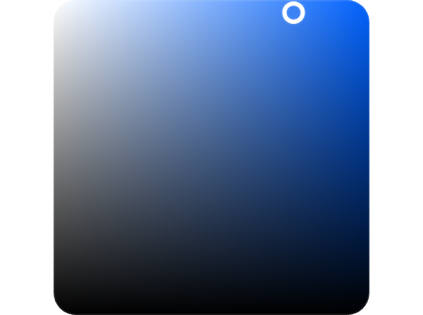
Sets two channels of a color at once on a gradient square, saturation and brightness under the chosen hue by default.
Import
In a Flutter app where fliin init has run:
Examples
Example
A two-dimensional picker: saturation across, brightness down. Drag the thumb, or use the arrow keys.
import 'package:your_app/ui/fliin/components/color_area/fl_color_area.dart';
import 'package:flutter/widgets.dart';

class ColorAreaExample extends StatefulWidget {
  const ColorAreaExample({super.key});

  @override
  State<ColorAreaExample> createState() => _ColorAreaExampleState();
}

class _ColorAreaExampleState extends State<ColorAreaExample> {
  var _color = const HSVColor.fromAHSV(1, 217, 0.76, 0.96);

  @override
  Widget build(BuildContext context) {
    return Center(
      child: FlColorArea(
        value: _color,
        xLabel: 'Saturation',
        yLabel: 'Brightness',
        onChanged: (color) => setState(() => _color = color),
      ),
    );
  }
}Value
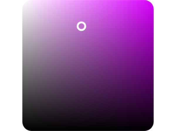
The area starts on the color you pass as value.
import 'package:your_app/ui/fliin/components/color_area/fl_color_area.dart';
import 'package:flutter/widgets.dart';

class ColorAreaValueExample extends StatefulWidget {
  const ColorAreaValueExample({super.key});

  @override
  State<ColorAreaValueExample> createState() => _ColorAreaValueExampleState();
}

class _ColorAreaValueExampleState extends State<ColorAreaValueExample> {
  var _color = const HSVColor.fromAHSV(1, 291, 0.45, 0.8);

  @override
  Widget build(BuildContext context) {
    return Center(
      child: FlColorArea(
        value: _color,
        xLabel: 'Saturation',
        yLabel: 'Brightness',
        onChanged: (color) => setState(() => _color = color),
      ),
    );
  }
}Dots
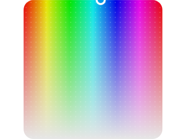
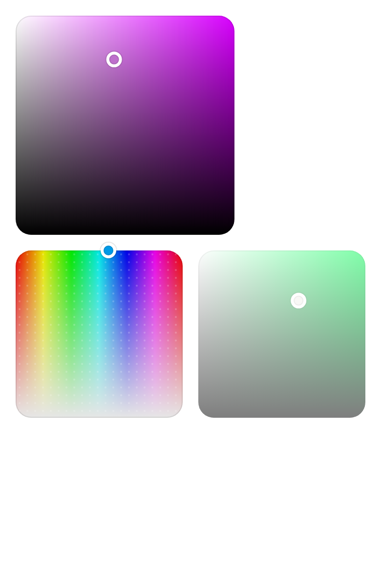
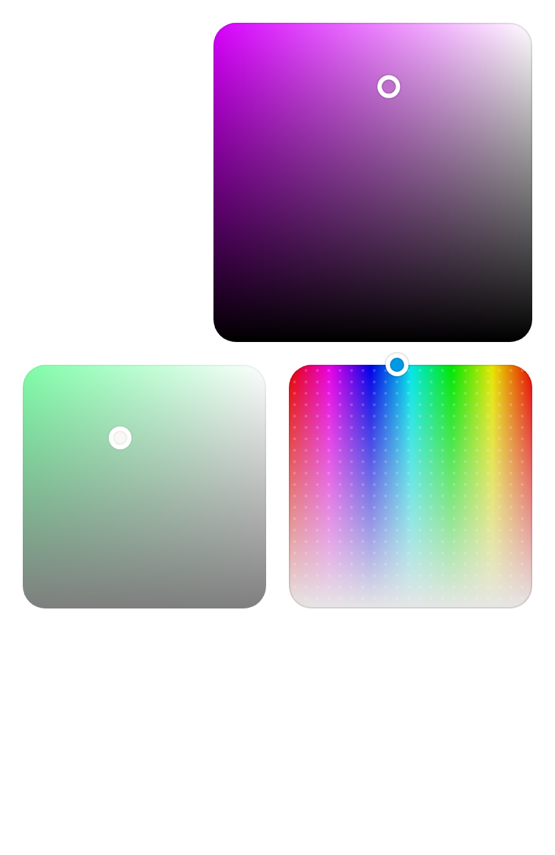
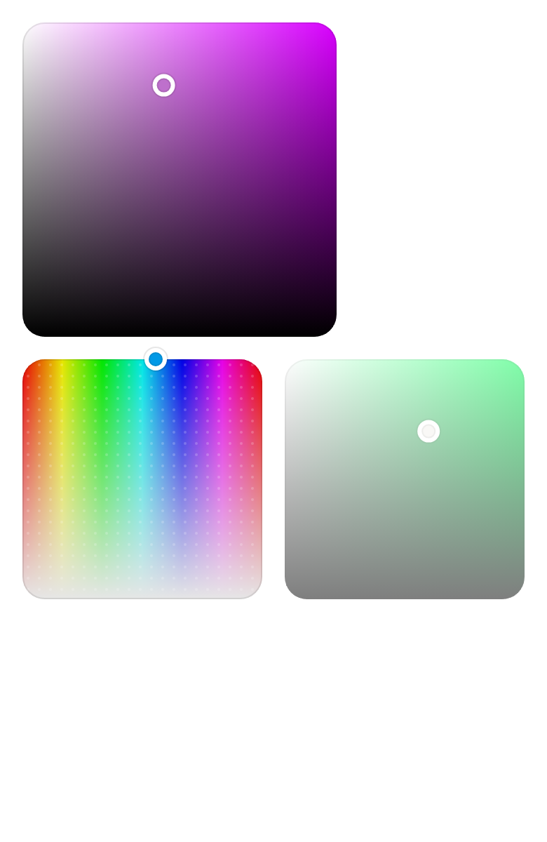
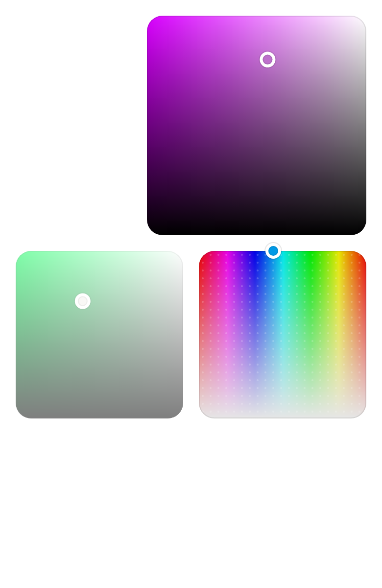
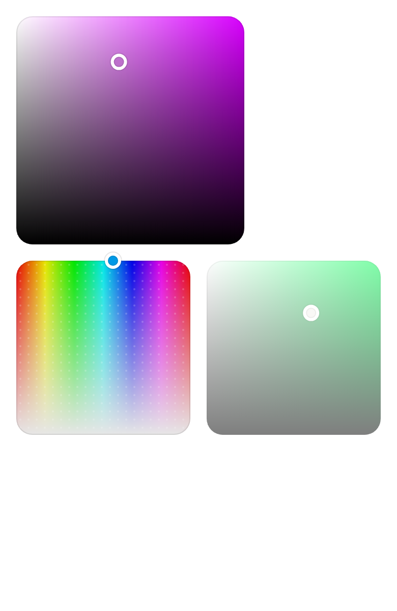
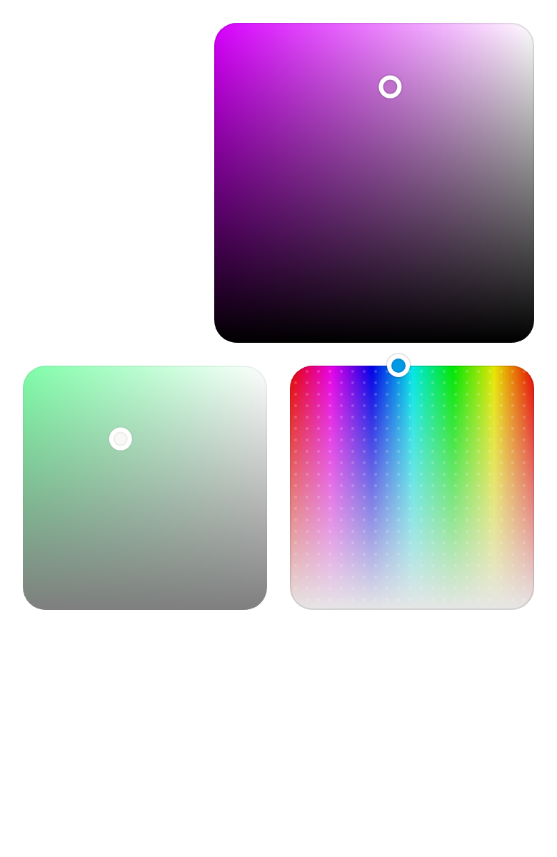
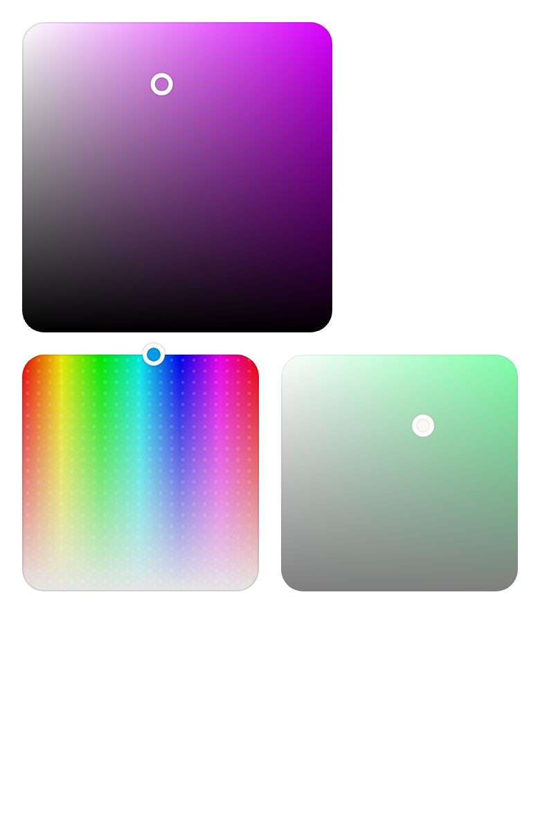
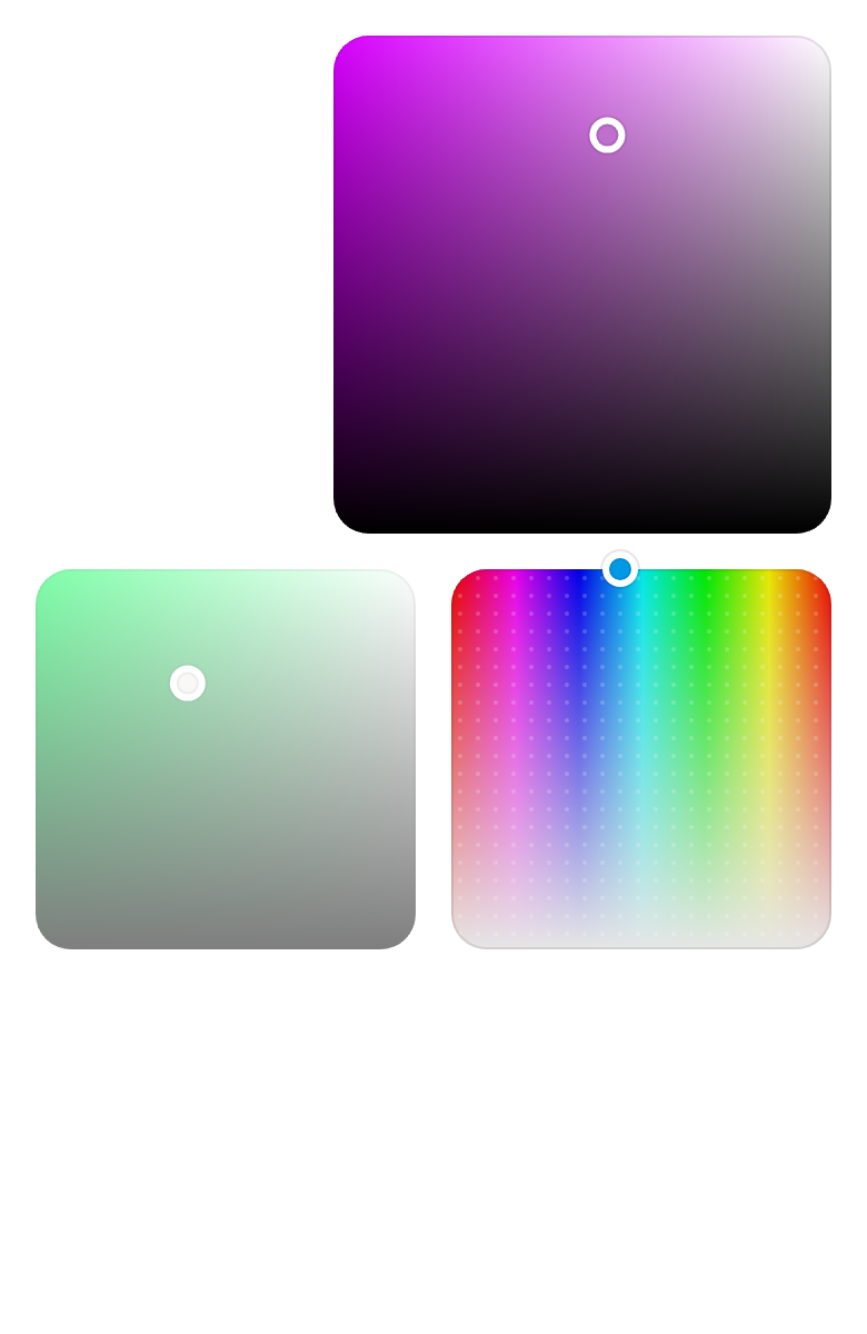
Any two channels, here hue and saturation, with showDots drawing a dot grid over the area.
import 'package:your_app/ui/fliin/components/color_area/fl_color_area.dart';
import 'package:your_app/ui/fliin/components/color_swatch/fl_color_channel.dart';
import 'package:flutter/widgets.dart';

class ColorAreaDotsExample extends StatefulWidget {
  const ColorAreaDotsExample({super.key});

  @override
  State<ColorAreaDotsExample> createState() => _ColorAreaDotsExampleState();
}

class _ColorAreaDotsExampleState extends State<ColorAreaDotsExample> {
  var _color = const HSVColor.fromAHSV(1, 200, 1, 0.9);

  @override
  Widget build(BuildContext context) {
    return Center(
      child: FlColorArea(
        value: _color,
          xChannel: FlColorChannel.hue,
          yChannel: FlColorChannel.saturation,
          showDots: true,
        xLabel: 'Hue',
        yLabel: 'Saturation',
        onChanged: (color) => setState(() => _color = color),
      ),
    );
  }
}Disabled
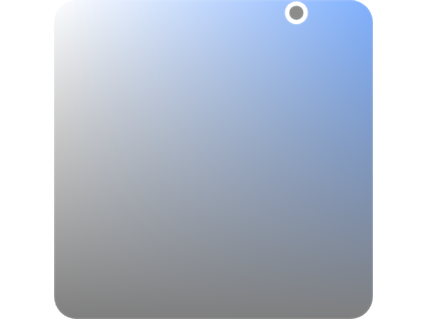
onChanged: null disables the area.
import 'package:your_app/ui/fliin/components/color_area/fl_color_area.dart';
import 'package:flutter/widgets.dart';

class ColorAreaDisabledExample extends StatefulWidget {
  const ColorAreaDisabledExample({super.key});

  @override
  State<ColorAreaDisabledExample> createState() => _ColorAreaDisabledExampleState();
}

class _ColorAreaDisabledExampleState extends State<ColorAreaDisabledExample> {
  final _color = const HSVColor.fromAHSV(1, 217, 0.76, 0.96);

  @override
  Widget build(BuildContext context) {
    return Center(
      child: FlColorArea(
        value: _color,
        xLabel: 'Saturation',
        yLabel: 'Brightness',
        onChanged: null,
      ),
    );
  }
}Usage
The code the reference images render:
final example = Builder(
  builder: (context) {
    final rtl = variant.dir == TextDirection.rtl;
    final theme = FlScope.of(context);
    String tr(String fr, String ar) => rtl ? ar : fr;
    return ColoredBox(
      color: theme.colors.surface,
      child: SingleChildScrollView(
        padding: EdgeInsetsDirectional.all(theme.space.lg),
        child: Column(
          crossAxisAlignment: CrossAxisAlignment.start,
          spacing: theme.space.lg,
          children: [
            FlColorArea(
              value: const HSVColor.fromAHSV(1, 291, 0.45, 0.8),
              xLabel: tr('Saturation', 'التشبع'),
              yLabel: tr('Brightness', 'السطوع'),
              onChanged: (_) {},
            ),
            Row(
              spacing: theme.space.lg,
              children: [
                Expanded(
                  child: FlColorArea(
                    value: const HSVColor.fromAHSV(1, 200, 1, 0.9),
                    xChannel: FlColorChannel.hue,
                    yChannel: FlColorChannel.saturation,
                    showDots: true,
                    xLabel: tr('Hue', 'الصبغة'),
                    yLabel: tr('Saturation', 'التشبع'),
                    onChanged: (_) {},
                  ),
                ),
                Expanded(
                  child: FlColorArea(
                    value: const HSVColor.fromAHSV(1, 140, 0.6, 0.7),
                    xLabel: tr('Saturation', 'التشبع'),
                    yLabel: tr('Brightness', 'السطوع'),
                    onChanged: null,
                  ),
                ),
              ],
            ),
          ],
        ),
      ),
    );
  },
);API
FlColorArea: class extends StatefulWidget
FlColorArea.new: const new({super.key, required HSVColor value, required ValueChanged<HSVColor>? onChanged, required String xLabel, required String yLabel, ValueChanged<HSVColor>? onChangeEnd, FlColorChannel xChannel, FlColorChannel yChannel, bool showDots, bool expand, bool autofocus})
FlColorArea.value: get HSVColor
FlColorArea.onChanged: get ValueChanged<HSVColor>?
FlColorArea.onChangeEnd: get ValueChanged<HSVColor>?
FlColorArea.xLabel: get String
FlColorArea.yLabel: get String
FlColorArea.xChannel: get FlColorChannel
FlColorArea.yChannel: get FlColorChannel
FlColorArea.showDots: get bool
FlColorArea.expand: get bool
FlColorArea.autofocus: get bool
FlColorArea.createState: State<FlColorArea>()Reference renders
The 16 images published with version 0.1.0, rendered by the shared harness on macOS with Flutter 3.47.7. fliin verify color-area compares your copy to them.
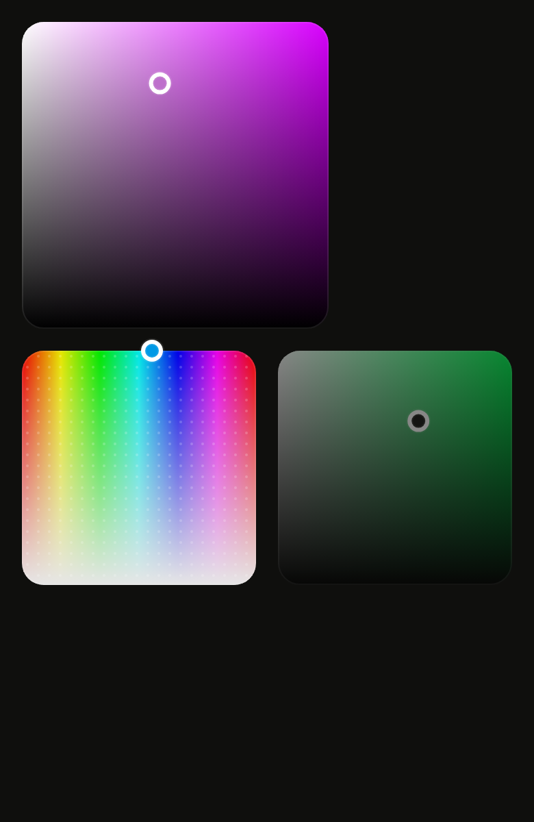
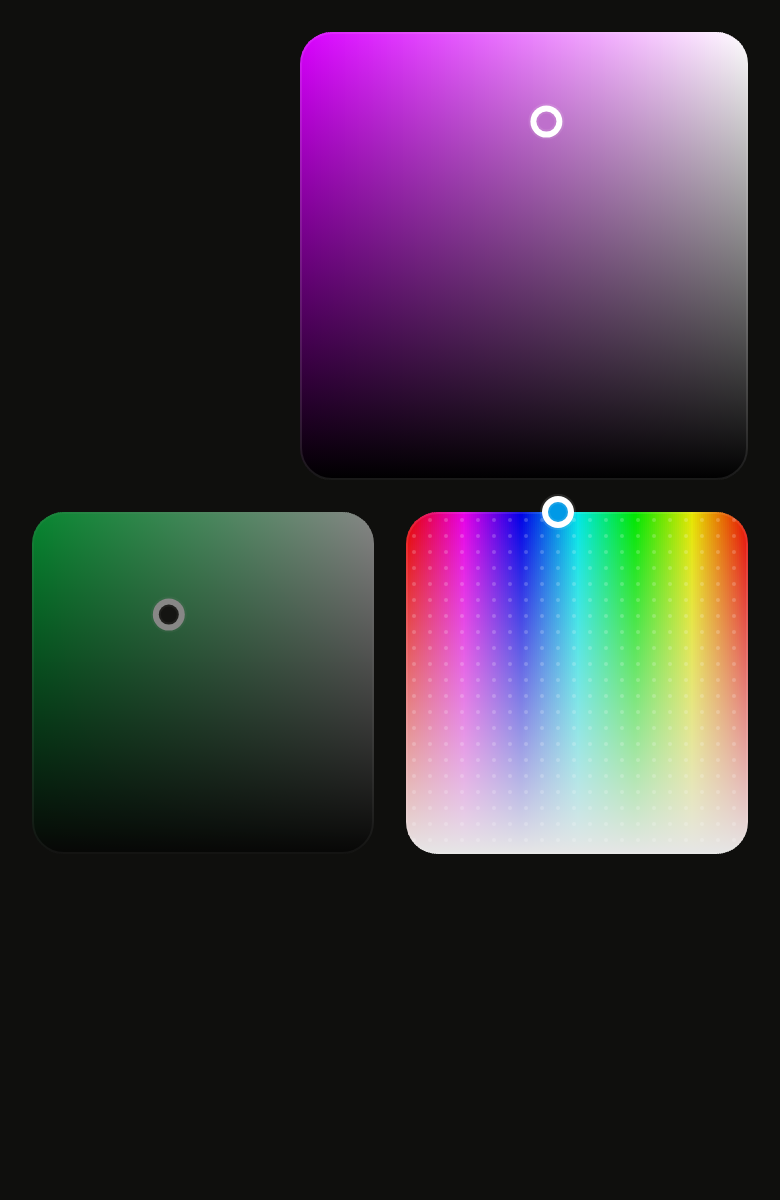
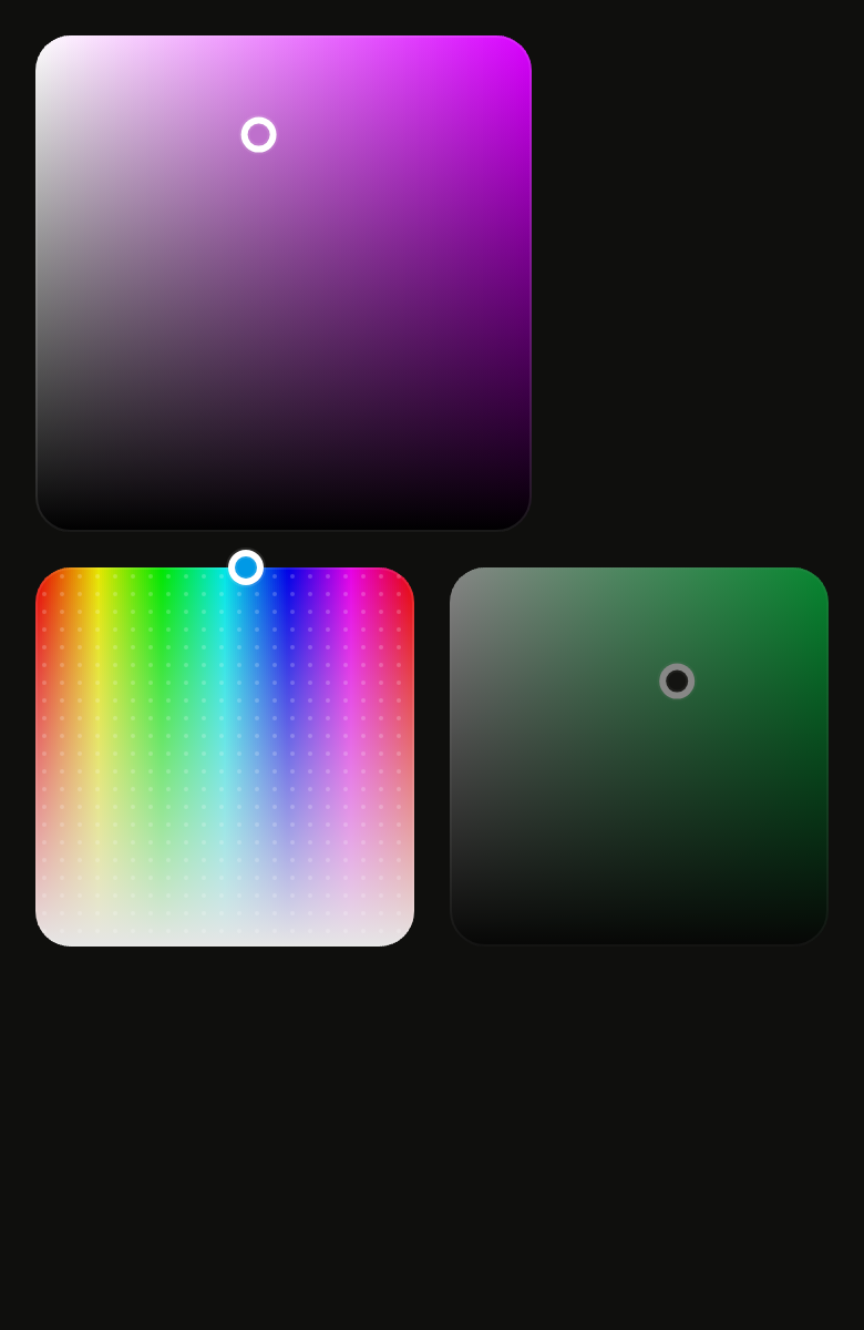
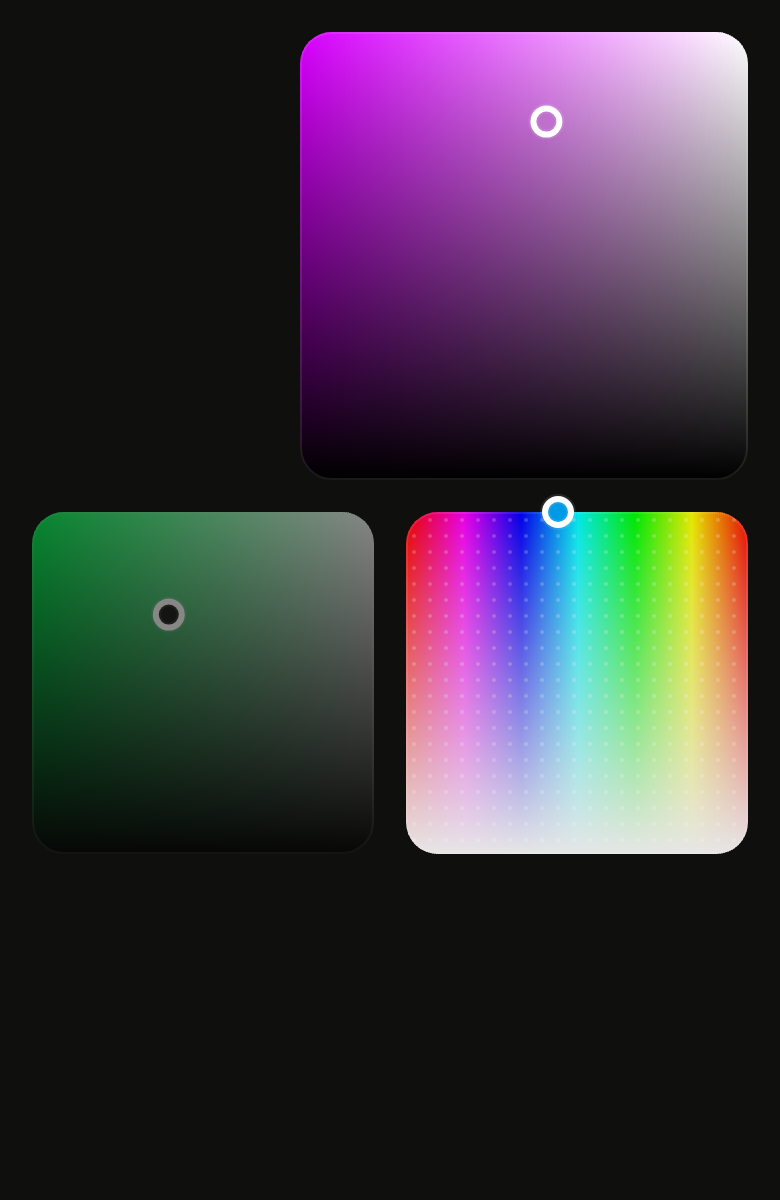
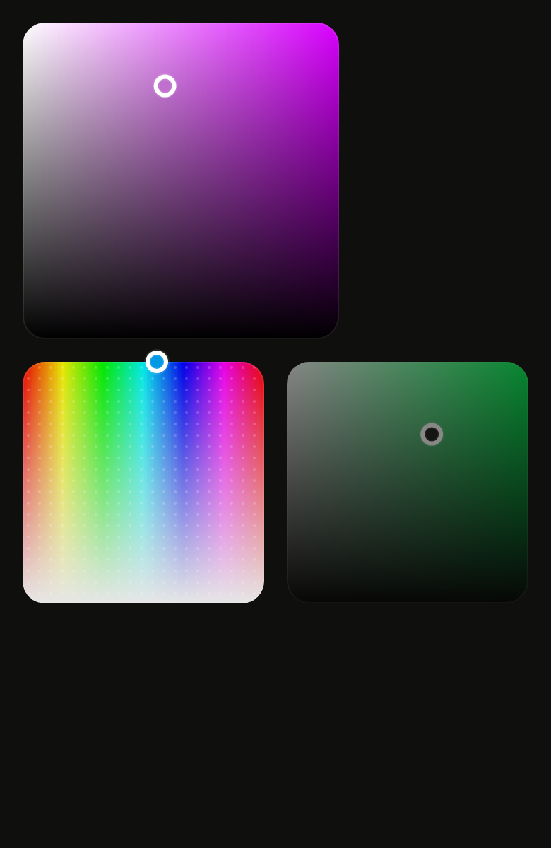
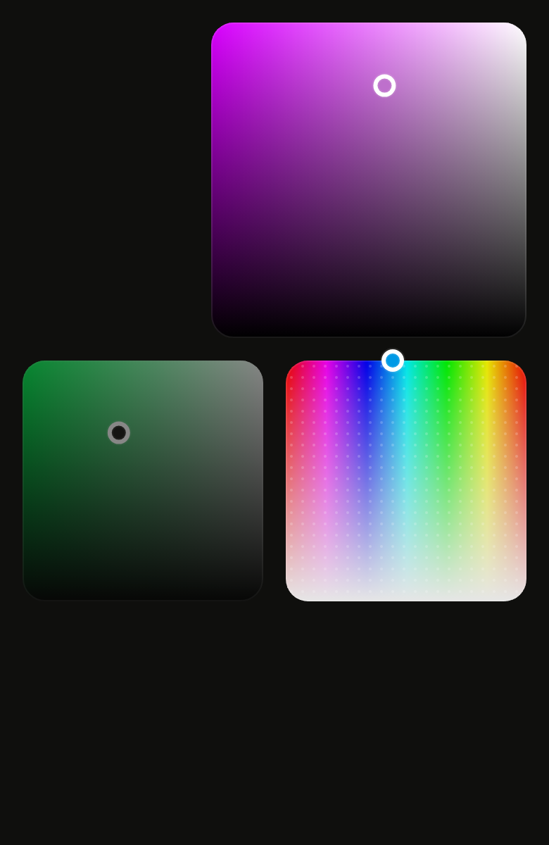
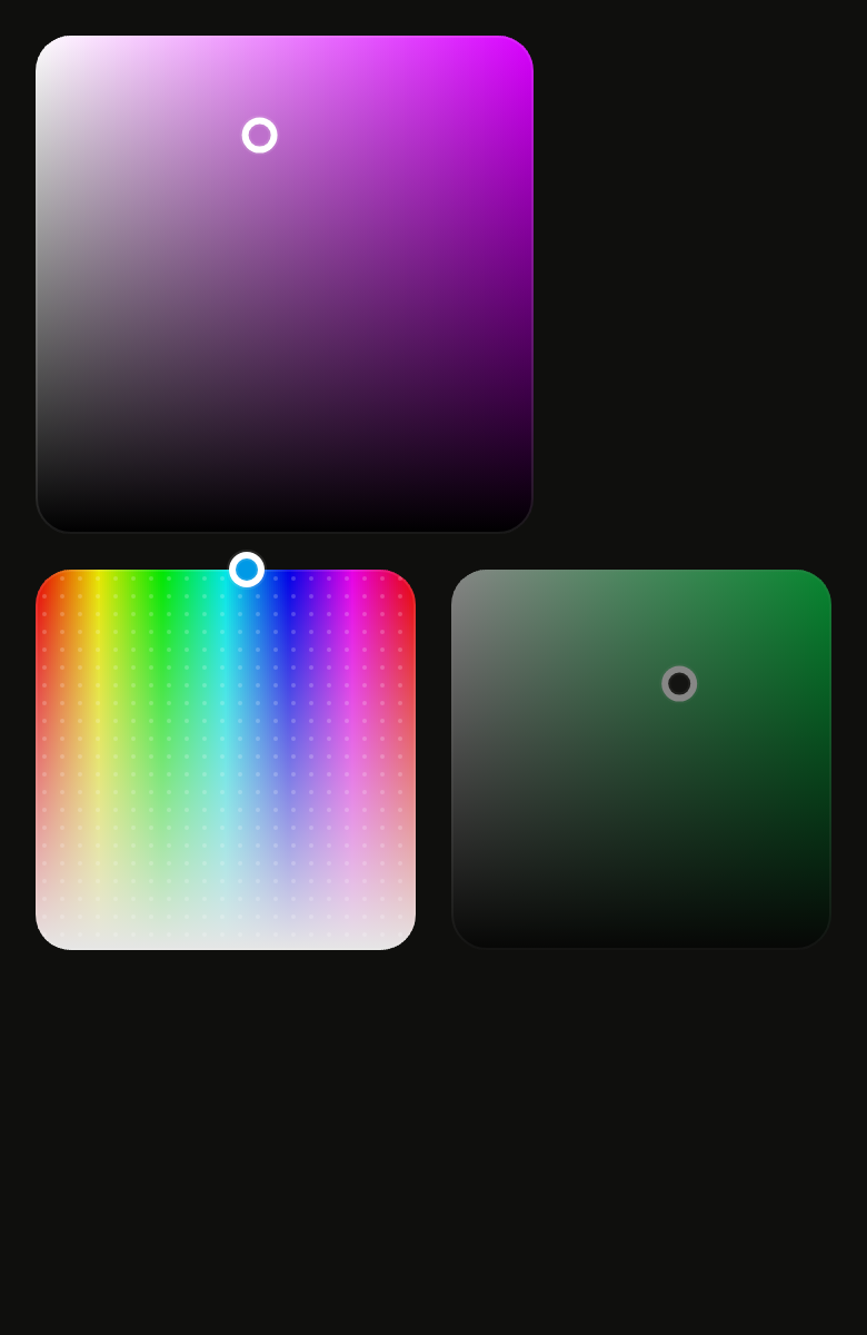
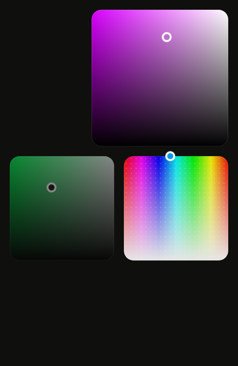
Use it to
- pick saturation and brightness of a colour on a square
- adjust two colour channels at once on a gradient square
- choose hue and saturation in one colour square
- show a dot grid over the colour area
- move the colour with the keyboard arrows
- Not for
- a single channel, such as the hue: use a color slider (color-slider)
- one color among a few shades: use a color swatch picker (color-swatch-picker)
- a full choice in a panel: use a color picker (color-picker)
- States
Source
The files fliin add color-area copies into your app, before your prefix and imports are applied.
color_area/fl_color_area.dart
// Modified from the ColorArea of HeroUI React v3, Copyright 2025 NextUI Inc.,
// licensed under Apache 2.0: https://www.apache.org/licenses/LICENSE-2.0
import 'dart:math' as math;

import 'package:flutter/gestures.dart' show DragStartBehavior;
import 'package:flutter/services.dart';
import 'package:flutter/widgets.dart';
import 'package:fliin_ui/components/color_swatch/fl_color_swatch.dart';
import 'package:fliin_ui/core/fliin.dart';

/// An arrow moves one percent (one degree of hue); Page, ten times as much.
const int _pageSteps = 10;

/// The dots of `color-area--show-dots`: 1 in radius every 8, in white at
/// 20 %.
const double _dotOpacity = 0.2;

class _MoveIntent extends Intent {
  const _MoveIntent(this.dx, this.dy);

  final int dx;
  final int dy;
}

/// A two-dimensional color area: [xChannel] grows
/// toward the end, [yChannel] upward, over a square painted with the colors
/// they reach, computed from [value]; a 16 thumb ringed with white shows the
/// picked color and grows to 20 while dragged. By default, saturation and
/// brightness, under the hue of [value]: the square of a color picker.
///
/// The color is a value of the app, held as an [HSVColor]; none of the
/// area's tints comes from the theme. The area does not keep it: the parent
/// gives back in [value] what [onChanged] receives.
///
/// The screen reader reads two sliders, one per channel, named by
/// [xLabel] and [yLabel]. On the keyboard, a single Tab stop: the
/// horizontal arrows move [xChannel], the vertical ones [yChannel], by one
/// percent, ten times as much with Shift or Page.
class FlColorArea extends StatefulWidget {
  /// An area over [xChannel] and [yChannel] of [value].
  const FlColorArea({
    super.key,
    required this.value,
    required this.onChanged,
    required this.xLabel,
    required this.yLabel,
    this.onChangeEnd,
    this.xChannel = FlColorChannel.saturation,
    this.yChannel = FlColorChannel.brightness,
    this.showDots = false,
    this.expand = false,
    this.autofocus = false,
  }) : assert(xChannel != yChannel, 'two different channels'),
       assert(
         xChannel != FlColorChannel.lightness &&
             yChannel != FlColorChannel.lightness &&
             xChannel != FlColorChannel.alpha &&
             yChannel != FlColorChannel.alpha,
         'the area crosses two channels of hsb: hue, saturation, brightness',
       );

  /// The color shown; the area moves its two channels only.
  final HSVColor value;

  /// Receives the color with its new channels while dragging, on tap and
  /// from the keyboard; null, the area is disabled and fades.
  final ValueChanged<HSVColor>? onChanged;

  /// Receives the color when a drag ends, after a tap or a key press.
  final ValueChanged<HSVColor>? onChangeEnd;

  /// The name of the horizontal channel for the screen reader
  /// ("Saturation").
  final String xLabel;

  /// The name of the vertical channel for the screen reader ("Brightness").
  final String yLabel;

  /// The horizontal channel, saturation by default.
  final FlColorChannel xChannel;

  /// The vertical channel, brightness by default.
  final FlColorChannel yChannel;

  /// True: a grid of light dots over the colors (`showDots`).
  final bool showDots;

  /// False (the default): at most 224 per side (`max-w-56`); true, the
  /// available width, as in a color picker (`max-w-full`).
  final bool expand;

  /// Takes focus on first build if nothing else in its scope has it.
  final bool autofocus;

  @override
  State<FlColorArea> createState() => _FlColorAreaState();
}

class _FlColorAreaState extends State<FlColorArea> with SingleTickerProviderStateMixin {
  final GlobalKey _box = GlobalKey();
  final FocusNode _focus = FocusNode(debugLabel: 'FlColorArea');

  /// 0 at rest, 1 dragged: the thumb grows from 16 to 20 over `short3`.
  late final AnimationController _grow = AnimationController(vsync: this);
  bool _focused = false;
  bool _dragging = false;

  /// The last color sent to the parent, until it rebuilds: two key presses
  /// in the same frame add up.
  HSVColor? _sent;

  bool get _enabled => widget.onChanged != null;

  HSVColor get _value => _sent ?? widget.value;

  @override
  void didUpdateWidget(FlColorArea oldWidget) {
    super.didUpdateWidget(oldWidget);
    _sent = null;
  }

  @override
  void dispose() {
    _grow.dispose();
    _focus.dispose();
    super.dispose();
  }

  double _read(FlColorChannel channel) => _value.channel(channel, FlColorSpace.hsb);

  double _stepOf(FlColorChannel channel) => channel == FlColorChannel.hue ? 1 : 0.01;

  HSVColor _with(double x, double y) =>
      _value.withChannel(widget.xChannel, FlColorSpace.hsb, x).withChannel(widget.yChannel, FlColorSpace.hsb, y);

  void _change(HSVColor next) {
    if (next == _value) return;
    _sent = next;
    widget.onChanged?.call(next);
  }

  void _commit(HSVColor next) {
    _change(next);
    widget.onChangeEnd?.call(next);
  }

  HSVColor? _at(Offset global) {
    final box = _box.currentContext?.findRenderObject();
    if (box is! RenderBox || !box.hasSize || box.size.isEmpty) return null;
    final local = box.globalToLocal(global);
    final ltr = Directionality.of(context) == TextDirection.ltr;
    final fx = ((ltr ? local.dx : box.size.width - local.dx) / box.size.width).clamp(0.0, 1.0);
    final fy = (1 - local.dy / box.size.height).clamp(0.0, 1.0);
    return _with(fx * widget.xChannel.max, fy * widget.yChannel.max);
  }

  void _setDragging(bool dragging) {
    if (dragging == _dragging) return;
    setState(() => _dragging = dragging);
    final motion = FlMotion.of(context);
    if (motion.reduced) {
      _grow.value = dragging ? 1 : 0;
    } else {
      _grow.animateTo(dragging ? 1 : 0, duration: motion.tokens.short3, curve: motion.tokens.easeOut);
    }
  }

  void _start(Offset global) {
    _setDragging(true);
    if (_at(global) case final next?) _change(next);
  }

  void _update(Offset global) {
    if (!_dragging) return;
    if (_at(global) case final next?) _change(next);
  }

  void _end() {
    if (!_dragging) return;
    _setDragging(false);
    widget.onChangeEnd?.call(_value);
  }

  void _move(int dx, int dy) => _commit(
    _with(
      _read(widget.xChannel) + dx * _stepOf(widget.xChannel),
      _read(widget.yChannel) + dy * _stepOf(widget.yChannel),
    ),
  );

  Map<ShortcutActivator, Intent> get _shortcuts {
    final forward = Directionality.of(context) == TextDirection.ltr ? 1 : -1;
    return {
      const SingleActivator(LogicalKeyboardKey.arrowRight): _MoveIntent(forward, 0),
      const SingleActivator(LogicalKeyboardKey.arrowLeft): _MoveIntent(-forward, 0),
      const SingleActivator(LogicalKeyboardKey.arrowUp): const _MoveIntent(0, 1),
      const SingleActivator(LogicalKeyboardKey.arrowDown): const _MoveIntent(0, -1),
      SingleActivator(LogicalKeyboardKey.arrowRight, shift: true): _MoveIntent(forward * _pageSteps, 0),
      SingleActivator(LogicalKeyboardKey.arrowLeft, shift: true): _MoveIntent(-forward * _pageSteps, 0),
      const SingleActivator(LogicalKeyboardKey.arrowUp, shift: true): const _MoveIntent(0, _pageSteps),
      const SingleActivator(LogicalKeyboardKey.arrowDown, shift: true): const _MoveIntent(0, -_pageSteps),
      const SingleActivator(LogicalKeyboardKey.pageUp): const _MoveIntent(0, _pageSteps),
      const SingleActivator(LogicalKeyboardKey.pageDown): const _MoveIntent(0, -_pageSteps),
    };
  }

  /// The slider node of one channel, adjusted by one step.
  Widget _axisNode(FlColorChannel channel, String label, Widget child) {
    final value = widget.value.channel(channel, FlColorSpace.hsb);
    final step = _stepOf(channel);
    final up = math.min(channel.max, value + step);
    final down = math.max(0.0, value - step);
    HSVColor set(double to) => _value.withChannel(channel, FlColorSpace.hsb, to);
    final canUp = _enabled && up != value;
    final canDown = _enabled && down != value;
    return Semantics(
      container: true,
      slider: true,
      enabled: _enabled,
      label: label,
      value: flColorChannelLabel(channel, value),
      increasedValue: canUp ? flColorChannelLabel(channel, up) : null,
      decreasedValue: canDown ? flColorChannelLabel(channel, down) : null,
      onIncrease: canUp ? () => _commit(set(up)) : null,
      onDecrease: canDown ? () => _commit(set(down)) : null,
      child: child,
    );
  }

  @override
  Widget build(BuildContext context) {
    final theme = FlScope.of(context);
    final xs = theme.space.xs;
    // color-area.css: `max-w-56`, square, `rounded-2xl`; a 16 thumb that
    // grows to 20 while dragged.
    final maxSide = xs * 56;
    final knob = xs * 4;
    final grown = xs * 5;
    final radius = theme.shape.radiusXxl;
    final shape = RoundedRectangleBorder(borderRadius: BorderRadius.all(Radius.circular(radius)));
    final x = widget.value.channel(widget.xChannel, FlColorSpace.hsb) / widget.xChannel.max;
    final y = widget.value.channel(widget.yChannel, FlColorSpace.hsb) / widget.yChannel.max;
    final thumbColor = _enabled ? widget.value.withAlpha(1).toColor() : theme.colors.control;

    final area = LayoutBuilder(
      builder: (context, constraints) {
        // Without a bounded width, the area keeps its 224.
        final side = !constraints.hasBoundedWidth
            ? maxSide
            : widget.expand
            ? constraints.maxWidth
            : math.min(maxSide, constraints.maxWidth);
        // Square inside a wider box, held at its start.
        return Align(
          alignment: AlignmentDirectional.topStart,
          widthFactor: 1,
          heightFactor: 1,
          child: SizedBox.square(
            key: _box,
            dimension: side,
            child: Stack(
              clipBehavior: Clip.none,
              children: [
                Positioned.fill(
                  child: CustomPaint(
                    painter: _AreaPainter(
                      value: widget.value.withAlpha(1),
                      xChannel: widget.xChannel,
                      yChannel: widget.yChannel,
                      shape: shape,
                      textDirection: Directionality.of(context),
                      dots: widget.showDots ? theme.colors.switchThumb.withValues(alpha: _dotOpacity) : null,
                      dotPitch: theme.space.sm,
                    ),
                    child: DecoratedBox(
                      decoration: ShapeDecoration(
                        shape: flColorEdge(shape, theme.colors.onSurface.withValues(alpha: flColorEdgeOpacity)),
                      ),
                    ),
                  ),
                ),
                AnimatedBuilder(
                  animation: _grow,
                  builder: (context, _) {
                    final extent = knob + (grown - knob) * _grow.value;
                    return PositionedDirectional(
                      start: x * side - extent / 2,
                      top: (1 - y) * side - extent / 2,
                      child: FlFocusRing(
                        visible: _focused,
                        borderRadius: BorderRadius.circular(extent / 2),
                        child: FlColorThumb(color: thumbColor, extent: extent, lifted: false),
                      ),
                    );
                  },
                ),
              ],
            ),
          ),
        );
      },
    );

    return Opacity(
      opacity: _enabled ? 1 : theme.size.disabledOpacity,
      child: FocusableActionDetector(
        focusNode: _focus,
        enabled: _enabled,
        autofocus: widget.autofocus,
        mouseCursor: _enabled ? SystemMouseCursors.click : MouseCursor.defer,
        shortcuts: _shortcuts,
        actions: {_MoveIntent: CallbackAction<_MoveIntent>(onInvoke: (intent) => _move(intent.dx, intent.dy))},
        onShowFocusHighlight: (visible) => setState(() => _focused = visible),
        child: Semantics(
          explicitChildNodes: true,
          child: _axisNode(
            widget.xChannel,
            widget.xLabel,
            _axisNode(
              widget.yChannel,
              widget.yLabel,
              GestureDetector(
                behavior: HitTestBehavior.opaque,
                excludeFromSemantics: true,
                dragStartBehavior: DragStartBehavior.down,
                onTapUp: _enabled ? (details) => _commit(_at(details.globalPosition) ?? widget.value) : null,
                onPanStart: _enabled ? (details) => _start(details.globalPosition) : null,
                onPanUpdate: _enabled ? (details) => _update(details.globalPosition) : null,
                onPanEnd: _enabled ? (_) => _end() : null,
                onPanCancel: _enabled ? _end : null,
                child: area,
              ),
            ),
          ),
        ),
      ),
    );
  }
}

/// The area's colors, one vertical strip per logical point: each strip is a
/// gradient along [yChannel] at the [xChannel] value of its middle. Exact
/// stops (six sixths for the hue, two ends otherwise), since each channel of
/// hsb is linear in RGB between them.
class _AreaPainter extends CustomPainter {
  const _AreaPainter({
    required this.value,
    required this.xChannel,
    required this.yChannel,
    required this.shape,
    required this.textDirection,
    required this.dots,
    required this.dotPitch,
  });

  final HSVColor value;
  final FlColorChannel xChannel;
  final FlColorChannel yChannel;
  final ShapeBorder shape;
  final TextDirection textDirection;
  final Color? dots;
  final double dotPitch;

  @override
  void paint(Canvas canvas, Size size) {
    if (size.isEmpty) return;
    final rect = Offset.zero & size;
    canvas
      ..save()
      ..clipPath(shape.getOuterPath(rect, textDirection: textDirection));
    final strips = size.width.ceil();
    final width = size.width / strips;
    final stops = yChannel == FlColorChannel.hue ? 7 : 2;
    final ltr = textDirection == TextDirection.ltr;
    final paint = Paint()..isAntiAlias = false;
    for (var i = 0; i < strips; i++) {
      final fx = (i + 0.5) / strips;
      final column = value.withChannel(xChannel, FlColorSpace.hsb, fx * xChannel.max);
      final left = ltr ? i * width : size.width - (i + 1) * width;
      // Each strip overlaps the next by a fraction, so that no seam shows.
      final strip = Rect.fromLTWH(left, 0, width + 0.5, size.height);
      paint.shader = LinearGradient(
        begin: AlignmentDirectional.bottomCenter,
        end: AlignmentDirectional.topCenter,
        colors: [
          for (var k = 0; k < stops; k++)
            column.withChannel(yChannel, FlColorSpace.hsb, yChannel.max * k / (stops - 1)).toColor(),
        ],
      ).createShader(strip, textDirection: textDirection);
      canvas.drawRect(strip, paint);
    }
    if (dots case final color?) {
      final dot = Paint()..color = color;
      for (var y = dotPitch / 2; y < size.height; y += dotPitch) {
        for (var x = dotPitch / 2; x < size.width; x += dotPitch) {
          canvas.drawCircle(Offset(x, y), 1, dot);
        }
      }
    }
    canvas.restore();
  }

  @override
  bool shouldRepaint(_AreaPainter oldDelegate) =>
      value != oldDelegate.value ||
      xChannel != oldDelegate.xChannel ||
      yChannel != oldDelegate.yChannel ||
      shape != oldDelegate.shape ||
      textDirection != oldDelegate.textDirection ||
      dots != oldDelegate.dots ||
      dotPitch != oldDelegate.dotPitch;
}