Components / data-display
Separator
Marks the limit between two rows, two blocks or two columns with a thin or thick line, sharp to the pixel.
Import
In a Flutter app where fliin init has run:
Examples
Example
A horizontal separator between a heading and what follows, and vertical ones between links on a row, through axis.
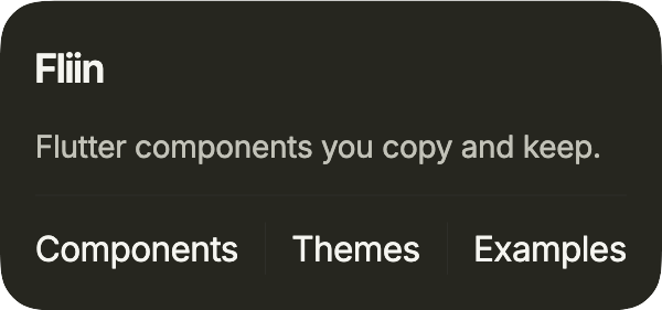
import 'package:your_app/ui/fliin/components/separator/fl_separator.dart';
import 'package:your_app/ui/fliin/components/surface/fl_surface.dart';
import 'package:your_app/ui/fliin/components/text/fl_text.dart';
import 'package:your_app/ui/fliin/core/fliin.dart';
import 'package:flutter/widgets.dart';

class SeparatorExample extends StatelessWidget {
  const SeparatorExample({super.key});

  @override
  Widget build(BuildContext context) {
    final space = FlScope.of(context).space;
    return FlSurface(
      variant: FlSurfaceVariant.secondary,
      child: Column(
        mainAxisSize: MainAxisSize.min,
        crossAxisAlignment: CrossAxisAlignment.start,
        spacing: space.md,
        children: [
          const FlText('Fliin', type: FlTextType.h5),
          const FlText('Flutter components you copy and keep.', type: FlTextType.bodySm, tone: FlTextTone.muted),
          const FlSeparator(),
          FittedBox(
            fit: BoxFit.scaleDown,
            alignment: AlignmentDirectional.centerStart,
            child: IntrinsicHeight(
              child: Row(
                spacing: space.md,
                children: const [
                  FlText('Components'),
                  FlSeparator(axis: Axis.vertical),
                  FlText('Themes'),
                  FlSeparator(axis: Axis.vertical),
                  FlText('Examples'),
                ],
              ),
            ),
          ),
        ],
      ),
    );
  }
}Variants
Two weights: thin by default between rows, thick between sections of a page.
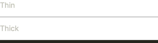
import 'package:your_app/ui/fliin/components/separator/fl_separator.dart';
import 'package:your_app/ui/fliin/components/text/fl_text.dart';
import 'package:your_app/ui/fliin/core/fliin.dart';
import 'package:flutter/widgets.dart';

class SeparatorVariantsExample extends StatelessWidget {
  const SeparatorVariantsExample({super.key});

  @override
  Widget build(BuildContext context) {
    return Column(
      mainAxisSize: MainAxisSize.min,
      crossAxisAlignment: CrossAxisAlignment.stretch,
      spacing: FlScope.of(context).space.md,
      children: const [
        FlText('Thin', type: FlTextType.bodySm, tone: FlTextTone.muted),
        FlSeparator(),
        FlText('Thick', type: FlTextType.bodySm, tone: FlTextTone.muted),
        FlSeparator(variant: FlSeparatorVariant.thick),
      ],
    );
  }
}With surface
On each surface its separator: separator on the default one, separatorSecondary and separatorTertiary through color on the recessed ones, so the line keeps the same contrast.
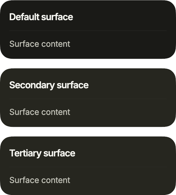
import 'package:your_app/ui/fliin/components/separator/fl_separator.dart';
import 'package:your_app/ui/fliin/components/surface/fl_surface.dart';
import 'package:your_app/ui/fliin/components/text/fl_text.dart';
import 'package:your_app/ui/fliin/core/fliin.dart';
import 'package:flutter/widgets.dart';

class SeparatorWithSurfaceExample extends StatelessWidget {
  const SeparatorWithSurfaceExample({super.key});

  @override
  Widget build(BuildContext context) {
    final theme = FlScope.of(context);
    final colors = theme.colors;
    return Column(
      mainAxisSize: MainAxisSize.min,
      crossAxisAlignment: CrossAxisAlignment.stretch,
      spacing: theme.space.lg,
      children: [
        for (final (variant, name, line) in [
          (FlSurfaceVariant.primary, 'Default surface', colors.separator),
          (
            FlSurfaceVariant.secondary,
            'Secondary surface',
            colors.separatorSecondary,
          ),
          (
            FlSurfaceVariant.tertiary,
            'Tertiary surface',
            colors.separatorTertiary,
          ),
        ])
          FlSurface(
            variant: variant,
            child: Column(
              mainAxisSize: MainAxisSize.min,
              crossAxisAlignment: CrossAxisAlignment.stretch,
              spacing: theme.space.md,
              children: [
                FlText(name, type: FlTextType.h6),
                FlSeparator(color: line),
                const FlText(
                  'Surface content',
                  type: FlTextType.bodySm,
                  tone: FlTextTone.muted,
                ),
              ],
            ),
          ),
      ],
    );
  }
}Custom styles
A heading over a separatorSecondary line, then links separated by vertical lines of a given length, the height of the text, which need no IntrinsicHeight around the row.

import 'package:your_app/ui/fliin/components/separator/fl_separator.dart';
import 'package:your_app/ui/fliin/components/text/fl_text.dart';
import 'package:your_app/ui/fliin/core/fliin.dart';
import 'package:flutter/widgets.dart';

class SeparatorCustomStylesExample extends StatelessWidget {
  const SeparatorCustomStylesExample({super.key});

  @override
  Widget build(BuildContext context) {
    final theme = FlScope.of(context);
    final textHeight = theme.typography.style(FlTextRole.textSm).size;
    return Column(
      mainAxisSize: MainAxisSize.min,
      crossAxisAlignment: CrossAxisAlignment.stretch,
      spacing: theme.space.lg,
      children: [
        FlText(
          'Account settings',
          type: FlTextType.bodySm,
          weight: theme.tokens.typography.weight.medium,
        ),
        FlSeparator(color: theme.colors.separatorSecondary),
        Wrap(
          crossAxisAlignment: WrapCrossAlignment.center,
          spacing: theme.space.md,
          runSpacing: theme.space.sm,
          children: [
            for (final (index, link) in const [
              'Profile',
              'Billing',
              'Security',
            ].indexed) ...[
              if (index > 0)
                FlSeparator(axis: Axis.vertical, length: textHeight),
              FlText(link, type: FlTextType.bodySm, tone: FlTextTone.muted),
            ],
          ],
        ),
      ],
    );
  }
}Usage
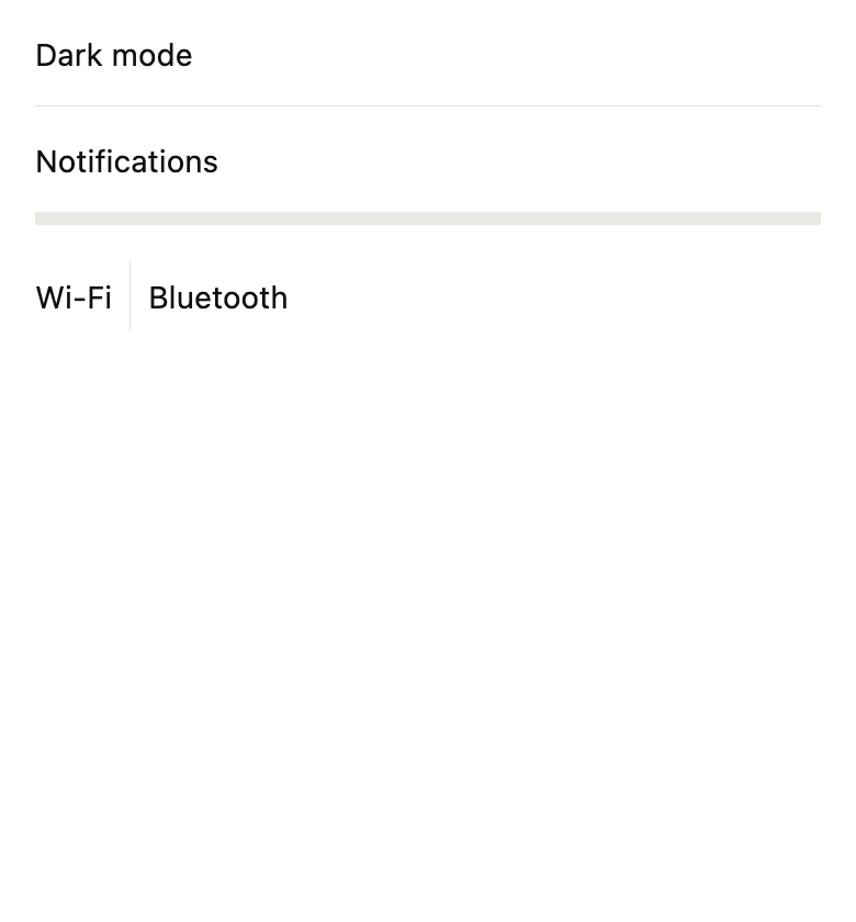
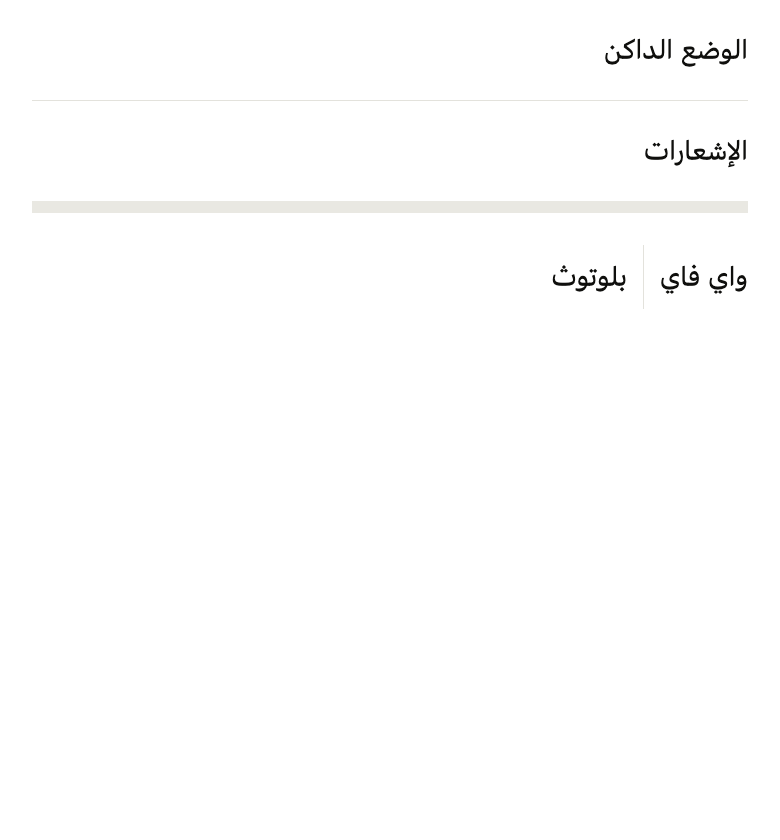
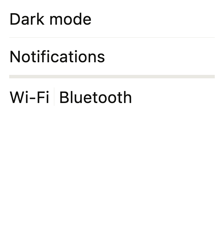
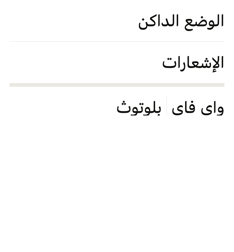
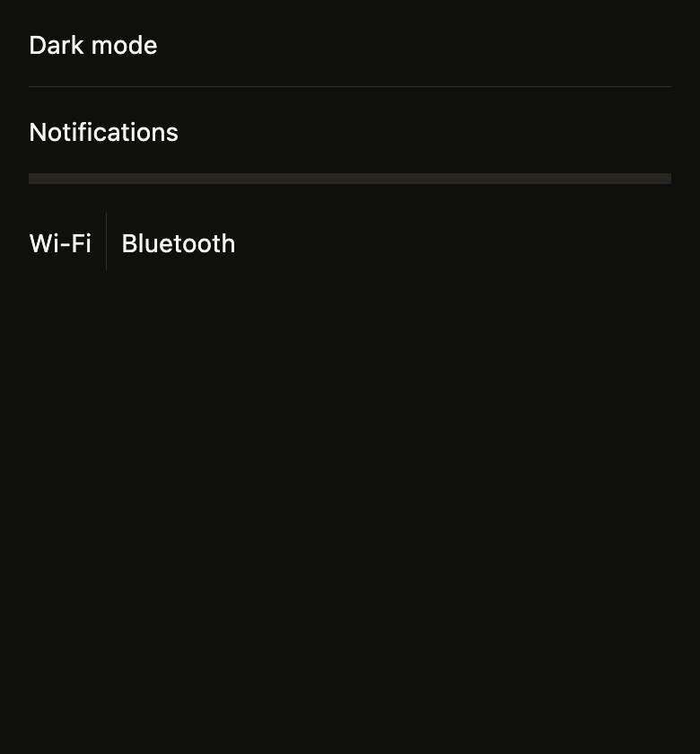
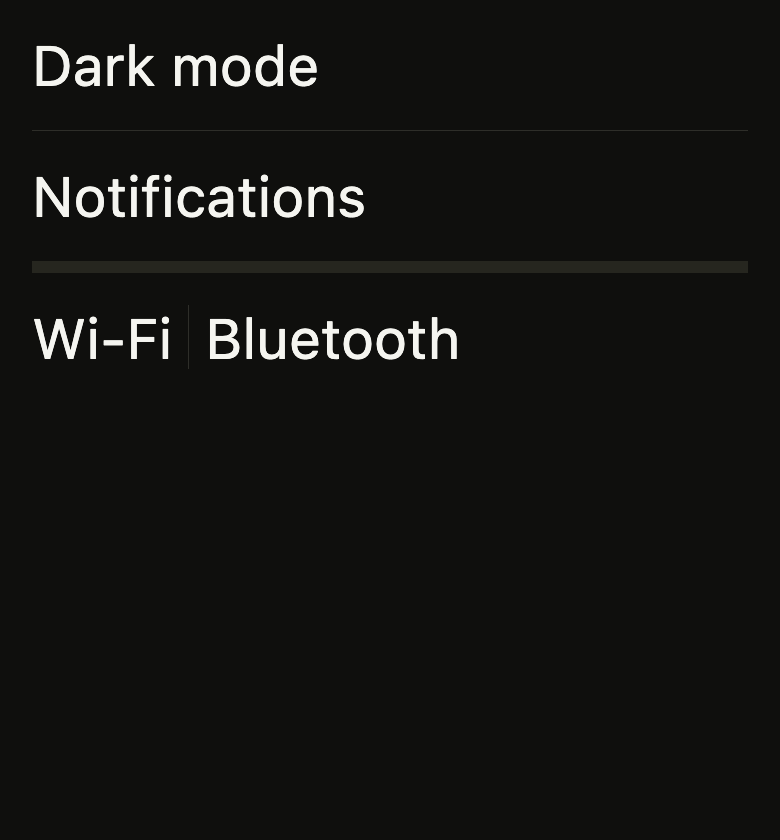
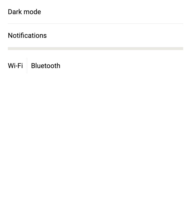
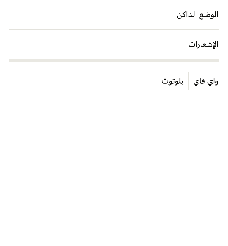
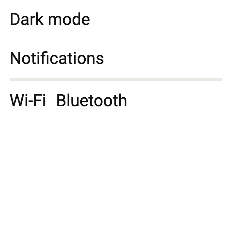
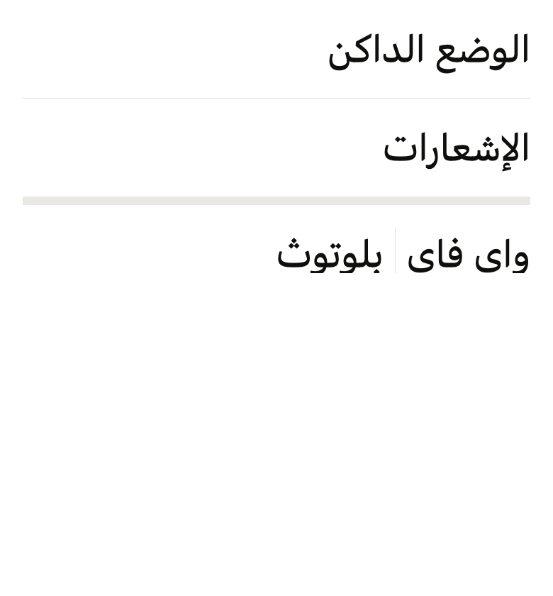
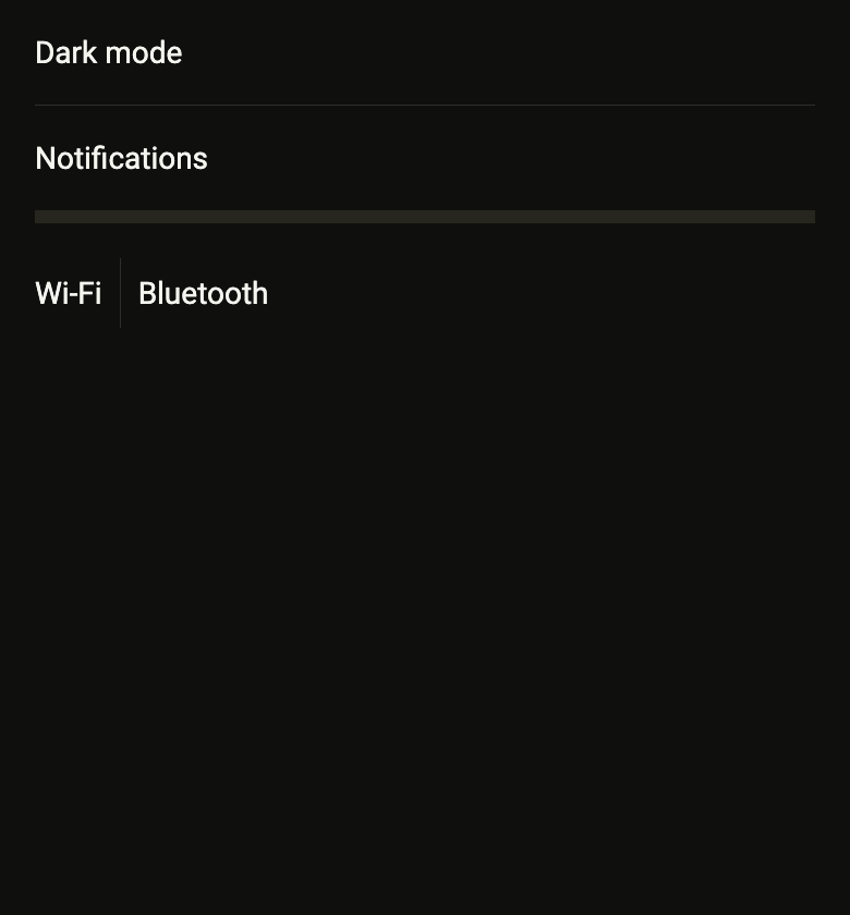
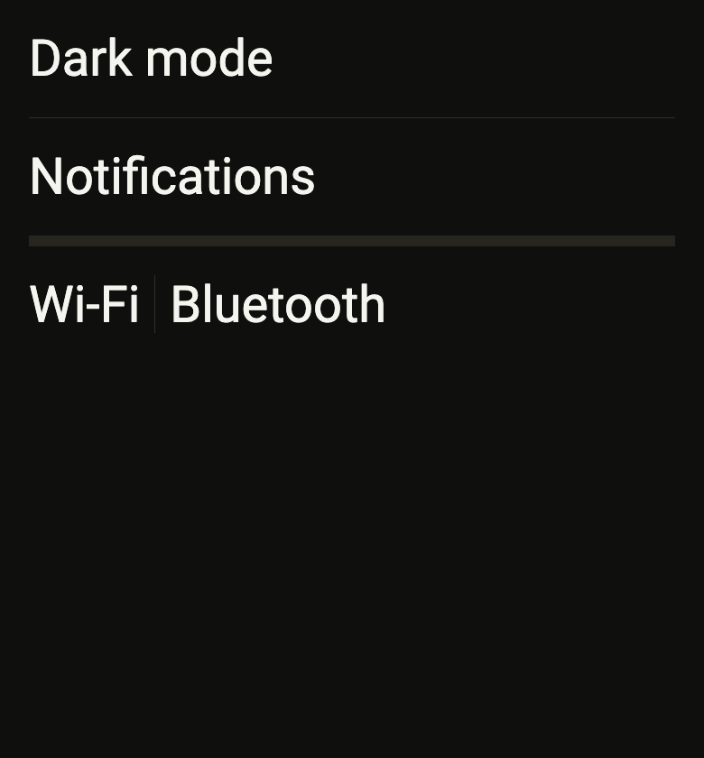
The code the reference images render:
final example = ColoredBox(
  color: FlScope.of(context).colors.surface,
  child: Padding(
    padding: EdgeInsetsDirectional.all(FlScope.of(context).space.lg),
    child: Column(
      crossAxisAlignment: CrossAxisAlignment.stretch,
      spacing: FlScope.of(context).space.sm,
      children: [
        Text(
          'Dark mode',
          style: TextStyle(color: FlScope.of(context).colors.onSurface),
        ),
        Padding(
          padding: EdgeInsetsDirectional.symmetric(
            vertical: FlScope.of(context).space.sm,
          ),
          child: FlSeparator(),
        ),
        Text(
          'Notifications',
          style: TextStyle(color: FlScope.of(context).colors.onSurface),
        ),
        Padding(
          padding: EdgeInsetsDirectional.symmetric(
            vertical: FlScope.of(context).space.sm,
          ),
          child: FlSeparator(variant: FlSeparatorVariant.thick),
        ),
        SizedBox(
          height: 32,
          child: Row(
            spacing: FlScope.of(context).space.sm,
            children: [
              Flexible(
                child: Text(
                  'Wi-Fi',
                  style: TextStyle(color: FlScope.of(context).colors.onSurface),
                ),
              ),
              FlSeparator(axis: Axis.vertical),
              Flexible(
                child: Text(
                  'Bluetooth',
                  style: TextStyle(color: FlScope.of(context).colors.onSurface),
                ),
              ),
            ],
          ),
        ),
      ],
    ),
  ),
);API
FlSeparatorVariant: enum {thin, thick}
FlSeparatorVariant.thin: static final FlSeparatorVariant
FlSeparatorVariant.thick: static final FlSeparatorVariant
FlSeparator: class extends StatelessWidget
FlSeparator.new: const new({super.key, Axis axis, FlSeparatorVariant variant, double? thickness, Color? color, double? length, double indent, double endIndent})
FlSeparator.axis: get Axis
FlSeparator.variant: get FlSeparatorVariant
FlSeparator.thickness: get double?
FlSeparator.color: get Color?
FlSeparator.length: get double?
FlSeparator.indent: get double
FlSeparator.endIndent: get double
FlSeparator.build: Widget(BuildContext context)Reference renders
The 16 images published with version 0.2.2, rendered by the shared harness on macOS with Flutter 3.47.7. fliin verify separator compares your copy to them.




Use it to
- separate list items with a horizontal line
- add a divider rule between sections or rows
- separate two columns with a vertical line
- split a form into parts
- show a thick break between two parts of a page
- Not for
- space without a line: use the token spacing (core)
Source
The files fliin add separator copies into your app, before your prefix and imports are applied.
separator/fl_separator.dart
// Modified from the Separator of HeroUI Native 1.0.10, Copyright 2025 NextUI
// Inc., licensed under Apache 2.0: https://www.apache.org/licenses/LICENSE-2.0
import 'package:flutter/widgets.dart';
import 'package:fliin_ui/core/fliin.dart';

/// The thickness of an [FlSeparator].
enum FlSeparatorVariant {
  /// One physical pixel, React Native's `hairlineWidth`.
  thin,

  /// `size.separatorThick`: separates two blocks rather than two rows.
  thick,
}

/// A `separator` line between two pieces of content, horizontal or vertical.
/// It takes the full length its parent offers (nothing when that length is
/// infinite), and snaps to the pixel grid to stay crisp. Purely decorative:
/// screen readers don't see it.
class FlSeparator extends StatelessWidget {
  /// An [axis] separator, thin by default.
  const FlSeparator({
    super.key,
    this.axis = Axis.horizontal,
    this.variant = FlSeparatorVariant.thin,
    this.thickness,
    this.color,
    this.length,
    this.indent = 0,
    this.endIndent = 0,
  }) : assert(length == null || length >= 0, 'length must not be negative'),
       assert(indent >= 0 && endIndent >= 0, 'indents must not be negative');

  /// Horizontal (a line between two rows) or vertical (between two
  /// columns).
  final Axis axis;

  /// Thin or thick.
  final FlSeparatorVariant variant;

  /// A chosen thickness, in logical points, instead of the one from
  /// [variant].
  final double? thickness;

  /// The line's color instead of the variant's: `separatorSecondary` or
  /// `separatorTertiary` on a `secondary` or `tertiary` surface.
  final Color? color;

  /// The line's length; when null, the full length the parent offers. A
  /// vertical separator between two words of a row takes one, the height of
  /// the text, without an `IntrinsicHeight` around the row.
  final double? length;

  /// The space left before the line: at the start of a horizontal
  /// separator, at the top of a vertical one.
  final double indent;

  /// The space left after the line: at the end of a horizontal separator,
  /// at the bottom of a vertical one.
  final double endIndent;

  @override
  Widget build(BuildContext context) {
    final theme = FlScope.of(context);
    final extent =
        thickness ??
        switch (variant) {
          FlSeparatorVariant.thin => 1 / MediaQuery.devicePixelRatioOf(context),
          FlSeparatorVariant.thick => theme.size.separatorThick,
        };
    // The canvas's thick rule is a band of `surfaceSecondary`, the thin one
    // a hairline of `separator`.
    final line = ColoredBox(
      color:
          color ??
          (variant == FlSeparatorVariant.thick && thickness == null
              ? theme.colors.surfaceSecondary
              : theme.colors.separator),
    );
    Widget separator = switch (axis) {
      // Nothing along an infinite length, unless a length is given.
      Axis.horizontal => LimitedBox(
        maxWidth: length ?? 0,
        child: SizedBox(
          width: length ?? double.infinity,
          height: extent,
          child: FlPixelSnap(child: line),
        ),
      ),
      Axis.vertical => LimitedBox(
        maxHeight: length ?? 0,
        child: SizedBox(
          width: extent,
          height: length ?? double.infinity,
          child: FlPixelSnap(child: line),
        ),
      ),
    };
    if (indent > 0 || endIndent > 0) {
      separator = Padding(
        padding: switch (axis) {
          Axis.horizontal => EdgeInsetsDirectional.only(start: indent, end: endIndent),
          Axis.vertical => EdgeInsetsDirectional.only(top: indent, bottom: endIndent),
        },
        child: separator,
      );
    }
    return ExcludeSemantics(child: separator);
  }
}