Components / forms
Input group
Puts a prefix and a suffix around an input: an icon, a unit, a protocol or a button inside the field frame, the text between them.
Import
In a Flutter app where fliin init has run:
Examples
Enabled
Fixed text around the input: decorativePrefix and decorativeSuffix keep https:// and .com out of what the screen reader announces as the value.

import 'package:your_app/ui/fliin/components/input_group/fl_input_group.dart';
import 'package:your_app/ui/fliin/components/text_field/fl_text_field.dart';
import 'package:flutter/widgets.dart';

class InputGroupEnabledExample extends StatelessWidget {
  const InputGroupEnabledExample({super.key});

  @override
  Widget build(BuildContext context) {
    return FlInputGroup(
      prefix: const Text('https://'),
      suffix: const Text('.com'),
      decorativePrefix: true,
      decorativeSuffix: true,
      child: const FlInput(label: 'Website', placeholder: 'fliin'),
    );
  }
}Error
invalid on the input outlines the whole group in danger.

import 'package:your_app/ui/fliin/components/input_group/fl_input_group.dart';
import 'package:your_app/ui/fliin/components/text_field/fl_text_field.dart';
import 'package:flutter/widgets.dart';

class InputGroupErrorExample extends StatelessWidget {
  const InputGroupErrorExample({super.key});

  @override
  Widget build(BuildContext context) {
    return FlInputGroup(
      prefix: const Text('https://'),
      suffix: const Text('.com'),
      decorativePrefix: true,
      decorativeSuffix: true,
      child: const FlInput(label: 'Website', placeholder: 'fliin', invalid: true),
    );
  }
}Disabled
disabled on the group fades the affixes with the input.

import 'package:your_app/ui/fliin/components/input_group/fl_input_group.dart';
import 'package:your_app/ui/fliin/components/text_field/fl_text_field.dart';
import 'package:flutter/widgets.dart';

class InputGroupDisabledExample extends StatelessWidget {
  const InputGroupDisabledExample({super.key});

  @override
  Widget build(BuildContext context) {
    return FlInputGroup(
      prefix: const Text('https://'),
      suffix: const Text('.com'),
      decorativePrefix: true,
      decorativeSuffix: true,
      disabled: true,
      child: const FlInput(label: 'Website', placeholder: 'fliin'),
    );
  }
}Icon prefix
An icon that says what goes in, then a fixed domain after the text: both decorative, so a tap on them focuses the input.

import 'package:your_app/ui/fliin/components/input_group/fl_input_group.dart';
import 'package:your_app/ui/fliin/components/text_field/fl_text_field.dart';
import 'package:your_app/ui/fliin/core/fliin.dart';
import 'package:your_app/ui/fliin/icons/fl_icons.dart';
import 'package:flutter/widgets.dart';

class InputGroupIconPrefixExample extends StatelessWidget {
  const InputGroupIconPrefixExample({super.key});

  @override
  Widget build(BuildContext context) {
    return FlInputGroup(
      prefix: FlIcon(FlIcons.envelope),
      suffix: const Text('@gmail.com'),
      decorativePrefix: true,
      decorativeSuffix: true,
      child: const FlInput(label: 'Email', placeholder: 'name'),
    );
  }
}Password toggle
A ghost icon button as suffix shows or hides the password; tightSuffix brings it close to the edge, since the button has its own padding, and flInputAffixExtent keeps it inside the input's height.

import 'package:your_app/ui/fliin/components/button/fl_button.dart';
import 'package:your_app/ui/fliin/components/input_group/fl_input_group.dart';
import 'package:your_app/ui/fliin/components/text_field/fl_text_field.dart';
import 'package:your_app/ui/fliin/core/fliin.dart';
import 'package:your_app/ui/fliin/icons/fl_icons.dart';
import 'package:flutter/widgets.dart';

class InputGroupPasswordToggleExample extends StatefulWidget {
  const InputGroupPasswordToggleExample({super.key});

  @override
  State<InputGroupPasswordToggleExample> createState() =>
      _InputGroupPasswordToggleExampleState();
}

class _InputGroupPasswordToggleExampleState
    extends State<InputGroupPasswordToggleExample> {
  final _password = TextEditingController(text: 'correct horse');
  bool _visible = false;

  @override
  void dispose() {
    _password.dispose();
    super.dispose();
  }

  @override
  Widget build(BuildContext context) {
    return FlInputGroup(
      tightSuffix: true,
      suffix: FlButton.icon(
        label: _visible ? 'Hide password' : 'Show password',
        icon: FlIcon(_visible ? FlIcons.eyeSlash : FlIcons.eye),
        variant: FlButtonVariant.ghost,
        size: FlButtonSize.sm,
        extent: flInputAffixExtent(FlScope.of(context)),
        onPressed: () => setState(() => _visible = !_visible),
      ),
      child: FlInput(
        label: 'Password',
        controller: _password,
        obscureText: !_visible,
      ),
    );
  }
}Keyboard shortcut
The shortcut that opens the command field, as a key cap at its end, tightSuffix close to the edge.

import 'package:your_app/ui/fliin/components/input_group/fl_input_group.dart';
import 'package:your_app/ui/fliin/components/kbd/fl_kbd.dart';
import 'package:your_app/ui/fliin/components/text_field/fl_text_field.dart';
import 'package:flutter/widgets.dart';

class InputGroupKeyboardShortcutExample extends StatelessWidget {
  const InputGroupKeyboardShortcutExample({super.key});

  @override
  Widget build(BuildContext context) {
    return const FlInputGroup(
      tightSuffix: true,
      decorativeSuffix: true,
      suffix: FlKbd(keys: [FlKbdKey.command], text: 'K'),
      child: FlInput(label: 'Command', placeholder: 'Command'),
    );
  }
}Loading
A small spinner as suffix while the value is checked: the screen reader reads its label.

import 'package:your_app/ui/fliin/components/input_group/fl_input_group.dart';
import 'package:your_app/ui/fliin/components/spinner/fl_spinner.dart';
import 'package:your_app/ui/fliin/components/text_field/fl_text_field.dart';
import 'package:flutter/widgets.dart';

class InputGroupLoadingExample extends StatefulWidget {
  const InputGroupLoadingExample({super.key});

  @override
  State<InputGroupLoadingExample> createState() =>
      _InputGroupLoadingExampleState();
}

class _InputGroupLoadingExampleState extends State<InputGroupLoadingExample> {
  final _username = TextEditingController(text: 'jane_doe');

  @override
  void dispose() {
    _username.dispose();
    super.dispose();
  }

  @override
  Widget build(BuildContext context) {
    return FlInputGroup(
      suffix: const FlSpinner(
        label: 'Checking availability',
        size: FlSpinnerSize.sm,
      ),
      child: FlInput(label: 'Username', controller: _username),
    );
  }
}Variants
The group takes the variant of its input: white and lifted, or filled with the control grey. FlField gives it a label and a help line.
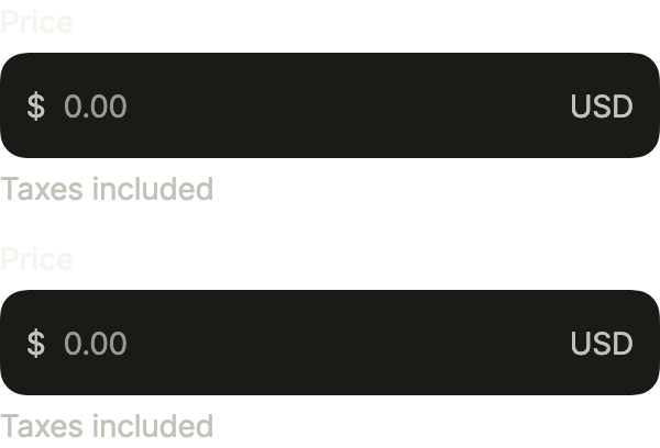
import 'package:your_app/ui/fliin/components/field/fl_field.dart';
import 'package:your_app/ui/fliin/components/input_group/fl_input_group.dart';
import 'package:your_app/ui/fliin/components/text_field/fl_text_field.dart';
import 'package:your_app/ui/fliin/core/fliin.dart';
import 'package:flutter/widgets.dart';

class InputGroupVariantsExample extends StatelessWidget {
  const InputGroupVariantsExample({super.key});

  @override
  Widget build(BuildContext context) {
    return Column(
      mainAxisSize: MainAxisSize.min,
      crossAxisAlignment: CrossAxisAlignment.stretch,
      spacing: FlScope.of(context).space.md,
      children: [
        for (final variant in FlInputVariant.values)
          FlField(
            label: 'Price',
            helper: 'Taxes included',
            child: FlInputGroup(
              prefix: const Text(r'$'),
              suffix: const Text('USD'),
              decorativePrefix: true,
              decorativeSuffix: true,
              child: FlInput(
                label: 'Price',
                placeholder: '0.00',
                variant: variant,
                keyboardType: const TextInputType.numberWithOptions(
                  decimal: true,
                ),
              ),
            ),
          ),
      ],
    );
  }
}Usage
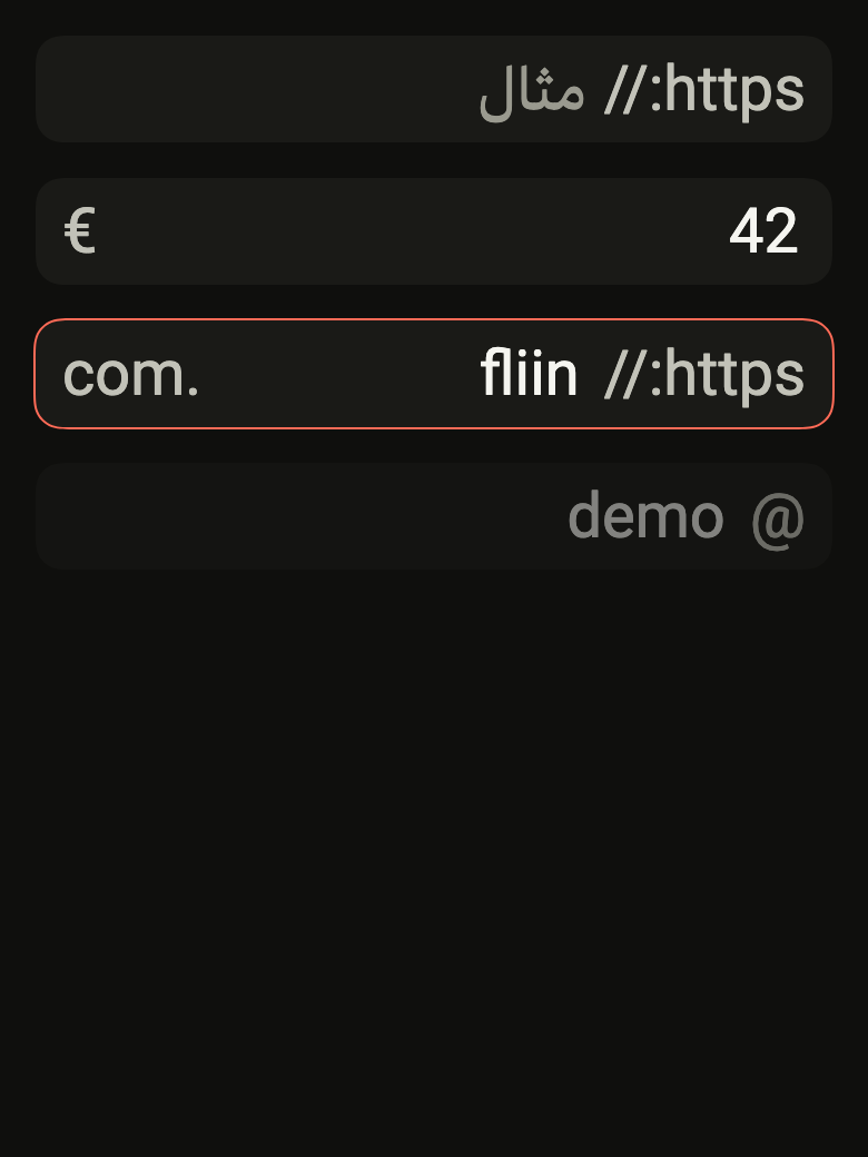
The code the reference images render:
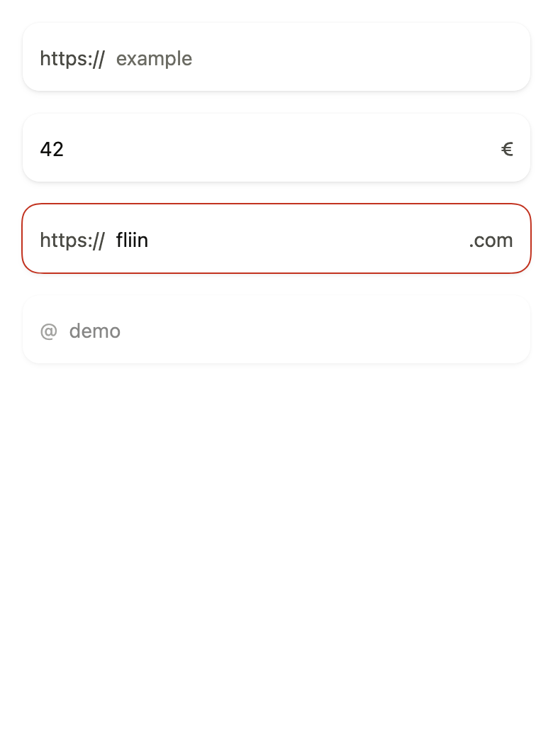
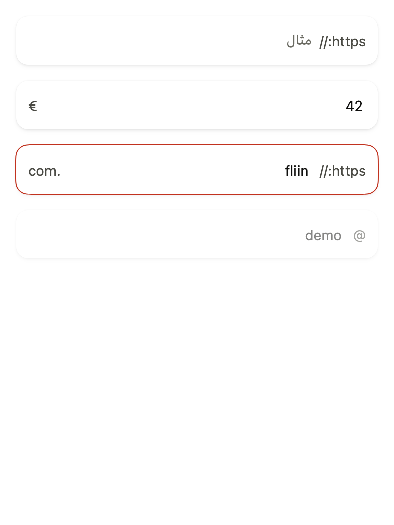
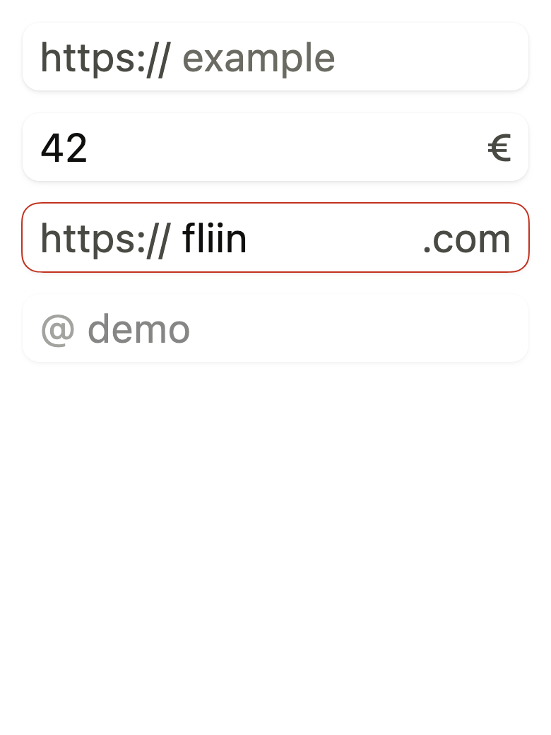
Localizations(locale: const Locale('en'), delegates: const [DefaultWidgetsLocalizations.delegate], child: Directionality(textDirection: variant.dir, child: Overlay(initialEntries: [OverlayEntry(builder: (context) => ColoredBox(color: FlScope.of(context).colors.surface, child: Padding(padding: EdgeInsetsDirectional.all(FlScope.of(context).space.lg), child: Column(crossAxisAlignment: CrossAxisAlignment.stretch, spacing: FlScope.of(context).space.lg, children: [FlInputGroup(prefix: const Text('https://'), decorativePrefix: true, child: FlInput(label: 'Website', placeholder: 'example'), FlInputGroup(suffix: const Text('€'), decorativeSuffix: true, child: FlInput(label: 'Amount', controller: TextEditingController(text: '42'))), FlInputGroup(prefix: const Text('https://'), suffix: const Text('.com'), decorativePrefix: true, decorativeSuffix: true, child: FlInput(label: 'Website', controller: TextEditingController(text: 'fliin'), invalid: true)), FlInputGroup(prefix: const Text('@'), decorativePrefix: true, disabled: true, child: FlInput(label: 'Username', controller: TextEditingController(text: 'demo')))]))))])))API
FlInputGroup: class extends StatelessWidget
FlInputGroup.new: const new({super.key, Widget? prefix, Widget? suffix, bool decorativePrefix, bool decorativeSuffix, bool tightPrefix, bool tightSuffix, bool? disabled, required Widget child})
FlInputGroup.prefix: get Widget?
FlInputGroup.suffix: get Widget?
FlInputGroup.decorativePrefix: get bool
FlInputGroup.decorativeSuffix: get bool
FlInputGroup.tightPrefix: get bool
FlInputGroup.tightSuffix: get bool
FlInputGroup.disabled: get bool?
FlInputGroup.child: get Widget
FlInputGroup.build: Widget(BuildContext context)Reference renders
The 16 images published with version 0.2.2, rendered by the shared harness on macOS with Flutter 3.47.7. fliin verify input-group compares your copy to them.
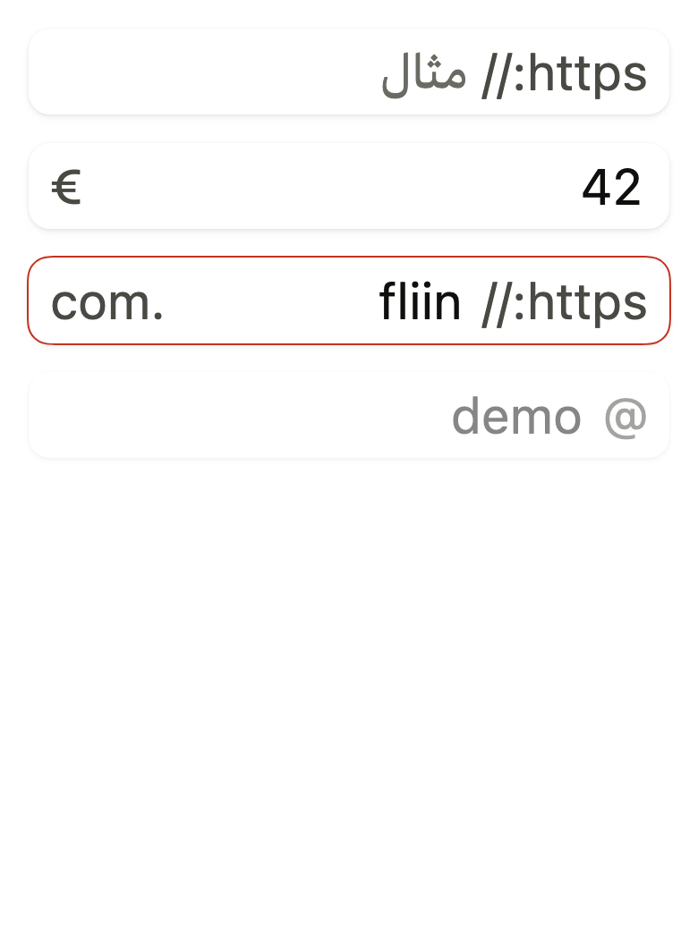
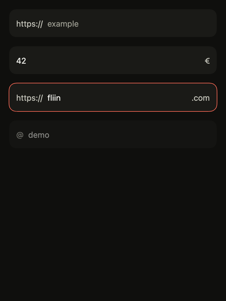
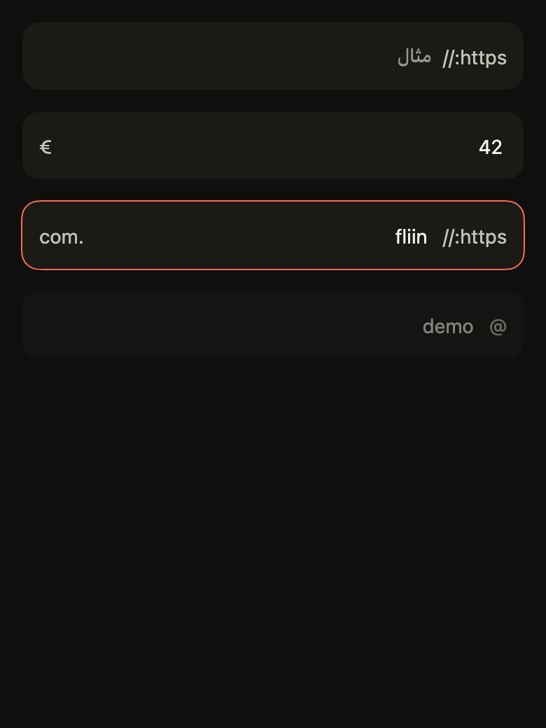
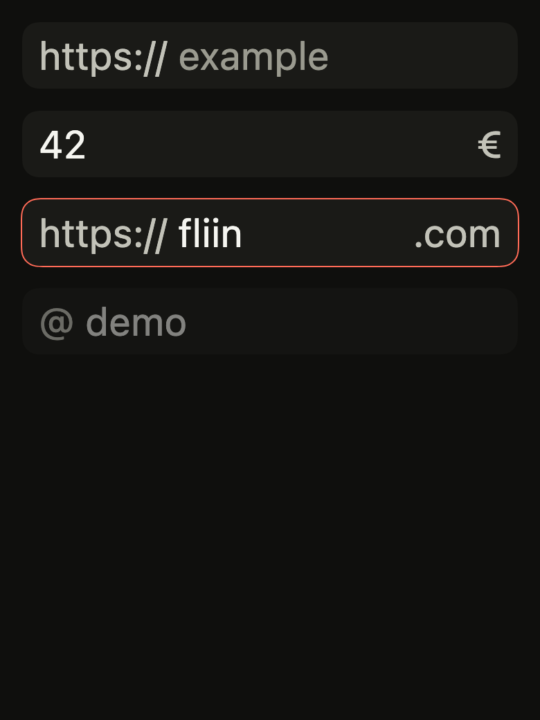
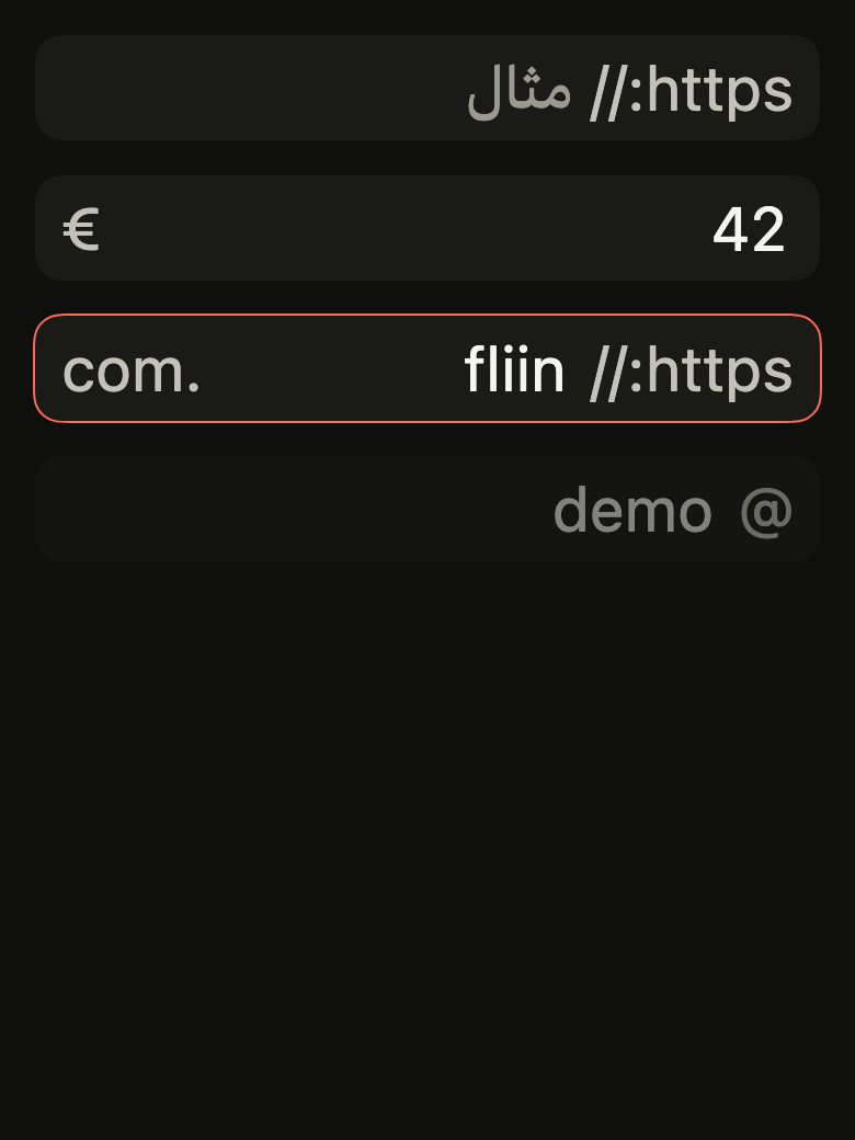
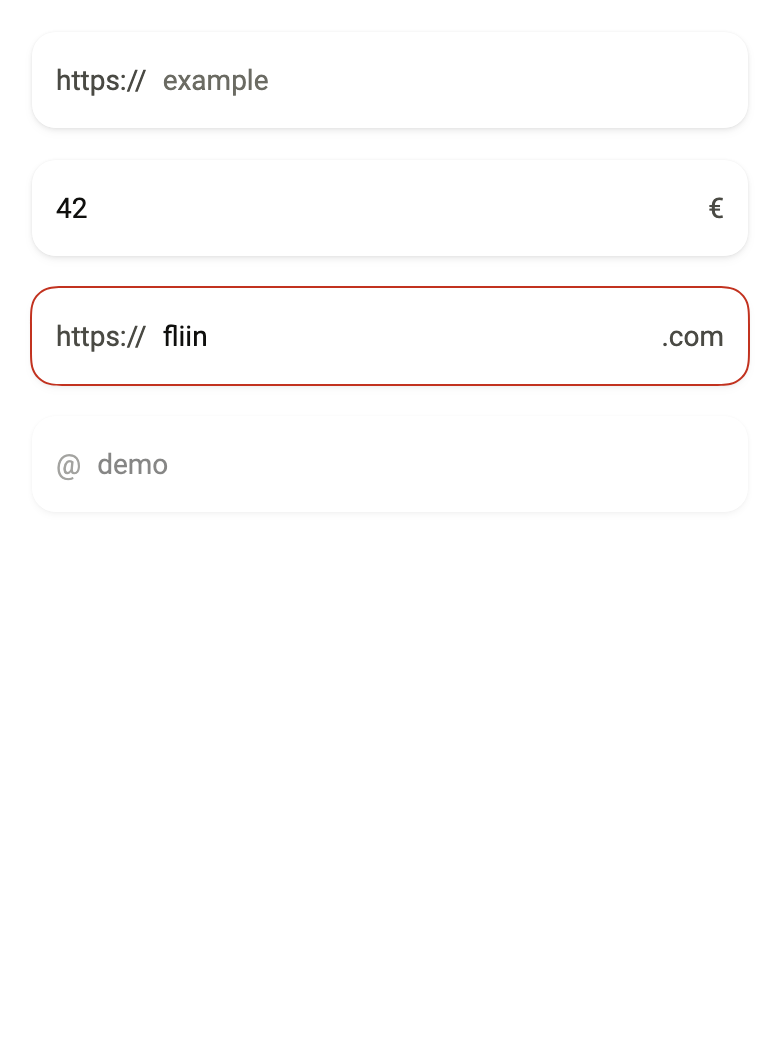
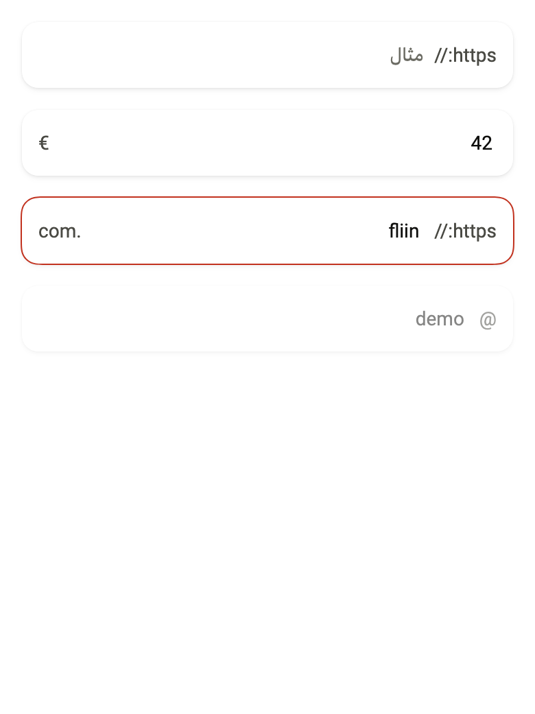
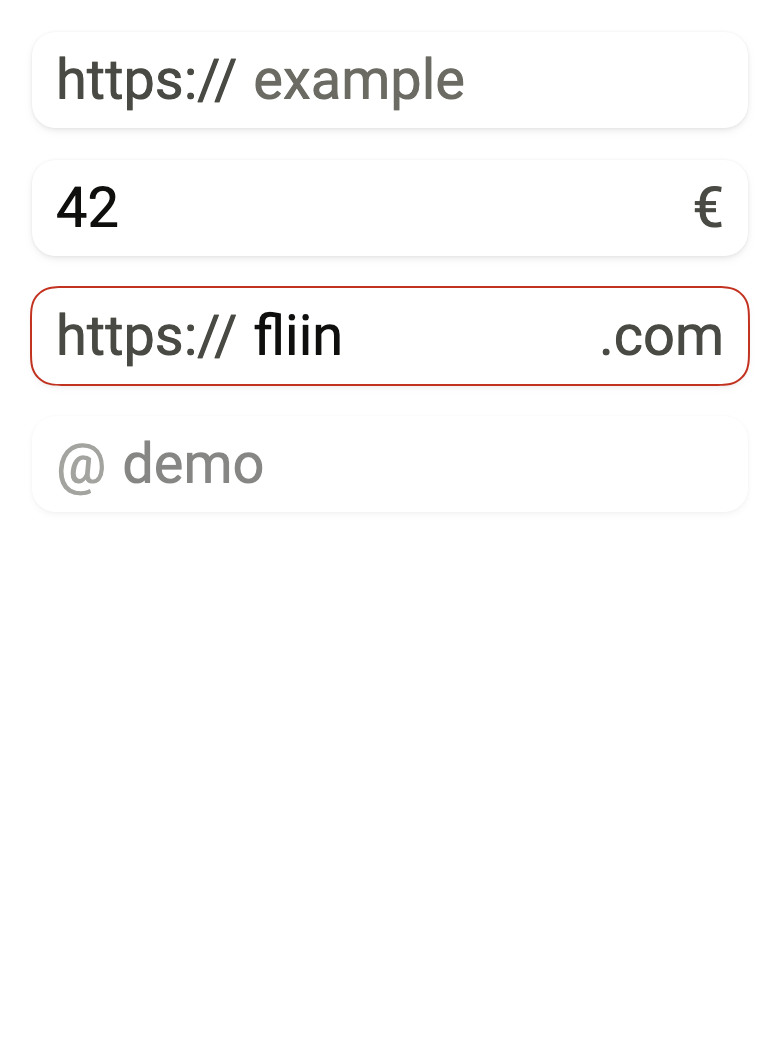
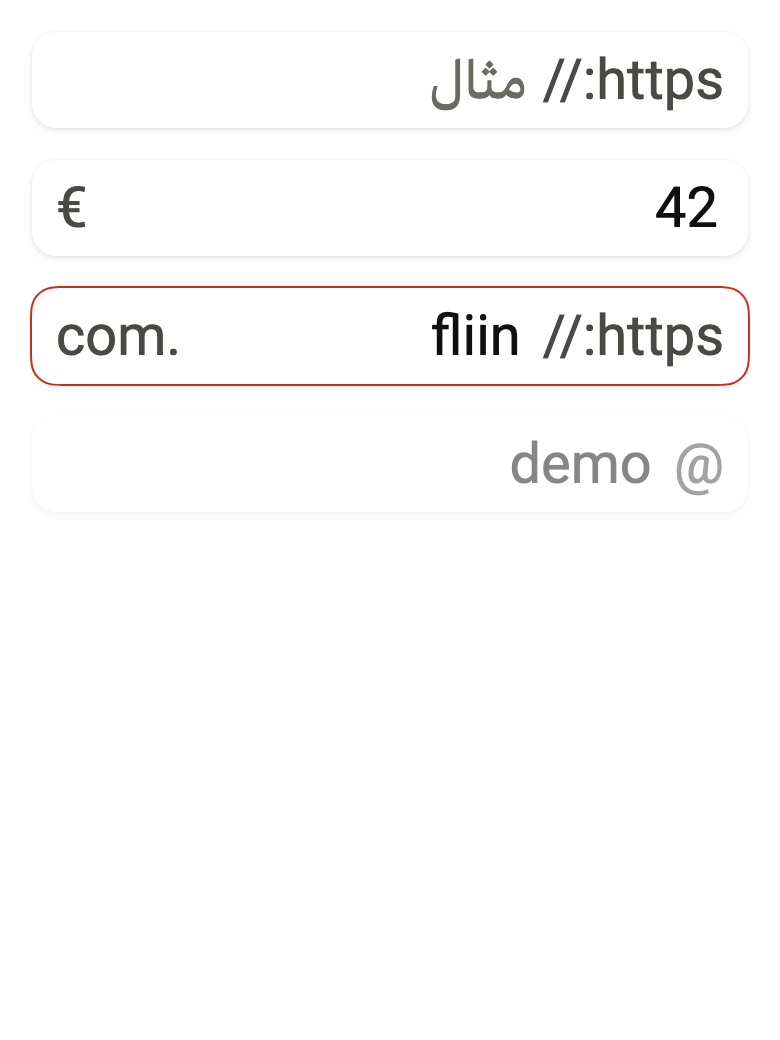
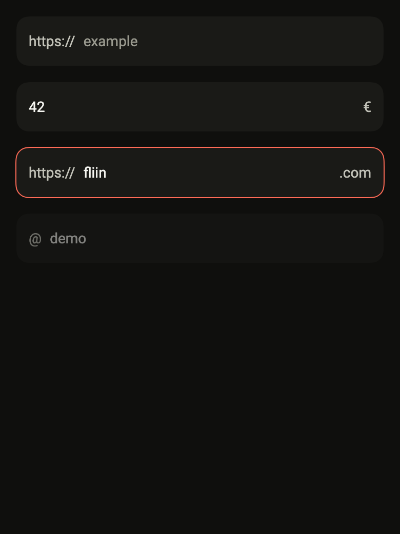
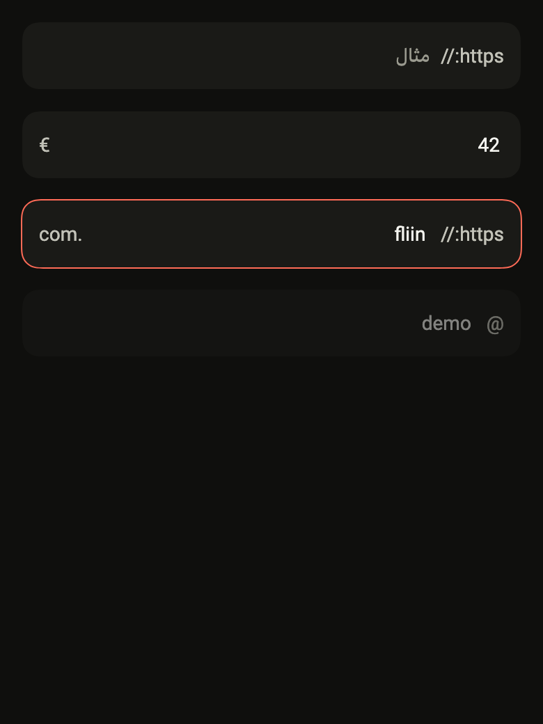
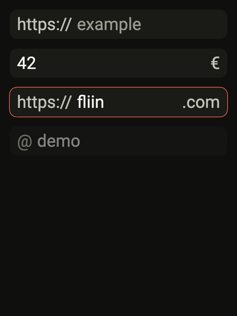
Use it to
- add an icon at the start of an input
- show a unit or currency after the amount
- add https:// before a web address
- add a show password button inside the field
- hide a decorative icon from screen readers
- Not for
- showing a label, help or an error: use a text field (text-field)
- searching a list: use a search field (search-field)
- States
Source
The files fliin add input-group copies into your app, before your prefix and imports are applied.
input_group/fl_input_group.dart
// Modified from InputGroup of HeroUI Native 1.0.10, Copyright 2025 NextUI Inc.,
// licensed under Apache 2.0: https://www.apache.org/licenses/LICENSE-2.0
import 'package:flutter/widgets.dart';
import 'package:fliin_ui/components/text_field/fl_text_field.dart';

/// An [FlInput] and what surrounds it: a [prefix]
/// at the start and a [suffix] at the end, inside the input's frame, each
/// between two `space.md` gaps, the text right after the prefix and before
/// the suffix. A decorative affix (an icon) is neither read nor touchable:
/// the touch goes to the input. An interactive affix (the button that shows
/// the password) keeps its touch and its semantics; a tight one sits
/// `space.xs` from the edge, for a button that carries its own padding.
///
/// ```dart
/// FlInputGroup(
///   prefix: FlIcon(FlIcons.envelope),
///   decorativePrefix: true,
///   child: FlInput(label: 'Email'),
/// )
/// ```
class FlInputGroup extends StatelessWidget {
  /// A group around the input [child].
  const FlInputGroup({
    super.key,
    this.prefix,
    this.suffix,
    this.decorativePrefix = false,
    this.decorativeSuffix = false,
    this.tightPrefix = false,
    this.tightSuffix = false,
    this.disabled,
    required this.child,
  });

  /// The content at the start, an icon or a unit, in `onSurfaceMuted`.
  final Widget? prefix;

  /// The content at the end, an icon, a unit or a button.
  final Widget? suffix;

  /// True: the prefix is neither read nor touchable.
  final bool decorativePrefix;

  /// True: the suffix is neither read nor touchable.
  final bool decorativeSuffix;

  /// True: the prefix sits `space.xs` from the start edge instead of
  /// `space.md`, for a button or a key cap with its own padding.
  final bool tightPrefix;

  /// True: the suffix sits `space.xs` from the end edge instead of
  /// `space.md`: a ghost icon button that copies, clears or reveals.
  final bool tightSuffix;

  /// True: the input is disabled, half opaque along with its affixes; null,
  /// the state of the enclosing `FlFieldScope`.
  final bool? disabled;

  /// The input, usually an [FlInput].
  final Widget child;

  @override
  Widget build(BuildContext context) {
    final prefix = this.prefix;
    final suffix = this.suffix;
    return FlInputAffixes(
      prefix: prefix == null ? null : FlInputAffix(decorative: decorativePrefix, tight: tightPrefix, child: prefix),
      suffix: suffix == null ? null : FlInputAffix(decorative: decorativeSuffix, tight: tightSuffix, child: suffix),
      disabled: disabled,
      child: child,
    );
  }
}