Components / data-display
Color swatch
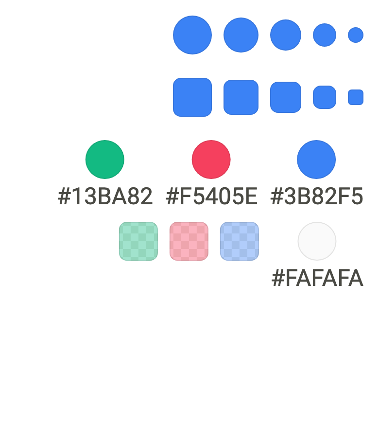
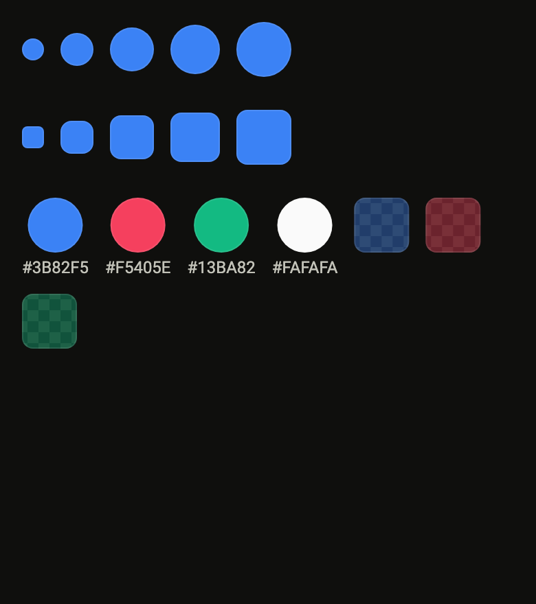
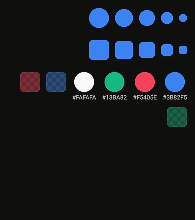
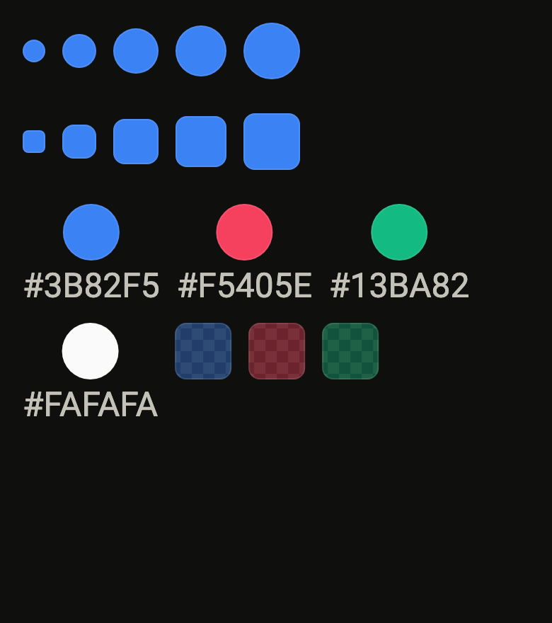
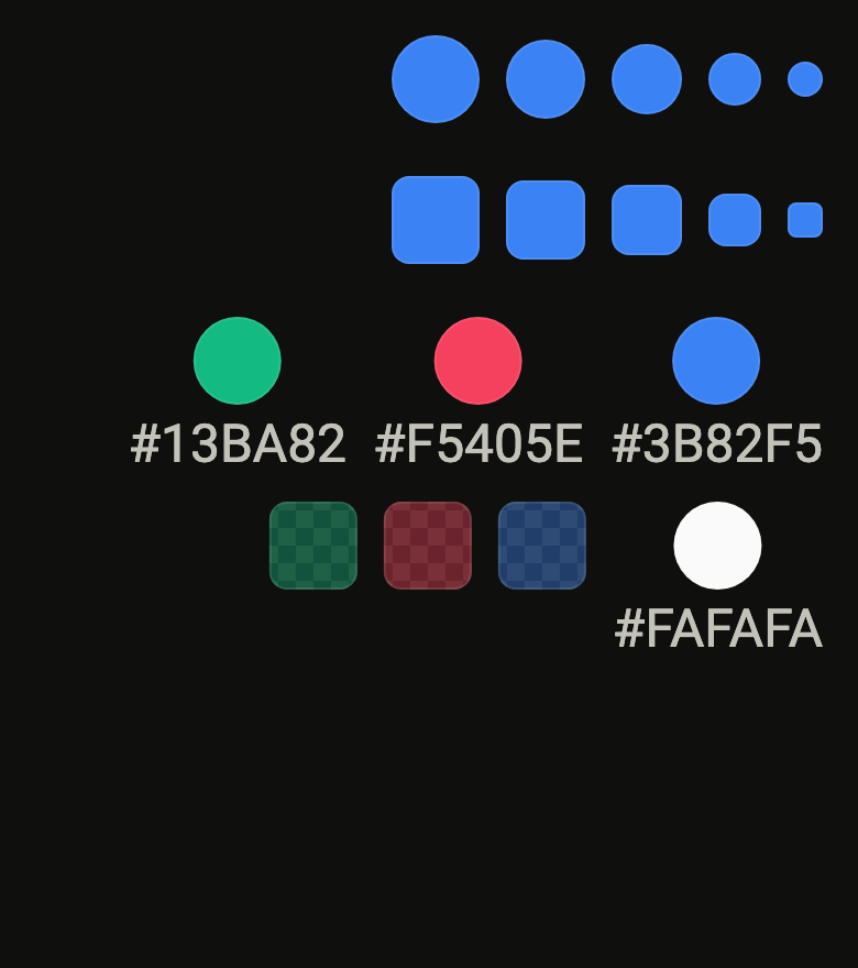
Shows a color the app picked in a round or square swatch, over a checkerboard that shows through a translucent tint. Screen readers read its name.
Import
In a Flutter app where fliin init has run:
Examples
Example
A swatch shows one color and names it for the screen reader with label. Your app picks the colors: none comes from the theme.

import 'package:your_app/ui/fliin/components/color_swatch/fl_color_swatch.dart';
import 'package:your_app/ui/fliin/core/fliin.dart';
import 'package:flutter/widgets.dart';

class ColorSwatchExample extends StatelessWidget {
  const ColorSwatchExample({super.key});

  @override
  Widget build(BuildContext context) {
    final space = FlScope.of(context).space;
    return Wrap(
      alignment: WrapAlignment.center,
      crossAxisAlignment: WrapCrossAlignment.center,
      spacing: space.sm,
      runSpacing: space.sm,
      children: [
        for (final (name, color) in _tints) FlColorSwatch(color: color.toColor(), label: name),
      ],
    );
  }
}

const _tints = [
  ('Blue', HSVColor.fromAHSV(1, 217, 0.76, 0.96)),
  ('Rose', HSVColor.fromAHSV(1, 350, 0.74, 0.96)),
  ('Emerald', HSVColor.fromAHSV(1, 160, 0.9, 0.73)),
  ('Amber', HSVColor.fromAHSV(1, 38, 0.92, 0.96)),
];Opaque
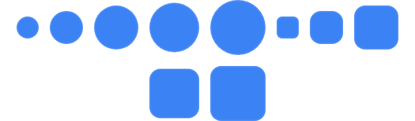
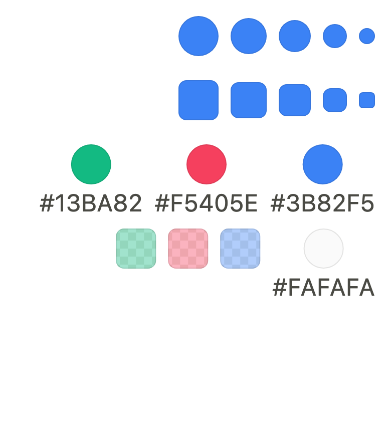
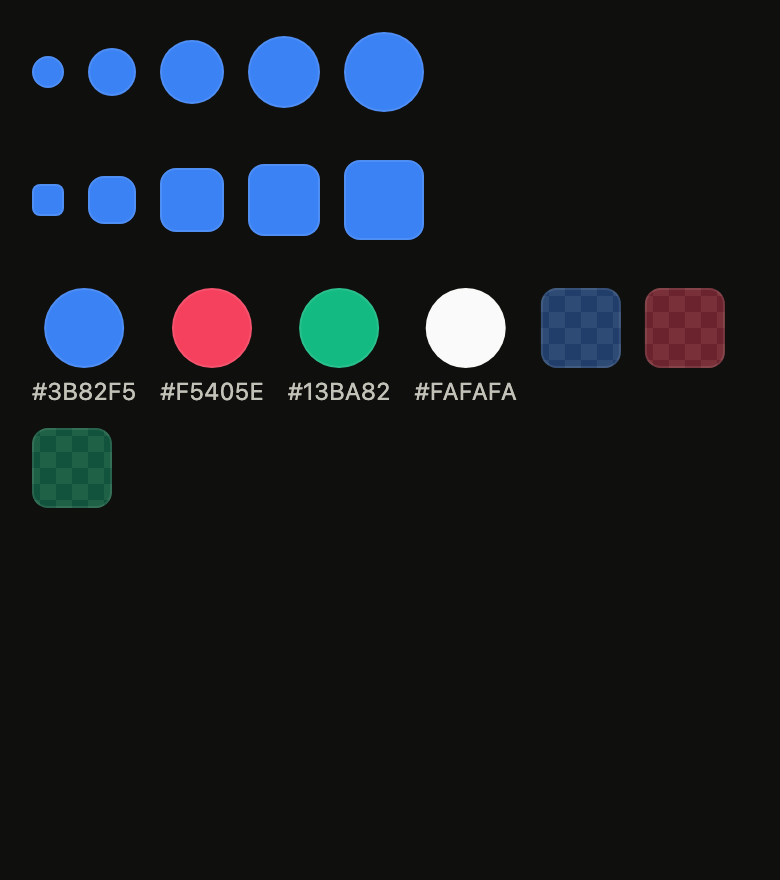
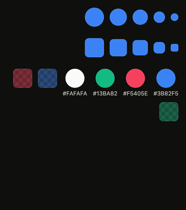
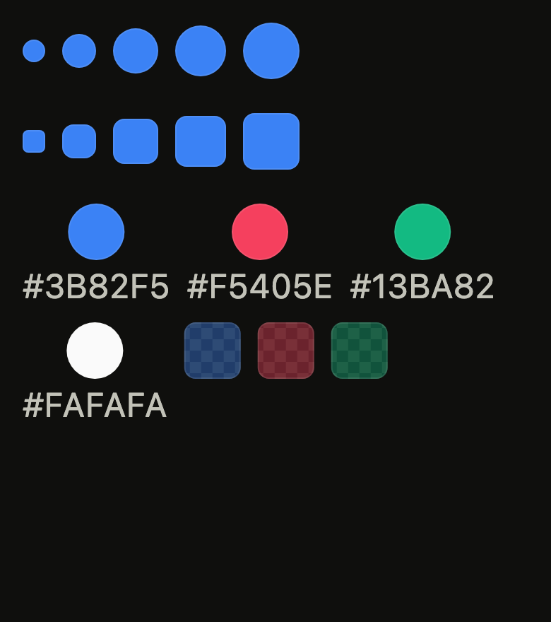
Every size, round by default or square with FlColorSwatchShape.square.
import 'package:your_app/ui/fliin/components/color_swatch/fl_color_swatch.dart';
import 'package:your_app/ui/fliin/core/fliin.dart';
import 'package:flutter/widgets.dart';

class ColorSwatchOpaqueExample extends StatelessWidget {
  const ColorSwatchOpaqueExample({super.key});

  @override
  Widget build(BuildContext context) {
    final space = FlScope.of(context).space;
    return Wrap(
      alignment: WrapAlignment.center,
      crossAxisAlignment: WrapCrossAlignment.center,
      spacing: space.sm,
      runSpacing: space.sm,
      children: [
        for (final size in FlColorSwatchSize.values)
          FlColorSwatch(color: _blue.toColor(), label: 'Blue', size: size),
        for (final size in FlColorSwatchSize.values)
          FlColorSwatch(color: _blue.toColor(), label: 'Blue', size: size, shape: FlColorSwatchShape.square),
      ],
    );
  }
}

const _blue = HSVColor.fromAHSV(1, 217, 0.76, 0.96);Translucent
A color with transparency shows the checkerboard through it, so a 40% tint reads as one.

import 'package:your_app/ui/fliin/components/color_swatch/fl_color_swatch.dart';
import 'package:your_app/ui/fliin/core/fliin.dart';
import 'package:flutter/widgets.dart';

class ColorSwatchTranslucentExample extends StatelessWidget {
  const ColorSwatchTranslucentExample({super.key});

  @override
  Widget build(BuildContext context) {
    final space = FlScope.of(context).space;
    return Wrap(
      alignment: WrapAlignment.center,
      crossAxisAlignment: WrapCrossAlignment.center,
      spacing: space.sm,
      runSpacing: space.sm,
      children: [
        for (final (name, color) in _tints)
          FlColorSwatch(
            color: color.withAlpha(0.4).toColor(),
            label: '$name at 40%',
            size: FlColorSwatchSize.xl,
            shape: FlColorSwatchShape.square,
          ),
      ],
    );
  }
}

const _tints = [
  ('Blue', HSVColor.fromAHSV(1, 217, 0.76, 0.96)),
  ('Rose', HSVColor.fromAHSV(1, 350, 0.74, 0.96)),
  ('Emerald', HSVColor.fromAHSV(1, 160, 0.9, 0.73)),
  ('Amber', HSVColor.fromAHSV(1, 38, 0.92, 0.96)),
];Usage
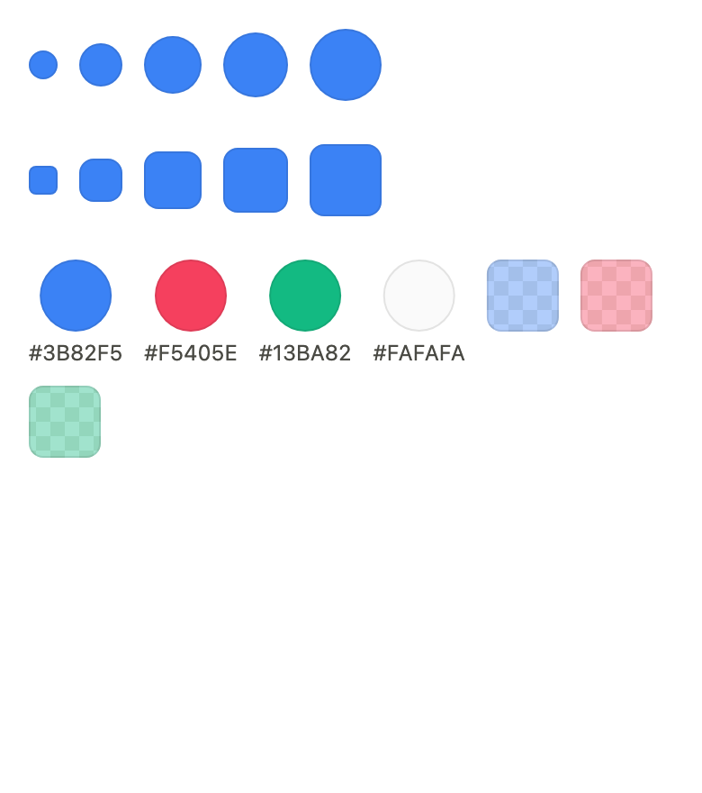
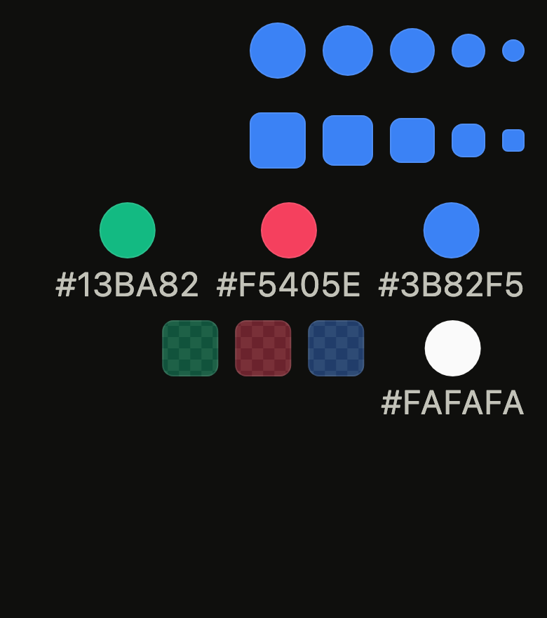
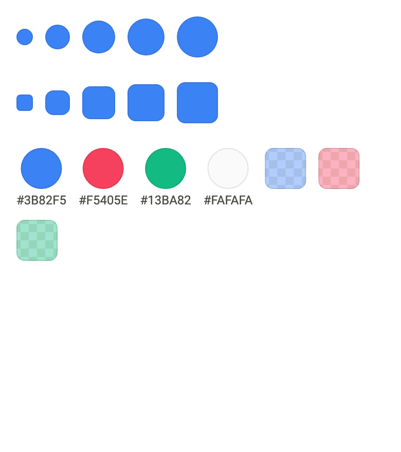
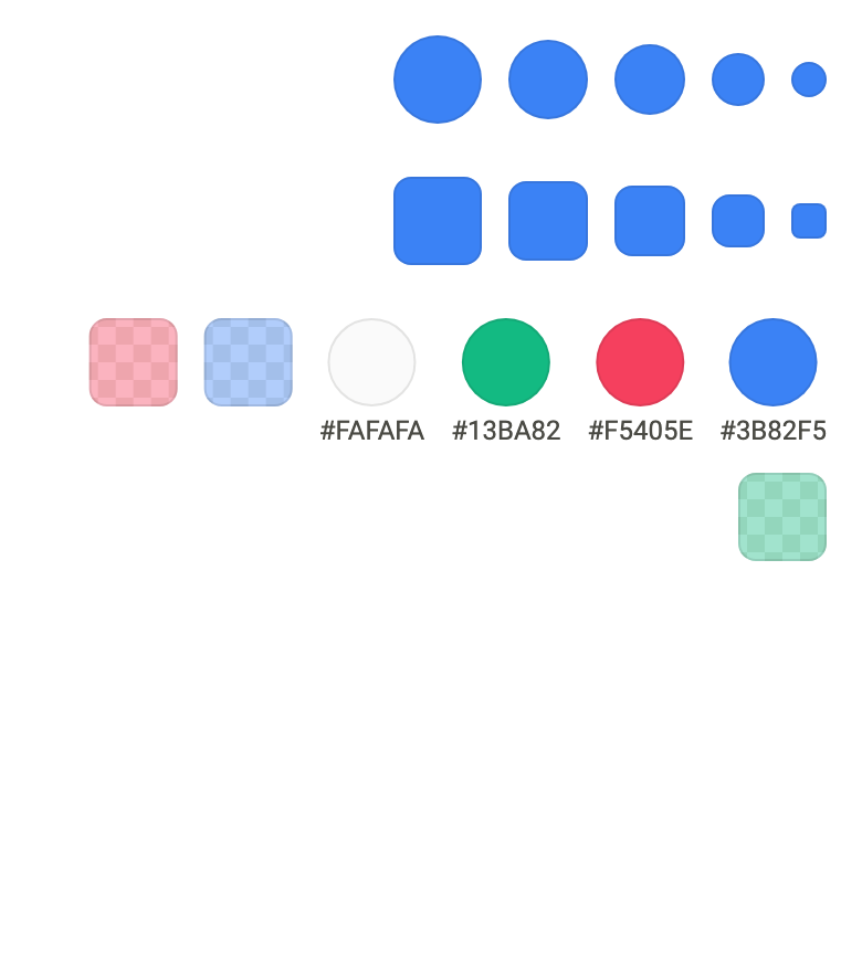
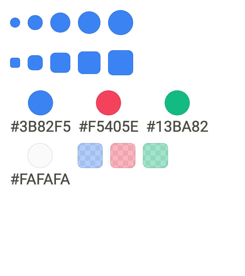
The code the reference images render:
final example = Builder(
  builder: (context) {
    final rtl = variant.dir == TextDirection.rtl;
    final theme = FlScope.of(context);
    String tr(String fr, String ar) => rtl ? ar : fr;
    final tints = [
      (tr('Blue', 'أزرق'), const HSVColor.fromAHSV(1, 217, 0.76, 0.96)),
      (tr('Pink', 'وردي'), const HSVColor.fromAHSV(1, 350, 0.74, 0.96)),
      (tr('Emerald', 'زمردي'), const HSVColor.fromAHSV(1, 160, 0.9, 0.73)),
      (tr('White', 'أبيض'), const HSVColor.fromAHSV(1, 0, 0, 0.98)),
    ];
    return ColoredBox(
      color: theme.colors.surface,
      child: SingleChildScrollView(
        padding: EdgeInsetsDirectional.all(theme.space.lg),
        child: Column(
          crossAxisAlignment: CrossAxisAlignment.start,
          spacing: theme.space.xl,
          children: [
            for (final shape in FlColorSwatchShape.values)
              Wrap(
                spacing: theme.space.md,
                runSpacing: theme.space.md,
                crossAxisAlignment: WrapCrossAlignment.center,
                children: [
                  for (final size in FlColorSwatchSize.values)
                    FlColorSwatch(
                      color: tints.first.$2.toColor(),
                      label: tints.first.$1,
                      size: size,
                      shape: shape,
                    ),
                ],
              ),
            Wrap(
              spacing: theme.space.md,
              runSpacing: theme.space.md,
              children: [
                for (final (name, tint) in tints)
                  Column(
                    mainAxisSize: MainAxisSize.min,
                    spacing: theme.space.xs,
                    children: [
                      FlColorSwatch(
                        color: tint.toColor(),
                        label: name,
                        size: FlColorSwatchSize.xl,
                      ),
                      ExcludeSemantics(
                        child: Text(
                          flColorHex(tint.toColor()),
                          textDirection: TextDirection.ltr,
                          style: theme.typography
                              .resolve(FlTextRole.textXs)
                              .copyWith(color: theme.colors.onSurfaceMuted),
                        ),
                      ),
                    ],
                  ),
                for (final (name, tint) in tints.take(3))
                  FlColorSwatch(
                    color: tint.withAlpha(0.4).toColor(),
                    label: tr('$name at 40%', '$name ٤٠٪'),
                    size: FlColorSwatchSize.xl,
                    shape: FlColorSwatchShape.square,
                  ),
              ],
            ),
          ],
        ),
      ),
    );
  },
);API
flColorEdgeOpacity: const double
FlColorSwatchSize: enum {xs, sm, md, lg, xl}
FlColorSwatchSize.xs: static final FlColorSwatchSize
FlColorSwatchSize.sm: static final FlColorSwatchSize
FlColorSwatchSize.md: static final FlColorSwatchSize
FlColorSwatchSize.lg: static final FlColorSwatchSize
FlColorSwatchSize.xl: static final FlColorSwatchSize
FlColorSwatchSize.new: const new(double extent, double ring)
FlColorSwatchSize.extent: get double
FlColorSwatchSize.ring: get double
FlColorSwatchShape: enum {circle, square}
FlColorSwatchShape.circle: static final FlColorSwatchShape
FlColorSwatchShape.square: static final FlColorSwatchShape
flColorSwatchOutline: ShapeBorder(FlColorSwatchShape shape, double radius)
FlColorSwatch: class extends StatelessWidget
FlColorSwatch.new: const new({super.key, required Color color, required String? label, FlColorSwatchSize size, FlColorSwatchShape shape, double? radius, bool edge})
FlColorSwatch.color: get Color
FlColorSwatch.label: get String?
FlColorSwatch.size: get FlColorSwatchSize
FlColorSwatch.shape: get FlColorSwatchShape
FlColorSwatch.radius: get double?
FlColorSwatch.edge: get bool
FlColorSwatch.build: Widget(BuildContext context)
FlColorThumb: class extends StatelessWidget
FlColorThumb.new: const new({super.key, required Color color, required double extent, bool lifted})
FlColorThumb.color: get Color
FlColorThumb.extent: get double
FlColorThumb.lifted: get bool
FlColorThumb.ring: static const double
FlColorThumb.build: Widget(BuildContext context)
flColorEdge: ShapeBorder(ShapeBorder outline, Color color, {double width})
FlColorChecker: class extends StatelessWidget
FlColorChecker.new: const new({super.key, required ShapeBorder shape, required Widget child})
FlColorChecker.shape: get ShapeBorder
FlColorChecker.child: get Widget
FlColorChecker.build: Widget(BuildContext context)
FlColorSpace: enum {hsb, hsl}
FlColorSpace.hsb: static final FlColorSpace
FlColorSpace.hsl: static final FlColorSpace
FlColorChannel: enum {hue, saturation, brightness, lightness, alpha}
FlColorChannel.hue: static final FlColorChannel
FlColorChannel.saturation: static final FlColorChannel
FlColorChannel.brightness: static final FlColorChannel
FlColorChannel.lightness: static final FlColorChannel
FlColorChannel.alpha: static final FlColorChannel
FlColorChannel.new: const new(double max)
FlColorChannel.max: get double
FlColorChannel.belongsTo: bool(FlColorSpace space)
FlColorChannels: extension on HSVColor
FlColorChannels.hslSaturation: get double
FlColorChannels.lightness: get double
FlColorChannels.channel: double(FlColorChannel channel, FlColorSpace space)
FlColorChannels.withChannel: HSVColor(FlColorChannel channel, FlColorSpace space, double to)
flColorChannelLabel: String(FlColorChannel channel, double value)
flColorHex: String(Color color, {bool alpha})
flParseColorHex: Color?(String text, {bool alpha})Reference renders
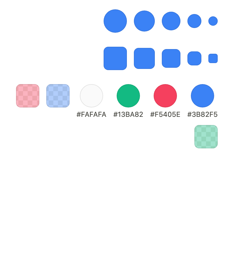
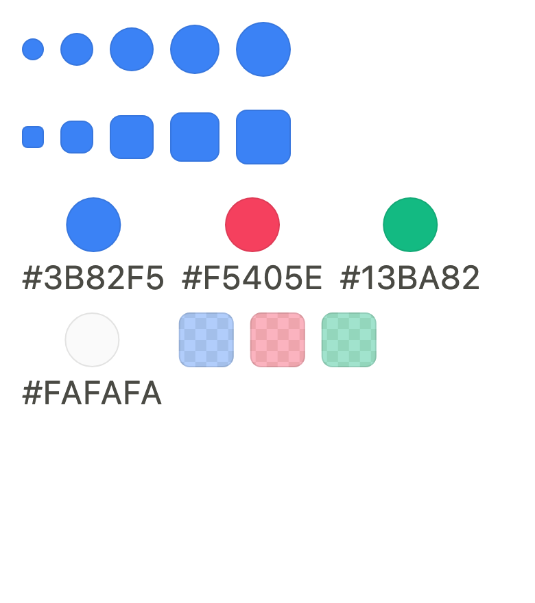
The 16 images published with version 0.1.0, rendered by the shared harness on macOS with Flutter 3.47.7. fliin verify color-swatch compares your copy to them.
Use it to
- show a product colour as a swatch
- show a calendar colour next to its name
- present a translucent colour over a checkerboard
- give a colour a name for screen readers
- use a round or square colour swatch in five sizes
- Not for
- picking a shade from a palette: use a color swatch picker (color-swatch-picker)
- setting any color freely: use a color picker (color-picker)
- a status dot next to an avatar: use a badge (badge)
- States
Source
The files fliin add color-swatch copies into your app, before your prefix and imports are applied.
color_swatch/fl_color_swatch.dart
// Modified from the ColorSwatch of HeroUI React v3, Copyright 2025 NextUI Inc.,
// licensed under Apache 2.0: https://www.apache.org/licenses/LICENSE-2.0
import 'package:flutter/widgets.dart';
import 'package:fliin_ui/core/fliin.dart';

export 'package:fliin_ui/components/color_swatch/fl_color_channel.dart';

/// The opacity of the 1 rule that outlines a swatch, a track or a color
/// area (`inset 0 0 0 1px rgba(0, 0, 0, 0.1)` of color-swatch.css), in the
/// theme's text color so that a dark tint also stands out from a dark
/// background.
const double flColorEdgeOpacity = 0.1;

/// The size of a swatch: 16, 24, 32, 36 or 40 per side.
enum FlColorSwatchSize {
  /// 16 (`size-4`), ring of 1.
  xs(16, 1),

  /// 24 (`size-6`), ring of 2.
  sm(24, 2),

  /// 32 (`size-8`), ring of 2: the default size.
  md(32, 2),

  /// 36 (`size-9`), ring of 2.
  lg(36, 2),

  /// 40 (`size-10`), ring of 2.
  xl(40, 2);

  const FlColorSwatchSize(this.extent, this.ring);

  /// The side, in logical points.
  final double extent;

  /// The ring thickness of a selected swatch in a picker.
  final double ring;
}

/// The shape of a swatch.
enum FlColorSwatchShape {
  /// A circle. The default.
  circle,

  /// A square with rounded corners (`square`).
  square,
}

/// The outline of a swatch of [shape], [radius] at the corners when square.
ShapeBorder flColorSwatchOutline(FlColorSwatchShape shape, double radius) => switch (shape) {
  FlColorSwatchShape.circle => const CircleBorder(),
  FlColorSwatchShape.square => RoundedRectangleBorder(borderRadius: BorderRadius.all(Radius.circular(radius))),
};

/// A color swatch: the tint [color] over a
/// checkerboard that shows through a translucent color, outlined by an
/// inner rule of 1 in the text color at 10 %, read by the screen reader as
/// an image named [label].
///
/// It is what the color controls show of their value: the picked tint of a
/// `FlColorSwatchPicker`, the prefix of a `FlColorField`, the trigger of a
/// `FlColorPicker`. The color is a value of the app, never a theme color.
class FlColorSwatch extends StatelessWidget {
  /// The swatch [color], named [label].
  const FlColorSwatch({
    super.key,
    required this.color,
    required this.label,
    this.size = FlColorSwatchSize.md,
    this.shape = FlColorSwatchShape.circle,
    this.radius,
    this.edge = true,
  });

  /// The tint shown.
  final Color color;

  /// The tint's name, given by the app ("Midnight blue"); null when the
  /// swatch only illustrates a control that already names the color, and
  /// is then left out of the semantics.
  final String? label;

  /// The side; `md` (32) by default.
  final FlColorSwatchSize size;

  /// Round by default.
  final FlColorSwatchShape shape;

  /// The corners of a square swatch; null, `shape.radiusMd`,
  /// `shape.radiusXs` at `xs`.
  final double? radius;

  /// False: no inner rule, for a tint whose contrast with the background
  /// already outlines it.
  final bool edge;

  @override
  Widget build(BuildContext context) {
    final theme = FlScope.of(context);
    // `rounded-md`, kept square at 16, where it would round to a circle.
    final corner = radius ?? (size == FlColorSwatchSize.xs ? theme.shape.radiusXs : theme.shape.radiusMd);
    final outline = flColorSwatchOutline(shape, corner);
    Widget swatch = DecoratedBox(
      decoration: ShapeDecoration(color: color, shape: outline),
      position: DecorationPosition.background,
      child: edge
          ? DecoratedBox(
              decoration: ShapeDecoration(
                shape: flColorEdge(outline, theme.colors.onSurface.withValues(alpha: flColorEdgeOpacity)),
              ),
            )
          : null,
    );
    // An opaque tint hides the checkerboard: none is painted, so that its
    // squares do not tint the antialiased edge.
    if (color.a < 1) swatch = FlColorChecker(shape: outline, child: swatch);
    swatch = SizedBox.square(dimension: size.extent, child: swatch);
    final label = this.label;
    swatch = label == null ? ExcludeSemantics(child: swatch) : Semantics(image: true, label: label, child: swatch);
    return swatch;
  }
}

/// The thumb of a color slider or a color area: a disc of [extent] in the
/// picked [color], ringed by 3 of `switchThumb`, which stays white on both brightnesses so that the
/// thumb stands out from any tint. Lifted by the `overlay` shadow when
/// [lifted], otherwise outlined by a 1 rule in the text color at 10 %
/// inside and out. A translucent color shows the checkerboard.
class FlColorThumb extends StatelessWidget {
  /// A thumb of [extent] in [color].
  const FlColorThumb({super.key, required this.color, required this.extent, this.lifted = true});

  /// The picked color, a value of the app.
  final Color color;

  /// The diameter, ring included.
  final double extent;

  /// True: the `overlay` shadow (the slider's); false: the outline rule
  /// (the area's).
  final bool lifted;

  /// The width of the white ring.
  static const double ring = 3;

  @override
  Widget build(BuildContext context) {
    final theme = FlScope.of(context);
    const outline = CircleBorder();
    final edge = theme.colors.onSurface.withValues(alpha: flColorEdgeOpacity);
    Widget inner = DecoratedBox(
      decoration: ShapeDecoration(color: color, shape: outline),
    );
    if (color.a < 1) inner = FlColorChecker(shape: outline, child: inner);
    if (!lifted) {
      inner = DecoratedBox(
        position: DecorationPosition.foreground,
        decoration: ShapeDecoration(shape: flColorEdge(outline, edge)),
        child: inner,
      );
    }
    final thumb = SizedBox.square(
      dimension: extent,
      child: DecoratedBox(
        decoration: ShapeDecoration(
          color: theme.colors.switchThumb,
          shape: lifted
              ? outline
              : CircleBorder(
                  side: BorderSide(color: edge, strokeAlign: BorderSide.strokeAlignOutside),
                ),
        ),
        child: Padding(padding: const EdgeInsetsDirectional.all(ring), child: inner),
      ),
    );
    return lifted ? FlShadow(layers: theme.shadows.overlay, shape: outline, child: thumb) : thumb;
  }
}

/// A stroke of [width] inside the edge of [outline], inward.
ShapeBorder flColorEdge(ShapeBorder outline, Color color, {double width = 1}) {
  final side = BorderSide(color: color, width: width, strokeAlign: BorderSide.strokeAlignInside);
  return switch (outline) {
    final RoundedRectangleBorder rect => rect.copyWith(side: side),
    final StadiumBorder _ => StadiumBorder(side: side),
    _ => CircleBorder(side: side),
  };
}

/// The checkerboard behind a translucent color: squares of 8 in `surface` and `surfaceSecondary`, clipped to [shape],
/// painted under [child]. An opaque color hides it entirely.
class FlColorChecker extends StatelessWidget {
  /// A checkerboard clipped to [shape], under [child].
  const FlColorChecker({super.key, required this.shape, required this.child});

  /// The outline that clips the checkerboard.
  final ShapeBorder shape;

  /// The color laid over it.
  final Widget child;

  @override
  Widget build(BuildContext context) {
    final colors = FlScope.of(context).colors;
    return CustomPaint(
      painter: _CheckerPainter(
        shape: shape,
        light: colors.surface,
        dark: colors.surfaceSecondary,
        textDirection: Directionality.maybeOf(context),
        cell: FlScope.of(context).space.sm,
      ),
      child: child,
    );
  }
}

class _CheckerPainter extends CustomPainter {
  const _CheckerPainter({
    required this.shape,
    required this.light,
    required this.dark,
    required this.textDirection,
    required this.cell,
  });

  final ShapeBorder shape;
  final Color light;
  final Color dark;
  final TextDirection? textDirection;
  final double cell;

  @override
  void paint(Canvas canvas, Size size) {
    final rect = Offset.zero & size;
    canvas
      ..save()
      ..clipPath(shape.getOuterPath(rect, textDirection: textDirection))
      ..drawRect(rect, Paint()..color = light);
    final paint = Paint()..color = dark;
    // `50%`: the pattern is centered on the box.
    final origin = size.center(Offset.zero) - Offset(cell, cell);
    final startX = origin.dx - (origin.dx / cell).ceil() * cell;
    final startY = origin.dy - (origin.dy / cell).ceil() * cell;
    var row = 0;
    for (var y = startY; y < size.height; y += cell, row++) {
      var column = 0;
      for (var x = startX; x < size.width; x += cell, column++) {
        if ((row + column).isOdd) {
          canvas.drawRect(Rect.fromLTWH(x, y, cell, cell), paint);
        }
      }
    }
    canvas.restore();
  }

  @override
  bool shouldRepaint(_CheckerPainter oldDelegate) =>
      shape != oldDelegate.shape ||
      light != oldDelegate.light ||
      dark != oldDelegate.dark ||
      textDirection != oldDelegate.textDirection ||
      cell != oldDelegate.cell;
}
color_swatch/fl_color_channel.dart
import 'dart:math' as math;

import 'package:flutter/widgets.dart';

/// The color space a channel is read in, React Aria's `colorSpace`: the
/// saturation of `hsb` is not that of `hsl`.
enum FlColorSpace {
  /// Hue, saturation, brightness (HSV): the space of the color area.
  hsb,

  /// Hue, saturation, lightness.
  hsl,
}

/// A channel of a color, React Aria's `ColorChannel`.
enum FlColorChannel {
  /// The hue, from 0 to 360 degrees.
  hue(360),

  /// The saturation of the space, from 0 to 1.
  saturation(1),

  /// The brightness of `hsb`, from 0 to 1.
  brightness(1),

  /// The lightness of `hsl`, from 0 to 1.
  lightness(1),

  /// The opacity, from 0 to 1.
  alpha(1);

  const FlColorChannel(this.max);

  /// The upper bound; the lower bound is 0.
  final double max;

  /// True when the channel exists in [space]: brightness only in `hsb`,
  /// lightness only in `hsl`.
  bool belongsTo(FlColorSpace space) => switch (this) {
    brightness => space == FlColorSpace.hsb,
    lightness => space == FlColorSpace.hsl,
    _ => true,
  };
}

/// Reads and writes the channels of a color held as an [HSVColor]: unlike a
/// `Color`, it keeps the hue of a gray and the saturation of a black, so a
/// thumb does not jump when the color goes through them.
extension FlColorChannels on HSVColor {
  /// The HSL saturation, from 0 to 1. Below mid lightness it does not depend
  /// on the brightness, so a color that goes through black keeps it.
  double get hslSaturation {
    final l = lightness;
    if (l <= 0.5) return saturation / (2 - saturation);
    if (l >= 1) return 0;
    return (value - l) / (1 - l);
  }

  /// The HSL lightness, from 0 to 1.
  double get lightness => value * (1 - saturation / 2);

  /// The value of [channel] read in [space].
  double channel(FlColorChannel channel, FlColorSpace space) => switch (channel) {
    FlColorChannel.hue => hue,
    FlColorChannel.saturation => space == FlColorSpace.hsb ? saturation : hslSaturation,
    FlColorChannel.brightness => value,
    FlColorChannel.lightness => lightness,
    FlColorChannel.alpha => alpha,
  };

  /// This color with [channel], read in [space], set to [to] (clamped to
  /// the channel's range).
  HSVColor withChannel(FlColorChannel channel, FlColorSpace space, double to) {
    final v = to.clamp(0.0, channel.max);
    return switch (channel) {
      FlColorChannel.hue => withHue(v),
      FlColorChannel.saturation when space == FlColorSpace.hsb => withSaturation(v),
      FlColorChannel.saturation => _fromHsl(v, lightness),
      FlColorChannel.brightness => withValue(v),
      FlColorChannel.lightness => _fromHsl(hslSaturation, v),
      FlColorChannel.alpha => withAlpha(v),
    };
  }

  HSVColor _fromHsl(double s, double l) {
    final v = l + s * math.min(l, 1 - l);
    final sv = v <= 0 ? 2 * s / (1 + s) : 2 * (1 - l / v);
    return HSVColor.fromAHSV(alpha, hue, sv.clamp(0.0, 1.0), v.clamp(0.0, 1.0));
  }
}

/// The value of [channel] as the color controls write and speak it:
/// "210°" for the hue, "40%" otherwise.
String flColorChannelLabel(FlColorChannel channel, double value) =>
    channel == FlColorChannel.hue ? '${value.round()}°' : '${(value * 100).round()}%';

int _byte(double channel) => (channel * 255).round().clamp(0, 255);

/// [color] in hexadecimal, `#RRGGBB` in capitals, followed by the opacity
/// (`#RRGGBBAA`) when [alpha] is true.
String flColorHex(Color color, {bool alpha = false}) {
  String pair(double channel) => _byte(channel).toRadixString(16).padLeft(2, '0').toUpperCase();
  return '#${pair(color.r)}${pair(color.g)}${pair(color.b)}${alpha ? pair(color.a) : ''}';
}

final _hex = RegExp(r'^#?([0-9a-fA-F]{3}|[0-9a-fA-F]{4}|[0-9a-fA-F]{6}|[0-9a-fA-F]{8})$');

/// The color written in [text], `#RGB`, `#RGBA`, `#RRGGBB` or `#RRGGBBAA`,
/// the `#` optional, spaces around ignored; null when it is not one. The
/// opacity is accepted only when [alpha] is true.
Color? flParseColorHex(String text, {bool alpha = false}) {
  final match = _hex.firstMatch(text.trim());
  if (match == null) return null;
  var digits = match[1]!;
  if (digits.length <= 4) digits = digits.split('').map((d) => '$d$d').join();
  if (digits.length == 8 && !alpha) return null;
  final rgb = int.parse(digits.substring(0, 6), radix: 16);
  final a = digits.length == 8 ? int.parse(digits.substring(6), radix: 16) : 0xFF;
  return Color.fromARGB(a, rgb >> 16 & 0xFF, rgb >> 8 & 0xFF, rgb & 0xFF);
}