Components / forms
Switch
Turns a setting on or off with a tap or a drag. The track turns to the accent, a spring thumb, still when motion is reduced.
Import
In a Flutter app where fliin init has run:
Examples
Settings
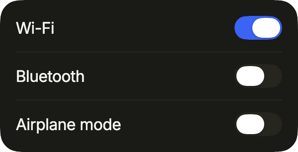
A settings card: each row pairs a label with a FlSwitch that applies at once. Give every switch the same label as its row, for the screen reader.
import 'package:your_app/ui/fliin/components/separator/fl_separator.dart';
import 'package:your_app/ui/fliin/components/surface/fl_surface.dart';
import 'package:your_app/ui/fliin/components/switch/fl_switch.dart';
import 'package:your_app/ui/fliin/components/text/fl_text.dart';
import 'package:your_app/ui/fliin/core/fliin.dart';
import 'package:flutter/widgets.dart';

class SwitchSettingsExample extends StatefulWidget {
  const SwitchSettingsExample({super.key});

  @override
  State<SwitchSettingsExample> createState() => _SwitchSettingsExampleState();
}

class _SwitchSettingsExampleState extends State<SwitchSettingsExample> {
  final _on = {'wifi': true, 'bluetooth': false, 'airplane': false};

  @override
  Widget build(BuildContext context) {
    final space = FlScope.of(context).space;
    return FlSurface(
      child: Column(
        mainAxisSize: MainAxisSize.min,
        spacing: space.md,
        children: [
          for (final (i, (id, label)) in [
            ('wifi', 'Wi-Fi'),
            ('bluetooth', 'Bluetooth'),
            ('airplane', 'Airplane mode'),
          ].indexed) ...[
            if (i > 0) const FlSeparator(),
            Row(
              spacing: space.md,
              children: [
                Expanded(child: FlText(label)),
                FlSwitch(
                  key: ValueKey(id),
                  value: _on[id]!,
                  label: label,
                  onChanged: (value) => setState(() => _on[id] = value),
                ),
              ],
            ),
          ],
        ],
      ),
    );
  }
}Enabled
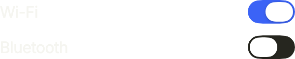
Switches beside their labels, one on and one off. onChanged receives the new value; keep it in your state and pass it back as value.
import 'package:your_app/ui/fliin/components/switch/fl_switch.dart';
import 'package:your_app/ui/fliin/components/text/fl_text.dart';
import 'package:your_app/ui/fliin/core/fliin.dart';
import 'package:flutter/widgets.dart';

class SwitchEnabledExample extends StatefulWidget {
  const SwitchEnabledExample({super.key});

  @override
  State<SwitchEnabledExample> createState() => _SwitchEnabledExampleState();
}

class _SwitchEnabledExampleState extends State<SwitchEnabledExample> {
  var _wifi = true;
  var _bluetooth = false;

  @override
  Widget build(BuildContext context) {
    final space = FlScope.of(context).space;
    return Column(
      mainAxisSize: MainAxisSize.min,
      crossAxisAlignment: CrossAxisAlignment.stretch,
      spacing: space.md,
      children: [
        Row(
          spacing: space.md,
          children: [
            const Expanded(child: FlText('Wi-Fi')),
            FlSwitch(
              value: _wifi,
              label: 'Wi-Fi',
              onChanged: (value) => setState(() => _wifi = value),
            ),
          ],
        ),
        Row(
          spacing: space.md,
          children: [
            const Expanded(child: FlText('Bluetooth')),
            FlSwitch(
              value: _bluetooth,
              label: 'Bluetooth',
              onChanged: (value) => setState(() => _bluetooth = value),
            ),
          ],
        ),
      ],
    );
  }
}On
A switch that is on: the track takes the accent and the thumb sits at the end of the reading direction.

import 'package:your_app/ui/fliin/components/switch/fl_switch.dart';
import 'package:your_app/ui/fliin/components/text/fl_text.dart';
import 'package:your_app/ui/fliin/core/fliin.dart';
import 'package:flutter/widgets.dart';

class SwitchOnExample extends StatefulWidget {
  const SwitchOnExample({super.key});

  @override
  State<SwitchOnExample> createState() => _SwitchOnExampleState();
}

class _SwitchOnExampleState extends State<SwitchOnExample> {
  var _wifi = true;

  @override
  Widget build(BuildContext context) {
    return Row(
      spacing: FlScope.of(context).space.md,
      children: [
        const Expanded(child: FlText('Wi-Fi')),
        FlSwitch(
          value: _wifi,
          label: 'Wi-Fi',
          onChanged: (value) => setState(() => _wifi = value),
        ),
      ],
    );
  }
}Off
A switch that is off: a neutral track, the thumb at the start of the reading direction.

import 'package:your_app/ui/fliin/components/switch/fl_switch.dart';
import 'package:your_app/ui/fliin/components/text/fl_text.dart';
import 'package:your_app/ui/fliin/core/fliin.dart';
import 'package:flutter/widgets.dart';

class SwitchOffExample extends StatefulWidget {
  const SwitchOffExample({super.key});

  @override
  State<SwitchOffExample> createState() => _SwitchOffExampleState();
}

class _SwitchOffExampleState extends State<SwitchOffExample> {
  var _wifi = false;

  @override
  Widget build(BuildContext context) {
    return Row(
      spacing: FlScope.of(context).space.md,
      children: [
        const Expanded(child: FlText('Wi-Fi')),
        FlSwitch(
          value: _wifi,
          label: 'Wi-Fi',
          onChanged: (value) => setState(() => _wifi = value),
        ),
      ],
    );
  }
}Disabled
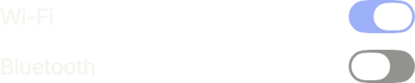
onChanged: null disables a switch: it fades, keeps its value, and the screen reader announces it as unavailable.
import 'package:your_app/ui/fliin/components/switch/fl_switch.dart';
import 'package:your_app/ui/fliin/components/text/fl_text.dart';
import 'package:your_app/ui/fliin/core/fliin.dart';
import 'package:flutter/widgets.dart';

class SwitchDisabledExample extends StatelessWidget {
  const SwitchDisabledExample({super.key});

  @override
  Widget build(BuildContext context) {
    final space = FlScope.of(context).space;
    return Column(
      mainAxisSize: MainAxisSize.min,
      crossAxisAlignment: CrossAxisAlignment.stretch,
      spacing: space.md,
      children: [
        Row(
          spacing: space.md,
          children: const [
            Expanded(child: FlText('Wi-Fi')),
            FlSwitch(value: true, label: 'Wi-Fi', onChanged: null),
          ],
        ),
        Row(
          spacing: space.md,
          children: const [
            Expanded(child: FlText('Bluetooth')),
            FlSwitch(value: false, label: 'Bluetooth', onChanged: null),
          ],
        ),
      ],
    );
  }
}Sizes
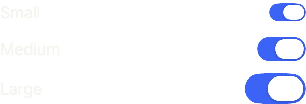
size scales the track and the thumb: sm for a dense list, lg for a switch that carries icons. The touch target stays the platform's.
import 'package:your_app/ui/fliin/components/switch/fl_switch.dart';
import 'package:your_app/ui/fliin/components/text/fl_text.dart';
import 'package:your_app/ui/fliin/core/fliin.dart';
import 'package:flutter/widgets.dart';

class SwitchSizesExample extends StatefulWidget {
  const SwitchSizesExample({super.key});

  @override
  State<SwitchSizesExample> createState() => _SwitchSizesExampleState();
}

class _SwitchSizesExampleState extends State<SwitchSizesExample> {
  final _on = {for (final size in FlSwitchSize.values) size: true};

  @override
  Widget build(BuildContext context) {
    final space = FlScope.of(context).space;
    return Column(
      mainAxisSize: MainAxisSize.min,
      crossAxisAlignment: CrossAxisAlignment.stretch,
      spacing: space.md,
      children: [
        for (final (size, label) in [
          (FlSwitchSize.sm, 'Small'),
          (FlSwitchSize.md, 'Medium'),
          (FlSwitchSize.lg, 'Large'),
        ])
          Row(
            spacing: space.md,
            children: [
              Expanded(child: FlText(label)),
              FlSwitch(
                value: _on[size]!,
                label: label,
                size: size,
                onChanged: (value) => setState(() => _on[size] = value),
              ),
            ],
          ),
      ],
    );
  }
}With icons
thumbIcon draws the state in the thumb, tinted by the switch: a check or a cross, an eye open or shut, a full or an empty heart.

import 'package:your_app/ui/fliin/components/switch/fl_switch.dart';
import 'package:your_app/ui/fliin/core/fliin.dart';
import 'package:your_app/ui/fliin/icons/fl_icons.dart';
import 'package:flutter/widgets.dart';

class SwitchWithIconsExample extends StatefulWidget {
  const SwitchWithIconsExample({super.key});

  @override
  State<SwitchWithIconsExample> createState() => _SwitchWithIconsExampleState();
}

class _SwitchWithIconsExampleState extends State<SwitchWithIconsExample> {
  final _on = {'Power': true, 'Visible': false, 'Favorite': true};

  @override
  Widget build(BuildContext context) {
    final icons = {
      'Power': (FlIcons.check, FlIcons.xmark),
      'Visible': (FlIcons.eye, FlIcons.eyeSlash),
      'Favorite': (FlIcons.heartFill, FlIcons.heart),
    };
    return Row(
      mainAxisSize: MainAxisSize.min,
      spacing: FlScope.of(context).space.lg,
      children: [
        for (final MapEntry(key: id, value: (on, off)) in icons.entries)
          FlSwitch(
            key: ValueKey(id),
            value: _on[id]!,
            label: id,
            size: FlSwitchSize.lg,
            thumbIcon: (selected) => FlIcon(selected ? on : off),
            onChanged: (value) => setState(() => _on[id] = value),
          ),
      ],
    );
  }
}Usage
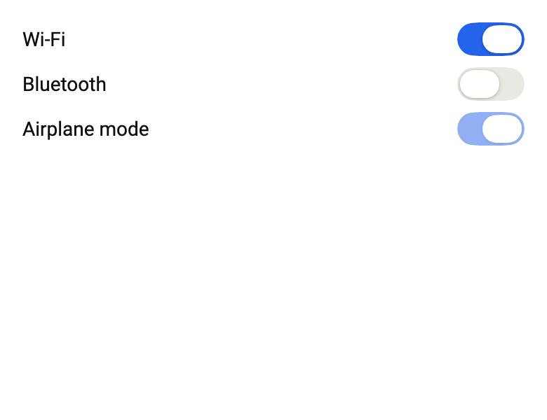
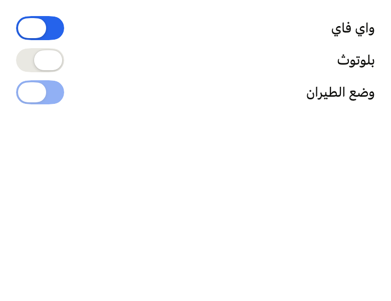
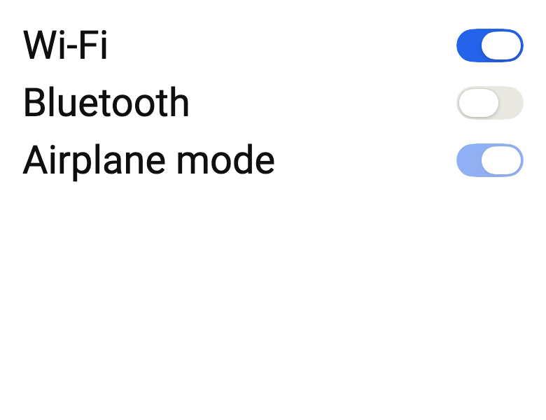
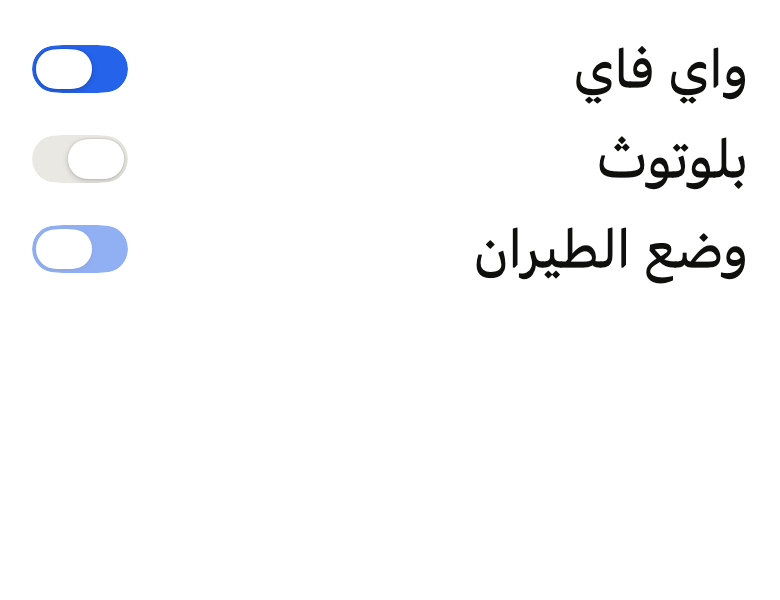
The code the reference images render:
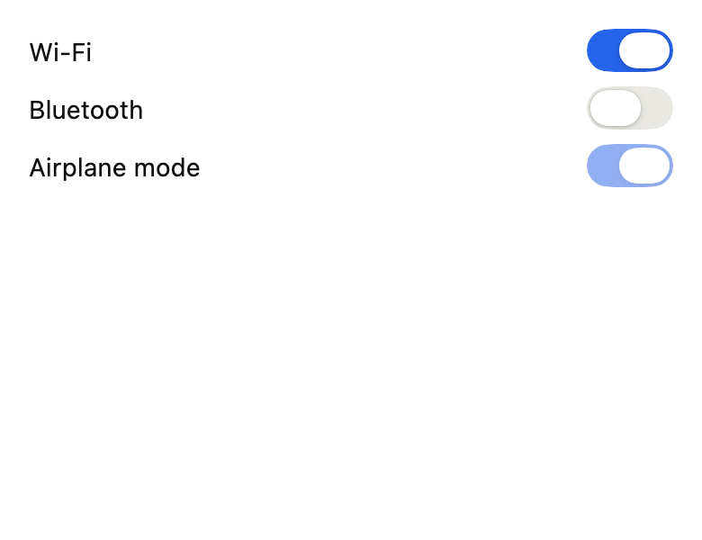
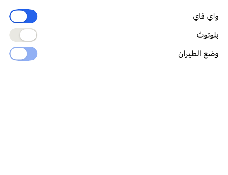
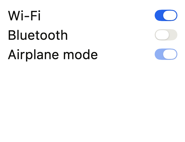
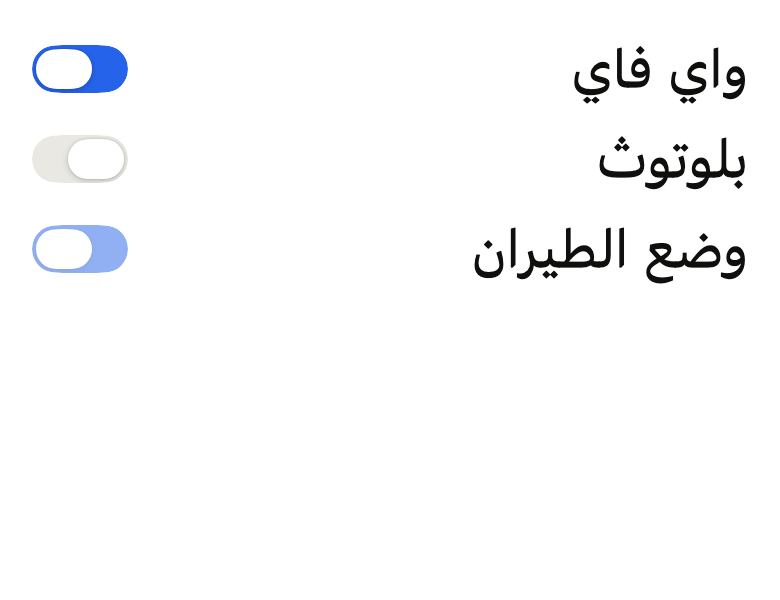
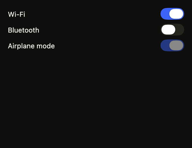
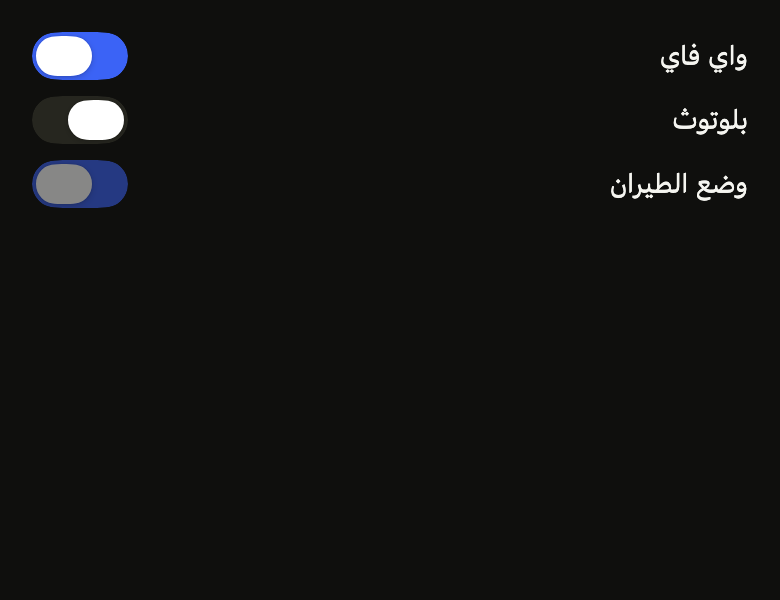
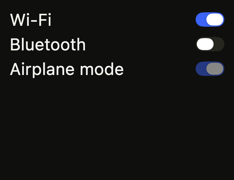
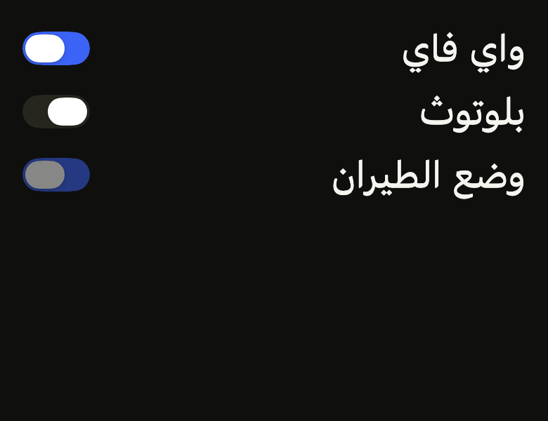
ColoredBox(color: FlScope.of(context).colors.surface, child: Padding(padding: EdgeInsetsDirectional.all(FlScope.of(context).space.lg), child: Column(crossAxisAlignment: CrossAxisAlignment.stretch, spacing: FlScope.of(context).space.sm, children: [for (final (fr, ar, on, enabled) in [('Wi-Fi', 'واي فاي', true, true), ('Bluetooth', 'بلوتوث', false, true), ('Airplane mode', 'وضع الطيران', true, false)]) Row(spacing: FlScope.of(context).space.md, children: [Expanded(child: Textfr, style: TextStyle(color: FlScope.of(context).colors.onSurface))), FlSwitch(value: on, label: fr, onChanged: enabled ? (_) {} : null)])])))API
FlSwitchSize: enum {sm, md, lg}
FlSwitchSize.sm: static final FlSwitchSize
FlSwitchSize.md: static final FlSwitchSize
FlSwitchSize.lg: static final FlSwitchSize
FlSwitchSize.new: const new(double scale)
FlSwitchSize.scale: get double
FlSwitch: class extends StatefulWidget
FlSwitch.new: const new({super.key, required bool value, required ValueChanged<bool>? onChanged, required String label, bool autofocus, WidgetStatesController? statesController, FlSwitchSize size, Widget? Function(bool on)? thumbIcon})
FlSwitch.value: get bool
FlSwitch.onChanged: get ValueChanged<bool>?
FlSwitch.label: get String
FlSwitch.autofocus: get bool
FlSwitch.statesController: get WidgetStatesController?
FlSwitch.size: get FlSwitchSize
FlSwitch.thumbIcon: get Widget? Function(bool on)?
FlSwitch.createState: State<FlSwitch>()Reference renders
The 16 images published with version 0.2.4, rendered by the shared harness on macOS with Flutter 3.47.7. fliin verify switch compares your copy to them.
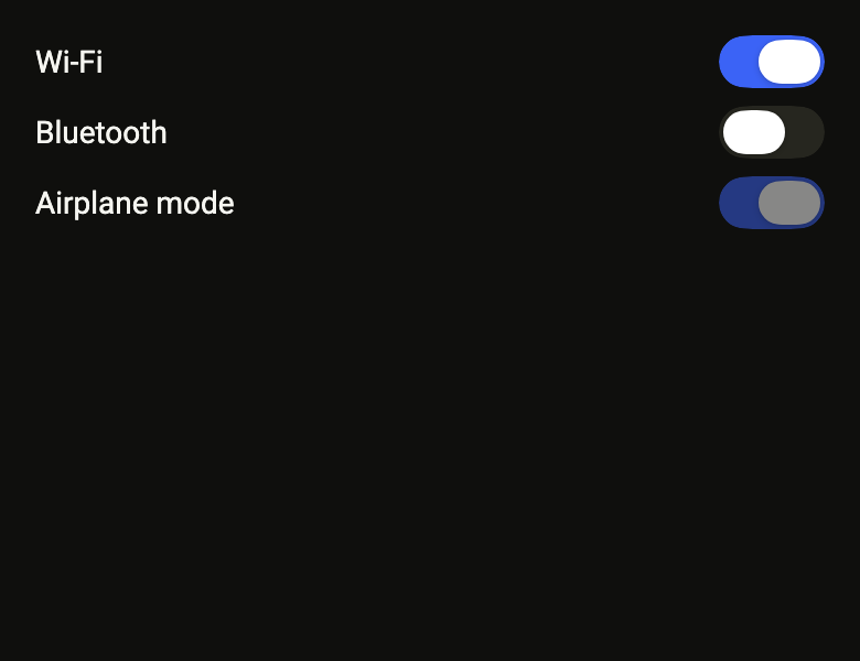
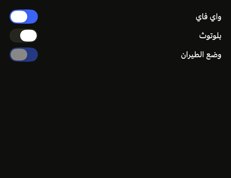
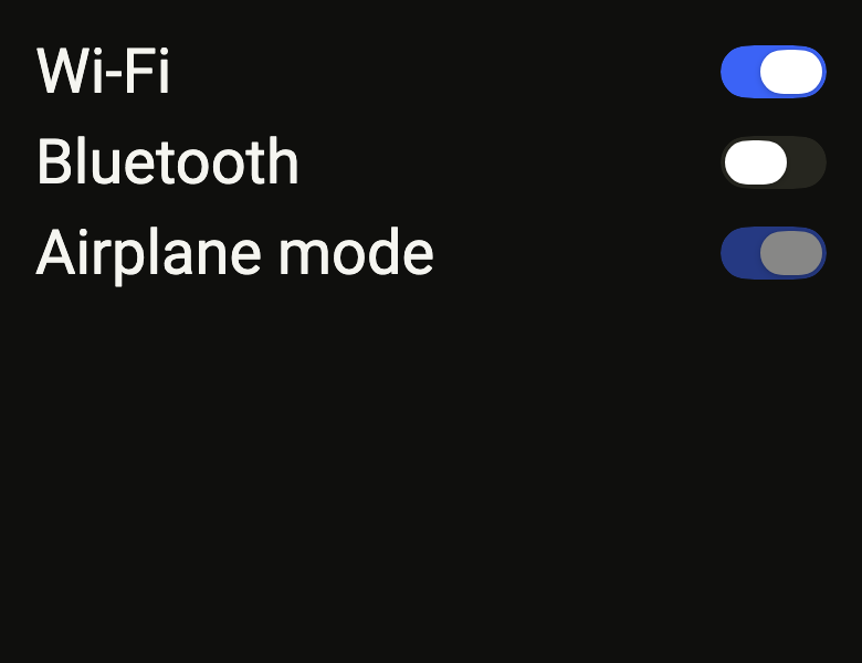
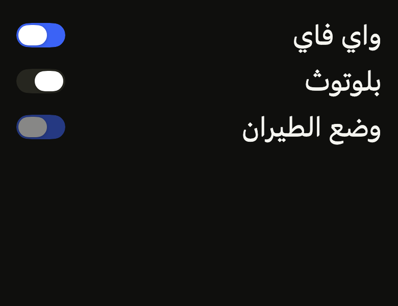
Use it to
- turn a setting on or off
- toggle notifications
- add an on/off switch to settings
- enable or disable a feature
- switch airplane mode on
- apply a setting as soon as it is flipped
- toggle dark mode on or off
- Not for
- a choice among several exclusive options: use radio buttons (radio)
- accepting terms before sending: use a checkbox (checkbox)
- States
Source
The files fliin add switch copies into your app, before your prefix and imports are applied.
switch/fl_switch.dart
// Modified from the Switch of HeroUI Native 1.0.10, Copyright 2025 NextUI Inc.,
// licensed under Apache 2.0: https://www.apache.org/licenses/LICENSE-2.0
import 'dart:math' as math;

import 'package:flutter/widgets.dart';
import 'package:fliin_ui/core/fliin.dart';

/// The size of an [FlSwitch]: the track, the thumb and its
/// insets scale together around the `size.switch*` tokens, the touch target
/// stays that of the platform.
enum FlSwitchSize {
  /// Three quarters of the tokens: a switch in a dense list or a toolbar.
  sm(0.75),

  /// The `size.switch*` tokens.
  md(1),

  /// Five quarters of the tokens: a switch that carries icons in its thumb.
  lg(1.25);

  const FlSwitchSize(this.scale);

  /// The factor applied to the `size.switch*` tokens.
  final double scale;
}

/// An on/off switch, drawn as the canvas's `.switch`: a
/// `switchTrack` track (outlined in `danger` under an invalid
/// `FlFieldScope`) that turns `selected`, and a `switchThumb` thumb lifted
/// by the `thumb` shadow, which springs to the end. It shrinks while
/// pressed, and its thumb stretches toward the side it would go to, as
/// under a finger; it turns half opaque when disabled. A tap or a drag of the
/// thumb toggles it. [size] makes it smaller or larger; [thumbIcon] puts an
/// icon in the thumb, `selected` when on and `onSurfaceMuted` when off.
class FlSwitch extends StatefulWidget {
  /// Creates a switch in the [value] state, named [label].
  const FlSwitch({
    super.key,
    required this.value,
    required this.onChanged,
    required this.label,
    this.autofocus = false,
    this.statesController,
    this.size = FlSwitchSize.md,
    this.thumbIcon,
  });

  /// On or off. The switch does not keep the state: the caller updates it
  /// from [onChanged], and the thumb follows.
  final bool value;

  /// Receives the state requested by a tap, a drag or the keyboard. When
  /// null, or under a disabled `FlFieldScope`, the switch is disabled.
  final ValueChanged<bool>? onChanged;

  /// The switch's name for the screen reader. It is not displayed: the
  /// visible label sits beside it.
  final String label;

  /// Takes focus on first build if nothing else in its scope has it. False
  /// by default.
  final bool autofocus;

  /// A `pressed` state set here shrinks the switch like a finger resting on
  /// it: a field (`control-field`) presses it when its row is touched.
  final WidgetStatesController? statesController;

  /// The track and thumb size; `md`, the tokens, by default.
  final FlSwitchSize size;

  /// The icon in the thumb for a state (`on` true or false), at three fifths
  /// of the thumb's height, tinted `selected` when on and `onSurfaceMuted`
  /// when off: a sun and a moon, a bell and a muted bell. Null for a state:
  /// a bare thumb. When null, no icon.
  final Widget? Function(bool on)? thumbIcon;

  @override
  State<FlSwitch> createState() => _FlSwitchState();
}

class _FlSwitchState extends State<FlSwitch> with TickerProviderStateMixin, ToggleableStateMixin {
  late final AnimationController _thumb = AnimationController.unbounded(vsync: this, value: _target(widget.value));
  late final AnimationController _color = AnimationController(vsync: this, value: _target(widget.value));
  late final AnimationController _fade = AnimationController.unbounded(vsync: this, value: 1);
  late final AnimationController _press = AnimationController(vsync: this);
  double _from = 0;
  bool _pressed = false;
  FlFieldScope? _scope;
  late FlMotion _motion;

  static double _target(bool value) => value ? 1 : 0;

  @override
  ValueChanged<bool?>? get onChanged => switch (widget.onChanged) {
    final onChanged? when !(_scope?.disabled ?? false) => (value) => onChanged(value!),
    _ => null,
  };

  @override
  bool get tristate => false;

  @override
  bool? get value => widget.value;

  @override
  void initState() {
    super.initState();
    widget.statesController?.addListener(_rebuild);
  }

  @override
  void didChangeDependencies() {
    super.didChangeDependencies();
    _motion = FlMotion.of(context);
    _scope = FlFieldScope.maybeOf(context);
    if (_motion.reduced) _press.value = 0;
  }

  @override
  void didUpdateWidget(FlSwitch oldWidget) {
    super.didUpdateWidget(oldWidget);
    if (oldWidget.statesController != widget.statesController) {
      oldWidget.statesController?.removeListener(_rebuild);
      widget.statesController?.addListener(_rebuild);
    }
    final disabledMidDrag = oldWidget.onChanged != null && widget.onChanged == null;
    if (oldWidget.value != widget.value || disabledMidDrag) {
      _moveTo(_target(widget.value));
    }
  }

  void _rebuild() => setState(() {});

  /// The thumb moves on the `thumb` spring and the colors change over
  /// `toggle` along `ease`. Under reduced motion, no
  /// translation: the thumb is set in place and the old state fades out
  /// (DESIGN.md §2.4).
  void _moveTo(double target, {double? velocity}) {
    final tokens = _motion.tokens;
    if (!_motion.reduced) {
      _color.animateTo(target, duration: tokens.toggle, curve: tokens.ease);
      _thumb.driveTo(target, FlSpringMotion(tokens.thumb), velocity: velocity);
      return;
    }
    _color.value = target;
    if (_thumb.value == target) return;
    _from = _thumb.value;
    _thumb.value = target;
    _fade.value = 0;
    _fade.driveTo(1, FlFadeMotion(tokens.short3));
  }

  /// The press scale, over `short3` along `easeInOutQuad`; none under
  /// reduced motion.
  void _follow(bool pressed) {
    if (pressed == _pressed) return;
    _pressed = pressed;
    if (_motion.reduced) return;
    _press.animateTo(pressed ? 1 : 0, duration: _motion.tokens.short3, curve: _motion.tokens.easeInOutQuad);
  }

  @override
  void dispose() {
    widget.statesController?.removeListener(_rebuild);
    _press.dispose();
    _fade.dispose();
    _color.dispose();
    _thumb.dispose();
    super.dispose();
  }

  /// A capsule, unless the theme's `radiusXxl` is smaller (`square`), the
  /// thumb concentric inside.
  double _trackRadius(FlTheme theme) => math.min(theme.shape.radiusXxl, _dims(theme).height / 2);

  /// The track, the thumb and its inset at [FlSwitch.size].
  ({double width, double height, double thumbWidth, double thumbHeight, double inset}) _dims(FlTheme theme) {
    final size = theme.size;
    final scale = widget.size.scale;
    return (
      width: size.switchWidth * scale,
      height: size.switchHeight * scale,
      thumbWidth: size.switchThumbWidth * scale,
      thumbHeight: size.switchThumbHeight * scale,
      inset: size.switchThumbInset * scale,
    );
  }

  /// The thumb's travel: the track's width minus the thumb and its two
  /// insets.
  double get _travel {
    final dims = _dims(FlScope.of(context));
    return dims.width - dims.thumbWidth - 2 * dims.inset;
  }

  double _forward(BuildContext context) => switch (Directionality.of(context)) {
    TextDirection.ltr => 1,
    TextDirection.rtl => -1,
  };

  void _dragStart(DragStartDetails details) => _thumb.stop();

  void _dragUpdate(DragUpdateDetails details) {
    _thumb.value = (_thumb.value + _forward(context) * details.primaryDelta! / _travel).clamp(0, 1);
  }

  /// The thumb moves to the side where it was released, with the finger's
  /// velocity. If the parent does not follow `onChanged`, it returns to
  /// `value` on the next frame.
  void _dragEnd(DragEndDetails details) {
    final target = _thumb.value >= 0.5;
    final velocity = _forward(context) * (details.primaryVelocity ?? 0) / _travel;
    _moveTo(_target(target), velocity: velocity);
    if (target != widget.value) {
      onChanged?.call(target);
    }
    WidgetsBinding.instance.addPostFrameCallback((_) {
      if (mounted && widget.value != target) {
        _moveTo(_target(widget.value));
      }
    });
    WidgetsBinding.instance.ensureVisualUpdate();
  }

  /// The track and the thumb, the thumb at [at] of its travel and the colors
  /// at [tint] from off to on, stretched by [press] of `space.xs`.
  Widget _frame(FlTheme theme, double at, double tint, {bool hovered = false, double press = 0}) {
    final colors = theme.colors;
    final t = at.clamp(0.0, 1.0);
    final c = tint.clamp(0.0, 1.0);
    final size = theme.size;
    // Only an invalid field outlines the off track, in `danger`.
    final invalid = _scope?.invalid ?? false;
    final track = FlContinuousBorder(
      radius: _trackRadius(theme),
      side: invalid
          ? BorderSide(width: size.border, color: Color.lerp(colors.danger, colors.danger.withValues(alpha: 0), c)!)
          : BorderSide.none,
    );
    final dims = _dims(theme);
    final thumbRadius = math.max(0.0, _trackRadius(theme) - dims.inset);
    final thumb = FlContinuousBorder(radius: thumbRadius);
    // The stretch grows from the thumb's resting side: off, toward the end;
    // on, toward the start.
    final stretch = theme.space.xs * widget.size.scale * press.clamp(0.0, 1.0);
    final icon = widget.thumbIcon?.call(t >= 0.5);
    return ClipPath(
      clipper: ShapeBorderClipper(shape: track, textDirection: Directionality.of(context)),
      child: DecoratedBox(
        // Izydesk's state matrix: hovered or pressed, the off track
        // darkens to `borderSecondary`.
        decoration: ShapeDecoration(
          color: Color.lerp(hovered ? colors.borderSecondary : colors.switchTrack, colors.selected, c),
          shape: track,
        ),
        child: SizedBox(
          width: dims.width,
          height: dims.height,
          child: Stack(
            children: [
              PositionedDirectional(
                start: dims.inset + t * (_travel - stretch),
                top: dims.inset,
                width: dims.thumbWidth + stretch,
                height: dims.thumbHeight,
                child: FlShadow(
                  layers: theme.shadows.thumb,
                  // React Native shadows a view from its circular corners.
                  shape: RoundedRectangleBorder(borderRadius: BorderRadius.circular(thumbRadius)),
                  child: DecoratedBox(
                    decoration: ShapeDecoration(color: colors.switchThumb, shape: thumb),
                    child: icon == null
                        ? null
                        : Center(
                            child: IconTheme.merge(
                              data: IconThemeData(
                                // Three fifths of the thumb: a 12 icon in a 20 thumb.
                                size: dims.thumbHeight * 3 / 5,
                                color: Color.lerp(colors.onSurfaceMuted, colors.selected, c),
                              ),
                              child: icon,
                            ),
                          ),
                  ),
                ),
              ),
            ],
          ),
        ),
      ),
    );
  }

  @override
  Widget build(BuildContext context) {
    final theme = FlScope.of(context);
    _follow(downPosition != null || (widget.statesController?.value.contains(WidgetState.pressed) ?? false));
    final radius = BorderRadius.circular(_trackRadius(theme));
    final all = {...states, ...?widget.statesController?.value};
    final hovered =
        isInteractive && (all.contains(WidgetState.hovered) || all.contains(WidgetState.pressed) || _pressed);
    // Its own size even under a tight constraint (alone in a stretched
    // column): otherwise the track or the box takes the full width.
    return Align(
      alignment: AlignmentDirectional.centerStart,
      widthFactor: 1,
      heightFactor: 1,
      child: FlHitTarget(
        child: Semantics(
          toggled: widget.value,
          label: widget.label,
          child: buildToggleableWithChild(
            autofocus: widget.autofocus,
            mouseCursor: WidgetStateProperty.resolveWith(
              (states) => states.contains(WidgetState.disabled) ? MouseCursor.defer : SystemMouseCursors.click,
            ),
            child: GestureDetector(
              excludeFromSemantics: true,
              onHorizontalDragStart: isInteractive ? _dragStart : null,
              onHorizontalDragUpdate: isInteractive ? _dragUpdate : null,
              onHorizontalDragEnd: isInteractive ? _dragEnd : null,
              child: FlFocusRing(
                visible: all.contains(WidgetState.focused),
                borderRadius: radius,
                child: FlPixelSnap(
                  child: Opacity(
                    opacity: isInteractive ? 1 : theme.size.disabledOpacity,
                    child: AnimatedBuilder(
                      animation: Listenable.merge([_thumb, _color, _fade, _press]),
                      builder: (context, _) {
                        final f = _fade.value.clamp(0.0, 1.0);
                        final settled = _motion.reduced ? _thumb.value : _color.value;
                        final frame = _frame(theme, _thumb.value, settled, hovered: hovered, press: _press.value);
                        return Transform.scale(
                          scale: 1 - (1 - theme.size.controlPressedScale) * _press.value,
                          child: f == 1
                              ? frame
                              : Stack(
                                  children: [
                                    _frame(theme, _from, _from),
                                    Opacity(opacity: f, child: frame),
                                  ],
                                ),
                        );
                      },
                    ),
                  ),
                ),
              ),
            ),
          ),
        ),
      ),
    );
  }
}