Components / feedback
Inline alert
Reports information, success, a warning or an error in the page, with the status icon and color, a title, a description and an action.
Import
In a Flutter app where fliin init has run:
Examples
Example
Alerts sit inline in the page: a status, a title, an optional description, and an action at the end through trailing.
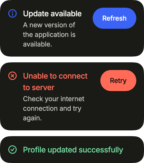
import 'package:your_app/ui/fliin/components/alert/fl_alert.dart';
import 'package:your_app/ui/fliin/components/button/fl_button.dart';
import 'package:your_app/ui/fliin/core/fliin.dart';
import 'package:flutter/widgets.dart';

class AlertExample extends StatelessWidget {
  const AlertExample({super.key});

  @override
  Widget build(BuildContext context) {
    return Column(
      mainAxisSize: MainAxisSize.min,
      crossAxisAlignment: CrossAxisAlignment.stretch,
      spacing: FlScope.of(context).space.md,
      children: [
        FlAlert(
          status: FlAlertStatus.accent,
          title: 'Update available',
          description: 'A new version of the application is available.',
          trailing: FlButton(label: 'Refresh', size: FlButtonSize.sm, onPressed: () {}),
        ),
        FlAlert(
          status: FlAlertStatus.danger,
          title: 'Unable to connect to server',
          description: 'Check your internet connection and try again.',
          trailing: FlButton(
            label: 'Retry',
            size: FlButtonSize.sm,
            variant: FlButtonVariant.danger,
            onPressed: () {},
          ),
        ),
        const FlAlert(status: FlAlertStatus.success, title: 'Profile updated successfully'),
      ],
    );
  }
}Neutral
The neutral status, for news that asks nothing of the reader.
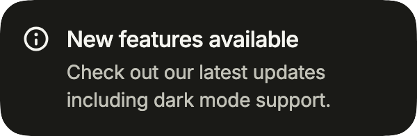
import 'package:your_app/ui/fliin/components/alert/fl_alert.dart';
import 'package:flutter/widgets.dart';

class AlertNeutralExample extends StatelessWidget {
  const AlertNeutralExample({super.key});

  @override
  Widget build(BuildContext context) {
    return const FlAlert(
      status: FlAlertStatus.neutral,
      title: 'New features available',
      description: 'Check out our latest updates including dark mode support.',
    );
  }
}Accent
The accent status, for something in progress or worth a look.
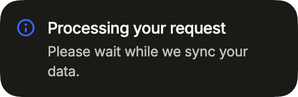
import 'package:your_app/ui/fliin/components/alert/fl_alert.dart';
import 'package:flutter/widgets.dart';

class AlertAccentExample extends StatelessWidget {
  const AlertAccentExample({super.key});

  @override
  Widget build(BuildContext context) {
    return const FlAlert(
      status: FlAlertStatus.accent,
      title: 'Processing your request',
      description: 'Please wait while we sync your data.',
    );
  }
}Success
The success status confirms that an action went through.

import 'package:your_app/ui/fliin/components/alert/fl_alert.dart';
import 'package:flutter/widgets.dart';

class AlertSuccessExample extends StatelessWidget {
  const AlertSuccessExample({super.key});

  @override
  Widget build(BuildContext context) {
    return const FlAlert(
      status: FlAlertStatus.success,
      title: 'Success',
      description: 'Your changes have been saved.',
    );
  }
}Warning
The warning status, for something the reader should plan around.

import 'package:your_app/ui/fliin/components/alert/fl_alert.dart';
import 'package:flutter/widgets.dart';

class AlertWarningExample extends StatelessWidget {
  const AlertWarningExample({super.key});

  @override
  Widget build(BuildContext context) {
    return const FlAlert(
      status: FlAlertStatus.warning,
      title: 'Scheduled maintenance',
      description: 'Sunday, 2 to 4 am.',
    );
  }
}Danger
The danger status, for a failure the reader has to deal with.

import 'package:your_app/ui/fliin/components/alert/fl_alert.dart';
import 'package:flutter/widgets.dart';

class AlertDangerExample extends StatelessWidget {
  const AlertDangerExample({super.key});

  @override
  Widget build(BuildContext context) {
    return const FlAlert(
      status: FlAlertStatus.danger,
      title: 'Unable to connect',
      description: 'Check your network.',
    );
  }
}Loading
icon takes any widget in place of the status icon: here a small spinner, while the request runs.
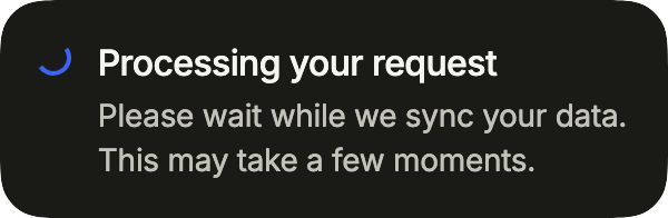
import 'package:your_app/ui/fliin/components/alert/fl_alert.dart';
import 'package:your_app/ui/fliin/components/spinner/fl_spinner.dart';
import 'package:flutter/widgets.dart';

class AlertLoadingExample extends StatelessWidget {
  const AlertLoadingExample({super.key});

  @override
  Widget build(BuildContext context) {
    return const FlAlert(
      status: FlAlertStatus.accent,
      icon: FlSpinner(label: 'Syncing', size: FlSpinnerSize.sm),
      title: 'Processing your request',
      description: 'Please wait while we sync your data. This may take a few moments.',
    );
  }
}Dismissible
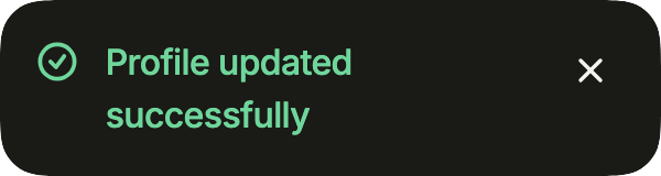
A close button in trailing lets the reader put the alert away; the app removes it from the page.
import 'package:your_app/ui/fliin/components/alert/fl_alert.dart';
import 'package:your_app/ui/fliin/components/close_button/fl_close_button.dart';
import 'package:flutter/widgets.dart';

class AlertDismissibleExample extends StatefulWidget {
  const AlertDismissibleExample({super.key});

  @override
  State<AlertDismissibleExample> createState() => _AlertDismissibleExampleState();
}

class _AlertDismissibleExampleState extends State<AlertDismissibleExample> {
  var _shown = true;

  @override
  Widget build(BuildContext context) {
    if (!_shown) return const SizedBox.shrink();
    return FlAlert(
      status: FlAlertStatus.success,
      title: 'Profile updated successfully',
      trailing: FlCloseButton(label: 'Close', onPressed: () => setState(() => _shown = false)),
    );
  }
}Steps
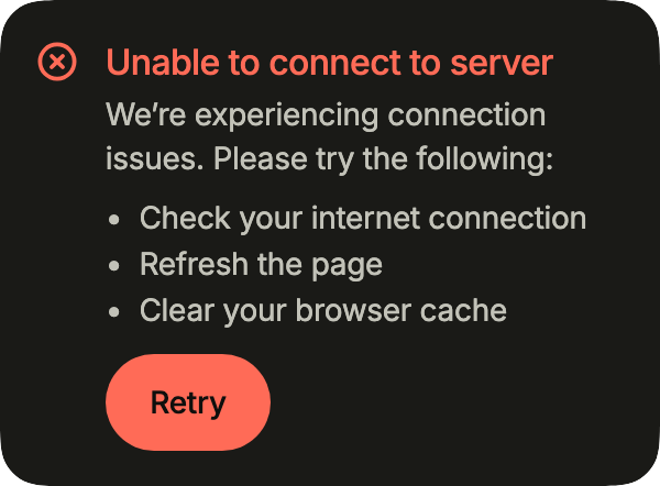
content holds what a sentence cannot, a list of steps here, and action puts the button under the text, where a phone has room for it.
import 'package:your_app/ui/fliin/components/alert/fl_alert.dart';
import 'package:your_app/ui/fliin/components/button/fl_button.dart';
import 'package:your_app/ui/fliin/core/fliin.dart';
import 'package:flutter/widgets.dart';

class AlertStepsExample extends StatelessWidget {
  const AlertStepsExample({super.key});

  @override
  Widget build(BuildContext context) {
    return FlAlert(
      status: FlAlertStatus.danger,
      title: 'Unable to connect to server',
      description: 'We’re experiencing connection issues. Please try the following:',
      content: Column(
        crossAxisAlignment: CrossAxisAlignment.start,
        spacing: FlScope.of(context).space.xs,
        children: const [
          Text('•  Check your internet connection'),
          Text('•  Refresh the page'),
          Text('•  Clear your browser cache'),
        ],
      ),
      action: FlButton(label: 'Retry', size: FlButtonSize.sm, variant: FlButtonVariant.danger, onPressed: () {}),
    );
  }
}Billing
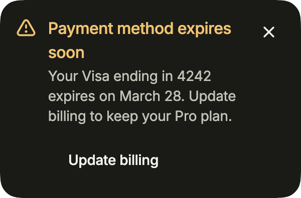
Both ends at once: an action under the text and a close button at the end of the row.
import 'package:your_app/ui/fliin/components/alert/fl_alert.dart';
import 'package:your_app/ui/fliin/components/button/fl_button.dart';
import 'package:your_app/ui/fliin/components/close_button/fl_close_button.dart';
import 'package:flutter/widgets.dart';

class AlertBillingExample extends StatelessWidget {
  const AlertBillingExample({super.key});

  @override
  Widget build(BuildContext context) {
    return FlAlert(
      status: FlAlertStatus.warning,
      title: 'Payment method expires soon',
      description: 'Your Visa ending in 4242 expires on March 28. Update billing to keep your Pro plan.',
      action: FlButton(
        label: 'Update billing',
        size: FlButtonSize.sm,
        variant: FlButtonVariant.tertiary,
        onPressed: () {},
      ),
      trailing: FlCloseButton(label: 'Close', onPressed: () {}),
    );
  }
}Usage
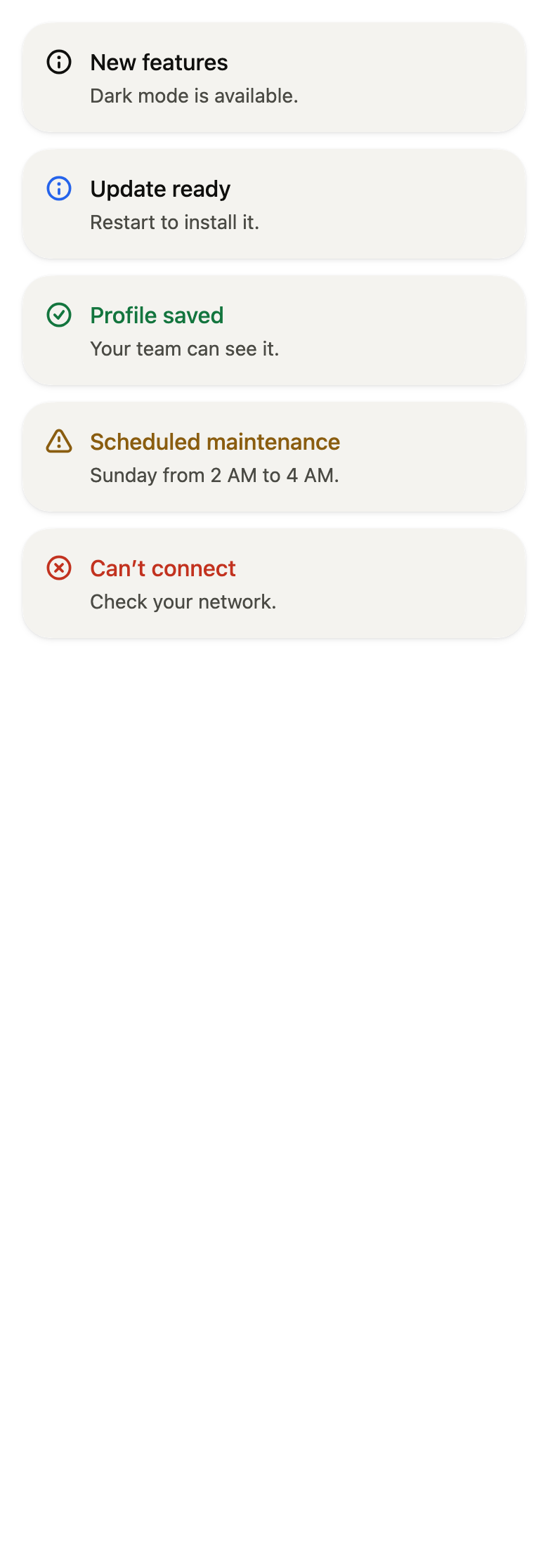
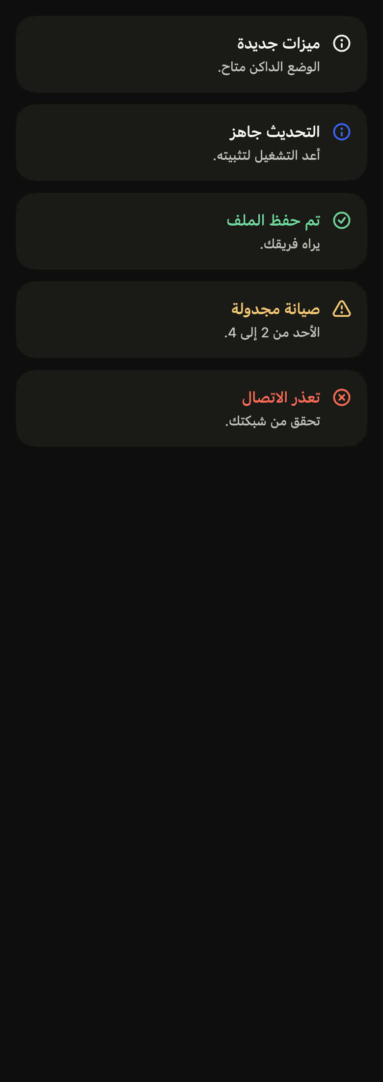
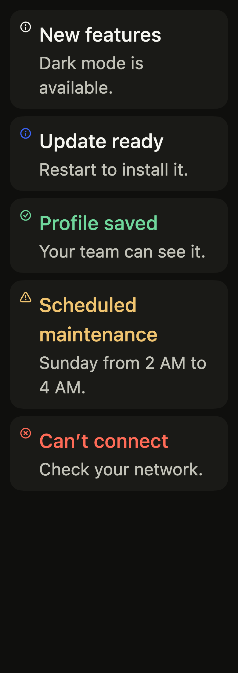
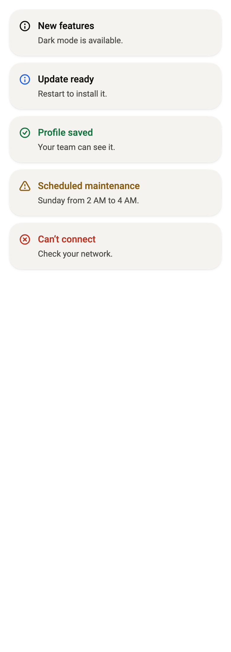
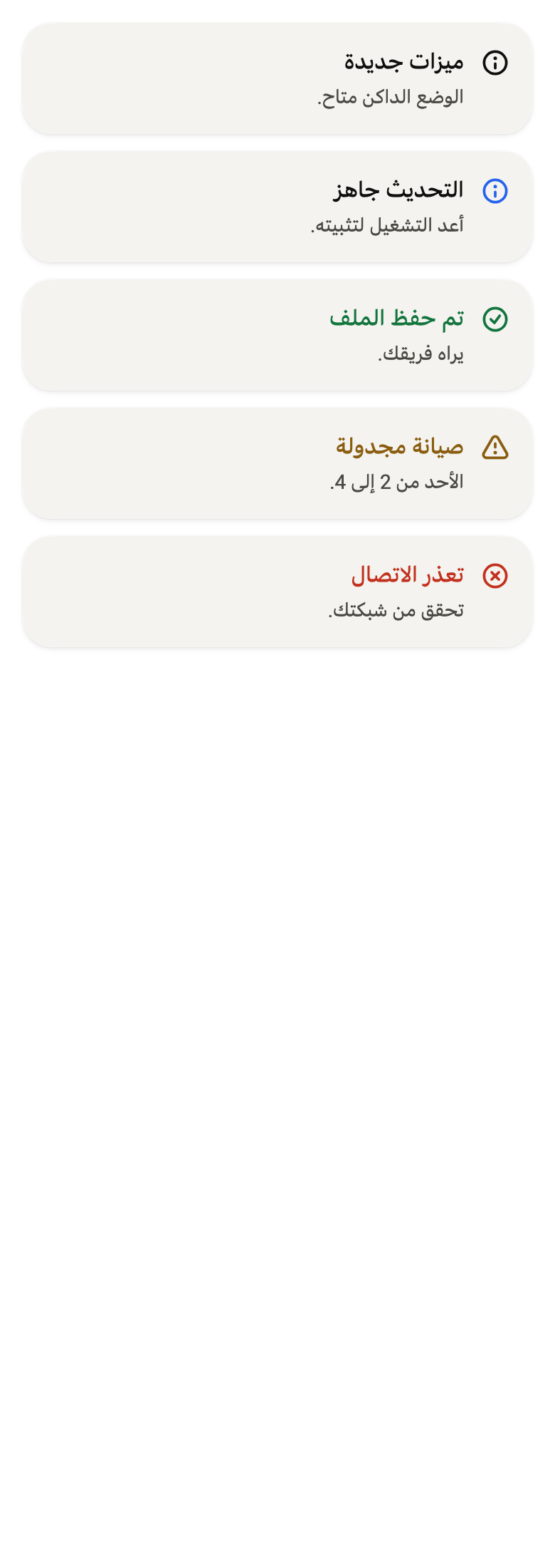
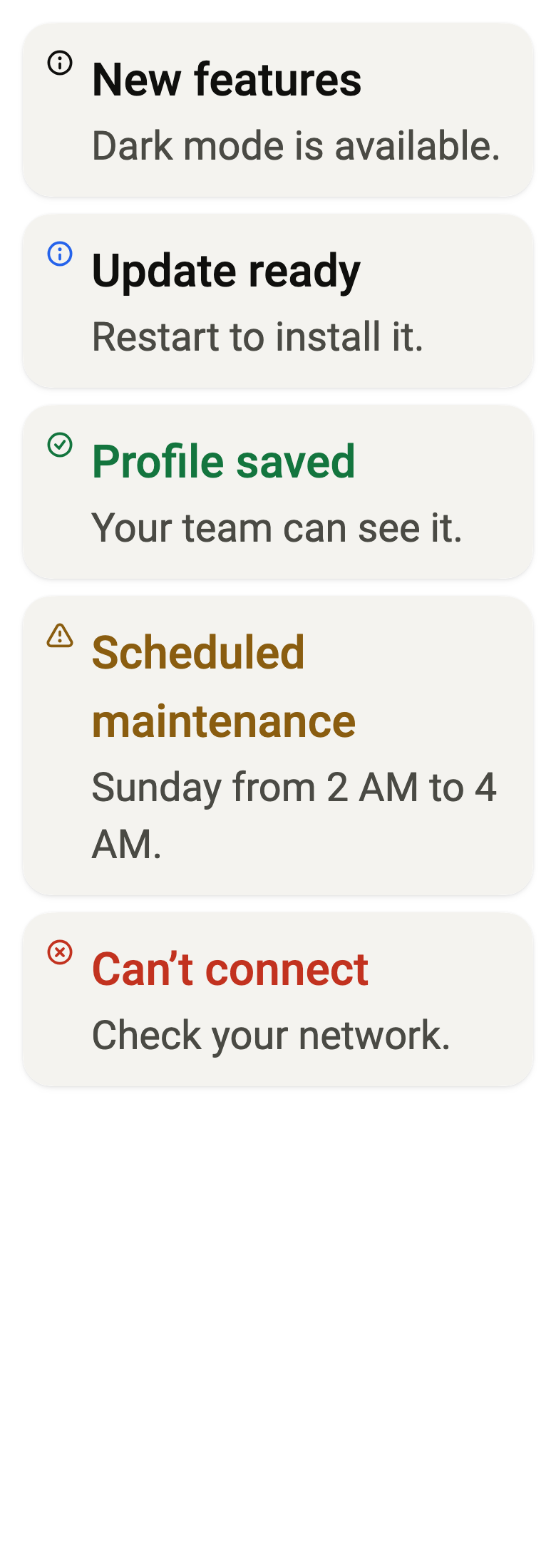
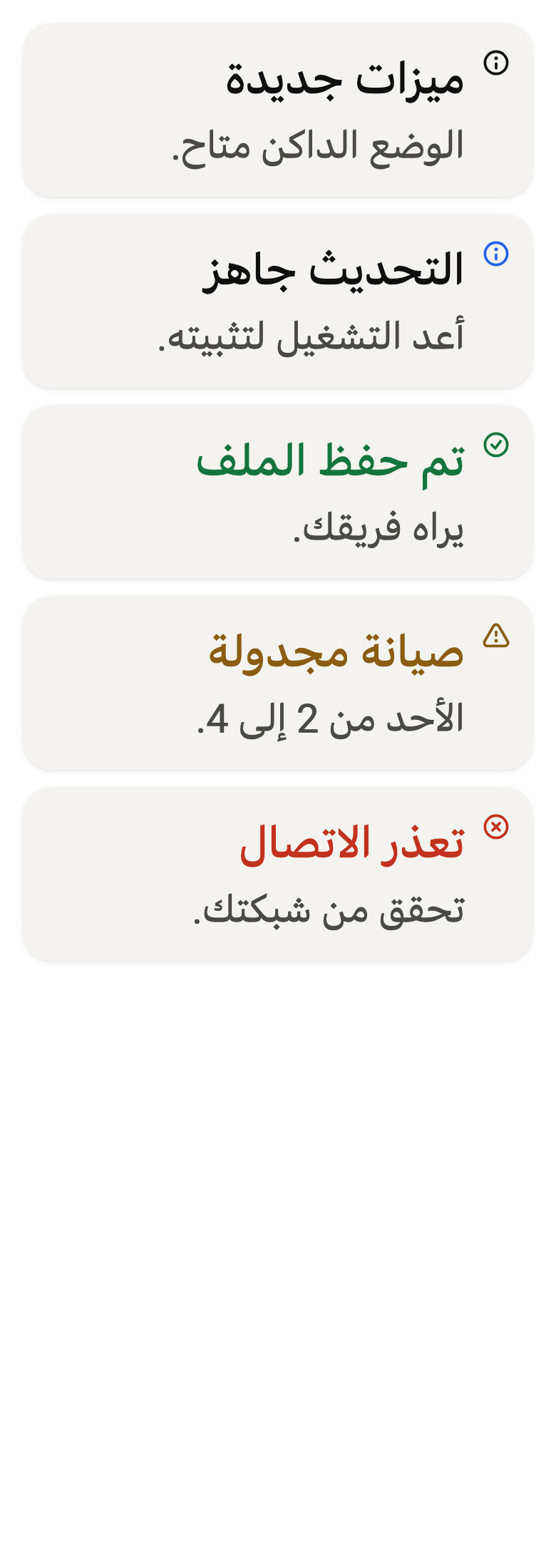
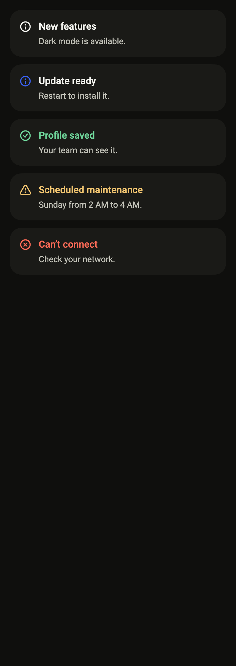
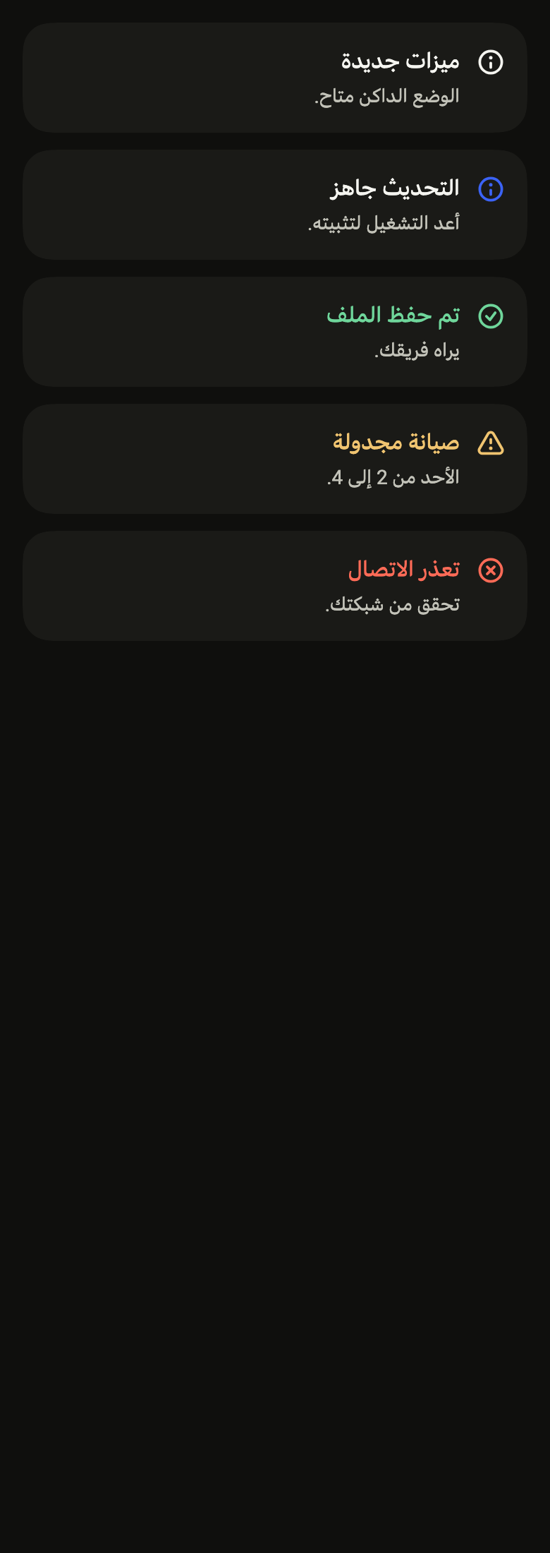
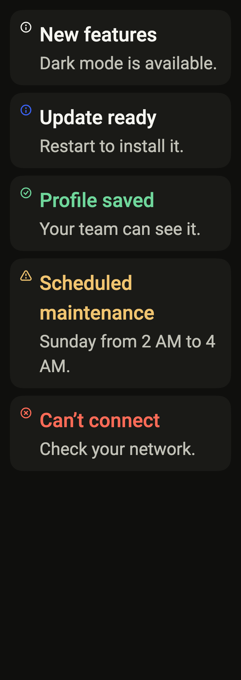
The code the reference images render:
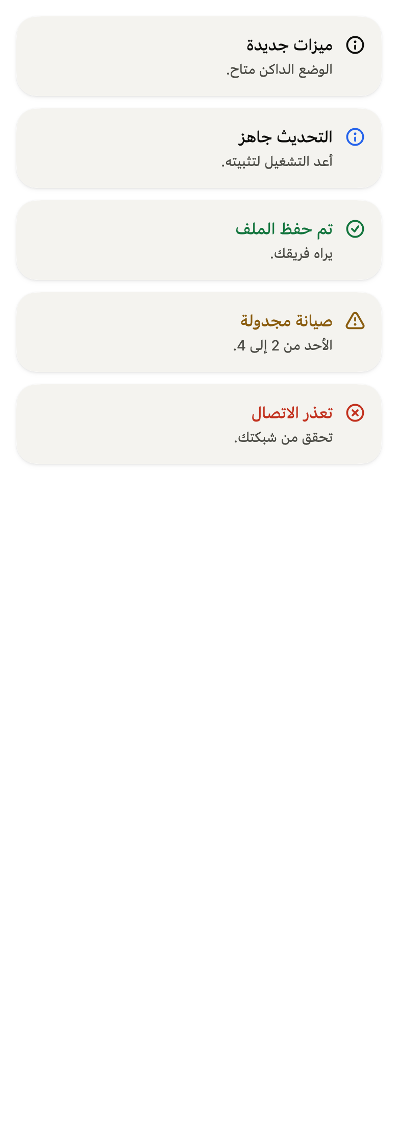
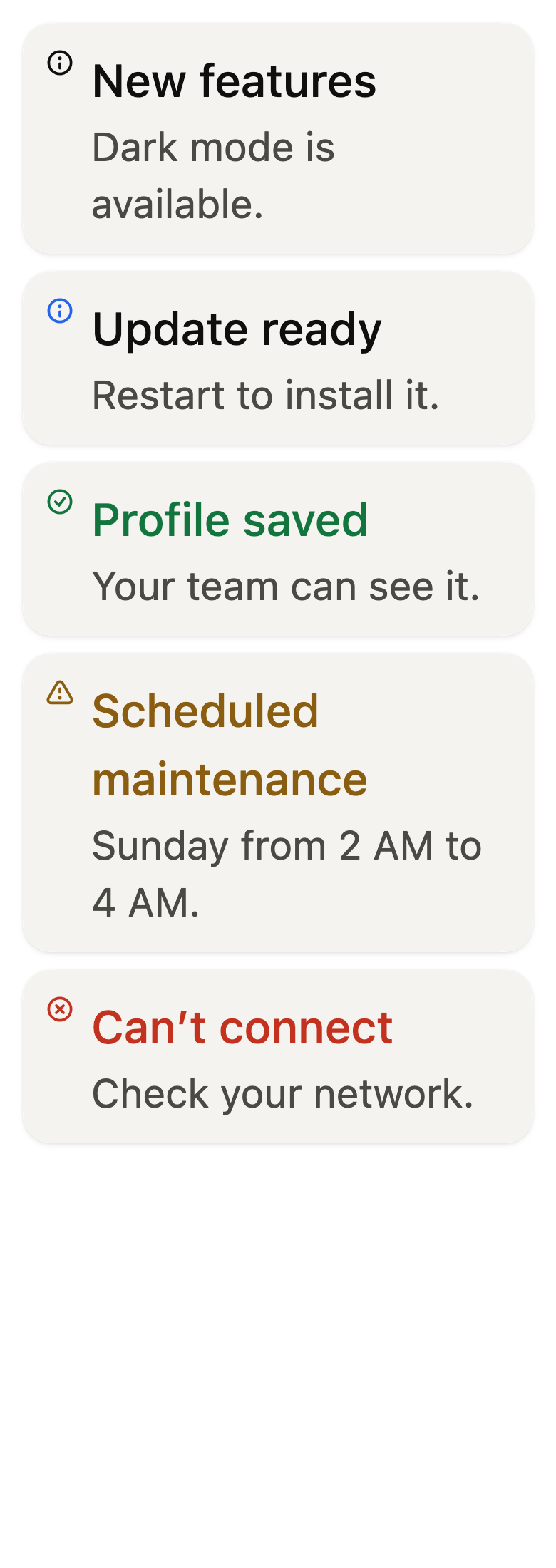
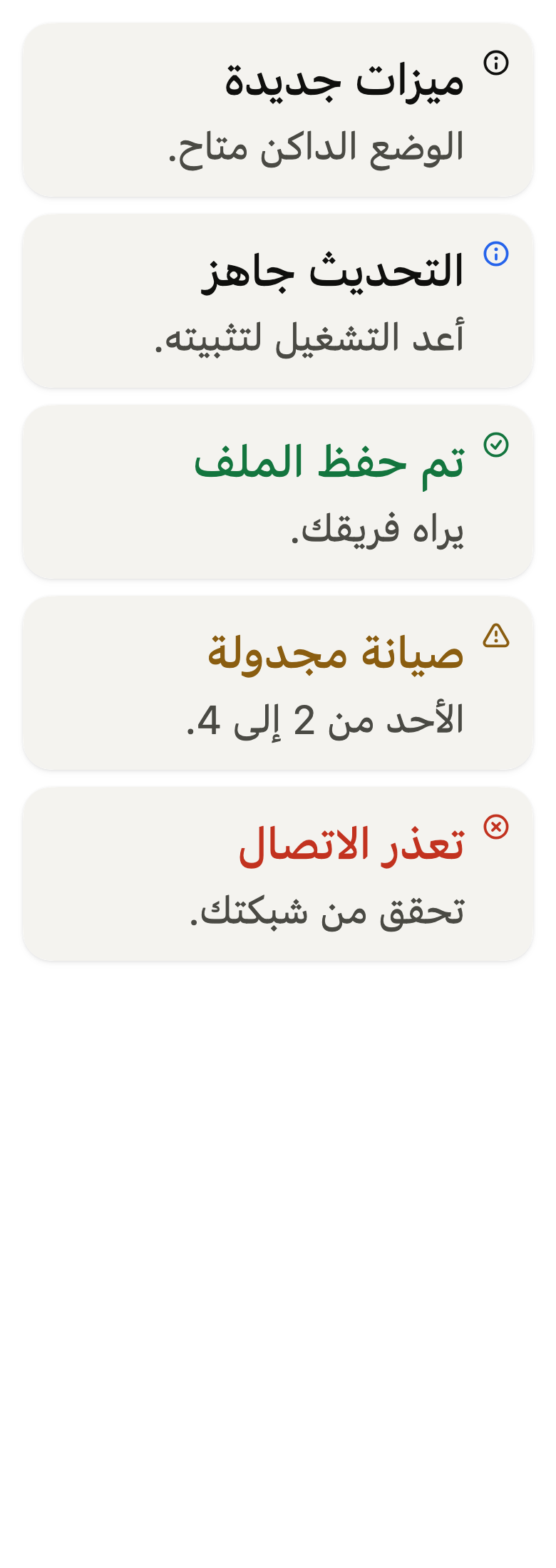
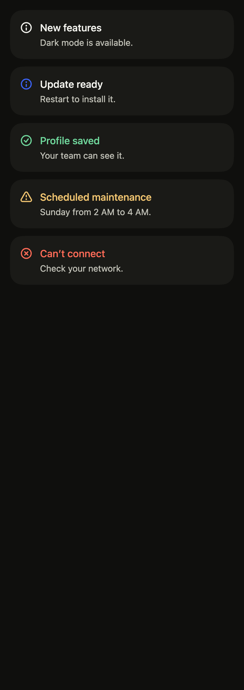
final example = ColoredBox(
  color: FlScope.of(context).colors.surface,
  child: Padding(
    padding: EdgeInsetsDirectional.all(FlScope.of(context).space.lg),
    child: Column(
      crossAxisAlignment: CrossAxisAlignment.stretch,
      spacing: FlScope.of(context).space.md,
      children: [
        FlAlert(
          status: FlAlertStatus.neutral,
          title: 'New features',
          description: 'Dark mode is available.',
        ),
        FlAlert(
          status: FlAlertStatus.accent,
          title: 'Update ready',
          description: 'Restart to install it.',
        ),
        FlAlert(
          status: FlAlertStatus.success,
          title: 'Profile saved',
          description: 'Your team can see it.',
        ),
        FlAlert(
          status: FlAlertStatus.warning,
          title: 'Scheduled maintenance',
          description: 'Sunday from 2 AM to 4 AM.',
        ),
        FlAlert(
          status: FlAlertStatus.danger,
          title: 'Can’t connect',
          description: 'Check your network.',
        ),
      ],
    ),
  ),
);API
FlAlertStatus: enum {neutral, accent, success, warning, danger}
FlAlertStatus.neutral: static final FlAlertStatus
FlAlertStatus.accent: static final FlAlertStatus
FlAlertStatus.success: static final FlAlertStatus
FlAlertStatus.warning: static final FlAlertStatus
FlAlertStatus.danger: static final FlAlertStatus
FlAlert: class extends StatelessWidget
FlAlert.new: const new({super.key, required String title, String? description, FlAlertStatus status, Widget? icon, bool showIcon, Widget? trailing, Widget? content, Widget? action})
FlAlert.title: get String
FlAlert.description: get String?
FlAlert.status: get FlAlertStatus
FlAlert.icon: get Widget?
FlAlert.showIcon: get bool
FlAlert.trailing: get Widget?
FlAlert.content: get Widget?
FlAlert.action: get Widget?
FlAlert.build: Widget(BuildContext context)Reference renders
The 16 images published with version 0.2.4, rendered by the shared harness on macOS with Flutter 3.47.7. fliin verify alert compares your copy to them.


Use it to
- give notice of planned maintenance on the page
- let people know an update is ready to install
- confirm on the page that a profile was saved
- explain why a payment or a connection failed
- show an inline notice with an action button
- Not for
- a passing message after an action: use a toast (toast)
- an input error on a field: use the field's error message (field)
- a confirmation before an irreversible action: use a dialog (dialog)
- States
Source
The files fliin add alert copies into your app, before your prefix and imports are applied.
alert/fl_alert.dart
// Modified from the Alert of HeroUI Native 1.0.10, Copyright 2025 NextUI Inc.,
// licensed under Apache 2.0: https://www.apache.org/licenses/LICENSE-2.0
import 'package:flutter/foundation.dart';
import 'package:flutter/rendering.dart';
import 'package:flutter/widgets.dart';
import 'package:fliin_ui/components/surface/fl_surface.dart';
import 'package:fliin_ui/core/fliin.dart';
import 'package:fliin_ui/icons/fl_icons.dart';

/// The status of a [FlAlert]: the color of its title and icon, and the icon
/// itself.
enum FlAlertStatus {
  /// `onSurface`, the info icon.
  neutral,

  /// The info icon in `accent`, the title in `onAccentSoft`: the accent
  /// reads as a mark, not as text, which it would not hold at 4.5:1 on a
  /// dark card.
  accent,

  /// `onSuccessSoft`, the check icon.
  success,

  /// `onWarningSoft`, the warning icon.
  warning,

  /// `onDangerSoft`, the cross icon.
  danger,
}

/// An inline alert: on a shadowed surface, the status
/// icon, a title in its color, a muted description and, at the end, an
/// action. Under the text, [content] takes what a sentence cannot hold (a
/// list of steps), and [action] a button below the text, where a phone has
/// room for it; [trailing] keeps the end of the row for a close button or a
/// short action. The screen reader announces it when it appears: on the web
/// through the `alert` role, elsewhere as a live region (the engine only
/// handles the `alert` role on the web, and refuses both together).
class FlAlert extends StatelessWidget {
  /// A [status] alert titled [title].
  const FlAlert({
    super.key,
    required this.title,
    this.description,
    this.status = FlAlertStatus.neutral,
    this.icon,
    this.showIcon = true,
    this.trailing,
    this.content,
    this.action,
  });

  /// The title, in medium-weight `textBase`, in the status color.
  final String title;

  /// The text under the title, in muted `textSm`. When null: the title alone.
  final String? description;

  /// The status.
  final FlAlertStatus status;

  /// An icon in place of the status one (`Alert.Indicator` and its
  /// children), in the status color and at its size, 20.
  final Widget? icon;

  /// When false: neither icon nor its space.
  final bool showIcon;

  /// Content after the text, most often an action (an sm button) or a
  /// `FlCloseButton`.
  final Widget? trailing;

  /// Content under the description, in `textSm` and `onSurfaceMuted` (a
  /// list of steps, a link), 8 below it.
  final Widget? content;

  /// An action under the text, 12 below it, aligned with the title (an sm
  /// button): the layout of an alert on a narrow screen, where a button at
  /// the end of the row would squeeze the text.
  final Widget? action;

  @override
  Widget build(BuildContext context) {
    final theme = FlScope.of(context);
    final colors = theme.colors;
    final scale = theme.typography;
    final family = DefaultTextStyle.of(context).style.fontFamily;
    final tone = switch (status) {
      FlAlertStatus.neutral => colors.onSurface,
      FlAlertStatus.accent => colors.onAccentSoft,
      FlAlertStatus.success => colors.onSuccessSoft,
      FlAlertStatus.warning => colors.onWarningSoft,
      // On `control`, `danger` holds 4.5:1, as in the canvas.
      FlAlertStatus.danger => colors.danger,
    };
    Text text(String data, FlTextRole role, Color color, {FontWeight? weight, bool? heading}) => Text(
      data,
      textAlign: TextAlign.start,
      style: scale.resolve(role, heading: heading).copyWith(color: color, fontWeight: weight),
      strutStyle: scale.strut(role, inheritedFamily: family, heading: heading),
    );
    final description = this.description;
    final trailing = this.trailing;
    final content = this.content;
    final action = this.action;
    // Izydesk's `.alert`: 16 of padding, 12 between icon, text and action.
    final gap = theme.space.md;
    return Semantics(
      container: true,
      role: kIsWeb ? SemanticsRole.alert : null,
      liveRegion: !kIsWeb,
      child: FlSurface(
        padding: EdgeInsets.all(theme.space.lg),
        child: Row(
          crossAxisAlignment: CrossAxisAlignment.start,
          spacing: gap,
          children: [
            if (showIcon)
              Padding(
                padding: const EdgeInsetsDirectional.only(top: _iconTop),
                child: IconTheme.merge(
                  data: IconThemeData(color: status == FlAlertStatus.accent ? colors.accent : tone, size: _iconSize),
                  child:
                      icon ??
                      FlIcon(switch (status) {
                        FlAlertStatus.success => FlIcons.circleCheck,
                        FlAlertStatus.warning => FlIcons.triangleExclamation,
                        FlAlertStatus.danger => FlIcons.circleXmark,
                        FlAlertStatus.neutral || FlAlertStatus.accent => FlIcons.circleInfo,
                      }),
                ),
              ),
            Expanded(
              child: Column(
                mainAxisSize: MainAxisSize.min,
                crossAxisAlignment: CrossAxisAlignment.start,
                spacing: _textGap,
                children: [
                  Semantics(
                    header: true,
                    child: text(
                      title,
                      FlTextRole.textBase,
                      tone,
                      weight: theme.tokens.typography.weight.medium,
                      heading: true,
                    ),
                  ),
                  if (description != null) text(description, FlTextRole.textSm, colors.onSurfaceMuted),
                  if (content != null)
                    Padding(
                      padding: EdgeInsetsDirectional.only(top: theme.space.sm - _textGap),
                      child: DefaultTextStyle.merge(
                        style: scale.resolve(FlTextRole.textSm).copyWith(color: colors.onSurfaceMuted),
                        child: content,
                      ),
                    ),
                  if (action != null)
                    Padding(
                      padding: EdgeInsetsDirectional.only(top: gap - _textGap),
                      child: action,
                    ),
                ],
              ),
            ),
            ?trailing,
          ],
        ),
      ),
    );
  }
}

/// The icon of Izydesk's `.alert`, 20 square.
const double _iconSize = 20;

/// The icon sits 2 below the top, centred on the title's first line.
const double _iconTop = 2;

/// Between the title and the description.
const double _textGap = 2;