Components / navigation
Breadcrumbs
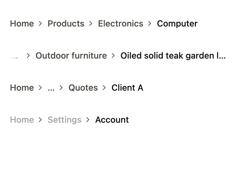
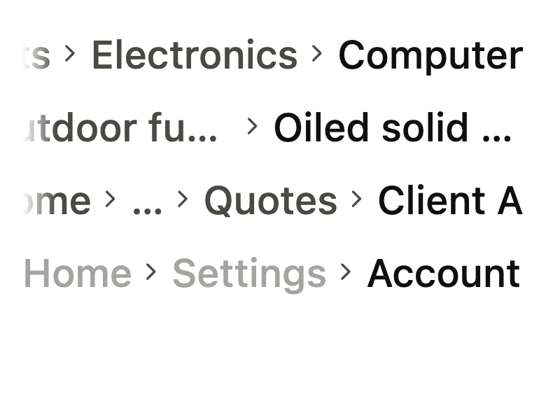
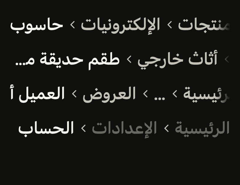
Shows where the current page sits in a hierarchy and goes back up a level: pressable levels between chevrons, on one line that scrolls and cuts long names.
Import
In a Flutter app where fliin init has run:
Examples
Levels
The path to the current page: each level but the last can be touched to go back up. semanticLabel names the trail.

import 'package:your_app/ui/fliin/components/breadcrumbs/fl_breadcrumbs.dart';
import 'package:flutter/widgets.dart';

class BreadcrumbsLevelsExample extends StatelessWidget {
  const BreadcrumbsLevelsExample({super.key});

  @override
  Widget build(BuildContext context) {
    return FlBreadcrumbs(
      semanticLabel: 'Breadcrumb',
      items: [
        FlBreadcrumb(label: 'Home', onPressed: () {}),
        FlBreadcrumb(label: 'Products', onPressed: () {}),
        FlBreadcrumb(label: 'Electronics', onPressed: () {}),
        FlBreadcrumb(label: 'Laptop', onPressed: () {}),
      ],
    );
  }
}Long
Long names wrap rather than run off the screen.

import 'package:your_app/ui/fliin/components/breadcrumbs/fl_breadcrumbs.dart';
import 'package:flutter/widgets.dart';

class BreadcrumbsLongExample extends StatelessWidget {
  const BreadcrumbsLongExample({super.key});

  @override
  Widget build(BuildContext context) {
    return FlBreadcrumbs(
      items: [
        FlBreadcrumb(label: 'Home', onPressed: () {}),
        FlBreadcrumb(label: 'Home and garden, furniture and decor', onPressed: () {}),
        FlBreadcrumb(label: 'Outdoor furniture', onPressed: () {}),
        FlBreadcrumb(label: 'Solid oiled teak garden lounge set', onPressed: () {}),
      ],
    );
  }
}Collapsed
maxItems folds the middle of a deep path behind an ellipsis that expandLabel names; touching it shows every level.

import 'package:your_app/ui/fliin/components/breadcrumbs/fl_breadcrumbs.dart';
import 'package:flutter/widgets.dart';

class BreadcrumbsCollapsedExample extends StatelessWidget {
  const BreadcrumbsCollapsedExample({super.key});

  @override
  Widget build(BuildContext context) {
    return FlBreadcrumbs(
      maxItems: 3,
      expandLabel: 'Show the whole path',
      items: [
        FlBreadcrumb(label: 'Home', onPressed: () {}),
        FlBreadcrumb(label: 'Documents', onPressed: () {}),
        FlBreadcrumb(label: 'Projects', onPressed: () {}),
        FlBreadcrumb(label: '2026', onPressed: () {}),
        FlBreadcrumb(label: 'Quotes', onPressed: () {}),
        FlBreadcrumb(label: 'Client A', onPressed: () {}),
      ],
    );
  }
}Disabled
enabled: false shows the path without letting the user leave the page through it.

import 'package:your_app/ui/fliin/components/breadcrumbs/fl_breadcrumbs.dart';
import 'package:flutter/widgets.dart';

class BreadcrumbsDisabledExample extends StatelessWidget {
  const BreadcrumbsDisabledExample({super.key});

  @override
  Widget build(BuildContext context) {
    return FlBreadcrumbs(
      enabled: false,
      items: [
        FlBreadcrumb(label: 'Home', onPressed: () {}),
        FlBreadcrumb(label: 'Settings', onPressed: () {}),
        FlBreadcrumb(label: 'Account', onPressed: () {}),
      ],
    );
  }
}Icons
leading puts an icon before a level's name, a house for the root most often; it takes the level's color.

import 'package:your_app/ui/fliin/components/breadcrumbs/fl_breadcrumbs.dart';
import 'package:your_app/ui/fliin/core/fliin.dart';
import 'package:your_app/ui/fliin/icons/fl_icons.dart';
import 'package:flutter/widgets.dart';

class BreadcrumbsIconsExample extends StatelessWidget {
  const BreadcrumbsIconsExample({super.key});

  @override
  Widget build(BuildContext context) {
    return FlBreadcrumbs(
      items: [
        FlBreadcrumb(label: 'Home', leading: FlIcon(FlIcons.house), onPressed: () {}),
        FlBreadcrumb(label: 'Settings', leading: FlIcon(FlIcons.gear), onPressed: () {}),
        FlBreadcrumb(label: 'Notifications', leading: FlIcon(FlIcons.bell)),
      ],
    );
  }
}Custom separator
separator replaces the chevron: an arrow from your icon set, or plain text such as a slash, both in the muted color.
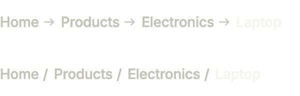
import 'package:your_app/ui/fliin/components/breadcrumbs/fl_breadcrumbs.dart';
import 'package:your_app/ui/fliin/core/fliin.dart';
import 'package:your_app/ui/fliin/icons/fl_icons.dart';
import 'package:flutter/widgets.dart';

class BreadcrumbsCustomSeparatorExample extends StatelessWidget {
  const BreadcrumbsCustomSeparatorExample({super.key});

  @override
  Widget build(BuildContext context) {
    List<FlBreadcrumb> levels() => [
      FlBreadcrumb(label: 'Home', onPressed: () {}),
      FlBreadcrumb(label: 'Products', onPressed: () {}),
      FlBreadcrumb(label: 'Electronics', onPressed: () {}),
      const FlBreadcrumb(label: 'Laptop'),
    ];
    return Column(
      mainAxisSize: MainAxisSize.min,
      spacing: FlScope.of(context).space.sm,
      children: [
        FlBreadcrumbs(separator: FlIcon(FlIcons.arrowRight), items: levels()),
        FlBreadcrumbs(separator: const Text('/'), items: levels()),
      ],
    );
  }
}Custom styles
The trail on a soft band: wrap it in your own container, padded, with the theme's control fill and corners.

import 'package:your_app/ui/fliin/components/breadcrumbs/fl_breadcrumbs.dart';
import 'package:your_app/ui/fliin/core/fliin.dart';
import 'package:flutter/widgets.dart';

class BreadcrumbsCustomStylesExample extends StatelessWidget {
  const BreadcrumbsCustomStylesExample({super.key});

  @override
  Widget build(BuildContext context) {
    final theme = FlScope.of(context);
    return DecoratedBox(
      decoration: ShapeDecoration(
        color: theme.colors.control,
        shape: FlContinuousBorder(radius: theme.shape.radiusLg),
      ),
      child: Padding(
        padding: EdgeInsetsDirectional.symmetric(horizontal: theme.space.md),
        child: FlBreadcrumbs(
          items: [
            FlBreadcrumb(label: 'Home', onPressed: () {}),
            FlBreadcrumb(label: 'Products', onPressed: () {}),
            const FlBreadcrumb(label: 'Laptop'),
          ],
        ),
      ),
    );
  }
}Usage
The code the reference images render:
final example = ColoredBox(
  color: FlScope.of(context).colors.surface,
  child: SingleChildScrollView(
    padding: EdgeInsetsDirectional.all(FlScope.of(context).space.lg),
    child: Column(
      crossAxisAlignment: CrossAxisAlignment.stretch,
      spacing: FlScope.of(context).space.sm,
      children: [
        FlBreadcrumbs(
          semanticLabel: 'Breadcrumbs',
          items: [
            FlBreadcrumb(label: 'Home', onPressed: () {}),
            FlBreadcrumb(label: 'Products', onPressed: () {}),
            FlBreadcrumb(label: 'Electronics', onPressed: () {}),
            FlBreadcrumb(label: 'Computer', onPressed: () {}),
          ],
        ),
        FlBreadcrumbs(
          items: [
            FlBreadcrumb(label: 'Home', onPressed: () {}),
            FlBreadcrumb(
              label: 'Home and garden, furniture and decor',
              onPressed: () {},
            ),
            FlBreadcrumb(label: 'Outdoor furniture', onPressed: () {}),
            FlBreadcrumb(
              label: 'Oiled solid teak garden lounge set',
              onPressed: () {},
            ),
          ],
        ),
        FlBreadcrumbs(
          maxItems: 3,
          expandLabel: 'Show the whole path',
          items: [
            FlBreadcrumb(label: 'Home', onPressed: () {}),
            FlBreadcrumb(label: 'Documents', onPressed: () {}),
            FlBreadcrumb(label: 'Projects', onPressed: () {}),
            FlBreadcrumb(label: '2026', onPressed: () {}),
            FlBreadcrumb(label: 'Quotes', onPressed: () {}),
            FlBreadcrumb(label: 'Client A', onPressed: () {}),
          ],
        ),
        FlBreadcrumbs(
          enabled: false,
          items: [
            FlBreadcrumb(label: 'Home', onPressed: () {}),
            FlBreadcrumb(label: 'Settings', onPressed: () {}),
            FlBreadcrumb(label: 'Account', onPressed: () {}),
          ],
        ),
      ],
    ),
  ),
);API
FlBreadcrumb: final class
FlBreadcrumb.new: const new({required String label, VoidCallback? onPressed, Widget? leading})
FlBreadcrumb.label: get String
FlBreadcrumb.leading: get Widget?
FlBreadcrumb.onPressed: get VoidCallback?
FlBreadcrumbs: class extends StatefulWidget
FlBreadcrumbs.new: const new({super.key, required List<FlBreadcrumb> items, int? maxItems, String? expandLabel, bool enabled, String? semanticLabel, Widget? separator})
FlBreadcrumbs.items: get List<FlBreadcrumb>
FlBreadcrumbs.maxItems: get int?
FlBreadcrumbs.expandLabel: get String?
FlBreadcrumbs.enabled: get bool
FlBreadcrumbs.semanticLabel: get String?
FlBreadcrumbs.separator: get Widget?
FlBreadcrumbs.createState: State<FlBreadcrumbs>()Reference renders
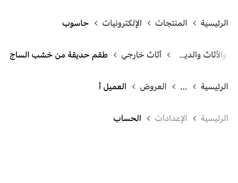
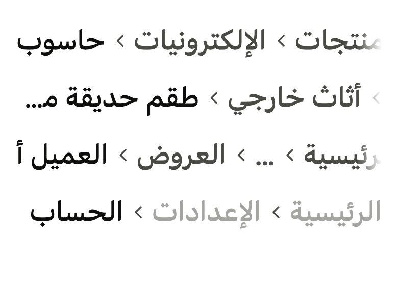
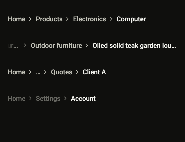
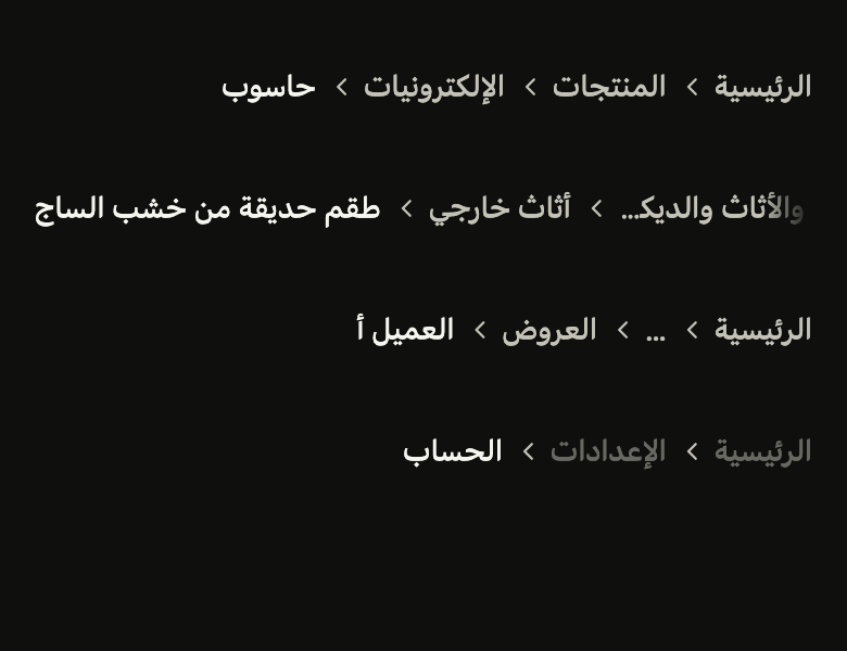
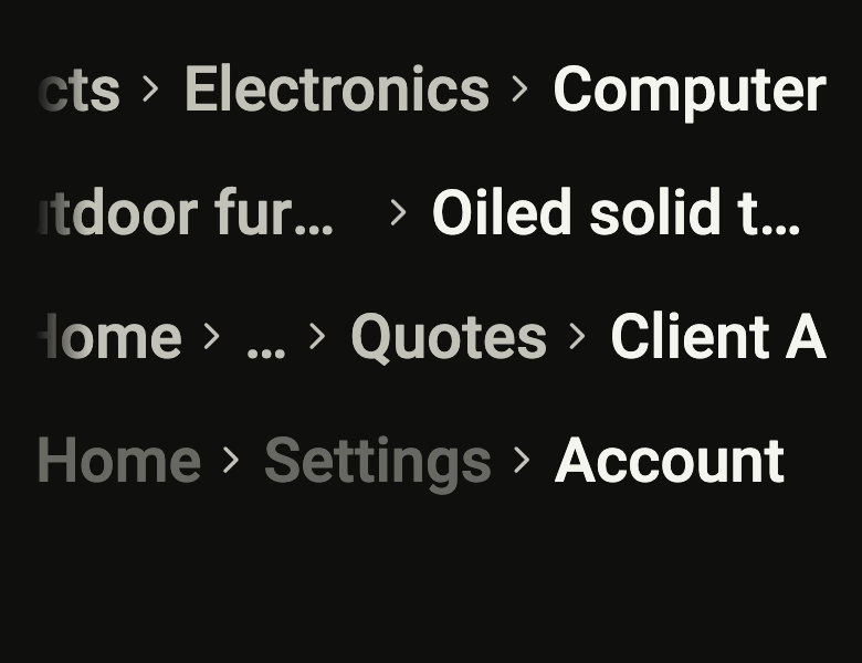
The 16 images published with version 0.1.1, rendered by the shared harness on macOS with Flutter 3.47.7. fliin verify breadcrumbs compares your copy to them.
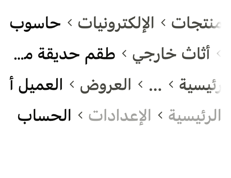
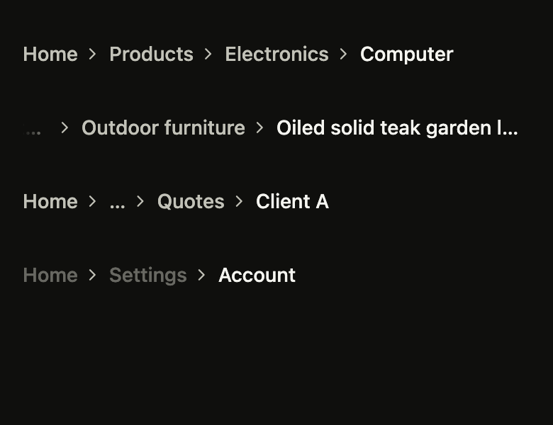
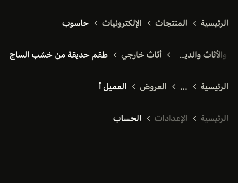
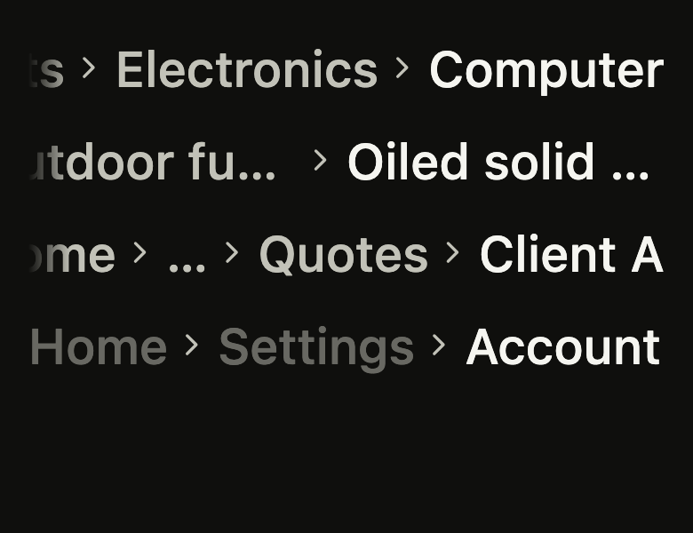
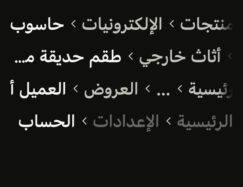
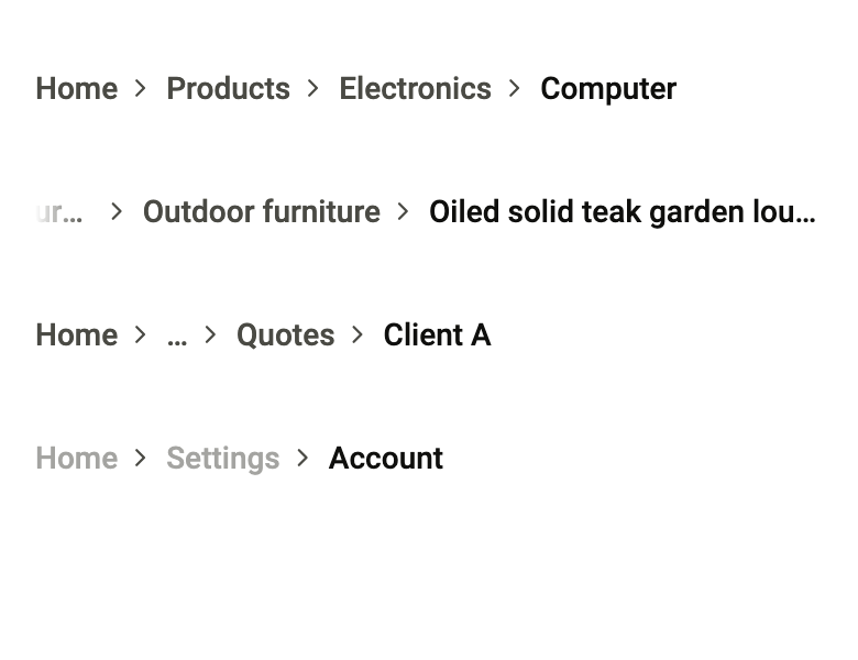
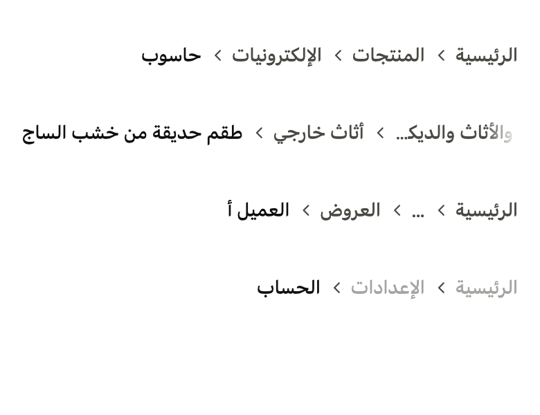
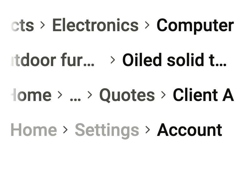
Use it to
- show the path of the open folder in a file browser
- navigate back up to the parent section of an article
- show which section a help article belongs to
- hide the middle levels of a long path
- present a home, section, page trail at the top of a screen
- Not for
- a title bar with a back button: use the app bar (app-bar)
- tabs between sibling views: use tabs (tabs)
- the steps of a process to follow: use the tracking steps (tracking-steps)
- States
Source
The files fliin add breadcrumbs copies into your app, before your prefix and imports are applied.
breadcrumbs/fl_breadcrumbs.dart
// Modified from the Breadcrumbs of HeroUI React v3, Copyright 2025 NextUI Inc.,
// licensed under Apache 2.0: https://www.apache.org/licenses/LICENSE-2.0
import 'package:flutter/widgets.dart';
import 'package:fliin_ui/core/fliin.dart';
import 'package:fliin_ui/icons/fl_icons.dart';

/// A level of an [FlBreadcrumbs]: its [label], an optional [leading] icon,
/// and the way back to it.
final class FlBreadcrumb {
  /// A level named [label].
  const FlBreadcrumb({required this.label, this.onPressed, this.leading});

  /// The page's name, short.
  final String label;

  /// An icon before the label, in its color, at `size.indicatorIcon`: a
  /// house for the root, a folder.
  final Widget? leading;

  /// Opens that page; ignored for the last level, the current page.
  final VoidCallback? onPressed;
}

/// Where the current page sits in a hierarchy:
/// each level in `textSm` medium `onSurfaceMuted`, underlined under the
/// pointer, then a chevron, up to the current page in `onSurface`, which
/// is not pressable.
///
/// On a phone, the trail stays on one line: it scrolls sideways, opened at
/// its end so that the current page shows, and each level is cut with an
/// ellipsis beyond half the width. Past [maxItems] levels, the middle ones
/// fold into a "…" button named [expandLabel] that unfolds them.
///
/// [separator] replaces the chevron (a slash, an arrow); give it a
/// direction-aware icon, which flips in RTL like the chevron does.
///
/// The screen reader reads [semanticLabel], then each level as a button,
/// the current page as text.
///
/// ```dart
/// FlBreadcrumbs(items: [
///   FlBreadcrumb(label: 'Home', leading: FlIcon(FlIcons.house), onPressed: openHome),
///   FlBreadcrumb(label: 'Settings'),
/// ])
/// ```
class FlBreadcrumbs extends StatefulWidget {
  /// A trail from the first of [items] to the current page, the last.
  const FlBreadcrumbs({
    super.key,
    required this.items,
    this.maxItems,
    this.expandLabel,
    this.enabled = true,
    this.semanticLabel,
    this.separator,
  }) : assert(items.length >= 1, 'at least the current page'),
       assert(maxItems == null || maxItems >= 2, 'the first level and the current page'),
       assert(maxItems == null || expandLabel != null, 'the folded levels need a name');

  /// The levels, from the root to the current page.
  final List<FlBreadcrumb> items;

  /// When there are more levels, the first one, "…", and the last
  /// `maxItems - 1` show; null shows them all.
  final int? maxItems;

  /// The name of the "…" button for the screen reader ("Show the whole
  /// path"); required with [maxItems].
  final String? expandLabel;

  /// False: the levels are faded and cannot be pressed.
  final bool enabled;

  /// The trail's name for the screen reader ("Breadcrumb").
  final String? semanticLabel;

  /// Drawn between two levels in place of the chevron, in `onSurfaceMuted`
  /// at the chevron's size through the `IconTheme`.
  final Widget? separator;

  @override
  State<FlBreadcrumbs> createState() => _FlBreadcrumbsState();
}

class _FlBreadcrumbsState extends State<FlBreadcrumbs> {
  bool _unfolded = false;

  /// The trail hides levels before the visible ones, or after them: that edge
  /// fades out.
  ({bool start, bool end}) _hidden = (start: false, end: false);

  bool _measure(ScrollMetricsNotification notification) {
    _track(notification.metrics);
    return false;
  }

  bool _scrolled(ScrollUpdateNotification notification) {
    _track(notification.metrics);
    return false;
  }

  void _track(ScrollMetrics metrics) {
    // Reversed: the offset grows toward the first level.
    final hidden = (start: metrics.extentAfter > 0, end: metrics.extentBefore > 0);
    if (hidden != _hidden) setState(() => _hidden = hidden);
  }

  @override
  Widget build(BuildContext context) {
    final theme = FlScope.of(context);
    const role = FlTextRole.textSm;
    final base = theme.typography.resolve(role).copyWith(fontWeight: theme.tokens.typography.weight.medium);
    final strut = theme.typography.strut(role, inheritedFamily: DefaultTextStyle.of(context).style.fontFamily);
    final items = widget.items;
    final maxItems = widget.maxItems;
    final folded = !_unfolded && maxItems != null && items.length > maxItems;
    final iconScaler = MediaQuery.textScalerOf(context).clamp(maxScaleFactor: theme.size.iconMaxScale);
    final chevron = iconScaler.scale(theme.space.md);
    final iconSize = iconScaler.scale(theme.size.indicatorIcon);

    // The label after its leading icon, both in the label's color.
    Widget labeled(Widget? leading, Widget text, Color color) => leading == null
        ? text
        : Row(
            mainAxisSize: MainAxisSize.min,
            spacing: theme.space.xs,
            children: [
              IconTheme.merge(
                data: IconThemeData(color: color, size: iconSize),
                child: leading,
              ),
              Flexible(child: text),
            ],
          );

    return LayoutBuilder(
      builder: (context, constraints) {
        final widest = constraints.maxWidth.isFinite ? constraints.maxWidth / 2 : double.infinity;

        Widget level(String label, VoidCallback? onPressed, {String? semanticLabel, Widget? leading}) => FlPressable(
          onPressed: widget.enabled ? onPressed : null,
          label: semanticLabel ?? label,
          borderRadius: BorderRadius.circular(theme.shape.radiusXs),
          overlay: FlPressOverlay.none,
          builder: (context, states) {
            final hovered = states.contains(WidgetState.hovered) || states.contains(WidgetState.pressed);
            return Opacity(
              opacity: states.contains(WidgetState.disabled)
                  ? theme.size.disabledOpacity
                  : states.contains(WidgetState.pressed)
                  ? 1 - theme.size.pressedOverlayOpacity
                  : 1,
              child: ConstrainedBox(
                constraints: BoxConstraints(maxWidth: widest),
                child: labeled(
                  leading,
                  Text(
                    label,
                    maxLines: 1,
                    overflow: TextOverflow.ellipsis,
                    style: base.copyWith(
                      color: theme.colors.onSurfaceMuted,
                      decoration: hovered ? TextDecoration.underline : null,
                      decorationColor: theme.colors.onSurfaceMuted,
                    ),
                    strutStyle: strut,
                  ),
                  theme.colors.onSurfaceMuted,
                ),
              ),
            );
          },
        );

        final current = items.last;
        final ancestors = items.sublist(0, items.length - 1);
        final shown = <Widget>[
          if (folded) ...[
            level(ancestors.first.label, ancestors.first.onPressed, leading: ancestors.first.leading),
            level('…', () => setState(() => _unfolded = true), semanticLabel: widget.expandLabel),
            for (final item in ancestors.sublist(items.length - maxItems + 1))
              level(item.label, item.onPressed, leading: item.leading),
          ] else
            for (final item in ancestors) level(item.label, item.onPressed, leading: item.leading),
        ];
        final separator = ExcludeSemantics(
          child: IconTheme.merge(
            data: IconThemeData(color: theme.colors.onSurfaceMuted, size: chevron),
            child: DefaultTextStyle.merge(
              style: base.copyWith(color: theme.colors.onSurfaceMuted),
              child: widget.separator ?? FlIcon(FlIcons.chevronRight),
            ),
          ),
        );
        final trail = Row(
          mainAxisSize: MainAxisSize.min,
          children: [
            for (final crumb in shown) ...[
              crumb,
              // 4 before the chevron, 6 after it.
              SizedBox(width: theme.space.xs),
              separator,
              SizedBox(width: theme.space.xs * 1.5),
            ],
            ConstrainedBox(
              constraints: BoxConstraints(maxWidth: widest),
              child: labeled(
                current.leading,
                Text(
                  current.label,
                  maxLines: 1,
                  overflow: TextOverflow.ellipsis,
                  style: base.copyWith(color: theme.colors.onSurface),
                  strutStyle: strut,
                ),
                theme.colors.onSurface,
              ),
            ),
          ],
        );
        return Semantics(
          container: true,
          label: widget.semanticLabel,
          explicitChildNodes: true,
          child: _Faded(
            start: _hidden.start,
            end: _hidden.end,
            reach: theme.space.xl,
            child: NotificationListener<ScrollMetricsNotification>(
              onNotification: _measure,
              child: NotificationListener<ScrollUpdateNotification>(
                onNotification: _scrolled,
                child: SingleChildScrollView(
                  scrollDirection: Axis.horizontal,
                  // Opened at the end: the current page shows first.
                  reverse: true,
                  child: ConstrainedBox(
                    // The levels' touch targets stay inside the clip; a trail
                    // that fits starts at the start, scrolled or not.
                    constraints: BoxConstraints(
                      minHeight: theme.hitTarget,
                      minWidth: constraints.maxWidth.isFinite ? constraints.maxWidth : 0,
                    ),
                    child: Align(alignment: AlignmentDirectional.centerStart, widthFactor: 1, child: trail),
                  ),
                ),
              ),
            ),
          ),
        );
      },
    );
  }
}

/// Fades [child] out over [reach] at the edges that hide more levels.
class _Faded extends StatelessWidget {
  const _Faded({required this.start, required this.end, required this.reach, required this.child});

  final bool start;
  final bool end;
  final double reach;
  final Widget child;

  @override
  Widget build(BuildContext context) {
    // Always a mask, opaque when nothing is hidden: adding it would rebuild
    // the scroll view and lose its offset.
    // Only the mask's opacity counts (`dstIn`): any color does.
    final opaque = FlScope.of(context).colors.onSurface;
    final clear = opaque.withValues(alpha: 0);
    final direction = Directionality.of(context);
    return ShaderMask(
      blendMode: BlendMode.dstIn,
      shaderCallback: (bounds) {
        final fade = bounds.width > 0 ? (reach / bounds.width).clamp(0.0, 0.5) : 0.0;
        return LinearGradient(
          begin: AlignmentDirectional.centerStart,
          end: AlignmentDirectional.centerEnd,
          colors: [start ? clear : opaque, opaque, opaque, end ? clear : opaque],
          stops: [0, fade, 1 - fade, 1],
        ).createShader(bounds, textDirection: direction);
      },
      child: child,
    );
  }
}