Components / data-display
Text
Gives the headings, paragraphs and inline code of the type scale, in the regular or muted color.
Import
In a Flutter app where fliin init has run:
Examples
Example
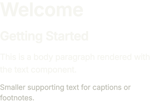
Headings, a body paragraph and a muted caption: type picks the step of the type scale, tone the emphasis.
import 'package:your_app/ui/fliin/components/text/fl_text.dart';
import 'package:your_app/ui/fliin/core/fliin.dart';
import 'package:flutter/widgets.dart';

class TextExample extends StatelessWidget {
  const TextExample({super.key});

  @override
  Widget build(BuildContext context) {
    return Column(
      mainAxisSize: MainAxisSize.min,
      crossAxisAlignment: CrossAxisAlignment.start,
      spacing: FlScope.of(context).space.md,
      children: const [
        FlText('Welcome', type: FlTextType.h1),
        FlText('Getting Started', type: FlTextType.h3),
        FlText('This is a body paragraph rendered with the text component.'),
        FlText('Smaller supporting text for captions or footnotes.', type: FlTextType.bodySm, tone: FlTextTone.muted),
      ],
    );
  }
}Types
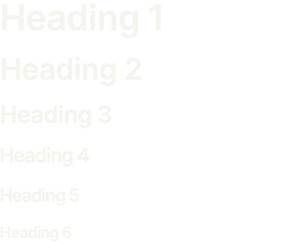
The six heading steps, from h1 to h6, set by the theme’s type scale.
import 'package:your_app/ui/fliin/components/text/fl_text.dart';
import 'package:your_app/ui/fliin/core/fliin.dart';
import 'package:flutter/widgets.dart';

class TextTypesExample extends StatelessWidget {
  const TextTypesExample({super.key});

  @override
  Widget build(BuildContext context) {
    return Column(
      mainAxisSize: MainAxisSize.min,
      crossAxisAlignment: CrossAxisAlignment.start,
      spacing: FlScope.of(context).space.md,
      children: [
        for (final type in const [
          FlTextType.h1,
          FlTextType.h2,
          FlTextType.h3,
          FlTextType.h4,
          FlTextType.h5,
          FlTextType.h6,
        ])
          FlText('Heading ${type.name.substring(1)}', type: type),
      ],
    );
  }
}Rich
spans styles words inside one paragraph, a date in bold, a place in the accent, while the paragraph keeps its type and line height; data stays the plain text the screen reader reads.

import 'package:your_app/ui/fliin/components/text/fl_text.dart';
import 'package:your_app/ui/fliin/core/fliin.dart';
import 'package:flutter/widgets.dart';

class TextRichExample extends StatelessWidget {
  const TextRichExample({super.key});

  @override
  Widget build(BuildContext context) {
    final theme = FlScope.of(context);
    final bold = TextStyle(fontWeight: theme.tokens.typography.weight.semibold);
    final accent = TextStyle(color: theme.colors.accent);
    return FlText(
      'Your order ships on Friday. Follow it in Orders.',
      spans: [
        const TextSpan(text: 'Your order ships on '),
        TextSpan(text: 'Friday', style: bold),
        const TextSpan(text: '. Follow it in '),
        TextSpan(text: 'Orders', style: accent),
        const TextSpan(text: '.'),
      ],
    );
  }
}Custom styles
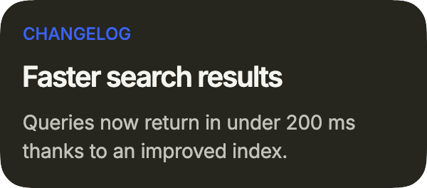
An announcement: an eyebrow in the accent through color, a heading, and a muted paragraph, on a secondary surface.
import 'package:your_app/ui/fliin/components/surface/fl_surface.dart';
import 'package:your_app/ui/fliin/components/text/fl_text.dart';
import 'package:your_app/ui/fliin/core/fliin.dart';
import 'package:flutter/widgets.dart';

class TextCustomStylesExample extends StatelessWidget {
  const TextCustomStylesExample({super.key});

  @override
  Widget build(BuildContext context) {
    final theme = FlScope.of(context);
    return FlSurface(
      variant: FlSurfaceVariant.secondary,
      child: Column(
        mainAxisSize: MainAxisSize.min,
        crossAxisAlignment: CrossAxisAlignment.start,
        spacing: theme.space.sm,
        children: [
          FlText(
            'CHANGELOG',
            type: FlTextType.bodyXs,
            weight: theme.tokens.typography.weight.medium,
            color: theme.colors.accent,
          ),
          const FlText('Faster search results', type: FlTextType.h4),
          const FlText(
            'Queries now return in under 200 ms thanks to an improved index.',
            type: FlTextType.bodySm,
            tone: FlTextTone.muted,
          ),
        ],
      ),
    );
  }
}Usage
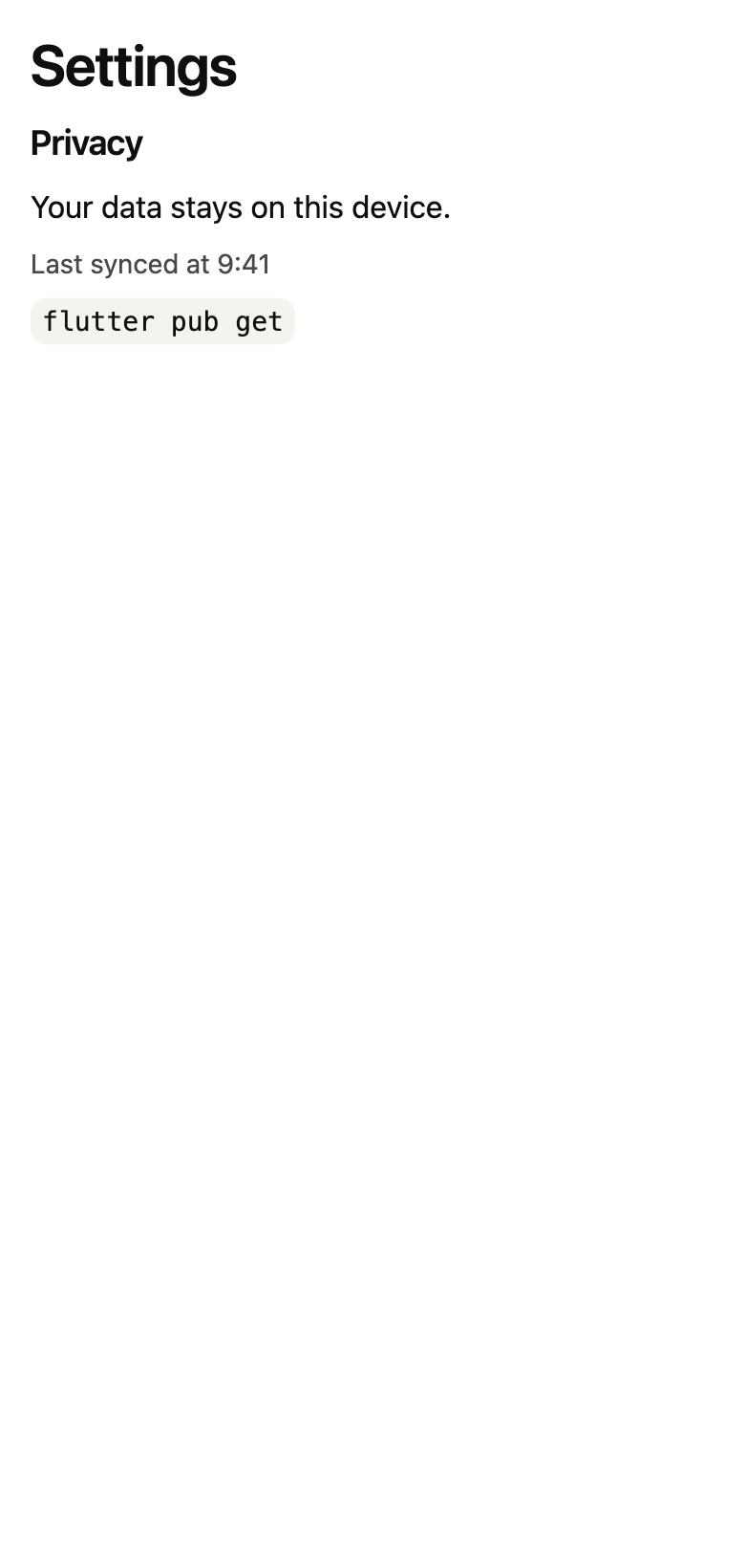
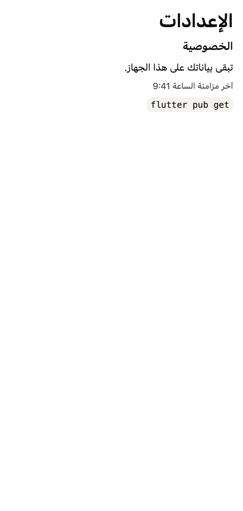
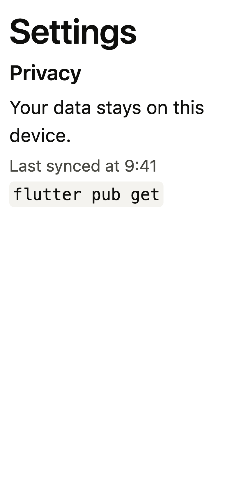
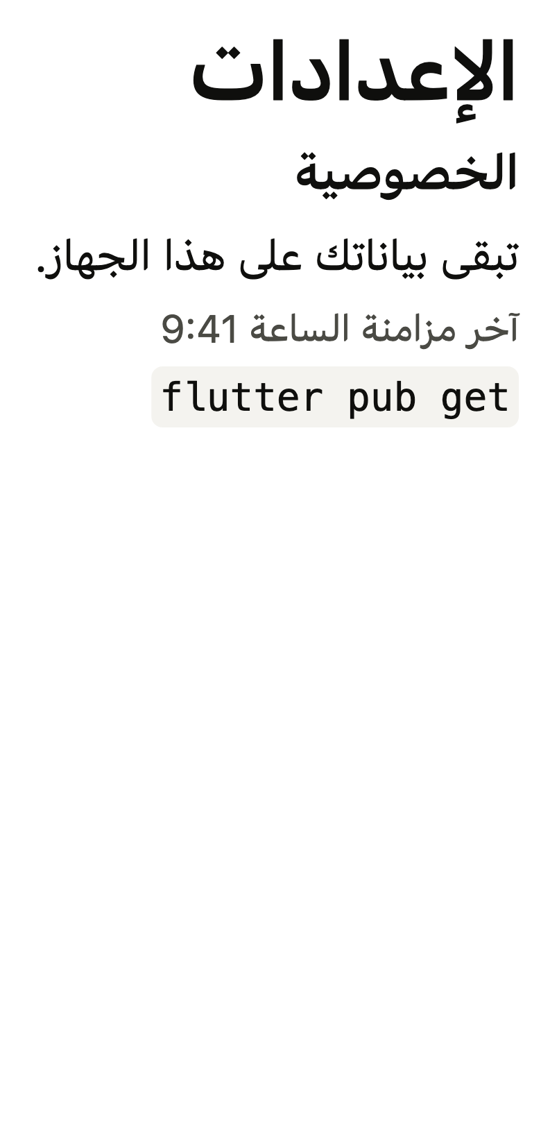
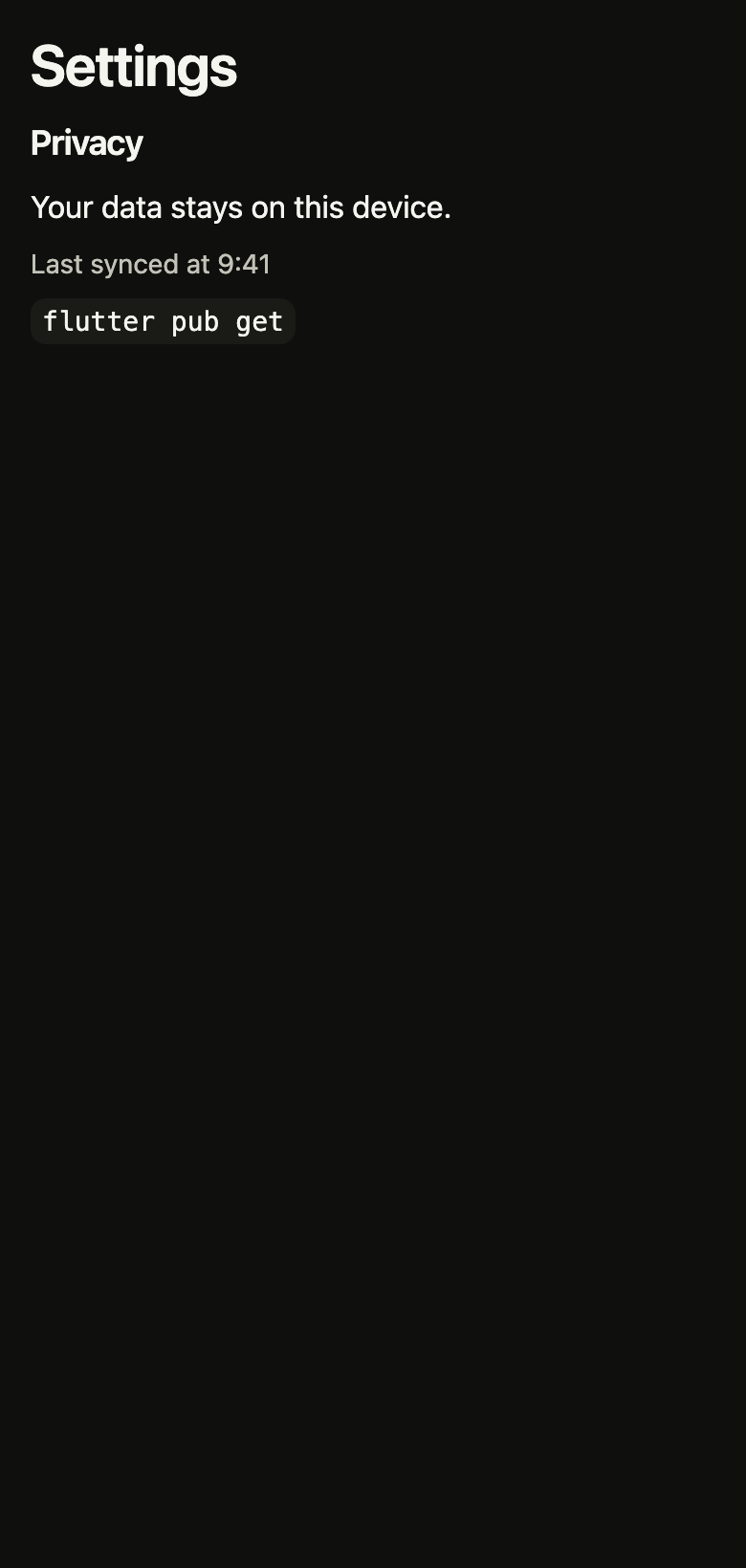
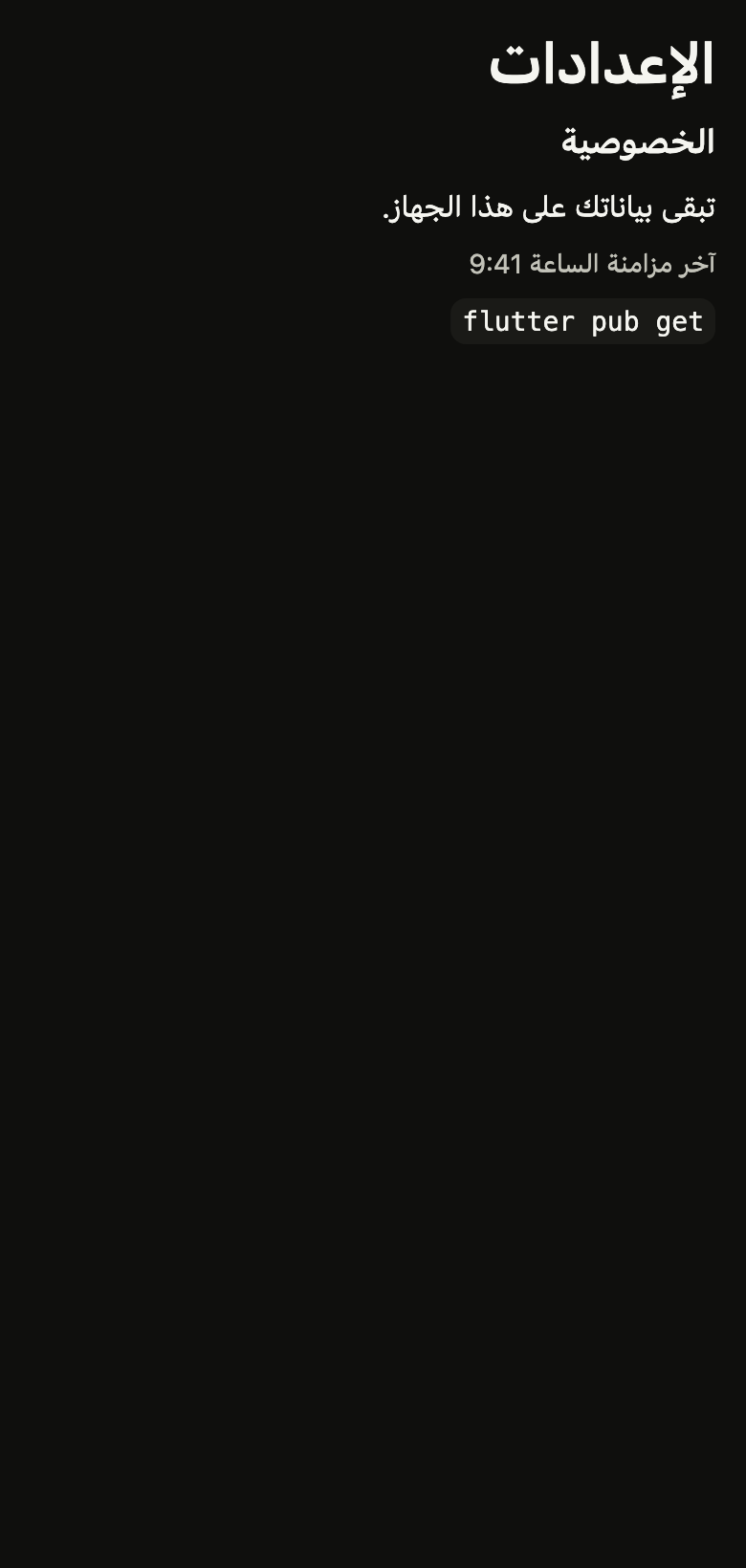
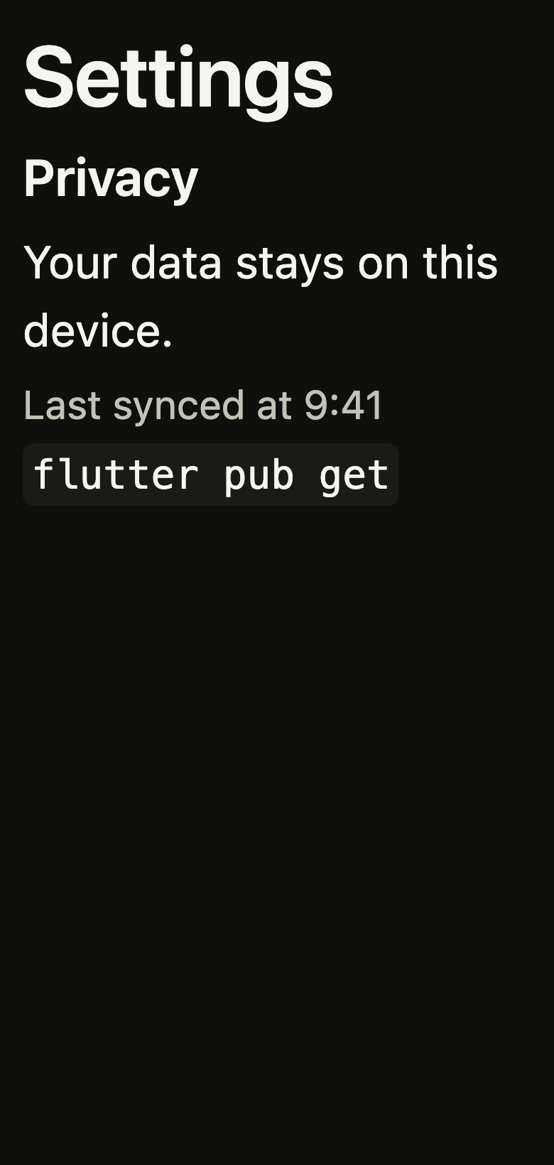
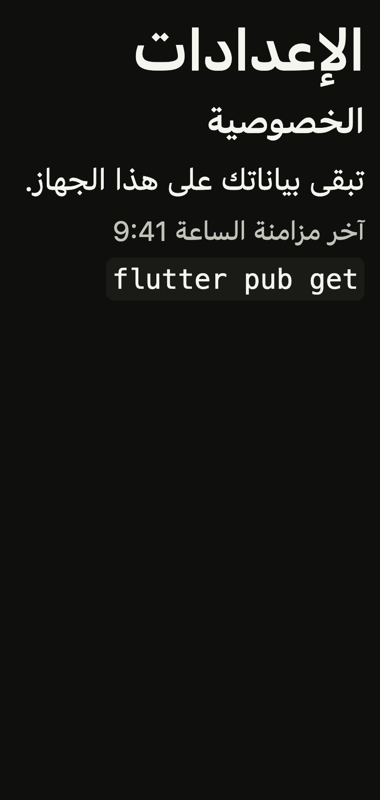
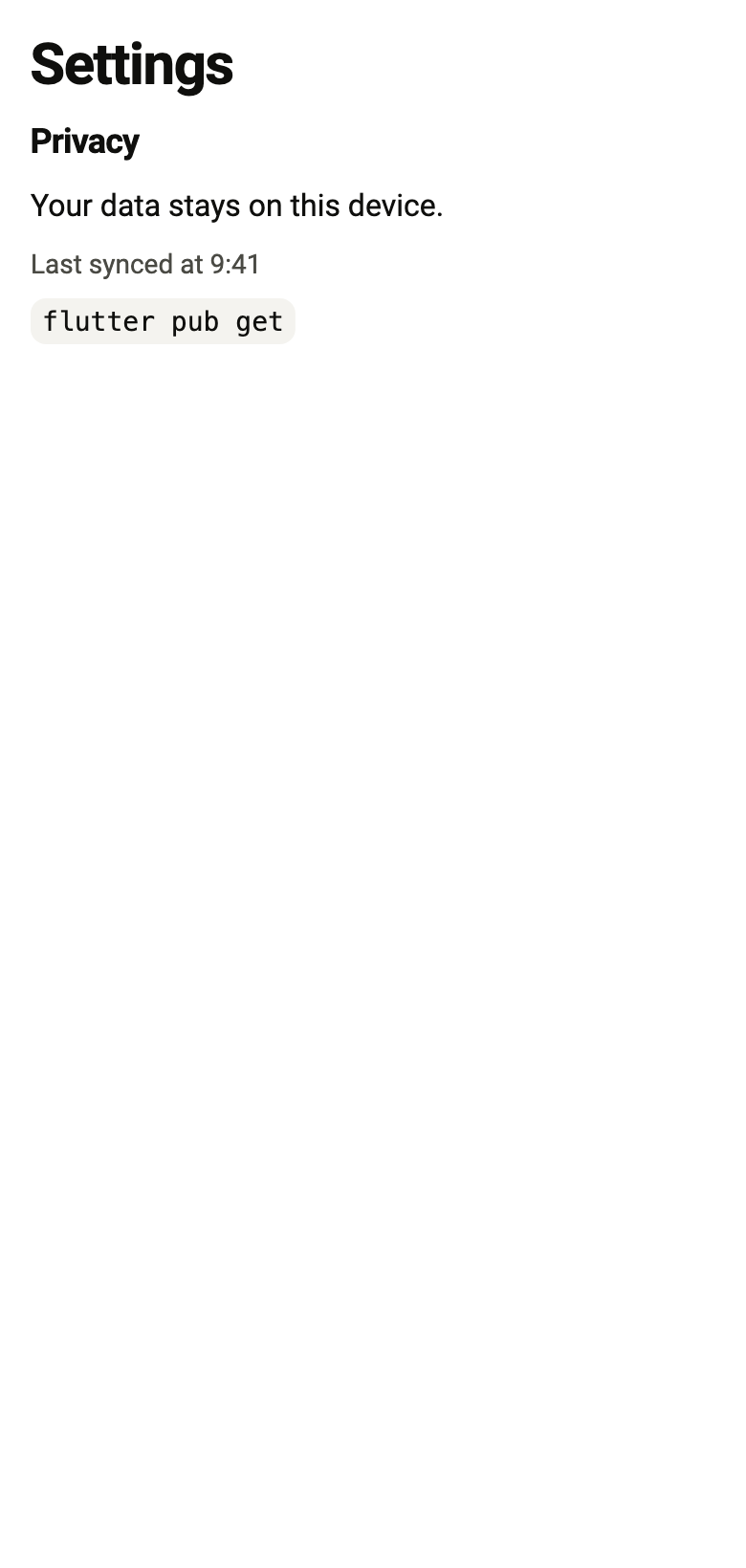
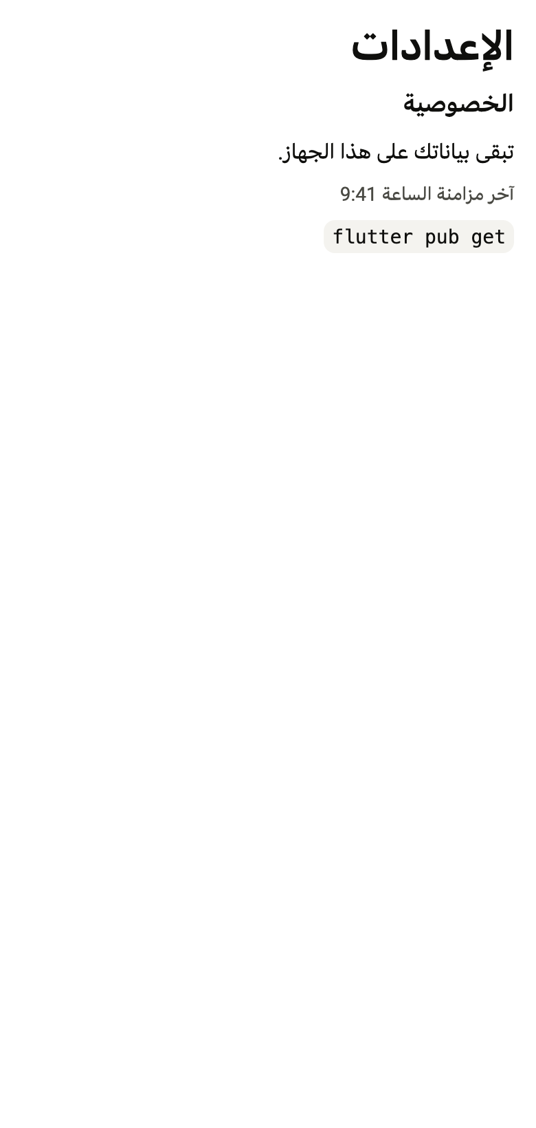
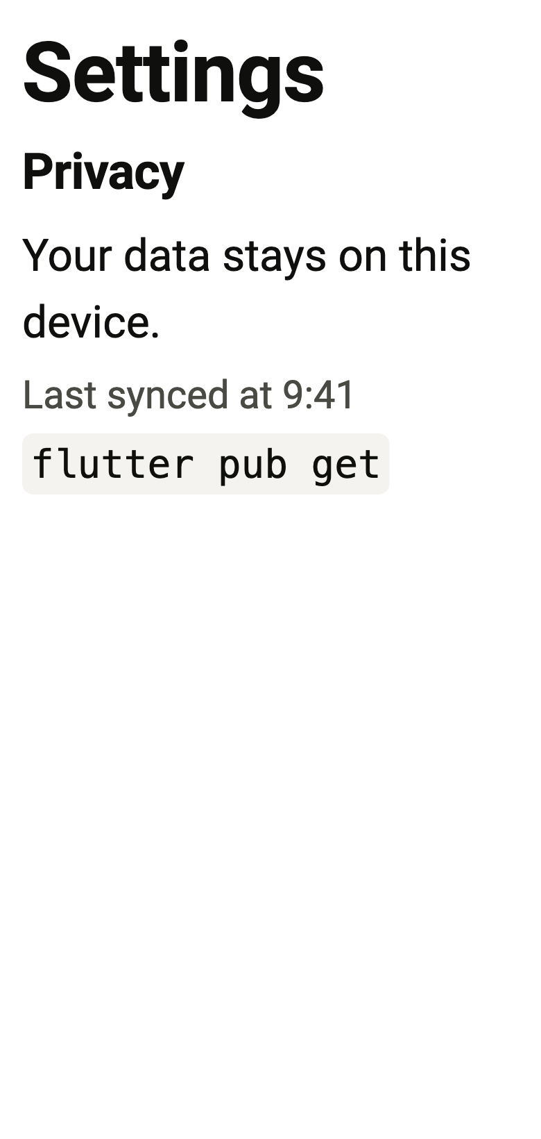
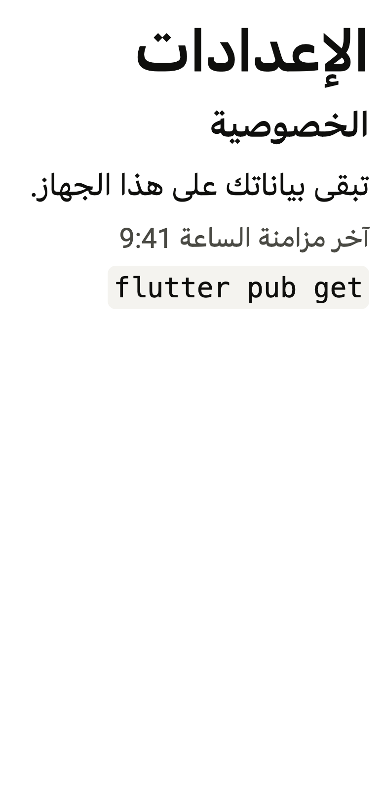
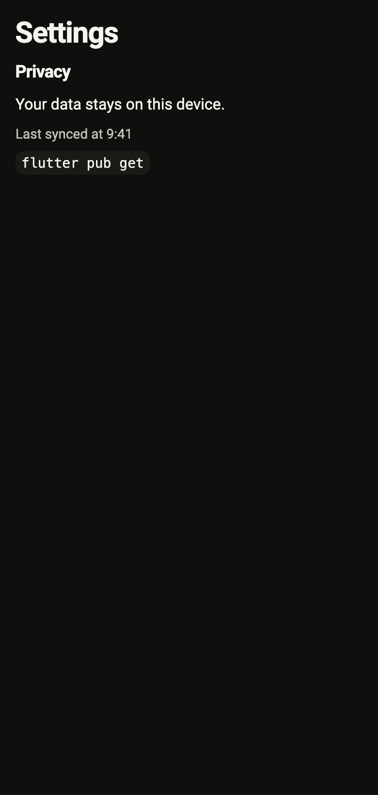
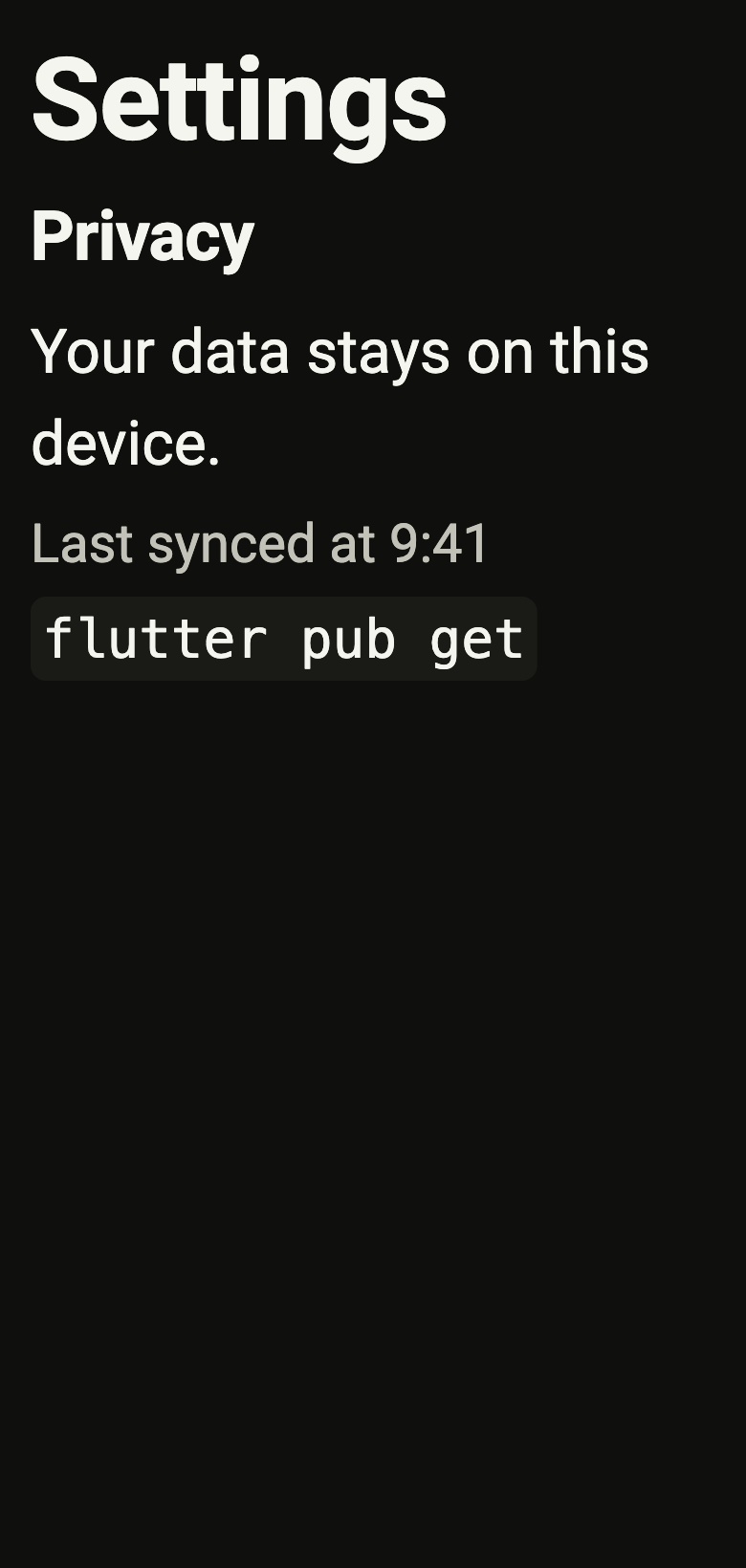
The code the reference images render:
final example = ColoredBox(
  color: FlScope.of(context).colors.surface,
  child: Padding(
    padding: EdgeInsetsDirectional.all(FlScope.of(context).space.lg),
    child: Column(
      crossAxisAlignment: CrossAxisAlignment.stretch,
      spacing: FlScope.of(context).space.sm,
      children: [
        FlText('Settings', type: FlTextType.h2),
        FlText('Privacy', type: FlTextType.h5),
        FlText('Your data stays on this device.'),
        FlText(
          'Last synced at 9:41',
          type: FlTextType.bodySm,
          tone: FlTextTone.muted,
        ),
        const FlText('flutter pub get', type: FlTextType.code),
      ],
    ),
  ),
);API
FlTextType: enum {h1, h2, h3, h4, h5, h6, body, bodySm, bodyXs, code}
FlTextType.h1: static final FlTextType
FlTextType.h2: static final FlTextType
FlTextType.h3: static final FlTextType
FlTextType.h4: static final FlTextType
FlTextType.h5: static final FlTextType
FlTextType.h6: static final FlTextType
FlTextType.body: static final FlTextType
FlTextType.bodySm: static final FlTextType
FlTextType.bodyXs: static final FlTextType
FlTextType.code: static final FlTextType
FlTextType.new: const new(FlTextRole role)
FlTextType.role: get FlTextRole
FlTextType.heading: get bool
FlTextTone: enum {normal, muted}
FlTextTone.normal: static final FlTextTone
FlTextTone.muted: static final FlTextTone
FlText: class extends StatelessWidget
FlText.new: const new(String data, {super.key, FlTextType type, FlTextTone tone, FontWeight? weight, TextAlign textAlign, int? maxLines, Color? color, List<InlineSpan>? spans})
FlText.data: get String
FlText.type: get FlTextType
FlText.tone: get FlTextTone
FlText.weight: get FontWeight?
FlText.textAlign: get TextAlign
FlText.maxLines: get int?
FlText.color: get Color?
FlText.spans: get List<InlineSpan>?
FlText.build: Widget(BuildContext context)Reference renders
The 16 images published with version 0.2.2, rendered by the shared harness on macOS with Flutter 3.47.7. fliin verify text compares your copy to them.


Use it to
- show a page heading
- add a paragraph of body text
- show muted secondary text
- present a command as inline code
- pick a heading size from h1 to h6
- Not for
- text typed by the user: use a text field (text-field)
Source
The files fliin add text copies into your app, before your prefix and imports are applied.
text/fl_text.dart
// Modified from the Text (Typography) of HeroUI Native 1.0.10, Copyright 2025
// NextUI Inc., licensed under Apache 2.0:
// https://www.apache.org/licenses/LICENSE-2.0
import 'package:flutter/widgets.dart';
import 'package:fliin_ui/core/fliin.dart';

/// The type of a [FlText].
enum FlTextType {
  /// h1 heading: 36 on 40, semibold.
  h1(FlTextRole.heading1),

  /// h2 heading: 30 on 36.
  h2(FlTextRole.heading2),

  /// h3 heading: 24 on 32.
  h3(FlTextRole.heading3),

  /// h4 heading: 20 on 28.
  h4(FlTextRole.heading4),

  /// h5 heading: 18 on 28.
  h5(FlTextRole.heading5),

  /// h6 heading: 16 on 24.
  h6(FlTextRole.heading6),

  /// Body text, the canvas's `t-base`: 16 on 24.
  body(FlTextRole.textBase),

  /// Small text, `t-sm`: 14 on 20.
  bodySm(FlTextRole.textSm),

  /// Extra-small text, `t-xs`: 12 on 16.
  bodyXs(FlTextRole.textXs),

  /// Inline code, in a monospace font on a `control` background.
  code(FlTextRole.code);

  const FlTextType(this.role);

  /// The role in the type scale.
  final FlTextRole role;

  /// True for headings, announced as such to screen readers.
  bool get heading => index <= h6.index;
}

/// The colour of a [FlText].
enum FlTextTone {
  /// `onSurface`, body text.
  normal,

  /// `onSurfaceMuted`, secondary text.
  muted,
}

/// A text from the type scale: headings, paragraphs and code, in the regular
/// or muted colour. Headings are announced as headers; the text stays
/// selectable under a `SelectionArea`.
class FlText extends StatelessWidget {
  /// [data] in the type [type], `body` by default.
  const FlText(
    this.data, {
    super.key,
    this.type = FlTextType.body,
    this.tone = FlTextTone.normal,
    this.weight,
    this.textAlign = TextAlign.start,
    this.maxLines,
    this.color,
    this.spans,
  });

  /// The text.
  final String data;

  /// Size, line height, weight and font.
  final FlTextType type;

  /// The colour.
  final FlTextTone tone;

  /// A weight instead of that of [type], from `typography.weight`.
  final FontWeight? weight;

  /// The alignment, at the start of the line by default.
  final TextAlign textAlign;

  /// The maximum number of lines, cut with an ellipsis; when null, no limit.
  final int? maxLines;

  /// A color instead of that of [tone]: `accent` for an eyebrow above a
  /// heading, `danger` for a warning.
  final Color? color;

  /// [data] in styled pieces (a word in bold, a link, inline code), each in
  /// the style of [type] unless it sets its own. Their text must be [data],
  /// so that the screen shows what is read.
  final List<InlineSpan>? spans;

  @override
  Widget build(BuildContext context) {
    final theme = FlScope.of(context);
    final colors = theme.colors;
    final scale = theme.typography;
    final metrics = scale.style(type.role);
    final style = scale
        .resolve(type.role)
        .copyWith(
          color: color ?? (tone == FlTextTone.muted ? colors.onSurfaceMuted : colors.onSurface),
          fontWeight: weight,
        );
    final spans = this.spans;
    assert(spans == null || TextSpan(children: spans).toPlainText() == data, 'the text of spans must be data');
    final system = scale.familyOf(type.role) == null;
    final scaler = MediaQuery.textScalerOf(context);
    // Core Text removes the excess of a line height smaller than the font's
    // at the top of the line, where an even line height splits it: the text
    // moves up by half of that excess.
    var excess = 0.0;
    if (system) {
      final painter = TextPainter(
        text: TextSpan(style: DefaultTextStyle.of(context).style.merge(style)),
        textDirection: TextDirection.ltr,
        textScaler: scaler,
      )..layout();
      excess = painter.preferredLineHeight - scaler.scale(metrics.lineHeight);
      painter.dispose();
    }
    // The system font fits in the role's line height, even when smaller
    // than its own (h1): it is forced, as React Native does. A named font keeps
    // the line height as a minimum, so as not to overflow.
    final textStyle = system
        ? style.copyWith(height: metrics.lineHeight / metrics.size, leadingDistribution: TextLeadingDistribution.even)
        : style;
    final strut = theme.typography.strut(type.role, inheritedFamily: DefaultTextStyle.of(context).style.fontFamily);
    final overflow = maxLines == null ? null : TextOverflow.ellipsis;
    Widget text = spans == null
        ? Text(data, textAlign: textAlign, maxLines: maxLines, overflow: overflow, style: textStyle, strutStyle: strut)
        : Text.rich(
            TextSpan(children: spans),
            textAlign: textAlign,
            maxLines: maxLines,
            overflow: overflow,
            style: textStyle,
            strutStyle: strut,
          );
    if (excess > 0) {
      text = Transform.translate(offset: Offset(0, -excess / 2), child: text);
    }
    if (type.heading) return Semantics(header: true, child: text);
    if (type != FlTextType.code) return text;
    return Align(
      alignment: AlignmentDirectional.topStart,
      widthFactor: 1,
      heightFactor: 1,
      child: DecoratedBox(
        decoration: ShapeDecoration(
          color: colors.control,
          shape: RoundedRectangleBorder(borderRadius: BorderRadius.circular(theme.shape.radiusMd)),
        ),
        child: Padding(
          padding: EdgeInsetsDirectional.symmetric(
            horizontal: theme.size.codePaddingX,
            vertical: theme.size.codePaddingY,
          ),
          child: text,
        ),
      ),
    );
  }
}