Components / data-display
Surface
Groups content on a raised, shadowed background with continuous corners: the base of cards, row groups and alerts.
Import
In a Flutter app where fliin init has run:
Examples
Variants
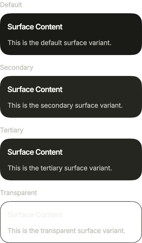
Four surfaces, from the most raised to the quietest: primary for a card on the page, secondary and tertiary inside it, and transparent, drawn here by its outline, over a background of its own.
import 'package:your_app/ui/fliin/components/surface/fl_surface.dart';
import 'package:your_app/ui/fliin/components/text/fl_text.dart';
import 'package:your_app/ui/fliin/core/fliin.dart';
import 'package:flutter/widgets.dart';

class SurfaceVariantsExample extends StatelessWidget {
  const SurfaceVariantsExample({super.key});

  @override
  Widget build(BuildContext context) {
    final space = FlScope.of(context).space;
    return Column(
      mainAxisSize: MainAxisSize.min,
      crossAxisAlignment: CrossAxisAlignment.stretch,
      spacing: space.lg,
      children: [
        for (final (variant, name) in const [
          (FlSurfaceVariant.primary, 'Default'),
          (FlSurfaceVariant.secondary, 'Secondary'),
          (FlSurfaceVariant.tertiary, 'Tertiary'),
          (FlSurfaceVariant.transparent, 'Transparent'),
        ])
          Column(
            mainAxisSize: MainAxisSize.min,
            crossAxisAlignment: CrossAxisAlignment.stretch,
            spacing: space.sm,
            children: [
              FlText(name, type: FlTextType.bodySm, tone: FlTextTone.muted),
              FlSurface(
                variant: variant,
                outlined: variant == FlSurfaceVariant.transparent,
                child: Column(
                  mainAxisSize: MainAxisSize.min,
                  crossAxisAlignment: CrossAxisAlignment.start,
                  spacing: space.md,
                  children: [
                    const FlText('Surface Content', type: FlTextType.h6),
                    FlText(
                      'This is the ${name.toLowerCase()} surface variant.',
                      type: FlTextType.bodySm,
                      tone: FlTextTone.muted,
                    ),
                  ],
                ),
              ),
            ],
          ),
      ],
    );
  }
}Nested
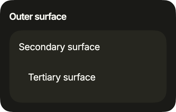
Surfaces nest: each level steps down a variant, so a panel inside a card stays readable without a border.
import 'package:your_app/ui/fliin/components/surface/fl_surface.dart';
import 'package:your_app/ui/fliin/components/text/fl_text.dart';
import 'package:your_app/ui/fliin/core/fliin.dart';
import 'package:flutter/widgets.dart';

class SurfaceNestedExample extends StatelessWidget {
  const SurfaceNestedExample({super.key});

  @override
  Widget build(BuildContext context) {
    final space = FlScope.of(context).space;
    return FlSurface(
      child: Column(
        mainAxisSize: MainAxisSize.min,
        crossAxisAlignment: CrossAxisAlignment.stretch,
        spacing: space.md,
        children: [
          const FlText('Outer surface', type: FlTextType.h6),
          FlSurface(
            variant: FlSurfaceVariant.secondary,
            child: Column(
              mainAxisSize: MainAxisSize.min,
              crossAxisAlignment: CrossAxisAlignment.stretch,
              spacing: space.md,
              children: const [
                FlText('Secondary surface'),
                FlSurface(variant: FlSurfaceVariant.tertiary, child: FlText('Tertiary surface')),
              ],
            ),
          ),
        ],
      ),
    );
  }
}With form
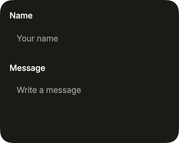
A form on a surface: the fields keep their white fill and their shadow, which set them apart from the raised background.
import 'package:your_app/ui/fliin/components/surface/fl_surface.dart';
import 'package:your_app/ui/fliin/components/text_field/fl_text_field.dart';
import 'package:your_app/ui/fliin/core/fliin.dart';
import 'package:flutter/widgets.dart';

class SurfaceWithFormExample extends StatelessWidget {
  const SurfaceWithFormExample({super.key});

  @override
  Widget build(BuildContext context) {
    return FlSurface(
      child: Column(
        mainAxisSize: MainAxisSize.min,
        crossAxisAlignment: CrossAxisAlignment.stretch,
        spacing: FlScope.of(context).space.lg,
        children: const [
          FlTextField(label: 'Name', placeholder: 'Your name'),
          FlTextField(
            label: 'Message',
            placeholder: 'Write a message',
            multiline: true,
          ),
        ],
      ),
    );
  }
}Custom styles
One surface adjusted without touching the theme: a gradient from a tint of the accent, an outlined edge and a smaller radius.

import 'package:your_app/ui/fliin/components/surface/fl_surface.dart';
import 'package:your_app/ui/fliin/components/text/fl_text.dart';
import 'package:your_app/ui/fliin/core/fliin.dart';
import 'package:flutter/widgets.dart';

class SurfaceCustomStylesExample extends StatelessWidget {
  const SurfaceCustomStylesExample({super.key});

  @override
  Widget build(BuildContext context) {
    final theme = FlScope.of(context);
    // A light tint of the accent, at 8 %.
    final tint = theme.colors.accent.withValues(alpha: 0.08);
    return FlSurface(
      radius: theme.shape.radiusXl,
      outlined: true,
      gradient: LinearGradient(
        begin: AlignmentDirectional.topStart,
        end: AlignmentDirectional.bottomEnd,
        colors: [tint, tint.withValues(alpha: 0)],
      ),
      child: Column(
        mainAxisSize: MainAxisSize.min,
        crossAxisAlignment: CrossAxisAlignment.start,
        spacing: theme.space.xs,
        children: [
          FlText(
            'Billing overview',
            type: FlTextType.bodySm,
            weight: theme.tokens.typography.weight.semibold,
          ),
          const FlText(
            'View invoices and payment methods in one place.',
            type: FlTextType.bodySm,
            tone: FlTextTone.muted,
          ),
        ],
      ),
    );
  }
}Usage
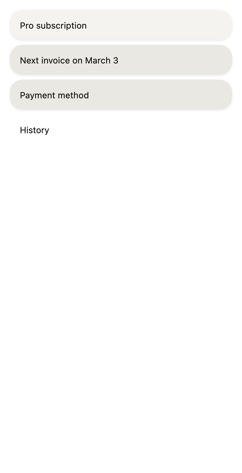
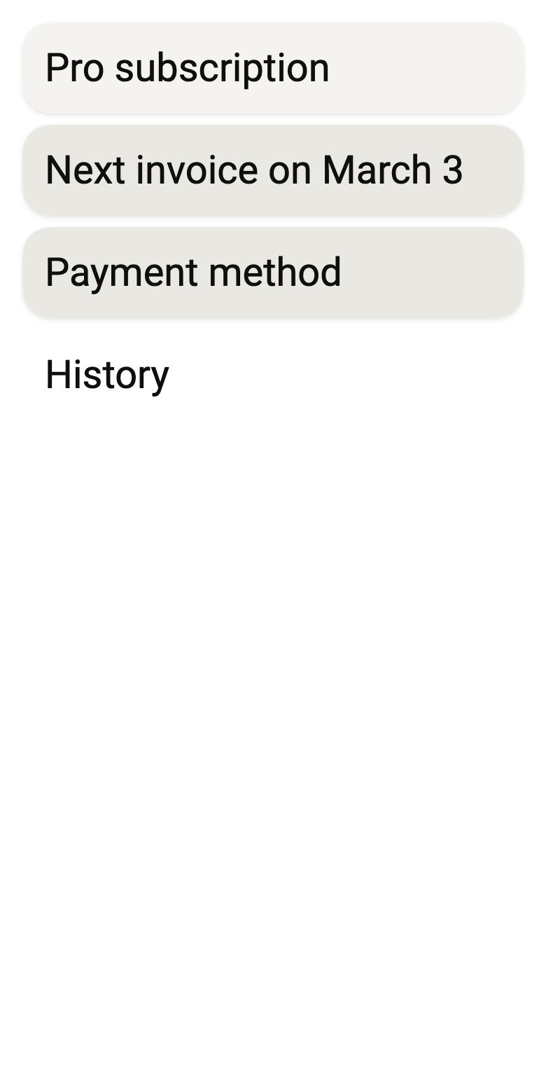
The code the reference images render:
final example = ColoredBox(
  color: FlScope.of(context).colors.surface,
  child: Padding(
    padding: EdgeInsetsDirectional.all(FlScope.of(context).space.lg),
    child: Column(
      crossAxisAlignment: CrossAxisAlignment.stretch,
      spacing: FlScope.of(context).space.sm,
      children: [
        FlSurface(
          child: Text(
            'Pro subscription',
            style: TextStyle(color: FlScope.of(context).colors.onSurface),
          ),
        ),
        FlSurface(
          variant: FlSurfaceVariant.secondary,
          child: Text(
            'Next invoice on March 3',
            style: TextStyle(color: FlScope.of(context).colors.onSurface),
          ),
        ),
        FlSurface(
          variant: FlSurfaceVariant.tertiary,
          child: Text(
            'Payment method',
            style: TextStyle(color: FlScope.of(context).colors.onSurface),
          ),
        ),
        FlSurface(
          variant: FlSurfaceVariant.transparent,
          child: Text(
            'History',
            style: TextStyle(color: FlScope.of(context).colors.onSurface),
          ),
        ),
      ],
    ),
  ),
);API
FlSurfaceVariant: enum {primary, secondary, tertiary, transparent}
FlSurfaceVariant.primary: static final FlSurfaceVariant
FlSurfaceVariant.secondary: static final FlSurfaceVariant
FlSurfaceVariant.tertiary: static final FlSurfaceVariant
FlSurfaceVariant.transparent: static final FlSurfaceVariant
FlSurface: class extends StatelessWidget
FlSurface.new: const new({super.key, FlSurfaceVariant variant, EdgeInsetsGeometry? padding, double? radius, Color? color, Gradient? gradient, bool outlined, required Widget child})
FlSurface.variant: get FlSurfaceVariant
FlSurface.padding: get EdgeInsetsGeometry?
FlSurface.radius: get double?
FlSurface.color: get Color?
FlSurface.gradient: get Gradient?
FlSurface.outlined: get bool
FlSurface.child: get Widget
FlSurface.build: Widget(BuildContext context)Reference renders
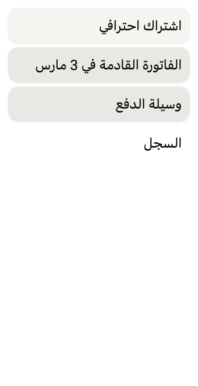
The 16 images published with version 0.2.1, rendered by the shared harness on macOS with Flutter 3.47.7. fliin verify surface compares your copy to them.
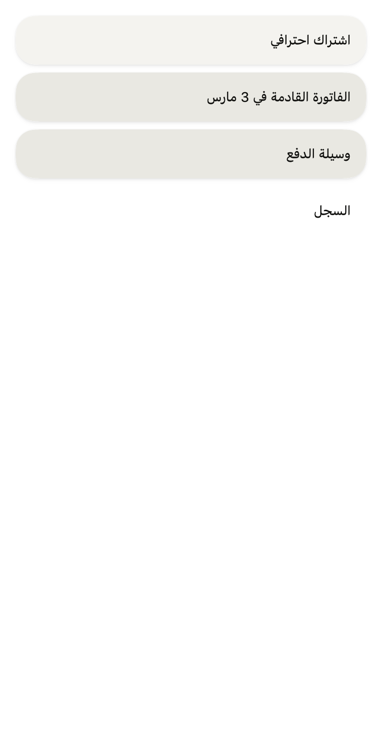
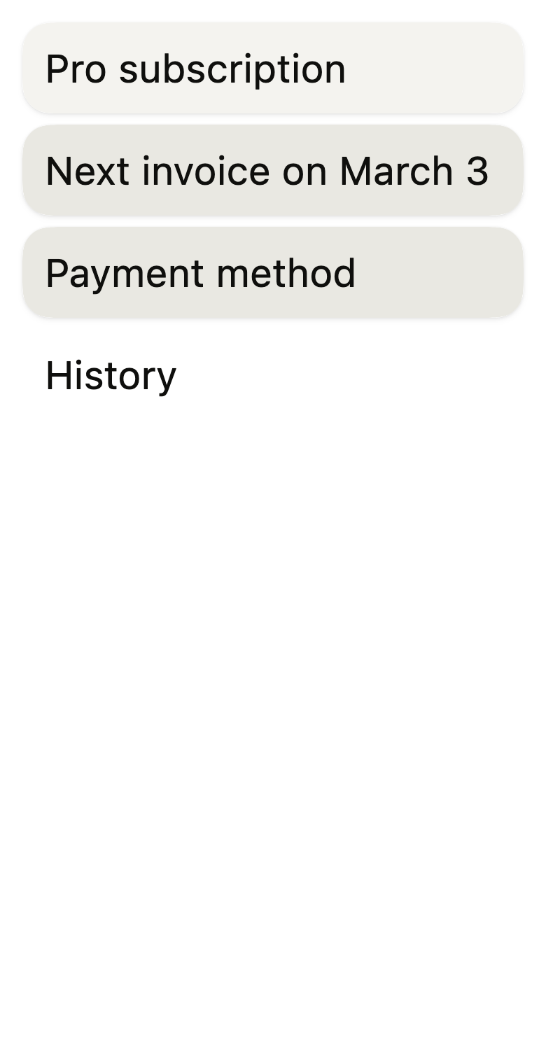
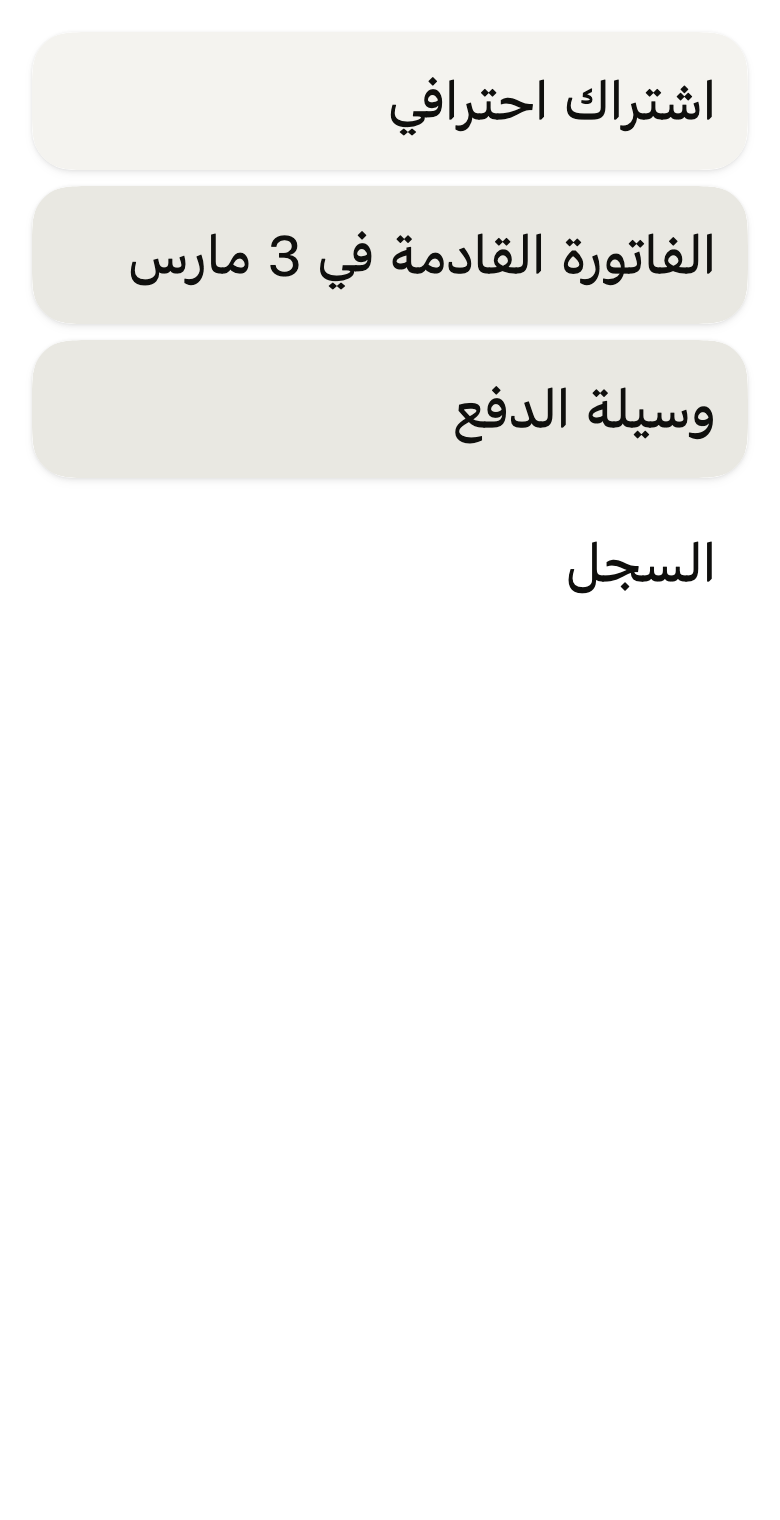





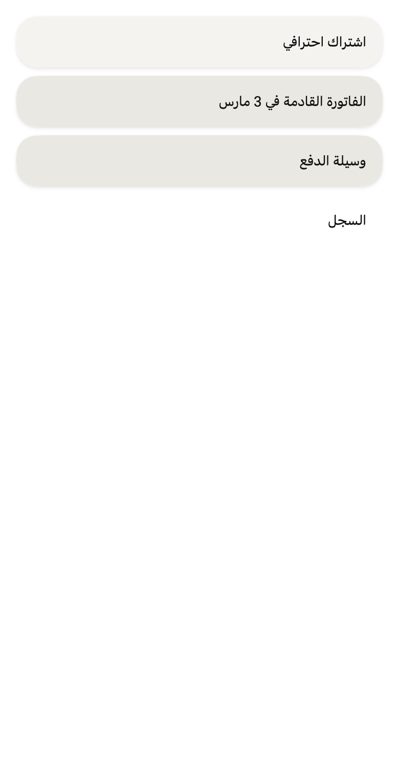




Use it to
- present content on a card
- show settings on a raised background
- present a shadowed block of information
- create a card with rounded corners
- show a section on a muted background
- Not for
- a window over the page: use a dialog (dialog)
Source
The files fliin add surface copies into your app, before your prefix and imports are applied.
surface/fl_surface.dart
// Modified from the Surface of HeroUI Native 1.0.10, Copyright 2025 NextUI
// Inc., licensed under Apache 2.0: https://www.apache.org/licenses/LICENSE-2.0
import 'package:flutter/widgets.dart';
import 'package:fliin_ui/core/fliin.dart';

/// The fill of an [FlSurface].
enum FlSurfaceVariant {
  /// `surfaceRaised`, with the `surface` shadow: a card resting on the page.
  primary,

  /// `surfaceSecondary` and the shadow: a recessed block.
  secondary,

  /// `surfaceTertiary` and the shadow: the most recessed.
  tertiary,

  /// No fill or shadow: keeps only the shape and the padding.
  transparent,
}

/// The container that holds cards, row groups and alerts: a fill, the
/// tokens' `surface` shadow, continuous corners of radius `shape.radiusCard`
/// that clip [child], `size.surfacePadding` padding, and a `border` stroke
/// of `size.surfaceBorder` when that token is not zero.
///
/// [radius], [color], [gradient] and [outlined] adjust one surface without
/// touching the theme: a billing panel tinted with the accent, a transparent
/// block drawn by its outline.
class FlSurface extends StatelessWidget {
  /// A surface around [child], `primary` by default.
  const FlSurface({
    super.key,
    this.variant = FlSurfaceVariant.primary,
    this.padding,
    this.radius,
    this.color,
    this.gradient,
    this.outlined = false,
    required this.child,
  }) : assert(radius == null || radius >= 0, 'radius must not be negative');

  /// The fill and the shadow.
  final FlSurfaceVariant variant;

  /// The padding around [child]; when null, `size.surfacePadding` on each
  /// side.
  final EdgeInsetsGeometry? padding;

  /// The radius of the continuous corners; when null, `shape.radiusCard`.
  final double? radius;

  /// The fill instead of that of [variant]; the shadow stays that of the
  /// variant.
  final Color? color;

  /// A gradient painted over the fill, clipped to the shape: from a tint of
  /// the accent to the surface, say.
  final Gradient? gradient;

  /// True: a `border` stroke of `size.border` around the surface, whatever
  /// the variant and the `size.surfaceBorder` token; a transparent surface
  /// then reads as an outlined block.
  final bool outlined;

  /// The content, clipped to the surface's shape.
  final Widget child;

  @override
  Widget build(BuildContext context) {
    final theme = FlScope.of(context);
    final colors = theme.colors;
    final fill =
        color ??
        switch (variant) {
          FlSurfaceVariant.primary => colors.surfaceRaised,
          FlSurfaceVariant.secondary => colors.surfaceSecondary,
          FlSurfaceVariant.tertiary => colors.surfaceTertiary,
          FlSurfaceVariant.transparent => null,
        };
    final cornerRadius = radius ?? theme.shape.radiusCard;
    final shape = FlContinuousBorder(radius: cornerRadius);
    final gradient = this.gradient;
    final padded = Padding(padding: padding ?? EdgeInsets.all(theme.size.surfacePadding), child: child);
    final stroke = outlined
        ? BorderSide(color: colors.border, width: theme.size.border)
        : fill == null || theme.size.surfaceBorder == 0
        ? BorderSide.none
        : BorderSide(color: colors.border, width: theme.size.surfaceBorder);
    return FlPixelSnap(
      child: FlShadow(
        layers: variant == FlSurfaceVariant.transparent ? const [] : theme.shadows.surface,
        // React Native shadows a view from its circular corners, even when
        // continuous: between the two curves, the page background shows through.
        shape: RoundedRectangleBorder(borderRadius: BorderRadius.circular(cornerRadius)),
        child: ClipPath(
          clipper: ShapeBorderClipper(shape: shape, textDirection: Directionality.maybeOf(context)),
          child: DecoratedBox(
            decoration: ShapeDecoration(color: fill, shape: shape),
            // The stroke is laid over the content: a list row without
            // padding would cover it otherwise.
            child: DecoratedBox(
              position: DecorationPosition.foreground,
              decoration: ShapeDecoration(
                shape: FlContinuousBorder(radius: cornerRadius, side: stroke),
              ),
              child: gradient == null
                  ? padded
                  : DecoratedBox(
                      // Clipped by the shape above: a rectangle is enough.
                      decoration: BoxDecoration(gradient: gradient),
                      child: padded,
                    ),
            ),
          ),
        ),
      ),
    );
  }
}