Components / forms
Switch group
Gathers independent on/off settings under one label, description and error, such as alerts or sync options, read as one named group.
Import
In a Flutter app where fliin init has run:
Examples
Example
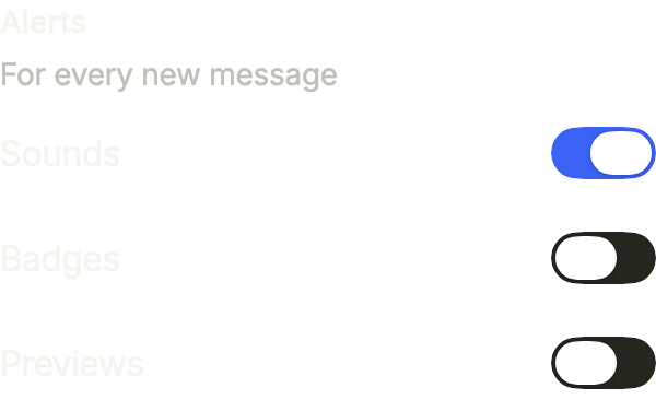
Independent switches under one label, each with its own value and onChanged. The group turns invalid when every alert is off.
import 'package:your_app/ui/fliin/components/switch_group/fl_switch_group.dart';
import 'package:flutter/widgets.dart';

class SwitchGroupExample extends StatefulWidget {
  const SwitchGroupExample({super.key});

  @override
  State<SwitchGroupExample> createState() => _SwitchGroupExampleState();
}

class _SwitchGroupExampleState extends State<SwitchGroupExample> {
  final _on = <String>{'sounds'};

  @override
  Widget build(BuildContext context) {
    return FlSwitchGroup(
      label: 'Alerts',
      description: 'For every new message',
      error: 'Keep at least one alert',
      invalid: _on.isEmpty,
      options: [
        FlSwitchGroupOption(
          value: _on.contains('sounds'),
          label: 'Sounds',
          onChanged: (on) => setState(() => on ? _on.add('sounds') : _on.remove('sounds')),
        ),
        FlSwitchGroupOption(
          value: _on.contains('badges'),
          label: 'Badges',
          onChanged: (on) => setState(() => on ? _on.add('badges') : _on.remove('badges')),
        ),
        FlSwitchGroupOption(
          value: _on.contains('previews'),
          label: 'Previews',
          onChanged: (on) => setState(() => on ? _on.add('previews') : _on.remove('previews')),
        ),
      ],
    );
  }
}Enabled
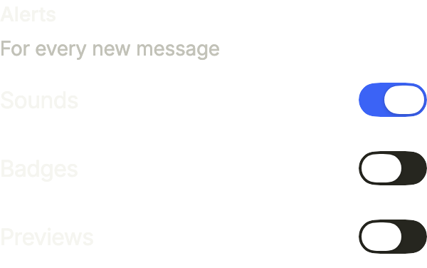
A switch group with one switch on.
import 'package:your_app/ui/fliin/components/switch_group/fl_switch_group.dart';
import 'package:flutter/widgets.dart';

class SwitchGroupEnabledExample extends StatefulWidget {
  const SwitchGroupEnabledExample({super.key});

  @override
  State<SwitchGroupEnabledExample> createState() => _SwitchGroupEnabledExampleState();
}

class _SwitchGroupEnabledExampleState extends State<SwitchGroupEnabledExample> {
  final _on = <String>{'sounds'};

  @override
  Widget build(BuildContext context) {
    return FlSwitchGroup(
      label: 'Alerts',
      description: 'For every new message',
      error: 'Keep at least one alert',
      options: [
        FlSwitchGroupOption(
          value: _on.contains('sounds'),
          label: 'Sounds',
          onChanged: (on) => setState(() => on ? _on.add('sounds') : _on.remove('sounds')),
        ),
        FlSwitchGroupOption(
          value: _on.contains('badges'),
          label: 'Badges',
          onChanged: (on) => setState(() => on ? _on.add('badges') : _on.remove('badges')),
        ),
        FlSwitchGroupOption(
          value: _on.contains('previews'),
          label: 'Previews',
          onChanged: (on) => setState(() => on ? _on.add('previews') : _on.remove('previews')),
        ),
      ],
    );
  }
}Selected
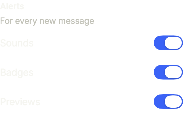
Every switch on.
import 'package:your_app/ui/fliin/components/switch_group/fl_switch_group.dart';
import 'package:flutter/widgets.dart';

class SwitchGroupSelectedExample extends StatefulWidget {
  const SwitchGroupSelectedExample({super.key});

  @override
  State<SwitchGroupSelectedExample> createState() => _SwitchGroupSelectedExampleState();
}

class _SwitchGroupSelectedExampleState extends State<SwitchGroupSelectedExample> {
  final _on = <String>{'sounds', 'badges', 'previews'};

  @override
  Widget build(BuildContext context) {
    return FlSwitchGroup(
      label: 'Alerts',
      description: 'For every new message',
      error: 'Keep at least one alert',
      options: [
        FlSwitchGroupOption(
          value: _on.contains('sounds'),
          label: 'Sounds',
          onChanged: (on) => setState(() => on ? _on.add('sounds') : _on.remove('sounds')),
        ),
        FlSwitchGroupOption(
          value: _on.contains('badges'),
          label: 'Badges',
          onChanged: (on) => setState(() => on ? _on.add('badges') : _on.remove('badges')),
        ),
        FlSwitchGroupOption(
          value: _on.contains('previews'),
          label: 'Previews',
          onChanged: (on) => setState(() => on ? _on.add('previews') : _on.remove('previews')),
        ),
      ],
    );
  }
}Unselected
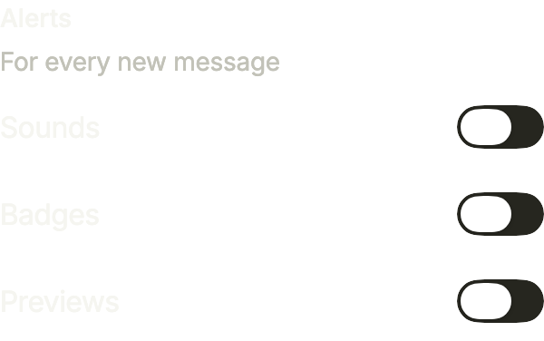
Every switch off.
import 'package:your_app/ui/fliin/components/switch_group/fl_switch_group.dart';
import 'package:flutter/widgets.dart';

class SwitchGroupUnselectedExample extends StatefulWidget {
  const SwitchGroupUnselectedExample({super.key});

  @override
  State<SwitchGroupUnselectedExample> createState() => _SwitchGroupUnselectedExampleState();
}

class _SwitchGroupUnselectedExampleState extends State<SwitchGroupUnselectedExample> {
  final _on = <String>{};

  @override
  Widget build(BuildContext context) {
    return FlSwitchGroup(
      label: 'Alerts',
      description: 'For every new message',
      error: 'Keep at least one alert',
      options: [
        FlSwitchGroupOption(
          value: _on.contains('sounds'),
          label: 'Sounds',
          onChanged: (on) => setState(() => on ? _on.add('sounds') : _on.remove('sounds')),
        ),
        FlSwitchGroupOption(
          value: _on.contains('badges'),
          label: 'Badges',
          onChanged: (on) => setState(() => on ? _on.add('badges') : _on.remove('badges')),
        ),
        FlSwitchGroupOption(
          value: _on.contains('previews'),
          label: 'Previews',
          onChanged: (on) => setState(() => on ? _on.add('previews') : _on.remove('previews')),
        ),
      ],
    );
  }
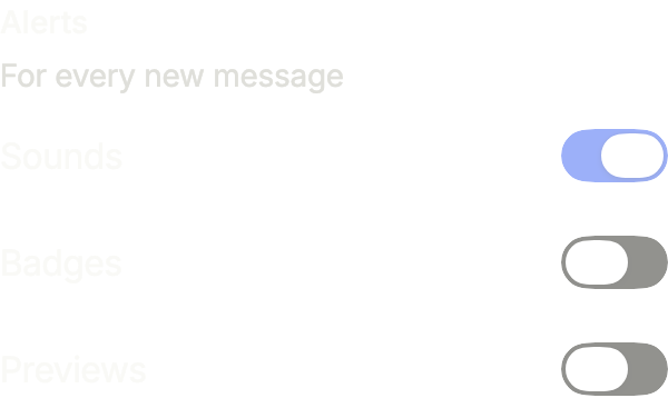
}Disabled
disabled locks every switch of the group.
import 'package:your_app/ui/fliin/components/switch_group/fl_switch_group.dart';
import 'package:flutter/widgets.dart';

class SwitchGroupDisabledExample extends StatefulWidget {
  const SwitchGroupDisabledExample({super.key});

  @override
  State<SwitchGroupDisabledExample> createState() => _SwitchGroupDisabledExampleState();
}

class _SwitchGroupDisabledExampleState extends State<SwitchGroupDisabledExample> {
  final _on = <String>{'sounds'};

  @override
  Widget build(BuildContext context) {
    return FlSwitchGroup(
      label: 'Alerts',
      description: 'For every new message',
      error: 'Keep at least one alert',
      disabled: true,
      options: [
        FlSwitchGroupOption(
          value: _on.contains('sounds'),
          label: 'Sounds',
          onChanged: (on) => setState(() => on ? _on.add('sounds') : _on.remove('sounds')),
        ),
        FlSwitchGroupOption(
          value: _on.contains('badges'),
          label: 'Badges',
          onChanged: (on) => setState(() => on ? _on.add('badges') : _on.remove('badges')),
        ),
        FlSwitchGroupOption(
          value: _on.contains('previews'),
          label: 'Previews',
          onChanged: (on) => setState(() => on ? _on.add('previews') : _on.remove('previews')),
        ),
      ],
    );
  }
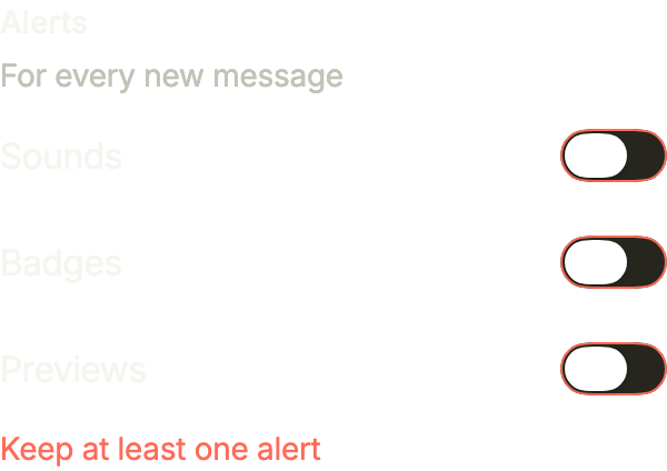
}Invalid
invalid shows the error under the switches.
import 'package:your_app/ui/fliin/components/switch_group/fl_switch_group.dart';
import 'package:flutter/widgets.dart';

class SwitchGroupInvalidExample extends StatefulWidget {
  const SwitchGroupInvalidExample({super.key});

  @override
  State<SwitchGroupInvalidExample> createState() => _SwitchGroupInvalidExampleState();
}

class _SwitchGroupInvalidExampleState extends State<SwitchGroupInvalidExample> {
  final _on = <String>{};

  @override
  Widget build(BuildContext context) {
    return FlSwitchGroup(
      label: 'Alerts',
      description: 'For every new message',
      error: 'Keep at least one alert',
      invalid: true,
      options: [
        FlSwitchGroupOption(
          value: _on.contains('sounds'),
          label: 'Sounds',
          onChanged: (on) => setState(() => on ? _on.add('sounds') : _on.remove('sounds')),
        ),
        FlSwitchGroupOption(
          value: _on.contains('badges'),
          label: 'Badges',
          onChanged: (on) => setState(() => on ? _on.add('badges') : _on.remove('badges')),
        ),
        FlSwitchGroupOption(
          value: _on.contains('previews'),
          label: 'Previews',
          onChanged: (on) => setState(() => on ? _on.add('previews') : _on.remove('previews')),
        ),
      ],
    );
  }
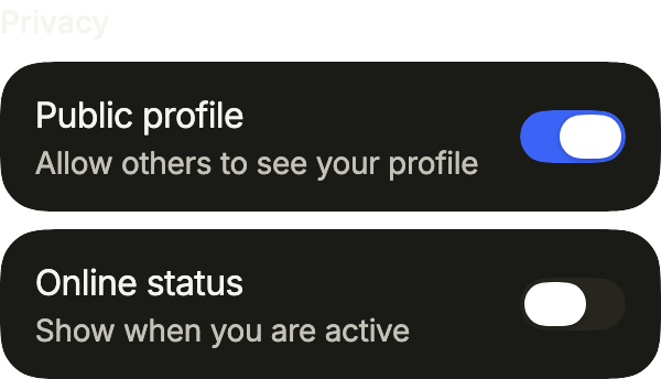
}Framed
framed puts each setting on its own card, for settings placed on the page rather than in a list.
import 'package:your_app/ui/fliin/components/switch_group/fl_switch_group.dart';
import 'package:flutter/widgets.dart';

class SwitchGroupFramedExample extends StatefulWidget {
  const SwitchGroupFramedExample({super.key});

  @override
  State<SwitchGroupFramedExample> createState() => _SwitchGroupFramedExampleState();
}

class _SwitchGroupFramedExampleState extends State<SwitchGroupFramedExample> {
  var _public = true;
  var _status = false;

  @override
  Widget build(BuildContext context) {
    return FlSwitchGroup(
      label: 'Privacy',
      framed: true,
      options: [
        FlSwitchGroupOption(
          value: _public,
          label: 'Public profile',
          description: 'Allow others to see your profile',
          onChanged: (value) => setState(() => _public = value),
        ),
        FlSwitchGroupOption(
          value: _status,
          label: 'Online status',
          description: 'Show when you are active',
          onChanged: (value) => setState(() => _status = value),
        ),
      ],
    );
  }
}Usage
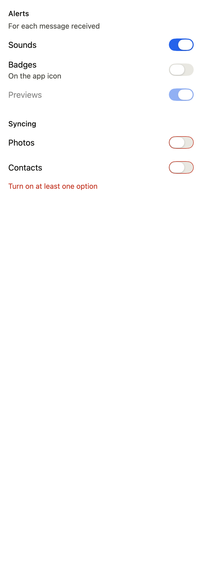
The code the reference images render:
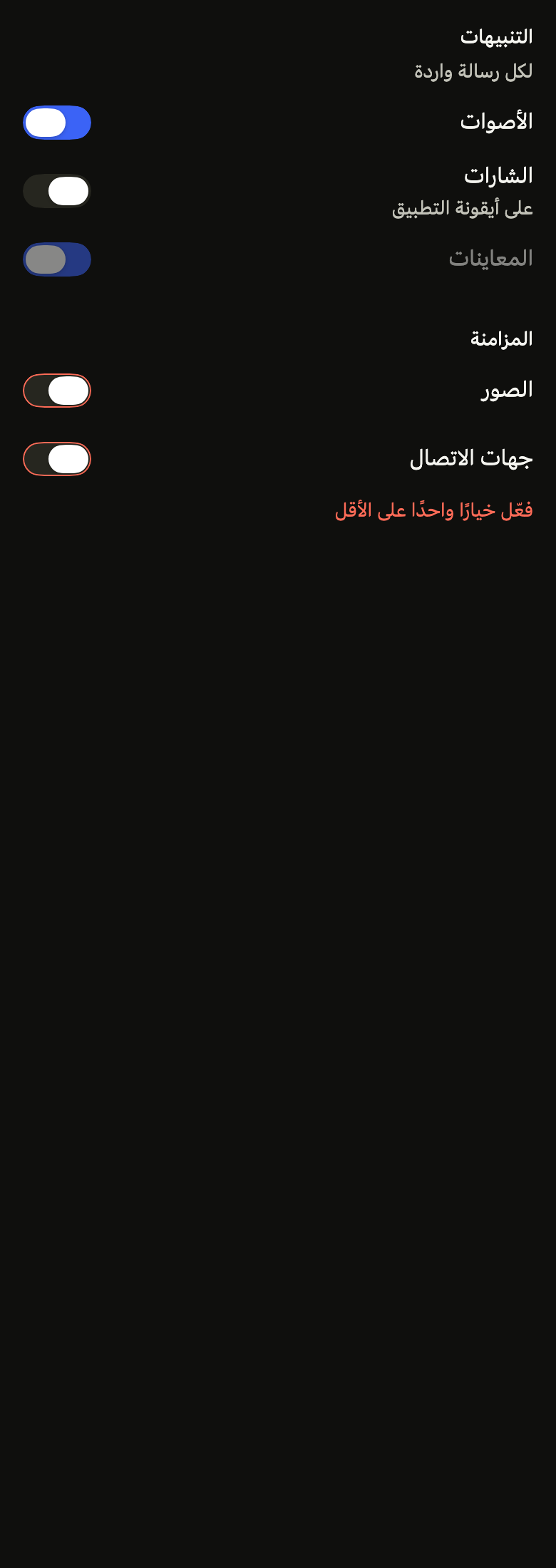
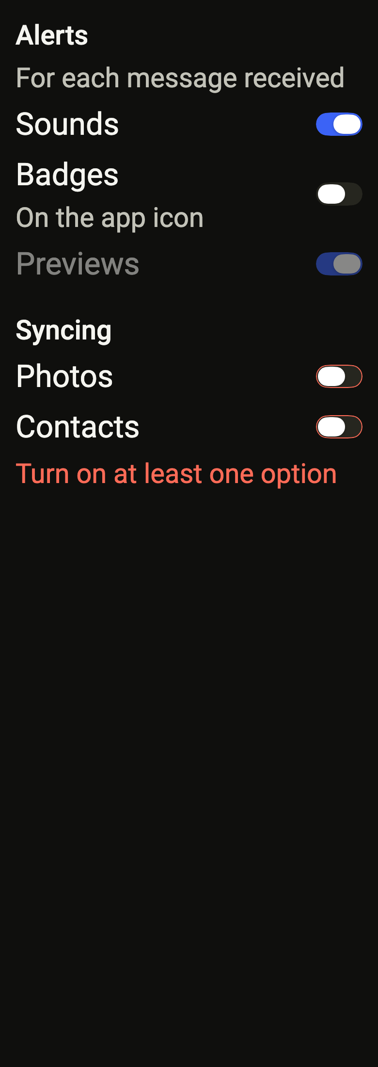
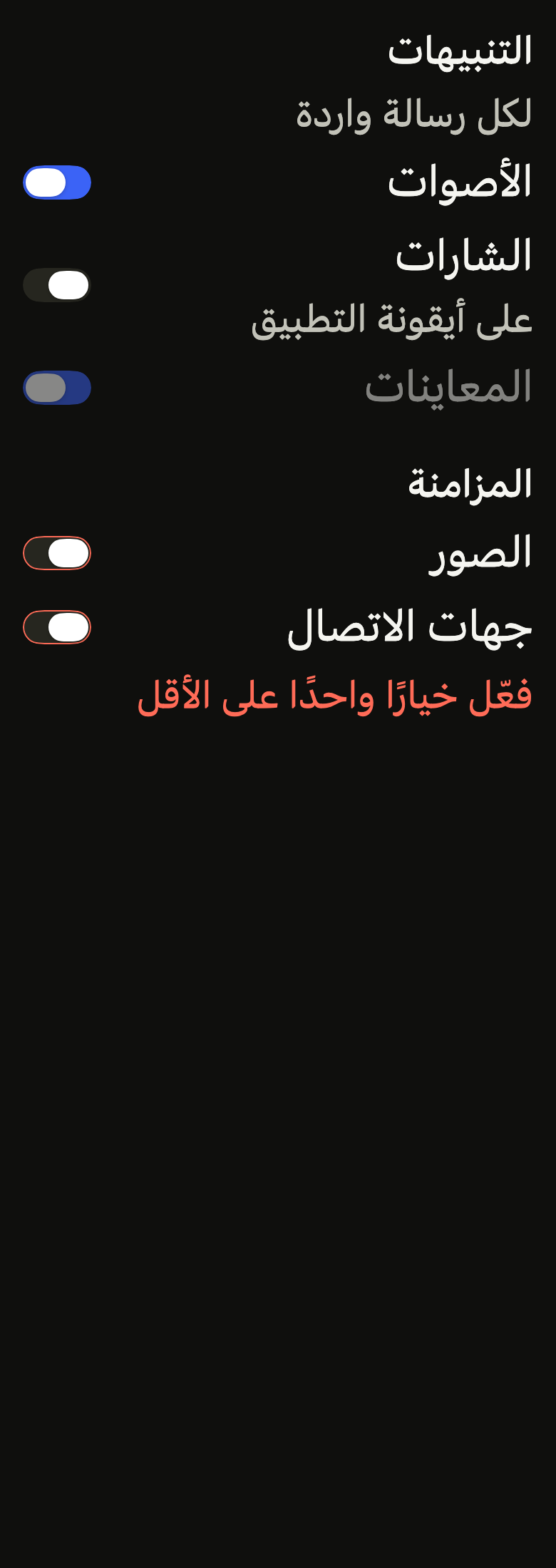
Localizations(locale: Locale'en', delegates: const [DefaultWidgetsLocalizations.delegate], child: Directionality(textDirection: variant.dir, child: ColoredBox(color: FlScope.of(context).colors.surface, child: Padding(padding: EdgeInsetsDirectional.all(FlScope.of(context).space.lg), child: Column(crossAxisAlignment: CrossAxisAlignment.stretch, spacing: FlScope.of(context).space.xl, children: [FlSwitchGroup(label: 'Alerts', description: 'For each message received', options: [FlSwitchGroupOption(value: true, onChanged: (_) {}, label: 'Sounds'), FlSwitchGroupOption(value: false, onChanged: (_) {}, label: 'Badges', description: 'On the app icon'), FlSwitchGroupOption(value: true, onChanged: null, label: 'Previews')]), FlSwitchGroup(label: 'Syncing', invalid: true, error: 'Turn on at least one option', options: [FlSwitchGroupOption(value: false, onChanged: (_) {}, label: 'Photos'), FlSwitchGroupOption(value: false, onChanged: (_) {}, label: 'Contacts')])])))))API
FlSwitchGroupOption: class
FlSwitchGroupOption.new: const new({required bool value, required ValueChanged<bool>? onChanged, required String label, String? description})
FlSwitchGroupOption.value: get bool
FlSwitchGroupOption.onChanged: get ValueChanged<bool>?
FlSwitchGroupOption.label: get String
FlSwitchGroupOption.description: get String?
FlSwitchGroup: class extends StatelessWidget
FlSwitchGroup.new: const new({super.key, required String label, required List<FlSwitchGroupOption> options, String? description, String? error, bool invalid, bool required, bool disabled, bool framed})
FlSwitchGroup.label: get String
FlSwitchGroup.framed: get bool
FlSwitchGroup.options: get List<FlSwitchGroupOption>
FlSwitchGroup.description: get String?
FlSwitchGroup.error: get String?
FlSwitchGroup.invalid: get bool
FlSwitchGroup.required: get bool
FlSwitchGroup.disabled: get bool
FlSwitchGroup.build: Widget(BuildContext context)Reference renders
The 16 images published with version 0.2.3, rendered by the shared harness on macOS with Flutter 3.47.7. fliin verify switch-group compares your copy to them.
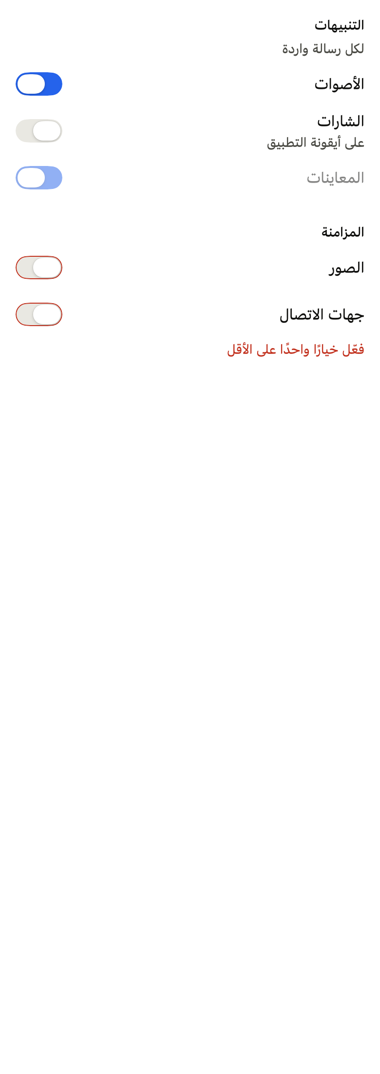
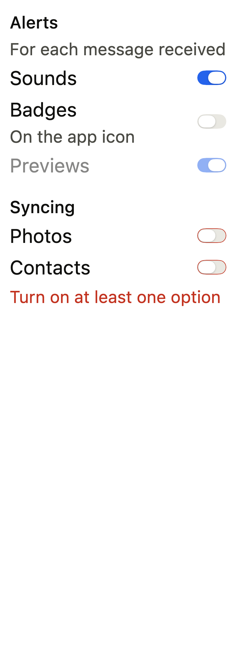
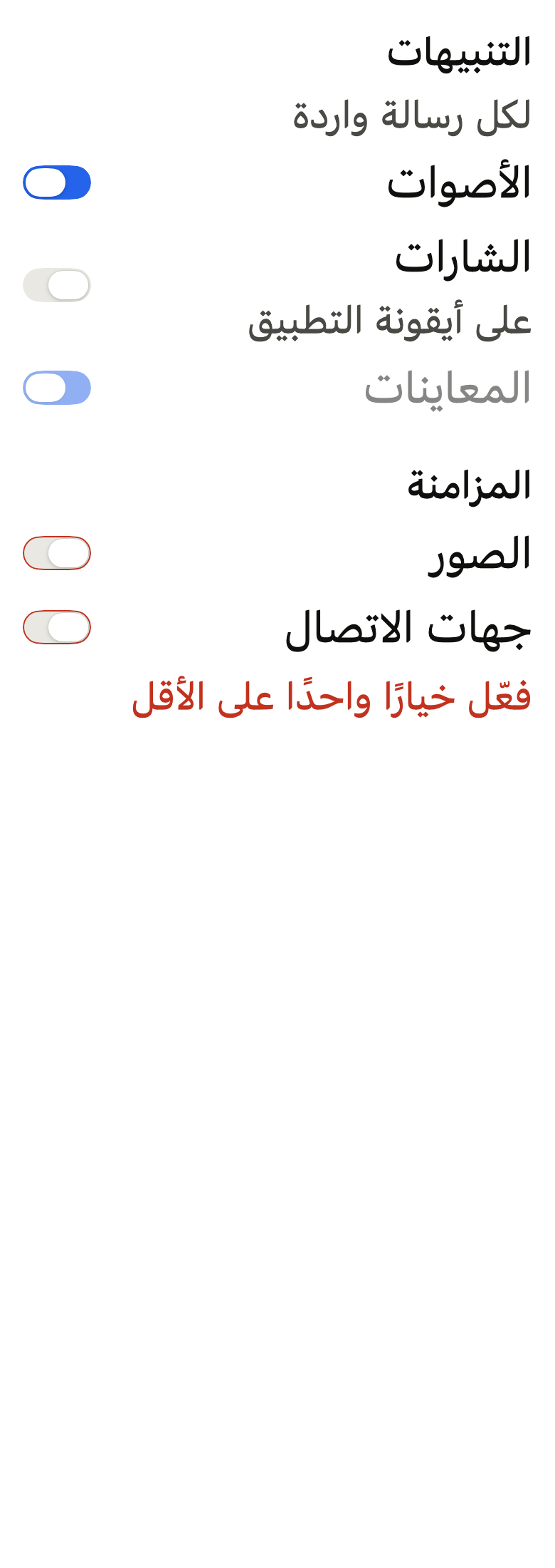
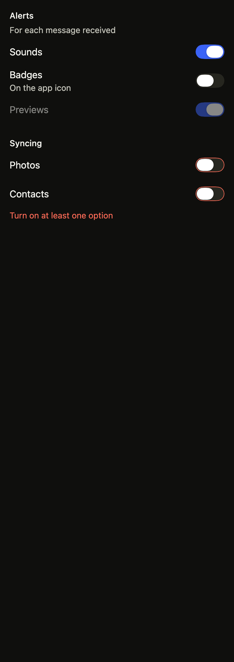
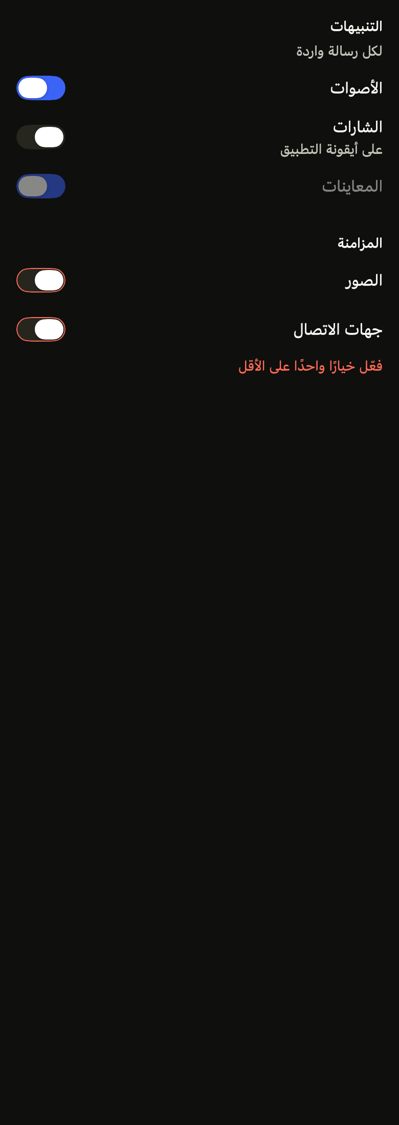
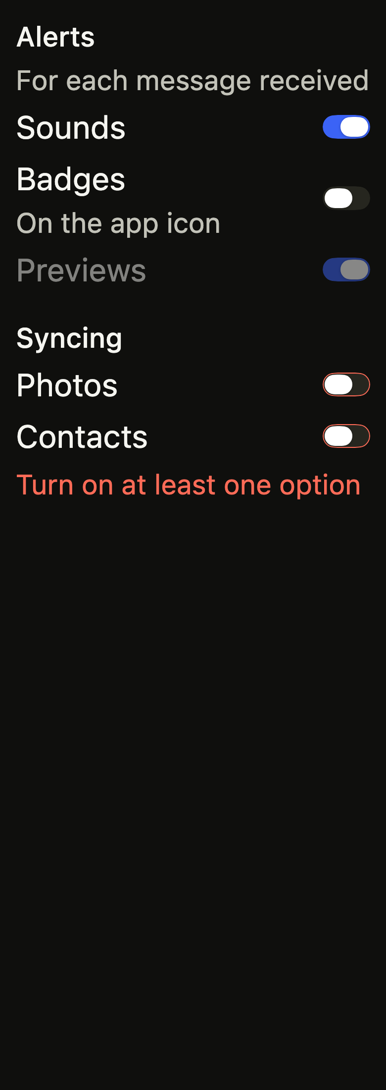
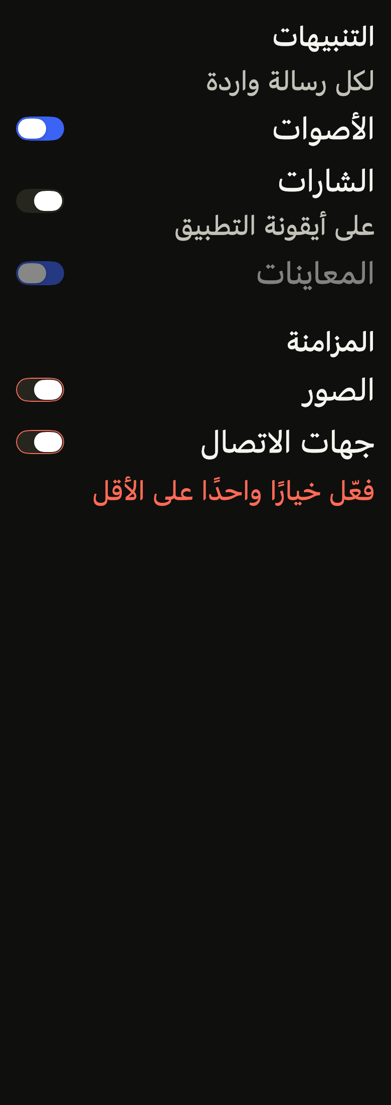
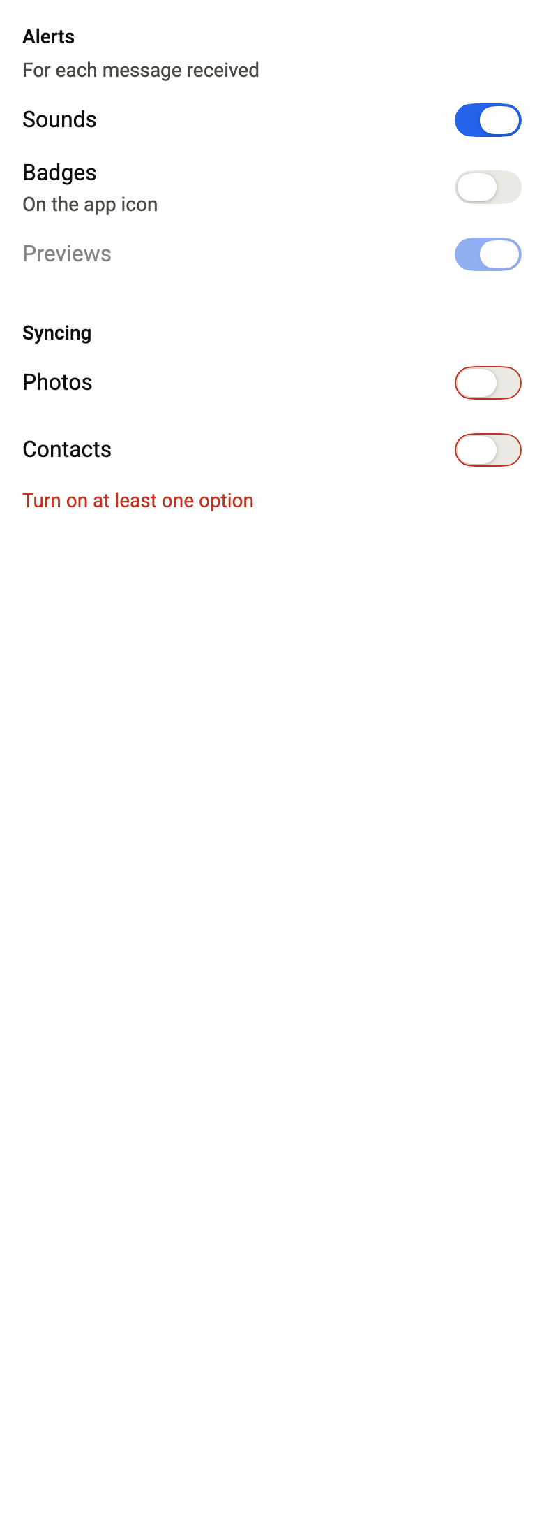
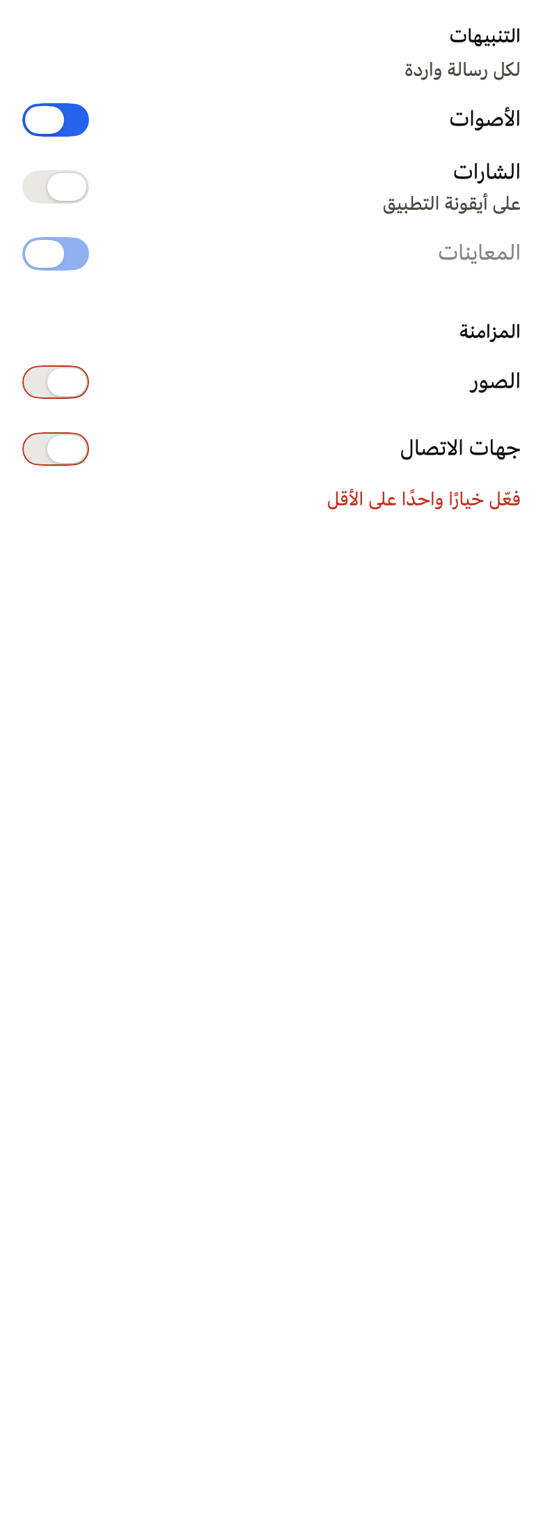
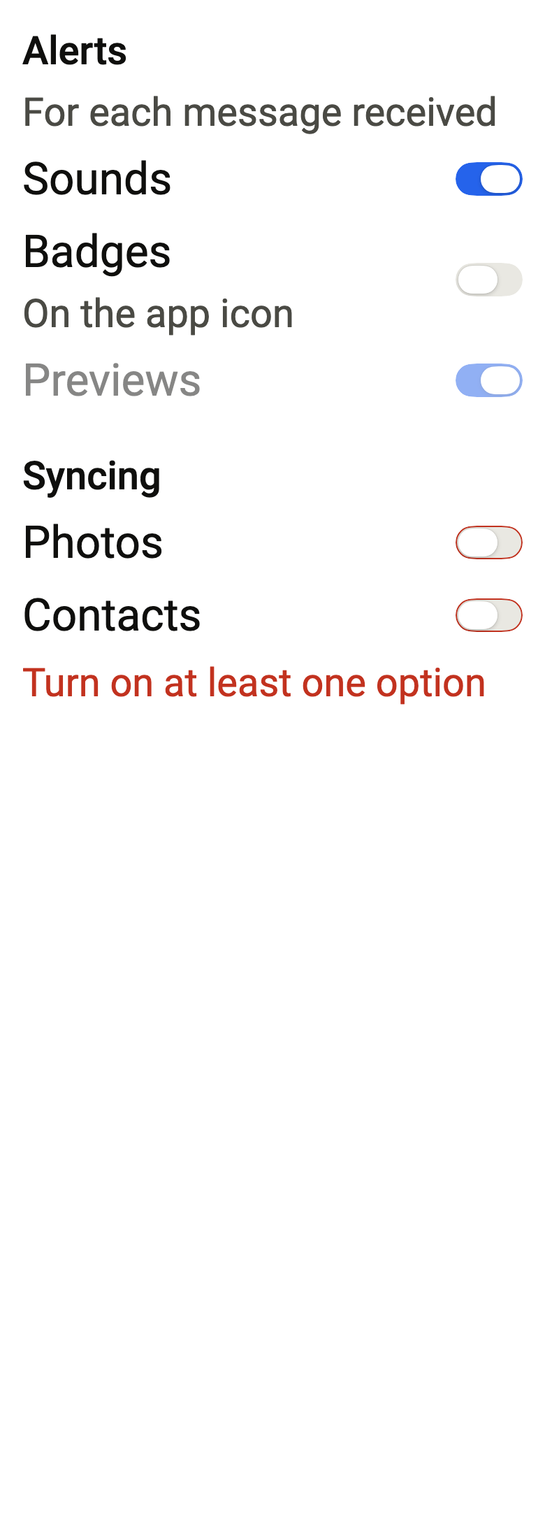
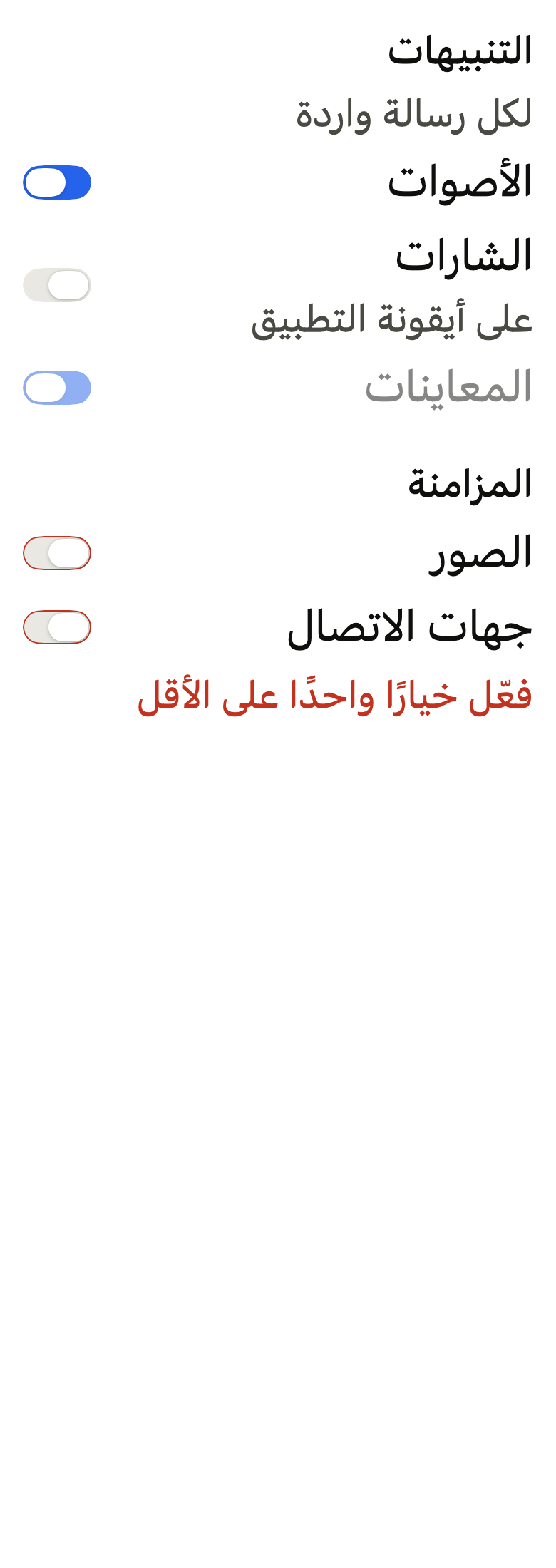
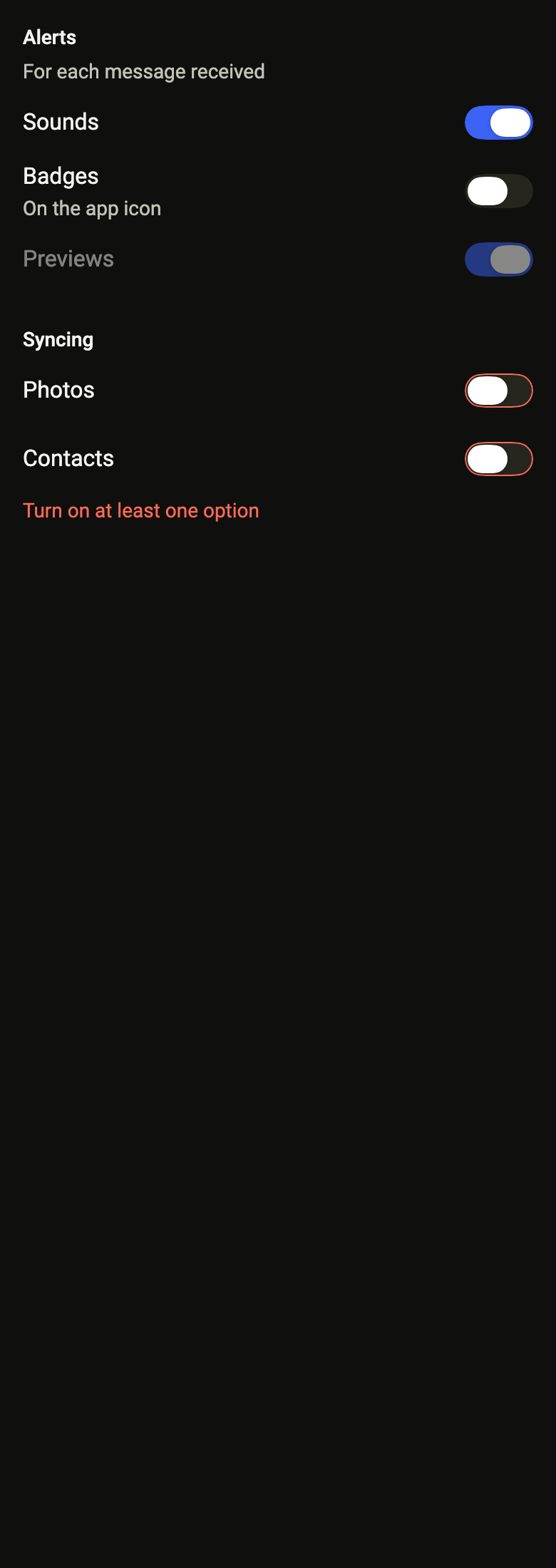
Use it to
- show several switches under one heading
- turn each kind of alert on or off
- keep sync options together
- show that at least one switch must stay on
- add a section of switches to a form
- Not for
- a single switch with its label: use a labeled control (control-field)
- several choices sent with the form: use a checkbox group (checkbox-group)
- a settings page as a list: use a list row (list-row)
- States
Source
The files fliin add switch-group copies into your app, before your prefix and imports are applied.
switch_group/fl_switch_group.dart
// Modified from the SwitchGroup of HeroUI React v3, Copyright 2020 Next UI
// Inc., licensed under the MIT license below and under Apache 2.0:
// https://www.apache.org/licenses/LICENSE-2.0
//
// Permission is hereby granted, free of charge, to any person obtaining a copy
// of this software and associated documentation files (the "Software"), to
// deal in the Software without restriction, including without limitation the
// rights to use, copy, modify, merge, publish, distribute, sublicense, and/or
// sell copies of the Software, and to permit persons to whom the Software is
// furnished to do so, subject to the following conditions:
//
// The above copyright notice and this permission notice shall be included in
// all copies or substantial portions of the Software.
//
// THE SOFTWARE IS PROVIDED "AS IS", WITHOUT WARRANTY OF ANY KIND, EXPRESS OR
// IMPLIED, INCLUDING BUT NOT LIMITED TO THE WARRANTIES OF MERCHANTABILITY,
// FITNESS FOR A PARTICULAR PURPOSE AND NONINFRINGEMENT. IN NO EVENT SHALL THE
// AUTHORS OR COPYRIGHT HOLDERS BE LIABLE FOR ANY CLAIM, DAMAGES OR OTHER
// LIABILITY, WHETHER IN AN ACTION OF CONTRACT, TORT OR OTHERWISE, ARISING
// FROM, OUT OF OR IN CONNECTION WITH THE SOFTWARE OR THE USE OR OTHER DEALINGS
// IN THE SOFTWARE.
//
// Also modified from the ControlField of HeroUI Native 1.0.10, Copyright 2025
// NextUI Inc., licensed under Apache 2.0.
import 'dart:ui' show SemanticsValidationResult;

import 'package:flutter/widgets.dart';
import 'package:fliin_ui/components/control_field/fl_control_field.dart';
import 'package:fliin_ui/components/field/fl_field.dart';
import 'package:fliin_ui/core/fliin.dart';

/// A switch of an [FlSwitchGroup]: a setting independent of the others, its
/// state, its label and its help text.
class FlSwitchGroupOption {
  /// The [label] switch, in the [value] state.
  const FlSwitchGroupOption({required this.value, required this.onChanged, required this.label, this.description});

  /// On or off; the parent holds it.
  final bool value;

  /// Receives the requested state. Null: this switch alone does not respond.
  final ValueChanged<bool>? onChanged;

  /// The row's label, also read by the screen reader.
  final String label;

  /// A help text under the label.
  final String? description;
}

/// A group of switches: one `FlControlField`
/// row per setting, `space.xs` apart, under a shared label and
/// description, with a shared error message. Each switch keeps its own
/// value: the group only brings them together.
///
/// The screen reader reads the group as a node named by [label] and
/// described by [description], then each switch; the error is announced
/// when it appears. [disabled] disables them all.
class FlSwitchGroup extends StatelessWidget {
  /// A [label] group of the [options] settings.
  const FlSwitchGroup({
    super.key,
    required this.label,
    required this.options,
    this.description,
    this.error,
    this.invalid = false,
    this.required = false,
    this.disabled = false,
    this.framed = false,
  });

  /// The group's label, in the `label` role, which names it for the screen
  /// reader.
  final String label;

  /// True: each setting sits on its own `surfaceRaised` card, `space.sm`
  /// apart, as settings placed on the page.
  final bool framed;

  /// The settings, top to bottom.
  final List<FlSwitchGroupOption> options;

  /// A help text under the label, in `textSm`.
  final String? description;

  /// The error message under the settings, shown when [invalid] is true.
  final String? error;

  /// True: the combination is rejected; the switches take a `danger` outline, and
  /// [error] appears.
  final bool invalid;

  /// True: the label carries an asterisk and the group announces itself as
  /// required.
  final bool required;

  /// True: no switch responds, and the whole group fades.
  final bool disabled;

  @override
  Widget build(BuildContext context) {
    final theme = FlScope.of(context);
    final description = this.description;
    final error = this.error;
    return FlFieldScope(
      invalid: invalid,
      disabled: disabled,
      required: required,
      child: Semantics(
        container: true,
        explicitChildNodes: true,
        label: label,
        hint: description,
        isRequired: required ? true : null,
        validationResult: invalid ? SemanticsValidationResult.invalid : SemanticsValidationResult.none,
        child: Column(
          mainAxisSize: MainAxisSize.min,
          crossAxisAlignment: CrossAxisAlignment.stretch,
          children: [
            ExcludeSemantics(
              child: _header(context, label: label, description: description, required: required, disabled: disabled),
            ),
            for (final option in options)
              Padding(
                padding: EdgeInsetsDirectional.only(top: framed ? theme.space.sm : theme.space.xs),
                child: FlControlField(
                  value: option.value,
                  onChanged: disabled ? null : option.onChanged,
                  label: option.label,
                  description: option.description,
                  invalid: invalid,
                  framed: framed,
                ),
              ),
            if (error != null)
              Padding(
                padding: EdgeInsetsDirectional.only(top: invalid ? theme.space.xs : 0),
                child: FlFieldError(error),
              ),
          ],
        ),
      ),
    );
  }
}

/// A group's header: [label] in the `label` role, `onSurface`, with a
/// `danger` asterisk when [required]; [description] in `textSm`
/// `onSurfaceMuted` under it. Neither turns `danger`: the outlines and the
/// error carry the invalid state. Disabled, it fades.
Widget _header(
  BuildContext context, {
  required String label,
  String? description,
  required bool required,
  required bool disabled,
}) {
  final theme = FlScope.of(context);
  final colors = theme.colors;
  final scale = theme.typography;
  final family = DefaultTextStyle.of(context).style.fontFamily;
  final header = Column(
    crossAxisAlignment: CrossAxisAlignment.stretch,
    spacing: theme.space.xs,
    children: [
      Text.rich(
        TextSpan(
          text: label,
          children: [
            if (required)
              TextSpan(
                text: ' *',
                semanticsLabel: '',
                style: TextStyle(color: disabled ? colors.onSurfaceMuted : colors.danger),
              ),
          ],
        ),
        style: scale.resolve(FlTextRole.label).copyWith(color: colors.onSurface),
        strutStyle: scale.strut(FlTextRole.label, inheritedFamily: family),
      ),
      if (description != null)
        Text(
          description,
          style: scale.resolve(FlTextRole.textSm).copyWith(color: colors.onSurfaceMuted),
          strutStyle: scale.strut(FlTextRole.textSm, inheritedFamily: family),
        ),
    ],
  );
  return disabled ? Opacity(opacity: theme.size.disabledOpacity, child: header) : header;
}